20054-UnlimitedColorPack-036-DNNSkins v6.7.0
Documentation
- Created: 08/24/2015
- Latest update: 10/25/2019
- By: DNNGo
- Email: dnnskindev@gmail.com
Thank you for purchasing my theme. If you have any questions that are beyond the scope of this help file, please feel free to email via my user page contact form here. Thanks so much!
General Information
DotNetNuke Information
To install this skin you must have a working version of Dotnetnuke already installed. If you need help to install Dotnetnuke, follow the instructions in Documentation Center.
What Is Included With Your Package
When you purchase our theme, you will receive one large .zip file that contains everything inside. Unzip that file to get all the content inside. Below is a full list of everything that is included along with a brief description of each item. See the corresponding sections for info on installing the theme.
- Inside the Content folder are: DNN Skins folder, DNNGo_DNNGalleryPro Module folder, DNNGo_LayerGalleryPro folder, DNNGo_PhotoAlbums Module folder, DNNGo_PowerForms Module folder, DNNGo_xPlugin Module folder, DNNGo_xBlog Module folder, PSD folder, Page template.
- DNN Skins folder - The skin in this folder can be used in DNN 8.x and DNN 9.x only.
- DNNGo_DNNGalleryPro Module folder - This module contains 15 responsive sldiers in total.
- DNNGo_DNNGo_LayerGalleryPro folder - You can see this module in the banner section on home page.
- DNNGo_PhotoAlbums folder - You can see this module in Portfolios page.
- DNNGo_PowerForms folder - You can create forms through this module.
- DNNGo_xBlog Module folder - You can see this module on Blog page.
- Page Templates folder - Exported page templates will allow you to reproduce our live demo pages.
Notice: If you bought the theme from DNN Store (http://store.dnnsoftware.com), then none of module files are included in the download package. It only include DNN Skins, DNNGo_xPlugin, Page Templates and PSD files. If you need to purchase modules, please contact us via email (dnnskindev@gmail.com).
What Are The Requirements To Use skins and modules
To use skins and modules, you must be running DNN 9.x or higher.
Skin and Required Modules Installation
For DNN 9
-
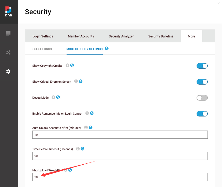
Go to Settings –> Security –> More, and select the tab MORE SECURITY SETTINGS, changing Max Upload Size to 28 or higher.
-
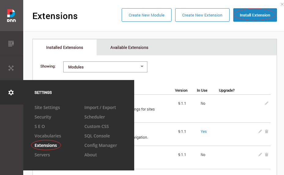
Go to Host –> Extensions –> Install Extension wizard to install the module pack DNNGo_xPlugin_0x.0x.0x_PA.zip
-
Go to Host –> Extensions –> Install Extension wizard to install the skin pack 20054-UnlimitedColorPack-036-DNNSkins.zip
-
You can install other modules as per your own needs.
-
Manage
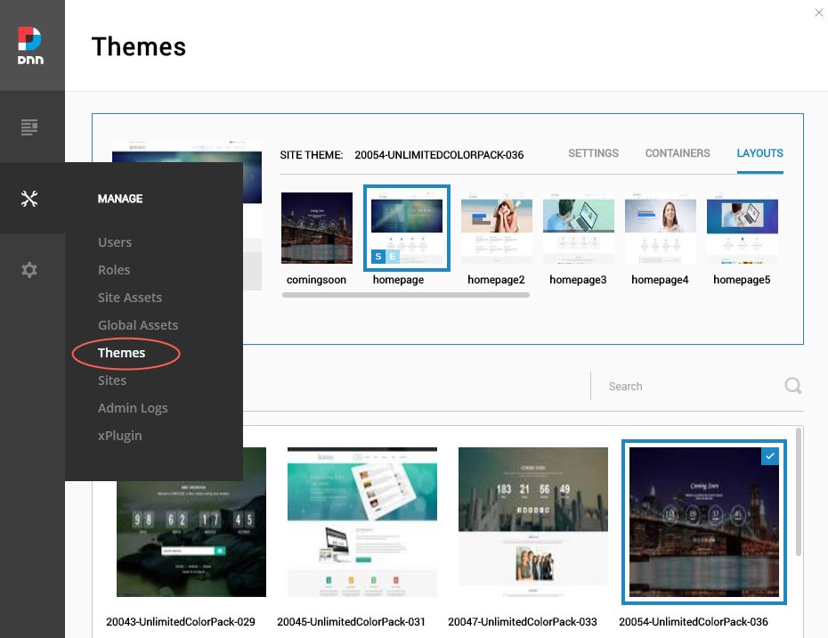
After the installation has been completed, navigate to Manage –> Themes. Select and apply 20054-UnlimitedColorPack-036
-
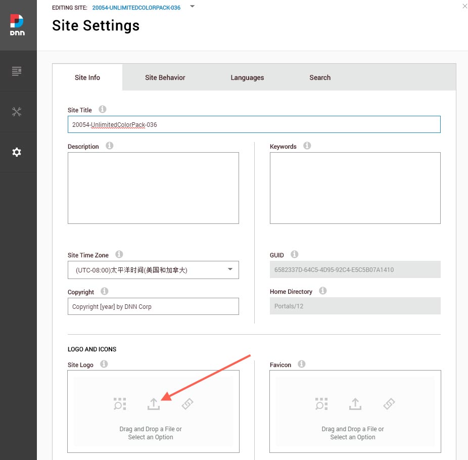
You can upload the LOGO image in Settings –> Site Settings page.
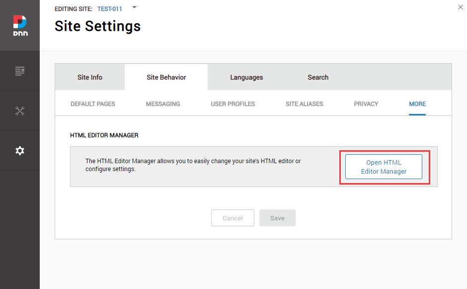
Change the Settings of HTML Editor
By default, HTML editor will remove the div tags whose content is blank. For example: if we add the code <div class=”pt-20″></div> in HTML editor and click save, you will find the code is missing when you edit it afterwards. So we need to change the settings to prevent this from happening.
Log in to your site as super administrator.
Go to SETTINGS > Site Settings > Site Behavior > MORE, click the Open HTML Editor Manager.
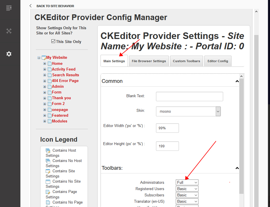
Click the Main Settings tab. Set the value of Administrators to be Full.
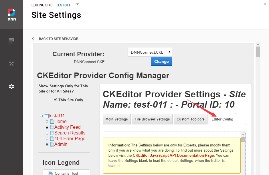
Click the Editor Config tab.
Set the value of AllowedContent to be true.
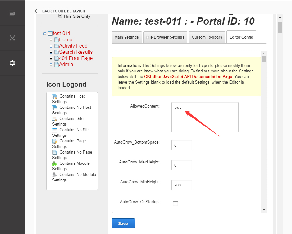
Set the value of FillEmptyBlocks to be false.
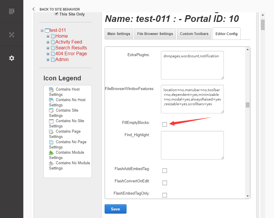
Set the value of ignoreEmptyParagraph to be false.
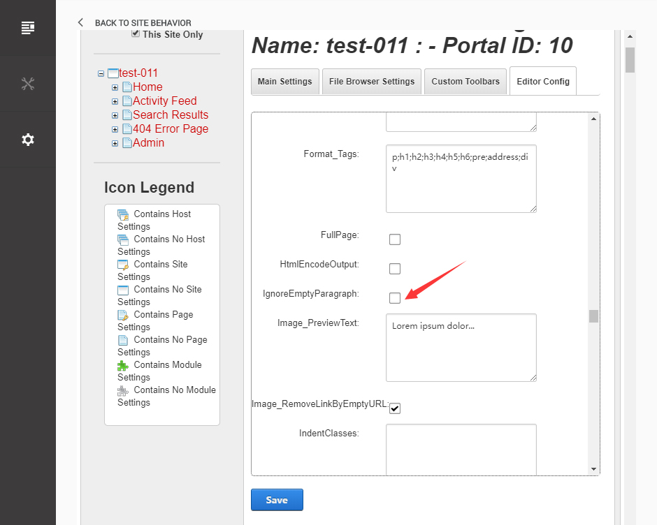
Click the Save button.
How to import page template?
Exported page templates will allow you to reproduce our live demo pages. We'll reproduce the home page as an example.
For DNN 8
-
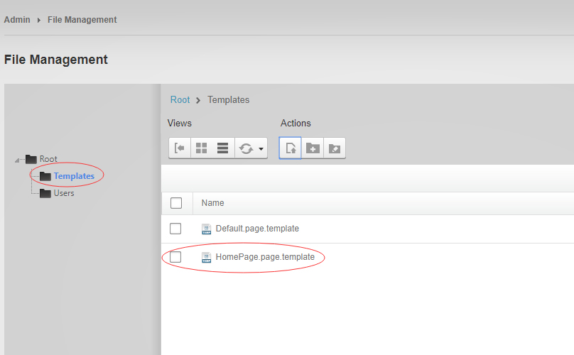
You can find these files in Page Templates Directory.
-
Upload Home.page.template file into your portal root (e.g. Portals/0/Templates/) in the previous chapter and synchronize your folders, you are able to start using page templates to clone live demo pages.
-
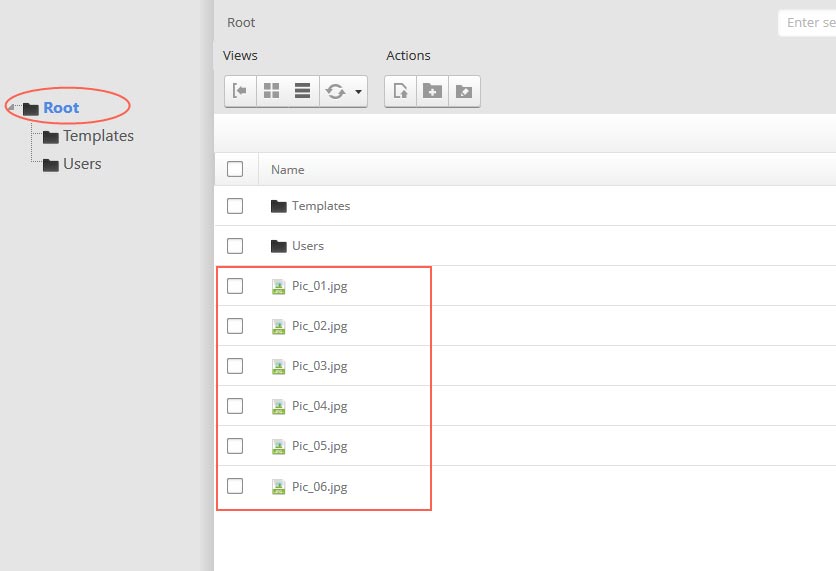
Because page templates can not import image files, you need to upload all the photo files of the "images" folder into your portal root (e.g. Portals/0/).
-
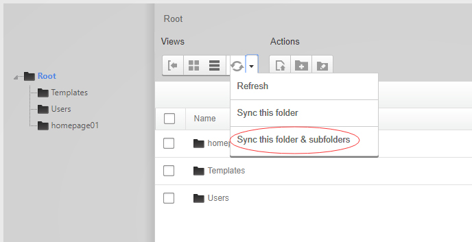
Synchronize the file in Admin > File-Management
-
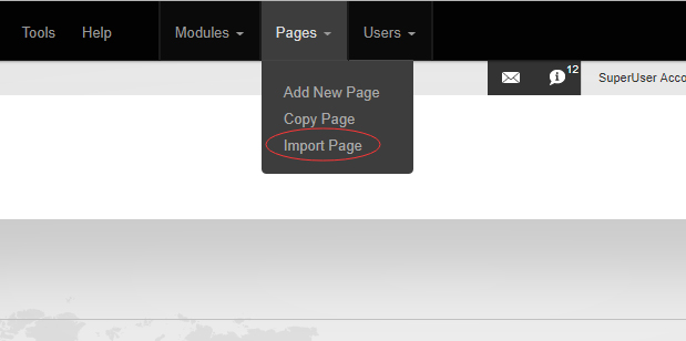
Navigate to the Home page and click Pages -> Import.
-
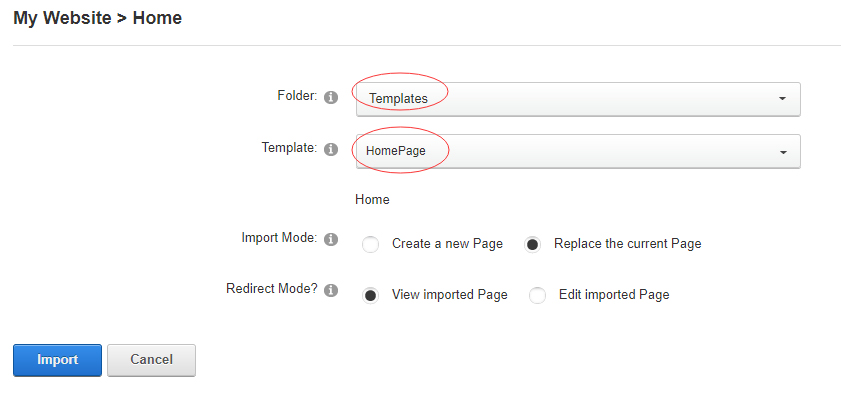
Find a proper page exported content file navigating to Templates folder and choosing for example Home page.
-
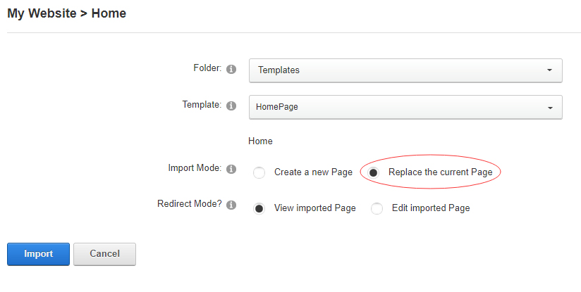
Choose "Replace the current Page" and the redirect mode you need. Please note, if you select "Replace the current Page", content of current page will be reset.
-
Click Import button if everything is correct.
-
Specify page settings according to your needs (necessarily apply HomePage skin to the home page) and click "Update Page". The home page is ready.
For DNN 9
-
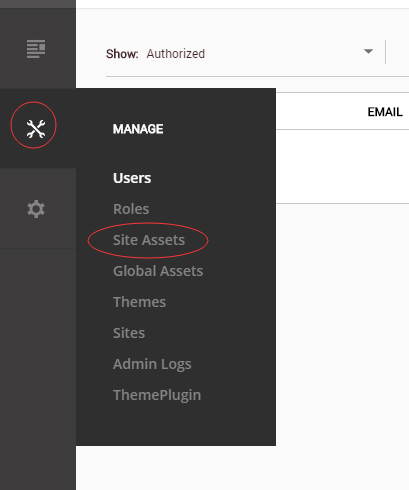
Go to Manage > Site Assets
-
Uploading Home.page.template file to Templates folder
-
Because page templates can not import image files, you need to upload all the photo files of the "images" folder into your portal root (e.g. Portals/0/).
-
Go to Content > Pages > Add Page
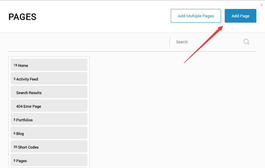
-
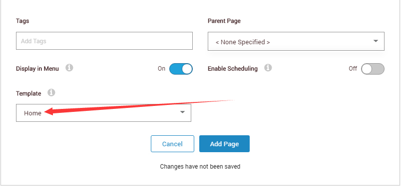
Choose your template from Template drop-down.
- Click Add Page
Note : Page templates can only be imported when you are creating a new page.
Skin features and how to use them.
Page Template
The product contains page templates for all pages in the live demo, you can copy our demo site by importing the page templates.
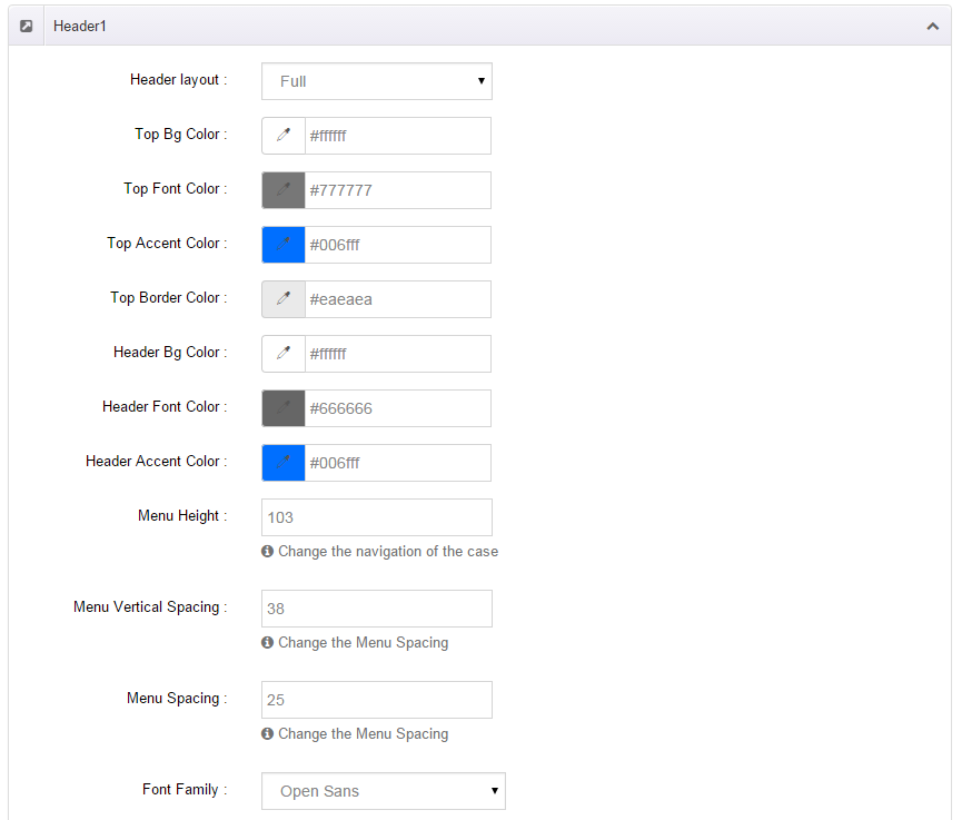
Seven kinds of header layout
You can click the xPlugin button to go to settings page, and then choose different header styles in Header Layout section.
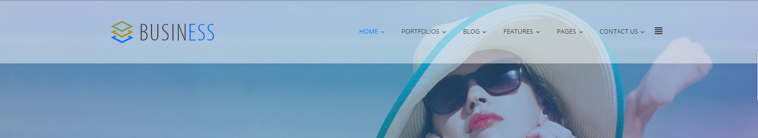
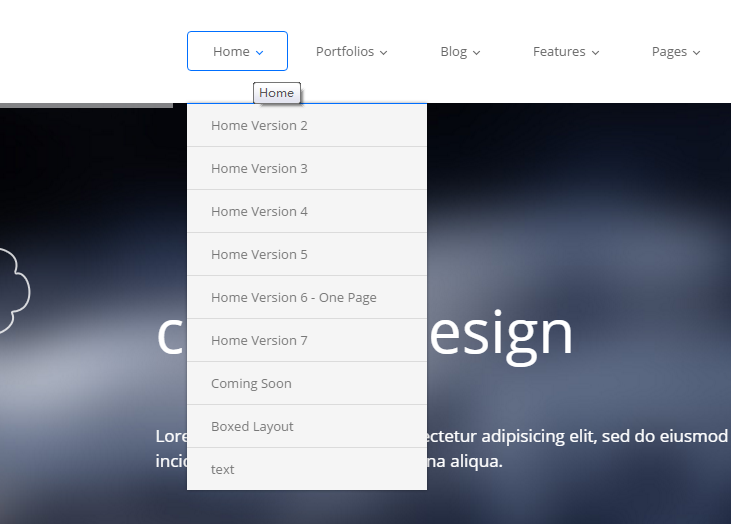
You can click these links to check different header styles. header 1, header 2, header 3, header 4, header 5, header 6, header 7
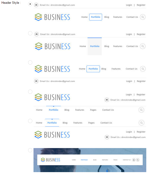
Each header includes very rich setting options, you can modify the color of whatever you would like to . For example: text color, font size and background color etc.
Header Position
Header Position is for setting the position of Header. If you have it set to Float to top, Header will float over the Banner. If you have it set to Not float, Header will show with Banner side by side. You can compare the difference between these two settings through the following two screen shots.
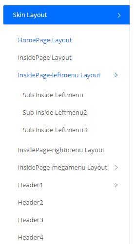
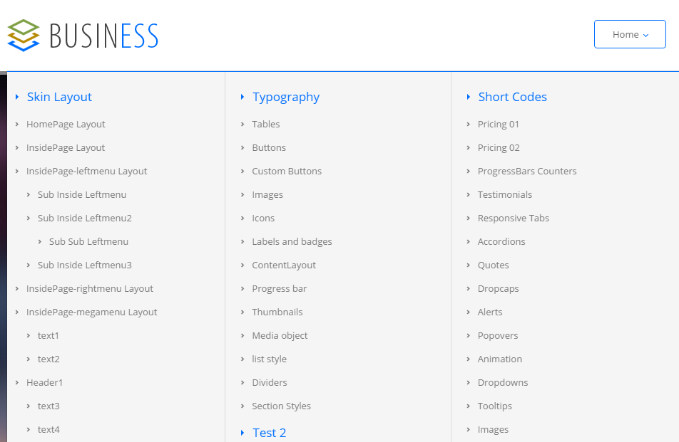
Insidepage-leftmenu layout
Insidepage-leftmenu layout page is using InsidePage-leftmenu skin. Menus on the left side are displaying the second level menus.
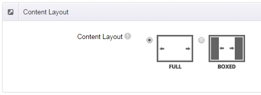
Full Layout and Boxed Layout
This skin contains Full Layout and Boxed Layout, you can set through Content Layout section.
With Boxed Layout applied, you can still set page background, it will display around the content. You can click link to check demo url of boxed layout.
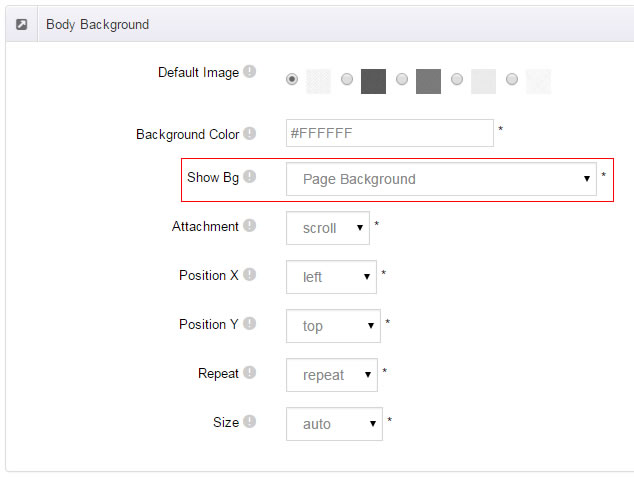
The background can be set as static or rotating image or any solid color for you choose to apply, also you can set different background images for different pages.
How to set background image for DNN page.
- You need to choose Boxed Layout.
- Choose Page Background in the Option for Show bg, save settings.
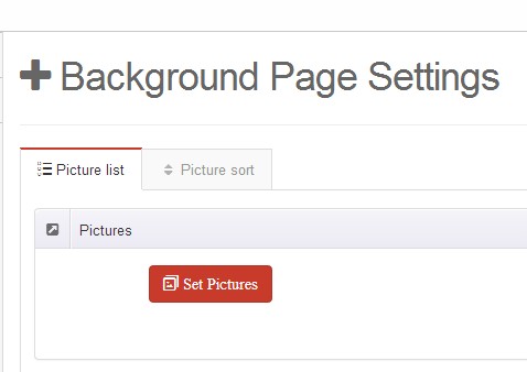
- Click "pages" nav in the xPlugin.
- Click Edit Background icon.
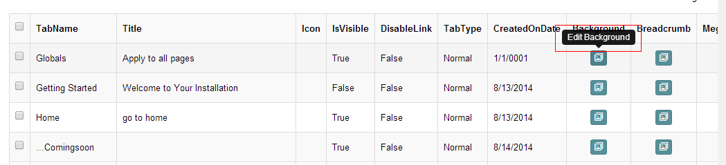
- Upload image, the background image will show as slider if you choose two or more images.
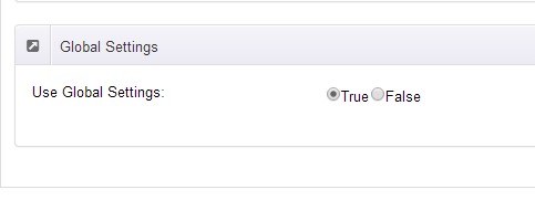
- "Globals" allows you to set background image for all pages.
- Also you can set background image for each page.
- You can set not to use images in "Globals".
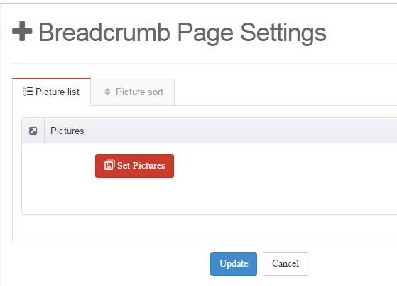
How to set breadcrumb image for DNN page.
- Choose Breadcrumb Background in the Option for Show bg, save settings.
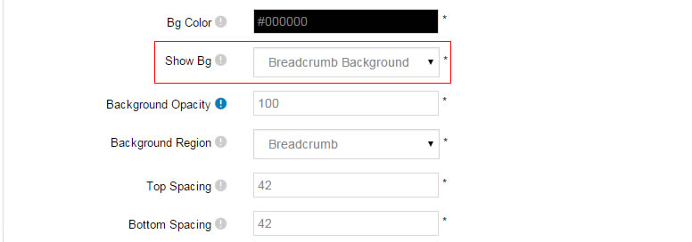
- Click "pages" nav in the xPlugin.
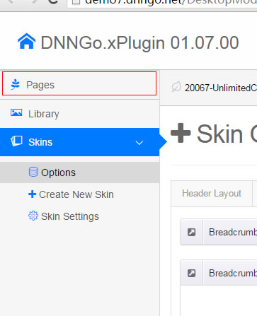
- Click Edit Breadcrumb icon.
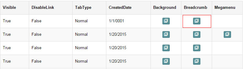
- Upload image, the background image will show as slider if you choose two or more images.
- "Globals" allows you to set background image for all pages.
- Also you can set background image for each page.
- You can set not to use images in "Globals".
Content Style
You can set the font color and size, link color, the color of H1-H6 etc of the content area.
Four kinds of Breadcrumb layouts
You can choose different Breadcrumb styles through Breadcrumb Layout.
You can click these links to check different breadcrumb styles. breadcrumb 1, breadcrumb 2, breadcrumb 3, breadcrumb 4
You can change the text color, background color and background image etc for each Breadcrumb layout.
Create a Skin
You can create a new skin through xPlugin. Please note the new skin name shouldn't be the same as the current skin.
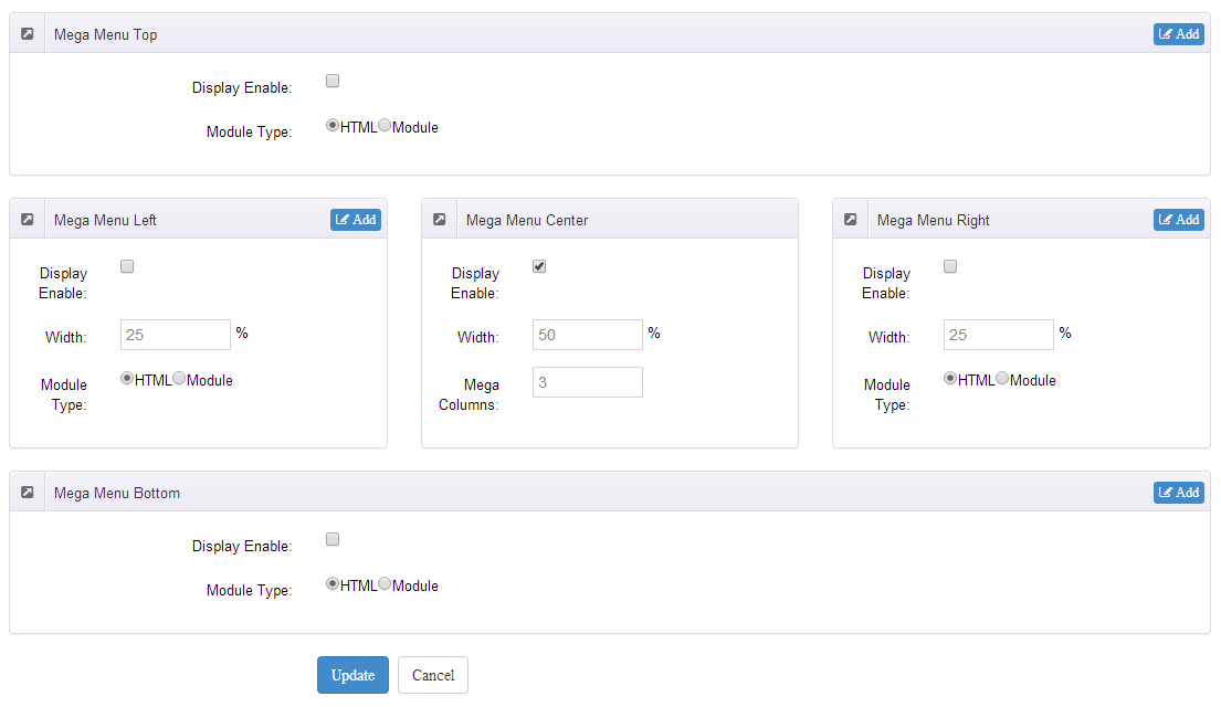
Standard Menu and MegaMenu
The skin sub menus contain two types-Standard Menu and MegaMenu.
Standard Menu is the default menu type, the sub menus will be set to display in one column only, as shown in screen shot below:
MegaMenu will set sub menus to display in multiple columns, also you can display HTML module or third party module in sub menus, as shown below:
You can set the MegaMenu as per steps below:
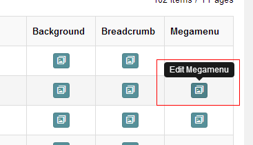
- Click "pages" nav in the xPlugin.
- Click Edit MegaMenu button. Please note MegaMenu can be set for first level menus only.
- Set the menu type to MegaMenu.
- Mega Menu has 5 sections: Menu Top, Menu Right, Menu Bottom, Menu Left, Menu Center.
- Click Add button so you will be able to add HTML module or any third module to Menu Top, Menu Right, Menu Bottom, Menu Left.
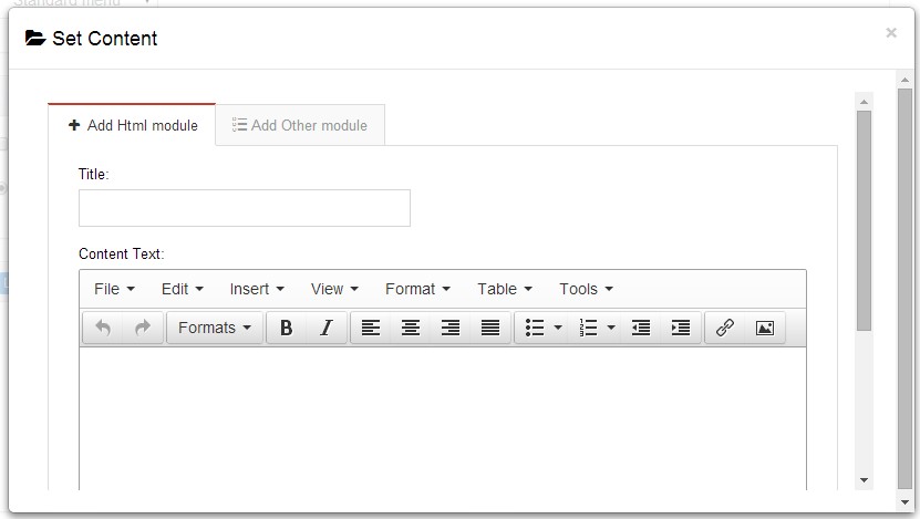
- Module Type-choose to display HTML module or third module.
- Menu Center-it will display secondary menus here.
- Mega Columns-set number of columns the secondary menu will display.
- You can set width for Menu Right, Menu Left, Menu Center, please note their previous total width shouldn't be more than 100.
Set Up Google Map
You can create Google Map easily following these steps:
- Go to xplugin, and click Map Settings tab to fill in API.
- You can register through https://developers.google.com/maps/documentation/javascript/get-api-key.
- Place the code <div id="gmap01"></div> into HTML module.
- Enter location of the map in Address, for example: Bear city, ny
- Enter description in Markers Html, for example: hello word
CSS Codes
Skin is using bootstrap framework. You will get to know more through this url. Link
Width of content area
dnn_layout is the page content framework:
| Device width | Width of content area |
| Large devices Desktops (≥1200px) | 1170px |
| Medium devices Desktops (≥992px) | 970px |
| Small devices Tablets (≥768px) | 750px |
| Extra small devices Phones (<768px) | auto |
content_mid is the spacing between both sides of the page :
| Device width | Spacing |
| Large devices Desktops (≥1200px) | 30px |
| Medium devices Desktops (≥992px) | 20px |
| Small devices Tablets (≥768px) | 15px |
| Extra small devices Phones (<768px) | 15px |
<div class="dnn_layout">
  <div class="content_mid clearfix"> content ... </div>
</div>
Bootstrap 12 grid layout
<!-- Tablet and desktop devices are 50% wide, mobile device is 100% wide -->
<div class="row">
  <div class="col-sm-6">.col-sm-6</div>
  <div class="col-sm-6">.col-sm-6</div>
</div>

<!-- Stack the columns on mobile by making one full-width and the other half-width -->
<div class="row">
  <div class="col-xs-12 col-md-8">.col-xs-12 .col-md-8</div>
  <div class="col-xs-6 col-md-4">.col-xs-6 .col-md-4</div>
</div>

<!-- Columns start at 50% wide on mobile and bump up to 33.3% wide on desktop -->
<div class="row">
  <div class="col-xs-6 col-md-4">.col-xs-6 .col-md-4</div>
  <div class="col-xs-6 col-md-4">.col-xs-6 .col-md-4</div>
  <div class="col-xs-6 col-md-4">.col-xs-6 .col-md-4</div>
</div>

<!-- Columns are always 50% wide, on mobile and desktop -->
<div class="row">
  <div class="col-xs-6">.col-xs-6</div>
  <div class="col-xs-6">.col-xs-6</div>
</div>

<!-- Add the extra clearfix for only the required viewport -->
<div class="clearfix visible-xs-block"></div>
Display and hide elements
| Extra small devices Phones (<768px) | Small devices Tablets (≥768px) | Medium devices Desktops (≥992px) | Large devices Desktops (≥1200px) | |
|---|---|---|---|---|
.visible-xs |
Visible | Hidden | Hidden | Hidden |
.visible-sm |
Hidden | Visible | Hidden | Hidden |
.visible-md |
Hidden | Hidden | Visible | Hidden |
.visible-lg |
Hidden | Hidden | Hidden | Visible |
.hidden-xs |
Hidden | Visible | Visible | Visible |
.hidden-sm |
Visible | Hidden | Visible | Visible |
.hidden-md |
Visible | Visible | Hidden | Visible |
.hidden-lg |
Visible | Visible | Visible | Hidden |
Visible in mobile devices and hidden in other devices
<div class="visible-xs">content...</div>

Visible in other devices and hidden in mobile devices
<div class="hidden-xs">content...</div>
Vertical spacing
 /*page Spacing*/
.mt-10 {margin-top: 10px;}
.mb-10 {margin-bottom: 10px;}
.pt-10 {padding-top: 10px;}
.pb-10 {padding-bottom: 10px;}
.mt-20 {margin-top: 20px;}
.mb-20 {margin-bottom: 20px;}
.pt-20 {padding-top: 20px;}
.pb-20 {padding-bottom: 20px;}
.mt-30 {margin-top: 30px;}
.mb-30 {margin-bottom: 30px;}
.pt-30 {padding-top: 30px;}
.pb-30 {padding-bottom: 30px;}
.mt-40 {margin-top: 40px;}
.mb-40 {margin-bottom: 40px;}
.pt-40 {padding-top: 40px;}
.pb-40 {padding-bottom: 40px;}
.mt-50 {margin-top: 50px;}
.mb-50 {margin-bottom: 50px;}
.pt-50 {padding-top: 50px;}
.pb-50 {padding-bottom: 50px;}
.mt-60 {margin-top: 60px;}
.mb-60 {margin-bottom: 60px;}
.pt-60 {padding-top: 60px;}
.pb-60 {padding-bottom: 60px;}
CSS background
<div class="backgroundImage1">backgroundImage1</div>

<div class="backgroundImage2">
  <div class="backgroundImage2_shade"> </div>
</div>
<div class="backgroundImage3">backgroundImage3</div>

<div class="backgroundImage4">backgroundImage4</div>
<div class="backgroundImage5">backgroundImage5</div>
<div class="backgroundImage6">backgroundImage6</div>

<div class="backgroundImage7">backgroundImage7</div>

<div class="backgroundImage8">backgroundImage8</div>
<div class="backgroundImage9">backgroundImage9</div>
Short Codes
This skin contains a lot of short codes, it is very easy for you to use even you know nothing about js and css, all you need to do is just copying the short codes to HTML module.
Pricing
You can click the link to check Pricing demo. Demo Link
Style 1:
Below is the screen shot:
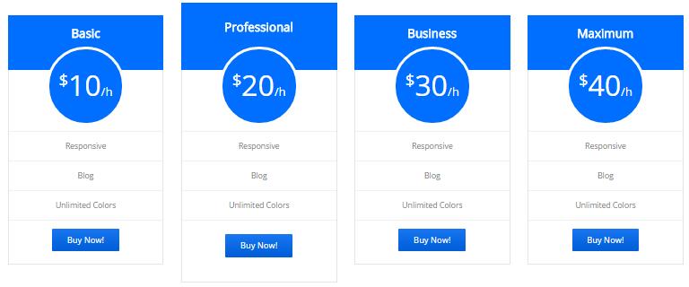
Codes are as follows:
<div class="price-table price-table7 row">
    <div class="col-md-3 col-sm-6">
        <div class="price_title">
            <h2>basic</h2>
        </div>
        <div class="price_holder">
            <div class="price_box">
                <span class="sup">$</span><span class="price">10</span><span class="unit">/h</span>
            </div>
            <ul>
                <li>responsive</li>
                <li>Blog</li>
                <li>Unlimited Colors</li>
            </ul>
            <a href="#" class="btn ">Buy Now!</a>
        </div>
    </div>
    <div class="col-md-3 col-sm-6 best_value">
        <div class="price_title ">
            <h2>professional</h2>
        </div>
        <div class="price_holder">
            <div class="price_box">
                <span class="sup">$</span><span class="price">20</span><span class="unit">/h</span>
            </div>
            <ul>
                <li>responsive</li>
                <li>Blog</li>
                <li>Unlimited Colors</li>
            </ul>
            <a href="#" class="btn">Buy Now!</a>
        </div>
    </div>
    <div class="col-md-3 col-sm-6">
        <div class="price_title">
            <h2>business</h2>
        </div>
        <div class="price_holder">
            <div class="price_box">
                <span class="sup">$</span><span class="price">30</span><span class="unit">/h</span>
            </div>
            <ul>
                <li>responsive</li>
                <li>Blog</li>
                <li>Unlimited Colors</li>
            </ul>
            <a href="#" class="btn">Buy Now!</a>
        </div>
    </div>
    <div class="col-md-3 col-sm-6">
        <div class="price_title">
            <h2>maximum</h2>
        </div>
        <div class="price_holder">
            <div class="price_box">
                <span class="sup">$</span><span class="price">40</span><span class="unit">/h</span>
            </div>
            <ul>
                <li>responsive</li>
                <li>Blog</li>
                <li>Unlimited Colors</li>
            </ul>
            <a href="#" class="btn ">Buy Now!</a>
        </div>
     </div>
</div>
Option:
col-md-3 col-sm-6is the width for each column. You can change the width you need through value1~12
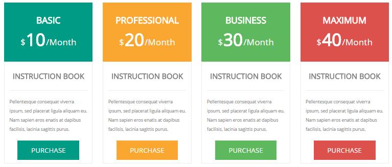
Style 2:
Below is the screen shot:
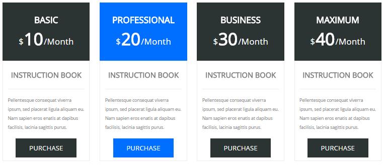
Codes are as follows:
<div class="price-table price-table3 row">
    <div class="col-md-3 col-sm-6">
        <div class="price_title">
            <h2>BASIC</h2>
            <div class="price_box"><span class="sup">$</span><span class="price">10</span><span class="unit">/Month</span></div>
        </div>
        <dl class="price_holder">
            <dt>INSTRUCTION BOOK</dt>
            <dd> Content text 1 ... </dd>
            <a href="#" class="btn ">PURCHASE</a>
        </dl>
    </div>
    <div class="col-md-3 col-sm-6 best_value">
        <div class="price_title ">
            <h2>PROFESSIONAL</h2>
            <div class="price_box"><span class="sup">$</span><span class="price">20</span><span class="unit">/Month</span></div>
        </div>
        <dl class="price_holder">
            <dt>INSTRUCTION BOOK </dt>
            <dd> Content text 2 ...</dd>
            <a href="#" class="btn">PURCHASE</a>
        </dl>
    </div>
    <div class="col-md-3 col-sm-6">
        <div class="price_title">
            <h2>BUSINESS</h2>
            <div class="price_box"><span class="sup">$</span><span class="price">30</span><span class="unit">/Month</span></div>
        </div>
        <dl class="price_holder">
            <dt>INSTRUCTION BOOK </dt>
            <dd> Content text 3 ...</dd>
            <a href="#" class="btn">PURCHASE</a>
        </dl>
    </div>
    <div class="col-md-3 col-sm-6">
        <div class="price_title">
            <h2>MAXIMUM</h2>
            <div class="price_box"><span class="sup">$</span><span class="price">40</span><span class="unit">/Month</span></div>
        </div>
        <dl class="price_holder">
            <dt>INSTRUCTION BOOK </dt>
            <dd> Content text 4 ...</dd>
            <a href="#" class="btn ">PURCHASE</a>
        </dl>
    </div>
</div>
Option:
col-md-3 col-sm-6is the width for each column. You can change the width you need through value1~12
Style 3:
Below is the screen shot:
Codes are as follows:
<div class="price-table price-table3 row">
    <div class="col-md-3 col-sm-6 color_1">
        <div class="price_title">
            <h2>BASIC</h2>
            <div class="price_box"><span class="sup">$</span><span class="price">10</span><span class="unit">/Month</span></div>
        </div>
        <dl class="price_holder">
            <dt>INSTRUCTION BOOK</dt>
            <dd> Content text 1 ... </dd>
            <a href="#" class="btn ">PURCHASE</a>
        </dl>
    </div>
    <div class="col-md-3 col-sm-6 color_2">
        <div class="price_title ">
            <h2>PROFESSIONAL</h2>
            <div class="price_box"><span class="sup">$</span><span class="price">20</span><span class="unit">/Month</span></div>
        </div>
        <dl class="price_holder">
            <dt>INSTRUCTION BOOK </dt>
            <dd> Content text 2 ... </dd>
            <a href="#" class="btn">PURCHASE</a>
        </dl>
    </div>
    <div class="col-md-3 col-sm-6 color_3">
        <div class="price_title">
            <h2>BUSINESS</h2>
            <div class="price_box"><span class="sup">$</span><span class="price">30</span><span class="unit">/Month</span></div>
        </div>
        <dl class="price_holder">
            <dt>INSTRUCTION BOOK </dt>
            <dd> Content text 3 ... </dd>
            <a href="#" class="btn">PURCHASE</a>
        </dl>
    </div>
    <div class="col-md-3 col-sm-6 color_4">
        <div class="price_title">
            <h2>MAXIMUM</h2>
            <div class="price_box"><span class="sup">$</span><span class="price">40</span><span class="unit">/Month</span></div>
        </div>
        <dl class="price_holder">
            <dt>INSTRUCTION BOOK </dt>
            <dd> Content text 4 ... </dd>
            <a href="#" class="btn ">PURCHASE</a>
        </dl>
    </div>
</div>
Option:
col-md-3 col-sm-6is the width for each column. You can change the width you need through value1~12color-1~color-5is the corresponding color of each column. You can change the color you need through value1~4
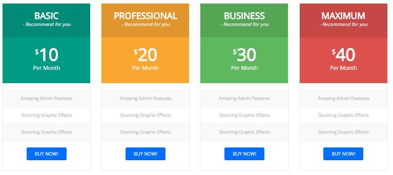
Style 4:
Below is the screen shot:
Codes are as follows:
  <div class="price-table price-table4 row">
    <div class="col-md-3 col-sm-6 color_1">
        <div class="price_border">
            <div class="price_title"><h2>BASIC</h2> - Recommend for you </div>
            <div class="price_holder">
            <div class="price_box"><span class="sup">$</span><span class="price">10</span><span class="unit">Per Month</span></div>
            <ul>
                <li>Amazing Admin Features</li>
                <li>Stunning Graphic Effects</li>
                <li>Stunning Graphic Effects</li>
            </ul>
            <a href="#" class="btn ">BUY NOW!</a> </div>
        </div>
    </div>
    <div class="col-md-3 col-sm-6 color_2">
        <div class="price_border">
            <div class="price_title "><h2>PROFESSIONAL</h2> - Recommend for you </div>
            <div class="price_holder">
            <div class="price_box"><span class="sup">$</span><span class="price">20</span><span class="unit">Per Month</span></div>
            <ul>
                <li>Amazing Admin Features</li>
                <li>Stunning Graphic Effects</li>
                <li>Stunning Graphic Effects</li>
            </ul>
            <a href="#" class="btn">BUY NOW!</a> </div>
        </div>
    </div>
    <div class="col-md-3 col-sm-6 color_3">
        <div class="price_border">
            <div class="price_title"><h2>BUSINESS</h2> - Recommend for you </div>
            <div class="price_holder">
            <div class="price_box"><span class="sup">$</span><span class="price">30</span><span class="unit">Per Month</span></div>
            <ul>
                <li>Amazing Admin Features</li>
                <li>Stunning Graphic Effects</li>
                <li>Stunning Graphic Effects</li>
            </ul>
            <a href="#" class="btn">BUY NOW!</a> </div>
        </div>
    </div>
    <div class="col-md-3 col-sm-6 color_4">
        <div class="price_border">
            <div class="price_title"><h2>MAXIMUM</h2> - Recommend for you </div>
            <div class="price_holder">
            <div class="price_box"><span class="sup">$</span><span class="price">40</span><span class="unit">Per Month</span></div>
            <ul>
                <li>Amazing Admin Features</li>
                <li>Stunning Graphic Effects</li>
                <li>Stunning Graphic Effects</li>
            </ul>
            <a href="#" class="btn ">BUY NOW!</a> </div>
        </div>
    </div>
</div>
Option:
col-md-3 col-sm-6is the width for each column. You can change the width you need through value1~12
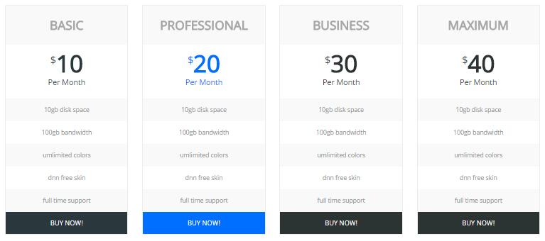
Style 5:
Below is the screen shot:
Codes are as follows:
  <div class="price-table price-table5 row">
    <div class="col-md-3 col-sm-6">
        <div class="price_border">
            <div class="price_title">
                <h2>BASIC</h2>
            </div>
            <div class="price_holder">
                <div class="price_box"><span class="sup">$</span><span class="price">10</span><span class="unit">Per Month</span></div>
                <ul>
                    <li>10gb disk space</li>
                    <li>100gb bandwidth</li>
                    <li>umlimited colors</li>
                    <li>dnn free skin</li>
                    <li>full time support</li>
                </ul>
                <a href="#" class="btn ">BUY NOW!</a>
            </div>
        </div>
    </div>
    <div class="col-md-3 col-sm-6 best_value">
        <div class="price_border">
            <div class="price_title ">
            <h2>PROFESSIONAL</h2>
            </div>
            <div class="price_holder">
                <div class="price_box"><span class="sup">$</span><span class="price">20</span><span class="unit">Per Month</span></div>
                <ul>
                    <li>10gb disk space</li>
                    <li>100gb bandwidth</li>
                    <li>umlimited colors</li>
                    <li>dnn free skin</li>
                    <li>full time support</li>
                </ul>
                <a href="#" class="btn">BUY NOW!</a> </div>
            </div>
    </div>
    <div class="col-md-3 col-sm-6">
        <div class="price_border">
            <div class="price_title">
            <h2>BUSINESS</h2>
            </div>
            <div class="price_holder">
                <div class="price_box"><span class="sup">$</span><span class="price">30</span><span class="unit">Per Month</span></div>
                <ul>
                    <li>10gb disk space</li>
                    <li>100gb bandwidth</li>
                    <li>umlimited colors</li>
                    <li>dnn free skin</li>
                    <li>full time support</li>
                </ul>
                <a href="#" class="btn">BUY NOW!</a>
            </div>
        </div>
    </div>
    <div class="col-md-3 col-sm-6">
        <div class="price_border">
            <div class="price_title">
            <h2>MAXIMUM</h2>
            </div>
            <div class="price_holder">
                <div class="price_box"><span class="sup">$</span><span class="price">40</span><span class="unit">Per Month</span></div>
                <ul>
                    <li>10gb disk space</li>
                    <li>100gb bandwidth</li>
                    <li>umlimited colors</li>
                    <li>dnn free skin</li>
                    <li>full time support</li>
                </ul>
                <a href="#" class="btn ">BUY NOW!</a>
            </div>
        </div>
    </div>
</div>
Option:
col-md-3 col-sm-6is the width for each column. You can change the width you need through value1~12
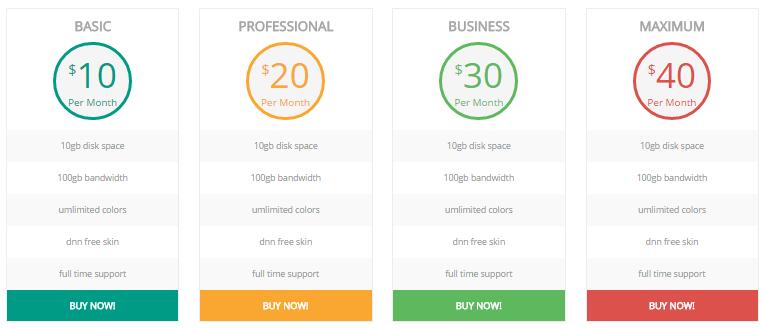
Style 6:
Below is the screen shot:
Codes are as follows:
  <div class="price-table price-table6 row">
    <div class="col-md-3 col-sm-6 color_1">
        <div class="price_border">
            <div class="price_title">
                <h2>BASIC</h2>
            </div>
            <div class="price_holder">
                <div class="price_box"><span class="sup">$</span><span class="price">10</span><span class="unit">Per Month</span></div>
                <ul>
                    <li>10gb disk space</li>
                    <li>100gb bandwidth</li>
                    <li>umlimited colors</li>
                    <li>dnn free skin</li>
                    <li>full time support</li>
                </ul>
                <a class="btn " href="#">BUY NOW!</a>
            </div>
        </div>
    </div>
    <div class="col-md-3 col-sm-6 color_2">
        <div class="price_border">
            <div class="price_title ">
                <h2>PROFESSIONAL</h2>
            </div>
            <div class="price_holder">
                <div class="price_box"><span class="sup">$</span><span class="price">20</span><span class="unit">Per Month</span></div>
                <ul>
                    <li>10gb disk space</li>
                    <li>100gb bandwidth</li>
                    <li>umlimited colors</li>
                    <li>dnn free skin</li>
                    <li>full time support</li>
                </ul>
                <a class="btn" href="#">BUY NOW!</a>
            </div>
        </div>
    </div>
    <div class="col-md-3 col-sm-6 color_3">
        <div class="price_border">
            <div class="price_title">
                <h2>BUSINESS</h2>
            </div>
            <div class="price_holder">
                <div class="price_box"><span class="sup">$</span><span class="price">30</span><span class="unit">Per Month</span></div>
                <ul>
                    <li>10gb disk space</li>
                    <li>100gb bandwidth</li>
                    <li>umlimited colors</li>
                    <li>dnn free skin</li>
                    <li>full time support</li>
                </ul>
                <a class="btn" href="#">BUY NOW!</a>
            </div>
        </div>
    </div>
    <div class="col-md-3 col-sm-6 color_4">
        <div class="price_border">
            <div class="price_title">
                <h2>MAXIMUM</h2>
            </div>
            <div class="price_holder">
                <div class="price_box"><span class="sup">$</span><span class="price">40</span><span class="unit">Per Month</span></div>
                <ul>
                    <li>10gb disk space</li>
                    <li>100gb bandwidth</li>
                    <li>umlimited colors</li>
                    <li>dnn free skin</li>
                    <li>full time support</li>
                </ul>
                <a class="btn " href="#">BUY NOW!</a>
            </div>
        </div>
    </div>
</div>
Option:
col-md-3 col-sm-6is the width for each column. You can change the width you need through value1~12
Style 7:
Below is the screen shot:
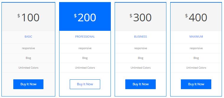
Codes are as follows:
  <div class="price-table price-table2 col4">
    <div class="col">
        <div class="price_holder">
            <div class="price_box"><span class="sup">$</span><span class="price">100</span></div>
            <ul>
                <li>
                    <h2>BASIC</h2>
                </li>
                <li>responsive</li>
                <li>Blog</li>
                <li>Unlimited Colors</li>
            </ul>
            <a class="btn " href="#">Buy It Now</a> </div>
    </div>
    <div class="col best_value">
        <div class="price_holder">
            <div class="price_box"><span class="sup">$</span><span class="price">200</span></div>
            <ul>
                <li>
                    <h2>PROFESSIONAL</h2>
                </li>
                <li>responsive</li>
                <li>Blog</li>
                <li>Unlimited Colors</li>
            </ul>
            <a class="btn" href="#">Buy It Now</a> </div>
    </div>
    <div class="col">
        <div class="price_holder">
            <div class="price_box"><span class="sup">$</span><span class="price">300</span></div>
            <ul>
                <li>
                    <h2>BUSINESS</h2>
                </li>
                <li>responsive</li>
                <li>Blog</li>
                <li>Unlimited Colors</li>
            </ul>
            <a class="btn" href="#">Buy It Now</a> </div>
    </div>
    <div class="col">
        <div class="price_holder">
            <div class="price_box"><span class="sup">$</span><span class="price">400</span></div>
            <ul>
                <li>
                    <h2>MAXIMUM</h2>
                </li>
                <li>responsive</li>
                <li>Blog</li>
                <li>Unlimited Colors</li>
            </ul>
            <a class="btn " href="#">Buy It Now</a> </div>
    </div>
</div>
Option:
col-md-3 col-sm-6is the width for each column. You can change the width you need through value1~12
Style 8:
Below is the screen shot:
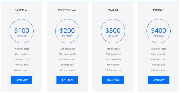
Codes are as follows:
  <div class="price-table price-table8 row">
    <div class="col-md-3 col-sm-6 color_1">
        <div class="price_border">
            <div class="price_title">
                <h2>BASIC PLAN</h2>
            </div>
            <div class="price_holder">
                <div class="price_box"><span class="sup">$</span><span class="price">100</span><span class="unit">Per Month</span></div>
                <ul>
                    <li>10gb disk space</li>
                    <li>100gb bandwidth</li>
                    <li>umlimited colors</li>
                    <li>dnn free skin</li>
                    <li>full time support</li>
                </ul>
                <a class="btn " href="#">BUY IT NOW</a> </div>
        </div>
    </div>
    <div class="col-md-3 col-sm-6 color_2">
        <div class="price_border">
            <div class="price_title ">
                <h2>PROFESSIONAL</h2>
            </div>
            <div class="price_holder">
                <div class="price_box"><span class="sup">$</span><span class="price">200</span><span class="unit">Per Month </span></div>
                <ul>
                    <li>10gb disk space</li>
                    <li>100gb bandwidth</li>
                    <li>umlimited colors</li>
                    <li>dnn free skin</li>
                    <li>full time support</li>
                </ul>
                <a class="btn" href="#">BUY IT NOW</a> </div>
        </div>
    </div>
    <div class="col-md-3 col-sm-6 color_3">
        <div class="price_border">
            <div class="price_title">
                <h2>MAXIUM</h2>
            </div>
            <div class="price_holder">
                <div class="price_box"><span class="sup">$</span><span class="price">300</span><span class="unit">Per Month</span></div>
                <ul>
                    <li>10gb disk space</li>
                    <li>100gb bandwidth</li>
                    <li>umlimited colors</li>
                    <li>dnn free skin</li>
                    <li>full time support</li>
                </ul>
                <a class="btn" href="#">BUY IT NOW</a> </div>
        </div>
    </div>
    <div class="col-md-3 col-sm-6 color_4">
        <div class="price_border">
            <div class="price_title">
                <h2>EXTREME</h2>
            </div>
            <div class="price_holder">
                <div class="price_box"><span class="sup">$</span><span class="price">400</span><span class="unit">Per Month</span></div>
                <ul>
                    <li>10gb disk space</li>
                    <li>100gb bandwidth</li>
                    <li>umlimited colors</li>
                    <li>dnn free skin</li>
                    <li>full time support</li>
                </ul>
                <a class="btn " href="#">BUY IT NOW</a> </div>
        </div>
    </div>
</div>
Option:
col-md-3 col-sm-6is the width for each column. You can change the width you need through value1~12
ProgressBars Counters
You can click the link to check ProgressBars Counters demo. Demo Link
Style 1
Below is the screen shot:
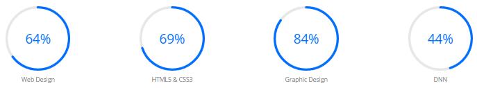
Codes are as follows:
<div class="chart_list row">
    <div class="col-sm-3">
        <div data-percent="65" class="percentage">
            <div class="percentage_inner"><span>0</span>%</div>
        </div>
        Web Design
    </div>
    <div class="col-sm-3">
        <div data-percent="70" class="percentage">
            <div class="percentage_inner"><span>0</span>%</div>
        </div>
        HTML5 & CSS3
    </div>
    <div class="col-sm-3">
        <div data-percent="85" class="percentage">
            <div class="percentage_inner"><span>0</span>%</div>
        </div>
        Graphic Design
    </div>
    <div class="col-sm-3">
        <div data-percent="45" class="percentage">
            <div class="percentage_inner"><span>0</span>%</div>
        </div>
        DNN
    </div>
</div>
Option:
col-md-3 col-sm-6is the width of each column, you can change the width you need through value1~12- You can change the value you need to display through
data-percent
Style 2
Below is the screen shot:
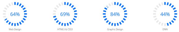
Codes are as follows:
<div class="chart_list2 row">
    <div class="col-sm-3">
        <div data-percent="65" class="percentage2">
            <div class="percentage_inner"><span>0</span>%</div>
        </div>
        Web Design
    </div>
    <div class="col-sm-3">
        <div data-percent="70" class="percentage2">
            <div class="percentage_inner"><span>0</span>%</div>
        </div>
        HTML5 & CSS3
    </div>
    <div class="col-sm-3">
        <div data-percent="85" class="percentage2">
            <div class="percentage_inner"><span>0</span>%</div>
        </div>
        Graphic Design
    </div>
    <div class="col-sm-3">
        <div data-percent="45" class="percentage2">
            <div class="percentage_inner"><span>0</span>%</div>
        </div>
        DNN
    </div>
</div>
Option:
col-md-3 col-sm-6is the width of each column, you can change the width you need through value1~12- You can change the value you need to display through
data-percent
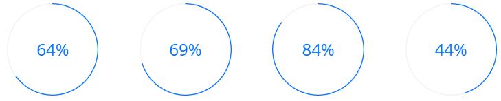
Style 3
Below is the screen shot:
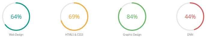
Codes are as follows:
<div class="chart_list row">
    <div class="col-sm-3">
        <div class="percentage color_1" data-percent="65">
            <div class="percentage_inner"><span>0</span>%</div>
        </div>
        Web Design
    </div>
    <div class="col-sm-3">
        <div class="percentage color_2" data-percent="70">
            <div class="percentage_inner"><span>0</span>%</div>
        </div>
        HTML5 & CSS3
    </div>
    <div class="col-sm-3">
        <div class="percentage color_3" data-percent="85">
            <div class="percentage_inner"><span>0</span>%</div>
        </div>
        Graphic Design
    </div>
    <div class="col-sm-3">
        <div class="percentage color_4" data-percent="45">
            <div class="percentage_inner"><span>0</span>%</div>
        </div>
        DNN
    </div>
</div>
Option:
col-md-3 col-sm-6is the width of each column, you can change the width you need through value1~12- You can change the value you need to display through
data-percent
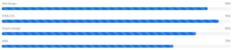
Style 4
Below is the screen shot:
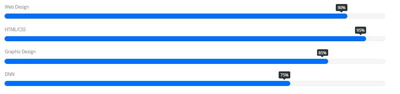
Codes are as follows:
  <div class="loaded_list">
    <p> Web Design </p>
    <div class="progress progress-striped active">
        <div class="progress-bar animation animationwidth" data-width="90%"><span></span></div>
    </div>
    <p> HTML/CSS</p>
    <div class="progress progress-striped active">
        <div class="progress-bar animation animationwidth" data-width="95%"><span></span></div>
    </div>
    <p>Graphic Design
    </p>
    <div class="progress progress-striped active">
        <div class="progress-bar animation animationwidth" data-width="85%"><span></span> </div>
    </div>
    <p>DNN</p>
    <div class="progress progress-striped active">
        <div class="progress-bar animation animationwidth" data-width="75%"><span></span></div>
    </div>
</div>
Option:
data-widthis for controlling the percentage that displays, you can display percentage through value0~100
Style 5
Below is the screen shot:
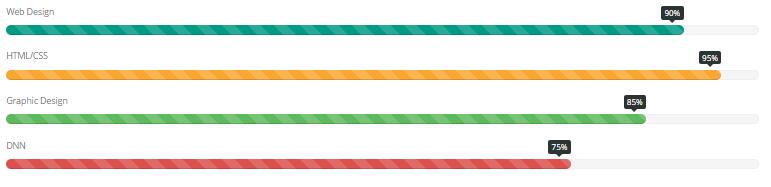
Codes are as follows:
  <div class="loaded_list2">
    <p> Web Design </p>
    <div class="progress progress-striped active">
        <div data-width="90%" class="progress-bar animation animationwidth color_1_bg"><span></span></div>
    </div>
    <p> HTML/CSS</p>
    <div class="progress progress-striped active">
        <div data-width="95%" class="progress-bar animation animationwidth color_2_bg"><span></span></div>
    </div>
    <p>Graphic Design </p>

    <p> </p>
    <div class="progress progress-striped active">
        <div data-width="85%" class="progress-bar animation animationwidth color_3_bg"><span></span> </div>
    </div>
    <p>DNN</p>
    <div class="progress progress-striped active">
        <div data-width="75%" class="progress-bar animation animationwidth color_4_bg"><span></span></div>
    </div>
</div>
Option:
data-widthis for controlling the percentage that displays, you can display percentage through value0~100
Style 6
Below is the screen shot:
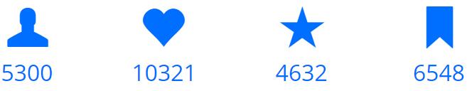
Codes are as follows:
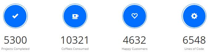
  <div class="number_Animation row">
    <div class="col-sm-3">
        <span class="glyphicons glyph-user"> </span> <span class="animation  number" data-number="5300">0</span>
    </div>
    <div class="col-sm-3">
        <span class="glyphicons glyph-heart"> </span> <span class="animation  number" data-number="10321">0</span>
    </div>
    <div class="col-sm-3">
        <span class="glyphicons glyph-star"> </span> <span class="animation  number" data-number="4632">0</span>
    </div>
    <div class="col-sm-3">
        <span class="glyphicons glyph-bookmark"> </span> <span class="animation  number" data-number="6548">0</span>
    </div>
</div>
Option:
col-md-3 col-sm-6is the width of each column, you can change the width you need through value1~12- You can change the font icon through
glyphicons glyph-user. font icon list - You can change the value you need to display through
data-number
Style 7
Below is the screen shot:
Codes are as follows:
  <div class="chart_list3 row">
    <div class="col-sm-3">
        <div data-percent="65" class="percentage3">
            <div class="percentage_inner"><span>0</span>%</div>
        </div>
        <h2> Web Design</h2>
        <p>Phasellus dignissim, purus at ornare fermentum, massa nulla enim nec tortor.</p>
    </div>
    <div class="col-sm-3">
        <div data-percent="70" class="percentage3">
            <div class="percentage_inner"><span>0</span>%</div>
        </div>
        <h2> HTML5 & CSS3</h2>
        <p>Phasellus dignissim, purus at ornare fermentum, massa nulla enim nec tortor.</p>
    </div>
    <div class="col-sm-3">
        <div data-percent="85" class="percentage3">
            <div class="percentage_inner"><span>0</span>%</div>
        </div>
        <h2>Javascript</h2>
        <p>Phasellus dignissim, purus at ornare fermentum, massa nulla enim nec tortor.</p>
    </div>
    <div class="col-sm-3">
        <div data-percent="45" class="percentage3">
            <div class="percentage_inner"><span>0</span>%</div>
        </div>
        <h2> Programme</h2>
        <p>Phasellus dignissim, purus at ornare fermentum, massa nulla enim nec tortor.</p>
    </div>
</div>
Option:
col-md-3 col-sm-6is the width of each column, you can change the width you need through value1~12- You can change the value you need to display through
data-percent
Style 8
Below is the screen shot:
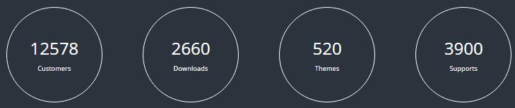
Codes are as follows:
  <div class="h2_bg pt-60 pb-60">
    <div class="dnn_layoutB">
        <div class="content_mid clearfix">
            <div class="pane_layout">
                <div class="row number_Animation2">
                    <div class="col-md-3 col-sm-6">
                        <div class="number_box"> <span class="animation number" data-number="12578">0</span> <span class="number_name">Customers</span> </div>
                    </div>
                    <div class="col-md-3 col-sm-6">
                        <div class="number_box"> <span class="animation number" data-number="2660">0</span> <span class="number_name">Downloads</span> </div>
                    </div>
                    <div class="col-md-3 col-sm-6">
                        <div class="number_box"> <span class="animation number" data-number="520">0</span> <span class="number_name">Themes</span> </div>
                    </div>
                    <div class="col-md-3 col-sm-6">
                        <div class="number_box"> <span class="animation number" data-number="3900">0</span> <span class="number_name">Supports</span> </div>
                    </div>
                </div>
            </div>
        </div>
    </div>
</div>
Option:
col-md-3 col-sm-6is the width of each column, you can change the width you need through value1~12- You can change the value you need to display through
data-percent
Style 9
Below is the screen shot:
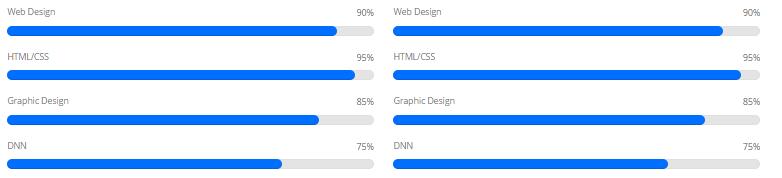
Codes are as follows:
  <div class=" row">
    <div class="col-sm-6">
        <div class="loaded_list4">
            <p> Web Design </p>
            <div class="progress progress-striped active">
                <div class="progress-bar animation animationwidth" data-width="90%"><span></span></div>
            </div>
            <p> HTML/CSS</p>
            <div class="progress progress-striped active">
                <div class="progress-bar animation animationwidth" data-width="95%"><span></span></div>
            </div>
            <p>Graphic Design </p>
            <div class="progress progress-striped active">
                <div class="progress-bar animation animationwidth" data-width="85%"><span></span> </div>
            </div>
            <p>DNN</p>
            <div class="progress progress-striped active">
                <div class="progress-bar animation animationwidth" data-width="75%"><span></span></div>
            </div>
        </div>
    </div>
</div>
Option:
col-md-3 col-sm-6is the width of each column, you can change the width you need through value1~12data-widthis for controlling the percentage that displays, you can display percentage through value0~100
Style 10
Below is the screen shot:
Codes are as follows:
  <div class="our_team2">
    <div class="progress_font"> Web Design </div>
    <div class="progress progress-striped active">
        <div data-width=" 90%" class="progress-bar animation animationwidth"><span></span></div>
    </div>
    <div class="progress_font"> HTML/CSS</div>
    <div class="progress progress-striped active">
        <div data-width=" 95%" class="progress-bar animation animationwidth"><span></span></div>
    </div>
    <div class="progress_font"> Graphic Design</div>
    <div class="progress progress-striped active">
        <div data-width=" 85%" class="progress-bar animation animationwidth"><span></span></div>
    </div>
    <div class="progress_font"> DNN</div>
    <div class="progress progress-striped active">
        <div data-width=" 75%" class="progress-bar animation animationwidth"><span></span></div>
    </div>
</div>
Option:
col-md-3 col-sm-6is the width of each column, you can change the width you need through value1~12data-widthis for controlling the percentage that displays, you can display percentage through value0~100
Style 11
Below is the screen shot:
Codes are as follows:
  <div class="number_Animation3 row">
    <div class="col-sm-3">
        <div class="number_Animation3_bor"> <span class="glyphicons glyph-ok-2"> </span></div>
        <div class="animation  number" data-number="5300">0</div>
        <p>Projects Completed</p>
    </div>
    <div class="col-sm-3">
        <div class="number_Animation3_bor"> <span class="glyphicons glyph-coffe-cup"> </span></div>
        <div class="animation  number" data-number="10321">0</div>
        <p>Coffees Consumed</p>
    </div>
    <div class="col-sm-3">
        <div class="number_Animation3_bor"><span class="glyphicons glyph-heart-empty"> </span></div>
        <div class="animation  number" data-number="4632">0</div>
        <p>Happy Customers</p>
    </div>
    <div class="col-sm-3">
        <div class="number_Animation3_bor"> <span class="glyphicons glyph-cogwheel"> </span></div>
        <div class="animation  number" data-number="6548">0</div>
        <p>Lines of Code</p>
    </div>
</div>
Option:
col-md-3 col-sm-6is the width of each column, you can change the width you need through value1~12- You can change the font icon through
glyphicons glyph-user. font icon list - You can change the value you need to display through
data-percent
Style 12
Below is the screen shot:
Codes are as follows:
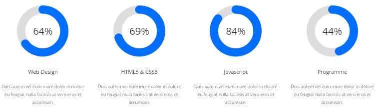
  <div class="chart_list4 row">
    <div class="col-sm-3">
        <div data-percent="65" class="percentage4">
            <div class="percentage_inner"><span>0</span>%</div>
        </div>
        <h2> Web Design</h2>
        <p>Duis autem vel eum iriure dolor in dolore eu feugiat nulla facilisis at vero eros et accumsan.</p>
    </div>
    <div class="col-sm-3">
        <div data-percent="70" class="percentage4">
            <div class="percentage_inner"><span>0</span>%</div>
        </div>
        <h2> HTML5 & CSS3</h2>
        <p>Duis autem vel eum iriure dolor in dolore eu feugiat nulla facilisis at vero eros et accumsan.</p>
    </div>
    <div class="col-sm-3">
        <div data-percent="85" class="percentage4">
            <div class="percentage_inner"><span>0</span>%</div>
        </div>
        <h2>Javascript</h2>
        <p>Duis autem vel eum iriure dolor in dolore eu feugiat nulla facilisis at vero eros et accumsan.</p>
    </div>
    <div class="col-sm-3">
        <div data-percent="45" class="percentage4">
            <div class="percentage_inner"><span>0</span>%</div>
        </div>
        <h2> Programme</h2>
        <p>Duis autem vel eum iriure dolor in dolore eu feugiat nulla facilisis at vero eros et accumsan.</p>
    </div>
</div>
Option:
col-md-3 col-sm-6is the width of each column, you can change the width you need through value1~12- You can change the value you need to display through
data-percent
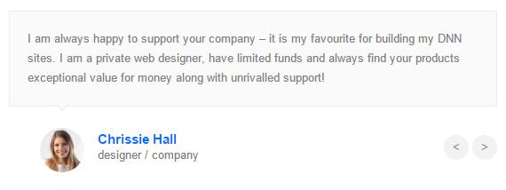
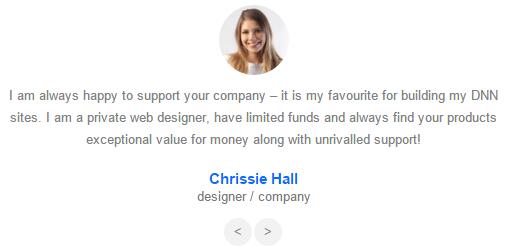
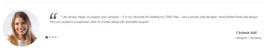
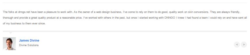
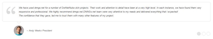
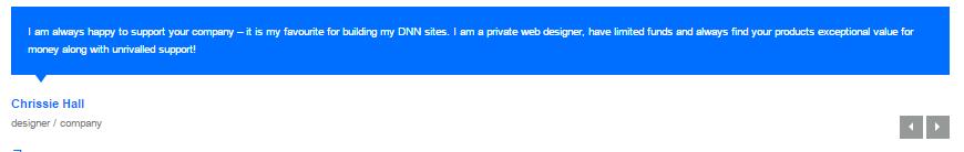
Testimonials
You can click the link to check Testimonials demo. Demo Link
Option:
Testimonials includes the parameters that listed below.
data-position |
Switch mode. fade:fade in fade out, roll-left:roll from side to side, roll-vertical:roll up and down |
data-display-navigation |
Navigation display and hidden. Default to true. true:Display, false:hidden |
data-display-arrows |
Left/right arrow display and hidden. Default to true. true:Display, false:hidden |
data-autoplay |
Whether to scroll automatically or not. 0 is for not scrolling automatically, numbers greater than 0 are for scrolling automatically, and these numbers are the time interval for scrolling. Default to 3000 |
data-autoheight |
Whether to be automatic height or not, default to true. true: automatic height, false: fixed height.< |
Example:
<ul class=" Testimonials_tab" data-position="roll-vertical" data-display-navigation="true" data-display-arrows="true" data-display-navigation="false" data-autoplay="3000" data-autoheight="true">
  <li>
    <h3 class="title a_t_c">What Others Say About Us ?</h3>
		......
Style 1:
Below is the screen shot:
Codes are as follows:
<ul class=" Testimonials_tab Testimonials_1" data-position="fade" data-display-navigation="false" data-autoplay="0">
    <li>
        <blockquote>
            <p>Content text 1 ...</p>
            <small><img alt="" src="/portals/12/Pic_14.jpg" /><span>Name </span>introduce</small>
        </blockquote>
    </li>
    <li>
        <blockquote>
            <p>Content text 2 ...</p>
            <small><img alt="" src="/portals/12/Pic_15.jpg" /><span>Name</span>introduce</small>
        </blockquote>
    </li>
    <li>
        <blockquote>
            <p>Content text 3 ...</p>
            <small><img alt="" src="/portals/12/Pic_16.jpg" /><span>Name</span>introduce</small>
        </blockquote>
    </li>
    <li>
        <blockquote>
            <p>Content text 4 ...</p>
            <small><img alt="" src="/portals/12/Pic_17.jpg" /><span>Name </span>introduce</small>
        </blockquote>
    </li>
</ul>
Style 2:
Below is the screen shot:
Codes are as follows:
<ul class="Testimonials_tab Testimonials_2" data-position="roll-left" data-display-navigation="false" data-height-auto="false">
    <li>
        <blockquote>
            <p><span class="Pic"><img alt="" src="/portals/12/Pic_14.jpg" /></span>Content text 1 ...</p>
            <small><span>Name </span>introduce</small>
        </blockquote>
    </li>
    <li>
        <blockquote>
            <p><span class="Pic"><img alt="" src="/portals/12/Pic_15.jpg" /></span>Content text 2 ...</p>
            <small><span>Name</span>introduce</small>
        </blockquote>
    </li>
    <li>
        <blockquote>
            <p><span class="Pic"><img alt="" src="/portals/12/Pic_16.jpg" /></span>Content text 3 ...</p>
            <small><span>Name</span>introduce</small>
        </blockquote>
    </li>
    <li>
        <blockquote>
            <p><span class="Pic"><img alt="" src="/portals/12/Pic_17.jpg" /></span>Content text 4 ...</p>
            <small><span>Name </span>introduce</small>
        </blockquote>
    </li>
</ul>
Style 3:
Below is the screen shot:
Codes are as follows:
<ul class=" Testimonials_tab Testimonials_3" data-autoplay="3000" data-display-arrows="false" data-position="roll-vertical">
    <li>
        <div class="Pic"><img alt="" src="/portals/12/Pic_14.jpg" /></div>
        <blockquote>
            <span class="mark">“</span>
            <p>Content text 1 ...</p>
            <small><span>Name</span>introduce</small>
        </blockquote>
    </li>
    <li>
        <div class="Pic"><img alt="" src="/portals/12/Pic_15.jpg" /></div>
        <blockquote>
            <span class="mark">“</span>
            <p>Content text 2 ...</p>
            <small><span>Name</span>introduce</small>
        </blockquote>
    </li>
    <li>
        <div class="Pic"><img alt="" src="/portals/12/Pic_16.jpg" /> </div>
        <blockquote>
            <span class="mark">“</span>
            <p>Content text 3 ...</p>
            <small><span>Name</span>introduce</small>
        </blockquote>
    </li>
    <li>
        <div class="Pic"><img alt="" src="/portals/12/Pic_17.jpg" /></div>
        <blockquote>
            <span class="mark">“</span>
            <p>>Content text 4 ...</p>
            <small><span>Name </span>introduce</small>
        </blockquote>
    </li>
</ul>
Style 4:
Below is the screen shot:
Codes are as follows:
<ul data-display-navigation="false" class="Testimonials_tab Testimonials_4">
    <li>
    <blockquote>
        <p>Content text 1 ...</p>
        <small><img alt="" src="/portals/12/Pic_14.jpg" /><span>Name</span> introduce</small>
    </blockquote>
    </li>
    <li>
    <blockquote>
        <p>Content text 2 ...</p>
        <small><img alt="" src="/portals/12/Pic_15.jpg" /><span>Name </span> introduce </small>
    </blockquote>
    </li>
    <li>
    <blockquote>
        <p>Content text 3 ...</p>
        <small><img alt="" src="/portals/12/Pic_16.jpg" /><span>Name  </span> introduce </small>
    </blockquote>
    </li>
    <li>
    <blockquote>
        <p>Content text 4 ...</p>
        <small><img alt="" src="/portals/12/Pic_17.jpg" /><span>Name</span> introduce </small>
    </blockquote>
    </li>
</ul>
Style 5:
Below is the screen shot:
Codes are as follows:
<ul data-display-arrows="false" data-position="fade" data-autoplay="0" class=" Testimonials_tab Testimonials_6">
    <li>
        <blockquote>
            <p>
            <span></span>
            Content text 1 ...
            </p>
            <small>
            <img alt="" src="/portals/12/Testimonial_img.jpg" /> --  Andy Weeks President</small>
        </blockquote>
    </li>
    <li>
        <blockquote>
            <p>
            <span></span>
            Content text 2 ...
            </p>
            <small>
            <img alt="" src="/portals/12/Testimonial_img.jpg" />-- Aaron - Calibrated Design</small>
        </blockquote>
    </li>
    <li>
        <blockquote>
            <p>
            <span></span>
            Content text 3 ...
            </p>
            <small>
            <img alt="" src="/portals/12/Testimonial_img.jpg" />-- James Divine - Divine Solutions</small>
        </blockquote>
    </li>
</ul>
Style 6:
Below is the screen shot:
Codes are as follows:
<ul class=" Testimonials_tab Testimonials_5" data-position="fade" data-display-navigation="false" data-autoplay="0">
    <li>
        <blockquote>
            <p>Content text 1 ...</p>
            <small><span>Name </span>introduce</small>
        </blockquote>
    </li>
    <li>
        <blockquote>
            <p>Content text 2 ...</p>
            <small><span>Name</span>introduce</small>
        </blockquote>
    </li>
    <li>
        <blockquote>
            <p>Content text 3 ...</p>
            <small><span>Name</span>introduce</small>
        </blockquote>
    </li>
    <li>
        <blockquote>
            <p>Content text 4 ...</p>
            <small><span>Name</span>introduce</small>
        </blockquote>
    </li>
</ul>
Style 7:
Below is the screen shot:
Codes are as follows:
  <div class=" pt-60 pb-30 backgroundImage13">
    <div class="dnn_layoutB">
        <div class="content_mid clearfix">
            <ul class=" Testimonials_tab Testimonials_7" data-position="roll-vertical" data-display-navigation="false" data-autoplay="0">
                <li>
                    <h3 class="title a_t_c"></h3>
                    <blockquote>
                        <p>“ Content text.... ”</p>
                        <small class="a_t_c">Frank Miller<span>Dnngo Buyer</span></small> </blockquote>
                </li>
                <li>
                    <h3 class="title a_t_c"></h3>
                    <blockquote>
                        <p>“ Content text.... ”</p>
                        <small class="a_t_c">Frank Miller<span>Dnngo Buyer</span></small> </blockquote>
                </li>
                <li>
                    <h3 class="title a_t_c"></h3>
                    <blockquote>
                        <p>“  Content text.... ”</p>
                        <small class="a_t_c">Frank Miller<span>Dnngo Buyer</span></small> </blockquote>
                </li>
                <li>
                    <h3 class="title a_t_c"></h3>
                    <blockquote>
                        <p>“  Content text.... ”</p>
                        <small class="a_t_c">Frank Miller<span>Dnngo Buyer</span></small> </blockquote>
                </li>
            </ul>
        </div>
    </div>
</div>
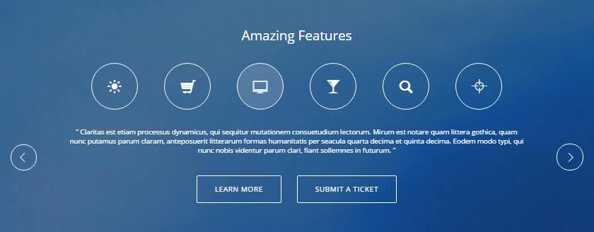
Style 8:
Below is the screen shot:
Codes are as follows:
  <div class=" pt-60 pb-60 backgroundImage17">
    <div class="dnn_layoutB">
        <div class="content_mid clearfix">
            <div class="h1_back pb-40">
                <h3 style="color: #ffffff;">Amazing Features</h3>
            </div>
            <ul class=" Testimonials_tab Testimonials_8" data-position="roll-left" data-display-navigation="false" data-autoplay="0">
                <li>
                    <div class="Testimonials_con_8"> <span class="glyphicons glyph-sun"></span> <span class="glyphicons glyph-shopping-cart"></span> <span class="glyphicons glyph-imac"></span> <span class="glyphicons glyph-glass"></span> <span class="glyphicons glyph-search"></span> <span class="glyphicons glyph-glass"></span>
                        <div class="pt-30 pb-30">
                            <p>“Content text... ”</p>
                        </div>
                        <div class="h5_bnt02"> <a href="#" class="Button_default">Learn More</a><a href="#" class="Button_default">Submit A Ticket</a> </div>
                    </div>
                </li>
            </ul>
        </div>
    </div>
</div>
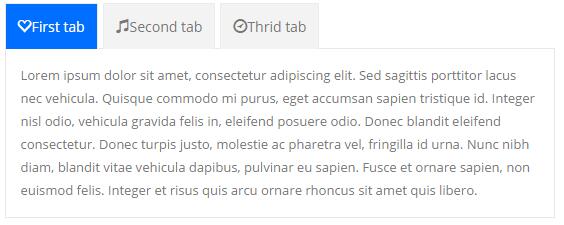
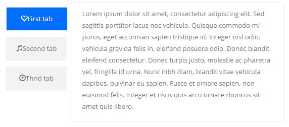
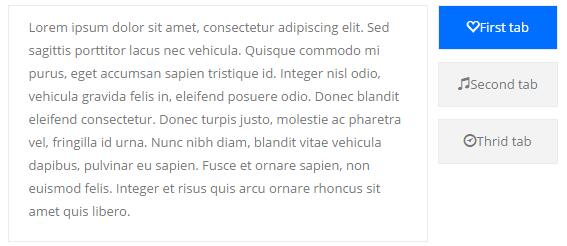
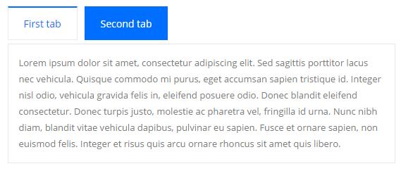
Responsive Tab
You can click the link to check Responsive Tab demo. Demo Link
You can add the "resp-tabs-list" of "li" to add tab item, and add the "resp-tabs-container" of "resp_container" to add content
Example:
<div class="horizontalTab_Top">
  <ul class="resp-tabs-list">

    <li> Tab1 </li>
    <li> Tab2 </li>
    ....

  </ul>
  <div class="resp-tabs-container">

    <div class="resp_container"> Tab1 Content </div>
    <div class="resp_container"> Tab2 Content </div>
    ....

  </div>
</div>
| Variable | Default | Type | Description |
|---|---|---|---|
data-autoplay |
true | int/boolean | Change to any integrer for example data-autoplay ="5000" to play every 3 seconds. If you set data-autoplay="false" Stop auto scroll animation. |
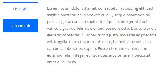
Style 1:
Below is the screen shot:
Codes are as follows:
<div class="horizontalTab_Top horizontalTab_Top_1">
    <ul class="resp-tabs-list">
        <li><span>Title 1</span></li>
        <li><span>Title 2</span></li>
    </ul>
    <div class="resp-tabs-container">
        <div class="resp_container">
            <div class="resp_margin">Content text 1 ...</div>
        </div>
        <div class="resp_container">
            <div class="resp_margin">Content text 2 ...</div>
        </div>
    </div>
</div>
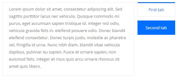
Style 2:
Below is the screen shot:
Codes are as follows:
<div class="verticalTab_Left verticalTab_Left_1">
  <ul class="resp-tabs-list">
    <li><span>Title 1</span></li>
    <li><span>Title 2</span></li>
  </ul>
  <div class="resp-tabs-container">
    <div class="resp_container">
      <div class="resp_margin">Content text 1 ...</div>
    </div>
    <div class="resp_container">
      <div class="resp_margin">Content text 2 ...</div>
    </div>
  </div>
</div>
Style 3:
Below is the screen shot:
Codes are as follows:
<div class="verticalTab_Right verticalTab_Right_1">
  <ul class="resp-tabs-list">
    <li><span>Title 1</span></li>
    <li><span>Title 2</span></li>
  </ul>
  <div class="resp-tabs-container">
    <div class="resp_container">
      <div class="resp_margin">Content text 1 ...</div>
    </div>
    <div class="resp_container">
      <div class="resp_margin">Content text 2 ...</div>
    </div>
  </div>
</div>
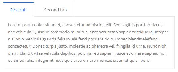
Style 4:
Below is the screen shot:
Codes are as follows:
<div class="horizontalTab_Top horizontalTab_Top_2">
  <ul class="resp-tabs-list">
    <li><span><em class="glyphicons glyph-heart-empty"></em>Title 1</span></li>
    <li><span><em class="glyphicons glyph-heart-empty"></em>Title 2</span></li>
  </ul>
  <div class="resp-tabs-container">
    <div class="resp_container">
      <div class="resp_margin">Content text 1 ...</div>
    </div>
    <div class="resp_container">
      <div class="resp_margin">Content text 2 ...</div>
    </div>
  </div>
</div>
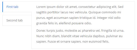
Style 5:
Below is the screen shot:
Codes are as follows:
<div class="verticalTab_Left verticalTab_Left_2">
  <ul class="resp-tabs-list">
    <li><span><em class="glyphicons glyph-heart-empty"></em>Title 1</span></li>
    <li><span><em class="glyphicons glyph-heart-empty"></em>Title 2</span></li>
  </ul>
  <div class="resp-tabs-container">
    <div class="resp_container">
      <div class="resp_margin">Content text 1 ...</div>
    </div>
    <div class="resp_container">
      <div class="resp_margin">Content text 2 ...</div>
    </div>
  </div>
</div>
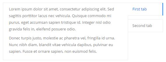
Style 6:
Below is the screen shot:
Codes are as follows:
<div class="verticalTab_Right verticalTab_Right_2">
  <ul class="resp-tabs-list">
    <li><span><em class="glyphicons glyph-heart-empty"></em>Title 1</span></li>
    <li><span><em class="glyphicons glyph-heart-empty"></em>Title 2</span></li>
  </ul>
  <div class="resp-tabs-container">
    <div class="resp_container">
      <div class="resp_margin">Content text 1 ...</div>
    </div>
    <div class="resp_container">
      <div class="resp_margin">Content text 2 ...</div>
    </div>
  </div>
</div>
Style 7:
Below is the screen shot:
Codes are as follows:
<div class="horizontalTab_Top horizontalTab_Top_3">
  <ul class="resp-tabs-list">
    <li><span>Title 1</span></li>
    <li><span>Title 2</span></li>
  </ul>
  <div class="resp-tabs-container">
    <div class="resp_container">
      <div class="resp_margin">Content text 1 ...</div>
    </div>
    <div class="resp_container">
      <div class="resp_margin">Content text 2 ...</div>
    </div>
  </div>
</div>
Style 8:
Below is the screen shot:
Codes are as follows:
  <div class="verticalTab_Left verticalTab_Left_3">
  <ul class="resp-tabs-list">
    <li><span>Title 1</span></li>
    <li><span>Title 2</span></li>
  </ul>
  <div class="resp-tabs-container">
    <div class="resp_container">
      <div class="resp_margin">Content text 1 ...</div>
    </div>
    <div class="resp_container">
      <div class="resp_margin">Content text 2 ...</div>
    </div>
  </div>
</div>
Style 9:
Below is the screen shot:
Codes are as follows:
  <div class="verticalTab_Right verticalTab_Right_3">
  <ul class="resp-tabs-list">
    <li><span>Title 1</span></li>
    <li><span>Title 2</span></li>
  </ul>
  <div class="resp-tabs-container">
    <div class="resp_container">
      <div class="resp_margin">Content text 1 ...</div>
    </div>
    <div class="resp_container">
      <div class="resp_margin">Content text 2 ...</div>
    </div>
  </div>
</div>
Style 10:
Below is the screen shot:
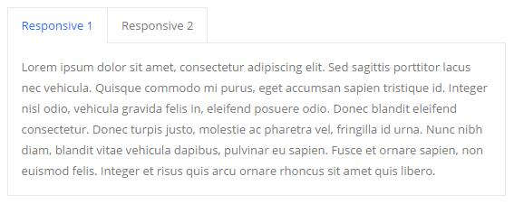
Codes are as follows:
  <div class="horizontalTab_Top">
  <ul class="resp-tabs-list">
    <li><span>Responsive 1</span></li>
    <li><span>Responsive 2</span></li>
  </ul>
  <div class="resp-tabs-container">
    <div class="resp_container">
      <div class="resp_margin">
        <p>Content text 1 ...</p>
      </div>
    </div>
    <div class="resp_container">
      <div class="resp_margin">
        <p>Content text 2 ...</p>
      </div>
    </div>
  </div>
</div>
Style 11:
Below is the screen shot:
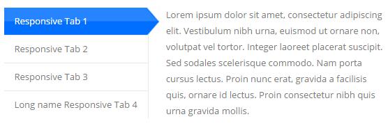
Codes are as follows:
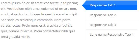
  <div class="verticalTab_Left">
  <ul class="resp-tabs-list">
    <li><span>Responsive Tab 1</span></li>
    <li><span>Responsive Tab 2</span></li>
    <li><span>Responsive Tab 3</span></li>
    <li><span>Long name Responsive Tab 4</span></li>
  </ul>
  <div class="resp-tabs-container">
    <div class="resp_container">
      <div class="resp_margin">
        <p>Content text 1 ...</p>
      </div>
    </div>
    <div class="resp_container">
      <div class="resp_margin">
        <p>Content text 2 ...</p>
      </div>
    </div>
    <div class="resp_container">
      <div class="resp_margin">
        <p>Content text 3 ...</p>
      </div>
    </div>
    <div class="resp_container">
      <div class="resp_margin">
        <p>Content text 4 ...</p>
      </div>
    </div>
  </div>
</div>
Style 12:
Below is the screen shot:
Codes are as follows:
  <div class="verticalTab_Right">
  <ul class="resp-tabs-list">
    <li><span>Responsive Tab 1</span></li>
    <li><span>Responsive Tab 2</span></li>
    <li><span>Responsive Tab 3</span></li>
    <li><span>Long name Responsive Tab 4</span></li>
  </ul>
  <div class="resp-tabs-container">
    <div class="resp_container">
      <div class="resp_margin">
        <p>Content text 1 ...</p>
      </div>
    </div>
    <div class="resp_container">
      <div class="resp_margin">
        <p>Content text 2 ...</p>
      </div>
    </div>
    <div class="resp_container">
      <div class="resp_margin">
        <p>Content text 3 ...</p>
      </div>
    </div>
    <div class="resp_container">
      <div class="resp_margin">
        <p>Content text 4 ...</p>
      </div>
    </div>
  </div>
</div>
Accordions
You can click the link to check Accordions demo. Demo Link
Option:
- id="accordion" of each accordions effect needs using different names.
"data-parent"needs to have the same name asid- href="#collapse1" is the id that needs to expand content.
- id="collapse1" is the content that needs to expand.
<div class="panel-group" id="accordion">

  <div class="panel panel-default">
    <div class="panel-heading">
      <h4 class="panel-title"> <a data-toggle="collapse" data-parent="#accordion" href="#collapse1"> Title Text ... </a> </h4>
    </div>
    <div id="collapse1" class="panel-collapse collapse in">
      <div class="panel-body">Content Text ... </div>
    </div>
  </div>
  ....

</div>
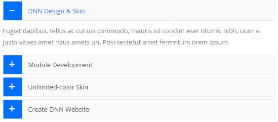
Style 1:
Below is the screen shot:
Codes are as follows:
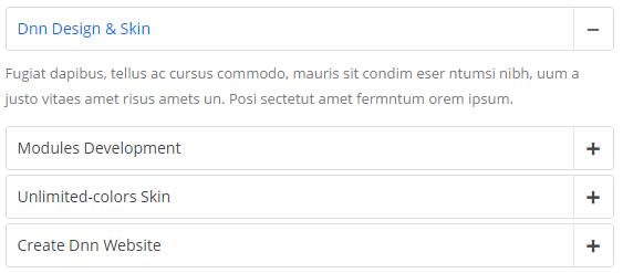
<div id="accordion2" class="panel-group accordion_2">
  <div class="panel panel-default">
    <div class="panel-heading">
      <h4 class="panel-title"><a class="collapsed" href="#item2_1" data-parent="#accordion2" data-toggle="collapse"> <span class="accordion_icon glyphicons"></span> Dnn Design & Skin </a></h4>
    </div>
    <div id="item2_1" class="panel-collapse collapse">
      <div class="panel-body"> Content text 1 ... </div>
    </div>
  </div>
  <div class="panel panel-default">
    <div class="panel-heading">
      <h4 class="panel-title"><a class="collapsed" href="#item2_2" data-parent="#accordion2" data-toggle="collapse"> <span class="accordion_icon glyphicons"></span> Modules Development </a></h4>
    </div>
    <div id="item2_2" class="panel-collapse collapse">
      <div class="panel-body"> Content text 2 ... </div>
    </div>
  </div>
  <div class="panel panel-default">
    <div class="panel-heading">
      <h4 class="panel-title"><a class="" href="#item2_3" data-parent="#accordion2" data-toggle="collapse"> <span class="accordion_icon glyphicons"></span> Unlimited-colors Skin </a></h4>
    </div>
    <div id="item2_3" class="panel-collapse in collapse">
      <div class="panel-body"> Content text 3 ... </div>
    </div>
  </div>
  <div class="panel panel-default">
    <div class="panel-heading ">
      <h4 class="panel-title"><a class="collapsed" href="#item2_4" data-parent="#accordion2" data-toggle="collapse"> <span class="accordion_icon glyphicons"></span> Create Dnn Website </a></h4>
    </div>
    <div id="item2_4" class="panel-collapse collapse">
      <div class="panel-body"> Content text 4 ... </div>
    </div>
  </div>
</div>
Style 2:
Below is the screen shot:
Codes are as follows:
<div class="panel-group accordion_3" id="accordion3">
  <div class="panel panel-default">
    <div class="panel-heading">
      <h4 class="panel-title"><a href="#item1" class="" data-toggle="collapse" data-parent="#accordion3"><span class="glyphicons  accordion_icon"></span> Dnn Design & Skin </a></h4>
    </div>
    <div class="panel-collapse collapse in" id="item1">
      <div class="panel-body"> Content text 1 ... </div>
    </div>
  </div>
  <div class="panel panel-default">
    <div class="panel-heading">
      <h4 class="panel-title"><a href="#item2" class="collapsed" data-toggle="collapse" data-parent="#accordion3"><span class="glyphicons  accordion_icon"></span> Modules Development </a></h4>
    </div>
    <div class="panel-collapse collapse" id="item2">
      <div class="panel-body"> Content text 2 ... </div>
    </div>
  </div>
  <div class="panel panel-default">
    <div class="panel-heading">
      <h4 class="panel-title"><a href="#item3" class="collapsed" data-toggle="collapse" data-parent="#accordion3"><span class="glyphicons  accordion_icon"></span> Unlimited-colors Skin </a></h4>
    </div>
    <div class="panel-collapse collapse" id="item3">
      <div class="panel-body"> Content text 3 ... </div>
    </div>
  </div>
  <div class="panel panel-default">
    <div class="panel-heading">
      <h4 class="panel-title"><a href="#item4" class="collapsed" data-toggle="collapse" data-parent="#accordion3"><span class="glyphicons  accordion_icon"></span> Create Dnn Website </a></h4>
    </div>
    <div class="panel-collapse collapse" id="item4">
      <div class="panel-body"> Content text 4 ... </div>
    </div>
  </div>
</div>
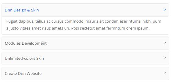
Style 3:
Below is the screen shot:
Codes are as follows:
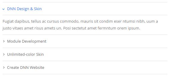
<div id="accordion4" class="panel-group accordion_4">
    <div class="panel panel-default">
        <div class="panel-heading">
    	    <h4 class="panel-title"><a data-parent="#accordion4" data-toggle="collapse" class="" href="#item4_1"><span class="accordion_icon"></span>DNN Design & Skin </a></h4>
        </div>
        <div id="item4_1" class="panel-collapse collapse in">
        	<div class="panel-body"> Content text 1 ... </div>
        </div>
    </div>
    <div class="panel panel-default">
        <div class="panel-heading">
  	      <h4 class="panel-title"><a data-parent="#accordion4" data-toggle="collapse" class="collapsed" href="#item4_2"><span class="accordion_icon"></span>Module Development </a></h4>
        </div>
        <div id="item4_2" class="panel-collapse collapse">
        	<div class="panel-body"> Content text 2 ... </div>
        </div>
    </div>
    <div class="panel panel-default">
        <div class="panel-heading">
    	    <h4 class="panel-title"><a data-parent="#accordion4" data-toggle="collapse" class="collapsed" href="#item4_3"><span class="accordion_icon"></span>Unlimited-color Skin </a></h4>
        </div>
        <div id="item4_3" class="panel-collapse collapse">
        	<div class="panel-body"> Content text 3 ... </div>
        </div>
    </div>
    <div class="panel panel-default">
        <div class="panel-heading">
     	   <h4 class="panel-title"><a data-parent="#accordion4" data-toggle="collapse" class="collapsed" href="#item4_4"><span class="accordion_icon"></span>Create DNN Website </a></h4>
        </div>
        <div id="item4_4" class="panel-collapse collapse">
        	<div class="panel-body"> Content text 4 ... </div>
        </div>
    </div>
</div>
Style 4:
Below is the screen shot:
Codes are as follows:
<div id="accordion5" class="panel-group accordion_5">
  <div class="panel panel-default">
    <div class="panel-heading">
      <h4 class="panel-title"><a data-parent="#accordion5" data-toggle="collapse" class="" href="#item5_1"><span class="glyphicons  accordion_icon"></span> DNN Design & Skin </a></h4>
    </div>
    <div id="item5_1" class="panel-collapse collapse in">
      <div class="panel-body"> Content text 1 ... </div>
    </div>
  </div>
  <div class="panel panel-default">
    <div class="panel-heading">
      <h4 class="panel-title"><a data-parent="#accordion5" data-toggle="collapse" class="collapsed" href="#item5_2"><span class="glyphicons  accordion_icon"></span> Module Development </a></h4>
    </div>
    <div id="item5_2" class="panel-collapse collapse">
      <div class="panel-body"> Content text 2 ... </div>
    </div>
  </div>
  <div class="panel panel-default">
    <div class="panel-heading">
      <h4 class="panel-title"><a data-parent="#accordion5" data-toggle="collapse" class="collapsed" href="#item5_3"><span class="glyphicons  accordion_icon"></span> Unlimited-color Skin </a></h4>
    </div>
    <div id="item5_3" class="panel-collapse collapse">
      <div class="panel-body"> Content text 3 ... </div>
    </div>
  </div>
  <div class="panel panel-default">
    <div class="panel-heading">
      <h4 class="panel-title"><a data-parent="#accordion5" data-toggle="collapse" class="collapsed" href="#item5_4"><span class="glyphicons  accordion_icon"></span> Create DNN Website </a></h4>
    </div>
    <div id="item5_4" class="panel-collapse collapse">
      <div class="panel-body"> Content text 4 ... </div>
    </div>
  </div>
</div>
Style 5:
Below is the screen shot:
Codes are as follows:
<div id="accordion6" class="panel-group accordion_6">
  <div class="panel panel-default">
    <div class="panel-heading">
      <h4 class="panel-title"><a data-parent="#accordion6" data-toggle="collapse" class="" href="#item6_1"><span class="accordion_icon"></span>Dnn Design & Skin </a></h4>
    </div>
    <div id="item6_1" class="panel-collapse collapse in">
      <div class="panel-body"> Content text 1 ... </div>
    </div>
  </div>
  <div class="panel panel-default">
    <div class="panel-heading">
      <h4 class="panel-title"><a data-parent="#accordion6" data-toggle="collapse" class="collapsed" href="#item6_2"><span class="accordion_icon"></span>Modules Development </a></h4>
    </div>
    <div id="item6_2" class="panel-collapse collapse">
      <div class="panel-body"> Content text 2 ... </div>
    </div>
  </div>
  <div class="panel panel-default">
    <div class="panel-heading">
      <h4 class="panel-title"><a data-parent="#accordion6" data-toggle="collapse" class="collapsed" href="#item6_3"><span class="accordion_icon"></span>Unlimited-colors Skin </a></h4>
    </div>
    <div id="item6_3" class="panel-collapse collapse">
      <div class="panel-body"> Content text 3 ... </div>
    </div>
  </div>
  <div class="panel panel-default">
    <div class="panel-heading">
      <h4 class="panel-title"><a data-parent="#accordion6" data-toggle="collapse" class="collapsed" href="#item6_4"><span class="accordion_icon"></span>Create Dnn Website </a></h4>
    </div>
    <div id="item6_4" class="panel-collapse collapse">
      <div class="panel-body"> Content text 4 ... </div>
    </div>
  </div>
</div>
Style 6:
Below is the screen shot:
Codes are as follows:
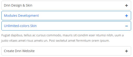
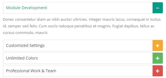
<div id="accordion7" class="panel-group accordion_7">
  <div class="panel panel-default">
    <div class="panel-heading">
      <h4 class="panel-title">
      <a href="#item7_1" data-parent="#accordion7" data-toggle="collapse" class="color_1_h"><span class="accordion_icon glyphicons color_1_bg"></span>Module Development </a> </div>
    </h4>
    <div class="panel-collapse collapse in" id="item7_1">
      <div class="panel-body"> Content text 1 ... </div>
    </div>
  </div>
  <div class="panel panel-default">
    <div class="panel-heading">
      <h4 class="panel-title">
      <a href="#item7_2" data-parent="#accordion7" data-toggle="collapse" class="collapsed color_2_h"><span class="accordion_icon glyphicons color_2_bg"></span>Customized Settings </a> </div>
    </h4>
    <div class="panel-collapse collapse" id="item7_2">
      <div class="panel-body"> Content text 2 ... </div>
    </div>
  </div>
  <div class="panel panel-default">
    <div class="panel-heading">
      <h4 class="panel-title">
      <a href="#item7_3" data-parent="#accordion7" data-toggle="collapse" class="collapsed color_3_h"> <span class="accordion_icon glyphicons color_3_bg"></span>Unlimited Colors </a> </div>
    </h4>
    <div class="panel-collapse collapse" id="item7_3">
      <div class="panel-body"> Content text 3 ... </div>
    </div>
  </div>
  <div class="panel panel-default">
    <div class="panel-heading">
      <h4 class="panel-title">
      <a href="#item7_4" data-parent="#accordion7" data-toggle="collapse" class="collapsed color_4_h"> <span class="accordion_icon glyphicons color_4_bg"></span>Professional Work & Team </a> </div>
    </h4>
    <div class="panel-collapse collapse" id="item7_4">
      <div class="panel-body"> Content text 4 ... </div>
    </div>
  </div>
</div>
Style 7:
Below is the screen shot:
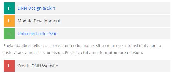
Codes are as follows:
  <div class="panel-group accordion_8" id="accordion8">
  <div class="panel panel-default">
    <div class="panel-heading">
      <h4 class="panel-title"><a class="collapsed" data-toggle="collapse" data-parent="#accordion8" href="#item8_1"><span class="accordion_icon color_1_bg"></span> DNN Design & Skin </a></h4>
    </div>
    <div style="height: 0px;" id="item8_1" class="panel-collapse collapse">
      <div class="panel-body color1-link"> Content text 1 ... </div>
    </div>
  </div>
  <div class="panel panel-default">
    <div class="panel-heading">
      <h4 class="panel-title"><a class="collapsed" data-toggle="collapse" data-parent="#accordion8" href="#item8_2"><span class="accordion_icon color_2_bg"></span> Module Development </a></h4>
    </div>
    <div style="height: 0px;" id="item8_2" class="panel-collapse collapse">
      <div class="panel-body color2-link"> Content text 2 ... </div>
    </div>
  </div>
  <div class="panel panel-default">
    <div class="panel-heading">
      <h4 class="panel-title"><a class="" data-toggle="collapse" data-parent="#accordion8" href="#item8_3"><span class="accordion_icon color_3_bg "></span> Unlimited-color Skin </a></h4>
    </div>
    <div style="height: auto;" id="item8_3" class="panel-collapse in collapse">
      <div class="panel-body color3-link"> Content text 3 ...</div>
    </div>
  </div>
  <div class="panel panel-default">
    <div class="panel-heading ">
      <h4 class="panel-title"><a class="collapsed" data-toggle="collapse" data-parent="#accordion8" href="#item8_4"><span class="accordion_icon color_4_bg"></span> Create DNN Website </a></h4>
    </div>
    <div id="item8_4" class="panel-collapse collapse">
      <div class="panel-body color3-link"> Content text 4 ... </div>
    </div>
  </div>
</div>
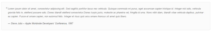
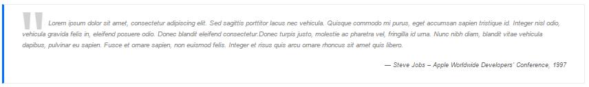
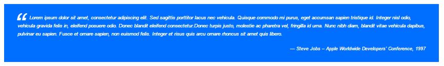
Quotes
You can click the link to check Quotes demo. Demo Link
  <div class="quotes_1">
<div class="quotes_1">
  <blockquote> <span class="mark"> “</span>
    <p>Content text  ...</p>
    <small>Name</small> </blockquote>
</div>
  <div class="quotes_2">
  <blockquote> <span class="mark"> “</span>
    <p>Content text  ...</p>
    <small>Name</small> </blockquote>
</div>
  <div class="quotes_3">
  <blockquote> <span class="mark"> “</span>
    <p>Content text  ...</p>
    <small>Name</small> </blockquote>
</div>
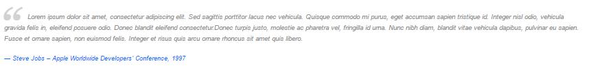
<div class="quotes_4">
  <blockquote> <span class="mark"> “</span>
    <p>Content text  ...</p>
    <small>Name</small> </blockquote>
</div>
Dropcaps
You can click the link to check Dropcaps demo. Demo Link
<p>
    <span class="dropcaps_1">L</span>Content text  ...
</p>
<p>
    <span class="dropcaps_2">L</span>Content text  ...
</p>
<p>
    <span class="dropcaps_3">L</span>Content text  ...
</p>
<p>
    <span class="dropcaps_5">L</span>Content text  ...
</p>
<p>
    <span class="dropcaps_4">L</span>Content text  ...
</p>
<p>
    <span class="dropcaps_6">L</span>Content text  ...
</p>
Carousel
You can click the link to check Carousel demo. Demo Link
Style 1:
Below is the screen shot:
Codes are as follows:
<div class="carousel carousel_1 " data-autoheight="false">
  <div class="item ">
    <div class="main">
      <div class="ico"><span>1</span></div>
      <h3>The flames </h3>
      <p>Content text 1 ... </p>
      <p><a href="#">More Information</a></p>
    </div>
  </div>
  <div class="item">
    <div class="main">
      <div class="ico"><span>2</span></div>
      <h3>The flames </h3>
      <p>Content text 2 ... </p>
      <p><a href="#">More Information</a></p>
    </div>
  </div>
  <div class="item">
    <div class="main">
      <div class="ico"><span>3</span></div>
      <h3>The flames </h3>
      <p>Content text 3 ... </p>
      <p><a href="#">More Information</a></p>
    </div>
  </div>
  <div class="item">
    <div class="main">
      <div class="ico"><span>4</span></div>
      <h3>The flames </h3>
      <p>Content text 4 ... </p>
      <p><a href="#">More Information</a></p>
    </div>
  </div>
  <div class="item">
    <div class="main">
      <div class="ico"><span>5</span></div>
      <h3>The flames </h3>
      <p>Content text 5 ... </p>
      <p><a href="#">More Information</a></p>
    </div>
  </div>
</div>
Option:
- You can increase your content items through adding
<div class="item"></div> - You can add image style effects through effects of imageeffects page.
- You can add image enlargement effect through the effect of lightbox page.
| Variable | Default | Type | Description |
|---|---|---|---|
data-items |
4 | int | This variable allows you to set the maximum amount of items displayed at a time with the widest browser width. |
data-navigation |
true | boolean | Display "next" and "prev" buttons. |
data-pagination |
true | boolean | Show pagination. |
data-autoplay |
true | int/boolean | Change to any integrer for example data-autoplay ="5000" to play every 5 seconds. If you set data-autoplay="false" Stop auto scroll animation. |
data-autoheight |
true | int/boolean | Add height to owl-wrapper-outer so you can use diffrent heights on slides. Use it only for one item per page setting. |
Example:
<div class="carousel" data-items="4" data-navigation="true" data-pagination="true" data-autoplay="true" data-autoheight="true">
  <div class="item">
		...
Style 2:
Below is the screen shot:

Codes are as follows:
<div class="carousel carousel_2" data-autoheight="false">
  <div class="item"> <img alt="" src="/portals/25/photo_20.jpg" /> </div>
  <div class="item"> <img alt="" src="/portals/25/photo_21.jpg" /> </div>
  <div class="item"> <img alt="" src="/portals/25/photo_20.jpg" /> </div>
  <div class="item"> <img alt="" src="/portals/25/photo_21.jpg" /> </div>
  <div class="item"> <img alt="" src="/portals/25/photo_20.jpg" /> </div>
  <div class="item"> <img alt="" src="/portals/25/photo_21.jpg" /> </div>
</div>
Style 3:
Below is the screen shot:

Codes are as follows:
<div data-autoheight="false" class="carousel carousel_3">
  <div class="item">
    <div class="photo_box  ico_zoom"> <a href="/Portals/25/Photo2.jpg" class="LightBox_image_gallery3">
      <div class="pic_box"> <img alt="" src="/portals/25/Photo2.jpg" />
        <div class="ico"> <span class="glyphicons glyph-search "></span> </div>
        <div class="shade"></div>
      </div>
      </a>
      <div class="text_sytle_6">
        <h3>carousel_title</h3>
        <p> Content text  ... </p>
      </div>
    </div>
  </div>
  <div class="item">
    <div class="photo_box  ico_zoom"> <a href="/Portals/25/Photo3.jpg" class="LightBox_image_gallery3">
      <div class="pic_box"> <img alt="" src="/portals/25/Photo3.jpg" />
        <div class="ico"> <span class="glyphicons glyph-search "></span> </div>
        <div class="shade"></div>
      </div>
      </a>
      <div class="text_sytle_6">
        <h3>carousel_title</h3>
        <p> Content text  ... </p>
      </div>
    </div>
  </div>
  <div class="item">
    <div class="photo_box  ico_zoom"> <a href="/Portals/25/Photo4.jpg" class="LightBox_image_gallery3">
      <div class="pic_box"> <img alt="" src="/portals/25/Photo4.jpg" />
        <div class="ico"> <span class="glyphicons glyph-search "></span> </div>
        <div class="shade"></div>
      </div>
      </a>
      <div class="text_sytle_6">
        <h3>carousel_title</h3>
        <p> Content text  ... </p>
      </div>
    </div>
  </div>
  <div class="item">
    <div class="photo_box  ico_zoom"> <a href="/Portals/25/Photo5.jpg" class="LightBox_image_gallery3">
      <div class="pic_box"> <img alt="" src="/portals/25/Photo5.jpg" />
        <div class="ico"> <span class="glyphicons glyph-search "></span> </div>
        <div class="shade"></div>
      </div>
      </a>
      <div class="text_sytle_6">
        <h3>carousel_title</h3>
        <p> Content text  ... </p>
      </div>
    </div>
  </div>
  <div class="item">
    <div class="photo_box  ico_zoom"> <a href="/Portals/25/Photo6.jpg" class="LightBox_image_gallery3">
      <div class="pic_box"> <img alt="" src="/portals/25/Photo6.jpg" />
        <div class="ico"> <span class="glyphicons glyph-search "></span> </div>
        <div class="shade"></div>
      </div>
      </a>
      <div class="text_sytle_6">
        <h3>carousel_title</h3>
        <p> Content text  ... </p>
      </div>
    </div>
  </div>
</div>
Style 4:
Below is the screen shot:
Codes are as follows:
<div class="carousel carousel_4" data-pagination="false">
  <div class="item">
    <div class="photo_box ico_LeftAndRight_enter">
      <div class="pic_box"> <img alt="" src="/portals/25/Photo2.jpg" />
        <div class="ico"> <a href="/Portals/25/Photo2.jpg" class="LightBox_image_gallery4"><span class="glyphicons glyph-search ico_left"></span></a> <a href="#"><span class="glyphicons glyph-link ico_right"></span></a> </div>
        <div class="shade"></div>
      </div>
    </div>
  </div>
  <div class="item">
    <div class="photo_box ico_LeftAndRight_enter">
      <div class="pic_box"> <img alt="" src="/portals/25/Photo3.jpg" />
        <div class="ico"> <a href="/Portals/25/Photo3.jpg" class="LightBox_image_gallery4"><span class="glyphicons glyph-search ico_left"></span></a> <a href="#"><span class="glyphicons glyph-link ico_right"></span></a> </div>
        <div class="shade"></div>
      </div>
    </div>
  </div>
  <div class="item">
    <div class="photo_box ico_LeftAndRight_enter">
      <div class="pic_box"> <img alt="" src="/portals/25/Photo4.jpg" />
        <div class="ico"> <a href="/Portals/25/Photo4.jpg" class="LightBox_image_gallery4"><span class="glyphicons glyph-search ico_left"></span></a> <a href="#"><span class="glyphicons glyph-link ico_right"></span></a> </div>
        <div class="shade"></div>
      </div>
    </div>
  </div>
  <div class="item">
    <div class="photo_box ico_LeftAndRight_enter">
      <div class="pic_box"> <img alt="" src="/portals/25/Photo5.jpg" />
        <div class="ico"> <a href="/Portals/25/Photo5.jpg" class="LightBox_image_gallery4"><span class="glyphicons glyph-search ico_left"></span></a> <a href="#"><span class="glyphicons glyph-link ico_right"></span></a> </div>
        <div class="shade"></div>
      </div>
    </div>
  </div>
  <div class="item">
    <div class="photo_box ico_LeftAndRight_enter">
      <div class="pic_box"> <img alt="" src="/portals/25/Photo6.jpg" />
        <div class="ico"> <a href="/Portals/25/Photo6.jpg" class="LightBox_image_gallery4"><span class="glyphicons glyph-search ico_left"></span></a> <a href="#"><span class="glyphicons glyph-link ico_right"></span></a> </div>
        <div class="shade"></div>
      </div>
    </div>
  </div>
  <div class="item">
    <div class="photo_box ico_LeftAndRight_enter">
      <div class="pic_box"> <img alt="" src="/portals/25/Photo7.jpg" />
        <div class="ico"> <a href="/Portals/25/Photo7.jpg" class="LightBox_image_gallery4"><span class="glyphicons glyph-search ico_left"></span></a> <a href="#"><span class="glyphicons glyph-link ico_right"></span></a> </div>
        <div class="shade"></div>
      </div>
    </div>
  </div>
</div>
Style 5:
Below is the screen shot:
Codes are as follows:
  <div data-autoplay="false" data-navigation="false" data-autoheight="false" class="carousel carousel_5">
  <div class="item">
    <div class="photo_box  ico_zoom"> <a href="/portals/25/Photo2.jpg" class="LightBox_image_gallery3">
      <div class="pic_box"> <img alt="" src="/portals/25/Photo2.jpg" />
        <div class="ico"> <span class="glyphicons glyph-search "></span> </div>
        <div class="shade"></div>
      </div>
      </a>
      <div class="text_sytle_6">
        <h3>Create Website</h3>
        <p> Professional & Hard </p>
      </div>
    </div>
  </div>
  <div class="item">
    <div class="photo_box  ico_zoom"> <a href="/portals/25/Photo3.jpg" class="LightBox_image_gallery3">
      <div class="pic_box"> <img alt="" src="/portals/25/Photo3.jpg" />
        <div class="ico"> <span class="glyphicons glyph-search "></span> </div>
        <div class="shade"></div>
      </div>
      </a>
      <div class="text_sytle_6">
        <h3>Mobilesite</h3>
        <p> Responsive Web </p>
      </div>
    </div>
  </div>
  <div class="item">
    <div class="photo_box  ico_zoom"> <a href="/portals/25/Photo4.jpg" class="LightBox_image_gallery3">
      <div class="pic_box"> <img alt="" src="/portals/25/Photo4.jpg" />
        <div class="ico"> <span class="glyphicons glyph-search "></span> </div>
        <div class="shade"></div>
      </div>
      </a>
      <div class="text_sytle_6">
        <h3>Read Books </h3>
        <p> More Concentrate </p>
      </div>
    </div>
  </div>
  <div class="item">
    <div class="photo_box  ico_zoom"> <a href="/portals/25/Photo5.jpg" class="LightBox_image_gallery3">
      <div class="pic_box"> <img alt="" src="/portals/25/Photo5.jpg" />
        <div class="ico"> <span class="glyphicons glyph-search "></span> </div>
        <div class="shade"></div>
      </div>
      </a>
      <div class="text_sytle_6">
        <h3>Skin Design </h3>
        <p>Clean & Attractive </p>
      </div>
    </div>
  </div>
  <div class="item">
    <div class="photo_box  ico_zoom"> <a href="/portals/25/Photo6.jpg" class="LightBox_image_gallery3">
      <div class="pic_box"> <img alt="" src="/portals/25/Photo6.jpg" />
        <div class="ico"> <span class="glyphicons glyph-search "></span> </div>
        <div class="shade"></div>
      </div>
      </a>
      <div class="text_sytle_6">
        <h3>carousel_title</h3>
        <p> Content text  ... </p>
      </div>
    </div>
  </div>
</div>
Style 6:
Below is the screen shot:
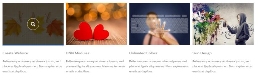
Codes are as follows:
  <div class="carousel carousel_6" data-pagination="false" data-items="4" data-autoheight="false">
  <div class="item">
    <div class="photo_box  ico_zoom"> <a class="LightBox_image_gallery3" href="/portals/25/Photo2.jpg">
      <div class="pic_box"> <img alt="" src="/portals/25/Photo2.jpg" />
        <div class="ico"> <span class="glyphicons glyph-search "></span> </div>
        <div class="shade"></div>
      </div>
      </a>
      <div class="text_sytle_6">
        <h3>Skin Features</h3>
        <p> Pellentesque consequat viverra ipsum, sed placerat ligula aliquam eu. Nam sapien eros enatis at dapibus. </p>
      </div>
    </div>
  </div>
  <div class="item">
    <div class="photo_box  ico_zoom"> <a class="LightBox_image_gallery3" href="/portals/25/Photo3.jpg">
      <div class="pic_box"> <img alt="" src="/portals/25/Photo3.jpg" />
        <div class="ico"> <span class="glyphicons glyph-search "></span> </div>
        <div class="shade"></div>
      </div>
      </a>
      <div class="text_sytle_6">
        <h3>Page Samples</h3>
        <p> Pellentesque consequat viverra ipsum, sed placerat ligula aliquam eu. Nam sapien eros enatis at dapibus. </p>
      </div>
    </div>
  </div>
  <div class="item">
    <div class="photo_box  ico_zoom"> <a class="LightBox_image_gallery3" href="/portals/25/Photo4.jpg">
      <div class="pic_box"> <img alt="" src="/portals/25/Photo4.jpg" />
        <div class="ico"> <span class="glyphicons glyph-search "></span> </div>
        <div class="shade"></div>
      </div>
      </a>
      <div class="text_sytle_6">
        <h3>Create Website</h3>
        <p> Pellentesque consequat viverra ipsum, sed placerat ligula aliquam eu. Nam sapien eros enatis at dapibus. </p>
      </div>
    </div>
  </div>
  <div class="item">
    <div class="photo_box  ico_zoom"> <a class="LightBox_image_gallery3" href="/portals/25/Photo5.jpg">
      <div class="pic_box"> <img alt="" src="/portals/25/Photo5.jpg" />
        <div class="ico"> <span class="glyphicons glyph-search "></span> </div>
        <div class="shade"></div>
      </div>
      </a>
      <div class="text_sytle_6">
        <h3>DNN Modules</h3>
        <p> Pellentesque consequat viverra ipsum, sed placerat ligula aliquam eu. Nam sapien eros enatis at dapibus. </p>
      </div>
    </div>
  </div>
  <div class="item">
    <div class="photo_box  ico_zoom"> <a class="LightBox_image_gallery3" href="/portals/25/Photo6.jpg">
      <div class="pic_box"> <img alt="" src="/portals/25/Photo6.jpg" />
        <div class="ico"> <span class="glyphicons glyph-search "></span> </div>
        <div class="shade"></div>
      </div>
      </a>
      <div class="text_sytle_6">
        <h3>Unlimited Colors</h3>
        <p> Pellentesque consequat viverra ipsum, sed placerat ligula aliquam eu. Nam sapien eros enatis at dapibus. </p>
      </div>
    </div>
  </div>
  <div class="item">
    <div class="photo_box  ico_zoom"> <a class="LightBox_image_gallery3" href="/portals/25/Photo7.jpg">
      <div class="pic_box"> <img alt="" src="/portals/25/Photo7.jpg" />
        <div class="ico"> <span class="glyphicons glyph-search "></span> </div>
        <div class="shade"></div>
      </div>
      </a>
      <div class="text_sytle_6">
        <h3>Skin Design</h3>
        <p> Pellentesque consequat viverra ipsum, sed placerat ligula aliquam eu. Nam sapien eros enatis at dapibus. </p>
      </div>
    </div>
  </div>
  <div class="item">
    <div class="photo_box  ico_zoom"> <a class="LightBox_image_gallery3" href="/portals/25/Photo2.jpg">
      <div class="pic_box"> <img alt="" src="/portals/25/Photo2.jpg" />
        <div class="ico"> <span class="glyphicons glyph-search "></span> </div>
        <div class="shade"></div>
      </div>
      </a>
      <div class="text_sytle_6">
        <h3>Responsive Web</h3>
        <p>Pellentesque consequat viverra ipsum, sed placerat ligula aliquam eu. Nam sapien eros enatis at dapibus. </p>
      </div>
    </div>
  </div>
  <div class="item">
    <div class="photo_box  ico_zoom"> <a class="LightBox_image_gallery3" href="/portals/25/Photo3.jpg">
      <div class="pic_box"> <img alt="" src="/portals/25/Photo3.jpg" />
        <div class="ico"> <span class="glyphicons glyph-search "></span> </div>
        <div class="shade"></div>
      </div>
      </a>
      <div class="text_sytle_6">
        <h3>Professional Work</h3>
        <p> Pellentesque consequat viverra ipsum, sed placerat ligula aliquam eu. Nam sapien eros enatis at dapibus. </p>
      </div>
    </div>
  </div>
</div>
Style 7:
Below is the screen shot:
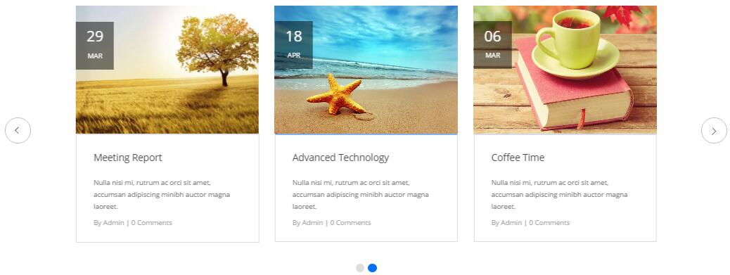
Codes are as follows:
  <div class="carousel carousel_7" data-autoplay="false" data-autoheight="false" data-items="3">
  <div class="item">
    <div class="photo_box icon_tag_push img_zoom"> <a href="#">
      <div class="pic_box"> <img alt="" src="/portals/25/Photo2.jpg" />
        <div class="ico "><span class="glyphicons glyph-link ico_right"></span></div>
        <div class="content">
          <h3>29</h3>
          Mar </div>
      </div>
      </a>
      <div class="text_sytle_6">
        <h3>Meeting Report</h3>
        <p> Nulla nisi mi, rutrum ac orci sit amet, accumsan adipiscing minibh auctor magna laoreet. </p>
        <span>By Admin   |   0 Comments</span> </div>
    </div>
  </div>
  <div class="item">
    <div class="photo_box icon_tag_push img_zoom"> <a href="#">
      <div class="pic_box"> <img alt="" src="/portals/25/Photo1.jpg" />
        <div class="ico "><span class="glyphicons glyph-link ico_right"></span></div>
        <div class="content">
          <h3>18</h3>
          Apr </div>
      </div>
      </a>
      <div class="text_sytle_6">
        <h3>Advanced Technology</h3>
        <p> Nulla nisi mi, rutrum ac orci sit amet, accumsan adipiscing minibh auctor magna laoreet. </p>
        <span>By Admin   |   0 Comments</span> </div>
    </div>
  </div>
  <div class="item">
    <div class="photo_box icon_tag_push img_zoom"> <a href="#">
      <div class="pic_box"> <img alt="" src="/portals/25/Photo3.jpg" />
        <div class="ico "><span class="glyphicons glyph-link ico_right"></span></div>
        <div class="content">
          <h3>06</h3>
          Mar </div>
      </div>
      </a>
      <div class="text_sytle_6">
        <h3>Coffee Time</h3>
        <p> Nulla nisi mi, rutrum ac orci sit amet, accumsan adipiscing minibh auctor magna laoreet. </p>
        <span>By Admin   |   0 Comments</span> </div>
    </div>
  </div>
  <div class="item">
    <div class="photo_box icon_tag_push img_zoom"> <a href="#">
      <div class="pic_box"> <img alt="" src="/portals/25/Photo2.jpg" />
        <div class="ico "><span class="glyphicons glyph-link ico_right"></span></div>
        <div class="content">
          <h3>29</h3>
          Mar </div>
      </div>
      </a>
      <div class="text_sytle_6">
        <h3>Meeting Report</h3>
        <p> Nulla nisi mi, rutrum ac orci sit amet, accumsan adipiscing minibh auctor magna laoreet. </p>
        <span>By Admin   |   0 Comments</span> </div>
    </div>
  </div>
  <div class="item">
    <div class="photo_box icon_tag_push img_zoom"> <a href="#">
      <div class="pic_box"> <img alt="" src="/portals/25/Photo1.jpg" />
        <div class="ico "><span class="glyphicons glyph-link ico_right"></span></div>
        <div class="content">
          <h3>18</h3>
          Apr </div>
      </div>
      </a>
      <div class="text_sytle_6">
        <h3>Advanced Technology</h3>
        <p> Nulla nisi mi, rutrum ac orci sit amet, accumsan adipiscing minibh auctor magna laoreet. </p>
        <span>By Admin   |   0 Comments</span> </div>
    </div>
  </div>
  <div class="item">
    <div class="photo_box icon_tag_push img_zoom"> <a href="#">
      <div class="pic_box"> <img alt="" src="/portals/25/Photo3.jpg" />
        <div class="ico "><span class="glyphicons glyph-link ico_right"></span></div>
        <div class="content">
          <h3>06</h3>
          Mar </div>
      </div>
      </a>
      <div class="text_sytle_6">
        <h3>Coffee Time</h3>
        <p> Nulla nisi mi, rutrum ac orci sit amet, accumsan adipiscing minibh auctor magna laoreet. </p>
        <span>By Admin   |   0 Comments</span> </div>
    </div>
  </div>
</div>
CSS3 Animations
You can click the link to check CSS3 Animations demo. Demo Link
Style 1:
This type is a group of effects which are displayed in time sequence. Below is the screen shot:
Codes are as follows:
<div class="animation">
   <div class="row mb-20">
       <div class="col-sm-3 animation_item scaleUp delay1"><img src="/portals/37/Photo2.jpg" /></div>
       <div class="col-sm-3 animation_item scaleUp delay2"><img src="/portals/37/Photo2.jpg" /></div>
       <div class="col-sm-3 animation_item scaleUp delay3"><img src="/portals/37/Photo2.jpg" /></div>
       <div class="col-sm-3 animation_item scaleUp delay4"><img src="/portals/37/Photo2.jpg" /></div>
	   ...
</div>
delay1, delay2, delay3, delay4 are used to control animation time, there are 12 time slots, which correspond to delay1~delay12 respectively.
scaleUp is used to control animation effect, there are scaleUp , bounceIn , bounceInDown , bounceInLeft , bounceInRight , bounceInUp , fadeIn , fadeInDown , fadeInLeft , fadeInRight , fadeInUp , fadeInDownBig , fadeInLeftBig , fadeInRightBig , fadeInUpBig , flip , flipInX , flipInY , lightSpeedIn , rotateIn , rotateInDownLeft , rotateInDownRight , rotateInUpLeft , rotateInUpRight , rollIn , zoomIn , zoomInDown , zoomInLeft , zoomInRight , zoomInUp 30 effects in total.
Style 2:
If you just need one animation effect, you can match with the following codes.
<div class="animation scaleUp"> <img src="/portals/37/Photo5.jpg" /> </div>
Style 3:
You can add animation for a certain element when mousing over. Codes are as follows:
<div class="animationhover bounce"> <img src="/portals/37/Photo5.jpg" /> </div>
When mousing over, it will show animation effect type (animationhover). There are bounce , flash , pulse , rubberBand , shake , swing , tada , wobble 8 effects.
Popovers
You can click the link to check Popovers demo. Demo Link
Below is the screen shot:
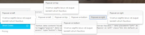
Codes are as follows:
<button data-content="Vivamus sagittis lacus vel augue laoreet rutrum faucibus." data-placement="left" data-toggle="popover" data-container="body" data-original-title="Popover on left" class="btn btn-default popovers" type="button">
    Popover on left
</button>
Option:
| Name | type | default | description |
|---|---|---|---|
| animation | boolean | true | apply a CSS fade transition to the tooltip |
| html | boolean | false | Insert HTML into the tooltip. If false, jQuery's text method will be used to insert content into the DOM. Use text if you're worried about XSS attacks. |
| placement | string | function | 'top' | how to position the tooltip - top | bottom | left | right | auto. When "auto" is specified, it will dynamically reorient the tooltip. For example, if placement is "auto left", the tooltip will display to the left when possible, otherwise it will display right. |
| selector | string | false | If a selector is provided, tooltip objects will be delegated to the specified targets. |
| title | string | function | '' | default title value if title attribute isn't present |
| trigger | string | 'hover focus' | how tooltip is triggered - click | hover | focus | manual. You may pass multiple triggers; separate them with a space. |
| delay | number | object | 0 | delay showing and hiding the tooltip (ms) - does not apply to manual trigger type If a number is supplied, delay is applied to both hide/show Object structure is: |
| container | string | false | false | Appends the tooltip to a specific element. Example: |
Alerts
You can click the link to check Alerts demo. Demo Link
Below is the screen shot:
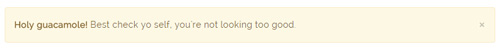
Codes are as follows:
<div class="alert alert-warning fade in">
    <button aria-hidden="true" data-dismiss="alert" class="close" type="button">×</button>
    <strong>Holy guacamole!</strong> Best check yo self, you're not looking too good.
</div>
Option:
- You can change
alert-to change the color, there arealert-warning,alert-danger,alert-success,alert-info4 colors included in the effects. fadeis for hiddeninis for display
Tooltips
You can click the link to check Tooltips demo. Tooltips
Below is the screen shot:
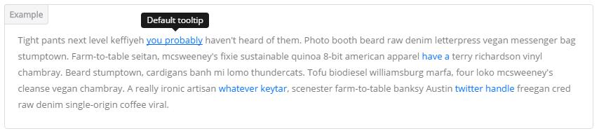
Codes are as follows:
<a href="#" class="tooltips" data-toggle="tooltip" title="first tooltip">Hover over me</a>
Option:
| Name | type | default | description |
|---|---|---|---|
| animation | boolean | true | apply a CSS fade transition to the tooltip |
| html | boolean | false | Insert HTML into the tooltip. If false, jQuery's text method will be used to insert content into the DOM. Use text if you're worried about XSS attacks. |
| placement | string | function | 'top' | how to position the tooltip - top | bottom | left | right | auto. When "auto" is specified, it will dynamically reorient the tooltip. For example, if placement is "auto left", the tooltip will display to the left when possible, otherwise it will display right. |
| selector | string | false | If a selector is provided, tooltip objects will be delegated to the specified targets. |
| title | string | function | '' | default title value if title attribute isn't present |
| trigger | string | 'hover focus' | how tooltip is triggered - click | hover | focus | manual. You may pass multiple triggers; separate them with a space. |
| delay | number | object | 0 | delay showing and hiding the tooltip (ms) - does not apply to manual trigger type If a number is supplied, delay is applied to both hide/show Object structure is: |
| container | string | false | false | Appends the tooltip to a specific element. Example: |
Dropdowns
You can click the link to check Dropdowns demo. Demo Link
Style 1:
Below is the screen shot:
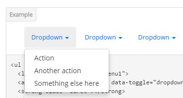
Codes are as follows:
<ul class="nav nav-pills">
  <li class="dropdown" id="menu1">
  <a class="dropdown-toggle" data-toggle="dropdown" href="#menu1">Dropdown
  <strong class="caret"></strong>
  </a>
    <ul class="dropdown-menu">
      <li><a href="#">Action</a></li>
      <li><a href="#">Another action</a></li>
      <li><a href="#">Something else here</a></li>
    </ul>
  </li>
</ul>
Style 2:
Below is the screen shot:
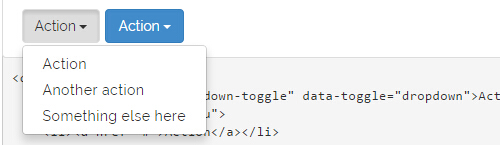
Codes are as follows:
<div class="btn-group">
  <button class="btn dropdown-toggle" data-toggle="dropdown">Action <span class="caret"></span></button>
  <ul class="dropdown-menu">
    <li><a href="#">Action</a></li>
    <li><a href="#">Another action</a></li>
    <li><a href="#">Something else here</a></li>
  </ul>
</div>
Style 3:
Below is the screen shot:
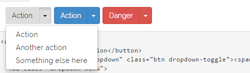
Codes are as follows:
<div class="btn-group">
  <button class="btn">Action</button>
  <button data-toggle="dropdown" class="btn dropdown-toggle"><span class="caret"></span></button>
  <ul class="dropdown-menu">
    <li><a href="#">Action</a></li>
    <li><a href="#">Another action</a></li>
    <li><a href="#">Something else here</a></li>
  </ul>
</div>
LightBox
You can click the link to check LightBox demo. Demo Link
Below is the screen shot:
Option:
1. LightBox_image |
Show one image alone. |
2. LightBox_image_gallery+group number |
Classify those that share the same class name to one group, you can show other images within the group by clicking left and right arrow of the image. |
3. LightBox_image_group |
Classify these sub levels whose label class name is LightBox_image_group into one group. |
4. LightBox_youtube |
Show youtube video. |
5. LightBox_vimeo |
Show video. |
6. LightBox_gmaps |
Shown map. |
7. LightBox_youtube_gallery+group number |
Classify these that share the same class name into a group of youtube video show |
8. LightBox_vimeo_gallery+group number |
Classify these that share the same class name into a group of video show. |
9. LightBox_gmaps_gallery+group number |
Classify these that share the same class name into a group of map show. |
10. LightBox_youtube_group |
Classify these sub levels whose label class name is LightBox_youtube_group into one group. |
11. LightBox_vimeo_group |
Classify these sub levels whose label class name is LightBox_vimeo_group into one group. |
12. LightBox_gmaps_group |
Classify these sub levels whose label class names is LightBox_gmaps_group into one group. |
13. LightBox_Box |
Take div as layer pop up, div needs to hide by default. Style of pop up is custom style. |
14. LightBox_ajax |
Pop up a page |
15. LightBox_ajax_group |
Pop up a group of pages |
You need to fill url of the pop up image(video, map) in href=""
1.LightBox_image
<a href="bigPhoto.jpg" class="LightBox_image" title="Single Image 1"><img alt="" src="cover.jpg" /></a>
2.LightBox_image_gallery
<a href="bigPhoto1.jpg" class="LightBox_image_gallery1" title="Single Image 1"><img alt="" src="cover.jpg" /></a>
<a href="bigPhoto2.jpg" class="LightBox_image_gallery1" title="Single Image 1"><img alt="" src="cover.jpg" /></a>
<a href="bigPhoto3.jpg" class="LightBox_image_gallery2" title="Single Image 2"><img alt="" src="cover.jpg" /></a>
<a href="bigPhoto4.jpg" class="LightBox_image_gallery2" title="Single Image 2"><img alt="" src="cover.jpg" /></a>
3.LightBox_image_group
<div class="LightBox_image_group">
    <a href="bigPhoto1.jpg" title=" People Scenery 1"><img alt="" src="cover.jpg" /> </a>
    <a href="bigPhoto2.jpg" title=" People Scenery 2"></a>
    <a href="bigPhoto3.jpg" title=" People Scenery 3"></a>
</div>
4.LightBox_youtube
<a href="http://www.youtube.com/watch?v=0O2aH4XLbto" class="LightBox_youtube" title="youtube"><img alt="" src="cover.jpg" /></a>
5.LightBox_vimeo
<a href="https://vimeo.com/45830194" class="LightBox_vimeo" title="vimeo"><img alt="" src="cover.jpg" /></a>
6.LightBox_gmaps
<a href="https://maps.google.com/maps?q=221B+Baker+Street,+London,+United+Kingdom&hl=en&t=v&hnear=221B+Baker+St,+London+NW1+6XE,+United+Kingdom" class="LightBox_gmaps" title="gmaps"><img alt="" src="cover.jpg" /></a>
7.LightBox_youtube_gallery
<a href="http://www.youtube.com/watch?v=0O2aH4XLbto" class="LightBox_youtube_gallery1" title="youtube gallery"><img alt="" src="cover.jpg" /></a>
<a href="http://www.youtube.com/watch?v=0O2aH4XLbto" class="LightBox_youtube_gallery1" title="youtube gallery"><img alt="" src="cover.jpg" /></a>
<a href="http://www.youtube.com/watch?v=0O2aH4XLbto" class="LightBox_youtube_gallery2" title="youtube gallery"><img alt="" src="cover.jpg" /></a>
<a href="http://www.youtube.com/watch?v=0O2aH4XLbto" class="LightBox_youtube_gallery2" title="youtube gallery"><img alt="" src="cover.jpg" /></a>
8.LightBox_vimeo_gallery
<a href="https://vimeo.com/45830194" class="LightBox_vimeo_gallery1" title="vimeo gallery"><img alt="" src="cover.jpg" /></a>
<a href="https://vimeo.com/45830194" class="LightBox_vimeo_gallery1" title="vimeo gallery"><img alt="" src="cover.jpg" /></a>
<a href="https://vimeo.com/45830194" class="LightBox_vimeo_gallery2" title="vimeo gallery"><img alt="" src="cover.jpg" /></a>
<a href="https://vimeo.com/45830194" class="LightBox_vimeo_gallery2" title="vimeo gallery"><img alt="" src="cover.jpg" /></a>
9.LightBox_gmaps_gallery
<a href="https://maps.google.com/maps?q=221B+Baker+Street,+London,+United+Kingdom&hl=en&t=v&hnear=221B+Baker+St,+London+NW1+6XE,+United+Kingdom" class="LightBox_gmaps_gallery1" title="gmaps gallery"><img alt="" src="cover.jpg" /></a>
<a href="https://maps.google.com/maps?q=221B+Baker+Street,+London,+United+Kingdom&hl=en&t=v&hnear=221B+Baker+St,+London+NW1+6XE,+United+Kingdom" class="LightBox_gmaps_gallery1" title="gmaps gallery"><img alt="" src="cover.jpg" /></a>
<a href="https://maps.google.com/maps?q=221B+Baker+Street,+London,+United+Kingdom&hl=en&t=v&hnear=221B+Baker+St,+London+NW1+6XE,+United+Kingdom" class="LightBox_gmaps_gallery2" title="gmaps gallery"><img alt="" src="cover.jpg" /></a>
<a href="https://maps.google.com/maps?q=221B+Baker+Street,+London,+United+Kingdom&hl=en&t=v&hnear=221B+Baker+St,+London+NW1+6XE,+United+Kingdom" class="LightBox_gmaps_gallery2" title="gmaps gallery"><img alt="" src="cover.jpg" /></a>
10.LightBox_youtube_group
<div class="LightBox_youtube_group">
    <a href="http://www.youtube.com/watch?v=0O2aH4XLbto" title=" youtube 1"><img alt="" src="cover.jpg" /> </a>
    <a href="http://www.youtube.com/watch?v=0O2aH4XLbto" title=" youtube 2"></a>
    <a href="http://www.youtube.com/watch?v=0O2aH4XLbto" title=" youtube 3"></a>
</div>
11.LightBox_vimeo_group
<div class="LightBox_vimeo_group">
    <a href="https://vimeo.com/45830194" title=" vimeo 1"><img alt="" src="cover.jpg" /> </a>
    <a href="https://vimeo.com/45830194" title=" vimeo 2"></a>
    <a href="https://vimeo.com/45830194" title=" vimeo 3"></a>
</div>
12.LightBox_gmaps_group
<div class="LightBox_gmaps_group">
    <a href="https://maps.google.com/maps?q=221B+Baker+Street,+London,+United+Kingdom&hl=en&t=v&hnear=221B+Baker+St,+London+NW1+6XE,+United+Kingdom" title=" gmaps 1"><img alt="" src="cover.jpg" /> </a>
    <a href="https://maps.google.com/maps?q=221B+Baker+Street,+London,+United+Kingdom&hl=en&t=v&hnear=221B+Baker+St,+London+NW1+6XE,+United+Kingdom" title=" gmaps 2"></a>
    <a href="https://maps.google.com/maps?q=221B+Baker+Street,+London,+United+Kingdom&hl=en&t=v&hnear=221B+Baker+St,+London+NW1+6XE,+United+Kingdom" title=" gmaps 3"></a>
</div>
13.LightBox_Box
<a href=".LightBox_Content" class="LightBox_Box"> Click Here To Pop </a>
<a href=".LightBox_Content" class="LightBox_Box Button_default"> Click Here To Pop </a>
<div class="LightBox_Content">
    <h3>Click Here To Pop</h3>
 	  content text ...
</div>
14.LightBox_ajax
<a href="index.aspx" class="LightBox_ajax" title="ajax"><img alt="" src="cover.jpg" /></a>
15.LightBox_ajax_group
<div class="LightBox_ajax_group">
    <a href="index.aspx" title=" ajax 1"><img alt="" src="cover.jpg" /> </a>
    <a href="index.aspx" title=" ajax 2"></a>
    <a href="index.aspx" title=" ajax 3"></a>
</div>
Image Effects
You can click the link to check Image Effects demo. Demo Link
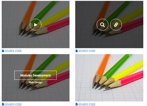
- You can copy over codes of the image effects directly to any HTML modules.
- You can change the font icon through modifying. font icon list
Flip Box
You can click the link to check Flip Box demo. Demo Link
Style 1:
Below is the screen shot:
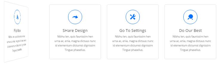
Codes are as follows:
<div class="row">
  <div class="col-sm-3">
    <div class="flip_box flip_box_1">
      <div class="rotate">
        <div class="front"> <span class="glyphicons glyph-cardio"></span>
          <h3>Flip Box</h3>
          <p>content text ...</p>
        </div>
        <div class="back">
          <h3>Flip Box</h3>
          <p>content text ...</p>
          <a href="#" class="but">Read More</a> </div>
      </div>
    </div>
  </div>
  <div class="col-sm-3">
    <div class="flip_box flip_right flip_box_1">
      <div class="rotate">
        <div class="front"> <span class="glyphicons glyph-redo"></span>
          <h3>SHare Design</h3>
          <p>content text ...</p>
        </div>
        <div class="back">
          <h3>SHare Design</h3>
          <p>content text ...</p>
          <a href="#" class="but">Read More</a> </div>
      </div>
    </div>
  </div>
  <div class="col-sm-3">
    <div class="flip_box flip_top flip_box_1">
      <div class="rotate">
        <div class="front"> <span class="glyphicons glyph-settings"></span>
          <h3>Go To Settings</h3>
          <p>content text ...</p>
        </div>
        <div class="back">
          <h3>Go To Settings</h3>
          <p>content text ...</p>
          <a href="#" class="but">Read More</a> </div>
      </div>
    </div>
  </div>
  <div class="col-sm-3">
    <div class="flip_box flip_bottom flip_box_1">
      <div class="rotate">
        <div class="front"> <span class="glyphicons glyph-table-tennis"></span>
          <h3>Do Our Best</h3>
          <p>content text ...</p>
        </div>
        <div class="back">
          <h3>Do Our Best</h3>
          <p>content text ...</p>
          <a href="#" class="but">Read More</a> </div>
      </div>
    </div>
  </div>
</div>
Option:
col-md-3 col-sm-6is the width of each column, you can change the width you need through value1~12.frontis for front content.backis for back content.
Style 2:
Below is the screen shot:
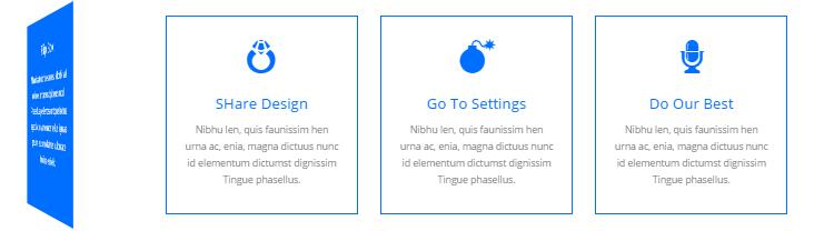
Codes are as follows:
<div class="row">
  <div class="col-sm-3">
    <div class="flip_box flip_box_2">
      <div class="rotate">
        <div class="front"> <span class="glyphicons glyph-drink"></span>
          <h3>Flip Box</h3>
          <p>content text ...</p>
        </div>
        <div class="back">
          <h3>Flip Box</h3>
          <p>content text ...</p>
        </div>
      </div>
    </div>
  </div>
  <div class="col-sm-3">
    <div class="flip_box flip_right flip_box_2">
      <div class="rotate">
        <div class="front"> <span class="glyphicons glyph-ring"></span>
          <h3>SHare Design</h3>
          <p>content text ...</p>
        </div>
        <div class="back">
          <h3>SHare Design</h3>
          <p>content text ...</p>
        </div>
      </div>
    </div>
  </div>
  <div class="col-sm-3">
    <div class="flip_box flip_top flip_box_2">
      <div class="rotate">
        <div class="front"> <span class="glyphicons glyph-bomb"></span>
          <h3>Go To Settings</h3>
          <p>content text ...</p>
        </div>
        <div class="back">
          <h3>Go To Settings</h3>
          <p>content text ...</p>
        </div>
      </div>
    </div>
  </div>
  <div class="col-sm-3">
    <div class="flip_box flip_bottom flip_box_2">
      <div class="rotate">
        <div class="front"> <span class="glyphicons glyph-microphone"></span>
          <h3>Do Our Best</h3>
          <p>content text ...</p>
        </div>
        <div class="back">
          <h3>Do Our Best</h3>
          <p>content text ...</p>
        </div>
      </div>
    </div>
  </div>
</div>
Responsive Video
Ratio between width and height of the video needs to be 16:9.
<div class="responsive-video">
    <iframe width="853" height="480" src="//www.youtube.com/embed/XcpOsJQXcx4?list=UUIkFV7_2tEhhEhh1NkkwTUw" frameborder="0" allowfullscreen></iframe>
</div>
<div class="responsive-video">
    <iframe src="//player.vimeo.com/video/106249100" width="1920" height="1080" frameborder="0" webkitallowfullscreen mozallowfullscreen allowfullscreen></iframe>
</div>
<div class="responsive-video">
     <embed  src="/portals/37/movie.swf" type="application/x-shockwave-flash" allownetworking="all" allowfullscreen="true" allowscriptaccess="always" wmode="Opaque"></embed>
</div>
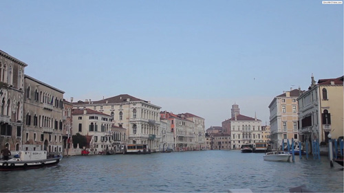
<div class="responsive-video">
    <video width="1920" height="1080"  controls="true">
    <source src="/portals/37/movie.m4v" type="video/mp4"></source>
    <source src="/portals/37/movie.ogv" type="video/ogg"></source>
    <source src="/portals/37/movie.webm" type="video/WebM"></source>
    Your browser does not support the video tag. </video>
</div>
Video Bg
You can click the link to check Video Bg demo. Demo Link

- "{videoURL:'npfu0fN9GUA' is the url of
youtube autoPlayis for whether to autoplay or nottrue/falseloopis for whether to play on a loop,true/false
<div data-property="{videoURL:'npfu0fN9GUA',containment:'self', showControls:false, autoPlay:true, loop:true, vol:50, mute:true, startAt:10, opacity:1, addRaster:false, quality:'hd1080'}" class="player">
<div class="Play"></div>
<div class="dnn_layout pt-60 pb-60">
<div class="content_mid clearfix">
<div class="player_boxes">
<h1 class="player_title"> Here Are Your Videos</h1>
<hr class="player_line" />
<h4 class="player_smalltitle">YOU CAN CHANGE THE BACKGROUND BY YOURSELF</h4>
<div class="player_content">
<p>Content Text 1 ... </p>
</div>
<p> <a class="Button_default" href="#"> VIEW PORTFOLIOS</a> <a class="Button_default" href="#"> LEARN MORE</a> </p>
</div>
</div>
</div>
</div>
Home Version 1 (Home)
You can click the link to check Home Version 1 (home) demo. Home Version 1 (Home)
Banner area
Below is the screen shot:
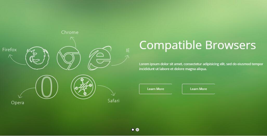
Codes are as follows:
It is using DNNGo LayerGallery module here, you can import ContentListEntity-Home1.xml of the DNNGo_LayerGalleryPro folder to duplicate banner of the demo.
Welcome To Our Website area
Below is the screen shot:
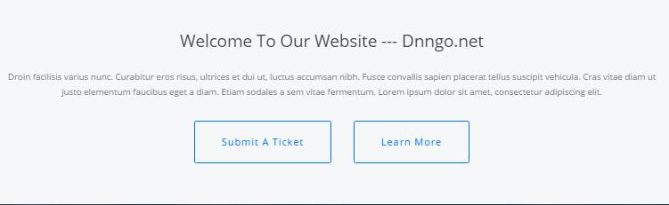
Codes are as follows:
<div class="backgroundImage9 pt-50 pb-50">
  <div class="dnn_layoutB animation zoomIn animated">
    <div class="content_mid clearfix h1_back">
      <h3>Welcome To Our Website --- Dnngo.net</h3>
      <div class="pt-30">Droin facilisis varius nunc. Curabitur eros risus, ultrices et dui ut, luctus accumsan nibh. Fusce convallis sapien placerat tellus suscipit vehicula. Cras vitae diam ut </div>
      <div class="pb-30">justo elementum faucibus eget a diam. Etiam sodales a sem vitae fermentum. Lorem ipsum dolor sit amet, consectetur adipiscing elit.</div>
      <p> <a class="Button_default" href="http://www.dnngo.net/ContactUs/OnlineSupportTicket.aspx" target="blank"> Submit A Ticket </a> <a class="Button_default" href="#" target="blank"> Learn More </a></p>
    </div>
  </div>
</div>
Option:
- You can modify
animationto change the animation on the slide. Animation list.
Our Team area
Below is the screen shot:
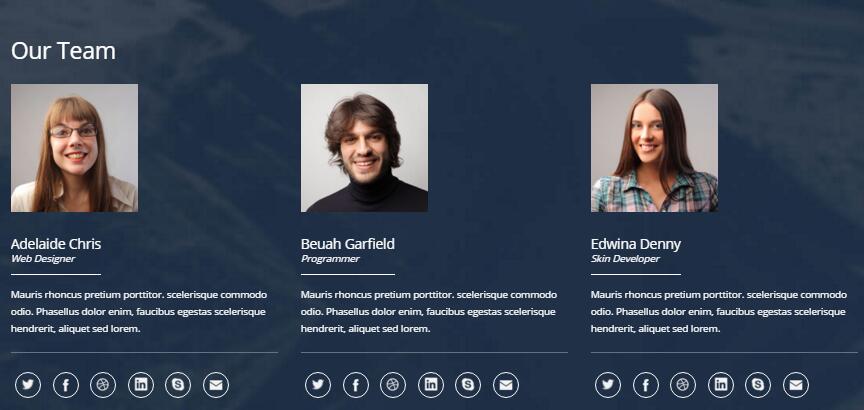
Codes are as follows:
<div class="backgroundImage10 pt-50 pb-50">
  <div class="dnn_layoutB">
    <div class="content_mid clearfix">
      <div class="h1_tit_left pb-20">
        <h3>Our Teams</h3>
      </div>
      <div class="row our_team animation">
        <div class="col-sm-4">
          <div class="team_list animation_item scaleUp delay1">
            <div class="team_person">
              <div class="team_img"><img alt="" src="/portals/12/Pic_1.png" /></div>
            </div>
            <div class="team_title">Adelaide Chris <span>Web Designer</span></div>
            <div class="team_content"> Content text ... </div>
            <div class="team_social">
              <div class="social-icons  clearfix"> <a href="#" class="social-twitter"> Twitter</a> <a href="#" class="social-facebook"> Facebook</a> <a href="#" class="social-picasa"> picasa</a> <a href="#" class="social-linkedin" rel="tooltip"> linkedin</a> <a href="#" class="social-skype"> skype</a> <a href="#" class="social-mail"> mail</a> </div>
            </div>
          </div>
        </div>
        <div class="col-sm-4">
          <div class="team_list animation_item scaleUp delay2">
            <div class="team_person">
              <div class="team_img"><img alt="" src="/portals/12/Pic_2.png" /></div>
            </div>
            <div class="team_title">Beuah Garfield<span>Programmer</span></div>
            <div class="team_content"> Content text ... </div>
            <div class="team_social">
              <div class="social-icons  clearfix"> <a href="#" class="social-twitter"> Twitter</a> <a href="#" class="social-facebook"> Facebook</a> <a href="#" class="social-picasa"> picasa</a> <a href="#" class="social-linkedin" rel="tooltip"> linkedin</a> <a href="#" class="social-skype"> skype</a> <a href="#" class="social-mail"> mail</a> </div>
            </div>
          </div>
        </div>
        <div class="col-sm-4">
          <div class="team_list animation_item scaleUp delay3">
            <div class="team_person">
              <div class="team_img"><img alt="" src="/portals/12/Pic_3.png" /></div>
            </div>
            <div class="team_title">Edwina Denny<span>Skin Developer</span></div>
            <div class="team_content"> Content text ... </div>
            <div class="team_social">
              <div class="social-icons  clearfix"> <a href="#" class="social-twitter"> Twitter</a> <a href="#" class="social-facebook"> Facebook</a> <a href="#" class="social-picasa"> picasa</a> <a href="#" class="social-linkedin" rel="tooltip"> linkedin</a> <a href="#" class="social-skype"> skype</a> <a href="#" class="social-mail"> mail</a> </div>
            </div>
          </div>
        </div>
      </div>
    </div>
  </div>
</div>
Full Carousel area
Below is the screen shot:

Codes are as follows:
<div data-pagination="false" class="carousel carousel_4 ">
  <div class="item">
    <div class="photo_box ico_LeftAndRight_enter">
      <div class="pic_box"> <img alt="" src="/portals/12/Photo1.jpg" />
        <div class="ico"> <a class="LightBox_image_gallery4" href="/Portals/12/Photo1.jpg"> <span class="glyphicons glyph-plus"></span></a> </div>
        <div class="shade"></div>
      </div>
    </div>
  </div>
  <div class="item">
    <div class="photo_box ico_LeftAndRight_enter">
      <div class="pic_box"> <img alt="" src="/portals/12/Photo2.jpg" />
        <div class="ico"> <a class="LightBox_image_gallery4" href="/Portals/12/Photo2.jpg"> <span class="glyphicons glyph-plus"></span></a> </div>
        <div class="shade"></div>
      </div>
    </div>
  </div>
  <div class="item">
    <div class="photo_box ico_LeftAndRight_enter">
      <div class="pic_box"> <img alt="" src="/portals/12/Photo3.jpg" />
        <div class="ico"> <a class="LightBox_image_gallery4" href="/Portals/12/Photo3.jpg"> <span class="glyphicons glyph-plus"></span></a> </div>
        <div class="shade"></div>
      </div>
    </div>
  </div>
  <div class="item">
    <div class="photo_box ico_LeftAndRight_enter">
      <div class="pic_box"> <img alt="" src="/portals/12/Photo4.jpg" />
        <div class="ico"> <a class="LightBox_image_gallery4" href="/Portals/12/Photo4.jpg"> <span class="glyphicons glyph-plus"></span></a> </div>
        <div class="shade"></div>
      </div>
    </div>
  </div>
  <div class="item">
    <div class="photo_box ico_LeftAndRight_enter">
      <div class="pic_box"> <img alt="" src="/portals/12/Photo5.jpg" />
        <div class="ico"> <a class="LightBox_image_gallery4" href="/Portals/12/Photo5.jpg"> <span class="glyphicons glyph-plus"></span></a> </div>
        <div class="shade"></div>
      </div>
    </div>
  </div>
  <div class="item">
    <div class="photo_box ico_LeftAndRight_enter">
      <div class="pic_box"> <img alt="" src="/portals/12/Photo6.jpg" />
        <div class="ico"> <a class="LightBox_image_gallery4" href="/Portals/12/Photo6.jpg"> <span class="glyphicons glyph-plus"></span></a> </div>
        <div class="shade"></div>
      </div>
    </div>
  </div>
  <div class="item">
    <div class="photo_box ico_LeftAndRight_enter">
      <div class="pic_box"> <img alt="" src="/portals/12/Photo7.jpg" />
        <div class="ico"> <a class="LightBox_image_gallery4" href="/Portals/12/Photo7.jpg"> <span class="glyphicons glyph-plus"></span></a> </div>
        <div class="shade"></div>
      </div>
    </div>
  </div>
  <div class="item">
    <div class="photo_box ico_LeftAndRight_enter">
      <div class="pic_box"> <img alt="" src="/portals/12/Photo1.jpg" />
        <div class="ico"> <a class="LightBox_image_gallery4" href="/Portals/12/Photo1.jpg"> <span class="glyphicons glyph-plus"></span></a> </div>
        <div class="shade"></div>
      </div>
    </div>
  </div>
  <div class="item">
    <div class="photo_box ico_LeftAndRight_enter">
      <div class="pic_box"> <img alt="" src="/portals/12/Photo2.jpg" />
        <div class="ico"> <a class="LightBox_image_gallery4" href="/Portals/12/Photo2.jpg"> <span class="glyphicons glyph-plus"></span></a> </div>
        <div class="shade"></div>
      </div>
    </div>
  </div>
  <div class="item">
    <div class="photo_box ico_LeftAndRight_enter">
      <div class="pic_box"> <img alt="" src="/portals/12/Photo3.jpg" />
        <div class="ico"> <a class="LightBox_image_gallery4" href="/Portals/12/Photo3.jpg"> <span class="glyphicons glyph-plus"></span></a> </div>
        <div class="shade"></div>
      </div>
    </div>
  </div>
</div>
Option:
- This is a
Carouseleffect.Carousel - You can modify
animationto change the animation on the slide. Animation list. - You can modify
glyphicons glyph-*to change icons. font icon list.
Our Services area
Below is the screen shot:
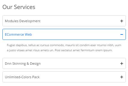
Codes are as follows:
<div class="panel-group accordion_2 h1_accordion animation fadeInLeft" id="accordion2">
  <div class="panel panel-default">
    <div class="panel-heading">
      <h4 class="panel-title"><a data-toggle="collapse" data-parent="#accordion2" href="#item2_1" class="collapsed"> <span class="accordion_icon glyphicons"></span> Modules Development</a></h4>
    </div>
    <div class="panel-collapse in collapse" id="item2_1">
      <div class="panel-body"> Droin facilisis varius nunc. Curabitur eros risus, ultrices et dui ut, luctus accumsan nibh. Fusce convallis sapien placer Lorem ipsum dolor sit amet, consectetur adipiscing elit. </div>
    </div>
  </div>
  <div class="panel panel-default">
    <div class="panel-heading">
      <h4 class="panel-title"><a data-toggle="collapse" data-parent="#accordion2" href="#item2_2" class="collapsed"> <span class="accordion_icon glyphicons"></span> ECommerce Web</a></h4>
    </div>
    <div class="panel-collapse collapse" id="item2_2">
      <div class="panel-body"> Fugiat dapibus, tellus ac cursus commodo, mauris sit condim eser ntumsi nibh, uum a justo vitaes amet risus amets un. Posi sectetut amet fermntum orem ipsum. </div>
    </div>
  </div>
  <div class="panel panel-default">
    <div class="panel-heading">
      <h4 class="panel-title"><a data-toggle="collapse" data-parent="#accordion2" href="#item2_3"> <span class="accordion_icon glyphicons"></span>Dnn Skinning & Design </a></h4>
    </div>
    <div class="panel-collapse collapse" id="item2_3">
      <div class="panel-body"> Fugiat dapibus, tellus ac cursus commodo, mauris sit condim eser ntumsi nibh, uum a justo vitaes amet risus amets un. Posi sectetut amet fermntum orem ipsum.</div>
    </div>
  </div>
  <div class="panel panel-default">
    <div class="panel-heading ">
      <h4 class="panel-title"><a data-toggle="collapse" data-parent="#accordion2" href="#item2_4" class="collapsed"> <span class="accordion_icon glyphicons"></span> Unlimited-Colors Pack</a></h4>
    </div>
    <div class="panel-collapse collapse" id="item2_4">
      <div class="panel-body"> Fugiat dapibus, tellus ac cursus commodo, mauris sit condim eser ntumsi nibh, uum a justo vitaes amet risus amets un. Posi sectetut amet fermntum orem ipsum. </div>
    </div>
  </div>
</div>
Option:
- You can modify
animationto change the animation on the slide. Animation list. Containeris usingContainer-3
Testimonial area
Below is the screen shot:
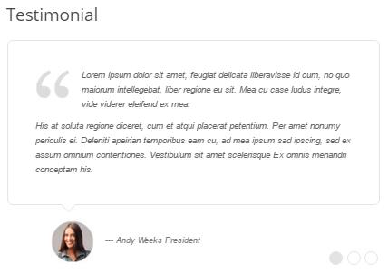
Codes are as follows:
<ul data-display-arrows="false" data-position="fade" data-autoplay="0" class=" Testimonials_tab Testimonials_6 h1_Testimonials_tab animation fadeInRight ">
  <li>
    <blockquote>
      <p> <span></span>Lorem ipsum dolor sit amet, feugiat delicata liberavisse id cum, no quo maiorum intellegebat, liber regione eu sit. Mea cu case ludus integre, vide viderer eleifend ex mea. <em style="display: block;" class="pt-10"> His at soluta regione diceret, cum et atqui placerat petentium. Per amet nonumy periculis ei. Deleniti apeirian temporibus eam cu, ad mea ipsum sad ipscing, sed ex assum omnium contentiones. Vestibulum sit amet scelerisque Ex omnis menandri conceptam his. </em></p>
      <small> <img alt="" src="/portals/12/home1_03.jpg" /> ---  Andy Weeks President</small> </blockquote>
  </li>
  <li>
    <blockquote>
      <p> <span></span> You guys do a fantastic job.  The skin looks exactly as we expected.  We have now done several skins and even skins that were done 6 months ago, you guys have been great in making the minor changes we request.  We love that you aren't a company that nickels and dimes their customers and I can see us having a nice long relationship. </p>
      <small> <img alt="" src="/portals/12/home1_01.jpg" />-- Aaron - Calibrated Design</small> </blockquote>
  </li>
  <li>
    <blockquote>
      <p> <span></span> The folks at <a href="http://www.dnngo.net">dnngo.net</a> have been a pleasure to work with.  As the owner of a web design business, I've come to rely on them to do good, quality work on skin conversions.  They are always friendly, thorough and provide a great quality product at a reasonable price.  I've worked with others in the past, but once I started working with DNNGO I knew I had found a team I could rely on and have sent all of my business to them ever since. </p>
      <small> <img alt="" src="/portals/12/home1_02.jpg" />-- James Divine - Divine Solutions</small> </blockquote>
  </li>
</ul>
Friendly Links area
Below is the screen shot:
Codes are as follows:
<div class="backgroundImage11 pt-50 pb-50">
  <div class="dnn_layoutB">
    <div class="content_mid clearfix">
      <div class="h1_tit_left pb-20">
        <h3>Friendly Links</h3>
      </div>
      <div class="isotope_grid isotope_1 animation zoomIn">
        <div class="isotope_group"> <a data-filter="*" href="#" class="active">All</a> <a data-filter=".graphics" href="#">Graphics</a> <a data-filter=".webdesign" href="#">Web design</a> <a data-filter=".photo" href="#">Photo</a> </div>
        <div data-min-width="270" class="isotope_main">
          <div class="isotope_item photo">
            <div class="photo_box"> <a target="_blank" href="http://www.dnngo.net">
              <div class="pic_box"><img alt="" src="/portals/12/DNNGallery/1574/link_1.png" />
                <div class="content"></div>
                <div class="shade"></div>
              </div>
              </a> </div>
          </div>
          <div class="isotope_item graphics">
            <div class="photo_box"> <a target="_blank" href="http://www.dnngo.net">
              <div class="pic_box"><img alt="" src="/portals/12/DNNGallery/1574/link_2.png" />
                <div class="content"></div>
                <div class="shade"></div>
              </div>
              </a> </div>
          </div>
          <div class="isotope_item webdesign">
            <div class="photo_box"> <a target="_blank" href="http://www.dnngo.net">
              <div class="pic_box"><img alt="" src="/portals/12/DNNGallery/1574/link_3.png" />
                <div class="content"></div>
                <div class="shade"></div>
              </div>
              </a> </div>
          </div>
          <div class="isotope_item photo">
            <div class="photo_box"> <a target="_blank" href="http://www.dnngo.net">
              <div class="pic_box"><img alt="" src="/portals/12/DNNGallery/1574/link_4.png" />
                <div class="content"></div>
                <div class="shade"></div>
              </div>
              </a> </div>
          </div>
        </div>
      </div>
    </div>
  </div>
</div>
Option:
- You can add
<a data-filter=".FilterName" href="#">Filter Name</a>to increase categories.data-filter=".FilterName"can not be blank space. - You can modify
data-min-widthto change minimum width of image. - You can modify
isotope_itemFilterNameto categorize images. - You can modify
animationto change the animation on the slide. Animation list.
Featured Products area
Below is the screen shot:
Codes are as follows:
<div class=" pt-50 pb-20">
  <div class="dnn_layoutB">
    <div class="content_mid clearfix">
      <div class="row">
        <div class="col-sm-8 animation fadeInLeft">
          <div class="h1_tit_left pb-20">
            <h3 style="color: #444444;">Featured Products</h3>
          </div>
          <div class="h1_Icon"> <span class="glyphicons glyph-calendar"></span>
            <div class="h1_Con">
              <h2>Unlimited Skins/Styles/Colors</h2>
              <p>Quisque tortor odio, feugiat vitae velit at, feugiat euismod nunc. Morbi lectus neque, mollis quis tellus eget, placerat viverra enim. Sed rhoncus neque sed adipiscing bibendum. </p>
            </div>
          </div>
          <div class="h1_Icon"> <span class="glyphicons glyph-folder-open"></span>
            <div class="h1_Con">
              <h2>Cutting-edge CSS3 animations</h2>
              <p>Quisque tortor odio, feugiat vitae velit at, feugiat euismod nunc. Morbi lectus neque, mollis quis tellus eget, placerat viverra enim. Sed rhoncus neque sed adipiscing bibendum. </p>
            </div>
          </div>
          <div class="h1_Icon"> <span class="glyphicons glyph-leaf"></span>
            <div class="h1_Con">
              <h2>Boxed & Wide Layout</h2>
              <p>Quisque tortor odio, feugiat vitae velit at, feugiat euismod nunc. Morbi lectus neque, mollis quis tellus eget, placerat viverra enim. Sed rhoncus neque sed adipiscing bibendum. </p>
            </div>
          </div>
        </div>
        <div class="col-sm-4 h1_img animation fadeInRight"><img alt="" src="/portals/12/h1_image.jpg" /> </div>
      </div>
    </div>
  </div>
</div>
Our Skills area
Below is the screen shot:
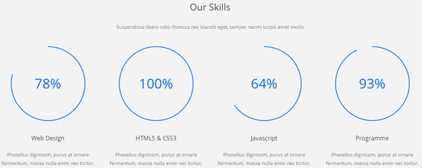
Codes are as follows:
<div class="chart_list3 row">
  <div class="col-md-3 col-sm-6 col-xs-12  animation_item scaleUp delay1">
    <div data-percent="79" class="percentage3">
      <div class="percentage_inner"><span>0</span>%</div>
    </div>
    <h2> Web Design</h2>
    <p>Phasellus dignissim, purus at ornare fermentum, massa nulla enim nec tortor.</p>
  </div>
  <div class="col-md-3 col-sm-6 col-xs-12 animation_item scaleUp delay2">
    <div data-percent="101" class="percentage3">
      <div class="percentage_inner"><span>0</span>%</div>
    </div>
    <h2> HTML5 & CSS3</h2>
    <p>Phasellus dignissim, purus at ornare fermentum, massa nulla enim nec tortor.</p>
  </div>
  <div class="clearfix visible-sm"></div>
  <div class="col-md-3 col-sm-6 col-xs-12 animation_item scaleUp delay3">
    <div data-percent="65" class="percentage3">
      <div class="percentage_inner"><span>0</span>%</div>
    </div>
    <h2>Javascript</h2>
    <p>Phasellus dignissim, purus at ornare fermentum, massa nulla enim nec tortor.</p>
  </div>
  <div class="col-md-3 col-sm-6 col-xs-12  animation_item scaleUp delay4">
    <div data-percent="93" class="percentage3">
      <div class="percentage_inner"><span>0</span>%</div>
    </div>
    <h2> Programme</h2>
    <p>Phasellus dignissim, purus at ornare fermentum, massa nulla enim nec tortor.</p>
  </div>
</div>
Photo Gallery area
Below is the screen shot:
Codes are as follows:
<ul class="insets_list clearfix animation fadeInLeft">
  <li>
    <div class="photo_box img_zoom"> <a href="/Portals/12/Photo_1_big.jpg" class="LightBox_image_gallery5">

      <div class="pic_box"> <img alt="" src="/portals/12/Photo_1.jpg" />
        <div class="shade"></div>
      </div>
      </a> </div>
  </li>
  <li>
    <div class="photo_box img_zoom"> <a href="/Portals/12/Photo_2_big.jpg" class="LightBox_image_gallery5">
      <div class="pic_box"> <img alt="" src="/portals/12/Photo_2.jpg" />
        <div class="shade"></div>
      </div>
      </a> </div>
  </li>
  <li>
    <div class="photo_box img_zoom"> <a href="/Portals/12/Photo_3_big.jpg" class="LightBox_image_gallery5">
      <div class="pic_box"> <img alt="" src="/portals/12/Photo_3.jpg" />
        <div class="shade"></div>
      </div>
      </a> </div>
  </li>
  <div class="row-fluid">
    <li>
      <div class="photo_box img_zoom"> <a href="/Portals/12/Photo_4_big.jpg" class="LightBox_image_gallery5">
        <div class="pic_box"> <img alt="" src="/portals/12/Photo_4.jpg" />
          <div class="shade"></div>
        </div>
        </a> </div>
    </li>
    <li>
      <div class="photo_box img_zoom"> <a href="/Portals/12/Photo_5_big.jpg" class="LightBox_image_gallery5">
        <div class="pic_box"> <img alt="" src="/portals/12/Photo_5.jpg" />
          <div class="shade"></div>
        </div>
        </a> </div>
    </li>
    <li>
      <div class="photo_box img_zoom"> <a href="/Portals/12/Photo_6_big.jpg" class="LightBox_image_gallery5">
        <div class="pic_box"> <img alt="" src="/portals/12/Photo_6.jpg" />
          <div class="shade"></div>
        </div>
        </a> </div>
    </li>
  </div>
  <div class="row-fluid">
    <li>
      <div class="photo_box img_zoom"> <a href="/Portals/12/Photo_7_big.jpg" class="LightBox_image_gallery5">
        <div class="pic_box"> <img alt="" src="/portals/12/Photo_7.jpg" />
          <div class="shade"></div>
        </div>
        </a> </div>
    </li>
    <li>
      <div class="photo_box img_zoom"> <a href="/Portals/12/Photo_8_big.jpg" class="LightBox_image_gallery5">
        <div class="pic_box"> <img alt="" src="/portals/12/Photo_8.jpg" />
          <div class="shade"></div>
        </div>
        </a> </div>
    </li>
    <li>
      <div class="photo_box img_zoom"> <a href="/Portals/12/Photo_9_big.jpg" class="LightBox_image_gallery5">
        <div class="pic_box"> <img alt="" src="/portals/12/Photo_9.jpg" />
          <div class="shade"></div>
        </div>
        </a> </div>
    </li>
  </div>
</ul>
Option:
Containeris usingContainer-H3-2
Contact Us area
Below is the screen shot:
Codes are as follows:
Option:
- This is
Theme_Responsive_20054-home2theme ofDNNGo PowerFormsmodule Containeris usingContainer-2
Home Version 2
You can click the link to check Home Version 2 demo. Home Version 2
Banner area
Below is the screen shot:
It is using DNNGo LayerGallery module here,you can import ContentListEntity-Home2.xml of the DNNGo_LayerGalleryPro folder to duplicate banner of the demo.
List area
Below is the screen shot:
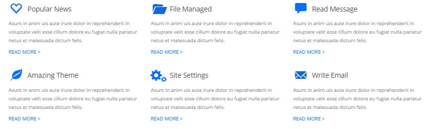
Codes are as follows:
<div class="clearfix pt-20 pb-30 animation">
  <div class="functionBox_2 row ">
    <div class="col-sm-4">
      <div class="functionMain animation_item scaleUp delay1">
        <h3><span class="functionIcon"><em class="glyphicons glyph-heart-empty"></em></span>Popular News</h3>
        <p>Asunt in anim uis aute irure dolor in reprehenderit in voluptate velit esse cillum dolore eu fugiat nulla pariatur  netus et malesuada dictum felis. </p>
        <p><a href="#" target="blank">Read More  ></a></p>
      </div>
    </div>
    <div class="col-sm-4">
      <div class="functionMain animation_item scaleUp delay2">
        <h3><span class="functionIcon"><em class="glyphicons glyph-folder-open"></em> </span>File Managed</h3>
        <p>Asunt in anim uis aute irure dolor in reprehenderit in voluptate velit esse cillum dolore eu fugiat nulla pariatur  netus et malesuada dictum felis. </p>
        <p><a href="#" target="blank">Read More  ></a></p>
      </div>
    </div>
    <div class="col-sm-4">
      <div class="functionMain animation_item scaleUp delay3">
        <h3><span class="functionIcon"><em class="glyphicons glyph-comments"></em></span>Read Message</h3>
        <p>Asunt in anim uis aute irure dolor in reprehenderit in voluptate velit esse cillum dolore eu fugiat nulla pariatur  netus et malesuada dictum felis. </p>
        <p><a href="#" target="blank">Read More  ></a></p>
      </div>
    </div>
  </div>
  <div class="functionBox_2 row">
    <div class="col-sm-4">
      <div class="functionMain animation_item scaleUp delay4">
        <h3><span class="functionIcon"><em class="glyphicons glyph-leaf"></em></span>Amazing Theme</h3>
        <p>Asunt in anim uis aute irure dolor in reprehenderit in voluptate velit esse cillum dolore eu fugiat nulla pariatur  netus et malesuada dictum felis. </p>
        <p><a href="#" target="blank">Read More  ></a></p>
      </div>
    </div>
    <div class="col-sm-4">
      <div class="functionMain animation_item scaleUp delay5">
        <h3><span class="functionIcon"><em class="glyphicons glyph-cogwheels"></em> </span>Site Settings</h3>
        <p>Asunt in anim uis aute irure dolor in reprehenderit in voluptate velit esse cillum dolore eu fugiat nulla pariatur  netus et malesuada dictum felis. </p>
        <p><a href="#" target="blank">Read More  ></a></p>
      </div>
    </div>
    <div class="col-sm-4">
      <div class="functionMain animation_item scaleUp delay6">
        <h3><span class="functionIcon animation_item scaleUp delay6"><em class="glyphicons glyph-envelope"></em></span>Write Email</h3>
        <p>Asunt in anim uis aute irure dolor in reprehenderit in voluptate velit esse cillum dolore eu fugiat nulla pariatur  netus et malesuada dictum felis. </p>
        <p><a href="#" target="blank">Read More  ></a></p>
      </div>
    </div>
  </div>
</div>
Option:
col-md-*is the width of each column, you can change the width you need through value1~12.- You can modify
animationto change the animation on the slide. Animation list. - You can modify
glyphicons glyph-*to change icons. font icon list.
Latest Products area
Below is the screen shot:
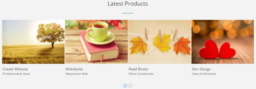
Codes are as follows:
<div data-autoplay="false" data-navigation="false" data-autoheight="false" class="carousel carousel_5 animation zoomIn">
  <div class="item">
    <div class="photo_box  ico_zoom"> <a href="/Portals/12/Photo2.jpg" class="LightBox_image_gallery3">
      <div class="pic_box"> <img alt="" src="/portals/12/Photo2.jpg" />
        <div class="ico"> <span class="glyphicons glyph-search "></span> </div>
        <div class="shade"></div>
      </div>
      </a>
      <div class="text_sytle_6">
        <h3>Create Website</h3>
        <p> Professional & Hard </p>
      </div>
    </div>
  </div>
  <div class="item">
    <div class="photo_box  ico_zoom"> <a href="/Portals/12/Photo3.jpg" class="LightBox_image_gallery3">
      <div class="pic_box"> <img alt="" src="/portals/12/Photo3.jpg" />
        <div class="ico"> <span class="glyphicons glyph-search "></span> </div>
        <div class="shade"></div>
      </div>
      </a>
      <div class="text_sytle_6">
        <h3>Mobilesite</h3>
        <p> Responsive Web </p>
      </div>
    </div>
  </div>
  <div class="item">
    <div class="photo_box  ico_zoom"> <a href="/Portals/12/Photo4.jpg" class="LightBox_image_gallery3">
      <div class="pic_box"> <img alt="" src="/portals/12/Photo4.jpg" />
        <div class="ico"> <span class="glyphicons glyph-search "></span> </div>
        <div class="shade"></div>
      </div>
      </a>
      <div class="text_sytle_6">
        <h3>Read Books </h3>
        <p> More Concentrate </p>
      </div>
    </div>
  </div>
  <div class="item">
    <div class="photo_box  ico_zoom"> <a href="/Portals/12/Photo5.jpg" class="LightBox_image_gallery3">
      <div class="pic_box"> <img alt="" src="/portals/12/Photo5.jpg" />
        <div class="ico"> <span class="glyphicons glyph-search "></span> </div>
        <div class="shade"></div>
      </div>
      </a>
      <div class="text_sytle_6">
        <h3>Skin Design </h3>
        <p>Clean & Attractive </p>
      </div>
    </div>
  </div>
  <div class="item">
    <div class="photo_box  ico_zoom"> <a href="/Portals/12/Photo6.jpg" class="LightBox_image_gallery3">
      <div class="pic_box"> <img alt="" src="/portals/12/Photo6.jpg" />
        <div class="ico"> <span class="glyphicons glyph-search "></span> </div>
        <div class="shade"></div>
      </div>
      </a>
      <div class="text_sytle_6">
        <h3>carousel_title</h3>
        <p> Content text  ... </p>
      </div>
    </div>
  </div>
</div>
Responsive Videos area
Below is the screen shot:
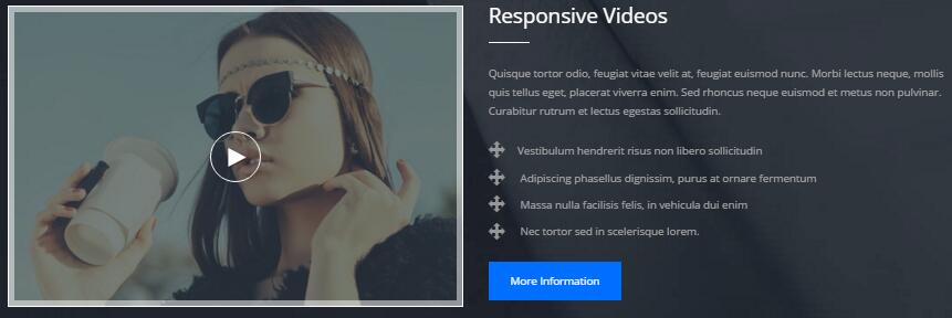
Codes are as follows:
<div class=" pt-60 pb-60 backgroundImage12 ">
  <div class="dnn_layoutB">
    <div class="content_mid clearfix">
      <div class="row">
        <div class="col-sm-6 h2_image animation fadeInLeft">
          <div class="photo_box default_show "> <a href="http://www.youtube.com/watch?v=0O2aH4XLbto" class="LightBox_youtube">
            <div class="pic_box"> <img alt="" src="/portals/12/h2_image.jpg" />
              <div class="ico ico_no_bg"> <span class="glyphicons glyph-play"></span> </div>
              <div class="shade"></div>
            </div>
            </a> </div>
        </div>
        <div class="col-sm-6 h2_tit_con animation fadeInRight">
          <div class="h2_tit02_left">
            <h2> Responsive Videos</h2>
          </div>
          <p> Quisque tortor odio, feugiat vitae velit at, feugiat euismod nunc. Morbi lectus neque, mollis quis tellus eget, placerat viverra enim. Sed rhoncus neque euismod et metus non pulvinar. Curabitur rutrum et lectus egestas sollicitudin.</p>
          <ul>
            <li> <span class="glyphicons glyph-move"></span><a href="#">Vestibulum hendrerit risus non libero sollicitudin</a></li>
            <li><span class="glyphicons glyph-move"></span> <a href="#">Adipiscing phasellus dignissim, purus at ornare fermentum</a></li>
            <li><span class="glyphicons glyph-move"></span><a href="#"> Massa nulla facilisis felis, in vehicula dui enim </a></li>
            <li><span class="glyphicons glyph-move"></span><a href="#"> Nec tortor sed in scelerisque lorem.</a></li>
          </ul>
          <a href="#" class="h2_bnt" target="blank">More Information</a> </div>
      </div>
    </div>
  </div>
</div>
Our Teams area
Below is the screen shot:
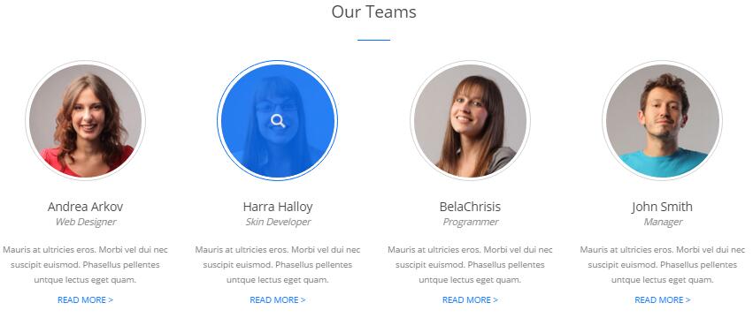
Codes are as follows:
<div class="pt-55 pb-40">
  <div class="h2_tit_cener pb-30">
    <h2>Our Teams</h2>
  </div>
  <div class="our_team_list row animation">
    <div class="col-md-3 col-sm-6 animation_item scaleUp delay1">
      <div class="functionIcon"><a href="#"><img alt="" src="/portals/12/Teams_01.jpg" /></a></div>
      <div class="functiontitle">Andrea Arkov<span>Web Designer</span></div>
      <div class="functionMain">
        <p>Content text ...</p>
        <a href="#" target="blank">Read More ></a> </div>
    </div>
    <div class="col-md-3 col-sm-6 animation_item scaleUp delay2">
      <div class="functionIcon"><a href="#"><img alt="" src="/portals/12/Teams_02.jpg" /></a></div>
      <div class="functiontitle">Harra Halloy<span>Skin Developer</span></div>
      <div class="functionMain">
        <p>Content text ...</p>
        <a href="#" target="blank">Read More ></a> </div>
    </div>
    <div class="col-md-3 col-sm-6 animation_item scaleUp delay3">
      <div class="functionIcon"><a href="#"><img alt="" src="/portals/12/Teams_03.jpg" /></a></div>
      <div class="functiontitle">BelaChrisis<span>Programmer</span></div>
      <div class="functionMain">
        <p>Content text ...</p>
        <a href="#" target="blank">Read More ></a> </div>
    </div>
    <div class="col-md-3 col-sm-6 animation_item scaleUp delay4">
      <div class="functionIcon"><a href="#"><img alt="" src="/portals/12/Teams_04.jpg" /></a></div>
      <div class="functiontitle">John Smith<span>Manager</span></div>
      <div class="functionMain">
        <p>Content text ...</p>
        <a href="#" target="blank">Read More ></a> </div>
    </div>
  </div>
</div>
Option:
col-md-*is the width of each column, you can change the width you need through value1~12.- You can modify
animationto change the animation on the slide. Animation list. - You can modify
glyphicons glyph-*to change icons. font icon list.
Our Skills area
Below is the screen shot:
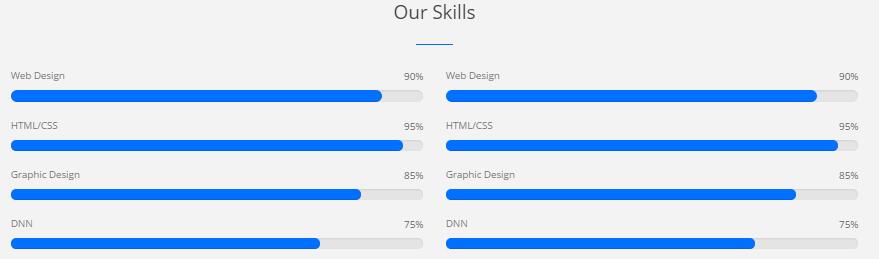
Codes are as follows:
<div class="content_mid clearfix">
  <div class="h2_tit_cener pb-30">
    <h2>Our Skills</h2>
  </div>
  <div class=" row">
    <div class="col-sm-6 animation fadeInLeft">
      <div class="loaded_list4">
        <p> Web Design </p>
        <div class="progress progress-striped active">
          <div class="progress-bar animation animationwidth" data-width="90%"><span></span></div>
        </div>
        <p> HTML/CSS</p>
        <div class="progress progress-striped active">
          <div class="progress-bar animation animationwidth" data-width="95%"><span></span></div>
        </div>
        <p>Graphic Design </p>
        <div class="progress progress-striped active">
          <div class="progress-bar animation animationwidth" data-width="85%"><span></span> </div>
        </div>
        <p>DNN</p>
        <div class="progress progress-striped active">
          <div class="progress-bar animation animationwidth" data-width="75%"><span></span></div>
        </div>
      </div>
    </div>
    <div class="col-sm-6 animation fadeInRight">
      <div class="loaded_list4">
        <p> Web Design </p>
        <div class="progress progress-striped active">
          <div class="progress-bar animation animationwidth" data-width="90%"><span></span></div>
        </div>
        <p> HTML/CSS</p>
        <div class="progress progress-striped active">
          <div class="progress-bar animation animationwidth" data-width="95%"><span></span></div>
        </div>
        <p>Graphic Design </p>
        <div class="progress progress-striped active">
          <div class="progress-bar animation animationwidth" data-width="85%"><span></span> </div>
        </div>
        <p>DNN</p>
        <div class="progress progress-striped active">
          <div class="progress-bar animation animationwidth" data-width="75%"><span></span></div>
        </div>
      </div>
    </div>
  </div>
</div>
Circle area
Below is the screen shot:
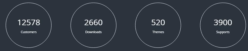
Codes are as follows:
<div class="h2_bg pt-60 pb-60">
  <div class="dnn_layoutB animation">
    <div class="content_mid clearfix">
      <div class="pane_layout">
        <div class="row number_Animation2 ">
          <div class="col-md-3 col-sm-6 animation_item scaleUp delay1">
            <div class="number_box"> <span class="animation number" data-number="12578">0</span> <span class="number_name">Customers</span> </div>
          </div>
          <div class="col-md-3 col-sm-6 animation_item scaleUp delay2">
            <div class="number_box"> <span class="animation number" data-number="2660">0</span> <span class="number_name">Downloads</span> </div>
          </div>
          <div class="col-md-3 col-sm-6 animation_item scaleUp delay3">
            <div class="number_box"> <span class="animation number" data-number="520">0</span> <span class="number_name">Themes</span> </div>
          </div>
          <div class="col-md-3 col-sm-6 animation_item scaleUp delay4">
            <div class="number_box"> <span class="animation number" data-number="3900">0</span> <span class="number_name">Supports</span> </div>
          </div>
        </div>
      </div>
    </div>
  </div>
</div>
Featured Skin area
Below is the screen shot:
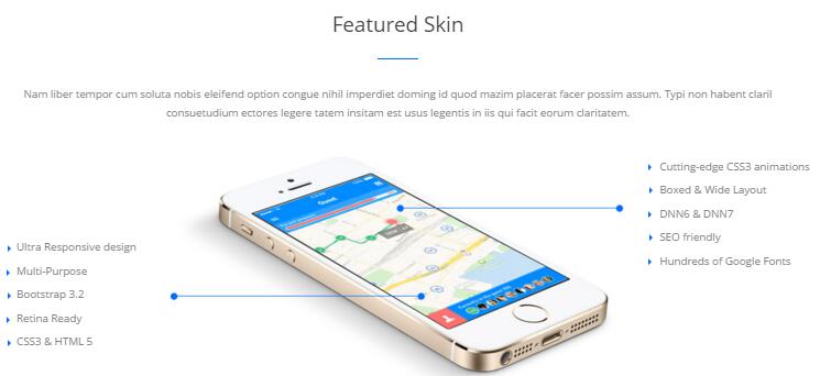
Codes are as follows:
<div class="Center">Nam liber tempor cum soluta nobis eleifend option congue nihil imperdiet doming id quod mazim placerat facer possim assum. Typi non habent claril</div>
<div class="Center pb-40"> consuetudium ectores legere tatem insitam est usus legentis in iis qui facit eorum claritatem.</div>
<div class=" row animation">
  <div class="col-sm-3 animation_item scaleUp delay2">
    <ul class="h2_list List_left">
      <li>Ultra Responsive design</li>
      <li>Multi-Purpose</li>
      <li>Bootstrap 3.2</li>
      <li>Retina Ready</li>
      <li>CSS3 & HTML 5</li>
    </ul>
  </div>
  <div class="col-sm-6 h2_img02 animation_item scaleUp delay1"> <img alt="" src="/portals/12/h2_image02.jpg" /></div>
  <div class="col-sm-3 animation_item scaleUp delay3">
    <ul class="h2_list List_right">
      <li> Cutting-edge CSS3 animations</li>
      <li>Boxed & Wide Layout</li>
      <li>DNN6 & DNN7</li>
      <li>SEO friendly</li>
      <li>Hundreds of Google Fonts</li>
    </ul>
  </div>
</div>
Option:
- You can modify
animationto change the animation on the slide. Animation list.
About Dnngo area
Below is the screen shot:

Codes are as follows:
<div class="h2_footer_left animation fadeInLeft"> <img alt="" src="/portals/12/h2_image03.png" />
  <p> Duis autem vel eum iriure dolor in hendrerit in vulputate velit esse molestie consequat, vel illum dolore eu feugiat nulla facilisis at vero eros et accumsan et iusto odio dignissim qui blandit praesent luptatum zzril delenit augue duis dolore te feugait nulla facilisi.</p>
  <a href="#" target="blank">Read More<span>arrow</span></a> </div>
Option:
Containeris usingContainer-2
Recent News area
Below is the screen shot:
Codes are as follows:
<div class="h2_footer_center animation fadeInDown">
  <div class="h2_footer_con clearfix"> <img alt="" src="/portals/12/h2_image04_01.jpg" />
    <p>Nam liber tempor cum soluta nobiselei fend option congue nihil.</p>
    <span>March 24th, 2015</span> </div>
  <div class="h2_footer_con clearfix"> <img alt="" src="/portals/12/h2_image04.jpg" />
    <p>Nam liber tempor cum soluta nobiselei fend option congue nihil.</p>
    <span>March 24th, 2015</span> </div>
</div>
Option:
Containeris usingContainer-2
Follow Us area
Below is the screen shot:
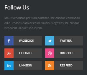
Codes are as follows:
<div class="h1_footer_right clearfix animation fadeInRight">
  <p>Content text ...</p>
  <ul>
    <li><img alt="" src="/portals/12/h2_footer.jpg" /><a href="#">Facebook</a></li>
    <li><img alt="" src="/portals/12/h2_footer-02.jpg" /><a href="#">Twitter</a></li>
    <li><img alt="" src="/portals/12/h2_footer-03.jpg" /><a href="#">Google+</a></li>
    <li><img alt="" src="/portals/12/h2_footer-04.jpg" /><a href="#">dribbble</a></li>
    <li><img alt="" src="/portals/12/h2_footer-05.jpg" /><a href="#">linkedin</a></li>
    <li><img alt="" src="/portals/12/h2_footer-06.jpg" /><a href="#">Rss Feed</a></li>
  </ul>
</div>
Option:
Containeris usingContainer-2
Home Version 3
You can click the link to check Home Version 3 demo. Home Version 3
Banner area
Below is the screen shot:

It is using Effect_11_TransBanner of DNNGalleryPro module.
List area
Below is the screen shot:
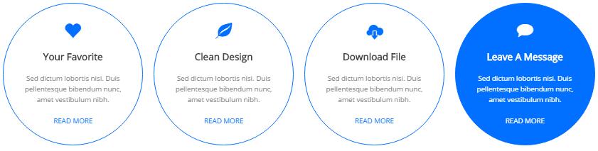
Codes are as follows:
<ul class="functionBox_3 pt-60 pb-55 animation">
  <li>
    <div class="functionMain animation_item scaleUp delay1">
      <div class="functionIcon"><span class="glyphicons glyph-heart"></span></div>
      <h3>Your Favorite</h3>
      <p>Sed dictum lobortis nisi. Duis pellentesque bibendum nunc,  amet vestibulum nibh. </p>
      <p><a href="#" target="blank">READ MORE</a></p>
    </div>
  </li>
  <li>
    <div class="functionMain animation_item scaleUp delay2">
      <div class="functionIcon"><span class="glyphicons glyph-leaf"></span></div>
      <h3>Clean Design</h3>
      <p>Sed dictum lobortis nisi. Duis pellentesque bibendum nunc,  amet vestibulum nibh. </p>
      <p><a href="#" target="blank">READ MORE</a></p>
    </div>
  </li>
  <li>
    <div class="functionMain animation_item scaleUp delay3">
      <div class="functionIcon"><span class="glyphicons glyph-cloud-upload"></span></div>
      <h3>Download File</h3>
      <p>Sed dictum lobortis nisi. Duis pellentesque bibendum nunc,  amet vestibulum nibh.</p>
      <p><a href="#" target="blank">READ MORE</a></p>
    </div>
  </li>
  <li>
    <div class="functionMain animation_item scaleUp delay4">
      <div class="functionIcon"><span class="glyphicons glyph-chat"></span></div>
      <h3>Leave A Message</h3>
      <p>Sed dictum lobortis nisi. Duis pellentesque bibendum nunc,  amet vestibulum nibh.</p>
      <p><a href="#" target="blank">READ MORE</a></p>
    </div>
  </li>
</ul>
Option:
col-md-*is the width of each column, you can change the width you need through value1~12.- You can modify
animationto change the animation on the slide. Animation list. - You can modify
glyphicons glyph-*to change icons. font icon list.
Latest Projects area
Below is the screen shot:
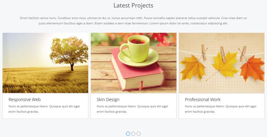
Codes are as follows:
<div class="backgroundImage9 pt-55 pb-55">
  <div class="dnn_layoutB">
    <div class="content_mid clearfix">
      <div class="h1_back">
        <h3>Latest Projects</h3>
      </div>
      <div class="pt-30">Droin facilisis varius nunc. Curabitur eros risus, ultrices et dui ut, luctus accumsan nibh. Fusce convallis sapien placerat tellus suscipit vehicula. Cras vitae diam ut </div>
      <div class="pb-30">justo elementum faucibus eget a diam. Etiam sodales a sem vitae fermentum. Lorem ipsum dolor sit amet, consectetur adipiscing elit.</div>
      <div class="carousel carousel_3 animation zoomIn" data-items="3" data-autoplay="false" data-navigation="false" data-autoheight="false">
        <div class="item">
          <div class="photo_box  ico_zoom"> <a class="LightBox_image_gallery3" href="/Portals/25/Photo2.jpg">
            <div class="pic_box"> <img alt="" src="/portals/25/Photo2.jpg" />
              <div class="ico"> <span class="glyphicons glyph-search "></span> </div>
              <div class="shade"></div>
            </div>
            </a>
            <div class="text_sytle_6">
              <h3>Responsive Web</h3>
              <p> Nunc at pellentesque libero. Quisque quis elit eget enim facilisis gravida.</p>
            </div>
          </div>
        </div>
        <div class="item">
          <div class="photo_box  ico_zoom"> <a class="LightBox_image_gallery3" href="/Portals/25/Photo3.jpg">
            <div class="pic_box"> <img alt="" src="/portals/25/Photo3.jpg" />
              <div class="ico"> <span class="glyphicons glyph-search "></span> </div>
              <div class="shade"></div>
            </div>
            </a>
            <div class="text_sytle_6">
              <h3>Skin Design</h3>
              <p> Nunc at pellentesque libero. Quisque quis elit eget enim facilisis gravida.</p>
            </div>
          </div>
        </div>
        <div class="item">
          <div class="photo_box  ico_zoom"> <a class="LightBox_image_gallery3" href="/Portals/25/Photo4.jpg">
            <div class="pic_box"> <img alt="" src="/portals/25/Photo4.jpg" />
              <div class="ico"> <span class="glyphicons glyph-search "></span> </div>
              <div class="shade"></div>
            </div>
            </a>
            <div class="text_sytle_6">
              <h3>Professional Work</h3>
              <p> Nunc at pellentesque libero. Quisque quis elit eget enim facilisis gravida.</p>
            </div>
          </div>
        </div>
        <div class="item">
          <div class="photo_box  ico_zoom"> <a class="LightBox_image_gallery3" href="/Portals/25/Photo5.jpg">
            <div class="pic_box"> <img alt="" src="/portals/25/Photo5.jpg" />
              <div class="ico"> <span class="glyphicons glyph-search "></span> </div>
              <div class="shade"></div>
            </div>
            </a>
            <div class="text_sytle_6">
              <h3>Create Website</h3>
              <p> Nunc at pellentesque libero. Quisque quis elit eget enim facilisis gravida.</p>
            </div>
          </div>
        </div>
        <div class="item">
          <div class="photo_box  ico_zoom"> <a class="LightBox_image_gallery3" href="/Portals/25/Photo6.jpg">
            <div class="pic_box"> <img alt="" src="/portals/25/Photo6.jpg" />
              <div class="ico"> <span class="glyphicons glyph-search "></span> </div>
              <div class="shade"></div>
            </div>
            </a>
            <div class="text_sytle_6">
              <h3>Unlimited Colors</h3>
              <p> Nunc at pellentesque libero. Quisque quis elit eget enim facilisis gravida.</p>
            </div>
          </div>
        </div>
        <div class="item">
          <div class="photo_box  ico_zoom"> <a class="LightBox_image_gallery3" href="/Portals/25/Photo7.jpg">
            <div class="pic_box"> <img alt="" src="/portals/25/Photo7.jpg" />
              <div class="ico"> <span class="glyphicons glyph-search "></span> </div>
              <div class="shade"></div>
            </div>
            </a>
            <div class="text_sytle_6">
              <h3>Skin Design</h3>
              <p> Nunc at pellentesque libero. Quisque quis elit eget enim facilisis gravida.</p>
            </div>
          </div>
        </div>
        <div class="item">
          <div class="photo_box  ico_zoom"> <a class="LightBox_image_gallery3" href="/Portals/25/Photo2.jpg">
            <div class="pic_box"> <img alt="" src="/portals/25/Photo2.jpg" />
              <div class="ico"> <span class="glyphicons glyph-search "></span> </div>
              <div class="shade"></div>
            </div>
            </a>
            <div class="text_sytle_6">
              <h3>Responsive Web</h3>
              <p> Nunc at pellentesque libero. Quisque quis elit eget enim facilisis gravida.</p>
            </div>
          </div>
        </div>
        <div class="item">
          <div class="photo_box  ico_zoom"> <a class="LightBox_image_gallery3" href="/Portals/25/Photo3.jpg">
            <div class="pic_box"> <img alt="" src="/portals/25/Photo3.jpg" />
              <div class="ico"> <span class="glyphicons glyph-search "></span> </div>
              <div class="shade"></div>
            </div>
            </a>
            <div class="text_sytle_6">
              <h3>Professional Work</h3>
              <p> Nunc at pellentesque libero. Quisque quis elit eget enim facilisis gravida.</p>
            </div>
          </div>
        </div>
      </div>
    </div>
  </div>
</div>
Pricing area
Below is the screen shot:
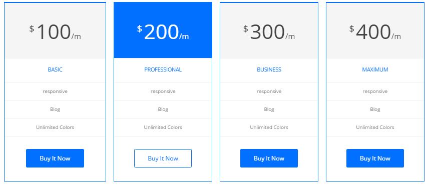
Codes are as follows:
<div class="pt-55 pb-40">
  <div class="h1_back">
    <h3>Pricing</h3>
  </div>
  <div class="pt-30 Center">Droin facilisis varius nunc. Curabitur eros risus, ultrices et dui ut, luctus accumsan nibh. Fusce convallis sapien placerat tellus suscipit vehicula. Cras vitae diam ut </div>
  <div class="Center">justo elementum faucibus eget a diam. Etiam sodales a sem vitae fermentum. Lorem ipsum dolor sit amet, consectetur adipiscing elit.</div>
  <div class="price-table price-table2 col4 animation">
    <div class="col animation_item scaleUp delay1">
      <div class="price_holder">
        <div class="price_box"><span class="sup">$</span><span class="price">100</span><span class="m_style">/m</span></div>
        <ul>
          <li>
            <h2>BASIC</h2>
          </li>
          <li>responsive</li>
          <li>Blog</li>
          <li>Unlimited Colors</li>
        </ul>
        <a class="btn " href="#" target="blank">Buy It Now</a> </div>
    </div>
    <div class="col best_value animation_item scaleUp delay2">
      <div class="price_holder">
        <div class="price_box"><span class="sup">$</span><span class="price">200</span><span class="m_style">/m</span></div>
        <ul>
          <li>
            <h2>PROFESSIONAL</h2>
          </li>
          <li>responsive</li>
          <li>Blog</li>
          <li>Unlimited Colors</li>
        </ul>
        <a class="btn" href="#" target="blank">Buy It Now</a> </div>
    </div>
    <div class="col animation_item scaleUp delay3">
      <div class="price_holder">
        <div class="price_box"><span class="sup">$</span><span class="price">300</span><span class="m_style">/m</span></div>
        <ul>
          <li>
            <h2>BUSINESS</h2>
          </li>
          <li>responsive</li>
          <li>Blog</li>
          <li>Unlimited Colors</li>
        </ul>
        <a class="btn" href="#" target="blank">Buy It Now</a> </div>
    </div>
    <div class="col animation_item scaleUp delay4">
      <div class="price_holder">
        <div class="price_box"><span class="sup">$</span><span class="price">400</span><span class="m_style">/m</span></div>
        <ul>
          <li>
            <h2>MAXIMUM</h2>
          </li>
          <li>responsive</li>
          <li>Blog</li>
          <li>Unlimited Colors</li>
        </ul>
        <a class="btn " href="#" target="blank">Buy It Now</a> </div>
    </div>
  </div>
</div>
Testimonials area
Below is the screen shot:
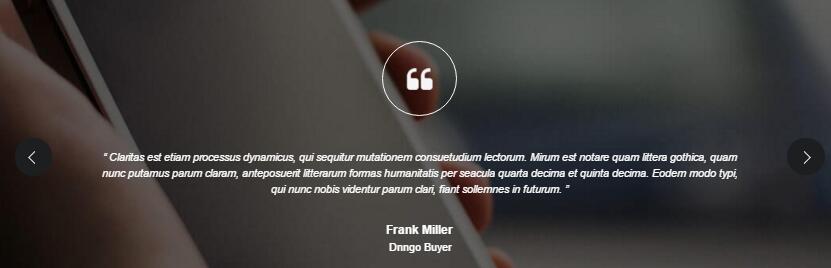
Codes are as follows:
<div class=" pt-60 pb-30 backgroundImage13">
  <div class="dnn_layoutB animation zoomIn">
    <div class="content_mid clearfix">
      <ul class=" Testimonials_tab Testimonials_7" data-position="roll-vertical" data-display-navigation="false" data-autoplay="0">
        <li>
          <h3 class="title a_t_c"></h3>
          <blockquote>
            <p>“ Claritas est etiam processus dynamicus, qui sequitur mutationem consuetudium lectorum. Mirum est notare quam littera gothica, quam nunc putamus parum claram, anteposuerit litterarum formas humanitatis per seacula quarta decima et quinta decima. Eodem modo typi, qui nunc nobis videntur parum clari, fiant sollemnes in futurum. ”</p>
            <small class="a_t_c">Frank Miller<span>Dnngo Buyer</span></small> </blockquote>
        </li>
        <li>
          <h3 class="title a_t_c"></h3>
          <blockquote>
            <p>“ Claritas est etiam processus dynamicus, qui sequitur mutationem consuetudium lectorum. Mirum est notare quam littera gothica, quam nunc putamus parum claram, anteposuerit litterarum formas humanitatis per seacula quarta decima et quinta decima. Eodem modo typi, qui nunc nobis videntur parum clari, fiant sollemnes in futurum. ”</p>
            <small class="a_t_c">Frank Miller<span>DNNgo Customer</span></small> </blockquote>
        </li>
      </ul>
    </div>
  </div>
</div>
Services list area
Below is the screen shot:
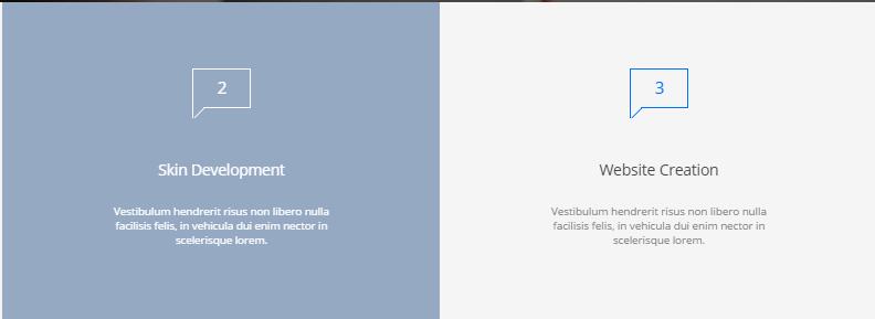
Codes are as follows:
<div class="clearfix animation ">
  <ul class="h3_last_box">
    <li class="h3_last_con animation_item scaleUp delay1">
      <div class="h3_tit_icon"><span></span>1</div>
      <h2> Web Design</h2>
      <p> Vestibulum hendrerit risus non libero  nulla facilisis felis, in vehicula dui enim nector in scelerisque lorem.</p>
    </li>
    <li class="h3_last_con animation_item scaleUp delay2">
      <div class="h3_tit_icon"><span></span>2</div>
      <h2> Skin Development</h2>
      <p> Vestibulum hendrerit risus non libero  nulla facilisis felis, in vehicula dui enim nector in scelerisque lorem.</p>
    </li>
    <li class="h3_last_con animation_item scaleUp delay3">
      <div class="h3_tit_icon"><span></span>3</div>
      <h2> Website Creation</h2>
      <p> Vestibulum hendrerit risus non libero  nulla facilisis felis, in vehicula dui enim nector in scelerisque lorem.</p>
    </li>
    <li class="h3_last_con animation_item scaleUp delay4">
      <div class="h3_tit_icon"><span></span>4</div>
      <h2> Program Test</h2>
      <p> Vestibulum hendrerit risus non libero  nulla facilisis felis, in vehicula dui enim nector in scelerisque lorem.</p>
    </li>
  </ul>
</div>
Contact Us area
Below is the screen shot:
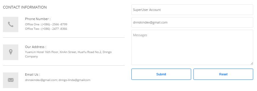
Codes are as follows:
<div class="h3_phone_box animation fadeInLeft">
  <h2> Contact Information</h2>
  <div class="h3_phone"> <span class="glyphicons glyph-earphone"></span>
    <div class="h3_phone_con">
      <h3>Phone Number :</h3>
      <p>Office One :  (+086) - 2566 -8799 </p>
      <p>Office Two :  (+086) - 2477 -8366 </p>
    </div>
  </div>
  <div class="h3_phone"> <span class="glyphicons glyph-google-maps"></span>
    <div class="h3_phone_con">
      <h3> Our Address :</h3>
      <p>YuanLin Hotel 16th Floor, XinAn Street, HuaYu Road No.2, Dnngo Company</p>
    </div>
  </div>
  <div class="h3_phone"> <span class="glyphicons glyph-envelope"></span>
    <div class="h3_phone_con">
      <h3> Email Us :</h3>
      <p>dnnskindev@gmail.com; dnngo-linda@gmailcom</p>
    </div>
  </div>
</div>
Option:
- This is
Theme_Responsive_20054_home3theme ofDNNGo PowerFormsmodule
About Us area
Below is the screen shot:

Codes are as follows:
<div class="h3_footera animation fadeInLeft"> <img alt="" class="img-responsive" src="/portals/12/h6_banner.png" />
  <p>Nam sapien eros enatis at dapibus facilis islacinia sagittis purus. Ut tuismod aliquet enim, nec semper mi posuere nec lor nam nunc est, faucibus iaculis varius vitae, eius modi tempora incidunt placerat quis felis labore et dolore magna. </p>
  <div class="H3_footer_Social"> <a href="#"><span class="social social-facebook"></span> </a> <a href="#"> <span class="social social-twitter"></span> </a> <a href="#"> <span class="social social-linked-in"></span> </a> <a href="#"> <span class="social social-picasa"></span> </a> </div>
</div>
Option:
Containeris usingContainer-2
Photo Gallery area
Below is the screen shot:
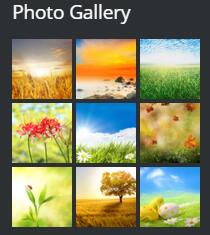
Codes are as follows:
<ul class="insets_list clearfix animation fadeInDown">
  <li>
    <div class="photo_box img_zoom"> <a href="/Portals/12/Photo_1_big.jpg" class="LightBox_image_gallery5">
      <div class="pic_box"> <img alt="" src="/portals/12/Photo_1.jpg" />
        <div class="shade"></div>
      </div>
      </a> </div>
  </li>
  <li>
    <div class="photo_box img_zoom"> <a href="/Portals/12/Photo_2_big.jpg" class="LightBox_image_gallery5">
      <div class="pic_box"> <img alt="" src="/portals/12/Photo_2.jpg" />
        <div class="shade"></div>
      </div>
      </a> </div>
  </li>
  <li>
    <div class="photo_box img_zoom"> <a href="/Portals/12/Photo_3_big.jpg" class="LightBox_image_gallery5">
      <div class="pic_box"> <img alt="" src="/portals/12/Photo_3.jpg" />
        <div class="shade"></div>
      </div>
      </a> </div>
  </li>
  <div class="row-fluid">
    <li>
      <div class="photo_box img_zoom"> <a href="/Portals/12/Photo_4_big.jpg" class="LightBox_image_gallery5">
        <div class="pic_box"> <img alt="" src="/portals/12/Photo_4.jpg" />
          <div class="shade"></div>
        </div>
        </a> </div>
    </li>
    <li>
      <div class="photo_box img_zoom"> <a href="/Portals/12/Photo_5_big.jpg" class="LightBox_image_gallery5">
        <div class="pic_box"> <img alt="" src="/portals/12/Photo_5.jpg" />
          <div class="shade"></div>
        </div>
        </a> </div>
    </li>
    <li>
      <div class="photo_box img_zoom"> <a href="/Portals/12/Photo_6_big.jpg" class="LightBox_image_gallery5">
        <div class="pic_box"> <img alt="" src="/portals/12/Photo_6.jpg" />
          <div class="shade"></div>
        </div>
        </a> </div>
    </li>
  </div>
  <div class="row-fluid">
    <li>
      <div class="photo_box img_zoom"> <a href="/Portals/12/Photo_7_big.jpg" class="LightBox_image_gallery5">
        <div class="pic_box"> <img alt="" src="/portals/12/Photo_7.jpg" />
          <div class="shade"></div>
        </div>
        </a> </div>
    </li>
    <li>
      <div class="photo_box img_zoom"> <a href="/Portals/12/Photo_8_big.jpg" class="LightBox_image_gallery5">
        <div class="pic_box"> <img alt="" src="/portals/12/Photo_8.jpg" />
          <div class="shade"></div>
        </div>
        </a> </div>
    </li>
    <li>
      <div class="photo_box img_zoom"> <a href="/Portals/12/Photo_9_big.jpg" class="LightBox_image_gallery5">
        <div class="pic_box"> <img alt="" src="/portals/12/Photo_9.jpg" />
          <div class="shade"></div>
        </div>
        </a> </div>
    </li>
  </div>
</ul>
Option:
Containeris usingContainer-2
Archives area
Below is the screen shot:
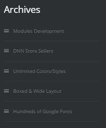
Codes are as follows:
<div class="h3_footerc animation fadeInUp">
  <ul>
    <li><span class="glyphicons glyph-show-lines"></span>Modules Development</li>
    <li><span class="glyphicons glyph-show-lines"></span>DNN Store Sellers</li>
    <li><span class="glyphicons glyph-show-lines"></span>Unlimited Colors/Styles</li>
    <li><span class="glyphicons glyph-show-lines"></span>Boxed & Wide Layout</li>
    <li><span class="glyphicons glyph-show-lines"></span>Hundreds of Google Fonts</li>
  </ul>
</div>
Option:
Containeris usingContainer-2
Twitter Feed area
Below is the screen shot:
Codes are as follows:
<div class="h3_footerd animation fadeInRight">
  <div class="h3_pos"> <span class="social social-twitter"> </span>
    <div class="h3_footerd_con">
      <p><a href="#">@DNNGOBUYER</a> Eodem modo typi, qui nunc nobis videntur parum.</p>
      20 mins ago </div>
  </div>
  <div class="h3_pos"> <span class="social social-twitter"> </span>
    <div class="h3_footerd_con">
      <p><a href="#">@DNNGOBUYER</a> Eodem modo typi, qui nunc nobis videntur parum.</p>
      20 mins ago </div>
  </div>
  <div class="h3_pos"> <span class="social social-twitter"> </span>
    <div class="h3_footerd_con">
      <p><a href="#">@DNNGOBUYER </a>Eodem modo typi, qui nunc nobis videntur parum.</p>
      20 mins ago </div>
  </div>
</div>
Option:
Containeris usingContainer-2
Home Version 4
You can click the link to check Home Version 4 demo. Home Version 4
Banner area
Below is the screen shot:
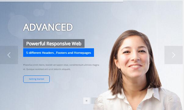
It is using DNNGo LayerGallery module here,you can import ContentListEntity-HomeVersion4.xml of the DNNGo_LayerGalleryPro folder to duplicate banner of the demo.
Banner Bottom area
Below is the screen shot:
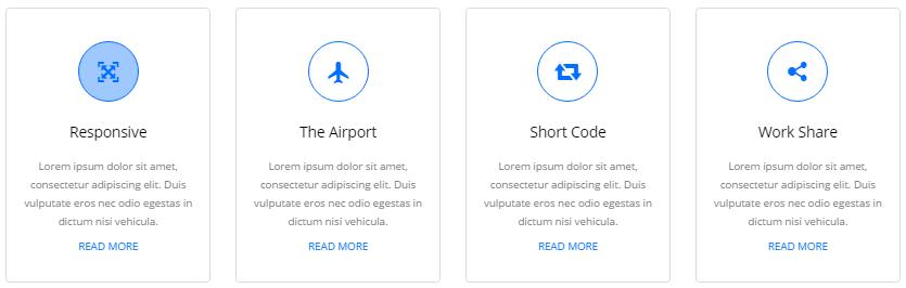
Codes are as follows:
<div class="functionBox_4 row pt-30 pb-55 animation">
  <div class="col-sm-3">
    <div class="functionMain animation_item scaleUp delay1">
      <div class="functionIcon"><span class="glyphicons glyph-fullscreen"></span> </div>
      <h3>Responsive</h3>
      <p>Lorem ipsum dolor sit amet, consectetur adipiscing elit. Duis vulputate
        eros nec odio egestas in dictum nisi vehicula. </p>
      <p><a href="#" target="blank">Read more</a></p>
    </div>
  </div>
  <div class="col-sm-3">
    <div class="functionMain animation_item scaleUp delay2">
      <div class="functionIcon"><span class="glyphicons glyph-airplane"></span></div>
      <h3>The Airport</h3>
      <p>Lorem ipsum dolor sit amet, consectetur adipiscing elit. Duis vulputate
        eros nec odio egestas in dictum nisi vehicula. </p>
      <p><a href="#" target="blank">Read more</a></p>
    </div>
  </div>
  <div class="col-sm-3">
    <div class="functionMain animation_item scaleUp delay3">
      <div class="functionIcon"><span class="glyphicons glyph-retweet-2"></span></div>
      <h3>Short Code</h3>
      <p>Lorem ipsum dolor sit amet, consectetur adipiscing elit. Duis vulputate
        eros nec odio egestas in dictum nisi vehicula. </p>
      <p><a href="#" target="blank">Read more</a></p>
    </div>
  </div>
  <div class="col-sm-3">
    <div class="functionMain animation_item scaleUp delay4">
      <div class="functionIcon"><span class="glyphicons glyph-share-alt"></span></div>
      <h3>Work Share</h3>
      <p>Lorem ipsum dolor sit amet, consectetur adipiscing elit. Duis vulputate
        eros nec odio egestas in dictum nisi vehicula. </p>
      <p><a href="#" target="blank">Read more</a></p>
    </div>
  </div>
</div>
Option:
col-md-*is the width of each column, you can change the width you need through value1~12.- You can modify
animationto change the animation on the slide. Animation list. - You can modify
glyphicons glyph-*to change icons. font icon list.
More Information area
Below is the screen shot:
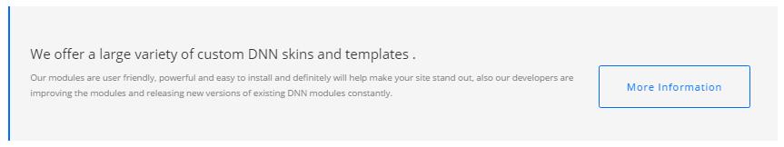
Codes are as follows:
<div class="boxes_style_8 pb-60 ">
  <div class="boxes animation zoomIn">
    <h3 class="Boxes_title">We offer a large variety of custom DNN skins and templates .</h3>
    <p>Our modules are user friendly, powerful and easy to install and definitely will help make your site stand out, also our developers are improving the modules and releasing new versions of existing DNN modules constantly.</p>
    <div class="but"><a class="Button_default" title="More Information" href="#" target="blank">More Information</a> </div>
  </div>
</div>
Option:
- You can modify
animationto change the animation on the slide. Animation list.
Latest Projects area
Below is the screen shot:
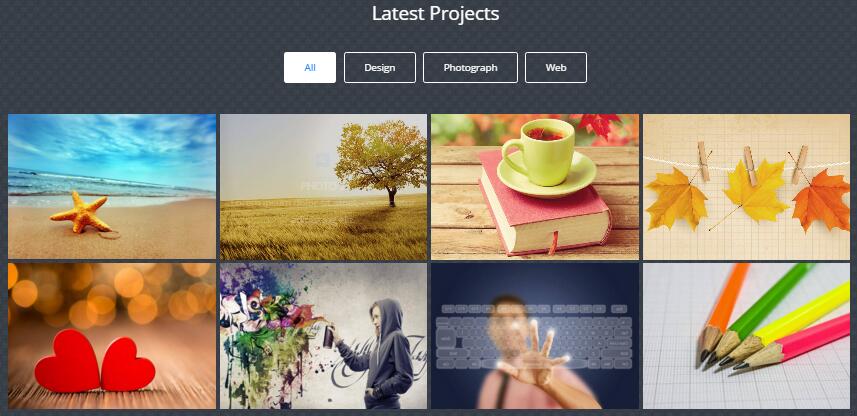
Codes are as follows:
<div class=" pt-55 pb-55 backgroundImage14">
  <div class="dnn_layoutB">
    <div class="content_mid">
      <div class="h1_back pb-30">
        <h3 style="color: #ffffff;">Latest Projects</h3>
      </div>
      <div class="isotope_grid isotope_3">
        <div class="isotope_group pb-30">
          <div class="isotope_3_center"><a data-filter="*" href="#" class="active">All</a> <a data-filter=".design" href="#">Design</a> <a data-filter=".photograph" href="#">Photograph</a> <a data-filter=".web" href="#">Web</a> </div>
        </div>
        <div data-min-width="270" class="isotope_main animation zoomIn">
          <div class="isotope_item design web">
            <div class="photo_box img_zoom ico_zoom"> <a class="LightBox_image_gallery1" href="/Portals/12/Photo1.jpg">
              <div class="pic_box"><img alt="" src="/portals/12/Photo1.jpg" />
                <div class="content">
                  <div class="vertical_center_1">
                    <div class="vertical_center_2">
                      <div class="ico"> <span class="glyphicons glyph-search"></span> </div>
                      <h2>Photo 1</h2>
                      <p>Lorem ipsum dolor sit amet, consectetur adipiscing elit.</p>
                    </div>
                  </div>
                </div>
                <div class="shade"></div>
              </div>
              </a> </div>
          </div>
          <div class="isotope_item design photograph">
            <div class="photo_box img_zoom ico_zoom"> <a class="LightBox_image_gallery1" href="/Portals/12/Photo2.jpg">
              <div class="pic_box"><img alt="" src="/portals/12/Photo2.jpg" />
                <div class="content">
                  <div class="vertical_center_1">
                    <div class="vertical_center_2">
                      <div class="ico"> <span class="glyphicons glyph-search"></span> </div>
                      <h2>Photo 2</h2>
                      <p>Lorem ipsum dolor sit amet, consectetur adipiscing elit.</p>
                    </div>
                  </div>
                </div>
                <div class="shade"></div>
              </div>
              </a> </div>
          </div>
          <div class="isotope_item photograph web">
            <div class="photo_box img_zoom ico_zoom"> <a class="LightBox_image_gallery1" href="/Portals/12/Photo3.jpg">
              <div class="pic_box"><img alt="" src="/portals/12/Photo3.jpg" />

                <div class="content">
                  <div class="vertical_center_1">
                    <div class="vertical_center_2">
                      <div class="ico"> <span class="glyphicons glyph-search"></span> </div>
                      <h2>Photo 3</h2>
                      <p>Lorem ipsum dolor sit amet, consectetur adipiscing elit.</p>
                    </div>
                  </div>
                </div>
                <div class="shade"></div>
              </div>
              </a> </div>
          </div>
          <div class="isotope_item design web">
            <div class="photo_box img_zoom ico_zoom"> <a class="LightBox_image_gallery1" href="/Portals/12/Photo4.jpg">
              <div class="pic_box"><img alt="" src="/portals/12/Photo4.jpg" />

                <div class="content">
                  <div class="vertical_center_1">
                    <div class="vertical_center_2">
                      <div class="ico"> <span class="glyphicons glyph-search"></span> </div>
                      <h2>Photo 4</h2>
                      <p>Lorem ipsum dolor sit amet, consectetur adipiscing elit.</p>
                    </div>
                  </div>
                </div>
                <div class="shade"></div>
              </div>
              </a> </div>
          </div>
          <div class="isotope_item photograph">
            <div class="photo_box img_zoom ico_zoom"> <a class="LightBox_image_gallery1" href="/Portals/12/Photo5.jpg">
              <div class="pic_box"><img alt="" src="/portals/12/Photo5.jpg" />
                <div class="content">
                  <div class="vertical_center_1">
                    <div class="vertical_center_2">
                      <div class="ico"> <span class="glyphicons glyph-search"></span> </div>
                      <h2>Photo 5</h2>
                      <p>Lorem ipsum dolor sit amet, consectetur adipiscing elit.</p>
                    </div>
                  </div>
                </div>
                <div class="shade"></div>
              </div>
              </a> </div>
          </div>
          <div class="isotope_item web">
            <div class="photo_box img_zoom ico_zoom"> <a class="LightBox_image_gallery1" href="/Portals/12/Photo7.jpg">
              <div class="pic_box"><img alt="" src="/portals/12/Photo7.jpg" />
                <div class="content">
                  <div class="vertical_center_1">
                    <div class="vertical_center_2">
                      <div class="ico"> <span class="glyphicons glyph-search"></span> </div>
                      <h2>Photo 6</h2>
                      <p>Lorem ipsum dolor sit amet, consectetur adipiscing elit.</p>
                    </div>
                  </div>
                </div>
                <div class="shade"></div>
              </div>
              </a> </div>
          </div>
          <div class="isotope_item design">
            <div class="photo_box img_zoom ico_zoom"> <a class="LightBox_image_gallery1" href="/Portals/12/Photo6.jpg">
              <div class="pic_box"><img alt="" src="/portals/12/Photo6.jpg" />
                <div class="content">
                  <div class="vertical_center_1">
                    <div class="vertical_center_2">
                      <div class="ico"> <span class="glyphicons glyph-search"></span> </div>
                      <h2>Photo 7</h2>
                      <p>Lorem ipsum dolor sit amet, consectetur adipiscing elit.</p>
                    </div>
                  </div>
                </div>
                <div class="shade"></div>
              </div>
              </a> </div>
          </div>
          <div class="isotope_item photograph">
            <div class="photo_box img_zoom ico_zoom"> <a class="LightBox_image_gallery1" href="/Portals/12/Photo8.jpg">
              <div class="pic_box"><img alt="" src="/portals/12/Photo8.jpg" />
                <div class="content">
                  <div class="vertical_center_1">
                    <div class="vertical_center_2">
                      <div class="ico"> <span class="glyphicons glyph-search"></span> </div>
                      <h2>Photo 8</h2>
                      <p>Lorem ipsum dolor sit amet, consectetur adipiscing elit.</p>
                    </div>
                  </div>
                </div>
                <div class="shade"></div>
              </div>
              </a> </div>
          </div>
        </div>
      </div>
    </div>
  </div>
</div>
Option:
- You can add
<a data-filter=".FilterName" href="#">Filter Name</a>to increase categories.data-filter=".FilterName"can not be blank space. - You can modify
data-min-widthto change minimum width of image. - You can modify
isotope_itemFilterNameto categorize images. - You can modify
animationto change the animation on the slide. Animation list. - You can modify
glyphicons glyph-*to change icons. font icon list.
Our Services area
Below is the screen shot:
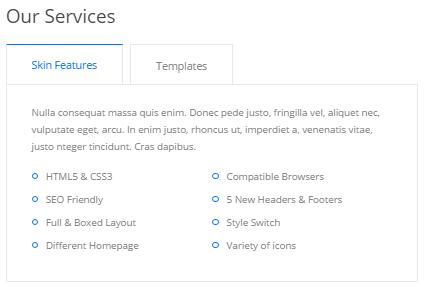
Codes are as follows:
<div class="horizontalTab_Top horizontalTab_Top2 h4_horizontalTab animation fadeInLeft">
  <ul class="resp-tabs-list">
    <li><span>Skin Features</span></li>
    <li><span>Templates</span></li>
  </ul>
  <div class="resp-tabs-container">
    <div class="resp_container">
      <div class="resp_margin">
        <p>Nulla consequat massa quis enim. Donec pede justo, fringilla vel, aliquet nec, vulputate eget, arcu. In enim justo, rhoncus ut, imperdiet a, venenatis vitae, justo nteger tincidunt. Cras dapibus. </p>
        <ul class="Services_list2">
          <li class="animation periodic1"><span class="ico"></span>HTML5 & CSS3</li>
          <li class="animation periodic1"><span class="ico"></span>Compatible Browsers</li>
          <li class="animation periodic2"><span class="ico"></span>SEO Friendly</li>
          <li class="animation periodic2"><span class="ico"></span>5 New Headers & Footers </li>
          <li class="animation periodic3"><span class="ico"></span>Full & Boxed Layout</li>
          <li class="animation periodic3"><span class="ico"></span>Style Switch</li>
          <li class="animation periodic4"><span class="ico"></span>Different Homepage</li>
          <li class="animation periodic4"><span class="ico"></span>Variety of icons </li>
        </ul>
      </div>
    </div>
  </div>
</div>
Option:
Containeris usingContainer-3
Our Skills area
Below is the screen shot:
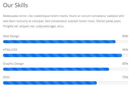
Codes are as follows:
<div class="animation fadeInRight">
  <p> Malesuada tortor, nec scelerisque lorem mattis. Nunc et rutrum consetetur sadipsci elitr sed diam nonumy at volutpat. Sed consectetur suscipit lorem nunc. Donec pede justo, fringilla vel, aliquet nec, vulputate eget, arcu. </p>
  <div class="our_team2">
    <div class="progress_font"> Web Design </div>
    <div class="progress progress-striped active">
      <div data-width=" 90%" class="progress-bar animation animationwidth"><span></span></div>
    </div>
    <div class="progress_font"> HTML/CSS</div>
    <div class="progress progress-striped active">
      <div data-width=" 95%" class="progress-bar animation animationwidth"><span></span></div>
    </div>
    <div class="progress_font"> Graphic Design</div>
    <div class="progress progress-striped active">
      <div data-width=" 85%" class="progress-bar animation animationwidth"><span></span></div>
    </div>
    <div class="progress_font"> DNN</div>
    <div class="progress progress-striped active">
      <div data-width=" 75%" class="progress-bar animation animationwidth"><span></span></div>
    </div>
  </div>
</div>
Option:
- This is a
ProgressBars Counterseffect.ProgressBars Counters data-widthis for controlling the percentage that displays, you can display percentage through value0~100- You can modify
animationto change the animation on the slide. Animation list. Containeris usingContainer-3
Cricle List area
Below is the screen shot:
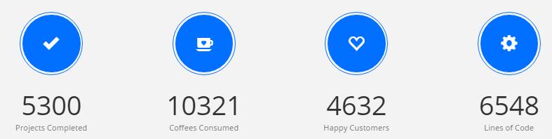
Codes are as follows:
<div class=" pt-60 pb-45 h1_bg">
  <div class="dnn_layoutB">
    <div class="content_mid animation ">
      <div class="number_Animation3 row">
        <div class="col-sm-3 animation_item scaleUp delay1">
          <div class="number_Animation3_bor"> <span class="glyphicons glyph-ok-2"> </span></div>
          <div class="animation  number" data-number="5300">0</div>
          <p>Projects Completed</p>
        </div>
        <div class="col-sm-3 animation_item scaleUp delay2">
          <div class="number_Animation3_bor"> <span class="glyphicons glyph-coffe-cup"> </span></div>
          <div class="animation  number" data-number="10321">0</div>
          <p>Coffees Consumed</p>
        </div>
        <div class="col-sm-3 animation_item scaleUp delay3">
          <div class="number_Animation3_bor"><span class="glyphicons glyph-heart-empty"> </span></div>
          <div class="animation  number" data-number="4632">0</div>
          <p>Happy Customers</p>
        </div>
        <div class="col-sm-3 animation_item scaleUp delay4">
          <div class="number_Animation3_bor"> <span class="glyphicons glyph-cogwheel"> </span></div>
          <div class="animation  number" data-number="6548">0</div>
          <p>Lines of Code</p>
        </div>
      </div>
    </div>
  </div>
</div>
Option:
col-md-*is the width of each column, you can change the width you need through value1~12.- You can modify
animationto change the animation on the slide. Animation list. - You can modify
glyphicons glyph-*to change icons. font icon list.
Testimonials area
Below is the screen shot:

Codes are as follows:
<div class=" pt-60 pb-50 backgroundImage15">
  <div class="dnn_layoutB">
    <div class="content_mid ">
      <div class="h1_back pb-40">
        <h3 style="color: #ffffff;">Testimonials</h3>
      </div>
      <div class=" row animation">
        <div class="col-sm-4 animation_item scaleUp delay1">
          <div class="h4_box clearfix">
            <div>
              <p>“ Investigationes demonstraverunt lectores lege re me lius quod ii legunt saepius. Clari tas este tiam processus dynamicus quisequ itur mutati onem consuetudium lectorumes tnotar quam littera gothica. ”</p>
            </div>
            <img alt="" src="/portals/12/h4_image.jpg" />
            <div class="h4_tit"> Harro Holloy <span>----  Dnngo Buyer </span></div>
          </div>
        </div>
        <div class="col-sm-4 animation_item scaleUp delay2">
          <div class="h4_box clearfix">
            <div>
              <p>“ Investigationes demonstraverunt lectores lege re me lius quod ii legunt saepius. Clari tas este tiam processus dynamicus quisequ itur mutati onem consuetudium lectorumes tnotar quam littera gothica. ”</p>
            </div>
            <img alt="" src="/portals/12/h4_image-02.png" />
            <div class="h4_tit"> Kante Chris <span>----  Dnngo Buyer </span></div>
          </div>
        </div>
        <div class="col-sm-4 animation_item scaleUp delay3">
          <div class="h4_box clearfix">
            <div>
              <p>“ Investigationes demonstraverunt lectores lege re me lius quod ii legunt saepius. Clari tas este tiam processus dynamicus quisequ itur mutati onem consuetudium lectorumes tnotar quam littera gothica. ”</p>
            </div>
            <img alt="" src="/portals/12/h4_image-03.jpg" />
            <div class="h4_tit"> Steven Doe <span>----  Dnngo Buyer </span> </div>
          </div>
        </div>
      </div>
    </div>
  </div>
</div>
Option:
col-md-*is the width of each column, you can change the width you need through value1~12.- You can modify
animationto change the animation on the slide. Animation list.
Responsive Template area
Below is the screen shot:
Codes are as follows:
<div class=" pt-60 pb-60 ">
  <div class="dnn_layoutB">
    <div class="content_mid ">
      <div class=" row">
        <div class="col-sm-5 animation fadeInLeft">
          <div class="h4_left">
            <h2>Creative Responsive Template</h2>
            <span>Unlimited, Powerful, Advanced</span>
            <div>
              <p>Content text ...</p>
            </div>
            <a href="#" target="blank" class="Button_default4">Purchase This Theme</a> </div>
        </div>
        <div class="col-sm-7 animation fadeInRight">
          <div class="h4_right"><img alt="" src="/portals/12/h4_image02.jpg" /></div>
        </div>
      </div>
    </div>
  </div>
</div>
Option:
col-md-*is the width of each column, you can change the width you need through value1~12.- You can modify
animationto change the animation on the slide. Animation list.
Our Location area
Below is the screen shot:
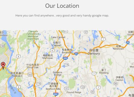
Codes are as follows:
<div id="gmap01"></div>
About Us area
Below is the screen shot:
Codes are as follows:
<div class="h4_footera animation fadeInLeft">
  <p>Lorem ipsu dolor sit amet, consectetur elit. dictum felis eu pedeLorem ipsudol orsit amet,
    consectetur adipisicing elit Lorem ipsu dolor sit amet, consectetur elit nam nunc.</p>
  <p>Ut wiseni ad minim veniam, quis nostru exerci tation ullamcorper suscipit lobort is nisl ut aliquip commodo.</p>
  <div class="H3_footer_Social"> <a href="#"><span class="social social-facebook"></span> </a> <a href="#"> <span class="social social-twitter"></span> </a> <a href="#"> <span class="social social-linked-in"></span> </a> </div>
</div>
Option:
Containeris usingContainer-H3-2
Friendly Links area
Below is the screen shot:
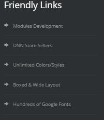
Codes are as follows:
<div class="h4_footerc animation fadeInDown">
  <ul>
    <li><span class="glyphicons glyph-right-arrow"></span>Modules Development</li>
    <li><span class="glyphicons glyph-right-arrow"></span>DNN Store Sellers</li>
    <li><span class="glyphicons glyph-right-arrow"></span>Unlimited Colors/Styles</li>
    <li><span class="glyphicons glyph-right-arrow"></span>Boxed & Wide Layout</li>
    <li><span class="glyphicons glyph-right-arrow"></span>Hundreds of Google Fonts</li>
  </ul>
</div>
Option:
Containeris usingContainer-H3-2
Get In Touch area
Below is the screen shot:

Codes are as follows:
<div class="h4_footerc animation fadeInUp">
  <div>
    <p>Nam sapien eros enatis at dapibus facilis islacinia sagittis purus. Ut tuismod aliquet enim, nec semper mi posuere nec lor nam nunc est, faucibus iaculis.</p>
  </div>
  <div class="h4_footerc_bottom">
    <p>Phone : (+88) - 1234 - 5678</p>
    <p>Skype : dnngo-linda</p>
    <p>Email : dnnskindev@gmail.com</p>
    <p>Address : XinAn Street, TaiShan Hotel</p>
  </div>
</div>
Option:
Containeris usingContainer-2
Contact Us area
Option:
- This is
Theme_Responsive_20054_home4theme ofDNNGo PowerFormsmodule Containeris usingContainer-2
Home Version 5
You can click the link to check Home Version 5 demo. Home Version 5
Banner area
Below is the screen shot:
It is using Effect_12_UnoSlider of DNNGalleryPro module.
Banner Bottom area
Below is the screen shot:
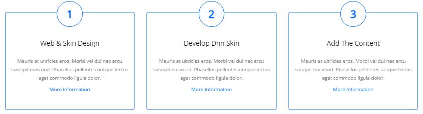
Codes are as follows:
<div class="functionBox_5 row pt-55 pb-60 animation">
  <div class="col-sm-4">
    <div class="functionMain animation_item scaleUp delay1">
      <div class="functionIcon"><span>1</span></div>
      <h3>Web & Skin Design </h3>
      <p>Mauris at ultricies eros. Morbi vel dui nec arcu suscipit euismod. Phasellus pellentes untque lectus eget commodo ligula dolor. </p>
      <p><a href="#" target="blank">More Information</a></p>
    </div>
  </div>
  <div class="col-sm-4">
    <div class="functionMain animation_item scaleUp delay2">
      <div class="functionIcon"><span>2</span></div>
      <h3>Develop Dnn Skin</h3>
      <p>Mauris at ultricies eros. Morbi vel dui nec arcu suscipit euismod. Phasellus pellentes untque lectus eget commodo ligula dolor. </p>
      <p><a href="#" target="blank">More Information</a></p>
    </div>
  </div>
  <div class="col-sm-4">
    <div class="functionMain animation_item scaleUp delay3">
      <div class="functionIcon"><span>3</span></div>
      <h3>Add The Content</h3>
      <p>Mauris at ultricies eros. Morbi vel dui nec arcu suscipit euismod. Phasellus pellentes untque lectus eget commodo ligula dolor. </p>
      <p><a href="#" target="blank">More Information</a></p>
    </div>
  </div>
</div>
Option:
col-md-*is the width of each column, you can change the width you need through value1~12.- You can modify
animationto change the animation on the slide. Animation list.
Latest Products area
Below is the screen shot:
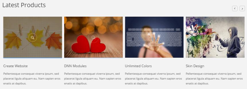
Codes are as follows:
<div class=" pt-60 pb-30 h1_bg">
  <div class="dnn_layoutB">
    <div class="content_mid ">
      <div class="h5_tit_left pb-40">
        <h3>Latest Products</h3>
      </div>
      <div class="carousel carousel_6 animation zoomIn" data-pagination="false" data-items="4" data-autoheight="false">
        <div class="item">
          <div class="photo_box  ico_zoom"> <a class="LightBox_image_gallery3" href="/Portals/12/Photo2.jpg">
            <div class="pic_box"> <img alt="" src="/portals/12/Photo2.jpg" />
              <div class="ico"> <span class="glyphicons glyph-search "></span> </div>
              <div class="shade"></div>
            </div>
            </a>
            <div class="text_sytle_6">
              <h3>Skin Features</h3>
              <p> Pellentesque consequat viverra ipsum, sed placerat ligula aliquam eu. Nam sapien eros enatis at dapibus. </p>
            </div>
          </div>
        </div>
        <div class="item">
          <div class="photo_box  ico_zoom"> <a class="LightBox_image_gallery3" href="/Portals/12/Photo3.jpg">
            <div class="pic_box"> <img alt="" src="/portals/12/Photo3.jpg" />
              <div class="ico"> <span class="glyphicons glyph-search "></span> </div>
              <div class="shade"></div>
            </div>
            </a>
            <div class="text_sytle_6">
              <h3>Page Samples</h3>
              <p> Pellentesque consequat viverra ipsum, sed placerat ligula aliquam eu. Nam sapien eros enatis at dapibus. </p>
            </div>
          </div>
        </div>
        <div class="item">
          <div class="photo_box  ico_zoom"> <a class="LightBox_image_gallery3" href="/Portals/12/Photo4.jpg">
            <div class="pic_box"> <img alt="" src="/portals/12/Photo4.jpg" />
              <div class="ico"> <span class="glyphicons glyph-search "></span> </div>
              <div class="shade"></div>
            </div>
            </a>
            <div class="text_sytle_6">
              <h3>Create Website</h3>
              <p> Pellentesque consequat viverra ipsum, sed placerat ligula aliquam eu. Nam sapien eros enatis at dapibus. </p>
            </div>
          </div>
        </div>
        <div class="item">
          <div class="photo_box  ico_zoom"> <a class="LightBox_image_gallery3" href="/Portals/12/Photo5.jpg">
            <div class="pic_box"> <img alt="" src="/portals/12/Photo5.jpg" />
              <div class="ico"> <span class="glyphicons glyph-search "></span> </div>
              <div class="shade"></div>
            </div>
            </a>
            <div class="text_sytle_6">
              <h3>DNN Modules</h3>
              <p> Pellentesque consequat viverra ipsum, sed placerat ligula aliquam eu. Nam sapien eros enatis at dapibus. </p>
            </div>
          </div>
        </div>
        <div class="item">
          <div class="photo_box  ico_zoom"> <a class="LightBox_image_gallery3" href="/Portals/12/Photo6.jpg">
            <div class="pic_box"> <img alt="" src="/portals/12/Photo6.jpg" />
              <div class="ico"> <span class="glyphicons glyph-search "></span> </div>
              <div class="shade"></div>
            </div>
            </a>
            <div class="text_sytle_6">
              <h3>Unlimited Colors</h3>
              <p> Pellentesque consequat viverra ipsum, sed placerat ligula aliquam eu. Nam sapien eros enatis at dapibus. </p>
            </div>
          </div>
        </div>
        <div class="item">
          <div class="photo_box  ico_zoom"> <a class="LightBox_image_gallery3" href="/Portals/12/Photo7.jpg">
            <div class="pic_box"> <img alt="" src="/portals/12/Photo7.jpg" />
              <div class="ico"> <span class="glyphicons glyph-search "></span> </div>
              <div class="shade"></div>
            </div>
            </a>
            <div class="text_sytle_6">
              <h3>Skin Design</h3>
              <p> Pellentesque consequat viverra ipsum, sed placerat ligula aliquam eu. Nam sapien eros enatis at dapibus. </p>
            </div>
          </div>
        </div>
        <div class="item">
          <div class="photo_box  ico_zoom"> <a class="LightBox_image_gallery3" href="/Portals/12/Photo2.jpg">
            <div class="pic_box"> <img alt="" src="/portals/12/Photo2.jpg" />
              <div class="ico"> <span class="glyphicons glyph-search "></span> </div>
              <div class="shade"></div>
            </div>
            </a>
            <div class="text_sytle_6">
              <h3>Responsive Web</h3>
              <p>Pellentesque consequat viverra ipsum, sed placerat ligula aliquam eu. Nam sapien eros enatis at dapibus. </p>
            </div>
          </div>
        </div>
        <div class="item">
          <div class="photo_box  ico_zoom"> <a class="LightBox_image_gallery3" href="/Portals/12/Photo3.jpg">
            <div class="pic_box"> <img alt="" src="/portals/12/Photo3.jpg" />
              <div class="ico"> <span class="glyphicons glyph-search "></span> </div>
              <div class="shade"></div>
            </div>
            </a>
            <div class="text_sytle_6">
              <h3>Professional Work</h3>
              <p> Pellentesque consequat viverra ipsum, sed placerat ligula aliquam eu. Nam sapien eros enatis at dapibus. </p>
            </div>
          </div>
        </div>
      </div>
    </div>
  </div>
</div>
Choose Products area
Below is the screen shot:
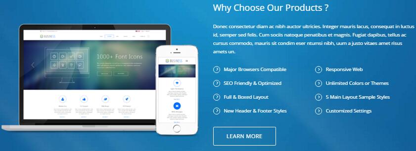
Codes are as follows:
<div class="backgroundImage16 pt-60 pb-60">
  <div class="dnn_layoutB">
    <div class="content_mid clearfix">
      <div class="row">
        <div class="col-md-6 col-sm-12 animation fadeInLeft h5_img_pad"><img alt="" class="img-responsive" src="/portals/12/h5_image.png" /></div>
        <div class="col-md-6 col-sm-12 animation fadeInRight" style="text-align: left;">
          <h3>Why Choose Our Products ?</h3>
          <p>Donec consectetur diam ac nibh auctor ultricies. Integer mauris lacus, consequat in luctus id, semper sed felis. Cum sociis natoque penatibus et magnis. Fugiat dapibus, tellus ac cursus commodo, mauris sit condim eser ntumsi nibh, uum a justo vitaes amet risus amets un.</p>
          <ul class="Services_list3">
            <li><span class="ico"></span>Major Browsers Compatible </li>
            <li><span class="ico"></span>Responsive Web</li>
            <li><span class="ico"></span>SEO Friendly & Optimized</li>
            <li><span class="ico"></span>Unlimited Colors or Themes</li>
            <li><span class="ico"></span>Full & Boxed Layout</li>
            <li><span class="ico"></span>5 Main Layout Sample Styles</li>
            <li><span class="ico"></span>New Header & Footer Styles</li>
            <li><span class="ico"></span>Customized Settings </li>
          </ul>
          <div class="h5_bnt"> <a href="#" class="Button_default" target="blank">Learn More</a> </div>
        </div>
      </div>
    </div>
  </div>
</div>
Option:
col-md-*is the width of each column, you can change the width you need through value1~12.- You can modify
animationto change the animation on the slide. Animation list.
What Others Say About Us area
Below is the screen shot:
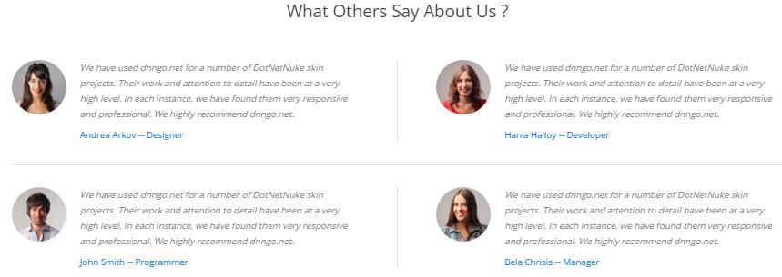
Codes are as follows:
<div class="pt-55 pb-55">
  <div class="h1_back pb-40">
    <h3>What Others Say About Us ?</h3>
  </div>
  <div class="personnel_list animation">
    <div class="personnel">
      <div class="personnel_box animation_item scaleUp delay1">
        <div class="personnel_pic"><img alt="" src="/portals/12/personnel_1.jpg" /></div>
        <div class="personnel_info">
          <p> We have used dnngo.net for a number of DotNetNuke skin projects. Their work and attention to detail have been at a very high level. In each instance, we have found them very responsive and professional. We highly recommend dnngo.net.</p>
          <a href="#">Andrea Arkov  -- Designer</a></div>
      </div>
      <div class="personnel_box animation_item scaleUp delay2">
        <div class="personnel_pic"> <img alt="" src="/portals/12/personnel_2.jpg" /></div>
        <div class="personnel_info">
          <p> We have used dnngo.net for a number of DotNetNuke skin projects. Their work and attention to detail have been at a very high level. In each instance, we have found them very responsive and professional. We highly recommend dnngo.net.</p>
          <a href="#">Harra Halloy  -- Developer</a></div>
      </div>
      <div class="clear"></div>
    </div>
    <div class="personnel">
      <div class="personnel_box animation_item scaleUp delay3">
        <div class="personnel_pic"> <img alt="" src="/portals/12/personnel_3.jpg" /></div>
        <div class="personnel_info">
          <p> We have used dnngo.net for a number of DotNetNuke skin projects. Their work and attention to detail have been at a very high level. In each instance, we have found them very responsive and professional. We highly recommend dnngo.net.</p>
          <a href="#">John Smith  -- Programmer</a></div>
      </div>
      <div class="personnel_box animation_item scaleUp delay4">
        <div class="personnel_pic"><img alt="" src="/portals/12/personnel_4.jpg" /> </div>
        <div class="personnel_info">
          <p> We have used dnngo.net for a number of DotNetNuke skin projects. Their work and attention to detail have been at a very high level. In each instance, we have found them very responsive and professional. We highly recommend dnngo.net.</p>
          <a href="#">Bela Chrisis  -- Manager</a></div>
      </div>
      <div class="clear"></div>
    </div>
  </div>
</div>
Option:
col-md-*is the width of each column, you can change the width you need through value1~12.- You can modify
animationto change the animation on the slide. Animation list.
Circle area
Below is the screen shot:
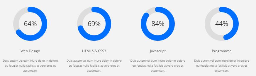
Codes are as follows:
<div class=" pt-60 pb-30 h1_bg ">
  <div class="dnn_layoutB">
    <div class="content_mid clearfix">
      <div class="chart_list4 row animation">
        <div class="col-sm-3 animation_item scaleUp delay1">
          <div data-percent="65" class="percentage4">
            <div class="percentage_inner"><span>0</span>%</div>
          </div>
          <h2> Web Design</h2>
          <p>Duis autem vel eum iriure dolor in dolore eu feugiat nulla facilisis at vero eros et accumsan.</p>
        </div>
        <div class="col-sm-3 animation_item scaleUp delay2">
          <div data-percent="70" class="percentage4">
            <div class="percentage_inner"><span>0</span>%</div>
          </div>
          <h2> HTML5 & CSS3</h2>
          <p>Duis autem vel eum iriure dolor in dolore eu feugiat nulla facilisis at vero eros et accumsan.</p>
        </div>
        <div class="col-sm-3 animation_item scaleUp delay3">
          <div data-percent="85" class="percentage4">
            <div class="percentage_inner"><span>0</span>%</div>
          </div>
          <h2>Javascript</h2>
          <p>Duis autem vel eum iriure dolor in dolore eu feugiat nulla facilisis at vero eros et accumsan.</p>
        </div>
        <div class="col-sm-3 animation_item scaleUp delay4">
          <div data-percent="45" class="percentage4">
            <div class="percentage_inner"><span>0</span>%</div>
          </div>
          <h2> Programme</h2>
          <p>Duis autem vel eum iriure dolor in dolore eu feugiat nulla facilisis at vero eros et accumsan.</p>
        </div>
      </div>
    </div>
  </div>
</div>
Amazing Features area
Below is the screen shot:
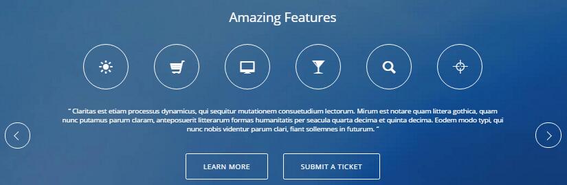
Codes are as follows:
<div class=" pt-60 pb-60 backgroundImage17">
  <div class="dnn_layoutB">
    <div class="content_mid clearfix">
      <div class="h1_back pb-40">
        <h3 style="color: #ffffff;">Amazing Features</h3>
      </div>
      <div class="Testimonials_icon_8 animation"> <a href="#"> <span class="glyphicons glyph-sun animation_item scaleUp delay1"></span></a> <a href="#"> <span class="glyphicons glyph-shopping-cart animation_item scaleUp delay2"></span> </a> <a href="#"> <span class="glyphicons glyph-imac animation_item scaleUp delay3"></span></a> <a href="#"> <span class="glyphicons glyph-glass animation_item scaleUp delay4"></span></a> <a href="#"> <span class="glyphicons glyph-search animation_item scaleUp delay5"></span> </a> <a href="#"> <span class="glyphicons glyph-screenshot animation_item scaleUp delay6"></span></a> </div>
      <ul class=" Testimonials_tab Testimonials_8 animation zoomIn" data-position="roll-left" data-display-navigation="false" data-autoplay="0">
        <li>
          <div class="Testimonials_con_8">
            <div class="pt-30 pb-30">
              <p>“ Claritas est etiam processus dynamicus, qui sequitur mutationem consuetudium lectorum. Mirum est notare quam littera gothica, quam nunc putamus parum claram, anteposuerit litterarum formas humanitatis per seacula quarta decima et quinta decima. Eodem modo typi, qui nunc nobis videntur parum clari, fiant sollemnes in futurum. ”</p>
            </div>
            <div class="h5_bnt02"> <a href="#" class="Button_default" target="blank">Learn More</a><a href="http://www.dnngo.net/ContactUs/OnlineSupportTicket.aspx" class="Button_default">Submit A Ticket</a> </div>
          </div>
        </li>
        <li>
          <div class="Testimonials_con_8">
            <div class="pt-30 pb-30">
              <p>Duis autem vel eum iriure dolor in dolore eu feugiat nulla facilisis at vero eros et accumsan.</p>
            </div>
            <div class="h5_bnt02"> <a href="#" class="Button_default" target="blank">Learn More</a><a href="http://www.dnngo.net/ContactUs/OnlineSupportTicket.aspx" class="Button_default">Submit A Ticket</a> </div>
          </div>
        </li>
        <li>
          <div class="Testimonials_con_8">
            <div class="pt-30 pb-30">
              <p>We have used dnngo.net for a number of DotNetNuke skin projects. Their work and attention to detail have been at a very high level. In each instance, we have found them very responsive and professional. We highly recommend dnngo.net.</p>
            </div>
            <div class="h5_bnt02"> <a href="#" class="Button_default" target="blank">Learn More</a><a href="http://www.dnngo.net/ContactUs/OnlineSupportTicket.aspx" class="Button_default">Submit A Ticket</a> </div>
          </div>
        </li>
      </ul>
    </div>
  </div>
</div>
Contact Us area
Below is the screen shot:
Option:
- This is
Theme_Responsive_20054_home5theme ofDNNGo PowerFormsmodule
Map area
Below is the screen shot:
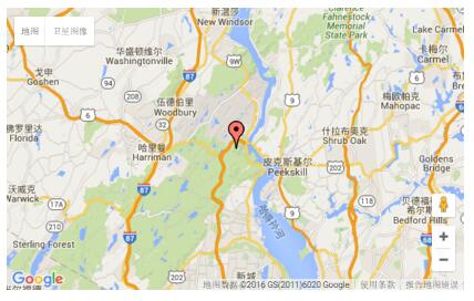
Option:
- You can change
gmapaddress incustom.js
About Us area
Below is the screen shot:

Codes are as follows:
<div class="h3_footera animation fadeInLeft"> <img alt="" class="img-responsive" src="/portals/12/h6_banner.png" />
  <p>Nam sapien eros enatis at dapibus facilis islacinia sagittis purus. Ut tuismod aliquet enim, nec semper mi posuere nec lor nam nunc est, faucibus iaculis varius vitae, eius modi tempora incidunt placerat quis felis labore et dolore magna. </p>
  <div class="H3_footer_Social"> <a href="#"><span class="social social-facebook"></span> </a> <a href="#"> <span class="social social-twitter"></span> </a> <a href="#"> <span class="social social-linked-in"></span> </a> <a href="#"> <span class="social social-picasa"></span> </a> </div>
</div>
Option:
Containeris usingContainer-3
Photo Gallery area
Below is the screen shot:
Codes are as follows:
<ul class="insets_list clearfix animation fadeInDown">
  <li>
    <div class="photo_box img_zoom"> <a href="/Portals/12/Photo_1_big.jpg" class="LightBox_image_gallery5">
      <div class="pic_box"> <img alt="" src="/portals/12/Photo_1.jpg" />
        <div class="shade"></div>
      </div>
      </a> </div>
  </li>
  <li>
    <div class="photo_box img_zoom"> <a href="/Portals/12/Photo_2_big.jpg" class="LightBox_image_gallery5">
      <div class="pic_box"> <img alt="" src="/portals/12/Photo_2.jpg" />
        <div class="shade"></div>
      </div>
      </a> </div>
  </li>
  <li>
    <div class="photo_box img_zoom"> <a href="/Portals/12/Photo_3_big.jpg" class="LightBox_image_gallery5">
      <div class="pic_box"> <img alt="" src="/portals/12/Photo_3.jpg" />
        <div class="shade"></div>
      </div>
      </a> </div>
  </li>
  <div class="row-fluid">
    <li>
      <div class="photo_box img_zoom"> <a href="/Portals/12/Photo_4_big.jpg" class="LightBox_image_gallery5">
        <div class="pic_box"> <img alt="" src="/portals/12/Photo_4.jpg" />
          <div class="shade"></div>
        </div>
        </a> </div>
    </li>
    <li>
      <div class="photo_box img_zoom"> <a href="/Portals/12/Photo_5_big.jpg" class="LightBox_image_gallery5">
        <div class="pic_box"> <img alt="" src="/portals/12/Photo_5.jpg" />
          <div class="shade"></div>
        </div>
        </a> </div>
    </li>
    <li>
      <div class="photo_box img_zoom"> <a href="/Portals/12/Photo_6_big.jpg" class="LightBox_image_gallery5">
        <div class="pic_box"> <img alt="" src="/portals/12/Photo_6.jpg" />
          <div class="shade"></div>
        </div>
        </a> </div>
    </li>
  </div>
  <div class="row-fluid">
    <li>
      <div class="photo_box img_zoom"> <a href="/Portals/12/Photo_7_big.jpg" class="LightBox_image_gallery5">
        <div class="pic_box"> <img alt="" src="/portals/12/Photo_7.jpg" />
          <div class="shade"></div>
        </div>
        </a> </div>
    </li>
    <li>
      <div class="photo_box img_zoom"> <a href="/Portals/12/Photo_8_big.jpg" class="LightBox_image_gallery5">
        <div class="pic_box"> <img alt="" src="/portals/12/Photo_8.jpg" />
          <div class="shade"></div>
        </div>
        </a> </div>
    </li>
    <li>
      <div class="photo_box img_zoom"> <a href="/Portals/12/Photo_9_big.jpg" class="LightBox_image_gallery5">
        <div class="pic_box"> <img alt="" src="/portals/12/Photo_9.jpg" />
          <div class="shade"></div>
        </div>
        </a> </div>
    </li>
  </div>
</ul>
Option:
Containeris usingContainer-3
Archives area
Below is the screen shot:
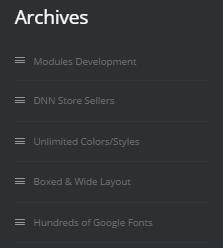
Codes are as follows:
<div class="h3_footerc animation fadeInUp">
  <ul>
    <li><span class="glyphicons glyph-show-lines"></span>Modules Development</li>
    <li><span class="glyphicons glyph-show-lines"></span>DNN Store Sellers</li>
    <li><span class="glyphicons glyph-show-lines"></span>Unlimited Colors/Styles</li>
    <li><span class="glyphicons glyph-show-lines"></span>Boxed & Wide Layout</li>
    <li><span class="glyphicons glyph-show-lines"></span>Hundreds of Google Fonts</li>
  </ul>
</div>
Option:
Containeris usingContainer-H3-2
Twitter Feed area
Below is the screen shot:
Codes are as follows:
<div class="h3_footerd animation fadeInRight">
  <div class="h3_pos"> <span class="social social-twitter"> </span>
    <div class="h3_footerd_con">
      <p><a href="#">@DNNGOBUYER</a> Eodem modo typi, qui nunc nobis videntur parum.</p>
      20 mins ago </div>
  </div>
  <div class="h3_pos"> <span class="social social-twitter"> </span>
    <div class="h3_footerd_con">
      <p><a href="#">@DNNGOBUYER</a> Eodem modo typi, qui nunc nobis videntur parum.</p>
      20 mins ago </div>
  </div>
  <div class="h3_pos"> <span class="social social-twitter"> </span>
    <div class="h3_footerd_con">
      <p><a href="#">@DNNGOBUYER </a>Eodem modo typi, qui nunc nobis videntur parum.</p>
      20 mins ago </div>
  </div>
</div>
Option:
Containeris usingContainer-3
HomeVersion6 One Page
You can click the link to check Home Version 6 demo. Home Version 6
Anchor area
It will scroll to the corresponding area on the page when clicking the menu texts at the top. It will also do so when clicking the dots on the right of the skin.
These anchors are generated through page's anchorTag. Codes are as follows. You can place this piece of codes in page's HTML module, click the right anchor, then page will slide to this HTML module area.
<div data-menuanchor="true" data-scrollshownav="true" data-offset="0" class="anchorTag" data-title="About Us"> </div>
Option:
data-title |
Title displayed correspondingly to the right navigation. If page title of the menu is the same as data-title, page will scroll to this area when clicking menu texts. |
data-menuanchor |
Whether to enable menu anchor feature or not. |
data-scrollshownav |
Whether to enable navigation or not. |
data-offset |
Offset value of up and down coordinate for anchor. |
data-icourl |
Image url that displays correspondingly of the right navigation. |
data-iconame |
Icon class names that displays correspondingly of the right navigation. |
How to set menu anchor
- Click Add New Page button.
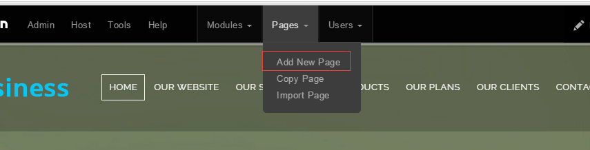
- Fill in Page Name and Page Title. Texts for Page Title needs to be the same as that of data-title.
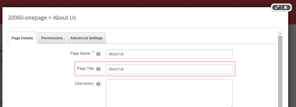
- Put the anchor code to HTML module of the page. It will scroll to the corresponding area on the page when clicking the top menu texts.
<div data-menuanchor="true" data-scrollshownav="true" data-offset="0" class="anchorTag" data-title="About Us"> </div>
Banner area
Below is the screen shot:

<div data-menuanchor="true" data-scrollshownav="true" data-offset="-150" class="anchorTag" data-title="Home"> </div>
<ul class="full_screen_pic">
  <li style="background: url('/Portals/34/h6_banner.jpg');">
    <div class="content">
      <div class="dnn_layout">
        <div class="h6_content animation">
          <h2 class="animation_item scaleUp delay1">ADVANCED TECHNOLOGY</h2>
          <p class="animation_item scaleUp delay2">Using the most advanced and cutting-edge development technology</p>
          <br />
          <div class="h5_bnt02 animation_item scaleUp delay3"> <a class="Button_default" href="#" target="blank">View Demo</a> </div>
        </div>
        <div id="nextPage" class="animation zoomInDown"><span></span></div>
      </div>
    </div>
  </li>
</ul>
ABOUT US area
Below is the screen shot:
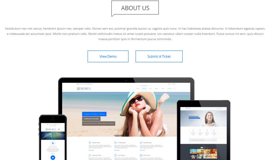
Codes are as follows:
<div class="h6_service pt-30 animation ">
  <div class="h6_tit"><span></span>About Us</div>
  <p class="pt-40 pb-20 animation_item scaleUp delay1">Vestibulum nec nisl varius, hendrerit ipsum nec, semper odio. Donec sem est, pulvinar gravida auctor ut, sagittis quis nunc. In hac habitasse platea dictumst. In bibendum egestas sapien, a malesuada est accumsan quis. Morbi non pretium odio. Morbi sollicitudin metus sit amet turpis posuere, con sectetur ullam corper nulla interdum. Fusce cursus mi sem, quis dictum massa porttitor quis in fermentum purus commodo.</p>
  <div clas="h6_bnt pb-55 animation_item scaleUp delay2"> <a href="#" class="Button_default5" target="blank">View Demo</a><a href="http://www.dnngo.net/ContactUs/OnlineSupportTicket.aspx" class="Button_default5" target="blank">Submit A Ticket</a> </div>
  <div class="Img_inline pt-45 animation_item scaleUp delay3"> <img alt="" class="img-responsive" src="/portals/34/h6_image.jpg" /> </div>
</div>
Option:
- You can modify
animationto change the animation on the slide. Animation list.
About Us Bottom List area
Below is the screen shot:
Codes are as follows:
<div class=" pt-60 pb-40 h1_bg">
  <div class="dnn_layoutB">
    <div class="content_mid ">
      <div class=" row animation">
        <div class="col-sm-4 animation_item scaleUp delay1">
          <div class="h6_service02"> <span class="glyphicons glyph-lightbulb"></span>
            <h2> Creative Design</h2>
            <p> Suspendisse potenti. Suspendisse ultrices rutrum ipsum, vel eleifend lacus elementum egestas. Vestibulum sit amet scelerisque ante. bitur eu metus commodo. </p>
            <a href="#" target="blank">Learn More</a> </div>
        </div>
        <div class="col-sm-4 animation_item scaleUp delay2">
          <div class="h6_service02"> <span class="glyphicons glyph-microphone"></span>
            <h2>Amazing Features</h2>
            <p> Suspendisse potenti. Suspendisse ultrices rutrum ipsum, vel eleifend lacus elementum egestas. Vestibulum sit amet scelerisque ante. bitur eu metus commodo. </p>
            <a href="#" target="blank">Learn More</a> </div>
        </div>
        <div class="col-sm-4 animation_item scaleUp delay3">
          <div class="h6_service02"> <span class="glyphicons glyph-book-open"></span>
            <h2> Unlimited Colors</h2>
            <p> Suspendisse potenti. Suspendisse ultrices rutrum ipsum, vel eleifend lacus elementum egestas. Vestibulum sit amet scelerisque ante. bitur eu metus commodo. </p>
            <a href="#" target="blank">Learn More</a> </div>
        </div>
      </div>
    </div>
  </div>
</div>
Option:
col-md-*is the width of each column, you can change the width you need through value1~12.- You can modify
animationto change the animation on the slide. Animation list. - You can modify
glyphicons glyph-*to change icons. font icon list.
LATEST WORKS area
Below is the screen shot:
Codes are as follows:
<div data-menuanchor="true" data-scrollshownav="true" data-offset="0" class="anchorTag" data-title="Latest Works"> </div>
<div class="pt-60 pb-60">
  <div class="h6_service  pb-50">
    <div class="h6_tit"><span></span>Latest Works</div>
  </div>
  <div class="h6_service03">
    <div class="carousel carousel_7 animation zoomIn" data-autoplay="false" data-autoheight="false" data-items="3">
      <div class="item">
        <div class="photo_box icon_tag_push img_zoom"> <a href="#" target="blank">
          <div class="pic_box"> <img alt="" src="/portals/34/Photo2.jpg" />
            <div class="ico "><span class="glyphicons glyph-link ico_right"></span></div>
            <div class="content">
              <h3>29</h3>
              Mar </div>
          </div>
          </a>
          <div class="text_sytle_6">
            <h3>Meeting Report</h3>
            <p> Nulla nisi mi, rutrum ac orci sit amet, accumsan adipiscing minibh auctor magna laoreet. </p>
            <span>By Admin   |   0 Comments</span> </div>
        </div>
      </div>
      <div class="item">
        <div class="photo_box icon_tag_push img_zoom"> <a href="#" target="blank">
          <div class="pic_box"> <img alt="" src="/portals/34/Photo1.jpg" />
            <div class="ico "><span class="glyphicons glyph-link ico_right"></span></div>
            <div class="content">
              <h3>18</h3>
              Apr </div>
          </div>
          </a>
          <div class="text_sytle_6">
            <h3>Advanced Technology</h3>
            <p> Nulla nisi mi, rutrum ac orci sit amet, accumsan adipiscing minibh auctor magna laoreet. </p>
            <span>By Admin   |   0 Comments</span> </div>
        </div>
      </div>
      <div class="item">
        <div class="photo_box icon_tag_push img_zoom"> <a href="#" target="blank">
          <div class="pic_box"> <img alt="" src="/portals/34/Photo3.jpg" />
            <div class="ico "><span class="glyphicons glyph-link ico_right"></span></div>
            <div class="content">
              <h3>06</h3>
              Mar </div>
          </div>
          </a>
          <div class="text_sytle_6">
            <h3>Coffee Time</h3>
            <p> Nulla nisi mi, rutrum ac orci sit amet, accumsan adipiscing minibh auctor magna laoreet. </p>
            <span>By Admin   |   0 Comments</span> </div>
        </div>
      </div>
      <div class="item">
        <div class="photo_box icon_tag_push img_zoom"> <a href="#" target="blank">
          <div class="pic_box"> <img alt="" src="/portals/34/Photo2.jpg" />
            <div class="ico "><span class="glyphicons glyph-link ico_right"></span></div>
            <div class="content">
              <h3>29</h3>
              Mar </div>
          </div>
          </a>
          <div class="text_sytle_6">
            <h3>Meeting Report</h3>
            <p> Nulla nisi mi, rutrum ac orci sit amet, accumsan adipiscing minibh auctor magna laoreet. </p>
            <span>By Admin   |   0 Comments</span> </div>
        </div>
      </div>
      <div class="item">
        <div class="photo_box icon_tag_push img_zoom"> <a href="#" target="blank">
          <div class="pic_box"> <img alt="" src="/portals/34/Photo1.jpg" />
            <div class="ico "><span class="glyphicons glyph-link ico_right"></span></div>
            <div class="content">
              <h3>18</h3>
              Apr </div>
          </div>
          </a>
          <div class="text_sytle_6">
            <h3>Advanced Technology</h3>
            <p> Nulla nisi mi, rutrum ac orci sit amet, accumsan adipiscing minibh auctor magna laoreet. </p>
            <span>By Admin   |   0 Comments</span> </div>
        </div>
      </div>
      <div class="item">
        <div class="photo_box icon_tag_push img_zoom"> <a href="#" target="blank">
          <div class="pic_box"> <img alt="" src="/portals/34/Photo3.jpg" />
            <div class="ico "><span class="glyphicons glyph-link ico_right"></span></div>
            <div class="content">
              <h3>06</h3>
              Mar </div>
          </div>
          </a>
          <div class="text_sytle_6">
            <h3>Coffee Time</h3>
            <p> Nulla nisi mi, rutrum ac orci sit amet, accumsan adipiscing minibh auctor magna laoreet. </p>
            <span>By Admin   |   0 Comments</span> </div>
        </div>
      </div>
    </div>
  </div>
</div>
<br />
Option:
- This is a
Carouseleffect.Carousel - You can modify
animationto change the animation on the slide. Animation list. - You can modify
glyphicons glyph-*to change icons. font icon list.
Circle List area
Below is the screen shot:
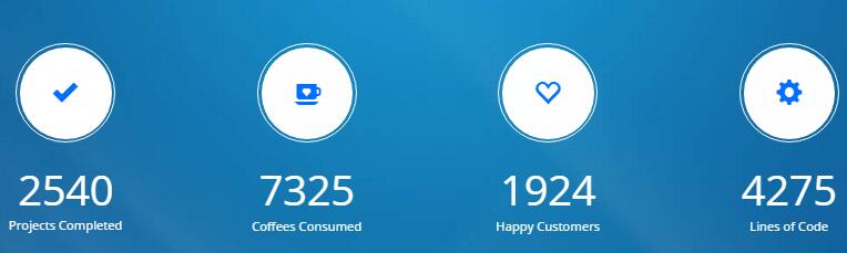
Codes are as follows:
<div class=" pt-60 pb-45 backgroundImage16">
  <div class="dnn_layoutB">
    <div class="content_mid animation">
      <div class="number_Animation3 h6_number_Animation3  row ">
        <div class="col-sm-3 animation_item scaleUp delay1">
          <div class="number_Animation3_bor"> <span class="glyphicons glyph-ok-2"> </span></div>
          <div class="animation  number" data-number="2540">0</div>
          <p>Projects Completed</p>
        </div>
        <div class="col-sm-3 animation_item scaleUp delay2">
          <div class="number_Animation3_bor"> <span class="glyphicons glyph-coffe-cup"> </span></div>
          <div class="animation  number" data-number="7325">0</div>
          <p>Coffees Consumed</p>
        </div>
        <div class="col-sm-3 animation_item scaleUp delay3">
          <div class="number_Animation3_bor"><span class="glyphicons glyph-heart-empty"> </span></div>
          <div class="animation  number" data-number="1924">0</div>
          <p>Happy Customers</p>
        </div>
        <div class="col-sm-3 animation_item scaleUp delay4">
          <div class="number_Animation3_bor"> <span class="glyphicons glyph-cogwheel"> </span></div>
          <div class="animation  number" data-number="4275">0</div>
          <p>Lines of Code</p>
        </div>
      </div>
    </div>
  </div>
</div>
OUR SERVICES area
Below is the screen shot:
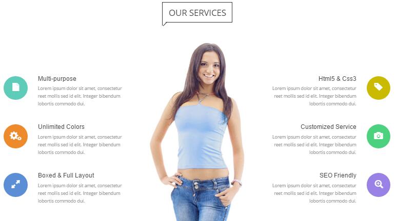
Codes are as follows:
<div data-menuanchor="true" data-scrollshownav="true" data-offset="0" class="anchorTag" data-title="Our Services"> </div>
<div class="h6_service pt-60 pb-50">
  <div class="h6_tit"> <span></span> Our Services </div>
</div>
<div class="row con_a ">
  <div class="col-md-4 col-sm-4 col-xs-12  pb-40 animation fadeInLeft">
    <div class="left ">
      <div class="box ">
        <div class="icon C5fccb9"> <span class="glyphicons glyph-file"></span> </div>
        <h6 class="title">Multi-purpose</h6>
        <p class="text">Lorem ipsum dolor sit amet, consectetur reet mollis sed id elit. Integer bibendum lobortis commodo dui.</p>
      </div>
      <div class="box ">
        <div class="icon Ced8b2c"> <span class="glyphicons glyph-cogwheels"></span> </div>
        <h6 class="title">Unlimited Colors</h6>
        <p class="text">Lorem ipsum dolor sit amet, consectetur reet mollis sed id elit. Integer bibendum lobortis commodo dui.</p>
      </div>
      <div class="box ">
        <div class="icon c5b8ed4"> <span class="glyphicons glyph-resize-full"></span> </div>
        <h6 class="title">Boxed & Full Layout</h6>
        <p class="text">Lorem ipsum dolor sit amet, consectetur reet mollis sed id elit. Integer bibendum lobortis commodo dui.</p>
      </div>
    </div>
  </div>
  <div class="col-md-4 col-sm-4 col-xs-12 animation fadeInDown">
    <div class="center animation fadeInUp animated"><img alt="" class="img-responsive" src="/portals/34/h6_image02.jpg" /></div>
  </div>
  <div class="clearfix visible-xs"></div>
  <div class="col-md-4 col-sm-4 pb-40 col-xs-12 animation fadeInRight">
    <div class="right  ">
      <div class="box ">
        <div class="icon Ccaba02"> <span class="glyphicons glyph-tag"></span> </div>
        <h6 class="title">Html5 & Css3</h6>
        <p class="text">Lorem ipsum dolor sit amet, consectetur reet mollis sed id elit. Integer bibendum lobortis commodo dui.</p>
      </div>
      <div class="box ">
        <div class="icon C4cd17e"> <span class="glyphicons glyph-camera"></span> </div>
        <h6 class="title">Customized Service</h6>
        <p class="text">Lorem ipsum dolor sit amet, consectetur reet mollis sed id elit. Integer bibendum lobortis commodo dui.</p>
      </div>
      <div class="box ">
        <div class="icon C9981e6"> <span class="glyphicons glyph-zoom-in"></span> </div>
        <h6 class="title">SEO Friendly</h6>
        <p class="text">Lorem ipsum dolor sit amet, consectetur reet mollis sed id elit. Integer bibendum lobortis commodo dui.</p>
      </div>
    </div>
  </div>
</div>
Option:
- You can modify
animationto change the animation on the slide. Animation list. - You can modify
glyphicons glyph-*to change icons. font icon list.
Testimonials area
Below is the screen shot:
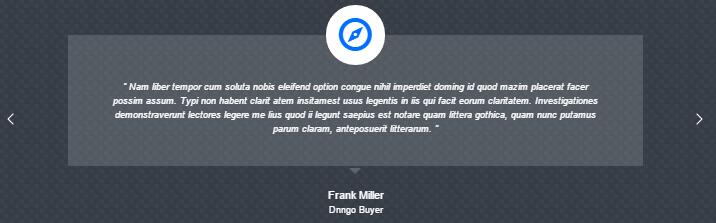
Codes are as follows:
<div class=" pt-60 pb-30 backgroundImage19">
  <div class="dnn_layoutB animation zoomIn">
    <div class="content_mid clearfix">
      <ul class=" Testimonials_tab Testimonials_7 h6_Testimonials_7 " data-position="roll-left" data-display-navigation="false" data-autoplay="0">
        <li>
          <div class="quotes_icon">
            <blockquote>
              <h2 class="glyphicons  glyph-compass"></h2>
              <p>“ Nam liber tempor cum soluta nobis eleifend option congue nihil imperdiet doming id quod mazim placerat facer possim assum. Typi non habent clarit atem insitamest usus legentis in iis qui facit eorum claritatem. Investigationes demonstraverunt lectores legere me lius quod ii legunt saepius est notare quam littera gothica, quam nunc putamus parum claram, anteposuerit litterarum. ”</p>
              <small class="a_t_c">Frank Miller<span>Dnngo Buyer</span></small> </blockquote>
          </div>
        </li>
        <li>
          <div class="quotes_icon">
            <blockquote>
              <h2 class="glyphicons  glyph-compass"></h2>
              <p>Lorem ipsum dolor sit amet, consectetur adipiscing elit. Etiam ante ex, fermentum vel libero eget, interdum semper libero. Curabitur egestas, arcu id tempor convallis, ex tortor efficitur turpis, eget mattis tellus risus ut dolor tempus hendrerit vehicula. Curabitur cursus blandit velit sed diam nonummy nibh euismod tincidunt ut laoreet dolore magn aliquam erat.</p>
              <small class="a_t_c">Frank Miller<span>Dnngo Buyer</span></small> </blockquote>
          </div>
        </li>
        <li>
          <div class="quotes_icon">
            <blockquote>
              <h2 class="glyphicons  glyph-compass"></h2>
              <p>Lorem ipsum dolor sit amet, consectetur reet mollis sed id elit. Integer bibendum lobortis commodo dui.</p>
              <small class="a_t_c">Frank Miller<span>Dnngo Buyer</span></small> </blockquote>
          </div>
        </li>
        <li>
          <div class="quotes_icon">
            <blockquote>
              <h2 class="glyphicons  glyph-compass"></h2>
              <p>Nulla nisi mi, rutrum ac orci sit amet, accumsan adipiscing minibh auctor magna laoreet.</p>
              <small class="a_t_c">Frank Miller<span>Dnngo Buyer</span></small> </blockquote>
          </div>
        </li>
      </ul>
    </div>
  </div>
</div>
PRICING area
Below is the screen shot:
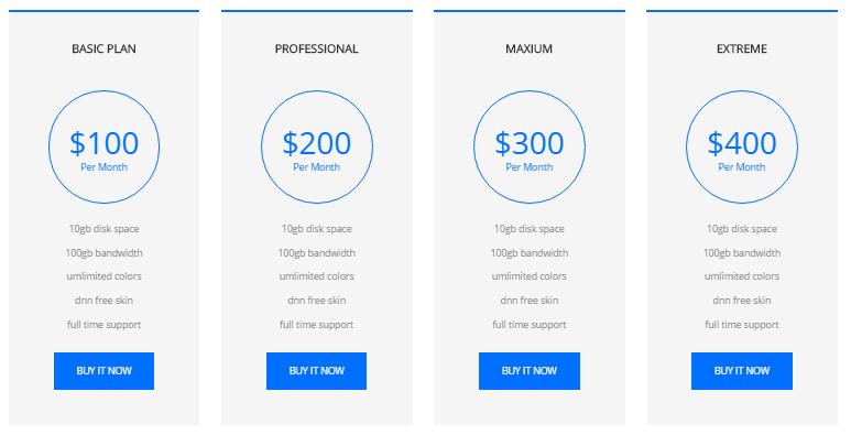
Codes are as follows:
<div data-menuanchor="true" data-scrollshownav="true" data-offset="0" class="anchorTag" data-title="Pricing"> </div>
<div class=" pt-60 pb-50 ">
  <div class="dnn_layoutB">
    <div class="content_mid ">
      <div class="h6_service pb-50">
        <div class="h6_tit"> <span></span> Pricing </div>
      </div>
      <div class="price-table price-table8 row animation">
        <div class="col-md-3 col-sm-6 animation_item scaleUp delay1">
          <div class="price_border">
            <div class="price_title">
              <h2>BASIC PLAN</h2>
            </div>
            <div class="price_holder">
              <div class="price_box"><span class="sup">$</span><span class="price">100</span><span class="unit">Per Month</span></div>
              <ul>
                <li>10gb disk space</li>
                <li>100gb bandwidth</li>
                <li>umlimited colors</li>
                <li>dnn free skin</li>
                <li>full time support</li>
              </ul>
              <a class="btn " href="#" target="blank">BUY IT NOW</a> </div>
          </div>
        </div>
        <div class="col-md-3 col-sm-6 animation_item scaleUp delay2">
          <div class="price_border">
            <div class="price_title ">
              <h2>PROFESSIONAL</h2>
            </div>
            <div class="price_holder">
              <div class="price_box"><span class="sup">$</span><span class="price">200</span><span class="unit">Per Month </span></div>
              <ul>
                <li>10gb disk space</li>
                <li>100gb bandwidth</li>
                <li>umlimited colors</li>
                <li>dnn free skin</li>
                <li>full time support</li>
              </ul>
              <a class="btn" href="#" target="blank">BUY IT NOW</a> </div>
          </div>
        </div>
        <div class="col-md-3 col-sm-6 animation_item scaleUp delay3">
          <div class="price_border">
            <div class="price_title">
              <h2>MAXIUM</h2>
            </div>
            <div class="price_holder">
              <div class="price_box"><span class="sup">$</span><span class="price">300</span><span class="unit">Per Month</span></div>
              <ul>
                <li>10gb disk space</li>
                <li>100gb bandwidth</li>
                <li>umlimited colors</li>
                <li>dnn free skin</li>
                <li>full time support</li>
              </ul>
              <a class="btn" href="#" target="blank">BUY IT NOW</a> </div>
          </div>
        </div>
        <div class="col-md-3 col-sm-6 animation_item scaleUp delay4">
          <div class="price_border">
            <div class="price_title">
              <h2>EXTREME</h2>
            </div>
            <div class="price_holder">
              <div class="price_box"><span class="sup">$</span><span class="price">400</span><span class="unit">Per Month</span></div>
              <ul>
                <li>10gb disk space</li>
                <li>100gb bandwidth</li>
                <li>umlimited colors</li>
                <li>dnn free skin</li>
                <li>full time support</li>
              </ul>
              <a class="btn " href="#" target="blank">BUY IT NOW</a> </div>
          </div>
        </div>
      </div>
    </div>
  </div>
</div>
Multi Purpose area
Below is the screen shot:
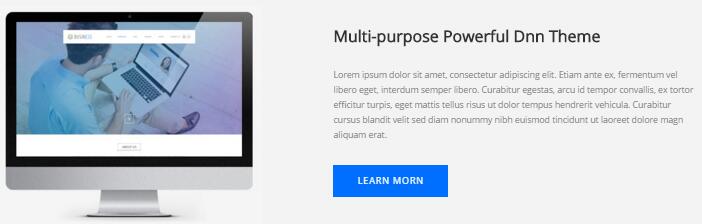
Codes are as follows:
<div class=" pt-60 pb-40 h1_bg">
  <div class="dnn_layoutB">
    <div class="content_mid ">
      <div class=" row">
        <div class="col-sm-6 animation fadeInLeft">
          <div class="h6_left"> <img alt="" class="img-responsive" src="/portals/34/h6_image03.jpg" /> </div>
        </div>
        <div class="col-sm-6 animation fadeInRight">
          <div class="h6_right">
            <h2>Multi-purpose Powerful Dnn Theme</h2>
            <p>Lorem ipsum dolor sit amet, consectetur adipiscing elit. Etiam ante ex, fermentum vel libero eget, interdum semper libero. Curabitur egestas, arcu id tempor convallis, ex tortor efficitur turpis, eget mattis tellus risus ut dolor tempus hendrerit vehicula. Curabitur cursus blandit velit sed diam nonummy nibh euismod tincidunt ut laoreet dolore magn aliquam erat.</p>
            <div class="h6_bnt"> <a href="#" target="blank" class="Button_default6">LEARN MORN</a></div>
          </div>
        </div>
      </div>
    </div>
  </div>
</div>
<div data-menuanchor="true" data-scrollshownav="true" data-offset="0" class="anchorTag" data-title="Concern us"> </div>
Option:
col-md-*is the width of each column, you can change the width you need through value1~12.- You can modify
animationto change the animation on the slide. Animation list.
CONTACT US area
Below is the screen shot:
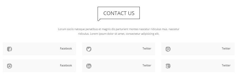
Codes are as follows:
<div class=" pt-60 pb-40 animation ">
  <div class="dnn_layoutB">
    <div class="content_mid ">
      <div class="h6_tit"> <span></span> Concern us </div>
      <div class="Center pt-30">Lorum sociis natoque penatibus et magnis dis parturient montes nascetur ridiculus mus. nascetur </div>
      <div class="Center pb-30">ridiculus. Lorem ipsum dolor sit amet, consectetur adipisicing elit. </div>
      <div class="  row H6_Con_us ">
        <div class="col-sm-4 animation_item scaleUp delay1">
          <div class="H6_Conus_box"> <a href="#"><span class="social social-facebook"></span> Facebook</a></div>
        </div>
        <div class="col-sm-4 animation_item scaleUp delay2">
          <div class="H6_Conus_box"><a href="#"><span class="social social-twitter"></span> Twitter</a></div>
        </div>
        <div class="col-sm-4 animation_item scaleUp delay3">
          <div class="H6_Conus_box"><a href="#"><span class="social social-quora"></span> Twitter</a></div>
        </div>
      </div>
      <div class="  row H6_Con_us">
        <div class="col-sm-4 animation_item scaleUp delay4">
          <div class="H6_Conus_box"> <a href="#"><span class="social social-picasa"></span> Facebook</a></div>
        </div>
        <div class="col-sm-4 animation_item scaleUp delay5">
          <div class="H6_Conus_box"><a href="#"><span class="social social-linked-in"></span> Twitter</a></div>
        </div>
        <div class="col-sm-4 animation_item scaleUp delay6">
          <div class="H6_Conus_box"><a href="#"><span class="social social-google-plus"></span> Twitter</a></div>
        </div>
      </div>
    </div>
  </div>
</div>
Contact Info area
Below is the screen shot:
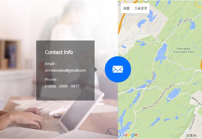
Codes are as follows:
<div class="clearfix h6_bottom_box No_mar30 animation">
  <div class="h6_bottom_left animation_item scaleUp delay1"><img alt="" class="img-responsive" src="/portals/34/h6_image04.jpg" /></div>
  <div id="gmap01" class="h6_bottom_right animation_item scaleUp delay2"></div>
  <span> <a class="glyphicons glyph-envelope"></a> </span>
  <div class="iLightBox6">
    <h3>Contact Info</h3>
    <p> Email : <br />
      dnnskindev@gmailcom</p>
    <p> Phone :<br />
      (+088) - 2600 - 9877</p>
  </div>
</div>
About Us area
Below is the screen shot:
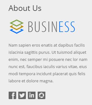
Codes are as follows:
<div class="h3_footera animation fadeInLeft"> <img alt="" class="img-responsive" src="/portals/34/h6_banner.png" />
  <p>Nam sapien eros enatis at dapibus facilis islacinia sagittis purus. Ut tuismod aliquet enim, nec semper mi posuere nec lor nam nunc est, faucibus iaculis varius vitae, eius modi tempora incidunt placerat quis felis labore et dolore magna. </p>
  <div class="H6_footer_Social"> <a href="#"><span class="social social-facebook"></span> </a> <a href="#"> <span class="social social-twitter"></span> </a> <a href="#"> <span class="social social-linked-in"></span> </a> <a href="#"> <span class="social social-picasa"></span> </a> </div>
</div>
Option:
- You can modify
animationto change the animation on the slide. Animation list. - You can modify
glyphicons glyph-*to change icons. font icon list. Containeris usingContainer-2
Photo Gallery area
Below is the screen shot:
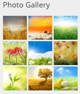
Codes are as follows:
<ul class="insets_list clearfix animation fadeInDown">
  <li>
    <div class="photo_box img_zoom"> <a href="/Portals/34/Photo_1_big.jpg" class="LightBox_image_gallery5">
      <div class="pic_box"> <img alt="" src="/portals/34/Photo_1.jpg" />
        <div class="shade"></div>
      </div>
      </a> </div>
  </li>
  <li>
    <div class="photo_box img_zoom"> <a href="/Portals/34/Photo_2_big.jpg" class="LightBox_image_gallery5">
      <div class="pic_box"> <img alt="" src="/portals/34/Photo_2.jpg" />
        <div class="shade"></div>
      </div>
      </a> </div>
  </li>
  <li>
    <div class="photo_box img_zoom"> <a href="/Portals/34/Photo_3_big.jpg" class="LightBox_image_gallery5">
      <div class="pic_box"> <img alt="" src="/portals/34/Photo_3.jpg" />
        <div class="shade"></div>
      </div>
      </a> </div>
  </li>
  <div class="row-fluid">
    <li>
      <div class="photo_box img_zoom"> <a href="/Portals/34/Photo_4_big.jpg" class="LightBox_image_gallery5">
        <div class="pic_box"> <img alt="" src="/portals/34/Photo_4.jpg" />
          <div class="shade"></div>
        </div>
        </a> </div>
    </li>
    <li>
      <div class="photo_box img_zoom"> <a href="/Portals/34/Photo_5_big.jpg" class="LightBox_image_gallery5">
        <div class="pic_box"> <img alt="" src="/portals/34/Photo_5.jpg" />
          <div class="shade"></div>
        </div>
        </a> </div>
    </li>
    <li>
      <div class="photo_box img_zoom"> <a href="/Portals/34/Photo_6_big.jpg" class="LightBox_image_gallery5">
        <div class="pic_box"> <img alt="" src="/portals/34/Photo_6.jpg" />
          <div class="shade"></div>
        </div>
        </a> </div>
    </li>
  </div>
  <div class="row-fluid">
    <li>
      <div class="photo_box img_zoom"> <a href="/Portals/34/Photo_7_big.jpg" class="LightBox_image_gallery5">
        <div class="pic_box"> <img alt="" src="/portals/34/Photo_7.jpg" />
          <div class="shade"></div>
        </div>
        </a> </div>
    </li>
    <li>
      <div class="photo_box img_zoom"> <a href="/Portals/34/Photo_8_big.jpg" class="LightBox_image_gallery5">
        <div class="pic_box"> <img alt="" src="/portals/34/Photo_8.jpg" />
          <div class="shade"></div>
        </div>
        </a> </div>
    </li>
    <li>
      <div class="photo_box img_zoom"> <a href="/Portals/34/Photo_9_big.jpg" class="LightBox_image_gallery5">
        <div class="pic_box"> <img alt="" src="/portals/34/Photo_9.jpg" />
          <div class="shade"></div>
        </div>
        </a> </div>
    </li>
  </div>
</ul>
Option:
Containeris usingContainer-2
Archives area
Below is the screen shot:
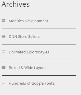
Codes are as follows:
<div class="h3_footerc animation fadeInUp">
<ul>
    <li><span class="glyphicons glyph-show-lines"></span>Modules Development</li>
    <li><span class="glyphicons glyph-show-lines"></span>DNN Store Sellers</li>
    <li><span class="glyphicons glyph-show-lines"></span>Unlimited Colors/Styles</li>
    <li><span class="glyphicons glyph-show-lines"></span>Boxed & Wide Layout</li>
    <li><span class="glyphicons glyph-show-lines"></span>Hundreds of Google Fonts</li>
</ul>
</div>
Option:
Containeris usingContainer-2
Twitter Feed area
Below is the screen shot:
Codes are as follows:
<div class="h3_footerd animation fadeInRight">
  <div class="H6_pos"> <a href="#"> <span class="social social-twitter"> </span></a>
    <div class="h3_footerd_con">
      <p><a href="#">@DNNGOBUYER</a> Eodem modo typi, qui nunc nobis videntur parum.</p>
      20 mins ago </div>
  </div>
  <div class="H6_pos"> <a href="#"> <span class="social social-twitter"> </span></a>
    <div class="h3_footerd_con">
      <p><a href="#">@DNNGOBUYER</a> Eodem modo typi, qui nunc nobis videntur parum.</p>
      20 mins ago </div>
  </div>
  <div class="H6_pos"> <a href="#"> <span class="social social-twitter"> </span></a>
    <div class="h3_footerd_con">
      <p><a href="#">@DNNGOBUYER </a>Eodem modo typi, qui nunc nobis videntur parum.</p>
      20 mins ago </div>
  </div>
</div>
Option:
Containeris usingContainer-2
Home Version 7
You can click the link to check Home Version 7 demo. Home Version 7
Banner area
Below is the screen shot:

<ul class="full_screen_pic">
  <li style="background-image: url(''http://dnn708.test.dnngo.net/Portals/12/h7_banner_01.jpg'');">
    <div class="content">
      <div class="dnn_layout">
        <div class="h6_content animation zoomIn">
          <h2> CONSTANTLY UPGRADE</h2>
          <p class="animation_item scaleUp delay1">Our works will keep upgrading our skins and modules.</p>
          <br />
          <div class="h5_bnt02 "> <a class="Button_default" href="#" target="blank">View Demo</a> </div>
        </div>
        <div id="nextPage" class="animation zoomIn"><span></span></div>
      </div>
    </div>
  </li>
</ul>
Banner Bottom area area
Below is the screen shot:
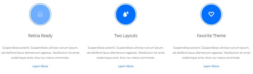
Codes are as follows:
<div class=" pt-60 pb-40 	">
  <div class="dnn_layoutB">
    <div class="content_mid ">
      <div class="row animation ">
        <div class="col-sm-4 animation_item scaleUp delay1">
          <div class="h7_service">
            <div class="h7_service_border"> <span class="glyphicons glyph-lock"></span></div>
            <h2> Retina Ready</h2>
            <p> Suspendisse potenti. Suspendisse ultrices rutrum ipsum, vel eleifend lacus elementum egestas. Vestibulum sit amet scelerisque ante. bitur eu metus commodo. </p>
            <a href="#" target="blank">Learn More</a> </div>
        </div>
        <div class="col-sm-4 animation_item scaleUp delay2">
          <div class="h7_service">
            <div class="h7_service_border"> <span class="glyphicons glyph-tint"></span></div>
            <h2>Two Layouts</h2>
            <p> Suspendisse potenti. Suspendisse ultrices rutrum ipsum, vel eleifend lacus elementum egestas. Vestibulum sit amet scelerisque ante. bitur eu metus commodo. </p>
            <a href="#" target="blank">Learn More</a> </div>
        </div>
        <div class="col-sm-4 animation_item scaleUp delay3">
          <div class="h7_service">
            <div class="h7_service_border"> <span class="glyphicons glyph-heart-empty"></span></div>
            <h2>Favorite Theme</h2>
            <p> Suspendisse potenti. Suspendisse ultrices rutrum ipsum, vel eleifend lacus elementum egestas. Vestibulum sit amet scelerisque ante. bitur eu metus commodo. </p>
            <a href="#" target="blank">Learn More</a> </div>
        </div>
      </div>
    </div>
  </div>
</div>
Advanced Theme area
Below is the screen shot:
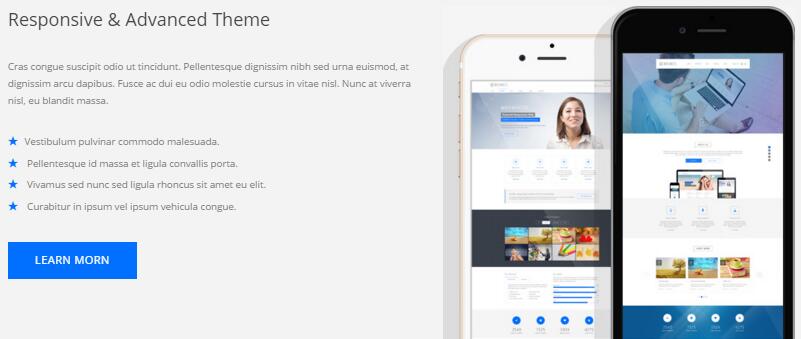
Codes are as follows:
<div class=" pt-60  h1_bg ">
  <div class="dnn_layoutB">
    <div class="content_mid ">
      <div class=" row h7_con">
        <div class="col-sm-6 Con_top  animation fadeInLeft  ">
          <div class="h7_left pb-60">
            <h2>Responsive & Advanced Theme</h2>
            <p>Cras congue suscipit odio ut tincidunt. Pellentesque dignissim nibh sed urna euismod, at dignissim arcu dapibus. Fusce ac dui eu odio molestie cursus in vitae nisl. Nunc at viverra nisl, eu blandit massa. </p>
            <ul>
              <li> <span class="glyphicons glyph-star"></span><a href="#">Vestibulum pulvinar commodo malesuada.</a></li>
              <li><span class="glyphicons glyph-star"></span> <a href="#"> Pellentesque id massa et ligula convallis porta.</a></li>
              <li><span class="glyphicons glyph-star"></span><a href="#"> Vivamus sed nunc sed ligula rhoncus sit amet eu elit.</a></li>
              <li><span class="glyphicons glyph-star"></span><a href="#"> Curabitur in ipsum vel ipsum vehicula congue.</a></li>
            </ul>
            <div class="h6_bnt"> <a href="#" target="blank" class="Button_default6">LEARN MORN</a></div>
          </div>
        </div>
        <div class="col-sm-6 animation fadeInRight">
          <div class="h7_right"> <img alt="" src="/portals/12/h7_01.jpg" /> </div>
        </div>
      </div>
    </div>
  </div>
</div>
Option:
col-md-*is the width of each column, you can change the width you need through value1~12.- You can modify
animationto change the animation on the slide. Animation list.
Unlimited Styles area
Below is the screen shot:
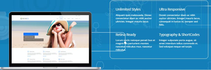
Codes are as follows:
<div class=" pt-60  backgroundImage20">
  <div class="dnn_layoutB">
    <div class="content_mid ">
      <div class=" row Tab_bot ">
        <div class="col-sm-6 ">
          <div class="h7_service03_img animation fadeInUp"><img alt="" src="/portals/12/h7_01_03.png" class="img-responsive" /></div>
        </div>
        <div class="col-sm-6">
          <ul class="h7_service03 clearfix mb-60 animation">
            <li class="animation_item scaleUp delay1">
              <h2>Unlimited Styles</h2>
              <p>Aliquam quis malesuada. Donec consectetur diam ac nibh auctor ultricies. Integer mauris lacus</p>
            </li>
            <li class="animation_item scaleUp delay2">
              <h2>Ultra Responsive</h2>
              <p>Donec consectetur diam ac nibh auctor ultricies. Integer mauris lacus, consequat in luctus id, semper sed felis.</p>
            </li>
            <li class="animation_item scaleUp delay3">
              <h2>Retina Ready</h2>
              <p>Lorum sociis natoque penati bus et magnis dis parturient montes nascetur ridiculus mus. nascetur ridiculus. </p>
            </li>
            <li class="animation_item scaleUp delay4">
              <h2>Typography & ShortCodes</h2>
              <p>Integer vulputate porta augue, sit amet interdum tellus commodo et. Sed volutpat neque vel turpis</p>
            </li>
          </ul>
        </div>
      </div>
    </div>
  </div>
</div>
Meet Our Team area
Below is the screen shot:
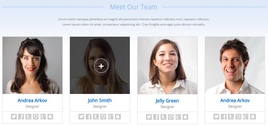
Codes are as follows:
<div class="  pb-55 h7_bg02 ">
  <div class="dnn_layoutB">
    <div class="content_mid ">
      <div class=" row Tab_bot">
        <div class="col-sm-6 h7_service03_img"> <img alt="" class="img-responsive" src="/portals/12/h7_02_01.png" /></div>
        <div class="col-sm-6"> </div>
      </div>
      <div class="H7_tit ">
        <h2>Meet Our Team </h2>
      </div>
      <div class=" pt-20 pb-40">
        <div class="Center">Lorum sociis natoque penatibus et magnis dis parturient montes nascetur ridiculus mus. nascetur ridiculus. </div>
        <div class="Center"> Lorem ipsum dolor sit amet, consectetur adipisicing elit. Cras fringilla eros eget justo dictum convallis. </div>
      </div>
      <div class="H7_About_us_box">
        <div class="row animation">
          <div class="col-sm-3 animation_item scaleUp delay1">
            <div class="photo_box  ico_right_enter box_border_padding H7_team_box  "> <a href="#">
              <div class="pic_box"> <img alt="" src="/portals/12/person01.jpg" />
                <div class="ico"> <span class="glyphicons glyph-plus"></span> </div>
                <div class="shade"> </div>
              </div>
              </a>
              <div class="H7_pic_box_con">
                <h2>Andrea Arkov</h2>
                <h3>Designer</h3>
              </div>
              <div class="H7_Social"> <a href="#"> <span class="social social-twitter"></span> </a> <a href="#"> <span class="social social-facebook"></span> </a> <a href="#"> <span class="social social-tumblr"></span> </a> <a href="#"> <span class="social social-picasa"></span> </a> <a href="#"> <span class="social social-google-plus"></span> </a> <a href="#"> <span class="social social-apple"></span> </a> </div>
            </div>
          </div>
          <div class="col-sm-3 animation_item scaleUp delay2">
            <div class="photo_box  ico_right_enter box_border_padding H7_team_box  "> <a href="#">
              <div class="pic_box"> <img alt="" src="/portals/12/person02.jpg" />
                <div class="ico"> <span class="glyphicons glyph-plus"></span> </div>
                <div class="shade"></div>
              </div>
              </a>
              <div class="H7_pic_box_con">
                <h2>John Smith</h2>
                <h3>Designer</h3>
              </div>
              <div class="H7_Social"> <a href="#"> <span class="social social-twitter"></span> </a> <a href="#"> <span class="social social-facebook"></span> </a> <a href="#"> <span class="social social-tumblr"></span> </a> <a href="#"> <span class="social social-picasa"></span> </a> <a href="#"> <span class="social social-google-plus"></span> </a> <a href="#"> <span class="social social-apple"></span> </a> </div>
            </div>
          </div>
          <div class="col-sm-3 animation_item scaleUp delay3">
            <div class="photo_box  ico_right_enter box_border_padding H7_team_box  "> <a href="#">
              <div class="pic_box"> <img alt="" src="/portals/12/person03.jpg" />
                <div class="ico"> <span class="glyphicons glyph-plus"></span> </div>

                <div class="shade"></div>
              </div>
              </a>
              <div class="H7_pic_box_con">
                <h2>Jelly Green</h2>
                <h3>Designer</h3>
              </div>
              <div class="H7_Social"> <a href="#"> <span class="social social-twitter"></span> </a> <a href="#"> <span class="social social-facebook"></span> </a> <a href="#"> <span class="social social-tumblr"></span> </a> <a href="#"> <span class="social social-picasa"></span> </a> <a href="#"> <span class="social social-google-plus"></span> </a> <a href="#"> <span class="social social-apple"></span> </a> </div>
            </div>
          </div>
          <div class="col-sm-3 animation_item scaleUp delay4">
            <div class="photo_box  ico_right_enter box_border_padding H7_team_box  "> <a href="#">
              <div class="pic_box"> <img alt="" src="/portals/12/person04.jpg" />
                <div class="ico"> <span class="glyphicons glyph-plus"></span> </div>
                <div class="shade"></div>
              </div>
              </a>
              <div class="H7_pic_box_con">
                <h2>Andrea Arkov</h2>
                <h3>Designer</h3>
              </div>
              <div class="H7_Social"> <a href="#"> <span class="social social-twitter"></span> </a> <a href="#"> <span class="social social-facebook"></span> </a> <a href="#"> <span class="social social-tumblr"></span> </a> <a href="#"> <span class="social social-picasa"></span> </a> <a href="#"> <span class="social social-google-plus"></span> </a> <a href="#"> <span class="social social-apple"></span> </a> </div>
            </div>
          </div>
        </div>
      </div>
    </div>
  </div>
</div>
How it was created area
Below is the screen shot:
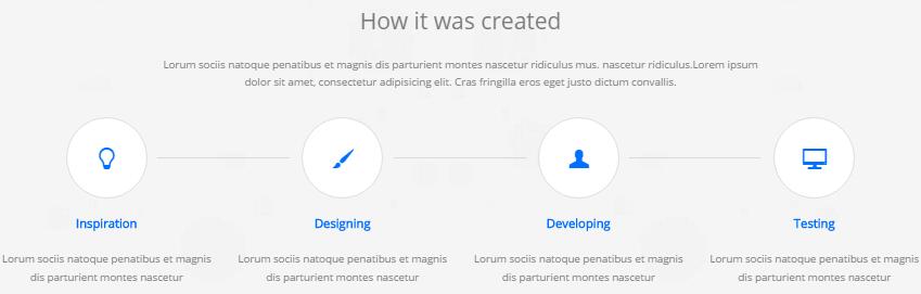
Codes are as follows:
<div class=" pt-60 pb-30 backgroundImage21">
  <div class="dnn_layoutB">
    <div class="content_mid ">
      <div class="H7_tit02">
        <h2>How it created</h2>
      </div>
      <div class="pt-30 Center">Lorum sociis natoque penatibus et magnis dis parturient montes nascetur ridiculus mus. nascetur ridiculus.Lorem ipsum </div>
      <div class="Center pb-30">dolor sit amet, consectetur adipisicing elit.  Cras fringilla eros eget justo dictum convallis. </div>
      <div class=" row animation">
        <div class="col-sm-3 animation_item scaleUp delay1">
          <div class="h7_created"><span class="glyphicons glyph-lightbulb"></span></div>
          <div class="h7_created_con">
            <h2>Inspiration</h2>
            <p>Lorum sociis natoque penatibus et magnis dis parturient montes nascetur </p>
          </div>
        </div>
        <div class="col-sm-3 animation_item scaleUp delay2">
          <div class="h7_created"><span class="glyphicons glyph-brush"></span></div>
          <div class="h7_created_con">
            <h2>Designing</h2>
            <p>Lorum sociis natoque penatibus et magnis dis parturient montes nascetur </p>
          </div>
        </div>
        <div class="col-sm-3 animation_item scaleUp delay3">
          <div class="h7_created"><span class="glyphicons glyph-user"></span></div>
          <div class="h7_created_con">
            <h2>Developing</h2>
            <p>Lorum sociis natoque penatibus et magnis dis parturient montes nascetur </p>
          </div>
        </div>
        <div class="col-sm-3 animation_item scaleUp delay4">
          <div class="h7_created last_after"><span class="glyphicons glyph-display"></span></div>
          <div class="h7_created_con">
            <h2>Testing</h2>
            <p>Lorum sociis natoque penatibus et magnis dis parturient montes nascetur </p>
          </div>
        </div>
      </div>
    </div>
  </div>
</div>
Function area
Below is the screen shot:
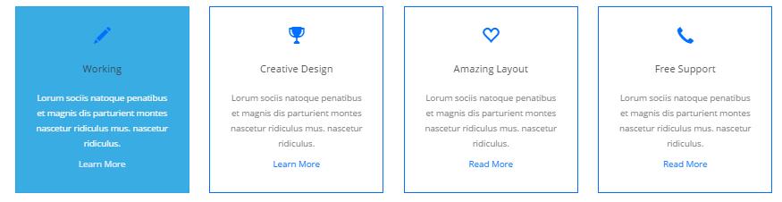
Codes are as follows:
<div class=" pt-60 pb-40 	">
  <div class="dnn_layoutB">
    <div class="content_mid ">
      <div class="row animation ">
        <div class="col-sm-3 animation_item scaleUp delay1">
          <div class="h7_service02"> <span class="glyphicons glyph-pencil"></span>
            <h2>Working </h2>
            <p>Lorum sociis natoque penatibus et magnis dis parturient montes nascetur ridiculus mus. nascetur ridiculus. </p>
            <a href="#" target="blank">Learn More</a> </div>
        </div>
        <div class="col-sm-3 animation_item scaleUp delay2">
          <div class="h7_service02"> <span class="glyphicons glyph-cup"></span>
            <h2>Creative Design</h2>
            <p> Lorum sociis natoque penatibus et magnis dis parturient montes nascetur ridiculus mus. nascetur ridiculus. </p>
            <a href="#" target="blank">Learn More</a> </div>
        </div>
        <div class="col-sm-3 animation_item scaleUp delay3">
          <div class="h7_service02"> <span class="glyphicons glyph-heart-empty"></span>
            <h2>Amazing Layout</h2>
            <p> Lorum sociis natoque penatibus et magnis dis parturient montes nascetur ridiculus mus. nascetur ridiculus. </p>
            <a href="#" target="blank">Read More</a> </div>
        </div>
        <div class="col-sm-3 animation_item scaleUp delay4">
          <div class="h7_service02"> <span class="glyphicons glyph-earphone"></span>
            <h2>Free Support</h2>
            <p> Lorum sociis natoque penatibus et magnis dis parturient montes nascetur ridiculus mus. nascetur ridiculus. </p>
            <a href="#" target="blank">Read More</a> </div>
        </div>
      </div>
    </div>
  </div>
</div>
Function Bottom area
Below is the screen shot:

Codes are as follows:
<div class="carousel carousel_4 animation zoomIn" data-pagination="false">
  <div class="item">
    <div class="photo_box shade_zoom">
      <div class="pic_box"> <img alt="" src="/portals/12/Photo2.jpg" />
        <div class="ico"> <a href="/Portals/12/Photo2.jpg" class="LightBox_image_gallery4"><span class="glyphicons glyph-resize-small"></span></a> </div>
        <div class="shade"></div>
      </div>
    </div>
  </div>
  <div class="item">
    <div class="photo_box shade_zoom">
      <div class="pic_box"> <img alt="" src="/portals/12/Photo3.jpg" />
        <div class="ico"> <a href="/Portals/12/Photo3.jpg" class="LightBox_image_gallery4"><span class="glyphicons glyph-resize-small"></span></a></div>
        <div class="shade"></div>
      </div>
    </div>
  </div>
  <div class="item">
    <div class="photo_box shade_zoom">
      <div class="pic_box"> <img alt="" src="/portals/12/Photo4.jpg" />
        <div class="ico"> <a href="/Portals/12/Photo4.jpg" class="LightBox_image_gallery4"><span class="glyphicons glyph-resize-small"></span></a> </div>
        <div class="shade"></div>
      </div>
    </div>
  </div>
  <div class="item">
    <div class="photo_box shade_zoom">
      <div class="pic_box"> <img alt="" src="/portals/12/Photo5.jpg" />
        <div class="ico"> <a href="/Portals/12/Photo5.jpg" class="LightBox_image_gallery4"><span class="glyphicons glyph-resize-small"></span></a> </div>
        <div class="shade"></div>
      </div>
    </div>
  </div>
  <div class="item">
    <div class="photo_box shade_zoom">
      <div class="pic_box"> <img alt="" src="/portals/12/Photo6.jpg" />
        <div class="ico"> <a href="/Portals/12/Photo6.jpg" class="LightBox_image_gallery4"><span class="glyphicons glyph-resize-small"></span></a> </div>
        <div class="shade"></div>
      </div>
    </div>
  </div>
  <div class="item">
    <div class="photo_box shade_zoom">
      <div class="pic_box"> <img alt="" src="/portals/12/Photo7.jpg" />
        <div class="ico"> <a href="/Portals/12/Photo7.jpg" class="LightBox_image_gallery4"><span class="glyphicons glyph-resize-small"></span></a> </div>
        <div class="shade"></div>
      </div>
    </div>
  </div>
</div>
CONTACT US area
Below is the screen shot:
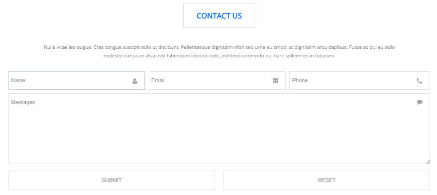
Option:
- This is
Theme_Responsive_20054_home7theme ofDNNGo PowerFormsmodule
About Us area
Below is the screen shot:
Codes are as follows:
<div class="h3_footera animation fadeInLeft"> <img alt="" class="img-responsive" src="/portals/34/h6_banner.png" />
  <p>Nam sapien eros enatis at dapibus facilis islacinia sagittis purus. Ut tuismod aliquet enim, nec semper mi posuere nec lor nam nunc est, faucibus iaculis varius vitae, eius modi tempora incidunt placerat quis felis labore et dolore magna. </p>
  <div class="H6_footer_Social"> <a href="#"><span class="social social-facebook"></span> </a> <a href="#"> <span class="social social-twitter"></span> </a> <a href="#"> <span class="social social-linked-in"></span> </a> <a href="#"> <span class="social social-picasa"></span> </a> </div>
</div>
Option:
Containeris usingContainer-2
Map area
Below is the screen shot:
Codes are as follows:
<ul class="insets_list clearfix animation fadeInDown">
  <li>
    <div class="photo_box img_zoom"> <a href="/Portals/34/Photo_1_big.jpg" class="LightBox_image_gallery5">
      <div class="pic_box"> <img alt="" src="/portals/34/Photo_1.jpg" />
        <div class="shade"></div>
      </div>
      </a> </div>
  </li>
  <li>
    <div class="photo_box img_zoom"> <a href="/Portals/34/Photo_2_big.jpg" class="LightBox_image_gallery5">
      <div class="pic_box"> <img alt="" src="/portals/34/Photo_2.jpg" />
        <div class="shade"></div>
      </div>
      </a> </div>
  </li>
  <li>
    <div class="photo_box img_zoom"> <a href="/Portals/34/Photo_3_big.jpg" class="LightBox_image_gallery5">
      <div class="pic_box"> <img alt="" src="/portals/34/Photo_3.jpg" />
        <div class="shade"></div>
      </div>
      </a> </div>
  </li>
  <div class="row-fluid">
    <li>
      <div class="photo_box img_zoom"> <a href="/Portals/34/Photo_4_big.jpg" class="LightBox_image_gallery5">
        <div class="pic_box"> <img alt="" src="/portals/34/Photo_4.jpg" />
          <div class="shade"></div>
        </div>
        </a> </div>
    </li>
    <li>
      <div class="photo_box img_zoom"> <a href="/Portals/34/Photo_5_big.jpg" class="LightBox_image_gallery5">
        <div class="pic_box"> <img alt="" src="/portals/34/Photo_5.jpg" />
          <div class="shade"></div>
        </div>
        </a> </div>
    </li>
    <li>
      <div class="photo_box img_zoom"> <a href="/Portals/34/Photo_6_big.jpg" class="LightBox_image_gallery5">
        <div class="pic_box"> <img alt="" src="/portals/34/Photo_6.jpg" />
          <div class="shade"></div>
        </div>
        </a> </div>
    </li>
  </div>
  <div class="row-fluid">
    <li>
      <div class="photo_box img_zoom"> <a href="/Portals/34/Photo_7_big.jpg" class="LightBox_image_gallery5">
        <div class="pic_box"> <img alt="" src="/portals/34/Photo_7.jpg" />
          <div class="shade"></div>
        </div>
        </a> </div>
    </li>
    <li>
      <div class="photo_box img_zoom"> <a href="/Portals/34/Photo_8_big.jpg" class="LightBox_image_gallery5">
        <div class="pic_box"> <img alt="" src="/portals/34/Photo_8.jpg" />
          <div class="shade"></div>
        </div>
        </a> </div>
    </li>
    <li>
      <div class="photo_box img_zoom"> <a href="/Portals/34/Photo_9_big.jpg" class="LightBox_image_gallery5">
        <div class="pic_box"> <img alt="" src="/portals/34/Photo_9.jpg" />
          <div class="shade"></div>
        </div>
        </a> </div>
    </li>
  </div>
</ul>
Option:
Containeris usingContainer-2
Archives area
Below is the screen shot:
Codes are as follows:
<div class="h3_footerc animation fadeInUp">
<ul>
    <li><span class="glyphicons glyph-show-lines"></span>Modules Development</li>
    <li><span class="glyphicons glyph-show-lines"></span>DNN Store Sellers</li>
    <li><span class="glyphicons glyph-show-lines"></span>Unlimited Colors/Styles</li>
    <li><span class="glyphicons glyph-show-lines"></span>Boxed & Wide Layout</li>
    <li><span class="glyphicons glyph-show-lines"></span>Hundreds of Google Fonts</li>
</ul>
</div>
Option:
Containeris usingContainer-2
Twitter Feed area
Below is the screen shot:
Codes are as follows:
<div class="h3_footerd animation fadeInRight">
  <div class="H6_pos"> <a href="#"> <span class="social social-twitter"> </span></a>
    <div class="h3_footerd_con">
      <p><a href="#">@DNNGOBUYER</a> Eodem modo typi, qui nunc nobis videntur parum.</p>
      20 mins ago </div>
  </div>
  <div class="H6_pos"> <a href="#"> <span class="social social-twitter"> </span></a>
    <div class="h3_footerd_con">
      <p><a href="#">@DNNGOBUYER</a> Eodem modo typi, qui nunc nobis videntur parum.</p>
      20 mins ago </div>
  </div>
  <div class="H6_pos"> <a href="#"> <span class="social social-twitter"> </span></a>
    <div class="h3_footerd_con">
      <p><a href="#">@DNNGOBUYER </a>Eodem modo typi, qui nunc nobis videntur parum.</p>
      20 mins ago </div>
  </div>
</div>
Option:
Containeris usingContainer-2
Coming Soon
You can click the link to check Coming Soon demo. Coming Soon
Below is the screen shot:
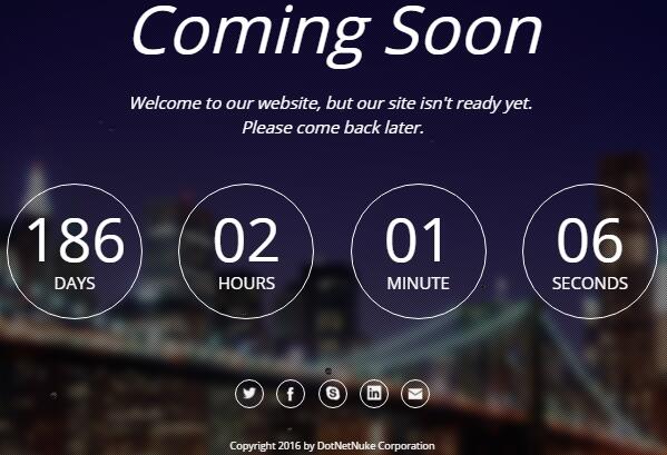
You can create the coming soon page easily following these steps:
- Create a page named coming soon page.
- Import the ComingSoon.Page.template for this page.
- You can set color, end time, and background image for Coming Soon page through xPlugin, as below:
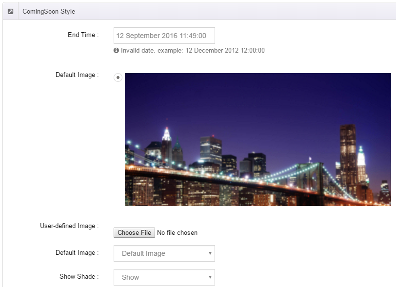
Boxed Layout
You can set Boxed mode in DNNGo.xPlugin > Skins > Options > Content Layout > Content Layout
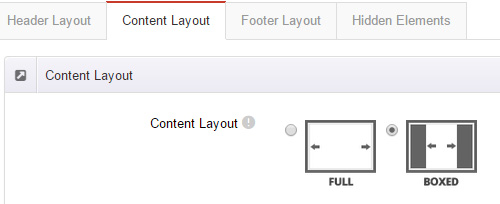
Dark Mode
You can set Dark mode directly in DNNGo.xPlugin > Skins > Options > Content Layout > Content Color Mode.
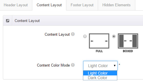
DNNGo_LayerGalleryPro Module
You can see this module in the banner section on the home page, we will guide you step by step to set up the module as the same as our demo site:
- Go to Host –> Extensions –> Install Extension wizard to install the module pack DNNGo_LayerGalleryPro.0x.0x_PA.zip.
- Add DNNGo_LayerGalleryPro module to the BannerPane.
- Click Manager button.
- Click the navigation of the left Import&Export
- Import ContentListEntity.xml file under DNNGo_LayerGalleryPro Module.
- You will see the imported data on Manage List page and you can change the text/image in the banner by clicking Edit button.
- Click this link so you can check the module instruction details.
DNNGo_GalleryPro Module
This module contains 15 responsive sldiers in total.
- Go to Host –> Extensions –> Install Extension wizard to install the module pack DNNGo_DNNGalleryPro_xx.xx.xx_PA.zip.
- Add DNNGo_DNNGalleryPro module to the page.
- Click Effect List tab.
- Choose an effect you like.
- You can click this link to check the module demo.
- Click this link so you can check the module instruction details.
DNNGo_xBlog Module
We use this module on the blog page, click this link so you can check the module instruction details.
DNNGo_PhotoAlbums Module
We use this module on the Portfolios page, click this link so you can check the module instruction details.
DNNGo_PowerForms Module
You can create the form through this module, click this link so you can check the module instruction details.
License interface
- Please login or register your account at http://www.dnngo.net
- Send an email to dnnskindev@gmail.com with your invoice ID, machine Key for every module( different module has different machine key), and your DNNGO username. We will generate an activation code for you. Please note: If your site is a demo site, your license will still be valid when you transfer your site to a live site.
- Manage my licenses
Contact Us
If you have any questions or suggestions about modules/skins or modules/skins installation process, please feel free to contact us.
- Website: www.dnngo.net
- Email: dnnskindev@gmail.com
- Skype: dnngo-linda