20063-UnlimitedColorsPack-045 v6.0.0
Documentation
- Created: 08/26/2015
- Latest update: 04/20/2019
- By: DNNGo
- Email: dnnskindev@gmail.com
Thank you for purchasing my theme. If you have any questions that are beyond the scope of this help file, please feel free to email via my user page contact form here. Thanks so much!
General Information
DotNetNuke Information
To install this skin you must have a working version of Dotnetnuke already installed. If you need help to install Dotnetnuke, follow the instructions in Documentation Center.
What Is Included With Your Package
When you purchase our theme, you will receive one large .zip file that contains everything inside. Unzip that file to get all the content inside. Below is a full list of everything that is included along with a brief description of each item. See the corresponding sections for info on installing the theme.
- Inside the Content folder are: DNN Skins folder, DNNGo_DNNGallery Module folder, DNNGo_LayerGalleryPro folder, DNNGo_PhotoAlbums Module folder, DNNGo_PowerForms Module folder, DNNGo_xPlugin Module folder, DNNGo_xBlog Module folder, PSD folder, Page template.
- DNN Skins folder - The skin in this folder can be used in DNN 8.x, DNN 9.x only.
- DNNGo_DNNGalleryPro Module folder - This module contains 15 responsive sldiers in total.
- DNNGo_LayerGalleryPro folder - You can see this module in the banner section on home page.
- DNNGo_PhotoAlbums folder - You can see this module in Portfolios page.
- DNNGo_PowerForms folder - You can create forms through this module.
- DNNGo_xBlog Module folder - You can see this module on Blog page.
- Page Templates folder - Exported page templates will allow you to reproduce our live demo pages.
Notice: If you bought the theme from DNN Store (http://store.dnnsoftware.com), then none of module files are included in the download package. It only include DNN Skins, DNNGo_xPlugin, Page Templates and PSD files. If you need to purchase modules, please contact us via email (dnnskindev@gmail.com).
What Are The Requirements To Use skins and modules
To use skins and modules, you must be running DNN 8.x or higher. We have tested it with DNN 8.x, DNN 9.x.
Skin and Required Modules Installation
For DNN 8
-
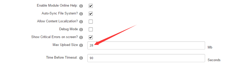
Go to Host-Settings –> Host-Settings, and select the tab Other Settings, changing Max Upload Size to 28 or higher.
-
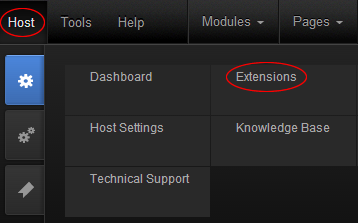
Go to Host –> Extensions –> Install Extension wizard to install the module pack DNNGo_xPlugin_0x.0x.00_PA.zip
-
Go to Host –> Extensions –> Install Extension wizard to install the skin pack 20063-UnlimitedColorsPack-045-DNNSkins.zip
-
You can install other modules as per your own needs.
-
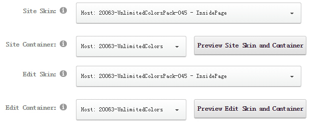
After the installation has been completed, navigate to Admin –> Site Settings –> Basic Settings (tab) –> Appearance (section) and specify portal and edit skins and containers like shown in the screenshot below. It should be done, in order to make your DNN admin UI look correct and readable.
-
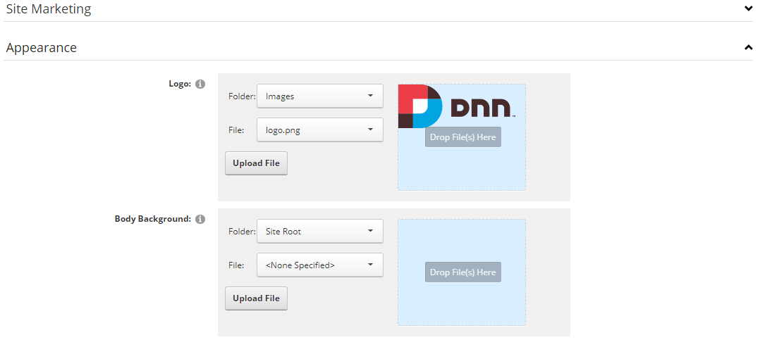
Now you can upload the LOGO image in Admin –> Site Settings –> Basic Settings (tab) –> Appearance (section) page.
For DNN 9
-
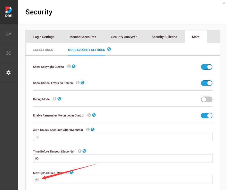
Go to Settings –> Security –> More, and select the tab MORE SECURITY SETTINGS, changing Max Upload Size to 28 or higher.
-
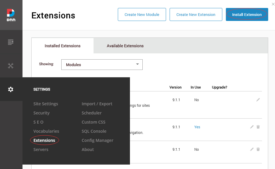
Go to Host –> Extensions –> Install Extension wizard to install the module pack DNNGo_xPlugin_0x.0x.00_PA.zip
-
Go to Host –> Extensions –> Install Extension wizard to install the skin pack 20063-UnlimitedColorsPack-045-DNNSkins.zip
-
You can install other modules as per your own needs.
-
Manage
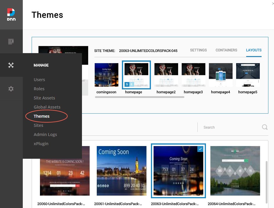
After the installation has been completed, navigate to Manage –> Themes. Select and apply 20063-UnlimitedColorsPack-045
-
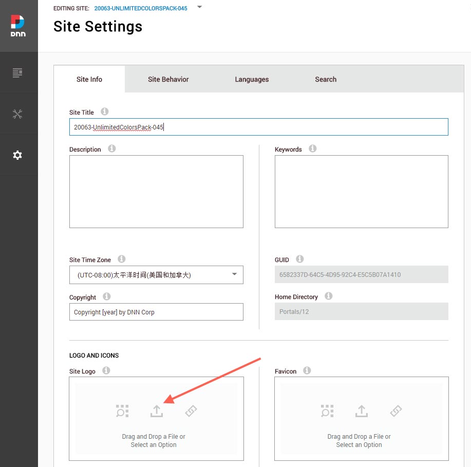
You can upload the LOGO image in Settings –> Site Settings page.
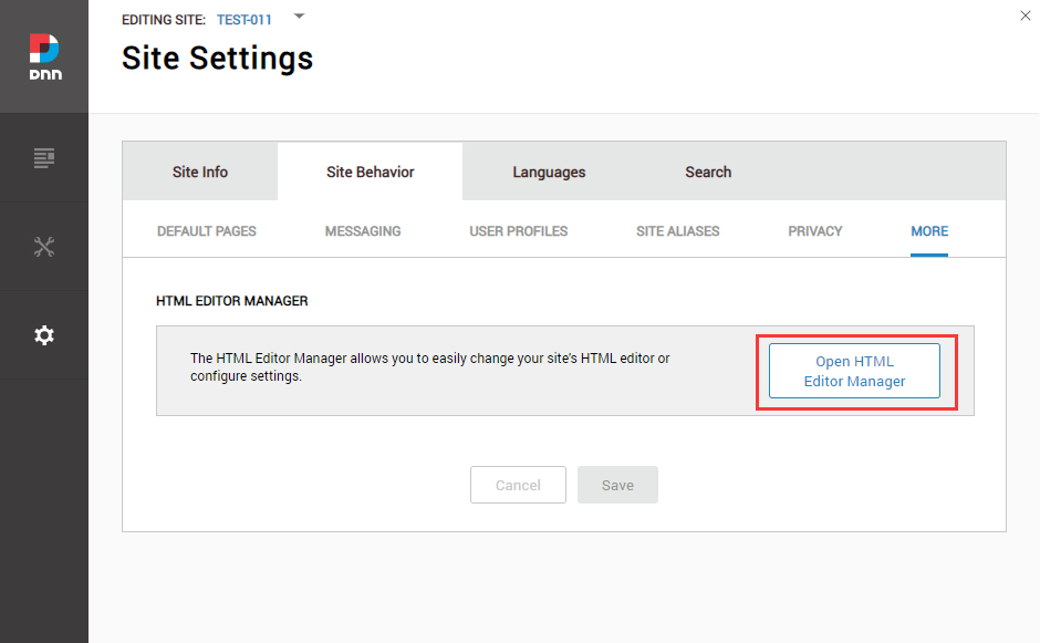
Change the Settings of HTML Editor
By default, HTML editor will remove the div tags whose content is blank. For example: if we add the code <div class=”pt-20″></div> in HTML editor and click save, you will find the code is missing when you edit it afterwards. So we need to change the settings to prevent this from happening.
Log in to your site as super administrator.
Go to SETTINGS > Site Settings > Site Behavior > MORE, click the Open HTML Editor Manager.
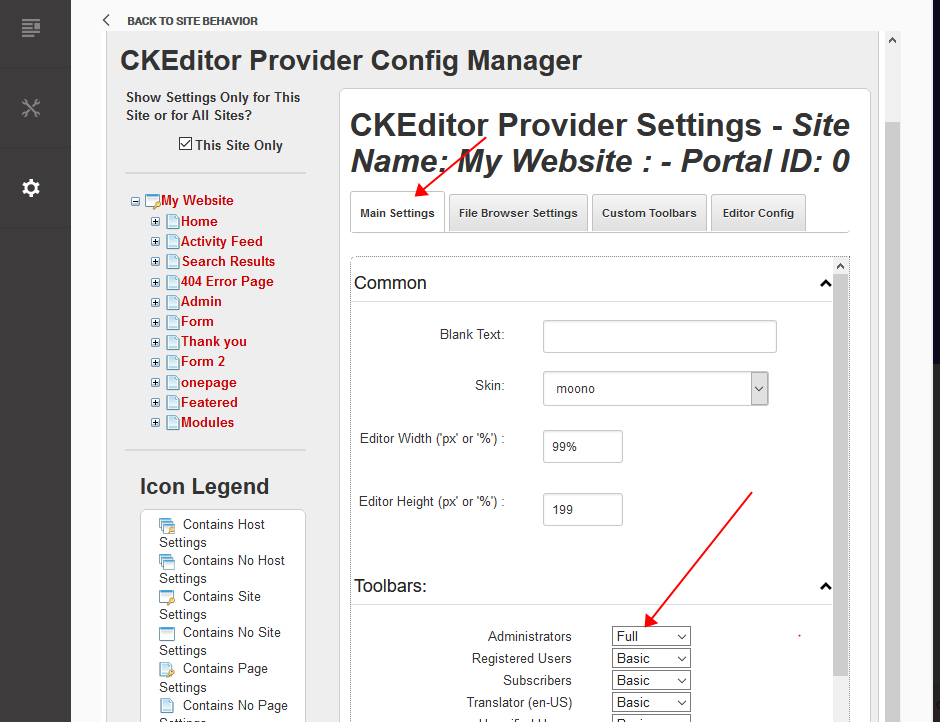
Click the Main Settings tab. Set the value of Administrators to be Full.
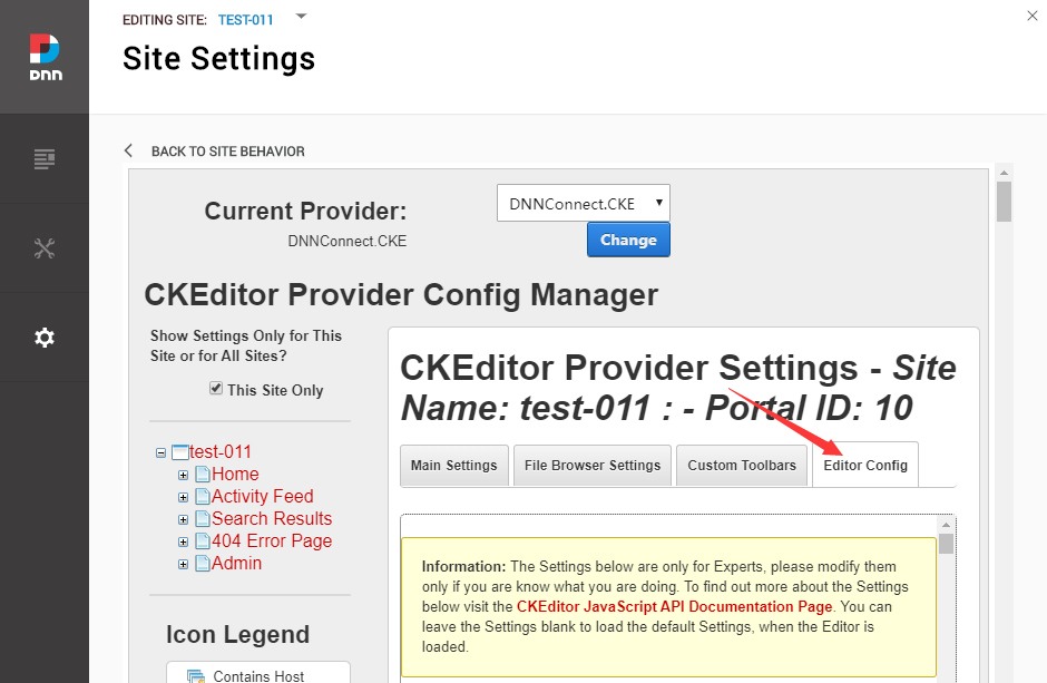
Click the Editor Config tab.
Set the value of AllowedContent to be true.
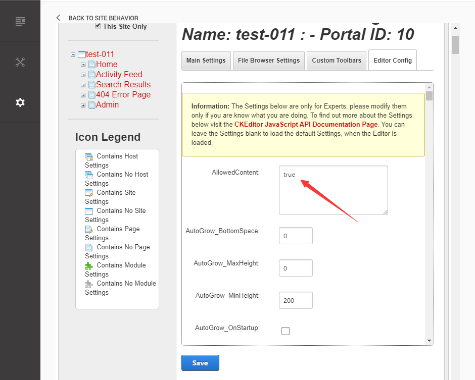
Set the value of FillEmptyBlocks to be false.
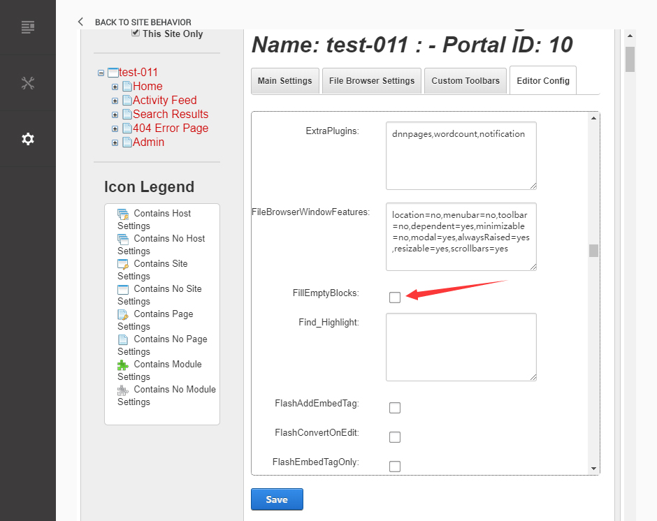
Set the value of ignoreEmptyParagraph to be false.
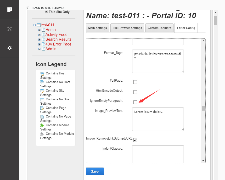
Click the Save button.
How to import page template?
Exported page templates will allow you to reproduce our live demo pages. We'll reproduce the home page as an example.
For DNN 8
-
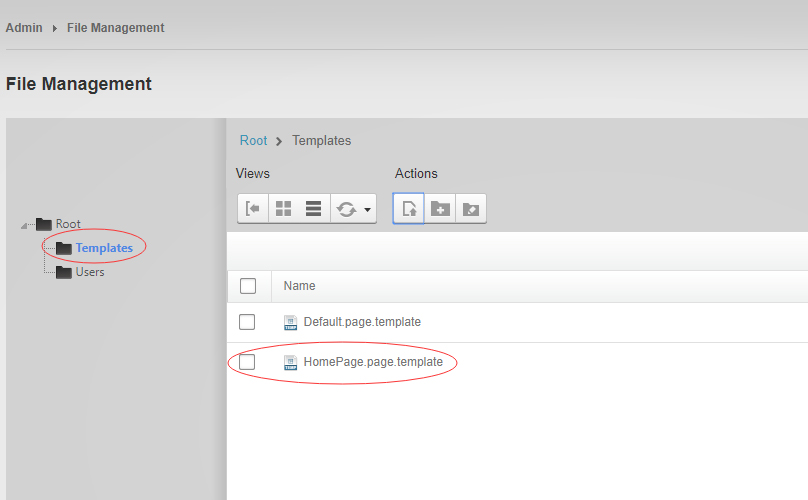
You can find these files in Page Templates Directory.
-
Upload Home.page.template file into your portal root (e.g. Portals/0/Templates/) in the previous chapter and synchronize your folders, you are able to start using page templates to clone live demo pages.
-
Because page templates can not import image files, you need to upload all the photo files of the "images" folder into your portal root (e.g. Portals/0/).
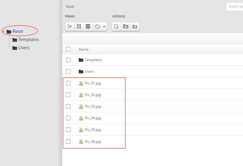
-
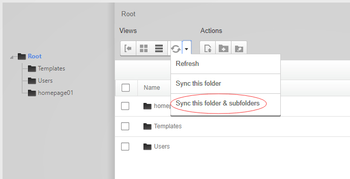
Synchronize the file in Admin > File-Management
-
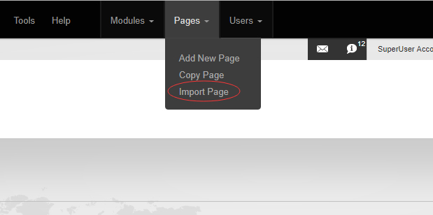
Navigate to the Home page and click Pages -> Import.
-
Find a proper page exported content file navigating to Templates folder and choosing for example Home page.
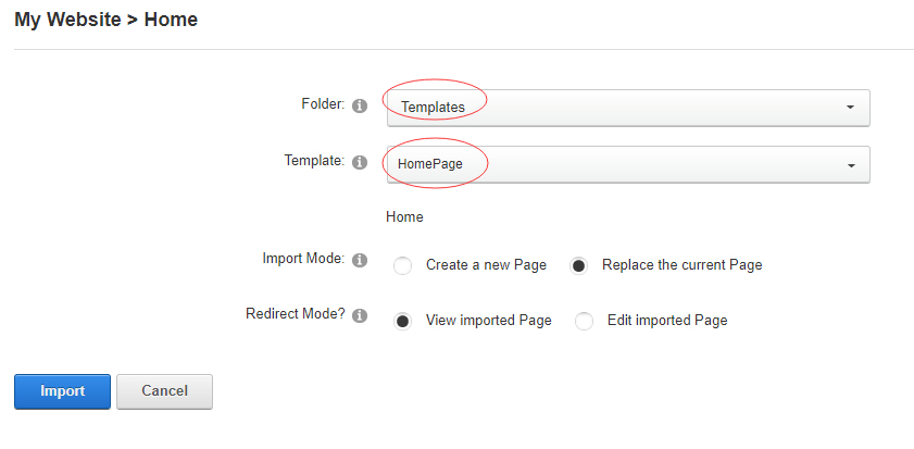
-
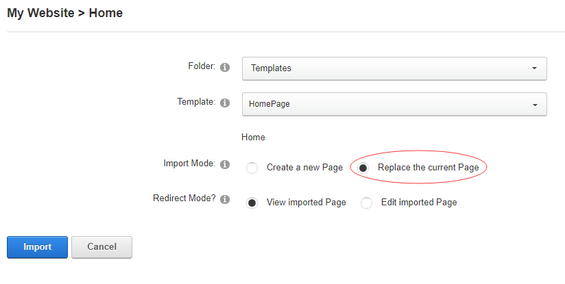
Choose "Replace the current Page" and the redirect mode you need. Please note, if you select "Replace the current Page", content of current page will be reset.
-
Click Import button if everything is correct.
-
Specify page settings according to your needs (necessarily apply HomePage skin to the home page) and click "Update Page". The home page is ready.
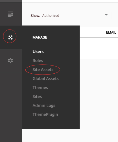
For DNN 9
-
Go to Manage > Site Assets
-
Uploading Home.page.template file to Templates folder
-
Because page templates can not import image files, you need to upload all the photo files of the "images" folder into your portal root (e.g. Portals/0/).
-
Go to Content > Pages > Add Page
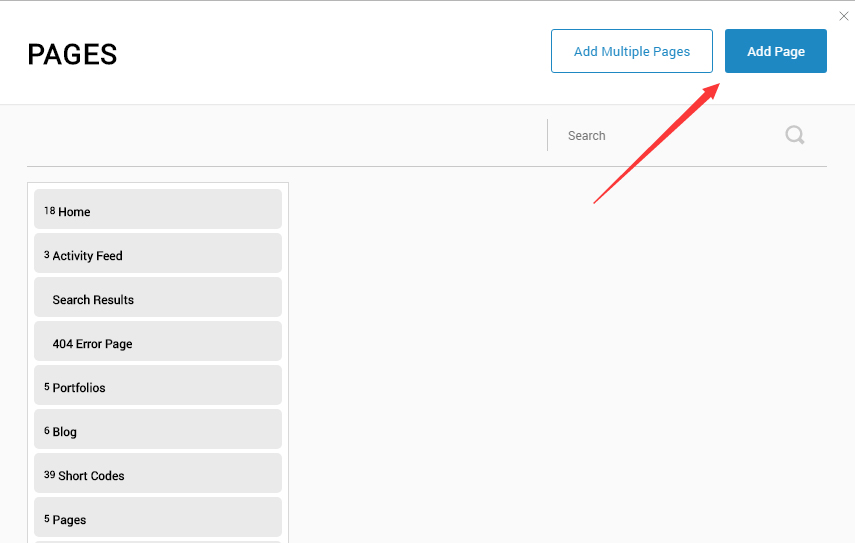
-
Choose your template from Template drop-down.
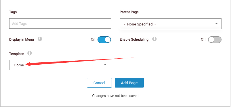
- Click Add Page
Note : Page templates can only be imported when you are creating a new page.
Skin feature and how to use them.
Page Template
The product contains page templates for all pages in the live demo, you can copy our demo site by importing the page templates.
Eight kinds of header layout
You can click the xPlugin button to go to settings page, and then choose different header styles in Header Layout section.
You can click these links to check different header styles. header 1, header 2, header 3, header 4, header 5, header 6, header 7, header 8
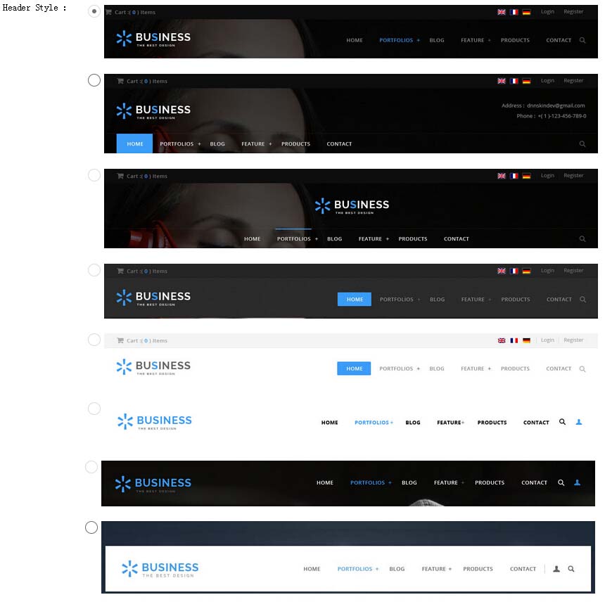
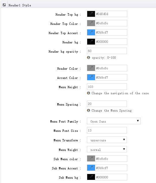
Each header includes very rich setting options, you can modify the color of whatever you would like to . For example: text color, font size and background color etc.
Header Position
Header Position is for setting the position of Header. If you have it set to Float to top, Header will float over the Banner. If you have it set to Not float, Header will show with Banner side by side.
You can compare the difference between these two settings through the following two screen shots.


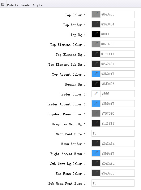
Mobile header Option
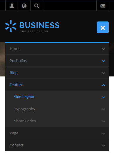
You can set the text color, background color and etc of mobile header in Mobile header style.
Insidepage-leftmenu layout
Insidepage-leftmenu layout page is using InsidePage-leftmenu skin. Menus on the left side are displaying the second level menus.
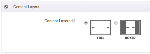
Full Layout and Boxed Layout
This skin contains Full Layout and Boxed Layout, you can set through Content Layout section.
With Boxed Layout applied, you can still set page background, it will display around the content. You can click link to check demo url of boxed layout.
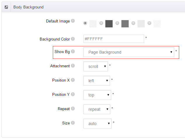
The background can be set as static or rotating image or any solid color for you choose to apply, also you can set different background images for different pages.
How to set background image for DNN page.
- You need to choose Boxed Layout.
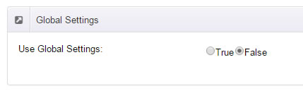
- Choose Page Background in the Option for Show bg, save settings.
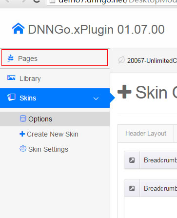
- Click "pages" nav in the xPlugin.
- Click Edit Background icon.
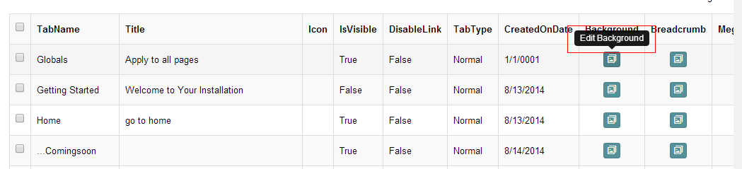
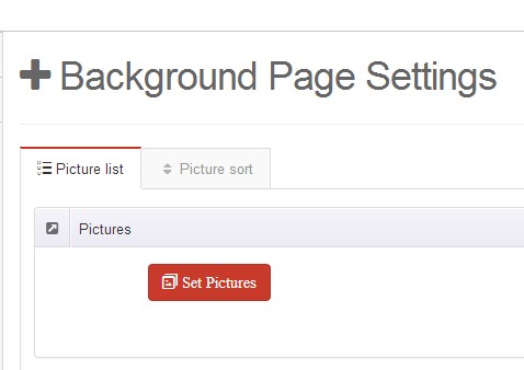
- Upload image, the background image will show as slider if you choose two or more images.
- "Globals" allows you to set background image for all pages.
- Also you can set background image for each page.
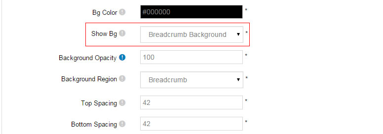
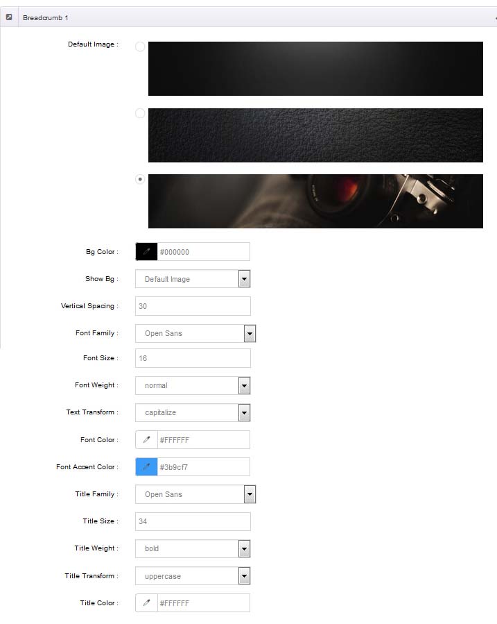
How to set breadcrumb image for DNN page.
- Choose Breadcrumb Background in the Option for Show bg, save settings.
- Click "pages" nav in the xPlugin.
- Click Edit Breadcrumb icon.
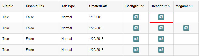
- Upload image, the background image will show as slider if you choose two or more images.
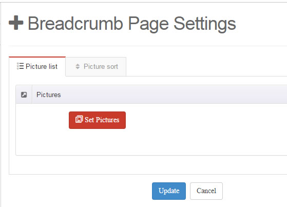
- "Globals" allows you to set background image for all pages.
- Also you can set background image for each page.
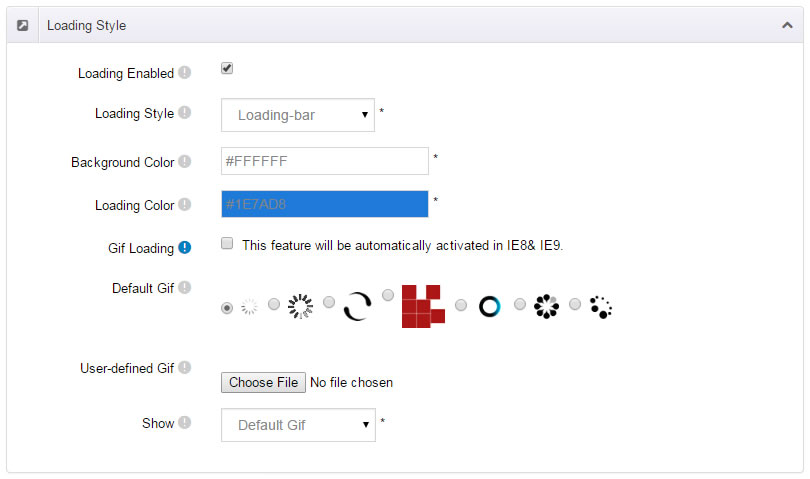
Loading Style
You can set the page loading animation.
You can select to have this feature turned on or off.
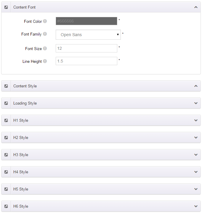
Content Style
You can set the font color and size, link color, the color of H1-H6 etc of the content area.
Four kinds of Breadcrumb layouts
You can choose different Breadcrumb styles through Breadcrumb Layout.
You can click these links to check different breadcrumb styles. breadcrumb 1, breadcrumb 2, breadcrumb 3, breadcrumb 4.
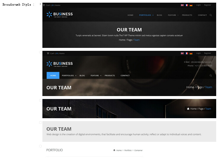
You can change the text color, background color and background image etc for each Breadcrumb layout.
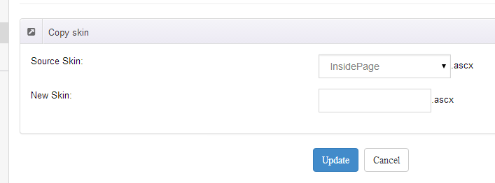
Create a Skin
You can create a new skin through xPlugin. Please note the new skin name shouldn't be the same as the current skin.
Standard Menu and MegaMenu
The skin sub menus contain two types-Standard Menu and MegaMenu.
Standard Menu is the default menu type, the sub menus will be set to display in one column only, as shown in screen shot below:
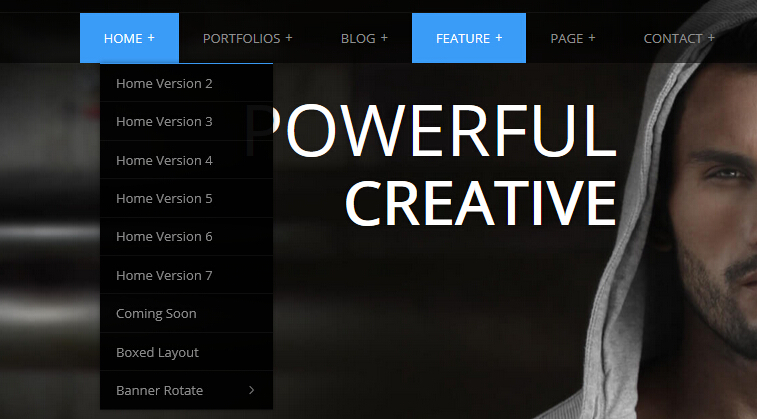
MegaMenu will set sub menus to display in multiple columns, also you can display HTML module or third party module in sub menus, as shown below:
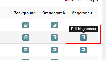
You can set the MegaMenu as per steps below:
- Click "pages" nav in the xPlugin.
- Click Edit MegaMenu button. Please note MegaMenu can be set for first level menus only.
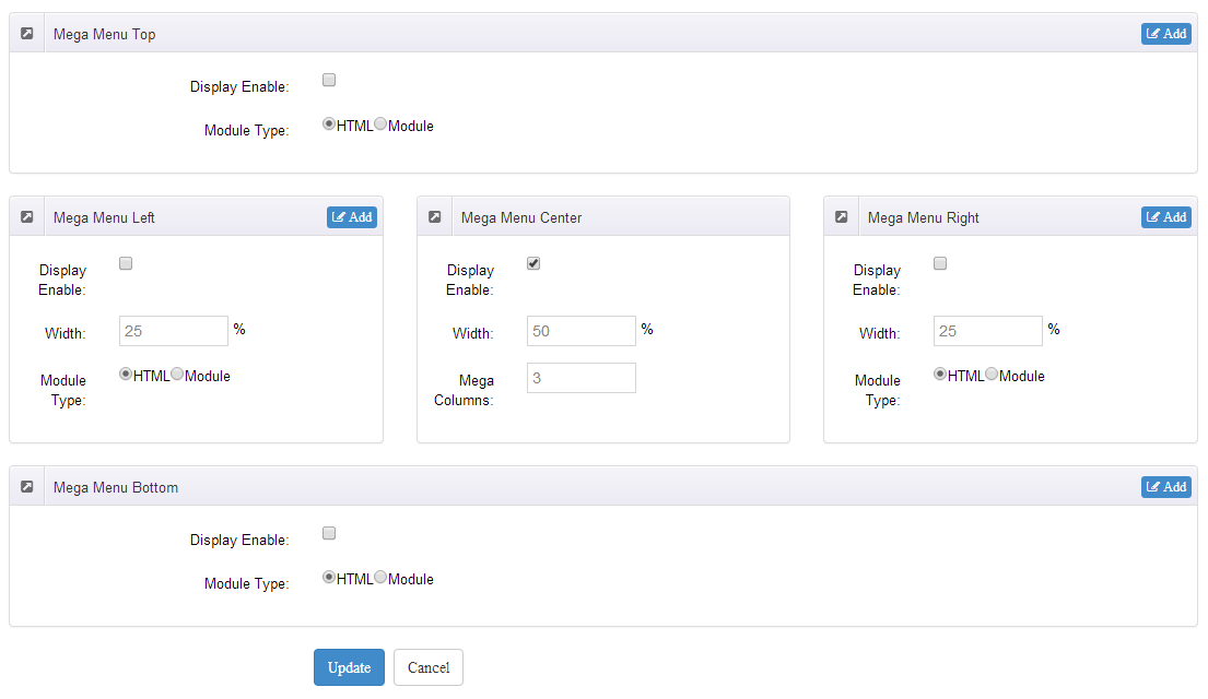
- Set the menu type to MegaMenu.
- Mega Menu has 5 sections: Menu Top, Menu Right, Menu Bottom, Menu Left, Menu Center.
- Click Add button so you will be able to add HTML module or any third module to Menu Top, Menu Right, Menu Bottom, Menu Left.
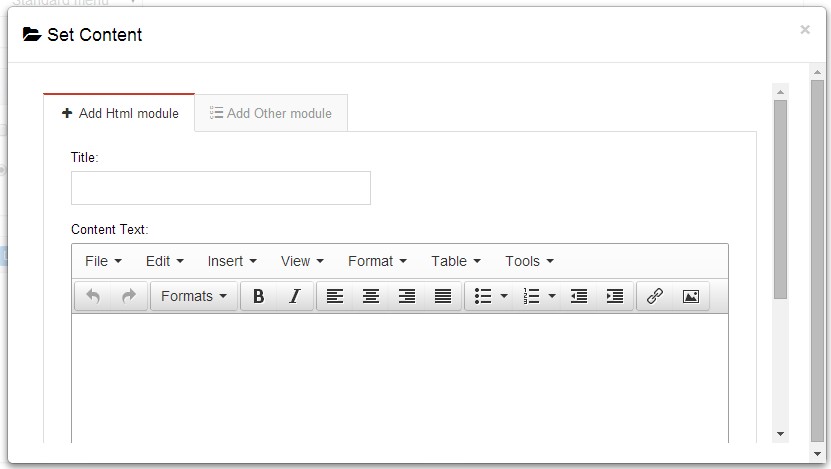
- Module Type-choose to display HTML module or third module.
- Menu Center-it will display secondary menus here.
- Mega Columns-set number of columns the secondary menu will display.
- You can set width for Menu Right, Menu Left, Menu Center, please note their previous total width shouldn't be more than 100.
Set Up Google Map
You can create Google Map easily following these steps:
- Go to xplugin, and click Map Settings tab to fill in API.
- You can register through https://developers.google.com/maps/documentation/javascript/get-api-key.
- Place the code <div id="gmap01"></div> into HTML module.
- Enter location of the map in Address, for example: Bear city, ny
- Enter description in Markers Html, for example: hello word
CSS Codes
Skin is using bootstrap framework. You will get to know more through this url. Link
Width of content area
dnn_layout is the page content framework:
| Device width | Width of content area |
| Large devices Desktops (≥1200px) | 1170px |
| Medium devices Desktops (≥992px) | 970px |
| Small devices Tablets (≥768px) | 750px |
| Extra small devices Phones (<768px) | auto |
content_mid is the spacing between both sides of the page :
| Device width | Spacing |
| Large devices Desktops (≥1200px) | 30px |
| Medium devices Desktops (≥992px) | 20px |
| Small devices Tablets (≥768px) | 15px |
| Extra small devices Phones (<768px) | 15px |
<div class="dnn_layout">
  <div class="content_mid clearfix"> content ... </div>
</div>
Bootstrap 12 grid layout
<!-- Tablet and desktop devices are 50% wide, mobile device is 100% wide -->
<div class="row">
  <div class="col-sm-6">.col-sm-6</div>
  <div class="col-sm-6">.col-sm-6</div>
</div>

<!-- Stack the columns on mobile by making one full-width and the other half-width -->
<div class="row">
  <div class="col-xs-12 col-md-8">.col-xs-12 .col-md-8</div>
  <div class="col-xs-6 col-md-4">.col-xs-6 .col-md-4</div>
</div>

<!-- Columns start at 50% wide on mobile and bump up to 33.3% wide on desktop -->
<div class="row">
  <div class="col-xs-6 col-md-4">.col-xs-6 .col-md-4</div>
  <div class="col-xs-6 col-md-4">.col-xs-6 .col-md-4</div>
  <div class="col-xs-6 col-md-4">.col-xs-6 .col-md-4</div>
</div>

<!-- Columns are always 50% wide, on mobile and desktop -->
<div class="row">
  <div class="col-xs-6">.col-xs-6</div>
  <div class="col-xs-6">.col-xs-6</div>
</div>

<!-- Add the extra clearfix for only the required viewport -->
<div class="clearfix visible-xs-block"></div>
Display and hide elements
| Extra small devices Phones (<768px) | Small devices Tablets (≥768px) | Medium devices Desktops (≥992px) | Large devices Desktops (≥1200px) | |
|---|---|---|---|---|
.visible-xs |
Visible | Hidden | Hidden | Hidden |
.visible-sm |
Hidden | Visible | Hidden | Hidden |
.visible-md |
Hidden | Hidden | Visible | Hidden |
.visible-lg |
Hidden | Hidden | Hidden | Visible |
.hidden-xs |
Hidden | Visible | Visible | Visible |
.hidden-sm |
Visible | Hidden | Visible | Visible |
.hidden-md |
Visible | Visible | Hidden | Visible |
.hidden-lg |
Visible | Visible | Visible | Hidden |
Visible in mobile devices and hidden in other devices
<div class="visible-xs">content...</div>

Visible in other devices and hidden in mobile devices
<div class="hidden-xs">content...</div>
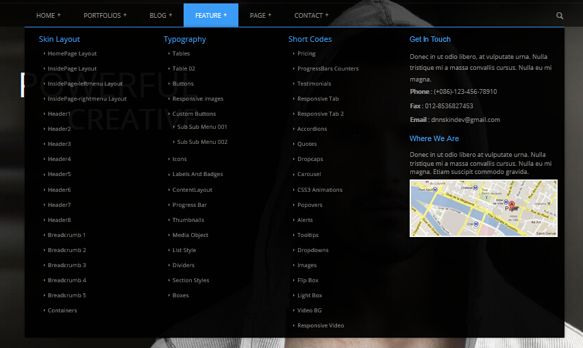
Short Codes
This skin contains a lot of short codes, it is very easy for you to use even you know nothing about js and css, all you need to do is just copying the short codes to HTML module.
Pricing
You can click the link to check Pricing demo. Demo Link
Style 1:
Below is the screen shot:
Codes are as follows:
<div class="price-table price-table1  row">
    <div class="col-md-3 col-sm-6">
        <div class="price_title">
            <h2>BASIC</h2>
        </div>
        <div class="price_holder">
            <div class="price_box"><span class="sup">$</span><span class="price">10</span><span class="unit">/month</span></div>
            <ul>
                <li>RESPONSIVE</li>
                <li>BLOG</li>
                <li>UNLIMITED COLORS</li>
            </ul>
            <a href="#" class="btn ">Purchase Now</a> </div>
    </div>
    <div class="col-md-3 col-sm-6 best_value">
        <div class="price_title ">
            <h2>PROFESSIONAL</h2>
        </div>
        <div class="price_holder">
            <div class="price_box"><span class="sup">$</span><span class="price">20</span><span class="unit">/month</span></div>
            <ul>
                <li>RESPONSIVE</li>
                <li>BLOG</li>
                <li>UNLIMITED COLORS</li>
            </ul>
            <a href="#" class="btn">Purchase Now</a> </div>
    </div>
    <div class="col-md-3 col-sm-6">
        <div class="price_title">
            <h2>BUSINESS</h2>
        </div>
        <div class="price_holder">
            <div class="price_box"><span class="sup">$</span><span class="price">30</span><span class="unit">/month</span></div>
            <ul>
                <li>RESPONSIVE</li>
                <li>BLOG</li>
                <li>UNLIMITED COLORS</li>
            </ul>
            <a href="#" class="btn">Purchase Now</a> </div>
    </div>
    <div class="col-md-3 col-sm-6">
        <div class="price_title">
            <h2>MAXIMUM</h2>
        </div>
        <div class="price_holder">
            <div class="price_box"><span class="sup">$</span><span class="price">40</span><span class="unit">/month</span></div>
            <ul>
                <li>RESPONSIVE</li>
                <li>BLOG</li>
                <li>UNLIMITED COLORS</li>
            </ul>
            <a href="#" class="btn ">Purchase Now</a> </div>
    </div>
</div>
Option:
col-md-3 col-sm-6is the width for each column. You can change the width you need through value1~12
Style 2:
Below is the screen shot:
Codes are as follows:
<div class="price-table price-table2">
    <div class="col-md-3 col-sm-6">
        <div class="price_title"> <span class="glyphicons glyph-tint"></span>
            <h2>BASIC</h2>
        </div>
        <div class="price_holder">
            <div class="price_box"><span class="sup">$</span><span class="price">10</span><span class="unit">/month</span></div>
            <ul>
                <li>RESPONSIVE</li>
                <li>BLOG</li>
                <li>UNLIMITED COLORS</li>
            </ul>
            <a href="#" class="btn ">Purchase Now</a> </div>
    </div>
    <div class="col-md-3 col-sm-6 best_value">
        <div class="price_title "> <span class="glyphicons glyph-tint"></span>
            <h2>PROFESSIONAL</h2>
        </div>
        <div class="price_holder">
            <div class="price_box"><span class="sup">$</span><span class="price">20</span><span class="unit">/month</span></div>
            <ul>
                <li>RESPONSIVE</li>
                <li>BLOG</li>
                <li>UNLIMITED COLORS</li>
            </ul>
            <a href="#" class="btn">Purchase Now</a> </div>
    </div>
    <div class="col-md-3 col-sm-6">
        <div class="price_title"> <span class="glyphicons glyph-tint"></span>
            <h2>BUSINESS</h2>
        </div>
        <div class="price_holder">
            <div class="price_box"><span class="sup">$</span><span class="price">30</span><span class="unit">/month</span></div>
            <ul>
                <li>RESPONSIVE</li>
                <li>BLOG</li>
                <li>UNLIMITED COLORS</li>
            </ul>
            <a href="#" class="btn">Purchase Now</a> </div>
    </div>
    <div class="col-md-3 col-sm-6">
        <div class="price_title"> <span class="glyphicons glyph-tint"></span>
            <h2>MAXIMUM</h2>
        </div>
        <div class="price_holder">
            <div class="price_box"><span class="sup">$</span><span class="price">40</span><span class="unit">/month</span></div>
            <ul>
                <li>RESPONSIVE</li>
                <li>BLOG</li>
                <li>UNLIMITED COLORS</li>
            </ul>
            <a href="#" class="btn ">Purchase Now</a> </div>
    </div>
</div>
Option:
col-md-3 col-sm-6is the width for each column. You can change the width you need through value1~12
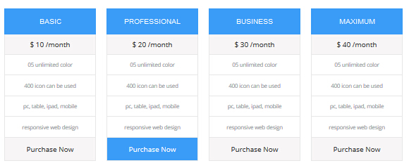
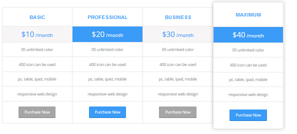
Style 3:
Below is the screen shot:
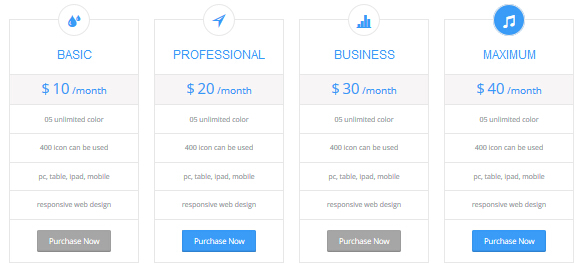
Codes are as follows:
<div class="price-table price-table3  row">
    <div class="col-md-3 col-sm-6">
        <div class="price_title"> <span class="glyphicons glyph-tint"></span>
            <h2>BASIC</h2>
        </div>
        <div class="price_holder">
            <div class="price_box"> <span class="sup">$</span><span class="price">10</span><span class="unit">/month</span> </div>
            <ul>
                <li>05 unlimited color</li>
                <li>400  icon can be used</li>
                <li>pc, table, ipad, mobile</li>
                <li>responsive web design</li>
            </ul>
            <a href="#" class="btn ">Purchase Now</a> </div>
    </div>
    <div class="col-md-3 col-sm-6  best_value">
        <div class="price_title "> <span class="glyphicons glyph-direction"></span>
            <h2>PROFESSIONAL</h2>
        </div>
        <div class="price_holder">
            <div class="price_box"> <span class="sup">$</span><span class="price">20</span><span class="unit">/month</span> </div>
            <ul>
                <li>05 unlimited color</li>
                <li>400  icon can be used</li>
                <li>pc, table, ipad, mobile</li>
                <li>responsive web design</li>
            </ul>
            <a href="#" class="btn">Purchase Now</a> </div>
    </div>
    <div class="col-md-3 col-sm-6">
        <div class="price_title"> <span class="glyphicons glyph-charts"></span>
            <h2>BUSINESS</h2>
        </div>
        <div class="price_holder">
            <div class="price_box"> <span class="sup">$</span><span class="price">30</span><span class="unit">/month</span> </div>
            <ul>
                <li>05 unlimited color</li>
                <li>400  icon can be used</li>
                <li>pc, table, ipad, mobile</li>
                <li>responsive web design</li>
            </ul>
            <a href="#" class="btn">Purchase Now</a> </div>
    </div>
    <div class="col-md-3 col-sm-6">
        <div class="price_title"> <span class="glyphicons glyph-music"></span>
            <h2>MAXIMUM</h2>
        </div>
        <div class="price_holder">
            <div class="price_box"> <span class="sup">$</span><span class="price">40</span><span class="unit">/month</span> </div>
            <ul>
                <li>05 unlimited color</li>
                <li>400  icon can be used</li>
                <li>pc, table, ipad, mobile</li>
                <li>responsive web design</li>
            </ul>
            <a href="#" class="btn ">Purchase Now</a> </div>
    </div>
</div>
Option:
col-md-3 col-sm-6is the width for each column. You can change the width you need through value1~12- You can modify
glyphiconsto change icons. font icon list.
Style 4:
Below is the screen shot:
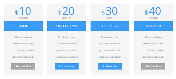
Codes are as follows:
<div class="price-table price-table4  row">
    <div class="col-md-3 col-sm-6">
        <div class="price_box"> <span class="sup">$</span><span class="price">10</span><span class="unit">/MONTH</span> </div>
        <div class="price_title">
            <h2>BASIC</h2>
        </div>
        <div class="price_holder">
            <ul>
                <li>05 unlimited color</li>
                <li>400  icon can be used</li>
                <li>pc, table, ipad, mobile</li>
                <li>responsive web design</li>
            </ul>
            <a href="#" class="btn ">Purchase Now</a> </div>
    </div>
    <div class="col-md-3 col-sm-6  best_value">
        <div class="price_box"> <span class="sup">$</span><span class="price">20</span><span class="unit">/MONTH</span> </div>
        <div class="price_title ">
            <h2>PROFESSIONAL</h2>
        </div>
        <div class="price_holder">
            <ul>
                <li>05 unlimited color</li>
                <li>400  icon can be used</li>
                <li>pc, table, ipad, mobile</li>
                <li>responsive web design</li>
            </ul>
            <a href="#" class="btn">Purchase Now</a> </div>
    </div>
    <div class="col-md-3 col-sm-6">
        <div class="price_box"> <span class="sup">$</span><span class="price">30</span><span class="unit">/MONTH</span> </div>
        <div class="price_title">
            <h2>BUSINESS</h2>
        </div>
        <div class="price_holder">
            <ul>
                <li>05 unlimited color</li>
                <li>400  icon can be used</li>
                <li>pc, table, ipad, mobile</li>
                <li>responsive web design</li>
            </ul>
            <a href="#" class="btn">Purchase Now</a> </div>
    </div>
    <div class="col-md-3 col-sm-6">
        <div class="price_box"> <span class="sup">$</span><span class="price">40</span><span class="unit">/MONTH</span> </div>
        <div class="price_title">
            <h2>MAXIMUM</h2>
        </div>
        <div class="price_holder">
            <ul>
                <li>05 unlimited color</li>
                <li>400  icon can be used</li>
                <li>pc, table, ipad, mobile</li>
                <li>responsive web design</li>
            </ul>
            <a href="#" class="btn ">Purchase Now</a> </div>
    </div>
</div>
Option:
col-md-3 col-sm-6is the width for each column. You can change the width you need through value1~12
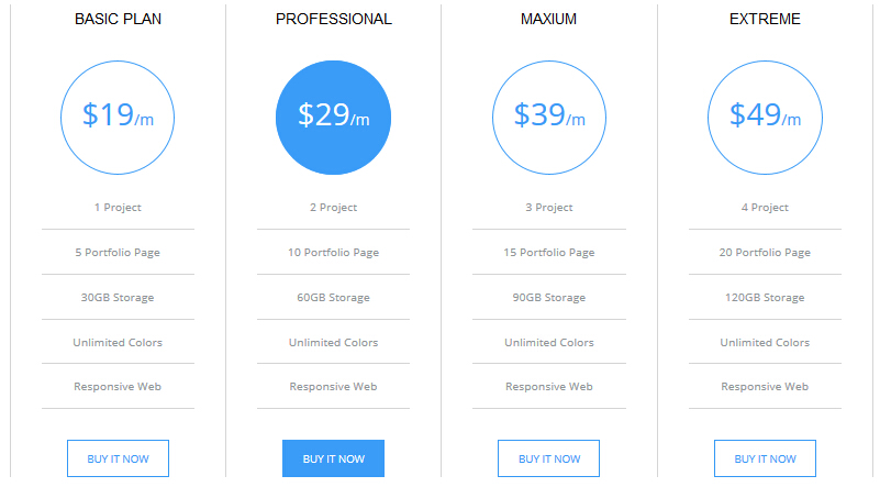
Style 5:
Below is the screen shot:
Codes are as follows:
<div class="price-table price-table5">
    <div class="col-md-3 col-sm-6">
        <div class="price_border">
            <div class="price_title">
                <h2>BASIC PLAN</h2>
            </div>
            <div class="price_holder">
                <div class="price_box"> <span class="sup">$</span><span class="price">19</span><span class="unit">/m</span> </div>
                <ul>
                    <li>1 Project</li>
                    <li>5 Portfolio Page</li>
                    <li>30GB Storage</li>
                    <li>Unlimited Colors</li>
                    <li>Responsive Web</li>
                </ul>
                <a href="#" class="Button_Accent2">BUY IT NOW</a> </div>
        </div>
    </div>
    <div class="col-md-3 col-sm-6  best_value">
        <div class="price_border">
            <div class="price_title">
                <h2>PROFESSIONAL</h2>
            </div>
            <div class="price_holder">
                <div class="price_box"> <span class="sup">$</span><span class="price">29</span><span class="unit">/m</span> </div>
                <ul>
                    <li>2 Project</li>
                    <li>10 Portfolio Page</li>
                    <li>60GB Storage</li>
                    <li>Unlimited Colors</li>
                    <li>Responsive Web</li>
                </ul>
                <a href="#" class="Button_Accent2">BUY IT NOW</a> </div>
        </div>
    </div>
    <div class="col-md-3 col-sm-6">
        <div class="price_border">
            <div class="price_title">
                <h2>MAXIUM</h2>
            </div>
            <div class="price_holder">
                <div class="price_box"> <span class="sup">$</span><span class="price">39</span><span class="unit">/m</span> </div>
                <ul>
                    <li>3 Project</li>
                    <li>15 Portfolio Page</li>
                    <li>90GB Storage</li>
                    <li>Unlimited Colors</li>
                    <li>Responsive Web</li>
                </ul>
                <a href="#" class="Button_Accent2">BUY IT NOW</a> </div>
        </div>
    </div>
    <div class="col-md-3 col-sm-6">
        <div class="price_border">
            <div class="price_title">
                <h2>EXTREME</h2>
            </div>
            <div class="price_holder">
                <div class="price_box"> <span class="sup">$</span><span class="price">49</span><span class="unit">/m</span> </div>
                <ul>
                    <li>4 Project</li>
                    <li>20 Portfolio Page</li>
                    <li>120GB Storage</li>
                    <li>Unlimited Colors</li>
                    <li>Responsive Web</li>
                </ul>
                <a href="#" class="Button_Accent2">BUY IT NOW</a> </div>
        </div>
    </div>
</div>
Option:
col-md-3 col-sm-6is the width for each column. You can change the width you need through value1~12
Style 6:
Below is the screen shot:
Codes are as follows:
   <div class="price-table price-table6 row">
    <div class="col-md-3 col-sm-6 price6_color1">
        <div class="price_border">
            <div class="price_title"> <span class="glyphicons glyph-heart-empty"></span>
                <div class="line"></div>
                <h2>BASIC</h2>
            </div>
            <div class="price_holder">
                <div class="price_box"> <span class="sup">$</span><span class="price">10</span><span class="unit">/m</span> </div>
                <ul>
                    <li>1GB Space</li>
                    <li>50GB Database</li>
                    <li>10 Portfolio Items</li>
                    <li>Unlimited- Colors</li>
                    <li>Responsive Web</li>
                </ul>
                <div class="price_button"><a href="#" class="btn">BUY IT NOW</a></div>
            </div>
        </div>
    </div>
    <div class="col-md-3 col-sm-6 best_value price6_color2">
        <div class="price_border">
            <div class="price_title"> <span class="glyphicons glyph-dislikes"></span>
                <div class="line"></div>
                <h2>PROFESSIONAL</h2>
            </div>
            <div class="price_holder">
                <div class="price_box"> <span class="sup">$</span><span class="price">20</span><span class="unit">/m</span> </div>
                <ul>
                    <li>2GB Space</li>
                    <li>100GB Database</li>
                    <li>15 Portfolio Items</li>
                    <li>Unlimited- Colors</li>
                    <li>Responsive Web</li>
                </ul>
                <div class="price_button"><a href="#" class="btn">BUY IT NOW</a></div>
            </div>
        </div>
    </div>
    <div class="col-md-3 col-sm-6 price6_color3">
        <div class="price_border">
            <div class="price_title"> <span class="glyphicons glyph-more-windows"></span>
                <div class="line"></div>
                <h2>MAXIMUM</h2>
            </div>
            <div class="price_holder">
                <div class="price_box"> <span class="sup">$</span><span class="price">30</span><span class="unit">/m</span> </div>
                <ul>
                    <li>3GB Space</li>
                    <li>150GB Database</li>
                    <li>20 Portfolio Items</li>
                    <li>Unlimited- Colors</li>
                    <li>Responsive Web</li>
                </ul>
                <div class="price_button"><a href="#" class="btn">BUY IT NOW</a></div>
            </div>
        </div>
    </div>
    <div class="col-md-3 col-sm-6 price6_color4">
        <div class="price_border">
            <div class="price_title"> <span class="glyphicons glyph-new-window-alt"></span>
                <div class="line"></div>
                <h2>EXTREME</h2>
            </div>
            <div class="price_holder">
                <div class="price_box"> <span class="sup">$</span><span class="price">40</span><span class="unit">/m</span> </div>
                <ul>
                    <li>4GB Space</li>
                    <li>200GB Database</li>
                    <li>25 Portfolio Items</li>
                    <li>Unlimited- Colors</li>
                    <li>Responsive Web</li>
                </ul>
                <div class="price_button"><a href="#" class="btn">BUY IT NOW</a></div>
            </div>
        </div>
    </div>
</div>
Option:
col-md-3 col-sm-6is the width for each column. You can change the width you need through value1~12- You can modify
glyphiconsto change icons. font icon list.
ProgressBars Counters
You can click the link to check ProgressBars Counters demo. Demo Link
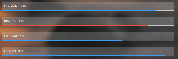
Style 1
Below is the screen shot:
Codes are as follows:
<div class="loaded_list">
    <p>PHOTOSHOP : 90%</p>
    <div class="progress">
        <div class="bar animation animationwidth" data-width="90%"></div>
    </div>
    <p>HTML / CSS : 85%</p>
    <div class="progress">
        <div class="bar accentColor animation animationwidth" data-width="85%"></div>
    </div>
    <p>ILLUSTRATE : 70%</p>
    <div class="progress">
        <div class="bar animation animationwidth" data-width="70%"></div>
    </div>
    <p>COREDREL : 95%</p>
    <div class="progress">
        <div class="bar animation animationwidth" data-width="95%"></div>
    </div>
</div>
Option:
- You can change the value you need to display through
data-width
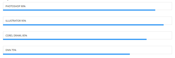
Style 2
Below is the screen shot:
Codes are as follows:
<div class="loaded_list_1">
    <p>PHOTOSHOP 90%</p>
    <div class="progress">
        <div class="bar animation animationwidth" data-width="90%"></div>
    </div>
    <p>ILLUSTRATOR 95%</p>
    <div class="progress">
        <div class="bar animation animationwidth" data-width="95%"></div>
    </div>
    <p>COREL DRAWL 85%</p>
    <div class="progress">
        <div class="bar animation animationwidth" data-width="85%"></div>
    </div>
    <p>DNN 75%</p>
    <div class="progress">
        <div class="bar animation animationwidth" data-width="75%"></div>
    </div>
</div>
Option:
- You can change the value you need to display through
data-width
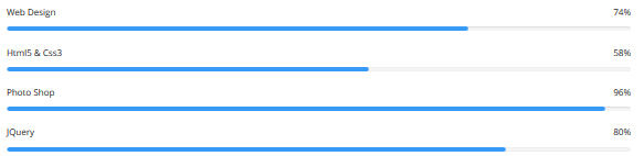
Style 3
Below is the screen shot:
Codes are as follows:
<div class="loaded_list_2">
    <p>Web Design<span>74%</span></p>
    <div class="progress">
        <div class="bar animation animationwidth" data-width="74%"></div>
    </div>
    <p>Html5 & Css3<span>58%</span></p>
    <div class="progress">
        <div class="bar animation animationwidth" data-width="58%"></div>
    </div>
    <p>Photo Shop<span>96%</span></p>
    <div class="progress">
        <div class="bar animation animationwidth" data-width="96%"></div>
    </div>
    <p>JQuery<span>80%</span></p>
    <div class="progress">
        <div class="bar animation animationwidth" data-width="80%"></div>
    </div>
</div>
Option:
data-widthis for controlling the percentage that displays, you can display percentage through value0~100
Style 4
Below is the screen shot:
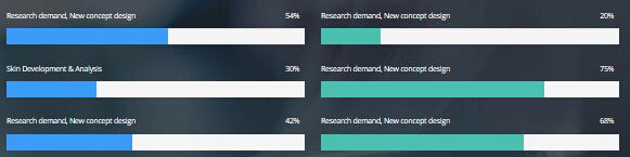
Codes are as follows:
<div class="row">
    <div class="col-sm-6">
        <div class="loaded_list_3 loaded_accent">
            <p>Research demand, New concept design<span>54%</span></p>
            <div class="progress">
                <div class="bar animation animationwidth" data-width="54%"></div>
            </div>
            <p>Skin Development & Analysis<span>30%</span></p>
            <div class="progress">
                <div class="bar animation animationwidth" data-width="30%"></div>
            </div>
            <p>Research demand, New concept design<span>42%</span></p>
            <div class="progress">
                <div class="bar animation animationwidth" data-width="42%"></div>
            </div>
        </div>
    </div>
    <div class="col-sm-6">
        <div class="loaded_list_3 loaded_color1">
            <p>Research demand, New concept design<span>20%</span></p>
            <div class="progress">
                <div class="bar animation animationwidth" data-width="20%"></div>
            </div>
            <p>Research demand, New concept design<span>75%</span></p>
            <div class="progress">
                <div class="bar animation animationwidth" data-width="75%"></div>
            </div>
            <p>Research demand, New concept design<span>68%</span></p>
            <div class="progress">
                <div class="bar animation animationwidth" data-width="68%"></div>
            </div>
        </div>
    </div>
</div>
Option:
col-sm-6is the width of each column, you can change the width you need through value1~12- You can change the value you need to display through
data-width
Style 5
Below is the screen shot:
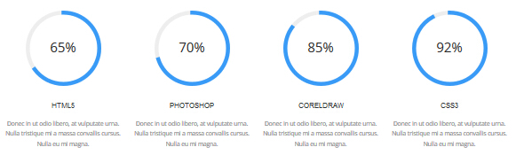
Codes are as follows:
<div class="chart_list row">
    <div class="col-sm-3">
        <div data-percent="65" class="percentage1">
            <div class="percentage_inner"><span>0</span>% </div>
        </div>
        <h3> HTML5 </h3>
        <p>Content text 1 ... </p>
    </div>
    <div class="col-sm-3">
        <div data-percent="70" class="percentage1">
            <div class="percentage_inner"><span>0</span>% </div>
        </div>
        <h3> PHOTOSHOP </h3>
        <p>Content text 2 ... </p>
    </div>
    <div class="col-sm-3">
        <div data-percent="85" class="percentage1">
            <div class="percentage_inner"><span>0</span>% </div>
        </div>
        <h3> CORELDRAW </h3>
        <p>Content text 3 ... </p>
    </div>
    <div class="col-sm-3">
        <div data-percent="92" class="percentage1">
            <div class="percentage_inner"><span>0</span>% </div>
        </div>
        <h3> CSS3 </h3>
        <p>Content text 4 ... </p>
    </div>
</div>
Option:
col-md-3is the width of each column, you can change the width you need through value1~12data-percentis for controlling the percentage that displays, you can display percentage through value0~100
Style 6
Below is the screen shot:
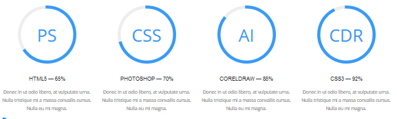
Codes are as follows:
<div class="chart_list_2 row">
    <div class="col-sm-3">
        <div data-percent="65" class="percentage1">
            <div class="percentage_inner">PS</div>
        </div>
        <h3> HTML5 — 65% </h3>
        <p>Content text 1 ... Nulla eu mi magna. </p>
    </div>
    <div class="col-sm-3">
        <div data-percent="70" class="percentage1">
            <div class="percentage_inner">CSS</div>
        </div>
        <h3> PHOTOSHOP — 70% </h3>
        <p>Content text 2 ... Nulla eu mi magna. </p>
    </div>
    <div class="col-sm-3">
        <div data-percent="85" class="percentage1">
            <div class="percentage_inner">AI</div>
        </div>
        <h3> CORELDRAW  — 85%</h3>
        <p>Content text 3 ... Nulla eu mi magna. </p>
    </div>
    <div class="col-sm-3">
        <div data-percent="92" class="percentage1">
            <div class="percentage_inner">CDR</div>
        </div>
        <h3> CSS3 — 92% </h3>
        <p>Content text 4 ... Nulla eu mi magna. </p>
    </div>
</div>
Option:
col-sm-3is the width of each column, you can change the width you need through value1~12data-percentis for controlling the percentage that displays, you can display percentage through value0~100
Style 7
Below is the screen shot:
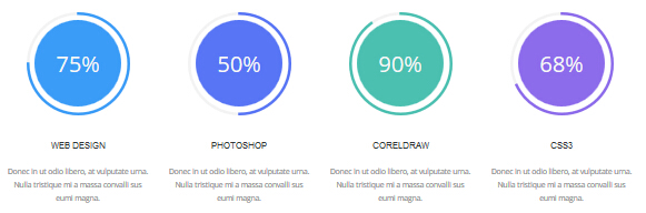
Codes are as follows:
<div class="chart_list_3 row">
    <div class="col-sm-6 col-md-3 chart_color1">
        <div data-percent="75" class="percentage2">
            <div class="percentage_inner"><span>0</span>% </div>
        </div>
        <h3> WEB DESIGN </h3>
        <p>Content text 1 ... </p>
    </div>
    <div class="col-sm-6 col-md-3 chart_color2">
        <div data-percent="50" class="percentage3">
            <div class="percentage_inner"><span>0</span>% </div>
        </div>
        <h3> PHOTOSHOP </h3>
        <p>Content text 2 ... </p>
    </div>
    <div class="col-sm-6 col-md-3 chart_color3">
        <div data-percent="90" class="percentage4">
            <div class="percentage_inner"><span>0</span>% </div>
        </div>
        <h3> CORELDRAW </h3>
        <p>Content text 3 ... </p>
    </div>
    <div class="col-sm-6 col-md-3 chart_color4">
        <div data-percent="68" class="percentage5">
            <div class="percentage_inner"><span>0</span>% </div>
        </div>
        <h3> CSS3 </h3>
        <p>Content text 4 ... </p>
    </div>
</div>
Option:
col-sm-6 col-md-3is the width of each column, you can change the width you need through value1~12data-percentis for controlling the percentage that displays, you can display percentage through value0~100
Style 8
Below is the screen shot:
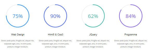
Codes are as follows:
<div class="chart_list_4 row">
<div class="col-sm-6 col-md-3 chart_color1">
    <div data-percent="75" class="percentage6">
        <div class="percentage_inner"><span>0</span>% </div>
    </div>
    <h3>Web Design</h3>
    <p>Content text 1 ... </p>
</div>
<div class="col-sm-6 col-md-3 chart_color2">
    <div data-percent="90" class="percentage7">
        <div class="percentage_inner"><span>0</span>% </div>
    </div>
    <h3>Html5 & Css3</h3>
    <p>Content text 2 ... </p>
</div>
<div class="col-sm-6 col-md-3 chart_color3">
    <div data-percent="62" class="percentage8">
        <div class="percentage_inner"><span>0</span>% </div>
    </div>
    <h3>JQuery</h3>
    <p>Content text 3 ... </p>
</div>
<div class="col-sm-6 col-md-3 chart_color4">
    <div data-percent="84" class="percentage9">
        <div class="percentage_inner"><span>0</span>% </div>
    </div>
    <h3>Programme</h3>
    <p>Content text 4 ... </p>
</div>
Option:
col-sm-6 col-md-3is the width of each column, you can change the width you need through value1~12data-percentis for controlling the percentage that displays, you can display percentage through value0~100
Style 9
Below is the screen shot:
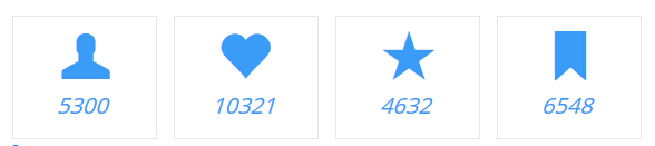
Codes are as follows:
<div class="number_Animation row">
    <div class="col-sm-3">
        <div class="number_box"> <span class="glyphicons glyph-user"> </span> <span class="animation  number" data-number="5300">0</span> </div>
    </div>
    <div class="col-sm-3">
        <div class="number_box"> <span class="glyphicons glyph-heart"> </span> <span class="animation  number" data-number="10321">0</span> </div>
    </div>
    <div class="col-sm-3">
        <div class="number_box"> <span class="glyphicons glyph-star"> </span> <span class="animation  number" data-number="4632">0</span> </div>
    </div>
    <div class="col-sm-3">
        <div class="number_box"> <span class="glyphicons glyph-bookmark"> </span> <span class="animation  number" data-number="6548">0</span> </div>
    </div>
</div>
Option:
col-sm-3is the width of each column, you can change the width you need through value1~12- You can modify
glyphiconsto change icons. font icon list. - You can change the value you need to display through
data-number
Style 10
Below is the screen shot:
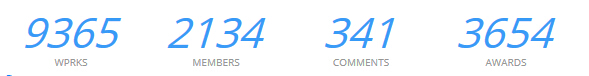
Codes are as follows:
<div class="number_Animation_2 row">
    <div class="col-sm-3">
        <div class="number_box"> <span class="animation  number" data-number="9365">0</span>WPRKS </div>
    </div>
    <div class="col-sm-3">
        <div class="number_box"> <span class="animation  number" data-number="2134">0</span>MEMBERS </div>
    </div>
    <div class="col-sm-3">
        <div class="number_box"> <span class="animation  number" data-number="341">0</span>COMMENTS </div>
    </div>
    <div class="col-sm-3">
        <div class="number_box"> <span class="animation  number" data-number="3654">0</span>AWARDS </div>
    </div>
</div>
Option:
col-sm-3is the width of each column, you can change the width you need through value1~12- You can change the value you need to display through
data-number
Style 11
Below is the screen shot:
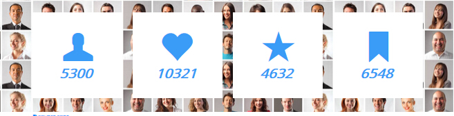
Codes are as follows:
<div class="number_Animation_3 row">
    <div class="col-md-3 col-sm-6">
        <div class="number_box"> <span class="glyphicons glyph-user"> </span> <span class="animation  number" data-number="5300">0</span> </div>
    </div>
    <div class="col-md-3 col-sm-6">
        <div class="number_box"> <span class="glyphicons glyph-heart"> </span> <span class="animation  number" data-number="10321">0</span> </div>
    </div>
    <div class="col-md-3 col-sm-6">
        <div class="number_box"> <span class="glyphicons glyph-star"> </span> <span class="animation  number" data-number="4632">0</span> </div>
    </div>
    <div class="col-md-3 col-sm-6">
        <div class="number_box"> <span class="glyphicons glyph-bookmark"> </span> <span class="animation  number" data-number="6548">0</span> </div>
    </div>
</div>
Option:
col-md-3 col-sm-6is the width of each column, you can change the width you need through value1~12- You can modify
glyphiconsto change icons. font icon list. - You can change the value you need to display through
data-number
Style 12
Below is the screen shot:
Codes are as follows:
<div class="number_Animation_4 row">
<div class="col-sm-3">
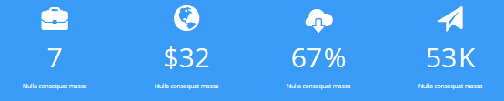
<div class="number_box"> <span class="glyphicons glyph-briefcase"> </span> <span class="animation number" data-number="7">0</span>
<p>Nulla consequat massa </p>
</div>
</div>
<div class="col-sm-3">
<div class="number_box"> <span class="glyphicons glyph-globe"> </span><span class="unit">$</span> <span class="animation number" data-number="32">0</span>
<p>Nulla consequat massa </p>
</div>
</div>
<div class="col-sm-3">
<div class="number_box"> <span class="glyphicons glyph-cloud-upload"> </span> <span class="animation number" data-number="67">0</span> <span class="unit">%</span>
<p>Nulla consequat massa </p>
</div>
</div>
<div class="col-sm-3">
<div class="number_box"> <span class="glyphicons glyph-send"> </span> <span class="animation number" data-number="53">0</span> <span class="unit">K</span>
<p>Nulla consequat massa </p>
</div>
</div>
</div>
Option:
col-sm-3is the width of each column, you can change the width you need through value1~12- You can change the value you need to display through
data-number - You can modify
glyphiconsto change icons. font icon list.
Style 13
Below is the screen shot:
Codes are as follows:
<div class="number_Animation_5 row">
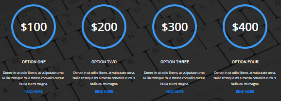
<div class="col-sm-6 col-md-3">
<div class="number_box"> $<span class="animation number" data-number="100">0</span> </div>
<h3>Option One</h3>
<p>Content text 1 ... </p>
<p><a href="#">Read More</a></p>
</div>
<div class="col-sm-6 col-md-3">
<div class="number_box"> $<span class="animation number" data-number="200">0</span> </div>
<h3>Option Two</h3>
<p>Content text 1 ... </p>
<p><a href="#">Read More</a></p>
</div>
<div class="col-sm-6 col-md-3">
<div class="number_box"> $<span class="animation number" data-number="300">0</span> </div>
<h3>Option Three</h3>
<p>Content text 1 ... </p>
<p><a href="#">Read More</a></p>
</div>
<div class="col-sm-6 col-md-3">
<div class="number_box"> $<span class="animation number" data-number="400">0</span> </div>
<h3>Option Four</h3>
<p>Content text 1 ... </p>
<p><a href="#">Read More</a></p>
</div>
</div>
Option:
col-sm-6 col-md-3is the width of each column, you can change the width you need through value1~12- You can change the value you need to display through
data-number
Style 14
Below is the screen shot:
Codes are as follows:
<div class="number_Animation_6 row">
<div class="col-xs-6 col-sm-4 col-lg-2 number_bgcolor1">
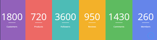
<div class="number_box"> <span class="animation number" data-number="1800">0</span> Customers </div>
</div>
<div class="col-xs-6 col-sm-4 col-lg-2 number_bgcolor2">
<div class="number_box"> <span class="animation number" data-number="720">0</span> Products </div>
</div>
<div class="col-xs-6 col-sm-4 col-lg-2 number_bgcolor3">
<div class="number_box"> <span class="animation number" data-number="3600">0</span> Followers </div>
</div>
<div class="col-xs-6 col-sm-4 col-lg-2 number_bgcolor4">
<div class="number_box"> <span class="animation number" data-number="950">0</span> Reviews </div>
</div>
<div class="col-xs-6 col-sm-4 col-lg-2 number_bgcolor5">
<div class="number_box"> <span class="animation number" data-number="1430">0</span> Comments </div>
</div>
<div class="col-xs-6 col-sm-4 col-lg-2 number_bgcolor6">
<div class="number_box"> <span class="animation number" data-number="260">0</span> Members </div>
</div>
</div>
Option:
col-xs-6 col-sm-4 col-lg-2is the width of each column, you can change the width you need through value1~12- You can change the value you need to display through
data-number
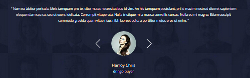
Testimonials
You can click the link to check Testimonials demo. Demo Link
Option:
Testimonials includes the parameters that listed below.
data-position |
Switch mode. fade:fade in fade out, roll-left:roll from side to side, roll-vertical:roll up and down |
data-display-navigation |
Navigation display and hidden. Default to true. true:Display, false:hidden |
data-display-arrows |
Left/right arrow display and hidden. Default to true. true:Display, false:hidden |
data-autoplay |
Whether to scroll automatically or not. 0 is for not scrolling automatically, numbers greater than 0 are for scrolling automatically, and these numbers are the time interval for scrolling. Default to 3000 |
data-autoheight |
Whether to be automatic height or not, default to true. true: automatic height, false: fixed height.< |
Example:
<ul class=" Testimonials_tab" data-position="roll-vertical" data-display-navigation="true" data-display-arrows="true" data-display-navigation="false" data-autoplay="3000" data-autoheight="true">
  <li>
    <h3 class="title a_t_c">What Others Say About Us ?</h3>
		......
Style 1:
Below is the screen shot:
Codes are as follows:
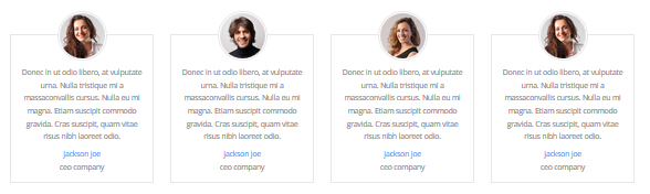
<div class="row">
    <div class="col-md-3 col-sm-6">
        <div class="Testimonials_list">
            <div class="Testimonials_list_pic"> <img alt="" src="/portals/31/Pic_18.jpg" /> </div>
            <p>Centent text 1 ...</p>
            <div class="Testimonials_list_info"><span>Name</span>introduce</div>
        </div>
    </div>
    <div class="col-md-3 col-sm-6">
        <div class="Testimonials_list">
            <div class="Testimonials_list_pic"> <img alt="" src="/portals/31/Pic_19.jpg" /> </div>
            <p>Centent text 2 ...</p>
            <div class="Testimonials_list_info"><span>Name</span>introduce</div>
        </div>
    </div>
    <div class="col-md-3 col-sm-6">
        <div class="Testimonials_list">
            <div class="Testimonials_list_pic"> <img alt="" src="/portals/31/Pic_16.jpg" /> </div>
            <p>Centent text 3 ...</p>
            <div class="Testimonials_list_info"><span>Name </span>introduce</div>
        </div>
    </div>
    <div class="col-md-3 col-sm-6">
        <div class="Testimonials_list">
            <div class="Testimonials_list_pic"> <img alt="" src="/portals/31/Pic_17.jpg" /> </div>
            <p>Centent text 4 ...</p>
            <div class="Testimonials_list_info"><span>Name </span>introduce</div>
        </div>
    </div>
</div>
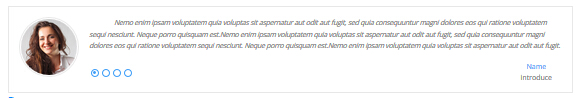
col-md-3 col-sm-6is the width of each column, you can change the width you need through value1~12
Style 2:
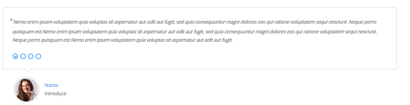
Below is the screen shot:
Codes are as follows:
<ul class=" Testimonials_tab Testimonials_1" data-position="fade" data-display-arrows="false" data-autoplay="0">
    <li>
        <blockquote> <span class="pic"> <img alt="" src="/portals/31/Pic_18.jpg" /></span>
            <p>Centent text 1 ...</p>
            <small><span>Name </span>introduce</small> </blockquote>
    </li>
    <li>
        <blockquote> <span class="pic"> <img alt="" src="/portals/31/Pic_19.jpg" /></span>
            <p>Centent text 2 ...</p>
            <small><span>Name</span>introduce</small> </blockquote>
    </li>
    <li>
        <blockquote> <span class="pic"> <img alt="" src="/portals/31/Pic_16.jpg" /></span>
            <p>Centent text 3 ...</p>
            <small><span>Name</span>introduce</small> </blockquote>
    </li>
    <li>
        <blockquote> <span class="pic"> <img alt="" src="/portals/31/Pic_17.jpg" /></span>
            <p>Centent text 4 ...</p>
            <small><span>Name </span>introduce</small> </blockquote>
    </li>
</ul>
Style 3:
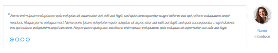
Below is the screen shot:
Codes are as follows:
<ul class=" Testimonials_tab Testimonials_2" data-position="fade" data-display-arrows="false" data-autoplay="0">
    <li>
        <blockquote>
            <p>Content text 1 ...</p>
            <small><img alt="" src="/portals/31/Pic_18.jpg" /><span>Name </span>introduce</small> </blockquote>
    </li>
    <li>
        <blockquote>
            <p>Content text 2 ...</p>
            <small><img alt="" src="/portals/31/Pic_19.jpg" /><span>Name</span>introduce</small> </blockquote>
    </li>
    <li>
        <blockquote>
            <p>Content text 3 ...</p>
            <small><img alt="" src="/portals/31/Pic_16.jpg" /><span>Name</span>introduce</small> </blockquote>
    </li>
    <li>
        <blockquote>
            <p>Content text 4 ...</p>
            <small><img alt="" src="/portals/31/Pic_17.jpg" /><span>Name </span>introduce</small> </blockquote>
    </li>
</ul>
Style 4:
Below is the screen shot:
Codes are as follows:
<ul class=" Testimonials_tab Testimonials_3" data-position="fade" data-display-arrows="false" data-autoplay="0">
    <li>
        <blockquote>
            <p>Content text 1 ...</p>
            <small><img alt="" src="/portals/31/Pic_18.jpg" /><span>Name </span>introduce</small> </blockquote>
    </li>
    <li>
        <blockquote>
            <p>Content text 2 ...</p>
            <small><img alt="" src="/portals/31/Pic_19.jpg" /><span>Name</span>introduce</small> </blockquote>
    </li>
    <li>
        <blockquote>
            <p>Content text 3 ...</p>
            <small><img alt="" src="/portals/31/Pic_16.jpg" /><span>Name</span>introduce</small> </blockquote>
    </li>
    <li>
        <blockquote>
            <p>Content text 4 ...</p>
            <small><img alt="" src="/portals/31/Pic_17.jpg" /><span>Name </span>introduce</small> </blockquote>
    </li>
</ul>
Style 5:
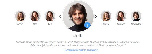
Below is the screen shot:
Codes are as follows:
<div class="slider_wrapper circle_slider1">
    <div class="slider_item" data-image="/Portals/31/Pic_18.jpg" data-link_url="home.aspx" data-link_target="_blank" data-lower_text_label="Amanda" data-lower_text_label_show="1">
        <div class="slider_wrap">
            <h3 class="pic_name">jackson doe</h3>
            <blockquote>
                <p>Content text 1 ...</p>
                <small> — jack Doe (ceo of company)</small> </blockquote>
        </div>
    </div>
    <div class="slider_item" data-image="/Portals/31/Pic_19.jpg" data-link_url="home.aspx" data-link_target="_blank" data-lower_text_label="Amanda" data-lower_text_label_show="1">
        <div class="slider_wrap">
            <h3 class="pic_name">jackson doe</h3>
            <blockquote>
                <p>Content text 1 ...</p>
                <small> — Chrissie Hall (ceo of company)</small> </blockquote>
        </div>
    </div>
    <div class="slider_item" data-image="/Portals/31/Pic_16.jpg" data-link_url="home.aspx" data-link_target="_blank" data-lower_text_label="Amanda" data-lower_text_label_show="1">
        <div class="slider_wrap">
            <h3 class="pic_name">jackson doe</h3>
            <blockquote>
                <p>Content text 1 ...</p>
                <small> — Aaron (Calibrated Design)</small> </blockquote>
        </div>
    </div>
    <div class="slider_item" data-image="/Portals/31/Pic_18.jpg" data-link_url="home.aspx" data-link_target="_blank" data-lower_text_label="Amanda" data-lower_text_label_show="1">
        <div class="slider_wrap">
            <h3 class="pic_name">jackson doe</h3>
            <blockquote>
                <p>Content text 2 ...</p>
                <small> — James Divine (Divine Solutions)</small> </blockquote>
        </div>
    </div>
    <div class="slider_item" data-image="/Portals/31/Pic_19.jpg" data-link_url="home.aspx" data-link_target="_blank" data-lower_text_label="Amanda" data-lower_text_label_show="1">
        <div class="slider_wrap">
            <h3 class="pic_name">jackson doe</h3>
            <blockquote>
                <p>Content text 3 ...</p>
                <small> — jack Doe (ceo of company)</small> </blockquote>
        </div>
    </div>
    <div class="slider_item" data-image="/Portals/31/Pic_16.jpg" data-link_url="home.aspx" data-link_target="_blank" data-lower_text_label="Amanda" data-lower_text_label_show="1">
        <div class="slider_wrap">
            <h3 class="pic_name">jackson doe</h3>
            <blockquote>
                <p>Content text 4 ...</p>
                <small> — Chrissie Hall (ceo of company)</small> </blockquote>
        </div>
    </div>
    <div class="slider_item" data-image="/Portals/31/Pic_18.jpg" data-link_url="home.aspx" data-link_target="_blank" data-lower_text_label="Amanda" data-lower_text_label_show="1">
        <div class="slider_wrap">
            <h3 class="pic_name">jackson doe</h3>
            <blockquote>
                <p>Content text 5 ...</p>
                <small> — Aaron (Calibrated Design)</small> </blockquote>
        </div>
    </div>
</div>
Style 6:
Below is the screen shot:
Codes are as follows:
<ul class=" Testimonials_tab Testimonials_4" data-position="fade" data-display-navigation="false" data-autoplay="0">
    <li>
        <blockquote>
            <p>Centent text 1 ...</p>
            <small><img alt="" src="/portals/31/home6_testimonials_img.png" /><span>Name</span>introduce</small> </blockquote>
    </li>
    <li>
        <blockquote>
            <p>Centent text 1 ...</p>
            <small><img alt="" src="/portals/31/home7_testimonials_img1.png" /><span>Name</span>introduce</small> </blockquote>
    </li>
    <li>
        <blockquote>
            <p>Centent text 1 ...</p>
            <small><img alt="" src="/portals/31/home7_testimonials_img2.png" /><span>Name</span>introduce</small> </blockquote>
    </li>
</ul>
Responsive Tab
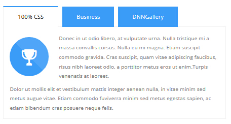
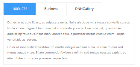
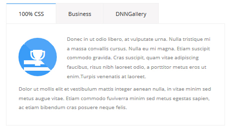
You can click the link to check Responsive Tab demo. Demo Link
You can add the "resp-tabs-list" of "li" to add tab item, and add the "resp-tabs-container" of "resp_container" to add content
Example:
<div class="horizontalTab_Top">
  <ul class="resp-tabs-list">

    <li> Tab1 </li>
    <li> Tab2 </li>
    ....

  </ul>
  <div class="resp-tabs-container">

    <div class="resp_container"> Tab1 Content </div>
    <div class="resp_container"> Tab2 Content </div>
    ....

  </div>
</div>
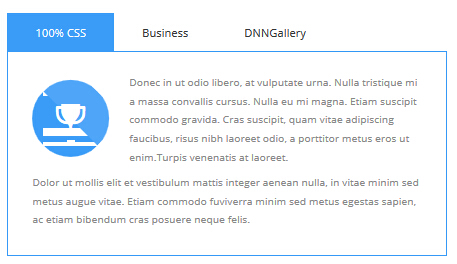
Style 1:
Below is the screen shot:
Codes are as follows:
<div class="horizontalTab_Top horizontalTab_Top_1">
    <ul class="resp-tabs-list">
        <li><span>Tab title 1</span></li>
        <li><span>Tab title 2</span></li>
        <li><span>Tab title 3</span></li>
    </ul>
    <div class="resp-tabs-container">
        <div class="resp_container">
            <div class="resp_margin">
                <div class="Tab_ico"><span class="glyphicons glyph-cup"></span></div>
                <p>Content text 1 ... </p>
            </div>
        </div>
        <div class="resp_container">
            <div class="resp_margin">
                <div class="Tab_ico"><span class="glyphicons glyph-snowflake"></span></div>
                <p>Content text 2 ... </p>
            </div>
        </div>
        <div class="resp_container">
            <div class="resp_margin">
                <div class="Tab_ico"><span class="glyphicons glyph-fire"></span></div>
                <p>Content text 3 ... </p>
            </div>
        </div>
    </div>
</div>
Option:
- You can modify
glyphiconsto change icons. font icon list.
Style 2:
Below is the screen shot:
Codes are as follows:
<div class="horizontalTab_Top horizontalTab_Top_2">
    <ul class="resp-tabs-list">
        <li><span>Tab title 1</span></li>
        <li><span>Tab title 2</span></li>
        <li><span>Tab title 3</span></li>
    </ul>
    <div class="resp-tabs-container">
        <div class="resp_container">
            <div class="resp_margin">
                <p>Content text 1 ... </p>
            </div>
        </div>
        <div class="resp_container">
            <div class="resp_margin">
                <p>Content text 2 ... </p>
            </div>
        </div>
        <div class="resp_container">
            <div class="resp_margin">
                <p>Content text 3 ... </p>
            </div>
        </div>
    </div>
</div>
Style 3:
Below is the screen shot:

Codes are as follows:
<div class="verticalTab_Left  verticalTab_Left_1">
    <ul class="resp-tabs-list">
        <li><span>Tab title 1</span></li>
        <li><span>Tab title 2</span></li>
        <li><span>Tab title 3</span></li>
    </ul>
    <div class="resp-tabs-container">
        <div class="resp_container">
            <div class="resp_margin">
                <div class="Tab_img"> <img alt="" src="/portals/31/pic_03.jpg" /> </div>
                Content text 1 ... </div>
        </div>
        <div class="resp_container">
            <div class="resp_margin">
                <div class="Tab_img"> <img alt="" src="/portals/31/pic_03.jpg" /> </div>
                Content text 2 ... </div>
        </div>
        <div class="resp_container">
            <div class="resp_margin">
                <div class="Tab_img"> <img alt="" src="/portals/31/pic_03.jpg" /> </div>
                Content text 3 ... </div>
        </div>
    </div>
</div>
Style 4:
Below is the screen shot:
Codes are as follows:
<div class="horizontalTab_Top horizontalTab_Top_3">
    <ul class="resp-tabs-list">
        <li><span>Tab title 1</span></li>
        <li><span>Tab title 2</span></li>
        <li><span>Tab title 3</span></li>
    </ul>
    <div class="resp-tabs-container">
        <div class="resp_container">
            <div class="resp_margin">
                <div class="Tab_ico"><span class="glyphicons glyph-cup"></span></div>
                Content text 1 ... </div>
        </div>
        <div class="resp_container">
            <div class="resp_margin">
                <div class="Tab_ico"><span class="glyphicons glyph-snowflake"></span></div>
                Content text 2 ... </div>
        </div>
        <div class="resp_container">
            <div class="resp_margin">
                <div class="Tab_ico"><span class="glyphicons glyph-fire"></span></div>
                Content text 3 ... </div>
        </div>
    </div>
</div>
Option:
- You can modify
glyphiconsto change icons. font icon list.
Style 5:
Below is the screen shot:
Codes are as follows:
<div class="horizontalTab_Top horizontalTab_Top_4">
    <ul class="resp-tabs-list">
        <li><span>Tab title 1</span></li>
        <li><span>Tab title 2</span></li>
        <li><span>Tab title 3</span></li>
    </ul>
    <div class="resp-tabs-container">
        <div class="resp_container">
            <div class="resp_margin">
                <div class="Tab_ico"><span class="glyphicons glyph-cup"></span></div>
                Content text 1 ... </div>
        </div>
        <div class="resp_container">
            <div class="resp_margin">
                <div class="Tab_ico"><span class="glyphicons glyph-snowflake"></span></div>
                Content text 2 ... </div>
        </div>
        <div class="resp_container">
            <div class="resp_margin">
                <div class="Tab_ico"><span class="glyphicons glyph-fire"></span></div>
                Content text 3 ... </div>
        </div>
    </div>
</div>
Option:
- You can modify
glyphiconsto change icons. font icon list.
Responsivetab2
You can click the link to check Responsivetab2 demo. Demo Link
Style 6:
Below is the screen shot:
Codes are as follows:
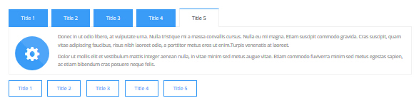
<div class="horizontalTab_Top horizontalTab_Top_1" id="tabposition">
    <ul class="resp-tabs-list">
        <li id="Title 1"><span>title 1</span></li>
        <li id="Title 2"><span>title 2</span></li>
        <li id="Title 3"><span>title 3</span></li>
        <li id="Title 4"><span>title 4</span></li>
        <li id="Title 5"><span>title 5</span></li>
    </ul>
    <div class="resp-tabs-container">
        <div class="resp_container">
            <div class="resp_margin"> Content text 1 ... </div>
        </div>
        <div class="resp_container">
            <div class="resp_margin"> Content text 2 ... </div>
        </div>
        <div class="resp_container">
            <div class="resp_margin"> Content text 3 ... </div>
        </div>
        <div class="resp_container">
            <div class="resp_margin"> Content text 4 ... </div>
        </div>
        <div class="resp_container">
            <div class="resp_margin"> Content text 5 ... </div>
        </div>
    </div>
</div>
<p>
<a target="blank" href="/20063/en-us/feature/shortcodes/responsivetab2.aspx?ResponsiveTab=Title1#tabposition" class="Button_default">Title 1</a>
<a target="blank" href="/20063/en-us/feature/shortcodes/responsivetab2.aspx?ResponsiveTab=Title2#tabposition" class="Button_default">Title 2</a>
<a target="blank" href="/20063/en-us/feature/shortcodes/responsivetab2.aspx?ResponsiveTab=Title3#tabposition" class="Button_default">Title 3</a>
<a target="blank" href="/20063/en-us/feature/shortcodes/responsivetab2.aspx?ResponsiveTab=Title4#tabposition" class="Button_default">Title 4</a>
<a target="blank" href="/20063/en-us/feature/shortcodes/responsivetab2.aspx?ResponsiveTab=Title5#tabposition" class="Button_default">Title 5</a>
</p>
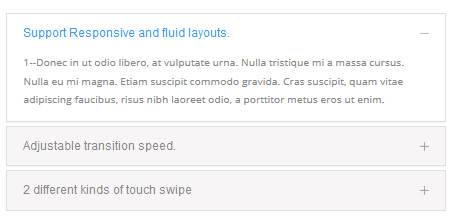
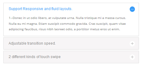
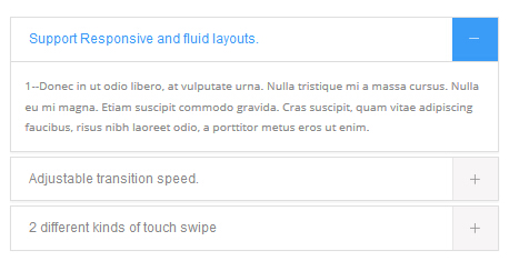
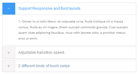
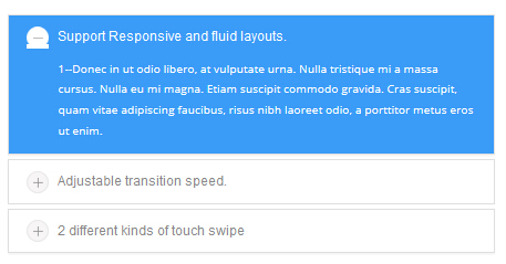
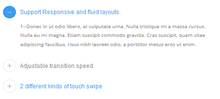
Accordions
You can click the link to check Accordions demo. Demo Link
Option:
- id="accordion" of each accordions effect needs using different names.
"data-parent"needs to have the same name asid- href="#collapse1" is the id that needs to expand content.
- id="collapse1" is the content that needs to expand.
<div class="panel-group" id="accordion">

  <div class="panel panel-default">
    <div class="panel-heading">
      <h4 class="panel-title"> <a data-toggle="collapse" data-parent="#accordion" href="#collapse1"> Title Text ... </a> </h4>
    </div>
    <div id="collapse1" class="panel-collapse collapse in">
      <div class="panel-body">Content Text ... </div>
    </div>
  </div>
  ....

</div>
Style 1:
Below is the screen shot:
Codes are as follows:
<div class="panel-group accordion_1" id="accordion">
    <div class="panel panel-default">
        <div class="panel-heading">
            <h4 class="panel-title"> <a data-toggle="collapse" data-parent="#accordion" href="#collapse1_1"><span class="accordion_icon"></span>title 1 </a> </h4>
        </div>
        <div id="collapse1_1" class="panel-collapse collapse in">
            <div class="panel-body">Content text 1 ... </div>
        </div>
    </div>
    <div class="panel panel-default">
        <div class="panel-heading">
            <h4 class="panel-title"> <a data-toggle="collapse" data-parent="#accordion" href="#collapse1_2" class="collapsed"><span class="accordion_icon"></span>title 2 </a> </h4>
        </div>
        <div id="collapse1_2" class="panel-collapse collapse">
            <div class="panel-body">Content text 2 ... </div>
        </div>
    </div>
    <div class="panel panel-default">
        <div class="panel-heading">
            <h4 class="panel-title"> <a data-toggle="collapse" data-parent="#accordion" href="#collapse1_3" class="collapsed"><span class="accordion_icon"></span>title 3 </a> </h4>
        </div>
        <div id="collapse1_3" class="panel-collapse collapse">
            <div class="panel-body">Content text 3 ... </div>
        </div>
    </div>
</div>
Style 2:
Below is the screen shot:
Codes are as follows:
<div class="panel-group accordion_2" id="accordion_2">
    <div class="panel panel-default">
        <div class="panel-heading">
            <h4 class="panel-title"> <a data-toggle="collapse" data-parent="#accordion_2" href="#collapse2_1"><span class="accordion_icon"></span>title 1 </a> </h4>
        </div>
        <div id="collapse2_1" class="panel-collapse collapse in">
            <div class="panel-body">Content text 1 ... </div>
        </div>
    </div>
    <div class="panel panel-default">
        <div class="panel-heading">
            <h4 class="panel-title"> <a data-toggle="collapse" data-parent="#accordion_2" href="#collapse2_2" class="collapsed"><span class="accordion_icon"></span>title 2 </a> </h4>
        </div>
        <div id="collapse2_2" class="panel-collapse collapse">
            <div class="panel-body">Content text 2 ... </div>
        </div>
    </div>
    <div class="panel panel-default">
        <div class="panel-heading">
            <h4 class="panel-title"> <a data-toggle="collapse" data-parent="#accordion_2" href="#collapse2_3" class="collapsed"><span class="accordion_icon"></span>title 3 </a> </h4>
        </div>
        <div id="collapse2_3" class="panel-collapse collapse">
            <div class="panel-body">Content text 3 ... </div>
        </div>
    </div>
</div>
Style 3:
Below is the screen shot:
Codes are as follows:
<div class="panel-group accordion_3" id="accordion_3">
    <div class="panel panel-default">
        <div class="panel-heading">
            <h4 class="panel-title"> <a data-toggle="collapse" data-parent="#accordion_3" href="#collapse3_1"><span class="accordion_icon"></span>title 1 </a> </h4>
        </div>
        <div id="collapse3_1" class="panel-collapse collapse in">
            <div class="panel-body">Content text 1 ... </div>
        </div>
    </div>
    <div class="panel panel-default">
        <div class="panel-heading">
            <h4 class="panel-title"> <a data-toggle="collapse" data-parent="#accordion_3" href="#collapse3_2" class="collapsed"><span class="accordion_icon"></span>title 2 </a> </h4>
        </div>
        <div id="collapse3_2" class="panel-collapse collapse">
            <div class="panel-body">Content text 2 ... </div>
        </div>
    </div>
    <div class="panel panel-default">
        <div class="panel-heading">
            <h4 class="panel-title"> <a data-toggle="collapse" data-parent="#accordion_3" href="#collapse3_3" class="collapsed"><span class="accordion_icon"></span>title 3 </a> </h4>
        </div>
        <div id="collapse3_3" class="panel-collapse collapse">
            <div class="panel-body">Content text 3 ... </div>
        </div>
    </div>
</div>
Style 4:
Below is the screen shot:
Codes are as follows:
<div class="panel-group accordion_4" id="accordion_4">
    <div class="panel panel-default">
        <div class="panel-heading">
            <h4 class="panel-title"> <a data-toggle="collapse" data-parent="#accordion_4" href="#collapse4_1"><span class="accordion_icon"></span>title 1 </a> </h4>
        </div>
        <div id="collapse4_1" class="panel-collapse collapse in">
            <div class="panel-body">Content text 1 ... </div>
        </div>
    </div>
    <div class="panel panel-default">
        <div class="panel-heading">
            <h4 class="panel-title"> <a data-toggle="collapse" data-parent="#accordion_4" href="#collapse4_2" class="collapsed"><span class="accordion_icon"></span>title 2 </a> </h4>
        </div>
        <div id="collapse4_2" class="panel-collapse collapse">
            <div class="panel-body">Content text 2 ... </div>
        </div>
    </div>
    <div class="panel panel-default">
        <div class="panel-heading">
            <h4 class="panel-title"> <a data-toggle="collapse" data-parent="#accordion_4" href="#collapse4_3" class="collapsed"><span class="accordion_icon"></span>title 3 </a> </h4>
        </div>
        <div id="collapse4_3" class="panel-collapse collapse">
            <div class="panel-body">Content text 3 ... </div>
        </div>
    </div>
</div>
Style 5:
Below is the screen shot:
Codes are as follows:
<div class="panel-group accordion_5" id="accordion_5">
    <div class="panel panel-default">
        <div class="panel-heading">
            <h4 class="panel-title"> <a data-toggle="collapse" data-parent="#accordion_5" href="#collapse5_1"><span class="accordion_icon"></span>title 1 </a> </h4>
        </div>
        <div id="collapse5_1" class="panel-collapse collapse in">
            <div class="panel-body">Content text 1 ... </div>
        </div>
    </div>
    <div class="panel panel-default">
        <div class="panel-heading">
            <h4 class="panel-title"> <a data-toggle="collapse" data-parent="#accordion_5" href="#collapse5_2" class="collapsed"><span class="accordion_icon"></span>title 2 </a> </h4>
        </div>
        <div id="collapse5_2" class="panel-collapse collapse">
            <div class="panel-body">Content text 2 ... </div>
        </div>
    </div>
    <div class="panel panel-default">
        <div class="panel-heading">
            <h4 class="panel-title"> <a data-toggle="collapse" data-parent="#accordion_5" href="#collapse5_3" class="collapsed"><span class="accordion_icon"></span>title 3 </a> </h4>
        </div>
        <div id="collapse5_3" class="panel-collapse collapse">
            <div class="panel-body">Content text 3 ... </div>
        </div>
    </div>
</div>
Style 6:
Below is the screen shot:
Codes are as follows:
<div class="panel-group accordion_7" id="accordion_7">
    <div class="panel panel-default">
        <div class="panel-heading">
            <h4 class="panel-title"> <a data-toggle="collapse" data-parent="#accordion_7" href="#collapse7_1"><span class="accordion_icon"></span>title 1 </a> </h4>
        </div>
        <div id="collapse7_1" class="panel-collapse collapse in">
            <div class="panel-body">Content text 1 ... </div>
        </div>
    </div>
    <div class="panel panel-default">
        <div class="panel-heading">
            <h4 class="panel-title"> <a data-toggle="collapse" data-parent="#accordion_7" href="#collapse7_2" class="collapsed"><span class="accordion_icon"></span>title 2 </a> </h4>
        </div>
        <div id="collapse7_2" class="panel-collapse collapse">
            <div class="panel-body">Content text 2 ... </div>
        </div>
    </div>
    <div class="panel panel-default">
        <div class="panel-heading">
            <h4 class="panel-title"> <a data-toggle="collapse" data-parent="#accordion_7" href="#collapse7_3" class="collapsed"><span class="accordion_icon"></span>title 3 </a> </h4>
        </div>
        <div id="collapse7_3" class="panel-collapse collapse">
            <div class="panel-body">Content text 3 ... </div>
        </div>
    </div>
    <div class="panel panel-default">
        <div class="panel-heading">
            <h4 class="panel-title"> <a data-toggle="collapse" data-parent="#accordion_7" href="#collapse7_4" class="collapsed"><span class="accordion_icon"></span>title 4 </a> </h4>
        </div>
        <div id="collapse7_4" class="panel-collapse collapse">
            <div class="panel-body">Content text 4 ... </div>
        </div>
    </div>
</div>
Quotes
You can click the link to check Quotes demo. Demo Link
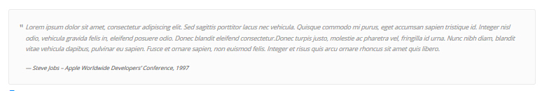
<div class="quotes_1">
    <blockquote> <span class="mark"> “</span>
        <p>Content text  ...</p>
        <small>Name</small> </blockquote>
</div>
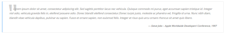
<div class="quotes_2">
    <blockquote> <span class="mark"> “</span>
        <p>Content text  ...</p>
        <small>Name</small> </blockquote>
</div>
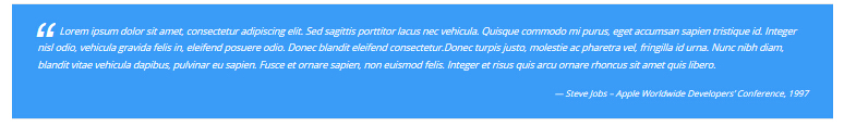
<div class="quotes_3">
    <blockquote> <span class="mark"> “</span>
        <p>Content text  ...</p>
        <small>Name</small> </blockquote>
</div>
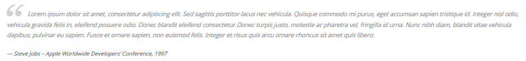
<div class="quotes_4">
    <blockquote> <span class="mark"> “</span>
        <p>Content text  ...</p>
        <small>Name</small> </blockquote>
</div>
Dropcaps
You can click the link to check Dropcaps demo. Demo Link
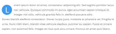
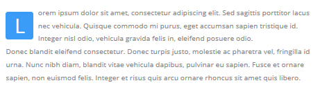
<p> <span class="dropcaps_1">L</span>Content text ... </p>
<p> <span class="dropcaps_2">L</span>Content text ... </p>
<p> <span class="dropcaps_3">L</span>Content text ... </p>
<p> <span class="dropcaps_4">L</span>Content text ... </p>
<p> <span class="dropcaps_5">L</span>Content text ... </p>
<p> <span class="dropcaps_6">L</span>Content text ... </p>
Carousel
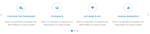
You can click the link to check Carousel demo. Demo Link
| Variable | Default | Type | Description |
|---|---|---|---|
data-items |
4 | int | This variable allows you to set the maximum amount of items displayed at a time with the widest browser width. |
data-navigation |
true | boolean | Display "next" and "prev" buttons. |
data-pagination |
true | boolean | Show pagination. |
data-autoplay |
true | int/boolean | Change to any integrer for example data-autoplay ="5000" to play every 5 seconds. If you set data-autoplay="false" Stop auto scroll animation. |
Option:
- You can increase your content items through adding
<div class="item"></div>
Example:
<div class="carousel" data-navigation="true" data-pagination="true" data-autoplay="true" data-autoheight="true">
  <div class="item">
		...
Style 1:
Below is the screen shot:
Codes are as follows:
<div class="carousel carousel_1" data-items="4" data-navigation="true" data-pagination="true" data-autoplay="true">
    <div class="item">
        <div class="ico"><span class="glyphicons glyph-ipad"></span></div>
        <h3>title 1</h3>
        <p>Content text 1 ... </p>
    </div>
    <div class="item">
        <div class="ico"><span class="glyphicons glyph-macbook"></span></div>
        <h3>title 2</h3>
        <p>Content text 2 ... </p>
    </div>
    <div class="item">
        <div class="ico"><span class="glyphicons glyph-cogwheels"></span></div>
        <h3>title 3</h3>
        <p>Content text 3 ... </p>
    </div>
    <div class="item">
        <div class="ico"><span class="glyphicons glyph-picture"></span></div>
        <h3>title 4</h3>
        <p>Content text 4 ... </p>
    </div>
    <div class="item">
        <div class="ico"><span class="glyphicons glyph-heart"></span></div>
        <h3>title 5</h3>
        <p>Content text 5 ... </p>
    </div>
</div>
Option:
- You can modify
glyphiconsto change icons. font icon list.
Style 2:
Below is the screen shot:
Codes are as follows:
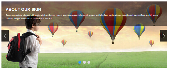
<div class="carousel carousel_2" data-navigation="true" data-pagination="true" data-autoplay="true" data-autoheight="true">
<div class="item"> <img alt="" src="/portals/31/controls_11.jpg">
<div class="carousel_content text_left_pull">
<h3>ABOUT OUR SKIN</h3>
<p>content text ...</p>
</div>
</div>
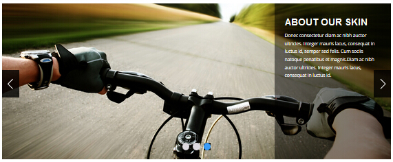
<div class="item"> <img alt="" src="/portals/31/controls_12.jpg">
<div class="carousel_content text_left_pull">
<h3>ABOUT OUR SKIN</h3>
<p>content text ...</p>
</div>
</div>
<div class="item"> <img alt="" src="/portals/31/controls_13.jpg">
<div class="carousel_content text_left_pull">
<h3>ABOUT OUR SKIN</h3>
<p>content text ...</p>
</div>
</div>
</div>
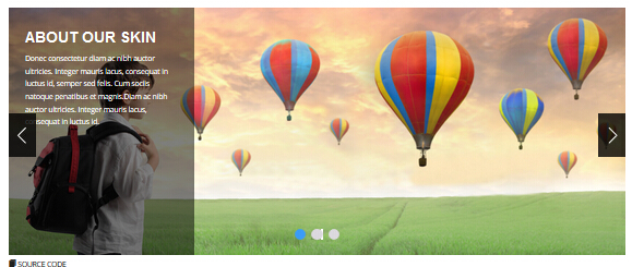
Style 3:
Below is the screen shot:
Codes are as follows:
<div class="carousel carousel_2" data-navigation="true" data-pagination="true" data-autoplay="true" data-autoheight="true">
    <div class="item"> <img alt="" src="/portals/31/controls_11.jpg">
        <div class="carousel_content text_right_pull">
            <h3>ABOUT OUR SKIN</h3>
            <p>content text ...</p>
        </div>
    </div>
    <div class="item"> <img alt="" src="/portals/31/controls_12.jpg">
        <div class="carousel_content text_right_pull">
            <h3>ABOUT OUR SKIN</h3>
            <p>content text ...</p>
        </div>
    </div>
    <div class="item"> <img alt="" src="/portals/31/controls_13.jpg">
        <div class="carousel_content text_right_pull">
            <h3>ABOUT OUR SKIN</h3>
            <p>content text ...</p>
        </div>
    </div>
</div>
Style 4:
Below is the screen shot:
Codes are as follows:
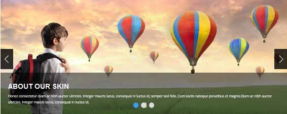
<div class="carousel carousel_2" data-navigation="true" data-pagination="true" data-autoplay="true" data-autoheight="true">
    <div class="item"> <img alt="" src="/portals/31/controls_11.jpg">
        <div class="carousel_content text_top_pull">
            <h3>ABOUT OUR SKIN</h3>
            <p>content text ...</p>
        </div>
    </div>
    <div class="item"> <img alt="" src="/portals/31/controls_12.jpg">
        <div class="carousel_content text_top_pull">
            <h3>ABOUT OUR SKIN</h3>
            <p>content text ...</p>
        </div>
    </div>
    <div class="item"> <img alt="" src="/portals/31/controls_13.jpg">
        <div class="carousel_content text_top_pull">
            <h3>ABOUT OUR SKIN</h3>
            <p>content text ...</p>
        </div>
    </div>
</div>
Style 5:
Below is the screen shot:
Codes are as follows:
<div class="carousel carousel_2" data-navigation="true" data-pagination="true" data-autoplay="true" data-autoheight="true">
    <div class="item"> <img alt="" src="/portals/161/controls_1.jpg">
        <div class="carousel_content text_bottom_pull">
            <h3>ABOUT OUR SKIN</h3>
            <p>content text ...</p>
        </div>
    </div>
    <div class="item"> <img alt="" src="/portals/161/controls_2.jpg">
        <div class="carousel_content text_bottom_pull">
            <h3>ABOUT OUR SKIN</h3>
            <p>content text ...</p>
        </div>
    </div>
    <div class="item"> <img alt="" src="/portals/161/controls_3.jpg">
        <div class="carousel_content text_bottom_pull">
            <h3>ABOUT OUR SKIN</h3>
            <p>content text ...</p>
        </div>
    </div>
</div>
Style 6:
Below is the screen shot:
Codes are as follows:
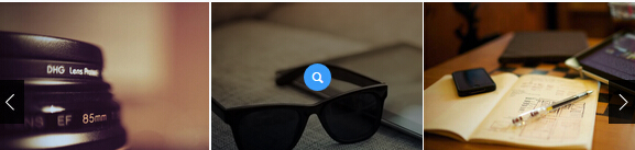
<div class="carousel carousel_3" data-items="5" data-pagination="false" data-navigation="true" data-autoplay="true">
    <div class="item">
        <div class="photo_box img_zoom ico_zoom"> <a href="/portals/31/Photo_1_big.jpg"  class="LightBox_image_gallery2">
            <div class="pic_box"> <img  src="/portals/31/Photo_1.jpg" >
                <div class="ico"><span class="glyphicons glyph-link"></span></div>
                <div class="shade"></div>
            </div>
            </a>
            <div class="text_sytle_5">
                <h3>photographic lens </h3>
            </div>
        </div>
    </div>
    <div class="item">
        <div class="photo_box img_zoom ico_zoom"> <a href="/portals/31/Photo_2_big.jpg"  class="LightBox_image_gallery2">
            <div class="pic_box"> <img  src="/portals/31/Photo_2.jpg" >
                <div class="ico"><span class="glyphicons glyph-link"></span></div>
                <div class="shade"></div>
            </div>
            </a>
            <div class="text_sytle_5">
                <h3>A Quiet Life</h3>
            </div>
        </div>
    </div>
    <div class="item">
        <div class="photo_box img_zoom ico_zoom"> <a href="/portals/31/Photo_3_big.jpg"  class="LightBox_image_gallery2">
            <div class="pic_box"> <img  src="/portals/31/Photo_3.jpg" >
                <div class="ico"><span class="glyphicons glyph-search"></span></div>
                <div class="shade"></div>
            </div>
            </a>
            <div class="text_sytle_5">
                <h3>The designer's afternoon </h3>
            </div>
        </div>
    </div>
    <div class="item">
        <div class="photo_box img_zoom ico_zoom"> <a href="/portals/31/Photo_4_big.jpg"  class="LightBox_image_gallery2">
            <div class="pic_box"> <img  src="/portals/31/Photo_4.jpg" >
                <div class="ico"><span class="glyphicons glyph-search"></span></div>
                <div class="shade"></div>
            </div>
            </a>
            <div class="text_sytle_5">
                <h3>Vintage Classic </h3>
            </div>
        </div>
    </div>
    <div class="item">
        <div class="photo_box img_zoom ico_zoom"> <a href="/portals/31/Photo_5_big.jpg"  class="LightBox_image_gallery2">
            <div class="pic_box"> <img  src="/portals/31/Photo_5.jpg" >
                <div class="ico"><span class="glyphicons glyph-search"></span></div>
                <div class="shade"></div>
            </div>
            </a>
            <div class="text_sytle_5">
                <h3>The world of the camera </h3>
            </div>
        </div>
    </div>
    <div class="item">
        <div class="photo_box img_zoom ico_zoom"> <a href="/portals/31/Photo_1_big.jpg"  class="LightBox_image_gallery2">
            <div class="pic_box"> <img  src="/portals/31/Photo_1.jpg" >
                <div class="ico"><span class="glyphicons glyph-search"></span></div>
                <div class="shade"></div>
            </div>
            </a>
            <div class="text_sytle_5">
                <h3>photographic lens </h3>
            </div>
        </div>
    </div>
</div>
Option:
- You can add image style effects through effects of imageeffects page.
- You can add image enlargement effect through the effect of lightbox page.
- You can modify
glyphiconsto change icons. font icon list.
Style 7:
Below is the screen shot:
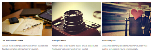
Codes are as follows:
<div class="carousel carousel_3" data-items="3" data-pagination="true" data-navigation="true" data-autoplay="true" >
    <div class="item">
        <div class="photo_box  img_zoom ico_zoom"> <a href="#">
            <div class="pic_box"> <img  src="/portals/31/Photo_1.jpg" >
                <div class="ico"> <span class="glyphicons glyph-plus"></span> </div>
                <div class="shade"></div>
            </div>
            </a>
            <div class="text_sytle_3">
                <h3>multi color pack </h3>
                <p>content text...</p>
            </div>
        </div>
    </div>
    <div class="item">
        <div class="photo_box  img_zoom ico_zoom"> <a href="#">
            <div class="pic_box"> <img  src="/portals/31/Photo_2.jpg" >
                <div class="ico"> <span class="glyphicons glyph-plus"></span> </div>
                <div class="shade"></div>
            </div>
            </a>
            <div class="text_sytle_3">
                <h3>The designer's afternoon </h3>
                <p>content text...</p>
            </div>
        </div>
    </div>
    <div class="item">
        <div class="photo_box  img_zoom ico_zoom"> <a href="#">
            <div class="pic_box"> <img  src="/portals/31/Photo_3.jpg" >
                <div class="ico"> <span class="glyphicons glyph-plus"></span> </div>
                <div class="shade"></div>
            </div>
            </a>
            <div class="text_sytle_3">
                <h3>The world of the camera </h3>
                <p>content text...</p>
            </div>
        </div>
    </div>
    <div class="item">
        <div class="photo_box  img_zoom ico_zoom"> <a href="#">
            <div class="pic_box"> <img  src="/portals/31/Photo_4.jpg" >
                <div class="ico"> <span class="glyphicons glyph-plus"></span> </div>
                <div class="shade"></div>
            </div>
            </a>
            <div class="text_sytle_3">
                <h3>Vintage Classic </h3>
                <p>content text...</p>
            </div>
        </div>
    </div>
</div>
Option:
- You can modify
glyphiconsto change icons. font icon list.
Style 8:
Below is the screen shot:
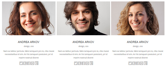
Codes are as follows:
<div class="carousel carousel_4" data-autoplay="true" data-pagination="false" data-navigation="false" data-items="3" >
    <div class="item">
        <div class="photo_box shade_zoom"> <a href="#">
            <div class="pic_box"> <img  src="/portals/31/member_1.jpg" >
                <div class="ico"> <span class="glyphicons glyph-resize-small"></span></div>
                <div class="shade"></div>
            </div>
            </a> </div>
        <div class="text_sytle_6">
            <h3>ANDREA ARKOV</h3>
            <div class="info">design, ceo</div>
            <p>content text...</p>
            <div class="social-icons  clearfix"> <a href="#"><span class="social social-twitter"></div>
        </div>
    </div>
    <div class="item">
        <div class="photo_box shade_zoom"> <a href="#">
            <div class="pic_box"> <img  src="/portals/31/member_2.jpg" >
                <div class="ico"> <span class="glyphicons glyph-resize-small"></span> </div>
                <div class="shade"></div>
            </div>
            </a> </div>
        <div class="text_sytle_6">
            <h3>ANDREA ARKOV</h3>
            <div class="info">design, ceo</div>
            <p>content text...</p>
            <div class="social-icons  clearfix"> <a href="#"><span class="social social-twitter"></span></div>
        </div>
    </div>
    <div class="item">
        <div class="photo_box shade_zoom"> <a href="#">
            <div class="pic_box"> <img  src="/portals/31/member_3.jpg" >
                <div class="ico"> <span class="glyphicons glyph-resize-small"></span> </div>
                <div class="shade"></div>
            </div>
            </a> </div>
        <div class="text_sytle_6">
            <h3>ANDREA ARKOV</h3>
            <div class="info">design, ceo</div>
            <p>content text...</p>
            <div class="social-icons  clearfix"> <a href="#"><span class="social social-twitter"></span></div>
        </div>
    </div>
    <div class="item">
        <div class="photo_box shade_zoom"> <a href="#">
            <div class="pic_box"> <img  src="/portals/31/member_1.jpg" >
                <div class="ico"> <span class="glyphicons glyph-resize-small"></span> </div>
                <div class="shade"></div>
            </div>
            </a> </div>
        <div class="text_sytle_6">
            <h3>ANDREA ARKOV</h3>
            <div class="info">design, ceo</div>
            <p>content text...</p>
            <div class="social-icons  clearfix"> <a href="#"><span class="social social-twitter"></span></a></div>
        </div>
    </div>
</div>
Option:
- You can modify
glyphiconsto change icons. font icon list.
Style 9:
Below is the screen shot:
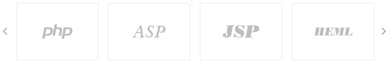
Codes are as follows:
<div class="carousel carousel_5"  data-autoplay="true" data-pagination="false" data-navigation="true" data-items="4">
    <div class="item"> <a href="#"><img  src="/portals/31/carousel_1.jpg" ></a> </div>
    <div class="item"> <a href="#"><img  src="/portals/31/carousel_2.jpg" ></a> </div>
    <div class="item"> <a href="#"><img  src="/portals/31/carousel_3.jpg" ></a> </div>
    <div class="item"> <a href="#"><img  src="/portals/31/carousel_4.jpg" ></a> </div>
</div>
Style 10:
Below is the screen shot:
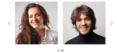
Codes are as follows:
<div class="carousel carousel_6" data-autoplay="true" data-pagination="true" data-navigation="true" data-items="2">
    <div class="item">
        <div class="photo_box img_zoom ico_zoom"> <a href="#">
            <div class="pic_box"> <img  src="/portals/31/carousel6_01.jpg" >
                <div class="ico"> <span class="glyphicons glyph-plus"></span> </div>
                <div class="shade"></div>
            </div>
            </a> </div>
    </div>
    <div class="item">
        <div class="photo_box img_zoom ico_zoom"> <a href="#">
            <div class="pic_box"> <img  src="/portals/31/carousel6_02.jpg" >
                <div class="ico"> <span class="glyphicons glyph-plus"></span> </div>
                <div class="shade"></div>
            </div>
            </a> </div>
    </div>
    <div class="item">
        <div class="photo_box img_zoom ico_zoom"> <a href="#">
            <div class="pic_box"> <img  src="/portals/31/carousel6_01.jpg" >
                <div class="ico"> <span class="glyphicons glyph-plus"></span> </div>
                <div class="shade"></div>
            </div>
            </a> </div>
    </div>
    <div class="item">
        <div class="photo_box img_zoom ico_zoom"> <a href="#">
            <div class="pic_box"> <img  src="/portals/31/carousel6_02.jpg" >
                <div class="ico"> <span class="glyphicons glyph-plus"></span> </div>
                <div class="shade"></div>
            </div>
            </a> </div>
    </div>
</div>
Option:
- You can modify
glyphiconsto change icons. font icon list.
Style 11:
Below is the screen shot:

Codes are as follows:
<div class="carousel carousel_7"  data-autoplay="true" data-pagination="false" data-navigation="true" data-items="5">
    <div class="item"> <img alt="" src="/portals/31/link_1.png" > </div>
    <div class="item"> <img alt="" src="/portals/31/link_2.png" > </div>
    <div class="item"> <img alt="" src="/portals/31/link_3.png" > </div>
    <div class="item"> <img alt="" src="/portals/31/link_4.png" > </div>
    <div class="item"> <img alt="" src="/portals/31/link_5.png" > </div>
    <div class="item"> <img alt="" src="/portals/31/link_1.png" > </div>
    <div class="item"> <img alt="" src="/portals/31/link_2.png" > </div>
</div>
Style 12:
Below is the screen shot:
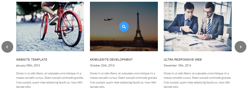
Codes are as follows:
<div class="carousel carousel_8" data-autoplay="true" data-pagination="false" data-navigation="true" data-items="3" >
    <div class="item">
        <div class="photo_box"> <a href="#">
            <div class="pic_box"> <img alt="" src="/portals/31/home7_carousel_img1.jpg" >
                <div class="ico"> <span class="glyphicons glyph-search"></span> </div>
                <div class="shade"></div>
            </div>
            </a>
            <div class="text_style5">
                <h3>Mobilesite Development</h3>
                <p class="date">October 25th, 2014</p>
                <p>content text...</p>
            </div>
        </div>
    </div>
    <div class="item">
        <div class="photo_box"> <a href="#">
            <div class="pic_box"> <img alt="" src="/portals/31/home7_carousel_img2.jpg" >
                <div class="ico"> <span class="glyphicons glyph-search"></span> </div>
                <div class="shade"></div>
            </div>
            </a>
            <div class="text_style5">
                <h3>Ultra Responsive Web</h3>
                <p class="date">December 18th, 2014</p>
                <p>content text...</p>
            </div>
        </div>
    </div>
    <div class="item">
        <div class="photo_box"> <a href="#">
            <div class="pic_box"> <img alt="" src="/portals/31/home7_carousel_img3.jpg" >
                <div class="ico"> <span class="glyphicons glyph-search"></span> </div>
                <div class="shade"></div>
            </div>
            </a>
            <div class="text_style5">
                <h3>Website Template</h3>
                <p class="date">January 09th, 2015</p>
                <p>content text...</p>
            </div>
        </div>
    </div>
    <div class="item">
        <div class="photo_box"> <a href="#">
            <div class="pic_box"> <img alt="" src="/portals/31/home7_carousel_img1.jpg" >
                <div class="ico"> <span class="glyphicons glyph-search"></span> </div>
                <div class="shade"></div>
            </div>
            </a>
            <div class="text_style5">
                <h3>Mobilesite Development</h3>
                <p class="date">October 25th, 2014</p>
                <p>content text...</p>
            </div>
        </div>
    </div>
    <div class="item">
        <div class="photo_box"> <a href="#">
            <div class="pic_box"> <img alt="" src="/portals/31/home7_carousel_img2.jpg" >
                <div class="ico"> <span class="glyphicons glyph-search"></span> </div>
                <div class="shade"></div>
            </div>
            </a>
            <div class="text_style5">
                <h3>Ultra Responsive Web</h3>
                <p class="date">December 18th, 2014</p>
                <p>content text...</p>
            </div>
        </div>
    </div>
</div>
Option:
- You can modify
glyphiconsto change icons. font icon list.
CSS3Animations
You can click the link to check CSS3Animations demo. Demo Link
Style 1:
This type is a group of effects which are displayed in time sequence. Below is the screen shot:
Codes are as follows:
<div class="animation">
   <div class="row mb-20">
       <div class="col-sm-3 animation_item scaleUp delay1"><img src="/portals/37/Photo2.jpg" /></div>
       <div class="col-sm-3 animation_item scaleUp delay2"><img src="/portals/37/Photo2.jpg" /></div>
       <div class="col-sm-3 animation_item scaleUp delay3"><img src="/portals/37/Photo2.jpg" /></div>
       <div class="col-sm-3 animation_item scaleUp delay4"><img src="/portals/37/Photo2.jpg" /></div>
	   ...
</div>
delay1, delay2, delay3, delay4 are used to control animation time, there are 12 time slots, which correspond to delay1~delay12 respectively.
scaleUp is used to control animation effect, there are scaleUp , bounceIn , bounceInDown , bounceInLeft , bounceInRight , bounceInUp , fadeIn , fadeInDown , fadeInLeft , fadeInRight , fadeInUp , fadeInDownBig , fadeInLeftBig , fadeInRightBig , fadeInUpBig , flip , flipInX , flipInY , lightSpeedIn , rotateIn , rotateInDownLeft , rotateInDownRight , rotateInUpLeft , rotateInUpRight , rollIn , zoomIn , zoomInDown , zoomInLeft , zoomInRight , zoomInUp 30 effects in total.
Style 2:
If you just need one animation effect, you can match with the following codes.
<div class="animation scaleUp"> <img src="/portals/37/Photo5.jpg" /> </div>
Style 3:
You can add animation for a certain element when mousing over. Codes are as follows:
<div class="animationhover bounce"> <img src="/portals/37/Photo5.jpg" /> </div>
When mousing over, it will show animation effect type (animationhover). There are bounce , flash , pulse , rubberBand , shake , swing , tada , wobble 8 effects.
Popovers
You can click the link to check Popovers demo. Demo Link
Below is the screen shot:
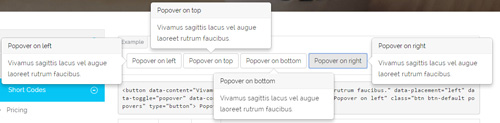
Codes are as follows:
<button data-content="Vivamus sagittis lacus vel augue laoreet rutrum faucibus." data-placement="left" data-toggle="popover"
data-container="body" data-original-title="Popover on left" class="btn btn-default popovers" type="button">
    Popover on left
</button>
Option:
| Name | type | default | description |
|---|---|---|---|
| animation | boolean | true | apply a CSS fade transition to the tooltip |
| html | boolean | false | Insert HTML into the tooltip. If false, jQuery's text method will be used to insert content into the DOM. Use text if you're worried about XSS attacks. |
| placement | string | function | 'top' | how to position the tooltip - top | bottom | left | right | auto. When "auto" is specified, it will dynamically reorient the tooltip. For example, if placement is "auto left", the tooltip will display to the left when possible, otherwise it will display right. |
| selector | string | false | If a selector is provided, tooltip objects will be delegated to the specified targets. |
| title | string | function | '' | default title value if title attribute isn't present |
| trigger | string | 'hover focus' | how tooltip is triggered - click | hover | focus | manual. You may pass multiple triggers; separate them with a space. |
| delay | number | object | 0 | delay showing and hiding the tooltip (ms) - does not apply to manual trigger type If a number is supplied, delay is applied to both hide/show Object structure is: |
| container | string | false | false | Appends the tooltip to a specific element. Example: |
Alerts
You can click the link to check Alerts demo. Demo Link
Below is the screen shot:
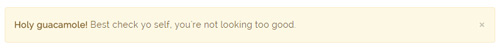
Codes are as follows:
<div class="alert alert-warning fade in">
    <button aria-hidden="true" data-dismiss="alert" class="close" type="button">×</button>
    <strong>Holy guacamole!</strong> Best check yo self, you're not looking too good.
</div>
Option:
- You can change
alert-to change the color, there arealert-warning,alert-danger,alert-success,alert-info4 colors included in the effects. fadeis for hiddeninis for display
Tooltips
You can click the link to check Tooltips demo. Tooltips
Below is the screen shot:
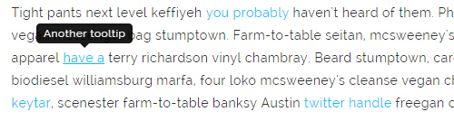
Codes are as follows:
<a href="#" class="tooltips" data-toggle="tooltip" title="first tooltip">Hover over me</a>
Option:
| Name | type | default | description |
|---|---|---|---|
| animation | boolean | true | apply a CSS fade transition to the tooltip |
| html | boolean | false | Insert HTML into the tooltip. If false, jQuery's text method will be used to insert content into the DOM. Use text if you're worried about XSS attacks. |
| placement | string | function | 'top' | how to position the tooltip - top | bottom | left | right | auto. When "auto" is specified, it will dynamically reorient the tooltip. For example, if placement is "auto left", the tooltip will display to the left when possible, otherwise it will display right. |
| selector | string | false | If a selector is provided, tooltip objects will be delegated to the specified targets. |
| title | string | function | '' | default title value if title attribute isn't present |
| trigger | string | 'hover focus' | how tooltip is triggered - click | hover | focus | manual. You may pass multiple triggers; separate them with a space. |
| delay | number | object | 0 | delay showing and hiding the tooltip (ms) - does not apply to manual trigger type If a number is supplied, delay is applied to both hide/show Object structure is: |
| container | string | false | false | Appends the tooltip to a specific element. Example: |
Dropdowns
You can click the link to check Dropdowns demo. Demo Link
Style 1:
Below is the screen shot:
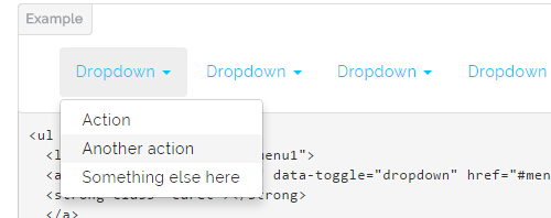
Codes are as follows:
<ul class="nav nav-pills">
  <li class="dropdown" id="menu1">
  <a class="dropdown-toggle" data-toggle="dropdown" href="#menu1">Dropdown
  <strong class="caret"></strong>
  </a>
    <ul class="dropdown-menu">
      <li><a href="#">Action</a></li>
      <li><a href="#">Another action</a></li>
      <li><a href="#">Something else here</a></li>
    </ul>
  </li>
</ul>
Style 2:
Below is the screen shot:
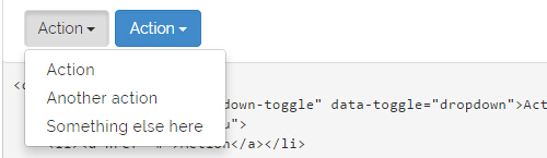
Codes are as follows:
<div class="btn-group">
  <button class="btn dropdown-toggle" data-toggle="dropdown">Action <span class="caret"></span></button>
  <ul class="dropdown-menu">
    <li><a href="#">Action</a></li>
    <li><a href="#">Another action</a></li>
    <li><a href="#">Something else here</a></li>
  </ul>
</div>
Style 3:
Below is the screen shot:
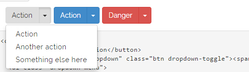
Codes are as follows:
<div class="btn-group">
  <button class="btn">Action</button>
  <button data-toggle="dropdown" class="btn dropdown-toggle"><span class="caret"></span></button>
  <ul class="dropdown-menu">
    <li><a href="#">Action</a></li>
    <li><a href="#">Another action</a></li>
    <li><a href="#">Something else here</a></li>
  </ul>
</div>
LightBox
You can click the link to check LightBox demo. Demo Link
Below is the screen shot:
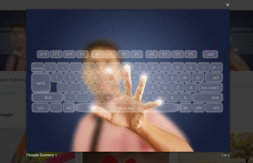
Option:
1. LightBox_image |
Show one image alone. |
2. LightBox_image_gallery+group number |
Classify those that share the same class name to one group, you can show other images within the group by clicking left and right arrow of the image. |
3. LightBox_image_group |
Classify these sub levels whose label class name is LightBox_image_group into one group. |
4. LightBox_youtube |
Show youtube video. |
5. LightBox_vimeo |
Show video. |
6. LightBox_gmaps |
Shown map. |
7. LightBox_youtube_gallery+group number |
Classify these that share the same class name into a group of youtube video show |
8. LightBox_vimeo_gallery+group number |
Classify these that share the same class name into a group of video show. |
9. LightBox_gmaps_gallery+group number |
Classify these that share the same class name into a group of map show. |
10. LightBox_youtube_group |
Classify these sub levels whose label class name is LightBox_youtube_group into one group. |
11. LightBox_vimeo_group |
Classify these sub levels whose label class name is LightBox_vimeo_group into one group. |
12. LightBox_gmaps_group |
Classify these sub levels whose label class names is LightBox_gmaps_group into one group. |
13. LightBox_Box |
Take div as layer pop up, div needs to hide by default. Style of pop up is custom style. |
14. LightBox_ajax |
Pop up a page |
15. LightBox_ajax_group |
Pop up a group of pages |
You need to fill url of the pop up image(video, map) in href=""
1.LightBox_image
<a href="bigPhoto.jpg" class="LightBox_image" title="Single Image 1"><img alt="" src="cover.jpg" /></a>
2.LightBox_image_gallery
<a href="bigPhoto1.jpg" class="LightBox_image_gallery1" title="Single Image 1"><img alt="" src="cover.jpg" /></a>
<a href="bigPhoto2.jpg" class="LightBox_image_gallery1" title="Single Image 1"><img alt="" src="cover.jpg" /></a>
<a href="bigPhoto3.jpg" class="LightBox_image_gallery2" title="Single Image 2"><img alt="" src="cover.jpg" /></a>
<a href="bigPhoto4.jpg" class="LightBox_image_gallery2" title="Single Image 2"><img alt="" src="cover.jpg" /></a>
3.LightBox_image_group
<div class="LightBox_image_group">
    <a href="bigPhoto1.jpg" title=" People Scenery 1"><img alt="" src="cover.jpg" /> </a>
    <a href="bigPhoto2.jpg" title=" People Scenery 2"></a>
    <a href="bigPhoto3.jpg" title=" People Scenery 3"></a>
</div>
4.LightBox_youtube
<a href="http://www.youtube.com/watch?v=0O2aH4XLbto" class="LightBox_youtube" title="youtube"><img alt="" src="cover.jpg" /></a>
5.LightBox_vimeo
<a href="https://vimeo.com/45830194" class="LightBox_vimeo" title="vimeo"><img alt="" src="cover.jpg" /></a>
6.LightBox_gmaps
<a href="https://maps.google.com/maps?q=221B+Baker+Street,+London,+United+Kingdom&hl=en&t=v&hnear=221B+Baker+St,+London+NW1+6XE,+United+Kingdom"
class="LightBox_gmaps" title="gmaps"><img alt="" src="cover.jpg" /></a>
7.LightBox_youtube_gallery
<a href="http://www.youtube.com/watch?v=0O2aH4XLbto" class="LightBox_youtube_gallery1" title="youtube gallery"><img alt="" src="cover.jpg" /></a>
<a href="http://www.youtube.com/watch?v=0O2aH4XLbto" class="LightBox_youtube_gallery1" title="youtube gallery"><img alt="" src="cover.jpg" /></a>
<a href="http://www.youtube.com/watch?v=0O2aH4XLbto" class="LightBox_youtube_gallery2" title="youtube gallery"><img alt="" src="cover.jpg" /></a>
<a href="http://www.youtube.com/watch?v=0O2aH4XLbto" class="LightBox_youtube_gallery2" title="youtube gallery"><img alt="" src="cover.jpg" /></a>
8.LightBox_vimeo_gallery
<a href="https://vimeo.com/45830194" class="LightBox_vimeo_gallery1" title="vimeo gallery"><img alt="" src="cover.jpg" /></a>
<a href="https://vimeo.com/45830194" class="LightBox_vimeo_gallery1" title="vimeo gallery"><img alt="" src="cover.jpg" /></a>
<a href="https://vimeo.com/45830194" class="LightBox_vimeo_gallery2" title="vimeo gallery"><img alt="" src="cover.jpg" /></a>
<a href="https://vimeo.com/45830194" class="LightBox_vimeo_gallery2" title="vimeo gallery"><img alt="" src="cover.jpg" /></a>
9.LightBox_gmaps_gallery
<a href="https://maps.google.com/maps?q=221B+Baker+Street,+London,+United+Kingdom&hl=en&t=v&hnear=221B+Baker+St,+London+NW1+6XE,+United+Kingdom"
class="LightBox_gmaps_gallery1" title="gmaps gallery"><img alt="" src="cover.jpg" /></a>
<a href="https://maps.google.com/maps?q=221B+Baker+Street,+London,+United+Kingdom&hl=en&t=v&hnear=221B+Baker+St,+London+NW1+6XE,+United+Kingdom"
class="LightBox_gmaps_gallery1" title="gmaps gallery"><img alt="" src="cover.jpg" /></a>
<a href="https://maps.google.com/maps?q=221B+Baker+Street,+London,+United+Kingdom&hl=en&t=v&hnear=221B+Baker+St,+London+NW1+6XE,+United+Kingdom"
class="LightBox_gmaps_gallery2" title="gmaps gallery"><img alt="" src="cover.jpg" /></a>
<a href="https://maps.google.com/maps?q=221B+Baker+Street,+London,+United+Kingdom&hl=en&t=v&hnear=221B+Baker+St,+London+NW1+6XE,+United+Kingdom"
class="LightBox_gmaps_gallery2" title="gmaps gallery"><img alt="" src="cover.jpg" /></a>
10.LightBox_youtube_group
<div class="LightBox_youtube_group">
    <a href="http://www.youtube.com/watch?v=0O2aH4XLbto" title=" youtube 1"><img alt="" src="cover.jpg" /> </a>
    <a href="http://www.youtube.com/watch?v=0O2aH4XLbto" title=" youtube 2"></a>
    <a href="http://www.youtube.com/watch?v=0O2aH4XLbto" title=" youtube 3"></a>
</div>
11.LightBox_vimeo_group
<div class="LightBox_vimeo_group">
    <a href="https://vimeo.com/45830194" title=" vimeo 1"><img alt="" src="cover.jpg" /> </a>
    <a href="https://vimeo.com/45830194" title=" vimeo 2"></a>
    <a href="https://vimeo.com/45830194" title=" vimeo 3"></a>
</div>
12.LightBox_gmaps_group
<div class="LightBox_gmaps_group">
    <a href="https://maps.google.com/maps?q=221B+Baker+Street,+London,+United+Kingdom&hl=en&t=v&hnear=221B+Baker+St,+London+NW1+6XE,+United+Kingdom"
    title=" gmaps 1"><img alt="" src="cover.jpg" /> </a>
    <a href="https://maps.google.com/maps?q=221B+Baker+Street,+London,+United+Kingdom&hl=en&t=v&hnear=221B+Baker+St,+London+NW1+6XE,+United+Kingdom"
    title=" gmaps 2"></a>
    <a href="https://maps.google.com/maps?q=221B+Baker+Street,+London,+United+Kingdom&hl=en&t=v&hnear=221B+Baker+St,+London+NW1+6XE,+United+Kingdom"
    title=" gmaps 3"></a>
</div>
13.LightBox_Box
<a href=".LightBox_Content" class="LightBox_Box"> Click Here To Pop </a>
<a href=".LightBox_Content" class="LightBox_Box Button_default"> Click Here To Pop </a>
<div class="LightBox_Content">
    <h3>Click Here To Pop</h3>
 	  content text ...
</div>
14.LightBox_ajax
<a href="index.aspx" class="LightBox_ajax" title="ajax"><img alt="" src="cover.jpg" /></a>
15.LightBox_ajax_group
<div class="LightBox_ajax_group">
    <a href="index.aspx" title=" ajax 1"><img alt="" src="cover.jpg" /> </a>
    <a href="index.aspx" title=" ajax 2"></a>
    <a href="index.aspx" title=" ajax 3"></a>
</div>
Image Effects
You can click the link to check Image Effects demo. Demo Link
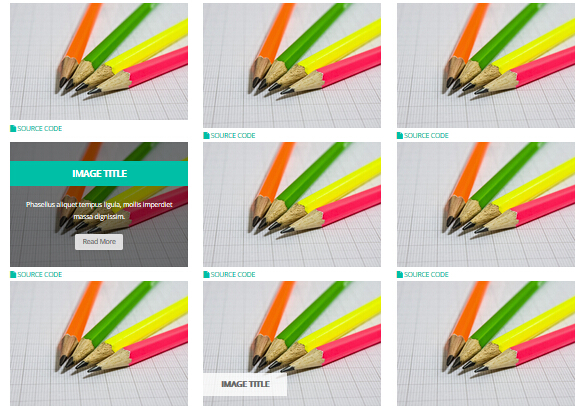
- You can copy over codes of the image effects directly to any HTML modules.
- You can change the font icon through modifying. font icon list
Flip Box
You can click the link to check Flip Box demo. Demo Link
Style 1:
Below is the screen shot:
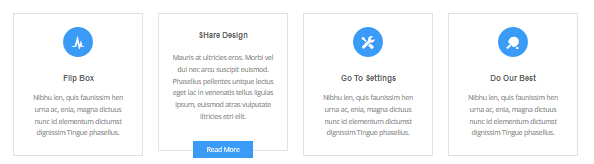
Codes are as follows:
<div class="row">
    <div class="col-sm-3">
        <div class="flip_box flip_box_1">
            <div class="rotate">
                <div class="front"> <span class="glyphicons glyph-cardio"></span>
                    <h3>Flip Box</h3>
                    <p>content text ...</p>
                </div>
                <div class="back">
                    <h3>Flip Box</h3>
                    <p>content text ...</p>
                    <a href="#" class="but">Read More</a> </div>
            </div>
        </div>
    </div>
    <div class="col-sm-3">
        <div class="flip_box flip_right flip_box_1">
            <div class="rotate">
                <div class="front"> <span class="glyphicons glyph-redo"></span>
                    <h3>SHare Design</h3>
                    <p>content text ...</p>
                </div>
                <div class="back">
                    <h3>SHare Design</h3>
                    <p>content text ...</p>
                    <a href="#" class="but">Read More</a> </div>
            </div>
        </div>
    </div>
    <div class="col-sm-3">
        <div class="flip_box flip_top flip_box_1">
            <div class="rotate">
                <div class="front"> <span class="glyphicons glyph-settings"></span>
                    <h3>Go To Settings</h3>
                    <p>content text ...</p>
                </div>
                <div class="back">
                    <h3>Go To Settings</h3>
                    <p>content text ...</p>
                    <a href="#" class="but">Read More</a> </div>
            </div>
        </div>
    </div>
    <div class="col-sm-3">
        <div class="flip_box flip_bottom flip_box_1">
            <div class="rotate">
                <div class="front"> <span class="glyphicons glyph-table-tennis"></span>
                    <h3>Do Our Best</h3>
                    <p>content text ...</p>
                </div>
                <div class="back">
                    <h3>Do Our Best</h3>
                    <p>content text ...</p>
                    <a href="#" class="but">Read More</a> </div>
            </div>
        </div>
    </div>
</div>
Option:
col-sm-3is the width of each column, you can change the width you need through value1~12.frontis for front content.backis for back content.
Style 2:
Below is the screen shot:
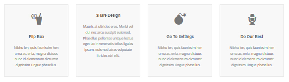
Codes are as follows:
<div class="row">
    <div class="col-sm-3">
        <div class="flip_box flip_box_2">
            <div class="rotate">
                <div class="front"> <span class="glyphicons glyph-drink"></span>
                    <h3>Flip Box</h3>
                    <p>content text ...</p>
                </div>
                <div class="back">
                    <h3>Flip Box</h3>
                    <p>content text ...</p>
                </div>
            </div>
        </div>
    </div>
    <div class="col-sm-3">
        <div class="flip_box flip_right flip_box_2">
            <div class="rotate">
                <div class="front"> <span class="glyphicons glyph-ring"></span>
                    <h3>SHare Design</h3>
                    <p>content text ...</p>
                </div>
                <div class="back">
                    <h3>SHare Design</h3>
                    <p>content text ...</p>
                </div>
            </div>
        </div>
    </div>
    <div class="col-sm-3">
        <div class="flip_box flip_top flip_box_2">
            <div class="rotate">
                <div class="front"> <span class="glyphicons glyph-bomb"></span>
                    <h3>Go To Settings</h3>
                    <p>content text ...</p>
                </div>
                <div class="back">
                    <h3>Go To Settings</h3>
                    <p>content text ...</p>
                </div>
            </div>
        </div>
    </div>
    <div class="col-sm-3">
        <div class="flip_box flip_bottom flip_box_2">
            <div class="rotate">
                <div class="front"> <span class="glyphicons glyph-microphone"></span>
                    <h3>Do Our Best</h3>
                    <p>content text ...</p>
                </div>
                <div class="back">
                    <h3>Do Our Best</h3>
                    <p>content text ...</p>
                </div>
            </div>
        </div>
    </div>
</div>
<br />
Style 3:
Below is the screen shot:
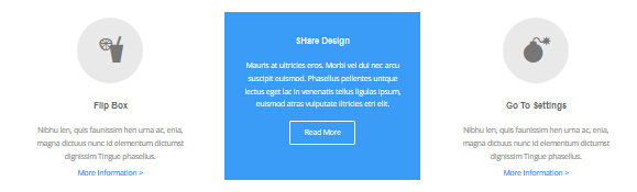
Codes are as follows:
<div class="row">
<div class="col-sm-4">
    <div class="flip_box flip_box_3">
        <div class="rotate">
            <div class="front"> <span class="glyphicons glyph-drink"></span>
                <h3>Flip Box</h3>
                <p>content text ...</p>
                <a href="#">More Information ></a> </div>
            <div class="back">
                <h3>Flip Box</h3>
                <p>content text ...</p>
                <a href="#" class="but">Read More</a> </div>
        </div>
    </div>
</div>
<div class="col-sm-4">
    <div class="flip_box flip_right flip_box_3">
        <div class="rotate">
            <div class="front"> <span class="glyphicons glyph-ring"></span>
                <h3>SHare Design</h3>
                <p>content text ...</p>
                <a href="#">More Information ></a> </div>
            <div class="back">
                <h3>SHare Design</h3>
                <p>content text ...</p>
                <a href="#" class="but">Read More</a> </div>
        </div>
    </div>
</div>
<div class="col-sm-4">
    <div class="flip_box flip_top flip_box_3">
        <div class="rotate">
            <div class="front"> <span class="glyphicons glyph-bomb"></span>
                <h3>Go To Settings</h3>
                <p>content text ...</p>
                <a href="#">More Information ></a> </div>
            <div class="back">
                <h3>Go To Settings</h3>
                <p>content text ...</p>
                <a href="#" class="but">Read More</a> </div>
        </div>
    </div>
</div>
<br />
Responsive Video
Ratio between width and height of the video needs to be 16:9.

<div class="responsive-video">
    <iframe width="853" height="480" src="//www.youtube.com/embed/XcpOsJQXcx4?list=UUIkFV7_2tEhhEhh1NkkwTUw" frameborder="0" allowfullscreen></iframe>
</div>
<div class="responsive-video">
    <iframe src="//player.vimeo.com/video/106249100" width="1920" height="1080" frameborder="0" webkitallowfullscreen mozallowfullscreen allowfullscreen></iframe>
</div>
<div class="responsive-video">
     <embed  src="/portals/37/movie.swf" type="application/x-shockwave-flash" allownetworking="all" allowfullscreen="true" allowscriptaccess="always" wmode="Opaque"></embed>
</div>
<div class="responsive-video">
    <video width="1920" height="1080"  controls="true">
    <source src="/portals/37/movie.m4v" type="video/mp4"></source>
    <source src="/portals/37/movie.ogv" type="video/ogg"></source>
    <source src="/portals/37/movie.webm" type="video/WebM"></source>
    Your browser does not support the video tag. </video>
</div>
Video Bg
You can click the link to check Video Bg demo. Demo Link
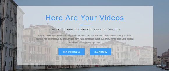
- "{videoURL:'npfu0fN9GUA' is the url of
youtube autoPlayis for whether to autoplay or nottrue/falseloopis for whether to play on a loop,true/false
<div data-property="{videoURL:'npfu0fN9GUA',containment:'self', showControls:false, autoPlay:true, loop:true, vol:50,
        mute:true, startAt:10, opacity:1, addRaster:false, quality:'hd1080'}" class="player">
    <div class="Play"></div>
    <div class="dnn_layout pt40 pb40">
        <div class="content_mid clearfix">
            <div class="player_boxes">
                <h1 class="player_title"> Here Are Your Videos</h1>
                <hr class="player_line" />
                <h4 class="player_smalltitle">YOU CAN CHANGE THE BACKGROUND BY YOURSELF</h4>
                <div class="player_content">
                    <p>Content Text 1 ... </p>
                </div>
                <p> <a class="Button_blue" href="#"> VIEW PORTFOLIOS</a>     <a class="Button_blue" href="#"> LEARN MORE</a> </p>
            </div>
        </div>
    </div>
</div>
Home Page Codes
This includes the html introductions that required for Home1~Home7 page, ComingSoon page, Boxed Layout page.
Home Version 1 (Home)
You can click the link to check Home Version 1 (home) demo. Home Version 1 (Home)
Top area
Below is the screen shot:

Codes are as follows:
<span class="glyphicons glyph-envelope"></span> E-mail : dnnskindev@gmail.com
Option:
- You can modify
glyphiconsto change icons. font icon list.
Banner area
Below is the screen shot:

It is using DNNGo LayerGalleryPro module here, you can import ContentListEntity-Home1.xml of the DNNGo_LayerGalleryPro folder to duplicate banner of the demo.
OUR QUALITY SERVICE area
Below is the screen shot:
Codes are as follows:
<div class="animation zoomIn" style="text-align: center;">Content Text...<br />
    Content Text...<br />
</div>
Option:
Containeris usingContainer-1- You can modify
animationto change the animation on the slide..CSS3Animations.
Services list area
Below is the screen shot:
Codes are as follows:
<div class="row ServeList animation ">
    <div class="col-md-3 col-sm-6 animation_item scaleUp delay1">
        <div class="ServeBox">
            <div class="Serve_Icon"><span class="glyphicons glyph-adjust"></span></div>
            <h3>RESPONSIVE WEB</h3>
            <p>Content Text...</p>
            <p><a target="_blank" href="#">more info >></a></p>
        </div>
    </div>
    <div class="col-md-3 col-sm-6 animation_item scaleUp delay2">
        <div class="ServeBox">
            <div class="Serve_Icon"><span class="glyphicons glyph-snowflake"></span></div>
            <h3>MOBILE DESIGN</h3>
            <p>Content Text...</p>
            <p><a target="_blank" href="#">more info >></a></p>
        </div>
    </div>
    <div class="clearfix visible-sm"></div>
    <div class="col-md-3 col-sm-6 animation_item scaleUp delay3">
        <div class="ServeBox">
            <div class="Serve_Icon"><span class="glyphicons glyph-roundabout"></span></div>
            <h3>CUSTOMIZE WEB </h3>
            <p>Content Text...</p>
            <p><a target="_blank" href="#">more info >></a></p>
        </div>
    </div>
    <div class="col-md-3 col-sm-6 animation_item scaleUp delay4">
        <div class="ServeBox">
            <div class="Serve_Icon"><span class="glyphicons glyph-saw-blade"></span></div>
            <h3>PHOTOGRAPHY</h3>
            <p>Content Text...</p>
            <p><a target="_blank" href="#">more info >></a></p>
        </div>
    </div>
</div>
Option:
col-md-3 col-sm-6is the width for each column. You can change the width you need through value1~12- You can modify
animationto change the animation on the slide..CSS3Animations. - You can modify
glyphiconsto change icons. font icon list.
THE POPULAR PRODUCTS
Below is the screen shot:
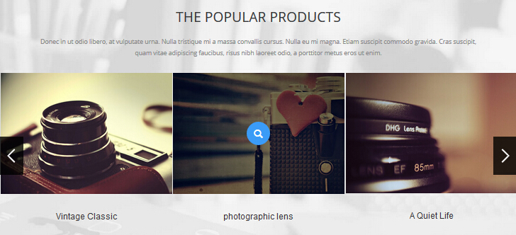
Codes are as follows:
<div class="backgroundImage1">
    <div class="dnn_layout ">
        <div class="content_mid  clearfix animation fadeIn "> <br />
            <br />
            <div class="title1" style="text-align: center;">THE POPULAR PRODUCTS</div>
            <br />
            <p style="text-align: center;">Content Text...</p>
            <br />
        </div>
    </div>
    <div data-pagination="false" class="carousel carousel_3 animation zoomIn">
        <div class="item">
            <div class="photo_box img_zoom ico_zoom"> <a class="LightBox_image_gallery2" href="/Portals/31/Photo_1.jpg">
                <div class="pic_box"> <img alt="" src="/portals/31/Photo_1.jpg" />
                    <div class="ico"><span class="glyphicons glyph-search"></span></div>
                    <div class="shade"></div>
                </div>
                </a>
                <div class="text_sytle_5">
                    <h3>photographic lens </h3>
                </div>
            </div>
        </div>
        <div class="item">
            <div class="photo_box img_zoom ico_zoom"> <a class="LightBox_image_gallery2" href="/Portals/31/Photo_2.jpg">
                <div class="pic_box"> <img alt="" src="/portals/31/Photo_2.jpg" />
                    <div class="ico"><span class="glyphicons glyph-search"></span></div>
                    <div class="shade"></div>
                </div>
                </a>
                <div class="text_sytle_5">
                    <h3>A Quiet Life</h3>
                </div>
            </div>
        </div>
        <div class="item">
            <div class="photo_box img_zoom ico_zoom"> <a class="LightBox_image_gallery2" href="/Portals/31/Photo_3.jpg">
                <div class="pic_box"> <img alt="" src="/portals/31/Photo_3.jpg" />
                    <div class="ico"><span class="glyphicons glyph-search"></span></div>
                    <div class="shade"></div>
                </div>
                </a>
                <div class="text_sytle_5">
                    <h3>The designer's afternoon </h3>
                </div>
            </div>
        </div>
        <div class="item">
            <div class="photo_box img_zoom ico_zoom"> <a class="LightBox_image_gallery2" href="/Portals/31/Photo_4.jpg">
                <div class="pic_box"> <img alt="" src="/portals/31/Photo_4.jpg" />
                    <div class="ico"><span class="glyphicons glyph-search"></span></div>
                    <div class="shade"></div>
                </div>
                </a>
                <div class="text_sytle_5">
                    <h3>Vintage Classic </h3>
                </div>
            </div>
        </div>
        <div class="item">
            <div class="photo_box img_zoom ico_zoom"> <a class="LightBox_image_gallery2" href="/Portals/31/Photo_5.jpg">
                <div class="pic_box"> <img alt="" src="/portals/31/Photo_5.jpg" />
                    <div class="ico"><span class="glyphicons glyph-search"></span></div>
                    <div class="shade"></div>
                </div>
                </a>
                <div class="text_sytle_5">
                    <h3>photographic lens </h3>
                </div>
            </div>
        </div>
        <div class="item">
            <div class="photo_box img_zoom ico_zoom"> <a class="LightBox_image_gallery2" href="/Portals/31/Photo_1.jpg">
                <div class="pic_box"> <img alt="" src="/portals/31/Photo_1.jpg" />
                    <div class="ico"><span class="glyphicons glyph-search"></span></div>
                    <div class="shade"></div>
                </div>
                </a>
                <div class="text_sytle_5">
                    <h3>A Quiet Life</h3>
                </div>
            </div>
        </div>
        <div class="item">
            <div class="photo_box img_zoom ico_zoom"> <a class="LightBox_image_gallery2" href="/Portals/31/Photo_2.jpg">
                <div class="pic_box"> <img alt="" src="/portals/31/Photo_2.jpg" />
                    <div class="ico"><span class="glyphicons glyph-search"></span></div>
                    <div class="shade"></div>
                </div>
                </a>
                <div class="text_sytle_5">
                    <h3>The designer's afternoon </h3>
                </div>
            </div>
        </div>
        <div class="item">
            <div class="photo_box img_zoom ico_zoom"> <a class="LightBox_image_gallery2" href="/Portals/31/Photo_3.jpg">
                <div class="pic_box"> <img alt="" src="/portals/31/Photo_3.jpg" />
                    <div class="ico"><span class="glyphicons glyph-search"></span></div>
                    <div class="shade"></div>
                </div>
                </a>
                <div class="text_sytle_5">
                    <h3>Vintage Classic </h3>
                </div>
            </div>
        </div>
        <div class="item">
            <div class="photo_box img_zoom ico_zoom"> <a class="LightBox_image_gallery2" href="/Portals/31/Photo_4.jpg">
                <div class="pic_box"> <img alt="" src="/portals/31/Photo_4.jpg" />
                    <div class="ico"><span class="glyphicons glyph-search"></span></div>
                    <div class="shade"></div>
                </div>
                </a>
                <div class="text_sytle_5">
                    <h3>photographic lens </h3>
                </div>
            </div>
        </div>
        <div class="item">
            <div class="photo_box img_zoom ico_zoom"> <a class="LightBox_image_gallery2" href="/Portals/31/Photo_5.jpg">
                <div class="pic_box"> <img alt="" src="/portals/31/Photo_5.jpg" />
                    <div class="ico"><span class="glyphicons glyph-search"></span></div>
                    <div class="shade"></div>
                </div>
                </a>
                <div class="text_sytle_5">
                    <h3>A Quiet Life</h3>
                </div>
            </div>
        </div>
        <div class="item">
            <div class="photo_box img_zoom ico_zoom"> <a class="LightBox_image_gallery2" href="/Portals/31/Photo_1.jpg">
                <div class="pic_box"> <img alt="" src="/portals/31/Photo_1.jpg" />
                    <div class="ico"><span class="glyphicons glyph-search"></span></div>
                    <div class="shade"></div>
                </div>
                </a>
                <div class="text_sytle_5">
                    <h3>The designer's afternoon </h3>
                </div>
            </div>
        </div>
        <div class="item">
            <div class="photo_box img_zoom ico_zoom"> <a class="LightBox_image_gallery2" href="/Portals/31/Photo_2.jpg">
                <div class="pic_box"> <img alt="" src="/portals/31/Photo_2.jpg" />
                    <div class="ico"><span class="glyphicons glyph-search"></span></div>
                    <div class="shade"></div>
                </div>
                </a>
                <div class="text_sytle_5">
                    <h3>Vintage Classic </h3>
                </div>
            </div>
        </div>
    </div>
    <br />
</div>
Option:
- You can modify
animationto change and delete animation. CSS3Animations. - You can modify
photo_boxto change image effects. Image Effects - You can modify
LightBoxto change image effects. LightBox - You can modify
glyphiconsto change icons. font icon list.
EXTRAORDINARY CREATIVITY area
Below is the screen shot:
Codes are as follows:
<div class=" animation fadeInLeft">Content Text...
    <ul class="list_style2">
        <li><span class="ico">1</span>clear and clean design</li>
        <li><span class="ico">2</span>unique portfolio and blog</li>
        <li><span class="ico">3</span>many kinds of theme styles</li>
        <li><span class="ico">4</span>layer slider</li>
        <li><span class="ico">5</span>box / full shortcodes design</li>
        <li><span class="ico">6</span>responsive web design</li>
        <li><span class="ico">7</span>unlimited colors</li>
        <li><span class="ico">8</span>400 kinds of icon you can choose</li>
    </ul>
    <br />
</div>
Option:
- You can modify
animationto change or delete animation.CSS3Animations. Containeris usingContainer-2
Image area
Below is the screen shot:
Codes are as follows:
<img alt="" src="/portals/31/Pic_1.jpg" class="img-responsive animation fadeInRight " /> <br />
Option:
img-responsiveimage responsive- You can modify
animationto change or delete animation.CSS3Animations.
OUR CLIENTS\OUR SKILLS area
Below is the screen shot:
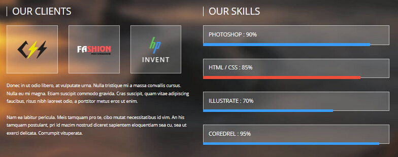
Codes are as follows:
<div class="backgroundImage2 text_left ">
    <div class="backgroundImage2_shade"><br />
        <br />
        <div class="dnn_layout">
            <div class="content_mid  clearfix">
                <div class="row">
                    <div class="col-sm-6 animation fadeInLeft ">
                        <div class="ContentTitle_1">OUR CLIENTS</div>
                        <div class="client_list">
                            <li><img alt="" src="/portals/31/client_img_1.png" /></li>
                            <li><img alt="" src="/portals/31/client_img_2.png" /></li>
                            <li><img alt="" src="/portals/31/client_img_3.png" /></li>
                        </div>
                        <br />
                        Content Text...<br />
                        <br />
                        Content Text...<br />
                        <br />
                    </div>
                    <div class="col-sm-6 animation fadeInRight">
                        <div class="ContentTitle_1">OUR SKILLS</div>
                        <div class="loaded_list">
                            <div class="progress">
                                <p>PHOTOSHOP : 90%</p>
                                <div data-width="90%" class="bar animation animationwidth"></div>
                            </div>
                            <div class="progress">
                                <p>HTML / CSS : 85%</p>
                                <div data-width="85%" class="bar accentColor animation animationwidth"></div>
                            </div>
                            <div class="progress">
                                <p>ILLUSTRATE : 70%</p>
                                <div data-width="70%" class="bar animation animationwidth"> </div>
                            </div>
                            <div class="progress">
                                <p>COREDREL : 95%</p>
                                <div data-width="95%" class="bar animation animationwidth"></div>
                            </div>
                        </div>
                    </div>
                </div>
            </div>
        </div>
        <br />
        <br />
    </div>
</div>
<br />
<br />
Option:
- You can modify
animationto change or delete animation.CSS3Animations. - This is a
ProgressBars Counterseffect. ProgressBars Counters col-md-6is the width of each column, you can change the width you need through value1~12.
Image area
Below is the screen shot:
Codes are as follows:
<div class="animation fadeInLeft"> <img alt="" class="img-responsive animationhover swing" src="/portals/31/Pic_2.jpg" /></div>
Option:
img-responsiveimage responsive- You can modify
animationto change or delete animation.CSS3Animations.
BUILT WITH CLEAN CODING area
Below is the screen shot:
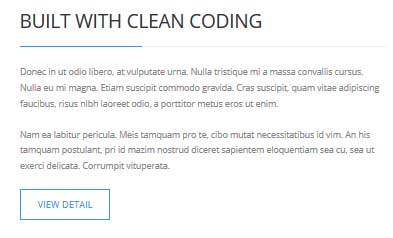
Codes are as follows:
<div class="animation fadeInRight">Content Text...<br />
    <br />
    Content Text...<br />
    <br />
    <a class="Button_default" href="#" target="_blank">VIEW DETAIL</a> </div>
Option:
- You can modify
animationto change or delete animation.CSS3Animations. Containeris usingContainer-2
OUR TEAM & MEMBERS area
Below is the screen shot:
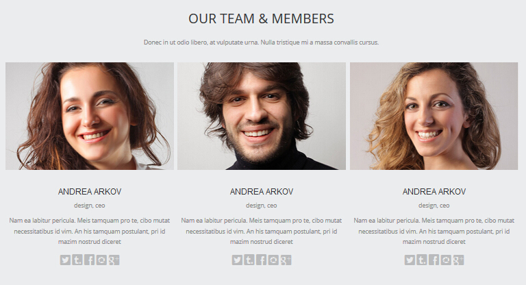
isotope follows:
<br />
<div class="backgroundImage3">
    <div class="dnn_layout">
        <div class="content_mid  clearfix"> <br />
            <br />
            <div class="title1 animation fadeIn" style="text-align: center;">OUR TEAM & MEMBERS</div>
            <br />
            <p class="animation fadeIn" style="text-align: center;">Content Text...</p>
            <br />
            <div class="carousel carousel_4 animation" data-navigation="false" data-pagination="false" data-autoheight="false">
                <div class="item animation_item scaleUp delay1">
                    <div class="photo_box shade_zoom"> <a href="#" target="_blank">
                        <div class="pic_box"> <img alt="" src="/portals/31/member_1.jpg" />
                            <div class="ico"> <span class="glyphicons glyph-resize-small"></span> </div>
                            <div class="shade"></div>
                        </div>
                        </a> </div>
                    <div class="text_sytle_6">
                        <h3>ANDREA ARKOV</h3>
                        <div class="info">design, ceo</div>
                        <p>Content Text...</p>
                        <div class="social-icons  clearfix"> <a href="#"><span class="social social-twitter"></span></a></div>
                    </div>
                </div>
                <div class="item animation_item scaleUp delay2">
                    <div class="photo_box shade_zoom"> <a href="#" target="_blank">
                        <div class="pic_box"> <img alt="" src="/portals/31/member_2.jpg" />
                            <div class="ico"> <span class="glyphicons glyph-resize-small"></span> </div>
                            <div class="shade"></div>
                        </div>
                        </a> </div>
                    <div class="text_sytle_6">
                        <h3>ANDREA ARKOV</h3>
                        <div class="info">design, ceo</div>
                        <p>Content Text...</p>
                        <div class="social-icons  clearfix"> <a href="#"><span class="social social-twitter"></span></a></div>
                    </div>
                </div>
                <div class="item animation_item scaleUp delay3">
                    <div class="photo_box shade_zoom"> <a href="#" target="_blank">
                        <div class="pic_box"> <img alt="" src="/portals/31/member_3.jpg" />
                            <div class="ico"> <span class="glyphicons glyph-resize-small"></span> </div>
                            <div class="shade"></div>
                        </div>
                        </a> </div>
                    <div class="text_sytle_6">
                        <h3>ANDREA ARKOV</h3>
                        <div class="info">design, ceo</div>
                        <p>Content Text...</p>
                        <div class="social-icons  clearfix"> <a href="#"><span class="social social-twitter"></span></a></div>
                    </div>
                </div>
            </div>
        </div>
        <br />
        <br />
    </div>
    <br />
</div>
<br />
<br />
- You can modify
animation fadeInRightto change the animation on the slide..CSS3Animations. - You can modify
glyphiconsto change icons. font icon list.
CLIENT TESTIMONIALS area
Below is the screen shot:
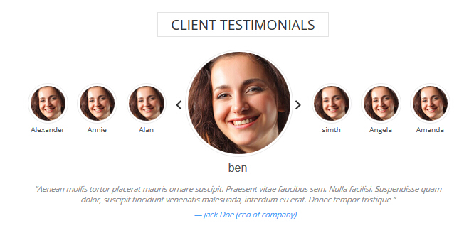
Codes are as follows:
<div class="slider_wrapper circle_slider1 animation zoomIn">
    <div data-lower_text_label_show="1" data-lower_text_label="ben " data-link_target="_blank"
    data-link_url="#" data-image="/Portals/31/member_1s.jpg" class="slider_item">
        <div class="slider_wrap">
            <h3 class="pic_name">ben </h3>
            <blockquote>
                <p>Content Text...</p>
                <small> — jack Doe (ceo of company)</small> </blockquote>
        </div>
        <div class="clear"></div>
    </div>
    <div data-lower_text_label_show="1" data-lower_text_label="simth" data-link_target="_blank" data-link_url="#"
    data-image="/Portals/31/member_1s.jpg" class="slider_item">
        <div class="slider_wrap">
            <h3 class="pic_name">simth</h3>
            <blockquote>
                <p>Content Text...</p>
                <small> — Chrissie Hall (ceo of company)</small> </blockquote>
        </div>
        <div class="clear"></div>
    </div>
    <div data-lower_text_label_show="1" data-lower_text_label="Angela" data-link_target="_blank" data-link_url="#"
    data-image="/Portals/31/member_1s.jpg" class="slider_item">
        <div class="slider_wrap">
            <h3 class="pic_name">Angela</h3>
            <blockquote>
                <p>Content Text...</p>
                <small> — Aaron (Calibrated Design)</small> </blockquote>
        </div>
        <div class="clear"></div>
    </div>
    <div data-lower_text_label_show="1" data-lower_text_label="Amanda" data-link_target="_blank" data-link_url="#"
    data-image="/Portals/31/member_1s.jpg" class="slider_item">
        <div class="slider_wrap">
            <h3 class="pic_name">jackson doe</h3>
            <blockquote>
                <p>Content Text...</p>
                <small> — James Divine (Divine Solutions)</small> </blockquote>
        </div>
        <div class="clear"></div>
    </div>
    <div data-lower_text_label_show="1" data-lower_text_label="Alexander " data-link_target="_blank" data-link_url="#"
    data-image="/Portals/31/member_1s.jpg" class="slider_item">
        <div class="slider_wrap">
            <h3 class="pic_name">Alexander </h3>
            <blockquote>
                <p>Content Text...</p>
                <small> — jack Doe (ceo of company)</small> </blockquote>
        </div>
        <div class="clear"></div>
    </div>
    <div data-lower_text_label_show="1" data-lower_text_label="Annie   " data-link_target="_blank" data-link_url="#"
    data-image="/Portals/31/member_1s.jpg" class="slider_item">
        <div class="slider_wrap">
            <h3 class="pic_name">Annie </h3>
            <blockquote>
                <p>Content Text...</p>
                <small> — Chrissie Hall (ceo of company)</small> </blockquote>
        </div>
        <div class="clear"></div>
    </div>
    <div data-lower_text_label_show="1" data-lower_text_label=" Alan" data-link_target="_blank" data-link_url="#"
    data-image="/Portals/31/member_1s.jpg" class="slider_item">
        <div class="slider_wrap">
            <h3 class="pic_name"> Alan</h3>
            <blockquote>
                <p>Content Text...</p>
                <small> — Aaron (Calibrated Design)</small> </blockquote>
        </div>
        <div class="clear"></div>
    </div>
</div>
Option:
- You can modify
animationto change the animation on the slide. CSS3Animations. - You can modify
glyphiconsto change icons. font icon list.
About Us area
Below is the screen shot:
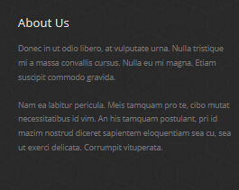
Codes are as follows:
<Content Text...<br />
    <br />
    Content Text...</div>
Option:
- You can modify
animationto change the animation on the slide. CSS3Animations. Containeris usingContainer-3
Recent News area
Below is the screen shot:
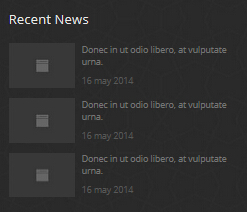
Codes are as follows:
<ul class="posts_list animation fadeInUp">
    <li><img alt="" src="/portals/31/img_3.jpg" />
        <p>Donec in ut odio libero, at vulputate urna.</p>
        <span>16 may 2014</span></li>
    <li><img alt="" src="/portals/31/img_3.jpg" />
        <p>Donec in ut odio libero, at vulputate urna.</p>
        <span>16 may 2014</span></li>
    <li><img alt="" src="/portals/31/img_3.jpg" />
        <p>Donec in ut odio libero, at vulputate urna.</p>
        <span>16 may 2014</span></li>
</ul>
Option:
- You can modify
animationto change the animation on the slide. CSS3Animations. Containeris usingContainer-3
Contact Us area
Below is the screen shot:
Option:
- This is
Theme_Responsive_20063-home1theme ofDNNGo PowerFormsmodule Containeris usingContainer-3
Home Version 2
You can click the link to check Home Version 2 demo. Home Version 2
Top area
Below is the screen shot:
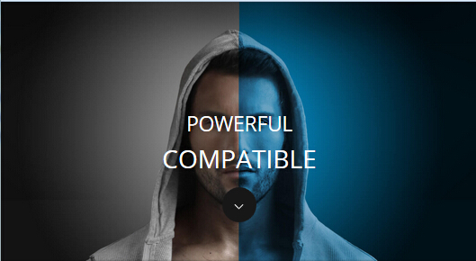
Codes are as follows:
<ul class="full_screen_pic">
    <li style="background-image: url('http://demo7.dnngo.net/Portals/31/full_screen_img.jpg');">
        <div class="content">
            <div class="title">
                <div class="animation_1"> POWERFUL</div>
                <div class="animation_2"> COMPATIBLE</div>
            </div>
            <div class="but"> </div>
        </div>
    </li>
</ul>
Banner area
Below is the screen shot:
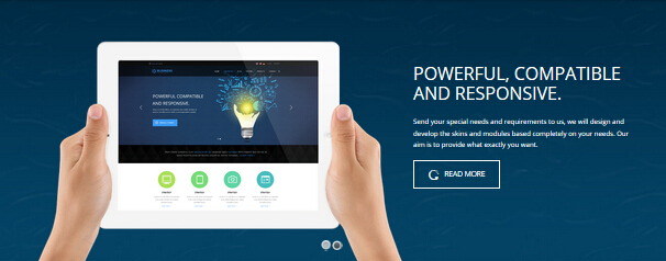
It is using DNNGo LayerGalleryPro module here, you can import ContentListEntity-Home2.xml of the DNNGo_LayerGalleryPro folder to duplicate banner of the demo.
Service Lists area
Below is the screen shot:
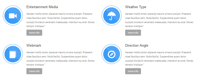
Codes are as follows:
<br />
<div class="row ServeList_5 animation">
    <div class="col-md-6 col-sm-12 animation_item scaleUp delay1">
        <div class="ServeBox">
            <div class="Serve_Icon"><span class="glyphicons glyph-facetime-video"></span></div>
            <h3>Entertainment Media </h3>
            <p>Content Text...</p>
            <p><a class="but" href="#" target="_blank">more info</a></p>
            <br />
        </div>
    </div>
    <div class="col-md-6 col-sm-12 animation_item scaleUp delay2">
        <div class="ServeBox">
            <div class="Serve_Icon"><span class="glyphicons glyph-umbrella"></span></div>
            <h3>Weather Type </h3>
            <p>Content Text...</p>
            <p><a class="but" href="#" target="_blank">more info</a></p>
            <br />
        </div>
    </div>
    <div class="clearfix visible-sm"></div>
    <div class="col-md-6 col-sm-12 animation_item scaleUp delay3">
        <div class="ServeBox">
            <div class="Serve_Icon"><span class="glyphicons glyph-blog"></span></div>
            <h3>Webmark </h3>
            <p>Content Text...</p>
            <p><a class="but" href="#" target="_blank">more info</a></p>
            <br />
        </div>
    </div>
    <div class="col-md-6 col-sm-12 animation_item scaleUp delay4">
        <div class="ServeBox">
            <div class="Serve_Icon"><span class="glyphicons glyph-compass"></span></div>
            <h3>Direction Angle </h3>
            <p>Content Text...</p>
            <p><a class="but" href="#" target="_blank">more info</a></p>
            <br />
        </div>
    </div>
</div>
<br />
Option:
- You can modify
animationto change the animation on the slide. CSS3Animations. col-md-6 col-sm-12is the width of each column, you can change the width you need through value1~12.- You can modify
glyphiconsto change icons. font icon list.
backgroundImage8 area
Below is the screen shot:
Codes are as follows:
<div class="backgroundImage8 font_sytle_1">
    <div class="dnn_layout">
        <div class="content_mid clearfix animation zoomIn"> <br />
            <br />
            <br />
            <br />
            <h3>BE ONE OF THE FIRST TO KNOW THE NEWS ABOUT US!</h3>
            <p>Content Text...</p>
            <br />
            <br />
            <br />
            <br />
        </div>
    </div>
</div>
<br />
<br />
Option:
- You can modify
animationto change the animation on the slide. CSS3Animations.
DIFFERENT SERVICE AND DIFFERENT PRICE area
Below is the screen shot:
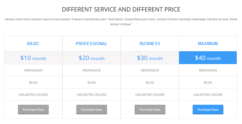
Codes are as follows:
<div class="animation zoomIn" style="text-align: center;">Content Text...<br />
    <br />
</div>
<div class="price-table price-table2 animation ">
    <div class="col-md-3 col-sm-6 animation_item scaleUp delay1">
        <div class="price_title">
            <h2>BASIC</h2>
        </div>
        <div class="price_holder">
            <div class="price_box"><span class="sup">$</span><span class="price">10</span><span class="unit">/month</span></div>
            <ul>
                <li>RESPONSIVE</li>
                <li>BLOG</li>
                <li>UNLIMITED COLORS</li>
            </ul>
            <a class="btn " href="#" target="_blank">Purchase Now</a> </div>
    </div>
    <div class="col-md-3 col-sm-6 animation_item scaleUp delay2">
        <div class="price_title ">
            <h2>PROFESSIONAL</h2>
        </div>
        <div class="price_holder">
            <div class="price_box"><span class="sup">$</span><span class="price">20</span><span class="unit">/month</span></div>
            <ul>
                <li>RESPONSIVE</li>
                <li>BLOG</li>
                <li>UNLIMITED COLORS</li>
            </ul>
            <a class="btn" href="#" target="_blank">Purchase Now</a> </div>
    </div>
    <div class="col-md-3 col-sm-6 animation_item scaleUp delay3">
        <div class="price_title">
            <h2>BUSINESS</h2>
        </div>
        <div class="price_holder">
            <div class="price_box"><span class="sup">$</span><span class="price">30</span><span class="unit">/month</span></div>
            <ul>
                <li>RESPONSIVE</li>
                <li>BLOG</li>
                <li>UNLIMITED COLORS</li>
            </ul>
            <a class="btn" href="#" target="_blank">Purchase Now</a> </div>
    </div>
    <div class="col-md-3 col-sm-6 best_value animation_item scaleUp delay4 ">
        <div class="price_title">
            <h2>MAXIMUM</h2>
        </div>
        <div class="price_holder">
            <div class="price_box"><span class="sup">$</span><span class="price">40</span><span class="unit">/month</span></div>
            <ul>
                <li>RESPONSIVE</li>
                <li>BLOG</li>
                <li>UNLIMITED COLORS</li>
            </ul>
            <a class="btn " href="#" target="_blank">Purchase Now</a> </div>
    </div>
</div>
Option:
- This is a
Pricingeffect.Pricing Containeris usingContainer-9col-md-3 col-sm-6is the width for each column. You can change the width you need through value1~12- You can modify
animationto change the animation on the slide. CSS3Animations.
OUR RECENT PORTFOLIO area
Below is the screen shot:
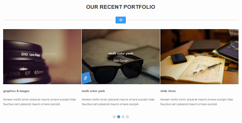
Codes are as follows:
<div class="backgroundImage5">
<div class="dnn_layout">
<div class="content_mid clearfix"> <br />
<br />
<h3> OUR RECENT PORTFOLIO</h3>
<div class="dividers_8 "> <span class="glyphicons glyph-screenshot"></span> </div>
<br />
<div data-navigation="false" data-items="3" class="carousel carousel_3 animation fadeInUp">
<div class="item ">
<div class="photo_box ico_left_rotate"> <a href="#" target="_blank">
<div class="pic_box"> <img alt="" src="/portals/31/carousel_5.jpg" />
<div class="ico"><span class="glyphicons glyph-link search"></span></div>
<div class="content">
<div class="vertical_center_1">
<div class="vertical_center_2">
<h3>graphics & images</h3>
<p>Web Design</p>
</div>
</div>
</div>
<div class="shade"></div>
</div>
</a>
<div class="text_sytle_3">
<h3>graphics & images</h3>
<p>Content Text...</p>
</div>
</div>
</div>
<div class="item ">
<div class="photo_box ico_left_rotate"> <a href="#" target="_blank">
<div class="pic_box"> <img alt="" src="/portals/31/carousel_6.jpg" />
<div class="ico"><span class="glyphicons glyph-link search"></span></div>
<div class="content">
<div class="vertical_center_1">
<div class="vertical_center_2">
<h3>multi color pack</h3>
<p>Web Design</p>
</div>
</div>
</div>
<div class="shade"></div>
</div>
</a>
<div class="text_sytle_3">
<h3>multi color pack</h3>
<p>Content Text...</p>
</div>
</div>
</div>
<div class="item ">
<div class="photo_box ico_left_rotate"> <a href="#" target="_blank">
<div class="pic_box"> <img alt="" src="/portals/31/carousel_7.jpg" />
<div class="ico"><span class="glyphicons glyph-link search"></span></div>
<div class="content">
<div class="vertical_center_1">
<div class="vertical_center_2">
<h3>slide show </h3>
<p>Web Design</p>
</div>
</div>
</div>
<div class="shade"></div>
</div>
</a>
<div class="text_sytle_3">
<h3>slide show </h3>
<p>Content Text...</p>
</div>
</div>
</div>
<div class="item">
<div class="photo_box ico_left_rotate"> <a href="#" target="_blank">
<div class="pic_box"> <img alt="" src="/portals/31/carousel_8.jpg" />
<div class="ico"><span class="glyphicons glyph-link search"></span></div>
<div class="content">
<div class="vertical_center_1">
<div class="vertical_center_2">
<h3>multi color pack </h3>
<p>Web Design</p>
</div>
</div>
</div>
<div class="shade"></div>
</div>
</a>
<div class="text_sytle_3">
<h3>multi color pack </h3>
<p>Content Text...</p>
</div>
</div>
</div>
<div class="item">
<div class="photo_box ico_left_rotate"> <a href="#" target="_blank">
<div class="pic_box"> <img alt="" src="/portals/31/carousel_9.jpg" />
<div class="ico"><span class="glyphicons glyph-link search"></span></div>
<div class="content">
<div class="vertical_center_1">
<div class="vertical_center_2">
<h3>multi color pack </h3>
<p>Web Design</p>
</div>
</div>
</div>
<div class="shade"></div>
</div>
</a>
<div class="text_sytle_3">
<h3>multi color pack </h3>
<p>Content Text...</p>
</div>
</div>
</div>
<div class="item">
<div class="photo_box ico_left_rotate"> <a href="#" target="_blank">
<div class="pic_box"> <img alt="" src="/portals/31/carousel_5.jpg" />
<div class="ico"><span class="glyphicons glyph-link search"></span></div>
<div class="content">
<div class="vertical_center_1">
<div class="vertical_center_2">
<h3>graphics & images</h3>
<p>Web Design</p>
</div>
</div>
</div>
<div class="shade"></div>
</div>
</a>
<div class="text_sytle_3">
<h3>graphics & images</h3>
<p>Content Text...</p>
</div>
</div>
</div>
<div class="item">
<div class="photo_box ico_left_rotate"> <a href="#" target="_blank">
<div class="pic_box"> <img alt="" src="/portals/31/carousel_6.jpg" />
<div class="ico"><span class="glyphicons glyph-link search"></span></div>
<div class="content">
<div class="vertical_center_1">
<div class="vertical_center_2">
<h3>multi color pack</h3>
<p>Web Design</p>
</div>
</div>
</div>
<div class="shade"></div>
</div>
</a>
<div class="text_sytle_3">
<h3>multi color pack</h3>
<p>Content Text...</p>
</div>
</div>
</div>
<div class="item">
<div class="photo_box ico_left_rotate"> <a href="#" target="_blank">
<div class="pic_box"> <img alt="" src="/portals/31/carousel_7.jpg" />
<div class="ico"><span class="glyphicons glyph-link search"></span></div>
<div class="content">
<div class="vertical_center_1">
<div class="vertical_center_2">
<h3>slide show </h3>
<p>Web Design</p>
</div>
</div>
</div>
<div class="shade"></div>
</div>
</a>
<div class="text_sytle_3">
<h3>slide show </h3>
<p>Content Text...</p>
</div>
</div>
</div>
<div class="item">
<div class="photo_box ico_left_rotate"> <a href="#" target="_blank">
<div class="pic_box"> <img alt="" src="/portals/31/carousel_8.jpg" />
<div class="ico"><span class="glyphicons glyph-link search"></span></div>
<div class="content">
<div class="vertical_center_1">
<div class="vertical_center_2">
<h3>multi color pack </h3>
<p>Web Design</p>
</div>
</div>
</div>
<div class="shade"></div>
</div>
</a>
<div class="text_sytle_3">
<h3>multi color pack </h3>
<p>Content Text...</p>
</div>
</div>
</div>
<div class="item">
<div class="photo_box ico_left_rotate"> <a href="#" target="_blank">
<div class="pic_box"> <img alt="" src="/portals/31/carousel_9.jpg" />
<div class="ico"><span class="glyphicons glyph-link search"></span></div>
<div class="content">
<div class="vertical_center_1">
<div class="vertical_center_2">
<h3>multi color pack </h3>
<p>Web Design</p>
</div>
</div>
</div>
<div class="shade"></div>
</div>
</a>
<div class="text_sytle_3">
<h3>multi color pack </h3>
<p>Content Text...</p>
</div>
</div>
</div>
</div>
<br />
<br />
</div>
</div>
</div>
Option:
- You can modify
animationto change the animation on the slide. CSS3Animations. - This is a
Carouseleffect. Carousel - You can modify
glyphiconsto change icons. font icon list.
THE LATEST PRODUCTS area
Below is the screen shot:
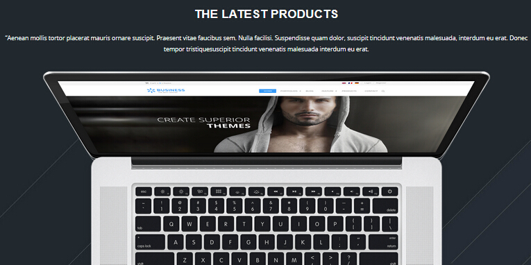
Codes are as follows:
<div class="backgroundImage10">
    <div class="dnn_layout ">
        <div class="content_mid clearfix "> <br />
            <br />
            <h3>THE LATEST PRODUCTS</h3>
            <p class="animation zoomIn">Content Text...</p>
            <br />
            <img alt="" class="img-responsive img_display animation fadeInDown" src="/portals/31/computer.png" /> </div>
    </div>
</div>
<br />
<br />
Option:
img-responsiveimage responsive- You can modify
animationto change the animation on the slide. CSS3Animations.
carousel area
Below is the screen shot:
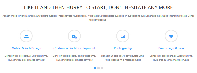
Left Codes are as follows:
<div class="animation fadeInUp" style="text-align: center;">Content Text...<br />
</div>
<br />
<br />
<div data-navigation="false" class="carousel carousel_1 animation fadeInUp">
    <div class="item">
        <div class="ico"><span class="glyphicons glyph-ipad"></span></div>
        <h3>Responsive web design</h3>
        <p>Content Text...</p>
    </div>
    <div class="item">
        <div class="ico"><span class="glyphicons glyph-macbook"></span></div>
        <h3>Mobile & Web Design</h3>
        <p>Content Text...</p>
    </div>
    <div class="item">
        <div class="ico"><span class="glyphicons glyph-cogwheels"></span></div>
        <h3>Customize Web Development</h3>
        <p>Content Text...</p>
    </div>
    <div class="item">
        <div class="ico"><span class="glyphicons glyph-picture"></span></div>
        <h3>Photography</h3>
        <p>Content Text...</p>
    </div>
    <div class="item">
        <div class="ico"><span class="glyphicons glyph-heart"></span></div>
        <h3>Dnn design & skin</h3>
        <p>Content Text...</p>
    </div>
    <div class="item">
        <div class="ico"><span class="glyphicons glyph-fire"></span></div>
        <h3>Module development</h3>
        <p>Content Text...</p>
    </div>
    <div class="item">
        <div class="ico"><span class="glyphicons glyph-snowflake"></span></div>
        <h3>Unlimited-color skin</h3>
        <p>Content Text...</p>
    </div>
    <div class="item">
        <div class="ico"><span class="glyphicons glyph-beach-umbrella"></span></div>
        <h3>the advantage of us</h3>
        <p>Content Text...</p>
    </div>
    <div class="item">
        <div class="ico"><span class="glyphicons glyph-film"></span></div>
        <h3>About our company</h3>
        <p>Content Text...</p>
    </div>
    <div class="item">
        <div class="ico"><span class="glyphicons glyph-pie-chart"></span></div>
        <h3>Heroic upgraded </h3>
        <p>Content Text...</p>
    </div>
    <div class="item">
        <div class="ico"><span class="glyphicons glyph-cargo"></span></div>
        <h3>A post looks like this</h3>
        <p>Content Text...</p>
    </div>
    <div class="item">
        <div class="ico"><span class="glyphicons glyph-cup"></span></div>
        <h3>A featured post </h3>
        <p>Content Text...</p>
    </div>
</div>
<br />
Option:
- This is a
Carouseleffect. Carousel - You can modify
animationto change the animation on the slide. CSS3Animations. - You can modify
glyphiconsto change icons. font icon list. Containeris usingContainer-9
Get in Touch area
Below is the screen shot:
Codes are as follows:
<div class="animation fadeInLeft"> Content Text...
    <ul class="list_style5">
        <li><span class="glyphicons glyph-envelope"></span>e-mail :  dnnskindev@gmail.com </li>
        <li><span class="glyphicons glyph-phone-alt"></span>phone :  +( 1 )-123-456-789-0</li>
        <li><span class="glyphicons glyph-home"></span>address :  zhong shan road no.417</li>
    </ul>
</div>
<div style="height: 10px;"></div>
Option:
- You can modify
animationto change the animation on the slide. CSS3Animations. Containeris usingContainer-3- You can modify
glyphiconsto change icons. font icon list.
Categories area
Below is the screen shot:
Codes are as follows:
<ul class="list_style6 animation fadeInUp">
    <li><a href="#" target="_blank"><span class="glyphicons glyph-star"></span>Donec in ut odio libero</a></li>
    <li><a href="#" target="_blank"><span class="glyphicons glyph-star"></span>at vulputate urna. </a></li>
    <li><a href="#" target="_blank"><span class="glyphicons glyph-star"></span>Nulla tristique mi a massa convallis cursus. </a></li>
</ul>
Option:
- You can modify
glyphiconsto change icons. font icon list. Containeris usingContainer-3- You can modify
animationto change the animation on the slide. CSS3Animations.
Google Map area
Below is the screen shot:
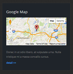
Codes are as follows:
<div class="animation fadeInRight">
    <div id="gmap01" ></div>
    <br />
    <p>Donec in ut odio libero, at vulputate urna. Nulla tristique mi a massa convallis cursus. </p>
    <a href="#" target="blank">detail >></a> </div>
Option:
Containeris usingContainer-3- You can modify
animationto change the animation on the slide. CSS3Animations.
Home Version 3
You can click the link to check Home Version 3 demo. Home Version 3
Top area
Below is the screen shot:
Codes are as follows:
<span class="glyphicons glyph-envelope"></span> E-mail : dnnskindev@gmail.com
Option:
- You can modify
glyphiconsto change icons. font icon list.
Banner area
Below is the screen shot:
Codes are as follows:
<ul class="full_screen_pic_2">
    <li style="background-image: url('http://demo7.dnngo.net/Portals/31/full_screen_img_2.jpg');">
        <div class="content">
            <div class="title"><br />
                <span class="animation_1"> POWERFUL</span> <span class="animation_2"> CREATIVE</span></div>
            <div class="but"> </div>
        </div>
    </li>
</ul>
Option:
- You can modify
animationto change the animation on the slide. CSS3Animations.
BANNER BOTTOM area
Below is the screen shot:
Codes are as follows:
<br />
<br />
<div class="animation">
    <div class="row ServeList_6  ">
        <div class="col-sm-4 animation_item scaleUp delay1">
            <div class="ServeBox">
                <div class="Serve_Icon"><span class="glyphicons glyph-snowflake"></span></div>
                <h3>RESPONSIVE WEB</h3>
                <p>Content Text... </p>
                <br />
            </div>
            <hr class="dividers_1" />
        </div>
        <div class="col-sm-4 animation_item scaleUp delay2">
            <div class="ServeBox">
                <div class="Serve_Icon"><span class="glyphicons glyph-cogwheels"></span></div>
                <h3>CUSTOMIZE WEB</h3>
                <p>Content Text... </p>
                <br />
            </div>
            <hr class="dividers_1" />
        </div>
        <div class="col-sm-4 animation_item scaleUp delay3">
            <div class="ServeBox">
                <div class="Serve_Icon"><span class="glyphicons glyph-sun"></span></div>
                <h3>RESPONSIVE WEB</h3>
                <p>Content Text... </p>
                <br />
            </div>
            <hr class="dividers_1" />
        </div>
    </div>
    <div class="row ServeList_6">
        <div class="col-sm-4 animation_item scaleUp delay4">
            <div class="ServeBox">
                <div class="Serve_Icon"><span class="glyphicons glyph-camera"></span></div>
                <h3>RESPONSIVE WEB</h3>
                <p>Content Text... </p>
                <br />
            </div>
        </div>
        <div class="col-sm-4 animation_item scaleUp delay5">
            <div class="ServeBox">
                <div class="Serve_Icon"><span class="glyphicons glyph-history"></span></div>
                <h3>CUSTOMIZE WEB</h3>
                <p>Content Text... </p>
                <br />
            </div>
        </div>
        <div class="col-sm-4 animation_item scaleUp delay6">
            <div class="ServeBox">
                <div class="Serve_Icon"><span class="glyphicons glyph-heart"></span></div>
                <h3>RESPONSIVE WEB</h3>
                <p>Content Text... </p>
                <br />
            </div>
        </div>
    </div>
</div>
<br />
Option:
col-sm-4is the width of each column, you can change the width you need through value1~12.- You can modify
glyphiconsto change icons. font icon list. - You can modify
animationto change the animation on the slide. CSS3Animations.
NEW PRODUCTS TO BRING YOU NEVER HAD THE PLEASURE area
Below is the screen shot:
Codes are as follows:
<div class="backgroundImage11">
    <div class="dnn_layout">
        <div class="content_mid clearfix "> <br />
            <br />
            <h3>NEW PRODUCTS TO BRING YOU NEVER HAD THE PLEASURE</h3>
            <div class="dividers_9"> <span></span> </div>
            <br />
            <p class="animation zoomIn">Content Text...</p>
            <br />
            <div data-pagination="false" data-items="3" class="carousel carousel_3 animation zoomIn">
                <div class="item">
                    <div class="photo_box img_zoom ico_zoom"> <a href="3" target="_blank">
                        <div class="pic_box"> <img alt="" src="/portals/31/carousel_5.jpg" />
                            <div class="content">
                                <div class="vertical_center_1">
                                    <div class="vertical_center_2">
                                        <div class="ico"><span class="glyphicons glyph-link"></span></div>
                                        <h3>IMAGE TITLE</h3>
                                        <p>Photos,Design</p>
                                    </div>
                                </div>
                            </div>
                            <div class="shade"></div>
                        </div>
                        </a> </div>
                    Design level: 2/3 Slider </div>
                <div class="item">
                    <div class="photo_box img_zoom ico_zoom"> <a href="3" target="_blank">
                        <div class="pic_box"> <img alt="" src="/portals/31/carousel_6.jpg" />
                            <div class="content">
                                <div class="vertical_center_1">
                                    <div class="vertical_center_2">
                                        <div class="ico"><span class="glyphicons glyph-link"></span></div>
                                        <h3>IMAGE TITLE</h3>
                                        <p>Photos,Design</p>
                                    </div>
                                </div>
                            </div>
                            <div class="shade"></div>
                        </div>
                        </a> </div>
                    Design level: 2/3 Slider </div>
                <div class="item">
                    <div class="photo_box img_zoom ico_zoom"> <a href="3" target="_blank">
                        <div class="pic_box"> <img alt="" src="/portals/31/carousel_7.jpg" />
                            <div class="content">
                                <div class="vertical_center_1">
                                    <div class="vertical_center_2">
                                        <div class="ico"><span class="glyphicons glyph-link"></span></div>
                                        <h3>IMAGE TITLE</h3>
                                        <p>Photos,Design</p>
                                    </div>
                                </div>
                            </div>
                            <div class="shade"></div>
                        </div>
                        </a> </div>
                    Design level: 2/3 Slider </div>
                <div class="item">
                    <div class="photo_box img_zoom ico_zoom"> <a href="3" target="_blank">
                        <div class="pic_box"> <img alt="" src="/portals/31/carousel_8.jpg" />
                            <div class="content">
                                <div class="vertical_center_1">
                                    <div class="vertical_center_2">
                                        <div class="ico"><span class="glyphicons glyph-link"></span></div>
                                        <h3>IMAGE TITLE</h3>
                                        <p>Photos,Design</p>
                                    </div>
                                </div>
                            </div>
                            <div class="shade"></div>
                        </div>
                        </a> </div>
                    Design level: 2/3 Slider </div>
                <div class="item">
                    <div class="photo_box img_zoom ico_zoom"> <a href="3" target="_blank">
                        <div class="pic_box"> <img alt="" src="/portals/31/carousel_9.jpg" />
                            <div class="content">
                                <div class="vertical_center_1">
                                    <div class="vertical_center_2">
                                        <div class="ico"><span class="glyphicons glyph-link"></span></div>
                                        <h3>IMAGE TITLE</h3>
                                        <p>Photos,Design</p>
                                    </div>
                                </div>
                            </div>
                            <div class="shade"></div>
                        </div>
                        </a> </div>
                    Design level: 2/3 Slider </div>
                <div class="item">
                    <div class="photo_box img_zoom ico_zoom"> <a href="3" target="_blank">
                        <div class="pic_box"> <img alt="" src="/portals/31/carousel_5.jpg" />
                            <div class="content">
                                <div class="vertical_center_1">
                                    <div class="vertical_center_2">
                                        <div class="ico"><span class="glyphicons glyph-link"></span></div>
                                        <h3>IMAGE TITLE</h3>
                                        <p>Photos,Design</p>
                                    </div>
                                </div>
                            </div>
                            <div class="shade"></div>
                        </div>
                        </a> </div>
                    Design level: 2/3 Slider </div>
            </div>
            <br />
            <p> <a class="Button_white" href="3" target="_blank">View the Full Portfolio </a></p>
            <br />
            <br />
        </div>
    </div>
</div>
<br />
<br />
Option:
- You can modify
animationto change the animation on the slide. CSS3Animations. - You can modify
glyphiconsto change icons. font icon list. - You can modify
photo_boxto change image effects. Image Effects - This is a
Carouseleffect. Carousel
MOBILE READY area
Below is the screen shot:
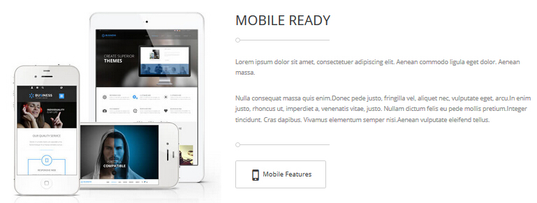
Codes are as follows:
<div class="animation fadeInRight">
    <hr class="dividers_10 " />
    <br />
    <p>Content Text...</p>
    <br />
    <p> Content Text...</p>
    <br />
    <hr class="dividers_10" />
    <br />
    <a class="Button_gray " href="#" target="_blank"> <span class="glyphicons glyph-iphone"></span> Mobile Features </a></div>
Option:
Containeris usingContainer-8- You can modify
animationto change the animation on the slide. CSS3Animations. - You can modify
glyphiconsto change icons. font icon list.
OUR QUALITY SERVICE
Below is the screen shot:
Codes are as follows:
<div class="backgroundImage8">
    <div class="dnn_layout">
        <div class="content_mid clearfix animation zoomIn"> <br />
            <br />
            <h3>OUR QUALITY SERVICE</h3>
            <div class="dividers_9"> <span></span> </div>
            <br />
            <p style="font-size: 24px;">Content Text...</p>
            <br />
            <br />
            <p><a class="Button_white" href="#" target="_blank">ABOUT OUR COMPANY</a>  <a class="Button_white" href="#" target="_blank">SAY HELLO </a> </p>
            <br />
            <br />
        </div>
    </div>
</div>
Option:
- You can modify
animationto change the animation on the slide. CSS3Animations.
WHAT OTHERS SAY ABOUT US area
Below is the screen shot:
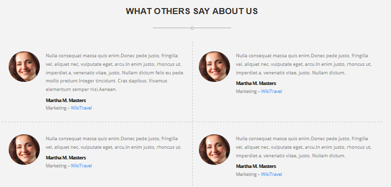
Testimonials follows:
<div class="backgroundImage12">
    <div class="dnn_layout">
        <div class="content_mid clearfix"> <br />
            <br />
            <h3>WHAT OTHERS SAY ABOUT US</h3>
            <div class="dividers_9"> <span></span> </div>
            <br />
            <ul class="comment_list animation">
                <li class="animation_item scaleUp delay1">
                    <div class="Picture"><img alt="" src="/portals/31/member_1s.jpg" /></div>
                    <p>Content Text...</p>
                    <div class="info"><strong> Martha M. Masters</strong> <br />
                        Marketing – <span>WikiTravel</span></div>
                </li>
                <li class="animation_item scaleUp delay2">
                    <div class="Picture"><img alt="" src="/portals/31/member_1s.jpg" /></div>
                    <p>Content Text...</p>
                    <div class="info"><strong> Martha M. Masters</strong> <br />
                        Marketing – <span>WikiTravel</span></div>
                </li>
                <li class="line"> </li>
                <li class="animation_item scaleUp delay3">
                    <div class="Picture"><img alt="" src="/portals/31/member_1s.jpg" /></div>
                    <p>Content Text...</p>
                    <div class="info"><strong> Martha M. Masters</strong> <br />
                        Marketing – <span>WikiTravel</span></div>
                </li>
                <li class="animation_item scaleUp delay4">
                    <div class="Picture"><img alt="" src="/portals/31/member_1s.jpg" /></div>
                    <p>Content Text...</p>
                    <div class="info"><strong> Martha M. Masters</strong> <br />
                        Marketing – <span>WikiTravel</span></div>
                </li>
            </ul>
            <br />
            <br />
        </div>
    </div>
</div>
Option:
- You can modify
animationto change the animation on the slide. CSS3Animations.
IN CASE YOU NEED HELP area
Below is the screen shot:
Codes are as follows:
<div class="backgroundImage13">
    <div class="dnn_layout">
        <div class="content_mid clearfix"> <br />
            <br />
            <h3>IN CASE YOU NEED HELP</h3>
            <div><small>Here are several ways to contact us</small> </div>
            <div class="dividers_11"> <span></span> </div>
            <p> </p>
            <br />
            <div class="row ServeList_7">
                <div class="col-sm-4 animation flipInY">
                    <div class="ServeBox">
                        <div class="Serve_Icon"><span class="glyphicons glyph-new-window"></span></div>
                        <h3>PRESALES QUESTION?</h3>
                        <p>Content Text...</p>
                        <a href="#" target="_blank">Learn more</a> <br />
                    </div>
                </div>
                <div class="col-sm-4 animation flipInY">
                    <div class="ServeBox">
                        <div class="Serve_Icon"><span class="glyphicons glyph-edit"></span></div>
                        <h3>PRESALES QUESTION?</h3>
                        <p>Content Text...</p>
                        <a href="#" target="_blank">Learn more</a> <br />
                    </div>
                </div>
                <div class="col-sm-4 animation flipInY">
                    <div class="ServeBox">
                        <div class="Serve_Icon"><span class="glyphicons glyph-check"></span></div>
                        <h3>PRESALES QUESTION?</h3>
                        <p>Content Text...</p>
                        <a href="#" target="_blank">Learn more</a> <br />
                    </div>
                </div>
            </div>
            <br />
            <br />
        </div>
    </div>
</div>
Option:
col-md-4is the width of each column, you can change the width you need through value1~12.- You can modify
glyphiconsto change icons. font icon list. - You can modify
animationto change the animation on the slide. CSS3Animations.
Bottom area
Below is the screen shot:

Codes are as follows:
<div class="backgroundImage14">
    <div class="dnn_layout">
        <div class="content_mid clearfix"> <br />
            <br />
            <ul class="link_list_2 animation">
                <li class="animation_item scaleUp delay1"><a href="#" target="blank"><img alt="" src="/portals/31/link_1.png" /></a></li>
                <li class="animation_item scaleUp delay2"><a href="#" target="blank"><img alt="" src="/portals/31/link_2.png" /></a></li>
                <li class="animation_item scaleUp delay3"><a href="#" target="blank"><img alt="" src="/portals/31/link_3.png" /></a></li>
                <li class="animation_item scaleUp delay4"><a href="#" target="blank"><img alt="" src="/portals/31/link_4.png" /></a></li>
                <li class="animation_item scaleUp delay5"><a href="#" target="blank"><img alt="" src="/portals/31/link_5.png" /></a></li>
            </ul>
            <br />
            <br />
        </div>
    </div>
</div>
Option:
- This is a
ProgressBars Counterseffect. ProgressBars Counters - You can modify
animationto change the animation on the slide. CSS3Animations.
PHOTO STREAM area
Below is the screen shot:
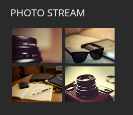
Codes are as follows:
<ul class="img_list animation fadeInLeft">
    <li> <a title="Image Gallery" class="LightBox_image_gallery5" href="/Portals/31/Photo_1.jpg">
	<img alt="" src="/portals/31/Photo_1.jpg" /> </a> </li>
    <li> <a title="Image Gallery" class="LightBox_image_gallery5" href="/Portals/31/Photo_2.jpg">
	<img alt="" src="/portals/31/Photo_2.jpg" /> </a> </li>
    <li> <a title="Image Gallery" class="LightBox_image_gallery5" href="/Portals/31/Photo_3.jpg">
	<img alt="" src="/portals/31/Photo_3.jpg" /> </a> </li>
    <li> <a title="Image Gallery" class="LightBox_image_gallery5" href="/Portals/31/Photo_4.jpg">
	<img alt="" src="/portals/31/Photo_4.jpg" /> </a> </li>
</ul>
Option:
- You can modify
photo_boxto change image effects. Image Effects - You can modify
LightBoxto change image effects. LightBox Containeris usingContainer-3- You can modify
animationto change the animation on the slide. CSS3Animations.
ABOUT US area
Below is the screen shot:
Codes are as follows:
<p class="animation zoomIn">Content Text...<a target="_blank" href="#">View More  <span class="glyphicons glyph-play"></span></a></p>
<div class="row ">
    <div class="col-sm-7 animation fadeInLeft">
        <h3 class="h3_style_1"> Quick Links</h3>
        <p>Content Text...</p>
        <div class="social-icons2  clearfix"> </div>
    </div>
    <div class="col-sm-5 animation fadeInRight">
        <h3 class="h3_style_1">Get in touch</h3>
        Fax: (123)123-4567<br />
        Address  :1234Street Name.City Name. United States<br />
        Email to us : <a href="mailto:dnnskindev@gmail.com">dnnskindev@gmail.com</a> </div>
</div>
Option:
Containeris usingContainer-3- You can modify
animationto change the animation on the slide. CSS3Animations.
Home Version 4
You can click the link to check Home Version 4 demo. Home Version 4
Top area
Below is the screen shot:
Codes are as follows:
<span class="glyphicons glyph-envelope"></span> E-mail : dnnskindev@gmail.com
Option:
- You can modify
glyphiconsto change icons. font icon list.
Banner area
Below is the screen shot:

It is using DNNGo LayerGalleryPro module here, you can import ContentListEntity-Home2.xml of the DNNGo_LayerGalleryPro folder to duplicate banner of the demo.
Banner Bottom area
Below is the screen shot:
Codes are as follows:
<div class="backgroundImage15">
    <div class="dnn_layout">
        <div class="content_mid clearfix "> <br />
            <br />
            <div style="font-size: 20px;" class="animation zoomIn"> Content Text...,
            <a href="#" target="blank">SEO friendly</a> Content Text...<a href="#" target="blank">
            customization service</a>, Content Text...<a href="#" target="blank"> submit a ticket ></a> </div>
            <br />
            <br />
        </div>
    </div>
</div>
Option:
- You can modify
animationto change the animation on the slide. CSS3Animations.
Service Lists area
Below is the screen shot:
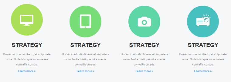
Codes are as follows:
<div class="backgroundImage9">
    <div class="dnn_layout">
        <div class="content_mid clearfix"> <br />
            <br />
            <div class="row ServeList_8 animation">
                <div class="col-md-3 col-sm-6 animation_item scaleUp delay1">
                    <div class="ServeBox">
                        <div class="Serve_Icon color_1"><span class="glyphicons glyph-imac"></span></div>
                        <h3>STRATEGY</h3>
                        <p>Content Text...</p>
                        <p><a href="#" target="blank">Learn more ></a></p>
                    </div>
                </div>
                <div class="col-md-3 col-sm-6 animation_item scaleUp delay2">
                    <div class="ServeBox">
                        <div class="Serve_Icon color_2"><span class="glyphicons glyph-ipad"></span></div>
                        <h3>STRATEGY</h3>
                        <p>Content Text...</p>
                        <p><a href="#" target="blank">Learn more ></a></p>
                    </div>
                </div>
                <div class="clearfix visible-sm"></div>
                <div class="col-md-3 col-sm-6 animation_item scaleUp delay3">
                    <div class="ServeBox">
                        <div class="Serve_Icon color_3"><span class="glyphicons glyph-camera"></span></div>
                        <h3>STRATEGY</h3>
                        <p>Content Text...</p>
                        <p><a href="#" target="blank">Learn more ></a></p>
                    </div>
                </div>
                <div class="col-md-3 col-sm-6 animation_item scaleUp delay4">
                    <div class="ServeBox">
                        <div class="Serve_Icon color_4"><span class="glyphicons glyph-projector"></span></div>
                        <h3>STRATEGY</h3>
                        <p>Content Text...</p>
                        <p><a href="#" target="blank">Learn more ></a></p>
                    </div>
                </div>
            </div>
            <br />
            <br />
        </div>
    </div>
</div>
<br />
<br />
Option:
- You can modify
glyphiconsto change icons. font icon list. col-md-3 col-sm-6is the width for each column. You can change the width you need through value1~12- You can modify
animationto change the animation on the slide. CSS3Animations.
ABOUT OUR DYNAMIC area
Below is the screen shot:
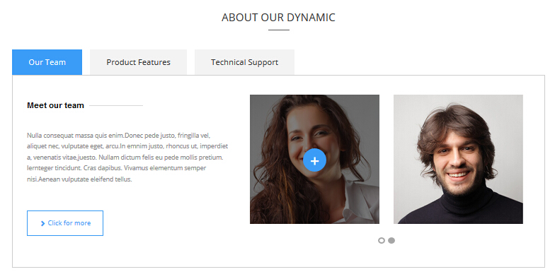
Codes are as follows:
<br />
<div class="horizontalTab_Top horizontalTab_Top_5 animation zoomIn">
    <ul class="resp-tabs-list">
        <li><span>Our Team</span></li>
        <li><span>Product Features</span></li>
        <li><span>Technical Support</span></li>
    </ul>
    <div class="resp-tabs-container">
        <div class="resp_container">
            <div class="resp_margin">
                <div class="row">
                    <div class="col-sm-5">
                        <h3 class="ContentTitle_2">Meet our team</h3>
                        <br />
                        <br />
                        <p> Content Text... </p>
                        <br />
                        <br />
                        <p> <a class="Button_Accent2" href="#" target="blank"> <span class="glyphicons glyph-chevron-right"> </span> Click for more </a></p>
                        <br />
                    </div>
                    <div class="col-sm-7">
                        <div data-navigation="false" class="carousel carousel_6">
                            <div class="item">
                                <div class="photo_box  img_zoom ico_zoom"> <a href="#" target="blank">
                                    <div class="pic_box"> <img alt="" src="/portals/31/carousel6_01.jpg" />
                                        <div class="ico"> <span class="glyphicons glyph-plus"></span> </div>
                                        <div class="shade"></div>
                                    </div>
                                    </a> </div>
                            </div>
                            <div class="item">
                                <div class="photo_box  img_zoom ico_zoom"> <a href="#" target="blank">
                                    <div class="pic_box"> <img alt="" src="/portals/31/carousel6_02.jpg" />
                                        <div class="ico"> <span class="glyphicons glyph-plus"></span> </div>
                                        <div class="shade"></div>
                                    </div>
                                    </a> </div>
                            </div>
                            <div class="item">
                                <div class="photo_box  img_zoom ico_zoom"> <a href="#" target="blank">
                                    <div class="pic_box"> <img alt="" src="/portals/31/carousel6_01.jpg" />
                                        <div class="ico"> <span class="glyphicons glyph-plus"></span> </div>
                                        <div class="shade"></div>
                                    </div>
                                    </a> </div>
                            </div>
                            <div class="item">
                                <div class="photo_box  img_zoom ico_zoom"> <a href="#" target="blank">
                                    <div class="pic_box"> <img alt="" src="/portals/31/carousel6_02.jpg" />
                                        <div class="ico"> <span class="glyphicons glyph-plus"></span> </div>
                                        <div class="shade"></div>
                                    </div>
                                    </a> </div>
                            </div>
                        </div>
                    </div>
                </div>
            </div>
        </div>
        <div class="resp_container">
            <div class="resp_margin">
                <div class="row">
                    <div class="col-sm-6">
                        <h3>Product Features </h3>
                        <ul class="list_style7">
                            <li><span class="glyphicons glyph-ok-2"></span> Content Text... </li>
                            <li><span class="glyphicons glyph-ok-2"></span> Content Text... </li>
                            <li><span class="glyphicons glyph-ok-2"></span> Content Text...g </li>
                            <li><span class="glyphicons glyph-ok-2"></span> Content Text... </li>
                            <li><span class="glyphicons glyph-ok-2"></span> Content Text...</li>
                        </ul>
                        <br />
                        <p> <a class="Button_Accent2" href="#" target="blank"> <span class="glyphicons glyph-plus"> </span> Read More </a></p>
                    </div>
                    <div class="col-sm-6"> <img alt="" class="img-responsive" src="/portals/31/pic_4.jpg" /> </div>
                </div>
            </div>
        </div>
        <div class="resp_container">
            <div class="resp_margin">
                <div class="row">
                    <div class="col-sm-4">
                        <div class="list_style8">
                            <div class="ico"><span>1</span></div>
                            <div class="title">THE FEATURES</div>
                            <ul>
                                <li><span class="glyphicons glyph-flash"></span>Full Support</li>
                                <li><span class="glyphicons glyph-flash"></span>Unlimited Colors or Themes</li>
                                <li><span class="glyphicons glyph-flash"></span>New Header & Footer</li>
                                <li><span class="glyphicons glyph-flash"></span>5 Main Layout Sample Styles</li>
                                <li><span class="glyphicons glyph-flash"></span>Full & Boxed Layout</li>
                                <li><span class="glyphicons glyph-flash"></span>Compatible with Major Browsers</li>
                                <li><span class="glyphicons glyph-flash"></span>SEO Friendly & Optimized</li>
                                <li><span class="glyphicons glyph-flash"></span>Customized Settings</li>
                            </ul>
                        </div>
                    </div>
                    <div class="col-sm-4">
                        <div class="list_style8">
                            <div class="ico"><span>2</span></div>
                            <div class="title">DOWNLOAD</div>
                            <ul>
                                <li><span class="glyphicons glyph-flash"></span>Unlimited Skins/Styles/Colors</li>
                                <li><span class="glyphicons glyph-flash"></span>Ultra Responsive design</li>
                                <li><span class="glyphicons glyph-flash"></span>Multi-Purpose</li>
                                <li><span class="glyphicons glyph-flash"></span>Bootstrap 3 & Retina Ready</li>
                                <li><span class="glyphicons glyph-flash"></span>Responsive Full Width Slider </li>
                                <li><span class="glyphicons glyph-flash"></span>CSS3 & HTML 5</li>
                                <li><span class="glyphicons glyph-flash"></span>DNN6 & DNN7</li>
                                <li><span class="glyphicons glyph-flash"></span>Hundreds of Google Fonts</li>
                            </ul>
                        </div>
                    </div>
                    <div class="col-sm-4">
                        <div class="list_style8">
                            <div class="ico"><span>3</span></div>
                            <div class="title">ADVANCED</div>
                            <ul>
                                <li><span class="glyphicons glyph-flash"></span>5 Header Styles</li>
                                <li><span class="glyphicons glyph-flash"></span>5 different menu designs</li>
                                <li><span class="glyphicons glyph-flash"></span>4 Menu options</li>
                                <li><span class="glyphicons glyph-flash"></span>Cutting-edge CSS3Animations</li>
                                <li><span class="glyphicons glyph-flash"></span>DNN 7 Page Template</li>
                                <li><span class="glyphicons glyph-flash"></span>Short Codes</li>
                                <li><span class="glyphicons glyph-flash"></span>Typography</li>
                                <li><span class="glyphicons glyph-flash"></span>3 Portfolios styles</li>
                            </ul>
                        </div>
                    </div>
                </div>
            </div>
        </div>
    </div>
</div>
<br />
Option:
col-md-*is the width of each column, you can change the width you need through value1~12.- This is a
Responsive Tabeffect.ResponsiveTab - This is a
Carouseleffect. Carousel Containeris usingContainer-12- You can modify
animationto change the animation on the slide. CSS3Animations. - You can modify
glyphiconsto change icons. font icon list.
backgroundImage16 area
Below is the screen shot:
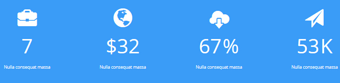
Codes are as follows:
<div class="backgroundImage16">
    <div class="dnn_layout">
        <div class="content_mid clearfix"> <br />
            <br />
            <div class="number_Animation_4 row animation">
                <div class="col-sm-3 animation_item scaleUp delay1">
                    <div class="number_box"> <span class="glyphicons glyph-briefcase">
                    </span> <span data-number="7" class="animation  number">0</span>
                        <p>Nulla consequat massa </p>
                    </div>
                </div>
                <div class="col-sm-3 animation_item scaleUp delay2">
                    <div class="number_box"> <span class="glyphicons glyph-globe">
                    </span><span class="unit">$</span><span data-number="32" class="animation  number">0</span>
                        <p>Nulla consequat massa </p>
                    </div>
                </div>
                <div class="col-sm-3 animation_item scaleUp delay3">
                    <div class="number_box"> <span class="glyphicons glyph-cloud-upload">
                    </span> <span data-number="67" class="animation  number">0</span> <span class="unit">%</span>
                        <p>Nulla consequat massa </p>
                    </div>
                </div>
                <div class="col-sm-3 animation_item scaleUp delay4">
                    <div class="number_box"> <span class="glyphicons glyph-send">
                    </span> <span data-number="53" class="animation  number">0</span> <span class="unit">K</span>
                        <p>Nulla consequat massa </p>
                    </div>
                </div>
            </div>
            <br />
            <br />
        </div>
    </div>
</div>
<br />
<br />
Option:
col-md-3is the width for each column. You can change the width you need through value1~12- This is a
ProgressBars Counterseffect. ProgressBars Counters - You can modify
glyphiconsto change icons. font icon list. - You can modify
animationto change the animation on the slide. CSS3Animations.
RECENT PROJECTS area
Below is the screen shot:
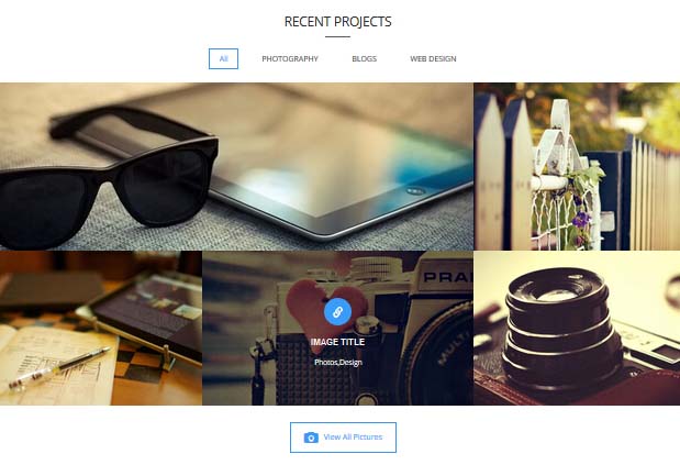
Codes are as follows:
<div class="isotope_grid animation fadeInUp">
    <div class="isotope_group"> <a class="active" href="#" data-filter="*">All</a> <a href="#" data-filter=".photography">PHOTOGRAPHY</a>
    <a href="#" data-filter=".blogs">BLOGS</a> <a href="#" data-filter=".webdesign">WEB DESIGN</a> </div>
    <div class="loading">
        <div class="loading-container container1">
            <div class="circle1"></div>
            <div class="circle2"></div>
            <div class="circle3"></div>
            <div class="circle4"></div>
        </div>
        <div class="loading-container container2">
            <div class="circle1"></div>
            <div class="circle2"></div>
            <div class="circle3"></div>
            <div class="circle4"></div>
        </div>
        <div class="loading-container container3">
            <div class="circle1"></div>
            <div class="circle2"></div>
            <div class="circle3"></div>
            <div class="circle4"></div>
        </div>
    </div>
    <div class="isotope_main" data-min-width="390">
        <div class="isotope_item blogs" data-zoom="2">
            <div class="photo_box img_zoom ico_zoom"> <a href="#" target="blank">
                <div class="pic_box"> <img alt="" src="/portals/31/isotope_img_01.jpg" />
                    <div class="content">
                        <div class="vertical_center_1">
                            <div class="vertical_center_2">
                                <div class="ico"><span class="glyphicons glyph-link"></span></div>
                                <h3>IMAGE TITLE</h3>
                                <p>Photos,Design</p>
                            </div>
                        </div>
                    </div>
                    <div class="shade"></div>
                </div>
                </a> </div>
        </div>
        <div class="isotope_item  photography">
            <div class="photo_box img_zoom ico_zoom"> <a href="#" target="blank">
                <div class="pic_box"> <img alt="" src="/portals/31/isotope_img_02.jpg" />
                    <div class="content">
                        <div class="vertical_center_1">
                            <div class="vertical_center_2">
                                <div class="ico"><span class="glyphicons glyph-link"></span></div>
                                <h3>IMAGE TITLE</h3>
                                <p>Photos,Design</p>
                            </div>
                        </div>
                    </div>
                    <div class="shade"></div>
                </div>
                </a> </div>
        </div>
        <div class="isotope_item webdesign">
            <div class="photo_box img_zoom ico_zoom"> <a href="#" target="blank">
                <div class="pic_box"> <img alt="" src="/portals/31/isotope_img_03.jpg" />
                    <div class="content">
                        <div class="vertical_center_1">
                            <div class="vertical_center_2">
                                <div class="ico"><span class="glyphicons glyph-link"></span></div>
                                <h3>IMAGE TITLE</h3>
                                <p>Photos,Design</p>
                            </div>
                        </div>
                    </div>
                    <div class="shade"></div>
                </div>
                </a> </div>
        </div>
        <div class="isotope_item photography">
            <div class="photo_box img_zoom ico_zoom"> <a href="#" target="blank">
                <div class="pic_box"> <img alt="" src="/portals/31/isotope_img_04.jpg" />
                    <div class="content">
                        <div class="vertical_center_1">
                            <div class="vertical_center_2">
                                <div class="ico"><span class="glyphicons glyph-link"></span></div>
                                <h3>IMAGE TITLE</h3>
                                <p>Photos,Design</p>
                            </div>
                        </div>
                    </div>
                    <div class="shade"></div>
                </div>
                </a> </div>
        </div>
        <div class="isotope_item blogs photography">
            <div class="photo_box img_zoom ico_zoom"> <a href="#" target="blank">
                <div class="pic_box"> <img alt="" src="/portals/31/isotope_img_05.jpg" />
                    <div class="content">
                        <div class="vertical_center_1">
                            <div class="vertical_center_2">
                                <div class="ico"><span class="glyphicons glyph-link"></span></div>
                                <h3>IMAGE TITLE</h3>
                                <p>Photos,Design</p>
                            </div>
                        </div>
                    </div>
                    <div class="shade"></div>
                </div>
                </a> </div>
        </div>
        <div class="isotope_item photography webdesign">
            <div class="photo_box img_zoom ico_zoom"> <a href="#" target="blank">
                <div class="pic_box"> <img alt="" src="/portals/31/isotope_img_06.jpg" />
                    <div class="content">
                        <div class="vertical_center_1">
                            <div class="vertical_center_2">
                                <div class="ico"><span class="glyphicons glyph-link"></span></div>
                                <h3>IMAGE TITLE</h3>
                                <p>Photos,Design</p>
                            </div>
                        </div>
                    </div>
                    <div class="shade"></div>
                </div>
                </a> </div>
        </div>
        <div class="isotope_item blogs">
            <div class="photo_box img_zoom ico_zoom"> <a href="#" target="blank">
                <div class="pic_box"> <img alt="" src="/portals/31/isotope_img_07.jpg" />
                    <div class="content">
                        <div class="vertical_center_1">
                            <div class="vertical_center_2">
                                <div class="ico"><span class="glyphicons glyph-link"></span></div>
                                <h3>IMAGE TITLE</h3>
                                <p>Photos,Design</p>
                            </div>
                        </div>
                    </div>
                    <div class="shade"></div>
                </div>
                </a> </div>
        </div>
        <div class="isotope_item blogs webdesign">
            <div class="photo_box img_zoom ico_zoom"> <a href="#" target="blank">
                <div class="pic_box"> <img alt="" src="/portals/31/isotope_img_08.jpg" />
                    <div class="content">
                        <div class="vertical_center_1">
                            <div class="vertical_center_2">
                                <div class="ico"><span class="glyphicons glyph-link"></span></div>
                                <h3>IMAGE TITLE</h3>
                                <p>Photos,Design</p>
                            </div>
                        </div>
                    </div>
                    <div class="shade"></div>
                </div>
                </a> </div>
        </div>
        <div class="isotope_item photography" data-zoom="2">
            <div class="photo_box img_zoom ico_zoom"> <a href="#" target="blank">
                <div class="pic_box"> <img alt="" src="/portals/31/isotope_img_09.jpg" />
                    <div class="content">
                        <div class="vertical_center_1">
                            <div class="vertical_center_2">
                                <div class="ico"><span class="glyphicons glyph-link"></span></div>
                                <h3>IMAGE TITLE</h3>
                                <p>Photos,Design</p>
                            </div>
                        </div>
                    </div>
                    <div class="shade"></div>
                </div>
                </a> </div>
        </div>
        <div class="isotope_item webdesign">
            <div class="photo_box img_zoom ico_zoom"> <a href="#" target="blank">
                <div class="pic_box"> <img alt="" src="/portals/31/isotope_img_10.jpg" />
                    <div class="content">
                        <div class="vertical_center_1">
                            <div class="vertical_center_2">
                                <div class="ico"><span class="glyphicons glyph-link"></span></div>
                                <h3>IMAGE TITLE</h3>
                                <p>Photos,Design</p>
                            </div>
                        </div>
                    </div>
                    <div class="shade"></div>
                </div>
                </a> </div>
        </div>
        <div class="isotope_item blogs">
            <div class="photo_box img_zoom ico_zoom"> <a href="#" target="blank">
                <div class="pic_box"> <img alt="" src="/portals/31/isotope_img_11.jpg" />
                    <div class="content">
                        <div class="vertical_center_1">
                            <div class="vertical_center_2">
                                <div class="ico"><span class="glyphicons glyph-link"></span></div>
                                <h3>IMAGE TITLE</h3>
                                <p>Photos,Design</p>
                            </div>
                        </div>
                    </div>
                    <div class="shade"></div>
                </div>
                </a> </div>
        </div>
    </div>
</div>
<br />
<br />
<p style="text-align: center;"><a href="#" target="blank" class="Button_Accent"><span class="glyphicons glyph-camera"></span>View All Pictures</a></p>
<br />
Option:
- You can modify
animationto change the animation on the slide. CSS3Animations. Containeris usingContainer-12- You can modify
photo_boxto change image effects. Image Effects - You can add
<a data-filter=".FilterName" href="#">Filter Name</a>to increase categories.data-filter=".FilterName"can not be blank space. - You can modify
data-min-widthto change minimum width of image. - You can modify
isotope_itemFilterNameto categorize images.
WHAT CLIENTS SAY area
Below is the screen shot:
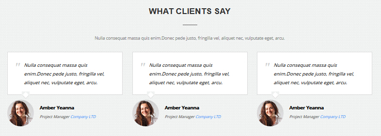
Codes are as follows:
<div class="backgroundImage17">
    <div class="dnn_layout">
        <div class="content_mid clearfix"> <br />
            <br />
            <h3>WHAT CLIENTS SAY </h3>
            <hr class="dividers_12" />
            <br />
            <p> Content Text... </p>
            <br />
            <div class="row animation">
                <div class="col-sm-4 animation_item scaleUp delay1">
                    <blockquote class="blockquote_sytle_2">
                        <p>Content Text...</p>
                        <small><span class="pic"> <img alt="" src="/portals/31/Pic_18.jpg" /></span>
                        <strong>Amber Yeanna </strong>Project Manager<span> Company LTD</span></small> </blockquote>
                </div>
                <div class="col-sm-4 animation_item scaleUp delay2">
                    <blockquote class="blockquote_sytle_2">
                        <p>Content Text...</p>
                        <small><span class="pic"> <img alt="" src="/portals/31/Pic_18.jpg" /></span>
                        <strong>Amber Yeanna </strong>Project Manager<span> Company LTD</span></small> </blockquote>
                </div>
                <div class="col-sm-4 animation_item scaleUp delay3">
                    <blockquote class="blockquote_sytle_2">
                        <p>Content Text...</p>
                        <small><span class="pic"> <img alt="" src="/portals/31/Pic_18.jpg" /></span>
                        <strong>Amber Yeanna </strong>Project Manager<span> Company LTD</span></small> </blockquote>
                </div>
            </div>
            <br />
            <br />
            <br />
        </div>
    </div>
</div>
Option:
col-md-4is the width of each column, you can change the width you need through value1~12.- You can modify
animationto change the animation on the slide. CSS3Animations. Containeris usingContainer-2
CWE OFFER A LARGE VARIETY OF CUSTOM DNN MODULES area
Below is the screen shot:
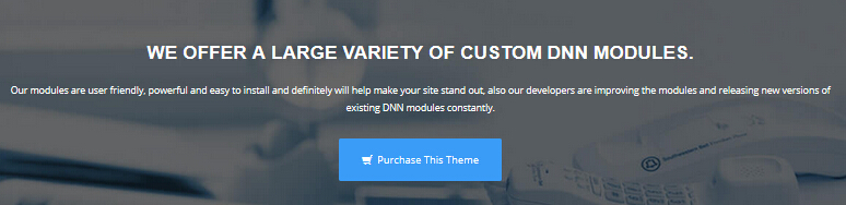
Codes are as follows:
<div class="backgroundImage18">
    <div class="dnn_layout">
        <div class="content_mid clearfix "> <br />
            <br />
            <br />
            <h3>WE OFFER A LARGE VARIETY OF CUSTOM DNN MODULES.</h3>
            <p class="animation zoomIn">Content Text...</p>
            <br />
            <p><a class="Button_white animation fadeIn" href="#" target="blank">
            <span class="glyphicons glyph-shopping-cart"></span> Purchase This Theme</a> </p>
            <br />
            <br />
        </div>
    </div>
</div>
Option:
- You can modify
animationto change the animation on the slide. CSS3Animations.
About Us area
Below is the screen shot:

Codes are as follows:
<div class="animation fadeInLeft"> Content Text...<a href="#" target="blank"> View More</a> </div>
Option:
Containeris usingContainer-3- You can modify
animationto change the animation on the slide. CSS3Animations.
Photo Stream area
Below is the screen shot:
Codes are as follows:
<ul class="img_list2 animation fadeInUp">
    <li> <a href="/Portals/31/Photo_1.jpg" class="LightBox_image_gallery5" title="Image Gallery">
	<img alt="" src="/portals/31/Photo_1.jpg" /> </a> </li>
    <li> <a href="/Portals/31/Photo_2.jpg" class="LightBox_image_gallery5" title="Image Gallery">
	<img alt="" src="/portals/31/Photo_2.jpg" /> </a> </li>
    <li> <a href="/Portals/31/Photo_3.jpg" class="LightBox_image_gallery5" title="Image Gallery">
	<img alt="" src="/portals/31/Photo_3.jpg" /> </a> </li>
    <li> <a href="/Portals/31/Photo_4.jpg" class="LightBox_image_gallery5" title="Image Gallery">
	<img alt="" src="/portals/31/Photo_4.jpg" /> </a> </li>
    <li> <a href="/Portals/31/Photo_1.jpg" class="LightBox_image_gallery5" title="Image Gallery">
	<img alt="" src="/portals/31/Photo_1.jpg" /> </a> </li>
    <li> <a href="/Portals/31/Photo_2.jpg" class="LightBox_image_gallery5" title="Image Gallery">
	<img alt="" src="/portals/31/Photo_2.jpg" /> </a> </li>
</ul>
Option:
- You can modify
photo_boxto change image effects. Image Effects - You can modify
LightBoxto change image effects. LightBox Containeris usingContainer-3- You can modify
animationto change the animation on the slide. CSS3Animations.
Get In Touch area
Below is the screen shot:
Codes are as follows:
<div class="animation fadeInUp"> Phone :  (+086) - 123 -456<br />
    Fax: (123)123-4567<br />
    Address  :1234Street Name.City Name. United States<br />
    Email to us : <a href="mailto:dnnskindev@gmail.com">dnnskindev@gmail.com</a> </div>
Option:
Containeris usingContainer-3- You can modify
animationto change the animation on the slide. CSS3Animations.
Quick Links area
Below is the screen shot:
Codes are as follows:
<div class="animation fadeInRight">Content Text...
    <div class="social-icons2  clearfix"> <a href="#"><span class="social social-twitter"></div>
</div>
Option:
Containeris usingContainer-3- You can modify
glyphiconsto change icons. font icon list. - You can modify
animationto change the animation on the slide. CSS3Animations.
HomeVersion5
You can click the link to check HomeVersion5 demo. HomeVersion5
Top area
Below is the screen shot:
Codes are as follows:
<span class="glyphicons glyph-envelope"></span> E-mail : dnnskindev@gmail.com
Option:
- You can modify
glyphiconsto change icons. font icon list.
Banner area
Below is the screen shot:
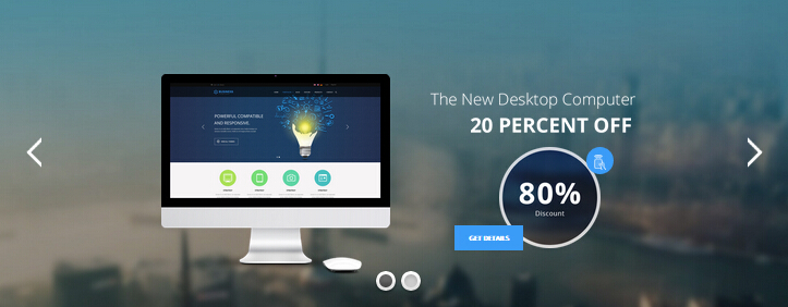
NOTEBOOK area
Below is the screen shot:
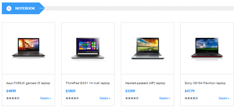
Codes are as follows:
<div class="compute_list animation">
    <div class="row ">
        <div class="col-sm-6 col-md-3 animation_item scaleUp delay1">
            <div class="compute_top"> <img alt="" class="img-responsive" src="/portals/31/home5_img1.jpg" /> </div>
            <div class="compute_bottom">
                <h3>Asus FX50JK gamers i5 laptop</h3>
                <div class="compute_price">$4899</div>
                <div class="compute_link clearfix"><span class="glyphicons glyph-star"></span><span class="glyphicons glyph-dislikes"></span>
                    <div class="compute_btn"><a href="#">Details ></a></div>
                </div>
            </div>
        </div>
        <div class="col-sm-6 col-md-3 animation_item scaleUp delay2">
            <div class="compute_top"> <img alt="" class="img-responsive" src="/portals/31/home5_img2.jpg" /> </div>
            <div class="compute_bottom">
                <h3>ThinkPad E431 14 inch laptop</h3>
                <div class="compute_price">$5869</div>
                <div class="compute_link clearfix"><span class="glyphicons glyph-star"></span><span class="glyphicons glyph-dislikes"></span>
                    <div class="compute_btn"><a href="#">Details ></a></div>
                </div>
            </div>
        </div>
        <div class="col-sm-6 col-md-3 animation_item scaleUp delay3">
            <div class="compute_top"> <img alt="" class="img-responsive" src="/portals/31/home5_img3.jpg" /> </div>
            <div class="compute_bottom">
                <h3>Hewlett-packard (HP)  laptop</h3>
                <div class="compute_price">$3209</div>
                <div class="compute_link clearfix"><span class="glyphicons glyph-star"></span><span class="glyphicons glyph-dislikes"></span>
                    <div class="compute_btn"><a href="#">Details ></a></div>
                </div>
            </div>
        </div>
        <div class="col-sm-6 col-md-3 animation_item scaleUp delay4">
            <div class="compute_top"> <img alt="" class="img-responsive" src="/portals/31/home5_img4.jpg" /> </div>
            <div class="compute_bottom">
                <h3>Sony X8104 Pavilion laptop</h3>
                <div class="compute_price">$4779</div>
                <div class="compute_link clearfix"><span class="glyphicons glyph-star"></span><span class="glyphicons glyph-dislikes"></span>
                    <div class="compute_btn"><a href="#">Details ></a></div>
                </div>
            </div>
        </div>
    </div>
</div>
Option:
col-md-6 col-md-3is the width of each column, you can change the width you need through value1~12.Containeris usingContainer-13- You can modify
glyphiconsto change icons. font icon list. - You can modify
animationto change the animation on the slide. CSS3Animations.
TABLET area
Below is the screen shot:
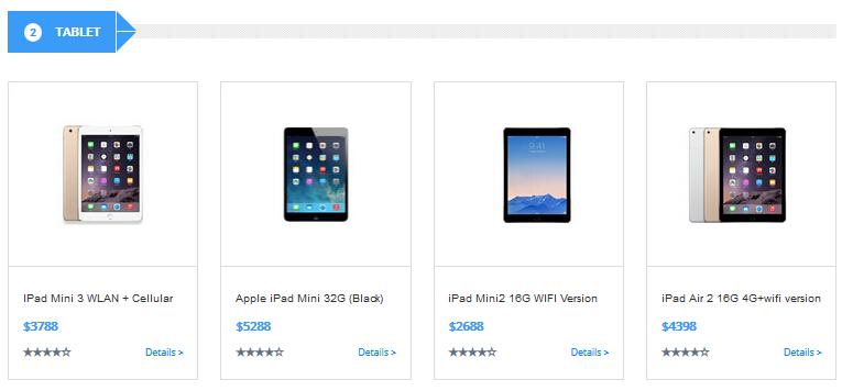
Codes are as follows:
<div class="compute_list animation zoomIn">
    <div class="row">
        <div class="col-sm-6 col-md-3">
            <div class="compute_top"> <img alt="" class="img-responsive" src="/portals/31/home5_img5.jpg" /> </div>
            <div class="compute_bottom">
                <h3>IPad Mini 3 WLAN + Cellular</h3>
                <div class="compute_price">$3788</div>
                <div class="compute_link clearfix"></span><span class="glyphicons glyph-star"></span><span class="glyphicons glyph-dislikes"></span>
                    <div class="compute_btn"><a href="#">Details ></a></div>
                </div>
            </div>
        </div>
        <div class="col-sm-6 col-md-3">
            <div class="compute_top"> <img alt="" class="img-responsive" src="/portals/31/home5_img6.jpg" /> </div>
            <div class="compute_bottom">
                <h3>Apple  iPad Mini 32G (Black)</h3>
                <div class="compute_price">$5288</div>
                <div class="compute_link clearfix"></span><span class="glyphicons glyph-star"></span><span class="glyphicons glyph-dislikes"></span>
                    <div class="compute_btn"><a href="#">Details ></a></div>
                </div>
            </div>
        </div>
        <div class="col-sm-6 col-md-3">
            <div class="compute_top"> <img alt="" class="img-responsive" src="/portals/31/home5_img7.jpg" /> </div>
            <div class="compute_bottom">
                <h3>iPad Mini2 16G WIFI Version</h3>
                <div class="compute_price">$2688</div>
                <div class="compute_link clearfix"></span><span class="glyphicons glyph-star"></span><span class="glyphicons glyph-dislikes"></span>
                    <div class="compute_btn"><a href="#">Details ></a></div>
                </div>
            </div>
        </div>
        <div class="col-sm-6 col-md-3">
            <div class="compute_top"> <img alt="" class="img-responsive" src="/portals/31/home5_img8.jpg" /> </div>
            <div class="compute_bottom">
                <h3>iPad Air 2 16G 4G+wifi version</h3>
                <div class="compute_price">$4398</div>
                <div class="compute_link clearfix"></span><span class="glyphicons glyph-star"></span><span class="glyphicons glyph-dislikes"></span>
                    <div class="compute_btn"><a href="#">Details ></a></div>
                </div>
            </div>
        </div>
    </div>
</div>
Option:
col-md-6 col-md-3is the width of each column, you can change the width you need through value1~12.Containeris usingContainer-13- You can modify
glyphiconsto change icons. font icon list. - You can modify
animationto change the animation on the slide. CSS3Animations.
ACCESSORIES area
Below is the screen shot:
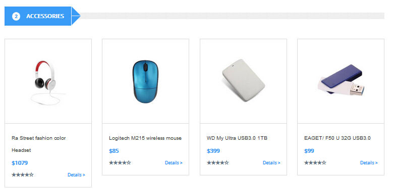
Codes are as follows:
<div class="compute_list animation ">
    <div class="row">
        <div class="col-sm-6 col-md-3 animation_item scaleUp delay1">
            <div class="compute_top"> <img alt="" class="img-responsive" src="/portals/31/home5_img9.jpg" /> </div>
            <div class="compute_bottom">
                <h3>Ra Street fashion color Headset</h3>
                <div class="compute_price">$1079</div>
                <div class="compute_link clearfix"><span class="glyphicons glyph-star"></span><span class="glyphicons glyph-dislikes"></span>
                    <div class="compute_btn"><a href="#">Details ></a></div>
                </div>
            </div>
        </div>
        <div class="col-sm-6 col-md-3 animation_item scaleUp delay2">
            <div class="compute_top"> <img alt="" class="img-responsive" src="/portals/31/home5_img10.jpg" /> </div>
            <div class="compute_bottom">
                <h3>Logitech M215  wireless mouse</h3>
                <div class="compute_price">$85</div>
                <div class="compute_link clearfix"><span class="glyphicons glyph-star"></span><span class="glyphicons glyph-dislikes"></span>
                    <div class="compute_btn"><a href="#">Details ></a></div>
                </div>
            </div>
        </div>
        <div class="col-sm-6 col-md-3 animation_item scaleUp delay3">
            <div class="compute_top"> <img alt="" class="img-responsive" src="/portals/31/home5_img11.jpg" /> </div>
            <div class="compute_bottom">
                <h3>WD My Ultra USB3.0 1TB</h3>
                <div class="compute_price">$399</div>
                <div class="compute_link clearfix"><span class="glyphicons glyph-star"></span><span class="glyphicons glyph-dislikes"></span>
                    <div class="compute_btn"><a href="#">Details ></a></div>
                </div>
            </div>
        </div>
        <div class="col-sm-6 col-md-3 animation_item scaleUp delay4">
            <div class="compute_top"> <img alt="" class="img-responsive" src="/portals/31/home5_img12.jpg" /> </div>
            <div class="compute_bottom">
                <h3>EAGET/ F50 U 32G USB3.0</h3>
                <div class="compute_price">$99</div>
                <div class="compute_link clearfix"><span class="glyphicons glyph-star"></span><span class="glyphicons glyph-dislikes"></span>
                    <div class="compute_btn"><a href="#">Details ></a></div>
                </div>
            </div>
        </div>
    </div>
</div>
Option:
col-md-6 col-md-3is the width of each column, you can change the width you need through value1~12.Containeris usingContainer-13- You can modify
glyphiconsto change icons. font icon list. - You can modify
animationto change the animation on the slide. CSS3Animations.
PRICING INFORMATION area
Below is the screen shot:
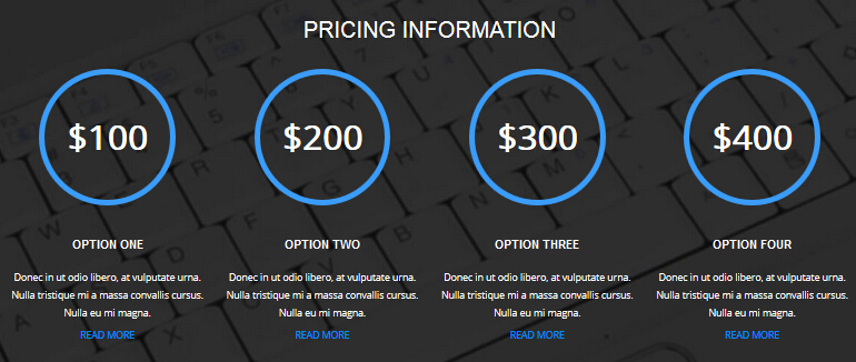
Codes are as follows:
<div class="backgroundImage19 pt40 pb40">
    <div class="dnn_layout">
        <div class="content_mid">
            <h3>Pricing information</h3>
            <div class="number_Animation_5 row animation zoomIn">
                <div class="col-sm-3 ">
                    <div class="number_box"> $<span data-number="100" class="animation  number">0</span> </div>
                    <h3>Option One</h3>
                    <p>Donec in ut odio libero, at vulputate urna. Nulla tristique mi a massa convallis cursus. Nulla eu mi magna.</p>
                    <p><a target="_blank" href="#">Read More</a></p>
                </div>
                <div class="col-sm-3 ">
                    <div class="number_box"> $<span data-number="200" class="animation  number">0</span> </div>
                    <h3>Option Two</h3>
                    <p>Donec in ut odio libero, at vulputate urna. Nulla tristique mi a massa convallis cursus. Nulla eu mi magna.</p>
                    <p><a target="_blank" href="#">Read More</a></p>
                </div>
                <div class="col-sm-3 ">
                    <div class="number_box"> $<span data-number="300" class="animation  number">0</span> </div>
                    <h3>Option Three</h3>
                    <p>Donec in ut odio libero, at vulputate urna. Nulla tristique mi a massa convallis cursus. Nulla eu mi magna.</p>
                    <p><a target="_blank" href="#">Read More</a></p>
                </div>
                <div class="col-sm-3 ">
                    <div class="number_box"> $<span data-number="400" class="animation  number">0</span> </div>
                    <h3>Option Four</h3>
                    <p>Donec in ut odio libero, at vulputate urna. Nulla tristique mi a massa convallis cursus. Nulla eu mi magna.</p>
                    <p><a target="_blank" href="#">Read More</a></p>
                </div>
            </div>
        </div>
    </div>
</div>
Option:
col-md-3is the width of each column, you can change the width you need through value1~12.- This is a
ProgressBars Counterseffect. ProgressBars Counters - You can modify
animationto change the animation on the slide. CSS3Animations.
APPLE ALL-IN-ONE PC area
Below is the screen shot:
Codes are as follows:
<div class="compute1_text">
    <div class="row">
        <div class="col-sm-7 clearfix animation fadeInLeft">
            <h3>Apple  all-in-one pc</h3>
            <p>Content Text...</p>
            <ul>
                <li><span class="glyphicons glyph-ok-2"></span>Integer nisl odio, vehicula gravida felis in, eleifend posuere odio</li>
                <li><span class="glyphicons glyph-ok-2"></span>Donec blandit eleifend consectetur.Donec turpis justo, molestie</li>
                <li><span class="glyphicons glyph-ok-2"></span>fringilla id urna. Nunc nibh diam, blandit vitae vehicula dapibus</li>
            </ul>
            <a target="_blank" href="#">More Information</a> </div>
        <div class="col-sm-5 animation fadeInRight"> <img alt="" class="img-responsive" src="/portals/31/pic_11.jpg" /> </div>
    </div>
</div>
<hr />
Option:
col-md-7 col-md-5is the width of each column, you can change the width you need through value1~12.- You can modify
animationto change the animation on the slide. CSS3Animations. - You can modify
glyphiconsto change icons. font icon list. img-responsiveimage responsive
THE NEW NOTEBOOK COMPUTER area
Below is the screen shot:
Codes are as follows:
<div class="compute2_text">
    <div class="row">
        <div class="col-sm-5 animation fadeInLeft"> <img alt="" class="img-responsive" src="/portals/31/pic_12.jpg" /> </div>
        <div class="col-sm-7 clearfix animation fadeInRight">
            <h3>The new notebook computer</h3>
            <p>Content Text...</p>
            <ul>
                <li><span class="glyphicons glyph-ok-2"></span>Content Text...</li>
                <li><span class="glyphicons glyph-ok-2"></span>Content Text...</li>
                <li><span class="glyphicons glyph-ok-2"></span>Content Text...</li>
            </ul>
            <a target="_blank" href="#">More Information</a> </div>
    </div>
</div>
Option:
col-md-5 col-md-7is the width of each column, you can change the width you need through value1~12.- You can modify
animationto change the animation on the slide. CSS3Animations. - You can modify
glyphiconsto change icons. font icon list. img-responsiveimage responsive
Carousel area
Below is the screen shot:
Codes are as follows:
<div class="backgroundImage12 pt40 pb40">
    <div class="dnn_layout">
        <div class="content_mid">
            <div class="carousel carousel_7 animation zoomIn" data-pagination="false">
                <div class="item"> <img alt="" src="/portals/31/link_1.png" /> </div>
                <div class="item"> <img alt="" src="/portals/31/link_2.png" /> </div>
                <div class="item"> <img alt="" src="/portals/31/link_3.png" /> </div>
                <div class="item"> <img alt="" src="/portals/31/link_4.png" /> </div>
                <div class="item"> <img alt="" src="/portals/31/link_5.png" /> </div>
                <div class="item"> <img alt="" src="/portals/31/link_1.png" /> </div>
                <div class="item"> <img alt="" src="/portals/31/link_2.png" /> </div>
            </div>
        </div>
    </div>
</div>
Option:
- You can modify
animationto change the animation on the slide. CSS3Animations. - This is a
Carouseleffect. Carousel
Popular area
Below is the screen shot:
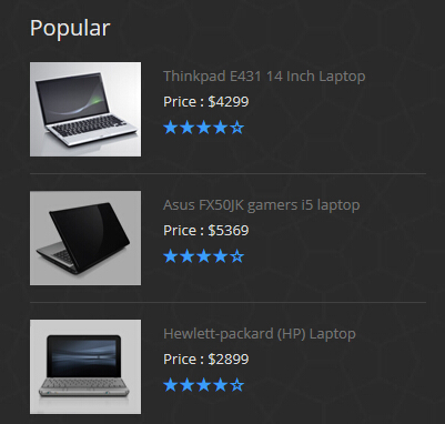
Codes are as follows:
<div class="popular animation fadeInUp">
    <div class="clearfix"> <img alt="" src="/portals/31/foot_img1.jpg" />
        <div class="popular_text">
            <div>Thinkpad E431  14 Inch  Laptop</div>
            <div class="foot_light_text">Price :  $4299</div>
            <div class="foot_star"><span class="glyphicons glyph-star"></span><span class="glyphicons glyph-star"></span></div>
        </div>
    </div>
    <div class="clearfix"> <img alt="" src="/portals/31/foot_img2.jpg" />
        <div class="popular_text">
            <div>Asus FX50JK gamers i5 laptop</div>
            <div class="foot_light_text">Price :  $5369</div>
            <div class="foot_star"><span class="glyphicons glyph-star"></span><span class="glyphicons glyph-star"></span></div>
        </div>
    </div>
    <div class="clearfix"> <img alt="" src="/portals/31/foot_img3.jpg" />
        <div class="popular_text">
            <div>Hewlett-packard (HP)  Laptop</div>
            <div class="foot_light_text">Price :  $2899</div>
            <div class="foot_star"><span class="glyphicons glyph-star"></span><span class="glyphicons glyph-star"></span></div>
        </div>
    </div>
</div>
Option:
Containeris usingContainer-3- You can modify
glyphiconsto change icons. font icon list. - You can modify
animationto change the animation on the slide. CSS3Animations.
About Us area
Below is the screen shot:
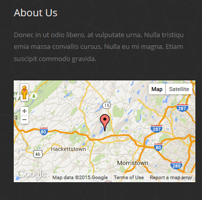
Codes are as follows:
<div class="animation fadeInUp">
<p>Content Text...</p>
<br />
<div id="gmap01" ></div>
</div>
Option:
Containeris usingContainer-3- You can modify
animationto change the animation on the slide. CSS3Animations.
Contact Us area
Below is the screen shot:
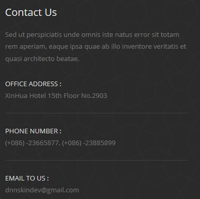
Codes are as follows:
<div class="animation fadeInUp">
    <p>Content Text...</p>
    <div class="contact_info">
        <div class="foot_light_text">OFFICE ADDRESS :</div>
        <div>XinHua Hotel 15th Floor No.2903</div>
    </div>
    <div class="contact_info">
        <div class="foot_light_text">PHONE NUMBER :</div>
        <div>(+086) -23665877, (+086) -23885899</div>
    </div>
    <div class="contact_info">
        <div class="foot_light_text">EMAIL TO US :</div>
        <div>dnnskindev@gmail.com</div>
    </div>
</div>
Option:
Containeris usingContainer-3- You can modify
animationto change the animation on the slide. CSS3Animations.
HomeVersion6
You can click the link to check HomeVersion6 demo. HomeVersion6
Banner area
Below is the screen shot:
Codes are as follows:
<ul class="home6_banner">
    <div class="content">
        <div class="title">
            <div class="animation_1">Create your New App Page</div>
            <div class="animation_2">Content Text...</div>
        </div>
        <div class="but"><a class="accent_btn2" href="#">DOWNLOAD NOW</a><a class="accent_btn2" href="#">LEARN MORE</a></div>
        <div class="bottom_img">
		<img alt="" src="/portals/31/home6_banner_img2.png" class="animation_3" />
		<img alt="" src="/portals/31/home6_banner_img1.png" class="animation_4" />
		<img alt="" src="/portals/31/home6_banner_img3.png" class="animation_5" /> </div>
    </div>
</ul>
Option:
- You can modify
animationto change the animation on the slide. CSS3Animations.
Our Service area
Below is the screen shot:

Codes are as follows:
 <div class="home6_service text-center">
     <div class="row animation">
         <div class="col-sm-3 animation_item scaleUp delay1">  <img alt="" src="/portals/31/home6_service_img1.png" />
             <h4>Document </h4>
             <p>Content Text... </p>
         </div>
         <div class="col-sm-3 animation_item scaleUp delay2">  <img alt="" src="/portals/31/home6_service_img2.png" />
             <h4>Ping Pong </h4>
             <p>Content Text... </p>
         </div>
         <div class="col-sm-3 animation_item scaleUp delay3">  <img alt="" src="/portals/31/home6_service_img3.png" />
             <h4>Book Pins </h4>
             <p>Content Text... </p>
         </div>
         <div class="col-sm-3 animation_item scaleUp delay4">  <img alt="" src="/portals/31/home6_service_img4.png" />
             <h4>Time O’clock </h4>
             <p>Content Text... </p>
         </div>
     </div>
     <img alt="" class="img_display img-responsive pl10 pr10 animation scaleUp" src="/portals/31/home6_service_img5.jpg" />  </div>
Option:
img-responsiveimage responsiveContaineris usingContainer-14col-md-3is the width of each column, you can change the width you need through value1~12.- You can modify
glyphiconsto change icons. font icon list. - You can modify
animationto change the animation on the slide. CSS3Animations.
Watch The Featured Videos area
Below is the screen shot:
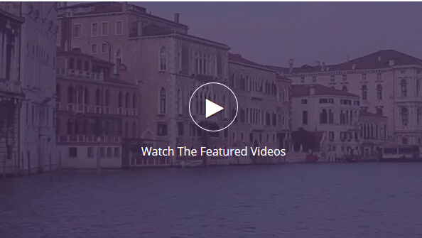
Codes are as follows:
<div class="home6_vedio">
    <div class="photo_box animation zoomIn"> <a class="LightBox_youtube" href="http://www.youtube.com/embed/npfu0fN9GUA?wmode=transparent">
        <div class="pic_box"> <img alt="" src="/portals/31/vedio_img.jpg" />
            <div class="ico ico_no_bg"> <span class="glyphicons glyph-play"></span>
                <div>Watch The Featured Videos</div>
            </div>
        </div>
        </a> </div>
</div>
Option:
- This is a
ResponsiveVideoeffect. ResponsiveVideo - You can modify
animationto change the animation on the slide. CSS3Animations. - You can modify
glyphiconsto change icons. font icon list.
Responsive, Retina Ready & Clean area
Below is the screen shot:
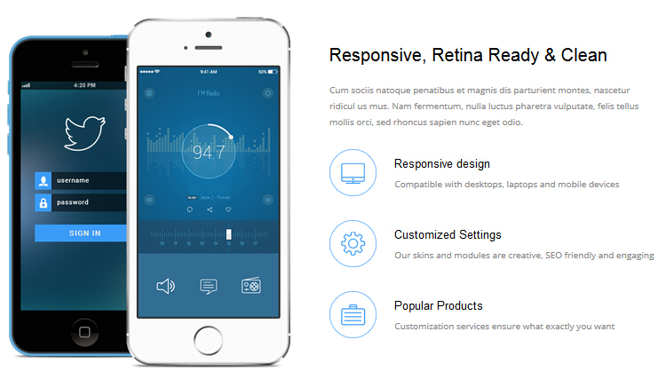
Codes are as follows:
<div class="dnn_layout pt60 pb60">
    <div class="content_mid">
        <div class="row">
            <div class="col-sm-6 text-center animation fadeInLeft"> <img alt="" class="img-responsive img_display" src="/portals/31/home6_phone.png" /> </div>
            <div class="col-sm-6">
                <div class="home6_content1">
                    <h3>Responsive, Retina Ready & Clean</h3>
                    <p class="animation fadeInRight">Content Text...</p>
                    <div class="home6_content1_list clearfix animation fadeInRight"> <img alt="" src="/portals/31/home6_icon1.png" />
                        <div class="text_hidden">
                            <h4>Responsive design</h4>
                            <p>Content Text...</p>
                        </div>
                    </div>
                    <div class="home6_content1_list clearfix animation fadeInRight"> <img alt="" src="/portals/31/home6_icon2.png" />
                        <div class="text_hidden">
                            <h4>Customized Settings</h4>
                            <p>Content Text...</p>
                        </div>
                    </div>
                    <div class="home6_content1_list clearfix animation fadeInRight"> <img alt="" src="/portals/31/home6_icon3.png" />
                        <div class="text_hidden">
                            <h4>Popular Products</h4>
                            <p>Content Text...</p>
                        </div>
                    </div>
                </div>
            </div>
        </div>
    </div>
</div>
Option:
- You can modify
glyphiconsto change icons. font icon list. col-md-6 col-md-6is the width of each column, you can change the width you need through value1~12.img-responsiveimage responsive- You can modify
animationto change the animation on the slide. CSS3Animations.
Extensive experienced Teams area
Below is the screen shot:
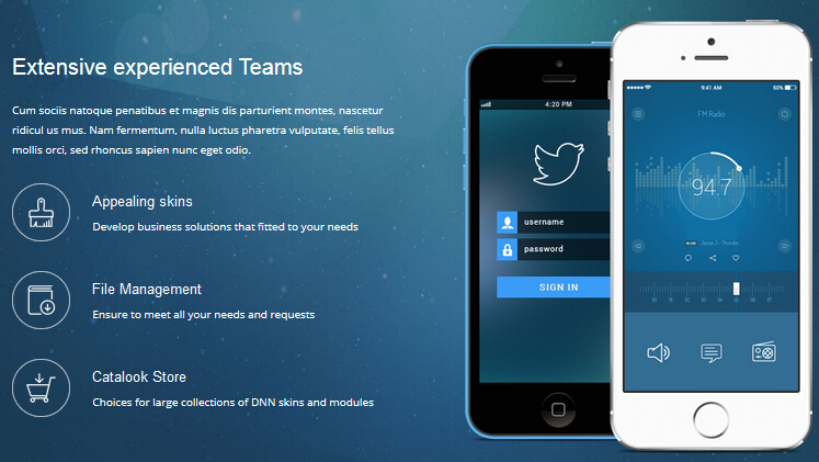
Codes are as follows:
<div class="backgroundImage20">
    <div class="dnn_layout pt60 pb60">
        <div class="content_mid">
            <div class="row">
                <div class="col-sm-6">
                    <div class="home6_content1">
                        <h3>Extensive experienced Teams</h3>
                        <p class="animation fadeInLeft">Content Text...</p>
                        <div class="home6_content1_list clearfix animation fadeInLeft"> <img alt="" src="/portals/31/home6_icon4.png" />
                            <div class="text_hidden">
                                <h4>Appealing skins</h4>
                                <p>Develop business solutions that fitted to your needs</p>
                            </div>
                        </div>
                        <div class="home6_content1_list clearfix animation fadeInLeft"> <img alt="" src="/portals/31/home6_icon5.png" />
                            <div class="text_hidden">
                                <h4>File Management</h4>
                                <p>Ensure to  meet all your needs and requests</p>
                            </div>
                        </div>
                        <div class="home6_content1_list clearfix animation fadeInLeft"> <img alt="" src="/portals/31/home6_icon6.png" />
                            <div class="text_hidden">
                                <h4>Catalook Store</h4>
                                <p>Choices for large collections of DNN skins and modules</p>
                            </div>
                        </div>
                    </div>
                </div>
                <div class="col-sm-6 text-center animation fadeInRight"> <img alt="" class="img-responsive img_display" src="/portals/31/home6_phone.png" /> </div>
            </div>
        </div>
    </div>
</div>
Option:
- You can modify
glyphiconsto change icons. font icon list. col-md-6 col-md-6is the width of each column, you can change the width you need through value1~12.img-responsiveimage responsive- You can modify
animationto change the animation on the slide. CSS3Animations.
Our Features area
Below is the screen shot:
Codes are as follows:
<div id="accordion_7" class="panel-group accordion_7 animation fadeInLeft">
    <div class="panel panel-default">
        <div class="panel-heading">
            <h4 class="panel-title"> <a href="#collapse7_1" data-parent="#accordion_7" data-toggle="collapse">
            <span class="accordion_icon"></span>App Landing Page</a> </h4>
        </div>
        <div class="panel-collapse collapse in" id="collapse7_1">
            <div class="panel-body">Content Text...</div>
        </div>
    </div>
    <div class="panel panel-default">
        <div class="panel-heading">
            <h4 class="panel-title"> <a class="collapsed" href="#collapse7_2" data-parent="#accordion_7" data-toggle="collapse">
            <span class="accordion_icon"></span>Create Dnn Website</a> </h4>
        </div>
        <div class="panel-collapse collapse" id="collapse7_2">
            <div class="panel-body">Content Text...</div>
        </div>
    </div>
    <div class="panel panel-default">
        <div class="panel-heading">
            <h4 class="panel-title"> <a class="collapsed" href="#collapse7_3" data-parent="#accordion_7" data-toggle="collapse">
            <span class="accordion_icon"></span>Product Description</a> </h4>
        </div>
        <div class="panel-collapse collapse" id="collapse7_3">
            <div class="panel-body">Content Text...</div>
        </div>
    </div>
    <div class="panel panel-default">
        <div class="panel-heading">
            <h4 class="panel-title"> <a class="collapsed" href="#collapse7_4" data-parent="#accordion_7" data-toggle="collapse">
            <span class="accordion_icon"></span>Business Solutions</a> </h4>
        </div>
        <div class="panel-collapse collapse" id="collapse7_4">
            <div class="panel-body">Content Text...</div>
        </div>
    </div>
</div>
Option:
- You can modify
glyphiconsto change icons. font icon list. - This is a
Accordionseffect. Accordions - You can modify
animationto change the animation on the slide..CSS3Animations. Containeris usingContainer-15
Why Choose Us area
Below is the screen shot:
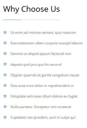
Codes are as follows:
<ul class="home6_list_ul animation fadeInUp">
    <li><span class="glyphicons glyph-dislikes"></span>Ut enim ad minima veniam, quis nostrum </li>
    <li><span class="glyphicons glyph-dislikes"></span>Exercitationem ullam corporis suscipit laborio </li>
    <li><span class="glyphicons glyph-dislikes"></span>Samnisi ut aliquid epsum factorial non </li>
    <li><span class="glyphicons glyph-dislikes"></span>deposit quid pro quo hic escorol </li>
    <li><span class="glyphicons glyph-dislikes"></span>Olypian quarrels et gorilla congolium nause</li>
    <li><span class="glyphicons glyph-dislikes"></span>Duis aute irure dolor in reprehenderit in </li>
    <li><span class="glyphicons glyph-dislikes"></span>Voluptate velit esse cillum dolore eu fugiat </li>
    <li><span class="glyphicons glyph-dislikes"></span>Nulla pariatur. Excepteur sint occaecat </li>
    <li><span class="glyphicons glyph-dislikes"></span>Cupidatat non proident, sunt in culpa qui </li>
    <ul>
    </ul>
</ul>
Option:
Containeris usingContainer-15- You can modify
animationto change the animation on the slide. CSS3Animations. - You can modify
glyphiconsto change icons. font icon list.
Our Skills area
Below is the screen shot:
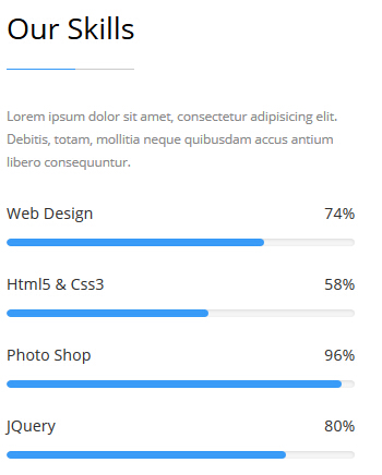
Codes are as follows:
<div class="home6_load animation fadeInRight">
    <p>Content Text...</p>
    <div class="loaded_list_2">
        <p>Web Design<span>74%</span></p>
        <div class="progress">
            <div data-width="74%" class="bar animation animationwidth"></div>
        </div>
        <p>Html5 & Css3<span>58%</span></p>
        <div class="progress">
            <div data-width="58%" class="bar animation animationwidth"></div>
        </div>
        <p>Photo Shop<span>96%</span></p>
        <div class="progress">
            <div data-width="96%" class="bar animation animationwidth"></div>
        </div>
        <p>JQuery<span>80%</span></p>
        <div class="progress">
            <div data-width="80%" class="bar animation animationwidth"></div>
        </div>
    </div>
</div>
Option:
Containeris usingContainer-15- This is a
ProgressBars Counterseffect. ProgressBars Counters
Top Numbers area
Below is the screen shot:
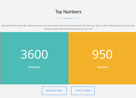
Codes are as follows:
 <div class="backgroundImage12 text-center pt60 pb60">
     <div class="home6_head_center">
         <h3>Top Numbers </h3>
         <div class="line"> </div>
     </div>
     <div class="dnn_layout">
         <div class="content_mid">
             <p class="pl10 pr10">Content Text... </p>
         </div>
     </div>
     <div class="home6_number animation zoomIn">
         <div class="number_Animation_6">
             <div class="col-xs-6 col-sm-4 col-lg-2 number_bgcolor1">
                 <div class="number_box">  <span data-number="1800" class="animation  number">0 </span>
                     <div class="line"> </div>
                    Customers  </div>
             </div>
             <div class="col-xs-6 col-sm-4 col-lg-2 number_bgcolor2">
                 <div class="number_box">  <span data-number="720" class="animation  number">0 </span>
                     <div class="line"> </div>
                    Products  </div>
             </div>
             <div class="col-xs-6 col-sm-4 col-lg-2 number_bgcolor3">
                 <div class="number_box">  <span data-number="3600" class="animation  number">0 </span>
                     <div class="line"> </div>
                    Followers  </div>
             </div>
             <div class="col-xs-6 col-sm-4 col-lg-2 number_bgcolor4">
                 <div class="number_box">  <span data-number="950" class="animation  number">0 </span>
                     <div class="line"> </div>
                    Reviews  </div>
             </div>
             <div class="col-xs-6 col-sm-4 col-lg-2 number_bgcolor5">
                 <div class="number_box">  <span data-number="1430" class="animation  number">0 </span>
                     <div class="line"> </div>
                    Comments  </div>
             </div>
             <div class="col-xs-6 col-sm-4 col-lg-2 number_bgcolor6">
                 <div class="number_box">  <span data-number="260" class="animation  number">0 </span>
                     <div class="line"> </div>
                    Members  </div>
             </div>
         </div>
         <a class="Button_Accent2" href="#">MORE FEATURES </a> <a class="Button_Accent2" href="#">CHECK OTHERS </a>  </div>
 </div>
Option:
Containeris usingContainer-15- This is a
ProgressBars Counterseffect. ProgressBars Counters col-xs-6 col-sm-4 col-lg-2is the width of each column, you can change the width you need through value1~12.
Amazing Features area
Below is the screen shot:
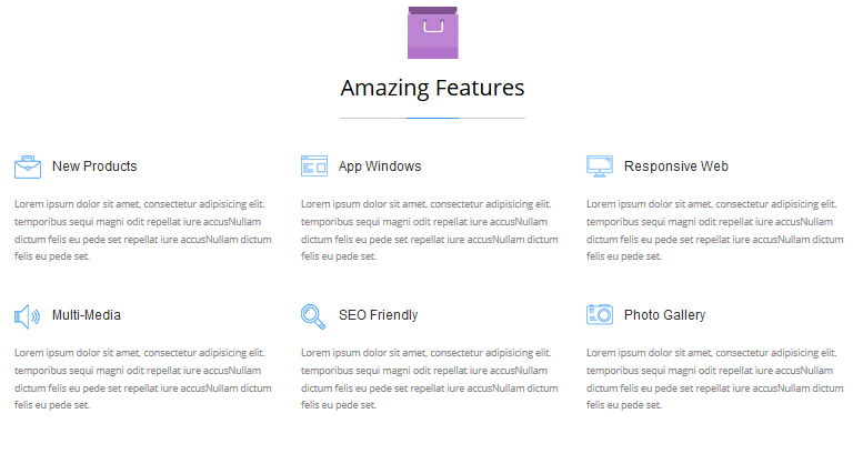
Codes are as follows:
<div class="home6_features animation">
    <div class="row ">
        <div class="col-sm-4  animation_item scaleUp delay1">
            <h3><img alt="" src="/portals/31/home6_features_icon1.png" />New Products</h3>
            <p>Content Text...</p>
        </div>
        <div class="col-sm-4  animation_item scaleUp delay2">
            <h3><img alt="" src="/portals/31/home6_features_icon2.png" />App Windows</h3>
            <p>Content Text...</p>
        </div>
        <div class="col-sm-4  animation_item scaleUp delay3">
            <h3><img alt="" src="/portals/31/home6_features_icon3.png" />Responsive Web</h3>
            <p>Content Text...</p>
        </div>
    </div>
    <div class="row">
        <div class="col-sm-4  animation_item scaleUp delay4">
            <h3><img alt="" src="/portals/31/home6_features_icon4.png" />Multi-Media</h3>
            <p>Content Text...</p>
        </div>
        <div class="col-sm-4  animation_item scaleUp delay5">
            <h3><img alt="" src="/portals/31/home6_features_icon5.png" />SEO Friendly</h3>
            <p>Content Text...</p>
        </div>
        <div class="col-sm-4  animation_item scaleUp delay6">
            <h3><img alt="" src="/portals/31/home6_features_icon6.png" />Photo Gallery</h3>
            <p>Content Text...</p>
        </div>
    </div>
</div>
Option:
col-md-4is the width of each column, you can change the width you need through value1~12.Containeris usingContainer-14- You can modify
glyphiconsto change icons. font icon list. - You can modify
animationto change the animation on the slide. CSS3Animations.
Screenshots area
Below is the screen shot:
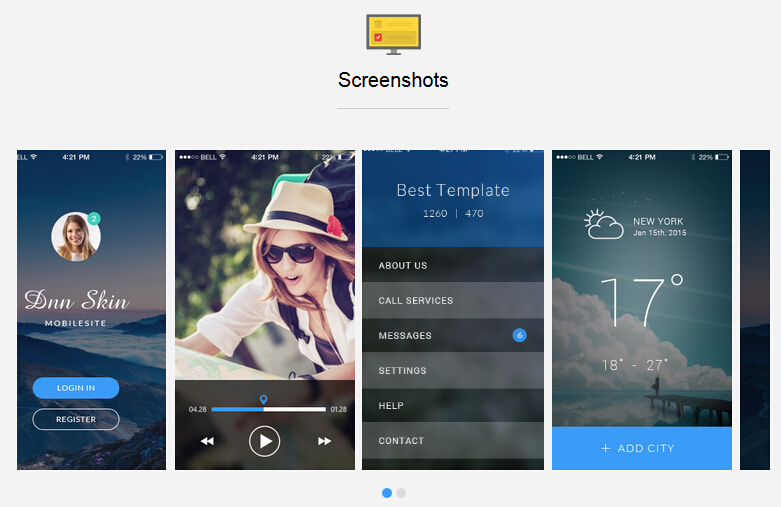
Codes are as follows:
<div class="backgroundImage12 text-center pt60 pb60">
    <div class="dnn_layout">
        <div class="content_mid">
            <div class="home6_head_center"> <img alt="" src="/portals/31/home6_title_icon3.png" />
                <h3>Screenshots</h3>
                <div class="line"></div>
            </div>
            <div data-autoheight="true" data-autoplay="true" data-pagination="true" data-navigation="false" class="carousel carousel_1 home6_carousel animation zoomIn">
                <div class="item">
                    <div class="photo_box img_zoom ico_zoom"> <a class="LightBox_image_gallery2" href="/Portals/31/home6_carousel_img1.jpg">
                        <div class="pic_box"> <img alt="" src="/portals/31/home6_carousel_img1.jpg" />
                            <div class="shade"></div>
                        </div>
                        </a> </div>
                </div>
                <div class="item">
                    <div class="photo_box img_zoom ico_zoom"> <a class="LightBox_image_gallery2" href="/Portals/31/home6_carousel_img2.jpg">
                        <div class="pic_box"> <img alt="" src="/portals/31/home6_carousel_img2.jpg" />
                            <div class="shade"></div>
                        </div>
                        </a> </div>
                </div>
                <div class="item">
                    <div class="photo_box img_zoom ico_zoom"> <a class="LightBox_image_gallery2" href="/Portals/31/home6_carousel_img3.jpg">
                        <div class="pic_box"> <img alt="" src="/portals/31/home6_carousel_img3.jpg" />
                            <div class="shade"></div>
                        </div>
                        </a> </div>
                </div>
                <div class="item">
                    <div class="photo_box img_zoom ico_zoom"> <a class="LightBox_image_gallery2" href="/Portals/31/home6_carousel_img4.jpg">
                        <div class="pic_box"> <img alt="" src="/portals/31/home6_carousel_img4.jpg" />
                            <div class="shade"></div>
                        </div>
                        </a> </div>
                </div>
                <div class="item">
                    <div class="photo_box img_zoom ico_zoom"> <a class="LightBox_image_gallery2" href="/Portals/31/home6_carousel_img1.jpg">
                        <div class="pic_box"> <img alt="" src="/portals/31/home6_carousel_img1.jpg" />
                            <div class="shade"></div>
                        </div>
                        </a> </div>
                </div>
                <div class="item">
                    <div class="photo_box img_zoom ico_zoom"> <a class="LightBox_image_gallery2" href="/Portals/31/home6_carousel_img2.jpg">
                        <div class="pic_box"> <img alt="" src="/portals/31/home6_carousel_img2.jpg" />
                            <div class="shade"></div>
                        </div>
                        </a> </div>
                </div>
            </div>
        </div>
    </div>
</div>
Option:
- You can modify
photo_boxto change image effects. Image Effects - You can modify
LightBoxto change image effects. LightBox - This is a
Carouseleffect. Carousel - You can modify
animationto change the animation on the slide. CSS3Animations.
Screenshots area
Below is the screen shot:
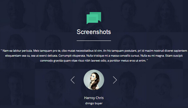
Codes are as follows:
<div class="backgroundImage21 pt60 pb60">
    <div class="dnn_layout">
        <div class="content_mid">
            <div class="home6_head_center"> <img alt="" src="/portals/31/home6_title_icon4.png" />
                <h3>Screenshots</h3>
                <div class="line"></div>
            </div>
            <ul data-autoplay="0" data-display-navigation="false" data-position="fade" class="Testimonials_tab Testimonials_4 animation zoomIn">
                <li>
                    <blockquote>
                        <p>"  Content Text...  "</p>
                        <small><img alt="" src="/portals/31/home6_testimonials_img.png" /><span>Harroy Chris</span>dnngo buyer</small> </blockquote>
                </li>
                <li>
                    <blockquote>
                        <p>"  Content Text...  "</p>
                        <small><img alt="" src="/portals/31/home7_testimonials_img1.png" /><span>Harroy Chris</span>dnngo buyer</small> </blockquote>
                </li>
                <li>
                    <blockquote>
                        <p>"  Content Text...  "</p>
                        <small><img alt="" src="/portals/31/home7_testimonials_img2.png" /><span>Harroy Chris</span>dnngo buyer</small> </blockquote>
                </li>
            </ul>
        </div>
    </div>
</div>
Option:
- This is a
Testimonialseffect. Testimonials - You can modify
animationto change the animation on the slide. CSS3Animations.
Pricing Tables area
Below is the screen shot:
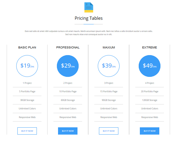
Codes are as follows:
<div class="home6_price">
    <p class="text-center pl10 pr10">Content Text...</p>
    <div class="price-table price-table5 animation ">
        <div class="col-md-3 col-sm-6 animation_item scaleUp delay1">
            <div class="price_border">
                <div class="price_title">
                    <h2>BASIC PLAN</h2>
                </div>
                <div class="price_holder">
                    <div class="price_box"><span class="sup">$</span><span class="price">19</span><span class="unit">/m</span></div>
                    <ul>
                        <li>1 Project</li>
                        <li>5 Portfolio Page</li>
                        <li>30GB Storage</li>
                        <li>Unlimited Colors</li>
                        <li>Responsive Web</li>
                    </ul>
                    <a class="Button_Accent2" href="#">BUY IT NOW</a> </div>
            </div>
        </div>
        <div class="col-md-3 col-sm-6 best_value animation_item scaleUp delay2">
            <div class="price_border">
                <div class="price_title">
                    <h2>PROFESSIONAL</h2>
                </div>
                <div class="price_holder">
                    <div class="price_box"><span class="sup">$</span><span class="price">29</span><span class="unit">/m</span></div>
                    <ul>
                        <li>2 Project</li>
                        <li>10 Portfolio Page</li>
                        <li>60GB Storage</li>
                        <li>Unlimited Colors</li>
                        <li>Responsive Web</li>
                    </ul>
                    <a class="Button_Accent2" href="#">BUY IT NOW</a> </div>
            </div>
        </div>
        <div class="col-md-3 col-sm-6 animation_item scaleUp delay3">
            <div class="price_border">
                <div class="price_title">
                    <h2>MAXIUM</h2>
                </div>
                <div class="price_holder">
                    <div class="price_box"><span class="sup">$</span><span class="price">39</span><span class="unit">/m</span></div>
                    <ul>
                        <li>3 Project</li>
                        <li>15 Portfolio Page</li>
                        <li>90GB Storage</li>
                        <li>Unlimited Colors</li>
                        <li>Responsive Web</li>
                    </ul>
                    <a class="Button_Accent2" href="#">BUY IT NOW</a> </div>
            </div>
        </div>
        <div class="col-md-3 col-sm-6 animation_item scaleUp delay4">
            <div class="price_border">
                <div class="price_title">
                    <h2>EXTREME</h2>
                </div>
                <div class="price_holder">
                    <div class="price_box"><span class="sup">$</span><span class="price">49</span><span class="unit">/m</span></div>
                    <ul>
                        <li>4 Project</li>
                        <li>20 Portfolio Page</li>
                        <li>120GB Storage</li>
                        <li>Unlimited Colors</li>
                        <li>Responsive Web</li>
                    </ul>
                    <a class="Button_Accent2" href="#">BUY IT NOW</a> </div>
            </div>
        </div>
    </div>
</div>
Option:
col-md-3 col-sm-6is the width of each column, you can change the width you need through value1~12.- This is a
Pricingeffect. Pricing Containeris usingContainer-14- You can modify
animationto change the animation on the slide. CSS3Animations.
Contact Us area
Below is the screen shot:
Option:
- You can modify
animationto change the animation on the slide. CSS3Animations. - This is
Theme_Responsive_20063-home1theme ofDNNGo PowerFormsmodule Containeris usingContainer-16
Download App Landing Page area
Below is the screen shot:
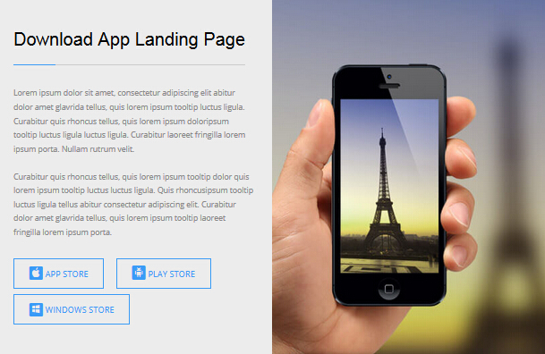
Codes are as follows:
<div class="home6_full_bg1 clearfix">
    <div class="home6_full_bg1_l">
        <div class="home6_head_left">
            <h3>Download App Landing Page</h3>
            <div class="line"></div>
        </div>
        <div class="animation fadeInLeft">
            <p>Content Text...</p>
            <p>Content Text...</p>
            <div class="home6_full_bg1_btn"><a class="Button_Accent2" href="#"><span class="social social-apple"></span>APP STORE</a>
			<a class="Button_Accent2" href="#"><span class="social social-android"></span>PLAY STORE</a>
			<a class="Button_Accent2" href="#"><span class="social social-windows"></span>WINDOWS  STORE</a></div>
        </div>
    </div>
    <div class="home6_full_bg1_r animation fadeInRight"> </div>
</div>
Option:
- You can modify
animationto change the animation on the slide. CSS3Animations. - You can modify
glyphiconsto change icons. font icon list.
Recent News area
Below is the screen shot:
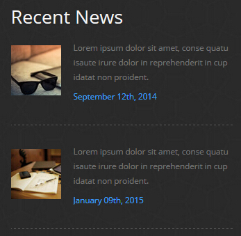
Codes are as follows:
<div class="animation fadeInUp">
    <div class="home6_foot_news clearfix"> <img alt="" src="/portals/31/home6_foot_img1.jpg" />
        <div class="news_text">
            <p>Content Text...</p>
            <div class="news_text_accent">September 12th, 2014</div>
        </div>
    </div>
    <div class="home6_foot_news clearfix"> <img alt="" src="/portals/31/home6_foot_img2.jpg" />
        <div class="news_text">
            <p>Content Text...</p>
            <div class="news_text_accent">January 09th, 2015</div>
        </div>
    </div>
</div>
Option:
- You can modify
animationto change the animation on the slide. CSS3Animations. Containeris usingContainer-17
About Us area
Below is the screen shot:
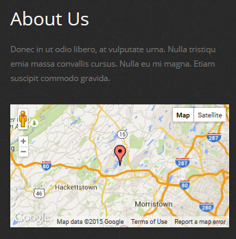
Codes are as follows:
<div class="animation fadeInUp">
    <p>Content Text...</p>
    <br />
    <div  id="gmap01"></div>
</div>
Option:
- You can modify
animationto change the animation on the slide. CSS3Animations. Containeris usingContainer-17- You can change
gmapaddress incustom.js
Get In Touch area
Below is the screen shot:
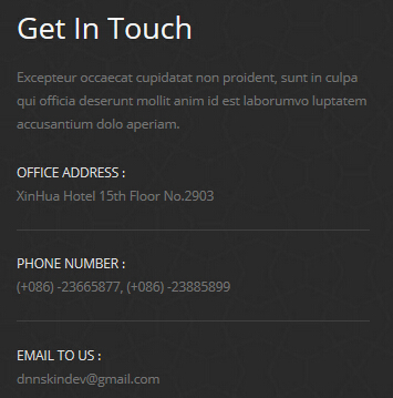
Codes are as follows:
<div class="animation fadeInUp">
    <p>Content Text...</p>
    <div class="contact_info">
        <div class="foot_light_text">OFFICE ADDRESS :</div>
        <div>XinHua Hotel 15th Floor No.2903</div>
    </div>
    <div class="contact_info">
        <div class="foot_light_text">PHONE NUMBER :</div>
        <div>(+086) -23665877, (+086) -23885899</div>
    </div>
    <div class="contact_info">
        <div class="foot_light_text">EMAIL TO US :</div>
        <div>dnnskindev@gmail.com</div>
    </div>
</div>
Option:
- You can modify
animationto change the animation on the slide. CSS3Animations. Containeris usingContainer-17
HomeVersion7 One Page
You can click the link to check HomeVersion7 demo. HomeVersion7
Banner area
Below is the screen shot:
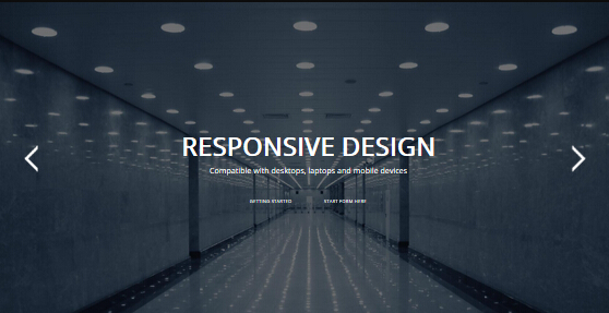
Option:
It is using DNNGo LayerGalleryPro module here, you can import ContentListEntity-Home7.xml of the DNNGo_LayerGalleryPro folder to duplicate banner of the demo.
Anchor area
It will scroll to the corresponding area on the page when clicking the menu texts at the top. It will also do so when clicking the dots on the right of the skin.
These anchors are generated through page's anchorTag. Codes are as follows. You can place this piece of codes in page's HTML module, click the right anchor, then page will slide to this HTML module area.
- <div data-title="About Us" class="anchorTag" data-offset="-60" data-scrollshownav="true" data-menuanchor="true"> </div>
Option:
data-title |
Title displayed correspondingly to the right navigation. If page title of the menu is the same as data-title, page will scroll to this area when clicking menu texts. |
data-menuanchor |
Whether to enable menu anchor feature or not. |
data-scrollshownav |
Whether to enable navigation or not. |
data-offset |
Offset value of up and down coordinate for anchor. |
data-icourl |
Image url that displays correspondingly of the right navigation. |
data-iconame |
Icon class names that displays correspondingly of the right navigation. |
How to set menu anchor
- Click Add New Page button.
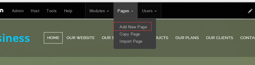
- Fill in Page Name and Page Title. Texts for Page Title needs to be the same as that of data-title.
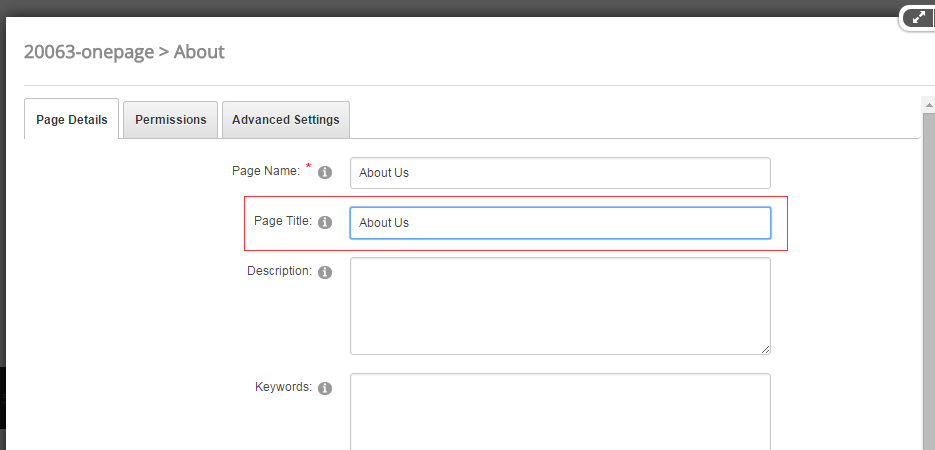
- Put the anchor code to HTML module of the page. It will scroll to the corresponding area on the page when clicking the top menu texts.
- <div data-title="About Us" class="anchorTag" data-offset="-60" data-scrollshownav="true" data-menuanchor="true"> </div>
ABOUT DNNGO area
Below is the screen shot:
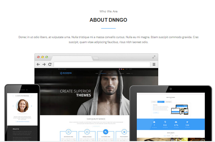
Codes are as follows:
<div class="home7_about">
    <div class="dnn_layout text-center pt60">
        <div class="content_mid">
            <div class="home7_head">
                <h4>Who We Are</h4>
                <h3>About Dnngo</h3>
                <div class="line_center"></div>
            </div>
            <p class="pl10 pr10 animation zoomIn">Content Text...</p>
            <div class="home7_about_img"> <img alt="" class="home7_mobile animation fadeInLeft" src="/portals/31/home7_mobile.png" />
            <img alt="" class="home7_mac animation fadeInUp" src="/portals/31/home7_mac.jpg" />
            <img alt="" class="home7_ipad animation fadeInRight" src="/portals/31/home7_ipad.png" /> </div>
        </div>
    </div>
</div>
Option:
- You can modify
animationto change the animation on the slide. CSS3Animations.
TESTIMONIALS area
Below is the screen shot:
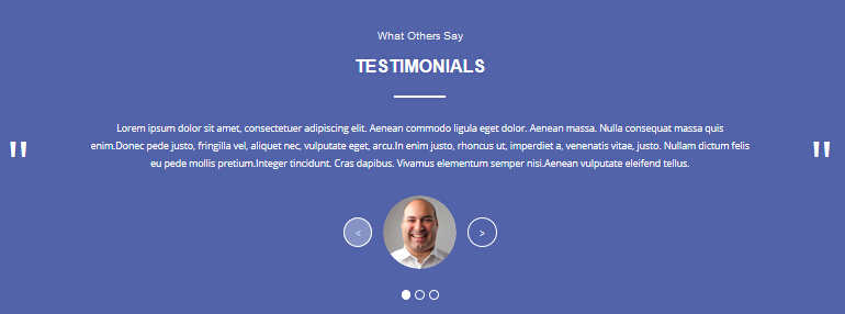
Codes are as follows:
<div data-title="Testimonials" class="anchorTag"></div>
<div class="backgroundImage22">
    <div class="dnn_layout pt60 pb60">
        <div class="content_mid">
            <div class="home7_head">
                <h4>What Others Say</h4>
                <h3>Testimonials</h3>
                <div class="line_center"></div>
            </div>
            <ul data-height-auto="true" data-autoplay="0" data-position="fade" class="Testimonials_tab Testimonials_5 animation zoomIn">
                <li>
                    <blockquote>
                        <p>Content Text...</p>
                        <small><span class="Pic"><img alt="" src="/portals/31/home7_testimonials_img1.png" /></span></small> </blockquote>
                </li>
                <li>
                    <blockquote>
                        <p>Content Text...</p>
                        <small><span class="Pic"><img alt="" src="/portals/31/home7_testimonials_img2.png" /></span></small> </blockquote>
                </li>
                <li>
                    <blockquote>
                        <p>Content Text...</p>
                        <small><span class="Pic"><img alt="" src="/portals/31/home6_testimonials_img.png" /></span></small> </blockquote>
                </li>
            </ul>
        </div>
    </div>
</div>
Option:
- This is a
Testimonialseffect. Testimonials - You can modify
animationto change the animation on the slide. CSS3Animations.
OUR RECENT WORKS area
Below is the screen shot:
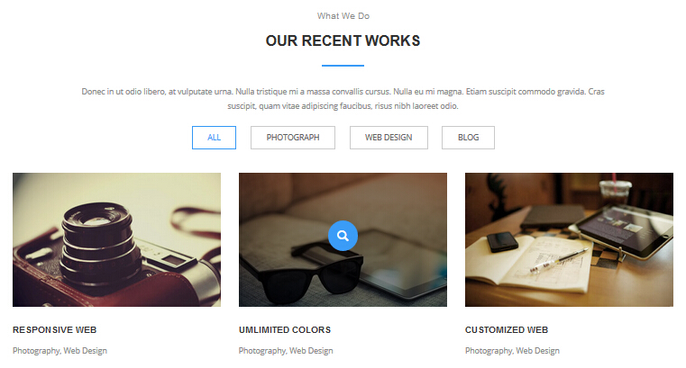
Codes are as follows:
<div class="anchorTag" data-title="Our Recent Works"></div>
<div class="dnn_layout pt60 pb60">
    <div class="content_mid">
        <div class="home7_head">
            <h4>What We Do</h4>
            <h3>Our Recent Works</h3>
            <div class="line_center"></div>
        </div>
        <p class="text-center pl10 pr10">Content Text...</p>
        <div class="isotope_grid home7_isotope animation zoomIn">
            <div class="isotope_group"> <a data-filter="*" href="#" class="active">ALL</a> <a data-filter=".photograph" href="#">PHOTOGRAPH</a>
            <a data-filter=".webdesign" href="#">WEB DESIGN</a> <a data-filter=".blogs" href="#">BLOG</a> </div>
            <div class="loading">
                <div class="loading-container container1">
                    <div class="circle1"></div>
                    <div class="circle2"></div>
                    <div class="circle3"></div>
                    <div class="circle4"></div>
                </div>
                <div class="loading-container container2">
                    <div class="circle1"></div>
                    <div class="circle2"></div>
                    <div class="circle3"></div>
                    <div class="circle4"></div>
                </div>
                <div class="loading-container container3">
                    <div class="circle1"></div>
                    <div class="circle2"></div>
                    <div class="circle3"></div>
                    <div class="circle4"></div>
                </div>
            </div>
            <div data-min-width="352" class="isotope_main">
                <div class="isotope_item photograph blogs">
                    <div class="photo_box">
                        <div class="pic_box"> <img alt="" src="/portals/31/home7_isotope_img1.jpg" />
                            <div class="content">
                                <div class="vertical_center_1">
                                    <div class="vertical_center_2">
                                        <div class="ico"> <a class="LightBox_image_gallery1" href="/Portals/31/home7_isotope_img1.jpg">
                                        <span class="glyphicons glyph-search"></span></a> </div>
                                    </div>
                                </div>
                            </div>
                            <div class="shade"></div>
                        </div>
                        <div class="text_style4">
                            <h3>Responsive Web</h3>
                            <p>Photography, Web Design</p>
                        </div>
                    </div>
                </div>
                <div class="isotope_item blogs webdesign">
                    <div class="photo_box">
                        <div class="pic_box"> <img alt="" src="/portals/31/home7_isotope_img2.jpg" />
                            <div class="content">
                                <div class="vertical_center_1">
                                    <div class="vertical_center_2">
                                        <div class="ico"> <a class="LightBox_image_gallery1" href="/Portals/31/home7_isotope_img2.jpg">
                                        <span class="glyphicons glyph-search"></span></a> </div>
                                    </div>
                                </div>
                            </div>
                            <div class="shade"></div>
                        </div>
                        <div class="text_style4">
                            <h3>Umlimited Colors</h3>
                            <p>Photography, Web Design</p>
                        </div>
                    </div>
                </div>
                <div class="isotope_item photograph webdesign">
                    <div class="photo_box">
                        <div class="pic_box"> <img alt="" src="/portals/31/home7_isotope_img3.jpg" />
                            <div class="content">
                                <div class="vertical_center_1">
                                    <div class="vertical_center_2">
                                        <div class="ico"> <a class="LightBox_image_gallery1" href="/Portals/31/home7_isotope_img3.jpg">
                                        <span class="glyphicons glyph-search"></span></a> </div>
                                    </div>
                                </div>
                            </div>
                            <div class="shade"></div>
                        </div>
                        <div class="text_style4">
                            <h3>Customized Web</h3>
                            <p>Photography, Web Design</p>
                        </div>
                    </div>
                </div>
                <div class="isotope_item blogs webdesign">
                    <div class="photo_box">
                        <div class="pic_box"> <img alt="" src="/portals/31/home7_isotope_img4.jpg" />
                            <div class="content">
                                <div class="vertical_center_1">
                                    <div class="vertical_center_2">
                                        <div class="ico"> <a class="LightBox_image_gallery1" href="/Portals/31/home7_isotope_img4.jpg">
                                        <span class="glyphicons glyph-search"></span></a> </div>
                                    </div>
                                </div>
                            </div>
                            <div class="shade"></div>
                        </div>
                        <div class="text_style4">
                            <h3>Advanced Technology</h3>
                            <p>Photography, Web Design</p>
                        </div>
                    </div>
                </div>
                <div class="isotope_item photograph webdesign">
                    <div class="photo_box">
                        <div class="pic_box"> <img alt="" src="/portals/31/home7_isotope_img5.jpg" />
                            <div class="content">
                                <div class="vertical_center_1">
                                    <div class="vertical_center_2">
                                        <div class="ico"> <a class="LightBox_image_gallery1" href="/Portals/31/home7_isotope_img5.jpg">
                                        <span class="glyphicons glyph-search"></span></a> </div>
                                    </div>
                                </div>
                            </div>
                            <div class="shade"></div>
                        </div>
                        <div class="text_style4">
                            <h3>Skin Development</h3>
                            <p>Photography, Web Design</p>
                        </div>
                    </div>
                </div>
                <div class="isotope_item blogs">
                    <div class="photo_box">
                        <div class="pic_box"> <img alt="" src="/portals/31/home7_isotope_img6.jpg" />
                            <div class="content">
                                <div class="vertical_center_1">
                                    <div class="vertical_center_2">
                                        <div class="ico"> <a class="LightBox_image_gallery1" href="/Portals/31/home7_isotope_img6.jpg">
                                        <span class="glyphicons glyph-search"></span></a> </div>
                                    </div>
                                </div>
                            </div>
                            <div class="shade"></div>
                        </div>
                        <div class="text_style4">
                            <h3>DNN Templates</h3>
                            <p>Photography, Web Design</p>
                        </div>
                    </div>
                </div>
            </div>
        </div>
    </div>
</div>
Option:
- You can modify
glyphiconsto change icons. font icon list. - You can modify
photo_boxto change image effects. Image Effects - You can add
<a data-filter=".FilterName" href="#">Filter Name</a>to increase categories.data-filter=".FilterName"can not be blank space. - You can modify
data-min-widthto change minimum width of image. - You can modify
isotope_itemFilterNameto categorize images. - You can modify
animationto change the animation on the slide. CSS3Animations.
backgroundImage23 area
Below is the screen shot:

Codes are as follows:
<div class="backgroundImage23">
    <div class="dnn_layout pt60 pb60 animation zoomIn">
        <div class="content_mid">
            <div class="home7_content2 row">
                <div class="col-sm-9">
                    <h3>Craft Web solutions for your online business</h3>
                    <p>Content Text...</p>
                </div>
                <div class="col-sm-3"> <a class="accent_btn" href="#">MORE FEATURES</a> </div>
            </div>
        </div>
    </div>
</div>
Option:
col-md-*is the width of each column, you can change the width you need through value1~12.- You can modify
animationto change the animation on the slide. CSS3Animations.
OUR SERVICES area
Below is the screen shot:
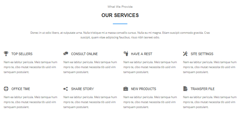
Codes are as follows:
<div data-title="Our Services" class="anchorTag"></div>
<div class="dnn_layout pt60 pb60">
    <div class="content_mid">
        <div class="home7_head">
            <h4>What We Provide</h4>
            <h3>Our Services</h3>
            <div class="line_center"></div>
        </div>
        <p class="text-center pl10 pr10">Content Text...</p>
        <div class="home7_services animation">
            <div class="row">
                <div class="col-sm-3 animation_item scaleUp delay1">
                    <h3><span class="glyphicons glyph-cup"></span>Top Sellers</h3>
                    <p>Content Text...</p>
                </div>
                <div class="col-sm-3 animation_item scaleUp delay2">
                    <h3><span class="glyphicons glyph-conversation"></span>Consult online</h3>
                    <p>Content Text...</p>
                </div>
                <div class="col-sm-3 animation_item scaleUp delay3">
                    <h3><span class="glyphicons glyph-drink"></span>Have A Rest</h3>
                    <p>Content Text...</p>
                </div>
                <div class="col-sm-3 animation_item scaleUp delay4">
                    <h3><span class="glyphicons glyph-settings"></span>Site Settings</h3>
                    <p>Content Text...</p>
                </div>
            </div>
            <div class="row">
                <div class="col-sm-3 animation_item scaleUp delay5">
                    <h3><span class="glyphicons glyph-life-preserver"></span>Office Time</h3>
                    <p>Content Text...</p>
                </div>
                <div class="col-sm-3 animation_item scaleUp delay6">
                    <h3><span class="glyphicons glyph-share-alt"></span>Share Story</h3>
                    <p>Content Text...</p>
                </div>
                <div class="col-sm-3 animation_item scaleUp delay7">
                    <h3><span class="glyphicons glyph-briefcase"></span>New Products</h3>
                    <p>Content Text...</p>
                </div>
                <div class="col-sm-3 animation_item scaleUp delay8">
                    <h3><span class="glyphicons glyph-file-export"></span>Transfer File</h3>
                    <p>Content Text...</p>
                </div>
            </div>
        </div>
    </div>
</div>
Option:
- You can modify
glyphiconsto change icons. font icon list. col-md-3is the width of each column, you can change the width you need through value1~12.- You can modify
animationto change the animation on the slide. CSS3Animations.
backgroundImage12 area
Below is the screen shot:
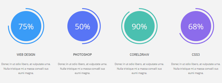
Codes are as follows:
<div class="backgroundImage12">
    <div class="dnn_layout text-center pt60 pb60 animation ">
        <div class="content_mid">
            <div class="chart_list_3 row">
                <div class="col-sm-6 col-md-3 chart_color1 animation_item scaleUp delay1">
                    <div class="percentage2" data-percent="75">
                        <div class="percentage_inner"><span>0</span>%</div>
                    </div>
                    <h3>WEB DESIGN</h3>
                    <p>Content Text...</p>
                </div>
                <div class="col-sm-6 col-md-3 chart_color2 animation_item scaleUp delay2">
                    <div class="percentage3" data-percent="50">
                        <div class="percentage_inner"><span>0</span>%</div>
                    </div>
                    <h3>PHOTOSHOP</h3>
                    <p>Content Text...</p>
                </div>
                <div class="col-sm-6 col-md-3 chart_color3 animation_item scaleUp delay3">
                    <div class="percentage4" data-percent="90">
                        <div class="percentage_inner"><span>0</span>%</div>
                    </div>
                    <h3>CORELDRAW</h3>
                    <p>Content Text...</p>
                </div>
                <div class="col-sm-6 col-md-3 chart_color4 animation_item scaleUp delay4">
                    <div class="percentage5" data-percent="68">
                        <div class="percentage_inner"><span>0</span>%</div>
                    </div>
                    <h3>CSS3</h3>
                    <p>Content Text...</p>
                </div>
            </div>
        </div>
    </div>
</div>
Option:
- This is a
ProgressBars Counterseffect. ProgressBars Counters col-sm-6 col-md-3is the width of each column, you can change the width you need through value1~12.- You can modify
animationto change the animation on the slide. CSS3Animations.
MEET OUR TEAMS area
Below is the screen shot:
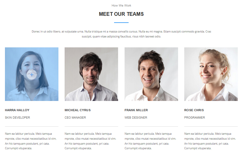
Codes are as follows:
<div data-title="Meet Our Teams" class="anchorTag"></div>
<div class="dnn_layout pt60 pb60">
    <div class="content_mid">
        <div class="home7_head  ">
            <h4>How We Work</h4>
            <h3>Meet Our Teams</h3>
            <div class="line_center"></div>
        </div>
        <p class="text-center pl10 pr10  animation zoomIn">Content Text...</p>
        <div class="home7_team row animation">
            <div class="col-sm-3 animation_item scaleUp delay1">
                <div class="photo_box"> <a href="#">
                    <div class="pic_box"> <img alt="" src="/portals/31/home7_team1.jpg" />
                        <div class="ico"> <span class="glyphicons glyph-plus"></span> </div>
                        <div class="shade"></div>
                    </div>
                    </a> </div>
                <h3>Harra Halloy<span>Skin Developer</span></h3>
                <p>Content Text...</p>
            </div>
            <div class="col-sm-3 animation_item scaleUp delay2">
                <div class="photo_box"> <a href="#">
                    <div class="pic_box"> <img alt="" src="/portals/31/home7_team2.jpg" />
                        <div class="ico"> <span class="glyphicons glyph-plus"></span> </div>
                        <div class="shade"></div>
                    </div>
                    </a> </div>
                <h3>Micheal Cyrus<span>CEO Manager</span></h3>
                <p>Content Text...</p>
            </div>
            <div class="col-sm-3 animation_item scaleUp delay3">
                <div class="photo_box"> <a href="#">
                    <div class="pic_box"> <img alt="" src="/portals/31/home7_team3.jpg" />
                        <div class="ico"> <span class="glyphicons glyph-plus"></span> </div>
                        <div class="shade"></div>
                    </div>
                    </a> </div>
                <h3>Frank Miller<span>Web Designer</span></h3>
                <p>Content Text...</p>
            </div>
            <div class="col-sm-3 animation_item scaleUp delay4">
                <div class="photo_box"> <a href="#">
                    <div class="pic_box"> <img alt="" src="/portals/31/home7_team4.jpg" />
                        <div class="ico"> <span class="glyphicons glyph-plus"></span> </div>
                        <div class="shade"></div>
                    </div>
                    </a> </div>
                <h3>Rose Chris<span>Programmer</span></h3>
                <p>Content Text...</p>
            </div>
        </div>
    </div>
</div>
Option:
col-md-3is the width of each column, you can change the width you need through value1~12.- You can modify
animationto change the animation on the slide. CSS3Animations. - You can modify
glyphiconsto change icons. font icon list.
WORK PROCESS area
Below is the screen shot:
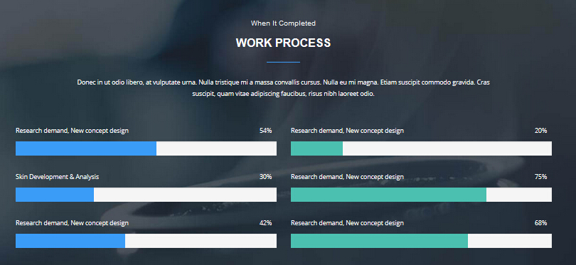
Codes are as follows:
<div data-title="Work Process" class="anchorTag"></div>
<div class="backgroundImage24">
    <div class="dnn_layout pt60 pb60">
        <div class="content_mid">
            <div class="home7_head">
                <h4>When It Completed</h4>
                <h3>Work Process</h3>
                <div class="line_center"></div>
            </div>
            <p class="text-center pl10 pr10">Content Text...</p>
            <div class="home7_loaded row">
                <div class="col-sm-6 animation fadeInLeft">
                    <div class="loaded_list_3 loaded_accent">
                        <p>Research demand, New concept design <span>54%</span></p>
                        <div class="progress">
                            <div data-width="54%" class="bar animation animationwidth"></div>
                        </div>
                        <p>Skin Development & Analysis <span>30%</span></p>
                        <div class="progress">
                            <div data-width="30%" class="bar animation animationwidth"></div>
                        </div>
                        <p>Research demand, New concept design <span>42%</span></p>
                        <div class="progress">
                            <div data-width="42%" class="bar animation animationwidth"></div>
                        </div>
                    </div>
                </div>
                <div class="col-sm-6 animation fadeInRight">
                    <div class="loaded_list_3 loaded_color1">
                        <p>Research demand, New concept design <span>20%</span></p>
                        <div class="progress">
                            <div data-width="20%" class="bar animation animationwidth"></div>
                        </div>
                        <p>Research demand, New concept design <span>75%</span></p>
                        <div class="progress">
                            <div data-width="75%" class="bar animation animationwidth"></div>
                        </div>
                        <p>Research demand, New concept design <span>68%</span></p>
                        <div class="progress">
                            <div data-width="68%" class="bar animation animationwidth"></div>
                        </div>
                    </div>
                </div>
            </div>
        </div>
    </div>
</div>
Option:
- This is a
ProgressBars Counterseffect. ProgressBars Counters col-sm-6is the width of each column, you can change the width you need through value1~12.- You can modify
animationto change the animation on the slide. CSS3Animations.
POPULAR BLOGS area
Below is the screen shot:
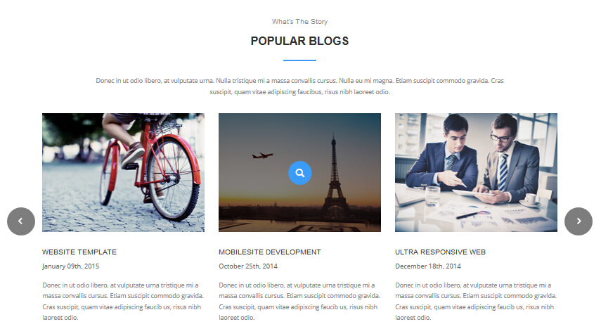
Codes are as follows:
<div data-title="Popular Blogs" class="anchorTag"></div>
<div class="dnn_layout pt60 pb60">
    <div class="content_mid">
        <div class="home7_blogs">
            <div class="home7_head">
                <h4>What’s The Story</h4>
                <h3>Popular Blogs</h3>
                <div class="line_center"></div>
            </div>
            <p class="text-center pl10 pr10">Content Text...</p>
            <div data-pagination="false" class="carousel carousel_8 animation zoomIn">
                <div class="item">
                    <div class="photo_box"> <a href="#">
                        <div class="pic_box"> <img alt="" src="/portals/31/home7_carousel_img1.jpg" />
                            <div class="ico"> <span class="glyphicons glyph-search"></span> </div>
                            <div class="shade"></div>
                        </div>
                        </a>
                        <div class="text_style5">
                            <h3>Mobilesite Development</h3>
                            <p class="date">October 25th, 2014</p>
                            <p>Content Text...</p>
                        </div>
                    </div>
                </div>
                <div class="item">
                    <div class="photo_box"> <a href="#">
                        <div class="pic_box"> <img alt="" src="/portals/31/home7_carousel_img2.jpg" />
                            <div class="ico"> <span class="glyphicons glyph-search"></span> </div>
                            <div class="shade"></div>
                        </div>
                        </a>
                        <div class="text_style5">
                            <h3>Ultra Responsive Web</h3>
                            <p class="date">December 18th, 2014</p>
                            <p>Content Text...</p>
                        </div>
                    </div>
                </div>
                <div class="item">
                    <div class="photo_box"> <a href="#">
                        <div class="pic_box"> <img alt="" src="/portals/31/home7_carousel_img3.jpg" />
                            <div class="ico"> <span class="glyphicons glyph-search"></span> </div>
                            <div class="shade"></div>
                        </div>
                        </a>
                        <div class="text_style5">
                            <h3>Website Template</h3>
                            <p class="date">January 09th, 2015</p>
                            <p>Content Text...</p>
                        </div>
                    </div>
                </div>
                <div class="item">
                    <div class="photo_box"> <a href="#">
                        <div class="pic_box"> <img alt="" src="/portals/31/home7_carousel_img1.jpg" />
                            <div class="ico"> <span class="glyphicons glyph-search"></span> </div>
                            <div class="shade"></div>
                        </div>
                        </a>
                        <div class="text_style5">
                            <h3>Mobilesite Development</h3>
                            <p class="date">October 25th, 2014</p>
                            <p>Content Text...</p>
                        </div>
                    </div>
                </div>
                <div class="item">
                    <div class="photo_box"> <a href="#">
                        <div class="pic_box"> <img alt="" src="/portals/31/home7_carousel_img2.jpg" />
                            <div class="ico"> <span class="glyphicons glyph-search"></span> </div>
                            <div class="shade"></div>
                        </div>
                        </a>
                        <div class="text_style5">
                            <h3>Ultra Responsive Web</h3>
                            <p class="date">December 18th, 2014</p>
                            <p>Content Text...</p>
                        </div>
                    </div>
                </div>
            </div>
        </div>
    </div>
</div>
Option:
- This is a
Carouseleffect. Carousel - You can modify
glyphiconsto change icons. font icon list. - You can modify
animationto change the animation on the slide. CSS3Animations.
SOCIAL NETWORKS area
Below is the screen shot:
Codes are as follows:
<div data-title="Social Networks" class="anchorTag"></div>
<div class="backgroundImage25">
    <div class="dnn_layout text-center pt60 pb60">
        <div class="content_mid">
            <div class="home7_head">
                <h4>How To Follow Us</h4>
                <h3>Social Networks</h3>
                <div class="line_center"></div>
            </div>
            <p class="pl10 pr10">Content Text...</p>
            <div class="home7_social row animation ">
                <div class="col-xs-6 col-sm-4 col-md-2 animation_item scaleUp delay1"> <
                a href="#"><img alt="" class="img-responsive img_display" src="/portals/31/home7_social1.png" /></a> </div>
                <div class="col-xs-6 col-sm-4 col-md-2 animation_item scaleUp delay2"> <
                a href="#"><img alt="" class="img-responsive img_display" src="/portals/31/home7_social2.png" /></a> </div>
                <div class="col-xs-6 col-sm-4 col-md-2 animation_item scaleUp delay3"> <
                a href="#"><img alt="" class="img-responsive img_display" src="/portals/31/home7_social3.png" /></a> </div>
                <div class="col-xs-6 col-sm-4 col-md-2 animation_item scaleUp delay4"> <
                a href="#"><img alt="" class="img-responsive img_display" src="/portals/31/home7_social4.png" /></a> </div>
                <div class="col-xs-6 col-sm-4 col-md-2 animation_item scaleUp delay5"> <
                a href="#"><img alt="" class="img-responsive img_display" src="/portals/31/home7_social5.png" /></a> </div>
                <div class="col-xs-6 col-sm-4 col-md-2 animation_item scaleUp delay5"> <
                a href="#"><img alt="" class="img-responsive img_display" src="/portals/31/home7_social6.png" /></a> </div>
            </div>
        </div>
    </div>
</div>
Option:
col-xs-6 col-sm-4is the width of each column, you can change the width you need through value1~12.- You can modify
animationto change the animation on the slide. CSS3Animations.
PRICING TABLES area
Below is the screen shot:
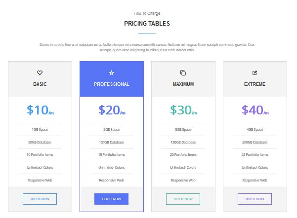
Codes are as follows:
<div data-title="Pricing Tables" class="anchorTag"></div>
<div class="dnn_layout pt60 pb60">
    <div class="content_mid">
        <div class="home7_head">
            <h4>How To Charge</h4>
            <h3>Pricing Tables</h3>
            <div class="line_center"></div>
        </div>
        <p class="text-center pl10 pr10">Content Text...</p>
        <div class="price-table price-table6  row animation">
            <div class="col-md-3 col-sm-6 price6_color1 animation_item scaleUp delay1">
                <div class="price_border">
                    <div class="price_title"> <span class="glyphicons glyph-heart-empty"></span>
                        <div class="line"></div>
                        <h2>BASIC</h2>
                    </div>
                    <div class="price_holder">
                        <div class="price_box"> <span class="sup">$</span><span class="price">10</span><span class="unit">/m</span> </div>
                        <ul>
                            <li>1GB Space</li>
                            <li>50GB Database</li>
                            <li>10 Portfolio Items</li>
                            <li>Unlimited- Colors</li>
                            <li>Responsive Web</li>
                        </ul>
                        <div class="price_button"><a class="btn" href="#">BUY IT NOW</a></div>
                    </div>
                </div>
            </div>
            <div class="col-md-3 col-sm-6  best_value price6_color2 animation_item scaleUp delay2">
                <div class="price_border">
                    <div class="price_title "> <span class="glyphicons glyph-dislikes"></span>
                        <div class="line"></div>
                        <h2>PROFESSIONAL</h2>
                    </div>
                    <div class="price_holder">
                        <div class="price_box"> <span class="sup">$</span><span class="price">20</span><span class="unit">/m</span> </div>
                        <ul>
                            <li>2GB Space</li>
                            <li>100GB Database</li>
                            <li>15 Portfolio Items</li>
                            <li>Unlimited- Colors</li>
                            <li>Responsive Web</li>
                        </ul>
                        <div class="price_button"><a class="btn" href="#">BUY IT NOW</a></div>
                    </div>
                </div>
            </div>
            <div class="col-md-3 col-sm-6 price6_color3 animation_item scaleUp delay3">
                <div class="price_border">
                    <div class="price_title"> <span class="glyphicons glyph-more-windows"></span>
                        <div class="line"></div>
                        <h2>MAXIMUM</h2>
                    </div>
                    <div class="price_holder">
                        <div class="price_box"> <span class="sup">$</span><span class="price">30</span><span class="unit">/m</span> </div>
                        <ul>
                            <li>3GB Space</li>
                            <li>150GB Database</li>
                            <li>20 Portfolio Items</li>
                            <li>Unlimited- Colors</li>
                            <li>Responsive Web</li>
                        </ul>
                        <div class="price_button"><a class="btn" href="#">BUY IT NOW</a></div>
                    </div>
                </div>
            </div>
            <div class="col-md-3 col-sm-6 price6_color4 animation_item scaleUp delay4">
                <div class="price_border">
                    <div class="price_title"> <span class="glyphicons glyph-new-window-alt"></span>
                        <div class="line"></div>
                        <h2>EXTREME</h2>
                    </div>
                    <div class="price_holder">
                        <div class="price_box"> <span class="sup">$</span><span class="price">40</span><span class="unit">/m</span> </div>
                        <ul>
                            <li>4GB Space</li>
                            <li>200GB Database</li>
                            <li>25 Portfolio Items</li>
                            <li>Unlimited- Colors</li>
                            <li>Responsive Web</li>
                        </ul>
                        <div class="price_button"><a class="btn" href="#">BUY IT NOW</a></div>
                    </div>
                </div>
            </div>
        </div>
    </div>
</div>
Option:
- This is a
Pricingeffect. Pricing col-md-3 col-sm-6is the width of each column, you can change the width you need through value1~12.- You can modify
animationto change the animation on the slide. CSS3Animations. - You can modify
glyphiconsto change icons. font icon list.
backgroundImage26 area
Below is the screen shot:
Codes are as follows:
<div class="backgroundImage26">
    <div class="dnn_layout pt60 pb60 ">
        <div class="content_mid animation zoomIn">
            <div class="home7_content2 row">
                <div class="col-sm-9">
                    <h3>Do You LIke This Awesome Business Theme ?</h3>
                    <p>Content Text...</p>
                </div>
                <div class="col-sm-3"> <a class="accent_btn2" href="#">PURCHASE THIS THEME</a> </div>
            </div>
        </div>
    </div>
</div>
Option:
col-sm-9 col-sm-3is the width of each column, you can change the width you need through value1~12.- You can modify
animationto change the animation on the slide. CSS3Animations.
Contact Us area
Below is the screen shot:
Codes are as follows:
<div data-title="Contact Us" class="anchorTag"></div>
<div class="pt60">
    <div class="home7_head">
        <h4>Get Connection</h4>
        <h3>Contact Us</h3>
        <div class="line_center"></div>
    </div>
    <p class="contact_padding text-center pl10 pr10">Content Text...</p>
</div>
Forms area
Below is the screen shot:
- This is
Theme_Responsive_20063-home7theme ofDNNGo PowerFormsmodule - You can modify
animationto change the animation on the slide. CSS3Animations.
CONTACT INFORMATION area
Below is the screen shot:
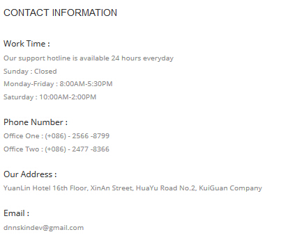
Codes are as follows:
<div class="home7_contact_info animation fadeInRight">
    <h4>CONTACT INFORMATION</h4>
    <div class="info_item">
        <div class="info_item_title">Work Time :</div>
        <div>Our support hotline is available 24 hours everyday</div>
        <div>Sunday : Closed</div>
        <div>Monday-Friday : 8:00AM-5:30PM</div>
        <div>Saturday : 10:00AM-2:00PM</div>
    </div>
    <div class="info_item">
        <div class="info_item_title">Phone Number :</div>
        <div>Office One :  (+086) - 2566 -8799</div>
        <div>Office Two :  (+086) - 2477 -8366</div>
    </div>
    <div class="info_item">
        <div class="info_item_title">Our Address :</div>
        <div>YuanLin Hotel 16th Floor, XinAn Street, HuaYu Road No.2, KuiGuan Company</div>
    </div>
    <div class="info_item">
        <div class="info_item_title">Email :</div>
        <div>dnnskindev@gmail.com</div>
    </div>
</div>
Option:
- You can modify
animationto change the animation on the slide. CSS3Animations.
Map area
Below is the screen shot:
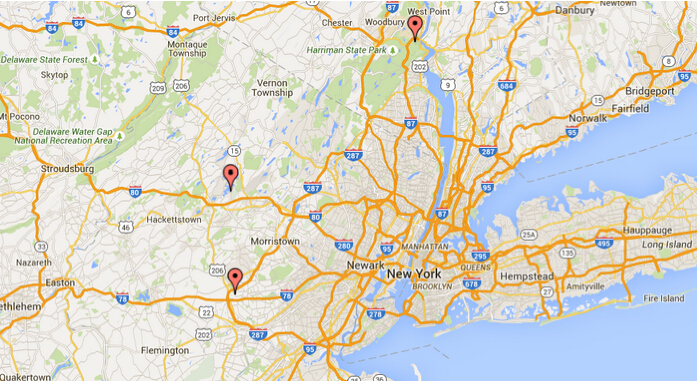
Codes are as follows:
<div id="gmap2" class="animation fadeInUp"></div>
Option:
- You can change
gmapaddress incustom.js - You can modify
animationto change the animation on the slide. CSS3Animations.
About Dnngo area
Below is the screen shot:
Codes are as follows:
<div class="animation fadeInUp">
    <p>Content Text...</p>
    <a href="#">+ More Information</a> </div>
Option:
- You can modify
animationto change the animation on the slide. CSS3Animations. Containeris usingContainer-18
Categories area
Below is the screen shot:
Codes are as follows:
<div class="home7_categories_list animation fadeInUp">
    <ul>
        <li><a href="#"><span class="glyphicons glyph-list"></span>Dnn Templates</a></li>
        <li><a href="#"><span class="glyphicons glyph-list"></span>Mobilesite Development</a></li>
        <li><a href="#"><span class="glyphicons glyph-list"></span>Responsive Skin</a></li>
        <li><a href="#"><span class="glyphicons glyph-list"></span>Dnn XBlog Modules</a></li>
    </ul>
</div>
Option:
- You can modify
animationto change the animation on the slide. CSS3Animations. Containeris usingContainer-18- You can modify
glyphiconsto change icons. font icon list.
Recent News area
Below is the screen shot:
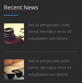
Codes are as follows:
<div class="animation fadeInUp">
    <div class="home7_foot_news clearfix"> <img alt="" src="/portals/31/home7_foot_img1.jpg" />
        <div class="news_text">
            <div>Content Text...</div>
        </div>
    </div>
    <div class="home7_foot_news clearfix"> <img alt="" src="/portals/31/home7_foot_img2.jpg" />
        <div class="news_text">
            <div>Content Text...</div>
        </div>
    </div>
</div>
Option:
- You can modify
animationto change the animation on the slide. CSS3Animations. Containeris usingContainer-18
Quick Links area
Below is the screen shot:
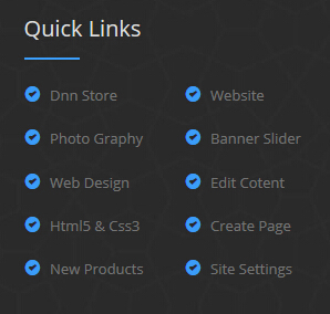
Codes are as follows:
<div class="home7_links_list animation fadeInUp">
    <div class="row">
        <div class="col-xs-6">
            <ul>
                <li><a href="#"><span class="glyphicons glyph-circle-ok"></span>Dnn Store</a></li>
                <li><a href="#"><span class="glyphicons glyph-circle-ok"></span>Photo Graphy</a></li>
                <li><a href="#"><span class="glyphicons glyph-circle-ok"></span>Web Design</a></li>
                <li><a href="#"><span class="glyphicons glyph-circle-ok"></span>Html5 & Css3</a></li>
                <li><a href="#"><span class="glyphicons glyph-circle-ok"></span>New Products</a></li>
            </ul>
        </div>
        <div class="col-xs-6">
            <ul>
                <li><a href="#"><span class="glyphicons glyph-circle-ok"></span>Website</a></li>
                <li><a href="#"><span class="glyphicons glyph-circle-ok"></span>Banner Slider</a></li>
                <li><a href="#"><span class="glyphicons glyph-circle-ok"></span>Edit Cotent</a></li>
                <li><a href="#"><span class="glyphicons glyph-circle-ok"></span>Create Page</a></li>
                <li><a href="#"><span class="glyphicons glyph-circle-ok"></span>Site Settings</a></li>
            </ul>
        </div>
    </div>
</div>
Option:
col-xs-6is the width of each column, you can change the width you need through value1~12.- You can modify
animationto change the animation on the slide. CSS3Animations. Containeris usingContainer-18- You can modify
glyphiconsto change icons. font icon list.
Coming Soon
You can click the link to check Coming Soon demo. Coming Soon
Below is the screen shot:
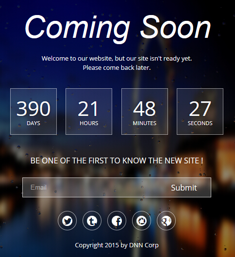
You can create the coming soon page easily following these steps:
- Create a page named coming soon page.
- Import the ComingSoon.Page.template for this page.
- You can set color, end time, and background image for Coming Soon page through xPlugin, as below:
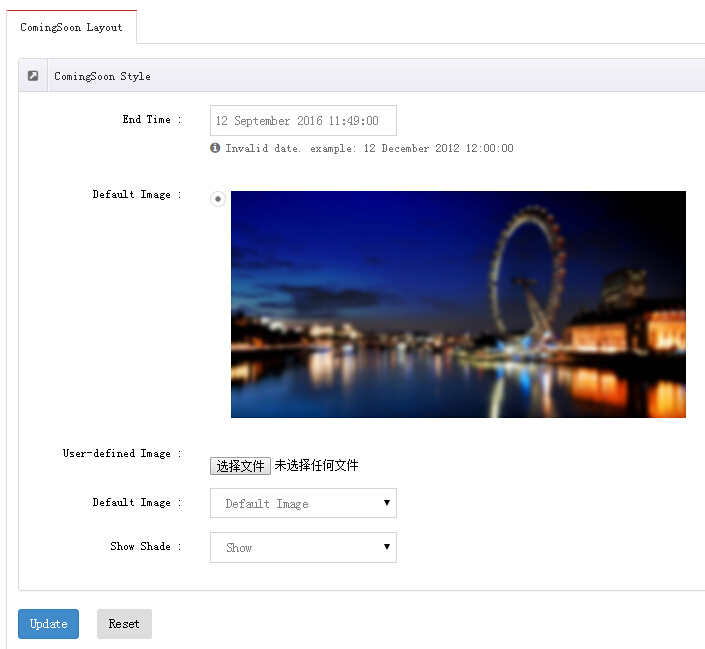
Boxed Layout
You can set Boxed mode in DNNGo.xPlugin > Skins > Options > Content Layout > Content Layout
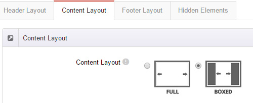
DNNGo_LayerGalleryPro Module
You can see this module in the banner section on the home page, we will guide you step by step to set up the module as the same as our demo site:
- Go to Host –> Extensions –> Install Extension wizard to install the module pack DNNGo_LayerGalleryPro.0x.0x_PA.zip.
- Add DNNGo_LayerGalleryPro module to the BannerPane.
- Click Manager button.
- Click the navigation of the left Import&Export
- Import ContentListEntity.xml file under DNNGo_LayerGalleryPro Module.
- You will see the imported data on Manage List page and you can change the text/image in the banner by clicking Edit button.
- Click this link so you can check the module instruction details.
DNNGo_GalleryPro Module
This module contains 15 responsive sldiers in total.
- Go to Host –> Extensions –> Install Extension wizard to install the module pack DNNGo_DNNGalleryPro_xx.xx.xx_PA.zip.
- Add DNNGo_DNNGalleryPro module to the page.
- Click Effect List tab.
- Choose an effect you like.
- You can click this link to check the module demo.
- Click this link so you can check the module instruction details.
DNNGo_xBlog Module
We use this module on the blog page, click this link so you can check the module instruction details.
DNNGo_PhotoAlbums Module
We use this module on the Portfolios page, click this link so you can check the module instruction details.
DNNGo_PowerForms Module
You can create the form through this module, click this link so you can check the module instruction details.
License interface
- Please login or register your account at http://www.dnngo.net
- Send an email to dnnskindev@gmail.com with your invoice ID, machine Key for every module( different module has different machine key), and your DNNGO username. We will generate an activation code for you. Please note: If your site is a demo site, your license will still be valid when you transfer your site to a live site.
- Manage my licenses
Contact Us
If you have any questions or suggestions about modules/skins or modules/skins installation process, please feel free to contact us.
- Website: www.dnngo.net
- Email: dnnskindev@gmail.com
- Skype: dnngo-linda