20068-UnlimitedColorsPack-050 v4.3.0
Documentation
- Created: 04/28/2011
- Latest update: 06/04/2019
- By: DNNGo
- Email: dnnskindev@gmail.com
Thank you for purchasing my theme. If you have any questions that are beyond the scope of this help file, please feel free to email via my user page contact form here. Thanks so much!
General Information
DotNetNuke Information
To install this skin you must have a working version of Dotnetnuke already installed. If you need help to install Dotnetnuke, follow the instructions in Documentation Center.
What Is Included With Your Package
When you purchase our theme, you will receive one large .zip file that contains everything inside. Unzip that file to get all the content inside. Below is a full list of everything that is included along with a brief description of each item. See the corresponding sections for info on installing the theme.
- Inside the Content folder are: DNN Skins folder, DNNGo_DNNGallery Module folder, DNNGo_LayerGalleryPro folder, DNNGo_PhotoAlbums Module folder, DNNGo_PowerForms Module folder, DNNGo_xPlugin Module folder, DNNGo_xBlog Module folder, PSD folder, Page template.
- DNN Skins folder - The skin in this folder can be used in DNN 8.x, DNN 9.x only.
- DNNGo_DNNGalleryPro Module folder - This module contains 15 responsive sldiers in total.
- DNNGo_LayerGalleryPro folder - You can see this module in the banner section on home page.
- DNNGo_PhotoAlbums folder - You can see this module in Portfolios page.
- DNNGo_PowerForms folder - You can create forms through this module.
- DNNGo_xBlog Module folder - You can see this module on Blog page.
- Page Templates folder - Exported page templates will allow you to reproduce our live demo pages.
Notice: If you bought the theme from DNN Store (http://store.dnnsoftware.com), then none of module files are included in the download package. It only include DNN Skins, DNNGo_xPlugin, Page Templates and PSD files. If you need to purchase modules, please contact us via email (dnnskindev@gmail.com).
What Are The Requirements To Use skins and modules
To use skins and modules, you must be running DNN 8.x or higher. We have tested it with DNN 8.x, DNN 9.x.
Skin and Required Modules Installation
For DNN 8
-
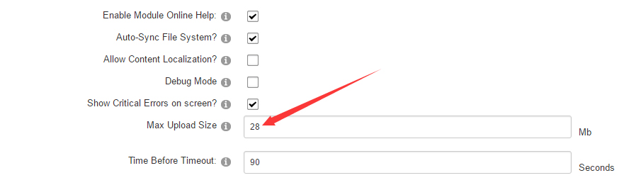
Go to Host-Settings –> Host-Settings, and select the tab Other Settings, changing Max Upload Size to 28 or higher.
-
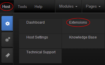
Go to Host –> Extensions –> Install Extension wizard to install the module pack DNNGo_xPlugin_0x.0x.0x_PA.zip
-
Go to Host –> Extensions –> Install Extension wizard to install the skin pack 20068-UnlimitedColorsPack-050-DNNSkins.zip
-
You can install other modules as per your own needs.
-
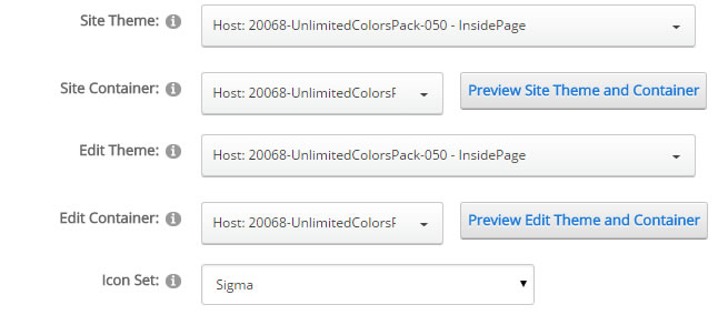
After the installation has been completed, navigate to Admin –> Site Settings –> Basic Settings (tab) –> Appearance (section) and specify portal and edit skins and containers like shown in the screenshot below. It should be done, in order to make your DNN admin UI look correct and readable.
-
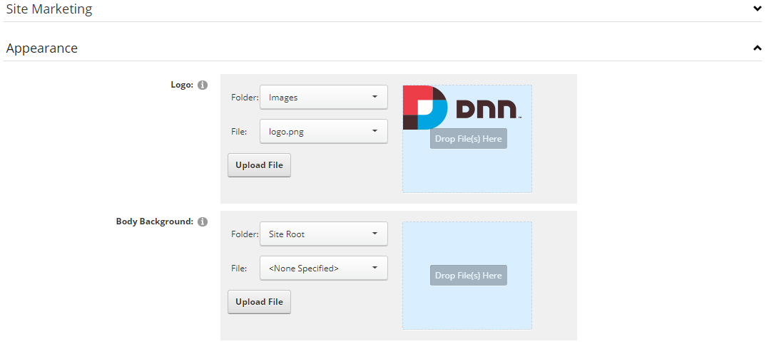
Now you can upload the LOGO image in Admin –> Site Settings –> Basic Settings (tab) –> Appearance (section) page.
For DNN 9
-
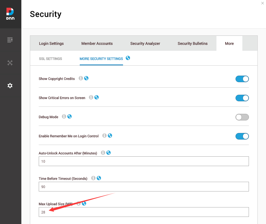
Go to Settings –> Security –> More, and select the tab MORE SECURITY SETTINGS, changing Max Upload Size to 28 or higher.
-
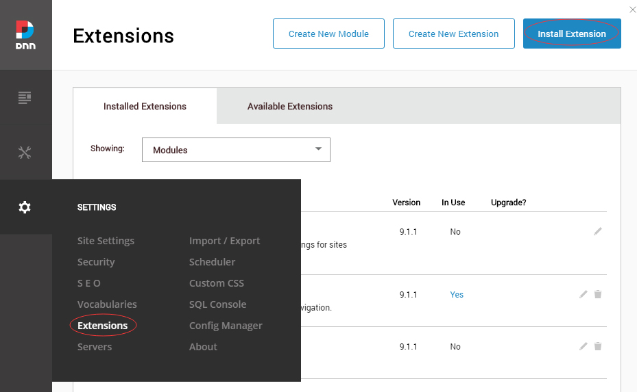
Go to Host –> Extensions –> Install Extension wizard to install the module pack DNNGo_xPlugin_0x.0x.0x_PA.zip
-
Go to Host –> Extensions –> Install Extension wizard to install the skin pack 20068-UnlimitedColorsPack-050-DNNSkins.zip
-
You can install other modules as per your own needs.
-
Manage
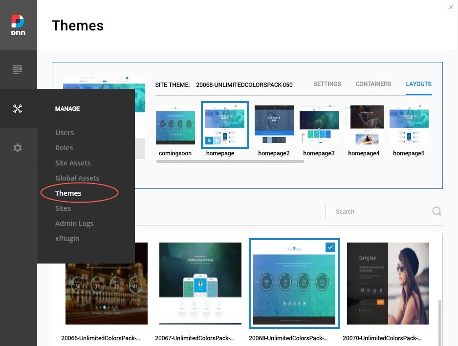
After the installation has been completed, navigate to Manage –> Themes. Select and apply 20068-UnlimitedColorsPack-050
-
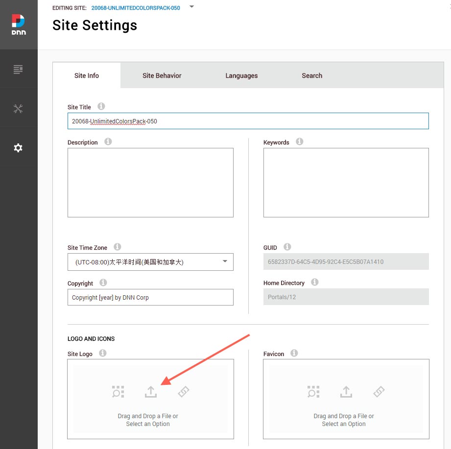
You can upload the LOGO image in Settings –> Site Settings page.
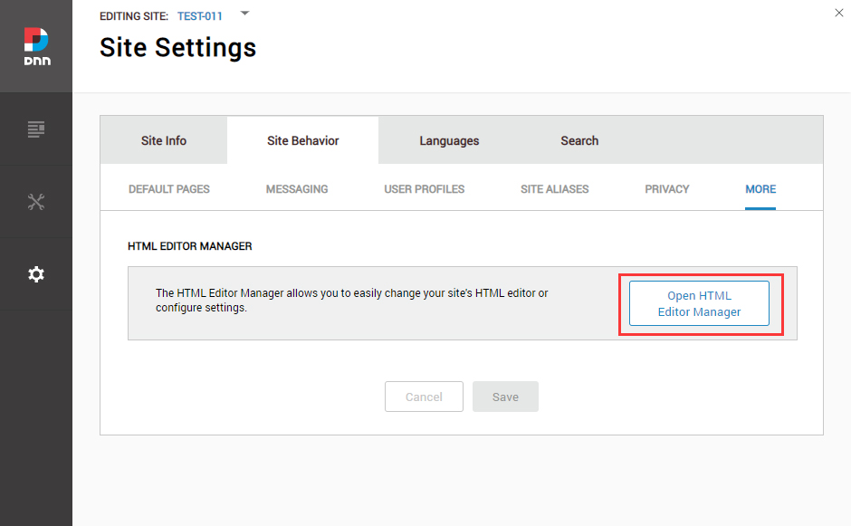
Change the Settings of HTML Editor
By default, HTML editor will remove the div tags whose content is blank. For example: if we add the code <div class=”pt-20″></div> in HTML editor and click save, you will find the code is missing when you edit it afterwards. So we need to change the settings to prevent this from happening.
Log in to your site as super administrator.
Go to SETTINGS > Site Settings > Site Behavior > MORE, click the Open HTML Editor Manager.
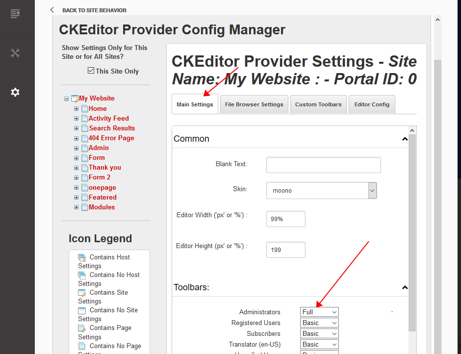
Click the Main Settings tab. Set the value of Administrators to be Full.
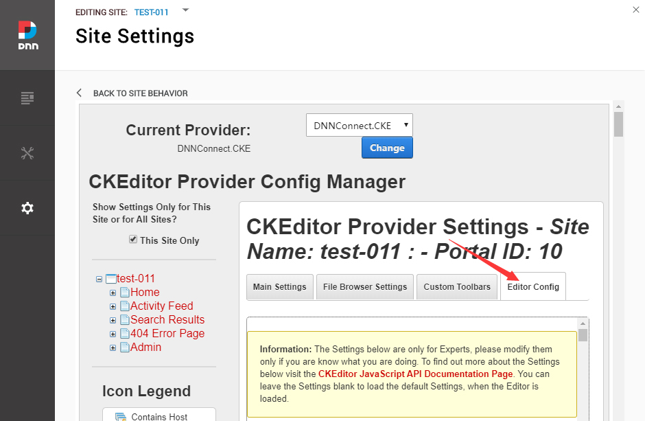
Click the Editor Config tab.
Set the value of AllowedContent to be true.
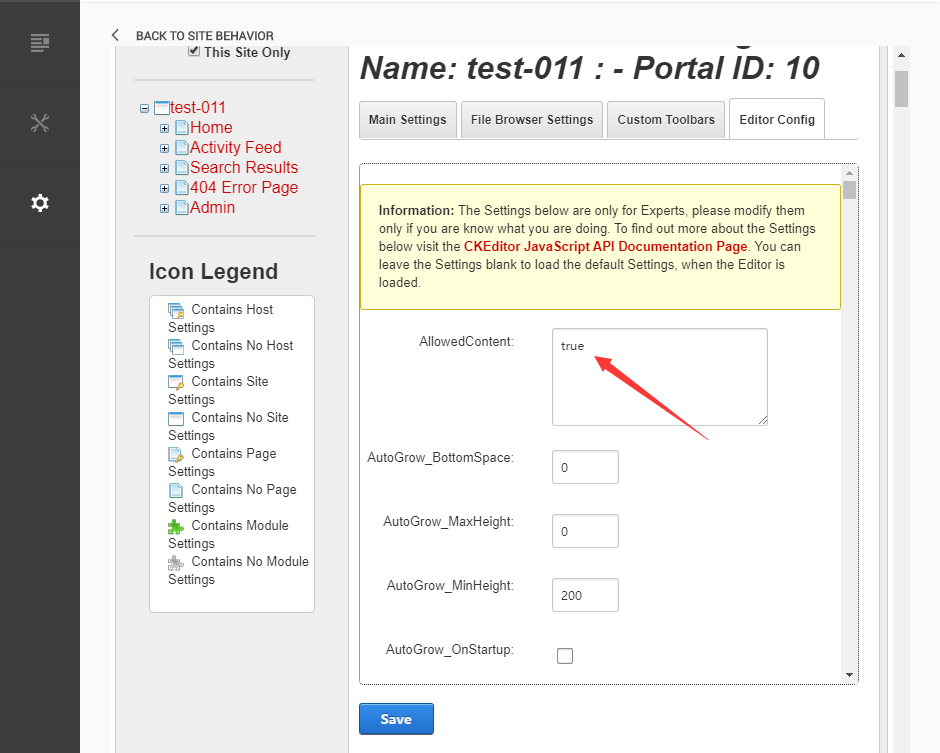
Set the value of FillEmptyBlocks to be false.
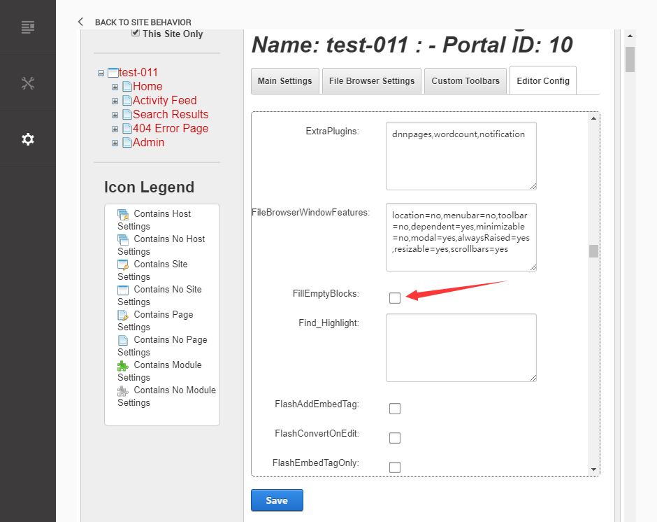
Set the value of ignoreEmptyParagraph to be false.
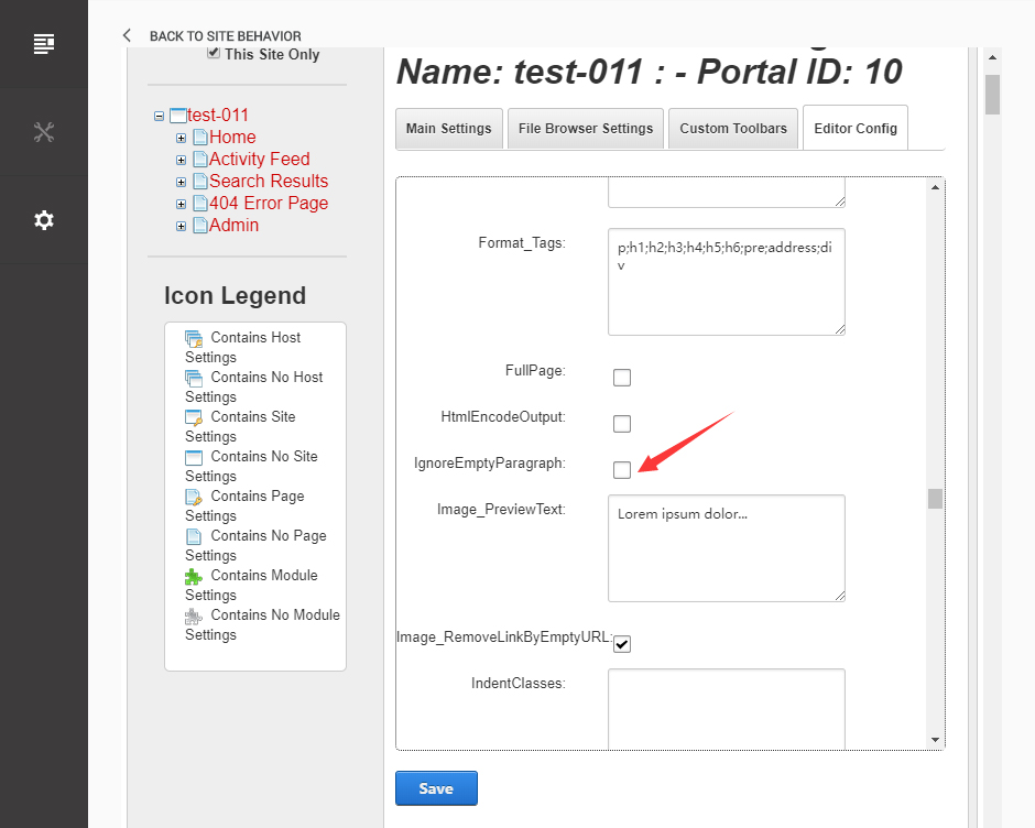
Click the Save button.
How to import page template?
Exported page templates will allow you to reproduce our live demo pages. We'll reproduce the home page as an example.
For DNN 8
-
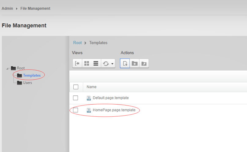
You can find these files in Page Templates Directory.
-
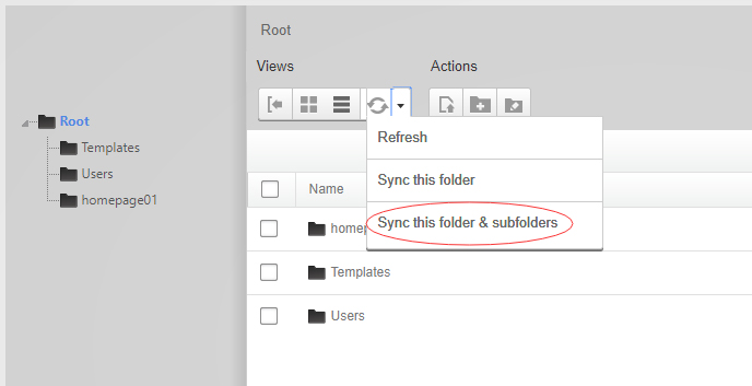
Upload Home.page.template file into your portal root (e.g. Portals/0/Templates/) in the previous chapter and synchronize your folders, you are able to start using page templates to clone live demo pages.
-
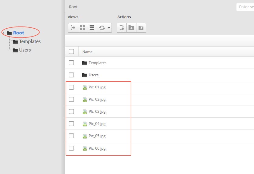
Because page templates can not import image files, you need to upload all the photo files of the "images" folder into your portal root (e.g. Portals/0/).
-
Synchronize the file in Admin > File-Management
-
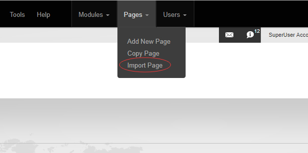
Navigate to the Home page and click Pages -> Import.
-
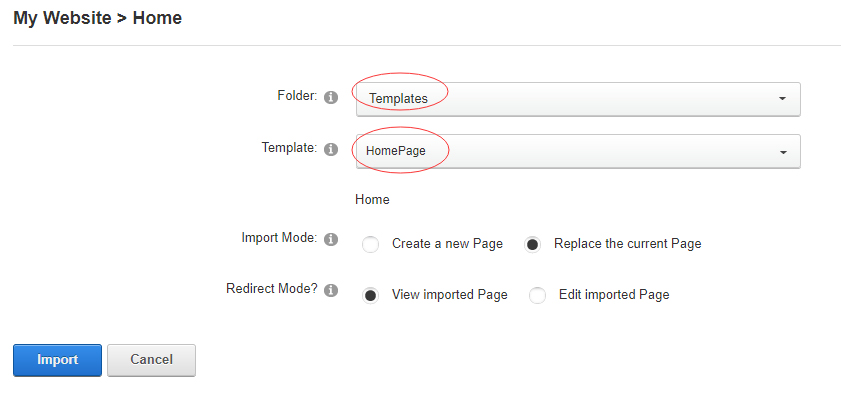
Find a proper page exported content file navigating to Templates folder and choosing for example Home page.
-
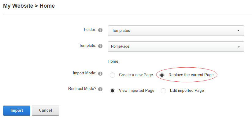
Choose "Replace the current Page" and the redirect mode you need. Please note, if you select "Replace the current Page", content of current page will be reset.
-
Click Import button if everything is correct.
-
Specify page settings according to your needs (necessarily apply HomePage skin to the home page) and click "Update Page". The home page is ready.
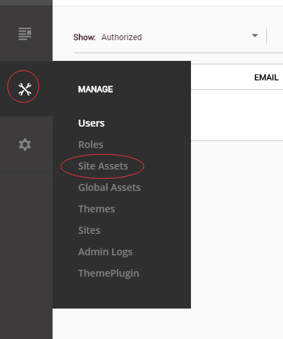
For DNN 9
-
Go to Manage > Site Assets
-
Uploading Home.page.template file to Templates folder
-
Because page templates can not import image files, you need to upload all the photo files of the "images" folder into your portal root (e.g. Portals/0/).
-
Go to Content > Pages > Add Page
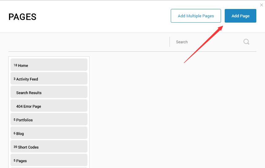
-
Choose your template from Template drop-down.
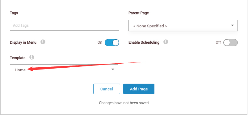
- Click Add Page
Note : Page templates can only be imported when you are creating a new page.
Skin features and how to use them.
Page Template
The product contains page templates for all pages in the live demo, you can copy our demo site by importing the page templates.
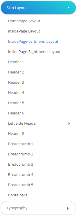
Eight kinds of header layout
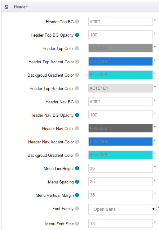
You can click the xPlugin button to go to settings page, and then choose different header styles in Header Layout section.
You can click these links to check different header styles. header 1, header 2, header 3, header 4, header 5, header 6, header 7, header 8
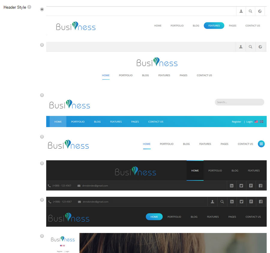
Each header includes very rich setting options, you can modify the color of whatever you would like to . For example: text color, font size and background color etc.
Header 7 is a left menu. It includes two display modes, which are Fixed Position, OnClick Open.
Insidepage-leftmenu layout
Insidepage-leftmenu layout page is using InsidePage-leftmenu skin. Menus on the left side are displaying the second level menus.
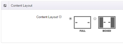
Full Layout and Boxed Layout
This skin contains Full Layout and Boxed Layout, you can set through Content Layout section.
With Boxed Layout applied, you can still set page background, it will display around the content. You can click link to check demo url of boxed layout.
The background can be set as static or rotating image or any solid color for you choose to apply, also you can set different background images for different pages.
How to set background image for DNN page.
- You need to choose Boxed Layout.
- Choose Page Background in the Option for Show bg, save settings.
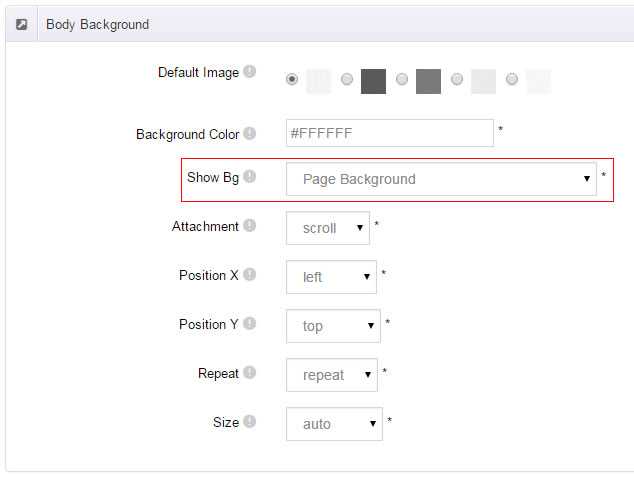
- Click "pages" nav in the xPlugin.
- Click Edit Background icon.
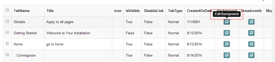
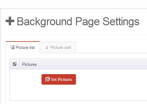
- Upload image, the background image will show as slider if you choose two or more images.
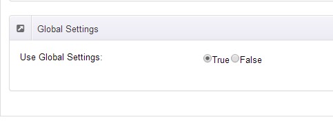
- "Globals" allow you to set background image for all pages.
- Also you can set background image for each page.
- You can set not to use images in "Globals".
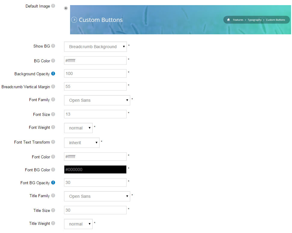
How to set breadcrumb image for DNN page.
- Choose Breadcrumb Background in the Option for Show bg, save settings.
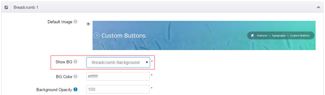
- Click "pages" nav in the xPlugin.
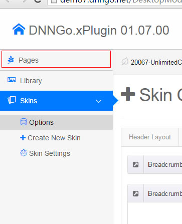
- Click Edit Breadcrumb icon.
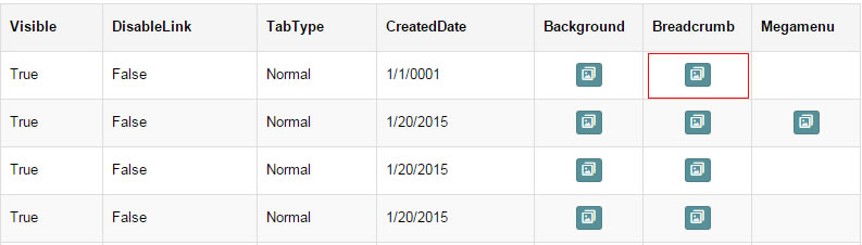
- Upload image, the background image will show as slider if you choose two or more images.
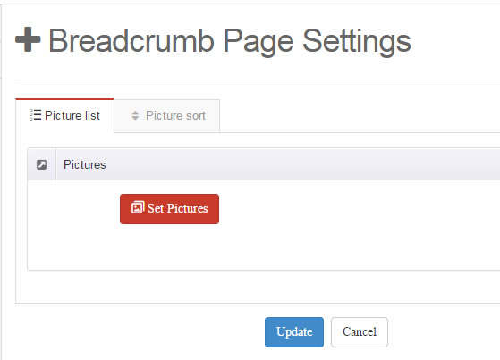
- "Globals" allow you to set background image for all pages.
- Also you can set background image for each page.
- You can set not to use images in "Globals".
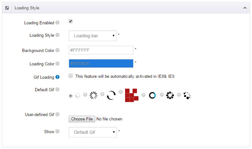
Loading Style
You can set the page loading animation.
You can select to have this feature turned on or off.
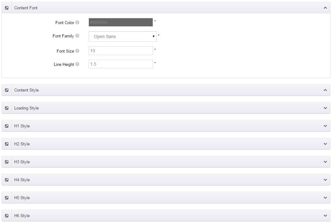
Content Style
You can set the font color and size, link color, the color of H1-H6 etc of the content area.
Five kinds of Breadcrumb layouts
You can choose different Breadcrumb styles through Breadcrumb Layout.
You can click these links to check different breadcrumb styles. breadcrumb 1, breadcrumb 2, breadcrumb 3, breadcrumb 4, breadcrumb 5
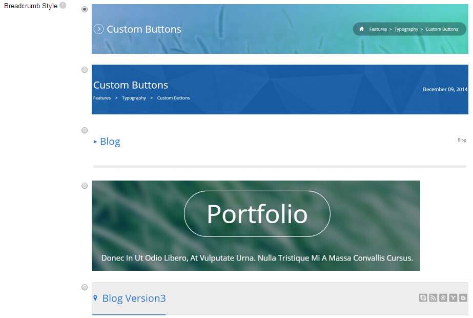
You can change the text color, background color and background image etc for each Breadcrumb layout.
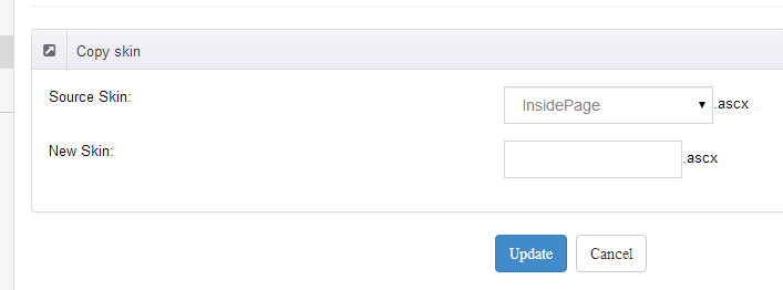
Create a Skin
You can create a new skin through xPlugin. Please note the new skin name shouldn't be the same as the current skin.
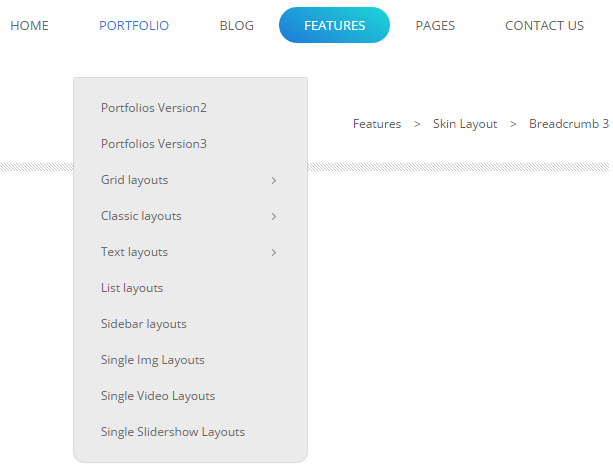
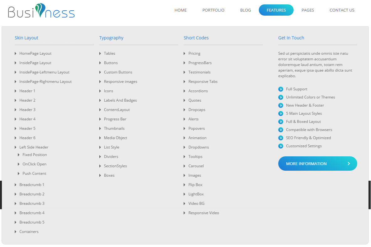
Standard Menu and MegaMenu
The skin sub menus contain two types-Standard Menu and MegaMenu.
Standard Menu is the default menu type, the sub menus will be set to display in one column only, as below screenshot:
MegaMenu will set sub menus to display in multiple columns, also you can display HTML module or third party module in sub menus, as shown below:
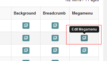
You can set the MegaMenu as per steps below:
- Click "pages" nav in the xPlugin.
- Click Edit MegaMenu button. Please note MegaMenu can be set for first level menus only.
- Set the menu type to MegaMenu.
- Mega Menu has 5 sections: Menu Top, Menu Right, Menu Bottom, Menu Left, Menu Center.
- Click Add button so you will be able to add HTML module or any third module to Menu Top, Menu Right, Menu Bottom, Menu Left.
- Module Type-choose to display HTML module or third module.
- Menu Center-it will display secondary menus here.
- Mega Columns-set number of columns the secondary menu will display.
- You can set width for Menu Right, Menu Left, Menu Center, please note their previous total width shouldn't be more than 100.
Set menu typography icon
You can set typography icon in Icon option under Pages setting, each page has separate icon settings.
You can choose the icon you need through dropdown options, you can also find the icon you need through text filter.
Set Up Google Map
You can create Google Map easily following these steps:
- Add this code to HTML module: <div id="gmap"></div>
- To change google map settings, open <skin root>/scripts/custom.js file for editing.
- Find this code:
//google map jQuery(document).ready(function($){ $("#gmap").gMap({ markers: [ { latitude: 47.651968,longitude: 9.478485,html: "_latlng" }, { address: "'Bear city, ny ",html: "The place I live" }, { address: "'Bear city, ny ", html: "_address" } ], address: "'Bear city, ny ", zoom: 10 , scrollwheel: false }); $("#gmap2").gMap({ markers: [ { latitude: 47.651968,longitude: 9.478485,html: "_latlng" }, { address: "'Bear city, ny ",html: "The place I live" }, { address: "'Bear city, ny ", html: "_address" } ], address: "'Bear city, ny ", zoom: 10 , scrollwheel: false }); $("#gmap3").gMap({ markers: [ { latitude: 47.651968,longitude: 9.478485,html: "_latlng" }, { address: "'Bear city, ny ",html: "The place I live" }, { address: "'Bear city, ny ", html: "_address" } ], address: "'Bear city, ny ", zoom: 10 , scrollwheel: false }); }); - Change "Bear city, ny" in address attribute to the desired one. Change address for the marker too.
- Markers attribute contains a list of points marked on the map. Every entry may include the following properties:
address: Address where the marker will be drawn
html: Content that will be shown within the info window for this marker. (Default: "")
popup: If true the info window for this marker will be shown when the map finished loading (Default: false)
CSS Codes
Skin is using bootstrap framework. You will get to know more through this url. Link
Width of content area
dnn_layout is the page content framework:
| Device width | Width of content area |
| Large devices Desktops (≥1200px) | 1170px |
| Medium devices Desktops (≥992px) | 970px |
| Small devices Tablets (≥768px) | 750px |
| Extra small devices Phones (<768px) | auto |
content_mid is the spacing between both sides of the page :
| Device width | Spacing |
| Large devices Desktops (≥1200px) | 20px |
| Medium devices Desktops (≥992px) | 20px |
| Small devices Tablets (≥768px) | 15px |
| Extra small devices Phones (<768px) | 15px |
<div class="dnn_layout">
  <div class="content_mid clearfix"> content ... </div>
</div>
Bootstrap 12 grid layout
<!-- Tablet and desktop devices are 50% wide, mobile device is 100% wide -->
<div class="row">
  <div class="col-sm-6">.col-sm-6</div>
  <div class="col-sm-6">.col-sm-6</div>
</div>

<!-- Stack the columns on mobile by making one full-width and the other half-width -->
<div class="row">
  <div class="col-xs-12 col-md-8">.col-xs-12 .col-md-8</div>
  <div class="col-xs-6 col-md-4">.col-xs-6 .col-md-4</div>
</div>

<!-- Columns start at 50% wide on mobile and bump up to 33.3% wide on desktop -->
<div class="row">
  <div class="col-xs-6 col-md-4">.col-xs-6 .col-md-4</div>
  <div class="col-xs-6 col-md-4">.col-xs-6 .col-md-4</div>
  <div class="col-xs-6 col-md-4">.col-xs-6 .col-md-4</div>
</div>

<!-- Columns are always 50% wide, on mobile and desktop -->
<div class="row">
  <div class="col-xs-6">.col-xs-6</div>
  <div class="col-xs-6">.col-xs-6</div>
</div>

<!-- Add the extra clearfix for only the required viewport -->
<div class="clearfix visible-xs-block"></div>
Display and hide elements
| Extra small devices Phones (<768px) | Small devices Tablets (≥768px) | Medium devices Desktops (≥992px) | Large devices Desktops (≥1200px) | |
|---|---|---|---|---|
.visible-xs |
Visible | Hidden | Hidden | Hidden |
.visible-sm |
Hidden | Visible | Hidden | Hidden |
.visible-md |
Hidden | Hidden | Visible | Hidden |
.visible-lg |
Hidden | Hidden | Hidden | Visible |
.hidden-xs |
Hidden | Visible | Visible | Visible |
.hidden-sm |
Visible | Hidden | Visible | Visible |
.hidden-md |
Visible | Visible | Hidden | Visible |
.hidden-lg |
Visible | Visible | Visible | Hidden |
Visible in mobile devices and hidden in other devices
<div class="visible-xs">content...</div>

Visible in other devices and hidden in mobile devices
<div class="hidden-xs">content...</div>
Vertical spacing
/*page Spacing*/
.mt-10 {margin-top: 10px;}
.mb-10 {margin-bottom: 10px;}
.pt-10 {padding-top: 10px;}
.pb-10 {padding-bottom: 10px;}
.mt-20 {margin-top: 20px;}
.mb-20 {margin-bottom: 20px;}
.pt-20 {padding-top: 20px;}
.pb-20 {padding-bottom: 20px;}
.mt-30 {margin-top: 30px;}
.mb-30 {margin-bottom: 30px;}
.pt-30 {padding-top: 30px;}
.pb-30 {padding-bottom: 30px;}
.mt-40 {margin-top: 40px;}
.mb-40 {margin-bottom: 40px;}
.pt-40 {padding-top: 40px;}
.pb-40 {padding-bottom: 40px;}
.mt-50 {margin-top: 50px;}
.mb-50 {margin-bottom: 50px;}
.pt-50 {padding-top: 50px;}
.pb-50 {padding-bottom: 50px;}
.pb60 {padding-bottom: 60px;}
.pt60 {padding-top: 60px;}
.mt60{margin-top:60px;}
.mb60{margin-bottom:60px;}
Short Codes
This skin contains a lot of short codes, it is very easy for you to use even you know nothing about js and css, all you need to do is just copy the short codes to HTML module.
Pricing
You can click the link to check Pricing demo. Demo Link
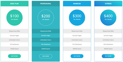
Style 1:
Below is the screen shot:
Codes are as follows:
<div class="price-table price-table1 row">
    <div class="col-md-3 col-sm-6 color_1">
        <div class="price_border">
            <div class="price_title">
            	<h2>Basic Plan</h2>
            </div>
            <div class="price_holder">
            	<div class="price_box"><span class="sup">$</span><span class="price">100</span><span class="unit">Per Month</span>
                </div>
                <ul>
                    <li>Responsive Web</li>
                    <li>Sample Pages</li>
                    <li>Unlimited Colors</li>
                    <li>50 Databases</li>
                    <li>100GB Space</li>
                </ul>
            	<a class="btn " href="#">BUY NOW!</a>
            </div>
        </div>
    </div>
    <div class="col-md-3 col-sm-6 color_2">
        <div class="price_border">
            <div class="price_title ">
                <h2>Professional</h2>
            </div>
            <div class="price_holder">
                <div class="price_box"><span class="sup">$</span><span class="price">200</span><span class="unit">Per Month</span>
                </div>
                <ul>
                    <li>Responsive Web</li>
                    <li>Sample Pages</li>
                    <li>Unlimited Colors</li>
                    <li>100 Databases</li>
                    <li>200GB Space</li>
                </ul>
                <a class="btn" href="#">BUY NOW!</a>
            </div>
        </div>
    </div>
    <div class="col-md-3 col-sm-6 color_3">
        <div class="price_border">
            <div class="price_title">
                <h2>Maxmium</h2>
            </div>
            <div class="price_holder">
                <div class="price_box"><span class="sup">$</span><span class="price">300</span><span class="unit">Per Month</span>
                </div>
                <ul>
                    <li>Responsive Web</li>
                    <li>Sample Pages</li>
                    <li>Unlimited Colors</li>
                    <li>150 Databases</li>
                    <li>300GB Space</li>
                </ul>
                <a class="btn" href="#">BUY NOW!</a>
            </div>
        </div>
    </div>
    <div class="col-md-3 col-sm-6 color_4">
        <div class="price_border">
            <div class="price_title">
                <h2>Extreme</h2>
            </div>
            <div class="price_holder">
                <div class="price_box"><span class="sup">$</span><span class="price">400</span><span class="unit">Per Month</span>
                </div>
                <ul>
                    <li>Responsive Web</li>
                    <li>Sample Pages</li>
                    <li>Unlimited Colors</li>
                    <li>200 Databases</li>
                    <li>400GB Space</li>
                </ul>
                <a class="btn" href="#">BUY NOW!</a>
            </div>
        </div>
    </div>
</div>
Option:
col-md-3 col-sm-6is the width for each column. You can change the width you need through value1~12color_1~color_4is the corresponding color of each column. You can change the color you need through value1~4
Style 2:
Below is the screen shot:
Codes are as follows:
<div class="pt60 col-width-5">
    <div class="price-table price-table2 row">
        <div class="col-sm-12">
            <div class="price_icon_box color1">
                <div class="price_icon">
                    <div class="price_title">
                        <h2>Plan Name</h2>
                    </div>
                </div>
                <div class="price_holder">
                    <div class="price_box">
                        <span class="fa fa-eur"></span>
                        <p>The Pricing</p>
                    </div>
                    <ul>
                        <li>Space</li>
                        <li>Product Size</li>
                        <li>Unlimited-colors</li>
                        <li>Responsive</li>
                        <li>Skin Pack</li>
                        <li>Order Here<span class="fa fa-arrow-circle-right"></span></li>
                    </ul>
                </div>
            </div>
            <div class="price_icon_box color2">
                <div class="price_icon">
                    <div class="price_title">
                        <h2>Basic Plan</h2>
                    </div>
                </div>
                <div class="price_holder">
                    <div class="price_box">
                        <span class="sup">$</span><span class="price">100</span>
                        <p>Per Month</p>
                    </div>
                    <ul>
                        <li>50GB</li>
                        <li>1600M</li>
                        <li><span class="fa fa-check"></span> </li>
                        <li><span class="fa fa-close"></span> </li>
                        <li><span class="fa fa-close"></span> </li>
                        <li><a href="#" class="btn ">Buy Now!</a></li>
                    </ul>
                </div>
            </div>
            <div class="price_icon_box color3">
                <div class="price_icon">
                    <div class="price_title">
                        <h2>Plan Name</h2>
                    </div>
                </div>
                <div class="price_holder">
                    <div class="price_box">
                        <span class="sup">$</span><span class="price">200</span>
                        <p>Per Month</p>
                    </div>
                    <ul>
                        <li>100GB</li>
                        <li>3200M</li>
                        <li><span class="fa fa-check"></span> </li>
                        <li><span class="fa fa-check"></span> </li>
                        <li><span class="fa fa-close"></span> </li>
                        <li><a href="#" class="btn ">Buy Now!</a></li>
                    </ul>
                </div>
            </div>
            <div class="price_icon_box color4">
                <div class="price_icon">
                    <div class="price_title">
                        <h2>Plan Name</h2>
                    </div>
                </div>
                <div class="price_holder">
                    <div class="price_box">
                        <span class="sup">$</span><span class="price">300</span>
                        <p>Per Month</p>
                    </div>
                    <ul>
                        <li>150GB</li>
                        <li>4800M</li>
                        <li><span class="fa fa-check"></span> </li>
                        <li><span class="fa fa-check"></span> </li>
                        <li><span class="fa fa-check"></span> </li>
                        <li><a href="#" class="btn ">Buy Now!</a></li>
                    </ul>
                </div>
            </div>
            <div class="price_icon_box color5">
                <div class="price_icon">
                    <div class="price_title">
                        <h2>Plan Name</h2>
                    </div>
                </div>
                <div class="price_holder">
                    <div class="price_box">
                        <span class="sup">$</span><span class="price">400</span>
                        <p>Per Month</p>
                    </div>
                    <ul>
                        <li>200GB</li>
                        <li>6400M</li>
                        <li><span class="fa fa-check"></span> </li>
                        <li><span class="fa fa-check"></span> </li>
                        <li><span class="fa fa-check"></span> </li>
                        <li><a href="#" class="btn ">Buy Now!</a></li>
                    </ul>
                </div>
            </div>
        </div>
    </div>
</div>
Option:
col-width-5is corresponding to the columns that display. You can change the columns you need through value1~5color1~color5is the corresponding color of each column. You can change the color you need through value1~5
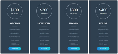
Style 3:
Below is the screen shot:
Codes are as follows:
<div class="price-table price-table3 row">
        <div class="col-md-3 col-sm-6">
            <div class="price_border">
                <div class="price_holder">
                    <div class="price_box"><span class="sup">$</span><span class="price">100</span><span class="unit">Per Month</span></div>
                    <div class="price_title">
                        <h2>Basic Plan</h2>
                        <div class="line"></div>
                    </div>
                    <ul>
                        <li>Responsive Web</li>
                        <li>Sample Pages</li>
                        <li>Unlimited Colors</li>
                        <li>50 Databases</li>
                        <li>100GB Space</li>
                    </ul>
                    <a class="btn " href="#">BUY NOW!</a>
                </div>
            </div>
        </div>
        <div class="col-md-3 col-sm-6">
            <div class="price_border">
                <div class="price_holder">
                    <div class="price_box"><span class="sup">$</span><span class="price">200</span><span class="unit">Per Month</span></div>
                    <div class="price_title">
                        <h2>Professional</h2>
                        <div class="line"></div>
                    </div>
                    <ul>
                        <li>Responsive Web</li>
                        <li>Sample Pages</li>
                        <li>Unlimited Colors</li>
                        <li>100 Databases</li>
                        <li>200GB Space</li>
                    </ul>
                    <a class="btn " href="#">BUY NOW!</a>
                </div>
            </div>
        </div>
        <div class="col-md-3 col-sm-6">
            <div class="price_border">
                <div class="price_holder">
                    <div class="price_box"><span class="sup">$</span><span class="price">300</span><span class="unit">Per Month</span></div>
                    <div class="price_title">
                        <h2>Maximum</h2>
                        <div class="line"></div>
                    </div>
                    <ul>
                        <li>Responsive Web</li>
                        <li>Sample Pages</li>
                        <li>Unlimited Colors</li>
                        <li>150 Databases</li>
                        <li>300GB Space</li>
                    </ul>
                    <a class="btn " href="#">BUY NOW!</a>
                </div>
            </div>
        </div>
        <div class="col-md-3 col-sm-6">
            <div class="price_border">
                <div class="price_holder">
                    <div class="price_box"><span class="sup">$</span><span class="price">400</span><span class="unit">Per Month</span></div>
                    <div class="price_title">
                        <h2>EXTREME</h2>
                        <div class="line"></div>
                    </div>
                    <ul>
                        <li>Responsive Web</li>
                        <li>Sample Pages</li>
                        <li>Unlimited Colors</li>
                        <li>200 Databases</li>
                        <li>400GB Space</li>
                    </ul>
                    <a class="btn " href="#">BUY NOW!</a>
                </div>
            </div>
        </div>
    </div>
Option:
col-md-3 col-sm-6is the width for each column. You can change the width you need through value1~12
ProgressBars Counters
You can click the link to check ProgressBars Counters demo. Demo Link
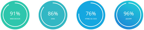
Style 1
Below is the screen shot:
Codes are as follows:
<div class="row ourteam_c">
    <div class="col-md-3 col-sm-6">
        <div class="color1">
            <div class="percentage2" data-percent="91">
                <div class="percentage_inner"><span>0</span>%
                    <h6>Web Design</h6>
                </div>
            </div>
        </div>
    </div>
    <div class="col-md-3 col-sm-6">
        <div class="color2">
            <div class="percentage2" data-percent="86">
                <div class="percentage_inner"><span>0</span>%
                    <h6>DNN</h6>
                </div>
            </div>
        </div>
    </div>
    <div class="col-md-3 col-sm-6">
        <div class="color3">
            <div class="percentage2" data-percent="76">
                <div class="percentage_inner"><span>0</span>%
                    <h6>Html5 & CsS3</h6>
                </div>
            </div>
        </div>
    </div>
    <div class="col-md-3 col-sm-6">
        <div class="color4">
            <div class="percentage2" data-percent="96">
                <div class="percentage_inner"><span>0</span>%
                    <h6>Jquery</h6>
                </div>
            </div>
        </div>
    </div>
</div>
Option:
col-md-3 col-sm-6is the width of each column, you can change the width you need through value1~12color1~color4is the corresponding color of each column. You can change the color you need through value1~4data-percentis for controlling the percentage that displays, you can display percentage through value0~100
Style 2
Below is the screen shot:
Codes are as follows:
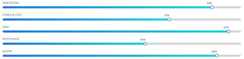
<div class="loaded_list">
    <p> Web Design </p>
    <div class="progress progress-striped active">
        <div data-width="88%" class="bar animation animationwidth"><span></span></div>
    </div>
    <p> Html5 & CSS3</p>
    <div class="progress progress-striped active">
        <div data-width="70%" class="bar animation animationwidth"><span></span></div>
    </div>
    <p>DNN</p>
    <div class="progress progress-striped active">
        <div data-width="95%" class="bar animation animationwidth"><span></span> </div>
    </div>
    <p>Photoshop</p>
    <div class="progress progress-striped active">
        <div data-width="60%" class="bar animation animationwidth"><span></span></div>
    </div>
    <p> Jquery </p>
    <div class="progress progress-striped active">
        <div data-width="90%" class="bar animation animationwidth"><span></span></div>
    </div>
</div>
Option:
data-widthis for controlling the percentage that displays, you can display percentage through value0~100
Style 3
Below is the screen shot:
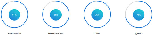
Codes are as follows:
<div class="col-md-3 col-sm-6">
        <div class="con_d">
            <div class="percentage1" data-percent="91">
                <div class="percentage_inner"><span>0</span>%</div>
            </div>
            <h6>Web Design</h6>
        </div>
    </div>
    <div class="col-md-3 col-sm-6">
        <div class="con_d">
            <div class="percentage1" data-percent="81">
                <div class="percentage_inner"><span>0</span>%</div>
            </div>
            <h6>Html5 & CsS3</h6>
        </div>
    </div>
    <div class="col-md-3 col-sm-6">
        <div class="con_d">
            <div class="percentage1" data-percent="96">
                <div class="percentage_inner"><span>0</span>%</div>
            </div>
            <h6>DNN</h6>
        </div>
    </div>
    <div class="col-md-3 col-sm-6">
        <div class="con_d">
            <div class="percentage1" data-percent="71">
                <div class="percentage_inner"><span>0</span>%</div>
            </div>
            <h6>Jquery</h6>
        </div>
    </div>
Option:
col-md-3 col-sm-6is the width of each column, you can change the width you need through value1~12data-percentis for controlling the percentage that displays, you can display percentage through value0~100
Style 4
Below is the screen shot:
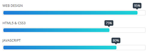
Codes are as follows:
<div class="row">
    <div class="col-sm-6">
        <div class="loaded_list2">
            <p> Web Design </p>
            <div class="progress progress-striped active">
                <div class="bar animation animationwidth" data-width="95%"><span></span></div>
            </div>
            <p> Html5 & CSS3</p>
            <div class="progress progress-striped active">
                <div class="bar animation animationwidth" data-width="75%"><span></span></div>
            </div>
            <p>JavaScript</p>
            <div class="progress progress-striped active">
                <div class="bar animation animationwidth" data-width="80%"><span></span> </div>
            </div>
        </div>
    </div>
    <div class="col-sm-6">
        <div class="loaded_list2">
            <p>Photoshop</p>
            <div class="progress progress-striped active">
                <div class="bar animation animationwidth" data-width="70%"><span></span></div>
            </div>
            <p>dnn</p>
            <div class="progress progress-striped active">
                <div class="bar animation animationwidth" data-width="85%"><span></span></div>
            </div>
            <p>ASp.net</p>
            <div class="progress progress-striped active">
                <div class="bar animation animationwidth" data-width="75%"><span></span></div>
            </div>
        </div>
    </div>
</div>
Option:
col-sm-6is the width of each column, you can change the width you need through value1~12data-widthis for controlling the percentage that displays, you can display percentage through value0~100
Style 5
Below is the screen shot:
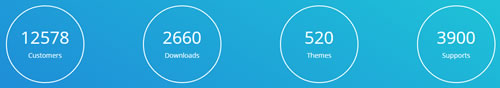
Codes are as follows:
<div class="con_k pt60 pb60">
    <div class="dnn_layout">
        <div class="content_mid clearfix">
            <div class="pane_layout">
                <div class="row number_Animation">
                    <div class="col-md-3 col-sm-6">
                        <div class="number_box">
                            <span class="animation number" data-number="12578">0</span>
                            <span class="number_name">Customers</span>
                        </div>
                    </div>
                    <div class="col-md-3 col-sm-6">
                        <div class="number_box">
                            <span class="animation number" data-number="2660">0</span>
                            <span class="number_name">Downloads</span>
                        </div>
                    </div>
                    <div class="col-md-3 col-sm-6">
                        <div class="number_box">
                            <span class="animation number" data-number="520">0</span>
                            <span class="number_name">Themes</span>
                        </div>
                    </div>
                    <div class="col-md-3 col-sm-6">
                        <div class="number_box">
                            <span class="animation number" data-number="3900">0</span>
                            <span class="number_name">Supports</span>
                        </div>
                    </div>
                </div>
            </div>
        </div>
    </div>
</div>
Option:
col-md-3 col-sm-6is the width of each column, you can change the width you need through value1~12- You can change the value you need to display through
data-number
Testimonials
You can click the link to check Testimonials demo. Demo Link
Option:
Testimonials include the parameters that listed below.
data-position |
Switch mode. fade:fade in fade out, roll-left:roll from side to side, roll-vertical:roll up and down |
data-display-navigation |
Navigation display and hidden. Default to true. true:Display, false:hidden |
data-display-arrows |
Left/right arrow display and hidden. Default to true. true:Display, false:hidden |
data-autoplay |
Whether to scroll automatically or not. 0 is for not scrolling automatically, numbers greater than 0 are for scrolling automatically, and these numbers are the time interval for scrolling. Default to 3000 |
data-autoheight |
Whether to be automatic height or not, default to true. true: automatic height, false: fixed height.< |
Example:
<ul class=" Testimonials_tab" data-position="roll-vertical" data-display-navigation="true" data-display-arrows="true" data-display-navigation="false" data-autoplay="3000" data-autoheight="true">
  <li>
    <h3 class="title a_t_c">What Others Say About Us ?</h3>
		......
Style 1:
Below is the screen shot:

Codes are as follows:
<ul class="Testimonials_tab Testimonials_4" data-position="roll-left" data-height-auto="false" data-autoplay="3000">
    <li>
        <blockquote>
            <p><span class="Pic"><img alt="" src="/portals/36/circle1.jpg" /></span> “   Content Text ...   ”</p>
            <small>David Smith <span>The Buyer of dnngo.net</span></small>
        </blockquote>
    </li>
    <li>
        <blockquote>
            <p><span class="Pic"><img alt="" src="/portals/36/circle2.jpg" /></span> “   Content Text ...   ”</p>
            <small>David Smith <span>The Buyer of dnngo.net</span></small>
        </blockquote>
    </li>
    <li>
        <blockquote>
            <p><span class="Pic"><img alt="" src="/portals/36/circle3.jpg" /></span> “   Content Text ...   ”</p>
            <small>David Smith <span>The Buyer of dnngo.net</span></small>
        </blockquote>
    </li>
    <li>
        <blockquote>
            <p><span class="Pic"><img alt="" src="/portals/36/circle4.jpg" /></span> “   Content Text ...   ”</p>
            <small>David Smith <span>The Buyer of dnngo.net</span></small>
        </blockquote>
    </li>
    <li>
        <blockquote>
            <p><span class="Pic"><img alt="" src="/portals/36/circle5.jpg" /></span> “   Content Text ...   ”</p>
            <small>David Smith <span>The Buyer of dnngo.net</span></small>
        </blockquote>
    </li>
</ul>
Style 2:
Below is the screen shot:
Codes are as follows:
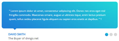
<ul class=" Testimonials_tab Testimonials_5" data-position="fade" data-display-arrows="false" data-autoplay="0">
    <li>
        <blockquote>
            <p>“   Content Text ...   ” 1</p>
            <small><span>David Smith</span>The Buyer of dnngo.net</small>
        </blockquote>
    </li>
    <li>
        <blockquote>
            <p>“   Content Text ...   ” 2</p>
            <small><span>David Smith</span>The Buyer of dnngo.net</small>
        </blockquote>
    </li>
    <li>
        <blockquote>
            <p>“   Content Text ...   ” 3</p>
            <small><span>David Smith</span>The Buyer of dnngo.net</small>
        </blockquote>
    </li>
</ul>
Style 3:
Below is the screen shot:
Codes are as follows:
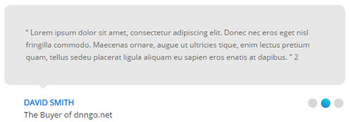
<ul class=" Testimonials_tab Testimonials_6" data-position="fade" data-display-arrows="false" data-autoplay="0">
    <li>
        <blockquote>
            <p>“   Content Text ...   ” 1</p>
            <small><span>David Smith</span>The Buyer of dnngo.net</small>
        </blockquote>
    </li>
    <li>
        <blockquote>
            <p>“   Content Text ...   ” 2</p>
            <small><span>David Smith</span>The Buyer of dnngo.net</small>
        </blockquote>
    </li>
    <li>
        <blockquote>
            <p>“   Content Text ...   ” 3</p>
            <small><span>David Smith</span>The Buyer of dnngo.net</small>
        </blockquote>
    </li>
</ul>
Style 4:
Below is the screen shot:
Codes are as follows:
<div class="con_c pt60 pb60">
<div class="dnn_layout">
<div class="content_mid clearfix">
<div class="pane_layout">
<div class="row">
<div class="col-sm-12">
<h3 class="title">What Others Say About Us</h3>
<div class="line"></div>
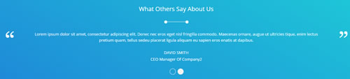
<ul class=" Testimonials_tab Testimonials_1" data-autoplay="3000" data-position="fade" data-display-arrows="false">
<li>
<blockquote>
<p> Content Text ... </p>
<small>David Smith<span>CEO Manager Of Company</span></small>
</blockquote>
</li>
<li>
<blockquote>
<p> Content Text ... </p>
<small>David Smith<span>CEO Manager Of Company2</span></small>
</blockquote>
</li>
</ul>
</div>
</div>
</div>
</div>
</div>
</div>
Style 5:
Below is the screen shot:
Codes are as follows:
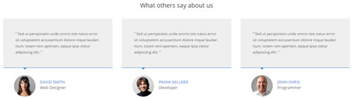
<div class="services_c">
    <h3>What others say about us</h3>
    <div class="row">
        <div class="col-sm-4">
            <div class=" Testimonials_tab Testimonials_3" data-autoplay="0" data-display-arrows="false" data-position="fade" data-display-navigation="false">
                <blockquote>
                    <p>“ Content Text ...  ”</p>
                    <small><img alt="" src="/portals/36/services_b1.jpg" /><span>David Smith</span>Web Designer</small>
                </blockquote>
            </div>
        </div>
        <div class="col-sm-4">
            <div class=" Testimonials_tab Testimonials_3" data-autoplay="0" data-display-arrows="false" data-position="fade" data-display-navigation="false">
                <blockquote>
                    <p>“ Content Text ...  ”</p>
                    <small><img alt="" src="/portals/36/services_b2.jpg" /><span>Frank Millker</span>Developer</small>
                </blockquote>
            </div>
        </div>
        <div class="col-sm-4">
            <div class=" Testimonials_tab Testimonials_3" data-autoplay="0" data-display-arrows="false" data-position="fade" data-display-navigation="false">
                <blockquote>
                    <p>“ Content Text ...  ”</p>
                    <small><img alt="" src="/portals/36/services_b3.jpg" /><span>John Chris</span>Programmer</small>
                </blockquote>
            </div>
        </div>
    </div>
</div>
Style 6:
Below is the screen shot:

Codes are as follows:
<div class="SectionStyles1">
    <div class="SectionStyles1_bg pt60 pb60">
        <div class="dnn_layout">
            <div class="content_mid clearfix">
                <div class="pane_layout">
                    <div class="row">
                        <div class="col-sm-12">
                            <div class="con_n">
                                <div class="title">
                                    <div class="box">
                                        <h1>Testimonials</h1>
                                        <div class="line"></div>
                                    </div>
                                </div>
                                <ul class="Testimonials_tab Testimonials_2" data-position="roll-left" data-height-auto="false" data-autoplay="3000">
                                    <li>
                                        <blockquote>
                                            <p><span class="Pic"><img alt="" src="/portals/36/circle4.jpg" /></span> “   Content Text ...   ”</p>
                                            <small>David Smith <span>The Buyer of dnngo.net</span></small>
                                        </blockquote>
                                    </li>
                                    <li>
                                        <blockquote>
                                            <p><span class="Pic"><img alt="" src="/portals/36/circle5.jpg" /></span> “   Content Text ...   ”</p>
                                            <small>David Smith <span>The Buyer of dnngo.net</span></small>
                                        </blockquote>
                                    </li>
                                </ul>
                            </div>
                        </div>
                    </div>
                </div>
            </div>
        </div>
    </div>
</div>
Responsive Tab
You can click the link to check Responsive Tab demo. Demo Link
You can add the "resp-tabs-list" of "li" to add tab item, and add the "resp-tabs-container" of "resp_container" to add content
Example:
<div class="horizontalTab_Top">
  <ul class="resp-tabs-list">

    <li> Tab1 </li>
    <li> Tab2 </li>
    ....

  </ul>
  <div class="resp-tabs-container">

    <div class="resp_container"> Tab1 Content </div>
    <div class="resp_container"> Tab2 Content </div>
    ....

  </div>
</div>
Style 1:
Below is the screen shot:
Codes are as follows:
<div class="horizontalTab_Top horizontalTab_Top_2">
<div class="con_f">
<div class="dnn_layout">
<div class="content_mid clearfix">
<div class="pane_layout">
<div class="row">
<div class="col-sm-12">
<div class="resp-tabs-container">
<div class="resp_container">
<div class="resp_margin">
<div class="boxes_style_1">
<div class="boxes">
<h3 class="Boxes_title">Develop business solutions that fitted to your needs</h3>
<p> Content Text ... </p>
<div class="but"><a class="buttoncolor2" href="#">More Information</a></div>
</div>
</div>
</div>
</div>
</div>
</div>
</div>
</div>
</div>
</div>
</div>
<div class="con_g">
<div class="dnn_layout">
<div class="content_mid clearfix">
<div class="pane_layout">
<div class="row">
<div class="col-sm-12">
<ul class="resp-tabs-list clearfix">
<li>
<div>
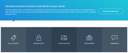
<span class="img"><img alt="" class="img-responsive" src="/portals/36/con_g1.png" /></span>
<p class="text">Full Support</p>
</div>
</li>
<li>
<div>
<span class="img"><img alt="" class="img-responsive" src="/portals/36/con_g2.png" /></span>
<p class="text">Info Security</p>
</div>
</li>
<li>
<div>
<span class="img"><img alt="" class="img-responsive" src="/portals/36/con_g3.png" /></span>
<p class="text">Photo Gallery</p>
</div>
</li>
<li>
<div>
<span class="img"><img alt="" class="img-responsive" src="/portals/36/con_g4.png" /></span>
<p class="text">Go Shopping</p>
</div>
</li>
<li>
<div>
<span class="img"><img alt="" class="img-responsive" src="/portals/36/con_g5.png" /></span>
<p class="text">Comments</p>
</div>
</li>
</ul>
</div>
</div>
</div>
</div>
</div>
</div>
</div>
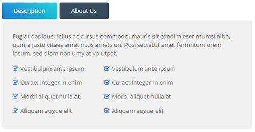
Style 2:
Below is the screen shot:
Codes are as follows:
<div class="horizontalTab_Top horizontalTab_Top_1">
    <ul class="resp-tabs-list clearfix">
        <li><span>Description</span></li>
        <li><span>About Us</span></li>
    </ul>
    <div class="resp-tabs-container">
        <div class="resp_container">
            <div class="resp_margin">
                <p> Content Text ... </p>
                <ul class="list_style">
                    <li><span class="fa  fa-check-square-o"></span>Vestibulum ante ipsum</li>
                    <li><span class="fa  fa-check-square-o"></span>Curae; Integer in enim</li>
                    <li><span class="fa  fa-check-square-o"></span>Morbi aliquet nulla at</li>
                    <li><span class="fa  fa-check-square-o"></span>Aliquam augue elit</li>
                </ul>
            </div>
        </div>
        <div class="resp_container">
            <div class="resp_margin">
                <p> Content Text ... </p>
            </div>
        </div>
    </div>
</div>
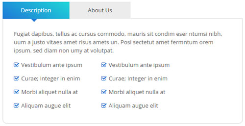
Style 3:
Below is the screen shot:
Codes are as follows:
<div class="horizontalTab_Top horizontalTab_Top_3">
    <ul class="resp-tabs-list">
        <li><span>Description</span></li>
        <li><span>About Us</span></li>
    </ul>
    <div class="resp-tabs-container">
        <div class="resp_container">
            <div class="resp_margin">
                <p> Content Text ... </p>
                <ul class="list_style">
                    <li><span class="fa fa-check-square-o"></span>Vestibulum ante ipsum</li>
                    <li><span class="fa fa-check-square-o"></span>Curae; Integer in enim</li>
                    <li><span class="fa fa-check-square-o"></span>Morbi aliquet nulla at</li>
                    <li><span class="fa fa-check-square-o"></span>Aliquam augue elit</li>
                </ul>
            </div>
        </div>
        <div class="resp_container">
            <div class="resp_margin">
                <p> Content Text ... </p>
            </div>
        </div>
    </div>
</div>
Style 4:
Below is the screen shot:
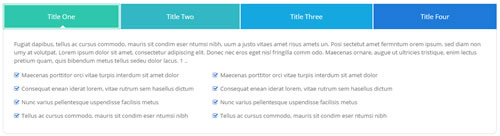
Codes are as follows:
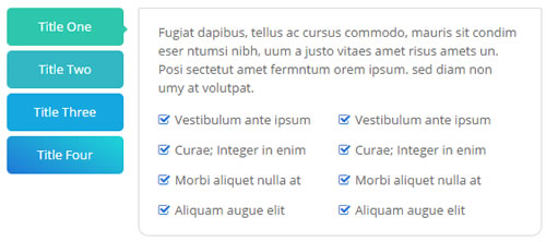
<div class="horizontalTab_Top horizontalTab_Top_4">
    <ul class="resp-tabs-list">
        <li>
        <div class="One"><span>Title One</span></div>
        </li>
        <li>
        <div class="Two"><span>Title Two</span></div>
        </li>
        <li>
        <div class="Three"><span>Title Three</span></div>
        </li>
        <li>
        <div class="Four"><span>Title Four</span></div>
        </li>
    </ul>
    <div class="resp-tabs-container">
        <div class="resp_container">
            <div class="resp_margin">
                <p> Content Text ... </p>
                <ul class="list_style">
                    <li><span class="fa fa-check-square-o"></span>Maecenas porttitor orci vitae turpis interdum sit amet dolor </li>
                    <li><span class="fa fa-check-square-o"></span>Consequat enean iderat lorem, vitae rutrum sem hasellus dictum</li>
                    <li><span class="fa fa-check-square-o"></span>Nunc varius pellentesque uspendisse facilisis metus</li>
                    <li><span class="fa fa-check-square-o"></span>Tellus ac cursus commodo, mauris sit condim eser ntumsi nibh</li>
                </ul>
            </div>
        </div>
    </div>
</div>
Style 5:
Below is the screen shot:
Codes are as follows:
<div class="verticalTab_Left verticalTab_Left_1">
    <ul class="resp-tabs-list">
        <li class="One"><span>Title One</span></li>
        <li class="Two"><span>Title Two</span></li>
        <li class="Three"><span>Title Three</span></li>
        <li class="Four"><span>Title Four</span></li>
    </ul>
    <div class="resp-tabs-container">
        <div class="resp_container">
            <div class="resp_margin">
                <p>Content Text ...</p>
                <ul class="list_style">
                    <li><span class="fa fa-check-square-o"></span>Vestibulum ante ipsum</li>
                    <li><span class="fa fa-check-square-o"></span>Curae; Integer in enim</li>
                    <li><span class="fa fa-check-square-o"></span>Morbi aliquet nulla at</li>
                    <li><span class="fa fa-check-square-o"></span>Aliquam augue elit</li>
                </ul>
            </div>
        </div>
        <div class="resp_container">
            <div class="resp_margin">
                <p>Content Text ...</p>
            </div>
        </div>
        <div class="resp_container">
            <div class="resp_margin">
                <p>Content Text ...</p>
            </div>
        </div>
        <div class="resp_container">
            <div class="resp_margin">
                <p>Content Text ...</p>
            </div>
        </div>
    </div>
</div>
Style 6:
Below is the screen shot:
Codes are as follows:
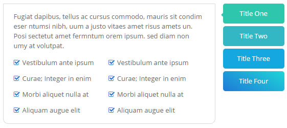
<div class="verticalTab_Right verticalTab_Right_1">
    <ul class="resp-tabs-list">
        <li class="One"><span>Title One</span></li>
        <li class="Two"><span>Title Two</span></li>
        <li class="Three"><span>Title Three</span></li>
        <li class="Four"><span>Title Four</span></li>
    </ul>
    <div class="resp-tabs-container">
        <div class="resp_container">
            <div class="resp_margin">
                <p>Content Text ...</p>
                <ul class="list_style">
                    <li><span class="fa fa-check-square-o"></span>Vestibulum ante ipsum</li>
                    <li><span class="fa fa-check-square-o"></span>Curae; Integer in enim</li>
                    <li><span class="fa fa-check-square-o"></span>Morbi aliquet nulla at</li>
                    <li><span class="fa fa-check-square-o"></span>Aliquam augue elit</li>
                </ul>
                <ul class="list_style">
                    <li><span class="fa fa-check-square-o"></span>Vestibulum ante ipsum</li>
                    <li><span class="fa fa-check-square-o"></span>Curae; Integer in enim</li>
                    <li><span class="fa fa-check-square-o"></span>Morbi aliquet nulla at</li>
                    <li><span class="fa fa-check-square-o"></span>Aliquam augue elit</li>
                </ul>
            </div>
        </div>
        <div class="resp_container">
            <div class="resp_margin">
                <p>Content Text ...</p>
            </div>
        </div>
        <div class="resp_container">
            <div class="resp_margin">
                <p>Content Text ...</p>
            </div>
        </div>
        <div class="resp_container">
            <div class="resp_margin">
                <p>Content Text ...</p>
            </div>
        </div>
    </div>
</div>
Accordions
You can click the link to check Accordions demo. Demo Link
Option:
- id="accordion" of each accordions effect needs using different names.
"data-parent"needs to have the same name asid- href="#collapse1" is the id that needs to expand content.
- id="collapse1" is the content that needs to expand.
<div class="panel-group" id="accordion">

  <div class="panel panel-default">
    <div class="panel-heading">
      <h4 class="panel-title"> <a data-toggle="collapse" data-parent="#accordion" href="#collapse1"> Title Text ... </a> </h4>
    </div>
    <div id="collapse1" class="panel-collapse collapse in">
      <div class="panel-body">Content Text ... </div>
    </div>
  </div>
  ....

</div>
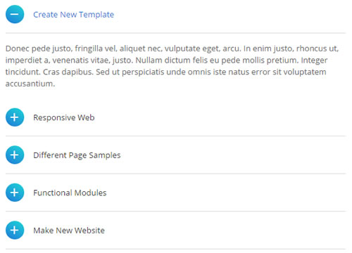
Style 1:
Below is the screen shot:
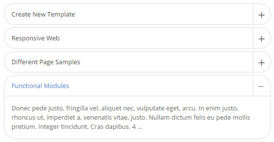
Codes are as follows:
<div id="accordion1" class="panel-group accordion_1">
    <div class="panel panel-default">
        <div class="panel-heading">
            <h4 class="panel-title"> <a href="#collapse1_1" data-parent="#accordion1" data-toggle="collapse"><span class="accordion_icon"></span>Create New Template</a> </h4>
        </div>
        <div class="panel-collapse collapse in" id="collapse1_1">
            <div class="panel-body">Content Text ...</div>
        </div>
    </div>
    <div class="panel panel-default">
        <div class="panel-heading">
            <h4 class="panel-title"> <a class="collapsed" href="#collapse1_2" data-parent="#accordion1" data-toggle="collapse"><span class="accordion_icon"></span>Responsive Web</a> </h4>
        </div>
        <div class="panel-collapse collapse" id="collapse1_2">
            <div class="panel-body">Content Text ...</div>
        </div>
    </div>
    <div class="panel panel-default">
        <div class="panel-heading">
            <h4 class="panel-title"> <a class="collapsed" href="#collapse1_3" data-parent="#accordion1" data-toggle="collapse"><span class="accordion_icon"></span>Different Page Samples</a> </h4>
        </div>
        <div class="panel-collapse collapse" id="collapse1_3">
            <div class="panel-body">Content Text ...</div>
        </div>
    </div>
    <div class="panel panel-default">
        <div class="panel-heading">
            <h4 class="panel-title"> <a class="collapsed" href="#collapse1_4" data-parent="#accordion1" data-toggle="collapse"><span class="accordion_icon"></span>Functional Modules</a> </h4>
        </div>
        <div class="panel-collapse collapse" id="collapse1_4">
            <div class="panel-body">Content Text ...</div>
        </div>
    </div>
</div>
Style 2:
Below is the screen shot:
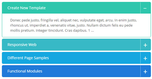
Codes are as follows:
<div class="panel-group accordion_3" id="accordion3">
    <div class="panel panel-default One">
        <div class="panel-heading">
            <h4 class="panel-title"> <a data-toggle="collapse" data-parent="#accordion3" href="#collapse3_1"><span class="accordion_icon"></span>Create New Template</a> </h4>
        </div>
        <div id="collapse3_1" class="panel-collapse collapse in">
            <div class="panel-body">Content Text ...</div>
        </div>
    </div>
    <div class="panel panel-default Two">
        <div class="panel-heading">
            <h4 class="panel-title"> <a data-toggle="collapse" data-parent="#accordion3" href="#collapse3_2" class="collapsed"><span class="accordion_icon"></span>Responsive Web</a> </h4>
        </div>
        <div id="collapse3_2" class="panel-collapse collapse">
            <div class="panel-body">Content Text ...</div>
        </div>
    </div>
    <div class="panel panel-default Three">
        <div class="panel-heading">
            <h4 class="panel-title"> <a data-toggle="collapse" data-parent="#accordion3" href="#collapse3_3" class="collapsed"><span class="accordion_icon"></span>Different Page Samples</a> </h4>
        </div>
        <div id="collapse3_3" class="panel-collapse collapse">
            <div class="panel-body">Content Text ...</div>
        </div>
    </div>
    <div class="panel panel-default Four">
        <div class="panel-heading">
            <h4 class="panel-title"> <a data-toggle="collapse" data-parent="#accordion3" href="#collapse3_4" class="collapsed"><span class="accordion_icon"></span>Functional Modules</a> </h4>
        </div>
        <div id="collapse3_4" class="panel-collapse collapse">
            <div class="panel-body">Content Text ...</div>
        </div>
    </div>
</div>
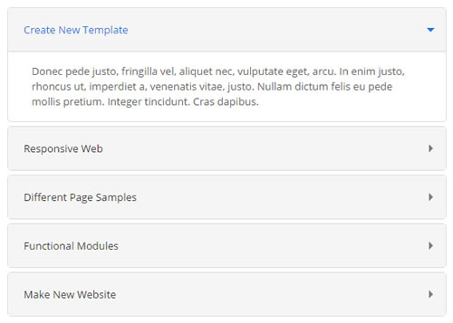
Style 3:
Below is the screen shot:
Codes are as follows:
<div class="panel-group accordion_2" id="accordion2">
    <div class="panel panel-default">
        <div class="panel-heading">
            <h4 class="panel-title"> <a data-toggle="collapse" data-parent="#accordion2" href="#collapse2_1"><span class="accordion_icon"></span>Create New Template</a> </h4>
        </div>
        <div id="collapse2_1" class="panel-collapse collapse in">
            <div class="panel-body">Content Text ...</div>
        </div>
    </div>
    <div class="panel panel-default">
        <div class="panel-heading">
            <h4 class="panel-title"> <a data-toggle="collapse" data-parent="#accordion2" href="#collapse2_2" class="collapsed"><span class="accordion_icon"></span>Responsive Web</a> </h4>
        </div>
        <div id="collapse2_2" class="panel-collapse collapse">
            <div class="panel-body">Content Text ...</div>
        </div>
    </div>
    <div class="panel panel-default">
        <div class="panel-heading">
            <h4 class="panel-title"> <a data-toggle="collapse" data-parent="#accordion2" href="#collapse2_3" class="collapsed"><span class="accordion_icon"></span>Different Page Samples</a> </h4>
        </div>
        <div id="collapse2_3" class="panel-collapse collapse">
            <div class="panel-body">Content Text ...</div>
        </div>
    </div>
    <div class="panel panel-default">
        <div class="panel-heading">
            <h4 class="panel-title"> <a data-toggle="collapse" data-parent="#accordion2" href="#collapse2_4" class="collapsed"><span class="accordion_icon"></span>Functional Modules</a> </h4>
        </div>
        <div id="collapse2_4" class="panel-collapse collapse">
            <div class="panel-body">Content Text ...</div>
        </div>
    </div>
    <div class="panel panel-default">
        <div class="panel-heading">
            <h4 class="panel-title"> <a data-toggle="collapse" data-parent="#accordion2" href="#collapse2_5" class="collapsed"><span class="accordion_icon"></span>Make New Website</a> </h4>
        </div>
        <div id="collapse2_5" class="panel-collapse collapse">
            <div class="panel-body">Content Text ...</div>
        </div>
    </div>
</div>
Style 4:
Below is the screen shot:
Codes are as follows:
<div class="panel-group accordion_4" id="accordion4">
    <div class="panel panel-default">
        <div class="panel-heading">
            <h4 class="panel-title"> <a data-toggle="collapse" data-parent="#accordion4" href="#collapse4_1"><span class="accordion_icon"></span>Create New Template</a> </h4>
        </div>
        <div id="collapse4_1" class="panel-collapse collapse in">
            <div class="panel-body">Content Text ...</div>
        </div>
    </div>
    <div class="panel panel-default">
        <div class="panel-heading">
            <h4 class="panel-title"> <a data-toggle="collapse" data-parent="#accordion4" href="#collapse4_2" class="collapsed"><span class="accordion_icon"></span>Responsive Web</a> </h4>
        </div>
        <div id="collapse4_2" class="panel-collapse collapse">
            <div class="panel-body">Content Text ...</div>
        </div>
    </div>
    <div class="panel panel-default">
        <div class="panel-heading">
            <h4 class="panel-title"> <a data-toggle="collapse" data-parent="#accordion4" href="#collapse4_3" class="collapsed"><span class="accordion_icon"></span>Different Page Samples</a> </h4>
        </div>
        <div id="collapse4_3" class="panel-collapse collapse">
            <div class="panel-body">Content Text ...</div>
        </div>
    </div>
    <div class="panel panel-default">
        <div class="panel-heading">
            <h4 class="panel-title"> <a data-toggle="collapse" data-parent="#accordion4" href="#collapse4_4" class="collapsed"><span class="accordion_icon"></span>Functional Modules</a> </h4>
        </div>
        <div id="collapse4_4" class="panel-collapse collapse">
            <div class="panel-body">Content Text ...</div>
        </div>
    </div>
    <div class="panel panel-default">
        <div class="panel-heading">
            <h4 class="panel-title"> <a data-toggle="collapse" data-parent="#accordion4" href="#collapse4_5" class="collapsed"><span class="accordion_icon"></span>Make New Website</a> </h4>
        </div>
        <div id="collapse4_5" class="panel-collapse collapse">
            <div class="panel-body">Content Text ...</div>
        </div>
    </div>
</div>
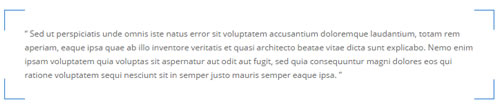
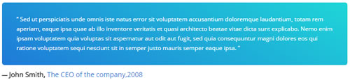
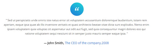
Quotes
You can click the link to check Quotes demo. Demo Link
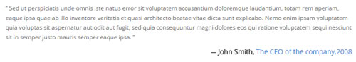
<div class="quotes_1">
    <blockquote>
        <p>Content text  ...</p>
        <small>Name<span>year</span></small>
    </blockquote>
</div>
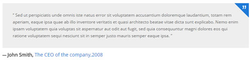
<div class="quotes_2">
    <blockquote>
        <p> <span>”</span>  Content text  ... </p>
        <small>Name<span>year</span></small>
    </blockquote>
</div>
<div class="quotes_3">
    <blockquote>
        <p> <span></span>  Content text  ... </p>
        <small>Name<span>year</span></small>
    </blockquote>
</div>
<div class="quotes_4">
    <blockquote>
        <p> Content text  ... </p>
        <small>Name<span>year</span></small>
    </blockquote>
</div>
<div class="quotes_5">
    <blockquote>
    	<span class="icon">“</span>
        <p> Content text  ...</p>
        <small>Name<span>year</span></small>
    </blockquote>
</div>
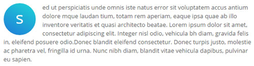
Dropcaps
You can click the link to check Dropcaps demo. Demo Link
<p>
    <span class="dropcaps_1">s</span> Content text  ...
</p>
<p>
    <span class="dropcaps_2">s</span> Content text  ...
</p>
<p>
    <span class="dropcaps_3">s</span> Content text  ...
</p>
<p>
    <span class="dropcaps_4">s</span> Content text  ...
</p>
<p>
    <span class="dropcaps_5">s</span> Content text  ...
</p>
<p>
    <span class="dropcaps_6">s</span> Content text  ...
</p>
Carousel
You can click the link to check Carousel demo. Demo Link
Style 1:
Below is the screen shot:
Codes are as follows:
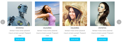
<div class="carousel carousel_2" data-pagination="false" data-items="4"  data-navigation="true" data-autoplay="true" >
  <div class="item">
    <div class="photo_box"> <a href="/Portals/37/carousel_01.jpg" class="iLightBox_image_gallery1" title="Image Gallery">
      <div class="pic_box"> <img alt="" src="/portals/37/carousel_01.jpg" />
        <div class="ico"> <span class="fa fa-picture-o"></span> </div>
        <div class="shade"></div>
      </div>
      </a> </div>
    <h3>CAROUSEL</h3>
    <p>Content Text ... </p>
    <a href="#" class="btn a_bg_c">READ MORE</a> </div>
  <div class="item">
    <div class="photo_box"> <a href="/Portals/37/carousel_02.jpg" class="iLightBox_image_gallery1" title="Image Gallery">
      <div class="pic_box"> <img alt="" src="/portals/37/carousel_02.jpg" />
        <div class="ico"> <span class="fa fa-picture-o"></span> </div>
        <div class="shade"></div>
      </div>
      </a> </div>
    <h3>PHOTOGRAPHY</h3>
    <p>Content Text ... </p>
    <a href="#" class="btn a_bg_c">READ MORE</a> </div>
  <div class="item">
    <div class="photo_box"> <a href="/Portals/37/carousel_03.jpg" class="iLightBox_image_gallery1" title="Image Gallery">
      <div class="pic_box"> <img alt="" src="/portals/37/carousel_03.jpg" />
        <div class="ico"> <span class="fa fa-picture-o"></span> </div>
        <div class="shade"></div>
      </div>
      </a> </div>
    <h3>COLOURING</h3>
    <p>Content Text ... </p>
    <a href="#" class="btn a_bg_c">READ MORE</a> </div>
  <div class="item">
    <div class="photo_box"> <a href="/Portals/37/carousel_04.jpg" class="iLightBox_image_gallery1" title="Image Gallery">
      <div class="pic_box"> <img alt="" src="/portals/37/carousel_04.jpg" />
        <div class="ico"> <span class="fa fa-picture-o"></span> </div>
        <div class="shade"></div>
      </div>
      </a> </div>
    <h3>PHOTOGRAPHY</h3>
    <p>Content Text ... </p>
    <a href="#" class="btn a_bg_c">READ MORE</a> </div>
  <div class="item">
    <div class="photo_box"> <a href="/Portals/37/carousel_01.jpg" class="iLightBox_image_gallery1" title="Image Gallery">
      <div class="pic_box"> <img alt="" src="/portals/37/carousel_01.jpg" />
        <div class="ico"> <span class="fa fa-picture-o"></span> </div>
        <div class="shade"></div>
      </div>
      </a> </div>
    <h3>STATISTICS</h3>
    <p>Content Text ... </p>
    <a href="#" class="btn a_bg_c">READ MORE</a> </div>
  <div class="item">
    <div class="photo_box"> <a href="/Portals/37/carousel_02.jpg" class="iLightBox_image_gallery1" title="Image Gallery">
      <div class="pic_box"> <img alt="" src="/portals/37/carousel_02.jpg" />
        <div class="ico"> <span class="fa fa-picture-o"></span> </div>
        <div class="shade"></div>
      </div>
      </a> </div>
    <h3>COLOURING </h3>
    <p>Content Text ... </p>
    <a href="#" class="btn a_bg_c">READ MORE</a> </div>
  <div class="item">
    <div class="photo_box"> <a href="/Portals/37/carousel_03.jpg" class="iLightBox_image_gallery1" title="Image Gallery">
      <div class="pic_box"> <img alt="" src="/portals/37/carousel_03.jpg" />
        <div class="ico"> <span class="fa fa-picture-o"></span> </div>
        <div class="shade"></div>
      </div>
      </a> </div>
    <h3>COLOURING</h3>
    <p>Content Text ... </p>
    <a href="#" class="btn a_bg_c">READ MORE</a> </div>
  <div class="item">
    <div class="photo_box"> <a href="/Portals/37/carousel_04.jpg" class="iLightBox_image_gallery1" title="Image Gallery">
      <div class="pic_box"> <img alt="" src="/portals/37/carousel_04.jpg" />
        <div class="ico"> <span class="fa fa-picture-o"></span> </div>
        <div class="shade"></div>
      </div>
      </a> </div>
    <h3>STATISTICS</h3>
    <p>Content Text ... </p>
    <a href="#" class="btn a_bg_c">READ MORE</a> </div>
</div>
Option:
- You can increase your content items through adding
<div class="item"></div> - You can add image style effects through effects of imageeffects page.
- You can add image enlargement effect through the effect of lightbox page.
| Variable | Default | Type | Description |
|---|---|---|---|
data-items |
4 | int | This variable allows you to set the maximum amount of items displayed at a time with the widest browser width. |
data-navigation |
true | boolean | Display "next" and "prev" buttons. |
data-pagination |
true | boolean | Show pagination. |
data-autoplay |
true | int/boolean | Change to any integrer for example data-autoplay ="5000" to play every 5 seconds. If you set data-autoplay="false" Stop auto scroll animation. |
Example:
<div class="carousel" data-items="4" data-navigation="true" data-pagination="true" data-autoplay="true" data-autoheight="true">
  <div class="item">
		...
Style 2:
Below is the screen shot:
Codes are as follows:
<div class="carousel carousel_4" data-items="4" data-navigation="true" data-pagination="false" data-autoplay="true" >
  <div class="item">
    <div class="photo_box img_zoom ico_zoom"> <a href="#">
      <div class="pic_box"> <img alt="" src="/portals/37/carousel_12.jpg" />
        <div class="content">
          <div class="vertical_center_1">
            <div class="vertical_center_2">
              <div class="ico"><span class="fa fa-link"></span></div>
              <h3>IMAGE TITLE</h3>
              <p>Photos,Design</p>
            </div>
          </div>
        </div>
        <div class="shade"></div>
      </div>
      </a> </div>
  </div>
  <div class="item">
    <div class="photo_box img_zoom ico_zoom"> <a href="#">
      <div class="pic_box"> <img alt="" src="/portals/37/carousel_13.jpg" />
        <div class="content">
          <div class="vertical_center_1">
            <div class="vertical_center_2">
              <div class="ico"><span class="fa fa-link"></span></div>
              <h3>IMAGE TITLE</h3>
              <p>Photos,Design</p>
            </div>
          </div>
        </div>
        <div class="shade"></div>
      </div>
      </a> </div>
  </div>
  <div class="item">
    <div class="photo_box img_zoom ico_zoom"> <a href="#">
      <div class="pic_box"> <img alt="" src="/portals/37/carousel_14.jpg" />
        <div class="content">
          <div class="vertical_center_1">
            <div class="vertical_center_2">
              <div class="ico"><span class="fa fa-link"></span></div>
              <h3>IMAGE TITLE</h3>
              <p>Photos,Design</p>
            </div>
          </div>
        </div>
        <div class="shade"></div>
      </div>
      </a> </div>
  </div>
  <div class="item">
    <div class="photo_box img_zoom ico_zoom"> <a href="#">
      <div class="pic_box"> <img alt="" src="/portals/37/carousel_15.jpg" />
        <div class="content">
          <div class="vertical_center_1">
            <div class="vertical_center_2">
              <div class="ico"><span class="fa fa-link"></span></div>
              <h3>IMAGE TITLE</h3>
              <p>Photos,Design</p>
            </div>
          </div>
        </div>
        <div class="shade"></div>
      </div>
      </a> </div>
  </div>
  <div class="item">
    <div class="photo_box img_zoom ico_zoom"> <a href="#">
      <div class="pic_box"> <img alt="" src="/portals/37/carousel_12.jpg" />
        <div class="content">
          <div class="vertical_center_1">
            <div class="vertical_center_2">
              <div class="ico"><span class="fa fa-link"></span></div>
              <h3>IMAGE TITLE</h3>
              <p>Photos,Design</p>
            </div>
          </div>
        </div>
        <div class="shade"></div>
      </div>
      </a> </div>
  </div>
  <div class="item">
    <div class="photo_box img_zoom ico_zoom"> <a href="#">
      <div class="pic_box"> <img alt="" src="/portals/37/carousel_13.jpg" />
        <div class="content">
          <div class="vertical_center_1">
            <div class="vertical_center_2">
              <div class="ico"><span class="fa fa-link"></span></div>
              <h3>IMAGE TITLE</h3>
              <p>Photos,Design</p>
            </div>
          </div>
        </div>
        <div class="shade"></div>
      </div>
      </a> </div>
  </div>
  <div class="item">
    <div class="photo_box img_zoom ico_zoom"> <a href="#">
      <div class="pic_box"> <img alt="" src="/portals/37/carousel_14.jpg" />
        <div class="content">
          <div class="vertical_center_1">
            <div class="vertical_center_2">
              <div class="ico"><span class="fa fa-link"></span></div>
              <h3>IMAGE TITLE</h3>
              <p>Photos,Design</p>
            </div>
          </div>
        </div>
        <div class="shade"></div>
      </div>
      </a> </div>
  </div>
  <div class="item">
    <div class="photo_box img_zoom ico_zoom"> <a href="#">
      <div class="pic_box"> <img alt="" src="/portals/37/carousel_15.jpg" />
        <div class="content">
          <div class="vertical_center_1">
            <div class="vertical_center_2">
              <div class="ico"><span class="fa fa-link"></span></div>
              <h3>IMAGE TITLE</h3>
              <p>Photos,Design</p>
            </div>
          </div>
        </div>
        <div class="shade"></div>
      </div>
      </a> </div>
  </div>
</div>
Option:
| Variable | Default | Type | Description |
|---|---|---|---|
data-items |
4 | int | This variable allows you to set the maximum amount of items displayed at a time with the widest browser width. |
data-navigation |
true | boolean | Display "next" and "prev" buttons. |
data-pagination |
true | boolean | Show pagination. |
data-autoplay |
true | int/boolean | Change to any integrer for example data-autoplay ="5000" to play every 5 seconds. If you set data-autoplay="false" Stop auto scroll animation. |
Style 3:
Below is the screen shot:
Codes are as follows:
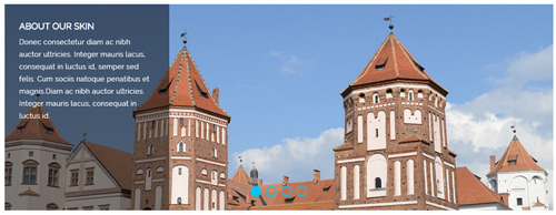
<div data-autoplay="true" data-navigation="true" data-pagination="true" class="carousel carousel_3 ">
  <div class="item"> <img alt="" src="/portals/37/carousel_06.jpg" />
    <div class="carousel_content text_left">
      <h3>ABOUT OUR SKIN</h3>
      <p>Content Text ...</p>
    </div>
  </div>
  <div class="item"> <img alt="" src="/portals/37/carousel_07.jpg" />
    <div class="carousel_content text_right">
      <h3>ABOUT OUR SKIN</h3>
      <p>Content Text ...</p>
    </div>
  </div>
  <div class="item"> <img alt="" src="/portals/37/carousel_05.jpg" />
    <div class="carousel_content text_top">
      <h3>ABOUT OUR SKIN</h3>
      <p>Content Text ...</p>
    </div>
  </div>
  <div class="item"> <img alt="" src="/portals/37/carousel_06.jpg" />
    <div class="carousel_content text_bottom">
      <h3>ABOUT OUR SKIN</h3>
      <p>Content Text ...</p>
    </div>
  </div>
</div>
Option:
- You can increase your content items through adding
<div class="item"></div> - You can control the way that the content comes out through these four styles
"text_left""text_right""text_top""text_bottom"
| Variable | Default | Type | Description |
|---|---|---|---|
data-navigation |
true | boolean | Display "next" and "prev" buttons. |
data-pagination |
true | boolean | Show pagination. |
data-autoplay |
true | int/boolean | Change to any integrer for example data-autoplay ="5000" to play every 5 seconds. If you set data-autoplay="false" Stop auto scroll animation. |
data-autoheight |
true | boolean | Add height to owl-wrapper-outer so you can use diffrent heights on slides. Use it only for one item per page setting. |
Example:
<div class="carousel" data-navigation="true" data-pagination="true" data-autoplay="true" data-autoheight="true">
  <div class="item">
		...
Style 4:
Below is the screen shot:
Codes are as follows:
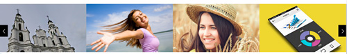
<div class="sync_carousel  sync_carousel_1">
  <div class="carousel_main">
    <div class="item"> <img alt="" src="/portals/37/carousel_08.jpg" /> </div>
    <div class="item"> <img alt="" src="/portals/37/carousel_09.jpg" /> </div>
    <div class="item"> <img alt="" src="/portals/37/carousel_10.jpg" /> </div>
    <div class="item"> <img alt="" src="/portals/37/carousel_11.jpg" /> </div>
  </div>
  <div class="carousel_nav">
    <div class="item"> <img alt="" src="/portals/37/carousel_08_small.jpg" /> </div>
    <div class="item"> <img alt="" src="/portals/37/carousel_09_small.jpg" /> </div>
    <div class="item"> <img alt="" src="/portals/37/carousel_10_small.jpg" /> </div>
    <div class="item"> <img alt="" src="/portals/37/carousel_11_small.jpg" /> </div>
  </div>
</div>
Option:
carousel_mainis the framework which large image shows,carousel_navis the framework which thumbnail shows.- You can increase your item numbers through adding
<div class="item"></div>. You also need to add corresponding thumbnails when adding larger images.
CSS3 Animations
You can click the link to check CSS3 Animations demo. Demo Link
Style 1:
This type is a group of effects which are displayed in time sequence. Below is the screen shot:
Codes are as follows:
<div class="animation">
   <div class="row mb-20">
       <div class="col-sm-3 animation_item scaleUp delay1"><img src="/portals/37/Photo2.jpg" /></div>
       <div class="col-sm-3 animation_item scaleUp delay2"><img src="/portals/37/Photo2.jpg" /></div>
       <div class="col-sm-3 animation_item scaleUp delay3"><img src="/portals/37/Photo2.jpg" /></div>
       <div class="col-sm-3 animation_item scaleUp delay4"><img src="/portals/37/Photo2.jpg" /></div>
	   ...
</div>
delay1, delay2, delay3, delay4 are used to control animation time, there are 12 time slots, which correspond to delay1~delay12 respectively.
scaleUp is used to control animation effect, there are scaleUp , bounceIn , bounceInDown , bounceInLeft , bounceInRight , bounceInUp , fadeIn , fadeInDown , fadeInLeft , fadeInRight , fadeInUp , fadeInDownBig , fadeInLeftBig , fadeInRightBig , fadeInUpBig , flip , flipInX , flipInY , lightSpeedIn , rotateIn , rotateInDownLeft , rotateInDownRight , rotateInUpLeft , rotateInUpRight , rollIn , zoomIn , zoomInDown , zoomInLeft , zoomInRight , zoomInUp 30 effects in total.
Style 2:
If you just need one animation effect, you can match with the following codes.
<div class="animation scaleUp"> <img src="/portals/37/Photo5.jpg" /> </div>
Style 3:
You can add animation for a certain element when mousing over. Codes are as follows:
<div class="animationhover bounce"> <img src="/portals/37/Photo5.jpg" /> </div>
When mousing over, it will show animation effect type (animationhover). There are bounce , flash , pulse , rubberBand , shake , swing , tada , wobble 8 effects.
Popovers
You can click the link to check Popovers demo. Demo Link
Below is the screen shot:
Codes are as follows:
<button data-content="Vivamus sagittis lacus vel augue laoreet rutrum faucibus." data-placement="left" data-toggle="popover" data-container="body" data-original-title="Popover on left" class="btn btn-default popovers" type="button">
    Popover on left
</button>
Option:
| Name | type | default | description |
|---|---|---|---|
| animation | boolean | true | apply a CSS fade transition to the tooltip |
| html | boolean | false | Insert HTML into the tooltip. If false, jQuery's text method will be used to insert content into the DOM. Use text if you're worried about XSS attacks. |
| placement | string | function | 'top' | how to position the tooltip - top | bottom | left | right | auto. When "auto" is specified, it will dynamically reorient the tooltip. For example, if placement is "auto left", the tooltip will display to the left when possible, otherwise it will display right. |
| selector | string | false | If a selector is provided, tooltip objects will be delegated to the specified targets. |
| title | string | function | '' | default title value if title attribute isn't present |
| trigger | string | 'hover focus' | how tooltip is triggered - click | hover | focus | manual. You may pass multiple triggers; separate them with a space. |
| delay | number | object | 0 | delay showing and hiding the tooltip (ms) - does not apply to manual trigger type If a number is supplied, delay is applied to both hide/show Object structure is: |
| container | string | false | false | Appends the tooltip to a specific element. Example: |
Alerts
You can click the link to check Alerts demo. Demo Link
Below is the screen shot:
Codes are as follows:
<div class="alert alert-warning fade in">
    <button aria-hidden="true" data-dismiss="alert" class="close" type="button">×</button>
    <strong>Holy guacamole!</strong> Best check yo self, you're not looking too good.
</div>
Option:
- You can change
alert-to change the color, there arealert-warning,alert-danger,alert-success,alert-info4 colors included in the effects. fadeis for hiddeninis for display
Tooltips
You can click the link to check Tooltips demo. Tooltips
Below is the screen shot:
Codes are as follows:
<a href="#" class="tooltips" data-toggle="tooltip" title="first tooltip">Hover over me</a>
Option:
| Name | type | default | description |
|---|---|---|---|
| animation | boolean | true | apply a CSS fade transition to the tooltip |
| html | boolean | false | Insert HTML into the tooltip. If false, jQuery's text method will be used to insert content into the DOM. Use text if you're worried about XSS attacks. |
| placement | string | function | 'top' | how to position the tooltip - top | bottom | left | right | auto. When "auto" is specified, it will dynamically reorient the tooltip. For example, if placement is "auto left", the tooltip will display to the left when possible, otherwise it will display right. |
| selector | string | false | If a selector is provided, tooltip objects will be delegated to the specified targets. |
| title | string | function | '' | default title value if title attribute isn't present |
| trigger | string | 'hover focus' | how tooltip is triggered - click | hover | focus | manual. You may pass multiple triggers; separate them with a space. |
| delay | number | object | 0 | delay showing and hiding the tooltip (ms) - does not apply to manual trigger type If a number is supplied, delay is applied to both hide/show Object structure is: |
| container | string | false | false | Appends the tooltip to a specific element. Example: |
Dropdowns
You can click the link to check Dropdowns demo. Demo Link
Style 1:
Below is the screen shot:
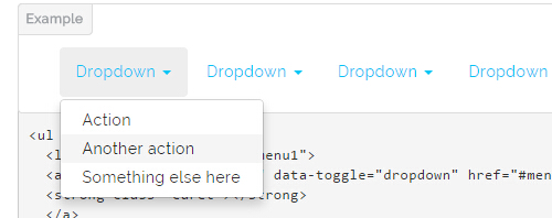
Codes are as follows:
<ul class="nav nav-pills">
  <li class="dropdown" id="menu1">
  <a class="dropdown-toggle" data-toggle="dropdown" href="#menu1">Dropdown
  <strong class="caret"></strong>
  </a>
    <ul class="dropdown-menu">
      <li><a href="#">Action</a></li>
      <li><a href="#">Another action</a></li>
      <li><a href="#">Something else here</a></li>
    </ul>
  </li>
</ul>
Style 2:
Below is the screen shot:
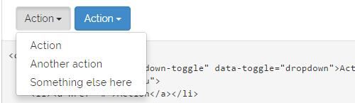
Codes are as follows:
<div class="btn-group">
  <button class="btn dropdown-toggle" data-toggle="dropdown">Action <span class="caret"></span></button>
  <ul class="dropdown-menu">
    <li><a href="#">Action</a></li>
    <li><a href="#">Another action</a></li>
    <li><a href="#">Something else here</a></li>
  </ul>
</div>
Style 3:
Below is the screen shot:
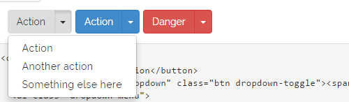
Codes are as follows:
<div class="btn-group">
  <button class="btn">Action</button>
  <button data-toggle="dropdown" class="btn dropdown-toggle"><span class="caret"></span></button>
  <ul class="dropdown-menu">
    <li><a href="#">Action</a></li>
    <li><a href="#">Another action</a></li>
    <li><a href="#">Something else here</a></li>
  </ul>
</div>
LightBox
You can click the link to check LightBox demo. Demo Link
Below is the screen shot:
Option:
1. LightBox_image |
Show one image alone. |
2. LightBox_image_gallery+group number |
Classify those that share the same class name to one group, you can show other images within the group by clicking left and right arrow of the image. |
3. LightBox_image_group |
Classify these sub levels whose label class name is LightBox_image_group into one group. |
4. LightBox_youtube |
Show youtube video. |
5. LightBox_vimeo |
Show video. |
6. LightBox_gmaps |
Shown map. |
7. LightBox_youtube_gallery+group number |
Classify these that share the same class name into a group of youtube video show |
8. LightBox_vimeo_gallery+group number |
Classify these that share the same class name into a group of video show. |
9. LightBox_gmaps_gallery+group number |
Classify these that share the same class name into a group of map show. |
10. LightBox_youtube_group |
Classify these sub levels whose label class name is LightBox_youtube_group into one group. |
11. LightBox_vimeo_group |
Classify these sub levels whose label class name is LightBox_vimeo_group into one group. |
12. LightBox_gmaps_group |
Classify these sub levels whose label class names is LightBox_gmaps_group into one group. |
13. LightBox_Box |
Take div as layer pop up, div needs to hide by default. Style of pop up is custom style. |
14. LightBox_ajax |
Pop up a page |
15. LightBox_ajax_group |
Pop up a group of pages |
You need to fill url of the pop up image(video, map) in href=""
1.LightBox_image
<a href="bigPhoto.jpg" class="LightBox_image" title="Single Image 1"><img alt="" src="cover.jpg" /></a>
2.LightBox_image_gallery
<a href="bigPhoto1.jpg" class="LightBox_image_gallery1" title="Single Image 1"><img alt="" src="cover.jpg" /></a>
<a href="bigPhoto2.jpg" class="LightBox_image_gallery1" title="Single Image 1"><img alt="" src="cover.jpg" /></a>
<a href="bigPhoto3.jpg" class="LightBox_image_gallery2" title="Single Image 2"><img alt="" src="cover.jpg" /></a>
<a href="bigPhoto4.jpg" class="LightBox_image_gallery2" title="Single Image 2"><img alt="" src="cover.jpg" /></a>
3.LightBox_image_group
<div class="LightBox_image_group">
    <a href="bigPhoto1.jpg" title=" People Scenery 1"><img alt="" src="cover.jpg" /> </a>
    <a href="bigPhoto2.jpg" title=" People Scenery 2"></a>
    <a href="bigPhoto3.jpg" title=" People Scenery 3"></a>
</div>
4.LightBox_youtube
<a href="http://www.youtube.com/watch?v=0O2aH4XLbto" class="LightBox_youtube" title="youtube"><img alt="" src="cover.jpg" /></a>
5.LightBox_vimeo
<a href="https://vimeo.com/45830194" class="LightBox_vimeo" title="vimeo"><img alt="" src="cover.jpg" /></a>
6.LightBox_gmaps
<a href="https://maps.google.com/maps?q=221B+Baker+Street,+London,+United+Kingdom&hl=en&t=v&hnear=221B+Baker+St,+London+NW1+6XE,+United+Kingdom" class="LightBox_gmaps" title="gmaps"><img alt="" src="cover.jpg" /></a>
7.LightBox_youtube_gallery
<a href="http://www.youtube.com/watch?v=0O2aH4XLbto" class="LightBox_youtube_gallery1" title="youtube gallery"><img alt="" src="cover.jpg" /></a>
<a href="http://www.youtube.com/watch?v=0O2aH4XLbto" class="LightBox_youtube_gallery1" title="youtube gallery"><img alt="" src="cover.jpg" /></a>
<a href="http://www.youtube.com/watch?v=0O2aH4XLbto" class="LightBox_youtube_gallery2" title="youtube gallery"><img alt="" src="cover.jpg" /></a>
<a href="http://www.youtube.com/watch?v=0O2aH4XLbto" class="LightBox_youtube_gallery2" title="youtube gallery"><img alt="" src="cover.jpg" /></a>
8.LightBox_vimeo_gallery
<a href="https://vimeo.com/45830194" class="LightBox_vimeo_gallery1" title="vimeo gallery"><img alt="" src="cover.jpg" /></a>
<a href="https://vimeo.com/45830194" class="LightBox_vimeo_gallery1" title="vimeo gallery"><img alt="" src="cover.jpg" /></a>
<a href="https://vimeo.com/45830194" class="LightBox_vimeo_gallery2" title="vimeo gallery"><img alt="" src="cover.jpg" /></a>
<a href="https://vimeo.com/45830194" class="LightBox_vimeo_gallery2" title="vimeo gallery"><img alt="" src="cover.jpg" /></a>
9.LightBox_gmaps_gallery
<a href="https://maps.google.com/maps?q=221B+Baker+Street,+London,+United+Kingdom&hl=en&t=v&hnear=221B+Baker+St,+London+NW1+6XE,+United+Kingdom" class="LightBox_gmaps_gallery1" title="gmaps gallery"><img alt="" src="cover.jpg" /></a>
<a href="https://maps.google.com/maps?q=221B+Baker+Street,+London,+United+Kingdom&hl=en&t=v&hnear=221B+Baker+St,+London+NW1+6XE,+United+Kingdom" class="LightBox_gmaps_gallery1" title="gmaps gallery"><img alt="" src="cover.jpg" /></a>
<a href="https://maps.google.com/maps?q=221B+Baker+Street,+London,+United+Kingdom&hl=en&t=v&hnear=221B+Baker+St,+London+NW1+6XE,+United+Kingdom" class="LightBox_gmaps_gallery2" title="gmaps gallery"><img alt="" src="cover.jpg" /></a>
<a href="https://maps.google.com/maps?q=221B+Baker+Street,+London,+United+Kingdom&hl=en&t=v&hnear=221B+Baker+St,+London+NW1+6XE,+United+Kingdom" class="LightBox_gmaps_gallery2" title="gmaps gallery"><img alt="" src="cover.jpg" /></a>
10.LightBox_youtube_group
<div class="LightBox_youtube_group">
    <a href="http://www.youtube.com/watch?v=0O2aH4XLbto" title=" youtube 1"><img alt="" src="cover.jpg" /> </a>
    <a href="http://www.youtube.com/watch?v=0O2aH4XLbto" title=" youtube 2"></a>
    <a href="http://www.youtube.com/watch?v=0O2aH4XLbto" title=" youtube 3"></a>
</div>
11.LightBox_vimeo_group
<div class="LightBox_vimeo_group">
    <a href="https://vimeo.com/45830194" title=" vimeo 1"><img alt="" src="cover.jpg" /> </a>
    <a href="https://vimeo.com/45830194" title=" vimeo 2"></a>
    <a href="https://vimeo.com/45830194" title=" vimeo 3"></a>
</div>
12.LightBox_gmaps_group
<div class="LightBox_gmaps_group">
    <a href="https://maps.google.com/maps?q=221B+Baker+Street,+London,+United+Kingdom&hl=en&t=v&hnear=221B+Baker+St,+London+NW1+6XE,+United+Kingdom" title=" gmaps 1"><img alt="" src="cover.jpg" /> </a>
    <a href="https://maps.google.com/maps?q=221B+Baker+Street,+London,+United+Kingdom&hl=en&t=v&hnear=221B+Baker+St,+London+NW1+6XE,+United+Kingdom" title=" gmaps 2"></a>
    <a href="https://maps.google.com/maps?q=221B+Baker+Street,+London,+United+Kingdom&hl=en&t=v&hnear=221B+Baker+St,+London+NW1+6XE,+United+Kingdom" title=" gmaps 3"></a>
</div>
13.LightBox_Box
<a href=".LightBox_Content" class="LightBox_Box"> Click Here To Pop </a>
<a href=".LightBox_Content" class="LightBox_Box Button_default"> Click Here To Pop </a>
<div class="LightBox_Content">
    <h3>Click Here To Pop</h3>
 	  content text ...
</div>
14.LightBox_ajax
<a href="index.aspx" class="LightBox_ajax" title="ajax"><img alt="" src="cover.jpg" /></a>
15.LightBox_ajax_group
<div class="LightBox_ajax_group">
    <a href="index.aspx" title=" ajax 1"><img alt="" src="cover.jpg" /> </a>
    <a href="index.aspx" title=" ajax 2"></a>
    <a href="index.aspx" title=" ajax 3"></a>
</div>
Image Effects
You can click the link to check Image Effects demo. Demo Link
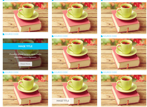
- You can copy over codes of the image effects directly to any HTML modules.
- You can change the font icon through modifying. font icon list
Flip Box
You can click the link to check Flip Box demo. Demo Link
Style 1:
Below is the screen shot:
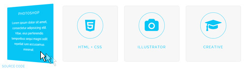
Codes are as follows:
<div class="row">
  <div class="col-md-3 col-sm-6">
    <div class="flip_box flip_box_2">
      <div class="rotate">
        <div class="front"> <span class="fa fa-edit a_b_c a_t_c"></span>
          <h3 class=" a_t_c">PHOTOSHOP</h3>
        </div>
        <div class="back a_bg_c">
          <h3>PHOTOSHOP</h3>
          <p>Content Text ...</p>
        </div>
      </div>
    </div>
  </div>
  <div class="col-md-3 col-sm-6">
    <div class="flip_box flip_box_2">
      <div class="rotate">
        <div class="front"> <span class="fa fa-html5 a_b_c a_t_c"></span>
          <h3 class=" a_t_c">HTML + CSS</h3>
        </div>
        <div class="back a_bg_c">
          <h3>HTML + CSS</h3>
          <p>Content Text ...</p>
        </div>
      </div>
    </div>
  </div>
  <div class="clearfix visible-sm"></div>
  <div class="col-md-3 col-sm-6">
    <div class="flip_box flip_box_2">
      <div class="rotate">
        <div class="front"> <span class="fa fa-camera a_b_c a_t_c"></span>
          <h3 class=" a_t_c">ILLUSTRATOR</h3>
        </div>
        <div class="back a_bg_c">
          <h3>ILLUSTRATOR</h3>
          <p>Content Text ...</p>
        </div>
      </div>
    </div>
  </div>
  <div class="col-md-3 col-sm-6">
    <div class="flip_box flip_box_2">
      <div class="rotate">
        <div class="front"> <span class="fa  fa-mortar-board a_b_c a_t_c"></span>
          <h3 class=" a_t_c">CREATIVE</h3>
        </div>
        <div class="back a_bg_c">
          <h3>CREATIVE</h3>
          <p>Content Text ...</p>
        </div>
      </div>
    </div>
  </div>
</div>
Option:
col-md-3 col-sm-6is the width of each column, you can change the width you need through value1~12.frontis for front content.backis for back content.
Style 2:
Below is the screen shot:
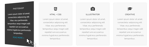
Codes are as follows:
<div class="row">
  <div class="col-md-3 col-sm-6">
    <div class="flip_box flip_box_3">
      <div class="rotate">
        <div class="front"> <span class="fa fa-edit"></span>
          <h3>PHOTOSHOP</h3>
          <p>Content Text ...</p>
        </div>
        <div class="back">
          <h3>PHOTOSHOP</h3>
          <p>Content Text ...</p>
          <a href="#">READ MORE > </a> </div>
      </div>
    </div>
  </div>
  <div class="col-md-3 col-sm-6">
    <div class="flip_box flip_box_3">
      <div class="rotate">
        <div class="front"> <span class="fa fa-html5"></span>
          <h3>HTML + CSS</h3>
          <p>Content Text ...</p>
        </div>
        <div class="back">
          <h3>HTML + CSS</h3>
          <p>Content Text ...</p>
          <a href="#">READ MORE > </a> </div>
      </div>
    </div>
  </div>
  <div class="clearfix visible-sm"></div>
  <div class="col-md-3 col-sm-6">
    <div class="flip_box flip_box_3">
      <div class="rotate">
        <div class="front"> <span class="fa fa-camera"></span>
          <h3>ILLUSTRATOR</h3>
          <p>Content Text ...</p>
        </div>
        <div class="back">
          <h3>ILLUSTRATOR</h3>
          <p>Content Text ...</p>
          <a href="#">READ MORE > </a> </div>
      </div>
    </div>
  </div>
  <div class="col-md-3 col-sm-6">
    <div class="flip_box flip_box_3">
      <div class="rotate">
        <div class="front"> <span class="fa fa-mortar-board"></span>
          <h3>CREATIVE</h3>
          <p>Content Text ...</p>
        </div>
        <div class="back">
          <h3>CREATIVE</h3>
          <p>Content Text ...</p>
          <a href="#">READ MORE > </a> </div>
      </div>
    </div>
  </div>
</div>
Style 3:
Below is the screen shot:
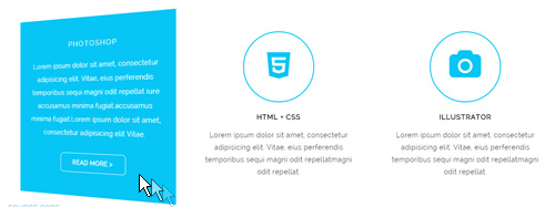
Codes are as follows:
<div class="row">
  <div class="col-sm-4">
    <div class="flip_box flip_box_4">
      <div class="rotate">
        <div class="front"> <span class="fa fa-edit a_b_c a_t_c"></span>
          <h3>PHOTOSHOP</h3>
          <p>Content Text ...</p>
        </div>
        <div class="back  a_bg_c">
          <h3>PHOTOSHOP</h3>
          <p>Content Text ...</p>
          <a href="#" class="btn">READ MORE ></a> </div>
      </div>
    </div>
  </div>
  <div class="col-sm-4">
    <div class="flip_box flip_box_4">
      <div class="rotate">
        <div class="front"> <span class="fa fa-html5 a_b_c a_t_c"></span>
          <h3>HTML + CSS</h3>
          <p>Content Text ...</p>
        </div>
        <div class="back  a_bg_c">
          <h3>HTML + CSS</h3>
          <p>Content Text ...</p>
          <a href="#" class="btn">READ MORE ></a> </div>
      </div>
    </div>
  </div>
  <div class="col-sm-4">
    <div class="flip_box flip_box_4">
      <div class="rotate">
        <div class="front"> <span class="fa fa-camera a_b_c a_t_c"></span>
          <h3>ILLUSTRATOR</h3>
          <p>Content Text ...</p>
        </div>
        <div class="back  a_bg_c">
          <h3>ILLUSTRATOR</h3>
          <p>Content Text ...</p>
          <a href="#" class="btn">READ MORE ></a> </div>
      </div>
    </div>
  </div>
</div>
Responsive Video
Ratio between width and height of the video needs to be 16:9.
<div class="responsive-video">
    <iframe width="853" height="480" src="//www.youtube.com/embed/XcpOsJQXcx4?list=UUIkFV7_2tEhhEhh1NkkwTUw" frameborder="0" allowfullscreen></iframe>
</div>
<div class="responsive-video">
    <iframe src="//player.vimeo.com/video/106249100" width="1920" height="1080" frameborder="0" webkitallowfullscreen mozallowfullscreen allowfullscreen></iframe>
</div>
<div class="responsive-video">
     <embed  src="/portals/37/movie.swf" type="application/x-shockwave-flash" allownetworking="all" allowfullscreen="true" allowscriptaccess="always" wmode="Opaque"></embed>
</div>
<div class="responsive-video">
    <video width="1920" height="1080"  controls="true">
    <source src="/portals/37/movie.m4v" type="video/mp4"></source>
    <source src="/portals/37/movie.ogv" type="video/ogg"></source>
    <source src="/portals/37/movie.webm" type="video/WebM"></source>
    Your browser does not support the video tag. </video>
</div>
Video Bg
You can click the link to check Video Bg demo. Demo Link

- "{videoURL:'npfu0fN9GUA' is the url of
youtube autoPlayis for whether to autoplay or nottrue/falseloopis for whether to play on a loop,true/false
<div data-property="{videoURL:'npfu0fN9GUA',containment:'self', showControls:false, autoPlay:true, loop:true, vol:50, mute:true, startAt:10, opacity:1, addRaster:false, quality:'hd1080'}" class="player">
<div class="Play"></div>
<div class="dnn_layout pt-60 pb-60">
<div class="content_mid clearfix">
<div class="player_boxes">
<h1 class="player_title"> Here Are Your Videos</h1>
<hr class="player_line" />
<h4 class="player_smalltitle">YOU CAN CHANGE THE BACKGROUND BY YOURSELF</h4>
<div class="player_content">
<p>Content Text 1 ... </p>
</div>
<p> <a class="Button_default" href="#"> VIEW PORTFOLIOS</a> <a class="Button_default" href="#"> LEARN MORE</a> </p>
</div>
</div>
</div>
</div>
Home Page Codes
This includes the html introductions that required for Home1~Home5 page, ComingSoon page, One Page page, App page, Boxed Layout page.
Home Version 1 (Home)
You can click the link to check Home Version 1 (home) demo. Home Version 1 (Home)
Contact us area
Below is the screen shot:
Codes are as follows:
<ul class="top_a">
    <li><span class="fa fa-phone"></span>(+088) - 123 4567</li>
    <li><span class="fa fa-envelope"></span><a href="#">dnnskindev@gmail.com</a></li>
</ul>
Social icon area
Below is the screen shot:
Codes are as follows:
<ul class="top_b clearfix">
    <li><a href="#" class="fa fa-linkedin-square"></a> </li>
    <li><a href="#" class="fa fa-twitter-square"></a> </li>
    <li><a href="#" class="fa fa-pinterest-square"></a> </li>
    <li><a href="#" class="fa fa-facebook-square"></a> </li>
</ul>
Banner area
Below is the screen shot:
It is using DNNGo LayerGalleryPro module here,you can import ContentListEntity-Home1.xml of the DNNGo_LayerGalleryPro folder to duplicate banner of the demo.
The Features area
Below is the screen shot:
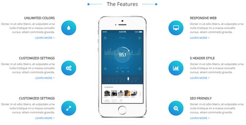
Codes are as follows:
<div class="con_a clearfix">
  <div class="left">
    <div class="box animation fadeInLeft">
      <div class="icon"> <span class="fa fa-tint"></span> </div>
      <h6 class="title">Unlimited Colors</h6>
      <p class="text">Content Text 1 ...</p>
      <a class="link" href="#" target="blank">Learn More</a> </div>
    <div class="box animation fadeInLeft">
      <div class="icon"> <span class="fa fa-cogs"></span> </div>
      <h6 class="title">Customized Settings</h6>
      <p class="text">Content Text 1 ...</p>
      <a class="link" href="#" target="blank">Learn More</a> </div>
    <div class="box animation fadeInLeft">
      <div class="icon"> <span class="fa fa-expand"></span> </div>
      <h6 class="title">Customized Settings</h6>
      <p class="text">Content Text 1 ...</p>
      <a class="link" href="#" target="blank">Learn More</a> </div>
  </div>
  <div class="center animation fadeInUp"><img alt="" src="/portals/36/pic1.jpg" class="img-responsive" /></div>
  <div class="right">
    <div class="box animation fadeInRight">
      <div class="icon"> <span class="fa fa-desktop"></span> </div>
      <h6 class="title">Responsive Web</h6>
      <p class="text">Content Text 1 ...</p>
      <a class="link" href="#" target="blank">Learn More</a> </div>
    <div class="box animation fadeInRight">
      <div class="icon"> <span class="fa fa-bar-chart"></span> </div>
      <h6 class="title">5 Header Style</h6>
      <p class="text">Content Text 1 ...</p>
      <a class="link" href="#" target="blank">Learn More</a> </div>
    <div class="box animation fadeInRight">
      <div class="icon"> <span class="fa fa-search-plus"></span> </div>
      <h6 class="title">SEO Friendly</h6>
      <p class="text">Content Text 1 ...</p>
      <a class="link" href="#" target="blank">Learn More</a> </div>
  </div>
</div>
Option:
- You can modify
animation fadeInLeftto change the animation on the slide. Animation list. - You can modify
fa fa-tintto change icons. font icon list. - Module Container is using
Container-1
Get In Touch With Us area
Below is the screen shot:
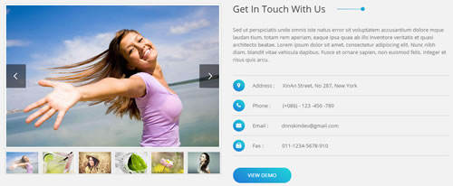
Codes are as follows:
<div class="con_b pt60 pb60">
  <div class="dnn_layout">
    <div class="content_mid clearfix">
      <div class="pane_layout">
        <div class="row">
          <div class="col-sm-6 animation fadeInLeft">
            <div class="sync_carousel  sync_carousel_1">
              <div class="carousel_main">
                <div class="item"> <img alt="" src="/portals/36/isotope1.jpg" /> </div>
                <div class="item"> <img alt="" src="/portals/36/isotope2.jpg" /> </div>
                <div class="item"> <img alt="" src="/portals/36/isotope3.jpg" /> </div>
                <div class="item"> <img alt="" src="/portals/36/isotope4.jpg" /> </div>
                <div class="item"> <img alt="" src="/portals/36/isotope5.jpg" /> </div>
                <div class="item"> <img alt="" src="/portals/36/isotope6.jpg" /> </div>
                <div class="item"> <img alt="" src="/portals/36/isotope7.jpg" /> </div>
                <div class="item"> <img alt="" src="/portals/36/isotope8.jpg" /> </div>
                <div class="item"> <img alt="" src="/portals/36/isotope9.jpg" /> </div>
              </div>
              <div class="carousel_nav">
                <div class="item"> <img alt="" src="/portals/36/isotope1.jpg" /> </div>
                <div class="item"> <img alt="" src="/portals/36/isotope2.jpg" /> </div>
                <div class="item"> <img alt="" src="/portals/36/isotope3.jpg" /> </div>
                <div class="item"> <img alt="" src="/portals/36/isotope4.jpg" /> </div>
                <div class="item"> <img alt="" src="/portals/36/isotope5.jpg" /> </div>
                <div class="item"> <img alt="" src="/portals/36/isotope6.jpg" /> </div>
                <div class="item"> <img alt="" src="/portals/36/isotope7.jpg" /> </div>
                <div class="item"> <img alt="" src="/portals/36/isotope8.jpg" /> </div>
                <div class="item"> <img alt="" src="/portals/36/isotope9.jpg" /> </div>
              </div>
            </div>
          </div>
          <div class="col-sm-6 east animation fadeInRight">
            <h1 class="title">Get In Touch With Us</h1>
            <p>Content Text 1 ...</p>
            <ul>
              <li><span class="fa fa-map-marker"></span>Address :      XinAn Street, No 287, New York</li>
              <li><span class="fa fa-phone"></span>Phone :         (+086) - 123 -456 -789</li>
              <li><span class="fa fa-envelope"></span>Email :          dnnskindev@gmail.com</li>
              <li><span class="fa fa-fax"></span>Fax :              011-1234-5678-910</li>
            </ul>
            <a href="#" target="blank" class="buttoncolor">View Demo</a> </div>
        </div>
      </div>
    </div>
  </div>
</div>
Option:
- You can modify
animationto change and delete animation. Animation list.
What Others Say About Us area
Below is the screen shot:
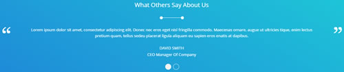
Codes are as follows:
<div class="con_c pt60 pb60">
  <div class="dnn_layout">
    <div class="content_mid clearfix">
      <div class="pane_layout">
        <div class="row">
          <div class="col-sm-12">
            <h3 class="title">What Others Say About Us</h3>
            <div class="line"></div>
            <ul class=" Testimonials_tab Testimonials_1" data-autoplay="3000" data-position="fade" data-display-arrows="false">
              <li>
                <blockquote>
                  <p>Content Text 1 ...</p>
                  <small>David Smith<span>CEO Manager Of Company</span></small> </blockquote>
              </li>
              <li>
                <blockquote>
                  <p>Content Text 2 ...</p>
                  <small>David Smith<span>CEO Manager Of Company2</span></small> </blockquote>
              </li>
            </ul>
          </div>
        </div>
      </div>
    </div>
  </div>
</div>
Option:
- This is a Testimonials effect.
Recent Works area
Below is the screen shot:
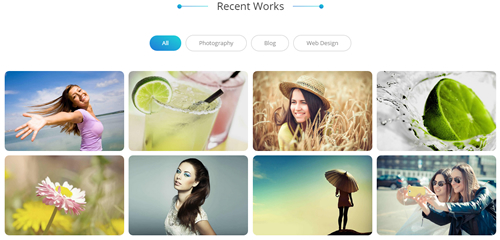
Codes are as follows:
<div class="con_d">
  <div class="isotope_grid isotope_1">
    <div class="isotope_group"> <a data-filter="*" href="#" class="active">All</a><a data-filter=".Photography" href="#">Photography</a><a data-filter=".Blog" href="#">Blog</a><a data-filter=".Webdesign" href="#">Web Design</a></div>
    <div class="loading">
      <div class="loading-container container1">
        <div class="circle1"></div>
        <div class="circle2"></div>
        <div class="circle3"></div>
        <div class="circle4"></div>
      </div>
      <div class="loading-container container2">
        <div class="circle1"></div>
        <div class="circle2"></div>
        <div class="circle3"></div>
        <div class="circle4"></div>
      </div>
      <div class="loading-container container3">
        <div class="circle1"></div>
        <div class="circle2"></div>
        <div class="circle3"></div>
        <div class="circle4"></div>
      </div>
    </div>
    <div class="isotope_main" data-min-width="230">
      <div class="isotope_item Webdesign Photography">
        <div class="photo_box ico_TopAndBottom_enter">
          <div class="pic_box"> <img alt="" src="/portals/36/isotope1.jpg" />
            <div class="ico"> <a href="/portals/36/isotope1.jpg" class="LightBox_image" title="Single Image 1"><span class="fa fa-search ico_top"></span></a> <a href="#" target="blank"><span class="fa fa-reply ico_bottom"></span></a> </div>
            <div class="shade"></div>
          </div>
        </div>
      </div>
      <div class="isotope_item Photography Blog">
        <div class="photo_box ico_TopAndBottom_enter">
          <div class="pic_box"> <img alt="" src="/portals/36/isotope2.jpg" />
            <div class="ico"> <a href="/portals/36/isotope2.jpg" class="LightBox_image" title="Single Image 1"><span class="fa fa-search ico_top"></span></a> <a href="#" target="blank"><span class="fa fa-reply ico_bottom"></span></a> </div>
            <div class="shade"></div>
          </div>
        </div>
      </div>
      <div class="isotope_item Blog">
        <div class="photo_box ico_TopAndBottom_enter">
          <div class="pic_box"> <img alt="" src="/portals/36/isotope3.jpg" />
            <div class="ico"> <a href="/portals/36/isotope3.jpg" class="LightBox_image" title="Single Image 1"><span class="fa fa-search ico_top"></span></a> <a href="#" target="blank"><span class="fa fa-reply ico_bottom"></span></a> </div>
            <div class="shade"></div>
          </div>
        </div>
      </div>
      <div class="isotope_item Webdesign">
        <div class="photo_box ico_TopAndBottom_enter">
          <div class="pic_box"> <img alt="" src="/portals/36/isotope4.jpg" />
            <div class="ico"> <a href="/portals/36/isotope4.jpg" class="LightBox_image" title="Single Image 1"><span class="fa fa-search ico_top"></span></a> <a href="#" target="blank"><span class="fa fa-reply ico_bottom"></span></a> </div>
            <div class="shade"></div>
          </div>
        </div>
      </div>
      <div class="isotope_item Webdesign Blog">
        <div class="photo_box ico_TopAndBottom_enter">
          <div class="pic_box"> <img alt="" src="/portals/36/isotope5.jpg" />
            <div class="ico"> <a href="/portals/36/isotope5.jpg" class="LightBox_image" title="Single Image 1"><span class="fa fa-search ico_top"></span></a> <a href="#" target="blank"><span class="fa fa-reply ico_bottom"></span></a> </div>
            <div class="shade"></div>
          </div>
        </div>
      </div>
      <div class="isotope_item Photography Blog Webdesign">
        <div class="photo_box ico_TopAndBottom_enter">
          <div class="pic_box"> <img alt="" src="/portals/36/isotope6.jpg" />
            <div class="ico"> <a href="/portals/36/isotope6.jpg" class="LightBox_image" title="Single Image 1"><span class="fa fa-search ico_top"></span></a> <a href="#" target="blank"><span class="fa fa-reply ico_bottom"></span></a> </div>
            <div class="shade"></div>
          </div>
        </div>
      </div>
      <div class="isotope_item Photography">
        <div class="photo_box ico_TopAndBottom_enter">
          <div class="pic_box"> <img alt="" src="/portals/36/isotope7.jpg" />
            <div class="ico"> <a href="/portals/36/isotope7.jpg" class="LightBox_image" title="Single Image 1"><span class="fa fa-search ico_top"></span></a> <a href="#" target="blank"><span class="fa fa-reply ico_bottom"></span></a> </div>
            <div class="shade"></div>
          </div>
        </div>
      </div>
      <div class="isotope_item Photography Blog Webdesign">
        <div class="photo_box ico_TopAndBottom_enter">
          <div class="pic_box"> <img alt="" src="/portals/36/isotope8.jpg" />
            <div class="ico"> <a href="/portals/36/isotope8.jpg" class="LightBox_image" title="Single Image 1"><span class="fa fa-search ico_top"></span></a> <a href="#" target="blank"><span class="fa fa-reply ico_bottom"></span></a> </div>
            <div class="shade"></div>
          </div>
        </div>
      </div>
    </div>
  </div>
</div>
Option:
- You can add
<a data-filter=".FilterName" href="#">Filter Name</a>to increase categories.data-filter=".FilterName"can not be blank space. - You can modify
data-min-widthto change minimum width of image. - You can modify
isotope_itemFilterNameto categorize images. - Module Container is using
Container-1
Our Features area
Below is the screen shot:
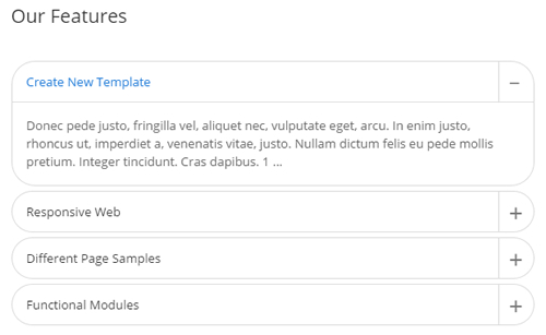
Codes are as follows:
<div class="panel-group accordion_1 animation fadeInLeft" id="accordion1">
  <div class="panel panel-default">
    <div class="panel-heading">
      <h4 class="panel-title"> <a data-toggle="collapse" data-parent="#accordion1" href="#collapse1_1"><span class="accordion_icon"></span>Create New Template</a> </h4>
    </div>
    <div id="collapse1_1" class="panel-collapse collapse in">
      <div class="panel-body">Content Text 1 ...</div>
    </div>
  </div>
  <div class="panel panel-default">
    <div class="panel-heading">
      <h4 class="panel-title"> <a data-toggle="collapse" data-parent="#accordion1" href="#collapse1_2" class="collapsed"><span class="accordion_icon"></span>Responsive Web</a> </h4>
    </div>
    <div id="collapse1_2" class="panel-collapse collapse">
      <div class="panel-body">Content Text 2 ...</div>
    </div>
  </div>
  <div class="panel panel-default">
    <div class="panel-heading">
      <h4 class="panel-title"> <a data-toggle="collapse" data-parent="#accordion1" href="#collapse1_3" class="collapsed"><span class="accordion_icon"></span>Different Page Samples</a> </h4>
    </div>
    <div id="collapse1_3" class="panel-collapse collapse">
      <div class="panel-body">Content Text 3 ...</div>
    </div>
  </div>
  <div class="panel panel-default">
    <div class="panel-heading">
      <h4 class="panel-title"> <a data-toggle="collapse" data-parent="#accordion1" href="#collapse1_4" class="collapsed"><span class="accordion_icon"></span>Functional Modules</a> </h4>
    </div>
    <div id="collapse1_4" class="panel-collapse collapse">
      <div class="panel-body">Content Text 4 ...</div>
    </div>
  </div>
</div>
Option:
- This is a Accordions effect.
- Module Container is using
Container-2
Why Choose Us
Below is the screen shot:
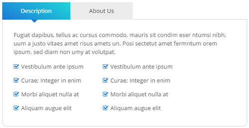
Codes are as follows:
<div class="horizontalTab_Top horizontalTab_Top_1 animation fadeInRight">
  <ul class="resp-tabs-list clearfix">
    <li><span>Description</span></li>
    <li><span>About Us</span></li>
  </ul>
  <div class="resp-tabs-container">
    <div class="resp_container">
      <div class="resp_margin">
        <p>Content Text 1 ... </p>
        <ul class="list_style">
          <li><span class="fa fa-check-square-o"></span>Vestibulum ante ipsum</li>
          <li><span class="fa fa-check-square-o"></span>Curae; Integer in enim</li>
          <li><span class="fa fa-check-square-o"></span>Morbi aliquet nulla at</li>
          <li><span class="fa fa-check-square-o"></span>Aliquam augue elit</li>
        </ul>
      </div>
    </div>
    <div class="resp_container">
      <div class="resp_margin">
        <p>Content Text 1 ... </p>
      </div>
    </div>
  </div>
</div>
Option:
- This is a Responsive Tab effect.
- Module Container is using
Container-2
Testimonials area
Below is the screen shot:
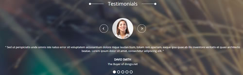
Codes are as follows:
<div class="SectionStyles1">
  <div class="SectionStyles1_bg pt60 pb60">
    <div class="dnn_layout">
      <div class="content_mid clearfix">
        <div class="pane_layout">
          <div class="row">
            <div class="col-sm-12">
              <div class="carousel carousel_1" data-pagination="false" data-autoheight="false" data-autoplay="3000">
                <div class="item">
                  <h3 class="title">Constantly upgrade DNN skins and modules</h3>
                  <div class="line"></div>
                  <p class="text">Content Text 1 ... </p>
                  <a href="#" target="blank" class="buttoncolor2">Buy This Theme</a> </div>
                <div class="item">
                  <h3 class="title">Advanced frontend development technology</h3>
                  <div class="line"></div>
                  <p class="text">Content Text 1 ... </p>
                  <a href="#" target="blank" class="buttoncolor2">View Portfolio</a> </div>
              </div>
            </div>
          </div>
        </div>
      </div>
    </div>
  </div>
</div>
Option:
- This is a Testimonials effect.
Our Skills area
Below is the screen shot:

Codes are as follows:
<div class="SectionStyles2 pt60 pb60">
  <div class="dnn_layout">
    <div class="content_mid clearfix">
      <div class="pane_layout">
        <div class="row">
          <div class="title">
            <div class="box">
              <h1>Our Skills</h1>
              <div class="line"></div>
            </div>
          </div>
          <div class="col-md-3 col-sm-6">
            <div class="con_d">
              <div data-percent="91" class="percentage1">
                <div class="percentage_inner"><span>0</span>%</div>
              </div>
              <h6>Web Design</h6>
              <p>Donec in ut odio libero, at vulputate urna. Nulla tristique Nulla eu mi magna. </p>
            </div>
          </div>
          <div class="col-md-3 col-sm-6">
            <div class="con_d">
              <div data-percent="81" class="percentage1">
                <div class="percentage_inner"><span>0</span>%</div>
              </div>
              <h6>Html5 & CsS3</h6>
              <p>Donec in ut odio libero, at vulputate urna. Nulla tristique Nulla eu mi magna. </p>
            </div>
          </div>
          <div class="col-md-3 col-sm-6">
            <div class="con_d">
              <div data-percent="96" class="percentage1">
                <div class="percentage_inner"><span>0</span>%</div>
              </div>
              <h6>DNN</h6>
              <p>Donec in ut odio libero, at vulputate urna. Nulla tristique Nulla eu mi magna. </p>
            </div>
          </div>
          <div class="col-md-3 col-sm-6">
            <div class="con_d">
              <div data-percent="71" class="percentage1">
                <div class="percentage_inner"><span>0</span>%</div>
              </div>
              <h6>Jquery</h6>
              <p>Donec in ut odio libero, at vulputate urna. Nulla tristique Nulla eu mi magna. </p>
            </div>
          </div>
        </div>
      </div>
    </div>
  </div>
</div>
Option:
- This is a ProgressBarsCounters effect.
Email To Us area
Below is the screen shot:
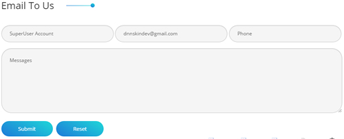
Option:
- This is
Theme_Responsive_20068-hometheme ofDNNGo PowerFormsmodule - Module Container is using
Container-3
Follow Us area
Below is the screen shot:
Codes are as follows:
<div class="con_e animation fadeInRight">
  <p>Nunc nibh diam, blandit vitae vehicula dapi bus, pulvinar eu sapien. Fusce et ornare sapien, non euismod felis.</p>
  <ul>
    <li><a href="#"><span class="fa fa-facebook-square"></span>Facebook</a></li>
    <li><a href="#"><span class="fa fa-twitter-square"></span>Twitter</a></li>
    <li><a href="#"><span class="fa fa-linkedin-square"></span>Linkdin</a></li>
    <li><a href="#"><span class="fa fa-google-plus-square"></span>Google +</a></li>
  </ul>
</div>
Option:
- Module Container is using
Container-3 - You can modify
fa fa-facebook-squareto change icons. font icon list.
PHOTOS area
Below is the screen shot:
Codes are as follows:
<div class="bottom_a row animation periodic1">
  <div class="col-sm-4 col-xs-6">
    <div class="photo_box"> <a title="Image Gallery" class="iLightBox_image_gallery1" href="/Portals/36/LightBox1.jpg">
      <div class="pic_box"> <img alt="" class="img-responsive" src="/portals/36/LightBox1.jpg" />
        <div class="shade"></div>
      </div>
      </a> </div>
  </div>
  <div class="col-sm-4  col-xs-6">
    <div class="photo_box"> <a title="Image Gallery" class="iLightBox_image_gallery1" href="/Portals/36/LightBox2.jpg">
      <div class="pic_box"> <img alt="" class="img-responsive" src="/portals/36/LightBox2.jpg" />
        <div class="shade"></div>
      </div>
      </a> </div>
  </div>
  <div class="col-sm-4  col-xs-6">
    <div class="photo_box"> <a title="Image Gallery" class="iLightBox_image_gallery1" href="/Portals/36/LightBox3.jpg">
      <div class="pic_box"> <img alt="" class="img-responsive" src="/portals/36/LightBox3.jpg" />
        <div class="shade"></div>
      </div>
      </a> </div>
  </div>
  <div class="col-sm-4  col-xs-6">
    <div class="photo_box"> <a title="Image Gallery" class="iLightBox_image_gallery1" href="/Portals/36/LightBox4.jpg">
      <div class="pic_box"> <img alt="" class="img-responsive" src="/portals/36/LightBox4.jpg" />
        <div class="shade"></div>
      </div>
      </a> </div>
  </div>
  <div class="col-sm-4  col-xs-6">
    <div class="photo_box"> <a title="Image Gallery" class="iLightBox_image_gallery1" href="/Portals/36/LightBox5.jpg">
      <div class="pic_box"> <img alt="" class="img-responsive" src="/portals/36/LightBox5.jpg" />
        <div class="shade"></div>
      </div>
      </a> </div>
  </div>
  <div class="col-sm-4  col-xs-6">
    <div class="photo_box"> <a title="Image Gallery" class="iLightBox_image_gallery1" href="/Portals/36/LightBox6.jpg">
      <div class="pic_box"> <img alt="" class="img-responsive" src="/portals/36/LightBox6.jpg" />
        <div class="shade"></div>
      </div>
      </a> </div>
  </div>
  <div class="col-sm-4  col-xs-6">
    <div class="photo_box"> <a title="Image Gallery" class="iLightBox_image_gallery1" href="/Portals/36/LightBox7.jpg">
      <div class="pic_box"> <img alt="" class="img-responsive" src="/portals/36/LightBox7.jpg" />
        <div class="shade"></div>
      </div>
      </a> </div>
  </div>
  <div class="col-sm-4  col-xs-6">
    <div class="photo_box"> <a title="Image Gallery" class="iLightBox_image_gallery1" href="/Portals/36/LightBox8.jpg">
      <div class="pic_box"> <img alt="" class="img-responsive" src="/portals/36/LightBox8.jpg" />
        <div class="shade"></div>
      </div>
      </a> </div>
  </div>
  <div class="col-sm-4  col-xs-6">
    <div class="photo_box"> <a title="Image Gallery" class="iLightBox_image_gallery1" href="/Portals/36/LightBox9.jpg">
      <div class="pic_box"> <img alt="" class="img-responsive" src="/portals/36/LightBox9.jpg" />
        <div class="shade"></div>
      </div>
      </a> </div>
  </div>
</div>
Option:
- Module Container is using
Container-4 - This is a LightBox effect.
TAG area
Below is the screen shot:
Codes are as follows:
<div class="bottom_b animation periodic2">
	<a href="#" target="blank">Dnngo</a>
	<a href="#" target="blank">HTML5</a>
	<a href="#" target="blank">CSS3</a>
</div>
Option:
- Module Container is using
Container-4
NEWS area
Below is the screen shot:
Codes are as follows:
<ul class="bottom_c animation periodic3">
    <li>
    <p class="title">DNN Modules</p>
    <p class="time">Thursday  |  01:30 PM</p>
    <a target="blank" href="#" class="link">Details</a>
    </li>
    <li>
    <p class="title">Responsive</p>
    <p class="time">Monday  |  9:50 AM</p>
    <a target="blank" href="#" class="link">Details</a>
    </li>
    <li>
    <p class="title">Unlimited-Colors</p>
    <p class="time">Friday  |  10:30 AM</p>
    <a target="blank" href="#" class="link">Details</a>
    </li>
    <li>
    <p class="title">Skin Pack</p>
    <p class="time">Tuesday  |  2:48 PM</p>
    <a target="blank" href="#" class="link">Details</a>
    </li>
</ul>
Option:
- Module Container is using
Container-4
LINKS area
Below is the screen shot:
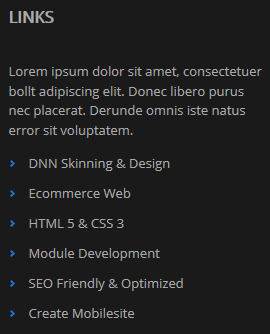
Codes are as follows:
<div class="animation periodic4">
<p>Lorem ipsum dolor sit amet, consectetuer bollt adipiscing elit. Donec libero purus nec placerat. Derunde omnis iste natus error sit voluptatem.</p>
<ul class="bottom_d">
    <li><a href="#" target="blank">DNN Skinning & Design</a></li>
    <li><a href="#" target="blank">Ecommerce Web</a></li>
    <li><a href="#" target="blank">HTML 5 & CSS 3</a></li>
    <li><a href="#" target="blank">Module Development</a></li>
    <li><a href="#" target="blank">SEO Friendly & Optimized</a></li>
    <li><a href="#" target="blank">Create Mobilesite</a></li>
</ul>
</div>
Option:
- Module Container is using
Container-4
Home Version 2
You can click the link to check Home Version 2 demo. Home Version 2
Contact us area
Below is the screen shot:
Codes are as follows:
<ul class="top_a">
  <li><span class="fa fa-phone"></span>(+088) - 123 4567</li>
  <li><span class="fa fa-envelope"></span>dnnskindev@gmail.com</li>
</ul>
Option:
- You can modify
fa fa-phoneto change icons. font icon list.
Social icon area
Below is the screen shot:
Codes are as follows:
<ul class="top_b clearfix">
    <li><a class="fa fa-linkedin-square" href="#"></a> </li>
    <li><a class="fa fa-twitter-square" href="#"></a> </li>
    <li><a class="fa fa-pinterest-square" href="#"></a> </li>
    <li><a class="fa fa-facebook-square" href="#"></a> </li>
</ul>
Option:
- You can modify
fa fa-linkedin-squareto change icons. font icon list.
Banner area
Below is the screen shot:
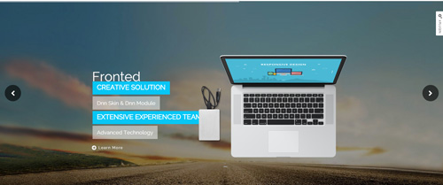
It is using DNNGo LayerGalleryPro module here,you can import ContentListEntity-Home2.xml of the DNNGo_LayerGalleryPro folder to duplicate banner of the demo.
TAB area
Below is the screen shot:
Codes are as follows:
<div class="horizontalTab_Top horizontalTab_Top_2">
    <div class="con_f">
        <div class="dnn_layout">
            <div class="content_mid clearfix">
                <div class="pane_layout">
                    <div class="row">
                        <div class="col-sm-12">
                            <div class="resp-tabs-container">
                                <div class="resp_container">
                                    <div class="resp_margin">
                                        <div class="boxes_style_1">
                                            <div class="boxes">
                                                <h3 class="Boxes_title">Develop business solutions that fitted to your needs</h3>
                                                <p> Content Text ... </p>
                                                <div class="but"><a class="buttoncolor2" href="#">More Information</a></div>
                                            </div>
                                        </div>
                                    </div>
                                </div>
                            </div>
                        </div>
                    </div>
                </div>
            </div>
        </div>
    </div>
    <div class="con_g">
        <div class="dnn_layout">
            <div class="content_mid clearfix">
                <div class="pane_layout">
                    <div class="row">
                        <div class="col-sm-12">
                            <ul class="resp-tabs-list clearfix">
                                <li>
                                    <div>
                                        <span class="img"><img alt="" class="img-responsive" src="/portals/36/con_g1.png" /></span>
                                        <p class="text">Full Support</p>
                                    </div>
                                </li>
                                <li>
                                    <div>
                                        <span class="img"><img alt="" class="img-responsive" src="/portals/36/con_g2.png" /></span>
                                        <p class="text">Info Security</p>
                                    </div>
                                </li>
                                <li>
                                    <div>
                                        <span class="img"><img alt="" class="img-responsive" src="/portals/36/con_g3.png" /></span>
                                        <p class="text">Photo Gallery</p>
                                    </div>
                                </li>
                                <li>
                                    <div>
                                        <span class="img"><img alt="" class="img-responsive" src="/portals/36/con_g4.png" /></span>
                                        <p class="text">Go Shopping</p>
                                    </div>
                                </li>
                                <li>
                                    <div>
                                        <span class="img"><img alt="" class="img-responsive" src="/portals/36/con_g5.png" /></span>
                                        <p class="text">Comments</p>
                                    </div>
                                </li>
                            </ul>
                        </div>
                    </div>
                </div>
            </div>
        </div>
    </div>
</div>
Option:
- This is a ResponsiveTab effect.
DNN skins and DNN modules area
Below is the screen shot:

Codes are as follows:
<div class="dnn_layout">
  <div class="content_mid clearfix">
    <div class="pane_layout">
      <div class="row">
        <div class="col-sm-6">
          <div class="con_h animation fadeInLeft"> <img alt="" class="img-responsive" src="/portals/36/con_h.png" /> </div>
        </div>
        <div class="col-sm-6">
          <div class="con_i animation fadeInRight">
            <h3>DNN skins and DNN modules</h3>
            <p>Content Text ... </p>
            <ul>
              <li><span>1</span>Donec in ut odioat vulputate</li>
              <li><span>2</span>Urna nulla tristique mi a massa</li>
              <li><span>3</span>Convallis cursus nulla eu migna</li>
              <li><span>4</span>Risus nibh laoreet odio</li>
              <li><span>5</span>Nulla tristique mi a massa</li>
            </ul>
            <ul class="sec">
              <li><span>6</span>Donec in ut odioat vulputate</li>
              <li><span>7</span>Urna nulla tristique mi a massa</li>
              <li><span>8</span>Convallis cursus nulla eu migna</li>
              <li><span>9</span>Risus nibh laoreet odio</li>
              <li><span>10</span>Nulla tristique mi a massa</li>
            </ul>
          </div>
        </div>
      </div>
    </div>
  </div>
</div>
Option:
- You can modify animation fadeInLeft to change and delete animation.
Recent Works area
Below is the screen shot:
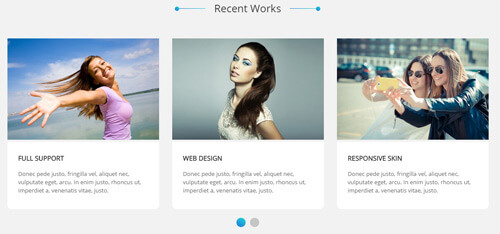
Codes are as follows:
<div class="con_j pt60 pb60">
  <div class="dnn_layout">
    <div class="content_mid clearfix">
      <div class="pane_layout">
        <div class="row">
          <div class="col-sm-12">
            <div class="title">
              <div class="box">
                <h1>Recent Works</h1>
                <div class="line"></div>
              </div>
            </div>
            <div data-autoplay="3000" data-navigation="false" data-autoheight="false" class="carousel carousel_2">
              <div class="item">
                <div class="photo_box"> <a title="Image Gallery" class="LightBox_image_gallery1" href="/Portals/36/con_j_1.jpg">
                  <div class="pic_box"> <img alt="" src="/portals/36/con_j_1.jpg" class="img-responsive" />
                    <div class="ico"> <span class="fa fa-search"></span> </div>
                    <div class="shade"></div>
                  </div>
                  </a> </div>
                <div class="box">
                  <h3>Full Support</h3>
                  <p>Content Text ... </p>
                </div>
              </div>
              <div class="item">
                <div class="photo_box"> <a title="Image Gallery" class="LightBox_image_gallery1" href="/Portals/36/con_j_2.jpg">
                  <div class="pic_box"> <img alt="" src="/portals/36/con_j_2.jpg" class="img-responsive" />
                    <div class="ico"> <span class="fa fa-search"></span> </div>
                    <div class="shade"></div>
                  </div>
                  </a> </div>
                <div class="box">
                  <h3>Web Design</h3>
                  <p>Content Text ... </p>
                </div>
              </div>
              <div class="item">
                <div class="photo_box"> <a title="Image Gallery" class="LightBox_image_gallery1" href="/Portals/36/con_j_3.jpg">
                  <div class="pic_box"> <img alt="" src="/portals/36/con_j_3.jpg" class="img-responsive" />
                    <div class="ico"> <span class="fa fa-search"></span> </div>
                    <div class="shade"></div>
                  </div>
                  </a> </div>
                <div class="box">
                  <h3>Responsive Skin</h3>
                  <p>Content Text ... </p>
                </div>
              </div>
              <div class="item">
                <div class="photo_box"> <a title="Image Gallery" class="LightBox_image_gallery1" href="/Portals/36/con_j_1.jpg">
                  <div class="pic_box"> <img alt="" src="/portals/36/con_j_1.jpg" class="img-responsive" />
                    <div class="ico"> <span class="fa fa-search"></span> </div>
                    <div class="shade"></div>
                  </div>
                  </a> </div>
                <div class="box">
                  <h3>Full Support</h3>
                  <p>Content Text ... </p>
                </div>
              </div>
              <div class="item">
                <div class="photo_box"> <a title="Image Gallery" class="LightBox_image_gallery1" href="/Portals/36/con_j_2.jpg">
                  <div class="pic_box"> <img alt="" src="/portals/36/con_j_2.jpg" class="img-responsive" />
                    <div class="ico"> <span class="fa fa-search"></span> </div>
                    <div class="shade"></div>
                  </div>
                  </a> </div>
                <div class="box">
                  <h3>Web Design</h3>
                  <p>Content Text ... </p>
                </div>
              </div>
              <div class="item">
                <div class="photo_box"> <a title="Image Gallery" class="LightBox_image_gallery1" href="/Portals/36/con_j_3.jpg">
                  <div class="pic_box"> <img alt="" src="/portals/36/con_j_3.jpg" class="img-responsive" />
                    <div class="ico"> <span class="fa fa-search"></span> </div>
                    <div class="shade"></div>
                  </div>
                  </a> </div>
                <div class="box">
                  <h3>Responsive Skin</h3>
                  <p>Content Text ... </p>
                </div>
              </div>
            </div>
          </div>
        </div>
      </div>
    </div>
  </div>
</div>
Option:
- This is a Carousel effect.
- You can increase your content items through adding
<div class="item"></div> - You can add image style effects through effects of imageeffects page.
- You can add image enlargement effect through the effect of lightbox page.
Module Containeris usingContainer-1
| Variable | Default | Type | Description |
|---|---|---|---|
data-items |
4 | int | This variable allows you to set the maximum amount of items displayed at a time with the widest browser width. |
data-navigation |
true | boolean | Display "next" and "prev" buttons. |
data-pagination |
true | boolean | Show pagination. |
data-autoplay |
true | int/boolean | Change to any integrer for example data-autoplay ="5000" to play every 5 seconds. If you set data-autoplay="false" Stop auto scroll animation. |
ProgressBars Counters area
Below is the screen shot:
Codes are as follows:
<div class="con_k pt60 pb60">
  <div class="dnn_layout">
    <div class="content_mid clearfix">
      <div class="pane_layout">
        <div class="row number_Animation">
          <div class="col-md-3 col-sm-6">
            <div class="number_box"> <span data-number="12578" class="animation number">0</span> <span class="number_name">Customers</span> </div>
          </div>
          <div class="col-md-3 col-sm-6">
            <div class="number_box"> <span data-number="2660" class="animation number">0</span> <span class="number_name">Downloads</span> </div>
          </div>
          <div class="col-md-3 col-sm-6">
            <div class="number_box"> <span data-number="520" class="animation number">0</span> <span class="number_name">Themes</span> </div>
          </div>
          <div class="col-md-3 col-sm-6">
            <div class="number_box"> <span data-number="3900" class="animation number">0</span> <span class="number_name">Supports</span> </div>
          </div>
        </div>
      </div>
    </div>
  </div>
</div>
Option:
- This is a ProgressBars Counters effect.
col-md-3 col-sm-6is the width of each column, you can change the width you need through value1~12- You can change the value you need to display through
data-number
Latest News area
Below is the screen shot:
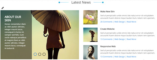
Codes are as follows:
<div class="con_p">
  <div class="row">
    <div class="col-sm-6 animation fadeInLeft">
      <div class="carousel carousel_9" data-navigation="false">
        <div class="item"> <img alt="" src="/portals/36/LightBox1_small.jpg" class="img-responsive" />
          <div class="carousel_content text_left">
            <h3>ABOUT OUR SKIN</h3>
            <p>>Content Text 1 ...</p>
          </div>
        </div>
        <div class="item"> <img alt="" src="/portals/36/LightBox2_small.jpg" class="img-responsive" />
          <div class="carousel_content text_left">
            <h3>ABOUT OUR SKIN</h3>
            <p>>Content Text 2 ...</p>
          </div>
        </div>
        <div class="item"> <img alt="" src="/portals/36/LightBox3_small.jpg" class="img-responsive" />
          <div class="carousel_content text_left">
            <h3>ABOUT OUR SKIN</h3>
            <p>>Content Text 3 ...</p>
          </div>
        </div>
      </div>
    </div>
    <div class="col-sm-6 animation fadeInRight">
      <ul class="con_p_right">
        <li> <img alt="" src="/portals/36/LightBox4.jpg" class="img-responsive" />
          <h6>Make New Skin</h6>
          <p>Content Text ...</p>
          <span><a href="#" target="blank">26 Comments</a> | <a href="#" target="blank">Web Design</a> | <a href="#" target="blank">Read More</a></span> </li>
        <li> <img alt="" src="/portals/36/LightBox1.jpg" class="img-responsive" />
          <h6>Create Website</h6>
          <p>Content Text ...</p>
          <span><a href="#" target="blank">13 Comments</a> | <a href="#" target="blank">Web Design</a> | <a href="#" target="blank">Read More</a></span> </li>
        <li> <img alt="" src="/portals/36/LightBox7.jpg" class="img-responsive" />
          <h6>Responsive Web</h6>
          <p>Content Text ...</p>
          <span><a href="#" target="blank">13 Comments</a> | <a href="#" target="blank">Web Design</a> | <a href="#" target="blank">Read More</a></span> </li>
      </ul>
    </div>
  </div>
</div>
Option:
- This is a Carousel effect.
- You can increase your content items through adding
<div class="item"></div> - You can modify animation to change or delete animation.
col-sm-6is the width of each column, you can change the width you need through value1~12Module Containeris usingContainer-1
| Variable | Default | Type | Description |
|---|---|---|---|
data-navigation |
true | boolean | Display "next" and "prev" buttons. |
data-pagination |
true | boolean | Show pagination. |
data-autoplay |
true | int/boolean | Change to any integrer for example data-autoplay ="5000" to play every 5 seconds. If you set data-autoplay="false" Stop auto scroll animation. |
data-autoheight |
true | boolean | Add height to owl-wrapper-outer so you can use diffrent heights on slides. Use it only for one item per page setting. |
Dividers area
Below is the screen shot:

Codes are as follows:
<div class="con_l mt60"></div>
Option:
- This is a Dividers effect.
Data Managed Charts area
Below is the screen shot:

Codes are as follows:
<div class="con_m animation periodic1">
<p>Sed ut perspiciatis unde omnis iste natus error voluptatem accusantium doloremque laudantium, totam rem aperiam, mauris semper eaque ipsa.</p>
<ul>
    <li><span class="fa fa-check-circle"></span>Responsive and Retina-Ready</li>
    <li><span class="fa fa-check-circle"></span>Full & Boxed Layout</li>
    <li><span class="fa fa-check-circle"></span>Multiple Header Options</li>
    <li><span class="fa fa-check-circle"></span>Compatibility with most Browsers</li>
    <li><span class="fa fa-check-circle"></span>Exclusive Slideshows</li>
</ul>
</div>
Option:
- You can modify
fa fa-check-circleto change icons. font icon list. Module Containeris usingContainer-5
New Product show area
Below is the screen shot:
Codes are as follows:
<div class="con_m animation periodic2">
<p>Sed ut perspiciatis unde omnis iste natus error voluptatem accusantium doloremque laudantium, totam rem aperiam, mauris semper eaque ipsa.</p>
<ul>
    <li><span class="fa fa-check-circle"></span>Unlimited Skins/Styles/Colors</li>
    <li><span class="fa fa-check-circle"></span>Ultra Responsive design</li>
    <li><span class="fa fa-check-circle"></span>Multi-Purpose  Bootstrap 3.2</li>
    <li><span class="fa fa-check-circle"></span>CSS3 & HTML 5</li>
    <li><span class="fa fa-check-circle"></span>Cutting-edge CSS3 animations</li>
</ul>
</div>
Option:
- You can modify
fa fa-check-circleto change icons. font icon list. Module Containeris usingContainer-5
Powerful Theme area
Below is the screen shot:
Codes are as follows:
<div class="con_m animation periodic3">
<p>Sed ut perspiciatis unde omnis iste natus error voluptatem accusantium doloremque laudantium, totam rem aperiam, mauris semper eaque ipsa.</p>
<ul>
    <li><span class="fa fa-check-circle"></span>DNN 7 Page Template</li>
    <li><span class="fa fa-check-circle"></span>Responsive Video & Video BG</li>
    <li><span class="fa fa-check-circle"></span>Coming Soon Page</li>
    <li><span class="fa fa-check-circle"></span>SEO friendly</li>
    <li><span class="fa fa-check-circle"></span>Hundreds of Google Fonts</li>
</ul>
</div>
Option:
- You can modify
fa fa-check-circleto change icons. font icon list. Module Containeris usingContainer-5
Testimonials area
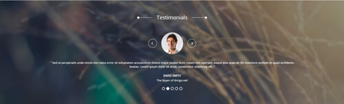
Codes are as follows:
<div class="SectionStyles1">
  <div class="SectionStyles1_bg pt60 pb60">
    <div class="dnn_layout">
      <div class="content_mid clearfix">
        <div class="pane_layout">
          <div class="row">
            <div class="col-sm-12">
              <div class="con_n">
                <div class="title">
                  <div class="box">
                    <h1>Testimonials</h1>
                    <div class="line"></div>
                  </div>
                </div>
                <ul class="Testimonials_tab Testimonials_2" data-position="fade" data-height-auto="false" data-autoplay="3000">
                  <li>
                    <blockquote>
                      <p><span class="Pic"><img alt="" src="/portals/36/circle1.jpg" /></span> “   Content Text ...1   ”</p>
                      <small>David Smith <span>The Buyer of dnngo.net</span></small> </blockquote>
                  </li>
                  <li>
                    <blockquote>
                      <p><span class="Pic"><img alt="" src="/portals/36/circle2.jpg" /></span> “   Content Text ...2   ”</p>
                      <small>David Smith <span>The Buyer of dnngo.net</span></small> </blockquote>
                  </li>
                  <li>
                    <blockquote>
                      <p><span class="Pic"><img alt="" src="/portals/36/circle3.jpg" /></span> “   Content Text ...3   ”</p>
                      <small>David Smith <span>The Buyer of dnngo.net</span></small> </blockquote>
                  </li>
                  <li>
                    <blockquote>
                      <p><span class="Pic"><img alt="" src="/portals/36/circle4.jpg" /></span> “   Content Text ...4   ”</p>
                      <small>David Smith <span>The Buyer of dnngo.net</span></small> </blockquote>
                  </li>
                  <li>
                    <blockquote>
                      <p><span class="Pic"><img alt="" src="/portals/36/circle5.jpg" /></span> “   Content Text ...5   ”</p>
                      <small>David Smith <span>The Buyer of dnngo.net</span></small> </blockquote>
                  </li>
                </ul>
              </div>
            </div>
          </div>
        </div>
      </div>
    </div>
  </div>
</div>
Option:
- This is a Testimonials effect.
Boxes area
Below is the screen shot:
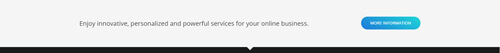
Codes are as follows:
<div class="SectionStyles4 animation fadeInUp">
  <div class="dnn_layout">
    <div class="content_mid clearfix">
      <div class="pane_layout">
        <div class="row">
          <div class="col-sm-12">
            <div class="con_o pt60 pb60">
              <div class="boxes_style_2">
                <div class="boxes">
                  <p>Enjoy innovative, personalized and powerful services for your online business.</p>
                  <div class="but"><a target="blank" href="#" class="buttoncolor4">More Information</a></div>
                </div>
              </div>
            </div>
          </div>
        </div>
      </div>
    </div>
  </div>
</div>
Option:
- You can modify animation fadeInUp to change or delete animation.
Get In Touch area
Below is the screen shot:
Codes are as follows:
<div class="bottom_f animation fadeInUp">
  <p>Sed ut perspiciatis unde omnis iste natus error sit voluptate  eaque ipsa quae ab illo inventore.</p>
  <ul>
    <li> <span class="fa fa-phone"></span>
      <h6 class="title">Phone :</h6>
      <p>Office One  :  (0086) -2568-3666</p>
      <p>Office Two  :  (0086) -2568-5666</p>
    </li>
    <li> <span class="fa fa-envelope"></span>
      <h6 class="title">Email :</h6>
      <p>Office One  :  dnnskindev@gmail.com</p>
      <p>Office Two  :  dnnskindev@gmail.com</p>
    </li>
    <li> <span class="fa fa-map-marker"></span>
      <h6 class="title">Address :</h6>
      <p>XinHua Hotel 15th Floor No.2903, DaZhi Road</p>
    </li>
  </ul>
</div>
Option:
- You can modify animation fadeInUp to change or delete animation.
Module Containeris usingContainer-4
Recent News area
Below is the screen shot:
<ul class="bottom_g animation fadeInUp">
    <li>
    <div class="img"><img alt="" src="/portals/36/LightBox1.jpg" /></div>
    <p>Lorem ipsum dolor sit amet, consectetuer bollt adipiscing elit. Donec libero purus nec placerat.</p>
    <span class="date">February 12nd,2014</span> </li>
    <li>
    <div class="img"><img alt="" src="/portals/36/LightBox2.jpg" /></div>
    <p>Lorem ipsum dolor sit amet, consectetuer bollt adipiscing elit. Donec libero purus nec placerat.</p>
    <span class="date">March 08th,2014</span> </li>
    <li>
    <div class="img"><img alt="" src="/portals/36/LightBox3.jpg" /></div>
    <p>Lorem ipsum dolor sit amet, consectetuer bollt adipiscing elit. Donec libero purus nec placerat.</p>
    <span class="date">April 26th,2014</span> </li>
</ul>
Option:
- You can modify animation fadeInUp to change or delete animation.
Module Containeris usingContainer-4
Email us area
Below is the screen shot:
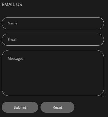
Option:
- This is
Theme_Responsive_20068_home2theme ofDNNGo PowerFormsmodule Module Containeris usingContainer-4
Home Version 3 One Page
You can click the link to check Home Version 3 demo. Home Version 3
Contact us area
Below is the screen shot:
Codes are as follows:
<ul class="top_a">
  <li><span class="fa fa-phone"></span>(+088) - 123 4567</li>
  <li><span class="fa fa-envelope"></span><a href="#">dnnskindev@gmail.com</a></li>
</ul>
Option:
- You can modify
fa fa-phoneto change icons. font icon list.
Social icon area
Below is the screen shot:
Codes are as follows:
<ul class="top_b clearfix">
  <li><a class="fa fa-linkedin-square" href="#"></a> </li>
  <li><a class="fa fa-twitter-square" href="#"></a> </li>
  <li><a class="fa fa-pinterest-square" href="#"></a> </li>
  <li><a class="fa fa-facebook-square" href="#"></a> </li>
</ul>
Option:
- You can modify
fa fa-linkedin-squareto change icons. font icon list.
Anchor area
It will scroll to the corresponding area on the page when clicking the menu texts at the top. It will also do so when clicking the dots on the left of the skin.
These anchors are generated through page's anchorTag. Codes are as follows. You can place this piece of codes in page's HTML module, click the left anchor, then page will slide to this HTML module area.
- <div data-title="Portfolio" class="anchorTag" data-offset="-60" data-scrollshownav="true" data-menuanchor="true"> </div>
Option:
data-title |
Title displayed correspondingly to the right navigation. If page title of the menu is the same as data-title, page will scroll to this area when clicking menu texts. |
data-menuanchor |
Whether to enable menu anchor feature or not. |
data-scrollshownav |
Whether to enable navigation or not. |
data-offset |
Offset value of up and down coordinate for anchor. |
data-icourl |
Image url that displays correspondingly of the right navigation. |
data-iconame |
Icon class names that displays correspondingly of the right navigation. |
How to set menu anchor
- Click Add New Page button.
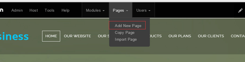
- Fill in Page Name and Page Title. Texts for Page Title needs to be the same as that of data-title.
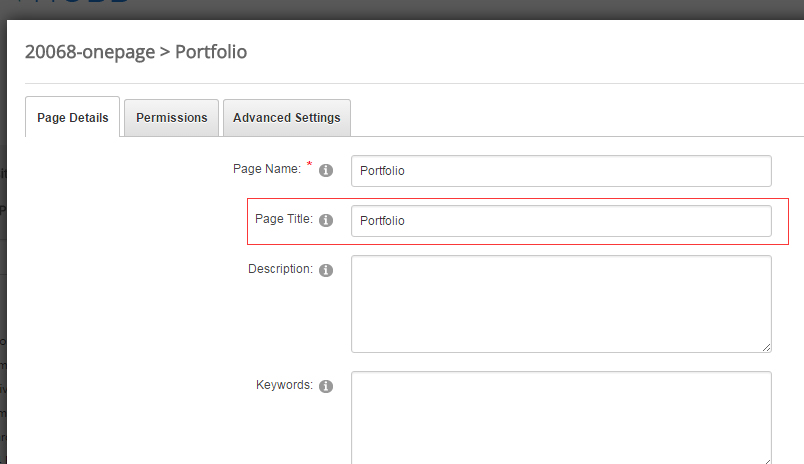
- Put the anchor code to HTML module of the page. It will scroll to the corresponding area on the page when clicking the top menu texts.
- <div data-title="Portfolio" class="anchorTag" data-offset="-60" data-scrollshownav="true" data-menuanchor="true"> </div>
Banner area
Below is the screen shot:

It is using DNNGo LayerGalleryPro module here,you can import ContentListEntity-Home3.xml of the DNNGo_LayerGalleryPro folder to duplicate banner of the demo.
Flip Box area
Below is the screen shot:
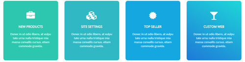
Codes are as follows:
<div class="home3con_a  mt-30">
  <div class="row">
    <div class="col-sm-6 col-md-3 animation periodic1">
      <div class="flip_box flip_box_1">
        <div class="rotate">
          <div class="front"> <span class="fa fa-briefcase"></span>
            <h3>New Products</h3>
            <p>Content Text ... </p>
          </div>
          <div class="back">
            <h3>Flip Box</h3>
            <p>Content Text ... </p>
            <a target="blank" href="#" class="but">Read More</a> </div>
        </div>
      </div>
    </div>
    <div class="col-sm-6 col-md-3 animation periodic2">
      <div class="flip_box flip_box_1">
        <div class="rotate">
          <div class="front"> <span class="fa fa-cubes"></span>
            <h3>Site Settings</h3>
            <p>Content Text ... </p>
          </div>
          <div class="back">
            <h3>Flip Box</h3>
            <p>Content Text ... </p>
            <a target="blank" href="#" class="but">Read More</a> </div>
        </div>
      </div>
    </div>
    <div class="col-sm-6 col-md-3 animation periodic3">
      <div class="flip_box flip_box_1">
        <div class="rotate">
          <div class="front"> <span class="fa fa-certificate"></span>
            <h3>Top Seller</h3>
            <p>Content Text ... </p>
          </div>
          <div class="back">
            <h3>Flip Box</h3>
            <p>Content Text ... </p>
            <a target="blank" href="#" class="but">Read More</a> </div>
        </div>
      </div>
    </div>
    <div class="col-sm-6 col-md-3 animation periodic4">
      <div class="flip_box flip_box_1">
        <div class="rotate">
          <div class="front"> <span class="fa fa-glass"></span>
            <h3>Custom Web</h3>
            <p>Content Text ... </p>
          </div>
          <div class="back">
            <h3>Flip Box</h3>
            <p>Content Text ... </p>
            <a target="blank" href="#" class="but">Read More</a> </div>
        </div>
      </div>
    </div>
  </div>
</div>
Option:
- You can modify animation to change and delete animation.
- This is a flip_box effect.
col-md-3 col-sm-6is the width of each column, you can change the width you need through value1~12- You can modify
fa fa-briefcaseto change icons. font icon list.
Welcome To Dnngo.net area
Below is the screen shot:
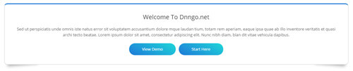
Codes are as follows:
<div class="boxes_style_3 pt60 animation fadeInUp">
  <div class="boxes">
    <h3 class="Boxes_title">Welcome To Dnngo.net</h3>
    <p>Content Text ... </p>
    <div class="but"><a class="buttoncolor" target="blank" href="#">View Demo</a><a class="buttoncolor" target="blank" href="#">Start Here</a></div>
  </div>
</div>
Option:
- This is a Boxes effect.
- You can modify
animation fadeInUpto change or delete animation. Animation list.
Isotope area
Below is the screen shot:

Codes are as follows:
<div class="home3con_b">
  <div class="isotope_grid isotope_2">
    <div class="loading">
      <div class="loading-container container1">
        <div class="circle1"></div>
        <div class="circle2"></div>
        <div class="circle3"></div>
        <div class="circle4"></div>
      </div>
      <div class="loading-container container2">
        <div class="circle1"></div>
        <div class="circle2"></div>
        <div class="circle3"></div>
        <div class="circle4"></div>
      </div>
      <div class="loading-container container3">
        <div class="circle1"></div>
        <div class="circle2"></div>
        <div class="circle3"></div>
        <div class="circle4"></div>
      </div>
    </div>
    <div data-min-width="390" class="isotope_main">
      <div class="isotope_item">
        <div class="photo_box ico_LeftAndRight_enter">
          <div class="pic_box"> <img alt="" src="/portals/36/isotope1.jpg" class="img-responsive" />
            <div class="ico">
              <h3>Dnn Modules</h3>
              <a target="blank" href="#"> <span class="fa fa-plus ico_left"></span></a> <a target="blank" href="#"><span class="fa fa-search ico_right"></span></a> </div>
            <div class="shade"></div>
          </div>
        </div>
      </div>
      <div class="isotope_item webdesign">
        <div class="photo_box ico_LeftAndRight_enter">
          <div class="pic_box"> <img alt="" src="/portals/36/isotope7.jpg" class="img-responsive" />
            <div class="ico">
              <h3>Dnn Modules</h3>
              <a target="blank" href="#"> <span class="fa fa-plus ico_left"></span></a> <a target="blank" href="#"><span class="fa fa-search ico_right"></span></a> </div>
            <div class="shade"></div>
          </div>
        </div>
      </div>
      <div data-zoom="2" class="isotope_item photography">
        <div class="photo_box ico_LeftAndRight_enter">
          <div class="pic_box"> <img alt="" src="/portals/36/isotope4.jpg" class="img-responsive" />
            <div class="ico">
              <h3>Dnn Modules</h3>
              <a target="blank" href="#"> <span class="fa fa-plus ico_left"></span></a> <a target="blank" href="#"><span class="fa fa-search ico_right"></span></a> </div>
            <div class="shade"></div>
          </div>
        </div>
      </div>
      <div class="isotope_item photography">
        <div class="photo_box ico_LeftAndRight_enter">
          <div class="pic_box"> <img alt="" src="/portals/36/isotope8.jpg" class="img-responsive" />
            <div class="ico">
              <h3>Dnn Modules</h3>
              <a target="blank" href="#"> <span class="fa fa-plus ico_left"></span></a> <a target="blank" href="#"><span class="fa fa-search ico_right"></span></a> </div>
            <div class="shade"></div>
          </div>
        </div>
      </div>
      <div class="isotope_item blogs photography">
        <div class="photo_box ico_LeftAndRight_enter">
          <div class="pic_box"> <img alt="" src="/portals/36/isotope6.jpg" class="img-responsive" />
            <div class="ico">
              <h3>Dnn Modules</h3>
              <a target="blank" href="#"> <span class="fa fa-plus ico_left"></span></a> <a target="blank" href="#"><span class="fa fa-search ico_right"></span></a> </div>
            <div class="shade"></div>
          </div>
        </div>
      </div>
    </div>
  </div>
</div>
Option:
- You can add
<a data-filter=".FilterName" href="#">Filter Name</a>to increase categories.data-filter=".FilterName"can not be blank space. - You can modify
data-min-widthto change minimum width of image. - You can modify
isotope_itemFilterNameto categorize images. - You can modify
fa fa-plus ico_leftto change icons. font icon list.
Carousel area

Codes are as follows:
<div class="home3con_c pt60 pb60">
  <div class="dnn_layout">
    <div class="content_mid clearfix">
      <div class="pane_layout">
        <div class="row">
          <div class="col-sm-12">
            <div class="carousel carousel_3" data-pagination="false" data-autoheight="false" data-autoplay="3000">
              <div class="item">
                <div class="ico"><span class="fa fa-camera"></span></div>
                <h3>Photo Gallery</h3>
                <p>Content Text ... </p>
              </div>
              <div class="item">
                <div class="ico"><span class="fa fa-fire"></span></div>
                <h3>The Flames</h3>
                <p>Content Text ... </p>
              </div>
              <div class="item">
                <div class="ico"><span class="fa fa-glass"></span></div>
                <h3>Best Seller</h3>
                <p>Content Text ... </p>
              </div>
              <div class="item">
                <div class="ico"><span class="fa fa-camera"></span></div>
                <h3>Photo Gallery</h3>
                <p>Content Text ... </p>
              </div>
              <div class="item">
                <div class="ico"><span class="fa fa-fire"></span></div>
                <h3>The Flames</h3>
                <p>Content Text ... </p>
              </div>
              <div class="item">
                <div class="ico"><span class="fa fa-glass"></span></div>
                <h3>Best Seller</h3>
                <p>Content Text ... </p>
              </div>
            </div>
          </div>
        </div>
      </div>
    </div>
  </div>
</div>
Option:
- This is a Carousel effect.
- You can increase your content items through adding
<div class="item"></div>
| Variable | Default | Type | Description |
|---|---|---|---|
data-items |
4 | int | This variable allows you to set the maximum amount of items displayed at a time with the widest browser width. |
data-navigation |
true | boolean | Display "next" and "prev" buttons. |
data-pagination |
true | boolean | Show pagination. |
data-autoplay |
true | int/boolean | Change to any integrer for example data-autoplay ="5000" to play every 5 seconds. If you set data-autoplay="false" Stop auto scroll animation. |
Recent Blogs And Our Skills area
Below is the screen shot:
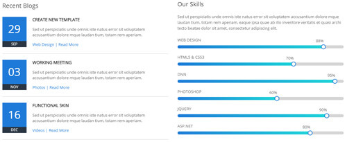
Codes are as follows:
<div class="home3con_d pt60 pb60 ">
  <div class="dnn_layout">
    <div class="content_mid clearfix">
      <div class="pane_layout">
        <div class="row">
          <div class="col-sm-6 animation fadeInLeft">
            <div class="home3con_d_left">
              <h3>Recent Blogs</h3>
              <ul>
                <li>
                  <div class="date"> <span class="nob">29</span> <span class="mon">Sep</span> </div>
                  <div class="rightbox">
                    <h6>Create New Template</h6>
                    <p>Content Text ...</p>
                    <span class="link"><a target="blank" href="#">Web Design</a> | <a target="blank" href="#">Read More</a></span> </div>
                </li>
                <li>
                  <div class="date"> <span class="nob">03</span> <span class="mon">Nov</span> </div>
                  <div class="rightbox">
                    <h6>Working Meeting</h6>
                    <p>Content Text ...</p>
                    <span class="link"><a target="blank" href="#">Photos</a> | <a target="blank" href="#">Read More</a></span> </div>
                </li>
                <li>
                  <div class="date"> <span class="nob">16</span> <span class="mon">Dec</span> </div>
                  <div class="rightbox">
                    <h6>Functional Skin</h6>
                    <p>Content Text ...</p>
                    <span class="link"><a target="blank" href="#">Videos</a> | <a target="blank" href="#">Read More</a></span> </div>
                </li>
              </ul>
            </div>
          </div>
          <div class="col-sm-6 animation fadeInRight">
            <div class="home3con_d_right">
              <h3>Our Skills</h3>
              <p>Content Text ... </p>
              <div class="loaded_list">
                <p> Web Design </p>
                <div class="progress progress-striped active">
                  <div class="bar animation animationwidth" data-width="88%"><span></span></div>
                </div>
                <p> Html5 & CSS3</p>
                <div class="progress progress-striped active">
                  <div class="bar animation animationwidth" data-width="70%"><span></span></div>
                </div>
                <p>DNN</p>
                <div class="progress progress-striped active">
                  <div class="bar animation animationwidth" data-width="95%"><span></span> </div>
                </div>
                <p>Photoshop</p>
                <div class="progress progress-striped active">
                  <div class="bar animation animationwidth" data-width="60%"><span></span></div>
                </div>
                <p> Jquery </p>
                <div class="progress progress-striped active">
                  <div class="bar animation animationwidth" data-width="90%"><span></span></div>
                </div>
                <p> ASp.net </p>
                <div class="progress progress-striped active">
                  <div class="bar animation animationwidth" data-width="80%"><span></span></div>
                </div>
              </div>
            </div>
          </div>
        </div>
      </div>
    </div>
  </div>
</div>
Option:
- You can modify animation to change or delete animation.
- This is a ProgressBars Counters effect.
data-widthis for controlling the percentage that displays, you can display percentage through value0~100
Powerful, Responsive, Awesome Theme area
Below is the screen shot:
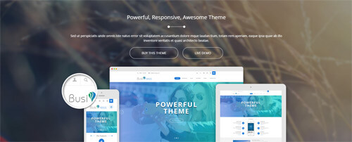
Codes are as follows:
<div class="SectionStyles1 ">
  <div class="SectionStyles1_bg ">
    <div class="home3con_e  pt60">
      <div class="dnn_layout">
        <div class="content_mid clearfix">
          <div class="pane_layout">
            <div class="row">
              <div class="col-sm-12">
                <div class="home3con_etop animation fadeInUp">
                  <h3 class="title">Powerful, Responsive, Awesome Theme</h3>
                  <div class="line"></div>
                  <p class="text">Content Text ...</p>
                  <a target="blank" href="#" class="buttoncolor2">Buy This Theme</a><a target="blank" href="#" class="buttoncolor2">Live demo</a> </div>
              </div>
              <div class="col-sm-12">
                <div class="home3con_ebottom">
                  <div class="mac animation periodic1"> <img alt="" class="img-responsive" src="/portals/36/home3con_emac.png" /> </div>
                  <div class="ipad animation periodic2"> <img alt="" class="img-responsive" src="/portals/36/home3con_eipad.png" /> </div>
                  <div class="phone animation periodic3"> <img alt="" class="img-responsive" src="/portals/36/home3con_ephone.png" /> </div>
                  <div class="cirde animation periodic4"> <img alt="" class="img-responsive" src="/portals/36/home3con_ecirde.png" /> </div>
                </div>
              </div>
            </div>
          </div>
        </div>
      </div>
    </div>
  </div>
</div>
Option:
- This is a SectionStyles effect.
- You can modify animation to change or delete animation.
Our History area
Below is the screen shot:
Codes are as follows:
<div class="home3con_f pt60 pb60 ">
  <div class="dnn_layout">
    <div class="content_mid clearfix">
      <div class="pane_layout">
        <div class="row">
          <div class="col-sm-12">
            <div class="title">
              <div class="box">
                <h1>Our History</h1>
                <div class="line"></div>
              </div>
            </div>
            <div class="Time_Line">
              <div class="Time_Line_top">
                <div class="Time_Line_top_time">2014</div>
              </div>
              <div class="Time_Line_content clearfix">
                <div class="Time_Line_left animation fadeInLeft">
                  <div class="photo_box ico_right_enter"> <a target="blank" href="#">
                    <div class="pic_box"> <img alt="" src="/portals/36/LightBox3.jpg" />
                      <div class="ico"> <span class="fa fa-plus"></span> </div>
                      <div class="shade"></div>
                    </div>
                    </a> </div>
                  <h3>Version 1.0 Updated</h3>
                  <p>Content Text ...</p>
                  <span><a target="blank" href="#">August 20th</a> | <a target="blank" href="#">Read More</a></span>
                  <div class="dot">1</div>
                </div>
                <div class="Time_Line_right animation fadeInRight">
                  <div class="photo_box ico_right_enter"> <a target="blank" href="#">
                    <div class="pic_box"> <img alt="" src="/portals/36/LightBox1.jpg" />
                      <div class="ico"> <span class="fa fa-plus"></span> </div>
                      <div class="shade"></div>
                    </div>
                    </a> </div>
                  <h3>DNN6 & DNN7</h3>
                  <p>Content Text ...</p>
                  <span><a target="blank" href="#">June 06th</a> | <a target="blank" href="#">Read More</a></span>
                  <div class="dot">2</div>
                </div>
              </div>
              <div class="Time_Line_top">
                <div class="Time_Line_top_time">2013</div>
              </div>
              <div class="Time_Line_content clearfix">
                <div class="Time_Line_left animation fadeInLeft">
                  <div class="photo_box ico_right_enter"> <a target="blank" href="#">
                    <div class="pic_box"> <img alt="" src="/portals/36/LightBox9.jpg" />
                      <div class="ico"> <span class="fa fa-plus"></span> </div>
                      <div class="shade"></div>
                    </div>
                    </a> </div>
                  <h3>Front Technology</h3>
                  <p>Content Text ...</p>
                  <span><a target="blank" href="#">May 13rd</a> | <a target="blank" href="#">Read More</a></span>
                  <div class="dot">3</div>
                </div>
                <div class="Time_Line_right animation fadeInRight">
                  <div class="photo_box ico_right_enter"> <a target="blank" href="#">
                    <div class="pic_box"> <img alt="" src="/portals/36/LightBox7.jpg" />
                      <div class="ico"> <span class="fa fa-plus"></span> </div>
                      <div class="shade"></div>
                    </div>
                    </a> </div>
                  <h3>Retina Ready</h3>
                  <p>Content Text ...</p>
                  <span><a target="blank" href="#">February 05th</a> | <a target="blank" href="#">Read More</a></span>
                  <div class="dot">4</div>
                </div>
              </div>
              <div class="Time_Line_line"></div>
            </div>
          </div>
        </div>
      </div>
    </div>
  </div>
</div>
Option:
- You can modify
photo_boxto change image effects. Image Effects - You can modify
fa fa-plusto change icons. font icon list. - You can modify
animationto change or delete animation.Animation list.
Our Services area
Below is the screen shot:
Codes are as follows:
<div class="SectionStyles5">
  <div class="home3con_g pt60 pb60 ">
    <div class="dnn_layout">
      <div class="content_mid clearfix">
        <div class="pane_layout">
          <div class="row">
            <div class="col-sm-12 animation fadeInUp">
              <div class="title">
                <div class="box">
                  <h1>Our Services</h1>
                  <div class="line"></div>
                </div>
              </div>
              <p class="text">Content Text ... </p>
              <ul class="clearfix">
                <li>
                  <div class="top">
                    <h6>Web Design</h6>
                    <div class="line"></div>
                    <p>Content Text ...</p>
                    <a target="blank" href="#" class="link">More Information ></a> </div>
                  <div class="bottom"><a target="blank" href="#"> Start Here <span class="glyphicons glyph-chevron-right"></span></a> </div>
                </li>
                <li>
                  <div class="top">
                    <h6>Develop skin</h6>
                    <div class="line"></div>
                    <p>Content Text ...</p>
                    <a target="blank" href="#" class="link">More Information ></a> </div>
                  <div class="bottom"> <a target="blank" href="#">Purchase It <span class="glyphicons glyph-chevron-right"></span></a> </div>
                </li>
                <li>
                  <div class="top">
                    <h6>DNN Modules</h6>
                    <div class="line"></div>
                    <p>Content Text ...</p>
                    <a target="blank" href="#" class="link">More Information ></a> </div>
                  <div class="bottom"><a target="blank" href="#"> Custom Theme <span class="glyphicons glyph-chevron-right"></span></a> </div>
                </li>
              </ul>
              <div class="bottomlink"><a class="buttoncolor2" target="blank" href="#">Custom Service</a><a class="buttoncolor2" target="blank" href="#">Make Website</a></div>
            </div>
          </div>
        </div>
      </div>
    </div>
  </div>
</div>
Option:
- This is a SectionStyles effect.
- You can modify animation to change or delete animation.
Pricing area
Below is the screen shot:
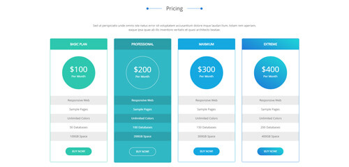
Codes are as follows:
<div class="home3con_h pt60 ">
  <div class="dnn_layout">
    <div class="content_mid clearfix">
      <div class="pane_layout">
        <div class="row">
          <div class="col-sm-12 animation fadeInUp">
            <div class="title">
              <div class="box">
                <h1>Pricing</h1>
                <div class="line"></div>
              </div>
            </div>
            <p class="text">Content Text ...</p>
          </div>
        </div>
        <div class="price-table price-table1 row">
          <div class="col-md-3 col-sm-6 color_1 animation periodic1">
            <div class="price_border">
              <div class="price_title">
                <h2>Basic Plan</h2>
              </div>
              <div class="price_holder">
                <div class="price_box"><span class="sup">$</span><span class="price">100</span><span class="unit">Per Month</span></div>
                <ul>
                  <li>Responsive Web</li>
                  <li>Sample Pages</li>
                  <li>Unlimited Colors</li>
                  <li>50 Databases</li>
                  <li>100GB Space</li>
                </ul>
                <a class="btn " target="blank" href="#">BUY NOW!</a> </div>
            </div>
          </div>
          <div class="col-md-3 col-sm-6 color_2 animation periodic2">
            <div class="price_border">
              <div class="price_title ">
                <h2>Professional</h2>
              </div>
              <div class="price_holder">
                <div class="price_box"><span class="sup">$</span><span class="price">200</span><span class="unit">Per Month</span></div>
                <ul>
                  <li>Responsive Web</li>
                  <li>Sample Pages</li>
                  <li>Unlimited Colors</li>
                  <li>100 Databases</li>
                  <li>200GB Space</li>
                </ul>
                <a class="btn" target="blank" href="#">BUY NOW!</a> </div>
            </div>
          </div>
          <div class="col-md-3 col-sm-6 color_3 animation periodic3">
            <div class="price_border">
              <div class="price_title">
                <h2>Maxmium</h2>
              </div>
              <div class="price_holder">
                <div class="price_box"><span class="sup">$</span><span class="price">300</span><span class="unit">Per Month</span></div>
                <ul>
                  <li>Responsive Web</li>
                  <li>Sample Pages</li>
                  <li>Unlimited Colors</li>
                  <li>150 Databases</li>
                  <li>300GB Space</li>
                </ul>
                <a class="btn" target="blank" href="#">BUY NOW!</a> </div>
            </div>
          </div>
          <div class="col-md-3 col-sm-6 color_4 animation periodic4">
            <div class="price_border">
              <div class="price_title">
                <h2>Extreme</h2>
              </div>
              <div class="price_holder">
                <div class="price_box"><span class="sup">$</span><span class="price">400</span><span class="unit">Per Month</span></div>
                <ul>
                  <li>Responsive Web</li>
                  <li>Sample Pages</li>
                  <li>Unlimited Colors</li>
                  <li>200 Databases</li>
                  <li>400GB Space</li>
                </ul>
                <a class="btn" target="blank" href="#">BUY NOW!</a> </div>
            </div>
          </div>
        </div>
      </div>
    </div>
  </div>
</div>
- This is a Price-table effect.
- You can modify animation to change or delete animation.
col-md-3 col-sm-6is the width of each column, you can change the width you need through value1~12
MAP area
Below is the screen shot:
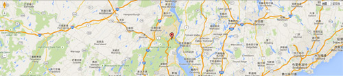
Codes are as follows:
<div class="home3con_i ">
  <div id="gmap" style="width: 100%;"></div>
</div>
Option:
- You can change address of
gmapincustom.js
Photos area
Below is the screen shot:
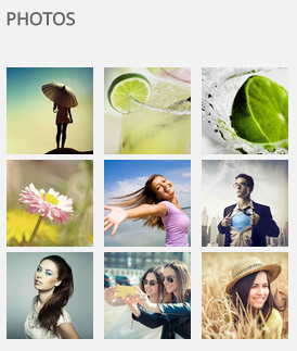
Codes are as follows:
<div class="bottom_a row animation fadeInUp">
  <div class="col-sm-4 col-xs-6">
    <div class="photo_box"> <a title="Image Gallery" class="iLightBox_image_gallery1" href="/Portals/36/LightBox1.jpg">
      <div class="pic_box"> <img alt="" class="img-responsive" src="/portals/36/LightBox1.jpg" />
        <div class="shade"></div>
      </div>
      </a> </div>
  </div>
  <div class="col-sm-4  col-xs-6">
    <div class="photo_box"> <a title="Image Gallery" class="iLightBox_image_gallery1" href="/Portals/36/LightBox2.jpg">
      <div class="pic_box"> <img alt="" class="img-responsive" src="/portals/36/LightBox2.jpg" />
        <div class="shade"></div>
      </div>
      </a> </div>
  </div>
  <div class="col-sm-4  col-xs-6">
    <div class="photo_box"> <a title="Image Gallery" class="iLightBox_image_gallery1" href="/Portals/36/LightBox3.jpg">
      <div class="pic_box"> <img alt="" class="img-responsive" src="/portals/36/LightBox3.jpg" />
        <div class="shade"></div>
      </div>
      </a> </div>
  </div>
  <div class="col-sm-4  col-xs-6">
    <div class="photo_box"> <a title="Image Gallery" class="iLightBox_image_gallery1" href="/Portals/36/LightBox4.jpg">
      <div class="pic_box"> <img alt="" class="img-responsive" src="/portals/36/LightBox4.jpg" />
        <div class="shade"></div>
      </div>
      </a> </div>
  </div>
  <div class="col-sm-4  col-xs-6">
    <div class="photo_box"> <a title="Image Gallery" class="iLightBox_image_gallery1" href="/Portals/36/LightBox5.jpg">
      <div class="pic_box"> <img alt="" class="img-responsive" src="/portals/36/LightBox5.jpg" />
        <div class="shade"></div>
      </div>
      </a> </div>
  </div>
  <div class="col-sm-4  col-xs-6">
    <div class="photo_box"> <a title="Image Gallery" class="iLightBox_image_gallery1" href="/Portals/36/LightBox6.jpg">
      <div class="pic_box"> <img alt="" class="img-responsive" src="/portals/36/LightBox6.jpg" />
        <div class="shade"></div>
      </div>
      </a> </div>
  </div>
  <div class="col-sm-4  col-xs-6">
    <div class="photo_box"> <a title="Image Gallery" class="iLightBox_image_gallery1" href="/Portals/36/LightBox7.jpg">
      <div class="pic_box"> <img alt="" class="img-responsive" src="/portals/36/LightBox7.jpg" />
        <div class="shade"></div>
      </div>
      </a> </div>
  </div>
  <div class="col-sm-4  col-xs-6">
    <div class="photo_box"> <a title="Image Gallery" class="iLightBox_image_gallery1" href="/Portals/36/LightBox8.jpg">
      <div class="pic_box"> <img alt="" class="img-responsive" src="/portals/36/LightBox8.jpg" />
        <div class="shade"></div>
      </div>
      </a> </div>
  </div>
  <div class="col-sm-4  col-xs-6">
    <div class="photo_box"> <a title="Image Gallery" class="iLightBox_image_gallery1" href="/Portals/36/LightBox9.jpg">
      <div class="pic_box"> <img alt="" class="img-responsive" src="/portals/36/LightBox9.jpg" />
        <div class="shade"></div>
      </div>
      </a> </div>
  </div>
</div>
Option:
- You can modify
photo_boxto change image effects. Image Effects - You can modify animation to change or delete animation.
col-sm-4 col-xs-6is the width of each column, you can change the width you need through value1~12Module Containeris usingContainer-4
Links area
Below is the screen shot:
Codes are as follows:
<ul class="bottom_h animation fadeInUp">
  <li><a target="blank" href="#"><span class="fa fa-angle-right"></span>Design & Skinning</a></li>
  <li><a target="blank" href="#"><span class="fa fa-angle-right"></span>Help Center</a></li>
  <li><a target="blank" href="#"><span class="fa fa-angle-right"></span>Modules Development</a></li>
  <li><a target="blank" href="#"><span class="fa fa-angle-right"></span>Download Center</a></li>
  <li><a target="blank" href="#"><span class="fa fa-angle-right"></span>Make Your Business</a></li>
  <li><a target="blank" href="#"><span class="fa fa-angle-right"></span>Find Our Location</a></li>
</ul>
Option:
- You can modify
fa fa-angle-rightto change icons. font icon list. - You can modify animation to change or delete animation.
Module Containeris usingContainer-4
Contact area
Below is the screen shot:
<ul class="bottom_i animation fadeInUp">
  <li>
    <p class="title">Office Address :</p>
    <p class="time">XinHua Hotel 15th Floor No.2903</p>
  </li>
  <li>
    <p class="title">Phone Number :</p>
    <p class="time">(0086) -23665877, (0086) -23885899</p>
  </li>
  <li>
    <p class="title">Email to Us :</p>
    <p class="time">dnnskindev@gmail.com</p>
  </li>
</ul>
Option:
Module Containeris usingContainer-4
Email Us area
Below is the screen shot:
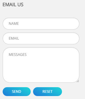
Option:
- This is
Theme_Responsive_20068_home3theme ofDNNGo PowerFormsmodule Module Containeris usingContainer-4
Home Version 4
You can click the link to check Home Version 4 demo. Home Version 4
Responsive Layout area
Below is the screen shot:
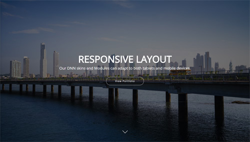
<ul class="full_screen_pic">
  <li style="background-image: url('http://demo7.dnngo.net/Portals/36/home5_banner1.jpg');">
    <div class="full_screen_pic_bg">
      <div class="full_screen_pic_main">
        <h1 class="animation periodic1">Responsive Layout</h1>
        <p class="animation periodic2">Our DNN skins and Modules can adapt to both tablets and mobile devices.</p>
        <a target="blank" href="#" class="Button_style2 jumbo white animation periodic3">View Portfolio</a> </div>
      <div id="nextPage"></div>
    </div>
  </li>
</ul>
Option:
- This area is using HTML module.
- You can modify <li style=" background-image: url('/Portals/36/home5_banner1.jpg');">to change background image.
- You can click down arrow to redirect to the area below banner.
Welcome to our website! area
Below is the screen shot:
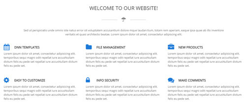
Codes are as follows:
<div class="row home5con_a animation fadeInUp">
  <div class="col-sm-12">
    <h3>Welcome to our website!</h3>
    <div class="linebox">
      <div class="line"></div>
      <span class="fa fa-umbrella"></span> </div>
    <p>Title Text ...  </p>
  </div>
</div>
<div class="home5con_b animation fadeInUp">
  <div class="row">
    <div class="col-sm-4">
      <h4><span class="fa fa-calendar"></span>DNN Templates</h4>
      <p>Content Text ...</p>
    </div>
    <div class="col-sm-4">
      <h4><span class="fa fa-folder"></span>File Management</h4>
      <p>Content Text ...</p>
    </div>
    <div class="col-sm-4">
      <h4><span class="fa fa-briefcase"></span>New Products</h4>
      <p>Content Text ...</p>
    </div>
  </div>
</div>
<div class="home5con_b animation fadeInUp">
  <div class="row">
    <div class="col-sm-4">
      <h4><span class="fa fa-cog"></span>Easy To Customize</h4>
      <p>Content Text ...</p>
    </div>
    <div class="col-sm-4">
      <h4><span class="fa fa-lock"></span>Info security</h4>
      <p>Content Text ...</p>
    </div>
    <div class="col-sm-4">
      <h4><span class="fa fa-comments"></span>Make Comments</h4>
      <p>Content Text ...</p>
    </div>
  </div>
</div>
Option:
col-sm-4is the width of each column, you can change the width you need through value1~12
Dividers area
Below is the screen shot:

Codes are as follows:
<hr class="dividers_2 mt60 mb60 animation fadeInUp" />
Option:
- This is a Dividers effect.
Our Works area
Below is the screen shot:
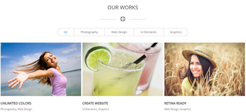
Codes are as follows:
<div class="row home5con_a animation fadeInUp">
  <div class="col-sm-12">
    <h3>Our Works</h3>
    <div class="linebox">
      <div class="line"></div>
      <span class="fa fa-life-ring"></span> </div>
  </div>
</div>
<div class="isotope_grid isotope_4 animation fadeInUp">
  <div class="isotope_group portfolios_group"> <a class="active" href="#" data-filter="*">All</a> <a href="#" data-filter=".photography">Photography</a> <a href="#" data-filter=".webdesign">Web Design</a> <a href="#" data-filter=".elements">UI Elements</a> <a href="#" data-filter=".graphics">Graphics</a> </div>
  <div class="loading">
    <div class="loading-container container1">
      <div class="circle1"></div>
      <div class="circle2"></div>
      <div class="circle3"></div>
      <div class="circle4"></div>
    </div>
    <div class="loading-container container2">
      <div class="circle1"></div>
      <div class="circle2"></div>
      <div class="circle3"></div>
      <div class="circle4"></div>
    </div>
    <div class="loading-container container3">
      <div class="circle1"></div>
      <div class="circle2"></div>
      <div class="circle3"></div>
      <div class="circle4"></div>
    </div>
  </div>
  <div class="isotope_main" data-min-width="300">
    <div class="isotope_item photography elements">
      <div class="photo_box">
        <div class="pic_box"> <img alt="" src="/portals/36/isotope1.jpg" />
          <div class="content">
            <div class="vertical_center_1">
              <div class="vertical_center_2">
                <div class="ico"> <a href="#" target="blank"><span class="fa fa-tag"></span></a> <a href="/Portals/36/isotope1.jpg" class="iLightBox_image_gallery1"><span class="fa fa-reply"></span></a> </div>
              </div>
            </div>
          </div>
          <div class="shade"></div>
        </div>
        <div class="text_sytle1">
          <h3>Unlimited Colors</h3>
          <p>Photogarphy, Web Design</p>
        </div>
      </div>
    </div>
    <div class="isotope_item elements graphics">
      <div class="photo_box">
        <div class="pic_box"> <img alt="" src="/portals/36/isotope2.jpg" />
          <div class="content">
            <div class="vertical_center_1">
              <div class="vertical_center_2">
                <div class="ico"> <a href="#" target="blank"><span class="fa fa-tag"></span></a> <a href="/Portals/36/isotope2.jpg" class="iLightBox_image_gallery1"><span class="fa fa-reply"></span></a> </div>
              </div>
            </div>
          </div>
          <div class="shade"></div>
        </div>
        <div class="text_sytle1">
          <h3>Create Website</h3>
          <p>UI Elements, Graphics</p>
        </div>
      </div>
    </div>
    <div class="isotope_item photography graphics webdesign">
      <div class="photo_box">
        <div class="pic_box"> <img alt="" src="/portals/36/isotope3.jpg" />
          <div class="content">
            <div class="vertical_center_1">
              <div class="vertical_center_2">
                <div class="ico"> <a href="#" target="blank"><span class="fa fa-tag"></span></a> <a href="/Portals/36/isotope3.jpg" class="iLightBox_image_gallery1"><span class="fa fa-reply"></span></a> </div>
              </div>
            </div>
          </div>
          <div class="shade"></div>
        </div>
        <div class="text_sytle1">
          <h3>RETINA READY</h3>
          <p>Web Design, Graphics</p>
        </div>
      </div>
    </div>
    <div class="isotope_item elements graphics">
      <div class="photo_box">
        <div class="pic_box"> <img alt="" src="/portals/36/isotope4.jpg" />
          <div class="content">
            <div class="vertical_center_1">
              <div class="vertical_center_2">
                <div class="ico"> <a href="#" target="blank"><span class="fa fa-tag"></span></a> <a href="/Portals/36/isotope4.jpg" class="iLightBox_image_gallery1"><span class="fa fa-reply"></span></a> </div>
              </div>
            </div>
          </div>
          <div class="shade"></div>
        </div>
        <div class="text_sytle1">
          <h3>DNN Modules</h3>
          <p>Photogarphy, UI Elements</p>
        </div>
      </div>
    </div>
    <div class="isotope_item photography graphics webdesign">
      <div class="photo_box">
        <div class="pic_box"> <img alt="" src="/portals/36/isotope5.jpg" />
          <div class="content">
            <div class="vertical_center_1">
              <div class="vertical_center_2">
                <div class="ico"> <a href="#" target="blank"><span class="fa fa-tag"></span></a> <a href="/Portals/36/isotope5.jpg" class="iLightBox_image_gallery1"><span class="fa fa-reply"></span></a> </div>
              </div>
            </div>
          </div>
          <div class="shade"></div>
        </div>
        <div class="text_sytle1">
          <h3>PREMIUM SLIDERS</h3>
          <p>Photogarphy, Web Design</p>
        </div>
      </div>
    </div>
    <div class="isotope_item elements">
      <div class="photo_box">
        <div class="pic_box"> <img alt="" src="/portals/36/isotope6.jpg" />
          <div class="content">
            <div class="vertical_center_1">
              <div class="vertical_center_2">
                <div class="ico"> <a href="#" target="blank"><span class="fa fa-tag"></span></a> <a href="/Portals/36/isotope6.jpg" class="iLightBox_image_gallery1"><span class="fa fa-reply"></span></a> </div>
              </div>
            </div>
          </div>
          <div class="shade"></div>
        </div>
        <div class="text_sytle1">
          <h3>CUSTOMIZABLE FONTS</h3>
          <p>Photogarphy, Graphics</p>
        </div>
      </div>
    </div>
    <div class="isotope_item elements graphics webdesign">
      <div class="photo_box">
        <div class="pic_box"> <img alt="" src="/portals/36/isotope7.jpg" />
          <div class="content">
            <div class="vertical_center_1">
              <div class="vertical_center_2">
                <div class="ico"> <a href="#" target="blank"><span class="fa fa-tag"></span></a> <a href="/Portals/36/isotope4.jpg" class="iLightBox_image_gallery1"><span class="fa fa-reply"></span></a> </div>
              </div>
            </div>
          </div>
          <div class="shade"></div>
        </div>
        <div class="text_sytle1">
          <h3>DNN Modules</h3>
          <p>Photogarphy, UI Elements</p>
        </div>
      </div>
    </div>
    <div class="isotope_item photography graphics webdesign">
      <div class="photo_box">
        <div class="pic_box"> <img alt="" src="/portals/36/isotope8.jpg" />
          <div class="content">
            <div class="vertical_center_1">
              <div class="vertical_center_2">
                <div class="ico"> <a href="#" target="blank"><span class="fa fa-tag"></span></a> <a href="/Portals/36/isotope5.jpg" class="iLightBox_image_gallery1"><span class="fa fa-reply"></span></a> </div>
              </div>
            </div>
          </div>
          <div class="shade"></div>
        </div>
        <div class="text_sytle1">
          <h3>PREMIUM SLIDERS</h3>
          <p>Photogarphy, Web Design</p>
        </div>
      </div>
    </div>
    <div class="isotope_item elements">
      <div class="photo_box">
        <div class="pic_box"> <img alt="" src="/portals/36/isotope9.jpg" />
          <div class="content">
            <div class="vertical_center_1">
              <div class="vertical_center_2">
                <div class="ico"> <a href="#" target="blank"><span class="fa fa-tag"></span></a> <a href="/Portals/36/isotope6.jpg" class="iLightBox_image_gallery1"><span class="fa fa-reply"></span></a> </div>
              </div>
            </div>
          </div>
          <div class="shade"></div>
        </div>
        <div class="text_sytle1">
          <h3>CUSTOMIZABLE FONTS</h3>
          <p>Photogarphy, Graphics</p>
        </div>
      </div>
    </div>
  </div>
</div>
Option:
- You can add
<a data-filter=".FilterName" href="#">Filter Name</a>to increase categories.data-filter=".FilterName"can not be blank space. - You can modify
data-min-widthto change minimum width of image. - You can modify
isotope_itemFilterNameto categorize images. - You can modify
fa fa-tagto change icons. font icon list.
Why Choose Us area
Below is the screen shot:
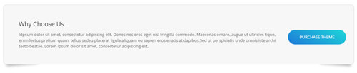
Codes are as follows:
<div class="boxes_style_9 animation fadeInUp">
  <div class="boxes">
    <h3 class="Boxes_title">Why Choose Us</h3>
    <p>Content Text ...   </p>
    <div class="but"><a class="buttoncolor5" target="blank" href="#">Purchase theme</a></div>
  </div>
</div>
Option:
- This is a Boxes effect.
- You can modify
animationto change or delete animation. Animation list.
Recent Projects area
Below is the screen shot:
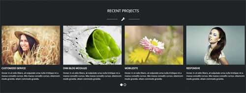
Codes are as follows:
<div class="SectionStyles13 pt60 pb60">
  <div class="dnn_layout">
    <div class="content_mid clearfix">
      <div class="pane_layout">
        <div class="row home5con_c animation fadeInUp">
          <div class="col-sm-12">
            <h3>Recent Projects</h3>
            <div class="linebox"> <span class="fa fa-wrench"></span> </div>
          </div>
        </div>
      </div>
    </div>
  </div>
  <div class="home5con_d animation fadeInUp">
    <div data-autoheight="false" data-navigation="false" data-autoplay="false" class="carousel carousel_11">
      <div class="item">
        <div class="photo_box"> <a target="blank" href="#">
          <div class="pic_box"> <img alt="" src="/portals/36/isotope1.jpg" />
            <div class="shade"></div>
          </div>
          </a> </div>
        <h3>Ecommerce Web</h3>
        <p>Content Text ...</p>
      </div>
      <div class="item">
        <div class="photo_box"> <a target="blank" href="#">
          <div class="pic_box"> <img alt="" src="/portals/36/isotope2.jpg" />
            <div class="shade"></div>
          </div>
          </a> </div>
        <h3>HTML5 & CSS3</h3>
        <p>Content Text ...</p>
      </div>
      <div class="item">
        <div class="photo_box"> <a target="blank" href="#">
          <div class="pic_box"> <img alt="" src="/portals/36/isotope3.jpg" />
            <div class="shade"></div>
          </div>
          </a> </div>
        <h3>CUSTOMIZED Service</h3>
        <p>Content Text ...</p>
      </div>
      <div class="item">
        <div class="photo_box"> <a target="blank" href="#">
          <div class="pic_box"> <img alt="" src="/portals/36/isotope4.jpg" />
            <div class="shade"></div>
          </div>
          </a> </div>
        <h3>DNN Blog Modules</h3>
        <p>Content Text ...</p>
      </div>
      <div class="item">
        <div class="photo_box"> <a target="blank" href="#">
          <div class="pic_box"> <img alt="" src="/portals/36/isotope5.jpg" />
            <div class="shade"></div>
          </div>
          </a> </div>
        <h3>Mobilesite</h3>
        <p>Content Text ...</p>
      </div>
      <div class="item">
        <div class="photo_box"> <a target="blank" href="#">
          <div class="pic_box"> <img alt="" src="/portals/36/isotope6.jpg" />
            <div class="shade"></div>
          </div>
          </a> </div>
        <h3>Responsive</h3>
        <p>Content Text ...</p>
      </div>
    </div>
  </div>
</div>
Option:
- This is a SectionStyles effect.
- This is a Carousel effect.
- You can modify
animationto change and delete animation. Animation list. - You can increase your content items through adding
<div class="item"></div> - You can modify
photo_boxto change image effects. Image Effects
| Variable | Default | Type | Description |
|---|---|---|---|
data-items |
4 | int | This variable allows you to set the maximum amount of items displayed at a time with the widest browser width. |
data-navigation |
true | boolean | Display "next" and "prev" buttons. |
data-pagination |
true | boolean | Show pagination. |
data-autoplay |
true | int/boolean | Change to any integrer for example data-autoplay ="5000" to play every 5 seconds. If you set data-autoplay="false" Stop auto scroll animation. |
Photos area
Below is the screen shot:
Codes are as follows:
<div class="bottom_a row animation periodic1">
  <div class="col-sm-4 col-xs-6">
    <div class="photo_box"> <a href="/Portals/36/LightBox1.jpg" class="iLightBox_image_gallery1" title="Image Gallery">
      <div class="pic_box"> <img alt="" src="/portals/36/LightBox1.jpg" class="img-responsive" />
        <div class="shade"></div>
      </div>
      </a> </div>
  </div>
  <div class="col-sm-4  col-xs-6">
    <div class="photo_box"> <a href="/Portals/36/LightBox2.jpg" class="iLightBox_image_gallery1" title="Image Gallery">
      <div class="pic_box"> <img alt="" src="/portals/36/LightBox2.jpg" class="img-responsive" />
        <div class="shade"></div>
      </div>
      </a> </div>
  </div>
  <div class="col-sm-4  col-xs-6">
    <div class="photo_box"> <a href="/Portals/36/LightBox3.jpg" class="iLightBox_image_gallery1" title="Image Gallery">
      <div class="pic_box"> <img alt="" src="/portals/36/LightBox3.jpg" class="img-responsive" />
        <div class="shade"></div>
      </div>
      </a> </div>
  </div>
  <div class="col-sm-4  col-xs-6">
    <div class="photo_box"> <a href="/Portals/36/LightBox4.jpg" class="iLightBox_image_gallery1" title="Image Gallery">
      <div class="pic_box"> <img alt="" src="/portals/36/LightBox4.jpg" class="img-responsive" />
        <div class="shade"></div>
      </div>
      </a> </div>
  </div>
  <div class="col-sm-4  col-xs-6">
    <div class="photo_box"> <a href="/Portals/36/LightBox5.jpg" class="iLightBox_image_gallery1" title="Image Gallery">
      <div class="pic_box"> <img alt="" src="/portals/36/LightBox5.jpg" class="img-responsive" />
        <div class="shade"></div>
      </div>
      </a> </div>
  </div>
  <div class="col-sm-4  col-xs-6">
    <div class="photo_box"> <a href="/Portals/36/LightBox6.jpg" class="iLightBox_image_gallery1" title="Image Gallery">
      <div class="pic_box"> <img alt="" src="/portals/36/LightBox6.jpg" class="img-responsive" />
        <div class="shade"></div>
      </div>
      </a> </div>
  </div>
  <div class="col-sm-4  col-xs-6">
    <div class="photo_box"> <a href="/Portals/36/LightBox7.jpg" class="iLightBox_image_gallery1" title="Image Gallery">
      <div class="pic_box"> <img alt="" src="/portals/36/LightBox7.jpg" class="img-responsive" />
        <div class="shade"></div>
      </div>
      </a> </div>
  </div>
  <div class="col-sm-4  col-xs-6">
    <div class="photo_box"> <a href="/Portals/36/LightBox8.jpg" class="iLightBox_image_gallery1" title="Image Gallery">
      <div class="pic_box"> <img alt="" src="/portals/36/LightBox8.jpg" class="img-responsive" />
        <div class="shade"></div>
      </div>
      </a> </div>
  </div>
  <div class="col-sm-4  col-xs-6">
    <div class="photo_box"> <a href="/Portals/36/LightBox9.jpg" class="iLightBox_image_gallery1" title="Image Gallery">
      <div class="pic_box"> <img alt="" src="/portals/36/LightBox9.jpg" class="img-responsive" />
        <div class="shade"></div>
      </div>
      </a> </div>
  </div>
</div>
Option:
- You can modify
photo_boxto change image effects. Image Effects - You can modify animation to change or delete animation.
col-sm-4 col-xs-6is the width of each column, you can change the width you need through value1~12Module Containeris usingContainer-7
Archives area
Below is the screen shot:
Codes are as follows:
<ul class="bottom_h animation periodic2">
  <li><a target="blank" href="#"><span class="fa fa-calendar"></span>February 08th, 2014</a></li>
  <li><a target="blank" href="#"><span class="fa fa-calendar"></span>March 16th, 2014</a></li>
  <li><a target="blank" href="#"><span class="fa fa-calendar"></span>August 29th, 2014</a></li>
  <li><a target="blank" href="#"><span class="fa fa-calendar"></span>September 09th, 2014</a></li>
  <li><a target="blank" href="#"><span class="fa fa-calendar"></span>October 10th, 2014</a></li>
  <li><a target="blank" href="#"><span class="fa fa-calendar"></span>December 24th, 2014</a></li>
</ul>
Option:
- You can modify animation to change or delete animation.
- You can modify
fa fa-calendarto change icons. font icon list. Module Containeris usingContainer-7
Tags area
Below is the screen shot:
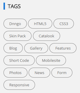
Codes are as follows:
<div class="bottom_b animation periodic3">
    <a target="blank" href="#">Dnngo</a>
    <a target="blank" href="#">HTML5</a>
    <a target="blank" href="#">CSS3</a>
    <a target="blank" href="#">Skin Pack</a>
    <a target="blank" href="#">Catalook</a>
    <a target="blank" href="#">Blog</a>
    <a target="blank" href="#">Gallery</a>
    <a target="blank" href="#">Features</a>
    <a target="blank" href="#">Short Code</a>
    <a target="blank" href="#">Mobilesite</a>
    <a target="blank" href="#">Photos</a>
    <a target="blank" href="#">News</a>
    <a target="blank" href="#">Form</a>
    <a target="blank" href="#">Responsive</a>
</div>
Option:
- You can modify animation to change or delete animation.
Module Containeris usingContainer-7
Contact area
Below is the screen shot:
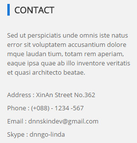
Codes are as follows:
<div class="animation periodic4">
  <p>Content Text ...<br />
    <br />
  </p>
  <p>Address :  XinAn Street No.362</p>
  <p>Phone :     (+088) - 1234 -567</p>
  <p>Email :       dnnskindev@gmail.com</p>
  <p>Skype :      dnngo-linda</p>
</div>
Option:
- You can modify animation to change or delete animation.
Module Containeris usingContainer-7
Home Version 5
You can click the link to check Home Version 5 demo. Home Version 5
Banner area
Below is the screen shot:

It is using DNNGo LayerGalleryPro module here,you can import ContentListEntity-Home5.xml of the DNNGo_LayerGalleryPro folder to duplicate banner of the demo.
Experienced developers and skillful designers area
Below is the screen shot:
Codes are as follows:
<div class="SectionStyles6 home4con_a pt60 pb60">
  <div class="dnn_layout">
    <div class="animation fadeInUp">
      <h3>Experienced developers and skillful designers</h3>
      <p>We are a team comprised of <a class="tooltips" data-toggle="tooltip" href="#" data-original-title="Default tooltip">experienced developers</a> and reliable designers whose aim is to provide you with <a class="tooltips" data-toggle="tooltip" href="#" data-original-title="Default tooltip">compelling </a>, engaging and satisfying skins and modules. Our aim is to provide what exactly you want. </p>
      <a class="Button_style1 large light a_bg_c" target="blank" href="#">Start From Here</a> </div>
  </div>
</div>
Option:
- This is a SectionStyles effect.
- You can modify animation to change or delete animation.
Services area
Below is the screen shot:
Codes are as follows:
<div class="services_a">
  <div class="row">
    <div class="col-md-3 col-sm-6">
      <div class="color1 animation periodic1"> <span class="fa fa-glass"></span>
        <h6>Our Awards</h6>
        <p>Content Text ... </p>
        <a target="blank" href="#">Learn More</a> </div>
    </div>
    <div class="col-md-3 col-sm-6">
      <div class="color2 animation periodic2"> <span class="fa fa-expand"></span>
        <h6>Responsive Web</h6>
        <p>Content Text ... </p>
        <a target="blank" href="#">Learn More</a> </div>
    </div>
    <div class="col-md-3 col-sm-6">
      <div class="color3 animation periodic3"> <span class="fa fa-cubes"></span>
        <h6>Site Settings</h6>
        <p>Content Text ... </p>
        <a target="blank" href="#">Learn More</a> </div>
    </div>
    <div class="col-md-3 col-sm-6">
      <div class="color4 animation periodic4"> <span class="fa fa-heart"></span>
        <h6>Manage Data </h6>
        <p>Content Text ... </p>
        <a target="blank" href="#">Learn More</a> </div>
    </div>
  </div>
</div>
Option:
col-md-3 col-sm-6is the width of each column, you can change the width you need through value1~12- You can modify animation to change or delete animation.
Awesome Themes area
Below is the screen shot:
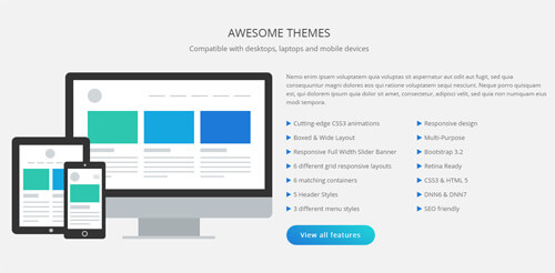
Codes are as follows:
<div class="SectionStyles12 pt60 pb60">
  <div class="dnn_layout">
    <div class="content_mid clearfix">
      <div class="pane_layout">
        <div class="row">
          <div class="col-sm-12">
            <h3>Awesome Themes</h3>
            <p>Compatible with desktops, laptops and mobile devices</p>
          </div>
        </div>
        <div class="row home4con_b">
          <div class="col-sm-6">
            <div class="home4con_b_left clearfix">
              <div class="mac animation periodic1"> <img alt="" src="/portals/36/home4_mac.png" class="img-responsive" /> </div>
              <div class="ipad animation periodic2"> <img alt="" src="/portals/36/home4_ipad.png" class="img-responsive" /> </div>
              <div class="mobile animation periodic3"> <img alt="" src="/portals/36/home4_mobile.png" class="img-responsive" /> </div>
            </div>
          </div>
          <div class="col-sm-6">
            <div class="home4con_b_right animation fadeInRight">
              <p>Content Text ...</p>
              <ul class="list_style">
                <li><span class="fa fa-play"></span>Cutting-edge CSS3 animations</li>
                <li><span class="fa fa-play"></span>Boxed & Wide Layout</li>
                <li><span class="fa fa-play"></span>Responsive Full Width Slider Banner</li>
                <li><span class="fa fa-play"></span>6 different grid responsive layouts</li>
                <li><span class="fa fa-play"></span>6 matching containers</li>
                <li><span class="fa fa-play"></span>5 Header Styles</li>
                <li><span class="fa fa-play"></span>3 different menu styles</li>
              </ul>
              <ul class="list_style">
                <li><span class="fa fa-play"></span>Responsive design</li>
                <li><span class="fa fa-play"></span>Multi-Purpose</li>
                <li><span class="fa fa-play"></span>Bootstrap 3.2</li>
                <li><span class="fa fa-play"></span>Retina Ready</li>
                <li><span class="fa fa-play"></span>CSS3 & HTML 5</li>
                <li><span class="fa fa-play"></span>DNN6 & DNN7</li>
                <li><span class="fa fa-play"></span>SEO friendly</li>
              </ul>
              <div class="clear"></div>
              <a target="blank" href="#" class="Button_style1 large light a_bg_c">View all features</a> </div>
          </div>
        </div>
      </div>
    </div>
  </div>
</div>
Option:
- This is a SectionStyles effect.
col-sm-6is the width of each column, you can change the width you need through value1~12- You can modify animation to change or delete animation.
- You can modify
fa fa-playto change icons. font icon list.
Number Animation area
Below is the screen shot:
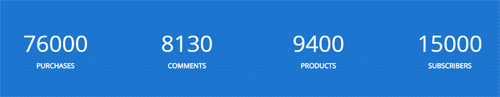
Codes are as follows:
<div class="SectionStyles7 pt60 pb60">
  <div class="dnn_layout">
    <div class="content_mid clearfix">
      <div class="pane_layout">
        <div class="row number_Animation_2">
          <div class="col-md-3 col-sm-6">
            <div class="number_box"> <span class="animation number" data-number="76000">0</span> <span class="number_name">Purchases</span> </div>
          </div>
          <div class="col-md-3 col-sm-6">
            <div class="number_box"> <span class="animation number" data-number="8130">0</span> <span class="number_name">Comments</span> </div>
          </div>
          <div class="col-md-3 col-sm-6">
            <div class="number_box"> <span class="animation number" data-number="9400">0</span> <span class="number_name">Products</span> </div>
          </div>
          <div class="col-md-3 col-sm-6">
            <div class="number_box"> <span class="animation number" data-number="15000">0</span> <span class="number_name">Subscribers</span> </div>
          </div>
        </div>
      </div>
    </div>
  </div>
</div>
Option:
- This is a SectionStyles effect.
col-md-3 col-sm-6is the width of each column, you can change the width you need through value1~12- This is a ProgressBars Counters effect.
- You can change the value you need to display through
data-number
Testimonials area
Below is the screen shot:
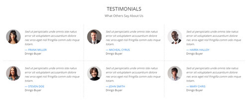
Codes are as follows:
<div class="home4con_c animation fadeInUp">
  <div class="home4con_c_top">
    <h3>Testimonials</h3>
    <p>What Others Say About Us</p>
  </div>
  <div class="home4con_c_bottom">
    <div class="row">
      <div class="col-sm-4 h4ccb_one">
        <ul class="Testimonials_tab Testimonials_7" data-autoplay="0" data-display-navigation="false" data-display-arrows="false">
          <li>
            <div class="Pic"><img alt="" class="img-responsive" src="/portals/36/4.jpg" /></div>
            <blockquote>
              <p>Content  Text ...</p>
              <small><span>Frank Miller</span>Dnngo Buyer</small> </blockquote>
          </li>
        </ul>
      </div>
      <div class="col-sm-4 h4ccb_two">
        <ul class="Testimonials_tab Testimonials_7" data-autoplay="0" data-display-navigation="false" data-display-arrows="false">
          <li>
            <div class="Pic"><img alt="" class="img-responsive" src="/portals/36/5.jpg" /></div>
            <blockquote>
              <p>Content  Text ...</p>
              <small><span>Micheal Cyrus</span>Dnngo Buyer</small> </blockquote>
          </li>
        </ul>
      </div>
      <div class="col-sm-4 h4ccb_three">
        <ul class="Testimonials_tab Testimonials_7" data-autoplay="0" data-display-navigation="false" data-display-arrows="false">
          <li>
            <div class="Pic"><img alt="" class="img-responsive" src="/portals/36/6.jpg" /></div>
            <blockquote>
              <p>Content  Text ...</p>
              <small><span>Harra Halloy</span>Dnngo Buyer</small> </blockquote>
          </li>
        </ul>
      </div>
    </div>
    <div class="row">
      <div class="col-sm-4 h4ccb_four">
        <ul class="Testimonials_tab Testimonials_7" data-autoplay="0" data-display-navigation="false" data-display-arrows="false">
          <li>
            <div class="Pic"><img alt="" class="img-responsive" src="/portals/36/7.jpg" /></div>
            <blockquote>
              <p>Content  Text ...</p>
              <small><span>Steven Doe</span>Dnngo Buyer</small> </blockquote>
          </li>
        </ul>
      </div>
      <div class="col-sm-4 h4ccb_five">
        <ul class="Testimonials_tab Testimonials_7" data-autoplay="0" data-display-navigation="false" data-display-arrows="false">
          <li>
            <div class="Pic"><img alt="" class="img-responsive" src="/portals/36/8.jpg" /></div>
            <blockquote>
              <p>Content  Text ...</p>
              <small><span>John Smith</span>Dnngo Buyer</small> </blockquote>
          </li>
        </ul>
      </div>
      <div class="col-sm-4 h4ccb_six">
        <ul class="Testimonials_tab Testimonials_7" data-autoplay="0" data-display-navigation="false" data-display-arrows="false">
          <li>
            <div class="Pic"><img alt="" class="img-responsive" src="/portals/36/9.jpg" /></div>
            <blockquote>
              <p>Content  Text ...</p>
              <small><span>Mary Chris</span>Dnngo Buyer</small> </blockquote>
          </li>
        </ul>
      </div>
    </div>
  </div>
</div>
Option:
- This is a SectionStyles effect.
col-sm-4is the width of each column, you can change the width you need through value1~12- This is a Testimonials effect.
- You can modify animation to change or delete animation.
Featured Products area
Below is the screen shot:

Codes are as follows:
<div class="SectionStyles6 pt60">
  <div class="dnn_layout">
    <div class="content_mid clearfix">
      <div class="pane_layout">
        <div class="row home4con_d animation fadeInUp">
          <div class="col-sm-12">
            <h3>Featured Products</h3>
            <h5>The Populars Of Our Works</h5>
            <p>Content  Text ... </p>
          </div>
        </div>
      </div>
    </div>
  </div>
</div>
Option:
- This is a SectionStyles effect.
col-sm-12is the width of each column, you can change the width you need through value1~12- You can modify animation to change or delete animation.
Carousel area
Below is the screen shot:

Codes are as follows:
<div data-autoheight="false" data-autoplay="3000" class="carousel carousel_10" data-pagination="false">
  <div class="item">
    <div class="photo_box ico_LeftAndRight_enter">
      <div class="pic_box"> <img alt="" class="img-responsive" src="/portals/36/LightBox1.jpg" />
        <div class="ico">
          <h3>Clean Design</h3>
          <p>June 26th,2014</p>
          <a href="/Portals/36/LightBox1.jpg" class="LightBox_image_gallery1" title="Single Image 1"> <span class="fa fa-picture-o ico_left"></span></a> <a target="blank" href="#"><span class="fa fa-link ico_right"></span></a> </div>
        <div class="shade"></div>
      </div>
    </div>
  </div>
  <div class="item">
    <div class="photo_box ico_LeftAndRight_enter">
      <div class="pic_box"> <img alt="" class="img-responsive" src="/portals/36/LightBox2.jpg" />
        <div class="ico">
          <h3>Clean Design</h3>
          <p>June 26th,2014</p>
          <a href="/Portals/36/LightBox2.jpg" class="LightBox_image_gallery1" title="Single Image 1"> <span class="fa fa-picture-o ico_left"></span></a> <a target="blank" href="#"><span class="fa fa-link ico_right"></span></a> </div>
        <div class="shade"></div>
      </div>
    </div>
  </div>
  <div class="item">
    <div class="photo_box ico_LeftAndRight_enter">
      <div class="pic_box"> <img alt="" class="img-responsive" src="/portals/36/LightBox3.jpg" />
        <div class="ico">
          <h3>Clean Design</h3>
          <p>June 26th,2014</p>
          <a href="/Portals/36/LightBox3.jpg" class="LightBox_image_gallery1" title="Single Image 1"> <span class="fa fa-picture-o ico_left"></span></a> <a target="blank" href="#"><span class="fa fa-link ico_right"></span></a> </div>
        <div class="shade"></div>
      </div>
    </div>
  </div>
  <div class="item">
    <div class="photo_box ico_LeftAndRight_enter">
      <div class="pic_box"> <img alt="" class="img-responsive" src="/portals/36/LightBox4.jpg" />
        <div class="ico">
          <h3>Clean Design</h3>
          <p>June 26th,2014</p>
          <a href="/Portals/36/LightBox4.jpg" class="LightBox_image_gallery1" title="Single Image 1"> <span class="fa fa-picture-o ico_left"></span></a> <a target="blank" href="#"><span class="fa fa-link ico_right"></span></a> </div>
        <div class="shade"></div>
      </div>
    </div>
  </div>
  <div class="item">
    <div class="photo_box ico_LeftAndRight_enter">
      <div class="pic_box"> <img alt="" class="img-responsive" src="/portals/36/LightBox5.jpg" />
        <div class="ico">
          <h3>Clean Design</h3>
          <p>June 26th,2014</p>
          <a href="/Portals/36/LightBox5.jpg" class="LightBox_image_gallery1" title="Single Image 1"> <span class="fa fa-picture-o ico_left"></span></a> <a target="blank" href="#"><span class="fa fa-link ico_right"></span></a> </div>
        <div class="shade"></div>
      </div>
    </div>
  </div>
  <div class="item">
    <div class="photo_box ico_LeftAndRight_enter">
      <div class="pic_box"> <img alt="" class="img-responsive" src="/portals/36/LightBox6.jpg" />
        <div class="ico">
          <h3>Clean Design</h3>
          <p>June 26th,2014</p>
          <a href="/Portals/36/LightBox6.jpg" class="LightBox_image_gallery1" title="Single Image 1"> <span class="fa fa-picture-o ico_left"></span></a> <a target="blank" href="#"><span class="fa fa-link ico_right"></span></a> </div>
        <div class="shade"></div>
      </div>
    </div>
  </div>
</div>
Option:
- This is a Carousel effect.
- You can increase your content items through adding
<div class="item"></div> - You can modify
photo_boxto change image effects. Image Effects
About Us & Services area
Below is the screen shot:
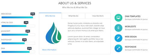
Codes are as follows:
<div class="row">
  <div class="col-sm-12 home4con_e_top">
    <h3>About Us & Services</h3>
    <p>Who We Are & What We Do</p>
  </div>
</div>
<div class="row home4con_e_bottom">
  <div class="col-sm-3">
    <div class="loaded_list2">
      <p> Web Design </p>
      <div class="progress progress-striped active">
        <div class="bar animation animationwidth" data-width="95%"><span></span></div>
      </div>
      <p> Html5 & CSS3</p>
      <div class="progress progress-striped active">
        <div class="bar animation animationwidth" data-width="75%"><span></span></div>
      </div>
      <p>JavaScript</p>
      <div class="progress progress-striped active">
        <div class="bar animation animationwidth" data-width="80%"><span></span> </div>
      </div>
      <p>Photoshop</p>
      <div class="progress progress-striped active">
        <div class="bar animation animationwidth" data-width="70%"><span></span></div>
      </div>
      <p>dnn</p>
      <div class="progress progress-striped active">
        <div class="bar animation animationwidth" data-width="85%"><span></span></div>
      </div>
    </div>
  </div>
  <div class="col-sm-6">
    <div class="horizontalTab_Top horizontalTab_Top_5 animation fadeInUp">
      <ul class="resp-tabs-list">
        <li>
          <div class="ht5One"><span>Who We Are</span></div>
        </li>
        <li>
          <div class="ht5Two"><span>What We Do</span></div>
        </li>
        <li>
          <div class="ht5Three"><span>How We Work</span></div>
        </li>
      </ul>
      <div class="resp-tabs-container">
        <div class="resp_container">
          <div class="resp_margin">
            <div class="home4con_e_bottom1"> <img alt="" src="/portals/36/home4con_e_bottom1.png" class="img-responsive" />
              <p>Content  Text ...</p>
              <br />
              <p>Content  Text ...</p>
              <br />
              <a target="blank" href="#"><span class="glyphicons glyph-chevron-right"></span>More Information</a> </div>
          </div>
        </div>
        <div class="resp_container">
          <div class="resp_margin">
            <div class="home4con_e_bottom2">
              <p>Content  Text ...</p>
              <ul class="list_style">
                <li><span class="fa fa-check-square-o"></span>Full Support</li>
                <li><span class="fa fa-check-square-o"></span>Modules Development</li>
                <li><span class="fa fa-check-square-o"></span>Icon Manager</li>
                <li><span class="fa fa-check-square-o"></span>Responsive Web</li>
              </ul>
              <ul class="list_style">
                <li><span class="fa fa-check-square-o"></span>Many Different Homepage</li>
                <li><span class="fa fa-check-square-o"></span>New Header Styles</li>
                <li><span class="fa fa-check-square-o"></span>Browser Compatibility</li>
                <li><span class="fa fa-check-square-o"></span>Countless Features</li>
              </ul>
            </div>
          </div>
        </div>
        <div class="resp_container">
          <div class="resp_margin">
            <div class="home4con_e_bottom3">
              <h4>We Create Website For Your Business</h4>
              <p> <span class="dropcaps_1">s</span>Content  Text ... </p>
            </div>
          </div>
        </div>
      </div>
    </div>
  </div>
  <div class="col-sm-3">
    <ul class="home4con_e_bottom4 animation fadeInRight">
      <li class="heb4one"><span class="fa fa-desktop"></span>
        <h6>DNN Templates</h6>
        Quisque commodo mi purus</li>
      <li class="heb4two"><span class="fa fa-mobile"></span>
        <h6>Mobilesite</h6>
        Quisque commodo mi purus</li>
      <li class="heb4three"><span class="fa fa-magic"></span>
        <h6>Web Design</h6>
        Quisque commodo mi purus</li>
      <li class="heb4four"><span class="fa fa-expand"></span>
        <h6>Responsive</h6>
        Quisque commodo mi purus</li>
    </ul>
  </div>
</div>
Option:
col-sm-3 col-sm-6is the width of each column, you can change the width you need through value1~12- This is a ProgressBarsCounters effect.
data-widthis for controlling the percentage that displays, you can display percentage through value0~100- This is a Responsive Tab effect.
- You can modify animation to change or delete animation.
- You can modify
fa fa-desktopto change icons. font icon list.
About Us area
Below is the screen shot:
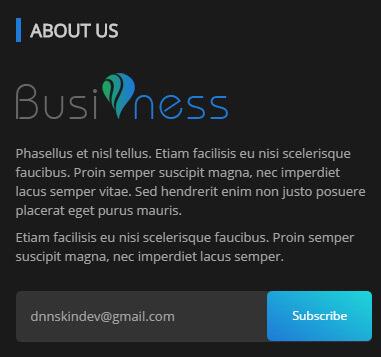
Codes are as follows:
<div class="bottom_j animation periodic1"> <img alt="" src="/portals/36/logo.png" />
  <p>Phasellus et nisl tellus. Etiam facilisis eu nisi scelerisque faucibus. Proin semper suscipit magna, nec imperdiet lacus semper vitae. Sed hendrerit enim non justo posuere placerat eget purus mauris.</p>
  <p>Etiam facilisis eu nisi scelerisque faucibus. Proin semper suscipit magna, nec imperdiet lacus semper.</p>
  <div class="bottom_jtext">
    <input type="text" title="Name" placeholder="dnnskindev@gmail.com" />
    <a href="#">Subscribe</a> </div>
</div>
Option:
- You can modify animation to change or delete animation.
Module Containeris usingContainer-6
Recent News area
Below is the screen shot:
Codes are as follows:
<ul class="bottom_k animation periodic2">
  <li class="bk1"> <img alt="" src="/portals/36/bottom_k1.jpg" />
    <h6>Meeting Report</h6>
    <p>Donec pede justo, fringilla vel, aliquet nec, ut, imperdiet avitae justo. </p>
  </li>
  <li class="bk2"> <img alt="" src="/portals/36/bottom_k2.jpg" />
    <h6>Functional Modules</h6>
    <p>Donec pede justo, fringilla vel, aliquet nec, ut, imperdiet avitae justo. </p>
  </li>
  <li class="bk3"> <img alt="" src="/portals/36/bottom_k3.jpg" />
    <h6>Page Samples</h6>
    <p>Donec pede justo, fringilla vel, aliquet nec, ut, imperdiet avitae justo. </p>
  </li>
</ul>
Option:
- You can modify animation to change or delete animation.
Module Containeris usingContainer-6
Location area
Below is the screen shot:
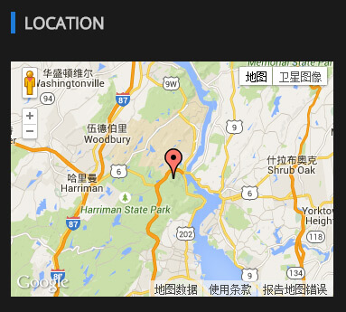
Codes are as follows:
<div class="animation periodic3">
  <div id="gmap2" style="width: 100%;"></div>
</div>
Option:
- You can change address of
gmap2incustom.js - You can modify animation to change or delete animation.
Module Containeris usingContainer-6
Coming Soon
You can click the link to check Coming Soon demo. Coming Soon
Below is the screen shot:
You can create the coming soon page easily following these steps:
- Create a page named coming soon page.
- Import the ComingSoon.Page.template for this page.
- You can set color, end time, and background image for Coming Soon page through xPlugin, as below:
App
You can click the link to check App demo. App
Banner area
Below is the screen shot:

Codes are as follows:
<ul class="home6app_banner full_screen_pic">
  <li style="background-image: url('http://demo7.dnngo.net/Portals/36/home6banner1.jpg');">
    <div class="home6banner_bg">
      <div class="dnn_layout">
        <div class="content_mid clearfix">
          <div class="pane_layout">
            <div class="row">
              <div class="col-sm-6">
                <div class="home6bannerbox clearfix">
                  <div class="home6bannerbox_a animation fadeInUp delay1"> <img alt="" class="img-responsive" src="/portals/36/home6banner1_1.png" /> </div>
                  <div class="home6bannerbox_b animation fadeInUp delay2"> <img alt="" class="img-responsive" src="/portals/36/home6banner1_2.png" /> </div>
                </div>
              </div>
              <div class="col-sm-6">
                <div class="home6bannerbox_c">
                  <h1 class="animation fadeInRight delay3">App Landing Page</h1>
                  <h2 class="animation fadeInRight delay4">Best Way To Create Your App</h2>
                  <div class="line animation fadeInRight delay5"></div>
                  <p class="animation fadeInRight delay6">We provide interactive, compelling and engaging website development, which will definitely improve satisfaction, raise awareness, and boost sales of your online business.</p>
                  <div class="home6bannerbox_d"> <a target="blank" href="#" class="Button_style2 large white animation fadeInUp delay7">Download</a><a target="blank" href="#" class="Button_style2 large white animation fadeInUp delay7">Learn More</a> </div>
                </div>
              </div>
            </div>
          </div>
        </div>
      </div>
    </div>
  </li>
</ul>
Option:
- This area is using HTML module.
- You can modify <li style=" background-image: url('/Portals/36/home6banner1.jpg');">to change image.
Services area
Below is the screen shot:
Codes are as follows:
<ul class="home6con_a clearfix">
  <li class="one animation zoomInUp delay1">
    <div class="icon"><em class="fa fa-inbox"></em></div>
    <h4>Popular Products</h4>
    <p>Content Text ...</p>
  </li>
  <li class="two animation zoomInUp delay2">
    <div class="icon"><em class="fa fa-cog"></em></div>
    <h4>Host Settings</h4>
    <p>Content Text ...</p>
  </li>
  <li class="three animation zoomInUp delay3">
    <div class="icon"><em class="fa fa-envelope"></em></div>
    <h4>Leave Message</h4>
    <p>Content Text ...</p>
  </li>
  <li class="four animation zoomInUp delay4">
    <div class="icon"><em class="fa fa-desktop"></em></div>
    <h4>Creative Web</h4>
    <p>Content Text ...</p>
  </li>
</ul>
Option:
- You can modify animation to change or delete animation
- You can modify
fa fa-inboxto change icon.font icon list.
Interactive, compelling and engaging area
Below is the screen shot:
Codes are as follows:
<div class="home6con_b pb60">
  <div class="dnn_layout">
    <div class="content_mid clearfix">
      <div class="pane_layout">
        <div class="row">
          <div class="col-sm-12 animation zoomInUp">
            <h1>Interactive, compelling and engaging</h1>
            <div class="line"></div>
            <p>contern text...</p>
            <img alt="" src="/portals/36/home6con_b.png" class="img-responsive" /> </div>
        </div>
      </div>
    </div>
  </div>
</div>
Option:
- You can modify animation to change or delete animation
Develop Business Solutions area
Below is the screen shot:

Codes are as follows:
<div class="SectionStyles14 home6con_c pt60">
  <div class="dnn_layout">
    <div class="content_mid clearfix">
      <div class="pane_layout">
        <div class="row">
          <div class="col-md-6 col-sm-12 animation zoomInLeft">
            <h1>Develop Business Solutions</h1>
            <div class="line"></div>
            <p>Content Text ... <br />
              <br />
              Content Text ...</p>
            <a target="blank" href="#" class="buttoncolor4">Purchase Theme</a> </div>
          <div class="col-md-6 animation zoomInRight"> <img alt="" class="img-responsive" src="/portals/36/home6con_c1.png" /> </div>
        </div>
      </div>
    </div>
  </div>
</div>
col-md-6is the width of each column, you can change the width you need through value1~12- This is a SectionStyles effect.
- You can modify animation to change or delete animation
Constantly upgrade DNN skins area
Below is the screen shot:
Codes are as follows:
<div class="home6con_d pt60 pb60">
  <div class="dnn_layout">
    <div class="content_mid clearfix">
      <div class="pane_layout">
        <div class="row">
          <div class="col-sm-6">
            <div class="home6con_d_left clearfix">
              <div class="home6con_d_left1 animation fadeInUp delay1"> <img alt="" class="img-responsive" src="/portals/36/home6con_d1.png" /> </div>
              <div class="home6con_d_left2 animation fadeInUp delay2"> <img alt="" class="img-responsive" src="/portals/36/home6con_d2.png" /> </div>
              <div class="home6con_d_left3 animation fadeInUp delay3"> <img alt="" class="img-responsive" src="/portals/36/home6con_d3.png" /> </div>
            </div>
          </div>
          <div class="col-sm-6 animation fadeInRight delay3">
            <h1>Constantly upgrade DNN skins</h1>
            <div class="line"></div>
            <p>content text... </p>
            <ul>
              <li> <em class="fa fa-camera"></em>
                <h3>Advanced Technology</h3>
                <p>Content Text ...</p>
              </li>
              <li> <em class="fa fa-clock-o"></em>
                <h3>Free Lifetime Services</h3>
                <p>Content Text ...</p>
              </li>
            </ul>
          </div>
        </div>
      </div>
    </div>
  </div>
</div>
col-md-6is the width of each column, you can change the width you need through value1~12- You can modify animation to change or delete animation
- You can modify
fa fa-camerato change icon.font icon list.
Aim to give your clients the best user experience area
Below is the screen shot:

Codes are as follows:
<div class="SectionStyles15 pt60 pb60">
  <div class="dnn_layout">
    <div class="content_mid clearfix">
      <div class="pane_layout">
        <div class="row">
          <div class="col-sm-12">
            <h1 class="special_color_1 animation fadeInUp"> Aim to give your clients the best user experience
              <div class="clearfix visible-sm"></div>
              <a class="Button_style2 large white" target="blank" href="#">Start From Here</a> </h1>
          </div>
        </div>
      </div>
    </div>
  </div>
</div>
- This is a SectionStyles effect.
- You can modify animation to change or delete animation
Screen Shots area
Below is the screen shot:
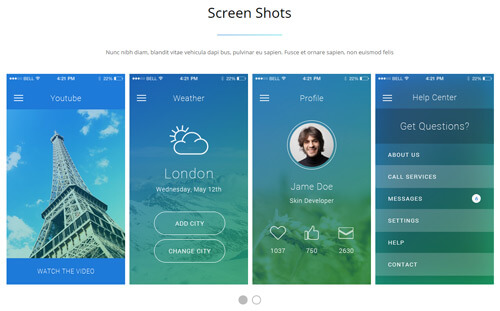
Codes are as follows:
<div class="home6con_b pb60 pt60">
  <div class="dnn_layout">
    <div class="content_mid clearfix">
      <div class="pane_layout">
        <div class="row">
          <div class="col-sm-12">
            <h1>Screen Shots</h1>
            <div class="line"></div>
            <p>Nunc nibh diam, blandit vitae vehicula dapi bus, pulvinar eu sapien. Fusce et ornare sapien, non euismod felis</p>
          </div>
          <div class="col-sm-12">
            <div class="carousel carousel_4 home6con_e" data-navigation="false" data-autoheight="false" data-autoplay="3000">
              <div class="item">
                <div class="photo_box  ico_rotate"> <a target="blank" href="#">
                  <div class="pic_box"> <img alt="" class="img-responsive" src="/portals/36/home6con_e1.png" />
                    <div class="ico"> <span class="fa fa-play"></span> </div>
                    <div class="shade"></div>
                  </div>
                  </a> </div>
              </div>
              <div class="item">
                <div class="photo_box  ico_rotate"> <a target="blank" href="#">
                  <div class="pic_box"> <img alt="" class="img-responsive" src="/portals/36/home6con_e2.png" />
                    <div class="ico"> <span class="fa fa-cog"></span> </div>
                    <div class="shade"></div>
                  </div>
                  </a> </div>
              </div>
              <div class="item">
                <div class="photo_box  ico_rotate"> <a target="blank" href="#">
                  <div class="pic_box"> <img alt="" class="img-responsive" src="/portals/36/home6con_e3.png" />
                    <div class="ico"> <span class="fa fa-suitcase"></span> </div>
                    <div class="shade"></div>
                  </div>
                  </a> </div>
              </div>
              <div class="item">
                <div class="photo_box  ico_rotate"> <a target="blank" href="#">
                  <div class="pic_box"> <img alt="" class="img-responsive" src="/portals/36/home6con_e4.png" />
                    <div class="ico"> <span class="fa fa-plus"></span> </div>
                    <div class="shade"></div>
                  </div>
                  </a> </div>
              </div>
              <div class="item">
                <div class="photo_box  ico_rotate"> <a target="blank" href="#">
                  <div class="pic_box"> <img alt="" class="img-responsive" src="/portals/36/home6con_e1.png" />
                    <div class="ico"> <span class="fa fa-tag"></span> </div>
                    <div class="shade"></div>
                  </div>
                  </a> </div>
              </div>
            </div>
          </div>
        </div>
      </div>
    </div>
  </div>
</div>
Option:
- This is a Carousel effect.
- You can increase your content items through adding
<div class="item"></div> - You can modify
photo_boxto change image effects. Image Effects
| Variable | Default | Type | Description |
|---|---|---|---|
data-items |
4 | int | This variable allows you to set the maximum amount of items displayed at a time with the widest browser width. |
data-navigation |
true | boolean | Display "next" and "prev" buttons. |
data-pagination |
true | boolean | Show pagination. |
data-autoplay |
true | int/boolean | Change to any integrer for example data-autoplay ="5000" to play every 5 seconds. If you set data-autoplay="false" Stop auto scroll animation. |
Number_Animation area
Below is the screen shot:
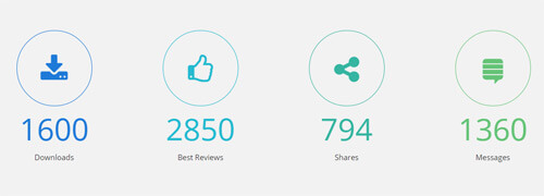
Codes are as follows:
<div class="SectionStyles6 pt60 pb60">
  <div class="dnn_layout">
    <div class="content_mid clearfix">
      <div class="pane_layout">
        <div class="number_Animation_3 row">
          <div class="col-sm-6 col-md-3 na3_1"> <span class="img"> <em class="fa fa-download"></em> </span> <span data-number="1600" class="animation  number">0</span>
            <p class="text">Downloads</p>
          </div>
          <div class="col-sm-6 col-md-3 na3_2"> <span class="img"> <em class="fa fa-thumbs-o-up"></em> </span> <span data-number="2850" class="animation  number">0</span>
            <p class="text">Best Reviews</p>
          </div>
          <div class="col-sm-6 col-md-3 na3_3"> <span class="img"> <em class="fa fa-share-alt"></em> </span> <span data-number="794" class="animation  number">0</span>
            <p class="text">Shares</p>
          </div>
          <div class="col-sm-6 col-md-3 na3_4"> <span class="img"> <em class="fa fa-stack-exchange"></em> </span> <span data-number="1360" class="animation  number">0</span>
            <p class="text">Messages</p>
          </div>
        </div>
      </div>
    </div>
  </div>
</div>
Option:
- This is a SectionStyles effect.
- You can modify animation to change or delete animation
col-md-3 col-sm-6is the width of each column, you can change the width you need through value1~12- This is a ProgressBars Counters effect.
- You can change the value you need to display through
data-number
Testimonials area
Below is the screen shot:
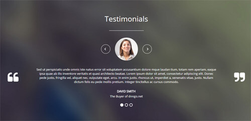
Codes are as follows:
<div class="SectionStyles17 pt60 pb60">
  <div class="dnn_layout">
    <div class="content_mid clearfix">
      <div class="pane_layout">
        <div class="row">
          <div class="col-sm-12">
            <h1>Testimonials</h1>
            <div class="line"></div>
            <ul class="Testimonials_tab Testimonials_8" data-position="roll-left" data-autoheight="false" data-autoplay="3000">
              <li>
                <blockquote>
                  <p><span class="Pic"><img alt="" src="/portals/36/circle1.jpg" /></span>Content text1.... </p>
                  <small>David Smith <span>The Buyer of dnngo.net</span></small> </blockquote>
              </li>
              <li>
                <blockquote>
                  <p><span class="Pic"><img alt="" src="/portals/36/circle2.jpg" /></span>Content text2.... </p>
                  <small>David Smith <span>The Buyer of dnngo.net</span></small> </blockquote>
              </li>
              <li>
                <blockquote>
                  <p><span class="Pic"><img alt="" src="/portals/36/circle3.jpg" /></span>Content text3.... </p>
                  <small>David Smith <span>The Buyer of dnngo.net</span></small> </blockquote>
              </li>
            </ul>
          </div>
        </div>
      </div>
    </div>
  </div>
</div>
Option:
- This is a SectionStyles effect.
- This is a Testimonials effect.
Pricing Table area
Below is the screen shot:
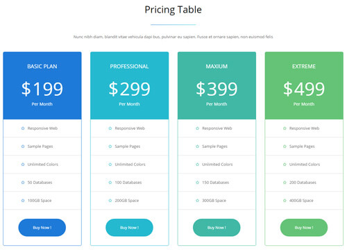
Codes are as follows:
<div class="home6con_b pt60">
  <div class="dnn_layout">
    <div class="content_mid clearfix">
      <div class="pane_layout">
        <div class="row">
          <div class="col-sm-12">
            <h1>Pricing Table</h1>
            <div class="line"></div>
            <p>Nunc nibh diam, blandit vitae vehicula dapi bus, pulvinar eu sapien. Fusce et ornare sapien, non euismod felis</p>
          </div>
        </div>
        <div class="price-table price-table4 row">
          <div class="col-sm-6 col-md-3">
            <div class="price_holder color1 animation zoomInUp delay1">
              <div class="price_box">
                <div class="price_title ">
                  <h2>Basic Plan</h2>
                </div>
                <span class="sup">$</span> <span class="price">199</span>
                <p>Per Month</p>
              </div>
              <ul>
                <li><span class="fa fa-star-o"></span>Responsive Web</li>
                <li><span class="fa fa-star-o"></span>Sample Pages</li>
                <li><span class="fa fa-star-o"></span>Unlimited Colors</li>
                <li><span class="fa fa-star-o"></span>50 Databases</li>
                <li><span class="fa fa-star-o"></span>100GB Space</li>
                <a target="blank" href="#">Buy Now !</a>
              </ul>
            </div>
          </div>
          <div class="col-sm-6 col-md-3">
            <div class="price_holder color2 animation zoomInUp delay2">
              <div class="price_box">
                <div class="price_title ">
                  <h2>Professional</h2>
                </div>
                <span class="sup">$</span> <span class="price">299</span>
                <p>Per Month</p>
              </div>
              <ul>
                <li><span class="fa fa-star-o"></span>Responsive Web</li>
                <li><span class="fa fa-star-o"></span>Sample Pages</li>
                <li><span class="fa fa-star-o"></span>Unlimited Colors</li>
                <li><span class="fa fa-star-o"></span>100 Databases</li>
                <li><span class="fa fa-star-o"></span>200GB Space</li>
                <a target="blank" href="#">Buy Now !</a>
              </ul>
            </div>
          </div>
          <div class="col-sm-6 col-md-3">
            <div class="price_holder color3 animation zoomInUp delay3">
              <div class="price_box">
                <div class="price_title ">
                  <h2>Maxium</h2>
                </div>
                <span class="sup">$</span> <span class="price">399</span>
                <p>Per Month</p>
              </div>
              <ul>
                <li><span class="fa fa-star-o"></span>Responsive Web</li>
                <li><span class="fa fa-star-o"></span>Sample Pages</li>
                <li><span class="fa fa-star-o"></span>Unlimited Colors</li>
                <li><span class="fa fa-star-o"></span>150 Databases</li>
                <li><span class="fa fa-star-o"></span>300GB Space</li>
                <a target="blank" href="#">Buy Now !</a>
              </ul>
            </div>
          </div>
          <div class="col-sm-6 col-md-3">
            <div class="price_holder color4 animation zoomInUp delay4">
              <div class="price_box">
                <div class="price_title ">
                  <h2>Extreme</h2>
                </div>
                <span class="sup">$</span> <span class="price">499</span>
                <p>Per Month</p>
              </div>
              <ul>
                <li><span class="fa fa-star-o"></span>Responsive Web</li>
                <li><span class="fa fa-star-o"></span>Sample Pages</li>
                <li><span class="fa fa-star-o"></span>Unlimited Colors</li>
                <li><span class="fa fa-star-o"></span>200 Databases</li>
                <li><span class="fa fa-star-o"></span>400GB Space</li>
                <a target="blank" href="#">Buy Now !</a>
              </ul>
            </div>
          </div>
        </div>
      </div>
    </div>
  </div>
</div>
Option:
col-md-3 col-sm-6is the width of each column, you can change the width you need through value1~12- You can modify animation to change or delete animation
- You can modify
fa fa-star-oto change icon. font icon list.
Download App From The Store area
Below is the screen shot:
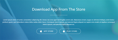
Codes are as follows:
<div class="SectionStyles16">
  <div class="SectionStyles16_bg pb60 pt60">
    <div class="dnn_layout">
      <div class="content_mid clearfix">
        <div class="pane_layout">
          <div class="row">
            <div class="col-sm-12 animation fadeInUp">
              <h1>Download App From The Store</h1>
              <div class="line"></div>
              <p>Content Text ... </p>
              <a target="blank" href="#" class="Button_style2 large white"><em class="fa fa-apple"></em>App Store</a><a target="blank" href="#" class="Button_style2 large white"><em class="fa fa-android"></em>Play Store</a> </div>
          </div>
        </div>
      </div>
    </div>
  </div>
</div>
Option:
- This is a SectionStyles effect.
- You can modify animation to change or delete animation
- You can modify
fa fa-appleto change icon. font icon list.
Boxed Layout
You can set Boxed mode in DNNGo.xPlugin > Skins > Options > Content Layout > Content Layout
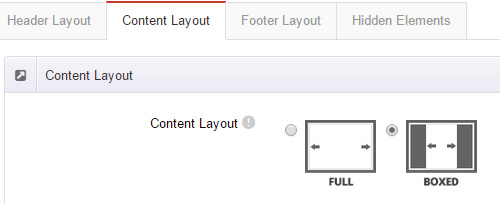
Dark Mode
You can set Dark mode directly in DNNGo.xPlugin > Skins > Options > Content Layout > Content Color Mode.
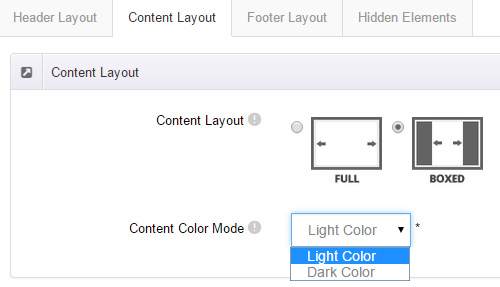
DNNGo_LayerGalleryPro Module
You can see this module in the banner section on the home page, we will guide you step by step to set up the module as the same as our demo site:
- Go to Host –> Extensions –> Install Extension wizard to install the module pack DNNGo_LayerGalleryPro.0x.0x.0x_PA.zip.
- Add DNNGo_LayerGalleryPro module to the BannerPane.
- Click Manager button.
- Click the navigation of the left Import&Export
- Import ContentListEntity.xml file under DNNGo_LayerGalleryPro Module.
- You will see the imported data on Manage List page and you can change the text/image in the banner by clicking Edit button.
- Click this link so you can check the module instruction details.
DNNGo_GalleryPro Module
This module contains 15 responsive sldiers in total.
- Go to Host –> Extensions –> Install Extension wizard to install the module pack DNNGo_DNNGalleryPro_xx.xx.xx_PA.zip.
- Add DNNGo_DNNGalleryPro module to the page.
- Click Effect List tab.
- Choose an effect you like.
- You can click this link to check the module demo.
- Click this link so you can check the module instruction details.
DNNGo_xBlog Module
We use this module on the blog page, click this link so you can check the module instruction details.
DNNGo_PhotoAlbums Module
We use this module on the Portfolios page, click this link so you can check the module instruction details.
DNNGo_PowerForms Module
You can create the form through this module, click this link so you can check the module instruction details.
License interface
- Please login or register your account at http://www.dnngo.net
- Send an email to dnnskindev@gmail.com with your invoice ID, machine Key for every module( different module has different machine key), and your DNNGO username. We will generate an activation code for you. Please note: If your site is a demo site, your license will still be valid when you transfer your site to a live site.
- Manage my licenses
Contact Us
If you have any questions or suggestions about modules/skins or modules/skins installation process, please feel free to contact us.
- Website: www.dnngo.net
- Email: dnnskindev@gmail.com
- Skype: dnngo-linda