20070-UnlimitedColorsPack-052 v3.1.0
Documentation
- Created: 06/10/2011
- Latest update: 06/13/2019
- By: DNNGo
- Email: dnnskindev@gmail.com
Thank you for purchasing my theme. If you have any questions that are beyond the scope of this help file, please feel free to email via my user page contact form here. Thanks so much!
General Information
DotNetNuke Information
To install this skin you must have a working version of Dotnetnuke already installed. If you need help to install Dotnetnuke, follow the instructions in Documentation Center.
What Is Included With Your Package
When you purchase our theme, you will receive one large .zip file that contains everything inside. Unzip that file to get all the content inside. Below is a full list of everything that is included along with a brief description of each item. See the corresponding sections for info on installing the theme.
- Inside the Content folder are: DNN Skins folder, DNNGo_DNNGallery Module folder, DNNGo_LayerGalleryPro folder, DNNGo_PhotoAlbums Module folder, DNNGo_PowerForms Module folder, DNNGo_xPlugin Module folder, DNNGo_xBlog Module folder, PSD folder, Page template.
- DNN Skins folder - The skin in this folder can be used in DNN 8.x, DNN 9.x only.
- DNNGo_DNNGalleryPro Module folder - This module contains 15 responsive sldiers in total.
- DNNGo_LayerGalleryPro folder - You can see this module in the banner section on home page.
- DNNGo_PhotoAlbums folder - You can see this module in Portfolios page.
- DNNGo_PowerForms folder - You can create forms through this module.
- DNNGo_xBlog Module folder - You can see this module on Blog page.
- Page Templates folder - Exported page templates will allow you to reproduce our live demo pages.
Notice: If you bought the theme from DNN Store (http://store.dnnsoftware.com), then none of module files are included in the download package. It only include DNN Skins, DNNGo_xPlugin, Page Templates and PSD files. If you need to purchase modules, please contact us via email (dnnskindev@gmail.com).
What Are The Requirements To Use skins and modules
To use skins and modules, you must be running DNN 8.x or higher. We have tested it with DNN 8.x, DNN 9.x.
Skin and Required Modules Installation
For DNN 8
-
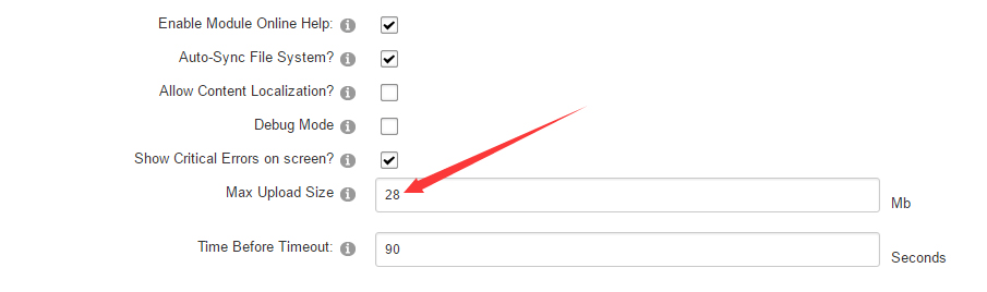
Go to Host-Settings –> Host-Settings, and select the tab Other Settings, changing Max Upload Size to 28 or higher.
-
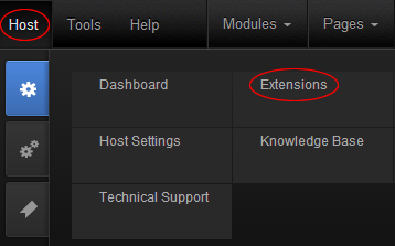
Go to Host –> Extensions –> Install Extension wizard to install the module pack DNNGo_xPlugin_0x.0x.0x_PA.zip
-
Go to Host –> Extensions –> Install Extension wizard to install the skin pack 20070-UnlimitedColorsPack-052-DNNSkins.zip
-
You can install other modules as per your own needs.
-
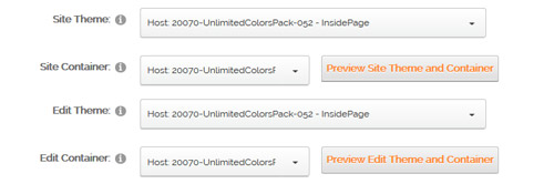
After the installation has been completed, navigate to Admin –> Site Settings –> Basic Settings (tab) –> Appearance (section) and specify portal and edit skins and containers like shown in the screenshot below. It should be done, in order to make your DNN admin UI look correct and readable.
-
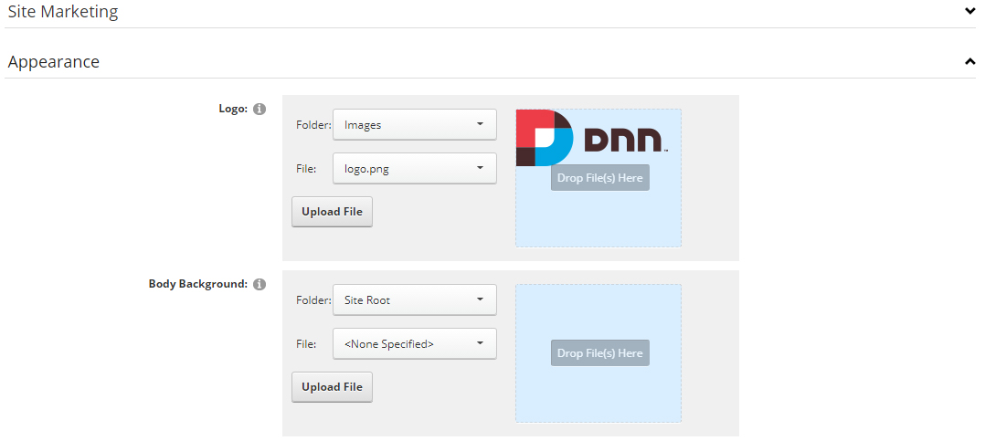
Now you can upload the LOGO image in Admin –> Site Settings –> Basic Settings (tab) –> Appearance (section) page.
For DNN 9
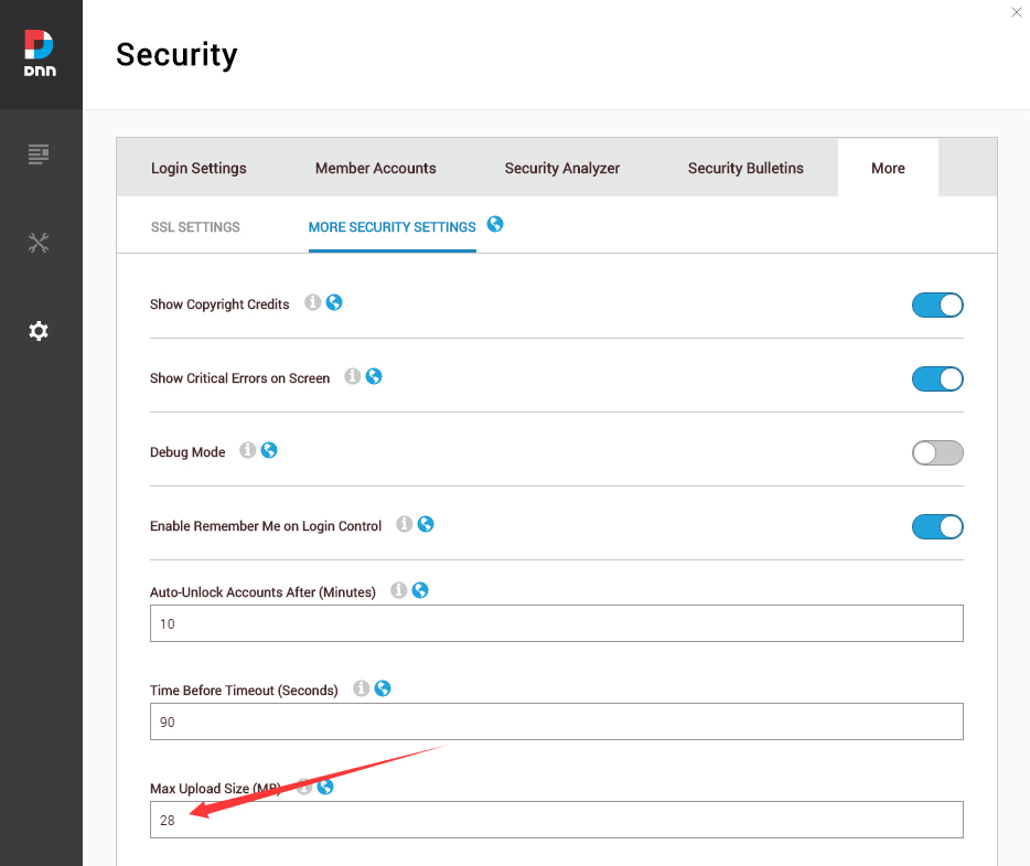
-
Go to Settings –> Security –> More, and select the tab MORE SECURITY SETTINGS, changing Max Upload Size to 28 or higher.
-
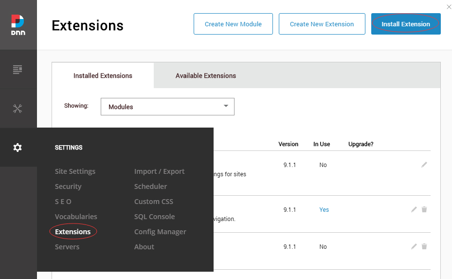
Go to Host –> Extensions –> Install Extension wizard to install the module pack DNNGo_xPlugin_0x.0x.00_PA.zip
-
Go to Host –> Extensions –> Install Extension wizard to install the skin pack 20070-UnlimitedColorsPack-052-DNNSkins.zip
-
You can install other modules as per your own needs.
-
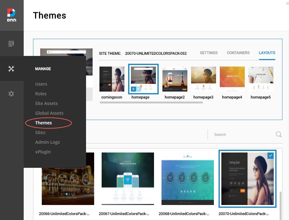
After the installation has been completed, navigate to Manage –> Themes. Select and apply 20070-UnlimitedColorsPack-052
-
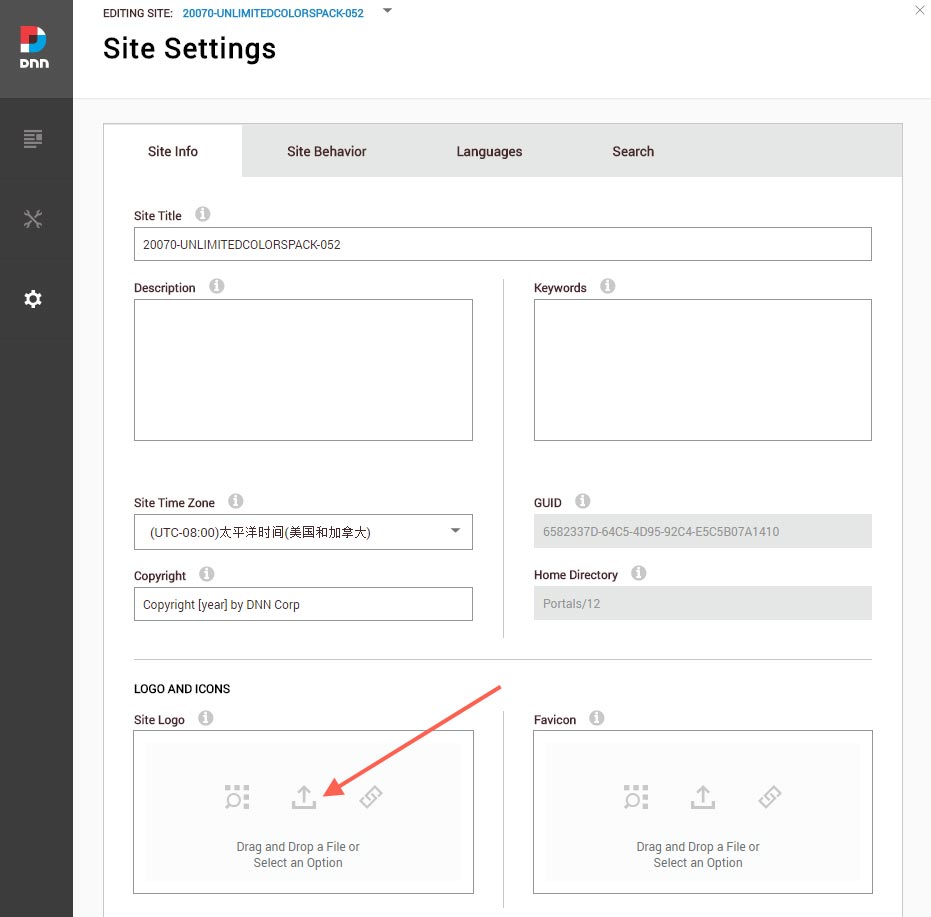
You can upload the LOGO image in Settings –> Site Settings page.
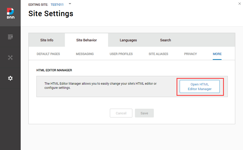
Change the Settings of HTML Editor
By default, HTML editor will remove the div tags whose content is blank. For example: if we add the code <div class=”pt-20″></div> in HTML editor and click save, you will find the code is missing when you edit it afterwards. So we need to change the settings to prevent this from happening.
Log in to your site as super administrator.
Go to SETTINGS > Site Settings > Site Behavior > MORE, click the Open HTML Editor Manager.
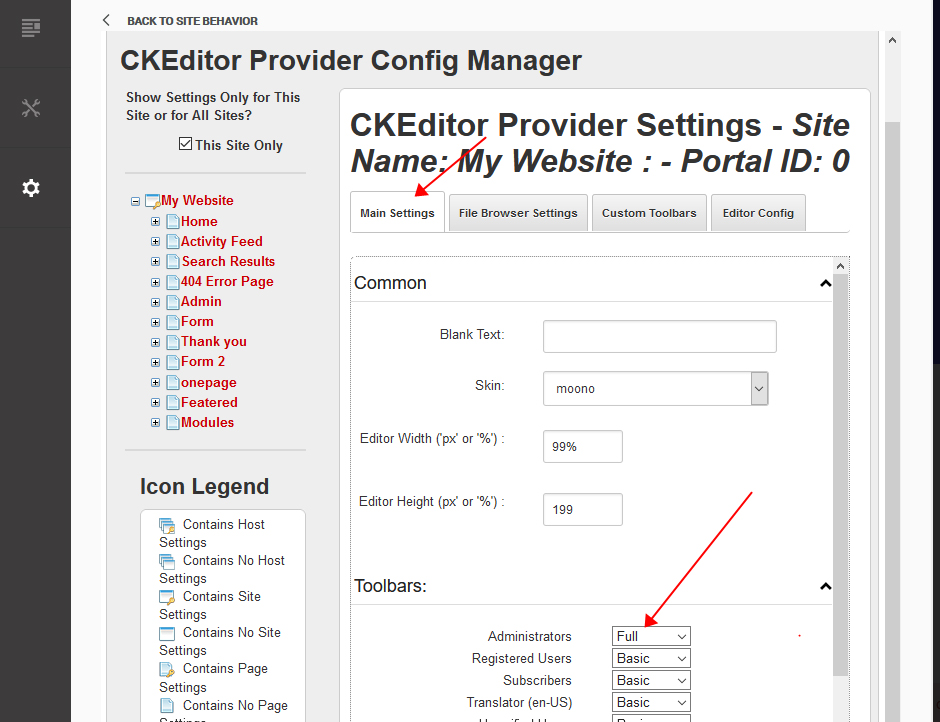
Click the Main Settings tab. Set the value of Administrators to be Full.
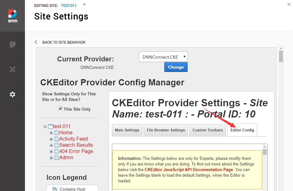
Click the Editor Config tab.
Set the value of AllowedContent to be true.
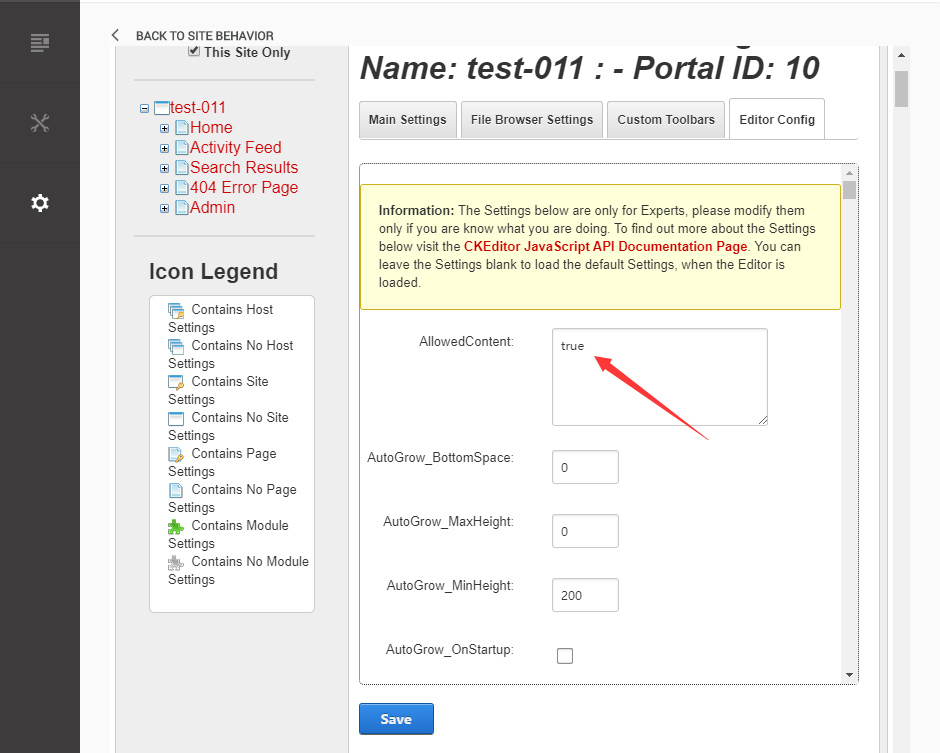
Set the value of FillEmptyBlocks to be false.
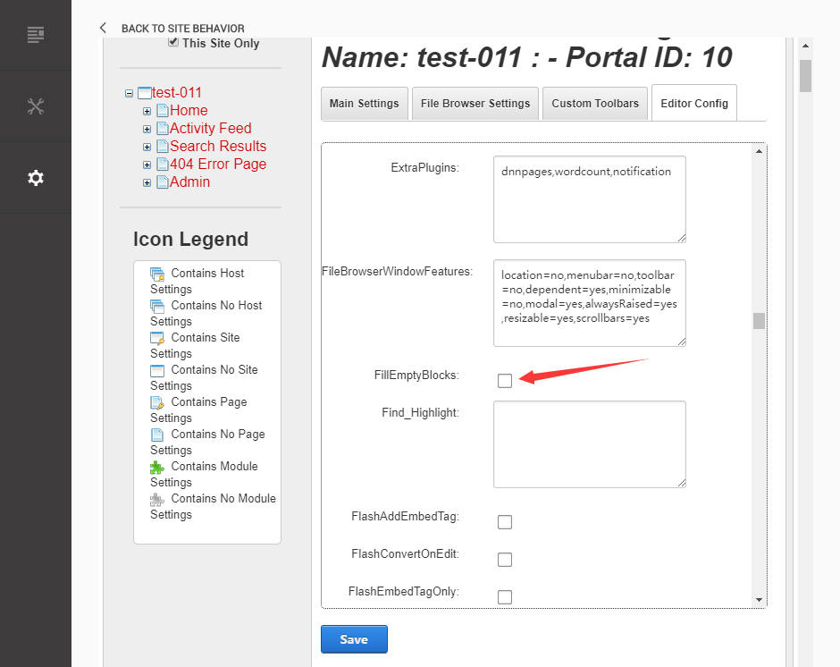
Set the value of ignoreEmptyParagraph to be false.
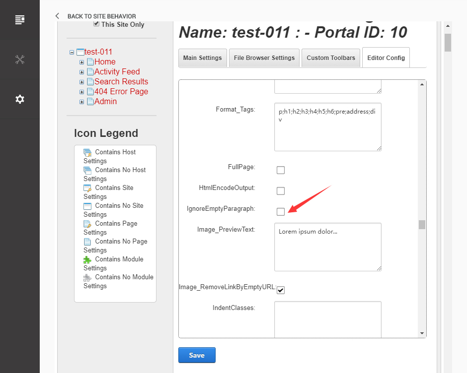
Click the Save button.
How to import page template?
Exported page templates will allow you to reproduce our live demo pages. We'll reproduce the home page as an example.
For DNN 8
-
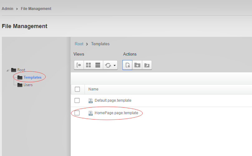
You can find these files in Page Templates Directory.
-
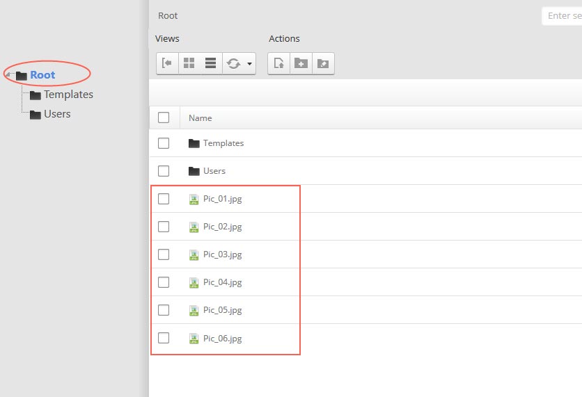
Upload Home.page.template file into your portal root (e.g. Portals/0/Templates/) in the previous chapter and synchronize your folders, you are able to start using page templates to clone live demo pages.
-
Because page templates can not import image files, you need to upload all the photo files of the "images" folder into your portal root (e.g. Portals/0/).
-
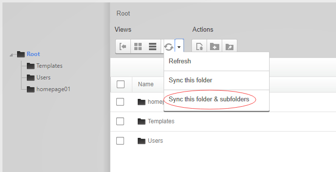
Synchronize the file in Admin > File-Management
-
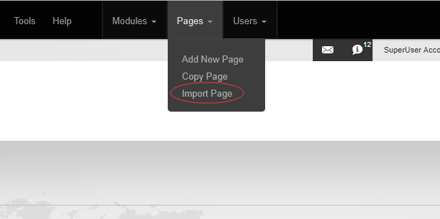
Navigate to the Home page and click Pages -> Import.
-
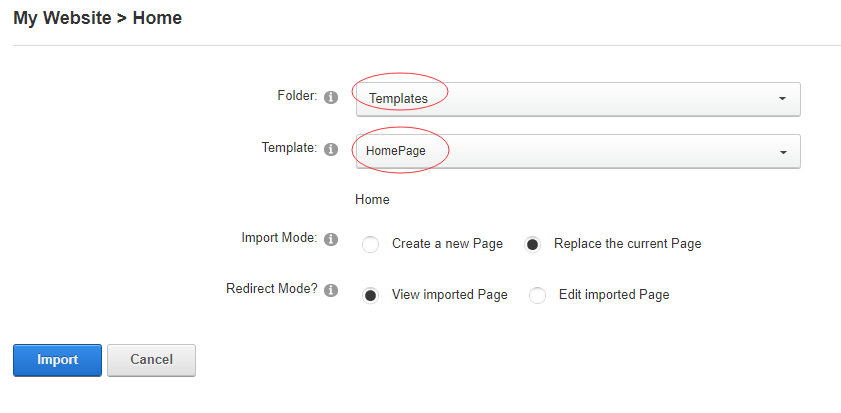
Find a proper page exported content file navigating to Templates folder and choosing for example Home page.
-
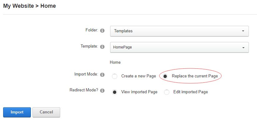
Choose "Replace the current Page" and the redirect mode you need. Please note, if you select "Replace the current Page", content of current page will be reset.
-
Click Import button if everything is correct.
-
Specify page settings according to your needs (necessarily apply HomePage skin to the home page) and click "Update Page". The home page is ready.
For DNN 9
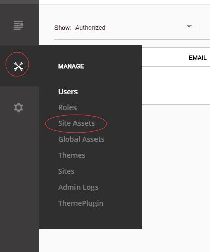
-
Go to Manage > Site Assets
-
Uploading Home.page.template file to Templates folder
-
Because page templates can not import image files, you need to upload all the photo files of the "images" folder into your portal root (e.g. Portals/0/).
-
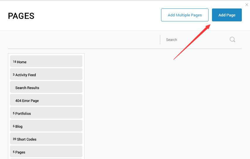
Go to Content > Pages > Add Page
-
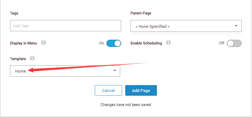
Choose your template from Template drop-down.
- Click Add Page
Note : Page templates can only be imported when you are creating a new page.
Skin features and how to use them.
Page Template
The product contains page templates for all pages in the live demo, you can copy our demo site by importing the page templates.
Seven kinds of header layout
You can click the xPlugin button to go to settings page, and then choose different header styles in Header Layout section.
You can click these links to check different header styles. header 1, header 2, header 3, header 4, header 5, header 6, header 7
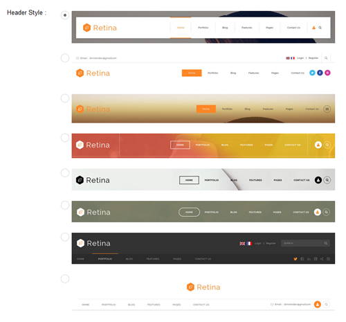
Each header includes very rich setting options, you can modify the color of whatever you would like to . For example: text color, font size and background color etc.
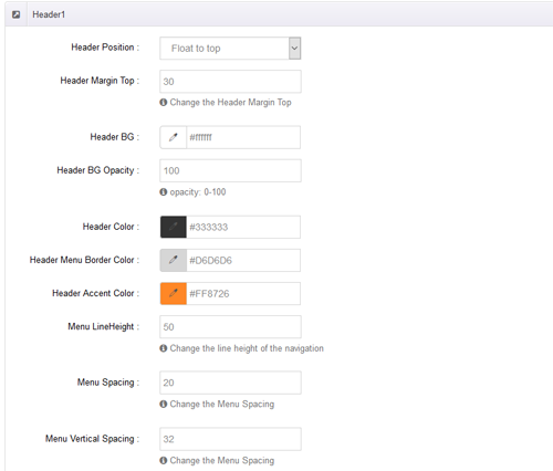
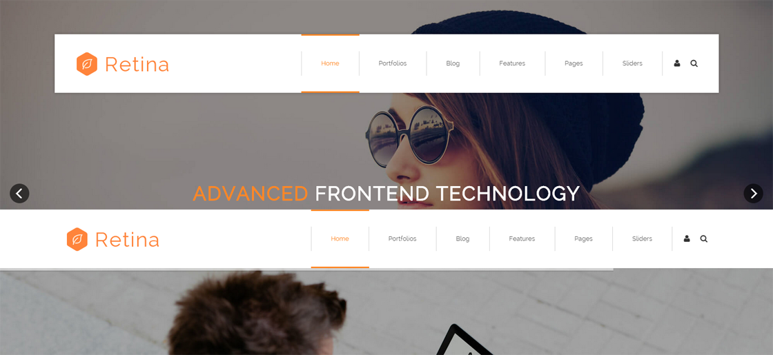
Header Position
Header Position is for setting the position of Header. If you have it set to Float to top, Header will float over the Banner. If you have it set to Not float, Header will show with Banner side by side. You can compare the difference between these two settings through the following two screen shots.
Insidepage-leftmenu layout
Insidepage-leftmenu layout page is using InsidePage-leftmenu skin. Menus on the left side are displaying the second level menus.
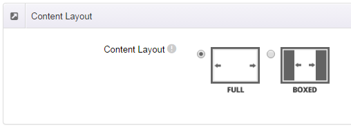
Full Layout and Boxed Layout
This skin contains Full Layout and Boxed Layout, you can set through Content Layout section.
With Boxed Layout applied, you can still set page background, it will display around the content. You can click link to check demo url of boxed layout.
The background can be set as static or rotating image or any solid color for you choose to apply, also you can set different background images for different pages.
How to set background image for DNN page.
- You need to choose Boxed Layout.
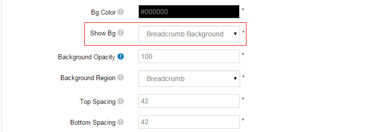
- Choose Page Background in the Option for Show bg, save settings.

- Click "pages" nav in the xPlugin.
- Click Edit Background icon.
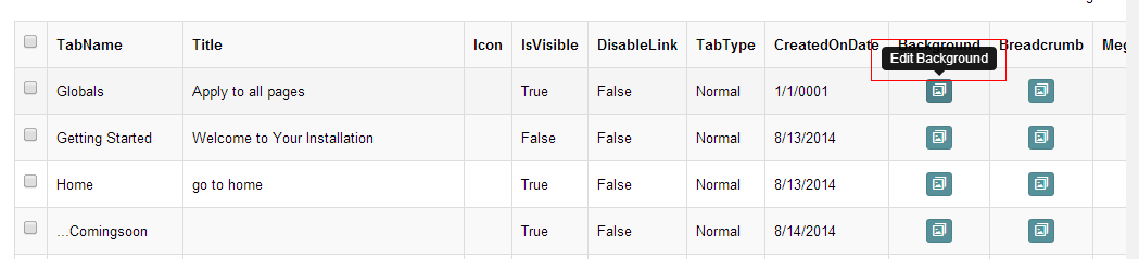
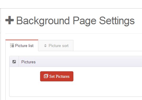
- Upload image, the background image will show as slider if you choose two or more images.
- "Globals" allows you to set background image for all pages.
- Also you can set background image for each page.
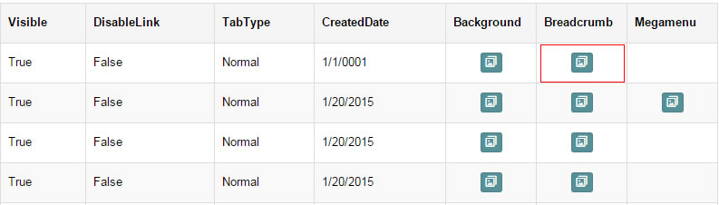
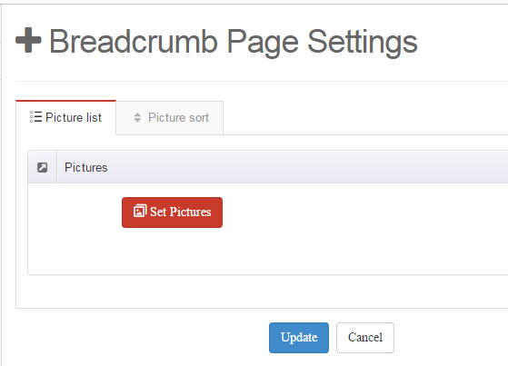
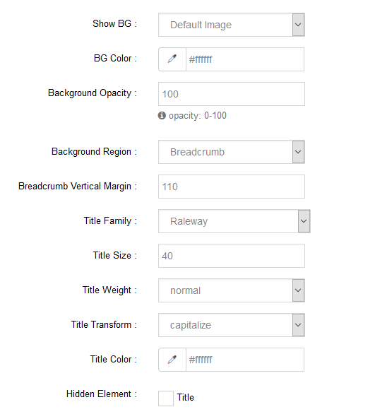
How to set breadcrumb image for DNN page.
- Choose Breadcrumb Background in the Option for Show bg, save settings.
- Click "pages" nav in the xPlugin.
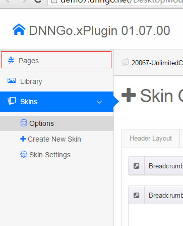
- Click Edit Breadcrumb icon.
- Upload image, the background image will show as slider if you choose two or more images.
- "Globals" allows you to set background image for all pages.
- Also you can set background image for each page.
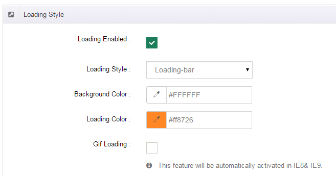
Loading Style
You can set the page loading animation.
You can select to have this feature turned on or off.
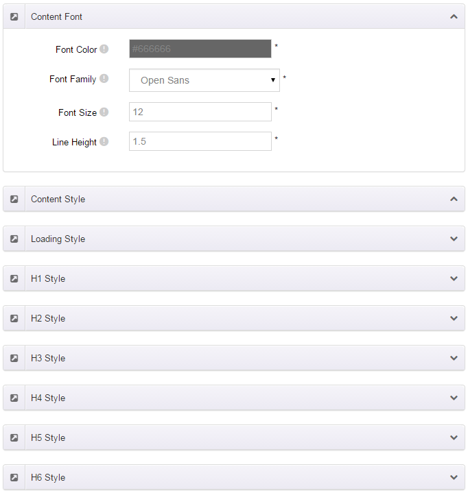
Content Style
You can set the font color and size, link color, the color of H1-H6 etc of the content area.
Five kinds of Breadcrumb layouts
You can choose different Breadcrumb styles through Breadcrumb Layout.
You can click these links to check different breadcrumb styles. breadcrumb 1, breadcrumb 2, breadcrumb 3, breadcrumb 4, breadcrumb 5.
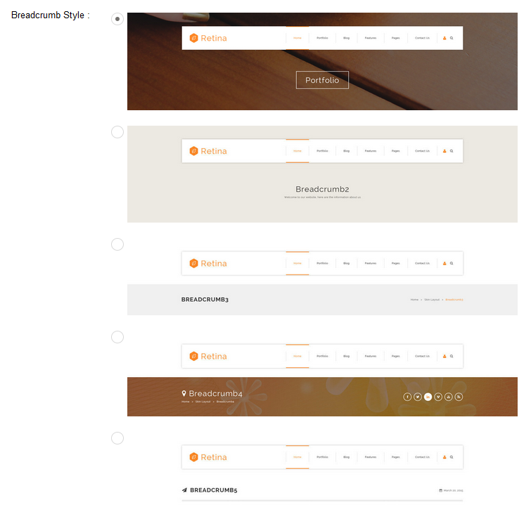
You can change the text color, background color and background image etc for each Breadcrumb layout.
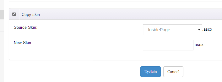
Create a Skin
You can create a new skin through xPlugin. Please note the new skin name shouldn't be the same as the current skin.
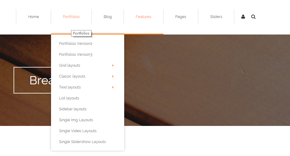
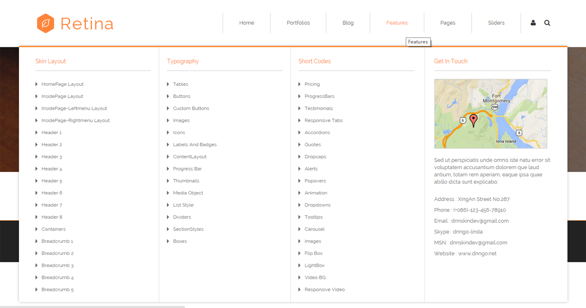
Standard Menu and MegaMenu
The skin sub menus contain two types-Standard Menu and MegaMenu.
Standard Menu is the default menu type, the sub menus will be set to display in one column only, as shown in screen shot below:
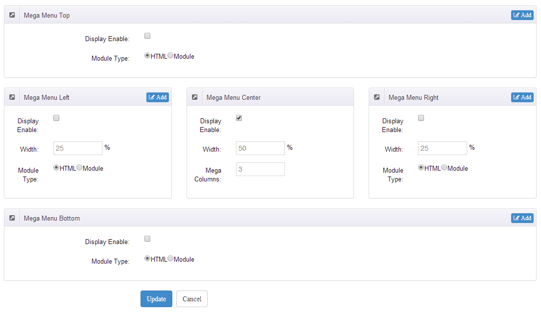
MegaMenu will set sub menus to display in multiple columns, also you can display HTML module or third party module in sub menus, as shown below:
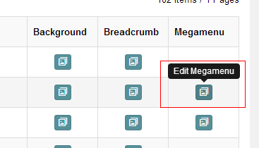
You can set the MegaMenu as per steps below:
- Click "pages" nav in the xPlugin.
- Click Edit MegaMenu button. Please note MegaMenu can be set for first level menus only.
- Set the menu type to MegaMenu.
- Mega Menu has 5 sections: Menu Top, Menu Right, Menu Bottom, Menu Left, Menu Center.
- Click Add button so you will be able to add HTML module or any third module to Menu Top, Menu Right, Menu Bottom, Menu Left.
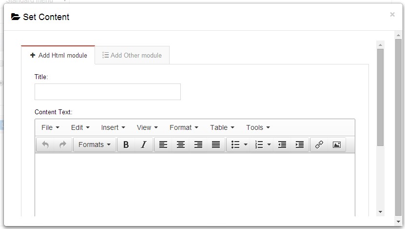
- Module Type-choose to display HTML module or third module.
- Menu Center-it will display secondary menus here.
- Mega Columns-set number of columns the secondary menu will display.
- You can set width for Menu Right, Menu Left, Menu Center, please note their previous total width shouldn't be more than 100.
Set menu typography icon
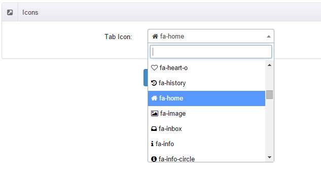
You can set menu typography icon through the settings below:
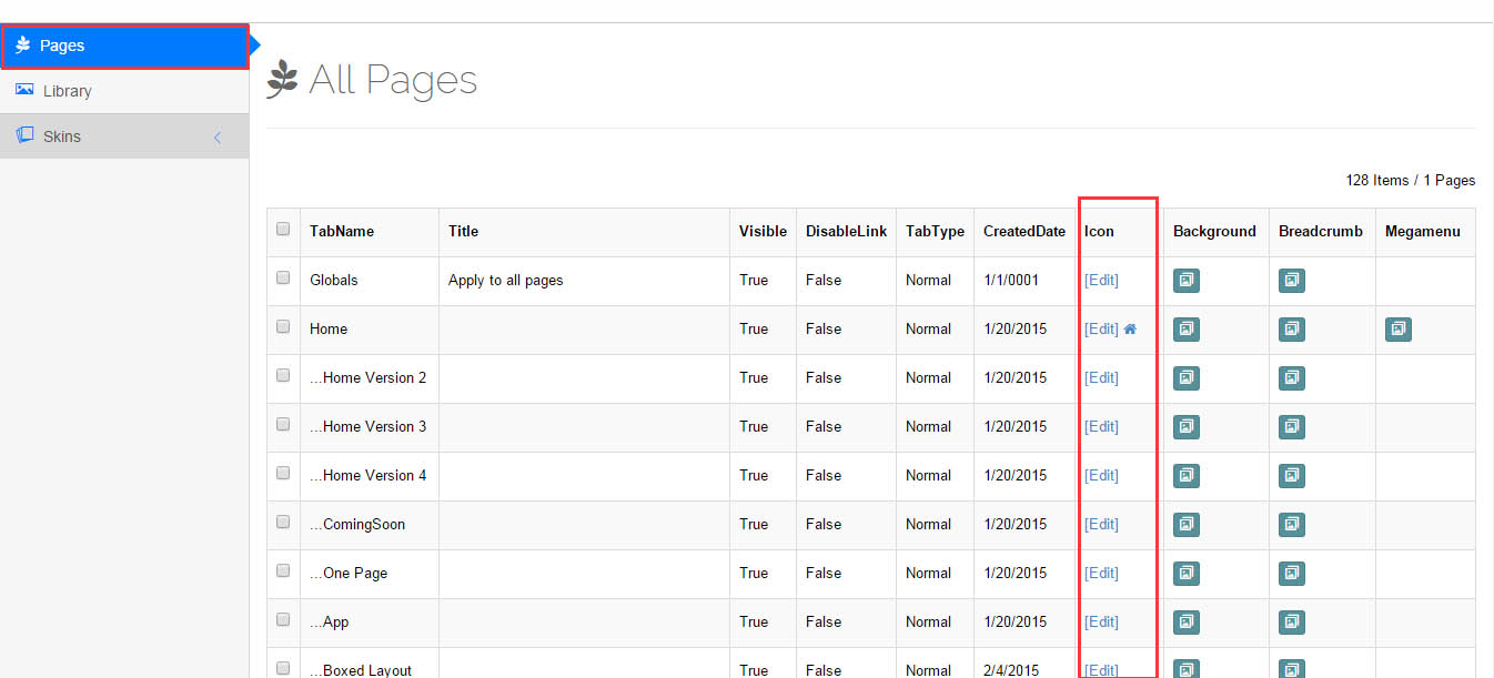
You can set typography icon in Icon option under Pages setting, each page has separate icon settings.
Set Up Google Map
You can create Google Map easily following these steps:
- Add this code to HTML module: <div id="gmap"></div>
- To change google map settings, open <skin root>/scripts/custom.js file for editing.
- Find this code:
//google map jQuery(document).ready(function($){ $("#gmap").gMap({ markers: [ { latitude: 47.651968,longitude: 9.478485,html: "_latlng" }, { address: "Bear city, ny ",html: "The place I live" }, { address: "Bear city, ny ", html: "_address" } ], address: "Bear city, ny ", zoom: 10 , scrollwheel: false }); $("#gmap2").gMap({ markers: [ { latitude: 47.651968,longitude: 9.478485,html: "_latlng" }, { address: "Bear city, ny ",html: "The place I live" }, { address: "Bear city, ny ", html: "_address" } ], address: "Bear city, ny ", zoom: 10 , scrollwheel: false }); $("#gmap3").gMap({ markers: [ { latitude: 47.651968,longitude: 9.478485,html: "_latlng" }, { address: "Bear city, ny ",html: "The place I live" }, { address: "Bear city, ny ", html: "_address" } ], address: "Bear city, ny ", zoom: 10 , scrollwheel: false }); }); - Change "Bear city, ny" in address attribute to the desired one. Change address for the marker too.
- Markers attribute contains a list of points marked on the map. Every entry may include the following properties:
address: Address where the marker will be drawn
html: Content that will be shown within the info window for this marker. (Default: "")
popup: If true the info window for this marker will be shown when the map finished loading (Default: false)
CSS Codes
Skin is using bootstrap framework. You will get to know more through this url. Link
Width of content area
dnn_layout is the page content framework:
| Device width | Width of content area |
| Large devices Desktops (≥1200px) | 1170px |
| Medium devices Desktops (≥992px) | 970px |
| Small devices Tablets (≥768px) | 750px |
| Extra small devices Phones (<768px) | auto |
content_mid is the spacing between both sides of the page :
| Device width | Spacing |
| Large devices Desktops (≥1200px) | 30px |
| Medium devices Desktops (≥992px) | 20px |
| Small devices Tablets (≥768px) | 15px |
| Extra small devices Phones (<768px) | 15px |
<div class="dnn_layout">
  <div class="content_mid clearfix"> content ... </div>
</div>
Bootstrap 12 grid layout
<!-- Tablet and desktop devices are 50% wide, mobile device is 100% wide -->
<div class="row">
  <div class="col-sm-6">.col-sm-6</div>
  <div class="col-sm-6">.col-sm-6</div>
</div>

<!-- Stack the columns on mobile by making one full-width and the other half-width -->
<div class="row">
  <div class="col-xs-12 col-md-8">.col-xs-12 .col-md-8</div>
  <div class="col-xs-6 col-md-4">.col-xs-6 .col-md-4</div>
</div>

<!-- Columns start at 50% wide on mobile and bump up to 33.3% wide on desktop -->
<div class="row">
  <div class="col-xs-6 col-md-4">.col-xs-6 .col-md-4</div>
  <div class="col-xs-6 col-md-4">.col-xs-6 .col-md-4</div>
  <div class="col-xs-6 col-md-4">.col-xs-6 .col-md-4</div>
</div>

<!-- Columns are always 50% wide, on mobile and desktop -->
<div class="row">
  <div class="col-xs-6">.col-xs-6</div>
  <div class="col-xs-6">.col-xs-6</div>
</div>

<!-- Add the extra clearfix for only the required viewport -->
<div class="clearfix visible-xs-block"></div>
Display and hide elements
| Extra small devices Phones (<768px) | Small devices Tablets (≥768px) | Medium devices Desktops (≥992px) | Large devices Desktops (≥1200px) | |
|---|---|---|---|---|
.visible-xs |
Visible | Hidden | Hidden | Hidden |
.visible-sm |
Hidden | Visible | Hidden | Hidden |
.visible-md |
Hidden | Hidden | Visible | Hidden |
.visible-lg |
Hidden | Hidden | Hidden | Visible |
.hidden-xs |
Hidden | Visible | Visible | Visible |
.hidden-sm |
Visible | Hidden | Visible | Visible |
.hidden-md |
Visible | Visible | Hidden | Visible |
.hidden-lg |
Visible | Visible | Visible | Hidden |
Visible in mobile devices and hidden in other devices
<div class="visible-xs">content...</div>

Visible in other devices and hidden in mobile devices
<div class="hidden-xs">content...</div>
Vertical spacing
 /*page Spacing*/
.mt-10 {margin-top: 10px;}
.mb-10 {margin-bottom: 10px;}
.pt-10 {padding-top: 10px;}
.pb-10 {padding-bottom: 10px;}
.mt-20 {margin-top: 20px;}
.mb-20 {margin-bottom: 20px;}
.pt-20 {padding-top: 20px;}
.pb-20 {padding-bottom: 20px;}
.mt-30 {margin-top: 30px;}
.mb-30 {margin-bottom: 30px;}
.pt-30 {padding-top: 30px;}
.pb-30 {padding-bottom: 30px;}
.mt-40 {margin-top: 40px;}
.mb-40 {margin-bottom: 40px;}
.pt-40 {padding-top: 40px;}
.pb-40 {padding-bottom: 40px;}
.mt-50 {margin-top: 50px;}
.mb-50 {margin-bottom: 50px;}
.pt-50 {padding-top: 50px;}
.pb-50 {padding-bottom: 50px;}
.mt-60 {margin-top: 60px;}
.mb-60 {margin-bottom: 60px;}
.pt-60 {padding-top: 60px;}
.pb-60 {padding-bottom: 60px;}
Short Codes
This skin contains a lot of short codes, it is very easy for you to use even you know nothing about js and css, all you need to do is just copying the short codes to HTML module.
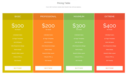
Pricing
You can click the link to check Pricing demo. Demo Link
Style 1:
Below is the screen shot:
Codes are as follows:
<div class="pb-60">
  <div class="dnn_layout">
    <div class="content_mid clearfix">
      <div class="pane_layout">
        <div class="row">
          <div class="col-sm-12">
            <h2 class="inside_con_title1">Pricing Table</h2>
            <div class="inside_con_titlep">Nunc nibh inventore veritatis diam blandit vitae vehicula dapibus.</div>
          </div>
          <div class="col-sm-12">
            <div class="price-table price-table2 row">
              <div class="col-md-3 col-sm-6 color_1">
                <div class="price_border mt-60">
                  <div class="price_title">
                    <h2>Basic</h2>
                  </div>
                  <div class="price_holder">
                    <div class="price_box"><span class="sup">$</span><span class="price">100</span><span class="unit">Per Month</span> </div>
                    <ul>
                      <li>Unlimited Colors</li>
                      <li>20 Page Templates</li>
                      <li>500 GB Space</li>
                      <li>Ultra Responsive design</li>
                      <li>Retina Ready</li>
                      <li>Boxed & Wide Layout</li>
                      <li>CSS3 & HTML 5</li>
                      <li>SEO friendly</li>
                    </ul>
                    <a class="btn " href="#">Buy It Now</a> </div>
                </div>
              </div>
              <div class="col-md-3 col-sm-6 color_2">
                <div class="price_border mt-60">
                  <div class="price_title ">
                    <h2>Professional</h2>
                  </div>
                  <div class="price_holder">
                    <div class="price_box"><span class="sup">$</span><span class="price">200</span><span class="unit">Per Month</span> </div>
                    <ul>
                      <li>Unlimited Colors</li>
                      <li>30 Page Templates</li>
                      <li>1000 GB Space</li>
                      <li>Ultra Responsive design</li>
                      <li>Retina Ready</li>
                      <li>Boxed & Wide Layout</li>
                      <li>CSS3 & HTML 5</li>
                      <li>SEO friendly</li>
                    </ul>
                    <a class="btn" href="#">Buy It Now</a> </div>
                </div>
              </div>
              <div class="col-md-3 col-sm-6 color_3">
                <div class="price_border mt-60">
                  <div class="price_title">
                    <h2>Maxmium</h2>
                  </div>
                  <div class="price_holder">
                    <div class="price_box"><span class="sup">$</span><span class="price">300</span><span class="unit">Per Month</span> </div>
                    <ul>
                      <li>Unlimited Colors</li>
                      <li>40 Page Templates</li>
                      <li>1500 GB Space</li>
                      <li>Ultra Responsive design</li>
                      <li>Retina Ready</li>
                      <li>Boxed & Wide Layout</li>
                      <li>CSS3 & HTML 5</li>
                      <li>SEO friendly</li>
                    </ul>
                    <a class="btn" href="#">Buy It Now</a> </div>
                </div>
              </div>
              <div class="col-md-3 col-sm-6 color_4">
                <div class="price_border mt-60">
                  <div class="price_title">
                    <h2>Extreme</h2>
                  </div>
                  <div class="price_holder">
                    <div class="price_box"><span class="sup">$</span><span class="price">400</span><span class="unit">Per Month</span> </div>
                    <ul>
                      <li>Unlimited Colors</li>
                      <li>50 Page Templates</li>
                      <li>2000 GB Space</li>
                      <li>Ultra Responsive design</li>
                      <li>Retina Ready</li>
                      <li>Boxed & Wide Layout</li>
                      <li>CSS3 & HTML 5</li>
                      <li>SEO friendly</li>
                    </ul>
                    <a class="btn" href="#">Buy It Now</a> </div>
                </div>
              </div>
            </div>
          </div>
        </div>
      </div>
    </div>
  </div>
</div>
Option:
col-md-* col-sm-*is the width for each column. You can change the width you need through value1~12
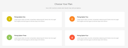
Style 2:
Below is the screen shot:
Codes are as follows:
<div class="SectionStyles2 pt-60 pb-60">
  <div class="dnn_layout">
    <div class="content_mid clearfix">
      <div class="pane_layout">
        <div class="row">
          <div class="col-sm-12">
            <h2 class="inside_con_title1">Choose Your Plan</h2>
            <div class="inside_con_titlep">Nunc nibh inventore veritatis diam blandit vitae vehicula dapibus.</div>
          </div>
          <div class="col-sm-6">
            <div class="price-table5 the1"> <span>1</span>
              <h6>Pricing Option One</h6>
              <p>Lorem ipsum dolor sit amet, consectetur adipiscing elit. Donec nec eros eget nisl fringilla commod ugue ut ultricies tique, enim lectus.</p>
            </div>
          </div>
          <div class="col-sm-6">
            <div class="price-table5 the2"> <span>2</span>
              <h6>Pricing Option Two</h6>
              <p>Lorem ipsum dolor sit amet, consectetur adipiscing elit. Donec nec eros eget nisl fringilla commod ugue ut ultricies tique, enim lectus.</p>
            </div>
          </div>
          <div class="col-sm-6">
            <div class="price-table5 the3"> <span>3</span>
              <h6>Pricing Option Three</h6>
              <p>Lorem ipsum dolor sit amet, consectetur adipiscing elit. Donec nec eros eget nisl fringilla commod ugue ut ultricies tique, enim lectus.</p>
            </div>
          </div>
          <div class="col-sm-6">
            <div class="price-table5 the4"> <span>4</span>
              <h6>Pricing Option Four</h6>
              <p>Lorem ipsum dolor sit amet, consectetur adipiscing elit. Donec nec eros eget nisl fringilla commod ugue ut ultricies tique, enim lectus.</p>
            </div>
          </div>
        </div>
      </div>
    </div>
  </div>
</div>
Option:
col-sm-*is the width for each column. You can change the width you need through value1~12
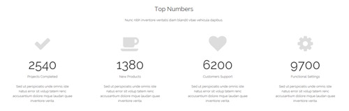
Style 3:
Below is the screen shot:
Codes are as follows:
<div class="pt-60">
  <div class="dnn_layout">
    <div class="content_mid clearfix">
      <div class="pane_layout">
        <div class="row">
          <div class="col-sm-12">
            <h2 class="inside_con_title1">Top Numbers</h2>
            <div class="inside_con_titlep">Nunc nibh inventore veritatis diam blandit vitae vehicula dapibus.</div>
          </div>
          <div class="number_Animation_2">
            <div class="col-md-3 col-sm-6">
              <div class="number_Animation_bg mt-50"> <span class="fa fa-check"> </span> <span class="animation  number" data-number="2540">0</span> <span class="number_name">Projects Completed</span>
                <p>Sed ut perspiciatis unde omnis iste natus error sit volup tatem renc accusantium dolore mque laudan  quae inventore verita.</p>
              </div>
            </div>
            <div class="col-md-3 col-sm-6">
              <div class="number_Animation_bg mt-50"> <span class="fa fa-coffee"> </span> <span class="animation  number" data-number="1380">0</span> <span class="number_name">New Products</span>
                <p>Sed ut perspiciatis unde omnis iste natus error sit volup tatem renc accusantium dolore mque laudan  quae inventore verita.</p>
              </div>
            </div>
            <div class="col-md-3 col-sm-6">
              <div class="number_Animation_bg mt-50"> <span class="fa fa-heart"> </span> <span class="animation  number" data-number="6200">0</span> <span class="number_name">Customers Support</span>
                <p>Sed ut perspiciatis unde omnis iste natus error sit volup tatem renc accusantium dolore mque laudan  quae inventore verita.</p>
              </div>
            </div>
            <div class="col-md-3 col-sm-6">
              <div class="number_Animation_bg mt-50"> <span class="fa fa-gear"> </span> <span class="animation  number" data-number="9700">0</span> <span class="number_name">Functional Settings</span>
                <p>Sed ut perspiciatis unde omnis iste natus error sit volup tatem renc accusantium dolore mque laudan  quae inventore verita.</p>
              </div>
            </div>
          </div>
        </div>
      </div>
    </div>
  </div>
</div>
Option:
col-md-* col-sm-*is the width for each column. You can change the width you need through value1~12
ProgressBars Counters
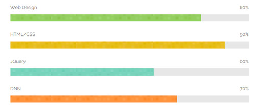
You can click the link to check ProgressBars Counters demo. Demo Link
Style 1
Below is the screen shot:
Codes are as follows:
<div class="loaded_list">
  <p>Web Design </p>
  <div class="the1 progress progress-striped active">
    <div class="bar animation animationwidth" data-width="80%"><span></span></div>
  </div>
  <p>HTML/CSS</p>
  <div class="the2 progress progress-striped active">
    <div class="bar animation animationwidth" data-width="90%"><span></span></div>
  </div>
  <p>JQuery</p>
  <div class="the3 progress progress-striped active">
    <div class="bar animation animationwidth" data-width="60%"><span></span> </div>
  </div>
  <p>DNN</p>
  <div class="the4 progress progress-striped active">
    <div class="bar animation animationwidth" data-width="70%"><span></span></div>
  </div>
</div>
Option:
- You can modify
animationto change the animation on the slide. Animation list. - You can change the value you need to display through
data-width
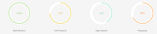
Style 2
Below is the screen shot:
Codes are as follows:
<div class="chart_list1 row">
  <div class="col-sm-6 col-md-3">
    <div class="the1">
      <div data-percent="100" class="percentage1">
        <div class="percentage_inner"><span>0</span>%</div>
      </div>
    </div>
    <h6>Best Reviews</h6>
  </div>
  <div class="col-sm-6 col-md-3">
    <div class="the2">
      <div data-percent="75" class="percentage1">
        <div class="percentage_inner"><span>0</span>%</div>
      </div>
    </div>
    <h6>Hot Products</h6>
  </div>
  <div class="col-sm-6 col-md-3">
    <div class="the3">
      <div data-percent="42" class="percentage1">
        <div class="percentage_inner"><span>0</span>%</div>
      </div>
    </div>
    <h6>High Opinion</h6>
  </div>
  <div class="col-sm-6 col-md-3">
    <div class="the4">
      <div data-percent="68" class="percentage1">
        <div class="percentage_inner"><span>0</span>%</div>
      </div>
    </div>
    <h6>Popularity</h6>
  </div>
</div>
Option:
col-sm-* col-xs-*is the width of each column, you can change the width you need through value1~12.data-percentis for controlling the percentage that displays, you can display percentage through value0~100
Style 3
Below is the screen shot:
Codes are as follows:
<div class="row">
  <div class="col-sm-6">
    <div class="loaded_list2 mb-60">
      <p>Web Design </p>
      <div class="progress progress-striped active">
        <div class="bar animation animationwidth" data-width="75%"><span></span></div>
      </div>
      <p>Html5 & Css3</p>
      <div class="progress progress-striped active">
        <div class="bar animation animationwidth" data-width="90%"><span></span></div>
      </div>
      <p>Javascript</p>
      <div class="progress progress-striped active">
        <div class="bar animation animationwidth" data-width="84%"><span></span> </div>
      </div>
      <p>DNN</p>
      <div class="the4 progress progress-striped active">
        <div class="bar animation animationwidth" data-width="62%"><span></span></div>
      </div>
    </div>
  </div>
</div>
Option:
col-sm-*is the width of each column, you can change the width you need through value1~12.- You can modify
animationto change the animation on the slide. Animation list. - You can change the value you need to display through
data-width
Style 4
Below is the screen shot:
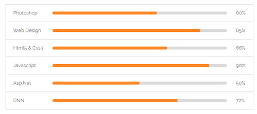
Codes are as follows:
<ul class="loaded_list3">
  <li>
    <p>Photoshop </p>
    <div class="progress progress-striped active">
      <div class="bar animation animationwidth" data-width="60%"><span></span></div>
    </div>
  </li>
  <li>
    <p>Web Design </p>
    <div class="progress progress-striped active">
      <div class="bar animation animationwidth" data-width="85%"><span></span></div>
    </div>
  </li>
  <li>
    <p>Html5 & Css3</p>
    <div class="progress progress-striped active">
      <div class="bar animation animationwidth" data-width="66%"><span></span></div>
    </div>
  </li>
  <li>
    <p>Javascript</p>
    <div class="progress progress-striped active">
      <div class="bar animation animationwidth" data-width="90%"><span></span> </div>
    </div>
  </li>
  <li>
    <p>Asp.Net</p>
    <div class="progress progress-striped active">
      <div class="bar animation animationwidth" data-width="50%"><span></span></div>
    </div>
  </li>
  <li>
    <p>DNN</p>
    <div class="the6 progress progress-striped active">
      <div class="bar animation animationwidth" data-width="72%"><span></span></div>
    </div>
  </li>
</ul>
Option:
- You can modify
animationto change the animation on the slide. Animation list. - You can change the value you need to display through
data-width
Style 5
Below is the screen shot:
Codes are as follows:
<div class="loaded_list4 the2">
  <p>Javascript</p>
  <div class="progress progress-striped active">
    <div class="bar animation animationwidth" data-width="82%"><span></span></div>
  </div>
  <p>DNN</p>
  <div class="progress progress-striped active">
    <div class="bar animation animationwidth" data-width="69%"><span></span></div>
  </div>
  <p>Asp.net</p>
  <div class="progress progress-striped active">
    <div class="bar animation animationwidth" data-width="47%"><span></span> </div>
  </div>
  <p>SEO</p>
  <div class="the4 progress progress-striped active">
    <div class="bar animation animationwidth" data-width="70%"><span></span></div>
  </div>
</div>
Option:
- You can modify
animationto change the animation on the slide. Animation list. - You can change the value you need to display through
data-width
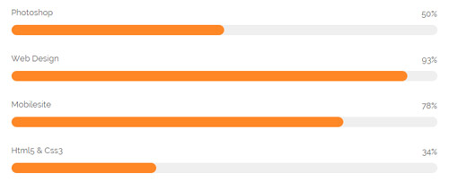
Style 6
Below is the screen shot:
Codes are as follows:
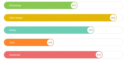
<div class="loaded_list5 mb-60">
  <div class="the1 progress progress-striped active">
    <p>Photoshop </p>
    <div class="bar animation animationwidth" data-width="62%"><span></span></div>
  </div>
  <div class="the2 progress progress-striped active">
    <p>Web Design</p>
    <div class="bar animation animationwidth" data-width="95%"><span></span></div>
  </div>
  <div class="the3 progress progress-striped active">
    <p>Html5</p>
    <div class="bar animation animationwidth" data-width="76%"><span></span> </div>
  </div>
  <div class="the4 progress progress-striped active">
    <p>Css3</p>
    <div class="bar animation animationwidth" data-width="42%"><span></span></div>
  </div>
  <div class="the5 progress progress-striped active">
    <p>Javascript</p>
    <div class="bar animation animationwidth" data-width="83%"><span></span></div>
  </div>
</div>
Option:
- You can change the value you need to display through
data-number - You can modify
animationto change the animation on the slide. Animation list.
Style 7
Below is the screen shot:
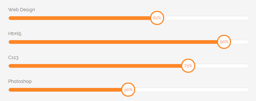
Codes are as follows:
<div class="loaded_list6 mb-60">
  <p>Web Design</p>
  <div class=" progress progress-striped active">
    <div class="bar animation animationwidth" data-width="62%"><span></span></div>
  </div>
  <p>Html5</p>
  <div class=" progress progress-striped active">
    <div class="bar animation animationwidth" data-width="90%"><span></span></div>
  </div>
  <p>Css3</p>
  <div class=" progress progress-striped active">
    <div class="bar animation animationwidth" data-width="75%"><span></span> </div>
  </div>
  <p>Photoshop</p>
  <div class=" progress progress-striped active">
    <div class="bar animation animationwidth" data-width="50%"><span></span></div>
  </div>
</div>
Option:
- You can change the value you need to display through
data-width - You can modify
animationto change the animation on the slide. Animation list.
Style 8
Below is the screen shot:
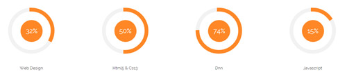
Codes are as follows:
<div class="chart_list2 row">
  <div class="col-sm-6 col-md-3">
    <div class="mt-60">
      <div data-percent="32" class="percentage2">
        <div class="percentage_inner"><span>0</span>%</div>
      </div>
      <h6>Web Design</h6>
    </div>
  </div>
  <div class="col-sm-6 col-md-3">
    <div class="mt-60">
      <div data-percent="50" class="percentage2">
        <div class="percentage_inner"><span>0</span>%</div>
      </div>
      <h6>Html5 & Css3</h6>
    </div>
  </div>
  <div class="col-sm-6 col-md-3">
    <div class="mt-60">
      <div data-percent="74" class="percentage2">
        <div class="percentage_inner"><span>0</span>%</div>
      </div>
      <h6>Dnn</h6>
    </div>
  </div>
  <div class="col-sm-6 col-md-3">
    <div class="mt-60">
      <div data-percent="15" class="percentage2">
        <div class="percentage_inner"><span>0</span>%</div>
      </div>
      <h6>Javascript</h6>
    </div>
  </div>
</div>
Option:
col-sm-* col-md-*is the width of each column, you can change the width you need through value1~12data-percentis for controlling the percentage that displays, you can display percentage through value0~100
Testimonials
You can click the link to check Testimonials demo. Demo Link
Option:
Testimonials includes the parameters that listed below.
data-position |
Switch mode. fade:fade in fade out, roll-left:roll from side to side, roll-vertical:roll up and down |
data-display-navigation |
Navigation display and hidden. Default to true. true:Display, false:hidden |
data-display-arrows |
Left/right arrow display and hidden. Default to true. true:Display, false:hidden |
data-autoplay |
Whether to scroll automatically or not. 0 is for not scrolling automatically, numbers greater than 0 are for scrolling automatically, and these numbers are the time interval for scrolling. Default to 3000 |
data-autoheight |
Whether to be automatic height or not, default to true. true: automatic height, false: fixed height.< |
Example:
<ul class=" Testimonials_tab" data-position="roll-vertical" data-display-navigation="true" data-display-arrows="true" data-display-navigation="false" data-autoplay="3000" data-autoheight="true">
  <li>
    <h3 class="title a_t_c">What Others Say About Us ?</h3>
		......
Style 1:
Below is the screen shot:
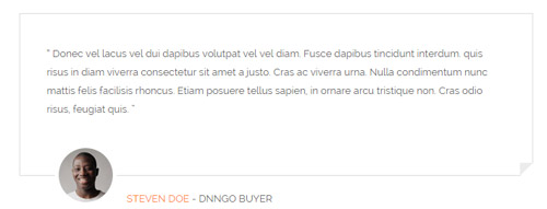
Codes are as follows:
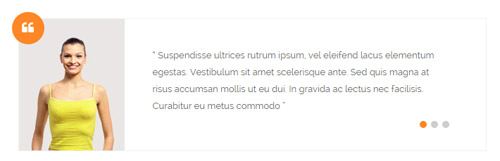
<div class=" Testimonials_tab Testimonials_1" data-autoplay="0" data-display-arrows="false" data-position="fade" data-display-navigation="false">
  <blockquote>
    <p>“ Donec vel lacus vel dui dapibus volutpat vel vel diam. Fusce dapibus tincidunt interdum. quis risus in diam viverra consectetur sit amet a justo. Cras ac viverra urna. Nulla condimentum nunc mattis felis facilisis rhoncus. Etiam posuere tellus sapien, in ornare arcu tristique non. Cras odio risus, feugiat quis. ”</p>
    <small><img alt="" src="/portals/8/Testimonials_1a.jpg" />
    <div><span>Steven Doe</span> - Dnngo Buyer</div>
    </small> </blockquote>
</div>
Style 2:
Below is the screen shot:
Codes are as follows:
<ul class=" Testimonials_tab Testimonials_2 " data-autoplay="3000" data-display-arrows="false" data-position="fade">
  <li>
    <blockquote> <img alt="" src="/portals/8/Testimonials_2a.jpg" />
      <p>text ....</p>
      <small> <span></span> </small> </blockquote>
  </li>
</ul>
Style 3:
Below is the screen shot:
Codes are as follows:
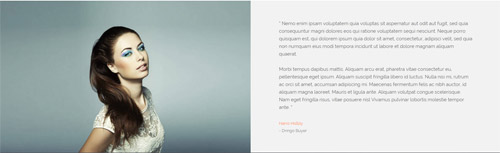
<div class=" Testimonials_tab Testimonials_3 clearfix" data-autoplay="0" data-display-arrows="false" data-position="fade" data-display-navigation="false">
<div class="img"></div>
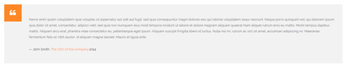
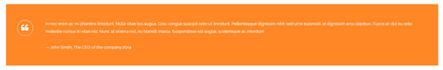
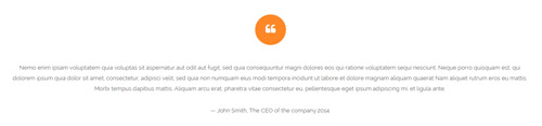
<blockquote>
<p>“ Nemo enim ipsam voluptatem quia voluptas sit aspernatur aut odit aut fugit, sed quia consequuntur magni dolores eos qui ratione voluptatem sequi nesciunt. Neque porro quisquam est, qui dolorem ipsum quia dolor sit amet, consectetur, adipisci velit, sed quia non numquam eius modi tempora incidunt ut labore et dolore magnam aliquam quaerat. <br />
<br />
Morbi tempus dapibus mattis. Aliquam arcu erat, pharetra vitae consectetur eu, pellentesque eget ipsum. Aliquam suscipit fringilla libero id luctus. Nulla nisi mi, rutrum ac orci sit amet, accumsan adipiscing mi. Maecenas fermentum felis ac nibh auctor, id aliquam magna laoreet. Mauris et ligula ante. Aliquam volutpat congue scelerisque. Nam eget fringilla risus, vitae posuere nisl Vivamus pulvinar lobortis molestie tempor ante. ”</p>
<small> <span>Harro Holloy</span> - Dnngo Buyer</small> </blockquote>
</div>
Style 4:
Below is the screen shot:

Codes are as follows:
<div class="SectionStyles12 pt-60 pb-60">
  <div class="dnn_layout">
    <div class="content_mid clearfix">
      <div class="pane_layout">
        <div class="row">
          <div class="col-sm-12">
            <h6 class="home5_con_title1">What They Say</h6>
            <h3 class="home5_con_title2">Testimonials</h3>
            <div class="home5_con_titleline"></div>
            <div class="sync_carousel  sync_carousel_1">
              <div class="carousel_main">
                <div class="item">
                  <p>You guys do a fantastic job.  The skin looks exactly as we expected.  We have now done several skins and even skins that were done 6 months ago, the teams have been great in making the minor changes we request.  We love that you aren't a company that nickels and dimes their customers and I can see us having a nice long relationship.</p>
                  <h6>Rante Smith</h6>
                </div>
                <div class="item">
                  <p>content text ...</p>
                  <h6>Rante Smith</h6>
                </div>
                <div class="item">
                  <p>Lorem ipsum dolor sit amet, consectetur adipiscing elit. Nunc nibh diam, blandit vitae vehicula dapibus. Fusce et ornare sapien, non euismod felis. Integer et risus quis arcu. </p>
                  <h6>Rante Smith</h6>
                </div>
              </div>
              <div class="carousel_nav">
                <div class="item">
                  <div class="out"><img alt="" src="/portals/8/sync_carousel_1_1.png" /></div>
                </div>
                <div class="item">
                  <div class="out"><img alt="" src="/portals/8/sync_carousel_1_2.png" /></div>
                </div>
                <div class="item">
                  <div class="out"><img alt="" src="/portals/8/sync_carousel_1_3.png" /></div>
                </div>
              </div>
            </div>
          </div>
        </div>
      </div>
    </div>
  </div>
</div>
Style 5:
Below is the screen shot:
Codes are as follows:
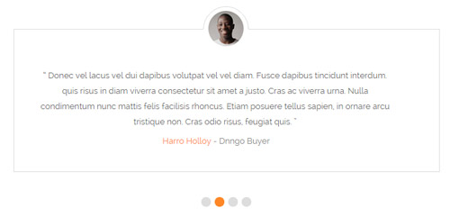
<div class=" Testimonials_tab Testimonials_4" data-autoplay="3000" data-display-arrows="false" data-position="fade" data-display-navigation="true">
  <blockquote>
    <p>“ Donec vel lacus vel dui dapibus volutpat vel vel diam. Fusce dapibus tincidunt interdum. quis risus in diam viverra consectetur sit amet a justo. Cras ac viverra urna. Nulla condimentum nunc mattis felis facilisis rhoncus. Etiam posuere tellus sapien, in ornare arcu tristique non. Cras odio risus, feugiat quis. ”</p>
    <small><img alt="" src="/portals/8/Testimonials_1a.jpg" />
    <div><span>Steven Doe</span> - Dnngo Buyer</div>
    </small> </blockquote>
</div>
Responsive Tab
You can click the link to check Responsive Tab demo. Demo Link
You can add the "resp-tabs-list" of "li" to add tab item, and add the "resp-tabs-container" of "resp_container" to add content
Example:
<div class="horizontalTab_Top">
  <ul class="resp-tabs-list">

    <li> Tab1 </li>
    <li> Tab2 </li>
    ....

  </ul>
  <div class="resp-tabs-container">

    <div class="resp_container"> Tab1 Content </div>
    <div class="resp_container"> Tab2 Content </div>
    ....

  </div>
</div>
Style 1:
Below is the screen shot:
Codes are as follows:
<div class="sync_carousel  sync_carousel_2">
  <div class="carousel_nav home3_cond">
    <div class="item">
      <div class="photo_box"> <a href="#">
        <div class="pic_box"> <img alt="" src="/portals/8/home3_cond1.jpg" class="img-responsive" />
          <div class="shade"></div>
        </div>
        </a> </div>
    </div>
    <div class="item">
      <div class="photo_box"> <a href="#">
        <div class="pic_box"> <img alt="" src="/portals/8/home3_cond2.jpg" class="img-responsive" />
          <div class="shade"></div>
        </div>
        </a> </div>
    </div>
    <div class="item">
      <div class="photo_box"> <a href="#">
        <div class="pic_box"> <img alt="" src="/portals/8/home3_cond3.jpg" class="img-responsive" />
          <div class="shade"></div>
        </div>
        </a> </div>
    </div>
    <div class="item">
      <div class="photo_box"> <a href="#">
        <div class="pic_box"> <img alt="" src="/portals/8/home3_cond4.jpg" class="img-responsive" />
          <div class="shade"></div>
        </div>
        </a> </div>
    </div>
  </div>
  <div class="carousel_main ">
    <div class="item"> text.... </div>
    <div class="item"> text.... </div>
    <div class="item"> text.... </div>
    <div class="item"> text.... </div>
  </div>
</div>
Style 2:
Below is the screen shot:
Codes are as follows:
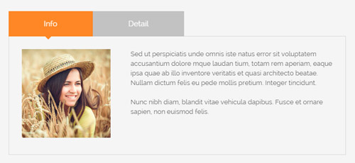
<div class="horizontalTab_Top horizontalTab_Top_1">
  <ul class="resp-tabs-list clearfix">
    <li><span>Info</span></li>
    <li><span>Detail</span></li>
  </ul>
  <div class="resp-tabs-container">
    <div class="resp_container">
      <div class="resp_margin">
        <p><img alt="" src="/portals/8/home4_conb1.jpg" />Content text ...<br />
          <br />
          Nunc nibh diam, blandit vitae vehicula dapibus. Fusce et ornare sapien, non euismod felis. </p>
      </div>
    </div>
    <div class="resp_container">
      <div class="resp_margin">
        <p>Fugiat dapibus, tellus ac cursus commodo, mauris sit condim eser ntumsi nibh, uum a justo vitaes amet risus amets un. Posi sectetut amet fermntum orem ipsum. sed diam non umy at volutpat. </p>
      </div>
    </div>
  </div>
</div>
Style 3:
Below is the screen shot:
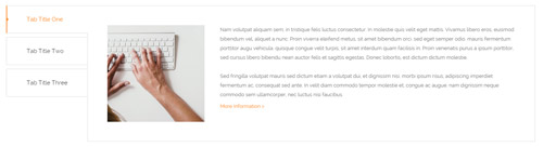
Codes are as follows:
<div class="verticalTab_Left  verticalTab_Left_1">
  <ul class="resp-tabs-list">
    <li><span>Tab Title One</span></li>
    <li><span>Tab Title Two</span></li>
    <li><span>Tab Title Three</span></li>
  </ul>
  <div class="resp-tabs-container">
    <div class="resp_container">
      <div class="resp_margin"> <img alt="" src="/portals/8/verticalTab_Left_1_a.jpg" />
        <p>text 1..... </p>
        <a href="#">More Information  ></a> </div>
    </div>
    <div class="resp_container">
      <div class="resp_margin&quo;> <img alt="" src="/portals/8/verticalTab_Left_1_a.jpg" />
      <p>text 2..... </p>
      <a href="#">More Information  ></a> </div>
  </div>
  <div class="resp_container">
    <div class="resp_margin"> <img alt="" src="/portals/8/verticalTab_Left_1_a.jpg" />
      <p>text 3..... </p>
      <a href="#">More Information  ></a> </div>
  </div>
</div>
</div>
Style 4:
Below is the screen shot:
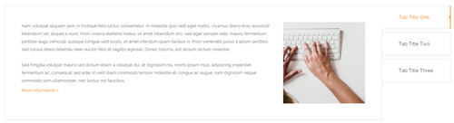
Codes are as follows:
<div class="verticalTab_Right verticalTab_Right_1"  id="tabposition">
  <ul class="resp-tabs-list">
    <li><span>Tab Title One</span></li>
    <li><span>Tab Title Two</span></li>
    <li id="unfoldstab" ><span>Tab Title Three</span></li>
  </ul>
  <div class="resp-tabs-container">
    <div class="resp_container">
      <div class="resp_margin"> <img alt="" src="/portals/8/verticalTab_Left_1_a.jpg" />
        <p>text1..... </p>
        <a href="#">More Information  ></a> </div>
    </div>
    <div class="resp_container">
      <div class="resp_margin"> <img alt="" src="/portals/8/verticalTab_Left_1_a.jpg" />
        <p>text2..... </p>
        <a href="#">More Information  ></a> </div>
    </div>
    <div class="resp_container">
      <div class="resp_margin"> <img alt="" src="/portals/8/verticalTab_Left_1_a.jpg" />
        <p>text3..... </p>
        <a href="#">More Information  ></a> </div>
    </div>
  </div>
</div>
Style 5:
Below is the screen shot:
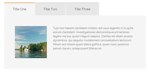
Codes are as follows:
<div class="horizontalTab_Top horizontalTab_Top_2">
  <ul class="resp-tabs-list">
    <li><span>Title One</span></li>
    <li><span>Title Two</span></li>
    <li><span>Title Three</span></li>
  </ul>
  <div class="resp-tabs-container">
    <div class="resp_container">
      <div class="resp_margin"> <img src="/portals/8/horizontalTab_Top_2_a.jpg" />
        <p>text1....</p>
      </div>
    </div>
    <div class="resp_container">
      <div class="resp_margin"> <img src="/portals/8/horizontalTab_Top_2_a.jpg" />
        <p> text2.....2</p>
      </div>
    </div>
    <div class="resp_container">
      <div class="resp_margin"> <img src="/portals/8/horizontalTab_Top_2_a.jpg" />
        <p> text3  .... 3</p>
      </div>
    </div>
  </div>
</div>
Accordions
You can click the link to check Accordions demo. Demo Link
Option:
- id="accordion" of each accordions effect needs using different names.
"data-parent"needs to have the same name asid- href="#collapse1" is the id that needs to expand content.
- id="collapse1" is the content that needs to expand.
<div class="panel-group" id="accordion">

  <div class="panel panel-default">
    <div class="panel-heading">
      <h4 class="panel-title"> <a data-toggle="collapse" data-parent="#accordion" href="#collapse1"> Title Text ... </a> </h4>
    </div>
    <div id="collapse1" class="panel-collapse collapse in">
      <div class="panel-body">Content Text ... </div>
    </div>
  </div>
  ....

</div>
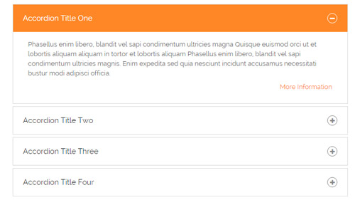
Style 1:
Below is the screen shot:
Codes are as follows:
<div class="panel-group accordion_1" id="accordion1">
  <div class="panel panel-default">
    <div class="panel-heading">
      <h4 class="panel-title"> <a data-toggle="collapse" data-parent="#accordion1" href="#collapse1_1"><span class="accordion_icon"></span>Accordion Title One</a> </h4>
    </div>
    <div id="collapse1_1" class="panel-collapse collapse in">
      <div class="panel-body">
        <p>Content Text ...</p>
        <p class="linker"><a href="#">More Information</a></p>
      </div>
    </div>
  </div>
  <div class="panel panel-default">
    <div class="panel-heading">
      <h4 class="panel-title"> <a data-toggle="collapse" data-parent="#accordion1" href="#collapse1_2" class="collapsed"><span class="accordion_icon"></span>Accordion Title Two</a> </h4>
    </div>
    <div id="collapse1_2" class="panel-collapse collapse">
      <div class="panel-body">
        <p>Content Text ...</p>
        <p class="linker"><a href="#">More Information</a></p>
      </div>
    </div>
  </div>
  <div class="panel panel-default">
    <div class="panel-heading">
      <h4 class="panel-title"> <a data-toggle="collapse" data-parent="#accordion1" href="#collapse1_3" class="collapsed"><span class="accordion_icon"></span>Accordion Title Three</a> </h4>
    </div>
    <div id="collapse1_3" class="panel-collapse collapse">
      <div class="panel-body">
        <p>Content Text ...</p>
        <p class="linker"><a href="#">More Information</a></p>
      </div>
    </div>
  </div>
  <div class="panel panel-default">
    <div class="panel-heading">
      <h4 class="panel-title"> <a data-toggle="collapse" data-parent="#accordion1" href="#collapse1_4" class="collapsed"><span class="accordion_icon"></span>Accordion Title Four</a> </h4>
    </div>
    <div id="collapse1_4" class="panel-collapse collapse">
      <div class="panel-body">
        <p>Content Text ...</p>
        <p class="linker"><a href="#">More Information</a></p>
      </div>
    </div>
  </div>
</div>
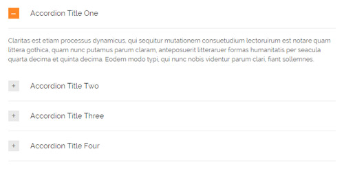
Style 2:
Below is the screen shot:
Codes are as follows:
<div class="panel-group accordion_2" id="accordion2">
  <div class="panel panel-default">
    <div class="panel-heading">
      <h4 class="panel-title"> <a data-toggle="collapse" data-parent="#accordion2" href="#collapse2_1"><span class="accordion_icon"></span>Accordion Title One</a> </h4>
    </div>
    <div id="collapse2_1" class="panel-collapse collapse in">
      <div class="panel-body">Content Text ... </div>
    </div>
  </div>
  <div class="panel panel-default">
    <div class="panel-heading">
      <h4 class="panel-title"> <a data-toggle="collapse" data-parent="#accordion2" href="#collapse2_2" class="collapsed"><span class="accordion_icon"></span>Accordion Title Two</a> </h4>
    </div>
    <div id="collapse2_2" class="panel-collapse collapse">
      <div class="panel-body">Content Text ... </div>
    </div>
  </div>
  <div class="panel panel-default">
    <div class="panel-heading">
      <h4 class="panel-title"> <a data-toggle="collapse" data-parent="#accordion2" href="#collapse2_3" class="collapsed"><span class="accordion_icon"></span>Accordion Title Three</a> </h4>
    </div>
    <div id="collapse2_3" class="panel-collapse collapse">
      <div class="panel-body">Content Text ... </div>
    </div>
  </div>
  <div class="panel panel-default">
    <div class="panel-heading">
      <h4 class="panel-title"> <a data-toggle="collapse" data-parent="#accordion2" href="#collapse2_4" class="collapsed"><span class="accordion_icon"></span>Accordion Title Four</a> </h4>
    </div>
    <div id="collapse2_4" class="panel-collapse collapse">
      <div class="panel-body">Content Text ... </div>
    </div>
  </div>
</div>
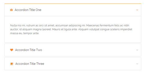
Style 3:
Below is the screen shot:
Codes are as follows:
<div class="panel-group accordion_3" id="accordion3">
  <div class="panel panel-default">
    <div class="panel-heading">
      <h4 class="panel-title"> <a data-toggle="collapse" data-parent="#accordion3" href="#collapse3_1"><span class="fa fa-gift"></span>Accordion Title One</a> </h4>
    </div>
    <div id="collapse3_1" class="panel-collapse collapse in">
      <div class="panel-body">Content Text ...</div>
    </div>
  </div>
  <div class="panel panel-default">
    <div class="panel-heading">
      <h4 class="panel-title"> <a data-toggle="collapse" data-parent="#accordion3" href="#collapse3_2" class="collapsed"><span class="fa fa-heart"></span>Accordion Title Two</a> </h4>
    </div>
    <div id="collapse3_2" class="panel-collapse collapse">
      <div class="panel-body">Content Text ...</div>
    </div>
  </div>
  <div class="panel panel-default">
    <div class="panel-heading">
      <h4 class="panel-title"> <a data-toggle="collapse" data-parent="#accordion3" href="#collapse3_3" class="collapsed"><span class="fa fa-coffee"></span>Accordion Title Three</a> </h4>
    </div>
    <div id="collapse3_3" class="panel-collapse collapse">
      <div class="panel-body">Content Text ...</div>
    </div>
  </div>
</div>
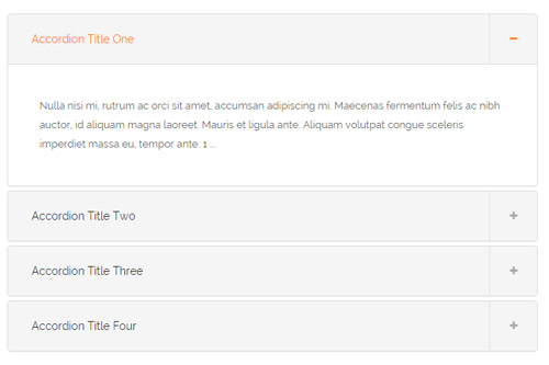
Style 4:
Below is the screen shot:
Codes are as follows:
<div class="panel-group accordion_4" id="accordion4">
  <div class="panel panel-default">
    <div class="panel-heading">
      <h4 class="panel-title"> <a data-toggle="collapse" data-parent="#accordion4" href="#collapse4_1"><span class="accordion_icon"></span>Accordion Title One</a> </h4>
    </div>
    <div id="collapse4_1" class="panel-collapse collapse in">
      <div class="panel-body">Content Text ... 1 ... </div>
    </div>
  </div>
  <div class="panel panel-default">
    <div class="panel-heading">
      <h4 class="panel-title"> <a data-toggle="collapse" data-parent="#accordion4" href="#collapse4_2" class="collapsed"><span class="accordion_icon"></span>Accordion Title Two</a> </h4>
    </div>
    <div id="collapse4_2" class="panel-collapse collapse">
      <div class="panel-body">Content Text ... 2 ...</div>
    </div>
  </div>
  <div class="panel panel-default">
    <div class="panel-heading">
      <h4 class="panel-title"> <a data-toggle="collapse" data-parent="#accordion4" href="#collapse4_3" class="collapsed"><span class="accordion_icon"></span>Accordion Title Three</a> </h4>
    </div>
    <div id="collapse4_3" class="panel-collapse collapse">
      <div class="panel-body">Content Text ... 3 ... </div>
    </div>
  </div>
  <div class="panel panel-default">
    <div class="panel-heading">
      <h4 class="panel-title"> <a data-toggle="collapse" data-parent="#accordion4" href="#collapse4_4" class="collapsed"><span class="accordion_icon"></span>Accordion Title Four</a> </h4>
    </div>
    <div id="collapse4_4" class="panel-collapse collapse">
      <div class="panel-body">Content Text ... 4 ...</div>
    </div>
  </div>
</div>
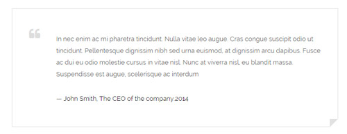
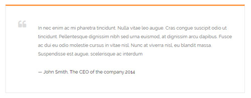
Quotes
You can click the link to check Quotes demo. Demo Link
Style 1:
Below is the screen shot:
<div class="quotes_1">
  <blockquote> <span class="mark fa fa-quote-left"></span>
    <p>Content text  ...</p>
    <small>Name</small> </blockquote>
</div>
Style 2:
Below is the screen shot:
<div class="quotes_2">
  <blockquote> <span class="mark fa fa-quote-left"></span>
    <p>Content text  ...</p>
    <small>Name</small> </blockquote>
</div>
Style 3:
Below is the screen shot:
<div class="quotes_3">
  <blockquote> <span class="mark fa fa-quote-left"></span>
    <p>Content text  ...</p>
    <small>Name</small> </blockquote>
</div>
Style 4:
Below is the screen shot:
<div class="quotes_4">
  <blockquote> <span class="mark fa fa-quote-left"></span>
    <p>Content text  ...</p>
    <small>Name</small> </blockquote>
</div>
Style 5:
Below is the screen shot:
<div class="quotes_5">
  <blockquote> <span class="mark fa fa-quote-left"></span>
    <p>Content text  ...</p>
    <small>Name</small> </blockquote>
</div>
Dropcaps
You can click the link to check Dropcaps demo. Demo Link
Style 1:
Below is the screen shot:
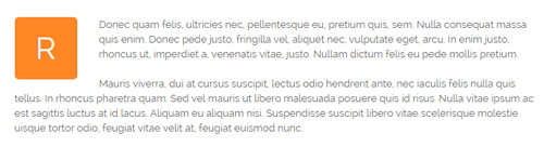
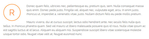
<p> <span class="dropcaps_1">R</span>Content text ... </p>
Style 2:
Below is the screen shot:
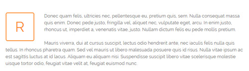
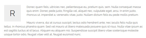
<p> <span class="dropcaps_2">R</span>Content text ... </p>
Style 3:
Below is the screen shot:
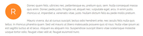
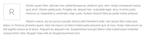
<p> <span class="dropcaps_3">R</span>Content text ... </p>
Style 4:
Below is the screen shot:
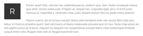
<p> <span class="dropcaps_4">R</span>Content text ... </p>
Style 5:
Below is the screen shot:
<p> <span class="dropcaps_5">R</span>Content text ... </p>
Style 6:
Below is the screen shot:
<p> <span class="dropcaps_6">R</span>Content text ... </p>
Style 7:
Below is the screen shot:
<p> <span class="dropcaps_7">R</span>Content text ... </p>
Style 8:
Below is the screen shot:
<p> <span class="dropcaps_8">R</span>Content text ... </p>
Carousel
You can click the link to check Carousel demo. Demo Link
Style 1:
Below is the screen shot:
Codes are as follows:
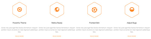
<div class="carousel carousel_5" data-pagination="false" data-autoheight="false" data-autoplay="false">
  <div class="item">
    <div class="home1_cona">
      <div class="icon_box"> <span class="fa fa-compass"></span> </div>
      <h5>Powerful Theme</h5>
      <p>Donec nec justo eget felis facilisis fermentum. Aliquam porttitor mauris sit amet orci nean dignissim pellentque felis.</p>
      <a href="#">Read More</a> </div>
  </div>
  <div class="item">
    <div class="home1_cona">
      <div class="icon_box"> <span class="fa fa-globe"></span> </div>
      <h5>Retina Ready</h5>
      <p>Donec nec justo eget felis facilisis fermentum. Aliquam porttitor mauris sit amet orci nean dignissim pellentque felis.</p>
      <a href="#">Read More</a> </div>
  </div>
  <div class="item">
    <div class="home1_cona">
      <div class="icon_box"> <span class="fa fa-soccer-ball-o"></span> </div>
      <h5>Fronted Skin</h5>
      <p>Donec nec justo eget felis facilisis fermentum. Aliquam porttitor mauris sit amet orci nean dignissim pellentque felis.</p>
      <a href="#">Read More</a> </div>
  </div>
  <div class="item">
    <div class="home1_cona">
      <div class="icon_box"> <span class="fa fa-adjust"></span> </div>
      <h5>Adjust Bugs</h5>
      <p>Donec nec justo eget felis facilisis fermentum. Aliquam porttitor mauris sit amet orci nean dignissim pellentque felis.</p>
      <a href="#">Read More</a> </div>
  </div>
  <div class="item">
    <div class="home1_cona">
      <div class="icon_box"> <span class="fa fa-compass"></span> </div>
      <h5>Powerful Theme</h5>
      <p>Donec nec justo eget felis facilisis fermentum. Aliquam porttitor mauris sit amet orci nean dignissim pellentque felis.</p>
      <a href="#">Read More</a> </div>
  </div>
</div>
Option:
- You can increase your content items through adding
<div class="item"></div> - You can modify
fato change icons. font icon list.
| Variable | Default | Type | Description |
|---|---|---|---|
data-items |
4 | int | This variable allows you to set the maximum amount of items displayed at a time with the widest browser width. |
data-navigation |
true | boolean | Display "next" and "prev" buttons. |
data-pagination |
true | boolean | Show pagination. |
data-autoplay |
true | int/boolean | Change to any integrer for example data-autoplay ="5000" to play every 5 seconds. If you set data-autoplay="false" Stop auto scroll animation. |
Example:
<div class="carousel" data-items="4" data-navigation="true" data-pagination="true" data-autoplay="true">
  <div class="item">
		...
Style 2:
Below is the screen shot:
Codes are as follows:
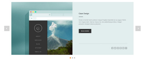
<div class="carousel carousel_1" data-autoheight="false" data-autoplay="false">
  <div class="item">
    <div class="cal1_main clearfix">
      <div class="cal1_left1"> </div>
      <div class="cal1_right1">
        <h5>Clean Design</h5>
        <div class="line"></div>
        <p>content text ...</p>
        <a href="#" class="linker">Read More</a>
        <div class="bottomline"></div>
        <div class="bottomicon"> <a href="#" class="fa fa-facebook-square"></a> <a href="#" class="fa fa-twitter-square"></a> <a href="#" class="fa fa-pinterest-square"></a> <a href="#" class="fa fa-tumblr-square"></a> <a href="#" class="fa fa-vimeo-square"></a> <a href="#" class="fa fa-hacker-news"></a> </div>
      </div>
    </div>
  </div>
  <div class="item">
    <div class="cal1_main clearfix">
      <div class="cal1_left2"> </div>
      <div class="cal1_right2">
        <h5>470 Font Icons</h5>
        <div class="line"></div>
        <p>content text ...</p>
        <a href="#" class="linker">Read More</a>
        <div class="bottomline"></div>
        <div class="bottomicon"> <a href="#" class="fa fa-facebook-square"></a> <a href="#" class="fa fa-twitter-square"></a> <a href="#" class="fa fa-pinterest-square"></a> <a href="#" class="fa fa-tumblr-square"></a> <a href="#" class="fa fa-vimeo-square"></a> <a href="#" class="fa fa-hacker-news"></a> </div>
      </div>
    </div>
  </div>
  <div class="item">
    <div class="cal1_main clearfix">
      <div class="cal1_left3"> </div>
      <div class="cal1_right3">
        <h5>Responsive Web</h5>
        <div class="line"></div>
        <p>content text ...</p>
        <a href="#" class="linker">Read More</a>
        <div class="bottomline"></div>
        <div class="bottomicon"> <a href="#" class="fa fa-facebook-square"></a> <a href="#" class="fa fa-twitter-square"></a> <a href="#" class="fa fa-pinterest-square"></a> <a href="#" class="fa fa-tumblr-square"></a> <a href="#" class="fa fa-vimeo-square"></a> <a href="#" class="fa fa-hacker-news"></a> </div>
      </div>
    </div>
  </div>
</div>
Option:
- You can increase your content items through adding
<div class="item"></div>
| Variable | Default | Type | Description |
|---|---|---|---|
data-items |
1 | int | This variable allows you to set the maximum amount of items displayed at a time with the widest browser width. |
data-navigation |
true | boolean | Display "next" and "prev" buttons. |
data-pagination |
true | boolean | Show pagination. |
data-autoplay |
true | int/boolean | Change to any integrer for example data-autoplay ="5000" to play every 5 seconds. If you set data-autoplay="false" Stop auto scroll animation. |
Example:
<div class="carousel" data-navigation="true" data-pagination="true" data-autoplay="true" data-autoheight="true">
  <div class="item">
		...
Style 3:
Below is the screen shot:
Codes are as follows:
<div class="carousel carousel_3" data-autoheight="false" data-pagination="false">
  <div class="item">
    <div class="photo_box  ico_LeftAndRight_enter content_bottom_push_in">
      <div class="pic_box"> <img alt="" src="/portals/8/carousel_3_1.jpg" />
        <div class="content">
          <h3>Modules Development</h3>
          <p>December 15th,2014</p>
        </div>
      </div>
    </div>
  </div>
  <div class="item">
    <div class="photo_box  ico_LeftAndRight_enter content_bottom_push_in">
      <div class="pic_box"> <img alt="" src="/portals/8/carousel_3_2.jpg" />
        <div class="content">
          <h3>Modules Development</h3>
          <p>December 15th,2014</p>
        </div>
      </div>
    </div>
  </div>
  <div class="item">
    <div class="photo_box  ico_LeftAndRight_enter content_bottom_push_in">
      <div class="pic_box"> <img alt="" src="/portals/8/carousel_3_3.jpg" />
        <div class="content">
          <h3>Modules Development</h3>
          <p>December 15th,2014</p>
        </div>
      </div>
    </div>
  </div>
  <div class="item">
    <div class="photo_box  ico_LeftAndRight_enter content_bottom_push_in">
      <div class="pic_box"> <img alt="" src="/portals/8/carousel_3_4.jpg" />
        <div class="content">
          <h3>Modules Development</h3>
          <p>December 15th,2014</p>
        </div>
      </div>
    </div>
  </div>
  <div class="item">
    <div class="photo_box  ico_LeftAndRight_enter content_bottom_push_in">
      <div class="pic_box"> <img alt="" src="/portals/8/carousel_3_1.jpg" />
        <div class="content">
          <h3>Modules Development</h3>
          <p>December 15th,2014</p>
        </div>
      </div>
    </div>
  </div>
  <div class="item">
    <div class="photo_box  ico_LeftAndRight_enter content_bottom_push_in">
      <div class="pic_box"> <img alt="" src="/portals/8/carousel_3_2.jpg" />
        <div class="content">
          <h3>Modules Development</h3>
          <p>December 15th,2014</p>
        </div>
      </div>
    </div>
  </div>
</div>
Option:
- You can increase your content items through adding
<div class="item"></div> - You can control the way that the content comes out through these four styles
"text_left""text_right""text_top""text_bottom"
| Variable | Default | Type | Description |
|---|---|---|---|
data-items |
4 | int | This variable allows you to set the maximum amount of items displayed at a time with the widest browser width. |
data-navigation |
true | boolean | Display "next" and "prev" buttons. |
data-pagination |
true | boolean | Show pagination. |
data-autoplay |
true | int/boolean | Change to any integrer for example data-autoplay ="5000" to play every 5 seconds. If you set data-autoplay="false" Stop auto scroll animation. |
data-autoheight |
true | int/boolean | Whether to be automatic height or not, default to true. true: automatic height, false: fixed height. |
Style 4:
Below is the screen shot:
Codes are as follows:
<div class="carousel carousel_2" data-autoheight="false" data-navigation="false" data-autoplay="false">
  <div class="item"> <img alt="" src="/portals/8/carousel_2_p1.jpg" />
    <div class="img"><img alt="" src="/portals/8/carousel_2_p1_1.jpg" /></div>
    <div class="item_box">
      <h6>Meeting Report</h6>
      <span>By Admin   |   Nov 25th, 2014   |   0 Comments</span>
      <p>Fugiat dapibus, tellus ac cursus commodo, mauris sit con dim eser ntumsi nibh, uum a justo vitaes amet risus amets  non umy at volutpat.</p>
    </div>
  </div>
  <div class="item"> <img alt="" src="/portals/8/carousel_2_p2.jpg" />
    <div class="img"><img alt="" src="/portals/8/carousel_2_p2_1.jpg" /></div>
    <div class="item_box">
      <h6>Special Advantage</h6>
      <span>By Admin   |   Sep 18th, 2014   |   5 Comments</span>
      <p>Fugiat dapibus, tellus ac cursus commodo, mauris sit con dim eser ntumsi nibh, uum a justo vitaes amet risus amets  non umy at volutpat.</p>
    </div>
  </div>
  <div class="item"> <img alt="" src="/portals/8/carousel_2_p3.jpg" />
    <div class="img"><img alt="" src="/portals/8/carousel_2_p3_1.jpg" /></div>
    <div class="item_box">
      <h6>Amazing Theme</h6>
      <span>By Admin   |   Nov 25th, 2014   |   3 Comments</span>
      <p>Fugiat dapibus, tellus ac cursus commodo, mauris sit con dim eser ntumsi nibh, uum a justo vitaes amet risus amets  non umy at volutpat.</p>
    </div>
  </div>
  <div class="item"> <img alt="" src="/portals/8/carousel_2_p1.jpg" />
    <div class="img"><img alt="" src="/portals/8/carousel_2_p1_1.jpg" /></div>
    <div class="item_box">
      <h6>Meeting Report</h6>
      <span>By Admin   |   Nov 25th, 2014   |   0 Comments</span>
      <p>Fugiat dapibus, tellus ac cursus commodo, mauris sit con dim eser ntumsi nibh, uum a justo vitaes amet risus amets  non umy at volutpat.</p>
    </div>
  </div>
  <div class="item"> <img alt="" src="/portals/8/carousel_2_p2.jpg" />
    <div class="img"><img alt="" src="/portals/8/carousel_2_p2_1.jpg" /></div>
    <div class="item_box">
      <h6>Special Advantage</h6>
      <span>By Admin   |   Sep 18th, 2014   |   5 Comments</span>
      <p>Fugiat dapibus, tellus ac cursus commodo, mauris sit con dim eser ntumsi nibh, uum a justo vitaes amet risus amets  non umy at volutpat.</p>
    </div>
  </div>
</div>
Option:
- You can increase your content items through adding
<div class="item"></div> - You can control the way that the content comes out through these four styles
"text_left""text_right""text_top""text_bottom"
| Variable | Default | Type | Description |
|---|---|---|---|
data-items |
3 | int | This variable allows you to set the maximum amount of items displayed at a time with the widest browser width. |
data-navigation |
true | boolean | Display "next" and "prev" buttons. |
data-pagination |
false | boolean | Show pagination. |
data-autoplay |
true | int/boolean | Change to any integrer for example data-autoplay ="5000" to play every 5 seconds. If you set data-autoplay="false" Stop auto scroll animation. |
Style 5:
Below is the screen shot:
Codes are as follows:
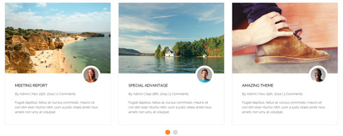
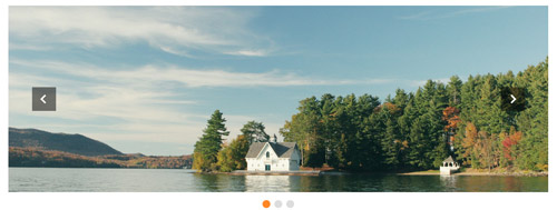
<div class="carousel carousel_6" data-autoplay="false" data-autoheight="false"  >
  <div class="item"> <img alt="" src="/portals/8/controls_6_1.jpg" /> </div>
  <div class="item"> <img alt="" src="/portals/8/controls_6_2.jpg" /> </div>
  <div class="item"> <img alt="" src="/portals/8/controls_6_1.jpg" /> </div>
</div>
Option:
- You can increase your content items through adding
<div class="item"></div> - You can control the way that the content comes out through these four styles
"text_left""text_right""text_top""text_bottom"
| Variable | Default | Type | Description |
|---|---|---|---|
data-items |
1 | int | This variable allows you to set the maximum amount of items displayed at a time with the widest browser width. |
data-navigation |
true | boolean | Display "next" and "prev" buttons. |
data-pagination |
true | boolean | Show pagination. |
data-autoplay |
true | int/boolean | Change to any integrer for example data-autoplay ="5000" to play every 5 seconds. If you set data-autoplay="false" Stop auto scroll animation. |
Style 6:
Below is the screen shot:
Codes are as follows:
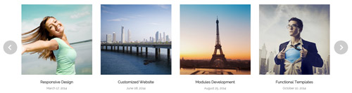
<div class="carousel carousel_7" data-autoheight="false" data-pagination="false" data-autoplay="false">
  <div class="item"> <img alt="" src="/portals/8/controls_7_1.jpg" />
    <h3>Responsive Design</h3>
    <p>March 17, 2014</p>
  </div>
  <div class="item"> <img alt="" src="/portals/8/controls_7_2.jpg" />
    <h3>Customized Website</h3>
    <p>June 08, 2014</p>
  </div>
  <div class="item"> <img alt="" src="/portals/8/controls_7_3.jpg" />
    <h3>Modules Development</h3>
    <p>August 25, 2014</p>
  </div>
  <div class="item"> <img alt="" src="/portals/8/controls_7_4.jpg" />
    <h3>Functional Templates</h3>
    <p>October 10, 2014</p>
  </div>
  <div class="item"> <img alt="" src="/portals/8/controls_7_1.jpg" />
    <h3>Responsive Design</h3>
    <p>March 17, 2014</p>
  </div>
</div>
Option:
- You can increase your content items through adding
<div class="item"></div> - You can control the way that the content comes out through these four styles
"text_left""text_right""text_top""text_bottom"
| Variable | Default | Type | Description |
|---|---|---|---|
data-items |
4 | int | This variable allows you to set the maximum amount of items displayed at a time with the widest browser width. |
data-navigation |
true | boolean | Display "next" and "prev" buttons. |
data-pagination |
false | boolean | Show pagination. |
data-autoplay |
true | int/boolean | Change to any integrer for example data-autoplay ="5000" to play every 5 seconds. If you set data-autoplay="false" Stop auto scroll animation. |
CSS3 Animations
You can click the link to check CSS3 Animations demo. Demo Link
Style 1:
This type is a group of effects which are displayed in time sequence. Below is the screen shot:
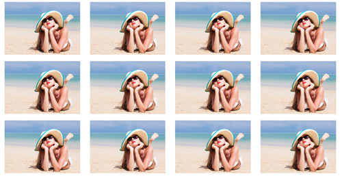
Codes are as follows:
<div class="animation">
   <div class="row mb-20">
       <div class="col-sm-3 animation_item scaleUp delay1"><img src="/portals/32/Photo2.jpg" /></div>
       <div class="col-sm-3 animation_item scaleUp delay2"><img src="/portals/32/Photo2.jpg" /></div>
       <div class="col-sm-3 animation_item scaleUp delay3"><img src="/portals/32/Photo2.jpg" /></div>
       <div class="col-sm-3 animation_item scaleUp delay4"><img src="/portals/32/Photo2.jpg" /></div>
	   ...
</div>
delay1, delay2, delay3, delay4 are used to control animation time, there are 12 time slots, which correspond to delay1~delay12 respectively.
scaleUp is used to control animation effect, there are scaleUp , bounceIn , bounceInDown , bounceInLeft , bounceInRight , bounceInUp , fadeIn , fadeInDown , fadeInLeft , fadeInRight , fadeInUp , fadeInDownBig , fadeInLeftBig , fadeInRightBig , fadeInUpBig , flip , flipInX , flipInY , lightSpeedIn , rotateIn , rotateInDownLeft , rotateInDownRight , rotateInUpLeft , rotateInUpRight , rollIn , zoomIn , zoomInDown , zoomInLeft , zoomInRight , zoomInUp 30 effects in total.
Style 2:
If you just need one animation effect, you can match with the following codes.
<div class="animation scaleUp"> <img src="/portals/32/Photo5.jpg" /> </div>
Style 3:
You can add animation for a certain element when mousing over. Codes are as follows:
<div class="animationhover bounce"> <img src="/portals/32/Photo5.jpg" /> </div>
When mousing over, it will show animation effect type (animationhover). There are bounce , flash , pulse , rubberBand , shake , swing , tada , wobble 8 effects.
Popovers
You can click the link to check Popovers demo. Demo Link
Below is the screen shot:
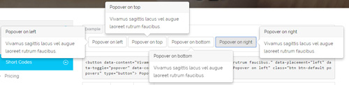
Codes are as follows:
<button data-content="Vivamus sagittis lacus vel augue laoreet rutrum faucibus." data-placement="left" data-toggle="popover" data-container="body" data-original-title="Popover on left" class="btn btn-default popovers" type="button">
    Popover on left
</button>
Option:
| Name | type | default | description |
|---|---|---|---|
| animation | boolean | true | apply a CSS fade transition to the tooltip |
| html | boolean | false | Insert HTML into the tooltip. If false, jQuery's text method will be used to insert content into the DOM. Use text if you're worried about XSS attacks. |
| placement | string | function | 'top' | how to position the tooltip - top | bottom | left | right | auto. When "auto" is specified, it will dynamically reorient the tooltip. For example, if placement is "auto left", the tooltip will display to the left when possible, otherwise it will display right. |
| selector | string | false | If a selector is provided, tooltip objects will be delegated to the specified targets. |
| title | string | function | '' | default title value if title attribute isn't present |
| trigger | string | 'hover focus' | how tooltip is triggered - click | hover | focus | manual. You may pass multiple triggers; separate them with a space. |
| delay | number | object | 0 | delay showing and hiding the tooltip (ms) - does not apply to manual trigger type If a number is supplied, delay is applied to both hide/show Object structure is: |
| container | string | false | false | Appends the tooltip to a specific element. Example: |
Alerts
You can click the link to check Alerts demo. Demo Link
Below is the screen shot:
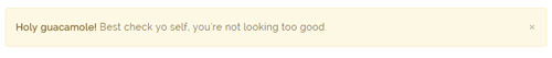
Codes are as follows:
<div class="alert alert-warning fade in">
    <button aria-hidden="true" data-dismiss="alert" class="close" type="button">×</button>
    <strong>Holy guacamole!</strong> Best check yo self, you're not looking too good.
</div>
Option:
- You can change
alert-to change the color, there arealert-warning,alert-danger,alert-success,alert-info4 colors included in the effects. fadeis for hiddeninis for display
Tooltips
You can click the link to check Tooltips demo. Tooltips
Below is the screen shot:
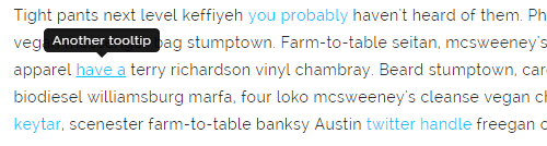
Codes are as follows:
<a href="#" class="tooltips" data-toggle="tooltip" title="first tooltip">Hover over me</a>
Option:
| Name | type | default | description |
|---|---|---|---|
| animation | boolean | true | apply a CSS fade transition to the tooltip |
| html | boolean | false | Insert HTML into the tooltip. If false, jQuery's text method will be used to insert content into the DOM. Use text if you're worried about XSS attacks. |
| placement | string | function | 'top' | how to position the tooltip - top | bottom | left | right | auto. When "auto" is specified, it will dynamically reorient the tooltip. For example, if placement is "auto left", the tooltip will display to the left when possible, otherwise it will display right. |
| selector | string | false | If a selector is provided, tooltip objects will be delegated to the specified targets. |
| title | string | function | '' | default title value if title attribute isn't present |
| trigger | string | 'hover focus' | how tooltip is triggered - click | hover | focus | manual. You may pass multiple triggers; separate them with a space. |
| delay | number | object | 0 | delay showing and hiding the tooltip (ms) - does not apply to manual trigger type If a number is supplied, delay is applied to both hide/show Object structure is: |
| container | string | false | false | Appends the tooltip to a specific element. Example: |
Dropdowns
You can click the link to check Dropdowns demo. Demo Link
Style 1:
Below is the screen shot:
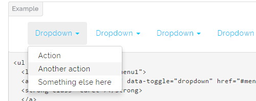
Codes are as follows:
<ul class="nav nav-pills">
  <li class="dropdown" id="menu1">
  <a class="dropdown-toggle" data-toggle="dropdown" href="#menu1">Dropdown
  <strong class="caret"></strong>
  </a>
    <ul class="dropdown-menu">
      <li><a href="#">Action</a></li>
      <li><a href="#">Another action</a></li>
      <li><a href="#">Something else here</a></li>
    </ul>
  </li>
</ul>
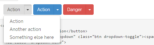
Style 2:
Below is the screen shot:
Codes are as follows:
<div class="btn-group">
  <button class="btn dropdown-toggle" data-toggle="dropdown">Action <span class="caret"></span></button>
  <ul class="dropdown-menu">
    <li><a href="#">Action</a></li>
    <li><a href="#">Another action</a></li>
    <li><a href="#">Something else here</a></li>
  </ul>
</div>
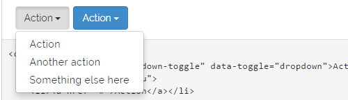
Style 3:
Below is the screen shot:
Codes are as follows:
<div class="btn-group">
  <button class="btn">Action</button>
  <button data-toggle="dropdown" class="btn dropdown-toggle"><span class="caret"></span></button>
  <ul class="dropdown-menu">
    <li><a href="#">Action</a></li>
    <li><a href="#">Another action</a></li>
    <li><a href="#">Something else here</a></li>
  </ul>
</div>
LightBox
You can click the link to check LightBox demo. Demo Link
Below is the screen shot:
Option:
1. LightBox_image |
Show one image alone. |
2. LightBox_image_gallery+group number |
Classify those that share the same class name to one group, you can show other images within the group by clicking left and right arrow of the image. |
3. LightBox_image_group |
Classify these sub levels whose label class name is LightBox_image_group into one group. |
4. LightBox_youtube |
Show youtube video. |
5. LightBox_vimeo |
Show video. |
6. LightBox_gmaps |
Shown map. |
7. LightBox_youtube_gallery+group number |
Classify these that share the same class name into a group of youtube video show |
8. LightBox_vimeo_gallery+group number |
Classify these that share the same class name into a group of video show. |
9. LightBox_gmaps_gallery+group number |
Classify these that share the same class name into a group of map show. |
10. LightBox_youtube_group |
Classify these sub levels whose label class name is LightBox_youtube_group into one group. |
11. LightBox_vimeo_group |
Classify these sub levels whose label class name is LightBox_vimeo_group into one group. |
12. LightBox_gmaps_group |
Classify these sub levels whose label class names is LightBox_gmaps_group into one group. |
13. LightBox_Box |
Take div as layer pop up, div needs to hide by default. Style of pop up is custom style. |
14. LightBox_ajax |
Pop up a page |
15. LightBox_ajax_group |
Pop up a group of pages |
You need to fill url of the pop up image(video, map) in href=""
1.LightBox_image
<a href="bigPhoto.jpg" class="LightBox_image" title="Single Image 1"><img alt="" src="cover.jpg" /></a>
2.LightBox_image_gallery
<a href="bigPhoto1.jpg" class="LightBox_image_gallery1" title="Single Image 1"><img alt="" src="cover.jpg" /></a>
<a href="bigPhoto2.jpg" class="LightBox_image_gallery1" title="Single Image 1"><img alt="" src="cover.jpg" /></a>
<a href="bigPhoto3.jpg" class="LightBox_image_gallery2" title="Single Image 2"><img alt="" src="cover.jpg" /></a>
<a href="bigPhoto4.jpg" class="LightBox_image_gallery2" title="Single Image 2"><img alt="" src="cover.jpg" /></a>
3.LightBox_image_group
<div class="LightBox_image_group">
    <a href="bigPhoto1.jpg" title=" People Scenery 1"><img alt="" src="cover.jpg" /> </a>
    <a href="bigPhoto2.jpg" title=" People Scenery 2"></a>
    <a href="bigPhoto3.jpg" title=" People Scenery 3"></a>
</div>
4.LightBox_youtube
<a href="http://www.youtube.com/watch?v=0O2aH4XLbto" class="LightBox_youtube" title="youtube"><img alt="" src="cover.jpg" /></a>
5.LightBox_vimeo
<a href="https://vimeo.com/45830194" class="LightBox_vimeo" title="vimeo"><img alt="" src="cover.jpg" /></a>
6.LightBox_gmaps
<a href="https://maps.google.com/maps?q=221B+Baker+Street,+London,+United+Kingdom&hl=en&t=v&hnear=221B+Baker+St,+London+NW1+6XE,+United+Kingdom" class="LightBox_gmaps" title="gmaps"><img alt="" src="cover.jpg" /></a>
7.LightBox_youtube_gallery
<a href="http://www.youtube.com/watch?v=0O2aH4XLbto" class="LightBox_youtube_gallery1" title="youtube gallery"><img alt="" src="cover.jpg" /></a>
<a href="http://www.youtube.com/watch?v=0O2aH4XLbto" class="LightBox_youtube_gallery1" title="youtube gallery"><img alt="" src="cover.jpg" /></a>
<a href="http://www.youtube.com/watch?v=0O2aH4XLbto" class="LightBox_youtube_gallery2" title="youtube gallery"><img alt="" src="cover.jpg" /></a>
<a href="http://www.youtube.com/watch?v=0O2aH4XLbto" class="LightBox_youtube_gallery2" title="youtube gallery"><img alt="" src="cover.jpg" /></a>
8.LightBox_vimeo_gallery
<a href="https://vimeo.com/45830194" class="LightBox_vimeo_gallery1" title="vimeo gallery"><img alt="" src="cover.jpg" /></a>
<a href="https://vimeo.com/45830194" class="LightBox_vimeo_gallery1" title="vimeo gallery"><img alt="" src="cover.jpg" /></a>
<a href="https://vimeo.com/45830194" class="LightBox_vimeo_gallery2" title="vimeo gallery"><img alt="" src="cover.jpg" /></a>
<a href="https://vimeo.com/45830194" class="LightBox_vimeo_gallery2" title="vimeo gallery"><img alt="" src="cover.jpg" /></a>
9.LightBox_gmaps_gallery
<a href="https://maps.google.com/maps?q=221B+Baker+Street,+London,+United+Kingdom&hl=en&t=v&hnear=221B+Baker+St,+London+NW1+6XE,+United+Kingdom" class="LightBox_gmaps_gallery1" title="gmaps gallery"><img alt="" src="cover.jpg" /></a>
<a href="https://maps.google.com/maps?q=221B+Baker+Street,+London,+United+Kingdom&hl=en&t=v&hnear=221B+Baker+St,+London+NW1+6XE,+United+Kingdom" class="LightBox_gmaps_gallery1" title="gmaps gallery"><img alt="" src="cover.jpg" /></a>
<a href="https://maps.google.com/maps?q=221B+Baker+Street,+London,+United+Kingdom&hl=en&t=v&hnear=221B+Baker+St,+London+NW1+6XE,+United+Kingdom" class="LightBox_gmaps_gallery2" title="gmaps gallery"><img alt="" src="cover.jpg" /></a>
<a href="https://maps.google.com/maps?q=221B+Baker+Street,+London,+United+Kingdom&hl=en&t=v&hnear=221B+Baker+St,+London+NW1+6XE,+United+Kingdom" class="LightBox_gmaps_gallery2" title="gmaps gallery"><img alt="" src="cover.jpg" /></a>
10.LightBox_youtube_group
<div class="LightBox_youtube_group">
    <a href="http://www.youtube.com/watch?v=0O2aH4XLbto" title=" youtube 1"><img alt="" src="cover.jpg" /> </a>
    <a href="http://www.youtube.com/watch?v=0O2aH4XLbto" title=" youtube 2"></a>
    <a href="http://www.youtube.com/watch?v=0O2aH4XLbto" title=" youtube 3"></a>
</div>
11.LightBox_vimeo_group
<div class="LightBox_vimeo_group">
    <a href="https://vimeo.com/45830194" title=" vimeo 1"><img alt="" src="cover.jpg" /> </a>
    <a href="https://vimeo.com/45830194" title=" vimeo 2"></a>
    <a href="https://vimeo.com/45830194" title=" vimeo 3"></a>
</div>
12.LightBox_gmaps_group
<div class="LightBox_gmaps_group">
    <a href="https://maps.google.com/maps?q=221B+Baker+Street,+London,+United+Kingdom&hl=en&t=v&hnear=221B+Baker+St,+London+NW1+6XE,+United+Kingdom" title=" gmaps 1"><img alt="" src="cover.jpg" /> </a>
    <a href="https://maps.google.com/maps?q=221B+Baker+Street,+London,+United+Kingdom&hl=en&t=v&hnear=221B+Baker+St,+London+NW1+6XE,+United+Kingdom" title=" gmaps 2"></a>
    <a href="https://maps.google.com/maps?q=221B+Baker+Street,+London,+United+Kingdom&hl=en&t=v&hnear=221B+Baker+St,+London+NW1+6XE,+United+Kingdom" title=" gmaps 3"></a>
</div>
13.LightBox_Box
<a href=".LightBox_Content" class="LightBox_Box"> Click Here To Pop </a>
<a href=".LightBox_Content" class="LightBox_Box Button_default"> Click Here To Pop </a>
<div class="LightBox_Content">
    <h3>Click Here To Pop</h3>
 	  content text ...
</div>
14.LightBox_ajax
<a href="index.aspx" class="LightBox_ajax" title="ajax"><img alt="" src="cover.jpg" /></a>
15.LightBox_ajax_group
<div class="LightBox_ajax_group">
    <a href="index.aspx" title=" ajax 1"><img alt="" src="cover.jpg" /> </a>
    <a href="index.aspx" title=" ajax 2"></a>
    <a href="index.aspx" title=" ajax 3"></a>
</div>
Image Effects
You can click the link to check Image Effects demo. Demo Link

- You can copy over codes of the image effects directly to any HTML modules.
- You can change the font icon through modifying. font icon list
Flip Box
You can click the link to check Flip Box demo. Demo Link
Style 1:
Below is the screen shot:
Codes are as follows:
<div class="row">
    <div class="col-sm-3">
        <div class="flip_box flip_box_1">
            <div class="rotate">
                <div class="front">
                    <span class="glyphicons glyph-cardio"></span>
                    <h3>Flip Box</h3>
                    <p>content text ...</p>
                </div>
                <div class="back">
                    <h3>Flip Box</h3>
                    <p>content text ...</p>
                    <a href="#" class="but">Read More</a>
                </div>
            </div>
        </div>
    </div>
    <div class="col-sm-3">
        <div class="flip_box flip_right flip_box_1">
            <div class="rotate">
                <div class="front">
                    <span class="glyphicons glyph-redo"></span>
                    <h3>SHare Design</h3>
                    <p>content text ...</p>
                </div>
                <div class="back">
                    <h3>SHare Design</h3>
                    <p>content text ...</p>
                    <a href="#" class="but">Read More</a>
                 </div>
            </div>
        </div>
    </div>
    <div class="col-sm-3">
        <div class="flip_box flip_top flip_box_1">
            <div class="rotate">
                <div class="front">
                    <span class="glyphicons glyph-settings"></span>
                    <h3>Go To Settings</h3>
                    <p>content text ...</p>
                </div>
                <div class="back">
                    <h3>Go To Settings</h3>
                    <p>content text ...</p>
                    <a href="#" class="but">Read More</a>
                </div>
            </div>
        </div>
    </div>
    <div class="col-sm-3">
        <div class="flip_box flip_bottom flip_box_1">
            <div class="rotate">
                <div class="front">
                    <span class="glyphicons glyph-table-tennis"></span>
                    <h3>Do Our Best</h3>
                    <p>content text ...</p>
                </div>
                <div class="back">
                    <h3>Do Our Best</h3>
                    <p>content text ...</p>
                    <a href="#" class="but">Read More</a>
                </div>
            </div>
        </div>
    </div>
</div>
Option:
col-md-3 col-sm-6is the width of each column, you can change the width you need through value1~12.frontis for front content.backis for back content.
Style 2:
Below is the screen shot:
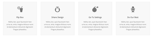
Codes are as follows:
<div class="row">
    <div class="col-sm-3">
        <div class="flip_box flip_box_2">
            <div class="rotate">
                <div class="front"> <span class="glyphicons glyph-drink"></span>
                    <h3>Flip Box</h3>
                    <p>content text ...</p>
                </div>
                <div class="back">
                    <h3>Flip Box</h3>
                    <p>content text ...</p>
                </div>
            </div>
        </div>
    </div>
    <div class="col-sm-3">
        <div class="flip_box flip_right flip_box_2">
            <div class="rotate">
                <div class="front"> <span class="glyphicons glyph-ring"></span>
                    <h3>SHare Design</h3>
                    <p>content text ...</p>
                </div>
                <div class="back">
                    <h3>SHare Design</h3>
                    <p>content text ...</p>
                </div>
            </div>
        </div>
    </div>
    <div class="col-sm-3">
        <div class="flip_box flip_top flip_box_2">
            <div class="rotate">
                <div class="front"> <span class="glyphicons glyph-bomb"></span>
                    <h3>Go To Settings</h3>
                    <p>content text ...</p>
                </div>
                <div class="back">
                    <h3>Go To Settings</h3>
                    <p>content text ...</p>
                </div>
            </div>
        </div>
    </div>
    <div class="col-sm-3">
        <div class="flip_box flip_bottom flip_box_2">
            <div class="rotate">
                <div class="front"> <span class="glyphicons glyph-microphone"></span>
                    <h3>Do Our Best</h3>
                    <p>content text ...</p>
                </div>
                <div class="back">
                    <h3>Do Our Best</h3>
                    <p>content text ...</p>
                </div>
                </div>
            </div>
        </div>
    </div>
<br />
Style 3:
Below is the screen shot:
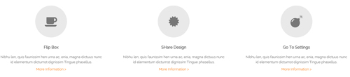
Codes are as follows:
<div class="row">
    <div class="col-sm-4">
        <div class="flip_box flip_box_3">
            <div class="rotate">
                <div class="front"> <span class="glyphicons glyph-drink"></span>
                    <h3>Flip Box</h3>
                    <p>content text ...</p>
                    <a href="#">More Information ></a>
                </div>
                <div class="back">
                    <h3>Flip Box</h3>
                    <p>content text ...</p>
                    <a href="#" class="but">Read More</a>
                </div>
            </div>
        </div>
    </div>
    <div class="col-sm-4">
        <div class="flip_box flip_right flip_box_3">
            <div class="rotate">
                <div class="front"> <span class="glyphicons glyph-ring"></span>
                    <h3>SHare Design</h3>
                    <p>content text ...</p>
                    <a href="#">More Information ></a>
                </div>
                <div class="back">
                    <h3>SHare Design</h3>
                    <p>content text ...</p>
                    <a href="#" class="but">Read More</a>
                </div>
            </div>
        </div>
    </div>
    <div class="col-sm-4">
        <div class="flip_box flip_top flip_box_3">
            <div class="rotate">
                <div class="front"> <span class="glyphicons glyph-bomb"></span>
                    <h3>Go To Settings</h3>
                    <p>content text ...</p>
                    <a href="#">More Information ></a>
                </div>
                <div class="back">
                    <h3>Go To Settings</h3>
                    <p>content text ...</p>
                    <a href="#" class="but">Read More</a>
                </div>
            </div>
        </div>
    </div>
<br />
Responsive Video
Ratio between width and height of the video needs to be 16:9.
<div class="responsive-video">
    <iframe width="853" height="480" src="//www.youtube.com/embed/XcpOsJQXcx4?list=UUIkFV7_2tEhhEhh1NkkwTUw" frameborder="0" allowfullscreen></iframe>
</div>
<div class="responsive-video">
    <iframe src="//player.vimeo.com/video/106249100" width="1920" height="1080" frameborder="0" webkitallowfullscreen mozallowfullscreen allowfullscreen></iframe>
</div>
<div class="responsive-video">
     <embed  src="/portals/32/movie.swf" type="application/x-shockwave-flash" allownetworking="all" allowfullscreen="true" allowscriptaccess="always" wmode="Opaque"></embed>
</div>
<div class="responsive-video">
    <video width="1920" height="1080"  controls="true">
    <source src="/portals/32/movie.m4v" type="video/mp4"></source>
    <source src="/portals/32/movie.ogv" type="video/ogg"></source>
    <source src="/portals/32/movie.webm" type="video/WebM"></source>
    Your browser does not support the video tag. </video>
</div>
Video Bg
You can click the link to check Video Bg demo. Demo Link
- "{videoURL:'npfu0fN9GUA' is the url of
youtube autoPlayis for whether to autoplay or nottrue/falseloopis for whether to play on a loop,true/false
<div data-property="{videoURL:'npfu0fN9GUA',containment:'self', showControls:false, autoPlay:true, loop:true, vol:50, mute:true, startAt:10, opacity:1, addRaster:false, quality:'hd1080'}" class="player">
<div class="Play"></div>
<div class="dnn_layout pt-60 pb-60">
<div class="content_mid clearfix">
<div class="player_boxes">
<h1 class="player_title"> Here Are Your Videos</h1>
<hr class="player_line" />
<h4 class="player_smalltitle">YOU CAN CHANGE THE BACKGROUND BY YOURSELF</h4>
<div class="player_content">
<p>Content Text 1 ... </p>
</div>
<p> <a class="Button_default" href="#"> VIEW PORTFOLIOS</a> <a class="Button_default" href="#"> LEARN MORE</a> </p>
</div>
</div>
</div>
</div>
- "{videoURL:'npfu0fN9GUA' is the url of
youtube autoPlayis for whether to autoplay or nottrue/falseloopis for whether to play on a loop,true/false
<div data-property="{videoURL:'npfu0fN9GUA',containment:'self', showControls:false, autoPlay:true, loop:true, vol:50, mute:true, startAt:10, opacity:1, addRaster:false, quality:'hd1080'}" class="player">
<div class="Play"></div>
<div class="dnn_layout pt40 pb40">
<div class="content_mid clearfix">
<div class="player_boxes dark">
<h1 class="player_title"> Here Are Your Videos</h1>
<hr class="player_line" />
<h4 class="player_smalltitle">YOU CAN CHANGE THE BACKGROUND BY YOURSELF</h4>
<div class="player_content">
<p>Content Text 1 ... </p>
</div>
<p> <a class="Button_blue" href="#"> VIEW PORTFOLIOS</a> <a class="Button_blue" href="#"> LEARN MORE</a> </p>
</div>
</div>
</div>
</div>
Home Page Codes
This includes the html introductions that required for Home1~Home7 page, ComingSoon page, Boxed Layout page.
Home Version 1 (Home)
You can click the link to check Home Version 1 (home) demo. Home Version 1 (Home)
Banner area
Below is the screen shot:
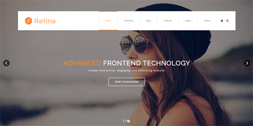
It is using DNNGo LayerGalleryPro module here, you can import ContentListEntity-Home1.xml of the DNNGo_LayerGalleryPro folder to duplicate banner of the demo.
ICONS
Below is the screen shot:
Codes are as follows:
<div class="dnn_layout">
  <div class="content_mid clearfix">
    <div class="pane_layout">
      <div class="row">
        <div class="col-sm-6 col-md-3">
          <div class="home1_cona animation fadeInUp delay1">
            <div class="icon_box"> <span class="fa fa-compass"></span> </div>
            <h5>Powerful Theme</h5>
            <p>Donec nec justo eget felis facilisis fermentum. Aliquam porttitor mauris sit amet orci nean dignissim pellentque felis.</p>
            <a target="blank" href="#">Read More</a> </div>
        </div>
        <div class="col-sm-6 col-md-3">
          <div class="home1_cona animation fadeInUp delay2">
            <div class="icon_box"> <span class="fa fa-globe"></span> </div>
            <h5>Retina Ready</h5>
            <p>Donec nec justo eget felis facilisis fermentum. Aliquam porttitor mauris sit amet orci nean dignissim pellentque felis.</p>
            <a target="blank" href="#">Read More</a> </div>
        </div>
        <div class="col-sm-6 col-md-3">
          <div class="home1_cona animation fadeInUp delay3">
            <div class="icon_box"> <span class="fa fa-soccer-ball-o"></span> </div>
            <h5>Adanced Skin</h5>
            <p>Donec nec justo eget felis facilisis fermentum. Aliquam porttitor mauris sit amet orci nean dignissim pellentque felis.</p>
            <a target="blank" href="#">Read More</a> </div>
        </div>
        <div class="col-sm-6 col-md-3">
          <div class="home1_cona animation fadeInUp delay4">
            <div class="icon_box"> <span class="fa fa-adjust"></span> </div>
            <h5>Adjust Bugs</h5>
            <p>Donec nec justo eget felis facilisis fermentum. Aliquam porttitor mauris sit amet orci nean dignissim pellentque felis.</p>
            <a target="blank" href="#">Read More</a> </div>
        </div>
      </div>
    </div>
  </div>
</div>
Option:
col-sm-* col-md-*is the width of each column, you can change the width you need through value1~12.- You can modify
animationto change and delete animation. Animation list. - You can modify
fato change icons. font icon list.
THE FEATURES area
Below is the screen shot:
Codes are as follows:
<div class="pb-60">
  <div class="dnn_layout">
    <div class="content_mid clearfix">
      <div class="pane_layout">
        <div class="row">
          <div class="col-sm-12">
            <div class="home1_con_titlebox">
              <div class="home1_con_title1">
                <h4>The Features</h4>
              </div>
            </div>
            <div class="carousel carousel_1" data-autoheight="false" data-autoplay="5000">
              <div class="item">
                <div class="cal1_main clearfix">
                  <div class="cal1_left1"> </div>
                  <div class="cal1_right1">
                    <h5>Clean Design</h5>
                    <div class="line"></div>
                    <p>content text ...</p>
                    <a target="blank" href="#" class="linker">Read More</a>
                    <div class="bottomline"></div>
                    <div class="bottomicon"> <a href="#" class="fa fa-facebook-square"></a> <a href="#" class="fa fa-twitter-square"></a> <a href="#" class="fa fa-pinterest-square"></a> <a href="#" class="fa fa-tumblr-square"></a> <a href="#" class="fa fa-vimeo-square"></a> <a href="#" class="fa fa-hacker-news"></a> </div>
                  </div>
                </div>
              </div>
              <div class="item">
                <div class="cal1_main clearfix">
                  <div class="cal1_left2"> </div>
                  <div class="cal1_right2">
                    <h5>470 Font Icons</h5>
                    <div class="line"></div>
                    <p>content text ...</p>
                    <a target="blank" href="#" class="linker">Read More</a>
                    <div class="bottomline"></div>
                    <div class="bottomicon"> <a href="#" class="fa fa-facebook-square"></a> <a href="#" class="fa fa-twitter-square"></a> <a href="#" class="fa fa-pinterest-square"></a> <a href="#" class="fa fa-tumblr-square"></a> <a href="#" class="fa fa-vimeo-square"></a> <a href="#" class="fa fa-hacker-news"></a> </div>
                  </div>
                </div>
              </div>
              <div class="item">
                <div class="cal1_main clearfix">
                  <div class="cal1_left3"> </div>
                  <div class="cal1_right3">
                    <h5>Responsive Web</h5>
                    <div class="line"></div>
                    <p>content text ...</p>
                    <a target="blank" href="#" class="linker">Read More</a>
                    <div class="bottomline"></div>
                    <div class="bottomicon"> <a href="#" class="fa fa-facebook-square"></a> <a href="#" class="fa fa-twitter-square"></a> <a href="#" class="fa fa-pinterest-square"></a> <a href="#" class="fa fa-tumblr-square"></a> <a href="#" class="fa fa-vimeo-square"></a> <a href="#" class="fa fa-hacker-news"></a> </div>
                  </div>
                </div>
              </div>
            </div>
          </div>
        </div>
      </div>
    </div>
  </div>
</div>
Option:
- This is a
Carouseleffect.Carousel - You can modify
fato change icons. font icon list.
CUSTOMIZATION SERVICES ENSURE WHAT EXACTLY YOU WANT area
Below is the screen shot:

Codes are as follows:
<div class="SectionStyles1 pt-60 pb-60">
  <div class="dnn_layout">
    <div class="content_mid clearfix">
      <div class="pane_layout">
        <div class="row">
          <div class="col-sm-12">
            <div class="home1_conb animation zoomIn">
              <h1> Customization services ensure what exactly you want</h1>
              <p>We will design and develop the skins and modules completely <span>based</span> on your needs. Our aim is to provide what exactly you want.</p>
              <div class="clearfix visible-sm"></div>
              <a class="Button_style1" target="blank" href="#">Start Your Business</a> </div>
          </div>
        </div>
      </div>
    </div>
  </div>
</div>
Option:
- This is a SectionStyles effect.
col-sm-*is the width of each column, you can change the width you need through value1~12.- You can modify
animationto change and delete animation. Animation list.
FEATURED PRODUCTS area
Below is the screen shot:

Codes are as follows:
<ul class="home1_conc clearfix">
  <li class="the1 animation fadeInUp delay1">
    <div class="icon"><img alt="" src="/portals/8/homa1_conc1.png" /></div>
    <h5>Featured Products</h5>
    <div class="line"></div>
    <p>Donec consectetur diam ac nibh auctor ultricies. Integer mauris lacus, consequat in luctus id, semper sed felis. Srum  felis. Cum sociis natoque magnis.</p>
    <a target="blank" href="#">Read More</a> </li>
  <li class="the2 animation fadeInUp delay2">
    <div class="icon"><img alt="" src="/portals/8/homa1_conc2.png" /></div>
    <h5>Powerful Theme</h5>
    <div class="line"></div>
    <p>Donec consectetur diam ac nibh auctor ultricies. Integer mauris lacus, consequat in luctus id, semper sed felis. Srum  felis. Cum sociis natoque magnis.</p>
    <a target="blank" href="#">Read More</a> </li>
  <li class="the3 animation fadeInUp delay3">
    <div class="icon"><img alt="" src="/portals/8/homa1_conc3.png" /></div>
    <h5>update Template</h5>
    <div class="line"></div>
    <p>Donec consectetur diam ac nibh auctor ultricies. Integer mauris lacus, consequat in luctus id, semper sed felis. Srum  felis. Cum sociis natoque magnis.</p>
    <a target="blank" href="#">Read More</a> </li>
</ul>
Option:
- You can modify
animationto change or delete animation.Animation list.
PORTFOLIOS area
Below is the screen shot:
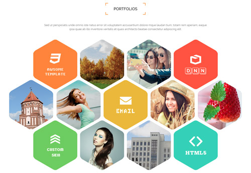
Codes are as follows:
<div class="pt-60 pb-60">
  <div class="dnn_layout">
    <div class="content_mid clearfix">
      <div class="pane_layout">
        <div class="row">
          <div class="col-sm-12">
            <div class="home1_con_titlebox">
              <div class="home1_con_title1">
                <h4>Portfolios</h4>
              </div>
            </div>
            <p class="home1_con_titlep"> content text ... </p>
            <ul class="home1_cond animation fadeInUp">
              <li> <a target="blank" href="http://www.dnngo.net/"><img alt="" src="/portals/8/home1_cond1.png" /></a> <a target="blank" href="#"><img alt="" src="/portals/8/home1_cond2.png" /></a> <a target="blank" href="#"><img alt="" src="/portals/8/home1_cond3.png" /></a> <a target="blank" href="http://www.dnngo.net/"><img alt="" src="/portals/8/home1_cond4.png" /></a> </li>
              <li> <a target="blank" href="#"><img alt="" src="/portals/8/home1_cond5.png" /></a> <a target="blank" href="#"><img alt="" src="/portals/8/home1_cond6.png" /></a> <a target="blank" href="http://www.dnngo.net/"><img alt="" src="/portals/8/home1_cond7.png" /></a> <a target="blank" href="#"><img alt="" src="/portals/8/home1_cond8.png" /></a> <a target="blank" href="#"><img alt="" src="/portals/8/home1_cond9.png" /></a> </li>
              <li> <a target="blank" href="http://www.dnngo.net/"><img alt="" src="/portals/8/home1_cond10.png" /></a> <a target="blank" href="#"><img alt="" src="/portals/8/home1_cond11.png" /></a> <a target="blank" href="#"><img alt="" src="/portals/8/home1_cond12.png" /></a> <a target="blank" href="http://www.dnngo.net/"><img alt="" src="/portals/8/home1_cond13.png" /></a> </li>
            </ul>
          </div>
        </div>
      </div>
    </div>
  </div>
</div>
Option:
col-sm-*is the width of each column, you can change the width you need through value1~12.- You can modify
animationto change or delete animation.Animation list.
RETINA READY area
Below is the screen shot:
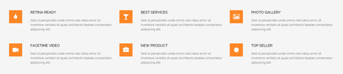
Codes are as follows:
<div class="SectionStyles2 pt-60">
  <div class="dnn_layout">
    <div class="content_mid clearfix">
      <div class="pane_layout">
        <div class="row">
          <div class="col-sm-4">
            <div class="home1_cone mb-50 animation fadeInUp delay1"> <span class="fa fa-tint"></span>
              <h6> Retina Ready</h6>
              <p>Sed ut perspiciatis unde omnis iste natus error sit inventore veritatis et quasi architecto beatae consectetur adipiscing elit.</p>
            </div>
          </div>
          <div class="col-sm-4">
            <div class="home1_cone mb-50 animation fadeInUp delay2"> <span class="fa fa-glass"></span>
              <h6> Best Services</h6>
              <p>Sed ut perspiciatis unde omnis iste natus error sit inventore veritatis et quasi architecto beatae consectetur adipiscing elit.</p>
            </div>
          </div>
          <div class="col-sm-4">
            <div class="home1_cone mb-50 animation fadeInUp delay3"> <span class="fa fa-picture-o"></span>
              <h6> Photo Gallery</h6>
              <p>Sed ut perspiciatis unde omnis iste natus error sit inventore veritatis et quasi architecto beatae consectetur adipiscing elit.</p>
            </div>
          </div>
          <div class="col-sm-4">
            <div class="home1_cone mb-60 animation fadeInUp delay4"> <span class="fa fa-video-camera"></span>
              <h6> Facetime Video</h6>
              <p>Sed ut perspiciatis unde omnis iste natus error sit inventore veritatis et quasi architecto beatae consectetur adipiscing elit.</p>
            </div>
          </div>
          <div class="col-sm-4">
            <div class="home1_cone mb-60 animation fadeInUp delay5"> <span class="fa fa-briefcase"></span>
              <h6> New Product</h6>
              <p>Sed ut perspiciatis unde omnis iste natus error sit inventore veritatis et quasi architecto beatae consectetur adipiscing elit.</p>
            </div>
          </div>
          <div class="col-sm-4">
            <div class="home1_cone mb-60 animation fadeInUp delay6"> <span class="fa fa-certificate"></span>
              <h6> Top Seller</h6>
              <p>Sed ut perspiciatis unde omnis iste natus error sit inventore veritatis et quasi architecto beatae consectetur adipiscing elit.</p>
            </div>
          </div>
        </div>
      </div>
    </div>
  </div>
</div>
Option:
- This is a SectionStyles effect.
col-sm-*is the width of each column, you can change the width you need through value1~12.- You can modify
animationto change or delete animation.Animation list. - You can modify
fato change icons. font icon list.
TOP NUMBERS area
Below is the screen shot:
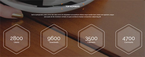
Codes are as follows:
<div class="SectionStyles3 pt-60 pb-60">
  <div class="dnn_layout">
    <div class="content_mid clearfix">
      <div class="pane_layout">
        <div class="row">
          <div class="col-sm-12">
            <div class="home1_con_titlebox">
              <div class="home1_con_title1">
                <h4>Top Numbers</h4>
              </div>
            </div>
            <p class="home1_con_titlep"> content text ... </p>
          </div>
        </div>
        <div class="number_Animation_3 row">
          <div class="col-md-6 col-sm-6 col-lg-3">
            <div class="na_box mt-60"> <span class="animation  number" data-number="2800">0</span>
              <p>Clients</p>
            </div>
          </div>
          <div class="col-md-6 col-sm-6 col-lg-3">
            <div class="na_box mt-60"> <span class="animation  number" data-number="9600">0</span>
              <p>Downloads</p>
            </div>
          </div>
          <div class="col-md-6 col-sm-6 col-lg-3">
            <div class="na_box mt-60"> <span class="animation  number" data-number="3500">0</span>
              <p>Followers</p>
            </div>
          </div>
          <div class="col-md-6 col-sm-6 col-lg-3">
            <div class="na_box mt-60"> <span class="animation  number" data-number="4700">0</span>
              <p>Comments</p>
            </div>
          </div>
        </div>
      </div>
    </div>
  </div>
</div>
Option:
- This is a SectionStyles effect.
col-sm-* col-md-* col-lg-*is the width of each column, you can change the width you need through value1~12.- You can modify
animationto change and delete animation. Animation list. - You can change the value you need to display through
data-number
ABOUT US area
Below is the screen shot:
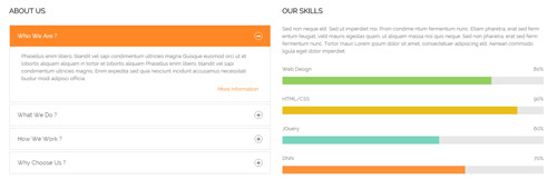
Codes are as follows:
<div class="pt-60">
  <div class="dnn_layout">
    <div class="content_mid clearfix">
      <div class="pane_layout">
        <div class="row">
          <div class="col-sm-6 animation fadeInLeft">
            <h4 class="home1_con_title2">About Us</h4>
            <div class="panel-group accordion_1" id="accordion1">
              <div class="panel panel-default">
                <div class="panel-heading">
                  <h4 class="panel-title"> <a data-toggle="collapse" data-parent="#accordion1" href="#collapse1_1"><span class="accordion_icon"></span>Who We Are ?</a> </h4>
                </div>
                <div id="collapse1_1" class="panel-collapse collapse in">
                  <div class="panel-body">
                    <p>Content Text ...</p>
                    <p class="linker"><a target="blank" href="#">More Information</a></p>
                  </div>
                </div>
              </div>
              <div class="panel panel-default">
                <div class="panel-heading">
                  <h4 class="panel-title"> <a data-toggle="collapse" data-parent="#accordion1" href="#collapse1_2" class="collapsed"><span class="accordion_icon"></span>What We Do ?</a> </h4>
                </div>
                <div id="collapse1_2" class="panel-collapse collapse">
                  <div class="panel-body">
                    <p>Content Text ...</p>
                    <p class="linker"><a target="blank" href="#">More Information</a></p>
                  </div>
                </div>
              </div>
              <div class="panel panel-default">
                <div class="panel-heading">
                  <h4 class="panel-title"> <a data-toggle="collapse" data-parent="#accordion1" href="#collapse1_3" class="collapsed"><span class="accordion_icon"></span>How We Work ?</a> </h4>
                </div>
                <div id="collapse1_3" class="panel-collapse collapse">
                  <div class="panel-body">
                    <p>Content Text ...</p>
                    <p class="linker"><a target="blank" href="#">More Information</a></p>
                  </div>
                </div>
              </div>
              <div class="panel panel-default">
                <div class="panel-heading">
                  <h4 class="panel-title"> <a data-toggle="collapse" data-parent="#accordion1" href="#collapse1_4" class="collapsed"><span class="accordion_icon"></span>Why Choose Us ?</a> </h4>
                </div>
                <div id="collapse1_4" class="panel-collapse collapse">
                  <div class="panel-body">
                    <p>Phasellus enim libero, blandit vel sapi condimentum ultricies magna Quisque euismod orci ut et lobortis aliquam aliquam in tortor et lobortis aliquam Phasellus enim libero, blandit vel sapi condimentum ultricies magnis. Enim expedita sed quia nesciunt incidunt accusamus necessitati bustur modi adipisci officia 4 ...</p>
                    <p class="linker"><a target="blank" href="#">More Information</a></p>
                  </div>
                </div>
              </div>
            </div>

          </div>
          <div class="col-sm-6 animation fadeInRight">
            <h4 class="home1_con_title2">Our Skills</h4>
            <p>Sed non neque elit. Sed ut imperdiet nisi. Proin condime ntum fermentum nunc. Etiam pharetra, erat sed ferm entum feugiat, velit mauris egestas quam, ut aliquam massa nisl quis neque. Sed non pharetra, erat sed ferm fermentum nunc.  Tortor mauri Lorem ipsum dolor sit amet, consectetuer adipiscing elit. Aenean commodo ligula eget dolor imperdiet.</p>
            <br />
            <div class="loaded_list">
              <p>Web Design </p>
              <div class="the1 progress progress-striped active">
                <div class="bar animation animationwidth" data-width="80%"><span></span></div>
              </div>
              <p>HTML/CSS</p>
              <div class="the2 progress progress-striped active">
                <div class="bar animation animationwidth" data-width="90%"><span></span></div>
              </div>
              <p>JQuery</p>
              <div class="the3 progress progress-striped active">
                <div class="bar animation animationwidth" data-width="60%"><span></span> </div>
              </div>
              <p>DNN</p>
              <div class="the4 progress progress-striped active">
                <div class="bar animation animationwidth" data-width="70%"><span></span></div>
              </div>
            </div>
          </div>
        </div>
      </div>
    </div>
  </div>
</div>
Option:
col-sm-*is the width of each column, you can change the width you need through value1~12.- You can modify
animationto change or delete animation.Animation list. - You can change the value you need to display through
data-width
APPEALING SKINS AND VERSATILE MODULES area
Below is the screen shot:
Codes are as follows:
<div class="SectionStyles4 pt-60 pb-60">
  <div class="dnn_layout">
    <div class="content_mid clearfix">
      <div class="pane_layout">
        <div class="row">
          <div class="col-sm-12 animation zoomIn">
            <h1>Appealing skins and <span>versatile</span> modules</h1>
            <p>We provide interactive, compelling and engaging website development, which will definitely improve satisfaction, raise awareness.</p>
            <a target="blank" href="#" class="linker">Getting Started</a><a target="blank" href="#" class="linker">Request A Quote</a> </div>
        </div>
      </div>
    </div>
  </div>
</div>
Option:
- This is a SectionStyles effect.
col-sm-*is the width of each column, you can change the width you need through value1~12.- You can modify
animationto change or delete animation.Animation list.
RECENT PROJECTS area
Below is the screen shot:
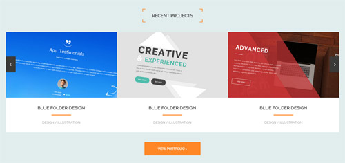
Codes are as follows:
<div class="SectionStyles18 pt-60 pb-60">
  <div class="dnn_layout">
    <div class="content_mid clearfix">
      <div class="pane_layout">
        <div class="row">
          <div class="col-sm-12">
            <div class="home1_con_titlebox">
              <div class="home1_con_title1">
                <h4><span>recent</span> projects</h4>
              </div>
            </div>
            <div class="carousel carousel_8" data-autoheight="false" data-pagination="false" data-autoplay="5000">
              <div class="item"> <img alt="" src="/portals/8/carousel_8_1.jpg" />
                <h3>blue folder design</h3>
                <div class="line"></div>
                <p>design / illustration</p>
              </div>
              <div class="item"> <img alt="" src="/portals/8/carousel_8_2.jpg" />
                <h3>blue folder design</h3>
                <div class="line"></div>
                <p>design / illustration</p>
              </div>
              <div class="item"> <img alt="" src="/portals/8/carousel_8_3.jpg" />
                <h3>blue folder design</h3>
                <div class="line"></div>
                <p>design / illustration</p>
              </div>
              <div class="item"> <img alt="" src="/portals/8/carousel_8_4.jpg" />
                <h3>blue folder design</h3>
                <div class="line"></div>
                <p>design / illustration</p>
              </div>
            </div>
            <div class="linker_out"> <a target="blank" href="#" class="linker">view portfolio ></a> </div>
          </div>
        </div>
      </div>
    </div>
  </div>
</div>
Option:
- This is a SectionStyles effect.
col-sm-*is the width of each column, you can change the width you need through value1~12.- This is a
Carouseleffect. Carousel
LATEST NEWS area
Below is the screen shot:
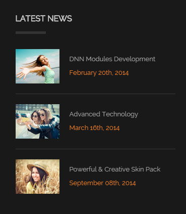
Codes are as follows:
<ul class="bottom_a">
  <li>
    <div class="img"><img alt="" src="/portals/8/bottom_a1.jpg" /></div>
    <p>DNN Modules Development</p>
    <span class="date">February 20th, 2014</span> </li>
  <div class="line"></div>
  <li>
    <div class="img"><img alt="" src="/portals/8/bottom_a2.jpg" /></div>
    <p>Advanced Technology</p>
    <span class="date">March 16th, 2014</span> </li>
  <div class="line"></div>
  <li>
    <div class="img"><img alt="" src="/portals/8/bottom_a3.jpg" /></div>
    <p>Powerful & Creative Skin Pack</p>
    <span class="date">September 08th, 2014</span> </li>
</ul>
Option:
Containeris usingContainer-1
FOLLOW US area
Below is the screen shot:
Codes are as follows:
<div class="bottom_b">
  <p>Sed non neque elit. Sed ut imperdiet nisi. Proin condime ntum fermentum nunc. Etiam pharetra, erat sed ferm entum feugiati.</p>
  <ul>
    <li><a href="#"><span class="fa fa-facebook-square"></span>Facebook</a></li>
    <li><a href="#"><span class="fa fa-twitter-square"></span>Twitter</a></li>
    <li><a href="#"><span class="fa fa-vimeo-square"></span>Vimeo</a></li>
    <li><a href="#"><span class="fa fa-pinterest-square"></span>pinterest</a></li>
  </ul>
</div>
Option:
- You can modify
fato change icons. font icon list. Containeris usingContainer-1
TWEETS area
Below is the screen shot:
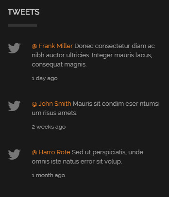
Codes are as follows:
<ul class="bottom_c">
  <li><span class="fa fa-twitter"></span><a href="#">@ Frank Miller</a> Donec consectetur diam ac nibh auctor ultricies. Integer mauris lacus, consequat magnis. <span class="date">1 day ago</span></li>
  <li><span class="fa fa-twitter"></span><a href="#">@ John Smith</a> Mauris sit condim eser ntumsi um risus amets. <span class="date">2 weeks ago</span></li>
  <li><span class="fa fa-twitter"></span><a href="#">@ Harro Rote</a> Sed ut perspiciatis, unde omnis iste natus error sit volup. <span class="date">1 month ago</span></li>
</ul>
Option:
- You can modify
fato change icons. font icon list. Containeris usingContainer-1
GET IN TOUCH area
Below is the screen shot:
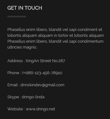
Codes are as follows:
<div class="bottom_d">
  <p>Phasellus enim libero, blandit vel sapi condiment et lobortis aliquam aliquam in tortor et lobortis aliquam Phasellus enim libero, blandit vel sapi condimentum ultricies magnis.</p>
  <ul>
    <li>Address : XingAn Street No.287</li>
    <li>Phone : (+086)-123-456-78910</li>
    <li>Email : dnnskindev@gmail.com</li>
    <li>Skype : dnngo-linda</li>
    <li>Website : www.dnngo.net</li>
  </ul>
</div>
Option:
Containeris usingContainer-1
Home Version 2
You can click the link to check Home Version 2 demo. Home Version 2
Banner area
Below is the screen shot:

It is using DNNGo LayerGalleryPro module here, you can import ContentListEntity-Home2.xml of the DNNGo_LayerGalleryPro folder to duplicate banner of the demo.
CREATE INTERACTIVE, ENGAGING AND SATISFYING WEBSITE area
Below is the screen shot:

Codes are as follows:
<div class="SectionStyles1 pt-60 pb-60">
  <div class="dnn_layout">
    <div class="content_mid clearfix">
      <div class="pane_layout">
        <div class="row">
          <div class="col-sm-12">
            <div class="home1_conb animation zoomIn">
              <h1> Create interactive, engaging and satisfying website</h1>
              <p>We are a team comprised of experienced employers whose aim is to provide you with compelling, engaging and satisfying skins.</p>
              <div class="clearfix visible-sm"></div>
              <a target="blank" href="#" class="Button_style1">Start Your Business</a> </div>
          </div>
        </div>
      </div>
    </div>
  </div>
</div>
Option:
- This is a SectionStyles effect.
col-sm-*is the width of each column, you can change the width you need through value1~12.- You can modify
animationto change or delete animation.Animation list.
PORTFOLIOS area
Below is the screen shot:
Codes are as follows:
<div class="pb-50">
  <div class="dnn_layout">
    <div class="content_mid clearfix">
      <div class="pane_layout">
        <div class="row">
          <div class="col-sm-12">
            <div class="home1_con_titlebox">
              <div class="home1_con_title1">
                <h4>Portfolios</h4>
              </div>
            </div>
            <p class="home1_con_titlep"> content text ... </p>
            <div class="home2_cona clearfix animation zoomIn">
              <div class="leftone">
                <div class="photo_box img_zoom ico_zoom the1"> <a target="blank" href="#">
                  <div class="pic_box"> <img alt="" src="/portals/8/home2_cona1.jpg" />
                    <div class="content">
                      <div class="vertical_center_1">
                        <div class="vertical_center_2">
                          <h3>Full Support</h3>
                          <p>March 15th, 2014</p>
                        </div>
                      </div>
                    </div>
                    <div class="shade"></div>
                  </div>
                  </a> </div>
                <div class="photo_box img_zoom ico_zoom the2"> <a target="blank" href="#">
                  <div class="pic_box"> <img alt="" src="/portals/8/home2_cona2.jpg" />
                    <div class="content">
                      <div class="vertical_center_1">
                        <div class="vertical_center_2">
                          <h3>Responsive Web</h3>
                          <p>April 08th, 2014</p>
                        </div>
                      </div>
                    </div>
                    <div class="shade"></div>
                  </div>
                  </a> </div>
              </div>
              <div class="rightone">
                <div class="photo_box img_zoom ico_zoom the3"> <a target="blank" href="#">
                  <div class="pic_box"> <img alt="" src="/portals/8/home2_cona3.jpg" />
                    <div class="content">
                      <div class="vertical_center_1">
                        <div class="vertical_center_2">
                          <h3>Responsive Web</h3>
                          <p>July 27th, 2014</p>
                        </div>
                      </div>
                    </div>
                    <div class="shade"></div>
                  </div>
                  </a> </div>
              </div>
              <div class="clear"></div>
              <div class="photo_box img_zoom ico_zoom the4"> <a target="blank" href="#">
                <div class="pic_box"> <img alt="" src="/portals/8/home2_cona4.jpg" />
                  <div class="content">
                    <div class="vertical_center_1">
                      <div class="vertical_center_2">
                        <h3>Attractive Theme </h3>
                        <p>September 13th, 2014</p>
                      </div>
                    </div>
                  </div>
                  <div class="shade"></div>
                </div>
                </a> </div>
            </div>
          </div>
        </div>
      </div>
    </div>
  </div>
</div>
Option:
- You can modify
animationto change or delete animation.Animation list. col-sm-*is the width of each column, you can change the width you need through value1~12.
FIND MORE PHOTOS area
Below is the screen shot:
Codes are as follows:
<div class="home2_conb"> <a class="linker" target="blank" href="#">Find More Photos</a><a class="linker" target="blank" href="#">Create A Portfolio</a>
  <div class="clearfix"></div>
  <div class="number_Animation number_Animation_1 pt-60 clearfix">
    <div class="number_out ">
      <div class="number_main animation fadeInUp delay1">
        <div class="number_box"> <span class="animation number" data-number="12,500">0</span><span class="line"></span> <span class="number_name">Products</span> </div>
      </div>
    </div>
    <div class="number_out ">
      <div class="number_main animation fadeInUp delay2">
        <div class="number_box"> <span class="animation number" data-number="9,400">0</span><span class="line"></span> <span class="number_name">Reviews</span> </div>
      </div>
    </div>
    <div class="number_out ">
      <div class="number_main animation fadeInUp delay3">
        <div class="number_box"> <span class="animation number" data-number="7,300">0</span><span class="line"></span> <span class="number_name">Comments</span> </div>
      </div>
    </div>
    <div class="number_out ">
      <div class="number_main animation fadeInUp delay4">
        <div class="number_box"> <span class="animation number" data-number="6,800">0</span><span class="line"></span> <span class="number_name">Supports</span> </div>
      </div>
    </div>
    <div class="number_out ">
      <div class="number_main animation fadeInUp delay5">
        <div class="number_box"> <span class="animation number" data-number="14,900">0</span><span class="line"></span> <span class="number_name">Purchases</span> </div>
      </div>
    </div>
    <div class="number_out ">
      <div class="number_main animation fadeInUp delay6">
        <div class="number_box"> <span class="animation number" data-number="5,200">0</span><span class="line"></span> <span class="number_name">Subscribers</span> </div>
      </div>
    </div>
  </div>
</div>
Option:
- You can modify
animationto change or delete animation.Animation list. - You can change the value you need to display through
data-number
LATEST PHOTOS area
Below is the screen shot:
Codes are as follows:
<div class="dnn_layout">
  <div class="content_mid clearfix">
    <div class="pane_layout">
      <div class="row">
        <div class="col-sm-12">
          <div class="home1_con_titlebox">
            <div class="home1_con_title1">
              <h4>Latest photos</h4>
            </div>
          </div>
          <p class="home1_con_titlep"> content text ... </p>
          <div class="isotope_grid Text_layouts2 animation zoomIn">
            <div class="isotope_group portfolios_group"> <a class="active" href="#" data-filter="*">All</a> <a href="#" data-filter=".photography">Photography</a> <a href="#" data-filter=".blogs">Blog</a> <a href="#" data-filter=".webdesign">Web Design</a> <a href="#" data-filter=".videos">Videos</a></div>
            <div class="loading">
              <div class="loading-container container1">
                <div class="circle1"></div>
                <div class="circle2"></div>
                <div class="circle3"></div>
                <div class="circle4"></div>
              </div>
              <div class="loading-container container2">
                <div class="circle1"></div>
                <div class="circle2"></div>
                <div class="circle3"></div>
                <div class="circle4"></div>
              </div>
              <div class="loading-container container3">
                <div class="circle1"></div>
                <div class="circle2"></div>
                <div class="circle3"></div>
                <div class="circle4"></div>
              </div>
            </div>
            <div class="isotope_main" data-min-width="362">
              <div class="isotope_item Videos webdesign">
                <div class="photo_box">
                  <div class="pic_box"> <img alt="" src="/portals/8/Text_layouts2_1.jpg" />
                    <div class="content">
                      <div class="vertical_center_1">
                        <div class="vertical_center_2">
                          <div class="ico"> <a href="#" target="blank"><span class="fa fa-link"></span></a> <a href="/Portals/8/Text_layouts2_1.jpg" class="LightBox_image_gallery1"><span class="fa fa-search"></span></a> </div>
                        </div>
                      </div>
                    </div>
                    <div class="shade"></div>
                  </div>
                  <div class="text_style1">
                    <h3>Banner Sliders Gallery</h3>
                    <p>Web Design, Videos</p>
                  </div>
                </div>
              </div>
              <div class="isotope_item blogs photography">
                <div class="photo_box">
                  <div class="pic_box"> <img alt="" src="/portals/8/Text_layouts2_2.jpg" />
                    <div class="content">
                      <div class="vertical_center_1">
                        <div class="vertical_center_2">
                          <div class="ico"> <a href="#" target="blank"><span class="fa fa-link"></span></a> <a href="/Portals/8/Text_layouts2_2.jpg" class="LightBox_image_gallery1"><span class="fa fa-search"></span></a> </div>
                        </div>
                      </div>
                    </div>
                    <div class="shade"></div>
                  </div>
                  <div class="text_style1">
                    <h3>Many Different Homepages</h3>
                    <p>Photography, Blogs</p>
                  </div>
                </div>
              </div>
              <div class="isotope_item blogs videos">
                <div class="photo_box">
                  <div class="pic_box"> <img alt="" src="/portals/8/Text_layouts2_3.jpg" />
                    <div class="content">
                      <div class="vertical_center_1">
                        <div class="vertical_center_2">
                          <div class="ico"> <a href="#" target="blank"><span class="fa fa-link"></span></a> <a href="/Portals/8/Text_layouts2_3.jpg" class="LightBox_image_gallery1"><span class="fa fa-search"></span></a> </div>
                        </div>
                      </div>
                    </div>
                    <div class="shade"></div>
                  </div>
                  <div class="text_style1">
                    <h3>Browser Compatibility</h3>
                    <p>Videos, Blogs</p>
                  </div>
                </div>
              </div>
              <div class="isotope_item videos photography">
                <div class="photo_box">
                  <div class="pic_box"> <img alt="" src="/portals/8/Text_layouts2_4.jpg" />
                    <div class="content">
                      <div class="vertical_center_1">
                        <div class="vertical_center_2">
                          <div class="ico"> <a href="#" target="blank"><span class="fa fa-link"></span></a> <a href="/Portals/8/Text_layouts2_4.jpg" class="LightBox_image_gallery1"><span class="fa fa-search"></span></a> </div>
                        </div>
                      </div>
                    </div>
                    <div class="shade"></div>
                  </div>
                  <div class="text_style1">
                    <h3>Module Development</h3>
                    <p>Photography, Videos</p>
                  </div>
                </div>
              </div>
              <div class="isotope_item blogs webdesign">
                <div class="photo_box">
                  <div class="pic_box"> <img alt="" src="/portals/8/Text_layouts2_5.jpg" />
                    <div class="content">
                      <div class="vertical_center_1">
                        <div class="vertical_center_2">
                          <div class="ico"> <a href="#" target="blank"><span class="fa fa-link"></span></a> <a href="/Portals/8/Text_layouts2_5.jpg" class="LightBox_image_gallery1"><span class="fa fa-search"></span></a> </div>
                        </div>
                      </div>
                    </div>
                    <div class="shade"></div>
                  </div>
                  <div class="text_style1">
                    <h3>Responsive Design</h3>
                    <p>Web Design, Blogs</p>
                  </div>
                </div>
              </div>
              <div class="isotope_item webdesign photography">
                <div class="photo_box">
                  <div class="pic_box"> <img alt="" src="/portals/8/Text_layouts2_6.jpg" />
                    <div class="content">
                      <div class="vertical_center_1">
                        <div class="vertical_center_2">
                          <div class="ico"> <a href="#" target="blank"><span class="fa fa-link"></span></a> <a href="/Portals/8/Text_layouts2_6.jpg" class="LightBox_image_gallery1"><span class="fa fa-search"></span></a> </div>
                        </div>
                      </div>
                    </div>
                    <div class="shade"></div>
                  </div>
                  <div class="text_style1">
                    <h3>Unlimited-color Skin</h3>
                    <p>Web Design, Photography</p>
                  </div>
                </div>
              </div>
              <div class="isotope_item videos webdesign">
                <div class="photo_box">
                  <div class="pic_box"> <img alt="" src="/portals/8/Text_layouts2_7.jpg" />
                    <div class="content">
                      <div class="vertical_center_1">
                        <div class="vertical_center_2">
                          <div class="ico"> <a href="#" target="blank"><span class="fa fa-link"></span></a> <a href="/Portals/8/Text_layouts2_7.jpg" class="LightBox_image_gallery1"><span class="fa fa-search"></span></a> </div>
                        </div>
                      </div>
                    </div>
                    <div class="shade"></div>
                  </div>
                  <div class="text_style1">
                    <h3>Edit Website Content</h3>
                    <p>Web Design, Videos</p>
                  </div>
                </div>
              </div>
              <div class="isotope_item blogs photography">
                <div class="photo_box">
                  <div class="pic_box"> <img alt="" src="/portals/8/Text_layouts2_8.jpg" />
                    <div class="content">
                      <div class="vertical_center_1">
                        <div class="vertical_center_2">
                          <div class="ico"> <a href="#" target="blank"><span class="fa fa-link"></span></a> <a href="/Portals/8/Text_layouts2_8.jpg" class="LightBox_image_gallery1"><span class="fa fa-search"></span></a> </div>
                        </div>
                      </div>
                    </div>
                    <div class="shade"></div>
                  </div>
                  <div class="text_style1">
                    <h3>Many Different Homepage</h3>
                    <p>Photography, Blogs</p>
                  </div>
                </div>
              </div>
              <div class="isotope_item blogs videos">
                <div class="photo_box">
                  <div class="pic_box"> <img alt="" src="/portals/8/Text_layouts2_9.jpg" />
                    <div class="content">
                      <div class="vertical_center_1">
                        <div class="vertical_center_2">
                          <div class="ico"> <a href="#" target="blank"><span class="fa fa-link"></span></a> <a href="/Portals/8/Text_layouts2_9.jpg" class="LightBox_image_gallery1"><span class="fa fa-search"></span></a> </div>
                        </div>
                      </div>
                    </div>
                    <div class="shade"></div>
                  </div>
                  <div class="text_style1">
                    <h3>Browser Compatibility</h3>
                    <p>Videos, Blogs</p>
                  </div>
                </div>
              </div>
            </div>
          </div>
        </div>
      </div>
    </div>
  </div>
</div>
Option:
- You can modify
animationto change or delete animation.Animation list. col-sm-*is the width of each column, you can change the width you need through value1~12.- You can modify
fato change icons. font icon list. - You can add
<a data-filter=".FilterName" href="#">Filter Name</a>to increase categories.data-filter=".FilterName"can not be blank space. - You can modify
data-min-widthto change minimum width of image. - You can modify
isotope_itemFilterNameto categorize images.
OUR SKILLS area
Below is the screen shot:
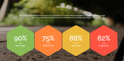
Codes are as follows:
<div class="SectionStyles5 pt-60 pb-60">
  <div class="dnn_layout">
    <div class="content_mid clearfix">
      <div class="pane_layout">
        <div class="row">
          <div class="col-sm-12">
            <div class="home1_con_titlebox">
              <div class="home1_con_title1">
                <h4>Our Skills</h4>
              </div>
            </div>
            <p class="home1_con_titlep"> content text ... </p>
            <div class="number_Animation_4 clearfix">
              <div class="na_box the1 mt-60">
                <div class="na_boxtop"><span class="animation  number" data-number="90">0</span>%</div>
                <div class="line"></div>
                <p>Web Design</p>
              </div>
              <div class="na_box the2 mt-60">
                <div class="na_boxtop"><span class="animation  number" data-number="75">0</span>%</div>
                <div class="line"></div>
                <p>Html5 & Css3</p>
              </div>
              <div class="na_box the3 mt-60">
                <div class="na_boxtop"><span class="animation  number" data-number="88">0</span>%</div>
                <div class="line"></div>
                <p>Java Script</p>
              </div>
              <div class="na_box the4 mt-60">
                <div class="na_boxtop"><span class="animation  number" data-number="62">0</span>%</div>
                <div class="line"></div>
                <p>Programme</p>
              </div>
            </div>
          </div>
        </div>
      </div>
    </div>
  </div>
</div>
Option:
- This is a SectionStyles effect.
col-sm-*is the width of each column, you can change the width you need through value1~12.- You can modify
animationto change or delete animation.Animation list. - You can change the value you need to display through
data-number
BUTTON area
Below is the screen shot:

Codes are as follows:
<div class="SectionStyles6 pt-60 pb-60">
  <div class="dnn_layout">
    <div class="content_mid clearfix">
      <div class="pane_layout">
        <div class="row">
          <div class="col-sm-12">
            <div class="home2_conc animation zoomIn">
              <h1> Craft the best Web solutions for your online business
                <div class="clearfix visible-sm  visible-xs"></div>
                <a class="Button_style1" target="blank" href="#">Getting Started</a> </h1>
            </div>
          </div>
        </div>
      </div>
    </div>
  </div>
</div>
Option:
- This is a SectionStyles effect.
- You can modify
animationto change or delete animation.Animation list. col-sm-*is the width of each column, you can change the width you need through value1~12.
LATEST NEWS area
Below is the screen shot:
Codes are as follows:
<ul class="bottom_a">
  <li>
    <div class="img"><img alt="" src="/portals/8/bottom_a1.jpg" /></div>
    <p>DNN Modules Development</p>
    <span class="date">February 20th, 2014</span> </li>
  <div class="line"></div>
  <li>
    <div class="img"><img alt="" src="/portals/8/bottom_a2.jpg" /></div>
    <p>Advanced Technology</p>
    <span class="date">March 16th, 2014</span> </li>
  <div class="line"></div>
  <li>
    <div class="img"><img alt="" src="/portals/8/bottom_a3.jpg" /></div>
    <p>Powerful & Creative Skin Pack</p>
    <span class="date">September 08th, 2014</span> </li>
</ul>
Option:
Containeris usingContainer-1
FOLLOW US area
Below is the screen shot:
Codes are as follows:
<div class="bottom_b">
  <p>Sed non neque elit. Sed ut imperdiet nisi. Proin condime ntum fermentum nunc. Etiam pharetra, erat sed ferm entum feugiati.</p>
  <ul>
    <li><a href="#"><span class="fa fa-facebook-square"></span>Facebook</a></li>
    <li><a href="#"><span class="fa fa-twitter-square"></span>Twitter</a></li>
    <li><a href="#"><span class="fa fa-vimeo-square"></span>Vimeo</a></li>
    <li><a href="#"><span class="fa fa-pinterest-square"></span>pinterest</a></li>
  </ul>
</div>
Option:
- You can modify
fato change icons. font icon list. Containeris usingContainer-1
TWEETS area
Below is the screen shot:
Codes are as follows:
<ul class="bottom_c">
  <li><span class="fa fa-twitter"></span><a href="#">@ Frank Miller</a> Donec consectetur diam ac nibh auctor ultricies. Integer mauris lacus, consequat magnis. <span class="date">1 day ago</span></li>
  <li><span class="fa fa-twitter"></span><a href="#">@ John Smith</a> Mauris sit condim eser ntumsi um risus amets. <span class="date">2 weeks ago</span></li>
  <li><span class="fa fa-twitter"></span><a href="#">@ Harro Rote</a> Sed ut perspiciatis, unde omnis iste natus error sit volup. <span class="date">1 month ago</span></li>
</ul>
Option:
- You can modify
fato change icons. font icon list. Containeris usingContainer-1
GET IN TOUCH area
Below is the screen shot:
Codes are as follows:
<div class="bottom_d">
  <p>Phasellus enim libero, blandit vel sapi condiment et lobortis aliquam aliquam in tortor et lobortis aliquam Phasellus enim libero, blandit vel sapi condimentum ultricies magnis.</p>
  <ul>
    <li>Address : XingAn Street No.287</li>
    <li>Phone : (+086)-123-456-78910</li>
    <li>Email : dnnskindev@gmail.com</li>
    <li>Skype : dnngo-linda</li>
    <li>Website : www.dnngo.net</li>
  </ul>
</div>
Option:
Containeris usingContainer-1
Home Version 3
You can click the link to check Home Version 3 demo. Home Version 3
Banner area
Below is the screen shot:
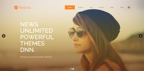
It is using DNNGo LayerGalleryPro module here,you can import ContentListEntity-Home3.xml of the DNNGo_LayerGalleryPro folder to duplicate banner of the demo.
ICONS area
Below is the screen shot:
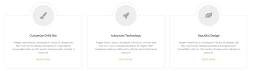
Codes are as follows:
<div class="pb-60 pt-60">
  <div class="dnn_layout">
    <div class="content_mid clearfix">
      <div class="pane_layout">
        <div class="row">
          <div class="col-sm-4">
            <div class="flip_box_4 animation fadeInUp delay1">
              <div class="icon"><span class="fa fa-paint-brush"></span></div>
              <h1>Customize DNN Skin</h1>
              <p> Content text ...</p>
              <a target="blank" href="#">Read More</a> </div>
          </div>
          <div class="col-sm-4">
            <div class="flip_box_4 animation fadeInUp delay2">
              <div class="icon"><span class="fa fa-rocket"></span></div>
              <h1>Advanced Technology</h1>
              <p> Content text ...</p>
              <a target="blank" href="#">Read More</a> </div>
          </div>
          <div class="col-sm-4 animation fadeInUp delay3">
            <div class="flip_box_4">
              <div class="icon"><span class="fa fa-leaf"></span></div>
              <h1>Beautiful Design</h1>
              <p> Content text ...</p>
              <a target="blank" href="#">Read More</a> </div>
          </div>
        </div>
      </div>
    </div>
  </div>
</div>
Option:
- You can modify
animationto change or delete animation.Animation list. - You can modify
fato change icons. font icon list.
IMAGE area
Below is the screen shot:
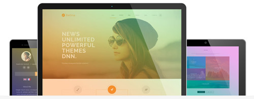
Codes are as follows:
<div class="dnn_layout">
  <div class="content_mid clearfix">
    <div class="pane_layout">
      <div class="row">
        <div class="col-sm-12">
          <div class="home3_cona">
            <div class="the1 animation fadeInLeft"> <img alt="" src="/portals/8/home3_cona_the1.png" /> </div>
            <div class="the2 animation fadeInRight"> <img alt="" src="/portals/8/home3_cona_the2.png" /> </div>
            <div class="the3 animation fadeInUp"> <img alt="" src="/portals/8/home3_cona_the3.jpg" /> </div>
          </div>
        </div>
      </div>
    </div>
  </div>
</div>
Option:
- You can modify
animationto change or delete animation.Animation list. col-sm-*is the width of each column, you can change the width you need through value1~12.
Best Reviews area
Below is the screen shot:
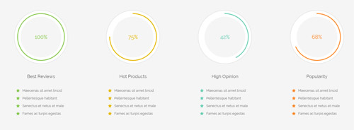
Codes are as follows:
<div class="SectionStyles7 pb-60">
  <div class="dnn_layout">
    <div class="content_mid clearfix">
      <div class="pane_layout">
        <div class="chart_list1 row">
          <div class="col-sm-6 col-md-3 mt-60">
            <div class="the1">
              <div data-percent="100" class="percentage1">
                <div class="percentage_inner"><span>0</span>%</div>
              </div>
            </div>
            <h6>Best Reviews</h6>
            <ul class="theone">
              <li><span class="fa fa-star"></span>Maecenas sit amet tincid</li>
              <li><span class="fa fa-star"></span>Pellentesque habitant</li>
              <li><span class="fa fa-star"></span>Senectus et netus et male</li>
              <li><span class="fa fa-star"></span>Fames ac turpis egestas </li>
            </ul>
          </div>
          <div class="col-sm-6 col-md-3 mt-60">
            <div class="the2">
              <div data-percent="75" class="percentage1">
                <div class="percentage_inner"><span>0</span>%</div>
              </div>
            </div>
            <h6>Hot Products</h6>
            <ul class="thetwo">
              <li><span class="fa fa-star"></span>Maecenas sit amet tincid</li>
              <li><span class="fa fa-star"></span>Pellentesque habitant</li>
              <li><span class="fa fa-star"></span>Senectus et netus et male</li>
              <li><span class="fa fa-star"></span>Fames ac turpis egestas </li>
            </ul>
          </div>
          <div class="col-sm-6 col-md-3 mt-60">
            <div class="the3">
              <div data-percent="42" class="percentage1">
                <div class="percentage_inner"><span>0</span>%</div>
              </div>
            </div>
            <h6>High Opinion</h6>
            <ul class="thethree">
              <li><span class="fa fa-star"></span>Maecenas sit amet tincid</li>
              <li><span class="fa fa-star"></span>Pellentesque habitant</li>
              <li><span class="fa fa-star"></span>Senectus et netus et male</li>
              <li><span class="fa fa-star"></span>Fames ac turpis egestas </li>
            </ul>
          </div>
          <div class="col-sm-6 col-md-3 mt-60">
            <div class="the4">
              <div data-percent="68" class="percentage1">
                <div class="percentage_inner"><span>0</span>%</div>
              </div>
            </div>
            <h6>Popularity</h6>
            <ul class="thefour">
              <li><span class="fa fa-star"></span>Maecenas sit amet tincid</li>
              <li><span class="fa fa-star"></span>Pellentesque habitant</li>
              <li><span class="fa fa-star"></span>Senectus et netus et male</li>
              <li><span class="fa fa-star"></span>Fames ac turpis egestas </li>
            </ul>
          </div>
        </div>
      </div>
    </div>
  </div>
</div>
Option:
- This is a SectionStyles effect.
col-sm-* col-md-*is the width of each column, you can change the width you need through value1~12.- You can change the value you need to display through
data-percent - You can modify
fato change icons. font icon list. - You can modify
animationto change or delete animation.Animation list.
RETINA READY area
Below is the screen shot:
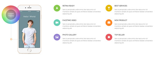
Codes are as follows:
<div class="pt-60 pb-60">
  <div class="dnn_layout">
    <div class="content_mid clearfix">
      <div class="pane_layout">
        <div class="row">
          <div class="col-sm-4 animation fadeInLeft"> <img alt="" class="img-responsive" src="/portals/8/home3_conb.jpg" /> </div>
          <div class="col-sm-8">
            <div class="row">
              <div class="col-sm-6">
                <div class="home3_conb animation fadeInUp delay1">
                  <div class="the1"><span class="fa fa-tint"> </span></div>
                  <h6>Retina Ready</h6>
                  <p>Sed ut perspiciatis unde omnis iste natus error sit inventore veritatis et quasi architecto beatae consectetur adipiscing elit.</p>
                </div>
              </div>
              <div class="col-sm-6">
                <div class="home3_conb animation fadeInUp delay2">
                  <div class="the2"><span class="fa fa-glass"> </span></div>
                  <h6>Best Services</h6>
                  <p>Sed ut perspiciatis unde omnis iste natus error sit inventore veritatis et quasi architecto beatae consectetur adipiscing elit.</p>
                </div>
              </div>
              <div class="col-sm-6">
                <div class="home3_conb animation fadeInUp delay3">
                  <div class="the3"><span class="fa fa-video-camera"> </span></div>
                  <h6>Facetime Video</h6>
                  <p>Sed ut perspiciatis unde omnis iste natus error sit inventore veritatis et quasi architecto beatae consectetur adipiscing elit.</p>
                </div>
              </div>
              <div class="col-sm-6">
                <div class="home3_conb animation fadeInUp delay4">
                  <div class="the4"><span class="fa fa-briefcase"> </span></div>
                  <h6>New Product</h6>
                  <p>Sed ut perspiciatis unde omnis iste natus error sit inventore veritatis et quasi architecto beatae consectetur adipiscing elit.</p>
                </div>
              </div>
              <div class="col-sm-6">
                <div class="home3_conb animation fadeInUp delay5">
                  <div class="the5"><span class="fa fa-picture-o"> </span></div>
                  <h6>Photo Gallery</h6>
                  <p>Sed ut perspiciatis unde omnis iste natus error sit inventore veritatis et quasi architecto beatae consectetur adipiscing elit.</p>
                </div>
              </div>
              <div class="col-sm-6">
                <div class="home3_conb animation fadeInUp delay6">
                  <div class="the6"><span class="fa fa-certificate"> </span></div>
                  <h6>Top Seller</h6>
                  <p>Sed ut perspiciatis unde omnis iste natus error sit inventore veritatis et quasi architecto beatae consectetur adipiscing elit.</p>
                </div>
              </div>
            </div>
          </div>
        </div>
      </div>
    </div>
  </div>
</div>
Option:
col-sm-*is the width of each column, you can change the width you need through value1~12- You can modify
fato change icons. font icon list. - You can modify
animationto change or delete animation.Animation list.
RECENT PROJECTS area
Below is the screen shot:
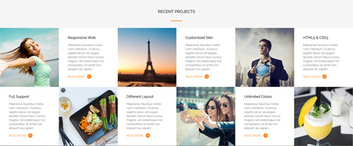
Codes are as follows:
<div class="SectionStyles7 pt-60">
  <div class="dnn_layout">
    <div class="content_mid clearfix">
      <div class="pane_layout">
        <div class="row">
          <div class="col-sm-12">
            <h5 class="home3_con_title1">Recent Projects</h5>
            <div class="home3_con_title1line"></div>
          </div>
        </div>
      </div>
    </div>
  </div>
  <ul class="home3_conc clearfix animation zoomIn">
    <li class="celarfix">
      <div class="hcc_box1"></div>
      <div class="hcc_box">
        <h6>Responsive Web</h6>
        <p>Maecenas faucibus mollis rutm interdum. Vivamus sagittis lacus vel augue laoreet rutrum fauci cursus magna, vel scelerisque nisl consectetur sit amet non aliquam eu sapien.</p>
        <a target="blank" href="#">Read More <span class="fa fa-angle-right"></span></a> </div>
    </li>
    <li class="celarfix">
      <div class="hcc_box2"></div>
      <div class="hcc_box">
        <h6>Customized Skin</h6>
        <p>Maecenas faucibus mollis rutm interdum. Vivamus sagittis lacus vel augue laoreet rutrum fauci cursus magna, vel scelerisque nisl consectetur sit amet non aliquam eu sapien.</p>
        <a target="blank" href="#">Read More <span class="fa fa-angle-right"></span></a> </div>
    </li>
    <li class="celarfix">
      <div class="hcc_box3"></div>
      <div class="hcc_box">
        <h6>HTML5 & CSS3</h6>
        <p>Maecenas faucibus mollis rutm interdum. Vivamus sagittis lacus vel augue laoreet rutrum fauci cursus magna, vel scelerisque nisl consectetur sit amet non aliquam eu sapien.</p>
        <a target="blank" href="#">Read More <span class="fa fa-angle-right"></span></a> </div>
    </li>
    <div class="clearfix"></div>
    <li class="celarfix">
      <div class="hcc_box the2">
        <h6>Full Support</h6>
        <p>Maecenas faucibus mollis rutm interdum. Vivamus sagittis lacus vel augue laoreet rutrum fauci cursus magna, vel scelerisque nisl consectetur sit amet non aliquam eu sapien.</p>
        <a target="blank" href="#">Read More <span class="fa fa-angle-right"></span></a> </div>
      <div class="hcc_box4"></div>
    </li>
    <li class="celarfix">
      <div class="hcc_box the2">
        <h6>Different Layout</h6>
        <p>Maecenas faucibus mollis rutm interdum. Vivamus sagittis lacus vel augue laoreet rutrum fauci cursus magna, vel scelerisque nisl consectetur sit amet non aliquam eu sapien.</p>
        <a target="blank" href="#">Read More <span class="fa fa-angle-right"></span></a> </div>
      <div class="hcc_box5"></div>
    </li>
    <li class="celarfix">
      <div class="hcc_box the2">
        <h6>Unlimited Colors</h6>
        <p>Maecenas faucibus mollis rutm interdum. Vivamus sagittis lacus vel augue laoreet rutrum fauci cursus magna, vel scelerisque nisl consectetur sit amet non aliquam eu sapien.</p>
        <a target="blank" href="#">Read More <span class="fa fa-angle-right"></span></a> </div>
      <div class="hcc_box6"></div>
    </li>
  </ul>
</div>
Option:
- This is a SectionStyles effect.
- You can modify
animationto change or delete animation.Animation list.
TESTIMONIALS area
Below is the screen shot:
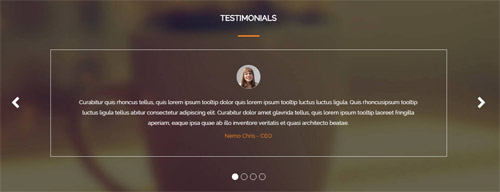
Codes are as follows:
<div class="SectionStyles8 pt-60 pb-60">
  <div class="dnn_layout">
    <div class="content_mid clearfix">
      <div class="pane_layout">
        <div class="row">
          <div class="col-sm-12">
            <h5 class="home3_con_title1">Testimonials</h5>
            <div class="home3_con_title1line"></div>
            <div class=" Testimonials_tab Testimonials_6" data-autoplay="5000" data-display-arrows="true" data-position="fade" data-display-navigation="true">
              <li>
                <blockquote>
                  <div class="img"><img alt="" src="/portals/8/Testimonials_4a.jpg" /></div>
                  <p>Curabitur quis rhoncus tellus, quis lorem ipsum tooltip dolor quis lorem ipsum tooltip luctus luctus ligula. Quis rhoncusipsum tooltip luctus ligula tellus abitur consectetur adipiscing elit. Curabitur dolor amet glavrida tellus, quis lorem ipsum tooltip laoreet fringilla  aperiam, eaque ipsa quae ab illo inventore veritatis et quasi architecto beatae.</p>
                  <small>
                  <div><span>Nemo Chris</span> - CEO</div>
                  </small> </blockquote>
              </li>
              <li>
                <blockquote>
                  <div class="img"><img alt="" src="/portals/8/Testimonials_4b.jpg" /></div>
                  <p>Curabitur quis rhoncus tellus, quis lorem ipsum tooltip dolor quis lorem ipsum tooltip luctus luctus ligula. Quis rhoncusipsum tooltip luctus ligula tellus abitur consectetur adipiscing elit. Curabitur dolor amet glavrida tellus, quis lorem ipsum tooltip laoreet fringilla  aperiam, eaque ipsa quae ab illo inventore veritatis et quasi architecto beatae.</p>
                  <small>
                  <div><span>Nemo Chris</span> - CEO</div>
                  </small> </blockquote>
              </li>
              <li>
                <blockquote>
                  <div class="img"><img alt="" src="/portals/8/Testimonials_4c.jpg" /></div>
                  <p>Curabitur quis rhoncus tellus, quis lorem ipsum tooltip dolor quis lorem ipsum tooltip luctus luctus ligula. Quis rhoncusipsum tooltip luctus ligula tellus abitur consectetur adipiscing elit. Curabitur dolor amet glavrida tellus, quis lorem ipsum tooltip laoreet fringilla  aperiam, eaque ipsa quae ab illo inventore veritatis et quasi architecto beatae.</p>
                  <small>
                  <div><span>Nemo Chris</span> - CEO</div>
                  </small> </blockquote>
              </li>
              <li>
                <blockquote>
                  <div class="img"><img alt="" src="/portals/8/Testimonials_4d.jpg" /></div>
                  <p>Curabitur quis rhoncus tellus, quis lorem ipsum tooltip dolor quis lorem ipsum tooltip luctus luctus ligula. Quis rhoncusipsum tooltip luctus ligula tellus abitur consectetur adipiscing elit. Curabitur dolor amet glavrida tellus, quis lorem ipsum tooltip laoreet fringilla  aperiam, eaque ipsa quae ab illo inventore veritatis et quasi architecto beatae.</p>
                  <small>
                  <div><span>Nemo Chris</span> - CEO</div>
                  </small> </blockquote>
              </li>
            </div>
          </div>
        </div>
      </div>
    </div>
  </div>
</div>
Option:
- This is a
Carouseleffect.Carousel - This is a SectionStyles effect.
OUR TEAM area
Below is the screen shot:
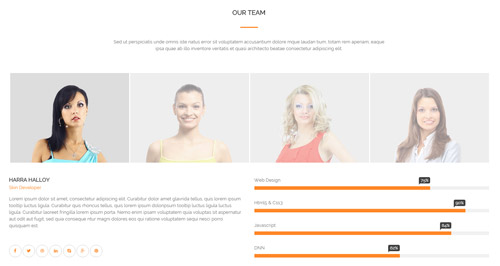
Codes are as follows:
<div class="pt-60 pb-60">
  <div class="dnn_layout">
    <div class="content_mid clearfix">
      <div class="pane_layout">
        <div class="row">
          <div class="col-sm-12">
            <h5 class="home3_con_title1">Our Team</h5>
            <div class="home3_con_title1line"></div>
            <div class="home1_con_titlep">content text ...</div>
          </div>
          <div class="col-sm-12">
            <div class="sync_carousel  sync_carousel_2 pt-60 animation zoomIn">
              <div class="carousel_nav home3_cond">
                <div class="item">
                  <div class="photo_box"> <a href="#">
                    <div class="pic_box"> <img alt="" src="/portals/8/home3_cond1.jpg" class="img-responsive" />
                      <div class="shade"></div>
                    </div>
                    </a> </div>
                </div>
                <div class="item">
                  <div class="photo_box"> <a href="#">
                    <div class="pic_box"> <img alt="" src="/portals/8/home3_cond2.jpg" class="img-responsive" />
                      <div class="shade"></div>
                    </div>
                    </a> </div>
                </div>
                <div class="item">
                  <div class="photo_box"> <a href="#">
                    <div class="pic_box"> <img alt="" src="/portals/8/home3_cond3.jpg" class="img-responsive" />
                      <div class="shade"></div>
                    </div>
                    </a> </div>
                </div>
                <div class="item">
                  <div class="photo_box"> <a href="#">
                    <div class="pic_box"> <img alt="" src="/portals/8/home3_cond4.jpg" class="img-responsive" />
                      <div class="shade"></div>
                    </div>
                    </a> </div>
                </div>
              </div>
              <div class="carousel_main ">
                <div class="item">
                  <div class="row">
                    <div class="col-sm-6">
                      <div class="home3_cone">
                        <h5>Harra Halloy</h5>
                        <h6>Skin Developer</h6>
                        <p>Lorem ipsum dolor sit amet, consectetur adipiscing elit. Curabitur dolor amet glavrida tellus, quis lorem ipsum tooltip luctus ligula. Curabitur quis rhoncus tellus, quis lorem ipsum doloripsum tooltip luctus ligula luctus ligula. Curabitur laoreet fringilla lorem ipsum porta. Nemo enim ipsam voluptatem quia voluptas sit aspernatur aut odit aut fugit, sed quia conseque ntur magni dolores eos qui ratione voluptatem sequi nesci porro quisquam est.</p>
                        <a href="#"><span class="fa fa-facebook"></span></a> <a href="#"><span class="fa fa-twitter"></span></a> <a href="#"><span class="fa fa-dribbble"></span></a> <a href="#"><span class="fa fa-linkedin"></span></a> <a href="#"><span class="fa fa-skype"></span></a> <a href="#"><span class="fa fa-google-plus"></span></a> <a href="#"><span class="fa fa-pinterest"></span></a> </div>
                    </div>
                    <div class="col-sm-6">
                      <div class="loaded_list2">
                        <p>Web Design </p>
                        <div class="progress progress-striped active">
                          <div class="bar animation animationwidth" data-width="75%"><span></span></div>
                        </div>
                        <p>Html5 & Css3</p>
                        <div class="progress progress-striped active">
                          <div class="bar animation animationwidth" data-width="90%"><span></span></div>
                        </div>
                        <p>Javascript</p>
                        <div class="progress progress-striped active">
                          <div class="bar animation animationwidth" data-width="84%"><span></span> </div>
                        </div>
                        <p>DNN</p>
                        <div class="the4 progress progress-striped active">
                          <div class="bar animation animationwidth" data-width="62%"><span></span></div>
                        </div>
                      </div>
                    </div>
                  </div>

                </div>
                <div class="item">
                  <div class="row">
                    <div class="col-sm-6">
                      <div class="home3_cone">
                        <h5>Harra Halloy</h5>
                        <h6>Skin Developer</h6>
                        <p>Lorem ipsum dolor sit amet, consectetur adipiscing elit. Curabitur dolor amet glavrida tellus, quis lorem ipsum tooltip luctus ligula. Curabitur quis rhoncus tellus, quis lorem ipsum doloripsum tooltip luctus ligula luctus ligula. Curabitur laoreet fringilla lorem ipsum porta. Nemo enim ipsam voluptatem quia voluptas sit aspernatur aut odit aut fugit, sed quia conseque ntur magni dolores eos qui ratione voluptatem sequi nesci porro quisquam est.</p>
                        <a href="#"><span class="fa fa-facebook"></span></a> <a href="#"><span class="fa fa-twitter"></span></a> <a href="#"><span class="fa fa-dribbble"></span></a> <a href="#"><span class="fa fa-linkedin"></span></a> <a href="#"><span class="fa fa-skype"></span></a> <a href="#"><span class="fa fa-google-plus"></span></a> <a href="#"><span class="fa fa-pinterest"></span></a> </div>
                    </div>
                    <div class="col-sm-6">
                      <div class="loaded_list2">
                        <p>Web Design </p>
                        <div class="progress progress-striped active">
                          <div class="bar animation animationwidth" data-width="75%"><span></span></div>
                        </div>
                        <p>Html5 & Css3</p>
                        <div class="progress progress-striped active">
                          <div class="bar animation animationwidth" data-width="90%"><span></span></div>
                        </div>
                        <p>Javascript</p>
                        <div class="progress progress-striped active">
                          <div class="bar animation animationwidth" data-width="84%"><span></span> </div>
                        </div>
                        <p>DNN</p>
                        <div class="the4 progress progress-striped active">
                          <div class="bar animation animationwidth" data-width="62%"><span></span></div>
                        </div>
                      </div>
                    </div>
                  </div>
                </div>
              </div>
            </div>
          </div>
        </div>
      </div>
    </div>
  </div>
</div>
Option:
col-sm-*is the width of each column, you can change the width you need through value1~12.- You can modify
animationto change or delete animation.Animation list. - You can modify
fato change icons. font icon list. - You can change the value you need to display through
data-width
CONTACT US area
Below is the screen shot:
Codes are as follows:
<h5 class="home3_con_title1">Contact Us</h5>
<div class="home3_con_title1line"></div>
<div class="home1_con_titlep">content text ...</div>
Option:
- This is a SectionStyles effect.
PowerForms area
Below is the screen shot:
Option:
- This is
Theme_Responsive_20070_home3theme ofDNNGo PowerFormsmodule
Archives area
Below is the screen shot:
Codes are as follows:
<ul class="bottom_e">
  <li><a target="blank" href="#"><span class="fa fa-angle-double-right"></span>February 13, 2014</a></li>
  <li><a target="blank" href="#"><span class="fa fa-angle-double-right"></span>March 08, 2014</a></li>
  <li><a target="blank" href="#"><span class="fa fa-angle-double-right"></span>August 27, 2014</a></li>
  <li><a target="blank" href="#"><span class="fa fa-angle-double-right"></span>September 06, 2014</a></li>
  <li><a target="blank" href="#"><span class="fa fa-angle-double-right"></span>December 19, 2014</a></li>
</ul>
Option:
Containeris usingContainer-2- You can modify
fato change icons. font icon list.
Tags area
Below is the screen shot:
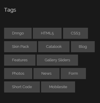
Codes are as follows:
<div class="bottom_f">
    <a target="blank" href="#">Dnngo</a>
    <a target="blank" href="#">HTML5</a>
    <a target="blank" href="#">CSS3</a>
    <a target="blank" href="#">Skin Pack</a>
    <a target="blank" href="#">Catalook</a>
    <a target="blank" href="#">Blog</a>
    <a target="blank" href="#">Features</a>
    <a target="blank" href="#">Gallery Sliders</a>
    <a target="blank" href="#">Photos</a>
    <a target="blank" href="#">News</a>
    <a target="blank" href="#">Form</a>
    <a target="blank" href="#">Short Code</a>
    <a target="blank" href="#">Mobilesite</a>
</div>
Option:
Containeris usingContainer-2
Contact area
Below is the screen shot:
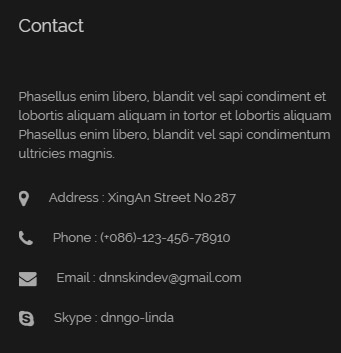
Codes are as follows:
<div class="bottom_d">
  <p>Phasellus enim libero, blandit vel sapi condiment et lobortis aliquam aliquam in tortor et lobortis aliquam Phasellus enim libero, blandit vel sapi condimentum ultricies magnis.</p>
  <ul>
    <li><span class="fa fa-map-marker"></span>Address : XingAn Street No.287</li>
    <li><span class="fa fa-phone"></span>Phone : (+086)-123-456-78910</li>
    <li><span class="fa fa-envelope"></span>Email : dnnskindev@gmail.com</li>
    <li><span class="fa fa-skype"></span>Skype : dnngo-linda</li>
  </ul>
</div>
Option:
Containeris usingContainer-2- You can modify
fato change icons. font icon list.
Photos area
Below is the screen shot:

Codes are as follows:
<div class="bottom_g row">
  <div class="col-sm-4 col-xs-6">
    <div class="photo_box"> <a href="/Portals/8/potots_hbh.jpg" class="LightBox_image_gallery1" title="Image Gallery">
      <div class="pic_box"> <img alt="" src="/portals/8/potots_hbh.jpg" class="img-responsive" />
        <div class="shade"></div>
      </div>
      </a> </div>
  </div>
  <div class="col-sm-4  col-xs-6">
    <div class="photo_box"> <a href="/Portals/8/potots_apic1494.jpg" class="LightBox_image_gallery1" title="Image Gallery">
      <div class="pic_box"> <img alt="" src="/portals/8/potots_apic1494.jpg" class="img-responsive" />
        <div class="shade"></div>
      </div>
      </a> </div>
  </div>
  <div class="col-sm-4  col-xs-6">
    <div class="photo_box"> <a href="/Portals/8/potots_dnngo-11.jpg" class="LightBox_image_gallery1" title="Image Gallery">
      <div class="pic_box"> <img alt="" src="/portals/8/potots_dnngo-11.jpg" class="img-responsive" />
        <div class="shade"></div>
      </div>
      </a> </div>
  </div>
  <div class="col-sm-4  col-xs-6">
    <div class="photo_box"> <a href="/Portals/8/potots_psds32202.jpg" class="LightBox_image_gallery1" title="Image Gallery">
      <div class="pic_box"> <img alt="" src="/portals/8/potots_psds32202.jpg" class="img-responsive" />
        <div class="shade"></div>
      </div>
      </a> </div>
  </div>
  <div class="col-sm-4  col-xs-6">
    <div class="photo_box"> <a href="/Portals/8/potots_chuangyisj68.jpg" class="LightBox_image_gallery1" title="Image Gallery">
      <div class="pic_box"> <img alt="" src="/portals/8/potots_chuangyisj68.jpg" class="img-responsive" />
        <div class="shade"></div>
      </div>
      </a> </div>
  </div>
  <div class="col-sm-4  col-xs-6">
    <div class="photo_box"> <a href="/Portals/8/potots_fe10667.jpg" class="LightBox_image_gallery1" title="Image Gallery">
      <div class="pic_box"> <img alt="" src="/portals/8/potots_fe10667.jpg" class="img-responsive" />
        <div class="shade"></div>
      </div>
      </a> </div>
  </div>
</div>
Option:
Containeris usingContainer-2col-sm-* col-xs-*is the width of each column, you can change the width you need through value1~12.- This is a
LightBoxeffect.LightBox
Home Version 4
You can click the link to check Home Version 4 demo. Home Version 4
Anchor area
It will scroll to the corresponding area on the page when clicking the menu texts at the top. It will also do so when clicking the dots on the right of the skin.
These anchors are generated through page's anchorTag. Codes are as follows. You can place this piece of codes in page's HTML module, click the right anchor, then page will slide to this HTML module area.
- <div data-title="About Us" class="anchorTag" data-offset="-60" data-scrollshownav="true" data-menuanchor="true"> </div>
Option:
data-title |
Title displayed correspondingly to the right navigation. If page title of the menu is the same as data-title, page will scroll to this area when clicking menu texts. |
data-menuanchor |
Whether to enable menu anchor feature or not. |
data-scrollshownav |
Whether to enable navigation or not. |
data-offset |
Offset value of up and down coordinate for anchor. |
data-icourl |
Image url that displays correspondingly of the right navigation. |
data-iconame |
Icon class names that displays correspondingly of the right navigation. |
How to set menu anchor
- Click Add New Page button.
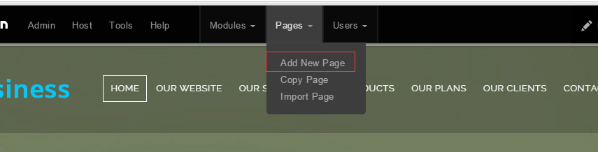
- Fill in Page Name and Page Title. Texts for Page Title needs to be the same as that of data-title.
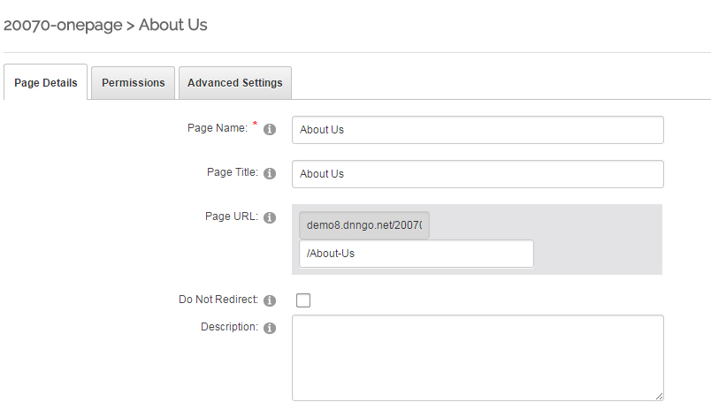
- Put the anchor code to HTML module of the page. It will scroll to the corresponding area on the page when clicking the top menu texts.
- <div data-title="About Us" class="anchorTag" data-offset="-60" data-scrollshownav="true" data-menuanchor="true"> </div>
Banner area
Below is the screen shot:
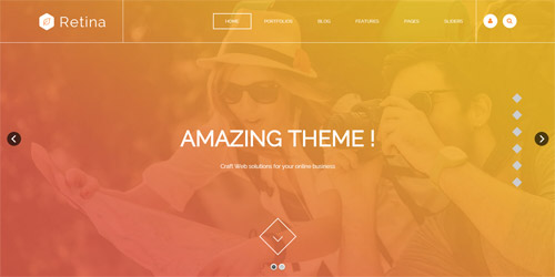
It is using DNNGo LayerGalleryPro module here,you can import ContentListEntity-Home3.xml of the DNNGo_LayerGalleryPro folder to duplicate banner of the demo.
About Us area
Below is the screen shot:
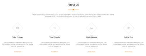
Codes are as follows:
<div class="anchorTag" data-title="About Us"> </div>
<div class="pb-60">
  <div class="dnn_layout">
    <div class="content_mid clearfix">
      <div class="pane_layout">
        <div class="row">
          <div class="col-sm-12">
            <h5 class="home4_con_title1">About Us</h5>
            <div class="home4_con_tltle1linebox">
              <div class="home4_con_title1line"></div>
            </div>
            <div class="home1_con_titlep">content text ...</div>
          </div>
          <div class="col-sm-6 col-md-3">
            <div class="home4_cona mt-50 animation fadeInUp delay1">
              <div class="icon_box"> <span class="fa fa-camera"></span> </div>
              <h5>Take Pictures</h5>
              <p>Cum sociis natoque penatibus et magnis.Diam consectetur diam ac nibh auctor ultricies auctor ultricies in luctus id.</p>
              <a target="blank" href="#">Read More</a> </div>
          </div>
          <div class="col-sm-6 col-md-3">
            <div class="home4_cona mt-50 animation fadeInUp delay2">
              <div class="icon_box"> <span class="fa fa-star-o"></span> </div>
              <h5>Your Favorite</h5>
              <p>Cum sociis natoque penatibus et magnis.Diam consectetur diam ac nibh auctor ultricies auctor ultricies in luctus id.</p>
              <a target="blank" href="#">Read More</a> </div>
          </div>
          <div class="col-sm-6 col-md-3">
            <div class="home4_cona mt-50 animation fadeInUp delay3">
              <div class="icon_box"> <span class="fa fa-picture-o"></span> </div>
              <h5>Photo Gallery</h5>
              <p>Cum sociis natoque penatibus et magnis.Diam consectetur diam ac nibh auctor ultricies auctor ultricies in luctus id.</p>
              <a target="blank" href="#">Read More</a> </div>
          </div>
          <div class="col-sm-6 col-md-3">
            <div class="home4_cona mt-50 animation fadeInUp delay4">
              <div class="icon_box"> <span class="fa fa-coffee"></span> </div>
              <h5>Coffee Cup</h5>
              <p>Cum sociis natoque penatibus et magnis.Diam consectetur diam ac nibh auctor ultricies auctor ultricies in luctus id.</p>
              <a target="blank" href="#">Read More</a> </div>
          </div>
        </div>
      </div>
    </div>
  </div>
</div>
Option:
col-sm-* col-xs-*is the width of each column, you can change the width you need through value1~12.- You can modify
animationto change the animation on the slide. Animation list. - You can modify
fato change icons. font icon list.
Who We Are area
Below is the screen shot:
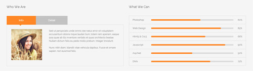
Codes are as follows:
<div class="SectionStyles2 pb-60">
  <div class="dnn_layout">
    <div class="content_mid clearfix">
      <div class="pane_layout">
        <div class="row">
          <div class="col-sm-6">
            <div class="home4_conb pt-60 animation fadeInLeft">
              <h5>Who We Are</h5>
              <div class="horizontalTab_Top horizontalTab_Top_1">
                <ul class="resp-tabs-list clearfix">
                  <li><span>Info</span></li>
                  <li><span>Detail</span></li>
                </ul>
                <div class="resp-tabs-container">
                  <div class="resp_container">
                    <div class="resp_margin">
                      <p><img alt="" src="/portals/8/home4_conb1.jpg" />Content text ...<br />
                        <br />
                        Nunc nibh diam, blandit vitae vehicula dapibus. Fusce et ornare sapien, non euismod felis. </p>
                    </div>
                  </div>
                  <div class="resp_container">
                    <div class="resp_margin">
                      <p>Fugiat dapibus, tellus ac cursus commodo, mauris sit condim eser ntumsi nibh, uum a justo vitaes amet risus amets un. Posi sectetut amet fermntum orem ipsum. sed diam non umy at volutpat. </p>
                    </div>
                  </div>
                </div>
              </div>
            </div>
          </div>
          <div class="col-sm-6">
            <div class="home4_conb pt-60 animation fadeInRight">
              <h5>What We Can</h5>
              <ul class="loaded_list3">
                <li>
                  <p>Photoshop </p>
                  <div class="progress progress-striped active">
                    <div class="bar animation animationwidth" data-width="60%"><span></span></div>
                  </div>
                </li>
                <li>
                  <p>Web Design </p>
                  <div class="progress progress-striped active">
                    <div class="bar animation animationwidth" data-width="85%"><span></span></div>
                  </div>
                </li>
                <li>
                  <p>Html5 & Css3</p>
                  <div class="progress progress-striped active">
                    <div class="bar animation animationwidth" data-width="66%"><span></span></div>
                  </div>
                </li>
                <li>
                  <p>Javascript</p>
                  <div class="progress progress-striped active">
                    <div class="bar animation animationwidth" data-width="90%"><span></span> </div>
                  </div>
                </li>
                <li>
                  <p>Asp.Net</p>
                  <div class="progress progress-striped active">
                    <div class="bar animation animationwidth" data-width="50%"><span></span></div>
                  </div>
                </li>
                <li>
                  <p>DNN</p>
                  <div class="the6 progress progress-striped active">
                    <div class="bar animation animationwidth" data-width="72%"><span></span></div>
                  </div>
                </li>
              </ul>
            </div>
          </div>
        </div>
      </div>
    </div>
  </div>
</div>
Option:
- This is a SectionStyles effect.
col-sm-*is the width of each column, you can change the width you need through value1~12.- This is a
Responsive Tabeffect.ResponsiveTab - You can change the value you need to display through
data-width - You can modify
animationto change the animation on the slide. Animation list.
Portfolios area
Below is the screen shot:
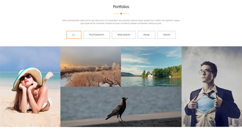
Codes are as follows:
<div class="anchorTag" data-title="Portfolios"> </div>
<div class="pb-60 pt-60">
  <div class="dnn_layout">
    <div class="content_mid clearfix">
      <div class="pane_layout">
        <div class="row">
          <div class="col-sm-12">
            <h5 class="home4_con_title1">Portfolios</h5>
            <div class="home4_con_tltle1linebox">
              <div class="home4_con_title1line"></div>
            </div>
            <div class="home1_con_titlep">content text ... </div>
          </div>
        </div>
      </div>
    </div>
  </div>
  <div class="isotope_grid isotope_1 animation zoomIn">
    <div class="isotope_group"> <a data-filter="*" href="#" class="active">All</a> <a data-filter=".photography" href="#">PHOTOGRAPHY</a> <a data-filter=".webdesign" href="#">WEB DESIGN</a> <a data-filter=".image" href="#">IMAGE</a> <a data-filter=".videos" href="#">VIDEOS</a></div>
    <div class="loading">
      <div class="loading-container container1">
        <div class="circle1"></div>
        <div class="circle2"></div>
        <div class="circle3"></div>
        <div class="circle4"></div>
      </div>
      <div class="loading-container container2">
        <div class="circle1"></div>
        <div class="circle2"></div>
        <div class="circle3"></div>
        <div class="circle4"></div>
      </div>
      <div class="loading-container container3">
        <div class="circle1"></div>
        <div class="circle2"></div>
        <div class="circle3"></div>
        <div class="circle4"></div>
      </div>
    </div>
    <div data-min-width="390" class="isotope_main">
      <div class="isotope_item image">
        <div class="photo_box img_zoom ico_zoom"> <a target="blank" href="#">
          <div class="pic_box"> <img alt="" src="http://demo8.dnngo.net/Portals/8/isotope_img_01.jpg" />
            <div class="content">
              <div class="vertical_center_1">
                <div class="vertical_center_2">
                  <div class="ico"><span class="fa fa-plus"></span></div>
                </div>
              </div>
            </div>
            <div class="shade"></div>
          </div>
          </a> </div>
      </div>
      <div class="isotope_item  photography">
        <div class="photo_box img_zoom ico_zoom"> <a target="blank" href="#">
          <div class="pic_box"> <img alt="" src="http://demo8.dnngo.net/Portals/8/isotope_img_02.jpg" />
            <div class="content">
              <div class="vertical_center_1">
                <div class="vertical_center_2">
                  <div class="ico"><span class="fa fa-plus"></span></div>
                </div>
              </div>
            </div>
            <div class="shade"></div>
          </div>
          </a> </div>
      </div>
      <div class="isotope_item webdesign">
        <div class="photo_box img_zoom ico_zoom"> <a target="blank" href="#">
          <div class="pic_box"> <img alt="" src="http://demo8.dnngo.net/Portals/8/isotope_img_03.jpg" />
            <div class="content">
              <div class="vertical_center_1">
                <div class="vertical_center_2">
                  <div class="ico"><span class="fa fa-plus"></span></div>
                </div>
              </div>
            </div>
            <div class="shade"></div>
          </div>
          </a> </div>
      </div>
      <div class="isotope_item videos" data-zoom="2">
        <div class="photo_box img_zoom ico_zoom"> <a target="blank" href="#">
          <div class="pic_box"> <img alt="" src="http://demo8.dnngo.net/Portals/8/isotope_img_04.jpg" />
            <div class="content">
              <div class="vertical_center_1">
                <div class="vertical_center_2">
                  <div class="ico"><span class="fa fa-plus"></span></div>
                </div>
              </div>
            </div>
            <div class="shade"></div>
          </div>
          </a> </div>
      </div>
      <div class="isotope_item image photography webdesign videos">
        <div class="photo_box img_zoom ico_zoom"> <a target="blank" href="#">
          <div class="pic_box"> <img alt="" src="http://demo8.dnngo.net/Portals/8/isotope_img_05.jpg" />
            <div class="content">
              <div class="vertical_center_1">
                <div class="vertical_center_2">
                  <div class="ico"><span class="fa fa-plus"></span></div>
                </div>
              </div>
            </div>
            <div class="shade"></div>
          </div>
          </a> </div>
      </div>
    </div>
  </div>
  <div class="isotope_1_bottom pt-60"> <a class="Button_style2" target="blank" href="#">Load More</a> </div>
</div>
Option:
- You can add
<a data-filter=".FilterName" href="#">Filter Name</a>to increase categories.data-filter=".FilterName"can not be blank space. - You can modify
data-min-widthto change minimum width of image. - You can modify
isotope_itemFilterNameto categorize images. col-sm-*is the width of each column, you can change the width you need through value1~12.- You can modify
fato change icons. font icon list. - You can modify
animationto change the animation on the slide. Animation list.
Services area
Below is the screen shot:
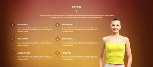
Codes are as follows:
<div class="anchorTag" data-title="Services"> </div>
<div class="SectionStyles10 pt-60 pb-60">
  <div class="dnn_layout">
    <div class="content_mid clearfix">
      <div class="pane_layout">
        <div class="row">
          <div class="col-sm-12">
            <h5 class="home4_con_title1">Services</h5>
            <div class="home4_con_tltle1linebox">
              <div class="home4_con_title1line"></div>
            </div>
            <div class="home1_con_titlep">content text ...</div>
          </div>
          <div class="col-md-4 col-sm-6">
            <ul class="home4_conc ">
              <li class="animation fadeInUp delay1"><span>1</span>
                <h6>Retina Ready</h6>
                <p>Donec in ut odio libero, at vulputate urna nulla tristique mi a massa convallis cursus. etiamnon euismod felis. Integer risus quis diam gravida.</p>
              </li>
              <li class="animation fadeInUp delay3"><span>3</span>
                <h6>Full Support</h6>
                <p>Donec in ut odio libero, at vulputate urna nulla tristique mi a massa convallis cursus. etiamnon euismod felis. Integer risus quis diam gravida.</p>
              </li>
              <li class="animation fadeInUp delay5"><span>5</span>
                <h6>Awesome THeme</h6>
                <p>Donec in ut odio libero, at vulputate urna nulla tristique mi a massa convallis cursus. etiamnon euismod felis. Integer risus quis diam gravida.</p>
              </li>
            </ul>
          </div>
          <div class="col-md-4 col-sm-6">
            <ul class="home4_conc">
              <li class="animation fadeInUp delay2"><span>2</span>
                <h6>Custom Skin</h6>
                <p>Donec in ut odio libero, at vulputate urna nulla tristique mi a massa convallis cursus. etiamnon euismod felis. Integer risus quis diam gravida.</p>
              </li>
              <li class="animation fadeInUp delay4"><span>4</span>
                <h6>Dnn Website</h6>
                <p>Donec in ut odio libero, at vulputate urna nulla tristique mi a massa convallis cursus. etiamnon euismod felis. Integer risus quis diam gravida.</p>
              </li>
              <li class="animation fadeInUp delay6"><span>6</span>
                <h6>Templates</h6>
                <p>Donec in ut odio libero, at vulputate urna nulla tristique mi a massa convallis cursus. etiamnon euismod felis. Integer risus quis diam gravida.</p>
              </li>
            </ul>
          </div>
          <div class="col-sm-4"> </div>
        </div>
      </div>
    </div>
  </div>
</div>
Option:
- This is a SectionStyles effect.
col-sm-* col-xs-*is the width of each column, you can change the width you need through value1~12.- You can modify
animationto change the animation on the slide. Animation list.
Recent Blogs area
Below is the screen shot:
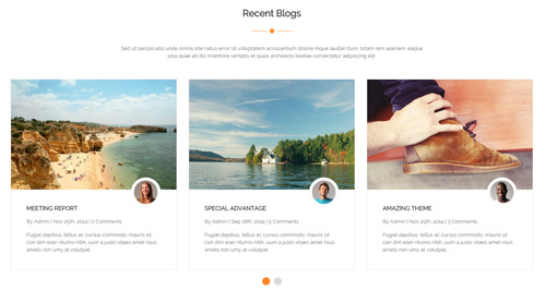
Codes are as follows:
<div class="anchorTag" data-title="Recent Blogs"> </div>
<div class="pb-60 pt-60">
  <div class="dnn_layout">
    <div class="content_mid clearfix">
      <div class="pane_layout">
        <div class="row">
          <div class="col-sm-12">
            <h5 class="home4_con_title1">Recent Blogs</h5>
            <div class="home4_con_tltle1linebox">
              <div class="home4_con_title1line"></div>
            </div>
            <div class="home1_con_titlep">content text ... </div>
            <div class="carousel carousel_2" data-autoheight="false" data-navigation="false" data-autoplay="5000">
              <div class="item"> <img alt="" src="/portals/8/carousel_2_p1.jpg" />
                <div class="img"><img alt="" src="/portals/8/carousel_2_p1_1.jpg" /></div>
                <div class="item_box">
                  <h6>Meeting Report</h6>
                  <span>By Admin   |   Nov 25th, 2014   |   0 Comments</span>
                  <p>Fugiat dapibus, tellus ac cursus commodo, mauris sit con dim eser ntumsi nibh, uum a justo vitaes amet risus amets  non umy at volutpat.</p>
                </div>
              </div>
              <div class="item"> <img alt="" src="/portals/8/carousel_2_p2.jpg" />
                <div class="img"><img alt="" src="/portals/8/carousel_2_p2_1.jpg" /></div>
                <div class="item_box">
                  <h6>Special Advantage</h6>
                  <span>By Admin   |   Sep 18th, 2014   |   5 Comments</span>
                  <p>Fugiat dapibus, tellus ac cursus commodo, mauris sit con dim eser ntumsi nibh, uum a justo vitaes amet risus amets  non umy at volutpat.</p>
                </div>
              </div>
              <div class="item"> <img alt="" src="/portals/8/carousel_2_p3.jpg" />
                <div class="img"><img alt="" src="/portals/8/carousel_2_p3_1.jpg" /></div>
                <div class="item_box">
                  <h6>Amazing Theme</h6>
                  <span>By Admin   |   Nov 25th, 2014   |   3 Comments</span>
                  <p>Fugiat dapibus, tellus ac cursus commodo, mauris sit con dim eser ntumsi nibh, uum a justo vitaes amet risus amets  non umy at volutpat.</p>
                </div>
              </div>
              <div class="item"> <img alt="" src="/portals/8/carousel_2_p1.jpg" />
                <div class="img"><img alt="" src="/portals/8/carousel_2_p1_1.jpg" /></div>
                <div class="item_box">
                  <h6>Meeting Report</h6>
                  <span>By Admin   |   Nov 25th, 2014   |   0 Comments</span>
                  <p>Fugiat dapibus, tellus ac cursus commodo, mauris sit con dim eser ntumsi nibh, uum a justo vitaes amet risus amets  non umy at volutpat.</p>
                </div>
              </div>
              <div class="item"> <img alt="" src="/portals/8/carousel_2_p2.jpg" />
                <div class="img"><img alt="" src="/portals/8/carousel_2_p2_1.jpg" /></div>
                <div class="item_box">
                  <h6>Special Advantage</h6>
                  <span>By Admin   |   Sep 18th, 2014   |   5 Comments</span>
                  <p>Fugiat dapibus, tellus ac cursus commodo, mauris sit con dim eser ntumsi nibh, uum a justo vitaes amet risus amets  non umy at volutpat.</p>
                </div>
              </div>
            </div>
          </div>
        </div>
      </div>
    </div>
  </div>
</div>
Option:
col-sm-*is the width of each column, you can change the width you need through value1~12.- This is a
Carouseleffect. Carousel
Pricing area
Below is the screen shot:
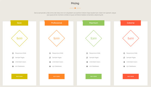
Codes are as follows:
<div class="anchorTag" data-title="Pricing"> </div>
<div class="SectionStyles4 pt-60 pb-60">
  <div class="dnn_layout">
    <div class="content_mid clearfix">
      <div class="pane_layout">
        <div class="row">
          <div class="col-sm-12">
            <h5 class="home4_con_title1">Pricing</h5>
            <div class="home4_con_tltle1linebox">
              <div class="home4_con_title1line"></div>
            </div>
            <div class="home1_con_titlep">content text ...</div>
          </div>
        </div>
        <div class="price-table price-table1 row">
          <div class="col-md-3 col-sm-6 color_1">
            <div class="price_border mt-50 animation fadeInUp delay1">
              <div class="price_title">
                <h2>Basic</h2>
              </div>
              <div class="price_holder">
                <div class="price_box"><span class="sup">$</span><span class="price">100</span> </div>
                <ul>
                  <li><span class="fa fa-power-off"></span>Responsive Web</li>
                  <li><span class="fa fa-refresh"></span>Sample Pages</li>
                  <li><span class="fa fa-star"></span>Unlimited Colors</li>
                  <li><span class="fa fa-gear"></span>100 Databases</li>
                </ul>
                <a class="btn " target="blank" href="#">Buy Now</a> </div>
            </div>
          </div>
          <div class="col-md-3 col-sm-6 color_2">
            <div class="price_border mt-50 animation fadeInUp delay2">
              <div class="price_title ">
                <h2>Professional</h2>
              </div>
              <div class="price_holder">
                <div class="price_box"><span class="sup">$</span><span class="price">200</span> </div>
                <ul>
                  <li><span class="fa fa-power-off"></span>Responsive Web</li>
                  <li><span class="fa fa-refresh"></span>Sample Pages</li>
                  <li><span class="fa fa-star"></span>Unlimited Colors</li>
                  <li><span class="fa fa-gear"></span>150 Databases</li>
                </ul>
                <a class="btn" target="blank" href="#">Buy Now</a> </div>
            </div>
          </div>
          <div class="col-md-3 col-sm-6 color_3">
            <div class="price_border mt-50 animation fadeInUp delay3">
              <div class="price_title">
                <h2>Maxmium</h2>
              </div>
              <div class="price_holder">
                <div class="price_box"><span class="sup">$</span><span class="price">300</span> </div>
                <ul>
                  <li><span class="fa fa-power-off"></span>Responsive Web</li>
                  <li><span class="fa fa-refresh"></span>Sample Pages</li>
                  <li><span class="fa fa-star"></span>Unlimited Colors</li>
                  <li><span class="fa fa-gear"></span>200 Databases</li>
                </ul>
                <a class="btn" target="blank" href="#">Buy Now</a> </div>
            </div>
          </div>
          <div class="col-md-3 col-sm-6 color_4">
            <div class="price_border mt-50 animation fadeInUp delay4">
              <div class="price_title">
                <h2>Extreme</h2>
              </div>
              <div class="price_holder">
                <div class="price_box"><span class="sup">$</span><span class="price">400</span> </div>
                <ul>
                  <li><span class="fa fa-power-off"></span>Responsive Web</li>
                  <li><span class="fa fa-refresh"></span>Sample Pages</li>
                  <li><span class="fa fa-star"></span>Unlimited Colors</li>
                  <li><span class="fa fa-gear"></span>250 Databases</li>
                </ul>
                <a class="btn" target="blank" href="#">Buy Now</a> </div>
            </div>
          </div>
        </div>
      </div>
    </div>
  </div>
</div>
Option:
- This is a SectionStyles effect.
col-sm-* col-md-*is the width of each column, you can change the width you need through value1~12.- You can modify
animationto change the animation on the slide. Animation list. - You can modify
fato change icons. font icon list.
Contact area
Below is the screen shot:
Codes are as follows:
<div class="anchorTag" data-title="Contact"> </div>
<div class="pt-60">
  <div class="dnn_layout">
    <div class="content_mid clearfix">
      <div class="pane_layout">
        <div class="row">
          <div class="col-sm-12">
            <h5 class="home4_con_title1">Contact</h5>
            <div class="home4_con_tltle1linebox">
              <div class="home4_con_title1line"></div>
            </div>
            <div class="home1_con_titlep">content text ... </div>
          </div>
        </div>
      </div>
    </div>
  </div>
</div>
Option:
col-sm-*is the width of each column, you can change the width you need through value1~12.
Content Us area
Below is the screen shot:
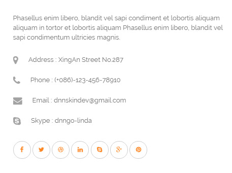
Codes are as follows:
<div class="home4_cond">
  <p>Phasellus enim libero, blandit vel sapi condiment et lobortis aliquam aliquam in tortor et lobortis aliquam Phasellus enim libero, blandit vel sapi condimentum ultricies magnis.</p>
  <ul>
    <li><span class="fa fa-map-marker"></span>Address : XingAn Street No.287</li>
    <li><span class="fa fa-phone"></span>Phone : (+086)-123-456-78910</li>
    <li><span class="fa fa-envelope"></span>Email : dnnskindev@gmail.com</li>
    <li><span class="fa fa-skype"></span>Skype : dnngo-linda</li>
  </ul>
  <a href="#"><span class="fa fa-facebook"></span></a> <a href="#"><span class="fa fa-twitter"></span></a> <a href="#"><span class="fa fa-dribbble"></span></a> <a href="#"><span class="fa fa-linkedin"></span></a> <a href="#"><span class="fa fa-skype"></span></a> <a href="#"><span class="fa fa-google-plus"></span></a> <a href="#"><span class="fa fa-pinterest"></span></a> </div>
Option:
- You can modify
fato change icons. font icon list.
MAP area
Below is the screen shot:
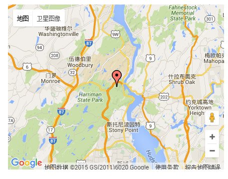
Codes are as follows:
<div id="gmap" style="width: 100%;"></div>
Option:
- You can change
gmapaddress incustom.js
PowerForms area
Below is the screen shot:
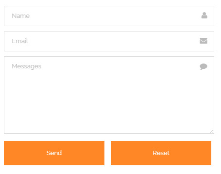
Option:
- This is
Theme_Responsive_20070_home4theme ofDNNGo PowerFormsmodule
Let`s Start Our Business, are you ready ? area
Below is the screen shot:
Codes are as follows:
<div class="SectionStyles2 pt-60 pb-60">
  <div class="dnn_layout">
    <div class="content_mid clearfix">
      <div class="pane_layout">
        <div class="row">
          <div class="col-sm-12">
            <div class="home4_cone animation zoomIn">
              <h2>Let`s Start Our Business, are you ready ?</h2>
            </div>
          </div>
        </div>
      </div>
    </div>
  </div>
</div>
Option:
- This is a SectionStyles effect.
- You can modify
animationto change the animation on the slide. Animation list. col-sm-*is the width of each column, you can change the width you need through value1~12.
About Us area
Below is the screen shot:
Codes are as follows:
<div class="bottom_h">
    <img alt="" src="/portals/8/logo3.png" />
    <p>Donec consectetur diam ac nibh auctor ultricies. Integer mauris lacus, consequat in luctus id, semp er sed felis. Cum sociis natoque penatibus et lectus turpis varius lorem, eu posuere magnis ermentum nunc.</p>
    <a target="blank" href="#">> More Information</a>
</div>
Option:
Containeris usingContainer-2
Stay Connected area
Below is the screen shot:
Codes are as follows:
<div class="bottom_i">
  <ul class="clearfix">
    <li class="the1"> <a class="fa fa-facebook" href="#"></a>
      <p>1580+</p>
    </li>
    <li class="the2"> <a class="fa fa-twitter" href="#"></a>
      <p>796+</p>
    </li>
    <li class="the3"> <a class="fa fa-google-plus" href="#"></a>
      <p>2400+</p>
    </li>
  </ul>
  <p>Fugiat dapibus, tellus ac cursus commodo, mauris sit condim eser ntumsi nibh, Posi sectetut amet fermntum orem ipsum.</p>
</div>
Option:
Containeris usingContainer-2- You can modify
fato change icons. font icon list.
Recent Posts area
Below is the screen shot:
Codes are as follows:
<ul class="bottom_e">
  <li><a target="blank" href="#">Morbi vel dui nec arcu suscipit</a></li>
  <li><a target="blank" href="#">Pellentesque lectus eget quam</a></li>
  <li><a target="blank" href="#">Ullamcorper consectetur</a></li>
  <li><a target="blank" href="#">Vestibulum vitae risus a erat</a></li>
  <li><a target="blank" href="#">Ollis lac in venenatis tellus</a></li>
</ul>
Option:
Containeris usingContainer-2
Photos area
Below is the screen shot:
Codes are as follows:
<div class="bottom_g row">
  <div class="col-sm-4 col-xs-6">
    <div class="photo_box"> <a href="/Portals/8/potots_hbh.jpg" class="LightBox_image_gallery1" title="Image Gallery">
      <div class="pic_box"> <img alt="" src="/portals/8/potots_hbh.jpg" class="img-responsive" />
        <div class="shade"></div>
      </div>
      </a> </div>
  </div>
  <div class="col-sm-4  col-xs-6">
    <div class="photo_box"> <a href="/Portals/8/potots_apic1494.jpg" class="LightBox_image_gallery1" title="Image Gallery">
      <div class="pic_box"> <img alt="" src="/portals/8/potots_apic1494.jpg" class="img-responsive" />
        <div class="shade"></div>
      </div>
      </a> </div>
  </div>
  <div class="col-sm-4  col-xs-6">
    <div class="photo_box"> <a href="/Portals/8/potots_dnngo-11.jpg" class="LightBox_image_gallery1" title="Image Gallery">
      <div class="pic_box"> <img alt="" src="/portals/8/potots_dnngo-11.jpg" class="img-responsive" />
        <div class="shade"></div>
      </div>
      </a> </div>
  </div>
  <div class="col-sm-4  col-xs-6">
    <div class="photo_box"> <a href="/Portals/8/potots_psds32202.jpg" class="LightBox_image_gallery1" title="Image Gallery">
      <div class="pic_box"> <img alt="" src="/portals/8/potots_psds32202.jpg" class="img-responsive" />
        <div class="shade"></div>
      </div>
      </a> </div>
  </div>
  <div class="col-sm-4  col-xs-6">
    <div class="photo_box"> <a href="/Portals/8/potots_chuangyisj68.jpg" class="LightBox_image_gallery1" title="Image Gallery">
      <div class="pic_box"> <img alt="" src="/portals/8/potots_chuangyisj68.jpg" class="img-responsive" />
        <div class="shade"></div>
      </div>
      </a> </div>
  </div>
  <div class="col-sm-4  col-xs-6">
    <div class="photo_box"> <a href="/Portals/8/potots_fe10667.jpg" class="LightBox_image_gallery1" title="Image Gallery">
      <div class="pic_box"> <img alt="" src="/portals/8/potots_fe10667.jpg" class="img-responsive" />
        <div class="shade"></div>
      </div>
      </a> </div>
  </div>
</div>
Option:
Containeris usingContainer-2- This is a
LightBoxeffect.LightBox col-sm-* col-xs-*is the width of each column, you can change the width you need through value1~12.
HomeVersion5
You can click the link to check HomeVersion5 demo. HomeVersion5
Banner area
Below is the screen shot:
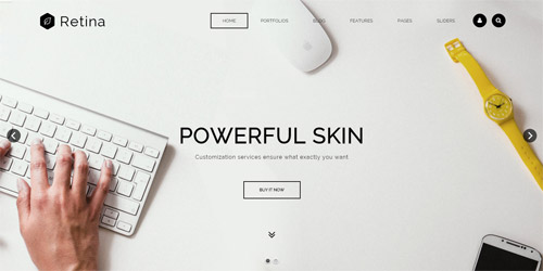
It is using DNNGo LayerGalleryPro module here,you can import ContentListEntity-Home3.xml of the DNNGo_LayerGalleryPro folder to duplicate banner of the demo.
DNN MODULES area
Below is the screen shot:
Codes are as follows:
<div class="dnn_layout">
  <div class="content_mid clearfix">
    <div class="pane_layout">
      <div class="row">
        <div class="col-sm-6 col-md-3">
          <div class="home5_cona mb-60 animation fadeInUp delay1">
            <div class="icon_box"> <span class="fa fa-archive"></span> </div>
            <h5>DNN Modules</h5>
            <p>Donec in ut odio libero, at vulputate urna nulla tristique mi a massa convallis cursus. etiam.</p>
            <a target="blank" href="#">Read More</a> </div>
        </div>
        <div class="col-sm-6 col-md-3">
          <div class="home5_cona mb-60 animation fadeInUp delay2">
            <div class="icon_box"> <span class="fa fa-briefcase"></span> </div>
            <h5>New Product</h5>
            <p>Donec in ut odio libero, at vulputate urna nulla tristique mi a massa convallis cursus. etiam.</p>
            <a target="blank" href="#">Read More</a> </div>
        </div>
        <div class="col-sm-6 col-md-3">
          <div class="home5_cona mb-60 animation fadeInUp delay3">
            <div class="icon_box"> <span class="fa fa-coffee"></span> </div>
            <h5>Coffee Time</h5>
            <p>Donec in ut odio libero, at vulputate urna nulla tristique mi a massa convallis cursus. etiam.</p>
            <a target="blank" href="#">Read More</a> </div>
        </div>
        <div class="col-sm-6 col-md-3">
          <div class="home5_cona mb-60 animation fadeInUp delay4">
            <div class="icon_box"> <span class="fa fa-envelope"></span> </div>
            <h5>Write Email</h5>
            <p>Donec in ut odio libero, at vulputate urna nulla tristique mi a massa convallis cursus. etiam.</p>
            <a target="blank" href="#">Read More</a> </div>
        </div>
      </div>
    </div>
  </div>
</div>
Option:
col-sm-* col-md-*is the width of each column, you can change the width you need through value1~12.- You can modify
animationto change the animation on the slide. Animation list. - You can modify
fato change icons. font icon list.
AMAZING FEATURED THEME area
Below is the screen shot:
Codes are as follows:
<div class="SectionStyles2 pb-60 pt-60">
  <div class="dnn_layout">
    <div class="content_mid clearfix">
      <div class="pane_layout">
        <div class="row">
          <div class="col-sm-5">
            <div class="home5_conb animation fadeInLeft"> <img alt="" class="img-responsive" src="/portals/8/home5_conb.jpg" /> </div>
          </div>
          <div class="col-sm-7">
            <div class="home5_conb animation fadeInRight">
              <h3>Amazing Featured Theme</h3>
              <div class="line"></div>
              <p>Content text ...</p>
              <ul>
                <li><span class="fa fa-power-off"></span>Morbi vel dui nec arcu suscipit orem ipsu</li>
                <li><span class="fa fa-refresh"></span>Pellentesque lectus eget quam</li>
                <li><span class="fa fa-star"></span>Ullamcorper consectetur mauris sit</li>
                <li><span class="fa fa-gear"></span>Vestibulum vitae risus a erat</li>
              </ul>
              <ul>
                <li><span class="fa fa-cloud-download"></span>Lorem ipsum dolor sit amet, consec</li>
                <li><span class="fa fa-arrows"></span>Tetuer adipiscing elit. Donec libero</li>
                <li><span class="fa fa-dot-circle-o"></span>Suspendisse purus nec placerat bibend</li>
                <li><span class="fa fa-crop"></span>Bibendum. Cras id urna. Morbi tinci</li>
              </ul>
              <div class="clearfix"></div>
              <a target="blank" href="#">More Features</a> </div>
          </div>
        </div>
      </div>
    </div>
  </div>
</div>
Option:
- This is a SectionStyles effect.
- You can modify
fato change icons. font icon list. col-sm-*is the width of each column, you can change the width you need through value1~12.- You can modify
animationto change the animation on the slide. Animation list.
APPEALING SKINS AND VERSATILE MODULES area
Below is the screen shot:

Codes are as follows:
<div class="SectionStyles11">
  <div class="dnn_layout">
    <div class="content_mid clearfix">
      <div class="pane_layout">
        <div class="row">
          <div class="col-sm-12">
            <div class="home5_conc animation zoomIn">
              <h1> Appealing skins and <span>versatile</span> modules</h1>
              <p>Our skins and modules are creative, SEO friendly and engaging.</p>
              <a target="blank" href="#" class="Button_style3">Learn More</a><a target="blank" href="#" class="Button_style3">View Demo</a> </div>
          </div>
        </div>
      </div>
    </div>
  </div>
</div>
Option:
- This is a SectionStyles effect.
- You can modify
animationto change and delete animation. Animation list.
WORK PROCESS area
Below is the screen shot:
Codes are as follows:
<div class="pb-60 pt-60">
  <div class="dnn_layout">
    <div class="content_mid clearfix">
      <div class="pane_layout">
        <div class="row">
          <div class="col-sm-12">
            <h6 class="home5_con_title1">How We Work</h6>
            <h3 class="home5_con_title2">Work Process</h3>
            <div class="home5_con_titleline"></div>
            <div class="home1_con_titlep">content text ...</div>
            <ul class="home5_cond clearfix animation zoomIn">
              <li class="mt-30">
                <div class="icon_box"> 01 </div>
                <h5>DNN Analysis</h5>
                <div class="line"></div>
                <p>Morbi tincidunt, convallis aliquam, lectus turpis varius lorem, suere nunc.</p>
              </li>
              <li class="mt-30">
                <div class="icon_box"> 02 </div>
                <h5>Web Design</h5>
                <div class="line"></div>
                <p>Morbi tincidunt, convallis aliquam, lectus turpis varius lorem, suere nunc.</p>
              </li>
              <li class="mt-30">
                <div class="icon_box"> 03 </div>
                <h5>Develop Skin</h5>
                <div class="line"></div>
                <p>Morbi tincidunt, convallis aliquam, lectus turpis varius lorem, suere nunc.</p>
              </li>
              <li class="mt-30">
                <div class="icon_box"> 04 </div>
                <h5>Program Test</h5>
                <div class="line"></div>
                <p>Morbi tincidunt, convallis aliquam, lectus turpis varius lorem, suere nunc.</p>
              </li>
              <li class="mt-30">
                <div class="icon_box"> 05 </div>
                <h5>Renovate Bugs</h5>
                <div class="line"></div>
                <p>Morbi tincidunt, convallis aliquam, lectus turpis varius lorem, suere nunc.</p>
              </li>
            </ul>
          </div>
        </div>
      </div>
    </div>
  </div>
</div>
Option:
col-sm-*is the width of each column, you can change the width you need through value1~12.- You can modify
animationto change the animation on the slide. Animation list.
LATEST WORKS area
Below is the screen shot:
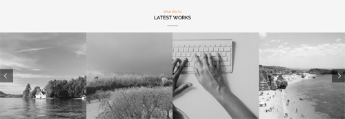
Codes are as follows:
<div class="SectionStyles2 pt-60">
  <div class="dnn_layout">
    <div class="content_mid clearfix">
      <div class="pane_layout">
        <div class="row">
          <div class="col-sm-12">
            <h6 class="home5_con_title1">What We Do</h6>
            <h3 class="home5_con_title2">Latest Works</h3>
            <div class="home5_con_titleline"></div>
          </div>
        </div>
      </div>
    </div>
  </div>
  <div class="carousel carousel_3" data-autoheight="false" data-pagination="false">
    <div class="item">
      <div class="photo_box  ico_LeftAndRight_enter content_bottom_push_in">
        <div class="pic_box"> <img alt="" src="/portals/8/carousel_3_1.jpg" />
          <div class="content">
            <h3>Modules Development</h3>
            <p>December 15th,2014</p>
          </div>
        </div>
      </div>
    </div>
    <div class="item">
      <div class="photo_box  ico_LeftAndRight_enter content_bottom_push_in">
        <div class="pic_box"> <img alt="" src="/portals/8/carousel_3_2.jpg" />
          <div class="content">
            <h3>Modules Development</h3>
            <p>December 15th,2014</p>
          </div>
        </div>
      </div>
    </div>
    <div class="item">
      <div class="photo_box  ico_LeftAndRight_enter content_bottom_push_in">
        <div class="pic_box"> <img alt="" src="/portals/8/carousel_3_3.jpg" />
          <div class="content">
            <h3>Modules Development</h3>
            <p>December 15th,2014</p>
          </div>
        </div>
      </div>
    </div>
    <div class="item">
      <div class="photo_box  ico_LeftAndRight_enter content_bottom_push_in">
        <div class="pic_box"> <img alt="" src="/portals/8/carousel_3_4.jpg" />
          <div class="content">
            <h3>Modules Development</h3>
            <p>December 15th,2014</p>
          </div>
        </div>
      </div>
    </div>
    <div class="item">
      <div class="photo_box  ico_LeftAndRight_enter content_bottom_push_in">
        <div class="pic_box"> <img alt="" src="/portals/8/carousel_3_1.jpg" />
          <div class="content">
            <h3>Modules Development</h3>
            <p>December 15th,2014</p>
          </div>
        </div>
      </div>
    </div>
    <div class="item">
      <div class="photo_box  ico_LeftAndRight_enter content_bottom_push_in">
        <div class="pic_box"> <img alt="" src="/portals/8/carousel_3_2.jpg" />
          <div class="content">
            <h3>Modules Development</h3>
            <p>December 15th,2014</p>
          </div>
        </div>
      </div>
    </div>
  </div>
</div>
Option:
- This is a SectionStyles effect.
- This is a
Carouseleffect. Carousel
OUR EMPLOYEES area
Below is the screen shot:
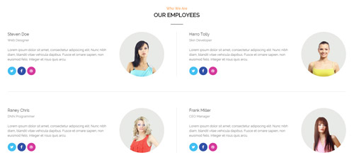
Codes are as follows:
<div class="pt-60">
  <div class="dnn_layout">
    <div class="content_mid clearfix">
      <div class="pane_layout">
        <div class="row">
          <div class="col-sm-12">
            <h6 class="home5_con_title1">Who We Are</h6>
            <h3 class="home5_con_title2">Our Employees</h3>
            <div class="home5_con_titleline"></div>
            <div class="home5_cone clearfix">
              <div class="leftbox clearfix mb-60 animation fadeInUp delay1"> <img alt="" src="/portals/8/home5_cone_1.jpg" />
                <h6>Steven Doe</h6>
                <span>Web Designer</span>
                <p>Lorem ipsum dolor sit amet, consectetur adipiscing elit. Nunc nibh diam, blandit vitae vehicula dapibus. Fusce et ornare sapien, non euismod felis. Integer et risus quis arcu.</p>
                <a href="#" class="the1 fa fa-twitter"></a><a href="#" class="the2 fa fa-facebook"></a><a href="#" class="the3 fa fa-dribbble"></a> </div>
              <div class="rightbox clearfix mb-60 animation fadeInUp delay2"> <img alt="" src="/portals/8/home5_cone_2.jpg" />
                <h6>Harro Tolly</h6>
                <span>Skin Developer</span>
                <p>Lorem ipsum dolor sit amet, consectetur adipiscing elit. Nunc nibh diam, blandit vitae vehicula dapibus. Fusce et ornare sapien, non euismod felis. Integer et risus quis arcu.</p>
                <a href="#" class="the1 fa fa-twitter"></a><a href="#" class="the2 fa fa-facebook"></a><a href="#" class="the3 fa fa-dribbble"></a> </div>
              <div class="line mb-60"></div>
              <div class="leftbox clearfix mb-60 animation fadeInUp delay3"> <img alt="" src="/portals/8/home5_cone_3.jpg" />
                <h6>Raney Chris</h6>
                <span>DNN Programmer</span>
                <p>Lorem ipsum dolor sit amet, consectetur adipiscing elit. Nunc nibh diam, blandit vitae vehicula dapibus. Fusce et ornare sapien, non euismod felis. Integer et risus quis arcu.</p>
                <a href="#" class="the1 fa fa-twitter"></a><a href="#" class="the2 fa fa-facebook"></a><a href="#" class="the3 fa fa-dribbble"></a> </div>
              <div class="rightbox clearfix mb-60 animation fadeInUp delay4"> <img alt="" src="/portals/8/home5_cone_4.jpg" />
                <h6>Frank Miller</h6>
                <span>CEO Manager</span>
                <p>Lorem ipsum dolor sit amet, consectetur adipiscing elit. Nunc nibh diam, blandit vitae vehicula dapibus. Fusce et ornare sapien, non euismod felis. Integer et risus quis arcu.</p>
                <a href="#" class="the1 fa fa-twitter"></a><a href="#" class="the2 fa fa-facebook"></a><a href="#" class="the3 fa fa-dribbble"></a> </div>
            </div>
          </div>
        </div>
      </div>
    </div>
  </div>
</div>
Option:
col-sm-*is the width of each column, you can change the width you need through value1~12.- You can modify
animationto change the animation on the slide. Animation list. - You can modify
fato change icons. font icon list.
TESTIMONIALS area
Below is the screen shot:

Codes are as follows:
<div class="SectionStyles12 pt-60 pb-60">
  <div class="dnn_layout">
    <div class="content_mid clearfix">
      <div class="pane_layout">
        <div class="row">
          <div class="col-sm-12">
            <h6 class="home5_con_title1">What They Say</h6>
            <h3 class="home5_con_title2">Testimonials</h3>
            <div class="home5_con_titleline"></div>
            <div class="sync_carousel  sync_carousel_1 animation zoomIn">
              <div class="carousel_main">
                <div class="item">
                  <p>You guys do a fantastic job.  The skin looks exactly as we expected.  We have now done several skins and even skins that were done 6 months ago, the teams have been great in making the minor changes we request.  We love that you aren't a company that nickels and dimes their customers and I can see us having a nice long relationship.</p>
                  <h6>Rante Smith</h6>
                </div>
                <div class="item">
                  <p>content text ...</p>
                  <h6>Rante Smith</h6>
                </div>
                <div class="item">
                  <p>Lorem ipsum dolor sit amet, consectetur adipiscing elit. Nunc nibh diam, blandit vitae vehicula dapibus. Fusce et ornare sapien, non euismod felis. Integer et risus quis arcu. </p>
                  <h6>Rante Smith</h6>
                </div>
              </div>
              <div class="carousel_nav">
                <div class="item">
                  <div class="out"><img alt="" src="/portals/8/sync_carousel_1_1.png" /></div>
                </div>
                <div class="item">
                  <div class="out"><img alt="" src="/portals/8/sync_carousel_1_2.png" /></div>
                </div>
                <div class="item">
                  <div class="out"><img alt="" src="/portals/8/sync_carousel_1_3.png" /></div>
                </div>
              </div>
            </div>
          </div>
        </div>
      </div>
    </div>
  </div>
</div>
Option:
col-sm-*is the width of each column, you can change the width you need through value1~12.- This is a SectionStyles effect.
- This is a
Testimonialseffect.Testimonials
OUR CAPABILITY area
Below is the screen shot:
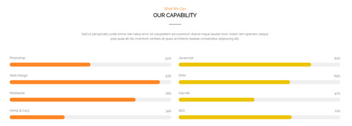
Codes are as follows:
<div class="pt-60">
  <div class="dnn_layout">
    <div class="content_mid clearfix">
      <div class="pane_layout">
        <div class="row">
          <div class="col-sm-12">
            <h6 class="home5_con_title1">What We Can</h6>
            <h3 class="home5_con_title2">Our Capability</h3>
            <div class="home5_con_titleline"></div>
            <div class="home1_con_titlep">content text ...</div>
          </div>
          <div class="col-sm-6">
            <div class="loaded_list4 the1 mt-60">
              <p>Photoshop</p>
              <div class="progress progress-striped active">
                <div class="bar animation animationwidth" data-width="50%"><span></span></div>
              </div>
              <p>Web Design</p>
              <div class="progress progress-striped active">
                <div class="bar animation animationwidth" data-width="93%"><span></span></div>
              </div>
              <p>Mobilesite</p>
              <div class="progress progress-striped active">
                <div class="bar animation animationwidth" data-width="78%"><span></span> </div>
              </div>
              <p>Html5 & Css3</p>
              <div class="the4 progress progress-striped active">
                <div class="bar animation animationwidth" data-width="34%"><span></span></div>
              </div>
            </div>
          </div>
          <div class="col-sm-6">
            <div class="loaded_list4 the2 mt-60">
              <p>Javascript</p>
              <div class="progress progress-striped active">
                <div class="bar animation animationwidth" data-width="82%"><span></span></div>
              </div>
              <p>DNN</p>
              <div class="progress progress-striped active">
                <div class="bar animation animationwidth" data-width="69%"><span></span></div>
              </div>
              <p>Asp.net</p>
              <div class="progress progress-striped active">
                <div class="bar animation animationwidth" data-width="47%"><span></span> </div>
              </div>
              <p>SEO</p>
              <div class="the4 progress progress-striped active">
                <div class="bar animation animationwidth" data-width="70%"><span></span></div>
              </div>
            </div>
          </div>
        </div>
      </div>
    </div>
  </div>
</div>
Option:
col-sm-*is the width of each column, you can change the width you need through value1~12.- This is a
ProgressBars Counterseffect.ProgressBars Counters - You can change the value you need to display through
data-width - You can modify
animationto change the animation on the slide. Animation list.
Carousel area
Below is the screen shot:

Codes are as follows:
<div class="SectionStyles13 pt-60 pb-60">
  <div class="dnn_layout">
    <div class="content_mid clearfix">
      <div class="pane_layout">
        <div class="row">
          <div class="col-sm-12">
            <div data-autoheight="false" data-pagination="false" data-navigation="false" data-autoplay="3000" class="carousel carousel_4">
              <div class="item"> <a target="blank" href="#"><img alt="" src="/portals/8/carousel_4_1.jpg" /></a> </div>
              <div class="item"> <a target="blank" href="#"><img alt="" src="/portals/8/carousel_4_2.jpg" /></a> </div>
              <div class="item"><a target="blank" href="#"> <img alt="" src="/portals/8/carousel_4_3.jpg" /></a> </div>
              <div class="item"><a target="blank" href="#"> <img alt="" src="/portals/8/carousel_4_4.jpg" /></a> </div>
              <div class="item"><a target="blank" href="#"> <img alt="" src="/portals/8/carousel_4_5.jpg" /></a> </div>
              <div class="item"><a target="blank" href="#"> <img alt="" src="/portals/8/carousel_4_1.jpg" /></a> </div>
              <div class="item"><a target="blank" href="#"> <img alt="" src="/portals/8/carousel_4_2.jpg" /> </a></div>
              <div class="item"><a target="blank" href="#"> <img alt="" src="/portals/8/carousel_4_3.jpg" /> </a></div>
              <div class="item"><a target="blank" href="#"> <img alt="" src="/portals/8/carousel_4_4.jpg" /></a> </div>
              <div class="item"><a target="blank" href="#"> <img alt="" src="/portals/8/carousel_4_5.jpg" /></a> </div>
              <div class="item"><a target="blank" href="#"> <img alt="" src="/portals/8/carousel_4_1.jpg" /></a> </div>
              <div class="item"><a target="blank" href="#"> <img alt="" src="/portals/8/carousel_4_2.jpg" /></a> </div>
            </div>
          </div>
        </div>
      </div>
    </div>
  </div>
</div>
Option:
- This is a SectionStyles effect.
- This is a
Carouseleffect. Carousel
Follow Us area
Below is the screen shot:
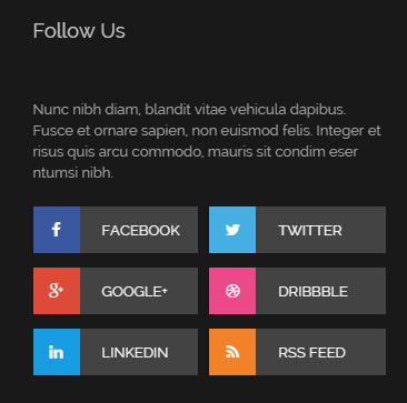
Codes are as follows:
<div class="bottom_j clearfix">
  <p>Nunc nibh diam, blandit vitae vehicula dapibus. Fusce et ornare sapien, non euismod felis. Integer et risus quis arcu commodo, mauris sit condim eser ntumsi nibh.</p>
  <ul class="the1">
    <li><a href="#"><span class="fa fa-facebook the1_1"></span>Facebook</a></li>
    <li><a href="#"><span class="fa fa-google-plus the1_2"></span>Google+</a></li>
    <li><a href="#"><span class="fa fa-linkedin the1_3"></span>linkedin</a></li>
  </ul>
  <ul class="the2">
    <li><a href="#"><span class="fa fa-twitter the1_4"></span>Twitter</a></li>
    <li><a href="#"><span class="fa fa-dribbble the1_5"></span>dribbble</a></li>
    <li><a href="#"><span class="fa fa-rss the1_6"></span>Rss Feed</a></li>
  </ul>
</div>
Option:
- You can modify
fato change icons. font icon list. Containeris usingContainer-2
Links area
Below is the screen shot:
Codes are as follows:
<ul class="bottom_e">
  <li><a target="blank" href="#"><span class="fa fa-play-circle"></span>Top Products</a></li>
  <li><a target="blank" href="#"><span class="fa fa-play-circle"></span>Unlimited Colors</a></li>
  <li><a target="blank" href="#"><span class="fa fa-play-circle"></span>DNN Skin Store</a></li>
  <li><a target="blank" href="#"><span class="fa fa-play-circle"></span>Mobilesite Development</a></li>
  <li><a target="blank" href="#"><span class="fa fa-play-circle"></span>Help Center</a></li>
</ul>
Option:
- You can modify
fato change icons. font icon list. Containeris usingContainer-2
Recent News area
Below is the screen shot:
Codes are as follows:
<ul class="bottom_a">
  <li>
    <div class="img"><img alt="" src="/portals/8/bottom_a4.jpg" /></div>
    <p>Donec in odio libero, vulputate urna nulla tristique mi a massa commodo gravida.</p>
    <span class="date">April 15th, 2014</span> </li>
  <div class="line"></div>
  <li>
    <div class="img"><img alt="" src="/portals/8/bottom_a5.jpg" /></div>
    <p>Donec in odio libero, vulputate urna nulla tristique mi a massa commodo gravida.</p>
    <span class="date">Juyl 08th, 2014</span> </li>
</ul>
Option:
Containeris usingContainer-2
Contact Us area
Below is the screen shot:
Option:
Containeris usingContainer-2- This is
Theme_Responsive_20070_home5theme ofDNNGo PowerFormsmodule
Coming Soon
You can click the link to check Coming Soon demo. Coming Soon
Below is the screen shot:

You can create the coming soon page easily following these steps:
- Create a page named coming soon page.
- Import the ComingSoon.Page.template for this page.
- You can set color, end time, and background image for Coming Soon page through xPlugin, as below:
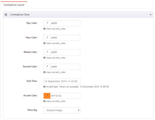
Boxed Layout
You can set Boxed mode in DNNGo.xPlugin > Skins > Options > Content Layout > Content Layout
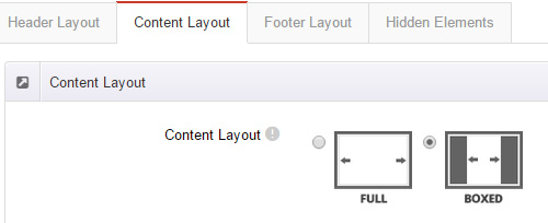
Dark Mode
You can set Dark mode directly in DNNGo.xPlugin > Skins > Options > Content Layout > Content Color Mode.
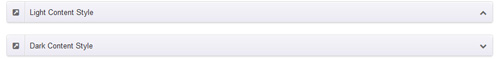
DNNGo_LayerGalleryPro Module
You can see this module in the banner section on the home page, we will guide you step by step to set up the module as the same as our demo site:
- Go to Host –> Extensions –> Install Extension wizard to install the module pack DNNGo_LayerGalleryPro.0x.0x_PA.zip.
- Add DNNGo_LayerGalleryPro module to the BannerPane.
- Click Manager button.
- Click the navigation of the left Import&Export
- Import ContentListEntity.xml file under DNNGo_LayerGalleryPro Module.
- You will see the imported data on Manage List page and you can change the text/image in the banner by clicking Edit button.
- Click this link so you can check the module instruction details.
DNNGo_GalleryPro Module
This module contains 15 responsive sldiers in total.
- Go to Host –> Extensions –> Install Extension wizard to install the module pack DNNGo_DNNGalleryPro_xx.xx.xx_PA.zip.
- Add DNNGo_DNNGalleryPro module to the page.
- Click Effect List tab.
- Choose an effect you like.
- You can click this link to check the module demo.
- Click this link so you can check the module instruction details.
DNNGo_xBlog Module
We use this module on the blog page, click this link so you can check the module instruction details.
DNNGo_PhotoAlbums Module
We use this module on the Portfolios page, click this link so you can check the module instruction details.
DNNGo_PowerForms Module
You can create the form through this module, click this link so you can check the module instruction details.
License interface
- Please login or register your account at http://www.dnngo.net
- Send an email to dnnskindev@gmail.com with your invoice ID, machine Key for every module( different module has different machine key), and your DNNGO username. We will generate an activation code for you. Please note: If your site is a demo site, your license will still be valid when you transfer your site to a live site.
- Manage my licenses
Contact Us
If you have any questions or suggestions about modules/skins or modules/skins installation process, please feel free to contact us.
- Website: www.dnngo.net
- Email: dnnskindev@gmail.com
- Skype: dnngo-linda