20072-UnlimitedColorsPack-054 v3.1.0
Documentation
- Created: 23/10/2015
- Latest update: 18/06/2019
- By: DNNGo
- Email: dnnskindev@gmail.com
Thank you for purchasing my theme. If you have any questions that are beyond the scope of this help file, please feel free to email via my user page contact form here. Thanks so much!
General Information
DotNetNuke Information
To install this skin you must have a working version of Dotnetnuke already installed. If you need help to install Dotnetnuke, follow the instructions in Documentation Center.
What Is Included With Your Package
When you purchase our theme, you will receive one large .zip file that contains everything inside. Unzip that file to get all the content inside. Below is a full list of everything that is included along with a brief description of each item. See the corresponding sections for info on installing the theme.
- Inside the Content folder are: DNN Skins folder, DNNGo_DNNGallery Module folder, DNNGo_LayerGalleryPro folder, DNNGo_PhotoAlbums Module folder, DNNGo_PowerForms Module folder, DNNGo_xPlugin Module folder, DNNGo_xBlog Module folder, PSD folder, Page template.
- DNN Skins folder - The skin in this folder can be used in DNN 8.x, DNN 9.x only.
- DNNGo_DNNGalleryPro Module folder - This module contains 15 responsive sldiers in total.
- DNNGo_LayerGalleryPro folder - You can see this module in the banner section on home page.
- DNNGo_PhotoAlbums folder - You can see this module in Portfolios page.
- DNNGo_PowerForms folder - You can create forms through this module.
- DNNGo_xBlog Module folder - You can see this module on Blog page.
- Page Templates folder - Exported page templates will allow you to reproduce our live demo pages.
Notice: If you bought the theme from DNN Store (http://store.dnnsoftware.com), then none of module files are included in the download package. It only include DNN Skins, DNNGo_xPlugin, Page Templates and PSD files. If you need to purchase modules, please contact us via email (dnnskindev@gmail.com).
What Are The Requirements To Use skins and modules
To use skins and modules, you must be running DNN 8.x or higher. We have tested it with DNN 8.x, DNN 9.x.
Skin and Required Modules Installation
For DNN 8
-
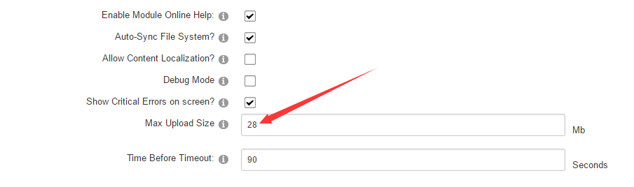
Go to Host-Settings –> Host-Settings, and select the tab Other Settings, changing Max Upload Size to 28 or higher.
-
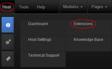
Go to Host –> Extensions –> Install Extension wizard to install the module pack DNNGo_xPlugin_0x.0x.0x_PA.zip
-
Go to Host –> Extensions –> Install Extension wizard to install the skin pack 20072-UnlimitedColorsPack-054-DNNSkins.zip
-
You can install other modules as per your own needs.
-
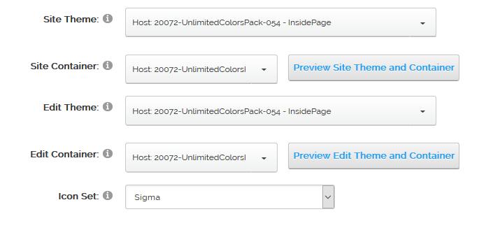
After the installation has been completed, navigate to Admin –> Site Settings –> Basic Settings (tab) –> Appearance (section) and specify portal and edit skins and containers like shown in the screenshot below. It should be done, in order to make your DNN admin UI look correct and readable.
-
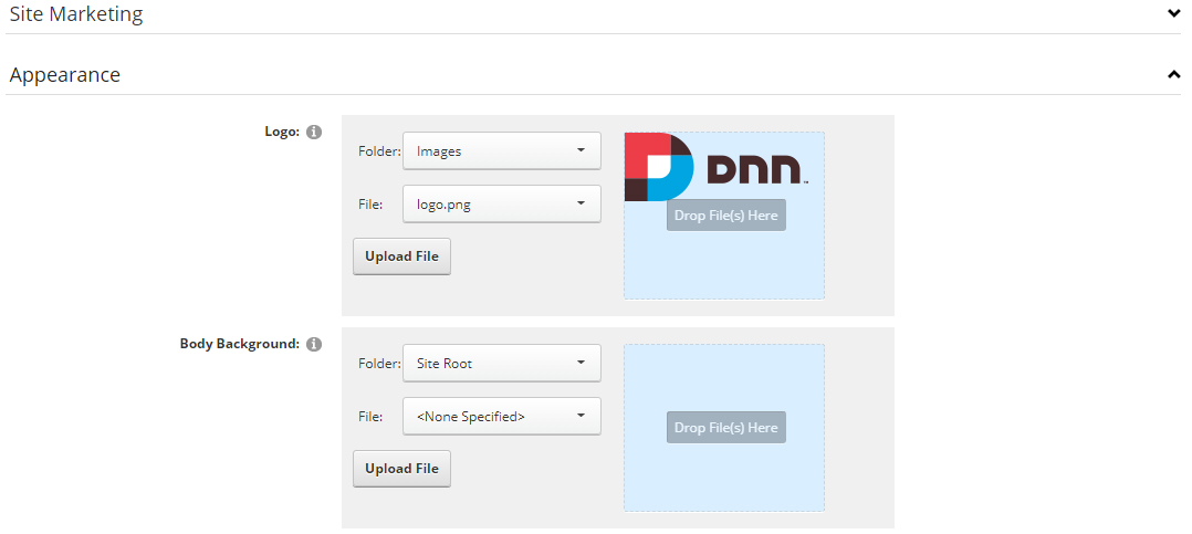
Now you can upload the LOGO image in Admin –> Site Settings –> Basic Settings (tab) –> Appearance (section) page.
For DNN 9
-
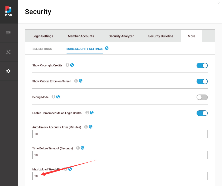
Go to Settings –> Security –> More, and select the tab MORE SECURITY SETTINGS, changing Max Upload Size to 28 or higher.
-
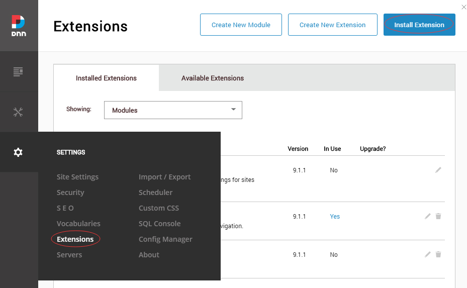
Go to Host –> Extensions –> Install Extension wizard to install the module pack DNNGo_xPlugin_0x.0x.0x_PA.zip
-
Go to Host –> Extensions –> Install Extension wizard to install the skin pack 20072-UnlimitedColorsPack-054-DNNSkins.zip
-
You can install other modules as per your own needs.
-
Manage
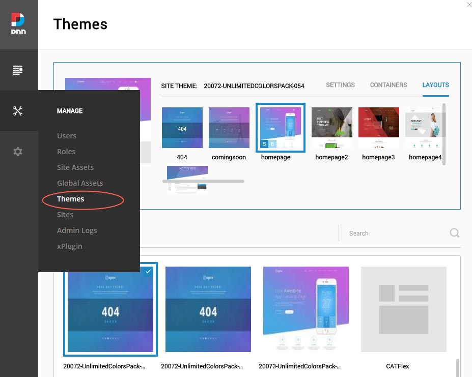
After the installation has been completed, navigate to Manage –> Themes. Select and apply 20072-UnlimitedColorsPack-054
-
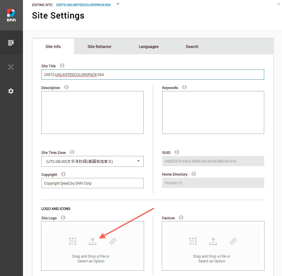
You can upload the LOGO image in Settings –> Site Settings page.
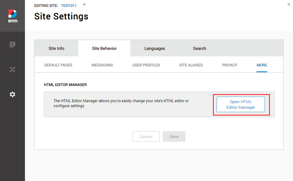
Change the Settings of HTML Editor
By default, HTML editor will remove the div tags whose content is blank. For example: if we add the code <div class=”pt-20″></div> in HTML editor and click save, you will find the code is missing when you edit it afterwards. So we need to change the settings to prevent this from happening.
Log in to your site as super administrator.
Go to SETTINGS > Site Settings > Site Behavior > MORE, click the Open HTML Editor Manager.
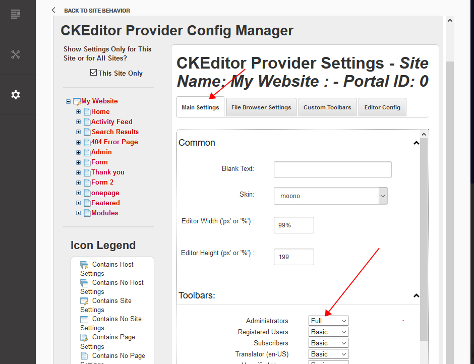
Click the Main Settings tab. Set the value of Administrators to be Full.
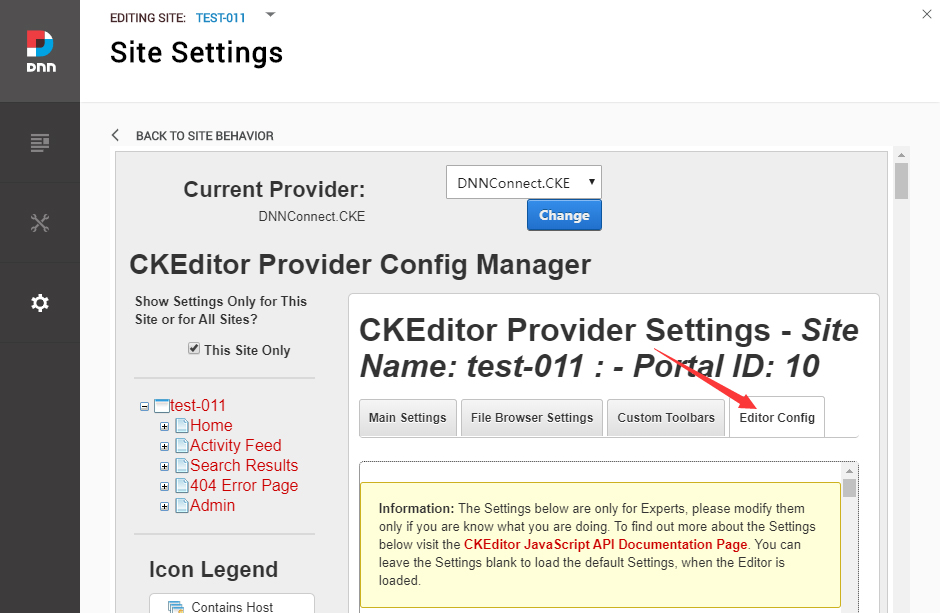
Click the Editor Config tab.
Set the value of AllowedContent to be true.
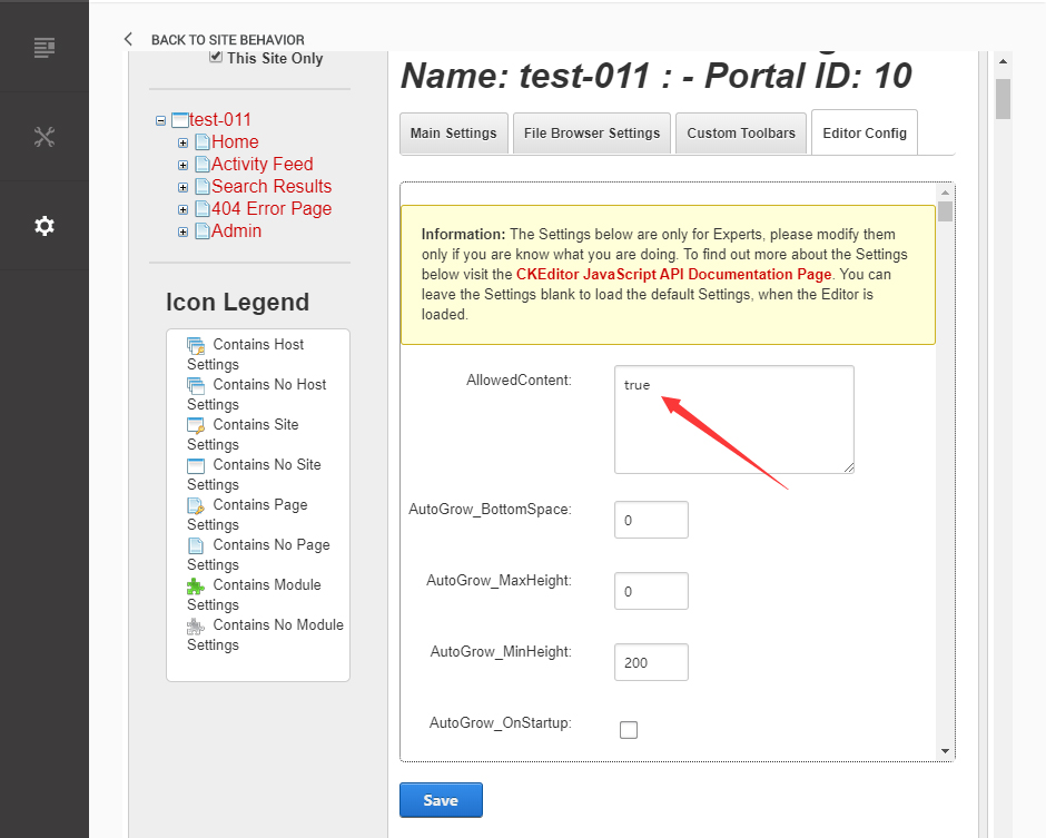
Set the value of FillEmptyBlocks to be false.
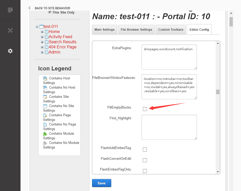
Set the value of ignoreEmptyParagraph to be false.
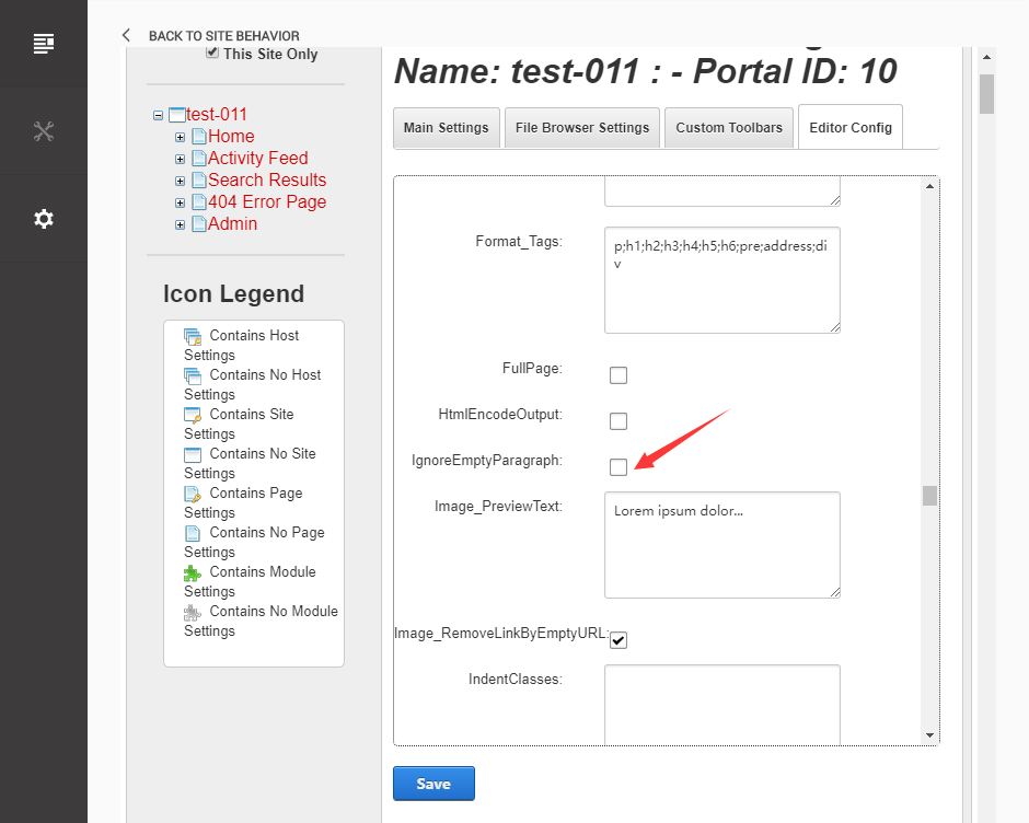
Click the Save button.
How to import page template?
Exported page templates will allow you to reproduce our live demo pages. We'll reproduce the home page as an example.
For DNN 8
-
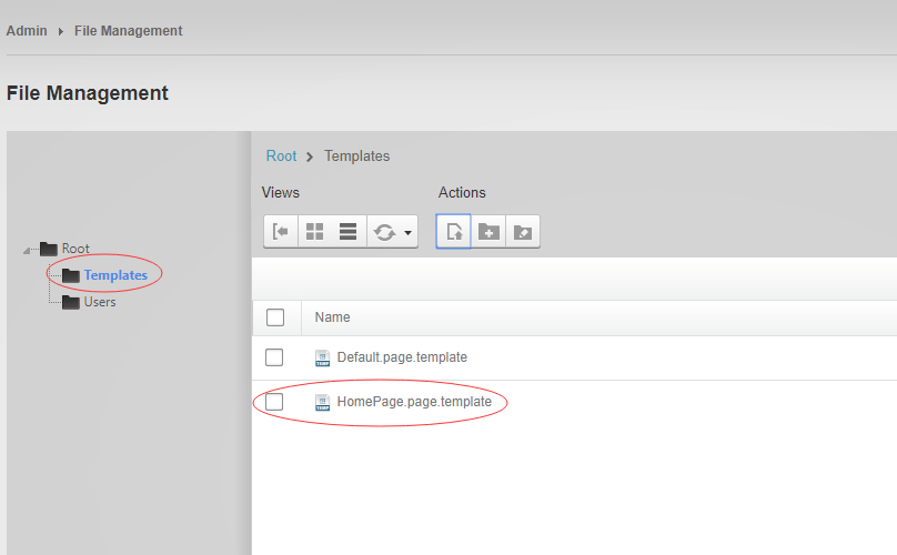
You can find these files in Page Templates Directory.
-
Upload Home.page.template file into your portal root (e.g. Portals/0/Templates/) in the previous chapter and synchronize your folders, you are able to start using page templates to clone live demo pages.
-
Because page templates can not import image files, you need to upload all the photo files of the "images" folder into your portal root (e.g. Portals/0/).
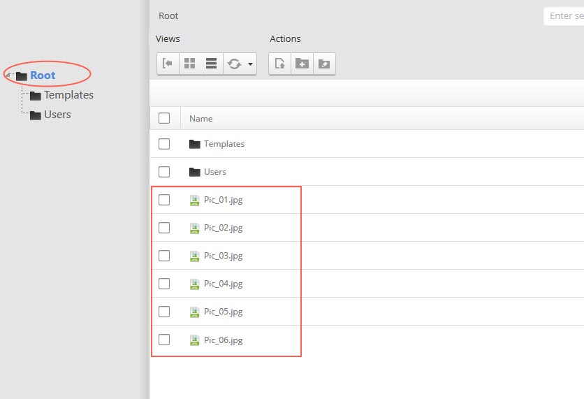
-
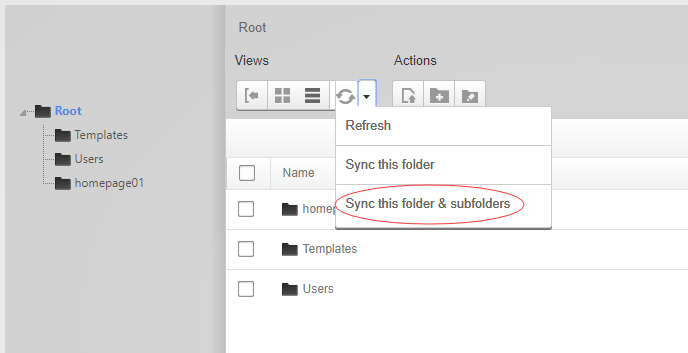
Synchronize the file in Admin > File-Management
-
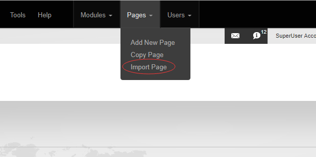
Navigate to the Home page and click Pages -> Import.
-
Find a proper page exported content file navigating to Templates folder and choosing for example Home page.
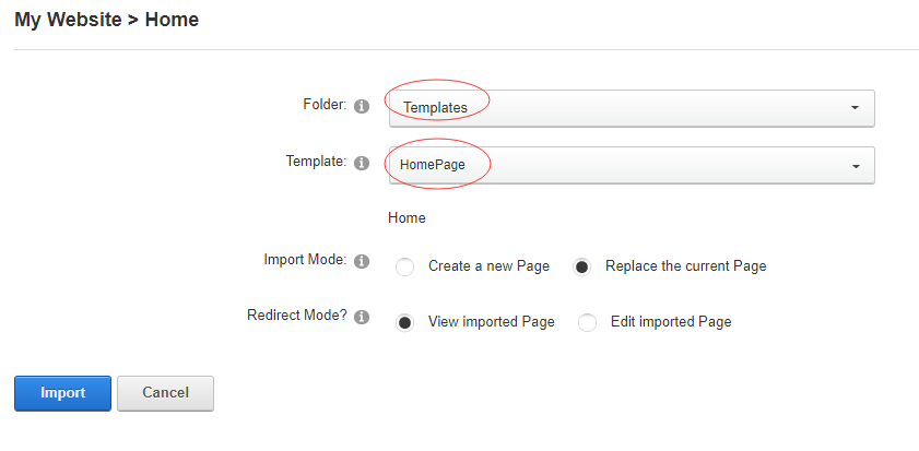
-
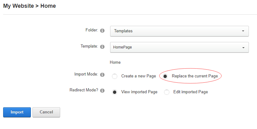
Choose "Replace the current Page" and the redirect mode you need. Please note, if you select "Replace the current Page", content of current page will be reset.
-
Click Import button if everything is correct.
-
Specify page settings according to your needs (necessarily apply HomePage skin to the home page) and click "Update Page". The home page is ready.
For DNN 9
-
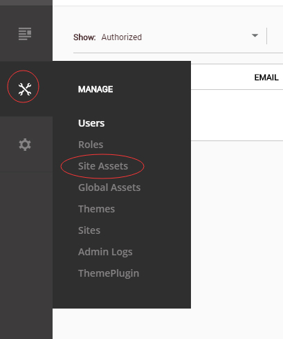
Go to Manage > Site Assets
-
Uploading Home.page.template file to Templates folder
-
Because page templates can not import image files, you need to upload all the photo files of the "images" folder into your portal root (e.g. Portals/0/).
-
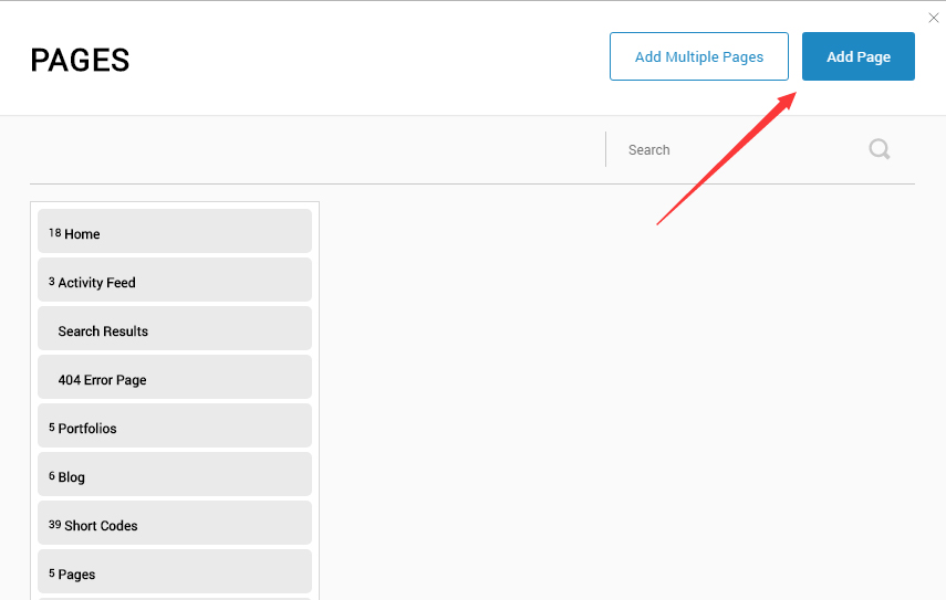
Go to Content > Pages > Add Page
-
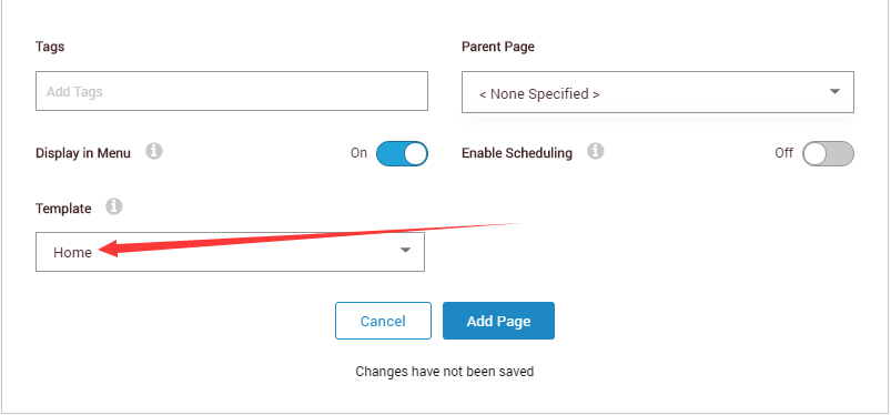
Choose your template from Template drop-down.
- Click Add Page
Note : Page templates can only be imported when you are creating a new page.
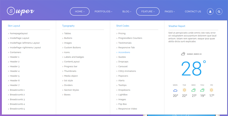
Skin features and how to use them.
Page Template
The product contains page templates for all pages in the live demo, you can copy our demo site by importing the page templates.
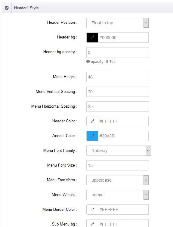
Seven kinds of header layout
You can click the xPlugin button to go to settings page, and then choose different header styles in Header Layout section.
You can click these links to check different header styles. header 1, header 2, header 3, header 4, header 5, header 6, header 7
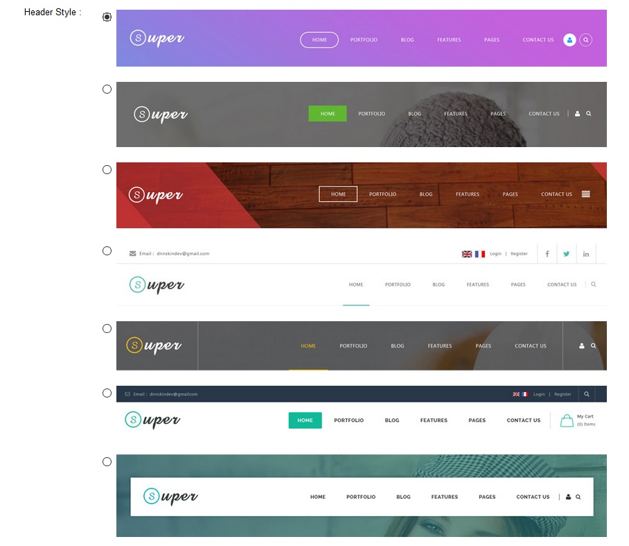
Each header includes very rich setting options, you can modify the color of whatever you would like to . For example: text color, font size and background color etc.
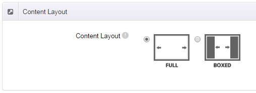
Full Layout and Boxed Layout
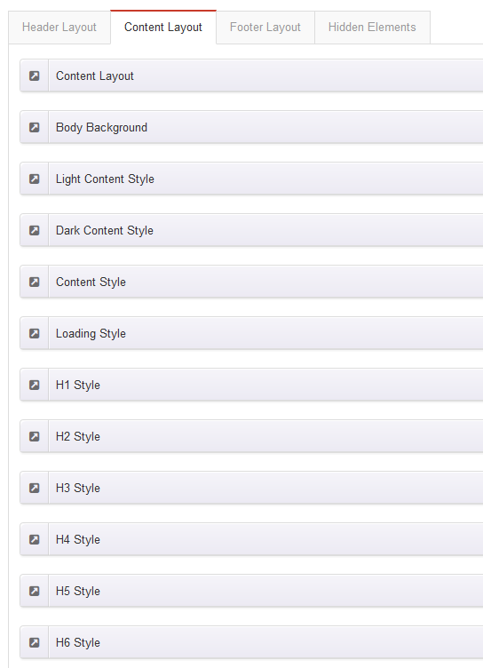
This skin contains Full Layout and Boxed Layout, you can set through Content Layout section.
With Boxed Layout applied, you can still set page background, it will display around the content. You can click link to check demo url of boxed layout.
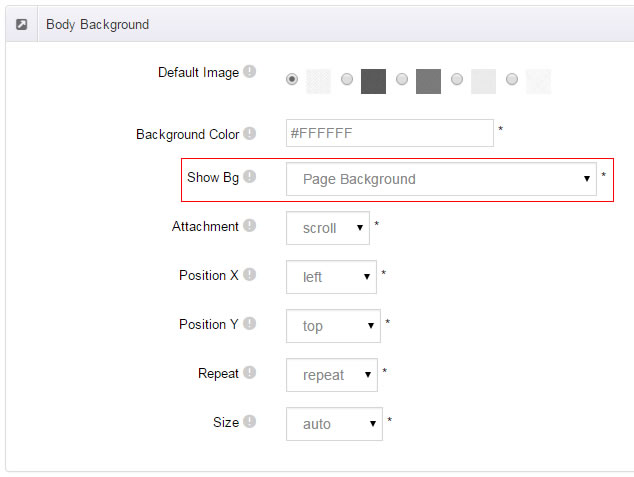
The background can be set as static or rotating image or any solid color for you choose to apply, also you can set different background images for different pages.
How to set background image for DNN page.
- You need to choose Boxed Layout.
- Choose Page Background in the Option for Show bg, save settings.
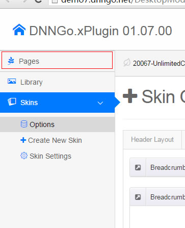
- Click "pages" nav in the xPlugin.
- Click Edit Background icon.
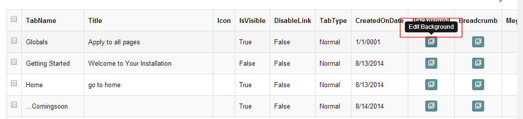
- Upload image, the background image will show as slider if you choose two or more images.
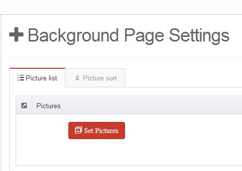
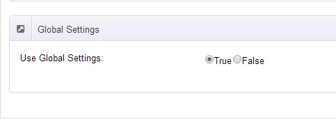
- "Globals" allows you to set background image for all pages.
- Also you can set background image for each page.
- You can set not to use images in "Globals".
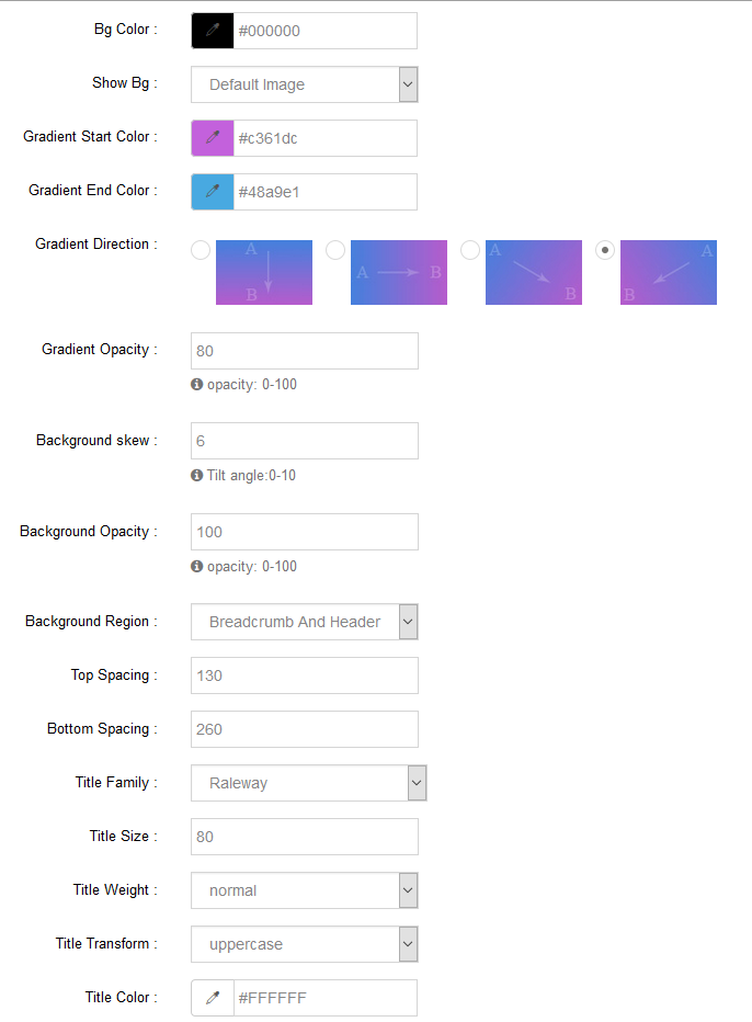
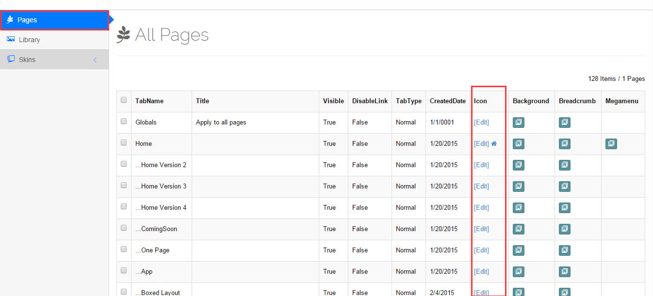
How to set breadcrumb image for DNN page.
- Choose Breadcrumb Background in the Option for Show bg, save settings.
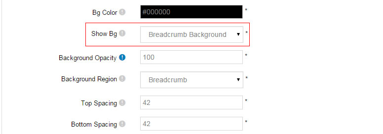
- Click "pages" nav in the xPlugin.
- Click Edit Breadcrumb icon.
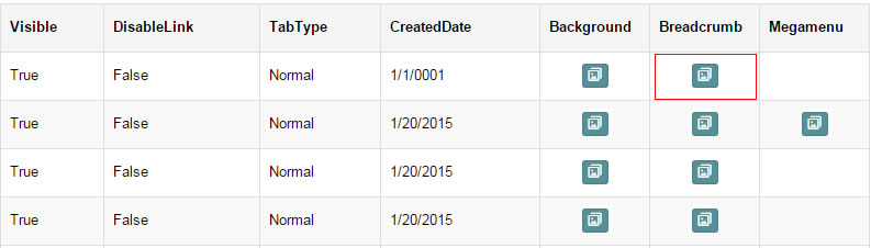
- Upload image, the background image will show as slider if you choose two or more images.
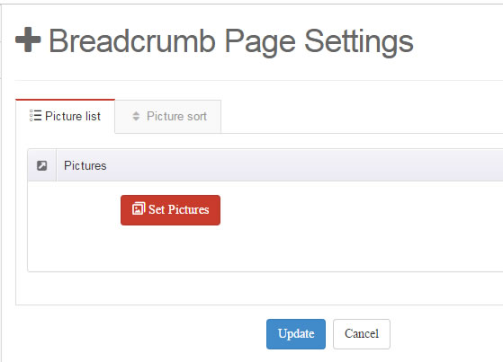
- "Globals" allows you to set background image for all pages.
- Also you can set background image for each page.
- You can set not to use images in "Globals".
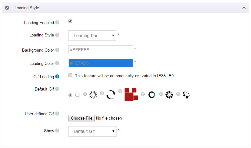
Loading Style
You can set the page loading animation.
You can select to have this feature turned on or off.
Content Style
You can set the font color and size, link color, the color of H1-H6 etc of the content area.
Five kinds of Breadcrumb layouts
You can choose different Breadcrumb styles through Breadcrumb Layout.
You can click these links to check different breadcrumb styles. breadcrumb 1, breadcrumb 2, breadcrumb 3, breadcrumb 4, breadcrumb 5
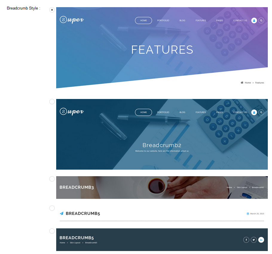
You can change the text color, background color and background image etc for each Breadcrumb layout.
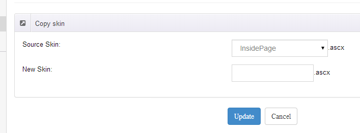
Create a Skin
You can create a new skin through xPlugin. Please note the new skin name shouldn't be the same as the current skin.
Standard Menu and MegaMenu
The skin sub menus contain two types-Standard Menu and MegaMenu.
Standard Menu is the default menu type, the sub menus will be set to display in one column only, as shown in screen shot below:
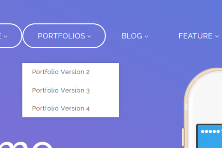
MegaMenu will set sub menus to display in multiple columns, also you can display HTML module or third party module in sub menus, as shown below:
You can set the MegaMenu as per steps below:
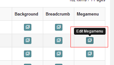
- Click "pages" nav in the xPlugin.
- Click Edit MegaMenu button. Please note MegaMenu can be set for first level menus only.
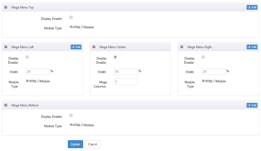
- Set the menu type to MegaMenu.
- Mega Menu has 5 sections: Menu Top, Menu Right, Menu Bottom, Menu Left, Menu Center.
- Click Add button so you will be able to add HTML module or any third module to Menu Top, Menu Right, Menu Bottom, Menu Left.
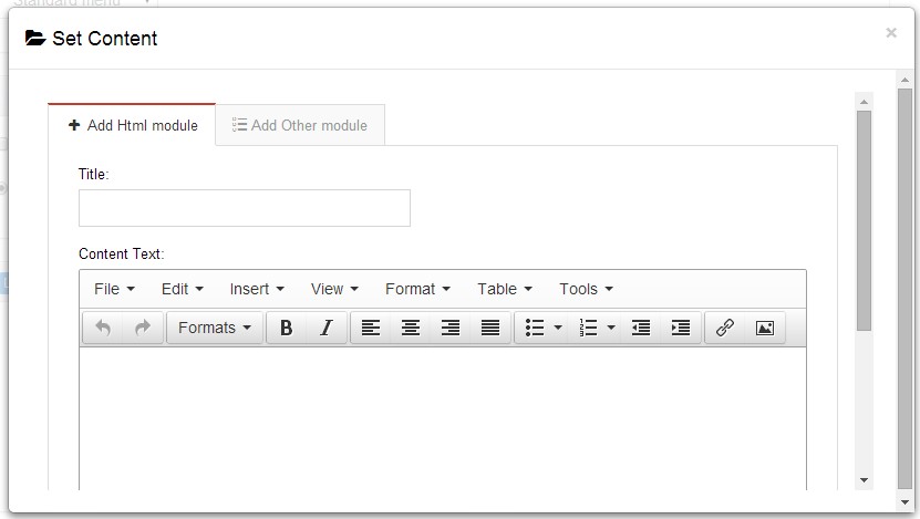
- Module Type-choose to display HTML module or third module.
- Menu Center-it will display secondary menus here.
- Mega Columns-set number of columns the secondary menu will display.
- You can set width for Menu Right, Menu Left, Menu Center, please note their previous total width shouldn't be more than 100.
Set menu typography icon
You can set menu typography icon through the settings below:
You can set typography icon in Icon option under Pages setting, each page has separate icon settings.
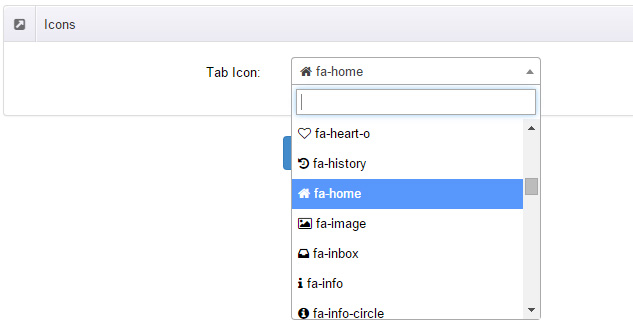
You can choose the icon you need through dropdown options, you can also find the icon you need through text filter.
Set Up Google Map
You can create Google Map easily following these steps:
- Go to xplugin, and click Map Settings tab to fill in API.
- You can register through https://developers.google.com/maps/documentation/javascript/get-api-key.
- Place the code <div id="gmap01"></div> into HTML module.
- Enter location of the map in Address, for example: Bear city, ny
- Enter description in Markers Html, for example: hello word
CSS Codes
Skin is using bootstrap framework. You will get to know more through this url. Link
Width of content area
dnn_layout is the page content framework:
| Device width | Width of content area |
| Large devices Desktops (≥1200px) | 1170px |
| Medium devices Desktops (≥992px) | 970px |
| Small devices Tablets (≥768px) | 750px |
| Extra small devices Phones (<768px) | auto |
content_mid is the spacing between both sides of the page :
| Device width | Spacing |
| Large devices Desktops (≥1200px) | 30px |
| Medium devices Desktops (≥992px) | 20px |
| Small devices Tablets (≥768px) | 15px |
| Extra small devices Phones (<768px) | 15px |
<div class="dnn_layout">
  <div class="content_mid clearfix"> content ... </div>
</div>
Bootstrap 12 grid layout
<!-- Tablet and desktop devices are 50% wide, mobile device is 100% wide -->
<div class="row">
  <div class="col-sm-6">.col-sm-6</div>
  <div class="col-sm-6">.col-sm-6</div>
</div>

<!-- Stack the columns on mobile by making one full-width and the other half-width -->
<div class="row">
  <div class="col-xs-12 col-md-8">.col-xs-12 .col-md-8</div>
  <div class="col-xs-6 col-md-4">.col-xs-6 .col-md-4</div>
</div>

<!-- Columns start at 50% wide on mobile and bump up to 33.3% wide on desktop -->
<div class="row">
  <div class="col-xs-6 col-md-4">.col-xs-6 .col-md-4</div>
  <div class="col-xs-6 col-md-4">.col-xs-6 .col-md-4</div>
  <div class="col-xs-6 col-md-4">.col-xs-6 .col-md-4</div>
</div>

<!-- Columns are always 50% wide, on mobile and desktop -->
<div class="row">
  <div class="col-xs-6">.col-xs-6</div>
  <div class="col-xs-6">.col-xs-6</div>
</div>

<!-- Add the extra clearfix for only the required viewport -->
<div class="clearfix visible-xs-block"></div>
Display and hide elements
| Extra small devices Phones (<768px) | Small devices Tablets (≥768px) | Medium devices Desktops (≥992px) | Large devices Desktops (≥1200px) | |
|---|---|---|---|---|
.visible-xs |
Visible | Hidden | Hidden | Hidden |
.visible-sm |
Hidden | Visible | Hidden | Hidden |
.visible-md |
Hidden | Hidden | Visible | Hidden |
.visible-lg |
Hidden | Hidden | Hidden | Visible |
.hidden-xs |
Hidden | Visible | Visible | Visible |
.hidden-sm |
Visible | Hidden | Visible | Visible |
.hidden-md |
Visible | Visible | Hidden | Visible |
.hidden-lg |
Visible | Visible | Visible | Hidden |
Visible in mobile devices and hidden in other devices
<div class="visible-xs">content...</div>

Visible in other devices and hidden in mobile devices
<div class="hidden-xs">content...</div>
Vertical spacing
 /*page Spacing*/
.mt-10 {margin-top: 10px;}
.mb-10 {margin-bottom: 10px;}
.pt-10 {padding-top: 10px;}
.pb-10 {padding-bottom: 10px;}
.mt-20 {margin-top: 20px;}
.mb-20 {margin-bottom: 20px;}
.pt-20 {padding-top: 20px;}
.pb-20 {padding-bottom: 20px;}
.mt-30 {margin-top: 30px;}
.mb-30 {margin-bottom: 30px;}
.pt-30 {padding-top: 30px;}
.pb-30 {padding-bottom: 30px;}
.mt-40 {margin-top: 40px;}
.mb-40 {margin-bottom: 40px;}
.pt-40 {padding-top: 40px;}
.pb-40 {padding-bottom: 40px;}
.mt-50 {margin-top: 50px;}
.mb-50 {margin-bottom: 50px;}
.pt-50 {padding-top: 50px;}
.pb-50 {padding-bottom: 50px;}
.mt-60 {margin-top: 60px;}
.mb-60 {margin-bottom: 60px;}
.pt-60 {padding-top: 60px;}
.pb-60 {padding-bottom: 60px;}
Font Family
You can set Font Family throughDNNGo.xPlugin > Content Layout > Content Style
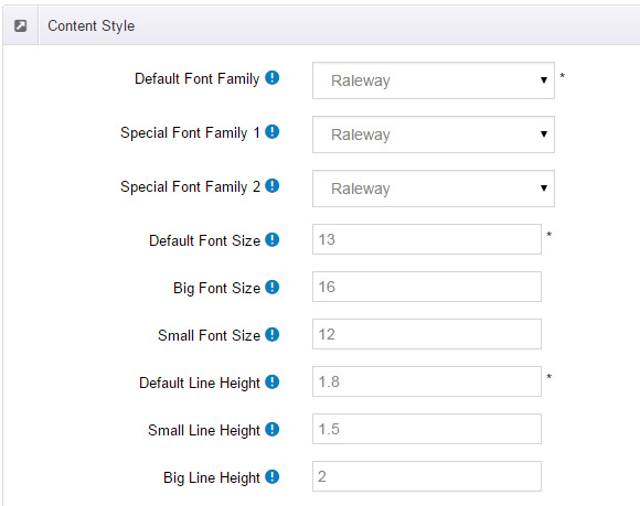
<div class="default_family">content...</div>Special Font Family 1:Extend font, you can call through class.
<div class="special_family_1">content...</div>Special Font Family 2:Extend font, you can call through class.
<div class="special_family_2">content...</div>Default Font Size :Used as page default font size, it is also possible to call through class.
<div class="default_size">content...</div>Big Font Size : Extend font size 1, you can call through class.
<div class="big_size">content...</div>Small Font Size : Extend font size 2, you can call through class.
<div class="small_size">content...</div>Default Line Height : Used as page default line-height, it is also possible to call through class.
<div class="default_line_height">content...</div>Small Line Height :Extend font size 1, you can call through class.
<div class="small_line_height">content...</div>Big Line Height :Extend font size 2, you can call through class.
<div class="big_line_height">content...</div>
CSS background
Section StylesShort Codes
This skin contains a lot of short codes, it is very easy for you to use even you know nothing about js and css, all you need to do is just copying the short codes to HTML module.
Pricing
You can click the link to check Pricing demo. Demo Link
Style 1:
Below is the screen shot:
Codes are as follows:
<div class="price-table price-table1 row">
  <div class="col-md-3 col-sm-6">
    <div class="price_title">
      <h2>STANDARD</h2>
    </div>
    <div class="price_holder">
      <div class="price_box"> <span class="sup">$</span><span class="price">100</span> <span class="unit">/month</span> </div>
      <ul>
        <li>10 Projects</li>
        <li>30GB Space</li>
        <li>Unlimited Colors</li>
        <li>5 Blog Page</li>
        <li>Responsive Web</li>
      </ul>
      <a href="#" class="btn ">Buy It Now</a> </div>
  </div>
  <div class="col-md-3 col-sm-6">
    <div class="price_title ">
      <h2>PROFESSIONAL</h2>
    </div>
    <div class="price_holder">
      <div class="price_box"> <span class="sup">$</span><span class="price">200</span> <span class="unit">/month</span> </div>
      <ul>
        <li>20 Projects</li>
        <li>60GB Space</li>
        <li>Unlimited Colors</li>
        <li>10 Blog Page</li>
        <li>Responsive Web</li>
      </ul>
      <a href="#" class="btn ">Buy It Now</a> </div>
  </div>
  <div class="clearfix visible-sm"></div>
  <div class="col-md-3 col-sm-6">
    <div class="price_title">
      <h2>MAXIMUM</h2>
    </div>
    <div class="price_holder">
      <div class="price_box"> <span class="sup">$</span><span class="price">300</span> <span class="unit">/month</span> </div>
      <ul>
        <li>30 Projects</li>
        <li>90GB Space</li>
        <li>Unlimited Colors</li>
        <li>15 Blog Page</li>
        <li>Responsive Web</li>
      </ul>
      <a href="#" class="btn ">Buy It Now</a> </div>
  </div>
  <div class="col-md-3 col-sm-6">
    <div class="price_title">
      <h2>EXTREME</h2>
    </div>
    <div class="price_holder">
      <div class="price_box"> <span class="sup">$</span><span class="price">400</span> <span class="unit">/month</span> </div>
      <ul>
        <li>40 Projects</li>
        <li>120GB Space</li>
        <li>Unlimited Colors</li>
        <li>20 Blog Page</li>
        <li>Responsive Web</li>
      </ul>
      <a href="#" class="btn ">Buy It Now</a> </div>
  </div>
</div>
Option:
col-md-*is the width of each column, you can change the width you need through value1~12.
Style 2:
Below is the screen shot:
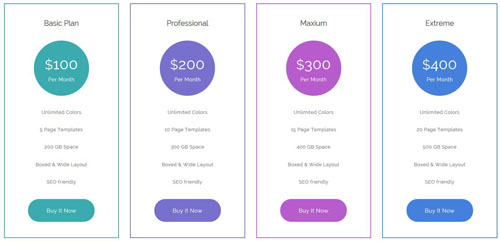
Codes are as follows:
<div class="price-table price-table2  row">
  <div class="col-md-3 col-sm-6 color_1">
    <div class="price_title">
      <h2>Basic Plan</h2>
    </div>
    <div class="price_holder">
      <div class="price_box"> <span class="sup">$</span><span class="price">100</span> <span class="unit">Per Month</span> </div>
      <ul>
        <li>Unlimited Colors</li>
        <li>5 Page Templates</li>
        <li>200 GB Space</li>
        <li>Boxed & Wide Layout</li>
        <li>SEO friendly</li>
      </ul>
      <a class="btn " href="#">Buy It Now</a> </div>
  </div>
  <div class="col-md-3 col-sm-6  color_2">
    <div class="price_title ">
      <h2>Professional</h2>
    </div>
    <div class="price_holder">
      <div class="price_box"> <span class="sup">$</span><span class="price">200</span> <span class="unit">Per Month</span> </div>
      <ul>
        <li>Unlimited Colors</li>
        <li>10 Page Templates</li>
        <li>300 GB Space</li>
        <li>Boxed & Wide Layout</li>
        <li>SEO friendly</li>
      </ul>
      <a class="btn" href="#">Buy It Now</a> </div>
  </div>
  <div class="clearfix visible-sm"></div>
  <div class="col-md-3 col-sm-6  color_3">
    <div class="price_title">
      <h2>Maxium</h2>
    </div>
    <div class="price_holder">
      <div class="price_box"> <span class="sup">$</span><span class="price">300</span> <span class="unit">Per Month</span> </div>
      <ul>
        <li>Unlimited Colors</li>
        <li>15 Page Templates</li>
        <li>400 GB Space</li>
        <li>Boxed & Wide Layout</li>
        <li>SEO friendly</li>
      </ul>
      <a class="btn" href="#">Buy It Now</a> </div>
  </div>
  <div class="col-md-3 col-sm-6  color_4">
    <div class="price_title">
      <h2>Extreme</h2>
    </div>
    <div class="price_holder">
      <div class="price_box"> <span class="sup">$</span><span class="price">400</span> <span class="unit">Per Month</span> </div>
      <ul>
        <li>Unlimited Colors</li>
        <li>20 Page Templates</li>
        <li>500 GB Space</li>
        <li>Boxed & Wide Layout</li>
        <li>SEO friendly</li>
      </ul>
      <a class="btn " href="#">Buy It Now</a> </div>
  </div>
</div>
Option:
col-md-*is the width of each column, you can change the width you need through value1~12.color_1~ color_4is the corresponding color of each column. You can change the color you need through value1~4
Style 3:
Below is the screen shot:
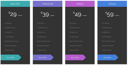
Codes are as follows:
<div class="price-table price-table3  row">
  <div class="col-md-3 col-sm-6 color_1">
    <div class="price_title">
      <h2>Basic Plan</h2>
    </div>
    <div class="price_holder">
      <div class="price_box"> <span class="sup">$</span><span class="price">29</span> <span class="unit">/ month</span> </div>
      <ul>
        <li>15 Projects</li>
        <li>Unlimited Colors</li>
        <li>5 Blog Post</li>
        <li>30 GB Storage</li>
        <li>Boxed & Wide Layout</li>
        <li>Responsive Design</li>
        <li>HTML5 & CSS3</li>
      </ul>
      <a class="btn " href="#">Buy It Now</a> </div>
  </div>
  <div class="col-md-3 col-sm-6  color_2">
    <div class="price_title ">
      <h2>Professional</h2>
    </div>
    <div class="price_holder">
      <div class="price_box"> <span class="sup">$</span><span class="price">39</span> <span class="unit">/ month</span> </div>
      <ul>
        <li>30 Projects</li>
        <li>Unlimited Colors</li>
        <li>10 Blog Post</li>
        <li>60 GB Storage</li>
        <li>Boxed & Wide Layout</li>
        <li>Responsive Design</li>
        <li>HTML5 & CSS3</li>
      </ul>
      <a class="btn" href="#">Buy It Now</a> </div>
  </div>
  <div class="clearfix visible-sm"></div>
  <div class="col-md-3 col-sm-6  color_3">
    <div class="price_title">
      <h2>Maxium</h2>
    </div>
    <div class="price_holder">
      <div class="price_box"> <span class="sup">$</span><span class="price">49</span> <span class="unit">/ month</span> </div>
      <ul>
        <li>60 Projects</li>
        <li>Unlimited Colors</li>
        <li>15 Blog Post</li>
        <li>90 GB Storage</li>
        <li>Boxed & Wide Layout</li>
        <li>Responsive Design</li>
        <li>HTML5 & CSS3</li>
      </ul>
      <a class="btn" href="#">Buy It Now</a> </div>
  </div>
  <div class="col-md-3 col-sm-6  color_4">
    <div class="price_title">
      <h2>Extreme</h2>
    </div>
    <div class="price_holder">
      <div class="price_box"> <span class="sup">$</span><span class="price">59</span> <span class="unit">/ month</span> </div>
      <ul>
        <li>120 Projects</li>
        <li>Unlimited Colors</li>
        <li>30 Blog Post</li>
        <li>120 GB Storage</li>
        <li>Boxed & Wide Layout</li>
        <li>Responsive Design</li>
        <li>HTML5 & CSS3</li>
      </ul>
      <a class="btn " href="#">Buy It Now</a> </div>
  </div>
</div>
Option:
col-md-*is the width of each column, you can change the width you need through value1~12.color_1~ color_4is the corresponding color of each column. You can change the color you need through value1~4
Style 4:
Below is the screen shot:
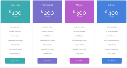
Codes are as follows:
<div class="price-table price-table4  row">
  <div class="col-md-3 col-sm-6 color_1">
    <div class="price_title">
      <h2>Basic Plan</h2>
    </div>
    <div class="price_holder">
      <div class="price_box"> <span class="sup">$</span><span class="price">100</span> <span class="unit">/ month</span> </div>
      <ul>
        <li>Unlimited Colors</li>
        <li>20 Page Templates</li>
        <li>500 GB Space</li>
        <li>Ultra Responsive design</li>
        <li>Retina Ready</li>
        <li>Boxed & Wide Layout</li>
        <li>CSS3 & HTML 5</li>
      </ul>
      <a class="btn " href="#">Buy It Now</a> </div>
  </div>
  <div class="col-md-3 col-sm-6  color_2">
    <div class="price_title ">
      <h2>Professional</h2>
    </div>
    <div class="price_holder">
      <div class="price_box"> <span class="sup">$</span><span class="price">200</span> <span class="unit">/ month</span> </div>
      <ul>
        <li>Unlimited Colors</li>
        <li>40 Page Templates</li>
        <li>1000 GB Space</li>
        <li>Ultra Responsive design</li>
        <li>Retina Ready</li>
        <li>Boxed & Wide Layout</li>
        <li>CSS3 & HTML 5</li>
      </ul>
      <a class="btn" href="#">Buy It Now</a> </div>
  </div>
  <div class="clearfix visible-sm"></div>
  <div class="col-md-3 col-sm-6  color_3">
    <div class="price_title">
      <h2>Maxium</h2>
    </div>
    <div class="price_holder">
      <div class="price_box"> <span class="sup">$</span><span class="price">300</span> <span class="unit">/ month</span> </div>
      <ul>
        <li>Unlimited Colors</li>
        <li>60 Page Templates</li>
        <li>1500 GB Space</li>
        <li>Ultra Responsive design</li>
        <li>Retina Ready</li>
        <li>Boxed & Wide Layout</li>
        <li>CSS3 & HTML 5</li>
      </ul>
      <a class="btn" href="#">Buy It Now</a> </div>
  </div>
  <div class="col-md-3 col-sm-6  color_4">
    <div class="price_title">
      <h2>Extreme</h2>
    </div>
    <div class="price_holder">
      <div class="price_box"> <span class="sup">$</span><span class="price">400</span> <span class="unit">/ month</span> </div>
      <ul>
        <li>Unlimited Colors</li>
        <li>80 Page Templates</li>
        <li>2000 GB Space</li>
        <li>Ultra Responsive design</li>
        <li>Retina Ready</li>
        <li>Boxed & Wide Layout</li>
        <li>CSS3 & HTML 5</li>
      </ul>
      <a class="btn " href="#">Buy It Now</a> </div>
  </div>
</div>
Option:
col-md-*is the width of each column, you can change the width you need through value1~12.color_1~ color_4is the corresponding color of each column. You can change the color you need through value1~4
Style 5:
Below is the screen shot:
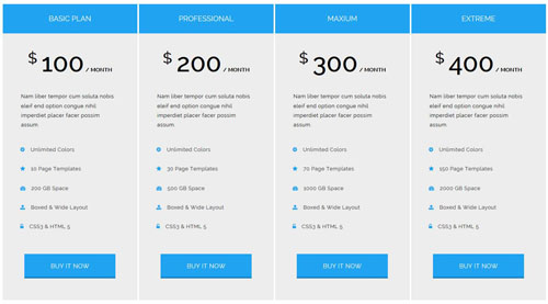
Codes are as follows:
<div class="price-table price-table5 row">
  <div class="col-md-3 col-sm-6">
    <div class="price_title">
      <h2>BASIC PLAN</h2>
    </div>
    <div class="price_holder">
      <div class="price_box"> <span class="price">$100</span> <span class="unit">/ MONTH</span>
        <div class="content">Nam liber tempor cum soluta nobis eleif end option congue nihil imperdiet placer facer possim assum.</div>
      </div>
      <ul>
        <li><span class="fa fa-gear"></span> Unlimited Colors</li>
        <li><span class="fa fa-star"></span> 10 Page Templates</li>
        <li><span class="fa fa-dashboard"></span> 200 GB Space</li>
        <li><span class="fa fa-upload"></span> Boxed & Wide Layout</li>
        <li><span class="fa fa-unlock-alt"></span> CSS3 & HTML 5</li>
      </ul>
      <a class="btn " href="#">BUY IT NOW</a> </div>
  </div>
  <div class="col-md-3 col-sm-6">
    <div class="price_title ">
      <h2>PROFESSIONAL</h2>
    </div>
    <div class="price_holder">
      <div class="price_box"> <span class="price">$200</span> <span class="unit">/ MONTH</span>
        <div class="content">Nam liber tempor cum soluta nobis eleif end option congue nihil imperdiet placer facer possim assum.</div>
      </div>
      <ul>
        <li><span class="fa fa-gear"></span> Unlimited Colors</li>
        <li><span class="fa fa-star"></span> 30 Page Templates</li>
        <li><span class="fa fa-dashboard"></span> 500 GB Space</li>
        <li><span class="fa fa-upload"></span> Boxed & Wide Layout</li>
        <li><span class="fa fa-unlock-alt"></span> CSS3 & HTML 5</li>
      </ul>
      <a class="btn" href="#">BUY IT NOW</a> </div>
  </div>
  <div class="clearfix visible-sm"></div>
  <div class="col-md-3 col-sm-6">
    <div class="price_title">
      <h2>MAXIUM</h2>
    </div>
    <div class="price_holder">
      <div class="price_box"> <span class="price">$300</span> <span class="unit">/ MONTH</span>
        <div class="content">Nam liber tempor cum soluta nobis eleif end option congue nihil imperdiet placer facer possim assum.</div>
      </div>
      <ul>
        <li><span class="fa fa-gear"></span> Unlimited Colors</li>
        <li><span class="fa fa-star"></span> 70 Page Templates</li>
        <li><span class="fa fa-dashboard"></span> 1000 GB Space</li>
        <li><span class="fa fa-upload"></span> Boxed & Wide Layout</li>
        <li><span class="fa fa-unlock-alt"></span> CSS3 & HTML 5</li>
      </ul>
      <a class="btn" href="#">BUY IT NOW</a> </div>
  </div>
  <div class="col-md-3 col-sm-6">
    <div class="price_title">
      <h2>EXTREME</h2>
    </div>
    <div class="price_holder">
      <div class="price_box"> <span class="price">$400</span> <span class="unit">/ MONTH</span>
        <div class="content">Nam liber tempor cum soluta nobis eleif end option congue nihil imperdiet placer facer possim assum.</div>
      </div>
      <ul>
        <li><span class="fa fa-gear"></span> Unlimited Colors</li>
        <li><span class="fa fa-star"></span> 150 Page Templates</li>
        <li><span class="fa fa-dashboard"></span> 2000 GB Space</li>
        <li><span class="fa fa-upload"></span> Boxed & Wide Layout</li>
        <li><span class="fa fa-unlock-alt"></span> CSS3 & HTML 5</li>
      </ul>
      <a class="btn " href="#">BUY IT NOW</a> </div>
  </div>
</div>
Option:
col-md-*is the width of each column, you can change the width you need through value1~12.- You can modify
fa fa-*to change icons. font icon list.
ProgressBars Counters
You can click the link to check ProgressBars Counters demo. Demo Link
Style 1
Below is the screen shot:
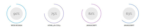
Codes are as follows:
<div class="chart_list_1 row">
  <div class="col-md-3 col-sm-6">
    <div data-percent="90" class="percentage1 color_1">
      <div class="percentage_inner"><span>0</span>%</div>
    </div>
    <p>WEB DESIGN</p>
  </div>
  <div class="col-md-3 col-sm-6">
    <div data-percent="75" class="percentage1 color_2">
      <div class="percentage_inner"><span>0</span>%</div>
    </div>
    <p>HTML5 & CSS3</p>
  </div>
  <div class="clearfix visible-sm"></div>
  <div class="col-md-3 col-sm-6">
    <div data-percent="82" class="percentage1 color_3">
      <div class="percentage_inner"><span>0</span>%</div>
    </div>
    <p>JAVASCRIPT</p>
  </div>
  <div class="col-md-3 col-sm-6">
    <div data-percent="63" class="percentage1 color_4">
      <div class="percentage_inner"><span>0</span>%</div>
    </div>
    <p>JAVASCRIPT</p>
  </div>
</div>
Option:
col-md-*is the width of each column, you can change the width you need through value1~12.data-percentis for controlling the percentage that displays, you can display percentage through value0~100
Style 2
Below is the screen shot:
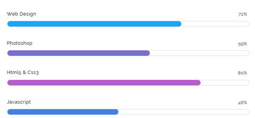
Codes are as follows:
<div class="loaded_list_1">
  <p>Web Design</p>
  <div class="progress">
    <div data-width="72%" class="bar animation animationwidth color_bg_1"> <span></span> </div>
  </div>
  <p>Photoshop</p>
  <div class="progress">
    <div data-width="59%" class="bar animation animationwidth color_bg_2"> <span></span> </div>
  </div>
  <p>Html5 & Css3</p>
  <p> </p>
  <div class="progress">
    <div data-width="80%" class="bar animation animationwidth color_bg_3"> <span></span> </div>
  </div>
  <p>Javascript</p>
  <div class="progress">
    <div data-width="46%" class="bar animation animationwidth color_bg_4"> <span></span> </div>
  </div>
</div>
Option:
data-widthis for controlling the percentage that displays, you can display percentage through value0~100color_bg_1~ color_bg_2is the corresponding color of each column. You can change the background you need through value1~4
Style 3
Below is the screen shot:
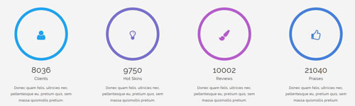
Codes are as follows:
<div class="row">
  <div class="col-md-3 col-sm-6">
    <div class="ServeList_4">
      <div data-percent="100" class="decorate color_1">
        <div class="fa fa-user"> </div>
      </div>
      <div class="animation number" data-number="8036">0</div>
      <div class="title">Clients</div>
      <p>Donec quam felis, ultricies nec, pellentesque eu, pretium quis, sem  massa quismollis pretium. </p>
    </div>
  </div>
  <div class="col-md-3 col-sm-6">
    <div class="ServeList_4">
      <div data-percent="100" class="decorate color_2">
        <div class="fa fa-lightbulb-o"> </div>
      </div>
      <div class="animation number" data-number="9750">0</div>
      <div class="title">Hot Skins</div>
      <p>Donec quam felis, ultricies nec, pellentesque eu, pretium quis, sem  massa quismollis pretium. </p>
    </div>
  </div>
  <div class="col-md-3 col-sm-6">
    <div class="ServeList_4">
      <div data-percent="100" class="decorate color_3">
        <div class="fa fa-paint-brush"> </div>
      </div>
      <div class="animation number" data-number="10002">0</div>
      <div class="title">Reviews</div>
      <p>Donec quam felis, ultricies nec, pellentesque eu, pretium quis, sem  massa quismollis pretium. </p>
    </div>
  </div>
  <div class="col-md-3 col-sm-6">
    <div class="ServeList_4">
      <div data-percent="100" class="decorate color_4">
        <div class="fa  fa-thumbs-o-up"> </div>
      </div>
      <div class="animation number" data-number="21040">0</div>
      <div class="title">Praises</div>
      <p>Donec quam felis, ultricies nec, pellentesque eu, pretium quis, sem  massa quismollis pretium. </p>
    </div>
  </div>
</div>
Option:
col-md-*is the width of each column, you can change the width you need through value1~12.- You can change the value you need to display through
data-number data-percentis for controlling the percentage that displays, you can display percentage through value0~100color_1~ color_4is the corresponding color of each column. You can change the color you need through value1~4
Style 4
Below is the screen shot:
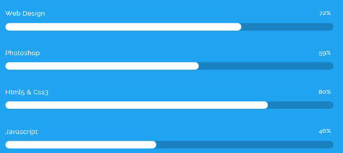
Codes are as follows:
<div class="row">
        <div class="col-md-6">
          <div class="loaded_list_5">
            <p>Web Design</p>
            <div class="progress">
              <div data-width="72%" class="bar animation animationwidth"> <span>72%</span> </div>
            </div>
            <p>Photoshop</p>
            <div class="progress">
              <div data-width="59%" class="bar animation animationwidth"> <span>59%</span> </div>
            </div>
            <p>Html5 & Css3</p>
            <p> </p>
            <div class="progress">
              <div data-width="80%" class="bar animation animationwidth"> <span>80%</span> </div>
            </div>
            <p>Javascript</p>
            <div class="progress">
              <div data-width="46%" class="bar animation animationwidth"> <span>46%</span> </div>
            </div>
          </div>
        </div>
      </div>
Option:
col-md-*is the width of each column, you can change the width you need through value1~12.data-widthis for controlling the percentage that displays, you can display percentage through value0~100
Style 5
Below is the screen shot:
Codes are as follows:
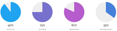
<div class="row">
  <div class="col-sm-6 col-md-3">
    <div class="sector color_1" data-fan="1:AccentColour:90% " data-color="#eeeeee" data-size="110"> </div>
    <p style="text-align: center;">Deveop Cost</p>
  </div>
  <div class="col-sm-6 col-md-3">
    <div class="sector  color_2" data-fan="2:AccentColour:75% " data-color="#eeeeee" data-size="110"> </div>
    <p style="text-align: center;">Skin Setting</p>
  </div>
  <div class="col-sm-6 col-md-3">
    <div class="sector  color_3" data-fan="3:AccentColour:82%" data-color="#eeeeee" data-size="110"> </div>
    <p style="text-align: center;">Debug Modules</p>
  </div>
  <div class="col-sm-6 col-md-3">
    <div class="sector  color_4" data-fan="4:AccentColour:35%" data-color="#eeeeee" data-size="110"> </div>
    <p style="text-align: center;">Technology Question</p>
  </div>
</div>
Option:
col-md-*is the width of each column, you can change the width you need through value1~12.data-fan是扇形的大小颜色配置, 格式为: "name:color:size" 也可以显示多个 格式为:"name 1:color 1:size 1,name 2:color 2:size 2".data-color是背景颜色,data-size是半径大小
Style 5
Below is the screen shot:
Codes are as follows:
<div class="loaded_list_6">
  <p>Web Design</p>
  <div class="progress">
    <div data-width="72%" class="bar animation animationwidth"> <span></span> </div>
  </div>
  <p>Photoshop</p>
  <div class="progress">
    <div data-width="59%" class="bar animation animationwidth"> <span></span> </div>
  </div>
  <p>Html5 & Css3</p>
  <p> </p>
  <div class="progress">
    <div data-width="80%" class="bar animation animationwidth"> <span></span> </div>
  </div>
  <p>Javascript</p>
  <div class="progress">
    <div data-width="46%" class="bar animation animationwidth"> <span></span> </div>
  </div>
</div>
Option:
data-widthis for controlling the percentage that displays, you can display percentage through value0~100
Testimonials
You can click the link to check Testimonials demo. Demo Link
Option:
Testimonials includes the parameters that listed below.
data-position |
Switch mode. fade:fade in fade out, roll-left:roll from side to side, roll-vertical:roll up and down |
data-display-navigation |
Navigation display and hidden. Default to true. true:Display, false:hidden |
data-display-arrows |
Left/right arrow display and hidden. Default to true. true:Display, false:hidden |
data-autoplay |
Whether to scroll automatically or not. 0 is for not scrolling automatically, numbers greater than 0 are for scrolling automatically, and these numbers are the time interval for scrolling. Default to 3000 |
data-autoheight |
Whether to be automatic height or not, default to true. true: automatic height, false: fixed height.< |
Example:
<ul class=" Testimonials_tab" data-position="roll-vertical" data-display-navigation="true" data-display-arrows="true" data-display-navigation="false" data-autoplay="3000" data-autoheight="true">
  <li>
    <h3 class="title a_t_c">What Others Say About Us ?</h3>
		......
Style 1:
Below is the screen shot:

Codes are as follows:
<ul data-autoplay="0" data-display-navigation="false" data-position="fade" class=" Testimonials_tab Testimonials_2">
  <li> <span class="pic"><img alt="" src="/portals/9/portrait_01.jpg" /></span>
    <blockquote>
      <p>“ Quisque tortor odio, feugiat vitae velit at, feugiat euismod nunc... ”</p>
      <small>FRANK MILLER<span>THE DNNGO BUYER</span></small> </blockquote>
  </li>
  <li><span class="pic"><img alt="" src="/portals/9/portrait_02.jpg" /></span>
    <blockquote>
      <p>“ Suspendisse libero odio, rhoncus nec blandit eget, semper nec mi... ”</p>
      <small>FRANK MILLER<span>THE DNNGO BUYER</span></small> </blockquote>
  </li>
  <li> <span class="pic"><img alt="" src="/portals/9/portrait_03.jpg" /></span>
    <blockquote>
      <p>“ Nemo enim ipsam voluptatem quia voluptas sit aspernatur aut odit aut fugit, sed quia consequuntur magni dolores eos qui ratione voluptatem sequi nesciunt... ”</p>
      <small>FRANK MILLER<span>THE DNNGO BUYER</span></small> </blockquote>
  </li>
</ul>
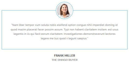
Style 2:
Below is the screen shot:
Codes are as follows:
<blockquote class="blockquote_3">
  <p>Nam liber tempor cum soluta nobis eleifend option ...</p>
  <small><img alt="" src="/portals/9/portrait_01.jpg" /><span>FRANK MILLER<em>THE DNNGO BUYER</em></span></small>
</blockquote>
Style 3:
Below is the screen shot:
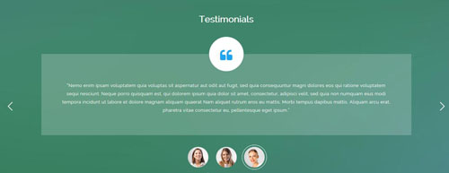
Codes are as follows:
<h3 class="title_style_5">Testimonials</h3>
<div data-autoplay="3000" class=" Testimonials_tab Testimonials_1">
<ul>
  <li>
    <div class="mark"><span class="fa fa-quote-left"></span></div>
    <blockquote>“Suspendisse libero odio, rhoncus nec blandit eget...”</blockquote>
  </li>
  <li>
    <div class="mark"><span class="fa fa-quote-left"></span></div>
    <blockquote>“In nec enim ac mi pharetra tincidunt...”</blockquote>
  </li>
  <li>
    <div class="mark"><span class="fa fa-quote-left"></span></div>
    <blockquote>“Nemo enim ipsam voluptatem quia voluptas ...”</blockquote>
  </li>
</ul>
<div class="dot">
    <a href="javascript:;"><img alt="" src="/portals/9/portrait_01.jpg" /></a>
    <a href="javascript:;"><img alt="" src="/portals/9/portrait_02.jpg" /></a>
    <a href="javascript:;"><img alt="" src="/portals/9/portrait_03.jpg" /></a>
</div>
</div>
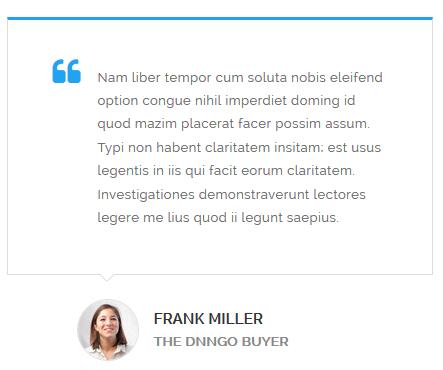
Style 4:
Below is the screen shot:
Codes are as follows:
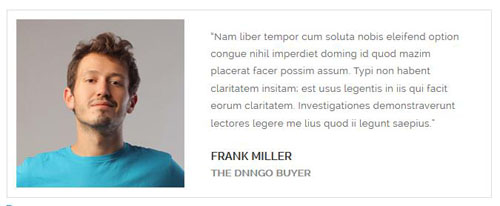
<blockquote class="blockquote_4">
  <div class="pic"><img alt="" src="/portals/9/portrait_01.jpg" /></div>
  <p>“Nam liber tempor cum soluta nobis eleifend option congue ...”</p>
  <small>FRANK MILLER<span>THE DNNGO BUYER</span></small>
</blockquote>
Style 5:
Below is the screen shot:

Codes are as follows:
<ul data-autoplay="0" data-display-navigation="false" data-position="fade" class=" Testimonials_tab Testimonials_3">
  <li>
    <blockquote>
      <p>“ Vestibulum hendrerit risus non libero sollicitudin adipiscing...”</p>
      <small class="a_t_c">FRANK MILLER<span> — THE DNNGO BUYER</span></small> </blockquote>
    <div class="pic"><img alt="" src="/portals/9/portrait_04.jpg" /></div>
  </li>
  <li>
    <blockquote>
      <p>“Quisque tortor odio, feugiat vitae velit at, feugiat euismod nunc...”</p>
      <small class="a_t_c">FRANK MILLER<span> — THE DNNGO BUYER</span></small> </blockquote>
    <div class="pic"><img alt="" src="/portals/9/portrait_05.jpg" /></div>
  </li>
  <li>
    <blockquote>
      <p>“ Suspendisse libero odio, rhoncus nec blandit eget, semper nec mi... ”</p>
      <small class="a_t_c">FRANK MILLER<span> — THE DNNGO BUYER</span></small> </blockquote>
    <div class="pic"><img alt="" src="/portals/9/portrait_06.jpg" /></div>
  </li>
  <li>
    <blockquote>
      <p>“ Nemo enim ipsam voluptatem quia voluptas sit aspernatur aut odit aut fugit...”</p>
      <small class="a_t_c">FRANK MILLER<span> — THE DNNGO BUYER</span></small> </blockquote>
    <div class="pic"><img alt="" src="/portals/9/portrait_07.jpg" /></div>
  </li>
</ul>
Style 6:
Below is the screen shot:
Codes are as follows:
<blockquote class="blockquote_5">
    <div class="pic"><img alt="" src="/portals/9/portrait_12.jpg" /></div>
    <div class="right">
        <p>“Nam liber tempor cum soluta nobis eleifend option congue nihil ...”</p>
        <small>FRANK MILLER<span>THE DNNGO BUYER</span></small>
    </div>
</blockquote>
Responsive Tab
You can click the link to check Responsive Tab demo. Demo Link
You can add the "resp-tabs-list" of "li" to add tab item, and add the "resp-tabs-container" of "resp_container" to add content
Example:
<div class="horizontalTab_Top">
  <ul class="resp-tabs-list">

    <li> Tab1 </li>
    <li> Tab2 </li>
    ....

  </ul>
  <div class="resp-tabs-container">

    <div class="resp_container"> Tab1 Content </div>
    <div class="resp_container"> Tab2 Content </div>
    ....

  </div>
</div>
| Variable | Default | Type | Description |
|---|---|---|---|
data-autoplay |
true | int/boolean | Change to any integrer for example data-autoplay ="5000" to play every 3 seconds. If you set data-autoplay="false" Stop auto scroll animation. |
Style 1:
Below is the screen shot:
Codes are as follows:
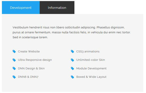
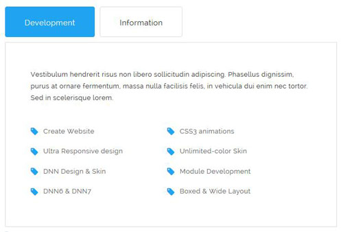
<div class="horizontalTab_Top horizontalTab_Top_2">
  <ul class="resp-tabs-list">
    <li> <span>Development</span> </li>
    <li> <span>Information</span> </li>
  </ul>
  <div class="resp-tabs-container">
    <div class="resp_container">
      <div class="resp_margin">
        <p class="pb-20">Vestibulum hendrerit risus non libero sollicitudin adipiscing...</p>
        <ul class="list_style_7 ">
          <li><span class="fa fa-tag"></span><a href="#">Create Website</a></li>
          <li><span class="fa fa-tag"></span><a href="#">CSS3 animations</a></li>
          <li><span class="fa fa-tag"></span><a href="#">Ultra Responsive design</a></li>
          <li><span class="fa fa-tag"></span><a href="#">Unlimited-color Skin</a></li>
          <li><span class="fa fa-tag"></span><a href="#">DNN Design & Skin</a></li>
          <li><span class="fa fa-tag"></span><a href="#">Module Development</a></li>
          <li><span class="fa fa-tag"></span><a href="#">DNN6 & DNN7</a></li>
          <li><span class="fa fa-tag"></span><a href="#">Boxed & Wide Layout</a></li>
        </ul>
      </div>
    </div>
    <div class="resp_container">
      <div class="resp_margin">
        <p class="pb-20">Vestibulum hendrerit risus non libero sollicitudin adipiscing...</p>
        <ul class="list_style_7 ">
          <li><span class="fa fa-tag"></span><a href="#">DNN Design & Skin</a></li>
          <li><span class="fa fa-tag"></span><a href="#">CSS3 animations</a></li>
          <li><span class="fa fa-tag"></span><a href="#">Module Development</a></li>
          <li><span class="fa fa-tag"></span><a href="#">Ultra Responsive design</a></li>
          <li><span class="fa fa-tag"></span><a href="#">Unlimited-color Skin</a></li>
          <li><span class="fa fa-tag"></span><a href="#">DNN6 & DNN7</a></li>
          <li><span class="fa fa-tag"></span><a href="#">Create Website</a></li>
          <li><span class="fa fa-tag"></span><a href="#">Boxed & Wide Layout</a></li>
        </ul>
      </div>
    </div>
  </div>
</div>
Style 2:
Below is the screen shot:
Codes are as follows:
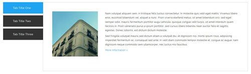
<div class="verticalTab_Left verticalTab_Left_1">
  <ul class="resp-tabs-list">
    <li> <span>Tab Title One</span> </li>
    <li> <span>Tab Title Two</span> </li>
    <li> <span>Tab Title Three</span> </li>
  </ul>
  <div class="resp-tabs-container">
    <div class="resp_container">
      <div class="resp_margin">
        <div class="pic"><img alt="" src="/portals/9/Photo_61.jpg" /></div>
        <p>Nam volutpat aliquam sem, in tristique felis luctus consectetur...</p>
        <p><a href="#">More Information  ></a></p>
      </div>
    </div>
    <div class="resp_container">
      <div class="resp_margin">
        <div class="pic"><img alt="" src="/portals/9/Photo_61.jpg" /></div>
        <p>Sed fringilla volutpat mauris sed dictum etiam a volutpat dui, et dignissim nisi...</p>
        <p><a href="#">More Information  ></a></p>
      </div>
    </div>
    <div class="resp_container">
      <div class="resp_margin">
        <div class="pic"><img alt="" src="/portals/9/Photo_61.jpg" /></div>
        <p>Nam volutpat aliquam sem, in tristique felis luctus consectetur...</p>
        <p><a href="#">More Information  ></a></p>
      </div>
    </div>
  </div>
</div>
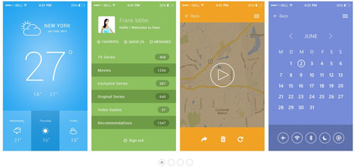
Style 3:
Below is the screen shot:
Codes are as follows:
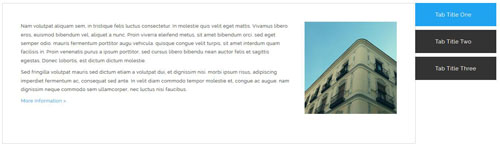
<div class="verticalTab_Right verticalTab_Right_1">
  <ul class="resp-tabs-list">
    <li> <span>Tab Title One</span> </li>
    <li> <span>Tab Title Two</span> </li>
    <li> <span>Tab Title Three</span> </li>
  </ul>
  <div class="resp-tabs-container">
    <div class="resp_container">
      <div class="resp_margin">
        <div class="pic"><img alt="" src="/portals/9/Photo_61.jpg" /></div>
        <p>Nam volutpat aliquam sem, in tristique felis luctus consectetur...</p>
        <p><a href="#">More Information  ></a></p>
      </div>

    </div>
    <div class="resp_container">
      <div class="resp_margin">
        <div class="pic"><img alt="" src="/portals/9/Photo_61.jpg" /></div>
        <p>Sed fringilla volutpat mauris sed dictum etiam a volutpat dui, et dignissim nisi...</p>
        <p><a href="#">More Information  ></a></p>
      </div>
    </div>
    <div class="resp_container">
      <div class="resp_margin">
        <div class="pic"><img alt="" src="/portals/9/Photo_61.jpg" /></div>
        <p>Nam volutpat aliquam sem, in tristique felis luctus consectetur...</p>
        <p><a href="#">More Information  ></a></p>
      </div>
    </div>
  </div>
</div>
Style 4:
Below is the screen shot:
Codes are as follows:
<div class="horizontalTab_Top horizontalTab_Top_3">
  <ul class="resp-tabs-list">
    <li> <span>Development</span> </li>
    <li> <span>Information</span> </li>
  </ul>
  <div class="resp-tabs-container">
    <div class="resp_container">
      <div class="resp_margin">
        <p class="pb-20">Vestibulum hendrerit risus non libero sollicitudin adipiscing...</p>
        <ul class="list_style_7 ">
          <li><span class="fa fa-tag"></span><a href="#">Create Website</a></li>
          <li><span class="fa fa-tag"></span><a href="#">CSS3 animations</a></li>
          <li><span class="fa fa-tag"></span><a href="#">Ultra Responsive design</a></li>
          <li><span class="fa fa-tag"></span><a href="#">Unlimited-color Skin</a></li>
          <li><span class="fa fa-tag"></span><a href="#">DNN Design & Skin</a></li>
          <li><span class="fa fa-tag"></span><a href="#">Module Development</a></li>
          <li><span class="fa fa-tag"></span><a href="#">DNN6 & DNN7</a></li>
          <li><span class="fa fa-tag"></span><a href="#">Boxed & Wide Layout</a></li>
        </ul>
      </div>
    </div>
    <div class="resp_container">
      <div class="resp_margin">
        <p class="pb-20">Vestibulum hendrerit risus non libero sollicitudin adipiscing...</p>
        <ul class="list_style_7 ">
          <li><span class="fa fa-tag"></span><a href="#">DNN Design & Skin</a></li>
          <li><span class="fa fa-tag"></span><a href="#">CSS3 animations</a></li>
          <li><span class="fa fa-tag"></span><a href="#">Module Development</a></li>
          <li><span class="fa fa-tag"></span><a href="#">Ultra Responsive design</a></li>
          <li><span class="fa fa-tag"></span><a href="#">Unlimited-color Skin</a></li>
          <li><span class="fa fa-tag"></span><a href="#">DNN6 & DNN7</a></li>
          <li><span class="fa fa-tag"></span><a href="#">Create Website</a></li>
          <li><span class="fa fa-tag"></span><a href="#">Boxed & Wide Layout</a></li>
        </ul>
      </div>
    </div>
  </div>
</div>
Style 5:
Below is the screen shot:
Codes are as follows:
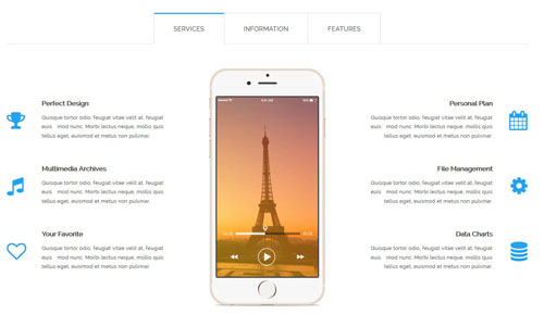
<div class="horizontalTab_Top horizontalTab_Top_1">
<ul class="resp-tabs-list">
<li> <span>SERVICES</span> </li>
<li> <span>INFORMATION</span> </li>
<li> <span>FEATURES</span> </li>
</ul>
<div class="resp-tabs-container">
<div class="resp_container">
<div class="resp_margin">
<div class="row">
<div class="col-sm-4">
<div class="pt-60"></div>
<div class="ServeList_12">
<li><span class="fa fa-trophy"></span>
<h3>Perfect Design</h3>
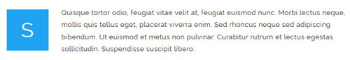
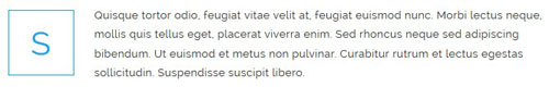
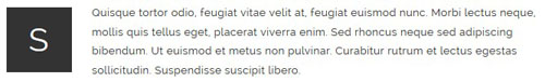
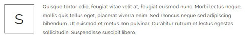
<p>Quisque tortor odio, feugiat vitae velit at, feugiat euis mod nunc. Morbi lectus neque, mollis quis tellus eget, euismod et metus non pulvinar. </p>
</li>
<li><span class="fa fa-music"></span>
<h3>Multimedia Archives</h3>
<p>Quisque tortor odio, feugiat vitae velit at, feugiat euis mod nunc. Morbi lectus neque, mollis quis tellus eget, euismod et metus non pulvinar. </p>
</li>
<li><span class="fa fa-heart-o"></span>
<h3>Your Favorite</h3>
<p>Quisque tortor odio, feugiat vitae velit at, feugiat euis mod nunc. Morbi lectus neque, mollis quis tellus eget, euismod et metus non pulvinar. </p>
</li>
</div>
</div>
<div class="col-sm-4" style="text-align: center;"><img alt="" src="/portals/9/pic_13.png" class="img-responsive" style="text-align: center;" /></div>
<div class="col-sm-4">
<div class="pt-60"></div>
<div class="ServeList_12 rtl">
<li><span class="fa fa-calendar"></span>
<h3>Personal Plan</h3>
<p>Quisque tortor odio, feugiat vitae velit at, feugiat euis mod nunc. Morbi lectus neque, mollis quis tellus eget, euismod et metus non pulvinar. </p>
</li>
<li><span class="fa fa-gear"></span>
<h3>File Management</h3>
<p>Quisque tortor odio, feugiat vitae velit at, feugiat euis mod nunc. Morbi lectus neque, mollis quis tellus eget, euismod et metus non pulvinar. </p>
</li>
<li><span class="fa fa-database"></span>
<h3>Data Charts</h3>
<p>Quisque tortor odio, feugiat vitae velit at, feugiat euis mod nunc. Morbi lectus neque, mollis quis tellus eget, euismod et metus non pulvinar. </p>
</li>
</div>
</div>
</div>
</div>
</div>
<div class="resp_container">
<div class="resp_margin">
<div class="row">
<div class="col-sm-6">
<div class="title_style_16">FREE LIFETIME SERVICES</div>
<p class="pt-10 pb-20"> Nemo enim ipsam voluptatem quia voluptas sit aspernatur aut odit aut fugit, sed quia consequuntur magni dolores eos qui ratione voluptatem sequi nesciunt. Neque porro quisquam est, qui dolorem ipsum quia dolor sit amet, consectetur, adipisci velit curabitur eu metus commodo ac lectus nec facilisis. </p>
<ul class="list_style_9">
<li>Quisque tortor odio, feugiat vitae velit at, feugiat euismod nunc </li>
<li>Morbi lectus neque, mollis quis tellus eget, placerat </li>
<li>Piverra enimed rhoncus neque sed adipiscing bibendum </li>
<li>Ut euismod et metus non pulvinar urabitur rutrum et lectus egestaol</li>
</ul>
<p class="pt-30"> <a class="btn_10" href="#"> LEARN MORE </a></p>
</div>
<div class="col-sm-6">
<div class="pt-40"></div>
<img alt="" src="/portals/9/pic_14.png" class="img-responsive" /> </div>
</div>
</div>
</div>
<div class="resp_container">
<div class="resp_margin">
<div class="row">
<div class="col-sm-12">
<div class="title_style_16">EXPERIENCED DEVELOPERS AND SKILLFUL DESIGNERS</div>
<p class="pt-10 pb-40"> Nemo enim ipsam voluptatem quia voluptas sit aspernatur aut odit aut fugit, sed quia consequuntur magni dolores eos qui ratione voluptatem sequi nesciunt. Neque porro quisquam est, qui dolorem ipsum quia dolor sit amet, consectetur, adipisci velit curabitur eu metus commodo ac lectus nec facilisis. </p>
</div>
</div>
<div class="row">
<div class="col-sm-6">
<div class="ServeList_13"> <span class="fa fa-flask"></span>
<h3>Unlimited Colors</h3>
<p>Quisque tortor odio, feugiat vitae velit at, feugiat euismod nunc. Morbi lectus neque, mollis quis tellus eget, placerat viverra enim. Sed rhoncus neque sed adipiscing bibendum. Ut euismod et metus non pulvinar. </p>
<p class="pt-20"><a href="#">LEARN MORE</a></p>
</div>
</div>
<div class="col-sm-6">
<div class="ServeList_13"> <span class="fa fa-gift"></span>
<h3>Free Download</h3>
<p>Quisque tortor odio, feugiat vitae velit at, feugiat euismod nunc. Morbi lectus neque, mollis quis tellus eget, placerat viverra enim. Sed rhoncus neque sed adipiscing bibendum. Ut euismod et metus non pulvinar. </p>
<p class="pt-20"><a href="#">LEARN MORE</a></p>
</div>
</div>
</div>
<div class="row">
<div class="col-sm-6">
<div class="ServeList_13"> <span class="fa fa-desktop"></span>
<h3>Retina Ready</h3>
<p>Quisque tortor odio, feugiat vitae velit at, feugiat euismod nunc. Morbi lectus neque, mollis quis tellus eget, placerat viverra enim. Sed rhoncus neque sed adipiscing bibendum. Ut euismod et metus non pulvinar. </p>
<p class="pt-20"><a href="#">LEARN MORE</a></p>
</div>
</div>
<div class="col-sm-6">
<div class="ServeList_13"> <span class="fa fa-calendar-o"></span>
<h3>Effective Work</h3>
<p>Quisque tortor odio, feugiat vitae velit at, feugiat euismod nunc. Morbi lectus neque, mollis quis tellus eget, placerat viverra enim. Sed rhoncus neque sed adipiscing bibendum. Ut euismod et metus non pulvinar. </p>
<p class="pt-20"><a href="#">LEARN MORE</a></p>
</div>
</div>
</div>
</div>
</div>
</div>
</div>
Accordions
You can click the link to check Accordions demo. Demo Link
Option:
- id="accordion" of each accordions effect needs using different names.
"data-parent"needs to have the same name asid- href="#collapse1" is the id that needs to expand content.
- id="collapse1" is the content that needs to expand.
<div class="panel-group" id="accordion">

  <div class="panel panel-default">
    <div class="panel-heading">
      <h4 class="panel-title"> <a data-toggle="collapse" data-parent="#accordion" href="#collapse1"> Title Text ... </a> </h4>
    </div>
    <div id="collapse1" class="panel-collapse collapse in">
      <div class="panel-body">Content Text ... </div>
    </div>
  </div>
  ....

</div>
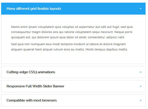
Style 1:
Below is the screen shot:
Codes are as follows:
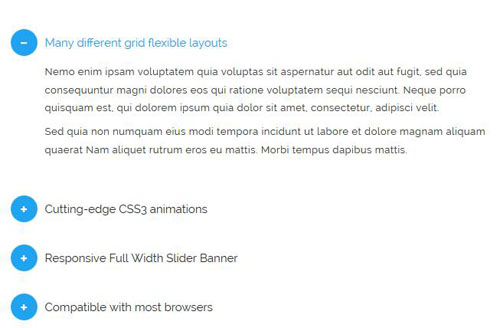
<div id="accordion1" class="panel-group accordion_1">
  <div class="panel panel-default">
    <div class="panel-heading">
      <h4 class="panel-title"> <a href="#collapse1_1" data-parent="#accordion1" data-toggle="collapse"> <span class="accordion_icon"></span>Many different grid flexible layouts</a> </h4>
    </div>
    <div class="panel-collapse collapse in" id="collapse1_1">
      <div class="panel-body">
        <p>Nemo enim ipsam voluptatem quia voluptas sit aspernatur aut odit aut fugit...</p>
      </div>
    </div>
  </div>
  <div class="panel panel-default">
    <div class="panel-heading">
      <h4 class="panel-title"> <a class="collapsed" href="#collapse1_2" data-parent="#accordion1" data-toggle="collapse"> <span class="accordion_icon"></span>Cutting-edge CSS3 animations</a> </h4>
    </div>
    <div class="panel-collapse collapse" id="collapse1_2">
      <div class="panel-body">
        <p>Nemo enim ipsam voluptatem quia voluptas sit aspernatur aut odit aut fugit...</p>
      </div>
    </div>
  </div>
  <div class="panel panel-default">
    <div class="panel-heading">
      <h4 class="panel-title"> <a class="collapsed" href="#collapse1_3" data-parent="#accordion1" data-toggle="collapse"> <span class="accordion_icon"></span>Responsive Full Width Slider Banner</a> </h4>
    </div>
    <div class="panel-collapse collapse" id="collapse1_3">
      <div class="panel-body">
        <p>Nemo enim ipsam voluptatem quia voluptas sit aspernatur aut odit aut fugit...</p>
      </div>
    </div>
  </div>
  <div class="panel panel-default">
    <div class="panel-heading">
      <h4 class="panel-title"> <a class="collapsed" href="#collapse1_4" data-parent="#accordion1" data-toggle="collapse"> <span class="accordion_icon"></span>Compatible with most browsers</a> </h4>
    </div>
    <div class="panel-collapse collapse" id="collapse1_4">
      <div class="panel-body">
        <p>Nemo enim ipsam voluptatem quia voluptas sit aspernatur aut odit aut fugit...</p>
      </div>
    </div>
  </div>
</div>
Style 2:
Below is the screen shot:
Codes are as follows:
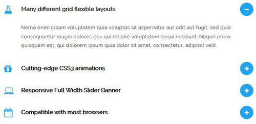
<div id="accordion2" class="panel-group accordion_2">
  <div class="panel panel-default">
    <div class="panel-heading">
      <h4 class="panel-title"> <a href="#collapse2_1" data-parent="#accordion2" data-toggle="collapse"> <span class="accordion_icon"></span><span class="fa fa-flask"></span>Many different grid flexible layouts</a> </h4>
    </div>
    <div class="panel-collapse collapse in" id="collapse2_1">
      <div class="panel-body">
        <p>Nemo enim ipsam voluptatem quia voluptas sit aspernatur aut odit aut fugit...</p>
      </div>
    </div>
  </div>
  <div class="panel panel-default">
    <div class="panel-heading">
      <h4 class="panel-title"> <a class="collapsed" href="#collapse2_2" data-parent="#accordion2" data-toggle="collapse"> <span class="accordion_icon"></span><span class="fa fa-gift"></span>Cutting-edge CSS3 animations</a> </h4>
    </div>
    <div class="panel-collapse collapse" id="collapse2_2">
      <div class="panel-body">
        <p>Nemo enim ipsam voluptatem quia voluptas sit aspernatur aut odit aut fugit...</p>
      </div>
    </div>
  </div>
  <div class="panel panel-default">
    <div class="panel-heading">
      <h4 class="panel-title"> <a class="collapsed" href="#collapse2_3" data-parent="#accordion2" data-toggle="collapse"> <span class="accordion_icon"></span><span class="fa fa-laptop"></span>Responsive Full Width Slider Banner</a> </h4>
    </div>
    <div class="panel-collapse collapse" id="collapse2_3">
      <div class="panel-body">
        <p>Nemo enim ipsam voluptatem quia voluptas sit aspernatur aut odit aut fugit...</p>
      </div>
    </div>
  </div>
  <div class="panel panel-default">
    <div class="panel-heading">
      <h4 class="panel-title"> <a class="collapsed" href="#collapse2_4" data-parent="#accordion2" data-toggle="collapse"> <span class="accordion_icon"></span><span class="fa fa-calendar-o"></span>Compatible with most browsers</a> </h4>
    </div>
    <div class="panel-collapse collapse" id="collapse2_4">
      <div class="panel-body">
        <p>Nemo enim ipsam voluptatem quia voluptas sit aspernatur aut odit aut fugit...</p>
      </div>
    </div>
  </div>
</div>
Style 3:
Below is the screen shot:
Codes are as follows:
<div id="accordion3" class="panel-group accordion_3">
  <div class="panel panel-default">
    <div class="panel-heading">
      <h4 class="panel-title"> <a href="#collapse3_1" data-parent="#accordion3" data-toggle="collapse"> <span class="accordion_icon"></span>Many different grid flexible layouts</a> </h4>
    </div>
    <div class="panel-collapse collapse in" id="collapse3_1">
      <div class="panel-body">
        <p>Nemo enim ipsam voluptatem quia voluptas sit aspernatur aut odit aut fugit...</p>
      </div>
    </div>
  </div>
  <div class="panel panel-default">
    <div class="panel-heading">
      <h4 class="panel-title"> <a class="collapsed" href="#collapse3_2" data-parent="#accordion3" data-toggle="collapse"> <span class="accordion_icon"></span>Cutting-edge CSS3 animations</a> </h4>
    </div>
    <div class="panel-collapse collapse" id="collapse3_2">
      <div class="panel-body">
        <p>Nemo enim ipsam voluptatem quia voluptas sit aspernatur aut odit aut fugit...</p>
      </div>
    </div>
  </div>
  <div class="panel panel-default">
    <div class="panel-heading">
      <h4 class="panel-title"> <a class="collapsed" href="#collapse3_3" data-parent="#accordion3" data-toggle="collapse"> <span class="accordion_icon"></span>Responsive Full Width Slider Banner</a> </h4>
    </div>
    <div class="panel-collapse collapse" id="collapse3_3">
      <div class="panel-body">
        <p>Nemo enim ipsam voluptatem quia voluptas sit aspernatur aut odit aut fugit...</p>
      </div>
    </div>
  </div>
  <div class="panel panel-default">
    <div class="panel-heading">
      <h4 class="panel-title"> <a class="collapsed" href="#collapse3_4" data-parent="#accordion3" data-toggle="collapse"> <span class="accordion_icon"></span>Compatible with most browsers</a> </h4>
    </div>
    <div class="panel-collapse collapse" id="collapse3_4">
      <div class="panel-body">
        <p>Nemo enim ipsam voluptatem quia voluptas sit aspernatur aut odit aut fugit...</p>
      </div>
    </div>
  </div>
</div>
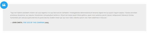
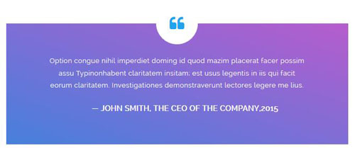
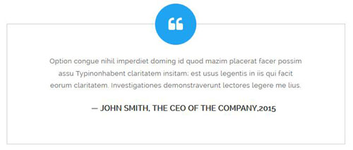
Quotes
You can click the link to check Quotes demo. Demo Link

<blockquote class="quotes_1">
  <p>“Typi non habent claritatem insitam; est usus...”</p>
  <small>JOHN SMITH, <span>THE CEO OF THE COMPANY</span>,2015</small>
</blockquote>
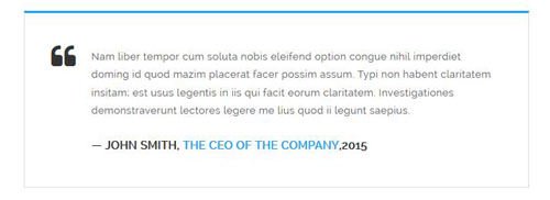
<blockquote class="quotes_2">
  <p>Typi non habent claritatem insitam; est usus...</p>
  <small>JOHN SMITH, <span>THE CEO OF THE COMPANY</span>,2015</small>
</blockquote>
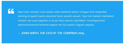
<blockquote class="quotes_3">
  <p>Typi non habent claritatem insitam; est usus...</p>
  <small>JOHN SMITH, <span>THE CEO OF THE COMPANY</span>,2015</small>
</blockquote>
<blockquote class="quotes_4">
  <p>“Typi non habent claritatem insitam; est usus...”</p>
  <small>JOHN SMITH, <span>THE CEO OF THE COMPANY</span>,2015</small>
</blockquote>
<blockquote class="quotes_5">
  <p>Typi non habent claritatem insitam; est usus...</p>
  <small>JOHN SMITH, <span>THE CEO OF THE COMPANY</span>,2015</small>
</blockquote>
<blockquote class="quotes_6">
  <p>Typi non habent claritatem insitam; est usus...</p>
  <small>JOHN SMITH, <span>THE CEO OF THE COMPANY</span>,2015</small>
</blockquote>
Dropcaps
You can click the link to check Dropcaps demo. Demo Link
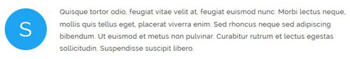
<span class="dropcaps_1 a_bg_c">R</span>
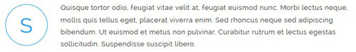
<span class="dropcaps_2 a_b_c a_t_c">R</span>
<span class="dropcaps_3 ">R</span>
<span class="dropcaps_4 a_t_c">R</span>
<span class="dropcaps_5 ">R</span>
<span class="dropcaps_6 ">R</span>
<span class="dropcaps_7 a_bg_c">R</span>
<span class="dropcaps_8 a_bg_c">R</span>
Carousel
You can click the link to check Carousel demo. Demo Link
Style 1:
Below is the screen shot:

Codes are as follows:
<div class="carousel carousel_4" data-pagination="false" data-items="4" data-navigation="true" data-autoplay="true">
  <div class="item">
    <div class="ServeList_28">
      <div class="ico"><span class="fa fa-flask"></span></div>
      <h5>Unlimited Colors</h5>
      <p>Sed rhoncus neque sed adipiscing bibendum. Ut euismod et metus non pulvinar. Curabitur rutrum et lectus egestas sollicitudin. </p>
    </div>
  </div>
  <div class="item">
    <div class="ServeList_28">
      <div class="ico"><span class="fa fa-gift"></span></div>
      <h5>Free Download</h5>
      <p>Sed rhoncus neque sed adipiscing bibendum. Ut euismod et metus non pulvinar. Curabitur rutrum et lectus egestas sollicitudin. </p>
    </div>
  </div>
  <div class="item">
    <div class="ServeList_28">
      <div class="ico"><span class="fa fa-desktop"></span></div>
      <h5>Retina Ready</h5>
      <p>Sed rhoncus neque sed adipiscing bibendum. Ut euismod et metus non pulvinar. Curabitur rutrum et lectus egestas sollicitudin. </p>
    </div>
  </div>
  <div class="item">
    <div class="ServeList_28">
      <div class="ico"><span class="fa fa-calendar-o"></span></div>
      <h5>Effective Work</h5>
      <p>Sed rhoncus neque sed adipiscing bibendum. Ut euismod et metus non pulvinar. Curabitur rutrum et lectus egestas sollicitudin. </p>
    </div>
  </div>
  <div class="item">
    <div class="ServeList_28">
      <div class="ico"><span class="fa fa-flask"></span></div>
      <h5>Unlimited Colors</h5>
      <p>Sed rhoncus neque sed adipiscing bibendum. Ut euismod et metus non pulvinar. Curabitur rutrum et lectus egestas sollicitudin. </p>
    </div>
  </div>
</div>
Option:
- You can increase your content items through adding
<div class="item"></div> - You can add image style effects through effects of imageeffects page.
- You can add image enlargement effect through the effect of lightbox page.
| Variable | Default | Type | Description |
|---|---|---|---|
data-items |
4 | int | This variable allows you to set the maximum amount of items displayed at a time with the widest browser width. |
data-navigation |
true | boolean | Display "next" and "prev" buttons. |
data-pagination |
true | boolean | Show pagination. |
data-autoplay |
true | int/boolean | Change to any integrer for example data-autoplay ="5000" to play every 5 seconds. If you set data-autoplay="false" Stop auto scroll animation. |
Example:
<div class="carousel" data-items="4" data-navigation="true" data-pagination="true" data-autoplay="true" data-autoheight="true">
  <div class="item">
		...
Style 2:
Below is the screen shot:
Codes are as follows:
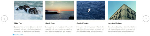
<div class="carousel carousel_5" data-pagination="false" data-items="4" data-navigation="true" data-autoplay="true">
  <div class="item"> <img alt="" src="/portals/9/Photo_62.jpg" />
    <h5>Create Website</h5>
    <p>Duis autem vel eum iriure dolor in hendrerit in vulp utate velit esse molestie consequat, vel illum dolore eu feugiat iusto odio luptatum.</p>
  </div>
  <div class="item"> <img alt="" src="/portals/9/Photo_63.jpg" />
    <h5>Make Plan</h5>
    <p>Duis autem vel eum iriure dolor in hendrerit in vulp utate velit esse molestie consequat, vel illum dolore eu feugiat iusto odio luptatum.</p>
  </div>
  <div class="item"> <img alt="" src="/portals/9/Photo_64.jpg" />
    <h5>Check Errors</h5>
    <p>Duis autem vel eum iriure dolor in hendrerit in vulp utate velit esse molestie consequat, vel illum dolore eu feugiat iusto odio luptatum.</p>
  </div>
  <div class="item"> <img alt="" src="/portals/9/Photo_65.jpg" />
    <h5>Create Website</h5>
    <p>Duis autem vel eum iriure dolor in hendrerit in vulp utate velit esse molestie consequat, vel illum dolore eu feugiat iusto odio luptatum.</p>
  </div>
  <div class="item"> <img alt="" src="/portals/9/Photo_62.jpg" />
    <h5>Upgrated Modules</h5>
    <p>Duis autem vel eum iriure dolor in hendrerit in vulp utate velit esse molestie consequat, vel illum dolore eu feugiat iusto odio luptatum.</p>
  </div>
</div>
Option:
- You can increase your content items through adding
<div class="item"></div> - You can add image style effects through effects of imageeffects page.
- You can add image enlargement effect through the effect of lightbox page.
| Variable | Default | Type | Description |
|---|---|---|---|
data-items |
4 | int | This variable allows you to set the maximum amount of items displayed at a time with the widest browser width. |
data-navigation |
true | boolean | Display "next" and "prev" buttons. |
data-pagination |
true | boolean | Show pagination. |
data-autoplay |
true | int/boolean | Change to any integrer for example data-autoplay ="5000" to play every 5 seconds. If you set data-autoplay="false" Stop auto scroll animation. |
Example:
<div class="carousel" data-items="4" data-navigation="true" data-pagination="true" data-autoplay="true" data-autoheight="true">
      <div class="item">
            ...
Style 3:
Below is the screen shot:
Codes are as follows:
<div class="carousel carousel_6" data-pagination="false" data-items="4" data-navigation="true" data-autoplay="true">
  <div class="item"> <img alt="" src="/portals/9/Photo_66.jpg" />
    <div class="text"> <span class="fa fa-compress"></span>
      <h5>MODULE DEVELOPMENT</h5>
      <p>August 25th,2014</p>
    </div>
  </div>
  <div class="item"> <img alt="" src="/portals/9/Photo_67.jpg" />
    <div class="text"> <span class="fa fa-compress"></span>
      <h5>MODULE DEVELOPMENT</h5>
      <p>August 25th,2014</p>
    </div>
  </div>
  <div class="item"> <img alt="" src="/portals/9/Photo_68.jpg" />
    <div class="text"> <span class="fa fa-compress"></span>
      <h5>MODULE DEVELOPMENT</h5>
      <p>August 25th,2014</p>
    </div>
  </div>
  <div class="item"> <img alt="" src="/portals/9/Photo_69.jpg" />
    <div class="text"> <span class="fa fa-compress"></span>
      <h5>MODULE DEVELOPMENT</h5>
      <p>August 25th,2014</p>
    </div>
  </div>
</div>
Option:
- You can increase your content items through adding
<div class="item"></div> - You can add image style effects through effects of imageeffects page.
- You can add image enlargement effect through the effect of lightbox page.
| Variable | Default | Type | Description |
|---|---|---|---|
data-items |
4 | int | This variable allows you to set the maximum amount of items displayed at a time with the widest browser width. |
data-navigation |
true | boolean | Display "next" and "prev" buttons. |
data-pagination |
true | boolean | Show pagination. |
data-autoplay |
true | int/boolean | Change to any integrer for example data-autoplay ="5000" to play every 5 seconds. If you set data-autoplay="false" Stop auto scroll animation. |
Example:
<div class="carousel" data-items="4" data-navigation="true" data-pagination="true" data-autoplay="true" data-autoheight="true">
      <div class="item">
            ...
Style 4:
Below is the screen shot:
Codes are as follows:
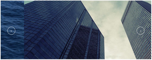
<div class="carousel carousel_7" data-pagination="true" data-navigation="true" data-autoplay="true">
  <div class="item"> <img alt="" src="/portals/9/Photo_70.jpg" /></div>
  <div class="item"> <img alt="" src="/portals/9/Photo_71.jpg" /></div>
</div>
Option:
- You can increase your content items through adding
<div class="item"></div> - You can control the way that the content comes out through these four styles
"text_left""text_right""text_top""text_bottom"
| Variable | Default | Type | Description |
|---|---|---|---|
data-navigation |
true | boolean | Display "next" and "prev" buttons. |
data-pagination |
true | boolean | Show pagination. |
data-autoplay |
true | int/boolean | Change to any integrer for example data-autoplay ="5000" to play every 5 seconds. If you set data-autoplay="false" Stop auto scroll animation. |
data-autoheight |
true | boolean | Add height to owl-wrapper-outer so you can use diffrent heights on slides. Use it only for one item per page setting. |
Style 5:
Below is the screen shot:
Codes are as follows:
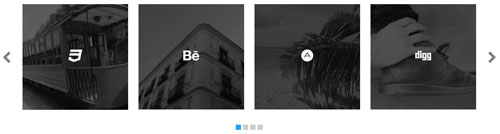
<div class="carousel carousel_2" data-pagination="true" data-items="4" data-navigation="true" data-autoplay="true">
  <div class="item">
    <div class="img_box"><img alt="" src="/portals/9/Photo_17.jpg" />
      <div class="content">
        <div class="ico"><span class="fa fa-digg"></span></div>
        <p>Integer fringilla blandit diam,  ultricies lacus, in facilisis leo. Vestibulum et turpis </p>
      </div>
    </div>
  </div>
  <div class="item">
    <div class="img_box"><img alt="" src="/portals/9/Photo_18.jpg" />
      <div class="content">
        <div class="ico"><span class="fa fa-css3"></span></div>
        <p>Integer fringilla blandit diam,  ultricies lacus, in facilisis leo. Vestibulum et turpis </p>
      </div>
    </div>
  </div>
  <div class="item">
    <div class="img_box"><img alt="" src="/portals/9/Photo_19.jpg" />
      <div class="content">
        <div class="ico"><span class="fa fa-behance"></span></div>
        <p>Integer fringilla blandit diam,  ultricies lacus, in facilisis leo. Vestibulum et turpis </p>
      </div>
    </div>
  </div>
  <div class="item">
    <div class="img_box"><img alt="" src="/portals/9/Photo_20.jpg" />
      <div class="content">
        <div class="ico"><span class="fa  fa-adn"></span></div>
        <p>Integer fringilla blandit diam,  ultricies lacus, in facilisis leo. Vestibulum et turpis </p>
      </div>
    </div>
  </div>
</div>
Option:
| Variable | Default | Type | Description |
|---|---|---|---|
data-items |
4 | int | This variable allows you to set the maximum amount of items displayed at a time with the widest browser width. |
data-navigation |
true | boolean | Display "next" and "prev" buttons. |
data-pagination |
true | boolean | Show pagination. |
data-autoplay |
true | int/boolean | Change to any integrer for example data-autoplay ="5000" to play every 5 seconds. If you set data-autoplay="false" Stop auto scroll animation. |
Style 6:
Below is the screen shot:
Codes are as follows:
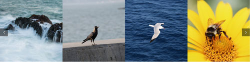
<div data-autoplay="true" data-navigation="false" data-items="4" data-pagination="true" class="carousel carousel_1">
  <div class="item">
    <div class="img_box"><a href="#"><img alt="" src="/portals/9/carousel_01.jpg" /></a></div>
  </div>
  <div class="item">
    <div class="img_box"><a href="#"><img alt="" src="/portals/9/carousel_02.jpg" /></a></div>
  </div>
  <div class="item">
    <div class="img_box"><a href="#"><img alt="" src="/portals/9/carousel_03.jpg" /></a></div>
  </div>
  <div class="item">
    <div class="img_box"><a href="#"><img alt="" src="/portals/9/carousel_04.jpg" /></a></div>
  </div>
</div>
Option:
| Variable | Default | Type | Description |
|---|---|---|---|
data-items |
4 | int | This variable allows you to set the maximum amount of items displayed at a time with the widest browser width. |
data-navigation |
true | boolean | Display "next" and "prev" buttons. |
data-pagination |
true | boolean | Show pagination. |
data-autoplay |
true | int/boolean | Change to any integrer for example data-autoplay ="5000" to play every 5 seconds. If you set data-autoplay="false" Stop auto scroll animation. |
CSS3 Animations
You can click the link to check CSS3 Animations demo. Demo Link
Style 1:
This type is a group of effects which are displayed in time sequence. Below is the screen shot:
Codes are as follows:
<div class="animation">
   <div class="row mb-20">
       <div class="col-sm-3 animation_item scaleUp delay1"><img src="/portals/37/Photo2.jpg" /></div>
       <div class="col-sm-3 animation_item scaleUp delay2"><img src="/portals/37/Photo2.jpg" /></div>
       <div class="col-sm-3 animation_item scaleUp delay3"><img src="/portals/37/Photo2.jpg" /></div>
       <div class="col-sm-3 animation_item scaleUp delay4"><img src="/portals/37/Photo2.jpg" /></div>
	   ...
</div>
delay1, delay2, delay3, delay4 are used to control animation time, there are 12 time slots, which correspond to delay1~delay12 respectively.
scaleUp is used to control animation effect, there are scaleUp , bounceIn , bounceInDown , bounceInLeft , bounceInRight , bounceInUp , fadeIn , fadeInDown , fadeInLeft , fadeInRight , fadeInUp , fadeInDownBig , fadeInLeftBig , fadeInRightBig , fadeInUpBig , flip , flipInX , flipInY , lightSpeedIn , rotateIn , rotateInDownLeft , rotateInDownRight , rotateInUpLeft , rotateInUpRight , rollIn , zoomIn , zoomInDown , zoomInLeft , zoomInRight , zoomInUp 30 effects in total.
Style 2:
If you just need one animation effect, you can match with the following codes.
<div class="animation scaleUp"> <img src="/portals/37/Photo5.jpg" /> </div>
Style 3:
You can add animation for a certain element when mousing over. Codes are as follows:
<div class="animationhover bounce"> <img src="/portals/37/Photo5.jpg" /> </div>
When mousing over, it will show animation effect type (animationhover). There are bounce , flash , pulse , rubberBand , shake , swing , tada , wobble 8 effects.
Popovers
You can click the link to check Popovers demo. Demo Link
Below is the screen shot:
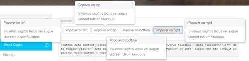
Codes are as follows:
<button data-content="Vivamus sagittis lacus vel augue laoreet rutrum faucibus." data-placement="left" data-toggle="popover" data-container="body" data-original-title="Popover on left" class="btn btn-default popovers" type="button">
    Popover on left
</button>
Option:
| Name | type | default | description |
|---|---|---|---|
| animation | boolean | true | apply a CSS fade transition to the tooltip |
| html | boolean | false | Insert HTML into the tooltip. If false, jQuery's text method will be used to insert content into the DOM. Use text if you're worried about XSS attacks. |
| placement | string | function | 'top' | how to position the tooltip - top | bottom | left | right | auto. When "auto" is specified, it will dynamically reorient the tooltip. For example, if placement is "auto left", the tooltip will display to the left when possible, otherwise it will display right. |
| selector | string | false | If a selector is provided, tooltip objects will be delegated to the specified targets. |
| title | string | function | '' | default title value if title attribute isn't present |
| trigger | string | 'hover focus' | how tooltip is triggered - click | hover | focus | manual. You may pass multiple triggers; separate them with a space. |
| delay | number | object | 0 | delay showing and hiding the tooltip (ms) - does not apply to manual trigger type If a number is supplied, delay is applied to both hide/show Object structure is: |
| container | string | false | false | Appends the tooltip to a specific element. Example: |
Alerts
You can click the link to check Alerts demo. Demo Link
Below is the screen shot:
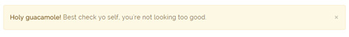
Codes are as follows:
<div class="alert alert-warning fade in">
    <button aria-hidden="true" data-dismiss="alert" class="close" type="button">×</button>
    <strong>Holy guacamole!</strong> Best check yo self, you're not looking too good.
</div>
Option:
- You can change
alert-to change the color, there arealert-warning,alert-danger,alert-success,alert-info4 colors included in the effects. fadeis for hiddeninis for display
Tooltips
You can click the link to check Tooltips demo. Tooltips
Below is the screen shot:
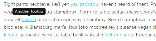
Codes are as follows:
<a href="#" class="tooltips" data-toggle="tooltip" title="first tooltip">Hover over me</a>
Option:
| Name | type | default | description |
|---|---|---|---|
| animation | boolean | true | apply a CSS fade transition to the tooltip |
| html | boolean | false | Insert HTML into the tooltip. If false, jQuery's text method will be used to insert content into the DOM. Use text if you're worried about XSS attacks. |
| placement | string | function | 'top' | how to position the tooltip - top | bottom | left | right | auto. When "auto" is specified, it will dynamically reorient the tooltip. For example, if placement is "auto left", the tooltip will display to the left when possible, otherwise it will display right. |
| selector | string | false | If a selector is provided, tooltip objects will be delegated to the specified targets. |
| title | string | function | '' | default title value if title attribute isn't present |
| trigger | string | 'hover focus' | how tooltip is triggered - click | hover | focus | manual. You may pass multiple triggers; separate them with a space. |
| delay | number | object | 0 | delay showing and hiding the tooltip (ms) - does not apply to manual trigger type If a number is supplied, delay is applied to both hide/show Object structure is: |
| container | string | false | false | Appends the tooltip to a specific element. Example: |
Dropdowns
You can click the link to check Dropdowns demo. Demo Link
Style 1:
Below is the screen shot:
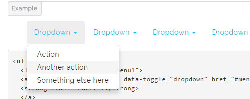
Codes are as follows:
<ul class="nav nav-pills">
  <li class="dropdown" id="menu1">
  <a class="dropdown-toggle" data-toggle="dropdown" href="#menu1">Dropdown
  <strong class="caret"></strong>
  </a>
    <ul class="dropdown-menu">
      <li><a href="#">Action</a></li>
      <li><a href="#">Another action</a></li>
      <li><a href="#">Something else here</a></li>
    </ul>
  </li>
</ul>
Style 2:
Below is the screen shot:
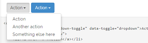
Codes are as follows:
<div class="btn-group">
  <button class="btn dropdown-toggle" data-toggle="dropdown">Action <span class="caret"></span></button>
  <ul class="dropdown-menu">
    <li><a href="#">Action</a></li>
    <li><a href="#">Another action</a></li>
    <li><a href="#">Something else here</a></li>
  </ul>
</div>
Style 3:
Below is the screen shot:
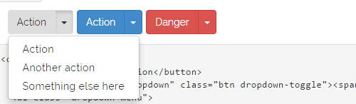
Codes are as follows:
<div class="btn-group">
  <button class="btn">Action</button>
  <button data-toggle="dropdown" class="btn dropdown-toggle"><span class="caret"></span></button>
  <ul class="dropdown-menu">
    <li><a href="#">Action</a></li>
    <li><a href="#">Another action</a></li>
    <li><a href="#">Something else here</a></li>
  </ul>
</div>
LightBox
You can click the link to check LightBox demo. Demo Link
Below is the screen shot:
Option:
1. LightBox_image |
Show one image alone. |
2. LightBox_image_gallery+group number |
Classify those that share the same class name to one group, you can show other images within the group by clicking left and right arrow of the image. |
3. LightBox_image_group |
Classify these sub levels whose label class name is LightBox_image_group into one group. |
4. LightBox_youtube |
Show youtube video. |
5. LightBox_vimeo |
Show video. |
6. LightBox_gmaps |
Shown map. |
7. LightBox_youtube_gallery+group number |
Classify these that share the same class name into a group of youtube video show |
8. LightBox_vimeo_gallery+group number |
Classify these that share the same class name into a group of video show. |
9. LightBox_gmaps_gallery+group number |
Classify these that share the same class name into a group of map show. |
10. LightBox_youtube_group |
Classify these sub levels whose label class name is LightBox_youtube_group into one group. |
11. LightBox_vimeo_group |
Classify these sub levels whose label class name is LightBox_vimeo_group into one group. |
12. LightBox_gmaps_group |
Classify these sub levels whose label class names is LightBox_gmaps_group into one group. |
13. LightBox_Box |
Take div as layer pop up, div needs to hide by default. Style of pop up is custom style. |
14. LightBox_ajax |
Pop up a page |
15. LightBox_ajax_group |
Pop up a group of pages |
You need to fill url of the pop up image(video, map) in href=""
1.LightBox_image
<a href="bigPhoto.jpg" class="LightBox_image" title="Single Image 1"><img alt="" src="cover.jpg" /></a>
2.LightBox_image_gallery
<a href="bigPhoto1.jpg" class="LightBox_image_gallery1" title="Single Image 1"><img alt="" src="cover.jpg" /></a>
<a href="bigPhoto2.jpg" class="LightBox_image_gallery1" title="Single Image 1"><img alt="" src="cover.jpg" /></a>
<a href="bigPhoto3.jpg" class="LightBox_image_gallery2" title="Single Image 2"><img alt="" src="cover.jpg" /></a>
<a href="bigPhoto4.jpg" class="LightBox_image_gallery2" title="Single Image 2"><img alt="" src="cover.jpg" /></a>
3.LightBox_image_group
<div class="LightBox_image_group">
    <a href="bigPhoto1.jpg" title=" People Scenery 1"><img alt="" src="cover.jpg" /> </a>
    <a href="bigPhoto2.jpg" title=" People Scenery 2"></a>
    <a href="bigPhoto3.jpg" title=" People Scenery 3"></a>
</div>
4.LightBox_youtube
<a href="http://www.youtube.com/watch?v=0O2aH4XLbto" class="LightBox_youtube" title="youtube"><img alt="" src="cover.jpg" /></a>
5.LightBox_vimeo
<a href="https://vimeo.com/45830194" class="LightBox_vimeo" title="vimeo"><img alt="" src="cover.jpg" /></a>
6.LightBox_gmaps
<a href="https://maps.google.com/maps?q=221B+Baker+Street,+London,+United+Kingdom&hl=en&t=v&hnear=221B+Baker+St,+London+NW1+6XE,+United+Kingdom" class="LightBox_gmaps" title="gmaps"><img alt="" src="cover.jpg" /></a>
7.LightBox_youtube_gallery
<a href="http://www.youtube.com/watch?v=0O2aH4XLbto" class="LightBox_youtube_gallery1" title="youtube gallery"><img alt="" src="cover.jpg" /></a>
<a href="http://www.youtube.com/watch?v=0O2aH4XLbto" class="LightBox_youtube_gallery1" title="youtube gallery"><img alt="" src="cover.jpg" /></a>
<a href="http://www.youtube.com/watch?v=0O2aH4XLbto" class="LightBox_youtube_gallery2" title="youtube gallery"><img alt="" src="cover.jpg" /></a>
<a href="http://www.youtube.com/watch?v=0O2aH4XLbto" class="LightBox_youtube_gallery2" title="youtube gallery"><img alt="" src="cover.jpg" /></a>
8.LightBox_vimeo_gallery
<a href="https://vimeo.com/45830194" class="LightBox_vimeo_gallery1" title="vimeo gallery"><img alt="" src="cover.jpg" /></a>
<a href="https://vimeo.com/45830194" class="LightBox_vimeo_gallery1" title="vimeo gallery"><img alt="" src="cover.jpg" /></a>
<a href="https://vimeo.com/45830194" class="LightBox_vimeo_gallery2" title="vimeo gallery"><img alt="" src="cover.jpg" /></a>
<a href="https://vimeo.com/45830194" class="LightBox_vimeo_gallery2" title="vimeo gallery"><img alt="" src="cover.jpg" /></a>
9.LightBox_gmaps_gallery
<a href="https://maps.google.com/maps?q=221B+Baker+Street,+London,+United+Kingdom&hl=en&t=v&hnear=221B+Baker+St,+London+NW1+6XE,+United+Kingdom" class="LightBox_gmaps_gallery1" title="gmaps gallery"><img alt="" src="cover.jpg" /></a>
<a href="https://maps.google.com/maps?q=221B+Baker+Street,+London,+United+Kingdom&hl=en&t=v&hnear=221B+Baker+St,+London+NW1+6XE,+United+Kingdom" class="LightBox_gmaps_gallery1" title="gmaps gallery"><img alt="" src="cover.jpg" /></a>
<a href="https://maps.google.com/maps?q=221B+Baker+Street,+London,+United+Kingdom&hl=en&t=v&hnear=221B+Baker+St,+London+NW1+6XE,+United+Kingdom" class="LightBox_gmaps_gallery2" title="gmaps gallery"><img alt="" src="cover.jpg" /></a>
<a href="https://maps.google.com/maps?q=221B+Baker+Street,+London,+United+Kingdom&hl=en&t=v&hnear=221B+Baker+St,+London+NW1+6XE,+United+Kingdom" class="LightBox_gmaps_gallery2" title="gmaps gallery"><img alt="" src="cover.jpg" /></a>
10.LightBox_youtube_group
<div class="LightBox_youtube_group">
    <a href="http://www.youtube.com/watch?v=0O2aH4XLbto" title=" youtube 1"><img alt="" src="cover.jpg" /> </a>
    <a href="http://www.youtube.com/watch?v=0O2aH4XLbto" title=" youtube 2"></a>
    <a href="http://www.youtube.com/watch?v=0O2aH4XLbto" title=" youtube 3"></a>
</div>
11.LightBox_vimeo_group
<div class="LightBox_vimeo_group">
    <a href="https://vimeo.com/45830194" title=" vimeo 1"><img alt="" src="cover.jpg" /> </a>
    <a href="https://vimeo.com/45830194" title=" vimeo 2"></a>
    <a href="https://vimeo.com/45830194" title=" vimeo 3"></a>
</div>
12.LightBox_gmaps_group
<div class="LightBox_gmaps_group">
    <a href="https://maps.google.com/maps?q=221B+Baker+Street,+London,+United+Kingdom&hl=en&t=v&hnear=221B+Baker+St,+London+NW1+6XE,+United+Kingdom" title=" gmaps 1"><img alt="" src="cover.jpg" /> </a>
    <a href="https://maps.google.com/maps?q=221B+Baker+Street,+London,+United+Kingdom&hl=en&t=v&hnear=221B+Baker+St,+London+NW1+6XE,+United+Kingdom" title=" gmaps 2"></a>
    <a href="https://maps.google.com/maps?q=221B+Baker+Street,+London,+United+Kingdom&hl=en&t=v&hnear=221B+Baker+St,+London+NW1+6XE,+United+Kingdom" title=" gmaps 3"></a>
</div>
13.LightBox_Box
<a href=".LightBox_Content" class="LightBox_Box"> Click Here To Pop </a>
<a href=".LightBox_Content" class="LightBox_Box Button_default"> Click Here To Pop </a>
<div class="LightBox_Content">
    <h3>Click Here To Pop</h3>
 	  content text ...
</div>
14.LightBox_ajax
<a href="index.aspx" class="LightBox_ajax" title="ajax"><img alt="" src="cover.jpg" /></a>
15.LightBox_ajax_group
<div class="LightBox_ajax_group">
    <a href="index.aspx" title=" ajax 1"><img alt="" src="cover.jpg" /> </a>
    <a href="index.aspx" title=" ajax 2"></a>
    <a href="index.aspx" title=" ajax 3"></a>
</div>
Image Effects
You can click the link to check Image Effects demo. Demo Link
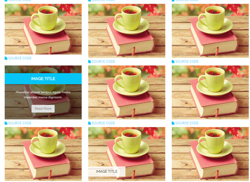
- You can copy over codes of the image effects directly to any HTML modules.
- You can change the font icon through modifying. font icon list
Flip Box
You can click the link to check Flip Box demo. Demo Link
Style 1:
Below is the screen shot:
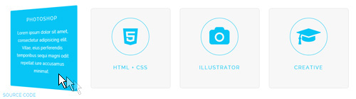
Codes are as follows:
<div class="row">
  <div class="col-md-3 col-sm-6">
    <div class="flip_box flip_box_2">
      <div class="rotate">
        <div class="front"> <span class="fa fa-edit a_b_c a_t_c"></span>
          <h3 class=" a_t_c">PHOTOSHOP</h3>
        </div>
        <div class="back a_bg_c">
          <h3>PHOTOSHOP</h3>
          <p>Content Text ...</p>
        </div>
      </div>
    </div>
  </div>
  <div class="col-md-3 col-sm-6">
    <div class="flip_box flip_box_2">
      <div class="rotate">
        <div class="front"> <span class="fa fa-html5 a_b_c a_t_c"></span>
          <h3 class=" a_t_c">HTML + CSS</h3>
        </div>
        <div class="back a_bg_c">
          <h3>HTML + CSS</h3>
          <p>Content Text ...</p>
        </div>
      </div>
    </div>
  </div>
  <div class="clearfix visible-sm"></div>
  <div class="col-md-3 col-sm-6">
    <div class="flip_box flip_box_2">
      <div class="rotate">
        <div class="front"> <span class="fa fa-camera a_b_c a_t_c"></span>
          <h3 class=" a_t_c">ILLUSTRATOR</h3>
        </div>
        <div class="back a_bg_c">
          <h3>ILLUSTRATOR</h3>
          <p>Content Text ...</p>
        </div>
      </div>
    </div>
  </div>
  <div class="col-md-3 col-sm-6">
    <div class="flip_box flip_box_2">
      <div class="rotate">
        <div class="front"> <span class="fa  fa-mortar-board a_b_c a_t_c"></span>
          <h3 class=" a_t_c">CREATIVE</h3>
        </div>
        <div class="back a_bg_c">
          <h3>CREATIVE</h3>
          <p>Content Text ...</p>
        </div>
      </div>
    </div>
  </div>
</div>
Option:
col-md-3 col-sm-6is the width of each column, you can change the width you need through value1~12.frontis for front content.backis for back content.
Style 2:
Below is the screen shot:
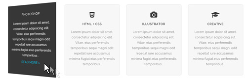
Codes are as follows:
<div class="row">
  <div class="col-md-3 col-sm-6">
    <div class="flip_box flip_box_3">
      <div class="rotate">
        <div class="front"> <span class="fa fa-edit"></span>
          <h3>PHOTOSHOP</h3>
          <p>Content Text ...</p>
        </div>
        <div class="back">
          <h3>PHOTOSHOP</h3>
          <p>Content Text ...</p>
          <a href="#">READ MORE > </a> </div>
      </div>
    </div>
  </div>
  <div class="col-md-3 col-sm-6">
    <div class="flip_box flip_box_3">
      <div class="rotate">
        <div class="front"> <span class="fa fa-html5"></span>
          <h3>HTML + CSS</h3>
          <p>Content Text ...</p>
        </div>
        <div class="back">
          <h3>HTML + CSS</h3>
          <p>Content Text ...</p>
          <a href="#">READ MORE > </a> </div>
      </div>
    </div>
  </div>
  <div class="clearfix visible-sm"></div>
  <div class="col-md-3 col-sm-6">
    <div class="flip_box flip_box_3">
      <div class="rotate">
        <div class="front"> <span class="fa fa-camera"></span>
          <h3>ILLUSTRATOR</h3>
          <p>Content Text ...</p>
        </div>
        <div class="back">
          <h3>ILLUSTRATOR</h3>
          <p>Content Text ...</p>
          <a href="#">READ MORE > </a> </div>
      </div>
    </div>
  </div>
  <div class="col-md-3 col-sm-6">
    <div class="flip_box flip_box_3">
      <div class="rotate">
        <div class="front"> <span class="fa fa-mortar-board"></span>
          <h3>CREATIVE</h3>
          <p>Content Text ...</p>
        </div>
        <div class="back">
          <h3>CREATIVE</h3>
          <p>Content Text ...</p>
          <a href="#">READ MORE > </a> </div>
      </div>
    </div>
  </div>
</div>
Style 3:
Below is the screen shot:
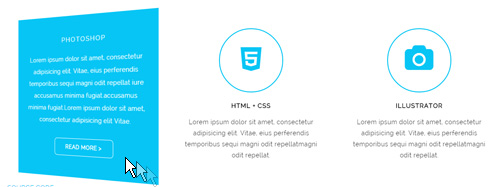
Codes are as follows:
<div class="row">
  <div class="col-sm-4">
    <div class="flip_box flip_box_4">
      <div class="rotate">
        <div class="front"> <span class="fa fa-edit a_b_c a_t_c"></span>
          <h3>PHOTOSHOP</h3>
          <p>Content Text ...</p>
        </div>
        <div class="back  a_bg_c">
          <h3>PHOTOSHOP</h3>
          <p>Content Text ...</p>
          <a href="#" class="btn">READ MORE ></a> </div>
      </div>
    </div>
  </div>
  <div class="col-sm-4">
    <div class="flip_box flip_box_4">
      <div class="rotate">
        <div class="front"> <span class="fa fa-html5 a_b_c a_t_c"></span>
          <h3>HTML + CSS</h3>
          <p>Content Text ...</p>
        </div>
        <div class="back  a_bg_c">
          <h3>HTML + CSS</h3>
          <p>Content Text ...</p>
          <a href="#" class="btn">READ MORE ></a> </div>
      </div>
    </div>
  </div>
  <div class="col-sm-4">
    <div class="flip_box flip_box_4">
      <div class="rotate">
        <div class="front"> <span class="fa fa-camera a_b_c a_t_c"></span>
          <h3>ILLUSTRATOR</h3>
          <p>Content Text ...</p>
        </div>
        <div class="back  a_bg_c">
          <h3>ILLUSTRATOR</h3>
          <p>Content Text ...</p>
          <a href="#" class="btn">READ MORE ></a> </div>
      </div>
    </div>
  </div>
</div>
Responsive Video
Ratio between width and height of the video needs to be 16:9.
<div class="responsive-video">
    <iframe width="853" height="480" src="//www.youtube.com/embed/XcpOsJQXcx4?list=UUIkFV7_2tEhhEhh1NkkwTUw" frameborder="0" allowfullscreen></iframe>
</div>
<div class="responsive-video">
    <iframe src="//player.vimeo.com/video/106249100" width="1920" height="1080" frameborder="0" webkitallowfullscreen mozallowfullscreen allowfullscreen></iframe>
</div>
<div class="responsive-video">
     <embed  src="/portals/37/movie.swf" type="application/x-shockwave-flash" allownetworking="all" allowfullscreen="true" allowscriptaccess="always" wmode="Opaque"></embed>
</div>
<div class="responsive-video">
    <video width="1920" height="1080"  controls="true">
    <source src="/portals/37/movie.m4v" type="video/mp4"></source>
    <source src="/portals/37/movie.ogv" type="video/ogg"></source>
    <source src="/portals/37/movie.webm" type="video/WebM"></source>
    Your browser does not support the video tag. </video>
</div>
Video Bg
You can click the link to check Video Bg demo. Demo Link

- "{videoURL:'npfu0fN9GUA' is the url of
youtube autoPlayis for whether to autoplay or nottrue/falseloopis for whether to play on a loop,true/false
<div data-property="{videoURL:'npfu0fN9GUA',containment:'self', showControls:false, autoPlay:true, loop:true, vol:50, mute:true, startAt:10, opacity:1, addRaster:false, quality:'hd1080'}" class="player">
<div class="Play"></div>
<div class="dnn_layout pt-60 pb-60">
<div class="content_mid clearfix">
<div class="player_boxes">
<h1 class="player_title"> Here Are Your Videos</h1>
<hr class="player_line" />
<h4 class="player_smalltitle">YOU CAN CHANGE THE BACKGROUND BY YOURSELF</h4>
<div class="player_content">
<p>Content Text 1 ... </p>
</div>
<p> <a class="Button_default" href="#"> VIEW PORTFOLIOS</a> <a class="Button_default" href="#"> LEARN MORE</a> </p>
</div>
</div>
</div>
</div>
Home Page Codes
This includes the html introductions that required for Home1~Home7 page, ComingSoon page, One Page page, Boxed Layout page, Dark Mode page.
Fixed Top:
Each page top includes a Fixed Top area. Users can click the upper right + sign to check content of this area, as shown in image below:
This area includes 10 panes, which are FixedTopPaneA ~ FixedTopPaneC , FixedTopPaneD ~ FixedTopPaneE , FixedTopPaneF ~ FixedTopPaneI , FixedTopPaneJ
Only after adding a module into one of the panes, can you click + sign to pop up content of this area.
Home Version 1 (Home)
You can click the link to check Home Version 1 (home) demo. Home Version 1 (Home)
Banner area
Below is the screen shot:
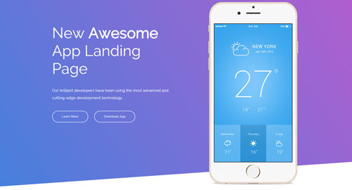
Codes are as follows:
<div class="Banner1">
  <div class="Banner1_bg"></div>
  <div class="dnn_layout">
    <div class="content_mid clearfix">
      <div class="row animation">
        <div class="col-sm-6">
          <div class="Banner1_title animation_item fadeInLeft delay1"> New <span>Awesome</span><br />
            App Landing Page </div>
          <div class="Banner1_content animation_item fadeInLeft delay2"> Our brilliant developers have been using the most advanced and
            cutting-edge development technology. </div>
          <div class="Banner1_link animation_item fadeInLeft delay3"> <a href="#">Learn More</a> <a href="#">Download App</a> </div>
        </div>
        <div class="col-sm-6">
          <div class="Banner1_img animation_item fadeInRight delay4"><img alt="" src="/portals/9/banner-01.png" /></div>
        </div>
      </div>
    </div>
  </div>
</div>
Option:
col-md-*is the width of each column, you can change the width you need through value1~12.- You can modify
animationto change the animation on the slide..Animation list.
4-box area
Below is the screen shot:
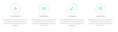
Codes are as follows:
<div class="pt-20 pt-20">
  <div class="row animation">
    <div class="col-md-3 col-sm-6 animation_item scaleUp delay1">
      <div class="ServeList_1">
        <div class="ico"><img alt="" title="New Products" src="/portals/9/ServeList_img_01.png" /></div>
        <h5>New Products</h5>
        <p>Sed ut perspiciatis unde omnis iste natus error sit voluptatem accusantium dolore mque laudan tium, totam rem aperiam, eaque ipsa quaet quasit. </p>
      </div>
    </div>
    <div class="col-md-3 col-sm-6 animation_item scaleUp delay2">
      <div class="ServeList_1">
        <div class="ico"><img alt="" title="Photo Gallery" src="/portals/9/ServeList_img_02.png" /></div>
        <h5>Photo Gallery</h5>
        <p>Sed ut perspiciatis unde omnis iste natus error sit voluptatem accusantium dolore mque laudan tium, totam rem aperiam, eaque ipsa quaet quasit. </p>
      </div>
    </div>
    <div class="clearfix visible-sm"></div>
    <div class="col-md-3 col-sm-6 animation_item scaleUp delay3">
      <div class="ServeList_1">
        <div class="ico"><img alt="" title="Full Support" src="/portals/9/ServeList_img_03.png" /></div>
        <h5>Full Support</h5>
        <p>Sed ut perspiciatis unde omnis iste natus error sit voluptatem accusantium dolore mque laudan tium, totam rem aperiam, eaque ipsa quaet quasit. </p>
      </div>
    </div>
    <div class="col-md-3 col-sm-6 animation_item scaleUp delay4">
      <div class="ServeList_1">
        <div class="ico"><img alt="" title="Custom Web" src="/portals/9/ServeList_img_04.png" /></div>
        <h5>Custom Web</h5>
        <p>Sed ut perspiciatis unde omnis iste natus error sit voluptatem accusantium dolore mque laudan tium, totam rem aperiam, eaque ipsa quaet quasit. </p>
      </div>
    </div>
  </div>
</div>
Option:
col-md-*is the width of each column, you can change the width you need through value1~12.- You can modify
animationto change the animation on the slide..Animation list.
Our Services area And Our Abilities area
Below is the screen shot:
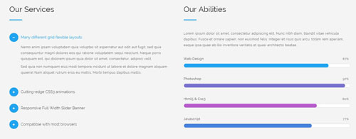
Codes are as follows:
<div class="backgroundImage1 pt-60 pb-60">
  <div class="dnn_layout">
    <div class="content_mid clearfix">
      <div class="row animation">
        <div class="col-sm-6 animation_item fadeInLeft delay1">
          <h3 class="title_style_1 ">Our Services</h3>
          <div id="accordion1" class="panel-group accordion_1">
            <div class="panel panel-default">
              <div class="panel-heading">
                <h4 class="panel-title"> <a href="#collapse1_1" data-parent="#accordion1" data-toggle="collapse"> <span class="accordion_icon"></span>Many different grid flexible layouts</a> </h4>
              </div>
              <div class="panel-collapse collapse in" id="collapse1_1">
                <div class="panel-body">
                  <p>Nemo enim ipsam voluptatem quia voluptas sit aspernatur aut odit aut fugit...</p>
                  <p>Sed quia non numquam eius modi tempora incidunt ut labore et dolore magnam aliquam quaerat Nam aliquet rutrum eros eu mattis. Morbi tempus dapibus mattis.</p>
                </div>
              </div>
            </div>
            <div class="panel panel-default">
              <div class="panel-heading">
                <h4 class="panel-title"> <a class="collapsed" href="#collapse1_2" data-parent="#accordion1" data-toggle="collapse"> <span class="accordion_icon"></span>Cutting-edge CSS3 animations</a> </h4>
              </div>
              <div class="panel-collapse collapse" id="collapse1_2">
                <div class="panel-body">
                  <p>Nemo enim ipsam voluptatem quia voluptas sit aspernatur aut odit aut...</p>
                  <p>Sed quia non numquam eius modi tempora incidunt ut labore et dolore magnam aliquam quaerat Nam aliquet rutrum eros eu mattis. Morbi tempus dapibus mattis.</p>
                </div>
              </div>
            </div>
            <div class="panel panel-default">
              <div class="panel-heading">
                <h4 class="panel-title"> <a class="collapsed" href="#collapse1_3" data-parent="#accordion1" data-toggle="collapse"> <span class="accordion_icon"></span>Responsive Full Width Slider Banner</a> </h4>
              </div>
              <div class="panel-collapse collapse" id="collapse1_3">
                <div class="panel-body">
                  <p>Nemo enim ipsam voluptatem quia voluptas sit aspernatur aut odit aut fugit...</p>
                  <p>Sed quia non numquam eius modi tempora incidunt ut labore et dolore magnam aliquam quaerat Nam aliquet rutrum eros eu mattis. Morbi tempus dapibus mattis.</p>
                </div>
              </div>
            </div>
            <div class="panel panel-default">
              <div class="panel-heading">
                <h4 class="panel-title"> <a class="collapsed" href="#collapse1_4" data-parent="#accordion1" data-toggle="collapse"> <span class="accordion_icon"></span>Compatible with most browsers</a> </h4>
              </div>
              <div class="panel-collapse collapse" id="collapse1_4">
                <div class="panel-body">
                  <p>Nemo enim ipsam voluptatem quia voluptas sit aspernatur aut odit aut fugit...</p>
                  <p>Sed quia non numquam eius modi tempora incidunt ut labore et dolore magnam aliquam quaerat Nam aliquet rutrum eros eu mattis. Morbi tempus dapibus mattis.</p>
                </div>
              </div>
            </div>
          </div>
          <div class="pb-60"> </div>
        </div>
        <div class="col-sm-6 animation_item fadeInRight delay1">
          <h3 class="title_style_1 ">Our Abilities</h3>
          <p>Lorem ipsum dolor sit amet, consectetur adipiscing elit. Nunc nibh diam, blandit vitae vehicula dapibus... </p>
          <br />
          <div class="loaded_list_1">
            <p>Web Design</p>
            <div class="progress">
              <div data-width="87%" class="bar animation animationwidth color_bg_1"> <span></span> </div>
            </div>
            <p>Photoshop</p>
            <div class="progress">
              <div data-width="97%" class="bar animation animationwidth color_bg_2"> <span></span> </div>
            </div>
            <p>Html5 & Css3</p>
            <p> </p>
            <div class="progress">
              <div data-width="80%" class="bar animation animationwidth color_bg_3"> <span></span> </div>
            </div>
            <p>Javascript</p>
            <div class="progress">
              <div data-width="77%" class="bar animation animationwidth color_bg_4"> <span></span> </div>
            </div>
          </div>
          <div class="pb-60"> </div>
        </div>
      </div>
    </div>
  </div>
  <div class="pb-20"> </div>
</div>
Option:
- This is a
Accordionseffect.Accordions data-widthis controlling the percentage that displays, you can display percentage through value0~100col-md-*is the width of each column, you can change the width you need through value1~12.- You can modify
animationto change the animation on the slide..Animation list.
Featured Products area
Below is the screen shot:
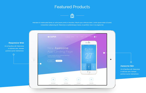
Codes are as follows:
<div class="backgroundImage2 color_white  pt-60">
  <div class="dnn_layout">
    <div class="content_mid clearfix animation">
      <h3 class="title_style_2 animation_item scaleUp delay1">Featured Products <span class="icon"> <em class="fa fa-hospital-o"></em></span></h3>
      <p class="pt-20 pb-20 animation_item scaleUp delay2" style="text-align: center;">Interdum et malesuada fames ac ante ipsum primis in faucibus. Mauris quis vehicula diam. Lorem ipsum dolor sit amet,<br />
        consectetur adipiscing elit. Maecenas ut pellentesque massa, ut porttitor risus. In eu ligula nisl.</p>
      <div class="content_text_1">
        <div class="text_img animation_item scaleUp delay3"><img alt="" src="/portals/9/iPad_01.png" /></div>
        <dl class="text_left animation_item fadeInLeft delay4">
          <dt>Responsive Web</dt>
          <dd>Ut ut faucibus elit. Maecenas in ultricies sem. Aenean pulvinar auctor elementum.</dd>
          <dd class="line"> </dd>
        </dl>
        <dl class="text_right animation_item fadeInRight delay4">
          <dt>Awesome Skin</dt>
          <dd>Ut ut faucibus elit. Maecenas in ultricies sem. Aenean pulvinar auctor elementum.</dd>
          <dd class="line"> </dd>
        </dl>
      </div>
    </div>
  </div>
</div>
<div class="pb-60"></div>
Option:
- You can modify
animationto change the animation on the slide..Animation list.
Amazing Features area
Below is the screen shot:
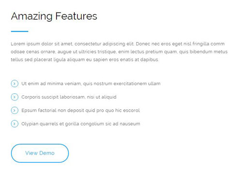
Codes are as follows:
<div class="animation fadeInLeft">
  <p class="mb-30">Lorem ipsum dolor sit amet, consectetur adipiscing elit...</p>
  <ul class="list_style_1">
    <li>Ut enim ad minima veniam, quis nostrum exercitationem ullam</li>
    <li>Corporis suscipit laboriosam, nisi ut aliquid</li>
    <li>Epsum factorial non deposit quid pro quo hic escorol</li>
    <li>Olypian quarrels et gorilla congolium sic ad nauseum</li>
  </ul>
  <p class="pt-30"> <a class="btn_1" href="#">View Demo</a></p>
</div>
Option:
- You can modify
animationto change the animation on the slide..Animation list. Containeris usingContainer-1
Creative Design area
Below is the screen shot:
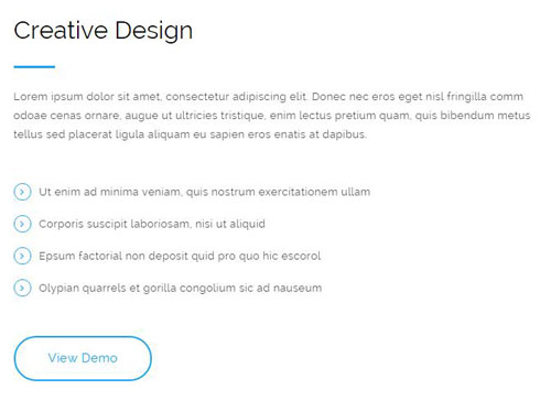
Codes are as follows:
<div class="animation fadeInRight">
  <p class="mb-30">Lorem ipsum dolor sit amet, consectetur adipiscing elit...</p>
  <ul class="list_style_1">
    <li>Ut enim ad minima veniam, quis nostrum exercitationem ullam</li>
    <li>Corporis suscipit laboriosam, nisi ut aliquid</li>
    <li>Epsum factorial non deposit quid pro quo hic escorol</li>
    <li>Olypian quarrels et gorilla congolium sic ad nauseum</li>
  </ul>
  <p class="pt-30 mb-60"> <a class="btn_1" href="#">View Demo</a></p>
</div>
Option:
- You can modify
animationto change the animation on the slide..Animation list. Containeris usingContainer-1
Download App area
Below is the screen shot:
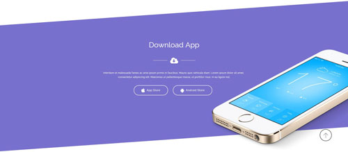
Codes are as follows:
<div class="backgroundImage3 color_white  pt-60 animation">
  <div class="dnn_layout">
    <div class="content_mid clearfix">
      <h3 class="title_style_2 animation_item scaleUp delay1">Download App <span class="icon"> <em class="fa fa-cloud-download"></em></span></h3>
      <p style="text-align: center;" class="pt-20 pb-20 animation_item scaleUp delay2">Interdum et malesuada fames ac ante ipsum primis in faucibus. Mauris quis vehicula diam. Lorem ipsum dolor sit amet, <br />
        consectetur adipiscing elit. Maecenas ut pellentesque massa, ut porttitor risus. In eu ligula nisl.</p>
      <p style="text-align: center;" class=" animation_item scaleUp delay3"> <a href="#" class="btn_2"><span class="fa fa-apple"></span> App Store</a>    <a href="#" class="btn_2"><span class="fa fa-android"></span> Android Store</a> </p>
    </div>
  </div>
  <div class="img_positionright animation_item fadeInRight"> <img alt="" src="/portals/9/iphone_01.png" class="img-responsive" /> </div>
</div>
Option:
- You can modify
animationto change the animation on the slide..Animation list.
Screenshots area
Below is the screen shot:
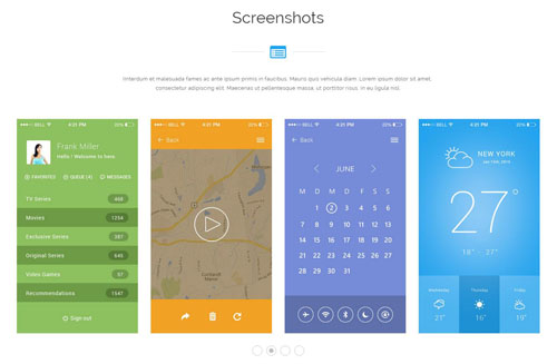
Codes are as follows:
<div class="animation">
  <h3 class="title_style_3 animation_item scaleUp">Screenshots <span class="icon"> <em class="fa  fa-list-alt"></em></span></h3>
  <p class="pt-20 pb-40 animation_item scaleUp delay1" style="text-align: center;">IInterdum et malesuada fames ac ante ipsum primis in faucibus...</p>
  <div data-autoplay="true" data-navigation="false" data-items="4" data-pagination="true" class="carousel carousel_1 animation_item scaleUp delay2">
    <div class="item">
      <div class="img_box"><a href="#"><img alt="" src="/portals/9/carousel_01.jpg" /></a></div>
    </div>
    <div class="item">
      <div class="img_box"><a href="#"><img alt="" src="/portals/9/carousel_02.jpg" /></a></div>
    </div>
    <div class="item">
      <div class="img_box"><a href="#"><img alt="" src="/portals/9/carousel_03.jpg" /></a></div>
    </div>
    <div class="item">
      <div class="img_box"><a href="#"><img alt="" src="/portals/9/carousel_04.jpg" /></a></div>
    </div>
    <div class="item">
      <div class="img_box"><a href="#"><img alt="" src="/portals/9/carousel_01.jpg" /></a></div>
    </div>
    <div class="item">
      <div class="img_box"><a href="#"><img alt="" src="/portals/9/carousel_02.jpg" /></a></div>
    </div>
    <div class="item">
      <div class="img_box"><a href="#"><img alt="" src="/portals/9/carousel_03.jpg" /></a></div>
    </div>
    <div class="item">
      <div class="img_box"><a href="#"><img alt="" src="/portals/9/carousel_04.jpg" /></a></div>
    </div>
  </div>
  <div class="pb-60 pt-60 "></div>
</div>
Option:
- This is a
Carouseleffect.Carousel - You can modify
fa fa-*to change icons. font icon list. - You can modify
animationto change the animation on the slide..Animation list.
Contact Us area
Below is the screen shot:

Codes are as follows:
<div class="animation scaleUp">
  <h3 class="title_style_2 pt-60">Contact Us<span class="icon"> <em class="fa fa-envelope-o "></em></span></h3>
  <p class="pt-30" style="text-align: center; color: #ffffff;">Interdum et malesuada fames ac ante ipsum primis in faucibus...</p>
</div>
Option:
- You can modify
fa fa-*to change icons. font icon list. - You can modify
animationto change the animation on the slide..Animation list.
PowerForms area
Below is the screen shot:
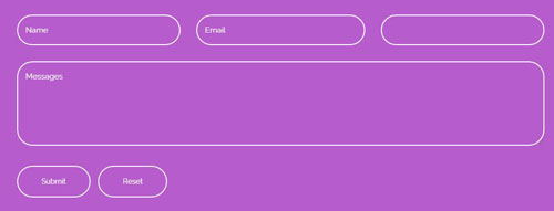
Option:
- This is
Theme_Responsive_20072_home1theme ofDNNGo PowerFormsmodule
Contact Us area
Below is the screen shot:
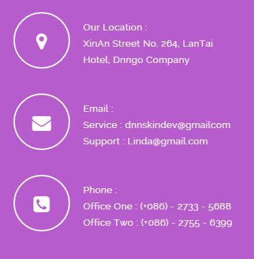
Codes are as follows:
<ul class="list_style_2 animation fadeInRight">
  <li><span class="fa fa-map-marker"></span>
    <div class="info"> Our Location :<br />
      XinAn Street No. 264, LanTai Hotel, Dnngo Company </div>
  </li>
  <li><span class="fa fa-envelope"></span>
    <div class="info"> Email :<br />
      Service :   dnnskindev@gmailcom<br />
      Support :  Linda@gmail.com </div>
  </li>
  <li><span class="fa fa-phone-square"></span>
    <div class="info"> Phone :<br />
      Office One :   (+086) - 2733 - 5688<br />
      Office Two :   (+086) - 2755 - 6399 </div>
  </li>
</ul>
Option:
- You can modify
animationto change the animation on the slide..Animation list. - You can modify
fa fa-*to change icons. font icon list.
PowerForms area
Below is the screen shot:
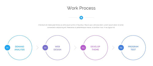
Codes are as follows:
<div class="dnn_layout">
  <div class="head_mid clearfix animation">
    <h3 class="title_style_3 animation_item scaleUp">Work Process <span class="icon"> <em class="fa fa-gear"></em></span></h3>
    <p class="pt-20 pb-40 animation_item scaleUp delay1" style="text-align: center;">IInterdum et malesuada fames ac ante ipsum primis in faucibus...</p>
    <div class="number_style_1 row">
      <div class="col-md-3 col-sm-6  animation_item fadeInLeft delay2">
        <div class="box color_border_1"> <span class="number color_bg_1">01</span>
          <div class="info color_1">DEMAND<br />
            ANALYSIS</div>
        </div>
      </div>
      <div class="col-md-3 col-sm-6  animation_item fadeInLeft delay3">
        <div class="box color_border_2"> <span class="number color_bg_2">02</span>
          <div class="info color_2">WEB<br />
            DESIGN</div>
        </div>
      </div>
      <div class="clearfix visible-sm"></div>
      <div class="col-md-3 col-sm-6  animation_item fadeInLeft delay4">
        <div class="box color_border_3"> <span class="number color_bg_3">03</span>
          <div class="info color_3">DEVELOP<br />
            THEME</div>
        </div>
      </div>
      <div class="col-md-3 col-sm-6  animation_item fadeInLeft delay5">
        <div class="box color_border_4"> <span class="number color_bg_4">04</span>
          <div class="info color_4">PROGRAM<br />
            TEST</div>
        </div>
      </div>
    </div>
  </div>
</div>
Option:
color_border_1~ color_border_4is the corresponding color of each column. You can change the border you need through value1~4color_1~ color_4is the corresponding color of each column. You can change the color you need through value1~4col-md-*is the width of each column, you can change the width you need through value1~12.- You can modify
animationto change the animation on the slide..Animation list.
About Us area
Below is the screen shot:
Codes are as follows:
<div class="animation scaleUp">
  <p> <img alt="" src="/portals/9/logo_02.png" /></p>
  <p>Ut ut faucibus elit. Maecenas in ultricies sem. Aenean pulvinar augue quis libero auctor elementum...</p>
  <p> </p>
  <p> Maecenas in ultricies sem aenean pulvinar quis libero auctor sociis natoque penatibus et magnis en aolliber. </p>
</div>
Option:
- You can modify
animationto change the animation on the slide..Animation list. Containeris usingContainer-2
Friendly Tags area
Below is the screen shot:
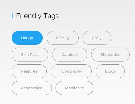
Codes are as follows:
<div class="tag_list_1 animation scaleUp delay1">
    <a href="#">Dnngo</a>
    <a href="#">HTML5</a>
    <a href="#">CSS3</a>
    <a href="#">Skin Pack</a>
    <a href="#">Catalook</a>
    <a href="#">Shotcodes</a>
    <a href="#">Features</a>
    <a href="#">Typography</a>
    <a href="#">Blogs</a>
    <a href="#">Responsive</a>
    <a href="#">Mobilesite</a>
</div>
Option:
- You can modify
animationto change the animation on the slide..Animation list. Containeris usingContainer-2
Photo Gallery area
Below is the screen shot:
Codes are as follows:
<ul class="img_list_1 animation scaleUp delay2">
  <li><a href="/Portals/9/Photo_12.jpg" class="LightBox_image_gallery1"><img alt="" src="/portals/9/Photo_01.jpg" /></a></li>
  <li><a href="/Portals/9/Photo_21.jpg" class="LightBox_image_gallery1"><img alt="" src="/portals/9/Photo_02.jpg" /></a></li>
  <li><a href="/Portals/9/Photo_29.jpg" class="LightBox_image_gallery1"><img alt="" src="/portals/9/Photo_03.jpg" /></a></li>
  <li><a href="/Portals/9/Photo_42.jpg" class="LightBox_image_gallery1"><img alt="" src="/portals/9/Photo_04.jpg" /></a></li>
  <li><a href="/Portals/9/Photo5.jpg" class="LightBox_image_gallery1"><img alt="" src="/portals/9/Photo_05.jpg" /></a></li>
  <li><a href="/Portals/9/Photo_26.jpg" class="LightBox_image_gallery1"><img alt="" src="/portals/9/Photo_06.jpg" /></a></li>
  <li><a href="/Portals/9/Photo_24.jpg" class="LightBox_image_gallery1"><img alt="" src="/portals/9/Photo_07.jpg" /></a></li>
  <li><a href="/Portals/9/Photo_40.jpg" class="LightBox_image_gallery1"><img alt="" src="/portals/9/Photo_08.jpg" /></a></li>
</ul>
Option:
- This is a
LightBoxeffect.LightBox - You can modify
animationto change the animation on the slide..Animation list. Containeris usingContainer-2
Photo Gallery area
Below is the screen shot:
Codes are as follows:
<div class="animation scaleUp">
    <div class="pt-60"></div>
    <h3 class="title_style_2 pt-60">Get Connected<span class="icon"> <em class="fa fa-link "></em></span></h3>
    <p style="text-align: center;" class="pt-30">Interdum et malesuada fames ac ante ipsum primis in faucibus. Mauris quis vehicula diam. Lorem ipsum dolor sit amet, <br />
    consectetur adipiscing elit. Maecenas ut pellentesque massa, ut porttitor risus. In eu ligula nisl.</p>
    <div class="social_list_1 pt-30 pb-60">
        <a href="#"><span class="fa fa-twitter"></span></a>
        <a href="#"><span class="fa fa-facebook"></span></a>
        <a href="#"><span class="fa fa-apple"></span></a>
        <a href="#"><span class="fa fa-android"></span></a>
        <a href="#"><span class="fa  fa-github"></span></a>
        <a href="#"><span class="fa  fa-skype"></span></a>
        <a href="#"><span class="fa fa-delicious"></span></a>
    </div>
</div>
Option:
- You can modify
fa fa-*to change icons. font icon list. - You can modify
animationto change the animation on the slide..Animation list.
Home Version 2
You can click the link to check Home Version 2 demo. Home Version 2
Banner area
Below is the screen shot:

Codes are as follows:
<div style="background-image: url('http://demo8.dnngo.net/Portals/9/Banner2.jpg');" class="Banner2">
  <div class="Banner2_bg"></div>
  <div class="dnn_layout animation">
    <div class="content_mid clearfix">
      <div class="Banner2_title animation_item scaleUp">BEST<br />
        POWERFUL<br />
        TEMPLATE </div>
      <div class="Banner2_content animation_item fadeInLeft delay1"> We are a team comprised of experienced employees whose <br />
        aim is to provide you with skins and modules. </div>
      <div class="Banner2_link animation_item fadeInRight delay2"><a href="#">Purchase This Theme <span class="fa fa-angle-right"></span></a></div>
    </div>
  </div>
</div>
Option:
- You can modify
animationto change the animation on the slide..Animation list.
Welcome To Our Website area
Below is the screen shot:
Codes are as follows:
<div class="content_text_2 pb-60 animation">
  <div class="text_img "> <img alt="" src="/portals/9/pic_03.png" /> </div>
  <dl class="text_box_1">
    <dt class="animation_item delay1 fadeInLeft">Free supports and updates</dt>
    <dd class="animation_item delay1 fadeInLeft">We promise to keep upgrading our skins and modules constantly.</dd>
    <dd class="line"> </dd>
  </dl>
  <dl class="text_box_2">
    <dt class="animation_item delay2 fadeInRight">Advanced technology</dt>
    <dd class="animation_item delay2 fadeInRight">Use the most cutting-edge development technology of HTML5 & CSS3.</dd>
    <dd class="line"> </dd>
  </dl>
  <dl class="text_box_3">
    <dt class="animation_item delay3 fadeInLeft">Lifetime Services</dt>
    <dd class="animation_item delay3 fadeInLeft">Aim to give you and your clients the best user experience</dd>
    <dd class="line"> </dd>
  </dl>
  <dl class="text_box_4">
    <dt class="animation_item delay4 fadeInRight">Responsive design</dt>
    <dd class="animation_item delay4 fadeInRight">Compatible with desktops, laptops and mobile devices.</dd>
    <dd class="line"> </dd>
  </dl>
</div>
Option:
- You can modify
animationto change the animation on the slide..Animation list. Containeris usingContainer-2
3-Box area
Below is the screen shot:
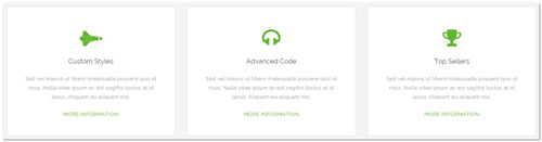
Codes are as follows:
<div class="backgroundImage1 pt-60 pb-60">
  <div class="dnn_layout  pt-20 pb-20">
    <div class="content_mid clearfix">
      <div class="row animation">
        <div class="col-sm-4 animation_item scaleUp delay1">
          <div class="ServeList_2">
            <div class="ico"><span class="fa fa-space-shuttle"></span></div>
            <h5>Custom Styles</h5>
            <p>Sed vel mauris ut libero malesuada posuere quis id risus. Nulla vitae ipsum ac est sagittis luctus at id lacus. Aliquam eu aliquam nisi. </p>
            <p class="pt-10"><a href="#">MORE INFORMATION</a></p>
          </div>
        </div>
        <div class="col-sm-4 animation_item scaleUp delay2">
          <div class="ServeList_2">
            <div class="ico"><span class="fa fa-headphones"></span></div>
            <h5>Advanced Code</h5>
            <p>Sed vel mauris ut libero malesuada posuere quis id risus. Nulla vitae ipsum ac est sagittis luctus at id lacus. Aliquam eu aliquam nisi. </p>
            <p class="pt-10"><a href="#">MORE INFORMATION</a></p>
          </div>
        </div>
        <div class="col-sm-4 animation_item scaleUp delay3">
          <div class="ServeList_2">
            <div class="ico"><span class="fa fa-trophy"></span></div>
            <h5>Top Sellers</h5>
            <p>Sed vel mauris ut libero malesuada posuere quis id risus. Nulla vitae ipsum ac est sagittis luctus at id lacus. Aliquam eu aliquam nisi. </p>
            <p class="pt-10"><a href="#">MORE INFORMATION</a></p>
          </div>
        </div>
      </div>
    </div>
  </div>
</div>
Option:
- You can modify
fa fa-*to change icons. font icon list. - You can modify
animationto change the animation on the slide..Animation list.
ARE YOU READY area
Below is the screen shot:

Codes are as follows:
<div class="backgroundImage5  color_white">
  <div class="shade  pt-60 pb-60">
    <div class="dnn_layout">
      <div class="content_mid clearfix">
        <div class="row ">
          <div class="pt-60 pb-60"></div>
          <div class="content_text_3 animation animated">
            <h3 class="animation_item scaleUp delay1">ARE YOU READY?</h3>
            <p class="pt-10 pb-30 animation_item scaleUp delay2">Go to the dnn store to choose the best template</p>
            <p><a href="#" class="btn_3 animation_item fadeInLeft delay3">CLICK HERE</a><span class="hidden-xs">    </span><a class="btn_3 animation_item fadeInRight delay3" href="#">LET’S GO</a> </p>
          </div>
          <div class="pt-60 pb-60"></div>
        </div>
      </div>
    </div>
  </div>
</div>
Option:
- You can modify
animationto change the animation on the slide..Animation list.
Amazing Portfolios area
Below is the screen shot:
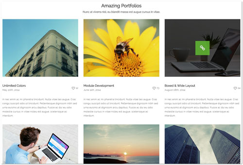
Codes are as follows:
<div class="row animation">
      <div class="col-md-4 animation_item scaleUp delay1">
        <div class="ServeList_3">
          <div class="img"><img alt="" src="/portals/9/Photo_09.jpg" /><a href="#"><span class="fa fa-link"></span></a></div>
          <div class="title">
            <h5>Unlimited Colors</h5>
            <div class="data">May 20th, 2014</div>
            <div class="love"><span class="fa fa-heart-o"></span>12</div>
          </div>
          <p>In nec enim ac mi pharetra tincidunt. Nulla vitae leo augue. Cras congu suscipit odio ut tincidunt... </p>
        </div>
      </div>
      <div class="col-md-4 animation_item scaleUp delay2">
        <div class="ServeList_3">
          <div class="img"><img alt="" src="/portals/9/Photo_10.jpg" /><a href="#"><span class="fa fa-link"></span></a></div>
          <div class="title">
            <h5>Module Development</h5>
            <div class="data">June 11th, 2014</div>
            <div class="love"><span class="fa fa-heart-o"></span>73</div>
          </div>
          <p>In nec enim ac mi pharetra tincidunt. Nulla vitae leo augue. Cras congu suscipit odio ut tincidunt... </p>
        </div>
      </div>
      <div class="col-md-4 animation_item scaleUp delay3">
        <div class="ServeList_3">
          <div class="img"><img alt="" src="/portals/9/Photo_11.jpg" /><a href="#"><span class="fa fa-link"></span></a></div>
          <div class="title">
            <h5>Boxed & Wide Layout</h5>
            <div class="data">August 08th, 2014</div>
            <div class="love"><span class="fa fa-heart-o"></span>24</div>
          </div>
          <p>In nec enim ac mi pharetra tincidunt. Nulla vitae leo augue. Cras congu suscipit odio ut tincidunt... </p>
        </div>
      </div>
      <div class="clearfix visible-sm"></div>
      <div class="col-md-4 animation_item scaleUp delay4">
        <div class="ServeList_3">
          <div class="img"><img alt="" src="/portals/9/Photo_12.jpg" /><a href="#"><span class="fa fa-link"></span></a></div>
          <div class="title">
            <h5>CSS3 & HTML 5</h5>
            <div class="data">September 27th, 2014</div>
            <div class="love"><span class="fa fa-heart-o"></span>56</div>
          </div>
          <p>In nec enim ac mi pharetra tincidunt. Nulla vitae leo augue. Cras congu suscipit odio ut tincidunt... </p>
        </div>
      </div>
      <div class="col-md-4 animation_item scaleUp delay5">
        <div class="ServeList_3">
          <div class="img"><img alt="" src="/portals/9/Photo_13.jpg" /><a href="#"><span class="fa fa-link"></span></a></div>
          <div class="title">
            <h5>Retina Ready</h5>
            <div class="data">October 10th, 2014</div>
            <div class="love"><span class="fa fa-heart-o"></span>57</div>
          </div>
          <p>In nec enim ac mi pharetra tincidunt. Nulla vitae leo augue... </p>
        </div>
      </div>
      <div class="col-md-4 animation_item scaleUp delay6">
        <div class="ServeList_3">
          <div class="img"><img alt="" src="/portals/9/Photo_14.jpg" /><a href="#"><span class="fa fa-link"></span></a></div>
          <div class="title">
            <h5>Multi-Purpose</h5>
            <div class="data">December 15th, 2014</div>
            <div class="love"><span class="fa fa-heart-o"></span>12</div>
          </div>
          <p>In nec enim ac mi pharetra tincidunt. Nulla vitae leo augue... </p>
        </div>
      </div>
    </div>
Option:
- You can modify
fa fa-*to change icons. font icon list. col-md-*is the width of each column, you can change the width you need through value1~12.- You can modify
animationto change the animation on the slide..Animation list.
Top Numbers area
Below is the screen shot:
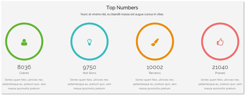
Codes are as follows:
<div class="backgroundImage1 pt-60 pb-60">
  <div class="dnn_layout  pt-20">
    <div class="content_mid clearfix animation">
      <h3 class="title_style_4 animation_item scaleUp">Top Numbers <span> Nunc at viverra nisl, eu blandit massa est augue cursus in vitae.</span></h3>
      <div class="row">
        <div class="col-md-3 col-sm-6 animation_item scaleUp delay1">
          <div class="ServeList_4">
            <div data-percent="100" class="decorate color_1">
              <div class="fa fa-user"> </div>
            </div>
            <div class="animation number" data-number="8036">0</div>
            <div class="title">Clients</div>
            <p>Donec quam felis, ultricies nec, pellentesque eu, pretium quis, sem  massa quismollis pretium. </p>
          </div>
        </div>
        <div class="col-md-3 col-sm-6 animation_item scaleUp delay2">
          <div class="ServeList_4">
            <div data-percent="100" class="decorate color_2">
              <div class="fa fa-lightbulb-o"> </div>
            </div>
            <div class="animation number" data-number="9750">0</div>
            <div class="title">Hot Skins</div>
            <p>Donec quam felis, ultricies nec, pellentesque eu, pretium quis, sem  massa quismollis pretium. </p>
          </div>
        </div>
        <div class="col-md-3 col-sm-6 animation_item scaleUp delay3">
          <div class="ServeList_4">
            <div data-percent="100" class="decorate color_3">
              <div class="fa fa-paint-brush"> </div>
            </div>
            <div class="animation number" data-number="10002">0</div>
            <div class="title">Reviews</div>
            <p>Donec quam felis, ultricies nec, pellentesque eu, pretium quis, sem  massa quismollis pretium. </p>
          </div>
        </div>
        <div class="col-md-3 col-sm-6 animation_item scaleUp delay4">
          <div class="ServeList_4">
            <div data-percent="100" class="decorate color_4">
              <div class="fa  fa-thumbs-o-up"> </div>
            </div>
            <div class="animation number" data-number="21040">0</div>
            <div class="title">Praises</div>
            <p>Donec quam felis, ultricies nec, pellentesque eu, pretium quis, sem  massa quismollis pretium. </p>
          </div>
        </div>
      </div>
    </div>
  </div>
</div>
Option:
color_1~ color_4is the corresponding color of each column. You can change the color you need through value1~4col-md-*is the width of each column, you can change the width you need through value1~12.- You can modify
animationto change the animation on the slide..Animation list.
Testimonials area
Below is the screen shot:
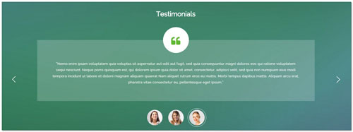
Codes are as follows:
<div class="backgroundImage6 color_white  pt-60 pb-60">
  <div class="dnn_layout  pt-20 pb-20">
    <div class="content_mid clearfix animation">
      <h3 class="title_style_5 animation_item scaleUp delay1">Testimonials</h3>
      <div data-autoplay="3000" class=" Testimonials_tab Testimonials_1 animation_item scaleUp delay2">
        <ul>
          <li>
            <div class="mark"><span class="fa fa-quote-left"></span></div>
            <blockquote>“Suspendisse libero odio, rhoncus nec blandit eget, semper nec mi...”</blockquote>
          </li>
          <li>
            <div class="mark"><span class="fa fa-quote-left"></span></div>
            <blockquote>“In nec enim ac mi pharetra tincidunt. Nulla vitae leo augue...”</blockquote>
          </li>
          <li>
            <div class="mark"><span class="fa fa-quote-left"></span></div>
            <blockquote>“Nemo enim ipsam voluptatem quia voluptas sit aspernatur aut odit aut fugit...”</blockquote>
          </li>
        </ul>
        <div class="dot">
            <a href="javascript:;"><img alt="" src="/portals/9/portrait_01.jpg" /></a>
            <a href="javascript:;"><img alt="" src="/portals/9/portrait_02.jpg" /></a>
            <a href="javascript:;"><img alt="" src="/portals/9/portrait_03.jpg" /></a>
        </div>
      </div>
    </div>
  </div>
</div>
Option:
- You can modify
fa fa-*to change icons. font icon list. - You can modify
animationto change the animation on the slide..Animation list.
Pricing Tables area
Below is the screen shot:
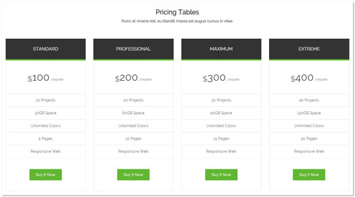
Codes are as follows:
<div class="price-table price-table1 row animation">
  <div class="col-md-3 col-sm-6 animation_item fadeInLeft delay1">
    <div class="price_title">
      <h2>STANDARD</h2>
    </div>
    <div class="price_holder">
      <div class="price_box"> <span class="sup">$</span><span class="price">100</span> <span class="unit">/month</span> </div>
      <ul>
        <li>10 Projects</li>
        <li>30GB Space</li>
        <li>Unlimited Colors</li>
        <li>5 Pages</li>
        <li>Responsive Web</li>
      </ul>
      <a href="#" class="btn ">Buy It Now</a> </div>
  </div>
  <div class="col-md-3 col-sm-6 animation_item fadeInLeft delay2">
    <div class="price_title ">
      <h2>PROFESSIONAL</h2>
    </div>
    <div class="price_holder">
      <div class="price_box"> <span class="sup">$</span><span class="price">200</span> <span class="unit">/month</span> </div>
      <ul>
        <li>20 Projects</li>
        <li>60GB Space</li>
        <li>Unlimited Colors</li>
        <li>10 Pages</li>
        <li>Responsive Web</li>
      </ul>
      <a href="#" class="btn ">Buy It Now</a> </div>
  </div>
  <div class="clearfix visible-sm"></div>
  <div class="col-md-3 col-sm-6 animation_item fadeInLeft delay3">
    <div class="price_title">
      <h2>MAXIMUM</h2>
    </div>
    <div class="price_holder">
      <div class="price_box"> <span class="sup">$</span><span class="price">300</span> <span class="unit">/month</span> </div>
      <ul>
        <li>30 Projects</li>
        <li>90GB Space</li>
        <li>Unlimited Colors</li>
        <li>15 Pages</li>
        <li>Responsive Web</li>
      </ul>
      <a href="#" class="btn ">Buy It Now</a> </div>
  </div>
  <div class="col-md-3 col-sm-6 animation_item fadeInLeft delay4">
    <div class="price_title">
      <h2>EXTREME</h2>
    </div>
    <div class="price_holder">
      <div class="price_box"> <span class="sup">$</span><span class="price">400</span> <span class="unit">/month</span> </div>
      <ul>
        <li>40 Projects</li>
        <li>120GB Space</li>
        <li>Unlimited Colors</li>
        <li>20 Pages</li>
        <li>Responsive Web</li>
      </ul>
      <a href="#" class="btn ">Buy It Now</a> </div>
  </div>
</div>
Option:
- This is a
Pricingeffect.Pricing - You can modify
fa fa-*to change icons. font icon list. - You can modify
animationto change the animation on the slide..Animation list. Containeris usingContainer-3
Advanced technology area
Below is the screen shot:
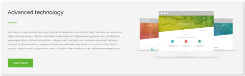
Codes are as follows:
<div class="backgroundImage1 pt-60 pb-60">
  <div class="dnn_layout  pt-40 pb-40">
    <div class="content_mid clearfix">
      <div class="row animation">
        <div class="col-sm-6 animation_item fadeInLeft delay1">
          <div class="title_style_6">Advanced technology</div>
          <p class="pb-30">Nemo enim ipsam voluptatem quia voluptas sit aspernatur aut odit aut fugit... </p>
          <a class="btn_4" href="#">Learn More</a> </div>
        <div class="col-sm-6 animation_item fadeInRight delay2"> <img alt="" class="img-responsive" src="/portals/9/pic_04.png" /> </div>
      </div>
    </div>
  </div>
</div>
Option:
col-md-*is the width of each column, you can change the width you need through value1~12.- You can modify
animationto change the animation on the slide..Animation list.
Get In Touch area
Below is the screen shot:
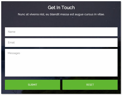
Codes are as follows:
<div class="color_white pt-60 pb-40 animation scaleUp ">
<h3 style="text-align: center;" class="title_style_7">Get In Touch</h3>
<p class="big_size" style="text-align: center;">Nunc at viverra nisl, eu blandit massa est augue cursus in vitae.</p>
</div>
Option:
- You can modify
animationto change the animation on the slide..Animation list. - This is
Theme_Responsive_20072_home2theme ofDNNGo PowerFormsmodule
Map area
Below is the screen shot:
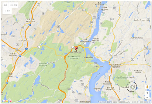
Codes are as follows:
<div id="gmap01"></div>
About Dnngo area
Below is the screen shot:
Codes are as follows:
<div class="animation scaleUp delay1">
      <p>Interdum et malesuada fames ac ante ipsum primis in faucibus. Mauris quis vehicula diam. Lorem ipsum dolor sit amet, consectetur adipiscing elit. Maecenas ut pellentesque massa, ut porttitor risus. </p>
      <p> </p>
      <p> Aliquam volutpat congue scelerisque. Nam eget fringilla risus, vitae posuere nisl Vivamus pulvinar lobortis molestie. </p>
      <a href="#">More Information ></a> </div>
Option:
- You can modify
animationto change the animation on the slide..Animation list. Containeris usingContainer-4
Categories area
Below is the screen shot:
Codes are as follows:
<ul class="list_style_3 animation scaleUp delay2">
  <li><a href="#">Module Development</a></li>
  <li><a href="#">Responsive Skin & Design</a></li>
  <li><a href="#">Amazing Portfolios</a></li>
  <li><a href="#">CSS3 Animations</a></li>
</ul>
Option:
- You can modify
animationto change the animation on the slide..Animation list. Containeris usingContainer-4
Recent News area
Below is the screen shot:
Codes are as follows:
<ul class="list_style_4 animation scaleUp delay3">
  <li><img alt="" src="/portals/9/Photo_15.jpg" />
    <p>Ut wisi enim ad minim veniam, amcorper suscipit lobortis nislut liquip exea commodo.</p>
    <a href="#">Read More</a></li>
  <li><img alt="" src="/portals/9/Photo_16.jpg" />
    <p>Ut wisi enim ad minim veniam, amcorper suscipit lobortis nislut liquip exea commodo.</p>
    <a href="#">Read More</a></li>
</ul>
Option:
- You can modify
animationto change the animation on the slide..Animation list. Containeris usingContainer-4
Follow Us area
Below is the screen shot:
Codes are as follows:
<div class="animation scaleUp delay3">
  <p>Morbi tempus dapibus mattis. Aliquam arcu erat, pharetra vitae consectetur eu, pellentesque eget ipsum nibh auctor.</p>
  <div class="pt-20 pb-20">
    <p>Email : dnnskindev@gmail.com</p>
    <p>Skype :  dnngo-linda</p>
  </div>
  <div class="social_list_3">
      <a href="#"><span class="fa fa-twitter"></span></a>
      <a href="#"><span class="fa fa-facebook"></span></a>
      <a href="#"><span class="fa fa-apple"></span></a>
      <a href="#"><span class="fa fa-android"></span></a>
  </div>
</div>
Option:
- You can modify
fa fa-*to change icons. font icon list. - You can modify
animationto change the animation on the slide..Animation list. Containeris usingContainer-4
Home Version 3
You can click the link to check Home Version 3 demo. Home Version 3
Banner area
Below is the screen shot:
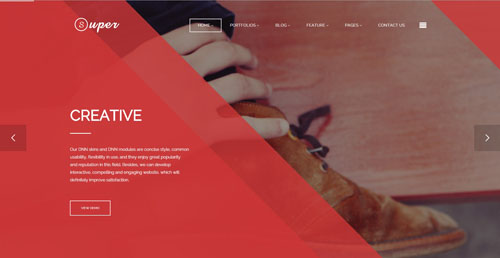
It is using DNNGo LayerGalleryPro module here,you can import ContentListEntity-Home3.xml of the DNNGo_LayerGalleryPro folder to duplicate banner of the demo.
ABOUT DNNGO.NET area
Below is the screen shot:

Codes are as follows:
<div class="animation scaleUp ">
      <p style="text-align: center;">Sed sollicitudin mi quis sem consequat vehicula. Lorem ipsum dolor sit amet, consectetur adipiscing elit. <br />
        Vivamus quis lorem neque sit amet vestibulum nibh malesuada. </p>
      <p style="text-align: center;"> <img alt="" class="img-responsive" src="/portals/9/pic_05.png" /></p>
    </div>
Option:
- You can modify
animationto change the animation on the slide..Animation list. Containeris usingContainer-5
3-Box area
Below is the screen shot:
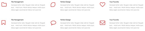
Codes are as follows:
<div class="row animation">
  <div class="col-sm-4 animation_item scaleUp delay1">
    <div class="ServeList_5">
      <div class="ico"><span class="fa fa-folder-o"></span></div>
      <h5>File Management</h5>
      <p>Quisque tortor odio, feugiat vitae velit at, feugiat euis mod nunc. Morbi lectus neque, mollis quis tellus eget, euismod et metus non pulvinar. </p>
    </div>
  </div>
  <div class="col-sm-4 animation_item scaleUp delay2">
    <div class="ServeList_5">
      <div class="ico"><span class="fa fa-lemon-o"></span></div>
      <h5>Perfect Design</h5>
      <p>Quisque tortor odio, feugiat vitae velit at, feugiat euis mod nunc. Morbi lectus neque, mollis quis tellus eget, euismod et metus non pulvinar. </p>
    </div>
  </div>
  <div class="col-sm-4 animation_item scaleUp delay3">
    <div class="ServeList_5">
      <div class="ico"><span class="fa fa-heart-o"></span></div>
      <h5>Your Favorite</h5>
      <p>Quisque tortor odio, feugiat vitae velit at, feugiat euis mod nunc. Morbi lectus neque, mollis quis tellus eget, euismod et metus non pulvinar. </p>
    </div>
  </div>
  <div class="clearfix"></div>
  <div class="col-sm-4 animation_item scaleUp delay4">
    <div class="ServeList_5">
      <div class="ico"><span class="fa fa-bookmark-o"></span></div>
      <h5>File Management</h5>
      <p>Quisque tortor odio, feugiat vitae velit at, feugiat euis mod nunc. Morbi lectus neque, mollis quis tellus eget, euismod et metus non pulvinar. </p>
    </div>
  </div>
  <div class="col-sm-4 animation_item scaleUp delay5">
    <div class="ServeList_5">
      <div class="ico"><span class="fa fa-comment-o"></span></div>
      <h5>Perfect Design</h5>
      <p>Quisque tortor odio, feugiat vitae velit at, feugiat euis mod nunc. Morbi lectus neque, mollis quis tellus eget, euismod et metus non pulvinar. </p>
    </div>
  </div>
  <div class="col-sm-4 animation_item scaleUp delay6">
    <div class="ServeList_5">
      <div class="ico"><span class="fa fa-envelope-o"></span></div>
      <h5>Your Favorite</h5>
      <p>Quisque tortor odio, feugiat vitae velit at, feugiat euis mod nunc. Morbi lectus neque, mollis quis tellus eget, euismod et metus non pulvinar. </p>
    </div>
  </div>
</div>
Option:
col-md-*is the width of each column, you can change the width you need through value1~12.- You can modify
fa fa-*to change icons. font icon list. - You can modify
animationto change the animation on the slide..Animation list.
OUR PARTNERS area
Below is the screen shot:
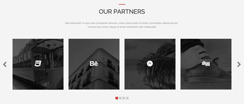
Codes are as follows:
<div class="backgroundImage1 pt-60 pb-60">
  <div class="dnn_layout">
    <div class="content_mid clearfix animation">
      <h3 class="title_style_8 animation_item scaleUp delay1">OUR PARTNERS</h3>
      <p class="pt-20 pb-40 animation_item scaleUp delay2" style="text-align: center;">Sed sollicitudin mi quis sem consequat vehicula. Lorem ipsum dolor sit amet, consectetur adipiscing elit. <br />
        Vivamus quis lorem neque sit amet vestibulum nibh malesuada.</p>
      <div class="carousel carousel_2 animation_item scaleUp delay3" data-pagination="true" data-items="4" data-navigation="true" data-autoplay="true">
        <div class="item">
          <div class="img_box"><img alt="" src="/portals/9/Photo_17.jpg" />
            <div class="content">
              <div class="ico"><span class="fa fa-digg"></span></div>
              <p>Integer fringilla blandit diam,  ultricies lacus, in facilisis leo. Vestibulum et turpis </p>
            </div>
          </div>
        </div>
        <div class="item">
          <div class="img_box"><img alt="" src="/portals/9/Photo_18.jpg" />
            <div class="content">
              <div class="ico"><span class="fa fa-css3"></span></div>
              <p>Integer fringilla blandit diam,  ultricies lacus, in facilisis leo. Vestibulum et turpis </p>
            </div>
          </div>
        </div>
        <div class="item">
          <div class="img_box"><img alt="" src="/portals/9/Photo_19.jpg" />
            <div class="content">
              <div class="ico"><span class="fa fa-behance"></span></div>
              <p>Integer fringilla blandit diam,  ultricies lacus, in facilisis leo. Vestibulum et turpis </p>
            </div>
          </div>
        </div>
        <div class="item">
          <div class="img_box"><img alt="" src="/portals/9/Photo_20.jpg" />
            <div class="content">
              <div class="ico"><span class="fa  fa-adn"></span></div>
              <p>Integer fringilla blandit diam,  ultricies lacus, in facilisis leo. Vestibulum et turpis </p>
            </div>
          </div>
        </div>
        <div class="item">
          <div class="img_box"><img alt="" src="/portals/9/Photo_17.jpg" />
            <div class="content">
              <div class="ico"><span class="fa fa-digg"></span></div>
              <p>Integer fringilla blandit diam,  ultricies lacus, in facilisis leo. Vestibulum et turpis </p>
            </div>
          </div>
        </div>
        <div class="item">
          <div class="img_box"><img alt="" src="/portals/9/Photo_18.jpg" />
            <div class="content">
              <div class="ico"><span class="fa fa-css3"></span></div>
              <p>Integer fringilla blandit diam,  ultricies lacus, in facilisis leo. Vestibulum et turpis </p>
            </div>
          </div>
        </div>
        <div class="item">
          <div class="img_box"><img alt="" src="/portals/9/Photo_19.jpg" />
            <div class="content">
              <div class="ico"><span class="fa fa-behance"></span></div>
              <p>Integer fringilla blandit diam,  ultricies lacus, in facilisis leo. Vestibulum et turpis </p>
            </div>
          </div>
        </div>
        <div class="item">
          <div class="img_box"><img alt="" src="/portals/9/Photo_20.jpg" />
            <div class="content">
              <div class="ico"><span class="fa  fa-adn"></span></div>
              <p>Integer fringilla blandit diam,  ultricies lacus, in facilisis leo. Vestibulum et turpis </p>
            </div>
          </div>
        </div>
      </div>
    </div>
  </div>
  <div class="pt-50"></div>
</div>
Option:
- This is a
Carouseleffect.Carousel - You can modify
fa fa-*to change icons. font icon list. - You can modify
animationto change the animation on the slide..Animation list.
OUR SERVICES area
Below is the screen shot:
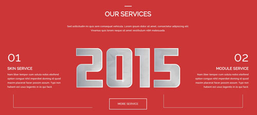
Codes are as follows:
<div class="backgroundImage8 color_white pt-60 pb-60">
  <div class="dnn_layout pt-20 pb-20">
    <div class="content_mid clearfix animation">
      <h3 class="title_style_9 animation_item scaleUp delay1">OUR SERVICES</h3>
      <p class="pt-20 pb-60 animation_item scaleUp delay2" style="text-align: center;">Sed sollicitudin mi quis sem consequat vehicula. Lorem ipsum dolor sit amet, consectetur adipiscing elit.<br />
        Vivamus quis lorem neque sit amet vestibulum nibh malesuada.</p>
      <div class="content_text_4">
        <div class="text_img"><img alt="" src="/portals/9/pic_06.png" class=" animation_item scaleUp delay3" />
          <p><a href="#" class="btn_5 animation_item scaleUp delay5">MORE SERVICE</a></p>
        </div>
        <dl class="text_left animation_item fadeInLeft delay4">
          <dt><span class="number">01</span>SKIN SERVICE</dt>
          <dd>Nam liber tempor cum soluta nobis eleifend option congue nihil imperdiet doming id quod mazim placerat facer possim assum. Typi non habent est usus legentis in iis qui facit. </dd>
          <dd class="line"> </dd>
        </dl>
        <dl class="text_right animation_item fadeInRight delay4">
          <dt><span class="number">02</span>MODULE SERVICE</dt>
          <dd>Nam liber tempor cum soluta nobis eleifend option congue nihil imperdiet doming id quod mazim placerat facer possim assum. Typi non habent est usus legentis in iis qui facit. </dd>
          <dd class="line"> </dd>
        </dl>
      </div>
    </div>
  </div>
</div>
Option:
- You can modify
animationto change the animation on the slide..Animation list.
CREATIVE & BEAUTIFUL WEB DESIGN area
Below is the screen shot:
Codes are as follows:
<div class="animation fadeInLeft">
  <p>Nemo enim ipsam voluptatem quia voluptas sit aspernatur aut odit aut fugit...</p>
  <p class="pt-30"> <a class="btn_6" href="#">BUY IT NOW</a> </p>
  <div class="pt-60"></div>
</div>
Option:
- You can modify
animationto change the animation on the slide..Animation list. Containeris usingContainer-6
RESPONSIVE & POWERFUL DNN TEMPLATES area
Below is the screen shot:
Codes are as follows:
<ul class="list_style_5 animation fadeInRight">
  <li>
    <div class="ico"><span class="fa fa-file-text"></span></div>
    <div class="content">
      <p>Mirum est notare quam littera gothica, quam nunc putamus parum claram, anteposuerit litterarum formas humanitatis per seacula quarta decima et quinta decima. Eodem modo typi, qui nunc nobis.</p>
      <a href="#">LEARN MORE</a> </div>
  </li>
  <li>
    <div class="ico"><span class="fa fa-gift"></span></div>
    <div class="content">
      <p>Mirum est notare quam littera gothica, quam nunc putamus parum claram, anteposuerit litterarum formas humanitatis per seacula quarta decima et quinta decima. Eodem modo typi, qui nunc nobis.</p>
      <a href="#">LEARN MORE</a> </div>
  </li>
</ul>
Option:
- You can modify
animationto change the animation on the slide..Animation list. Containeris usingContainer-6
OUR WORKS area
Below is the screen shot:
Codes are as follows:
<div class="backgroundImage9 color_white  pt-60 mb-40">
  <div class="dnn_layout   pt-20">
    <div class="content_mid clearfix">
      <h3 class="title_style_10 animation scaleUp">OUR WORKS</h3>
      <p style="text-align: center;" class="pt-20 pb-40 color_gray animation scaleUp">Sed sollicitudin mi quis sem consequat vehicula. Lorem ipsum dolor sit amet, consectetur adipiscing elit.<br />
        Vivamus quis lorem neque sit amet vestibulum nibh malesuada.</p>
    </div>
  </div>
  <div class="isotope_grid isotope_grid1  ">
    <div class="isotope_group  animation scaleUp">
        <a class="active" href="#" data-filter="*">ALL</a>
        <a href="#" data-filter=".photography">PHOTOGRAPHY</a>
        <a href="#" data-filter=".webdesign">WEB DESIGN</a>
        <a href="#" data-filter=".image">IMAGE</a>
        <a href="#" data-filter=".videos">VIDEOS</a>
    </div>
    <div class="loading  animation scaleUp">
      <div class="loading-container container1">
        <div class="circle1"></div>
        <div class="circle2"></div>
        <div class="circle3"></div>
        <div class="circle4"></div>
      </div>
      <div class="loading-container container2">
        <div class="circle1"></div>
        <div class="circle2"></div>
        <div class="circle3"></div>
        <div class="circle4"></div>
      </div>
      <div class="loading-container container3">
        <div class="circle1"></div>
        <div class="circle2"></div>
        <div class="circle3"></div>
        <div class="circle4"></div>
      </div>
    </div>
    <div class="isotope_main animation scaleUp " data-min-width="381">
      <div class="isotope_item photography webdesign">
        <div class="photo"><a href="#"> <img alt="" src="/portals/9/Photo_21.jpg" />
          <div class="content">
            <div class="ico"><span class="fa  fa-compress"></span></div>
            <h3>Module Development</h3>
            <p>August 25th,2014</p>
          </div>
          </a> </div>
      </div>
      <div class="isotope_item webdesign image">
        <div class="photo"><a href="#"> <img alt="" src="/portals/9/Photo_22.jpg" />
          <div class="content">
            <div class="ico"><span class="fa  fa-compress"></span></div>
            <h3>Module Development</h3>
            <p>August 25th,2014</p>
          </div>
          </a> </div>
      </div>
      <div class="isotope_item videos photography">
        <div class="photo"><a href="#"> <img alt="" src="/portals/9/Photo_23.jpg" />
          <div class="content">
            <div class="ico"><span class="fa  fa-compress"></span></div>
            <h3>Module Development</h3>
            <p>August 25th,2014</p>
          </div>
          </a> </div>
      </div>
      <div class="isotope_item webdesign image">
        <div class="photo"><a href="#"> <img alt="" src="/portals/9/Photo_24.jpg" />
          <div class="content">
            <div class="ico"><span class="fa  fa-compress"></span></div>
            <h3>Module Development</h3>
            <p>August 25th,2014</p>
          </div>
          </a> </div>
      </div>
      <div class="isotope_item image">
        <div class="photo"><a href="#"> <img alt="" src="/portals/9/Photo_25.jpg" />
          <div class="content">
            <div class="ico"><span class="fa  fa-compress"></span></div>
            <h3>Module Development</h3>
            <p>August 25th,2014</p>
          </div>
          </a> </div>
      </div>
      <div class="isotope_item videos photography">
        <div class="photo"><a href="#"> <img alt="" src="/portals/9/Photo_26.jpg" />
          <div class="content">
            <div class="ico"><span class="fa  fa-compress"></span></div>
            <h3>Module Development</h3>
            <p>August 25th,2014</p>
          </div>
          </a> </div>
      </div>
      <div class="isotope_item videos image">
        <div class="photo"><a href="#"> <img alt="" src="/portals/9/Photo_27.jpg" />
          <div class="content">
            <div class="ico"><span class="fa  fa-compress"></span></div>
            <h3>Module Development</h3>
            <p>August 25th,2014</p>
          </div>
          </a> </div>
      </div>
      <div class="isotope_item photography webdesign videos">
        <div class="photo"><a href="#"> <img alt="" src="/portals/9/Photo_28.jpg" />
          <div class="content">
            <div class="ico"><span class="fa  fa-compress"></span></div>
            <h3>Module Development</h3>
            <p>August 25th,2014</p>
          </div>
          </a> </div>
      </div>
    </div>
  </div>
</div>
<div class="pb-40"></div>
Option:
- You can add
<a data-filter=".FilterName" href="#">Filter Name</a>to increase categories.data-filter=".FilterName"can not be blank space. - You can modify
data-min-widthto change minimum width of image. - You can modify
isotope_itemFilterNameto categorize images. - You can modify
fa fa-*to change icons. font icon list. - You can modify
animationto change the animation on the slide..Animation list.
AMAZING SKIN area
Below is the screen shot:
Codes are as follows:
<div class="animation">
  <p class="pt-20 pb-40 animation_item scaleUp delay1" style="text-align: center;">Sed sollicitudin mi quis sem consequat vehicula. Lorem ipsum dolor sit amet, consectetur adipiscing elit.<br />
    Vivamus quis lorem neque sit amet vestibulum nibh malesuada.</p>
  <p style="text-align: center;">
      <a href="#" class="btn_6 animation_item fadeInLeft delay2">PURCHASE IT</a>
      <a href="#" class="btn_6 animation_item fadeInRight delay2">VIEW DEMO</a>
  </p>
  <div style="text-align: center;" class="animation_item scaleUp delay3"> <br />
    <img alt="" class="img-responsive" src="/portals/9/pic_09.png" /></div>
</div>
Option:
- You can modify
animationto change the animation on the slide..Animation list.
OUR ABILITY area
Below is the screen shot:

Codes are as follows:
<div class="backgroundImage10 color_white pt-60 pb-60">
  <div class="dnn_layout pt-40 pb-60">
    <div class="content_mid clearfix">
      <div class="row">
        <div class="col-sm-6"> </div>
        <div class="col-sm-6">
          <div class="title_style_11 animation scaleUp">OUR ABILITIES</div>
          <p class="pb-20 pt-20 animation scaleUp">Nemo enim ipsam voluptatem quia voluptas sit aspernatur aut odit aut ...</p>
          <div class="loaded_list_2 animation scaleUp">
            <div class="progress">
              <div data-width="90%" class="bar animation animationwidth a_bg_c">Web Design <span></span> </div>
            </div>
            <div class="progress">
              <div data-width="95%" class="bar animation animationwidth a_bg_c">HTML5 & CSS3 <span></span> </div>
            </div>
            <div class="progress">
              <div data-width="85%" class="bar animation animationwidth a_bg_c">Javascript <span></span> </div>
            </div>
            <div class="progress">
              <div data-width="75%" class="bar animation animationwidth a_bg_c">Programme <span></span> </div>
            </div>
          </div>
          <p class="pt-60 animation scaleUp"><a class="btn_5" href="#">GET DETAILS</a> </p>
        </div>
      </div>
    </div>
  </div>
</div>
Option:
data-widthis controlling the percentage that displays, you can display percentage through value0~100- You can modify
animationto change the animation on the slide..Animation list.
CONTACT US area
Below is the screen shot:
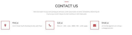
Codes are as follows:
<p style="text-align: center;" class="pb-40 animation scaleUp">Sed sollicitudin mi quis sem consequat vehicula. Lorem ipsum dolor sit amet, consectetur adipiscing elit.<br />
  Vivamus quis lorem neque sit amet vestibulum nibh malesuada.</p>
<div class="row pb-40 animation">
  <div class="col-sm-4 animation_item scaleUp delay1">
    <div class="contact_info2"><span class="fa fa-map-marker a_t_c a_b_c"></span>
      <h3>Find us</h3>
      <p>XinAn Street HuaFu Building No.263, 15th Floor</p>
    </div>
  </div>
  <div class="col-sm-4 animation_item scaleUp delay2">
    <div class="contact_info2"><span class="fa fa-phone a_t_c a_b_c"></span>
      <h3>Call us</h3>
      <p>Miss Lin : (+86) - 2755 - 8888, (+86) - 2766 -9999</p>
    </div>
  </div>
  <div class="col-sm-4 animation_item scaleUp delay3">
    <div class="contact_info2"><span class="fa fa-envelope a_t_c a_b_c"></span>
      <h3>Email us</h3>
      <p>dnnskindev@gmail.com, dnngo-Linda@gmail.com</p>
    </div>
  </div>
</div>
Option:
col-md-*is the width of each column, you can change the width you need through value1~12.- You can modify
fa fa-*to change icons. font icon list. - You can modify
animationto change the animation on the slide..Animation list.
CONTACT US area
Below is the screen shot:
Codes are as follows:
Option:
- This is
Theme_Responsive_20072_home3-home2theme ofDNNGo PowerFormsmodule
FRIENDLY LINKS area
Below is the screen shot:
Codes are as follows:
<div class="animation scaleUp delay2">
    <p>Nemo enim ipsam voluptatem quia voluptas sit aspernatur aut odit aut fugit, sed quia consequuntur magni dolores eos qui ratione voluptatem sequi nesciunt. Neque porro quisquam est, qui dolorem ipsum quia dolor sit amet, consectetur, adipisci velit.  </p>
    <br />
    <ul class="list_style_6">
      <li><a href="#">HTML5&CSS3</a></li>
      <li><a href="#">Responsive</a></li>
      <li><a href="#">Skin Pack </a></li>
      <li><a href="#">Mobilesite</a></li>
      <li><a href="#">Catalook Skin </a></li>
      <li><a href="#">Unlimited Colors</a></li>
      <li><a href="#">Blog Post</a></li>
      <li><a href="#">Full & Boxed</a></li>
      <li><a href="#">Featured Product</a></li>
      <li><a href="#">Seven Layout</a></li>
      <li><a href="#">Typography</a></li>
      <li><a href="#">Membership</a></li>
    </ul>
</div>
Option:
Containeris usingContainer-7- You can modify
animationto change the animation on the slide..Animation list.
WHERE WE ARE area
Below is the screen shot:
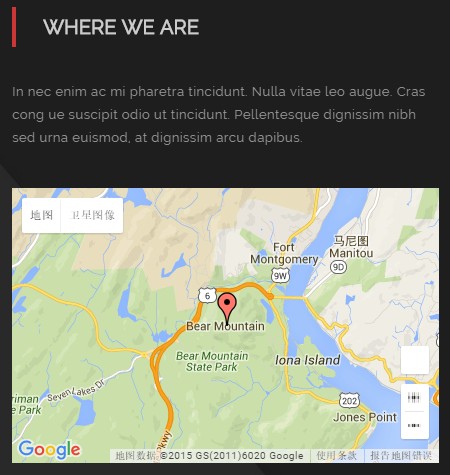
Codes are as follows:
<p class="mb-30">In nec enim ac mi pharetra tincidunt. Nulla vitae leo augue. Cras cong ue suscipit odio ut tincidunt. Pellentesque dignissim nibh sed urna euismod, at dignissim arcu dapibus.</p>
<div id="gmap01"></div>
Option:
- You can modify
animationto change the animation on the slide..Animation list. Containeris usingContainer-7
SOCIAL NETWORKS area
Below is the screen shot:
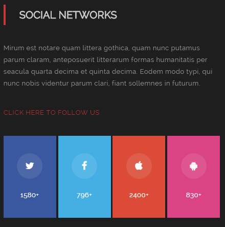
Codes are as follows:
<div class="animation scaleUp delay3">
    <p>Mirum est notare quam littera gothica, quam nunc putamus parum claram, anteposuerit litterarum formas ...</p>
    <p class="pt-20 pb-20"><a href="#">CLICK HERE TO FOLLOW US</a></p>
    <div class="social_list_2">
        <a class="color_bg_1" href="#"><span class="fa fa-twitter"></span> 1580+</a>
        <a class="color_bg_2" href="#"><span class="fa fa-facebook"></span> 796+</a>
        <a class="color_bg_3" href="#"><span class="fa fa-apple"></span> 2400+</a>
        <a class="color_bg_4" href="#"><span class="fa fa-android"></span> 830+</a>
    </div>
</div>
Option:
color_bg_1 ~ color_bg_4is the corresponding color of each column. You can change the background you need through value1~4- You can modify
fa fa-*to change icons. font icon list. - You can modify
animationto change the animation on the slide..Animation list. Containeris usingContainer-7
Home Version 4
You can click the link to check Home Version 4 demo. Home Version 4
Banner area
Below is the screen shot:
It is using DNNGo LayerGalleryPro module here,you can import ContentListEntity-Home4.xml of the DNNGo_LayerGalleryPro folder to duplicate banner of the demo.
WHAT WE DO area
Below is the screen shot:
Codes are as follows:
<div class="animation">
  <p style="text-align: center;" class=" pb-40 animation_item scaleUp delay1">Sed sollicitudin mi quis sem consequat vehicula. Lorem ipsum dolor sit amet, consectetur adipiscing elit.<br />
    Vivamus quis lorem neque sit amet vestibulum nibh malesuada.</p>
  <div class="pt-20 pt-20">
    <div class="row">
      <div class="col-md-3 col-sm-6 animation_item fadeInRight delay2">
        <div class="ServeList_6">
          <div class="ico"><span class="fa fa-flask"></span></div>
          <h5>New Products</h5>
          <p>Sed ut perspiciatis unde omnis iste natus error sit voluptatem accusantium dolore mque laudan tium, totam rem aperiam, eaque ipsa quaet quasit. </p>
        </div>
      </div>
      <div class="col-md-3 col-sm-6 animation_item fadeInRight delay3">
        <div class="ServeList_6">
          <div class="ico"><span class="fa fa-gift"></span></div>
          <h5>Photo Gallery</h5>
          <p>Sed ut perspiciatis unde omnis iste natus error sit voluptatem accusantium dolore mque laudan tium, totam rem aperiam, eaque ipsa quaet quasit. </p>
        </div>
      </div>
      <div class="clearfix visible-sm"></div>
      <div class="col-md-3 col-sm-6 animation_item fadeInRight delay4">
        <div class="ServeList_6">
          <div class="ico"><span class="fa fa-desktop"></span></div>
          <h5>Full Support</h5>
          <p>Sed ut perspiciatis unde omnis iste natus error sit voluptatem accusantium dolore mque laudan tium, totam rem aperiam, eaque ipsa quaet quasit. </p>
        </div>
      </div>
      <div class="col-md-3 col-sm-6 animation_item fadeInRight delay5">
        <div class="ServeList_6">
          <div class="ico"><span class="fa fa-calendar-o"></span></div>
          <h5>Custom Web</h5>
          <p>Sed ut perspiciatis unde omnis iste natus error sit voluptatem accusantium dolore mque laudan tium, totam rem aperiam, eaque ipsa quaet quasit. </p>
        </div>
      </div>
    </div>
  </div>
  <p class="pt-40 animation_item fadeInUp delay6" style="text-align: center;"><img alt="" src="/portals/9/pic_28.png" class="img-responsive" style="text-align: center;" /> </p>
</div>
Option:
col-md-*is the width of each column, you can change the width you need through value1~12.- You can modify
fa fa-*to change icons. font icon list. Containeris usingContainer-8
OUR SERVICES area
Below is the screen shot:

Codes are as follows:
<div class="backgroundImage11 pt-60">
  <div class="dnn_layout  pt-60">
    <div class="content_mid clearfix">
      <div class="row">
        <div class="col-md-6 animation fadeInLeft"><img alt="" class="img-responsive" src="/portals/9/pic_10.png" /></div>
        <div class="col-md-6 right_bg  pb-60 ">
          <div class="pl_100 animation fadeInRight">
            <h3 class="title_style_12">OUR SERVICES</h3>
            <p class="pt-10 pb-40">Nemo enim ipsam voluptatem quia voluptas sit aspernatur aut odit aut fugit, sed quia consequuntur magni dolores eos qui ratione voluptatem sequi nesciunt...</p>
            <ul class="list_style_7 ">
              <li><span class="fa fa-folder-o"></span><a href="#">DNN Design & Skin</a></li>
              <li><span class="fa fa-folder-o"></span><a href="#">CSS3 animations</a></li>
              <li><span class="fa fa-folder-o"></span><a href="#">Module Development</a></li>
              <li><span class="fa fa-folder-o"></span><a href="#">Ultra Responsive design</a></li>
              <li><span class="fa fa-folder-o"></span><a href="#">Unlimited-color Skin</a></li>
              <li><span class="fa fa-folder-o"></span><a href="#">DNN6 & DNN7</a></li>
              <li><span class="fa fa-folder-o"></span><a href="#">Create Website</a></li>
              <li><span class="fa fa-folder-o"></span><a href="#">Boxed & Wide Layout</a></li>
            </ul>
            <p class="pt-40"> <a class="btn_7" href="#">VIEW DEMO</a> <a class="btn_7" href="#">BUY NOW</a> </p>
          </div>
        </div>
      </div>
    </div>
  </div>
</div>
Option:
col-md-*is the width of each column, you can change the width you need through value1~12.- You can modify
animationto change the animation on the slide..Animation list. - You can modify
fa fa-*to change icons. font icon list.
RECENT WORKS area
Below is the screen shot:
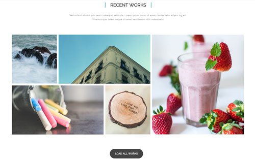
Codes are as follows:
<div class="animation">
  <p class=" pb-40 animation_item scaleUp delay1" style="text-align: center;">Sed sollicitudin mi quis sem consequat vehicula. Lorem ipsum dolor sit amet, consectetur adipiscing elit.<br />
    Vivamus quis lorem neque sit amet vestibulum nibh malesuada.</p>
  <div class="isotope_grid isotope_grid2 animation_item scaleUp delay2">
    <div class="loading  animation scaleUp">
      <div class="loading-container container1">
        <div class="circle1"></div>
        <div class="circle2"></div>
        <div class="circle3"></div>
        <div class="circle4"></div>
      </div>
      <div class="loading-container container2">
        <div class="circle1"></div>
        <div class="circle2"></div>
        <div class="circle3"></div>
        <div class="circle4"></div>
      </div>
      <div class="loading-container container3">
        <div class="circle1"></div>
        <div class="circle2"></div>
        <div class="circle3"></div>
        <div class="circle4"></div>
      </div>
    </div>
    <div class="isotope_main animation" data-min-width="230">
      <div class="isotope_item">
        <div class="photo"><a href="#"> <img alt="" src="/portals/9/Photo_29.jpg" /> <span class="fa  fa-heart"></span> </a> </div>
      </div>
      <div class="isotope_item" data-zoom="2">
        <div class="photo"><a href="#"> <img alt="" src="/portals/9/Photo_30.jpg" /> <span class="fa  fa-heart"></span> </a> </div>
      </div>
      <div class="isotope_item" data-zoom="2">
        <div class="photo"><a href="#"> <img alt="" src="/portals/9/Photo_31.jpg" /> <span class="fa fa-heart"></span> </a> </div>
      </div>
      <div class="isotope_item" data-zoom="2">
        <div class="photo"><a href="#"> <img alt="" src="/portals/9/Photo_32.jpg" /> <span class="fa fa-heart"></span> </a> </div>
      </div>
      <div class="isotope_item">
        <div class="photo"><a href="#"> <img alt="" src="/portals/9/Photo_33.jpg" /> <span class="fa fa-heart"></span> </a> </div>
      </div>
    </div>
  </div>
  <p style="text-align: center;" class="pt-60 animation_item scaleUp delay3"><a href="#" class="btn_8">LOAD ALL WORKS</a></p>
</div>
Option:
- You can modify
data-min-widthto change minimum width of image. - You can modify
animationto change the animation on the slide..Animation list. - You can modify
fa fa-*to change icons. font icon list.
HOW WE WORK area
Below is the screen shot:
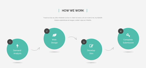
Codes are as follows:
<div class="backgroundImage1 pt-60 pb-60">
  <div class="dnn_layout pb-60">
    <div class="content_mid clearfix animation">
      <h3 class="title_style_14 animation_item scaleUp delay1">HOW WE WORK</h3>
      <p style="text-align: center;" class="pt-20 pb-40 animation_item scaleUp delay2">Fusce ac dui eu odio molestie cursus in vitae nisl atury unc at viverra nisl, eu blandit<br />
        massa uspendisse est augue, sceleri sque ac interdu.</p>
      <div class="row">
        <div class="col-md-3 col-sm-6 animation_item fadeInLeft delay3">
          <div class="ServeList_7 mt"> <span class="number">1</span> <span class="fa fa-bolt"></span> Demand <br />
            Analysis </div>
        </div>
        <div class="col-md-3 col-sm-6 animation_item fadeInLeft delay4">
          <div class="ServeList_7"> <span class="number">2</span> <span class="fa fa-leaf"></span> Web <br />
            Design </div>
        </div>
        <div class="clearfix visible-sm"></div>
        <div class="col-md-3 col-sm-6 animation_item fadeInLeft delay5">
          <div class="ServeList_7  mt"> <span class="number">3</span> <span class="fa fa-edit"></span> Develop <br />
            Skin </div>
        </div>
        <div class="col-md-3 col-sm-6 animation_item fadeInLeft delay6">
          <div class="ServeList_7"> <span class="number">4</span> <span class="fa fa-key"></span> Complete <br />
            Submission </div>
        </div>
      </div>
    </div>
  </div>
</div>
Option:
col-md-*is the width of each column, you can change the width you need through value1~12.- You can modify
animationto change the animation on the slide..Animation list. - You can modify
fa fa-*to change icons. font icon list.
HOW WE WORK area
Below is the screen shot:
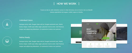
Codes are as follows:
<div class="backgroundImage12 pt-60 pb-60 color_white ">
  <div class="dnn_layout pb-60">
    <div class="content_mid clearfix animation">
      <h3 class="title_style_13 animation_item scaleUp delay1">HOW WE WORK</h3>
      <p style="text-align: center;" class="pt-20 pb-40 animation_item scaleUp delay2">Fusce ac dui eu odio molestie cursus in vitae nisl atury unc at viverra nisl, eu blandit<br />
        massa uspendisse est augue, sceleri sque ac interdu.</p>
      <div class="row">
        <div class="col-md-6 animation_item fadeInLeft delay3">
          <ul class="list_style_8 ">
            <li><span class="fa fa-flask"></span>
              <h3>Unlimited Colors</h3>
              <p>Quisque tortor odio, feugiat vitae velit at, feugiat euismod nunc... </p>
            </li>
            <li><span class="fa fa-desktop"></span>
              <h3>Retina Ready</h3>
              <p>Quisque tortor odio, feugiat vitae velit at, feugiat euismod nunc. Morbi lectus neque... </p>
            </li>
          </ul>
        </div>
        <div class="col-md-6 animation_item fadeInRight delay4"><img alt="" class="img-responsive" src="/portals/9/pic_11.png" /> </div>
      </div>
    </div>
  </div>
</div>
Option:
col-md-*is the width of each column, you can change the width you need through value1~12.- You can modify
animationto change the animation on the slide..Animation list. - You can modify
fa fa-*to change icons. font icon list.
TESTIMONIALS & CLIENTS area
Below is the screen shot:

Codes are as follows:
<ul data-autoplay="0" data-display-navigation="false" data-position="fade" class=" Testimonials_tab Testimonials_2 animation scaleUp ">
  <li> <span class="pic"><img alt="" src="/portals/9/portrait_01.jpg" /></span>
    <blockquote>
      <p>“ Quisque tortor odio, feugiat vitae velit at, feugiat euismod nunc... ”</p>
      <small>FRANK MILLER<span>THE DNNGO BUYER</span></small> </blockquote>
  </li>
  <li><span class="pic"><img alt="" src="/portals/9/portrait_02.jpg" /></span>
    <blockquote>
      <p>“ Suspendisse libero odio, rhoncus nec blandit eget, semper nec mi. Fusce dapibus tellus eu interdum varius... ”</p>
      <small>FRANK MILLER<span>THE DNNGO BUYER</span></small> </blockquote>
  </li>
  <li> <span class="pic"><img alt="" src="/portals/9/portrait_03.jpg" /></span>
    <blockquote>
      <p>“ Nemo enim ipsam voluptatem quia voluptas sit aspernatur aut odit aut fugit... ”</p>
      <small>FRANK MILLER<span>THE DNNGO BUYER</span></small> </blockquote>
  </li>
</ul>
Option:
- This is a
Testimonialseffect.Testimonials - You can modify
animationto change the animation on the slide..Animation list.
LINK area
Below is the screen shot:

Codes are as follows:
    <div class="pt-60"></div>
    <ul class="link_img_list_01 animation">
      <li class="animation_item fadeInRight delay3"><a href="#"><img alt="" src="/portals/9/link_img_01.jpg" /></a></li>
      <li class="animation_item fadeInRight delay2"><a href="#"><img alt="" src="/portals/9/link_img_02.jpg" /></a> </li>
      <li class="animation_item fadeInRight delay1"><a href="#"><img alt="" src="/portals/9/link_img_03.jpg" /></a> </li>
      <li class="animation_item fadeInLeft delay1"><a href="#"><img alt="" src="/portals/9/link_img_04.jpg" /></a> </li>
      <li class="animation_item fadeInLeft delay2"><a href="#"><img alt="" src="/portals/9/link_img_05.jpg" /></a> </li>
      <li class="animation_item fadeInLeft delay3"><a href="#"><img alt="" src="/portals/9/link_img_06.jpg" /></a> </li>
    </ul>
Option:
- You can modify
animationto change the animation on the slide..Animation list.
MEET OUR TEAM area
Below is the screen shot:
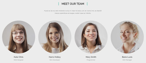
Codes are as follows:
<div class="content_mid clearfix animation animated">
  <h3 class="title_style_14 animation_item scaleUp delay1">MEET OUR TEAM</h3>
  <p class="pt-20 pb-40 animation_item scaleUp delay2" style="text-align: center;">Fusce ac dui eu odio molestie cursus in vitae nisl atury unc at viverra nisl, eu blandit<br>
    massa uspendisse est augue, sceleri sque ac interdu.</p>
  <div class="row">
    <div class="col-sm-3 animation_item fadeInLeft delay3">
      <div class="ServeList_8 ">
        <div class="pic"><img alt="" src="/portals/9/portrait_04.jpg"></div>
        <p>Kate Chris <span>Web Designer</span></p>
      </div>
    </div>
    <div class="col-sm-3 animation_item fadeInLeft delay4">
      <div class="ServeList_8 ">
        <div class="pic"><img alt="" src="/portals/9/portrait_05.jpg"></div>
        <p>Harro Holloy<span>Skin Developer</span></p>
      </div>
    </div>
    <div class="col-sm-3 animation_item fadeInLeft delay5">
      <div class="ServeList_8 ">
        <div class="pic"><img alt="" src="/portals/9/portrait_06.jpg"></div>
        <p>Mary Smith<span>Programmer</span></p>
      </div>
    </div>
    <div class="col-sm-3 animation_item fadeInLeft delay6">
      <div class="ServeList_8 ">
        <div class="pic"><img alt="" src="/portals/9/portrait_07.jpg"></div>
        <p>Bane Luois<span>CEO Manager</span></p>
      </div>
    </div>
  </div>
</div>
Option:
col-md-*is the width of each column, you can change the width you need through value1~12.- You can modify
animationto change the animation on the slide..Animation list.
OUR SKILLS area
Below is the screen shot:
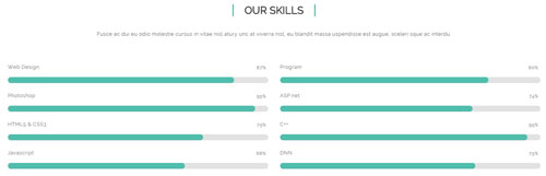
Codes are as follows:
<div class="content_mid clearfix animation">
  <p class=" pb-40 animation_item scaleUp delay1" style="text-align: center;">Fusce ac dui eu odio molestie cursus in vitae nisl atury unc at viverra nisl, eu blandit massa uspendisse est augue, sceleri sque ac interdu.</p>
  <div class="row">
    <div class="col-sm-6 animation_item fadeInLeft delay2">
      <div class="loaded_list_3">
        <p>Web Design </p>
        <div class="progress">
          <div data-width="87%" class="bar animation animationwidth  a_bg_c"> <span></span> </div>
        </div>
        <p>Photoshop</p>
        <div class="progress">
          <div data-width="95%" class="bar animation animationwidth  a_bg_c"> <span></span> </div>
        </div>
        <p>HTML5 & CSS3</p>
        <p> </p>
        <div class="progress">
          <div data-width="75%" class="bar animation animationwidth  a_bg_c"> <span></span> </div>
        </div>
        <p>Javascript</p>
        <div class="progress">
          <div data-width="68%" class="bar animation animationwidth  a_bg_c"> <span></span> </div>
        </div>
      </div>
    </div>
    <div class="col-sm-6 animation_item fadeInRight delay3">
      <div class="loaded_list_3">
        <p>Program</p>
        <div class="progress">
          <div data-width="80%" class="bar animation animationwidth  a_bg_c"> <span></span> </div>
        </div>
        <p>ASP.net</p>
        <div class="progress">
          <div data-width="74%" class="bar animation animationwidth  a_bg_c"> <span></span> </div>
        </div>
        <p>C++</p>
        <p> </p>
        <div class="progress">
          <div data-width="95%" class="bar animation animationwidth  a_bg_c"> <span></span> </div>
        </div>
        <p>DNN</p>
        <div class="progress">
          <div data-width="75%" class="bar animation animationwidth  a_bg_c"> <span></span> </div>
        </div>
      </div>
    </div>
  </div>
</div>
Option:
data-widthis controlling the percentage that displays, you can display percentage through value0~100col-md-*is the width of each column, you can change the width you need through value1~12.- You can modify
animationto change the animation on the slide..Animation list.
ENJOY INNOVATIVE AND POWERFUL SERVICES area
Below is the screen shot:

Codes are as follows:
<div class="backgroundImage14 pt-60 pb-60 color_white ">
  <div class="dnn_layout pt-20  pb-20">
    <div class="content_mid clearfix animation">
      <div class="content_text_5">
        <div class="ico animation_item scaleUp delay1"><span class="fa fa-twitter"></span></div>
        <div class="title animation_item scaleUp delay2">ENJOY INNOVATIVE AND POWERFUL SERVICES</div>
        <p class="animation_item scaleUp delay3"> Develop strong and flexible solutions that are fitted to the needs of our customers.</p>
        <p class="pt-30"> <a class="btn_9 animation_item fadeInLeft delay4" href="#">FOLLOW US</a><a class="btn_9 animation_item fadeInRight delay4" href="#">CLICK HERE</a> </p>
      </div>
    </div>
  </div>
</div>
Option:
- You can modify
animationto change the animation on the slide..Animation list.
About Dnngo area
Below is the screen shot:
Codes are as follows:
<div class="animation scaleUp delay1">
      <p>Interdum et malesuada fames ac ante ipsum primis in faucibus. Mauris quis vehicula diam. Lorem ipsum dolor sit amet, consectetur adipiscing elit. Maecenas ut pellentesque massa, ut porttitor risus. </p>
      <p> </p>
      <p> Aliquam volutpat congue scelerisque. Nam eget fringilla risus, vitae posuere nisl Vivamus pulvinar lobortis molestie. </p>
      <a href="#">More Information ></a> </div>
Option:
- You can modify
animationto change the animation on the slide..Animation list. Containeris usingContainer-4
Categories area
Below is the screen shot:
Codes are as follows:
<ul class="list_style_3 animation scaleUp delay2">
  <li><a href="#">Module Development</a></li>
  <li><a href="#">Responsive Skin & Design</a></li>
  <li><a href="#">Amazing Portfolios</a></li>
  <li><a href="#">CSS3 Animations</a></li>
</ul>
Option:
- You can modify
animationto change the animation on the slide..Animation list. Containeris usingContainer-4
Recent News area
Below is the screen shot:
Codes are as follows:
<ul class="list_style_4 animation scaleUp delay3">
  <li><img alt="" src="/portals/9/Photo_15.jpg" />
    <p>Ut wisi enim ad minim veniam, amcorper suscipit lobortis nislut liquip exea commodo.</p>
    <a href="#">Read More</a></li>
  <li><img alt="" src="/portals/9/Photo_16.jpg" />
    <p>Ut wisi enim ad minim veniam, amcorper suscipit lobortis nislut liquip exea commodo.</p>
    <a href="#">Read More</a></li>
</ul>
Option:
- You can modify
animationto change the animation on the slide..Animation list. Containeris usingContainer-4
Follow Us area
Below is the screen shot:
Codes are as follows:
<div class="animation scaleUp delay3">
  <p>Morbi tempus dapibus mattis. Aliquam arcu erat, pharetra vitae consectetur eu, pellentesque eget ipsum nibh auctor.</p>
  <div class="pt-20 pb-20">
    <p>Email : dnnskindev@gmail.com</p>
    <p>Skype :  dnngo-linda</p>
  </div>
  <div class="social_list_3">
      <a href="#"><span class="fa fa-twitter"></span></a>
      <a href="#"><span class="fa fa-facebook"></span></a>
      <a href="#"><span class="fa fa-apple"></span></a>
      <a href="#"><span class="fa fa-android"></span></a>
  </div>
</div>
Option:
- You can modify
fa fa-*to change icons. font icon list. - You can modify
animationto change the animation on the slide..Animation list. Containeris usingContainer-4
Home Version 6
You can click the link to check Home Version 6 demo. Home Version 6
Banner area
Below is the screen shot:

It is using DNNGo LayerGalleryPro module here,you can import ContentListEntity-Home6.xml of the DNNGo_LayerGalleryPro folder to duplicate banner of the demo.
FEATURED PRODUCTS area
Below is the screen shot:
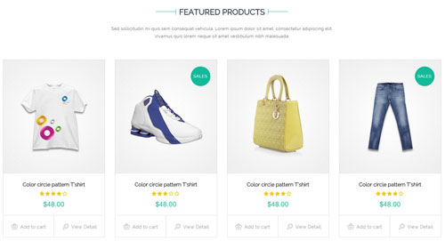
Codes are as follows:
<div class="animation">
  <p style="text-align: center;" class=" pb-40 animation_item fadeInUp delay1">Sed sollicitudin mi quis sem consequat vehicula. Lorem ipsum dolor sit amet, consectetur adipiscing elit.<br />
    Vivamus quis lorem neque sit amet vestibulum nibh malesuada.</p>
  <div class="phone_center">
    <div class="row">
      <div class="col-md-3 col-sm-6 animation_item fadeInUp delay2">
        <div class="product_list_01">
          <div class="img"><img alt="" src="/portals/9/product_01.jpg" /> </div>
          <h3>Color circle pattern T’shirt</h3>
          <div class="ratings"> <span class="fa fa-star"></span><span class="fa fa-star"></span><span class="fa fa-star"></span><span class="fa fa-star"></span><span class="fa fa-star-o"></span> </div>
          <div class="price">$48.00</div>
          <div class="link"> <a href="#"><span class="shopping"></span>Add to cart</a><a href="#"><span class="view"></span>View Detail</a></div>
        </div>
      </div>
      <div class="col-md-3 col-sm-6 animation_item fadeInUp delay3">
        <div class="product_list_01">
          <div class="img">
            <div class="sales">SALES</div>
            <img alt="" src="/portals/9/product_02.jpg" /> </div>
          <h3>Color circle pattern T’shirt</h3>
          <div class="ratings"> <span class="fa fa-star"></span><span class="fa fa-star"></span><span class="fa fa-star"></span><span class="fa fa-star-o"></span><span class="fa fa-star-o"></span> </div>
          <div class="price">$48.00</div>
          <div class="link"> <a href="#"><span class="shopping"></span>Add to cart</a><a href="#"><span class="view"></span>View Detail</a></div>
        </div>
      </div>
      <div class="col-md-3 col-sm-6 animation_item fadeInUp delay4">
        <div class="product_list_01">
          <div class="img"><img alt="" src="/portals/9/product_03.jpg" /> </div>
          <h3>Color circle pattern T’shirt</h3>
          <div class="ratings"> <span class="fa fa-star"></span><span class="fa fa-star"></span><span class="fa fa-star"></span><span class="fa fa-star"></span><span class="fa fa-star-o"></span> </div>
          <div class="price">$48.00</div>
          <div class="link"> <a href="#"><span class="shopping"></span>Add to cart</a><a href="#"><span class="view"></span>View Detail</a></div>
        </div>
      </div>
      <div class="col-md-3 col-sm-6 animation_item fadeInUp delay5">
        <div class="product_list_01">
          <div class="img">
            <div class="sales">SALES</div>
            <img alt="" src="/portals/9/product_04.jpg" /> </div>
          <h3>Color circle pattern T’shirt</h3>
          <div class="ratings"> <span class="fa fa-star"></span><span class="fa fa-star"></span><span class="fa fa-star"></span><span class="fa fa-star"></span><span class="fa fa-star-o"></span> </div>
          <div class="price">$48.00</div>
          <div class="link"> <a href="#"><span class="shopping"></span>Add to cart</a><a href="#"><span class="view"></span>View Detail</a></div>
        </div>
      </div>
    </div>
    <div class="row">
      <div class="col-md-3 col-sm-6 animation_item fadeInUp delay6">
        <div class="product_list_01">
          <div class="img"><img alt="" src="/portals/9/product_05.jpg" /> </div>
          <h3>Color circle pattern T’shirt</h3>
          <div class="ratings"> <span class="fa fa-star"></span><span class="fa fa-star"></span><span class="fa fa-star"></span><span class="fa fa-star"></span><span class="fa fa-star"></span> </div>
          <div class="price">$48.00</div>
          <div class="link"> <a href="#"><span class="shopping"></span>Add to cart</a><a href="#"><span class="view"></span>View Detail</a></div>
        </div>
      </div>
      <div class="col-md-3 col-sm-6 animation_item fadeInUp delay7">
        <div class="product_list_01">
          <div class="img"><img alt="" src="/portals/9/product_06.jpg" /> </div>
          <h3>Color circle pattern T’shirt</h3>
          <div class="ratings"> <span class="fa fa-star"></span><span class="fa fa-star"></span><span class="fa fa-star"></span><span class="fa fa-star"></span><span class="fa fa-star-o"></span> </div>
          <div class="price">$48.00</div>
          <div class="link"> <a href="#"><span class="shopping"></span>Add to cart</a><a href="#"><span class="view"></span>View Detail</a></div>
        </div>
      </div>
      <div class="col-md-3 col-sm-6 animation_item fadeInUp delay8">
        <div class="product_list_01">
          <div class="img">
            <div class="sales">SALES</div>
            <img alt="" src="/portals/9/product_07.jpg" /> </div>
          <h3>Color circle pattern T’shirt</h3>
          <div class="ratings"> <span class="fa fa-star"></span><span class="fa fa-star"></span><span class="fa fa-star"></span><span class="fa fa-star"></span><span class="fa fa-star"></span> </div>
          <div class="price">$48.00</div>
          <div class="link"> <a href="#"><span class="shopping"></span>Add to cart</a><a href="#"><span class="view"></span>View Detail</a></div>
        </div>
      </div>
      <div class="col-md-3 col-sm-6 animation_item fadeInUp delay9">
        <div class="product_list_01">
          <div class="img"><img alt="" src="/portals/9/product_08.jpg" /> </div>
          <h3>Color circle pattern T’shirt</h3>
          <div class="ratings"> <span class="fa fa-star"></span><span class="fa fa-star"></span><span class="fa fa-star"></span><span class="fa fa-star-o"></span><span class="fa fa-star-o"></span> </div>
          <div class="price">$48.00</div>
          <div class="link"> <a href="#"><span class="shopping"></span>Add to cart</a><a href="#"><span class="view"></span>View Detail</a></div>
        </div>
      </div>
    </div>
  </div>
  <p style="text-align: center;" class="pt-20"> <a href="#" class="btn_11 animation_item fadeInLeft delay10">LOAD MORE</a> <a href="#" class="btn_11 animation_item fadeInRight delay10">GO TO STORE</a> </p>
</div>
Option:
- You can modify
fa fa-*to change icons. font icon list. col-md-*is the width of each column, you can change the width you need through value1~12.- You can modify
animationto change the animation on the slide..Animation list. Containeris usingContainer-9
Wondering what customers say about our services area
Below is the screen shot:

Codes are as follows:
<div class="backgroundImage17">
  <div class="dnn_layout  pt-60">
    <div class="content_mid clearfix">
      <div class="row">
        <div class="col-md-5 col-sm-6 animation">
          <h3 class="title_style_19 animation_item fadeInUp delay1"> <span>Wondering what customers <br />
            say about our services </span></h3>
          <div class="mt-20"></div>
          <blockquote class="blockquote_1 ">
            <p class="animation_item fadeInUp delay2">“ Mauris viverra, dui at cursus suscipit, lectus odio hendrerit ante...  ”</p>
            <small class="animation_item fadeInUp delay3">DAVID SMITH<span>—THE DNNGO BUYER</span></small> </blockquote>
          <div class="link_img_list_03 pt-30 pb-60 animation_item fadeInUp delay4"> <a href="#"><img alt="" src="/portals/9/link_img_13.png" /></a> <a href="#"><img alt="" src="/portals/9/link_img_14.png" /></a> <a href="#"><img alt="" src="/portals/9/link_img_15.png" /></a> <a href="#"><img alt="" src="/portals/9/link_img_16.png" /></a> </div>
        </div>
        <div class="col-md-1 hidden-sm"></div>
        <div class="col-sm-6 right_bg "> </div>
      </div>
    </div>
  </div>
</div>
Option:
- You can modify
animationto change the animation on the slide..Animation list.
WHAT WE HAVE area
Below is the screen shot:
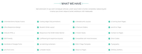
Codes are as follows:
<div class="animation">
  <p class=" pb-40 animation_item fadeInUp delay1" style="text-align: center;">Sed sollicitudin mi quis sem consequat vehicula. Lorem ipsum dolor sit amet, consectetur adipiscing elit.<br />
    Vivamus quis lorem neque sit amet vestibulum nibh malesuada.</p>
  <div class="row">
    <div class="col-md-3 col-sm-6 animation_item fadeInRight delay1">
      <ul class="list_style_10">
        <li><span class="fa  fa-check"></span><a href="#">Unlimited Skins/Styles/Colors</a></li>
        <li><span class="fa  fa-check"></span><a href="#">Ultra Responsive design</a></li>
        <li><span class="fa  fa-check"></span><a href="#">CSS3 & HTML 5</a></li>
        <li><span class="fa  fa-check"></span><a href="#">SEO friendly</a></li>
        <li><span class="fa  fa-check"></span><a href="#">Hundreds of Google Fonts</a></li>
        <li><span class="fa  fa-check"></span><a href="#">470 Font Icons</a></li>
      </ul>
    </div>
    <div class="col-md-3 col-sm-6 animation_item fadeInRight delay2">
      <ul class="list_style_10">
        <li><span class="fa  fa-check"></span><a href="#">Cutting-edge CSS3 animations</a></li>
        <li><span class="fa  fa-check"></span><a href="#">Boxed & Wide Layout</a></li>
        <li><span class="fa  fa-check"></span><a href="#">Responsive Full Width Slider Banner</a></li>
        <li><span class="fa  fa-check"></span><a href="#">5 different grid responsive layouts</a></li>
        <li><span class="fa  fa-check"></span><a href="#">14 matching containers</a></li>
        <li><span class="fa  fa-check"></span><a href="#">5 Header Styles</a></li>
      </ul>
    </div>
    <div class="col-md-3 col-sm-6 animation_item fadeInRight delay3">
      <ul class="list_style_10">
        <li><span class="fa  fa-check"></span><a href="#">4 Breadcrumb Layouts</a></li>
        <li><span class="fa  fa-check"></span><a href="#">5 Premium Sliders</a></li>
        <li><span class="fa  fa-check"></span><a href="#">2 Footer Styles</a></li>
        <li><span class="fa  fa-check"></span><a href="#">Compatible with most browsers</a></li>
        <li><span class="fa  fa-check"></span><a href="#">DNN 7 Page Template</a></li>
        <li><span class="fa  fa-check"></span><a href="#">About Us Pages</a></li>
      </ul>
    </div>
    <div class="col-md-3 col-sm-6 animation_item fadeInRight delay4">
      <ul class="list_style_10">
        <li><span class="fa  fa-check"></span><a href="#">2 Coming Soon Pages</a></li>
        <li><span class="fa  fa-check"></span><a href="#">404 Error Page</a></li>
        <li><span class="fa  fa-check"></span><a href="#">Contact Us Pages</a></li>
        <li><span class="fa  fa-check"></span><a href="#">Short Codes</a></li>
        <li><span class="fa  fa-check"></span><a href="#">Typography</a></li>
        <li><span class="fa  fa-check"></span><a href="#">DNNGo_GoMenu</a></li>
      </ul>
    </div>
  </div>
  <div class="pb-40"></div>
</div>
Option:
col-md-*is the width of each column, you can change the width you need through value1~12.- You can modify
animationto change the animation on the slide..Animation list. - You can modify
fa fa-*to change icons. font icon list.
RED JACKET area
Below is the screen shot:

Codes are as follows:
<div class="photo_sytle_1 animation ">
  <div class="left">
    <div class="photo_box_1 animation_item fadeInLeft delay1"> <img alt="" src="/portals/9/Photo_48.jpg" />
      <div class="photo_content">
        <div class="title_1">THE LATEST PRODUCT</div>
        <div class="title_2">RED JACKET</div>
        <div class="title_3">FOR THIS AUTUMN</div>
      </div>
    </div>
  </div>
  <div class="right">
    <div class="photo_box_2 animation_item fadeInRight delay2"> <img alt="" src="/portals/9/Photo_49.jpg" />
      <div class="photo_content">
        <div class="title_1">THE BEST CLOTHES</div>
        <div class="title_2">FOR CHILD</div>
        <div class="more"><a href="#">CHECK IT NOW</a></div>
      </div>
    </div>
    <div class="photo_box_3 animation_item fadeInRight delay3"> <img alt="" src="/portals/9/Photo_50.jpg" />
      <div class="photo_content">
        <div class="title_1">80% DISCOUNT</div>
        <div class="title_2">SPORT SHOES</div>
        <div class="more"><a href="#">ADD TO CART</a></div>
      </div>
    </div>
  </div>
</div>
Option:
- You can modify
animationto change the animation on the slide..Animation list.
PRE-SALE area
Below is the screen shot:
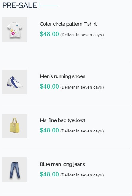
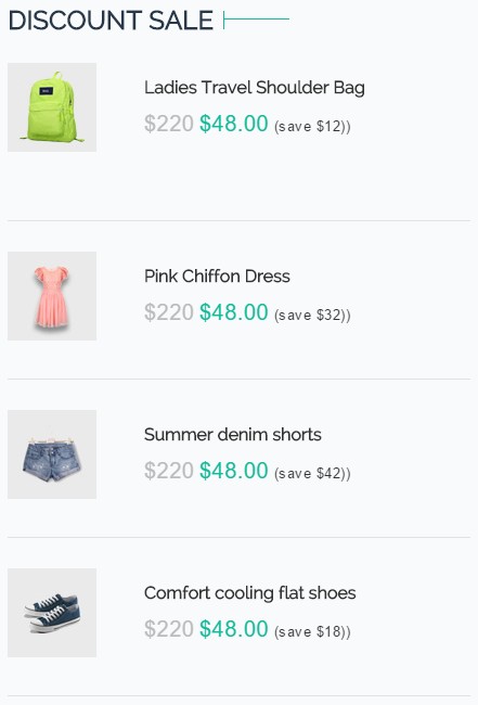
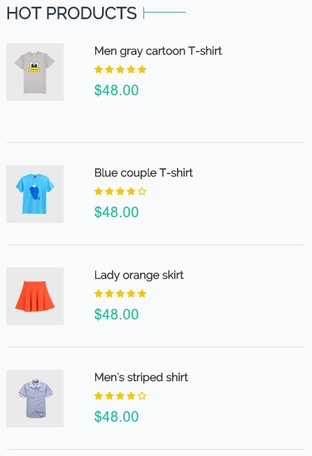
Codes are as follows:
<ul class="product_list_02 animation">
  <li class="animation_item fadeInUp delay1">
    <div class="img"><img alt="" src="/portals/9/product_09.jpg" /></div>
    <div class="content">
      <h3>Color circle pattern T’shirt</h3>
      <div class="price"><span class="current">$48.00</span> <span class="info">(Deliver in seven days)</span></div>
    </div>
  </li>
  <li class="animation_item fadeInUp delay2">
    <div class="img"><img alt="" src="/portals/9/product_10.jpg" /></div>
    <div class="content">
      <h3>Men's running shoes</h3>
      <div class="price"><span class="current">$48.00</span> <span class="info">(Deliver in seven days)</span></div>
    </div>
  </li>
  <li class="animation_item fadeInUp delay3">
    <div class="img"><img alt="" src="/portals/9/product_11.jpg" /></div>
    <div class="content">
      <h3>Ms. fine bag (yellow)</h3>
      <div class="price"><span class="current">$48.00</span> <span class="info">(Deliver in seven days)</span></div>
    </div>
  </li>
  <li class="animation_item fadeInUp delay4">
    <div class="img"><img alt="" src="/portals/9/product_12.jpg" /></div>
    <div class="content">
      <h3>Blue man long jeans</h3>
      <div class="price"><span class="current">$48.00</span> <span class="info">(Deliver in seven days)</span></div>
    </div>
  </li>
</ul>
Option:
Containeris usingContainer-10- You can modify
animationto change the animation on the slide..Animation list.
ABOUT US area
Below is the screen shot:
Codes are as follows:
<div class="animation fadeInUp delay1">
  <p><img alt="" src="/portals/9/logo3.png" /></p>
  <p>Luauris viverra, dui at cursus suscipit, lectus odio hendrerit ante, nec iaculis felis nulla quis tellus male suada posuere quis id risus ulla vitae ipsum ac est sagittis luctus. </p>
  <br />
  <p> Aliquam eu aliquam nisi. Suspendisse suscipit libero vitae scelerisque molestie.  ” </p>
  <br />
  <p> <a href="#">LEARN MORE</a></p>
</div>
Option:
Containeris usingContainer-11- You can modify
animationto change the animation on the slide..Animation list.
CATEGORIES area
Below is the screen shot:
Codes are as follows:
<ul class="list_style_11 animation fadeInUp delay2">
  <li><span class="fa fa-file-text-o"></span><a href="#">Module Development</a></li>
  <li><span class="fa fa-file-text-o"></span><a href="#">Create DNN Website</a></li>
  <li><span class="fa fa-file-text-o"></span><a href="#">Browser Compatiblity</a></li>
  <li><span class="fa fa-file-text-o"></span><a href="#">Go to DNN Store</a></li>
  <li><span class="fa fa-file-text-o"></span><a href="#">Call support service</a></li>
</ul>
Option:
- You can modify
fa fa-*to change icons. font icon list. Containeris usingContainer-11- You can modify
animationto change the animation on the slide..Animation list.
TAGS area
Below is the screen shot:
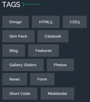
Codes are as follows:
<div class="tag_list_2 animation fadeInUp delay3">
    <a href="#">Dnngo</a>
    <a href="#">HTML5</a>
    <a href="#">CSS3</a>
    <a href="#">Skin Pack</a>
    <a href="#">Catalook</a>
    <a href="#">Blog</a>
    <a href="#">Features</a>
    <a href="#">Gallery Sliders</a>
    <a href="#">Photos</a>
    <a href="#">News</a>
    <a href="#">Form</a>
    <a href="#">Short Code</a>
    <a href="#">Mobilesite</a>
</div>
Option:
Containeris usingContainer-11- You can modify
animationto change the animation on the slide..Animation list.
CONTACT area
Below is the screen shot:

Codes are as follows:
<div class="animation fadeInUp delay4">
  <p>Vestibulum hendrerit risus non libero sollicitudin fermentum, massa nulla facilisis felis, in vehicula dui enim nec tortor. </p>
  <br />
  <p>Address : XingAn Street No.287</p>
  <p>Phone : (+086)-123-456-78910</p>
  <p>Email : dnnskindev@gmail.com</p>
  <p>Skype : dnngo-linda</p>
  <p>Website : www.dnngo.net</p>
</div>
Option:
Containeris usingContainer-11- You can modify
animationto change the animation on the slide..Animation list.
Home Version 7
You can click the link to check Home Version 7 demo. Home Version 7
Banner area
Below is the screen shot:

It is using DNNGo LayerGalleryPro module here,you can import ContentListEntity-Home7.xml of the DNNGo_LayerGalleryPro folder to duplicate banner of the demo.
ABOUT US area
Below is the screen shot:
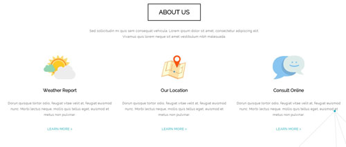
Codes are as follows:
<div class="backgroundImage19 pb-60">
  <div class="dnn_layout pb-60">
    <div class="content_mid clearfix animation">
      <p class=" pb-40 animation_item fadeInUp delay1" style="text-align: center;">Sed sollicitudin mi quis sem consequat vehicula. Lorem ipsum dolor sit amet, consectetur adipiscing elit.<br />
        Vivamus quis lorem neque sit amet vestibulum nibh malesuada.</p>
      <div class="row">
        <div class="col-sm-4 animation_item fadeInLeft delay2">
          <div class="ServeList_14"> <img alt="" src="/portals/9/icon_01.png" />
            <h3>Weather Report</h3>
            <p>Dorun quisque tortor odio, feugiat vitae velit at, feugiat euismod nunc. Morbi lectus neque, mollis quis tellus eget, euismod et metus non pulvinar. </p>
            <p class="pt-20"><a href="#">LEARN MORE ></a></p>
          </div>
        </div>
        <div class="col-sm-4 animation_item fadeInLeft delay3">
          <div class="ServeList_14"> <img alt="" src="/portals/9/icon_02.png" />
            <h3>Our Location</h3>
            <p>Dorun quisque tortor odio, feugiat vitae velit at, feugiat euismod nunc. Morbi lectus neque, mollis quis tellus eget, euismod et metus non pulvinar. </p>
            <p class="pt-20"><a href="#">LEARN MORE ></a></p>
          </div>
        </div>
        <div class="col-sm-4 animation_item fadeInLeft delay4">
          <div class="ServeList_14"> <img alt="" src="/portals/9/icon_03.png" />
            <h3>Consult Online</h3>
            <p>Dorun quisque tortor odio, feugiat vitae velit at, feugiat euismod nunc. Morbi lectus neque, mollis quis tellus eget, euismod et metus non pulvinar. </p>
            <p class="pt-20"><a href="#">LEARN MORE ></a></p>
          </div>
        </div>
      </div>
    </div>
  </div>
  <div class="pb-60"></div>
</div>
Option:
Containeris usingContainer-12- You can modify
animationto change the animation on the slide..Animation list.
FEATURED SKIN area
Below is the screen shot:
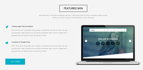
Codes are as follows:
<div class="backgroundImage1 pt-60  pb-60">
  <div class="dnn_layout pb-60">
    <div class="content_mid clearfix animation">
      <div class="title_style_20 animation_item fadeInUp">
        <h3>FEATURED SKIN</h3>
      </div>
      <p class=" pb-40 animation_item fadeInUp delay1" style="text-align: center;">Sed sollicitudin mi quis sem consequat vehicula. Lorem ipsum dolor sit amet, consectetur adipiscing elit.<br />
        Vivamus quis lorem neque sit amet vestibulum nibh malesuada.</p>
      <div class="row">
        <div class="col-sm-6">
          <div class="ServeList_15">
            <li class="animation_item fadeInLeft delay3"><span class="ico fa fa-rocket"></span>
              <h3>Cutting-edge CSS3 animations</h3>
              <p>Nemo enim ipsam voluptatem quia voluptas sit aspernatur aut odit aut fugit...</p>
            </li>
            <li class="animation_item fadeInLeft delay4"><span class="ico fa fa-thumbs-up"></span>
              <h3>Hundreds of Google Fonts</h3>
              <p>Nemo enim ipsam voluptatem quia voluptas sit aspernatur aut odit aut fugit...</p>
            </li>
          </div>
          <br />
          <p><a class="btn_12 animation_item fadeInLeft delay5" href="#">BUY IT NOW</a></p>
        </div>
        <div class="col-sm-6 animation_item fadeInRight delay2"> <img alt="" class="img-responsive" src="/portals/9/pic_15.png" /></div>
      </div>
    </div>
  </div>
</div>
Option:
- You can modify
fa fa-*to change icons. font icon list. col-md-*is the width of each column, you can change the width you need through value1~12.- You can modify
animationto change the animation on the slide..Animation list.
WORK PROCESS area
Below is the screen shot:
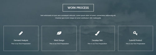
Codes are as follows:
<div class="backgroundImage20 color_white  pt-60 pb-60">
  <div class="dnn_layout">
    <div class="content_mid clearfix animation">
      <div class="title_style_21 animation_item scaleUp delay1">
        <h3>WORK PROCESS</h3>
      </div>
      <p class=" pb-40 animation_item scaleUp delay2" style="text-align: center;">Sed sollicitudin mi quis sem consequat vehicula. Lorem ipsum dolor sit amet, consectetur adipiscing elit.<br />
        Vivamus quis lorem neque sit amet vestibulum nibh malesuada.</p>
      <div class="row">
        <div class="col-md-3 col-sm-6 animation_item fadeInRight delay3">
          <div class="ServeList_16"> <span class="fa fa-pencil"></span>
            <h3>Demand Analysis</h3>
            <p> This is our first Preparation</p>
          </div>
        </div>
        <div class="col-md-3 col-sm-6 animation_item fadeInRight delay4">
          <div class="ServeList_16"> <span class="fa fa-leaf"></span>
            <h3>Web Design</h3>
            <p> This is our first Preparation</p>
          </div>
        </div>
        <div class="col-md-3 col-sm-6 animation_item fadeInRight delay5">
          <div class="ServeList_16"> <span class="fa fa-paint-brush"></span>
            <h3>Develop Skin</h3>
            <p> This is our first Preparation</p>
          </div>
        </div>
        <div class="col-md-3 col-sm-6 animation_item fadeInRight delay6">
          <div class="ServeList_16"> <span class="fa fa-key"></span>
            <h3>Submit Product</h3>
            <p> This is our first Preparation</p>
          </div>
        </div>
      </div>
    </div>
  </div>
  <div class="pb-60 pt-60"></div>
</div>
Option:
- You can modify
fa fa-*to change icons. font icon list. col-md-*is the width of each column, you can change the width you need through value1~12.- You can modify
animationto change the animation on the slide..Animation list.
OUR TEAMS area
Below is the screen shot:
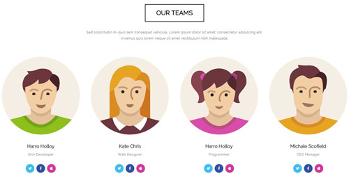
Codes are as follows:
<div class="animation">
  <p class="pb-40 animation_item fadeInUp delay1" style="text-align: center;">Sed sollicitudin mi quis sem consequat vehicula. Lorem ipsum dolor sit amet, consectetur adipiscing elit.<br />
    Vivamus quis lorem neque sit amet vestibulum nibh malesuada.</p>
  <div class="row">
    <div class="col-sm-3 animation_item fadeInLeft delay5">
      <div class="ServeList_17"> <img alt="" src="/portals/9/Photo_51.jpg" />
        <h3>Harro Holloy</h3>
        <p>Skin Developer</p>
        <div class="social_list_4 mt-20">
        <a href="#"><span class="fa fa-twitter color_bg_1"></span></a>
        <a href="#"><span class="fa fa-facebook color_bg_2"></span></a>
        <a href="#"><span class="fa fa-apple color_bg_3"></span></a>
        </div>
      </div>
    </div>
    <div class="col-sm-3 animation_item fadeInLeft delay4">
      <div class="ServeList_17"> <img alt="" src="/portals/9/Photo_52.jpg" />
        <h3>Kate Chris</h3>
        <p>Web Designer</p>
        <div class="social_list_4 mt-20">
        <a href="#"><span class="fa fa-twitter color_bg_1"></span></a>
        <a href="#"><span class="fa fa-facebook color_bg_2"></span></a>
        <a href="#"><span class="fa fa-apple color_bg_3"></span></a>
        </div>
      </div>
    </div>
    <div class="col-sm-3 animation_item fadeInLeft delay3">
      <div class="ServeList_17"> <img alt="" src="/portals/9/Photo_53.jpg" />
        <h3>Harro Holloy</h3>
        <p>Programmer</p>
        <div class="social_list_4 mt-20">
        <a href="#"><span class="fa fa-twitter color_bg_1"></span></a>
        <a href="#"><span class="fa fa-facebook color_bg_2"></span></a>
        <a href="#"><span class="fa fa-apple color_bg_3"></span></a>
        </div>
      </div>
    </div>
    <div class="col-sm-3 animation_item fadeInLeft delay2">
      <div class="ServeList_17"> <img alt="" src="/portals/9/Photo_54.jpg" />
        <h3>Michale Scofield</h3>
        <p>CEO Manager</p>
        <div class="social_list_4 mt-20">
        <a href="#"><span class="fa fa-twitter color_bg_1"></span></a>
        <a href="#"><span class="fa fa-facebook color_bg_2"></span></a>
        <a href="#"><span class="fa fa-apple color_bg_3"></span></a>
        </div>
      </div>
    </div>
  </div>
</div>
Option:
Containeris usingContainer-12- You can modify
fa fa-*to change icons. font icon list. color_1~ color_4is the corresponding color of each column. You can change the color you need through value1~4col-md-*is the width of each column, you can change the width you need through value1~12.- You can modify
animationto change the animation on the slide..Animation list.
RECENT BLOG area
Below is the screen shot:
Codes are as follows:
<div class="backgroundImage1 pt-60  pb-60">
  <div class="dnn_layout pb-60">
    <div class="content_mid clearfix animation">
      <div class="title_style_20 animation_item scaleUp delay1">
        <h3>RECENT BLOG</h3>
      </div>
      <p style="text-align: center;" class=" pb-40 animation_item scaleUp delay2">Sed sollicitudin mi quis sem consequat vehicula. Lorem ipsum dolor sit amet, consectetur adipiscing elit.<br />
        Vivamus quis lorem neque sit amet vestibulum nibh malesuada.</p>
      <div data-autoplay="true" data-navigation="true" data-items="3" data-pagination="true" class="carousel carousel_3 animation_item scaleUp delay3">
        <div class="item">
          <div class="photo_box  img_zoom"> <a href="#">
            <div class="pic_box"> <img alt="" src="/portals/9/Photo_55.jpg" />
              <div class="ico"> <span class="fa fa-search"></span> </div>
              <div class="shade"></div>
            </div>
            </a> </div>
          <div class="content">
            <h3>DNN 7 Page Templates</h3>
            <p>Mirum est notare quam littera gothica, quam nunc puta manitatis per seacula quarta decima et quinta decima fiant sollemnes in futurum.</p>
            <div class="info">By Admin    |    0 Comments</div>
          </div>
        </div>
        <div class="item">
          <div class="photo_box  img_zoom"> <a href="#">
            <div class="pic_box"> <img alt="" src="/portals/9/Photo_56.jpg" />
              <div class="ico"> <span class="fa fa-search"></span> </div>
              <div class="shade"></div>
            </div>
            </a> </div>
          <div class="content">
            <h3>Loading Animation</h3>
            <p>Mirum est notare quam littera gothica, quam nunc puta manitatis per seacula quarta decima et quinta decima fiant sollemnes in futurum.</p>
            <div class="info">By Admin    |    0 Comments</div>
          </div>
        </div>
        <div class="item">
          <div class="photo_box  img_zoom"> <a href="#">
            <div class="pic_box"> <img alt="" src="/portals/9/Photo_57.jpg" />
              <div class="ico"> <span class="fa fa-search"></span> </div>
              <div class="shade"></div>
            </div>
            </a> </div>
          <div class="content">
            <h3>Layer Gallery</h3>
            <p>Mirum est notare quam littera gothica, quam nunc puta manitatis per seacula quarta decima et quinta decima fiant sollemnes in futurum.</p>
            <div class="info">By Admin    |    0 Comments</div>
          </div>
        </div>
        <div class="item">
          <div class="photo_box  img_zoom"> <a href="#">
            <div class="pic_box"> <img alt="" src="/portals/9/Photo_55.jpg" />
              <div class="ico"> <span class="fa fa-search"></span> </div>
              <div class="shade"></div>
            </div>
            </a> </div>
          <div class="content">
            <h3>DNN 7 Page Templates</h3>
            <p>Mirum est notare quam littera gothica, quam nunc puta manitatis per seacula quarta decima et quinta decima fiant sollemnes in futurum.</p>
            <div class="info">By Admin    |    0 Comments</div>
          </div>
        </div>
        <div class="item">
          <div class="photo_box  img_zoom"> <a href="#">
            <div class="pic_box"> <img alt="" src="/portals/9/Photo_56.jpg" />
              <div class="ico"> <span class="fa fa-search"></span> </div>
              <div class="shade"></div>
            </div>
            </a> </div>
          <div class="content">
            <h3>Loading Animation</h3>
            <p>Mirum est notare quam littera gothica, quam nunc puta manitatis per seacula quarta decima et quinta decima fiant sollemnes in futurum.</p>
            <div class="info">By Admin    |    0 Comments</div>
          </div>
        </div>
      </div>
      <div class="pb-60"></div>
    </div>
  </div>
</div>
Option:
- You can modify
photo_boxto change image effects. Image Effects - This is a
Carouseleffect.Carousel - You can modify
fa fa-*to change icons. font icon list. - You can modify
animationto change the animation on the slide..Animation list.
OUR SERVICES area
Below is the screen shot:
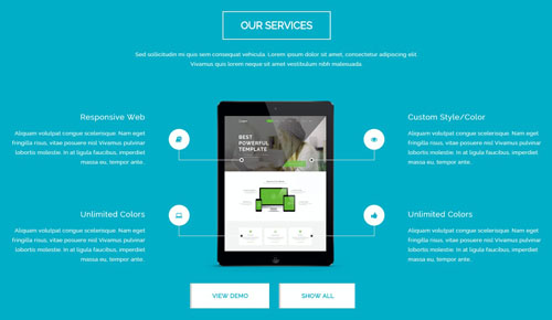
Codes are as follows:
<div class="backgroundImage21 color_white  pt-60 pb-60">
  <div class="dnn_layout">
    <div class="content_mid clearfix animation">
      <div class="title_style_21 animation_item fadeInUp delay1">
        <h3>OUR SERVICES</h3>
      </div>
      <p style="text-align: center;" class=" pb-40 animation_item fadeInUp delay2">Sed sollicitudin mi quis sem consequat vehicula. Lorem ipsum dolor sit amet, consectetur adipiscing elit.<br />
        Vivamus quis lorem neque sit amet vestibulum nibh malesuada.</p>
      <div class="content_text_6">
        <div class="text_img animation_item scaleUp delay3"><img alt="" src="/portals/9/pic_16.png" /></div>
        <dl class="text_box_1 animation_item fadeInUp delay4">
          <dt>Responsive Web</dt>
          <dd>Aliquam volutpat congue scelerisque. Nam eget fringilla risus, vitae posuere nisl Vivamus pulvinar lobortis molestie. In at ligula faucibus, imperdiet massa eu, tempor ante..</dd>
          <dd class="line"><span class="fa fa-book"></span> </dd>
        </dl>
        <dl class="text_box_2 animation_item fadeInRight delay4">
          <dt>Custom Style/Color</dt>
          <dd>Aliquam volutpat congue scelerisque. Nam eget fringilla risus, vitae posuere nisl Vivamus pulvinar lobortis molestie. In at ligula faucibus, imperdiet massa eu, tempor ante..</dd>
          <dd class="line"><span class="fa  fa-eye"></span> </dd>
        </dl>
        <dl class="text_box_3 animation_item fadeInLeft delay5">
          <dt>Unlimited Colors</dt>
          <dd>Aliquam volutpat congue scelerisque. Nam eget fringilla risus, vitae posuere nisl Vivamus pulvinar lobortis molestie. In at ligula faucibus, imperdiet massa eu, tempor ante..</dd>
          <dd class="line"><span class="fa fa-laptop"></span> </dd>
        </dl>
        <dl class="text_box_4 animation_item fadeInRight delay5">
          <dt>Unlimited Colors</dt>
          <dd>Aliquam volutpat congue scelerisque. Nam eget fringilla risus, vitae posuere nisl Vivamus pulvinar lobortis molestie. In at ligula faucibus, imperdiet massa eu, tempor ante..</dd>
          <dd class="line"><span class="fa fa-thumbs-up"></span> </dd>
        </dl>
      </div>
      <p class="pt-20" style="text-align: center;"> <a class="btn_13 animation_item fadeInLeft delay6" href="#">VIEW DEMO</a> <a class="btn_13 animation_item fadeInRight delay6" href="#">SHOW ALL</a> </p>
    </div>
  </div>
  <div class="pb-60 pt-60"></div>
</div>
Option:
- You can modify
animationto change the animation on the slide..Animation list.
CONTACT US area
Below is the screen shot:
Codes are as follows:
    <p style="text-align: center;" class=" animation  fadeInUp">Sed sollicitudin mi quis sem consequat vehicula. Lorem ipsum dolor sit amet, consectetur adipiscing elit.<br />
      Vivamus quis lorem neque sit amet vestibulum nibh malesuada.</p>
Option:
Containeris usingContainer-12- You can modify
animationto change the animation on the slide..Animation list.
CONTACT US area
Below is the screen shot:
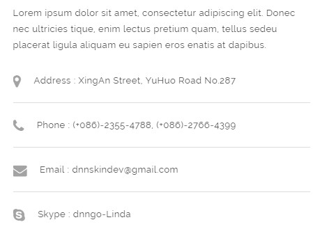
Codes are as follows:
    <div class="animation fadeInUp delay1">
      <p>Lorem ipsum dolor sit amet, consectetur adipiscing elit. Donec nec ultricies tique, enim lectus pretium quam, tellus sedeu placerat ligula aliquam eu sapien eros enatis at dapibus.</p>
      <ul class="list_style_12">
        <li><span class="fa fa-map-marker"></span>Address : XingAn Street, YuHuo Road No.287</li>
        <li><span class="fa fa-phone"></span>Phone : (+086)-2355-4788, (+086)-2766-4399</li>
        <li><span class="fa fa-envelope"></span>Email : dnnskindev@gmail.com</li>
        <li><span class="fa fa-skype"></span>Skype : dnngo-Linda</li>
      </ul>
    </div>
Option:
- You can modify
fa fa-*to change icons. font icon list. - You can modify
animationto change the animation on the slide..Animation list.
GMAP area
Below is the screen shot:
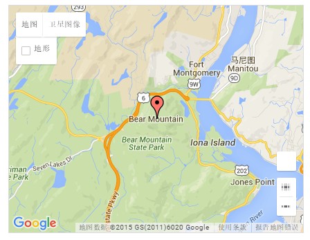
Codes are as follows:
<div id="gmap01"></div>
PowerForms area
Below is the screen shot:
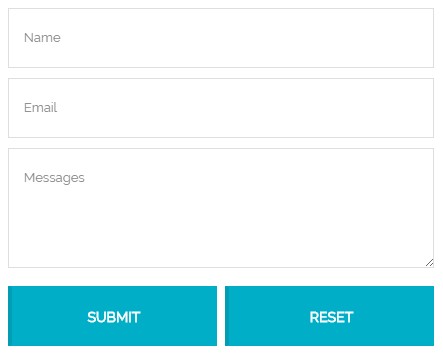
Option:
- This is
Theme_Responsive_20072_home7theme ofDNNGo PowerFormsmodule
FRIENDLY LINKS area
Below is the screen shot:
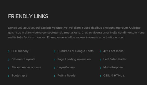
Codes are as follows:
<div class="animation fadeInLeft ">
  <p class="pb-20">Donec vel lacus vel dui dapibus volutpat vel vel diam. Fusce dapibus tincidunt interdum. Quisque quis risus in diam viverra consectetur sit amet a justo. Cras ac viverra urna. Nulla condimentum nunc mattis felis facilisis rhoncus. Etiam posuere tellus sapien, in ornare arcu tristique non. </p>
  <ul class="list_style_13">
    <li><span class="fa fa-angle-right"></span>SEO friendly</li>
    <li><span class="fa fa-angle-right"></span>Hundreds of Google Fonts</li>
    <li><span class="fa fa-angle-right"></span>470 Font Icons</li>
    <li><span class="fa fa-angle-right"></span>Different Layouts</li>
    <li><span class="fa fa-angle-right"></span>Page Loading Animation</li>
    <li><span class="fa fa-angle-right"></span>Left Side Header</li>
    <li><span class="fa fa-angle-right"></span>Sticky header options</li>
    <li><span class="fa fa-angle-right"></span>LayerGallery</li>
    <li><span class="fa fa-angle-right"></span>Multi-Purpose</li>
    <li><span class="fa fa-angle-right"></span>Bootstrap 3</li>
    <li><span class="fa fa-angle-right"></span>Retina Ready</li>
    <li><span class="fa fa-angle-right"></span>CSS3 & HTML 5</li>
  </ul>
</div>
Option:
Containeris usingContainer-13- You can modify
fa fa-*to change icons. font icon list. - You can modify
animationto change the animation on the slide..Animation list.
SUBSCRIBE area
Below is the screen shot:
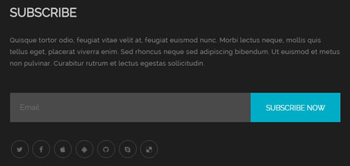
Codes are as follows:
<p class="pb-30 animation fadeInRight">Quisque tortor odio, feugiat vitae velit at, feugiat euismod nunc. Morbi lectus neque, mollis quis tellus eget, placerat viverra enim. Sed rhoncus neque sed adipiscing bibendum. Ut euismod et metus non pulvinar. Curabitur rutrum et lectus egestas sollicitudin.</p>

Theme_Responsive_20072_home7-Email

<div class="social_list_5 mt-20 animation fadeInRight">
    <a href="#"><span class="fa fa-twitter"></span></a>
    <a href="#"><span class="fa fa-facebook"></span></a>
    <a href="#"><span class="fa fa-apple"></span></a>
    <a href="#"><span class="fa fa-android"></span></a>
    <a href="#"><span class="fa  fa-github"></span></a>
    <a href="#"><span class="fa  fa-skype"></span></a>
    <a href="#"><span class="fa fa-delicious"></span></a>
</div>
Option:
- This is
Theme_Responsive_20072_home7theme ofDNNGo PowerFormsmodule Containeris usingContainer-13- You can modify
fa fa-*to change icons. font icon list. - You can modify
animationto change the animation on the slide..Animation list.
Coming Soon
You can click the link to check Coming Soon demo. Coming Soon
Below is the screen shot:
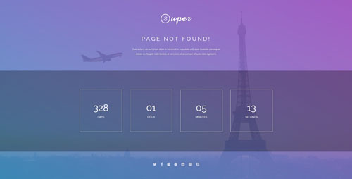
You can create the coming soon page easily following these steps:
- Create a page named coming soon page.
- Import the ComingSoon.Page.template for this page.
- You can set color, end time, and background image for Coming Soon page through xPlugin, as below:
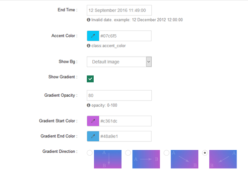
One Page
You can click the link to check One Page demo. One Page
Anchor area
It will scroll to the corresponding area on the page when clicking the menu texts at the top. It will also do so when clicking the dots on the right of the skin.
These anchors are generated through page's anchorTag. Codes are as follows. You can place this piece of codes in page's HTML module, click the right anchor, then page will slide to this HTML module area.
<div data-title="WELCOME TO OUR WEBSITE" class="anchorTag" data-offset="-60" data-scrollshownav="true" data-menuanchor="true"> </div>
Option:
data-title |
Title displayed correspondingly to the right navigation. If page title of the menu is the same as data-title, page will scroll to this area when clicking menu texts. |
data-menuanchor |
Whether to enable menu anchor feature or not. |
data-scrollshownav |
Whether to enable navigation or not. |
data-offset |
Offset value of up and down coordinate for anchor. |
data-icourl |
Image url that displays correspondingly of the right navigation. |
data-iconame |
Icon class names that displays correspondingly of the right navigation. |
How to set menu anchor
- Click Add New Page button.
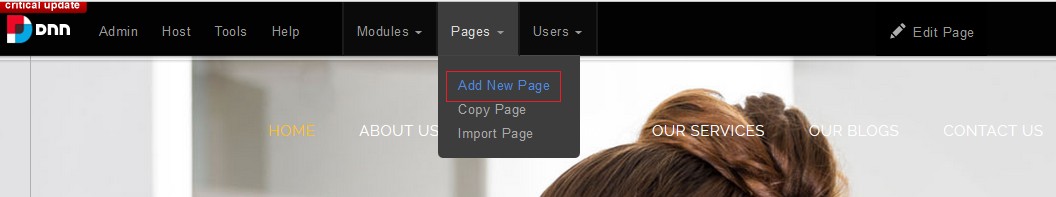
- Fill in Page Name and Page Title. Texts for Page Title needs to be the same as that of data-title.
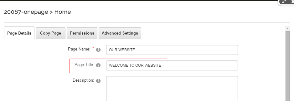
- Put the anchor code to HTML module of the page. It will scroll to the corresponding area on the page when clicking the top menu texts.
<div data-title="WELCOME TO OUR WEBSITE" class="anchorTag" data-offset="-60" data-scrollshownav="true" data-menuanchor="true"> </div>
Banner area
Below is the screen shot:
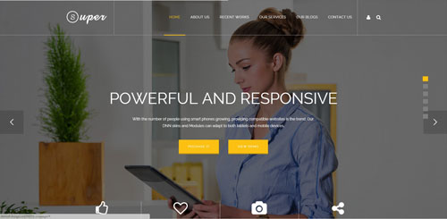
It is using DNNGo LayerGalleryPro module here,you can import OnePage.xml of the DNNGo_LayerGalleryPro folder to duplicate banner of the demo.
4-Box area
Below is the screen shot:
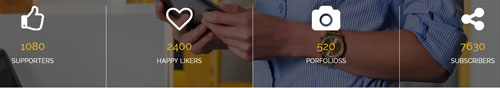
Codes are as follows:
<div class="dnn_layout">
  <div class="content_mid clearfix">
    <div class="banner_bottom_text">
      <div class="row">
        <div class="col-sm-3">
          <div class="ServeList_9"><span class="fa fa-thumbs-o-up"></span><span class="animation  number" data-number="1080">0</span>
            <p>SUPPORTERS</p>
          </div>
        </div>
        <div class="col-sm-3">
          <div class="ServeList_9"><span class="fa fa-heart-o"></span><span class="animation  number" data-number="2400">0</span>
            <p>HAPPY LIKERS</p>
          </div>
        </div>
        <div class="col-sm-3">
          <div class="ServeList_9"><span class="fa fa-camera"></span><span class="animation  number" data-number="520">0</span>
            <p>PORFOLIOSS</p>
          </div>
        </div>
        <div class="col-sm-3">
          <div class="ServeList_9"><span class="fa fa-share-alt"></span> <span class="animation  number" data-number="7630">0</span>
            <p>SUBSCRIBERS</p>
          </div>
        </div>
      </div>
    </div>
  </div>
</div>
Option:
- You can change the value you need to display through
data-number col-md-*is the width of each column, you can change the width you need through value1~12.- You can modify
animationto change the animation on the slide..Animation list. - You can modify
fa fa-*to change icons. font icon list.
ABOUT US area
Below is the screen shot:
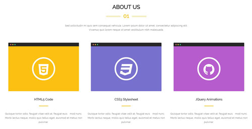
Codes are as follows:
<div class="title_style_15">
  <div data-title="ABOUT US" class="anchorTag" data-offset="-60" data-scrollshownav="true" data-menuanchor="true"> </div>
  <h3>ABOUT US</h3>
  <span class="number">01</span> </div>
<p class=" pb-40" style="text-align: center;">Sed sollicitudin mi quis sem consequat vehicula. Lorem ipsum dolor sit amet, consectetur adipiscing elit.<br />
  Vivamus quis lorem neque sit amet vestibulum nibh malesuada.</p>
<div class="row">
  <div class="col-sm-4">
    <div class="ServeList_10">
      <div class="icoBox color_bg_1"><span class="fa fa-html5"></span> </div>
      <h3>HTML5 Code</h3>
      <p>Quisque tortor odio, feugiat vitae velit at, feugiat euis mod nunc. Morbi lectus neque, mollis quis tellus eget, euismod et metus non pulvinar. </p>
    </div>
  </div>
  <div class="col-sm-4">
    <div class="ServeList_10">
      <div class="icoBox color_bg_2"><span class="fa fa-css3"></span> </div>
      <h3>CSS3 Stylesheet</h3>
      <p>Quisque tortor odio, feugiat vitae velit at, feugiat euis mod nunc. Morbi lectus neque, mollis quis tellus eget, euismod et metus non pulvinar. </p>
    </div>
  </div>
  <div class="col-sm-4">
    <div class="ServeList_10">
      <div class="icoBox color_bg_3"><span class="fa fa-github"></span> </div>
      <h3>JQuery Animations</h3>
      <p>Quisque tortor odio, feugiat vitae velit at, feugiat euis mod nunc. Morbi lectus neque, mollis quis tellus eget, euismod et metus non pulvinar. </p>
    </div>
  </div>
</div>
Option:
col-md-*is the width of each column, you can change the width you need through value1~12.- You can modify
animationto change the animation on the slide..Animation list. - You can modify
fa fa-*to change icons. font icon list.
WHAT WE CAN area
Below is the screen shot:
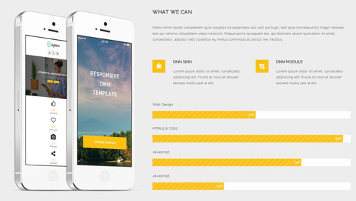
Codes are as follows:
<div class="backgroundImage15 pt-60 pb-60">
  <div class="dnn_layout pt-20 pb-20">
    <div class="content_mid clearfix">
      <div class="row">
        <div class="col-sm-5" style="text-align: center;"> <img alt="" class="img-responsive mb-20" src="/portals/10/pic_12.png" style="text-align: center;" /> </div>
        <div class="col-sm-7">
          <div class="title_style_16">WHAT WE CAN</div>
          <p class="pt-10 pb-40"> Nemo enim ipsam voluptatem quia voluptas sit aspernatur aut odit aut fugit, sed quia consequuntur magni dolores eos qui ratione voluptatem sequi nesciunt. Neque porro quisquam est, qui dolorem ipsum quia dolor sit amet, consectetur, adipisci velit curabitur eu metus commodo ac lectus nec facilisis. </p>
          <div class="row pb-40">
            <div class="col-sm-6">
              <div class="ServeList_11"> <span class="fa fa-bug"></span>
                <h3>DNN SKIN</h3>
                <p>Lorem ipsum dolor sit amet, consectetu adipiscing elit. Fusce at risus at lacuser laoreet mollis sed id elit. </p>
              </div>
            </div>
            <div class="col-sm-6">
              <div class="ServeList_11"> <span class="fa  fa-crop"></span>
                <h3>DNN MODULE</h3>
                <p>Lorem ipsum dolor sit amet, consectetu adipiscing elit. Fusce at risus at lacuser laoreet mollis sed id elit. </p>
              </div>
            </div>
          </div>
          <div class="loaded_list_4">
            <p>Web Design</p>
            <div class="progress">
              <div class="bar animation animationwidth  a_bg_c" data-width="52%"> <span></span> </div>
            </div>
            <p>HTML5 & CSS3</p>
            <div class="progress">
              <div class="bar animation animationwidth  a_bg_c" data-width="96%"> <span></span> </div>
            </div>
            <p>Javascript</p>
            <div class="progress">
              <div class="bar animation animationwidth  a_bg_c" data-width="75%"> <span></span> </div>
            </div>
            <p>Javascript</p>
            <div class="progress">
              <div class="bar animation animationwidth  a_bg_c" data-width="36%"> <span></span> </div>
            </div>
          </div>
        </div>
      </div>
    </div>
  </div>
</div>
Option:
data-widthis controlling the percentage that displays, you can display percentage through value0~100col-md-*is the width of each column, you can change the width you need through value1~12.- You can modify
animationto change the animation on the slide..Animation list. - You can modify
fa fa-*to change icons. font icon list.
RECENT WORKS area
Below is the screen shot:
Codes are as follows:
<div class="dnn_layout pt-60">
  <div class="content_mid clearfix">
    <div class="title_style_15">
      <div data-offset="-60" class="anchorTag" data-title="RECENT WORKS" data-menuanchor="true"> </div>
      <h3>RECENT WORKS</h3>
      <span class="number">02</span> </div>
    <p style="text-align: center;" class=" pb-40">Sed sollicitudin mi quis sem consequat vehicula. Lorem ipsum dolor sit amet, consectetur adipiscing elit.<br />
      Vivamus quis lorem neque sit amet vestibulum nibh malesuada.</p>
  </div>
</div>
<div class="isotope_grid isotope_grid3">
  <div class="isotope_group  animation scaleUp"> <a class="active" href="#" data-filter="*">ALL</a>
<a href="#" data-filter=".photography">PHOTOGRAPHY</a>
<a href="#" data-filter=".webdesign">WEB DESIGN</a>
<a href="#" data-filter=".image">IMAGE</a>
<a href="#" data-filter=".videos">VIDEOS</a> </div>
  <div class="loading  animation scaleUp">
    <div class="loading-container container1">
      <div class="circle1"></div>
      <div class="circle2"></div>
      <div class="circle3"></div>
      <div class="circle4"></div>
    </div>
    <div class="loading-container container2">
      <div class="circle1"></div>
      <div class="circle2"></div>
      <div class="circle3"></div>
      <div class="circle4"></div>
    </div>
    <div class="loading-container container3">
      <div class="circle1"></div>
      <div class="circle2"></div>
      <div class="circle3"></div>
      <div class="circle4"></div>
    </div>
  </div>
  <div class="isotope_main animation backgroundImage15" data-min-width="350">
    <div data-zoom="2" class="isotope_item photography videos">
      <div class="photo"> <img alt="" src="/portals/10/Photo_34.jpg" />
        <div class="ico">
        <a target="_blank" href="#"><span class="fa fa-search"></span> </a>
        <a target="_blank" href="#"><span class="fa fa-heart-o"></span> </a>
        <a target="_blank" href="#"><span class="fa fa-link"></span> </a></div>
      </div>
    </div>
    <div class="isotope_item webdesign videos">
      <div class="photo"><img alt="" src="/portals/10/Photo_35.jpg" />
        <div class="ico">
        <a target="_blank" href="#"><span class="fa fa-search"></span> </a>
        <a target="_blank" href="#"><span class="fa fa-heart-o"></span> </a>
        <a target="_blank" href="#"><span class="fa fa-link"></span> </a></div>
      </div>
    </div>
    <div class="isotope_item photography image">
      <div class="photo"> <img alt="" src="/portals/10/Photo_36.jpg" />
        <div class="ico">
        <a target="_blank" href="#"><span class="fa fa-search"></span> </a>
        <a target="_blank" href="#"><span class="fa fa-heart-o"></span> </a>
        <a target="_blank" href="#"><span class="fa fa-link"></span> </a></div>
      </div>
    </div>
    <div class="isotope_item webdesign">
      <div class="photo"> <img alt="" src="/portals/10/Photo_37.jpg" />
        <div class="ico">
        <a target="_blank" href="#"><span class="fa fa-search"></span> </a>
        <a target="_blank" href="#"><span class="fa fa-heart-o"></span> </a>
        <a target="_blank" href="#"><span class="fa fa-link"></span> </a></div>
      </div>
    </div>
    <div data-zoom="2" class="isotope_item photography image">
      <div class="photo"> <img alt="" src="/portals/10/Photo_38.jpg" />
        <div class="ico">
        <a target="_blank" href="#"><span class="fa fa-search"></span> </a>
        <a target="_blank" href="#"><span class="fa fa-heart-o"></span> </a>
        <a target="_blank" href="#"><span class="fa fa-link"></span> </a></div>
      </div>
    </div>
    <div class="isotope_item webdesign videos">
      <div class="photo"> <img alt="" src="/portals/10/Photo_39.jpg" />
        <div class="ico">
        <a target="_blank" href="#"><span class="fa fa-search"></span> </a>
        <a target="_blank" href="#"><span class="fa fa-heart-o"></span> </a>
        <a target="_blank" href="#"><span class="fa fa-link"></span> </a></div>
      </div>
    </div>
    <div class="isotope_item webdesign">
      <div class="photo"> <img alt="" src="/portals/10/Photo_40.jpg" />
        <div class="ico">
        <a target="_blank" href="#"><span class="fa fa-search"></span> </a>
        <a target="_blank" href="#"><span class="fa fa-heart-o"></span> </a>
        <a target="_blank" href="#"><span class="fa fa-link"></span> </a></div>
      </div>
    </div>
    <div class="isotope_item photography">
      <div class="photo"> <img alt="" src="/portals/10/Photo_41.jpg" />
        <div class="ico">
        <a target="_blank" href="#"><span class="fa fa-search"></span> </a>
        <a target="_blank" href="#"><span class="fa fa-heart-o"></span> </a>
        <a target="_blank" href="#"><span class="fa fa-link"></span> </a></div>
      </div>
    </div>
    <div class="isotope_item image videos">
      <div class="photo"> <img alt="" src="/portals/10/Photo_42.jpg" />
        <div class="ico">
        <a target="_blank" href="#"><span class="fa fa-search"></span> </a>
        <a target="_blank" href="#"><span class="fa fa-heart-o"></span> </a>
        <a target="_blank" href="#"><span class="fa fa-link"></span> </a></div>
      </div>
    </div>
    <div class="isotope_item image">
      <div class="photo"> <img alt="" src="/portals/10/Photo_43.jpg" />
        <div class="ico">
        <a target="_blank" href="#"><span class="fa fa-search"></span> </a>
        <a target="_blank" href="#"><span class="fa fa-heart-o"></span> </a>
        <a target="_blank" href="#"><span class="fa fa-link"></span> </a></div>
      </div>
    </div>
  </div>
  <p style="text-align: center;" class="pt-60 pb-60 backgroundImage15">
    <a class="btn_10" href="#"> LOAD MORE </a>
    <a class="btn_10" href="#"> SHOW ALL </a>
  </p>
</div>
Option:
- You can add
<a data-filter=".FilterName" href="#">Filter Name</a>to increase categories.data-filter=".FilterName"can not be blank space. - You can modify
data-min-widthto change minimum width of image. - You can modify
isotope_itemFilterNameto categorize images. - You can modify
animationto change the animation on the slide..Animation list. - You can modify
fa fa-*to change icons. font icon list.
RECENT WORKS area
Below is the screen shot:
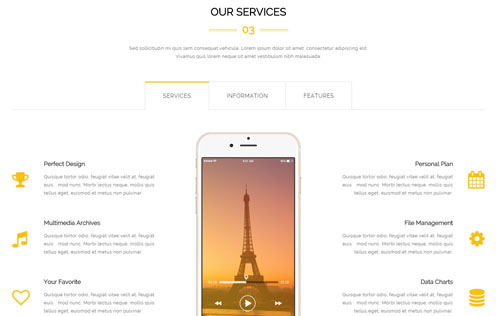
Codes are as follows:
    <div class="title_style_15">
      <div class="anchorTag" data-offset="-60" data-title="OUR SERVICES" data-menuanchor="true"> </div>
      <h3>OUR SERVICES</h3>
      <span class="number">03</span> </div>
    <p class=" pb-40" style="text-align: center;">Sed sollicitudin mi quis sem consequat vehicula. Lorem ipsum dolor sit amet, consectetur adipiscing elit.<br />
      Vivamus quis lorem neque sit amet vestibulum nibh malesuada.</p>
    <div class="horizontalTab_Top horizontalTab_Top_1">
      <ul class="resp-tabs-list">
        <li> <span>SERVICES</span> </li>
        <li> <span>INFORMATION</span> </li>
        <li> <span>FEATURES</span> </li>
      </ul>
      <div class="resp-tabs-container">
        <div class="resp_container">
          <div class="resp_margin">
            <div class="row">
              <div class="col-md-4">
                <div class="pt-60"></div>
                <div class="ServeList_12">
                  <li><span class="fa  fa-trophy"></span>
                    <h3>Perfect Design</h3>
                    <p>Quisque tortor odio, feugiat vitae velit at, feugiat euis mod nunc. Morbi lectus neque, mollis quis tellus eget, euismod et metus non pulvinar. </p>
                  </li>
                  <li><span class="fa  fa-music"></span>
                    <h3>Multimedia Archives</h3>
                    <p>Quisque tortor odio, feugiat vitae velit at, feugiat euis mod nunc. Morbi lectus neque, mollis quis tellus eget, euismod et metus non pulvinar. </p>
                  </li>
                  <li><span class="fa fa-heart-o"></span>
                    <h3>Your Favorite</h3>
                    <p>Quisque tortor odio, feugiat vitae velit at, feugiat euis mod nunc. Morbi lectus neque, mollis quis tellus eget, euismod et metus non pulvinar. </p>
                  </li>
                </div>
              </div>
              <div class="col-md-4" style="text-align: center;"><img alt="" class="img-responsive" style="text-align: center;" src="/portals/10/pic_13.png" /></div>
              <div class="col-md-4">
                <div class="pt-60"></div>
                <div class="ServeList_12 rtl">
                  <li><span class="fa fa-calendar"></span>
                    <h3>Personal Plan</h3>
                    <p>Quisque tortor odio, feugiat vitae velit at, feugiat euis mod nunc. Morbi lectus neque, mollis quis tellus eget, euismod et metus non pulvinar. </p>
                  </li>
                  <li><span class="fa fa-gear"></span>
                    <h3>File Management</h3>
                    <p>Quisque tortor odio, feugiat vitae velit at, feugiat euis mod nunc. Morbi lectus neque, mollis quis tellus eget, euismod et metus non pulvinar. </p>
                  </li>
                  <li><span class="fa fa-database"></span>
                    <h3>Data Charts</h3>
                    <p>Quisque tortor odio, feugiat vitae velit at, feugiat euis mod nunc. Morbi lectus neque, mollis quis tellus eget, euismod et metus non pulvinar. </p>
                  </li>
                </div>
              </div>
            </div>
          </div>
        </div>
        <div class="resp_container">
          <div class="resp_margin">
            <div class="row">
              <div class="col-md-6">
                <div class="title_style_16">FREE LIFETIME SERVICES</div>
                <p class="pt-10 pb-20"> Nemo enim ipsam voluptatem quia voluptas sit aspernatur aut odit aut fugit, sed quia consequuntur magni dolores eos qui ratione voluptatem sequi nesciunt. Neque porro quisquam est, qui dolorem ipsum quia dolor sit amet, consectetur, adipisci velit curabitur eu metus commodo ac lectus nec facilisis. </p>
                <ul class="list_style_9">
                  <li>Quisque tortor odio, feugiat vitae velit at, feugiat euismod nunc </li>
                  <li>Morbi lectus neque, mollis quis tellus eget, placerat </li>
                  <li>Piverra enimed rhoncus neque sed adipiscing bibendum </li>
                  <li>Ut euismod et metus non pulvinar urabitur rutrum et lectus egestaol</li>
                </ul>
                <p class="pt-30"> <a class="btn_10" href="#"> LEARN MORE </a></p>
              </div>
              <div class="col-md-6">
                <div class="pt-40"></div>
                <img alt="" class="img-responsive" src="/portals/10/pic_14.png" /> </div>
            </div>
          </div>
        </div>
        <div class="resp_container">
          <div class="resp_margin">
            <div class="row">
              <div class="col-sm-12">
                <div class="title_style_16">EXPERIENCED DEVELOPERS AND SKILLFUL DESIGNERS</div>
                <p class="pt-10 pb-40"> Nemo enim ipsam voluptatem quia voluptas sit aspernatur aut odit aut fugit, sed quia consequuntur magni dolores eos qui ratione voluptatem sequi nesciunt. Neque porro quisquam est, qui dolorem ipsum quia dolor sit amet, consectetur, adipisci velit curabitur eu metus commodo ac lectus nec facilisis. </p>
              </div>
            </div>
            <div class="row">
              <div class="col-md-6">
                <div class="ServeList_13"> <span class="fa fa-flask"></span>
                  <h3>Unlimited Colors</h3>
                  <p>Quisque tortor odio, feugiat vitae velit at, feugiat euismod nunc. Morbi lectus neque, mollis quis tellus eget, placerat viverra enim. Sed rhoncus neque sed adipiscing bibendum. Ut euismod et metus non pulvinar. </p>
                  <p class="pt-20"><a href="#">LEARN MORE</a></p>
                </div>
              </div>
              <div class="col-md-6">
                <div class="ServeList_13"> <span class="fa fa-gift"></span>
                  <h3>Free Download</h3>
                  <p>Quisque tortor odio, feugiat vitae velit at, feugiat euismod nunc. Morbi lectus neque, mollis quis tellus eget, placerat viverra enim. Sed rhoncus neque sed adipiscing bibendum. Ut euismod et metus non pulvinar. </p>
                  <p class="pt-20"><a href="#">LEARN MORE</a></p>
                </div>
              </div>
            </div>
            <div class="row">
              <div class="col-md-6">
                <div class="ServeList_13"> <span class="fa fa-desktop"></span>
                  <h3>Retina Ready</h3>
                  <p>Quisque tortor odio, feugiat vitae velit at, feugiat euismod nunc. Morbi lectus neque, mollis quis tellus eget, placerat viverra enim. Sed rhoncus neque sed adipiscing bibendum. Ut euismod et metus non pulvinar. </p>
                  <p class="pt-20"><a href="#">LEARN MORE</a></p>
                </div>
              </div>
              <div class="col-md-6">
                <div class="ServeList_13"> <span class="fa fa-calendar-o"></span>
                  <h3>Effective Work</h3>
                  <p>Quisque tortor odio, feugiat vitae velit at, feugiat euismod nunc. Morbi lectus neque, mollis quis tellus eget, placerat viverra enim. Sed rhoncus neque sed adipiscing bibendum. Ut euismod et metus non pulvinar. </p>
                  <p class="pt-20"><a href="#">LEARN MORE</a></p>
                </div>
              </div>
            </div>
          </div>
        </div>
      </div>
    </div>
Option:
- This is a
Responsive Tabeffect.ResponsiveTab col-md-*is the width of each column, you can change the width you need through value1~12.- You can modify
animationto change the animation on the slide..Animation list. - You can modify
fa fa-*to change icons. font icon list.
EXPERIENCED DEVELOPERS AND SKILLFUL DESIGNERS area
Below is the screen shot:

Codes are as follows:
<div class="backgroundImage8 color_white pt-60 pb-60">
  <div class="dnn_layout pt-40 pb-60">
    <div class="content_mid clearfix">
      <div class="title_style_18">EXPERIENCED DEVELOPERS AND SKILLFUL DESIGNERS</div>
      <p style="text-align: center;" class="pt-20 pb-60">Nemo enim ipsam voluptatem quia voluptas sit aspernatur aut odit aut fugit, sed quia consequuntur magni dolores eos qui ratione voluptatem sequi nesciunt. Neque porro quisquam <br />
        est, qui dolorem ipsum quia dolor sit amet, consectetur, adipisci velit curabitur eu metus commodo ac lectus nec facilisis.</p>
      <div class="link_img_list_02"> <a href="#"><img alt="" src="/portals/10/link_img_07.png" /></a> <a href="#"><img alt="" src="/portals/10/link_img_08.png" /></a> <a href="#"><img alt="" src="/portals/10/link_img_09.png" /></a> <a href="#"><img alt="" src="/portals/10/link_img_10.png" /></a> <a href="#"><img alt="" src="/portals/10/link_img_11.png" /></a> <a href="#"><img alt="" src="/portals/10/link_img_12.png" /></a> </div>
      <div class="pb-60"></div>
      <ul data-autoplay="0" data-display-navigation="false" data-position="fade" class=" Testimonials_tab Testimonials_3">
        <li>
          <blockquote>
            <p>“ Vestibulum hendrerit risus non libero sollicitudin adipiscing hasellu dignissim, purus at ornare fermentum, massa nulla facilisis felis, inlte vehicula dui enim nec tortor scelerisque lore.”</p>
            <small class="a_t_c">FRANK MILLER<span> — THE DNNGO BUYER</span></small> </blockquote>
          <div class="pic"><img alt="" src="/portals/10/portrait_04.jpg" /></div>
        </li>
        <li>
          <blockquote>
            <p>“Quisque tortor odio, feugiat vitae velit at, feugiat euismod nunc. Morbi lectus neque, mollis quis tellus eget, placerat viverra enim. Sed rhoncus neque sed adipiscing bibendum. Ut euismod et metus non pulvinar.”</p>
            <small class="a_t_c">FRANK MILLER<span> — THE DNNGO BUYER</span></small> </blockquote>
          <div class="pic"><img alt="" src="/portals/10/portrait_05.jpg" /></div>
        </li>
        <li>
          <blockquote>
            <p>“ Suspendisse libero odio, rhoncus nec blandit eget, semper nec mi. Fusce dapibus tellus eu interdum varius. Quisque tempor faucibus turpis sit amet mollis. Vivamus enim ligula, porta vel velit nec, varius sagittis quam. Integer fringilla blandit diam, quis tempus ligula. Sed vel ultricies lacus, in facilisis leo. Vestibulum et turpio. ”</p>
            <small class="a_t_c">FRANK MILLER<span> — THE DNNGO BUYER</span></small> </blockquote>
          <div class="pic"><img alt="" src="/portals/10/portrait_06.jpg" /></div>
        </li>
        <li>
          <blockquote>
            <p>“ Nemo enim ipsam voluptatem quia voluptas sit aspernatur aut odit aut fugit, sed quia consequuntur magni dolores eos qui ratione voluptatem sequi nesciunt. Neque porro quisquam est, qui dolorem ipsum quia dolor sit amet, consectetur, adipisci velit, sed quia non numquam eius modi tempora incidunt ut labore.”</p>
            <small class="a_t_c">FRANK MILLER<span> — THE DNNGO BUYER</span></small> </blockquote>
          <div class="pic"><img alt="" src="/portals/10/portrait_07.jpg" /></div>
        </li>
      </ul>
    </div>
  </div>
</div>
Option:
- This is a
Testimonialseffect.Testimonials - You can modify
animationto change the animation on the slide..Animation list. - You can modify
fa fa-*to change icons. font icon list.
OUR BLOGS area
Below is the screen shot:
Codes are as follows:
<div class="dnn_layout pt-60 pb-30">
  <div class="content_mid clearfix">
    <div class="title_style_15">
      <div data-title="OUR BLOGS" class="anchorTag" data-offset="-60" data-menuanchor="true"> </div>
      <h3>OUR BLOGS</h3>
      <span class="number">04</span> </div>
    <p class=" pb-40" style="text-align: center;">Sed sollicitudin mi quis sem consequat vehicula. Lorem ipsum dolor sit amet, consectetur adipiscing elit.<br />
      Vivamus quis lorem neque sit amet vestibulum nibh malesuada.</p>
    <div class="row">
      <div class="col-sm-6">
        <div class="photo_list_1">
          <div class="photo_box">
            <div class="date"> <span>27</span> AUG </div>
            <a href="#"><span class="fa fa-image"></span></a> <img alt="" src="/portals/10/Photo_44.jpg" /> </div>
          <div class="photo_content">
            <h3>DNN Templates</h3>
            <div class="info"> BY ADMIN    |    AUGUST 27TH, 2014</div>
            <p>Nemo enim ipsam voluptatem quia voluptas sit aspernatur aut odit aut fugit, sed quia consequuntur magni dolores eos qui ratione voluptatem  aliquet rutrum eros eu mattis sequi nesciunt tempus. </p>
          </div>
        </div>
      </div>
      <div class="col-sm-6">
        <div class="photo_list_1">
          <div class="photo_box">
            <div class="date"> <span>27</span> AUG </div>
            <a href="#"><span class="fa fa-image"></span></a> <img alt="" src="/portals/10/Photo_45.jpg" /> </div>
          <div class="photo_content">
            <h3>Multi-Purpose</h3>
            <div class="info"> BY ADMIN    |    AUGUST 27TH, 2014</div>
            <p>Nemo enim ipsam voluptatem quia voluptas sit aspernatur aut odit aut fugit, sed quia consequuntur magni dolores eos qui ratione voluptatem  aliquet rutrum eros eu mattis sequi nesciunt tempus. </p>
          </div>
        </div>
      </div>
    </div>
    <div class="row">
      <div class="col-sm-6">
        <div class="photo_list_1">
          <div class="photo_box">
            <div class="date"> <span>27</span> AUG </div>
            <a href="#"><span class="fa fa-image"></span></a> <img alt="" src="/portals/10/Photo_46.jpg" /> </div>
          <div class="photo_content">
            <h3>CSS3 animations</h3>
            <div class="info"> BY ADMIN    |    AUGUST 27TH, 2014</div>
            <p>Nemo enim ipsam voluptatem quia voluptas sit aspernatur aut odit aut fugit, sed quia consequuntur magni dolores eos qui ratione voluptatem  aliquet rutrum eros eu mattis sequi nesciunt tempus. </p>
          </div>
        </div>
      </div>
      <div class="col-sm-6">
        <div class="photo_list_1">
          <div class="photo_box">
            <div class="date"> <span>27</span> AUG </div>
            <a href="#"><span class="fa fa-image"></span></a> <img alt="" src="/portals/10/Photo_47.jpg" /> </div>
          <div class="photo_content">
            <h3>Light & Dark Mode</h3>
            <div class="info"> BY ADMIN    |    AUGUST 27TH, 2014</div>
            <p>Nemo enim ipsam voluptatem quia voluptas sit aspernatur aut odit aut fugit, sed quia consequuntur magni dolores eos qui ratione voluptatem  aliquet rutrum eros eu mattis sequi nesciunt tempus. </p>
          </div>
        </div>
      </div>
    </div>
  </div>
</div>
Option:
col-md-*is the width of each column, you can change the width you need through value1~12.- You can modify
animationto change the animation on the slide..Animation list. - You can modify
fa fa-*to change icons. font icon list.
Number area
Below is the screen shot:
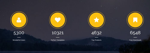
Codes are as follows:
<div class="backgroundImage14 pt-60 pb-60 color_white ">
  <div class="dnn_layout pt-20  pb-20">
    <div class="content_mid clearfix">
      <div class="number_style_2 row">
        <div class="col-md-3 col-sm-6"> <span class="fa fa-user"> </span> <span data-number="5300" class="animation number">0</span>Wonderful Users </div>
        <div class="col-md-3 col-sm-6"> <span class="fa fa-heart"> </span> <span data-number="10321" class="animation number">0</span>Perfect Templates </div>
        <div class="clearfix visible-sm"></div>
        <div class="col-md-3 col-sm-6"> <span class="fa fa-star"> </span> <span data-number="4632" class="animation number">0</span>Top Products</div>
        <div class="col-md-3 col-sm-6"> <span class="fa fa-bookmark"> </span> <span data-number="6548" class="animation number">0</span>Free Downloads</div>
      </div>
    </div>
  </div>
</div>
Option:
- You can change the value you need to display through
data-number col-md-*is the width of each column, you can change the width you need through value1~12.- You can modify
animationto change the animation on the slide..Animation list. - You can modify
fa fa-*to change icons. font icon list.
CONTACT US area
Below is the screen shot:
Codes are as follows:
<div class="title_style_15">
  <div data-offset="-60" class="anchorTag" data-title="CONTACT US" data-menuanchor="true"> </div>
  <h3>CONTACT US</h3>
  <span class="number">05</span> </div>
<p style="text-align: center;">Sed sollicitudin mi quis sem consequat vehicula. Lorem ipsum dolor sit amet, consectetur adipiscing elit.<br />
  Vivamus quis lorem neque sit amet vestibulum nibh malesuada.</p>
Option:
- You can modify
animationto change the animation on the slide..Animation list.
Contact Information area
Below is the screen shot:
Codes are as follows:
<div class="ContactInfo">
  <div class="pt-20"></div>
  <strong>WORK TIME :</strong><br />
  Our support hotline is available 24 hours everyday<br />
  Sunday : Closed<br />
  Monday-Friday : 8:00AM-5:30PM<br />
  Saturday : 10:00AM-2:00PM<br />
  <br />
  <strong>PHONE NUMBER :</strong><br />
  Office One :  (+086) - 2566 -8799 <br />
  Office Two :  (+086) - 2477 -8366<br />
  <br />
  <strong>OUR ADDRESS :</strong><br />
  YuanLin Hotel 16th Floor, XinAn Street, HuaYu Road No.2, DNNGO Company<br />
  <br />
  <strong>EMAIL US :</strong><br />
  dnnskindev@gmail.com<br />
</div>
Option:
- You can modify
animationto change the animation on the slide..Animation list.
PowerForms area
Below is the screen shot:
Option:
- This is
Theme_Responsive_20072_home5-home2theme ofDNNGo PowerFormsmodule
GMAP area
Below is the screen shot:
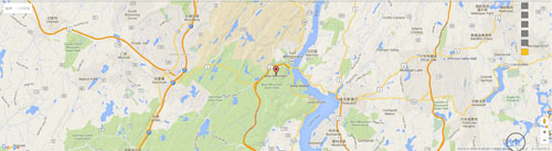
Codes are as follows:
<div id="gmap01"></div>
PowerForms area
Below is the screen shot:

Option:
- This is
Theme_Responsive_20072_home5-Emailtheme ofDNNGo PowerFormsmodule
Boxed Layout
You can set Boxed mode in DNNGo.xPlugin > Skins > Options > Content Layout > Content Layout
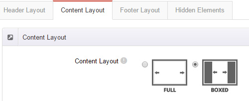
Dark Mode
You can set Dark mode directly in DNNGo.xPlugin > Skins > Options > Content Layout > Content Color Mode.
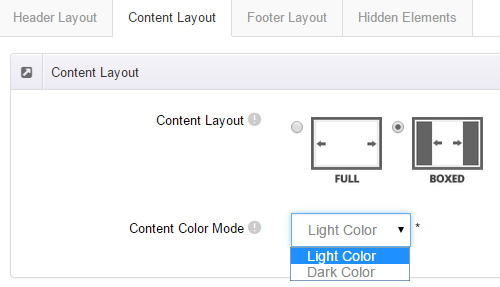
DNNGo_LayerGalleryPro Module
You can see this module in the banner section on the home page, we will guide you step by step to set up the module as the same as our demo site:
- Go to Host –> Extensions –> Install Extension wizard to install the module pack DNNGo_LayerGalleryPro.0x.0x_PA.zip.
- Add DNNGo_LayerGalleryPro module to the BannerPane.
- Click Manager button.
- Click the navigation of the left Import&Export
- Import ContentListEntity.xml file under DNNGo_LayerGalleryPro Module.
- You will see the imported data on Manage List page and you can change the text/image in the banner by clicking Edit button.
- Click this link so you can check the module instruction details.
DNNGo_GalleryPro Module
This module contains 15 responsive sldiers in total.
- Go to Host –> Extensions –> Install Extension wizard to install the module pack DNNGo_DNNGalleryPro_xx.xx.xx_PA.zip.
- Add DNNGo_DNNGalleryPro module to the page.
- Click Effect List tab.
- Choose an effect you like.
- You can click this link to check the module demo.
- Click this link so you can check the module instruction details.
DNNGo_xBlog Module
We use this module on the blog page, click this link so you can check the module instruction details.
DNNGo_PhotoAlbums Module
We use this module on the Portfolios page, click this link so you can check the module instruction details.
DNNGo_PowerForms Module
You can create the form through this module, click this link so you can check the module instruction details.
License interface
- Please login or register your account at http://www.dnngo.net
- Send an email to dnnskindev@gmail.com with your invoice ID, machine Key for every module( different module has different machine key), and your DNNGO username. We will generate an activation code for you. Please note: If your site is a demo site, your license will still be valid when you transfer your site to a live site.
- Manage my licenses
Contact Us
If you have any questions or suggestions about modules/skins or modules/skins installation process, please feel free to contact us.
- Website: www.dnngo.net
- Email: dnnskindev@gmail.com
- Skype: dnngo-linda