20047-UnlimitedColorsPack-033 v6.7.0
Documentation
- Created: 08/24/2015
- Latest update: 03/28/2019
- By: DNNGo
- Email: dnnskindev@gmail.com
Thank you for purchasing my theme. If you have any questions that are beyond the scope of this help file, please feel free to email via my user page contact form here. Thanks so much!
General Information
DotNetNuke Information
To install this skin you must have a working version of Dotnetnuke already installed. If you need help to install Dotnetnuke, follow the instructions in Documentation Center.
What Is Included With Your Package
When you purchase our theme, you will receive one large .zip file that contains everything inside. Unzip that file to get all the content inside. Below is a full list of everything that is included along with a brief description of each item. See the corresponding sections for info on installing the theme.
- Inside the Content folder are: DNN Skins folder, DNNGo_DNNGallery Module folder, DNNGo_LayerGalleryPro folder, DNNGo_PhotoAlbums Module folder, DNNGo_PowerForms Module folder, DNNGo_xPlugin Module folder, DNNGo_xBlog Module folder, PSD folder, Page template.
- DNN Skins folder - The skin in this folder can be used in DNN 8.x, DNN 9.x only.
- DNNGo_DNNGalleryPro Module folder - This module contains 15 responsive sldiers in total.
- DNNGo_LayerGalleryPro folder - You can see this module in the banner section on home page.
- DNNGo_PhotoAlbums folder - You can see this module in Portfolios page.
- DNNGo_PowerForms folder - You can create forms through this module.
- DNNGo_xBlog Module folder - You can see this module on Blog page.
- Page Templates folder - Exported page templates will allow you to reproduce our live demo pages.
Notice: If you bought the theme from DNN Store (http://store.dnnsoftware.com), then none of module files are included in the download package. It only include DNN Skins, DNNGo_xPlugin, Page Templates and PSD files. If you need to purchase modules, please contact us via email (dnnskindev@gmail.com).
What Are The Requirements To Use skins and modules
To use skins and modules, you must be running DNN 8.x or higher. We have tested it with DNN 8.x, DNN 9.x.
Skin and Required Modules Installation
For DNN 8
-
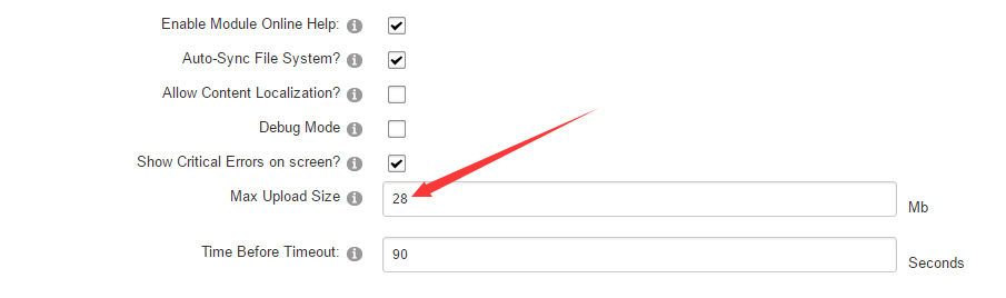
Go to Host-Settings –> Host-Settings, and select the tab Other Settings, changing Max Upload Size to 28 or higher.
-
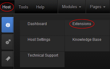
Go to Host –> Extensions –> Install Extension wizard to install the module pack DNNGo_xPlugin_02.07.05_PA.zip
-
Go to Host –> Extensions –> Install Extension wizard to install the skin pack 20047-UnlimitedColorsPack-033-DNNSkins.zip
-
You can install other modules as per your own needs.
-
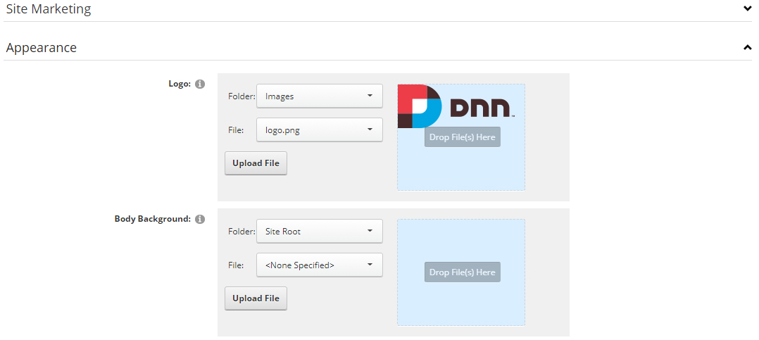
After the installation has been completed, navigate to Admin –> Site Settings –> Basic Settings (tab) –> Appearance (section) and specify portal and edit skins and containers like shown in the screenshot below. It should be done, in order to make your DNN admin UI look correct and readable.
-
Now you can upload the LOGO image in Admin –> Site Settings –> Basic Settings (tab) –> Appearance (section) page.
For DNN 9
-
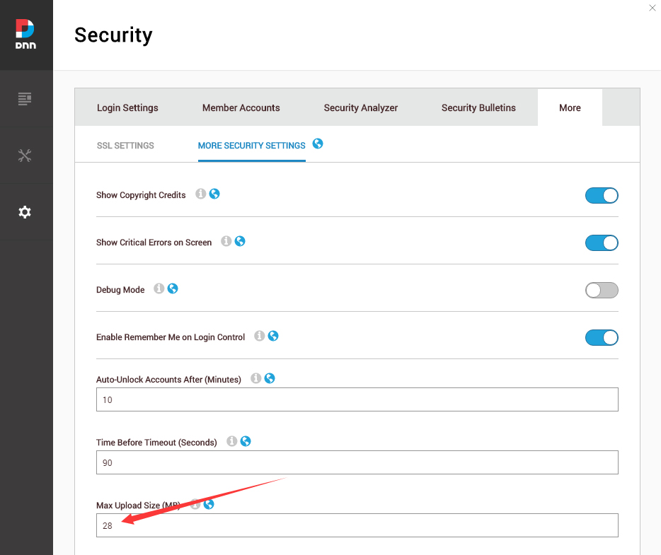
Go to Settings –> Security –> More, and select the tab MORE SECURITY SETTINGS, changing Max Upload Size to 28 or higher.
-
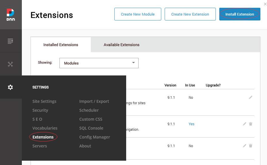
Go to Host –> Extensions –> Install Extension wizard to install the module pack DNNGo_xPlugin_02.07.05_PA.zip
-
Go to Host –> Extensions –> Install Extension wizard to install the skin pack 20047-UnlimitedColorsPack-033-DNNSkins.zip
-
You can install other modules as per your own needs.
-
Manage
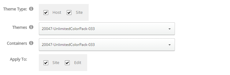
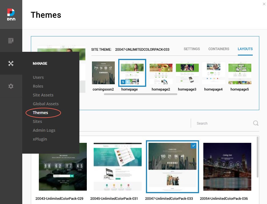
After the installation has been completed, navigate to Manage –> Themes. Select and apply 20047-UnlimitedColorsPack-033
-
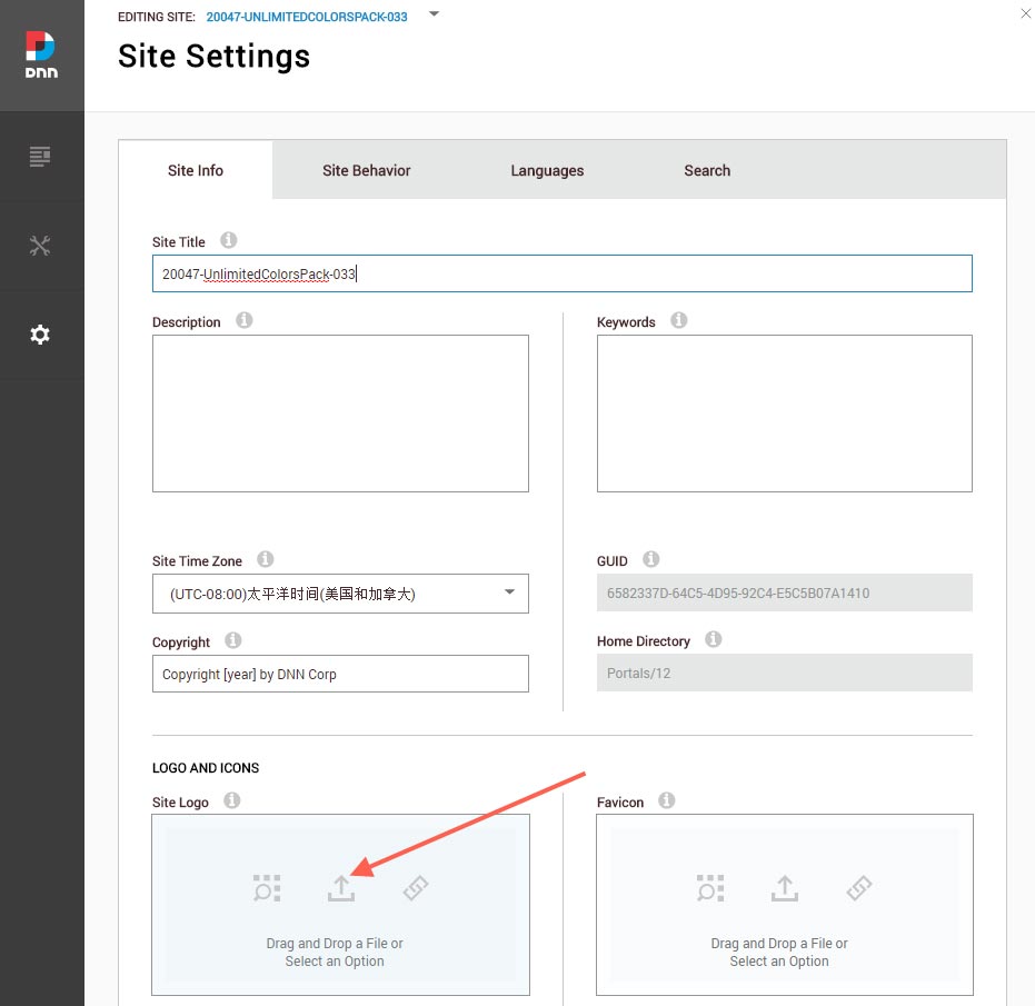
You can upload the LOGO image in Settings –> Site Settings page.
Change the Settings of HTML Editor
By default, HTML editor will remove the div tags whose content is blank. For example: if we add the code <div class=”pt-20″></div> in HTML editor and click save, you will find the code is missing when you edit it afterwards. So we need to change the settings to prevent this from happening.
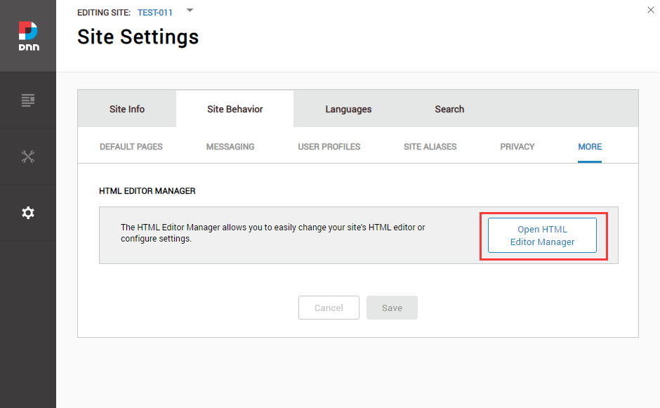
Log in to your site as super administrator.
Go to SETTINGS > Site Settings > Site Behavior > MORE, click the Open HTML Editor Manager.
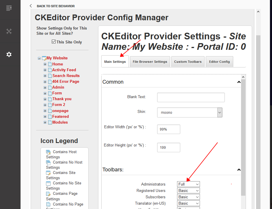
Click the Main Settings tab. Set the value of Administrators to be Full.
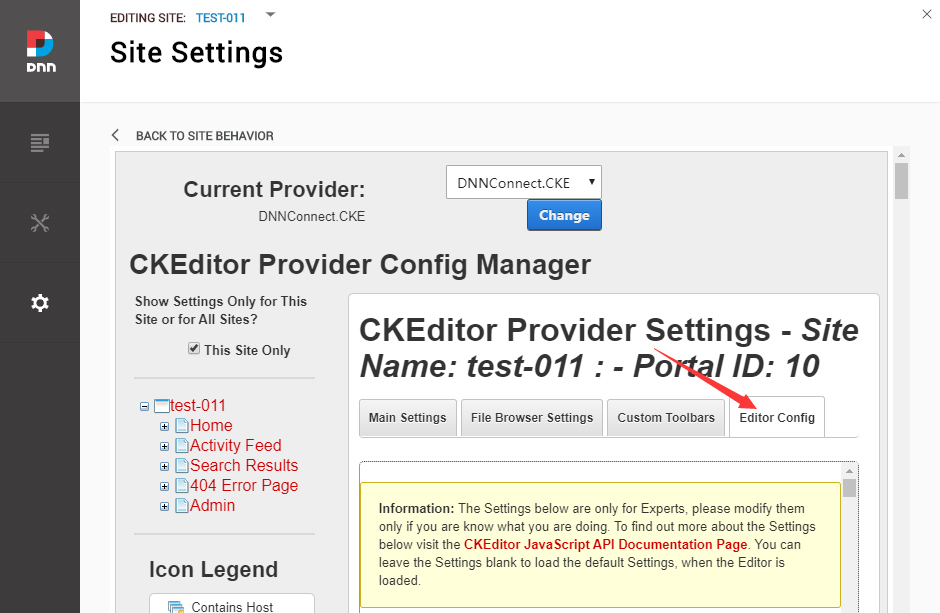
Click the Editor Config tab.
Set the value of AllowedContent to be true.
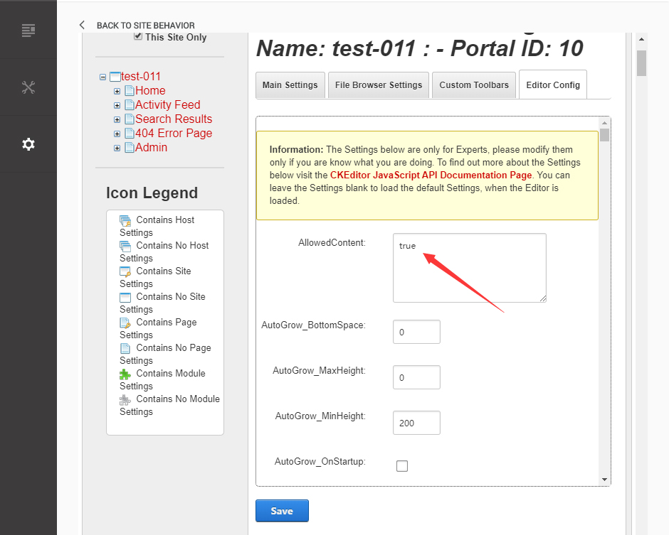
Set the value of FillEmptyBlocks to be false.
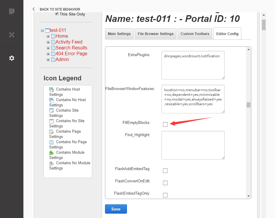
Set the value of ignoreEmptyParagraph to be false.
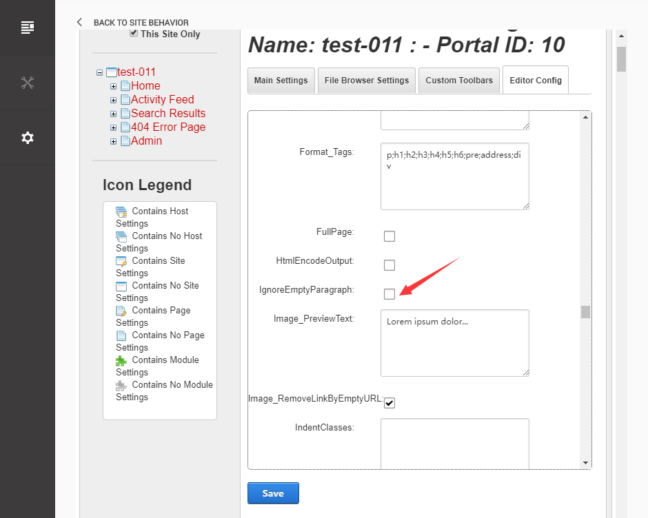
Click the Save button.
How to import page template?
Exported page templates will allow you to reproduce our live demo pages. We'll reproduce the home page as an example.
For DNN 7/8
-
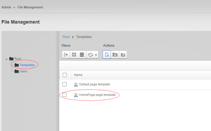
You can find these files in Page Templates Directory.
-
Upload Home.page.template file into your portal root (e.g. Portals/0/Templates/) in the previous chapter and synchronize your folders, you are able to start using page templates to clone live demo pages.
-
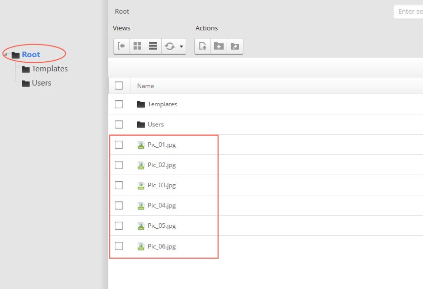
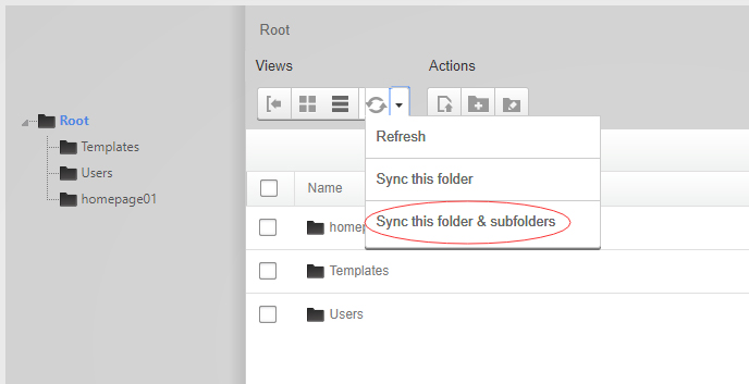
Because page templates can not import image files, you need to upload all the photo files of the "images" folder into your portal root (e.g. Portals/0/).
-
Synchronize the file in Admin > File-Management
-
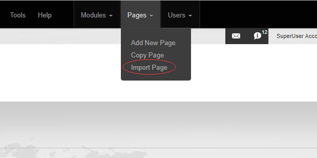
Navigate to the Home page and click Pages -> Import.
-
Find a proper page exported content file navigating to Templates folder and choosing for example Home page.
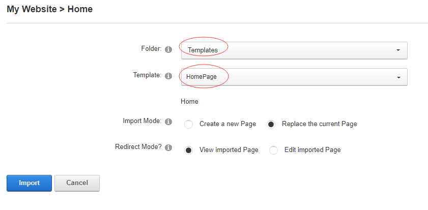
-
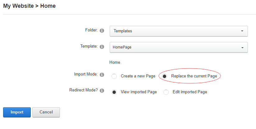
Choose "Replace the current Page" and the redirect mode you need. Please note, if you select "Replace the current Page", content of current page will be reset.
-
Click Import button if everything is correct.
-
Specify page settings according to your needs (necessarily apply HomePage skin to the home page) and click "Update Page". The home page is ready.
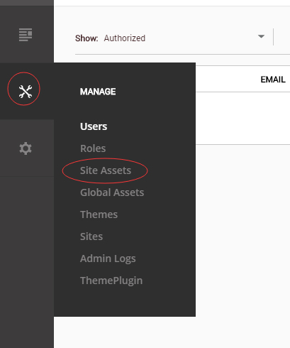
For DNN 9
-
Go to Manage > Site Assets
-
Uploading Home.page.template file to Templates folder
-
Because page templates can not import image files, you need to upload all the photo files of the "images" folder into your portal root (e.g. Portals/0/).
-
Go to Content > Pages > Add Page
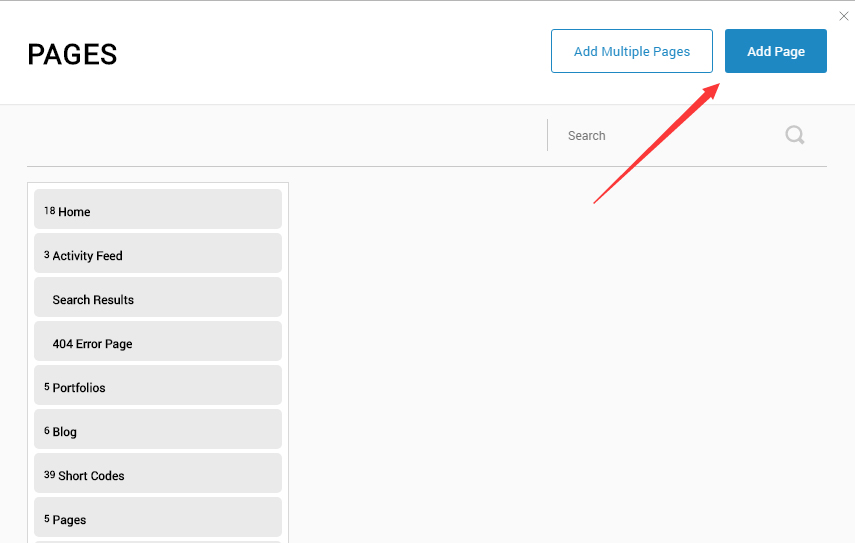
-
Choose your template from Template drop-down.
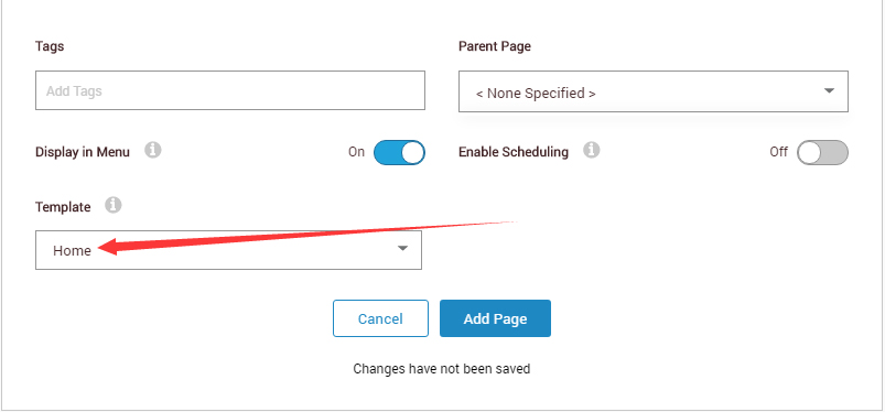
- Click Add Page
Note : Page templates can only be imported when you are creating a new page.
Skin features and how to use them.
Page Template
The product contains page templates for all pages in the live demo, you can copy our demo site by importing the page templates.
Seven kinds of header layout
You can click the xPlugin button to go to settings page, and then choose different header styles in Header Layout section.
You can click these links to check different header styles. header 1, header 2, header 3, header 4, header 5, header 6, header 7
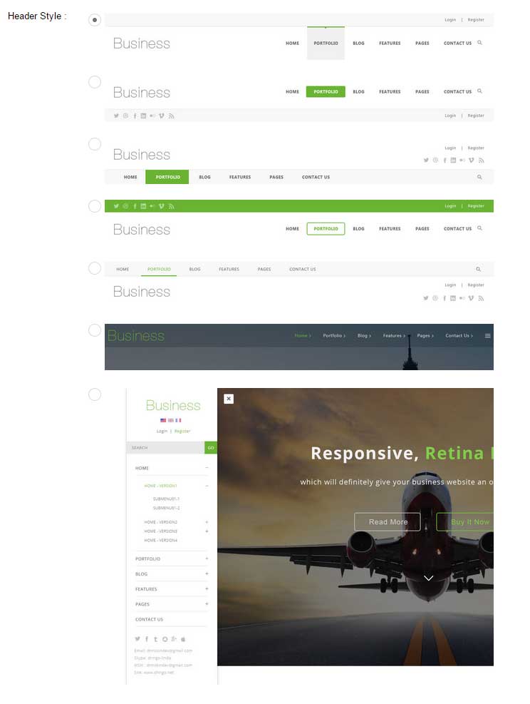
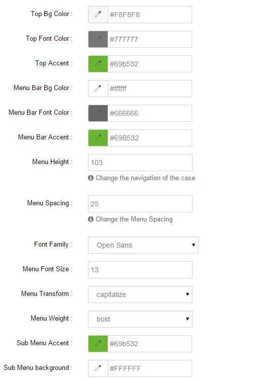
Each header includes very rich setting options, you can modify the color of whatever you would like to . For example: text color, font size and background color etc.
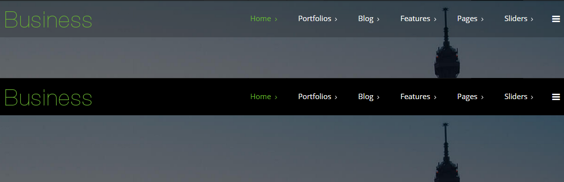
Header Position
Header Position is for setting the position of Header. If you have it set to Float to top, Header will float over the Banner. If you have it set to Not float, Header will show with Banner side by side.
You can compare the difference between these two settings through the following two screen shots.
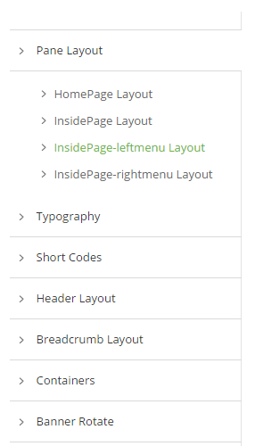
Insidepage-leftmenu layout
Insidepage-leftmenu layout page is using InsidePage-leftmenu skin. Menus on the left side are displaying the second level menus.
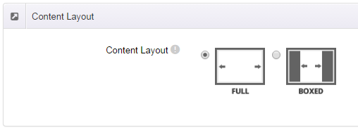
Full Layout and Boxed Layout
This skin contains Full Layout and Boxed Layout, you can set through Content Layout section.
With Boxed Layout applied, you can still set page background, it will display around the content. You can click link to check demo url of boxed layout.
The background can be set as static or rotating image or any solid color for you choose to apply, also you can set different background images for different pages.
How to set background image for DNN page.
- You need to choose Boxed Layout.
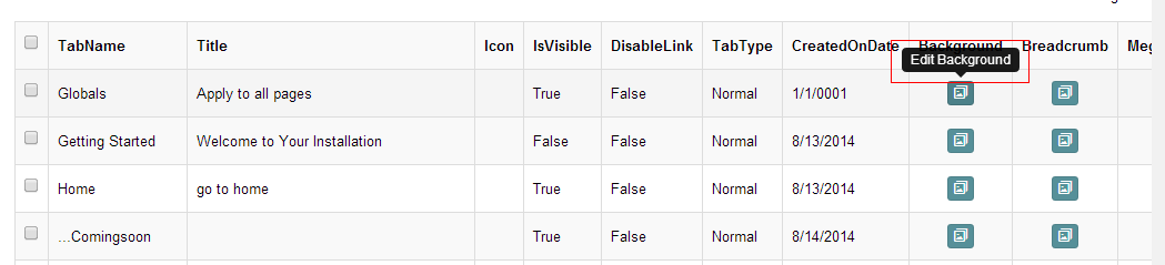
- Choose Page Background in the Option for Show bg, save settings.
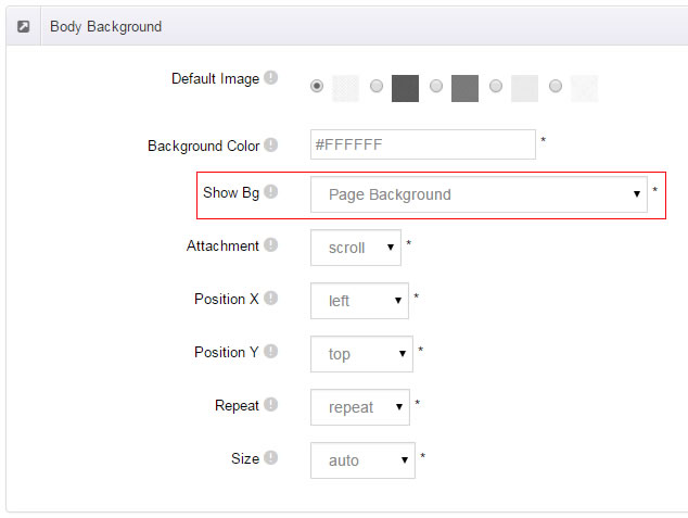
- Click "pages" nav in the xPlugin.
- Click Edit Background icon.
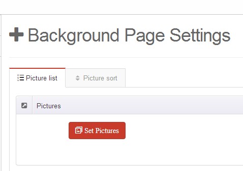
- Upload image, the background image will show as slider if you choose two or more images.
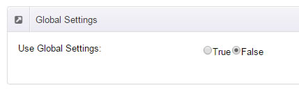
- "Globals" allows you to set background image for all pages.
- Also you can set background image for each page.
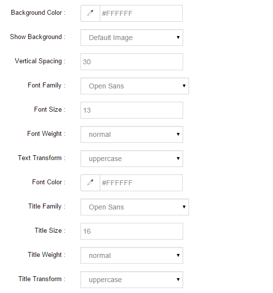
How to set breadcrumb image for DNN page.
- Choose Breadcrumb Background in the Option for Show bg, save settings.
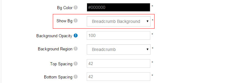
- Click "pages" nav in the xPlugin.
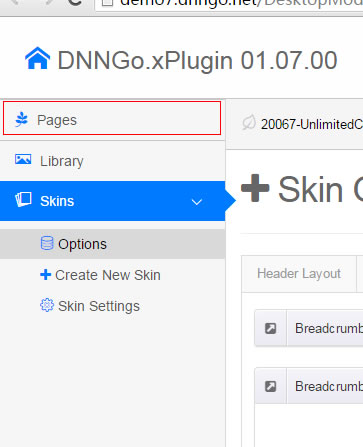
- Click Edit Breadcrumb icon.
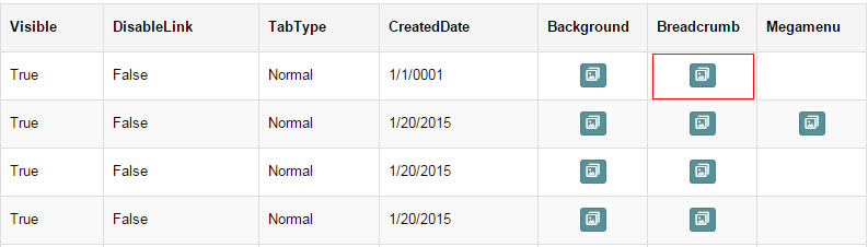
- Upload image, the background image will show as slider if you choose two or more images.
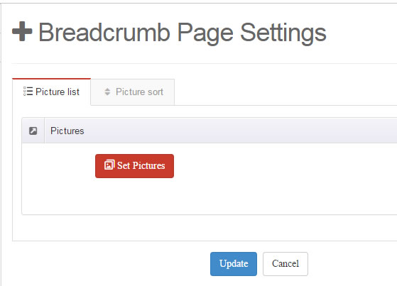
- "Globals" allows you to set background image for all pages.
- Also you can set background image for each page.
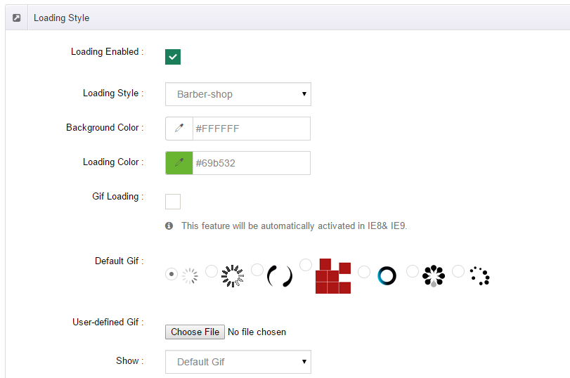
Loading Style
You can set the page loading animation.

You can select to have this feature turned on or off.
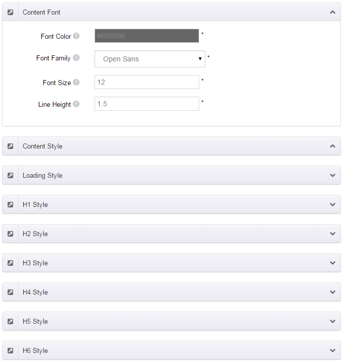
Content Style
You can set the font color and size, link color, the color of H1-H6 etc of the content area.
Four kinds of Breadcrumb layouts
You can choose different Breadcrumb styles through Breadcrumb Layout.
You can click these links to check different breadcrumb styles. breadcrumb 1, breadcrumb 2, breadcrumb 3, breadcrumb 4.
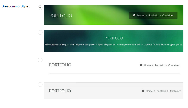
You can change the text color, background color and background image etc for each Breadcrumb layout.
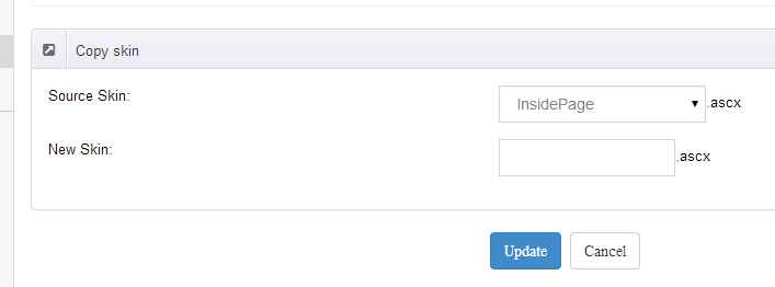
Create a Skin
You can create a new skin through xPlugin. Please note the new skin name shouldn't be the same as the current skin.
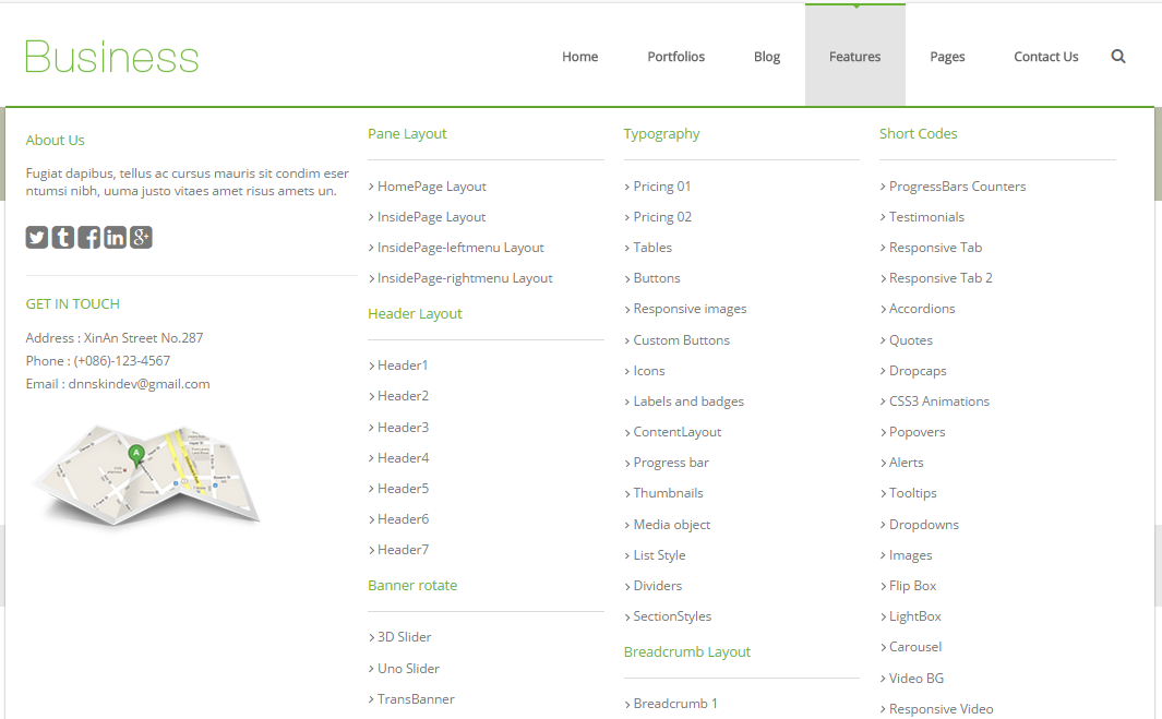
Standard Menu and MegaMenu
The skin sub menus contain two types-Standard Menu and MegaMenu.
Standard Menu is the default menu type, the sub menus will be set to display in one column only, as shown in screen shot below:
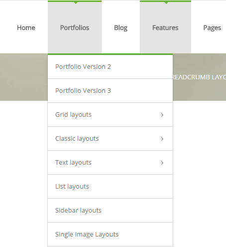
MegaMenu will set sub menus to display in multiple columns, also you can display HTML module or third party module in sub menus, as shown below:
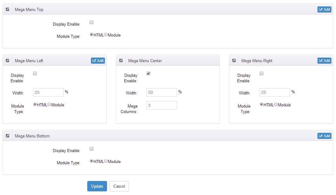
You can set the MegaMenu as per steps below:
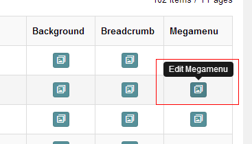
- Click "pages" nav in the xPlugin.
- Click Edit MegaMenu button. Please note MegaMenu can be set for first level menus only.
- Set the menu type to MegaMenu.
- Mega Menu has 5 sections: Menu Top, Menu Right, Menu Bottom, Menu Left, Menu Center.
- Click Add button so you will be able to add HTML module or any third module to Menu Top, Menu Right, Menu Bottom, Menu Left.
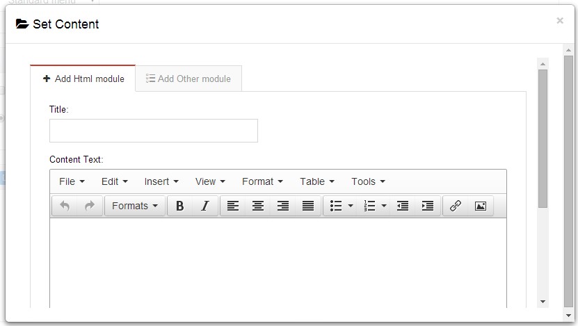
- Module Type-choose to display HTML module or third module.
- Menu Center-it will display secondary menus here.
- Mega Columns-set number of columns the secondary menu will display.
- You can set width for Menu Right, Menu Left, Menu Center, please note their previous total width shouldn't be more than 100.
Set Up Google Map
You can create Google Map easily following these steps:
- Go to xplugin, and click Map Settings tab to fill in API.
- You can register through https://developers.google.com/maps/documentation/javascript/get-api-key.
- Place the code <div id="gmap01"></div> into HTML module.
- Enter location of the map in Address, for example: Bear city, ny
- Enter description in Markers Html, for example: hello word
CSS Codes
Skin is using bootstrap framework. You will get to know more through this url. Link
Width of content area
dnn_layout is the page content framework:
| Device width | Width of content area |
| Large devices Desktops (≥1200px) | 1170px |
| Medium devices Desktops (≥992px) | 970px |
| Small devices Tablets (≥768px) | 750px |
| Extra small devices Phones (<768px) | auto |
content_mid is the spacing between both sides of the page :
| Device width | Spacing |
| Large devices Desktops (≥1200px) | 30px |
| Medium devices Desktops (≥992px) | 20px |
| Small devices Tablets (≥768px) | 15px |
| Extra small devices Phones (<768px) | 15px |
<div class="dnn_layout">
  <div class="content_mid clearfix"> content ... </div>
</div>
Bootstrap 12 grid layout
<!-- Tablet and desktop devices are 50% wide, mobile device is 100% wide -->
<div class="row">
  <div class="col-sm-6">.col-sm-6</div>
  <div class="col-sm-6">.col-sm-6</div>
</div>

<!-- Stack the columns on mobile by making one full-width and the other half-width -->
<div class="row">
  <div class="col-xs-12 col-md-8">.col-xs-12 .col-md-8</div>
  <div class="col-xs-6 col-md-4">.col-xs-6 .col-md-4</div>
</div>

<!-- Columns start at 50% wide on mobile and bump up to 33.3% wide on desktop -->
<div class="row">
  <div class="col-xs-6 col-md-4">.col-xs-6 .col-md-4</div>
  <div class="col-xs-6 col-md-4">.col-xs-6 .col-md-4</div>
  <div class="col-xs-6 col-md-4">.col-xs-6 .col-md-4</div>
</div>

<!-- Columns are always 50% wide, on mobile and desktop -->
<div class="row">
  <div class="col-xs-6">.col-xs-6</div>
  <div class="col-xs-6">.col-xs-6</div>
</div>

<!-- Add the extra clearfix for only the required viewport -->
<div class="clearfix visible-xs-block"></div>
Display and hide elements
| Extra small devices Phones (<768px) | Small devices Tablets (≥768px) | Medium devices Desktops (≥992px) | Large devices Desktops (≥1200px) | |
|---|---|---|---|---|
.visible-xs |
Visible | Hidden | Hidden | Hidden |
.visible-sm |
Hidden | Visible | Hidden | Hidden |
.visible-md |
Hidden | Hidden | Visible | Hidden |
.visible-lg |
Hidden | Hidden | Hidden | Visible |
.hidden-xs |
Hidden | Visible | Visible | Visible |
.hidden-sm |
Visible | Hidden | Visible | Visible |
.hidden-md |
Visible | Visible | Hidden | Visible |
.hidden-lg |
Visible | Visible | Visible | Hidden |
Visible in mobile devices and hidden in other devices
<div class="visible-xs">content...</div>

Visible in other devices and hidden in mobile devices
<div class="hidden-xs">content...</div>
Vertical spacing
 /*page Spacing*/
.mt-10 {margin-top: 10px;}
.mb-10 {margin-bottom: 10px;}
.pt-10 {padding-top: 10px;}
.pb-10 {padding-bottom: 10px;}
.mt-20 {margin-top: 20px;}
.mb-20 {margin-bottom: 20px;}
.pt-20 {padding-top: 20px;}
.pb-20 {padding-bottom: 20px;}
.mt-30 {margin-top: 30px;}
.mb-30 {margin-bottom: 30px;}
.pt-30 {padding-top: 30px;}
.pb-30 {padding-bottom: 30px;}
.mt-40 {margin-top: 40px;}
.mb-40 {margin-bottom: 40px;}
.pt-40 {padding-top: 40px;}
.pb-40 {padding-bottom: 40px;}
.mt-50 {margin-top: 50px;}
.mb-50 {margin-bottom: 50px;}
.pt-50 {padding-top: 50px;}
.pb-50 {padding-bottom: 50px;}
.mt-60 {margin-top: 60px;}
.mb-60 {margin-bottom: 60px;}
.pt-60 {padding-top: 60px;}
.pb-60 {padding-bottom: 60px;}
CSS background

<div class="backgroundImage1">backgroundImage1</div>
<div class="backgroundImage2">backgroundImage2</div>
<div class="backgroundImage3">backgroundImage3</div>

<div class="backgroundImage4">backgroundImage4</div>
<div class="backgroundImage5">backgroundImage5</div>

<div class="backgroundImage6">backgroundImage6</div>

<div class="backgroundImage7">backgroundImage7</div>

<div class="backgroundImage8">backgroundImage8</div>
<div class="backgroundImage9">backgroundImage9</div>

<div class="backgroundImage10">backgroundImage10</div>

<div class="backgroundImage11">backgroundImage11</div>

<div class="backgroundImage12">backgroundImage12</div>

<div class="backgroundImage13">backgroundImage13</div>
<div class="backgroundImage14">backgroundImage14</div>

<div class="backgroundImage15">backgroundImage15</div>

<div class="backgroundImage16">backgroundImage16</div>
<div class="backgroundImage17">backgroundImage17</div>

<div class="backgroundImage18">backgroundImage18</div>
Short Codes
This skin contains a lot of short codes, it is very easy for you to use even you know nothing about js and css, all you need to do is just copying the short codes to HTML module.
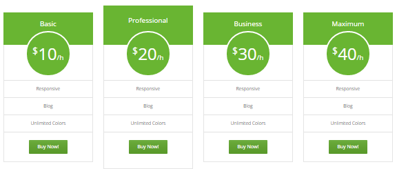
Pricing
You can click the link to check Pricing demo. Demo Link
Style 1:
Below is the screen shot:
Codes are as follows:
<div class="price-table price-table2 row">
  <div class="col-md-3 col-sm-6">
    <div class="price_title">
      <h2>basic</h2>
    </div>
    <div class="price_holder">
      <div class="price_box"> <span class="sup">$</span><span class="price">10</span><span class="unit">/h</span> </div>
      <ul>
        <li>responsive</li>
        <li>Blog</li>
        <li>Unlimited Colors</li>
      </ul>
      <a href="#" class="btn ">Buy Now!</a> </div>
  </div>
  <div class="col-md-3 col-sm-6 best_value">
    <div class="price_title ">
      <h2>professional</h2>
    </div>
    <div class="price_holder">
      <div class="price_box"> <span class="sup">$</span><span class="price">20</span><span class="unit">/h</span> </div>
      <ul>
        <li>responsive</li>
        <li>Blog</li>
        <li>Unlimited Colors</li>
      </ul>
      <a href="#" class="btn">Buy Now!</a> </div>
  </div>
  <div class="col-md-3 col-sm-6">
    <div class="price_title">
      <h2>business</h2>
    </div>
    <div class="price_holder">
      <div class="price_box"> <span class="sup">$</span><span class="price">30</span><span class="unit">/h</span> </div>
      <ul>
        <li>responsive</li>
        <li>Blog</li>
        <li>Unlimited Colors</li>
      </ul>
      <a href="#" class="btn">Buy Now!</a> </div>
  </div>
  <div class="col-md-3 col-sm-6">
    <div class="price_title">
      <h2>maximum</h2>
    </div>
    <div class="price_holder">
      <div class="price_box"> <span class="sup">$</span><span class="price">40</span><span class="unit">/h</span> </div>
      <ul>
        <li>responsive</li>
        <li>Blog</li>
        <li>Unlimited Colors</li>
      </ul>
      <a href="#" class="btn ">Buy Now!</a> </div>
  </div>
</div>
Option:
col-md-3 col-sm-6is the width for each column. You can change the width you need through value1~12
Style 2:
Below is the screen shot:
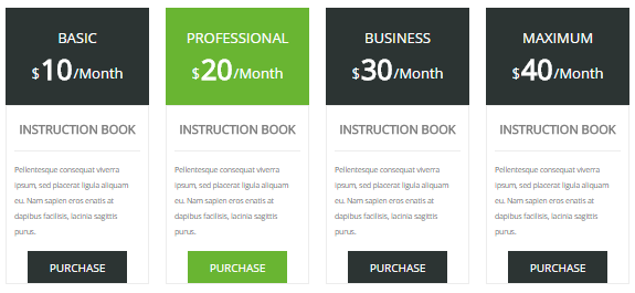
Codes are as follows:
<div class="price-table price-table3 row">
  <div class="col-md-3 col-sm-6">
    <div class="price_title">
      <h2>BASIC</h2>
      <div class="price_box"><span class="sup">$</span><span class="price">10</span><span class="unit">/Month</span></div>
    </div>
    <dl class="price_holder">
      <dt>INSTRUCTION BOOK</dt>
      <dd> Content text 1 ... </dd>
      <a href="#" class="btn ">PURCHASE</a>
    </dl>
  </div>
  <div class="col-md-3 col-sm-6 best_value">
    <div class="price_title ">
      <h2>PROFESSIONAL</h2>
      <div class="price_box"><span class="sup">$</span><span class="price">20</span><span class="unit">/Month</span></div>
    </div>
    <dl class="price_holder">
      <dt>INSTRUCTION BOOK </dt>
      <dd> Content text 2 ...</dd>
      <a href="#" class="btn">PURCHASE</a>
    </dl>
  </div>
  <div class="col-md-3 col-sm-6">
    <div class="price_title">
      <h2>BUSINESS</h2>
      <div class="price_box"><span class="sup">$</span><span class="price">30</span><span class="unit">/Month</span></div>
    </div>
    <dl class="price_holder">
      <dt>INSTRUCTION BOOK </dt>
      <dd> Content text 3 ...</dd>
      <a href="#" class="btn">PURCHASE</a>
    </dl>
  </div>
  <div class="col-md-3 col-sm-6">
    <div class="price_title">
      <h2>MAXIMUM</h2>
      <div class="price_box"><span class="sup">$</span><span class="price">40</span><span class="unit">/Month</span></div>
    </div>
    <dl class="price_holder">
      <dt>INSTRUCTION BOOK </dt>
      <dd> Content text 4 ...</dd>
      <a href="#" class="btn ">PURCHASE</a>
    </dl>
  </div>
</div>
Option:
col-md-3 col-sm-6is the width for each column. You can change the width you need through value1~12
Style 3:
Below is the screen shot:
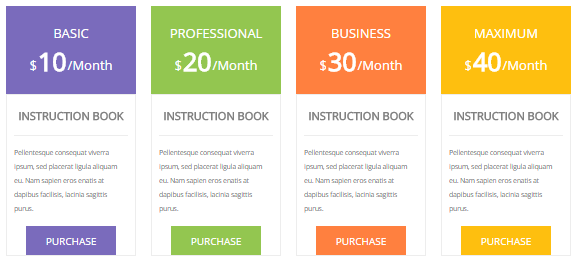
Codes are as follows:
<div class="price-table price-table3 row">
  <div class="col-md-3 col-sm-6 color_1">
    <div class="price_title">
      <h2>BASIC</h2>
      <div class="price_box"><span class="sup">$</span><span class="price">10</span><span class="unit">/Month</span></div>
    </div>
    <dl class="price_holder">
      <dt>INSTRUCTION BOOK</dt>
      <dd> Content text 1 ... </dd>
      <a href="#" class="btn ">PURCHASE</a>
    </dl>
  </div>
  <div class="col-md-3 col-sm-6 color_2">
    <div class="price_title ">
      <h2>PROFESSIONAL</h2>
      <div class="price_box"><span class="sup">$</span><span class="price">20</span><span class="unit">/Month</span></div>
    </div>
    <dl class="price_holder">
      <dt>INSTRUCTION BOOK </dt>
      <dd> Content text 2 ... </dd>
      <a href="#" class="btn">PURCHASE</a>
    </dl>
  </div>
  <div class="col-md-3 col-sm-6 color_3">
    <div class="price_title">
      <h2>BUSINESS</h2>
      <div class="price_box"><span class="sup">$</span><span class="price">30</span><span class="unit">/Month</span></div>
    </div>
    <dl class="price_holder">
      <dt>INSTRUCTION BOOK </dt>
      <dd> Content text 3 ... </dd>
      <a href="#" class="btn">PURCHASE</a>
    </dl>
  </div>
  <div class="col-md-3 col-sm-6 color_4">
    <div class="price_title">
      <h2>MAXIMUM</h2>
      <div class="price_box"><span class="sup">$</span><span class="price">40</span><span class="unit">/Month</span></div>
    </div>
    <dl class="price_holder">
      <dt>INSTRUCTION BOOK </dt>
      <dd> Content text 4 ... </dd>
      <a href="#" class="btn ">PURCHASE</a>
    </dl>
  </div>
</div>
Option:
col-md-3 col-sm-6is the width for each column. You can change the width you need through value1~12
Style 4:
Below is the screen shot:
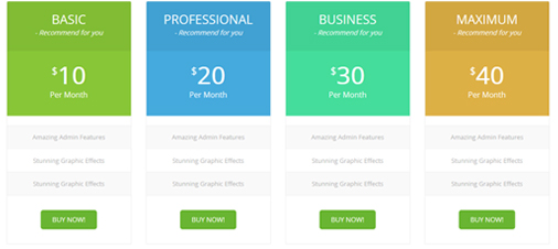
Codes are as follows:
<div class="price-table price-table4 row">
  <div class="col-md-3 col-sm-6 color_1">
    <div class="price_border">
      <div class="price_title">
        <h2>BASIC</h2>
        - Recommend for you </div>
      <div class="price_holder">
        <div class="price_box"><span class="sup">$</span><span class="price">10</span><span class="unit">Per Month</span></div>
        <ul>
          <li>Amazing Admin Features</li>
          <li>Stunning Graphic Effects</li>
          <li>Stunning Graphic Effects</li>
        </ul>
        <a href="#" class="btn ">BUY NOW!</a> </div>
    </div>
  </div>
  <div class="col-md-3 col-sm-6 color_2">
    <div class="price_border">
      <div class="price_title ">
        <h2>PROFESSIONAL</h2>
        - Recommend for you </div>
      <div class="price_holder">
        <div class="price_box"><span class="sup">$</span><span class="price">20</span><span class="unit">Per Month</span></div>
        <ul>
          <li>Amazing Admin Features</li>
          <li>Stunning Graphic Effects</li>
          <li>Stunning Graphic Effects</li>
        </ul>
        <a href="#" class="btn">BUY NOW!</a> </div>
    </div>
  </div>
  <div class="col-md-3 col-sm-6 color_3">
    <div class="price_border">
      <div class="price_title">
        <h2>BUSINESS</h2>
        - Recommend for you </div>
      <div class="price_holder">
        <div class="price_box"><span class="sup">$</span><span class="price">30</span><span class="unit">Per Month</span></div>
        <ul>
          <li>Amazing Admin Features</li>
          <li>Stunning Graphic Effects</li>
          <li>Stunning Graphic Effects</li>
        </ul>
        <a href="#" class="btn">BUY NOW!</a> </div>
    </div>
  </div>
  <div class="col-md-3 col-sm-6 color_4">
    <div class="price_border">
      <div class="price_title">
        <h2>MAXIMUM</h2>
        - Recommend for you </div>
      <div class="price_holder">
        <div class="price_box"><span class="sup">$</span><span class="price">40</span><span class="unit">Per Month</span></div>
        <ul>
          <li>Amazing Admin Features</li>
          <li>Stunning Graphic Effects</li>
          <li>Stunning Graphic Effects</li>
        </ul>
        <a href="#" class="btn ">BUY NOW!</a> </div>
    </div>
  </div>
</div>
Option:
col-md-3 col-sm-6is the width for each column. You can change the width you need through value1~12
Style 5:
Below is the screen shot:
Codes are as follows:
<div class="price-table price-table5 row">
  <div class="col-md-3 col-sm-6">
    <div class="price_border">
      <div class="price_title">
        <h2>BASIC</h2>
      </div>
      <div class="price_holder">
        <div class="price_box"><span class="sup">$</span><span class="price">10</span><span class="unit">Per Month</span></div>
        <ul>
          <li>10gb disk space</li>
          <li>100gb bandwidth</li>
          <li>umlimited colors</li>
          <li>dnn free skin</li>
          <li>full time support</li>
        </ul>
        <a href="#" class="btn ">BUY NOW!</a> </div>
    </div>
  </div>
  <div class="col-md-3 col-sm-6 best_value">
    <div class="price_border">
      <div class="price_title ">
        <h2>PROFESSIONAL</h2>
      </div>
      <div class="price_holder">
        <div class="price_box"><span class="sup">$</span><span class="price">20</span><span class="unit">Per Month</span></div>
        <ul>
          <li>10gb disk space</li>
          <li>100gb bandwidth</li>
          <li>umlimited colors</li>
          <li>dnn free skin</li>
          <li>full time support</li>
        </ul>
        <a href="#" class="btn">BUY NOW!</a> </div>
    </div>
  </div>
  <div class="col-md-3 col-sm-6">
    <div class="price_border">
      <div class="price_title">
        <h2>BUSINESS</h2>
      </div>
      <div class="price_holder">
        <div class="price_box"><span class="sup">$</span><span class="price">30</span><span class="unit">Per Month</span></div>
        <ul>
          <li>10gb disk space</li>
          <li>100gb bandwidth</li>
          <li>umlimited colors</li>
          <li>dnn free skin</li>
          <li>full time support</li>
        </ul>
        <a href="#" class="btn">BUY NOW!</a> </div>
    </div>
  </div>
  <div class="col-md-3 col-sm-6">
    <div class="price_border">
      <div class="price_title">
        <h2>MAXIMUM</h2>
      </div>
      <div class="price_holder">
        <div class="price_box"><span class="sup">$</span><span class="price">40</span><span class="unit">Per Month</span></div>
        <ul>
          <li>10gb disk space</li>
          <li>100gb bandwidth</li>
          <li>umlimited colors</li>
          <li>dnn free skin</li>
          <li>full time support</li>
        </ul>
        <a href="#" class="btn ">BUY NOW!</a> </div>
    </div>
  </div>
</div>
Option:
col-md-3 col-sm-6is the width for each column. You can change the width you need through value1~12
Style 6:
Below is the screen shot:
Codes are as follows:
<div class="price-table price-table6 row">
  <div class="col-md-3 col-sm-6 color_1">
    <div class="price_border">
      <div class="price_title">
        <h2>BASIC</h2>
      </div>
      <div class="price_holder">
        <div class="price_box"><span class="sup">$</span><span class="price">10</span><span class="unit">Per Month</span></div>
        <ul>
          <li>10gb disk space</li>
          <li>100gb bandwidth</li>
          <li>umlimited colors</li>
          <li>dnn free skin</li>
          <li>full time support</li>
        </ul>
        <a class="btn " href="#">BUY NOW!</a> </div>
    </div>
  </div>
  <div class="col-md-3 col-sm-6 color_2">
    <div class="price_border">
      <div class="price_title ">
        <h2>PROFESSIONAL</h2>
      </div>
      <div class="price_holder">
        <div class="price_box"><span class="sup">$</span><span class="price">20</span><span class="unit">Per Month</span></div>
        <ul>
          <li>10gb disk space</li>
          <li>100gb bandwidth</li>
          <li>umlimited colors</li>
          <li>dnn free skin</li>
          <li>full time support</li>
        </ul>
        <a class="btn" href="#">BUY NOW!</a> </div>
    </div>
  </div>
  <div class="col-md-3 col-sm-6 color_3">
    <div class="price_border">
      <div class="price_title">
        <h2>BUSINESS</h2>
      </div>
      <div class="price_holder">
        <div class="price_box"><span class="sup">$</span><span class="price">30</span><span class="unit">Per Month</span></div>
        <ul>
          <li>10gb disk space</li>
          <li>100gb bandwidth</li>
          <li>umlimited colors</li>
          <li>dnn free skin</li>
          <li>full time support</li>
        </ul>
        <a class="btn" href="#">BUY NOW!</a> </div>
    </div>
  </div>
  <div class="col-md-3 col-sm-6 color_4">
    <div class="price_border">
      <div class="price_title">
        <h2>MAXIMUM</h2>
      </div>
      <div class="price_holder">
        <div class="price_box"><span class="sup">$</span><span class="price">40</span><span class="unit">Per Month</span></div>
        <ul>
          <li>10gb disk space</li>
          <li>100gb bandwidth</li>
          <li>umlimited colors</li>
          <li>dnn free skin</li>
          <li>full time support</li>
        </ul>
        <a class="btn " href="#">BUY NOW!</a> </div>
    </div>
  </div>
</div>
Option:
col-md-3 col-sm-6is the width for each column. You can change the width you need through value1~12
ProgressBars Counters
You can click the link to check ProgressBars Counters demo. Demo Link
Style 1
Below is the screen shot:
Codes are as follows:
<div class="chart_list row">
  <div class="col-sm-3">
    <div data-percent="65" class="percentage">
      <div class="percentage_inner"><span>0</span>%</div>
    </div>
    Web Design </div>
  <div class="col-sm-3">
    <div data-percent="70" class="percentage">
      <div class="percentage_inner"><span>0</span>%</div>
    </div>
    HTML5 & CSS3 </div>
  <div class="col-sm-3">
    <div data-percent="85" class="percentage">
      <div class="percentage_inner"><span>0</span>%</div>
    </div>
    Graphic Design </div>
  <div class="col-sm-3">
    <div data-percent="45" class="percentage">
      <div class="percentage_inner"><span>0</span>%</div>
    </div>
    DNN </div>
</div>
Option:
col-sm-3is the width of each column, you can change the width you need through value1~12- You can change the value you need to display through
data-percent
Style 2
Below is the screen shot:
Codes are as follows:
<div class="chart_list2 row">
  <div class="col-sm-3">
    <div data-percent="65" class="percentage2">
      <div class="percentage_inner"><span>0</span>%</div>
    </div>
    Web Design </div>
  <div class="col-sm-3">
    <div data-percent="70" class="percentage2">
      <div class="percentage_inner"><span>0</span>%</div>
    </div>
    HTML5 & CSS3 </div>
  <div class="col-sm-3">
    <div data-percent="85" class="percentage2">
      <div class="percentage_inner"><span>0</span>%</div>
    </div>
    Graphic Design </div>
  <div class="col-sm-3">
    <div data-percent="45" class="percentage2">
      <div class="percentage_inner"><span>0</span>%</div>
    </div>
    DNN </div>
</div>
Option:
col-sm-3is the width of each column, you can change the width you need through value1~12data-percentis for controlling the percentage that displays, you can display percentage through value0~100
Style 3
Below is the screen shot:
Codes are as follows:
<div class="row loaded_list">
  <p> Web Design </p>
  <div class="progress progress-striped active">
    <div class="progress-bar animation animationwidth" data-width="90%"><span></span></div>
  </div>
  <p> HTML/CSS</p>
  <div class="progress progress-striped active">
    <div class="progress-bar animation animationwidth" data-width="95%"><span></span></div>
  </div>
  <p>Graphic Design </p>
  <div class="progress progress-striped active">
    <div class="progress-bar animation animationwidth" data-width="85%"><span></span> </div>
  </div>
  <p>DNN</p>
  <div class="progress progress-striped active">
    <div class="progress-bar animation animationwidth" data-width="75%"><span></span></div>
  </div>
</div>
Option:
data-widthis for controlling the percentage that displays, you can display percentage through value0~100
Style 4
Below is the screen shot:
Codes are as follows:
<div class="number_Animation row">
  <div class="col-sm-3"> <span class="fa fa-user"> </span> <span data-number="5300" class="animation  number">0</span> </div>
  <div class="col-sm-3"> <span class="fa fa-heart"> </span> <span data-number="10321" class="animation  number">0</span> </div>
  <div class="col-sm-3"> <span class="fa fa-star"> </span> <span data-number="4632" class="animation  number">0</span> </div>
  <div class="col-sm-3"> <span class="fa fa-bookmark"> </span> <span data-number="6548" class="animation  number">0</span> </div>
</div>
Option:
col-sm-3is the width of each column, you can change the width you need through value1~12- You can change the font icon through
fa fa-user. font icon list - You can change the value you need to display through
data-number
Style 5
Below is the screen shot:
Codes are as follows:
<div class="backgroundImage24 pb-50 pt-50">
  <div class="dnn_layout">
    <div class="content_mid">
      <div class=" row number_Animation_3">
        <div class="col-sm-3"> <span class="animation  number" data-number="9400">0</span><span class="font">Theme Users </span> </div>
        <div class="col-sm-3"> <span class="animation  number" data-number="4080">0</span> <span class="font"> Product Subscribers </span> </div>
        <div class="col-sm-3"> <span class="animation  number" data-number="1150">0</span><span class="font">Features Added </span> </div>
        <div class="col-sm-3"> <span class="animation  number" data-number="23740">0</span> <span class="font"> Downloads</span> </div>
      </div>
    </div>
  </div>
</div>
Option:
col-sm-3is the width of each column, you can change the width you need through value1~12- You can change the font icon through
fa fa-user. font icon list - You can change the value you need to display through
data-number
Testimonials
You can click the link to check Testimonials demo. Demo Link
Option:
Testimonials includes the parameters that listed below.
data-position |
Switch mode. fade:fade in fade out, roll-left:roll from side to side, roll-vertical:roll up and down |
data-display-navigation |
Navigation display and hidden. Default to true. true:Display, false:hidden |
data-display-arrows |
Left/right arrow display and hidden. Default to true. true:Display, false:hidden |
data-autoplay |
Whether to scroll automatically or not. 0 is for not scrolling automatically, numbers greater than 0 are for scrolling automatically, and these numbers are the time interval for scrolling. Default to 3000 |
data-autoheight |
Whether to be automatic height or not, default to true. true: automatic height, false: fixed height. |
Example:
<ul class=" Testimonials_tab" data-position="roll-vertical" data-display-navigation="true" data-display-arrows="true" data-display-navigation="false" data-autoplay="3000" data-autoheight="true">
  <li>
    <h3 class="title a_t_c">What Others Say About Us ?</h3>
		......
Style 1:
Below is the screen shot:
Codes are as follows:
<ul class=" Testimonials_tab Testimonials_1" data-position="fade" data-display-navigation="false" data-autoplay="0">
  <li>
    <blockquote>
      <p>Content text 1 ...</p>
      <small><img alt="" src="/portals/23/team_pic_1.png" /><span>Name </span>introduce</small> </blockquote>
  </li>
  <li>
    <blockquote>
      <p>Content text 2 ...</p>
      <small><img alt="" src="/portals/23/team_pic_2.png" /><span>Name</span>introduce</small> </blockquote>
  </li>
  <li>
    <blockquote>
      <p>Content text 3 ...</p>
      <small><img alt="" src="/portals/23/team_pic_3.png" /><span>Name</span>introduce</small> </blockquote>
  </li>
  <li>
    <blockquote>
      <p>Content text 4 ...</p>
      <small><img alt="" src="/portals/23/team_pic_4.png" /><span>Name </span>introduce</small> </blockquote>
  </li>
</ul>
Style 2:
Below is the screen shot:
Codes are as follows:
<ul class="Testimonials_tab Testimonials_2" data-position="roll-left" data-display-navigation="false">
  <li>
    <blockquote>
      <p><span class="Pic"><img alt="" src="/portals/23/team_pic_1.png" /></span>Content text 1 ...</p>
      <small><span>Name </span>introduce</small> </blockquote>
  </li>
  <li>
    <blockquote>
      <p><span class="Pic"><img alt="" src="/portals/23/team_pic_2.png" /></span>Content text 2 ...</p>
      <small><span>Name</span>introduce</small> </blockquote>
  </li>
  <li>
    <blockquote>
      <p><span class="Pic"><img alt="" src="/portals/23/team_pic_3.png" /></span>Content text 3 ...</p>
      <small><span>Name</span>introduce</small> </blockquote>
  </li>
  <li>
    <blockquote>
      <p><span class="Pic"><img alt="" src="/portals/23/team_pic_4.png" /></span>Content text 4 ...</p>
      <small><span>Name </span>introduce</small> </blockquote>
  </li>
</ul>
Style 3:
Below is the screen shot:
Codes are as follows:
<ul class=" Testimonials_tab Testimonials_3" data-autoplay="3000" data-display-arrows="false" data-position="roll-vertical">
  <li>
    <div class="Pic"><img alt="" src="/portals/23/team_pic_1.png" /></div>
    <blockquote> <span class="mark">“</span>
      <p>Content text 1 ...</p>
      <small><span>Name</span>introduce</small> </blockquote>
  </li>
  <li>
    <div class="Pic"><img alt="" src="/portals/23/team_pic_2.png" /></div>
    <blockquote> <span class="mark">“</span>
      <p>Content text 2 ...</p>
      <small><span>Name</span>introduce</small> </blockquote>
  </li>
  <li>
    <div class="Pic"><img alt="" src="/portals/23/team_pic_3.png" /> </div>
    <blockquote> <span class="mark">“</span>
      <p>Content text 3 ...</p>
      <small><span>Name</span>introduce</small> </blockquote>
  </li>
  <li>
    <div class="Pic"><img alt="" src="/portals/23/team_pic_4.png" /></div>
    <blockquote> <span class="mark">“</span>
      <p>>Content text 4 ...</p>
      <small><span>Name </span>introduce</small> </blockquote>
  </li>
</ul>
Style 4:
Below is the screen shot:
Codes are as follows:
<ul class="Testimonials_tab Testimonials_4"  data-display-navigation="false">
  <li>
    <blockquote>
      <p>Content text 1 ...</p>
      <small><img alt="" src="/portals/23/team_pic_1.png" /><span>Name</span> introduce</small> </blockquote>
  </li>
  <li>
    <blockquote>
      <p>Content text 2 ...</p>
      <small><img alt="" src="/portals/23/team_pic_2.png" /><span>Name </span> introduce </small> </blockquote>
  </li>
  <li>
    <blockquote>
      <p>Content text 3 ...</p>
      <small><img alt="" src="/portals/23/team_pic_3.png" /><span>Name </span> introduce </small> </blockquote>
  </li>
  <li>
    <blockquote>
      <p>Content text 4 ...</p>
      <small><img alt="" src="/portals/23/team_pic_4.png" /><span>Name</span> introduce </small> </blockquote>
  </li>
</ul>
Style 5:
Below is the screen shot:
Codes are as follows:
<ul class=" Testimonials_tab Testimonials_5" data-position="fade" data-display-navigation="false" data-autoplay="0">
  <li>
    <blockquote>
      <p>Content text 1 ...</p>
      <small><span>Name </span>introduce</small> </blockquote>
  </li>
  <li>
    <blockquote>
      <p>Content text 2 ...</p>
      <small><span>Name</span>introduce</small> </blockquote>
  </li>
  <li>
    <blockquote>
      <p>Content text 3 ...</p>
      <small><span>Name</span>introduce</small> </blockquote>
  </li>
  <li>
    <blockquote>
      <p>Content text 4 ...</p>
      <small><span>Name</span>introduce</small> </blockquote>
  </li>
</ul>
Style 6:
Below is the screen shot:

Codes are as follows:
<ul data-display-navigation="false" data-autoplay="0" data-position="roll-left" class=" Testimonials_tab Testimonials_7">
<li>
<blockquote>
<p><span class="Pic"><img alt="" src="/portals/3021/team_pic_1.png" /></span>content text1</p>
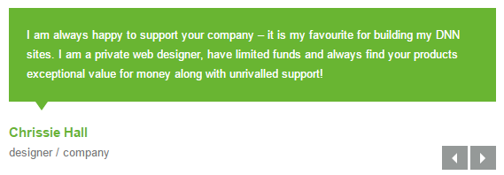
<small><span>Chrissie Hall </span> </small> </blockquote>
</li>
<li>
<blockquote>
<p><span class="Pic"><img alt="" src="/portals/3021/team_pic_2.png" /></span>content text2</p>
<small><span>Aaron</span></small> </blockquote>
</li>
<li>
<blockquote>
<p><span class="Pic"><img alt="" src="/portals/3021/team_pic_3.png" /> </span>content text3</p>
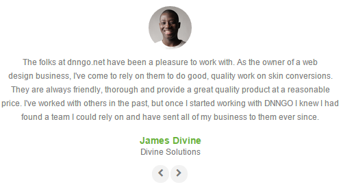
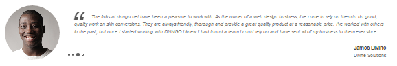
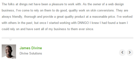
<small><span>James Divine</span></small> </blockquote>
</li>
<li>
<blockquote>
<p><span class="Pic"><img alt="" src="/portals/3021/team_pic_4.png" /></span> content text4</p>
<small><span>John Barclay </span> </small> </blockquote>
</li>
</ul>
Style 7:
Below is the screen shot:
Codes are as follows:
<div class="animation scaleUp ">
  <div class="blockquote_title"><span class="ico"></span><span>Testimonial</span></div>
  <ul class=" Testimonials_tab blockquote_box" data-position="roll-left" data-display-navigation="false">
    <li>
      <blockquote>
        <p>Content Text1...</p>
        <small> Chrissie Hall - Cornwall, UK </small> </blockquote>
    </li>
    <li>
      <blockquote>
        <p>Content Text2...</p>
        <small>Aaron - Calibrated Design</small> </blockquote>
    </li>
    <li>
      <blockquote>
        <p>Content Text3...</p>
        <small>James Divine - Divine Solutions</small> </blockquote>
    </li>
    <li>
      <blockquote>
        <p>Content Text4...</p>
        <small>John Barclay - Grays Harbor Networking and Internet Services</small> </blockquote>
    </li>
  </ul>
</div>
Style 8:
Below is the screen shot:
Codes are as follows:
<ul class=" Testimonials_tab Testimonials_8 animation fadeInLeft" data-autoplay="0" data-display-arrows="false" data-position="roll-vertical">
  <li>
    <div class="Pic"><img alt="" src="/portals/23/team_pic_1.png" /></div>
    <blockquote>
      <p>Content text1...</p>
      <small><span>Kevin G</span>Jdseqbsdvk Company</small> </blockquote>
  </li>
  <li>
    <div class="Pic"><img alt="" src="/portals/23/team_pic_2.png" /></div>
    <blockquote>
      <p>Content text2...</p>
      <small><span>Kevin G</span>Jdseqbsdvk Company</small> </blockquote>
  </li>
  <li>
    <div class="Pic"><img alt="" src="/portals/23/team_pic_3.png" /> </div>
    <blockquote>
      <p>Content text3...</p>
      <small><span>Kevin G</span>Jdseqbsdvk Company</small> </blockquote>
  </li>
  <li>
    <div class="Pic"><img alt="" src="/portals/23/team_pic_4.png" /></div>
    <blockquote>
      <p>Content text4...</p>
      <small><span>Kevin G </span>Jdseqbsdvk Company</small> </blockquote>
  </li>
</ul>
Responsive Tab
You can click the link to check Responsive Tab demo. Demo Link
You can add the "resp-tabs-list" of "li" to add tab item, and add the "resp-tabs-container" of "resp_container" to add content
Example:
<div class="horizontalTab_Top">
  <ul class="resp-tabs-list">

    <li> Tab1 </li>
    <li> Tab2 </li>
    ....

  </ul>
  <div class="resp-tabs-container">

    <div class="resp_container"> Tab1 Content </div>
    <div class="resp_container"> Tab2 Content </div>
    ....

  </div>
</div>
Style 1:
Below is the screen shot:
Codes are as follows:
<div class="horizontalTab_Top horizontalTab_Top_1">
  <ul class="resp-tabs-list">
    <li><span>Title 1</span></li>
    <li><span>Title 2</span></li>
  </ul>
  <div class="resp-tabs-container">
    <div class="resp_container">
      <div class="resp_margin">Content text 1 ...</div>
    </div>
    <div class="resp_container">
      <div class="resp_margin">Content text 2 ...</div>
    </div>
  </div>
</div>
Style 2:
Below is the screen shot:
Codes are as follows:
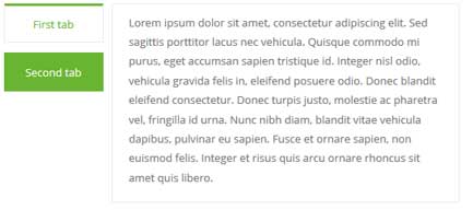
<div class="verticalTab_Left verticalTab_Left_1">
  <ul class="resp-tabs-list">
    <li><span>First tab</span></li>
    <li><span>Second tab</span></li>
  </ul>
  <div class="resp-tabs-container">
    <div class="resp_container">
      <div class="resp_margin">Content text 1 ...</div>
    </div>
    <div class="resp_container">
      <div class="resp_margin">Content text 2 ...</div>
    </div>
  </div>
</div>
Style 3:
Below is the screen shot:
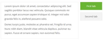
Codes are as follows:
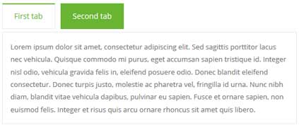
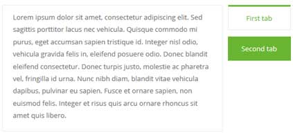
<div class="verticalTab_Right verticalTab_Right_2">
  <ul class="resp-tabs-list">
    <li><span>First tab</span></li>
    <li><span>Second tab</span></li>
  </ul>
  <div class="resp-tabs-container">
    <div class="resp_container">
      <div class="resp_margin">Content text 1 ...</div>
    </div>
    <div class="resp_container">
      <div class="resp_margin">Content text 2 ...</div>
    </div>
  </div>
</div>
Style 4:
Below is the screen shot:
Codes are as follows:
<div class="horizontalTab_Top horizontalTab_Top_2">
  <ul class="resp-tabs-list">
    <li><span><em class="fa fa-heart-o"></em>Title 1</span></li>
    <li><span><em class="fa fa-music"></em>Title 2</span></li>
  </ul>
  <div class="resp-tabs-container">
    <div class="resp_container">
      <div class="resp_margin">Content text 1 ...</div>
    </div>
    <div class="resp_container">
      <div class="resp_margin">Content text 2 ...</div>
    </div>
  </div>
</div>
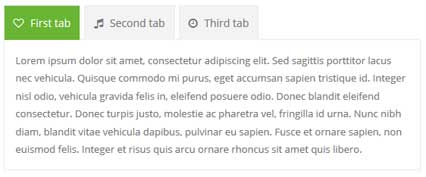
Style 5:
Below is the screen shot:
Codes are as follows:
<div class="verticalTab_Left verticalTab_Left_2">
  <ul class="resp-tabs-list">
    <li><span><em class="fa-heart-o"></em>Title 1</span></li>
    <li><span><em class="fa fa-music"></em>Title 2</span></li>
  </ul>
  <div class="resp-tabs-container">
    <div class="resp_container">
      <div class="resp_margin">Content text 1 ...</div>
    </div>
    <div class="resp_container">
      <div class="resp_margin">Content text 2 ...</div>
    </div>
  </div>
</div>
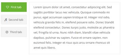
Style 6:
Below is the screen shot:
Codes are as follows:
<div class="verticalTab_Left verticalTab_Left_3">
  <ul class="resp-tabs-list">
    <li><span>First tab</span></li>
    <li><span>Second tab</span></li>
  </ul>
  <div class="resp-tabs-container">
    <div class="resp_container">
      <div class="resp_margin">Content text 1 ...</div>
    </div>
    <div class="resp_container">
      <div class="resp_margin">Content text 2 ...</div>
    </div>
  </div>
</div>
Style 7:
Below is the screen shot:
Codes are as follows:
<div class="horizontalTab_Top horizontalTab_Top_3">
  <ul class="resp-tabs-list">
    <li><span>First tab</span></li>
    <li><span>Second tab</span></li>
  </ul>
  <div class="resp-tabs-container">
    <div class="resp_container">
      <div class="resp_margin">Content text 1 ...</div>
    </div>
    <div class="resp_container">
      <div class="resp_margin">Content text 2 ...</div>
    </div>
  </div>
</div>
Style 8:
Below is the screen shot:
Codes are as follows:
<div class="verticalTab_Left verticalTab_Left_3">
  <ul class="resp-tabs-list">
    <li><span>First tab</span></li>
    <li><span>Second tab</span></li>
  </ul>
  <div class="resp-tabs-container">
    <div class="resp_container">
      <div class="resp_margin">Content text 1 ...</div>
    </div>
    <div class="resp_container">
      <div class="resp_margin">Content text 2 ...</div>
    </div>
  </div>
</div>
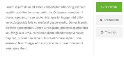
Style 9:
Below is the screen shot:
Codes are as follows:
<div class="verticalTab_Right verticalTab_Right_3">
  <ul class="resp-tabs-list">
    <li><span>First tab</span></li>
    <li><span>Second tab</span></li>
  </ul>
  <div class="resp-tabs-container">
    <div class="resp_container">
      <div class="resp_margin">Content text 1 ...</div>
    </div>
    <div class="resp_container">
      <div class="resp_margin">Content text 2 ...</div>
    </div>
  </div>
</div>
Style 10:
Below is the screen shot:
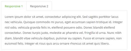
Codes are as follows:
<div class="horizontalTab_Top">
  <ul class="resp-tabs-list">
    <li><span>Responsive 1</span></li>
    <li><span>Responsive 2</span></li>
  </ul>
  <div class="resp-tabs-container">
    <div class="resp_container">
      <div class="resp_margin">
        <p>Content text 1 ...</p>
      </div>
    </div>
    <div class="resp_container">
      <div class="resp_margin">
        <p>Content text 2 ...</p>
      </div>
    </div>
  </div>
</div>
Style 11:
Below is the screen shot:
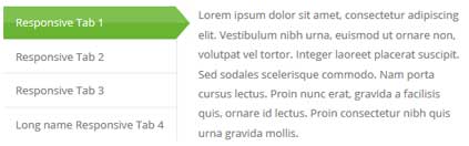
Codes are as follows:
<div class="verticalTab_Left">
  <ul class="resp-tabs-list">
    <li><span>Responsive Tab 1</span></li>
    <li><span>Responsive Tab 2</span></li>
    <li><span>Responsive Tab 3</span></li>
    <li><span>Long name Responsive Tab 4</span></li>
  </ul>
  <div class="resp-tabs-container">
    <div class="resp_container">
      <div class="resp_margin">
        <p>Content Text1...</p>
      </div>
    </div>
    <div class="resp_container">
      <div class="resp_margin">
        <p>Content Text1...</p>
      </div>
    </div>
    <div class="resp_container">
      <div class="resp_margin">
        <p>Content Text3...</p>
      </div>
    </div>
    <div class="resp_container">
      <div class="resp_margin">
        <p>Content Text4...</p>
      </div>
    </div>
  </div>
</div>
Style 12:
Below is the screen shot:
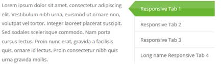
Codes are as follows:
<div class="verticalTab_Right">
  <ul class="resp-tabs-list">
    <li><span>Responsive Tab 1</span></li>
    <li><span>Responsive Tab 2</span></li>
    <li><span>Responsive Tab 3</span></li>
    <li><span>Long name Responsive Tab 4</span></li>
  </ul>
  <div class="resp-tabs-container">
    <div class="resp_container">
      <div class="resp_margin">
        <p>Content Text1...</p>
      </div>
    </div>
    <div class="resp_container">
      <div class="resp_margin">
        <p>Content Text2...</p>
      </div>
    </div>
    <div class="resp_container">
      <div class="resp_margin">
        <p>Content Text3...</p>
      </div>
    </div>
    <div class="resp_container">
      <div class="resp_margin">
        <p>Content Text4...</p>
      </div>
    </div>
  </div>
</div>
Accordions
You can click the link to check Accordions demo. Demo Link
Option:
- id="accordion" of each accordions effect needs using different names.
"data-parent"needs to have the same name asid- href="#collapse1" is the id that needs to expand content.
- id="collapse1" is the content that needs to expand.
<div class="panel-group" id="accordion">

  <div class="panel panel-default">
    <div class="panel-heading">
      <h4 class="panel-title"> <a data-toggle="collapse" data-parent="#accordion" href="#collapse1"> Title Text ... </a> </h4>
    </div>
    <div id="collapse1" class="panel-collapse collapse in">
      <div class="panel-body">Content Text ... </div>
    </div>
  </div>
  ....

</div>
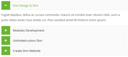
Style 1:
Below is the screen shot:
Codes are as follows:
<div class="panel-group accordion_3" id="accordion3">
<div class="panel panel-default">
<div class="panel-heading">
<h4 class="panel-title"> <a href="#item1" class="" data-toggle="collapse" data-parent="#accordion3"><span class="fa accordion_icon"></span> Dnn Design & Skin </a> </h4>
</div>
<div class="panel-collapse collapse in" id="item1">
<div class="panel-body"> Content text 1 ... </div>
</div>
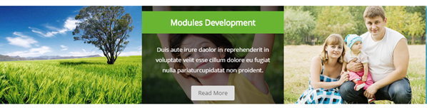
</div>
<div class="panel panel-default">
<div class="panel-heading">
<h4 class="panel-title"> <a href="#item2" class="collapsed" data-toggle="collapse" data-parent="#accordion3"><span class="fa accordion_icon"></span> Modules Development </a> </h4>
</div>
<div class="panel-collapse collapse" id="item2">
<div class="panel-body"> Content text 2 ... </div>
</div>
</div>
<div class="panel panel-default">
<div class="panel-heading">
<h4 class="panel-title"> <a href="#item3" class="collapsed" data-toggle="collapse" data-parent="#accordion3"><span class="fa accordion_icon"></span> Unlimited-colors Skin </a> </h4>
</div>
<div class="panel-collapse collapse" id="item3">
<div class="panel-body"> Content text 3 ... </div>
</div>
</div>
<div class="panel panel-default">
<div class="panel-heading">
<h4 class="panel-title"> <a href="#item4" class="collapsed" data-toggle="collapse" data-parent="#accordion3"><span class="fa accordion_icon"></span> Create Dnn Website </a> </h4>
</div>
<div class="panel-collapse collapse" id="item4">
<div class="panel-body"> Content text 4 ... </div>
</div>
</div>
</div>
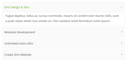
Style 2:
Below is the screen shot:
Codes are as follows:
<div id="accordion4" class="panel-group accordion_4">
  <div class="panel panel-default">
    <div class="panel-heading">
      <h4 class="panel-title"> <a data-parent="#accordion4" data-toggle="collapse" class="" href="#item4_1"><span class="accordion_icon"></span>Dnn Design & Skin </a> </h4>
    </div>
    <div id="item4_1" class="panel-collapse collapse in">
      <div class="panel-body"> Content text 1 ... </div>
    </div>
  </div>
  <div class="panel panel-default">
    <div class="panel-heading">
      <h4 class="panel-title"> <a data-parent="#accordion4" data-toggle="collapse" class="collapsed" href="#item4_2"><span class="accordion_icon"></span>Modules Development </a> </h4>
    </div>
    <div id="item4_2" class="panel-collapse collapse">
      <div class="panel-body"> Content text 2 ... </div>
    </div>
  </div>
  <div class="panel panel-default">
    <div class="panel-heading">
      <h4 class="panel-title"> <a data-parent="#accordion4" data-toggle="collapse" class="collapsed" href="#item4_3"><span class="accordion_icon"></span>Unlimited-colors Skin </a> </h4>
    </div>
    <div id="item4_3" class="panel-collapse collapse">
      <div class="panel-body"> Content text 3 ... </div>
    </div>
  </div>
  <div class="panel panel-default">
    <div class="panel-heading">
      <h4 class="panel-title"> <a data-parent="#accordion4" data-toggle="collapse" class="collapsed" href="#item4_4"><span class="accordion_icon"></span>Create Dnn Website </a> </h4>
    </div>
    <div id="item4_4" class="panel-collapse collapse">
      <div class="panel-body"> Content text 4 ... </div>
    </div>
  </div>
</div>
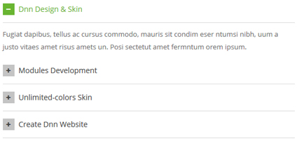
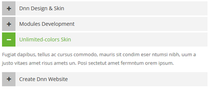
Style 3:
Below is the screen shot:
Codes are as follows:
<div id="accordion5" class="panel-group accordion_5">
  <div class="panel panel-default">
    <div class="panel-heading">
      <h4 class="panel-title"> <a data-parent="#accordion5" data-toggle="collapse" class="" href="#item5_1"><span class="fa  accordion_icon"></span> Dnn Design & Skin </a> </h4>
    </div>
    <div id="item5_1" class="panel-collapse collapse in">
      <div class="panel-body"> Content text 1 ... </div>
    </div>
  </div>
  <div class="panel panel-default">
    <div class="panel-heading">
      <h4 class="panel-title"> <a data-parent="#accordion5" data-toggle="collapse" class="collapsed" href="#item5_2"><span class="fa  accordion_icon"></span> Modules Development </a> </h4>
    </div>
    <div id="item5_2" class="panel-collapse collapse">
      <div class="panel-body"> Content text 2 ... </div>
    </div>
  </div>
  <div class="panel panel-default">
    <div class="panel-heading">
      <h4 class="panel-title"> <a data-parent="#accordion5" data-toggle="collapse" class="collapsed" href="#item5_3"><span class="fa  accordion_icon"></span> Unlimited-colors Skin </a> </h4>
    </div>
    <div id="item5_3" class="panel-collapse collapse">
      <div class="panel-body"> Content text 3 ... </div>
    </div>
  </div>
  <div class="panel panel-default">
    <div class="panel-heading">
      <h4 class="panel-title"> <a data-parent="#accordion5" data-toggle="collapse" class="collapsed" href="#item5_4"><span class="fa  accordion_icon"></span> Create Dnn Website </a> </h4>
    </div>
    <div id="item5_4" class="panel-collapse collapse">
      <div class="panel-body"> Content text 4 ... </div>
    </div>
  </div>
</div>
Style 4:
Below is the screen shot:
Codes are as follows:
<div id="accordion6" class="panel-group accordion_6">
  <div class="panel panel-default">
    <div class="panel-heading">
      <h4 class="panel-title"> <a data-parent="#accordion6" data-toggle="collapse" class="" href="#item6_1"><span class="accordion_icon"></span>Dnn Design & Skin </a> </h4>
    </div>
    <div id="item6_1" class="panel-collapse collapse in">
      <div class="panel-body"> Content text 1 ... </div>
    </div>
  </div>
  <div class="panel panel-default">
    <div class="panel-heading">
      <h4 class="panel-title"> <a data-parent="#accordion6" data-toggle="collapse" class="collapsed" href="#item6_2"><span class="accordion_icon"></span>Modules Development </a> </h4>
    </div>
    <div id="item6_2" class="panel-collapse collapse">
      <div class="panel-body"> Content text 2 ... </div>
    </div>
  </div>
  <div class="panel panel-default">
    <div class="panel-heading">
      <h4 class="panel-title"> <a data-parent="#accordion6" data-toggle="collapse" class="collapsed" href="#item6_3"><span class="accordion_icon"></span>Unlimited-colors Skin </a> </h4>
    </div>
    <div id="item6_3" class="panel-collapse collapse">
      <div class="panel-body"> Content text 3 ... </div>
    </div>
  </div>
  <div class="panel panel-default">
    <div class="panel-heading">
      <h4 class="panel-title"> <a data-parent="#accordion6" data-toggle="collapse" class="collapsed" href="#item6_4"><span class="accordion_icon"></span>Create Dnn Website </a> </h4>
    </div>
    <div id="item6_4" class="panel-collapse collapse">
      <div class="panel-body"> Content text 4 ... </div>
    </div>
  </div>
</div>
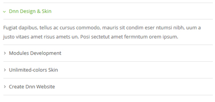
Style 5:
Below is the screen shot:
Codes are as follows:
<div id="accordion2" class="panel-group accordion_2 animation fadeInRight">
  <div class="panel panel-default">
    <div class="panel-heading">
      <h4 class="panel-title"><a href="#item2_1" data-parent="#accordion2" data-toggle="collapse" class="collapsed"><span class="accordion_icon fa"></span> Dnn Design & Skin </a></h4>
    </div>
    <div class="panel-collapse collapse" id="item2_1">
      <div class="panel-body">Content Text 1...</div>
    </div>
  </div>
  <div class="panel panel-default">
    <div class="panel-heading">
      <h4 class="panel-title"><a href="#item2_2" data-parent="#accordion2" data-toggle="collapse" class="collapsed"><span class="accordion_icon fa"></span> Modules Development </a></h4>
    </div>
    <div class="panel-collapse collapse" id="item2_2">
      <div class="panel-body">Content Text 1... </div>
    </div>
  </div>
  <div class="panel panel-default">
    <div class="panel-heading">
      <h4 class="panel-title"><a href="#item2_3" data-parent="#accordion2" data-toggle="collapse"><span class="accordion_icon fa"></span> Unlimited-colors Skin </a></h4>
    </div>
    <div class="panel-collapse in collapse" id="item2_3">
      <div class="panel-body">Content Text 1...</div>
    </div>
  </div>
  <div class="panel panel-default">
    <div class="panel-heading">
      <h4 class="panel-title"><a href="#item2_4" data-parent="#accordion2" data-toggle="collapse" class="collapsed"><span class="accordion_icon fa"></span> Create Dnn Website </a></h4>
    </div>
    <div class="panel-collapse collapse" id="item2_4">
      <div class="panel-body">Content Text 1...</div>
    </div>
  </div>
</div>
Style 6:
Below is the screen shot:
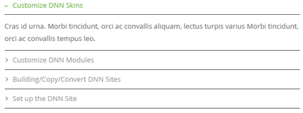
Codes are as follows:
<div id="accordion7" class="panel-group accordion_7">
  <div class="panel panel-default">
    <div class="panel-heading">
      <h4 class="panel-title"> <a data-parent="#accordion7" data-toggle="collapse" href="#item7_1"><span class="accordion_icon"></span>Customize DNN Skins</a> </h4>
    </div>
    <div id="item7_1" class="panel-collapse collapse in">
      <div class="panel-body">Content text 1 ...</div>
    </div>
  </div>
  <div class="panel panel-default">
    <div class="panel-heading">
      <h4 class="panel-title"> <a data-parent="#accordion7" data-toggle="collapse" class="collapsed" href="#item7_2"><span class="accordion_icon"></span>Customize DNN Modules</a> </h4>
    </div>
    <div id="item7_2" class="panel-collapse collapse">
      <div class="panel-body">Content text 2 ...</div>
    </div>
  </div>
  <div class="panel panel-default">
    <div class="panel-heading">
      <h4 class="panel-title"> <a data-parent="#accordion7" data-toggle="collapse" class="collapsed" href="#item7_3"><span class="accordion_icon"></span>Building/Copy/Convert DNN Sites</a> </h4>
    </div>
    <div id="item7_3" class="panel-collapse collapse">
      <div class="panel-body">Content text 3 ...</div>
    </div>
  </div>
  <div class="panel panel-default">
    <div class="panel-heading">
      <h4 class="panel-title"> <a data-parent="#accordion7" data-toggle="collapse" class="collapsed" href="#item7_4"><span class="accordion_icon"></span>Set up the DNN Site</a> </h4>
    </div>
    <div id="item7_4" class="panel-collapse collapse">
      <div class="panel-body">Content text 4 ...</div>
    </div>
  </div>
</div>
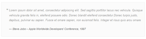
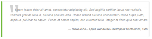
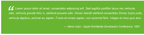
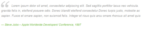
Quotes
You can click the link to check Quotes demo. Demo Link
<div class="quotes_1">
  <blockquote> <span class="mark"> “</span>
    <p>Content text  ...</p>
    <small>Name</small> </blockquote>
</div>
<div class="quotes_2">
  <blockquote> <span class="mark"> “</span>
    <p>Content text  ...</p>
    <small>Name</small> </blockquote>
</div>
<div class="quotes_3">
  <blockquote> <span class="mark"> “</span>
    <p>Content text  ...</p>
    <small>Name</small> </blockquote>
</div>
<div class="quotes_4">
  <blockquote> <span class="mark"> “</span>
    <p>Content text  ...</p>
    <small>Name</small> </blockquote>
</div>
Dropcaps
You can click the link to check Dropcaps demo. Demo Link
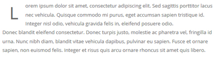
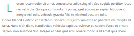
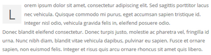
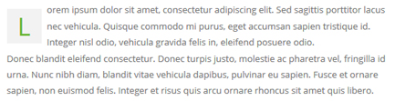
<span class="dropcaps_1">R</span> Content Text ...
<span class="dropcaps_2">R</span> Content Text ...
<span class="dropcaps_3">R</span> Content Text ...
<span class="dropcaps_4">R</span> Content Text ...
<span class="dropcaps_5">R</span> Content Text ...
<span class="dropcaps_6">R</span> Content Text ...
Carousel
You can click the link to check Carousel demo. Demo Link
Style 1:
Below is the screen shot:

Codes are as follows:
<div class="carousel carousel_1" data-pagination="false" data-autoheight="false" data-autoplay="true" data-navigation="true">
  <div class="item"> <a href="#"><span class="fa fa-asterisk"></span></a> </div>
  <div class="item"> <a href="#"><span class="fa fa-asterisk"></span></a> </div>
  <div class="item"> <a href="#"><span class="fa fa-fire"></span></a> </div>
  <div class="item"> <a href="#"><span class="fa fa-keys"></span></a> </div>
  <div class="item"> <a href="#"><span class="fa fa-umbrella"></span></a> </div>
  <div class="item"> <a href="#"><span class="fa fa-trash"></span></a> </div>
  <div class="item"> <a href="#"><span class="fa fa-cutlery"></span></a> </div>
  <div class="item"> <a href="#"><span class="fa fa-gift"></span></a> </div>
</div>
Option:
- You can increase your content items through adding
<div class="item"></div> - You can add image style effects through effects of imageeffects page.
- You can add image enlargement effect through the effect of lightbox page.
| Variable | Default | Type | Description |
|---|---|---|---|
data-items |
4 | int | This variable allows you to set the maximum amount of items displayed at a time with the widest browser width. |
data-navigation |
true | boolean | Display "next" and "prev" buttons. |
data-pagination |
true | boolean | Show pagination. |
data-autoplay |
true | int/boolean | Change to any integrer for example data-autoplay ="5000" to play every 5 seconds. If you set data-autoplay="false" Stop auto scroll animation. |
data-autoheight |
true | boolean | Add height to owl-wrapper-outer so you can use diffrent heights on slides. Use it only for one item per page setting. |
Example:
<div class="carousel" data-items="4" data-navigation="true" data-pagination="true" data-autoplay="true">
  <div class="item">
		...
Style 2:
Below is the screen shot:
Codes are as follows:
<div class="carousel carousel_2" data-pagination="false" data-autoheight="false">
  <div class="item">
    <div class="photo_box img_zoom ico_top_enter"> <a title=" Title One" href="/Portals/23/Photo2.jpg" class="LightBox_image_gallery1">
      <div class="pic_box"> <img  src="/portals/23/Photo2.jpg" >
        <div class="ico"> <span class="fa fa-photo"></span> </div>
        <div class="shade"></div>
      </div>
      </a>
      <div class="text_sytle_3">
        <h3>Title One</h3>
        <p>content text ...</p>
        <a href="#">READ MORE</a> </div>
    </div>
  </div>
  <div class="item">
    <div class="photo_box img_zoom ico_top_enter"> <a title=" Title One" href="/Portals/23/Photo5.jpg" class="LightBox_image_gallery1">
      <div class="pic_box"> <img  src="/portals/23/Photo5.jpg" >
        <div class="ico"> <span class="fa fa-photo"></span> </div>
        <div class="shade"></div>
      </div>
      </a>
      <div class="text_sytle_3">
        <h3>Title Three</h3>
        <p>content text ...</p>
        <a href="#">READ MORE</a> </div>
    </div>
  </div>
  <div class="item">
    <div class="photo_box img_zoom ico_top_enter"> <a title=" Title One" href="/Portals/23/Photo6.jpg" class="LightBox_image_gallery1">
      <div class="pic_box"> <img  src="/portals/23/Photo6.jpg" >
        <div class="ico"> <span class="fa fa-photo"></span> </div>
        <div class="shade"></div>
      </div>
      </a>
      <div class="text_sytle_3">
        <h3>Title Four</h3>
        <p>content text ...</p>
        <a href="#">READ MORE</a> </div>
    </div>
  </div>
  <div class="item">
    <div class="photo_box img_zoom ico_top_enter"> <a title=" Title One" href="/Portals/23/Photo8.jpg" class="LightBox_image_gallery1">
      <div class="pic_box"> <img  src="/portals/23/Photo8.jpg" >
        <div class="ico"> <span class="fa fa-photo"></span> </div>
        <div class="shade"></div>
      </div>
      </a>
      <div class="text_sytle_3">
        <h3>Title Five</h3>
        <p>content text ...</p>
        <a href="#">READ MORE</a> </div>
    </div>
  </div>
  <div class="item">
    <div class="photo_box img_zoom ico_top_enter"> <a title=" Title One" href="/Portals/23/Photo2.jpg" class="LightBox_image_gallery1">
      <div class="pic_box"> <img  src="/portals/23/Photo2.jpg" >
        <div class="ico"> <span class="fa fa-photo"></span> </div>
        <div class="shade"></div>
      </div>
      </a>
      <div class="text_sytle_3">
        <h3>Title Six</h3>
        <p>content text ...</p>
        <a href="#">READ MORE</a> </div>
    </div>
  </div>
</div>
Style 3:
Below is the screen shot:

Codes are as follows:
<div class="carousel carousel_3" data-autoheight="false">
  <div class="item"> <img alt="" src="/portals/23/pic_10.jpg" />
    <div class="carousel_content text_left">
      <h3>ABOUT OUR SKIN</h3>
      <p>Content text1...</p>
    </div>
  </div>
  <div class="item"> <img alt="" src="/portals/23/pic_11.jpg" />
    <div class="carousel_content text_right">
      <h3>ABOUT OUR SKIN</h3>
      <p>Content text2...</p>
    </div>
  </div>
  <div class="item"> <img alt="" src="/portals/23/pic_10.jpg" />
    <div class="carousel_content text_top">
      <h3>ABOUT OUR SKIN</h3>
      <p>Content text3...</p>
    </div>
  </div>
  <div class="item"> <img alt="" src="/portals/23/pic_11.jpg" />
    <div class="carousel_content text_bottom">
      <h3>ABOUT OUR SKIN</h3>
      <p>Content text4...</p>
    </div>
  </div>
</div>
Style 4:
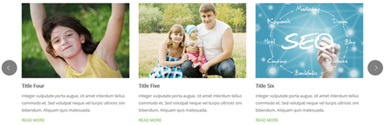
Below is the screen shot:
Codes are as follows:
<div class="carousel carousel_4" data-pagination="false" data-navigation="false" data-autoheight="false">
  <div class="item">
    <div class="photo_box content_top_increment">
      <div class="pic_box"> <img  src="/portals/23/Photo8.jpg" >
        <div class="content">
          <div class="vertical_center_1">
            <div class="vertical_center_2">
              <h3 class="increment_3">Modules Development</h3>
              <p  class="increment_2 ">content text ...</p>
              <div class="increment_1"> <a href="#" class="but">Read More</a></div>
            </div>
          </div>
        </div>
        <div class="shade"></div>
      </div>
    </div>
  </div>
  <div class="item">
    <div class="photo_box content_top_increment">
      <div class="pic_box"> <img  src="/portals/23/Photo2.jpg" >
        <div class="content">
          <div class="vertical_center_1">
            <div class="vertical_center_2">
              <h3 class="increment_3">Modules Development</h3>
              <p  class="increment_2 ">content text ...</p>
              <div class="increment_1"> <a href="#" class="but">Read More</a></div>
            </div>
          </div>
        </div>
        <div class="shade"></div>
      </div>
    </div>
  </div>
  <div class="item">
    <div class="photo_box content_top_increment">
      <div class="pic_box"> <img  src="/portals/23/Photo5.jpg" >
        <div class="content">
          <div class="vertical_center_1">
            <div class="vertical_center_2">
              <h3 class="increment_3">Modules Development</h3>
              <p  class="increment_2 ">content text ...</p>
              <div class="increment_1"> <a href="#" class="but">Read More</a></div>
            </div>
          </div>
        </div>
        <div class="shade"></div>
      </div>
    </div>
  </div>
  <div class="item">
    <div class="photo_box content_top_increment">
      <div class="pic_box"> <img  src="/portals/23/Photo6.jpg" >
        <div class="content">
          <div class="vertical_center_1">
            <div class="vertical_center_2">
              <h3 class="increment_3">Modules Development</h3>
              <p  class="increment_2 ">content text ...</p>
              <div class="increment_1"> <a href="#" class="but">Read More</a></div>
            </div>
          </div>
        </div>
        <div class="shade"></div>
      </div>
    </div>
  </div>
  <div class="item">
    <div class="photo_box content_top_increment">
      <div class="pic_box"> <img  src="/portals/23/Photo8.jpg" >
        <div class="content">
          <div class="vertical_center_1">
            <div class="vertical_center_2">
              <h3 class="increment_3">Modules Development</h3>
              <p  class="increment_2 ">content text ...</p>
              <div class="increment_1"> <a href="#" class="but">Read More</a></div>
            </div>
          </div>
        </div>
        <div class="shade"></div>
      </div>
    </div>
  </div>
  <div class="item">
    <div class="photo_box content_top_increment">
      <div class="pic_box"> <img  src="/portals/23/Photo2.jpg" >
        <div class="content">
          <div class="vertical_center_1">
            <div class="vertical_center_2">
              <h3 class="increment_3">Modules Development</h3>
              <p  class="increment_2 ">content text ...</p>
              <div class="increment_1"> <a href="#" class="but">Read More</a></div>
            </div>
          </div>
        </div>
        <div class="shade"></div>
      </div>
    </div>
  </div>
</div>
Style 5:
Below is the screen shot:

Codes are as follows:
<div data-autoheight="false" data-navigation="true" data-pagination="false" class="carousel carousel_8">
  <div class="item">
    <div class="photo_box content_bottom_push_in_2">
      <div class="pic_box"> <img alt="" src="/portals/23/Photo8.jpg" />
        <div class="content">
          <div class="vertical_center_1">
            <div class="vertical_center_2">
              <h3>Responsive Web</h3>
              <p>Donec libero. Suspendisse purus nec placerat bibendbibendum.</p>
              <div class="ico"><a href="#" target="blank"><span class="fa fa-link"></span> </a>
              <a class="LightBox_image_gallery4" href="/Portals/23/Photo8.jpg"><span class="fa-search fa"></span></a></div>
            </div>
          </div>
        </div>
        <div class="shade"></div>
      </div>
    </div>
  </div>
  <div class="item">
    <div class="photo_box content_bottom_push_in_2">
      <div class="pic_box"> <img alt="" src="/portals/23/Photo2.jpg" />
        <div class="content">
          <div class="vertical_center_1">
            <div class="vertical_center_2">
              <h3>Create Website</h3>
              <p>Donec libero. Suspendisse purus nec placerat bibendbibendum.</p>
              <div class="ico"><a href="#" target="blank"><span class="fa fa-link"></span> </a>
              <a class="LightBox_image_gallery4" href="/Portals/23/Photo2.jpg"><span class="fa-search fa"></span></a></div>
            </div>
          </div>
        </div>
        <div class="shade"></div>
      </div>
    </div>
  </div>
  <div class="item">
    <div class="photo_box content_bottom_push_in_2">
      <div class="pic_box"> <img alt="" src="/portals/23/Photo5.jpg" />
        <div class="content">
          <div class="vertical_center_1">
            <div class="vertical_center_2">
              <h3>DNN Modules</h3>
              <p>Donec libero. Suspendisse purus nec placerat bibendbibendum.</p>
              <div class="ico"><a href="#" target="blank"><span class="fa fa-link"></span> </a>
              <a class="LightBox_image_gallery4" href="/Portals/23/Photo5.jpg"><span class="fa-search fa"></span></a></div>
            </div>
          </div>
        </div>
        <div class="shade"></div>
      </div>
    </div>
  </div>
  <div class="item">
    <div class="photo_box content_bottom_push_in_2">
      <div class="pic_box"> <img alt="" src="/portals/23/Photo6.jpg" />
        <div class="content">
          <div class="vertical_center_1">
            <div class="vertical_center_2">
              <h3>Professional Work</h3>
              <p>Donec libero. Suspendisse purus nec placerat bibendbibendum.</p>
              <div class="ico"><a href="#" target="blank"><span class="fa fa-link"></span> </a>
              <a class="LightBox_image_gallery4" href="/Portals/23/Photo6.jpg"><span class="fa-search fa"></span></a></div>
            </div>
          </div>
        </div>
        <div class="shade"></div>
      </div>
    </div>
  </div>
  <div class="item">
    <div class="photo_box content_bottom_push_in_2">
      <div class="pic_box"> <img alt="" src="/portals/23/Photo8.jpg" />
        <div class="content">
          <div class="vertical_center_1">
            <div class="vertical_center_2">
              <h3>Site Settings</h3>
              <p>Donec libero. Suspendisse purus nec placerat bibendbibendum.</p>
              <div class="ico"><a href="#" target="blank"><span class="fa fa-link"></span> </a>
              <a class="LightBox_image_gallery4" href="/Portals/23/Photo8.jpg"><span class="fa-search fa"></span></a></div>
            </div>
          </div>
        </div>
        <div class="shade"></div>
      </div>
    </div>
  </div>
  <div class="item">
    <div class="photo_box content_bottom_push_in_2">
      <div class="pic_box"> <img alt="" src="/portals/23/Photo2.jpg" />
        <div class="content">
          <div class="vertical_center_1">
            <div class="vertical_center_2">
              <h3>Modules Development</h3>
              <p>Donec libero. Suspendisse purus nec placerat bibendbibendum.</p>
              <div class="ico"><a href="#" target="blank"><span class="fa fa-link"></span> </a>
              <a class="LightBox_image_gallery4" href="/Portals/23/Photo2.jpg"><span class="fa-search fa"></span></a></div>
            </div>
          </div>
        </div>
        <div class="shade"></div>
      </div>
    </div>
  </div>
  <div class="item">
    <div class="photo_box content_bottom_push_in_2">
      <div class="pic_box"> <img alt="" src="/portals/23/Photo5.jpg" />
        <div class="content">
          <div class="vertical_center_1">
            <div class="vertical_center_2">
              <h3>Modules Development</h3>
              <p>Donec libero. Suspendisse purus nec placerat bibendbibendum.</p>
              <div class="ico"><a href="#" target="blank"><span class="fa fa-link"></span> </a>
              <a class="LightBox_image_gallery4" href="/Portals/23/Photo5.jpg"><span class="fa-search fa"></span></a></div>
            </div>
          </div>
        </div>
        <div class="shade"></div>
      </div>
    </div>
  </div>
  <div class="item">
    <div class="photo_box content_bottom_push_in_2">
      <div class="pic_box"> <img alt="" src="/portals/23/Photo6.jpg" />
        <div class="content">
          <div class="vertical_center_1">
            <div class="vertical_center_2">
              <h3>Modules Development</h3>
              <p>Donec libero. Suspendisse purus nec placerat bibendbibendum.</p>
              <div class="ico"><a href="#" target="blank"><span class="fa fa-link"></span> </a>
              <a class="LightBox_image_gallery4" href="/Portals/23/Photo6.jpg"><span class="fa-search fa"></span></a></div>
            </div>
          </div>
        </div>
        <div class="shade"></div>
      </div>
    </div>
  </div>
  <div class="item">
    <div class="photo_box content_bottom_push_in_2">
      <div class="pic_box"> <img alt="" src="/portals/23/Photo8.jpg" />
        <div class="content">
          <div class="vertical_center_1">
            <div class="vertical_center_2">
              <h3>Modules Development</h3>
              <p>Donec libero. Suspendisse purus nec placerat bibendbibendum.</p>
              <div class="ico"><a href="#" target="blank"><span class="fa fa-link"></span> </a>
              <a class="LightBox_image_gallery4" href="/Portals/23/Photo8.jpg"><span class="fa-search fa"></span></a></div>
            </div>
          </div>
        </div>
        <div class="shade"></div>
      </div>
    </div>
  </div>
</div>
CSS3 Animations
You can click the link to check CSS3 Animations demo. Demo Link
Style 1:
This type is a group of effects which are displayed in time sequence. Below is the screen shot:
Codes are as follows:
<div class="animation">
  <div class="row mb-20">
    <div class="col-sm-3 animation_item scaleUp delay1"><img src="/portals/23/Photo2.jpg" /></div>
    <div class="col-sm-3 animation_item scaleUp delay2"><img src="/portals/23/Photo2.jpg" /></div>
    <div class="col-sm-3 animation_item scaleUp delay3"><img src="/portals/23/Photo2.jpg" /></div>
    <div class="col-sm-3 animation_item scaleUp delay4"><img src="/portals/23/Photo2.jpg" /></div>
  </div>
  <div class="row mb-20">
    <div class="col-sm-3 animation_item scaleUp delay5"><img src="/portals/23/Photo2.jpg" /></div>
    <div class="col-sm-3 animation_item scaleUp delay6"><img src="/portals/23/Photo2.jpg" /></div>
    <div class="col-sm-3 animation_item scaleUp delay7"><img src="/portals/23/Photo2.jpg" /></div>
    <div class="col-sm-3 animation_item scaleUp delay8"><img src="/portals/23/Photo2.jpg" /></div>
  </div>
  <div class="row">
    <div class="col-sm-3 animation_item scaleUp delay9"><img src="/portals/23/Photo2.jpg" /></div>
    <div class="col-sm-3 animation_item scaleUp delay10"><img src="/portals/23/Photo2.jpg" /></div>
    <div class="col-sm-3 animation_item scaleUp delay11"><img src="/portals/23/Photo2.jpg" /></div>
    <div class="col-sm-3 animation_item scaleUp delay12"><img src="/portals/23/Photo2.jpg" /></div>
  </div>
</div>
delay1, delay2, delay3, delay4 are used to control animation time, there are 12 time slots, which correspond to delay1~delay12 respectively.
scaleUp is used to control animation effect, there are scaleUp , bounceIn , bounceInDown , bounceInLeft , bounceInRight , bounceInUp , fadeIn , fadeInDown , fadeInLeft , fadeInRight , fadeInUp , fadeInDownBig , fadeInLeftBig , fadeInRightBig , fadeInUpBig , flip , flipInX , flipInY , lightSpeedIn , rotateIn , rotateInDownLeft , rotateInDownRight , rotateInUpLeft , rotateInUpRight , rollIn , zoomIn , zoomInDown , zoomInLeft , zoomInRight , zoomInUp 30 effects in total.
Style 2:
If you just need one animation effect, you can match with the following codes.
<div class="row">
  <div class="col-sm-3 animationhover bounce"> <img src="/portals/23/Photo3.jpg" /> </div>
  <div class="col-sm-3 animationhover flash"> <img src="/portals/23/Photo3.jpg" /> </div>
  <div class="col-sm-3 animationhover pulse"> <img src="/portals/23/Photo3.jpg" /> </div>
  <div class="col-sm-3 animationhover rubberBand"> <img src="/portals/23/Photo3.jpg" /> </div>
</div>
Style 3:
You can add animation for a certain element when mousing over. Codes are as follows:
<div class="animationhover bounce"> <img src="/portals/23/Photo4.jpg" /> </div>
When mousing over, it will show animation effect type (animationhover). There are bounce , flash , pulse , rubberBand , shake , swing , tada , wobble 8 effects.
Popovers
You can click the link to check Popovers demo. Demo Link
Below is the screen shot:
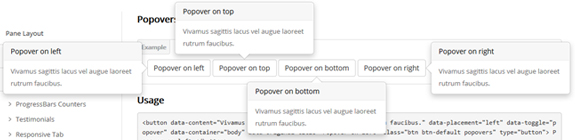
Codes are as follows:
<button data-content="Vivamus sagittis lacus vel augue laoreet rutrum faucibus." data-placement="left" data-toggle="popover"
data-container="body" data-original-title="Popover on left" class="btn btn-default popovers" type="button">
Popover on left
</button>
Option:
| Name | type | default | description |
|---|---|---|---|
| animation | boolean | true | apply a CSS fade transition to the tooltip |
| html | boolean | false | Insert HTML into the tooltip. If false, jQuery's text method will be used to insert content into the DOM. Use text if you're worried about XSS attacks. |
| placement | string | function | 'top' | how to position the tooltip - top | bottom | left | right | auto. When "auto" is specified, it will dynamically reorient the tooltip. For example, if placement is "auto left", the tooltip will display to the left when possible, otherwise it will display right. |
| selector | string | false | If a selector is provided, tooltip objects will be delegated to the specified targets. |
| title | string | function | '' | default title value if title attribute isn't present |
| trigger | string | 'hover focus' | how tooltip is triggered - click | hover | focus | manual. You may pass multiple triggers; separate them with a space. |
| delay | number | object | 0 | delay showing and hiding the tooltip (ms) - does not apply to manual trigger type If a number is supplied, delay is applied to both hide/show Object structure is: |
| container | string | false | false | Appends the tooltip to a specific element. Example: |
Alerts
You can click the link to check Alerts demo. Demo Link
Below is the screen shot:
Codes are as follows:
<div class="alert alert-warning fade in">
  <button aria-hidden="true" data-dismiss="alert" class="close" type="button">×</button>
  <strong>Holy guacamole!</strong> Best check yo self, you're not looking too good.
</div>
Option:
- You can change
alert-to change the color, there arealert-warning,alert-danger,alert-success,alert-info4 colors included in the effects. fadeis for hiddeninis for display
Tooltips
You can click the link to check Tooltips demo. Tooltips
Below is the screen shot:
Codes are as follows:
<a href="#" class="tooltips" data-toggle="tooltip" title="first tooltip">Hover over me</a>
Option:
| Name | type | default | description |
|---|---|---|---|
| animation | boolean | true | apply a CSS fade transition to the tooltip |
| html | boolean | false | Insert HTML into the tooltip. If false, jQuery's text method will be used to insert content into the DOM. Use text if you're worried about XSS attacks. |
| placement | string | function | 'top' | how to position the tooltip - top | bottom | left | right | auto. When "auto" is specified, it will dynamically reorient the tooltip. For example, if placement is "auto left", the tooltip will display to the left when possible, otherwise it will display right. |
| selector | string | false | If a selector is provided, tooltip objects will be delegated to the specified targets. |
| title | string | function | '' | default title value if title attribute isn't present |
| trigger | string | 'hover focus' | how tooltip is triggered - click | hover | focus | manual. You may pass multiple triggers; separate them with a space. |
| delay | number | object | 0 | delay showing and hiding the tooltip (ms) - does not apply to manual trigger type If a number is supplied, delay is applied to both hide/show Object structure is: |
| container | string | false | false | Appends the tooltip to a specific element. Example: |
Dropdowns
You can click the link to check Dropdowns demo. Demo Link
Style 1:
Below is the screen shot:
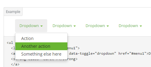
Codes are as follows:
<ul class="nav nav-pills">
  <li class="dropdown" id="menu1">
  <a class="dropdown-toggle" data-toggle="dropdown" href="#menu1">Dropdown
  <strong class="caret"></strong>
  </a>
    <ul class="dropdown-menu">
      <li><a href="#">Action</a></li>
      <li><a href="#">Another action</a></li>
      <li><a href="#">Something else here</a></li>
    </ul>
  </li>
</ul>
Style 2:
Below is the screen shot:
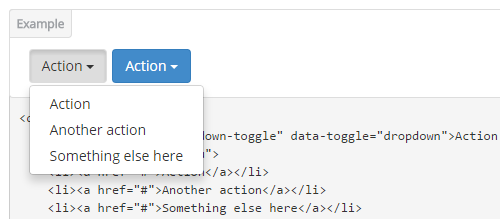
Codes are as follows:
<div class="btn-group">
  <button class="btn dropdown-toggle" data-toggle="dropdown">Action <span class="caret"></span></button>
  <ul class="dropdown-menu">
    <li><a href="#">Action</a></li>
    <li><a href="#">Another action</a></li>
    <li><a href="#">Something else here</a></li>
  </ul>
</div>
Style 3:
Below is the screen shot:
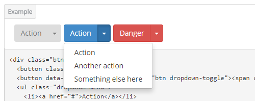
Codes are as follows:
<div class="btn-group">
  <button class="btn">Action</button>
  <button data-toggle="dropdown" class="btn dropdown-toggle"><span class="caret"></span></button>
  <ul class="dropdown-menu">
    <li><a href="#">Action</a></li>
    <li><a href="#">Another action</a></li>
    <li><a href="#">Something else here</a></li>
  </ul>
</div>
LightBox
You can click the link to check LightBox demo. Demo Link
Below is the screen shot:
Option:
1. LightBox_image |
Show one image alone. |
2. LightBox_image_gallery+group number |
Classify those that share the same class name to one group, you can show other images within the group by clicking left and right arrow of the image. |
3. LightBox_image_group |
Classify these sub levels whose label class name is LightBox_image_group into one group. |
4. LightBox_youtube |
Show youtube video. |
5. LightBox_vimeo |
Show video. |
6. LightBox_gmaps |
Shown map. |
7. LightBox_youtube_gallery+group number |
Classify these that share the same class name into a group of youtube video show |
8. LightBox_vimeo_gallery+group number |
Classify these that share the same class name into a group of video show. |
9. LightBox_gmaps_gallery+group number |
Classify these that share the same class name into a group of map show. |
10. LightBox_youtube_group |
Classify these sub levels whose label class name is LightBox_youtube_group into one group. |
11. LightBox_vimeo_group |
Classify these sub levels whose label class name is LightBox_vimeo_group into one group. |
12. LightBox_gmaps_group |
Classify these sub levels whose label class names is LightBox_gmaps_group into one group. |
13. LightBox_Box |
Take div as layer pop up, div needs to hide by default. Style of pop up is custom style. |
14. LightBox_ajax |
Pop up a page |
15. LightBox_ajax_group |
Pop up a group of pages |
You need to fill url of the pop up image(video, map) in href=""
1.LightBox_image
<a href="bigPhoto.jpg" class="LightBox_image" title="Single Image 1"><img alt="" src="cover.jpg" /></a>
2.LightBox_image_gallery
<a href="bigPhoto1.jpg" class="LightBox_image_gallery1" title="Single Image 1"><img alt="" src="cover.jpg" /></a>
<a href="bigPhoto2.jpg" class="LightBox_image_gallery1" title="Single Image 1"><img alt="" src="cover.jpg" /></a>
<a href="bigPhoto3.jpg" class="LightBox_image_gallery2" title="Single Image 2"><img alt="" src="cover.jpg" /></a>
<a href="bigPhoto4.jpg" class="LightBox_image_gallery2" title="Single Image 2"><img alt="" src="cover.jpg" /></a>
3.LightBox_image_group
<div class="LightBox_image_group">
    <a href="bigPhoto1.jpg" title=" People Scenery 1"><img alt="" src="cover.jpg" /> </a>
    <a href="bigPhoto2.jpg" title=" People Scenery 2"></a>
    <a href="bigPhoto3.jpg" title=" People Scenery 3"></a>
</div>
4.LightBox_youtube
<a href="http://www.youtube.com/watch?v=0O2aH4XLbto" class="LightBox_youtube" title="youtube"><img alt="" src="cover.jpg" /></a>
5.LightBox_vimeo
<a href="https://vimeo.com/45830194" class="LightBox_vimeo" title="vimeo"><img alt="" src="cover.jpg" /></a>
6.LightBox_gmaps
<a href="https://maps.google.com/maps?q=221B+Baker+Street,+London,+United+Kingdom&hl=en&t=v&hnear=221B+Baker+St,+London+NW1+6XE,+United+Kingdom" class="LightBox_gmaps" title="gmaps"><img alt="" src="cover.jpg" /></a>
7.LightBox_youtube_gallery
<a href="http://www.youtube.com/watch?v=0O2aH4XLbto" class="LightBox_youtube_gallery1" title="youtube gallery"><img alt="" src="cover.jpg" /></a>
<a href="http://www.youtube.com/watch?v=0O2aH4XLbto" class="LightBox_youtube_gallery1" title="youtube gallery"><img alt="" src="cover.jpg" /></a>
<a href="http://www.youtube.com/watch?v=0O2aH4XLbto" class="LightBox_youtube_gallery2" title="youtube gallery"><img alt="" src="cover.jpg" /></a>
<a href="http://www.youtube.com/watch?v=0O2aH4XLbto" class="LightBox_youtube_gallery2" title="youtube gallery"><img alt="" src="cover.jpg" /></a>
8.LightBox_vimeo_gallery
<a href="https://vimeo.com/45830194" class="LightBox_vimeo_gallery1" title="vimeo gallery"><img alt="" src="cover.jpg" /></a>
<a href="https://vimeo.com/45830194" class="LightBox_vimeo_gallery1" title="vimeo gallery"><img alt="" src="cover.jpg" /></a>
<a href="https://vimeo.com/45830194" class="LightBox_vimeo_gallery2" title="vimeo gallery"><img alt="" src="cover.jpg" /></a>
<a href="https://vimeo.com/45830194" class="LightBox_vimeo_gallery2" title="vimeo gallery"><img alt="" src="cover.jpg" /></a>
9.LightBox_gmaps_gallery
<a href="https://maps.google.com/maps?q=221B+Baker+Street,+London,+United+Kingdom&hl=en&t=v&hnear=221B+Baker+St,+London+NW1+6XE,+United+Kingdom" class="LightBox_gmaps_gallery1" title="gmaps gallery"><img alt="" src="cover.jpg" /></a>
<a href="https://maps.google.com/maps?q=221B+Baker+Street,+London,+United+Kingdom&hl=en&t=v&hnear=221B+Baker+St,+London+NW1+6XE,+United+Kingdom" class="LightBox_gmaps_gallery1" title="gmaps gallery"><img alt="" src="cover.jpg" /></a>
<a href="https://maps.google.com/maps?q=221B+Baker+Street,+London,+United+Kingdom&hl=en&t=v&hnear=221B+Baker+St,+London+NW1+6XE,+United+Kingdom" class="LightBox_gmaps_gallery2" title="gmaps gallery"><img alt="" src="cover.jpg" /></a>
<a href="https://maps.google.com/maps?q=221B+Baker+Street,+London,+United+Kingdom&hl=en&t=v&hnear=221B+Baker+St,+London+NW1+6XE,+United+Kingdom" class="LightBox_gmaps_gallery2" title="gmaps gallery"><img alt="" src="cover.jpg" /></a>
10.LightBox_youtube_group
<div class="LightBox_youtube_group">
    <a href="http://www.youtube.com/watch?v=0O2aH4XLbto" title=" youtube 1"><img alt="" src="cover.jpg" /> </a>
    <a href="http://www.youtube.com/watch?v=0O2aH4XLbto" title=" youtube 2"></a>
    <a href="http://www.youtube.com/watch?v=0O2aH4XLbto" title=" youtube 3"></a>
</div>
11.LightBox_vimeo_group
<div class="LightBox_vimeo_group">
    <a href="https://vimeo.com/45830194" title=" vimeo 1"><img alt="" src="cover.jpg" /> </a>
    <a href="https://vimeo.com/45830194" title=" vimeo 2"></a>
    <a href="https://vimeo.com/45830194" title=" vimeo 3"></a>
</div>
12.LightBox_gmaps_group
<div class="LightBox_gmaps_group">
    <a href="https://maps.google.com/maps?q=221B+Baker+Street,+London,+United+Kingdom&hl=en&t=v&hnear=221B+Baker+St,+London+NW1+6XE,+United+Kingdom" title=" gmaps 1"><img alt="" src="cover.jpg" /> </a>
    <a href="https://maps.google.com/maps?q=221B+Baker+Street,+London,+United+Kingdom&hl=en&t=v&hnear=221B+Baker+St,+London+NW1+6XE,+United+Kingdom" title=" gmaps 2"></a>
    <a href="https://maps.google.com/maps?q=221B+Baker+Street,+London,+United+Kingdom&hl=en&t=v&hnear=221B+Baker+St,+London+NW1+6XE,+United+Kingdom" title=" gmaps 3"></a>
</div>
13.LightBox_Box
<a href=".LightBox_Content" class="LightBox_Box"> Click Here To Pop </a>
<a href=".LightBox_Content" class="LightBox_Box Button_default"> Click Here To Pop </a>
<div class="LightBox_Content">
    <h3>Click Here To Pop</h3>
 	  content text ...
</div>
14.LightBox_ajax
<a href="index.aspx" class="LightBox_ajax" title="ajax"><img alt="" src="cover.jpg" /></a>
15.LightBox_ajax_group
<div class="LightBox_ajax_group">
    <a href="index.aspx" title=" ajax 1"><img alt="" src="cover.jpg" /> </a>
    <a href="index.aspx" title=" ajax 2"></a>
    <a href="index.aspx" title=" ajax 3"></a>
</div>
Image Effects
You can click the link to check Image Effects demo. Demo Link
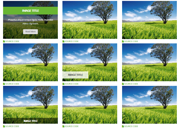
- You can copy over codes of the image effects directly to any HTML modules.
- You can change the font icon through modifying. font icon list
Flip Box
You can click the link to check Flip Box demo. Demo Link
Style 1:
Below is the screen shot:
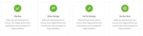
Codes are as follows:
<div class="row">
  <div class="col-sm-3">
    <div class="flip_box flip_box_1">
      <div class="rotate">
        <div class="front"> <span class="fa fa-line-chart"></span>
          <h3>Flip Box</h3>
          <p>content text ...</p>
        </div>
        <div class="back">
          <h3>Flip Box</h3>
          <p>content text ...</p>
          <a href="#" class="but">Read More</a> </div>
      </div>
    </div>
  </div>
  <div class="col-sm-3">
    <div class="flip_box flip_right flip_box_1">
      <div class="rotate">
        <div class="front"> <span class="fa fa-mail-forward"></span>
          <h3>SHare Design</h3>
          <p>content text ...</p>
        </div>
        <div class="back">
          <h3>SHare Design</h3>
          <p>content text ...</p>
          <a href="#" class="but">Read More</a> </div>
      </div>
    </div>
  </div>
  <div class="col-sm-3">
    <div class="flip_box flip_top flip_box_1">
      <div class="rotate">
        <div class="front"> <span class="fa fa-wrench"></span>
          <h3>Go To Settings</h3>
          <p>content text ...</p>
        </div>
        <div class="back">
          <h3>Go To Settings</h3>
          <p>content text ...</p>
          <a href="#" class="but">Read More</a> </div>
      </div>
    </div>
  </div>
  <div class="col-sm-3">
    <div class="flip_box flip_bottom flip_box_1">
      <div class="rotate">
        <div class="front"> <span class="fa fa-soccer-ball-o"></span>
          <h3>Do Our Best</h3>
          <p>content text ...</p>
        </div>
        <div class="back">
          <h3>Do Our Best</h3>
          <p>content text ...</p>
          <a href="#" class="but">Read More</a> </div>
      </div>
    </div>
  </div>
</div>
Option:
col-sm-3is the width of each column, you can change the width you need through value1~12.frontis for front content.backis for back content.
Style 2:
Below is the screen shot:
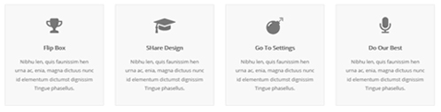
Codes are as follows:
<div class="row">
  <div class="col-sm-3">
    <div class="flip_box flip_box_2">
      <div class="rotate">
        <div class="front"> <span class="fa fa-trophy"></span>
          <h3>Flip Box</h3>
          <p>content text ...</p>
        </div>
        <div class="back">
          <h3>Flip Box</h3>
          <p>content text ...</p>
        </div>
      </div>
    </div>
  </div>
  <div class="col-sm-3">
    <div class="flip_box flip_right flip_box_2">
      <div class="rotate">
        <div class="front"> <span class="fa fa-mortar-board"></span>
          <h3>SHare Design</h3>
          <p>content text ...</p>
        </div>
        <div class="back">
          <h3>SHare Design</h3>
          <p>content text ...</p>
        </div>
      </div>
    </div>
  </div>
  <div class="col-sm-3">
    <div class="flip_box flip_top flip_box_2">
      <div class="rotate">
        <div class="front"> <span class="fa fa-bomb"></span>
          <h3>Go To Settings</h3>
          <p>content text ...</p>
        </div>
        <div class="back">
          <h3>Go To Settings</h3>
          <p>content text ...</p>
        </div>
      </div>
    </div>
  </div>
  <div class="col-sm-3">
    <div class="flip_box flip_bottom flip_box_2">
      <div class="rotate">
        <div class="front"> <span class="fa fa-microphone"></span>
          <h3>Do Our Best</h3>
          <p>content text ...</p>
        </div>
        <div class="back">
          <h3>Do Our Best</h3>
          <p>content text ...</p>
        </div>
      </div>
    </div>
  </div>
</div>
Style 3:
Below is the screen shot:
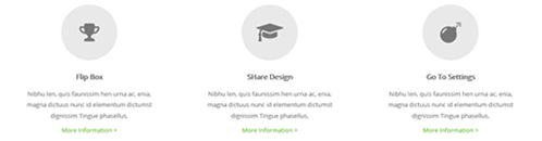
Codes are as follows:
<div class="row">
<div class="col-sm-4">
  <div class="flip_box flip_box_3">
    <div class="rotate">
      <div class="front"> <span class="fa fa-trophy"></span>
        <h3>Flip Box</h3>
        <p>content text ...</p>
        <a href="#">More Information ></a> </div>
      <div class="back">
        <h3>Flip Box</h3>
        <p>content text ...</p>
        <a href="#" class="but">Read More</a> </div>
    </div>
  </div>
</div>
<div class="col-sm-4">
  <div class="flip_box flip_right flip_box_3">
    <div class="rotate">
      <div class="front"> <span class="fa fa-mortar-board"></span>
        <h3>SHare Design</h3>
        <p>content text ...</p>
        <a href="#">More Information ></a> </div>
      <div class="back">
        <h3>SHare Design</h3>
        <p>content text ...</p>
        <a href="#" class="but">Read More</a> </div>
    </div>
  </div>
</div>
<div class="col-sm-4">
  <div class="flip_box flip_top flip_box_3">
    <div class="rotate">
      <div class="front"> <span class="fa fa-bomb"></span>
        <h3>Go To Settings</h3>
        <p>content text ...</p>
        <a href="#">More Information ></a> </div>
      <div class="back">
        <h3>Go To Settings</h3>
        <p>content text ...</p>
        <a href="#" class="but">Read More</a> </div>
    </div>
  </div>
</div>
Responsive Video
Ratio between width and height of the video needs to be 16:9.
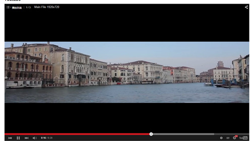
<div class="responsive-video">
    <iframe width="853" height="480" src="//www.youtube.com/embed/XcpOsJQXcx4?list=UUIkFV7_2tEhhEhh1NkkwTUw" frameborder="0" allowfullscreen></iframe>
</div>
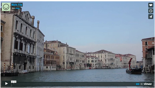
<div class="responsive-video">
    <iframe src="//player.vimeo.com/video/106249100" width="1920" height="1080" frameborder="0" webkitallowfullscreen mozallowfullscreen allowfullscreen></iframe>
</div>
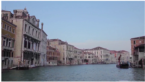
<div class="responsive-video">
     <embed  src="/portals/37/movie.swf" type="application/x-shockwave-flash" allownetworking="all" allowfullscreen="true" allowscriptaccess="always" wmode="Opaque"></embed>
</div>
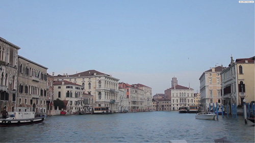
<div class="responsive-video">
    <video width="1920" height="1080"  controls="true">
    <source src="/portals/37/movie.m4v" type="video/mp4"></source>
    <source src="/portals/37/movie.ogv" type="video/ogg"></source>
    <source src="/portals/37/movie.webm" type="video/WebM"></source>
    Your browser does not support the video tag. </video>
</div>
Video Bg
You can click the link to check Video Bg demo. Demo Link
Style 1
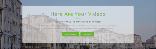
- "{videoURL:'npfu0fN9GUA' is the url of
youtube autoPlayis for whether to autoplay or nottrue/falseloopis for whether to play on a loop,true/false
<div data-property="{videoURL:'npfu0fN9GUA',containment:'self', showControls:false, autoPlay:true, loop:true, vol:50, mute:true, startAt:10, opacity:1, addRaster:false, quality:'hd1080'}"
class="player">
<div class="Play"></div>
<div class="dnn_layout pt-60 pb-60">
<div class="content_mid clearfix">
<div class="player_boxes">
<h1 class="player_title"> Here Are Your Videos</h1>
<hr class="player_line" />
<h4 class="player_smalltitle">YOU CAN CHANGE THE BACKGROUND BY YOURSELF</h4>
<div class="player_content">
<p>Content Text 1 ... </p>
</div>
<p> <a class="Button_default" href="#"> VIEW PORTFOLIOS</a> <a class="Button_default" href="#"> LEARN MORE</a> </p>
</div>
</div>
</div>
</div>
Style 2
You can click the link to check Video Bg demo. Demo Link
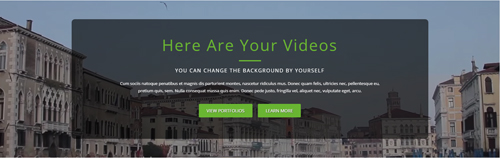
<div data-property="{videoURL:'npfu0fN9GUA',containment:'self', showControls:false, autoPlay:true, loop:true, vol:50, mute:true, startAt:10, opacity:1, addRaster:false, quality:'hd1080'}"
    class="player">
  <div class="Play"></div>
  <div class="dnn_layout pt-60 pb-60">
    <div class="content_mid clearfix">
      <div class="player_boxes dark">
        <h1 class="player_title"> Here Are Your Videos</h1>
        <hr class="player_line" />
        <h4 class="player_smalltitle">YOU CAN CHANGE THE BACKGROUND BY YOURSELF</h4>
        <div class="player_content">
          <p>Content Text 1 ... </p>
        </div>
        <p> <a class="Button_default" href="#"> VIEW PORTFOLIOS</a>     <a class="Button_default" href="#"> LEARN MORE</a> </p>
      </div>
    </div>
  </div>
</div>
Home Page Codes
This includes the html introductions that required for Home1~Home7 page, ComingSoon page, Boxed Layout page.
Home Version 1 (Home)
You can click the link to check Home Version 1 (home) demo. Home Version 1 (Home)
Contact Us area
Below is the screen shot:

Codes are as follows:
<ul class="Header_Info">
  <li> <span class="fa  fa-phone"></span> Call Us : (+088) - 0123 - 456 789 </li>
  <li> <span class="fa fa-envelope"></span> Email Us : dnnskindev@gmail.com </li>
</ul>
Banner area
Below is the screen shot:

It is using DNNGo LayerGalleryPro module here, you can import ContentListEntity-Home1.xml of the DNNGo_LayerGalleryPro folder to duplicate banner of the demo.
Message Box area
Below is the screen shot:
Codes are as follows:
<div class="MessageBox  animation scaleUp pb-10 pt-10">
  <div class="Message_Icon"> <span class="trumpet fa fa-volume-up"></span> </div>
  <div class="MessageRightBox">
    <div class="Message_Content">
      <h3> We offer a large variety of custom DNN modules. </h3>
      <p> Content Text1...</p>
    </div>
    <div class="Message_Button"> <a href="#" target="blank" class="Button_default">Purchase This Theme</a> </div>
  </div>
</div>
Option:
- You can modify
animation scaleUpto change the animation on the slide..Animation list.
Function Box area
Below is the screen shot:
Codes are as follows:
<div class="functionList row">
  <div class="functionBox col-sm-4 pb-30 animation flipInY">
    <div class="functionIcon"><span class="fa fa-headphones"></span></div>
    <div class="functiontitle"> Listen to Music <span>To Relax your mood</span></div>
    <div class="functionMain">
      <p>content text ... </p>
      <a target="blank" href="#">Read More  ></a> </div>
  </div>
  <div class="functionBox col-sm-4 pb-30 animation flipInY">
    <div class="functionIcon"><span class="fa fa-repeat"></span> </div>
    <div class="functiontitle"> Revocation<span> avoid losing data</span></div>
    <div class="functionMain">
      <p> content text ... </p>
      <a target="blank" href="#">Read More  ></a> </div>
  </div>
  <div class="functionBox col-sm-4 pb-30 animation flipInY">
    <div class="functionIcon"> <span class="fa fa-cog"></span></div>
    <div class="functiontitle">Settings<span>Better ease of use</span> </div>
    <div class="functionMain">
      <p> content text ... </p>
      <a target="blank" href="#">Read More  ></a> </div>
  </div>
</div>
Option:
- You can modify
animation fadeInRightto change the animation on the slide..Animation list. col-sm-4is the width for each column. You can change the width you need through value1~12- You can modify
fa fa-conversationto change icons. font icon list.
About Us area
Below is the screen shot:
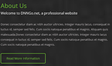
Codes are as follows:
<div class="backgroundImage23">
  <div class="dnn_layout">
    <div class="content_mid clearfix">
      <div class="home1_full_bg1">
        <div class="home1_head animation fadeInLeft">
          <h4 class="pb-10">About Us</h4>
          <h3 class="pb-20">Welcome to DNNGo.net, a professional website</h3>
          <div class="line"></div>
        </div>
        <div class="animation fadeInLeft">
          <p>Content Text1...</p>
          <div class="home1_full_bg1_btn"><a class="Button_default" href="#" target="blank">Read More Information</a></div>
        </div>
      </div>
      <div class="home1_full_bg1_r"> </div>
    </div>
  </div>
</div>
Option:
- You can modify
animationto change and delete animation. Animation list.
Check Our Work area
Below is the screen shot:
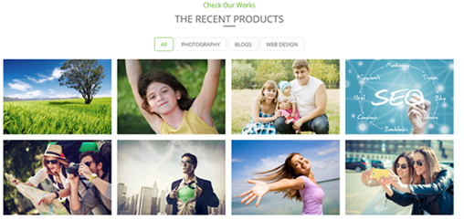
Codes are as follows:
<h3 class="common_h3">Check Our Works</h3>
<h4 class="common_h4">The Recent Products</h4>
<div class="isotope_grid animation scaleUp">
  <div class="isotope_group2 isotope_group">
  <a class="active" href="#" data-filter="*">All</a>
  <a href="#" data-filter=".photography">PHOTOGRAPHY</a>
  <a href="#" data-filter=".blogs">BLOGS</a>
  <a href="#" data-filter=".webdesign">WEB DESIGN</a>
  </div>
  <div class="loading">
    <div class="loading-container container1">
      <div class="circle1"></div>
      <div class="circle2"></div>
      <div class="circle3"></div>
      <div class="circle4"></div>
    </div>
    <div class="loading-container container2">
      <div class="circle1"></div>
      <div class="circle2"></div>
      <div class="circle3"></div>
      <div class="circle4"></div>
    </div>
    <div class="loading-container container3">
      <div class="circle1"></div>
      <div class="circle2"></div>
      <div class="circle3"></div>
      <div class="circle4"></div>
    </div>
  </div>
  <div class="isotope_main" data-min-width="270">
    <div class="isotope_item photography blogs">
      <div class="photo_box">
        <div class="pic_box"> <img alt="" src="/portals/23/Photo8.jpg" />
          <div class="content">
            <div class="vertical_center_1">
              <div class="vertical_center_2">
                <div class="ico">
                <a href="#" target="blank"><span class="fa fa-link"></span></a>
                <a href="/Portals/23/Photo8.jpg" class="LightBox_image_gallery1"><span class="fa fa-search"></span></a>
                </div>
                <h2>Photo1</h2>
                <p>May 12 , 2013</p>
              </div>
            </div>
          </div>
          <div class="shade"></div>
        </div>
      </div>
    </div>
    <div class="isotope_item blogs webdesign">
      <div class="photo_box">
        <div class="pic_box"> <img alt="" src="/portals/23/Photo2.jpg" />
          <div class="content">
            <div class="vertical_center_1">
              <div class="vertical_center_2">
                <div class="ico">
                <a href="#" target="blank"><span class="fa fa-link"></span></a>
                <a href="/Portals/23/Photo2.jpg" class="LightBox_image_gallery1"><span class="fa fa-search"></span></a>
                </div>
                <h2>Photo2</h2>
                <p>May 12 , 2013</p>
              </div>
            </div>
          </div>
          <div class="shade"></div>
        </div>
      </div>
    </div>
    <div class="isotope_item photography webdesign">
      <div class="photo_box">
        <div class="pic_box"> <img alt="" src="/portals/23/Photo5.jpg" />
          <div class="content">
            <div class="vertical_center_1">
              <div class="vertical_center_2">
                <div class="ico">
                <a href="#" target="blank"><span class="fa fa-link"></span></a>
                <a href="/Portals/23/Photo5.jpg" class="LightBox_image_gallery1"><span class="fa fa-search"></span></a>
                </div>
                <h2>Photo3</h2>
                <p>May 12 , 2013</p>
              </div>
            </div>
          </div>
          <div class="shade"></div>
        </div>
      </div>
    </div>
    <div class="isotope_item blogs webdesign">
      <div class="photo_box">
        <div class="pic_box"> <img alt="" src="/portals/23/Photo6.jpg" />
          <div class="content">
            <div class="vertical_center_1">
              <div class="vertical_center_2">
                <div class="ico">
                <a href="#" target="blank"><span class="fa fa-link"></span></a>
                <a href="/Portals/23/Photo6.jpg" class="LightBox_image_gallery1"><span class="fa fa-search"></span></a>
                </div>
                <h2>Photo4</h2>
                <p>March 10 , 2013</p>
              </div>
            </div>
          </div>
          <div class="shade"></div>
        </div>
      </div>
    </div>
    <div class="isotope_item photography webdesign">
      <div class="photo_box">
        <div class="pic_box"> <img alt="" src="/portals/23/Photo11.jpg" />
          <div class="content">
            <div class="vertical_center_1">
              <div class="vertical_center_2">
                <div class="ico">
                <a href="#" target="blank"><span class="fa fa-link"></span></a>
                <a href="/Portals/23/Photo11.jpg" class="LightBox_image_gallery1"><span class="fa fa-search"></span></a>
                </div>
                <h2>Photo5</h2>
                <p>June 19 , 2013</p>
              </div>
            </div>
          </div>
          <div class="shade"></div>
        </div>
      </div>
    </div>
    <div class="isotope_item blogs">
      <div class="photo_box">
        <div class="pic_box"> <img alt="" src="/portals/23/Photo12.jpg" />
          <div class="content">
            <div class="vertical_center_1">
              <div class="vertical_center_2">
                <div class="ico">
                <a href="#" target="blank"><span class="fa fa-link"></span></a>
                <a href="/Portals/23/Photo12.jpg" class="LightBox_image_gallery1"><span class="fa fa-search"></span></a>
                </div>
                <h2>Photo6</h2>
                <p>July 28 , 2013</p>
              </div>
            </div>
          </div>
          <div class="shade"></div>
        </div>
      </div>
    </div>
    <div class="isotope_item photography blogs">
      <div class="photo_box">
        <div class="pic_box"> <img alt="" src="/portals/23/Photo13.jpg" />
          <div class="content">
            <div class="vertical_center_1">
              <div class="vertical_center_2">
                <div class="ico">
                <a href="#" target="blank"><span class="fa fa-link"></span></a>
                <a href="/Portals/23/Photo13.jpg" class="LightBox_image_gallery1"><span class="fa fa-search"></span></a>
                </div>
                <h2>Photo7</h2>
                <p>July 12 , 2012</p>
              </div>
            </div>
          </div>
          <div class="shade"></div>
        </div>
      </div>
    </div>
    <div class="isotope_item blogs">
      <div class="photo_box">
        <div class="pic_box"> <img alt="" src="/portals/23/Photo10.jpg" />
          <div class="content">
            <div class="vertical_center_1">
              <div class="vertical_center_2">
                <div class="ico">
                <a href="#" target="blank"><span class="fa fa-link"></span></a>
                <a href="/Portals/23/Photo10.jpg" class="LightBox_image_gallery1"><span class="fa fa-search"></span></a>
                </div>
                <h2>Photo8</h2>
                <p>July 06 , 2012</p>
              </div>
            </div>
          </div>
          <div class="shade"></div>
        </div>
      </div>
    </div>
  </div>
</div>
<br />
Option:
- You can add
<a data-filter=".FilterName" href="#">Filter Name</a>to increase categories.data-filter=".FilterName"can not be blank space. - You can modify
data-min-widthto change minimum width of image. - You can modify
isotope_itemFilterNameto categorize images. - You can modify
animationto change or delete animation.Animation list.
ProgressBars Counters area
Below is the screen shot:
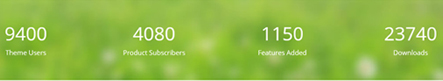
Codes are as follows:
This is a ProgressBars Counters effect. ProgressBars Counters
<div class="backgroundImage24 pb-50 pt-50">
  <div class="dnn_layout animation scaleUp">
    <div class="content_mid">
      <div class=" row number_Animation_3">
        <div class="col-sm-3"> <span class="animation  number" data-number="9400">0</span><span class="font">Theme Users </span> </div>
        <div class="col-sm-3"> <span class="animation  number" data-number="4080">0</span> <span class="font"> Product Subscribers </span> </div>
        <div class="col-sm-3"> <span class="animation  number" data-number="1150">0</span><span class="font">Features Added </span> </div>
        <div class="col-sm-3"> <span class="animation  number" data-number="23740">0</span> <span class="font"> Downloads</span> </div>
      </div>
    </div>
  </div>
</div>
Option:
- You can modify
animation scaleUpto change the animation on the slide. Animation list. col-sm-3is the width for each column. You can change the width you need through value1~12- You can modify
data-numberto change number.
Our Team area
Below is the screen shot:
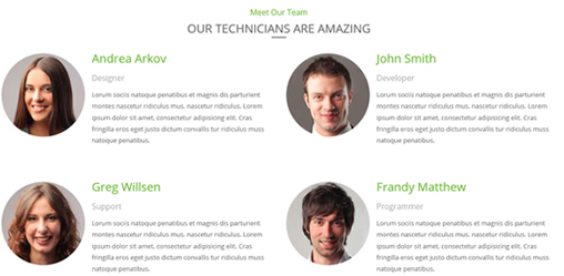
Codes are as follows:
<div class="out_team">
  <h3 class="common_h3 animation fadeInDown">Meet Our Team</h3>
  <h4 class="common_h4 animation fadeInDown">our technicians are amazing</h4>
  <div class="row">
    <div class="col-sm-6 animation fadeInDown">
      <div class="introduce_box"> <img alt="" class="img-responsive" src="/portals/23/member1.jpg" />
        <div class="introduce member1">
          <h3>Andrea Arkov</h3>
          <h4>Designer</h4>
          <p>Content Text1...</p>
        </div>
      </div>
    </div>
    <div class="col-sm-6 animation fadeInDown">
      <div class="introduce_box"> <img alt="" class="img-responsive" src="/portals/23/member2.jpg" />
        <div class="introduce member2">
          <h3>John Smith</h3>
          <h4>Developer</h4>
          <p>Content Text2...</p>
        </div>
      </div>
    </div>
  </div>
  <div class="row">
    <div class="col-sm-6 animation fadeInUp">
      <div class="introduce_box"> <img alt="" class="img-responsive" src="/portals/23/member3.jpg" />
        <div class="introduce member3">
          <h3>Greg Willsen</h3>
          <h4>Support</h4>
          <p>Content Text3... </p>
        </div>
      </div>
    </div>
    <div class="col-sm-6 animation fadeInUp">
      <div class="introduce_box"> <img alt="" class="img-responsive" src="/portals/23/member4.jpg" />
        <div class="introduce member4">
          <h3>Frandy Matthew</h3>
          <h4>Programmer</h4>
          <p>Content Text4... </p>
        </div>
      </div>
    </div>
  </div>
</div>
Option:
- You can modify
animation scaleUpto change the animation on the slide. Animation list. col-sm-4is the width for each column. You can change the width you need through value1~12
Testimonials area
Below is the screen shot:

isotope follows:
 <div class="backgroundImage25 pb-60 pt-60">
  <div class="dnn_layout scaleUp animation">
    <div class="content_mid">
      <h4 class="common_h4"> Testimonials  About Us</h4>
      <ul data-display-navigation="false" data-autoplay="0" data-position="roll-left" class=" Testimonials_tab Testimonials_7">
        <li>
          <blockquote>
            <p><span class="Pic"><img alt="" src="/portals/23/team_pic_1.jpg" /></span>Content Text1...</p>
            <small><span>Chrissie Hall </span> </small> </blockquote>
        </li>
        <li>
          <blockquote>
            <p><span class="Pic"><img alt="" src="/portals/23/team_pic_2.jpg" /></span>Content Text2...</p>
            <small><span>Aaron</span></small> </blockquote>
        </li>
        <li>
          <blockquote>
            <p><span class="Pic"><img alt="" src="/portals/23/team_pic_3.jpg" /> </span>Content Text3...</p>
            <small><span>James Divine</span></small> </blockquote>
        </li>
        <li>
          <blockquote>
            <p><span class="Pic"><img alt="" src="/portals/23/team_pic_4.jpg" /></span> Content Text4...</p>
            <small><span>John Barclay </span> </small> </blockquote>
        </li>
      </ul>
    </div>
  </div>
</div>
Option:
- This is a
Testimonialseffect.You can modifyTestimonialsto change image effects. Testimonials - You can modify
animation scaleUpto change the animation on the slide. Animation list.
Our Services area
Below is the screen shot:
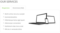
Codes are as follows:
<div class="horizontalTab_Top animation fadeInLeft">
  <ul class="resp-tabs-list">
    <li><span>Responsive</span></li>
    <li><span>ECommerce Web</span></li>
  </ul>
  <div class="resp-tabs-container">
    <div class="resp_container">
      <div class="resp_margin">
        <ul class="OurServices_list">
          <li><a href="#" target="blank">Morbi vel dui nec arcu suscipit</a></li>
          <li><a href="#" target="blank">Euismod  phasellus </a></li>
          <li><a href="#" target="blank">Pellentesque lectus eget quam </a></li>
          <li><a href="#" target="blank">Ullamcorper consectetur </a></li>
          <li><a href="#" target="blank"> Vestibulum vitae risus a erat </a></li>
          <li><a href="#" target="blank">Ollis lac in venenatis tellus </a></li>
        </ul>
        <div class="OurServices_Pic"><img alt="" src="/portals/23/Services_Pic.jpg" /> </div>
      </div>
    </div>
    <div class="resp_container">
      <div class="resp_margin">
        <ul class="OurServices_list">
          <li><a href="#" target="blank">DNN Design & Skin </a></li>
          <li><a href="#" target="blank">Module Development </a></li>
          <li><a href="#" target="blank">Unlimited-color Skin </a></li>
          <li><a href="#" target="blank">Create DNN Website </a></li>
          <li><a href="#" target="blank">Information About Us</a></li>
          <li><a href="#" target="blank">Popular Products</a></li>
        </ul>
        <div class="OurServices_Pic"><img alt="" src="/portals/23/Services_Pic.jpg" class="animate-element" /> </div>
      </div>
    </div>
  </div>
</div>
Option:
- This is a
ResponsiveTabeffect. ResponsiveTab - You can modify
animation scaleUpto change the animation on the slide. Animation list.
Information area
Below is the screen shot:
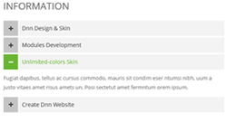
Codes are as follows:
<div id="accordion2" class="panel-group accordion_2 animation fadeInRight">
  <div class="panel panel-default">
    <div class="panel-heading">
      <h4 class="panel-title">
      <a href="#item2_1" data-parent="#accordion2" data-toggle="collapse" class="collapsed">
      <span class="accordion_icon glyphicons"></span> Dnn Design & Skin
      </a>
      </h4>
    </div>
    <div class="panel-collapse collapse" id="item2_1">
      <div class="panel-body">Content Text1... </div>
    </div>
  </div>
  <div class="panel panel-default">
    <div class="panel-heading">
      <h4 class="panel-title">
      <a href="#item2_2" data-parent="#accordion2" data-toggle="collapse" class="collapsed">
      <span class="accordion_icon glyphicons"></span> Modules Development
      </a>
      </h4>
    </div>
    <div class="panel-collapse collapse" id="item2_2">
      <div class="panel-body">Content Text2... </div>
    </div>
  </div>
  <div class="panel panel-default">
    <div class="panel-heading">
      <h4 class="panel-title">
      <a href="#item2_3" data-parent="#accordion2" data-toggle="collapse">
      <span class="accordion_icon glyphicons">
      </span> Unlimited-colors Skin
      </a>
      </h4>
    </div>
    <div class="panel-collapse in collapse" id="item2_3">
      <div class="panel-body"> Content Text2... </div>
    </div>
  </div>
  <div class="panel panel-default">
    <div class="panel-heading">
      <h4 class="panel-title">
      <a href="#item2_4" data-parent="#accordion2" data-toggle="collapse" class="collapsed">
      <span class="accordion_icon glyphicons"></span> Create Dnn Website
      </a>
      </h4>
    </div>
    <div class="panel-collapse collapse" id="item2_4">
      <div class="panel-body"> Content Text3... </div>
    </div>
  </div>
</div>
Option:
- This is an
Accordionseffect. You can modifyAccordionsto change image effects. Accordions - You can modify
animation fadeInRightto change the animation on the slide..Animation list.
About Us area
Below is the screen shot:
Codes are as follows:
<ul class="home_light_box clearfix animation fadeInUp">
  <li class="iteam">
    <div class="photo_box"> <a href="/Portals/0/Photo8.jpg" class="LightBox_image_gallery1" title="Image Gallery">
      <div class="pic_box"> <img alt="" src="/portals/3021/light1.jpg" />
        <div class="shade"></div>
      </div>
      </a> </div>
  </li>
  <li>
    <div class="photo_box"> <a href="/Portals/0/Photo2.jpg" class="LightBox_image_gallery1" title="Image Gallery">
      <div class="pic_box"> <img alt="" src="/portals/3021/light2.jpg" />
        <div class="shade"></div>
      </div>
      </a> </div>
  </li>
  <li>
    <div class="photo_box"> <a href="/Portals/0/Photo5.jpg" class="LightBox_image_gallery1" title="Image Gallery">
      <div class="pic_box"> <img alt="" src="/portals/3021/light3.jpg" />
        <div class="shade"></div>
      </div>
      </a> </div>
  </li>
  <li class="iteam">
    <div class="photo_box"> <a href="/Portals/0/Photo6.jpg" class="LightBox_image_gallery1" title="Image Gallery">
      <div class="pic_box"> <img alt="" src="/portals/3021/light4.jpg" />
        <div class="shade"></div>
      </div>
      </a> </div>
  </li>
  <li>
    <div class="photo_box"> <a href="/Portals/0/Photo8.jpg" class="LightBox_image_gallery1" title="Image Gallery">
      <div class="pic_box"> <img alt="" src="/portals/3021/light5.jpg" />
        <div class="shade"></div>
      </div>
      </a> </div>
  </li>
  <li>
    <div class="photo_box"> <a href="/Portals/0/Photo2.jpg" class="LightBox_image_gallery1" title="Image Gallery">
      <div class="pic_box"> <img alt="" src="/portals/3021/light6.jpg" />
        <div class="shade"></div>
      </div>
      </a> </div>
  </li>
  <li class="iteam">
    <div class="photo_box"> <a href="/Portals/0/Photo5.jpg" class="LightBox_image_gallery1" title="Image Gallery">
      <div class="pic_box"> <img alt="" src="/portals/3021/light7.jpg" />
        <div class="shade"></div>
      </div>
      </a> </div>
  </li>
  <li>
    <div class="photo_box"> <a href="/Portals/0/Photo6.jpg" class="LightBox_image_gallery1" title="Image Gallery">
      <div class="pic_box"> <img alt="" src="/portals/3021/light8.jpg" />
        <div class="shade"></div>
      </div>
      </a> </div>
  </li>
  <li>
    <div class="photo_box"> <a href="/Portals/0/Photo8.jpg" class="LightBox_image_gallery1" title="Image Gallery">
      <div class="pic_box"> <img alt="" src="/portals/3021/light9.jpg" />
        <div class="shade"></div>
      </div>
      </a> </div>
  </li>
</ul>
Option:
- You can modify
animationto change the animation on the slide. Animation list. Containeris usingContainer-3
Site Links area
Below is the screen shot:
Codes are as follows:
<ul class="Links_List animation fadeInUp">
  <li> <a href="#" target="blank"> Style Demo</a> </li>
  <li> <a href="#" target="blank"> Blog</a> </li>
  <li> <a href="#" target="blank"> Archive</a> </li>
  <li> <a href="#" target="blank"> Template Info</a> </li>
  <li> <a href="#" target="blank"> Get In Touch</a></li>
  <li> <a href="#" target="blank">DNN Responsive Skins</a> </li>
  <li> <a href="#" target="blank">DNN Modules</a></li>
</ul>
Option:
- You can modify
animationto change the animation on the slide. Animation list. Containeris usingContainer-3
Contact Info area
Below is the screen shot:
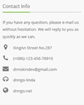
Codes are as follows:
<div class="animation fadeInUp">
  <p>If you have any question, please e-mail us without hesitation. We will reply to you as quickly as we can.</p>
  <ul class="Contact_List ">
    <li><span class="fa fa-map-marker"></span> XingAn Street No.287</li>
    <li><span class="fa fa-phone"></span> (+086)-123-456-78910</li>
    <li><span class="fa fa-envelope"></span> dnnskindev@gmail.com</li>
    <li><span class="fa fa-headphones"></span> dnngo-linda</li>
    <li><span class="fa fa-globe"></span> dnngo.net</li>
  </ul>
</div>
Option:
- You can modify
animationto change the animation on the slide. Animation list. Containeris usingContainer-3
Email Us area
Option:
- This is
Theme_Responsive_20047_home1theme ofDNNGo PowerFormsmodule - You can modify
animationto change the animation on the slide. Animation list. Containeris usingContainer-3
Home Version 2
You can click the link to check Home Version 2 demo. Home Version 2
Contact Us area
Below is the screen shot:
Codes are as follows:
<ul class="Header_Info">
  <li> <span class="fa  fa-phone"></span> Call Us : (+088) - 0123 - 456 789 </li>
  <li> <span class="fa fa-envelope"></span> Email Us : dnnskindev@gmail.com </li>
</ul>
Banner area
Below is the screen shot:

It is using DNNGo LayerGalleryPro module here, you can import ContentListEntity-Home2.xml of the DNNGo_LayerGalleryPro folder to duplicate banner of the demo.
Services list area
Below is the screen shot:
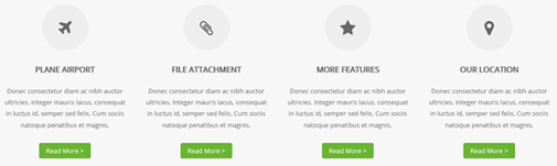
Codes are as follows:
<div class="functionList_2 row">
  <div class="functionBox col-sm-3 animation rotateIn">
    <div class="functionIcon"><span class="fa fa-plane"></span></div>
    <div class="functiontitle"> Plane Airport</div>
    <div class="functionMain">
      <p>Donec consectetur diam ac nibh auctor ultricies. Integer mauris lacus, consequat in luctus id, semper sed felis. Cum sociis natoque penatibus et magnis.</p>
      <a class="Button_green2" href="#" target="blank">Read More  ></a> </div>
  </div>
  <div class="functionBox col-sm-3 animation rotateIn">
    <div class="functionIcon"><span class="fa fa-paperclip"></span></div>
    <div class="functiontitle"> File Attachment </div>
    <div class="functionMain">
      <p>Donec consectetur diam ac nibh auctor ultricies. Integer mauris lacus, consequat in luctus id, semper sed felis. Cum sociis natoque penatibus et magnis.</p>
      <a class="Button_green2" href="#" target="blank">Read More  ></a> </div>
  </div>
  <div class="functionBox col-sm-3 animation  rotateIn">
    <div class="functionIcon"><span class="fa fa-star"></span></div>
    <div class="functiontitle"> More Features </div>
    <div class="functionMain">
      <p>Donec consectetur diam ac nibh auctor ultricies. Integer mauris lacus, consequat in luctus id, semper sed felis. Cum sociis natoque penatibus et magnis.</p>
      <a class="Button_green2" href="#" target="blank">Read More  ></a> </div>
  </div>
  <div class="functionBox col-sm-3 animation  rotateIn">
    <div class="functionIcon"><span class="fa fa-map-marker"></span></div>
    <div class="functiontitle"> Our Location </div>
    <div class="functionMain">
      <p>Donec consectetur diam ac nibh auctor ultricies. Integer mauris lacus, consequat in luctus id, semper sed felis. Cum sociis natoque penatibus et magnis.</p>
      <a class="Button_green2" href="#" target="blank">Read More  ></a> </div>
  </div>
</div>
Option:
col-sm-3is the width of each column, you can change the width you need through value1~12.- You can modify
animationto change the animation on the slide. Animation list. - You can modify
fato change icons. font icon list.
WHAT IS DNNGO? area
Below is the screen shot:

Codes are as follows:
<div class="row pt-30 pb-20">
  <div class="col-sm-6 animation fadeInRight">
    <div class="home2_doing">
      <h3 class="home2_head">What is dnngo?</h3>
      <p> Content text ... </p>
      <p> Content text ... </p>
      <div class="home2_text_ul">
        <div class="row">
          <div class="col-sm-6">
            <ul>
              <li><span class="fa fa-check"></span><a href="#" target="blank">Customize DNN Skins </a></li>
              <li><span class="fa fa-check"></span><a href="#" target="blank">Customize DNN Modules </a></li>
              <li><span class="fa fa-check"></span><a href="#" target="blank">Building DNN sites</a></li>
            </ul>
          </div>
          <div class="col-sm-6">
            <ul>
              <li><span class="fa fa-check"></span><a href="#" target="blank">Convert to DNN Skins</a></li>
              <li><span class="fa fa-check"></span><a href="#" target="blank">Design banner/graphics/buttons</a></li>
              <li><span class="fa fa-check"></span><a href="#" target="blank">Content placement for DNN site</a></li>
            </ul>
          </div>
        </div>
      </div>
      <a href="#" target="blank" class="Button_green3">Learn More</a> </div>
  </div>
  <div class="col-sm-6 animation fadeInRight"><img alt="" class="doing_img img-responsive" src="/portals/23/doing.jpg" /> </div>
</div>
Option:
- You can modify
animationto change the animation on the slide. Animation list. - You can modify
fato change icons. font icon list. col-sm-6is the width for each column. You can change the width you need through value1~12
Responsive Video area
Below is the screen shot:

<div class="photo_box photo_box2 default_show">
  <div class="pic_box">
    <div class=" animation scaleUp">
      <h3>Responsive Video & YouTube videos</h3>
      <div class="ico icon_border ico_no_bg">
          <a href="http://www.youtube.com/watch?v=0O2aH4XLbto" class="LightBox_youtube">
              <span class="fa fa-play"></span>
          </a>
      </div>
    </div>
  </div>
</div>
Option:
- You can modify
animationto change the animation on the slide. Animation list. - You can modify
fato change icons. font icon list.
Latest Projects area
Below is the screen shot:
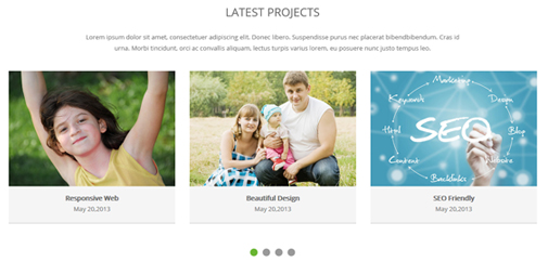
Codes are as follows:
<div class="carousel carousel_5 animation fadeInUp" data-navigation="false" data-autoheight="false" data-autoplay="false">
  <div class="item">
    <div class="photo_box  ico_top_enter"> <a href="#" target="blank">
      <div class="pic_box"> <img alt="" src="/portals/23/Photo2.jpg" />
        <div class="ico ico2"> <span class="fa fa-link"></span> </div>
        <div class="shade"></div>
      </div>
      </a>
      <div class="text_sytle_2">
        <h3>Responsive Web</h3>
        <p>May 20,2013</p>
      </div>
    </div>
  </div>
  <div class="item">
    <div class="photo_box  ico_top_enter   "> <a href="#" target="blank">
      <div class="pic_box"> <img alt="" src="/portals/23/Photo5.jpg" />
        <div class="ico ico2"> <span class="fa fa-link"></span> </div>
        <div class="shade"></div>
      </div>
      </a>
      <div class="text_sytle_2">
        <h3>Beautiful Design</h3>
        <p>May 20,2013</p>
      </div>
    </div>
  </div>
  <div class="item">
    <div class="photo_box  ico_top_enter"> <a href="#" target="blank">
      <div class="pic_box"> <img alt="" src="/portals/23/Photo6.jpg" />
        <div class="ico ico2"> <span class="fa fa-link"></span> </div>
        <div class="shade"></div>
      </div>
      </a>
      <div class="text_sytle_2">
        <h3>SEO Friendly</h3>
        <p>May 20,2013</p>
      </div>
    </div>
  </div>
  <div class="item">
    <div class="photo_box  ico_top_enter"> <a href="#" target="blank">
      <div class="pic_box"> <img alt="" src="/portals/23/Photo8.jpg" />
        <div class="ico ico2"> <span class="fa fa-link"></span> </div>
        <div class="shade"></div>
      </div>
      </a>
      <div class="text_sytle_2">
        <h3>SEO Friendly</h3>
        <p>May 20,2013</p>
      </div>
    </div>
  </div>
  <div class="item">
    <div class="photo_box  ico_top_enter   "> <a href="#" target="blank">
      <div class="pic_box"> <img alt="" src="/portals/23/Photo2.jpg" />
        <div class="ico ico2"> <span class="fa fa-link"></span> </div>
        <div class="shade"></div>
      </div>
      </a>
      <div class="text_sytle_2">
        <h3>Responsive Web</h3>
        <p>May 20,2013</p>
      </div>
    </div>
  </div>
  <div class="item">
    <div class="photo_box  ico_top_enter"> <a href="#" target="blank">
      <div class="pic_box"> <img alt="" src="/portals/23/Photo5.jpg" />
        <div class="ico ico2"> <span class="fa fa-link"></span> </div>
        <div class="shade"></div>
      </div>
      </a>
      <div class="text_sytle_2">
        <h3>Beautiful Design</h3>
        <p>May 20,2013</p>
      </div>
    </div>
  </div>
  <div class="item">
    <div class="photo_box  ico_top_enter"> <a href="#" target="blank">
      <div class="pic_box"> <img alt="" src="/portals/23/Photo6.jpg" />
        <div class="ico ico2"> <span class="fa fa-link"></span> </div>
        <div class="shade"></div>
      </div>
      </a>
      <div class="text_sytle_2">
        <h3>SEO Friendly</h3>
        <p>May 20,2013</p>
      </div>
    </div>
  </div>
  <div class="item">
    <div class="photo_box  ico_top_enter   "> <a href="#" target="blank">
      <div class="pic_box"> <img alt="" src="/portals/23/Photo8.jpg" />
        <div class="ico ico2"> <span class="fa fa-link"></span> </div>
        <div class="shade"></div>
      </div>
      </a>
      <div class="text_sytle_2">
        <h3>SEO Friendly</h3>
        <p>May 20,2013</p>
      </div>
    </div>
  </div>
  <div class="item">
    <div class="photo_box  ico_top_enter"> <a href="#" target="blank">
      <div class="pic_box"> <img alt="" src="/portals/23/Photo2.jpg" />
        <div class="ico ico2"> <span class="fa fa-link"></span> </div>
        <div class="shade"></div>
      </div>
      </a>
      <div class="text_sytle_2">
        <h3>Responsive Web</h3>
        <p>May 20,2013</p>
      </div>
    </div>
  </div>
  <div class="item">
    <div class="photo_box  ico_top_enter"> <a href="#" target="blank">
      <div class="pic_box"> <img alt="" src="/portals/23/Photo5.jpg" />
        <div class="ico ico2"> <span class="fa fa-link"></span> </div>
        <div class="shade"></div>
      </div>
      </a>
      <div class="text_sytle_2">
        <h3>Beautiful Design</h3>
        <p>May 20,2013</p>
      </div>
    </div>
  </div>
  <div class="item">
    <div class="photo_box  ico_top_enter"> <a href="#" target="blank">
      <div class="pic_box"> <img alt="" src="/portals/23/Photo6.jpg" />
        <div class="ico ico2"> <span class="fa fa-link"></span> </div>
        <div class="shade"></div>
      </div>
      </a>
      <div class="text_sytle_2">
        <h3>SEO Friendly</h3>
        <p>May 20,2013</p>
      </div>
    </div>
  </div>
  <div class="item">
    <div class="photo_box  ico_top_enter"> <a href="#" target="blank">
      <div class="pic_box"> <img alt="" src="/portals/23/Photo8.jpg" />
        <div class="ico ico2"> <span class="fa fa-link"></span> </div>
        <div class="shade"></div>
      </div>
      </a>
      <div class="text_sytle_2">
        <h3>SEO Friendly</h3>
        <p>May 20,2013</p>
      </div>
    </div>
  </div>
</div>
Option:
- This is a
Carouseleffect.Carousel - You can modify
animationto change the animation on the slide. Animation list. - You can modify
photo_boxto change image effects. Image Effects
Our Services area
Below is the screen shot:
Codes are as follows:
<div id="accordion3" class="panel-group accordion_3 animation fadeInLeft">
  <div class="panel panel-default">
    <div class="panel-heading">
      <h4 class="panel-title">
          <a href="#item3_1" data-parent="#accordion3" data-toggle="collapse" class="collapsed">
              <span class="accordion_icon glyphicons"></span> DNN Design & Skin
           </a>
      </h4>
    </div>
    <div class="panel-collapse collapse" id="item3_1">
      <div class="panel-body">Content Text1... </div>
    </div>
  </div>
  <div class="panel panel-default">
    <div class="panel-heading">
      <h4 class="panel-title">
          <a href="#item3_2" data-parent="#accordion3" data-toggle="collapse" class="collapsed">
              <span class="accordion_icon glyphicons"></span> Module Development
           </a>
      </h4>
    </div>
    <div class="panel-collapse collapse" id="item3_2">
      <div class="panel-body">Content Text2... </div>
    </div>
  </div>
  <div class="panel panel-default">
    <div class="panel-heading">
      <h4 class="panel-title">
          <a href="#item3_3" data-parent="#accordion3" data-toggle="collapse">
              <span class="accordion_icon glyphicons"></span> Unlimited-color Skin
          </a>
      </h4>
    </div>
    <div class="panel-collapse in collapse" id="item3_3">
      <div class="panel-body">Content Text3... </div>
    </div>
  </div>
  <div class="panel panel-default">
    <div class="panel-heading ">
      <h4 class="panel-title">
          <a href="#item3_4" data-parent="#accordion3" data-toggle="collapse" class="collapsed">
              <span class="accordion_icon glyphicons"></span> Create DNN Website
          </a>
      </h4>
    </div>
    <div class="panel-collapse collapse" id="item3_4">
      <div class="panel-body">Content Text4... </div>
    </div>
  </div>
</div>
Option:
- This is an
Accordionseffect.You can modifyAccordionsto change image effects. Accordions - You can modify
animationto change the animation on the slide. Animation list. - You can modify
fato change icons. font icon list. Containeris usingContainer-2
Latest News area
Below is the screen shot:
Codes are as follows:
<div class="latestNews animation fadeInRight">
  <dl>
    <dt> <img alt="" src="/portals/23/Pic_1.jpg" /> </dt>
    <dd>
      <h3>Popular Products</h3>
      Lorum sociis natoque penatibus et magnis dis parturient montes nascetur ridiculus mus. nascetur ridiculus.Lorem ipsum dolor sit amet, consectetur adipisicing elit.
      <p style="text-align: right;"><a href="#" target="blank" title="More">More ></a></p>
    </dd>
  </dl>
  <dl>
    <dt> <img alt="" src="/portals/23/Pic_2.jpg" /> </dt>
    <dd>
      <h3>Information About Us</h3>
      Lorum sociis natoque penatibus et magnis dis parturient montes nascetur ridiculus mus. nascetur ridiculus.Lorem ipsum dolor sit amet, consectetur adipisicing elit.
      <p style="text-align: right;"><a href="#" target="blank" title="More">More ></a></p>
    </dd>
  </dl>
</div>
Option:
- You can modify
animation scaleUpto change the animation on the slide. Animation list. - You can modify
fato change icons. font icon list. Containeris usingContainer-2
Why Choose Our Products area
Below is the screen shot:
Codes are as follows:
<div class="pt-50 pb-50 periodic_box animation fadeIn">
  <div class="dnn_layout">
    <h3 class="home2_common_title">Why Choose Our Products ?</h3>
    <div class="describe">Desktop, Ipad and  Mobile Responsive, Custom Panel, Photo Albums, Gallery, Social Page, GoMenu, Mobile Skins, Mobility, Mobile Blog </div>
    <div class="list_list row">
      <ul class="col-sm-3">
        <li><span class="ico"></span>Full Support </li>
        <li><span class="ico"></span>Unlimited Colors or Themes</li>
        <li><span class="ico"></span>New Header & Footer Styles</li>
      </ul>
      <ul class="col-sm-3">
        <li><span class="ico"></span>Compatible with Major Browsers</li>
        <li><span class="ico"></span>SEO Friendly & Optimized</li>
        <li><span class="ico"></span>Responsive Web</li>
      </ul>
      <ul class="col-sm-3">
        <li><span class="ico"></span>5 Main Layout Sample Styles</li>
        <li><span class="ico"></span>Full & Boxed Layout</li>
        <li><span class="ico"></span>Icon Manager</li>
      </ul>
      <ul class="col-sm-3">
        <li><span class="ico"></span>Customized Settings</li>
        <li><span class="ico"></span>Insidepage With Countless Features </li>
        <li><span class="ico"></span>More Banner Sliders</li>
      </ul>
    </div>
  </div>
</div>
Option:
col-md-3 col-sm-6is the width of each column, you can change the width you need through value1~12.- You can modify
animationto change the animation on the slide. Animation list. - You can modify
fato change icons. font icon list.
Testimonials_tab area
Below is the screen shot:
Codes are as follows:
<ul class=" Testimonials_tab Testimonials_8 animation fadeInLeft" data-autoplay="0" data-display-arrows="false" data-position="roll-vertical">
  <li>
    <div class="Pic"><img alt="" src="/portals/23/team_pic_1.jpg" /></div>
    <blockquote>
      <p>Content Text1...</p>
      <small><span>Kevin G</span>Jdseqbsdvk Company</small> </blockquote>
  </li>
  <li>
    <div class="Pic"><img alt="" src="/portals/23/team_pic_2.jpg" /></div>
    <blockquote>
      <p>Content Text2...</p>
      <small><span>Kevin G</span>Jdseqbsdvk Company</small> </blockquote>
  </li>
  <li>
    <div class="Pic"><img alt="" src="/portals/23/team_pic_3.jpg" /> </div>
    <blockquote>
      <p>Content Text3...</p>
      <small><span>Kevin G</span>Jdseqbsdvk Company</small> </blockquote>
  </li>
  <li>
    <div class="Pic"><img alt="" src="/portals/23/team_pic_4.jpg" /></div>
    <blockquote>
      <p>Content Text4...</p>
      <small><span>Kevin G </span>Jdseqbsdvk Company</small> </blockquote>
  </li>
</ul>
Option:
- This is a
Testimonialseffect.You can modifyTestimonialsto change image effects. Testimonials - You can modify
animationto change the animation on the slide. Animation list.
Logos area
Below is the screen shot:

Codes are as follows:
<ul class="mark_show clearfix animation fadeInRight">
  <li><a href="#" target="blank"><img alt="" src="/portals/23/mark1.jpg" /></a></li>
  <li><a href="#" target="blank"><img alt="" src="/portals/23/mark2.jpg" /></a></li>
  <li><a href="#" target="blank"><img alt="" src="/portals/23/mark3.jpg" /></a></li>
</ul>
<ul class="mark_show last clearfix animation fadeInRight">
  <li><a href="#" target="blank"><img alt="" src="/portals/23/mark4.jpg" /></a></li>
  <li><a href="#" target="blank"><img alt="" src="/portals/23/mark5.jpg" /></a></li>
  <li><a href="#" target="blank"><img alt="" src="/portals/23/mark6.jpg" /></a></li>
</ul>
Option:
- You can modify
animationto change the animation on the slide. Animation list.
About Us area
Below is the screen shot:
Codes are as follows:
<div class="footer_about_us clearfix animation fadeInUp">
  <p>Content Text1...</p>
  <p>Content Text2...</p>
  <div class="footer_social">
      <a href="#" class="rss">
          <span class="icon"><em class="fa fa-rss"></em></span><span class="character">RSS Feed</span>
      </a>
      <a href="#" class="twriter">
          <span class="icon"><em class="fa fa-twitter"></em></span><span class="character">Follow Us</span>
      </a>
      <a href="#" class="facebook">
          <span class="icon"><em class="fa fa-facebook"></em></span><span class="character">Link Us</span>
      </a>
      <a href="#" class="google">
          <span class="icon"><em class="fa fa-google-plus"></em></span><span class="character">Plus 1 Us</span>
      </a>
  </div>
</div>
Option:
- You can modify
animationto change the animation on the slide. Animation list. - You can modify
fato change icons. font icon list. Containeris usingContainer-3
Our Location area
Below is the screen shot:
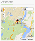
Codes are as follows:
<div id="gmap01" class="animation fadeInUp"></div>
Contact Info area
Below is the screen shot:
Codes are as follows:
<div class="animation fadeInUp">
  <p>If you have any question, please e-mail us without hesitation. We will reply to you as quickly as we can.</p>
  <ul class="Contact_List ">
    <li><span class="fa fa-map-marker green_color"></span> XingAn Street No.287</li>
    <li><span class="fa fa-phone red_color"></span> (+086)-123-456-78910</li>
    <li><span class="fa fa-envelope blue_color"></span> dnnskindev@gmail.com</li>
    <li><span class="fa fa-headphones yellow_color"></span> dnngo-linda</li>
    <li><span class="fa fa-globe light_blue"></span> dnngo.net</li>
  </ul>
</div>
Option:
- You can modify
fato change icons. font icon list. - You can modify
animation scaleUpto change the animation on the slide. Animation list. Containeris usingContainer-3
Email Us area
Below is the screen shot:
Codes are as follows:
Option:
- This is
Theme_Responsive_20047_home2theme ofDNNGo PowerFormsmodule - You can modify
animation scaleUpto change the animation on the slide. Animation list. Containeris usingContainer-3
Home Version 3
You can click the link to check Home Version 3 demo. Home Version 3
Contact Us area
Below is the screen shot:
Codes are as follows:
<ul class="Header_Info">
  <li> <span class="fa  fa-phone"></span> Call Us : (+088) - 0123 - 456 789 </li>
  <li> <span class="fa fa-envelope"></span> Email Us : dnnskindev@gmail.com </li>
</ul>
Banner area
Below is the screen shot:

It is using Effect_12_UnoSlider of DNNGalleryPro module.
Services list area
Below is the screen shot:
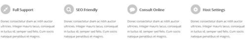
Codes are as follows:
<div class="functionList_3 row">
  <div class="functionBox col-sm-3 animation flipInX">
    <div class="functionIcon"><span class="fa fa-compress"></span></div>
    <div class="functiontitle">Full Support</div>
    <div class="functionMain">
      <p>Donec consectetur diam ac nibh auctor ultricies. Integer mauris lacus, consequat in luctus id, semper sed felis. Cum sociis natoque penatibus et magnis.</p>
    </div>
  </div>
  <div class="functionBox col-sm-3 animation flipInX">
    <div class="functionIcon"><span class="fa fa-search"></span></div>
    <div class="functiontitle">SEO Friendly</div>
    <div class="functionMain">
      <p>Donec consectetur diam ac nibh auctor ultricies. Integer mauris lacus, consequat in luctus id, semper sed felis. Cum sociis natoque penatibus et magnis.</p>
    </div>
  </div>
  <div class="functionBox col-sm-3 animation flipInX">
    <div class="functionIcon"><span class="fa fa-comment"></span></div>
    <div class="functiontitle">Consult Online</div>
    <div class="functionMain">
      <p>Donec consectetur diam ac nibh auctor ultricies. Integer mauris lacus, consequat in luctus id, semper sed felis. Cum sociis natoque penatibus et magnis.</p>
    </div>
  </div>
  <div class="functionBox col-sm-3 animation flipInX">
    <div class="functionIcon"><span class="fa fa-cog"></span></div>
    <div class="functiontitle">Host Settings</div>
    <div class="functionMain">
      <p>Donec consectetur diam ac nibh auctor ultricies. Integer mauris lacus, consequat in luctus id, semper sed felis. Cum sociis natoque penatibus et magnis.</p>
    </div>
  </div>
</div>
Option:
- You can modify
fato change icons. font icon list. col-sm-3is the width of each column, you can change the width you need through value1~12.- You can modify
animationto change the animation on the slide. Animation list.
About This Theme area
Below is the screen shot:
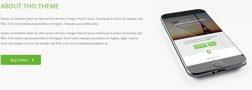
Codes are as follows:
<div class="backgroundImage26 pt-50 pb-20">
  <div class="dnn_layout animation fadeInDown">
    <div class="content_mid">
      <div class="row">
        <div class="col-sm-7 animation fadeInLeft">
          <div class="home3_about">
            <h3>ABOUT THIS THEME</h3>
            <p> Content text ... </p>
            <p> Content text ... </p>
            <a href="#" target="blank">Buy It Now<span class="fa fa-chevron-right"></span></a> </div>
        </div>
        <div class="col-sm-5 animation fadeInRight"> <img alt="" class="img-responsive" src="/portals/23/home3_mobile.jpg" /></div>
      </div>
    </div>
  </div>
</div>
Option:
col-sm-7is the width of each column, you can change the width you need through value1~12.- You can modify
animationto change the animation on the slide. Animation list. - You can modify
fato change icons. font icon list.
Advanced Frontend Technology area
Below is the screen shot:
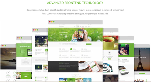
Codes are as follows:
<div class="dnn_layout">
  <div class="content_mid">
    <div class="home3_advance pt-60 animation fadeInUp">
      <h3>Advanced Frontend Technology</h3>
      <p>Content Text1... <span> felis. Cum sociis natoque penatibus et magnis. Aliquam quis malesuada.</span></p>
      <img alt="" class="img-responsive" src="/portals/23/web_page.jpg" /> </div>
  </div>
</div>
Option:
- You can modify
animationto change the animation on the slide. Animation list.
Our Fun Facts area
Below is the screen shot:
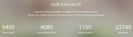
Codes are as follows:
<div class="backgroundImage27 pb-60 pt-60">
  <div class="dnn_layout animation fadeInUp">
    <div class="content_mid">
      <div class="home3_facts">
        <h3>OUR FUN FACTS</h3>
        <p>Content Text1...</span> </p>
      </div>
      <div class=" row number_Animation_3">
        <div class="col-sm-3">
            <span class="animation  number" data-number="9400">0</span><span class="font">Theme Users </span>
        </div>
        <div class="col-sm-3">
            <span class="animation  number" data-number="4080">0</span> <span class="font"> Product Subscribers </span>
        </div>
        <div class="col-sm-3">
            <span class="animation  number" data-number="1150">0</span><span class="font">Features Added </span>
        </div>
        <div class="col-sm-3">
            <span class="animation  number" data-number="23740">0</span> <span class="font"> Downloads</span>
        </div>
      </div>
    </div>
  </div>
</div>
Option:
- This is a
ProgressBarsCounterseffect. ProgressBarsCounters col-sm-3is the width of each column, you can change the width you need through value1~12.- You can modify
animationto change the animation on the slide. Animation list.
Why Choose Our Products area
Below is the screen shot:
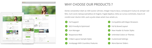
Codes are as follows:
<div class="animation fadeInRight">
  <p>Content Text1...</p>
  <div class="list_list row">
    <ul class="col-sm-6">
      <li><span class="ico"></span>Full Support </li>
      <li><span class="ico"></span>SEO Friendly & Optimized</li>
      <li><span class="ico"></span>Icon Manager</li>
      <li><span class="ico"></span>Responsive Web</li>
      <li><span class="ico"></span>5 Main Layout Sample Styles</li>
      <li><span class="ico"></span>Insidepage With Countless Features </li>
    </ul>
    <ul class="col-sm-6">
      <li><span class="ico"></span>Compatible with Major Browsers</li>
      <li><span class="ico"></span>Full & Boxed Layout</li>
      <li><span class="ico"></span>New Header & Footer Styles</li>
      <li><span class="ico"></span>Unlimited Colors or Themes</li>
      <li><span class="ico"></span>Customized Settings</li>
      <li><span class="ico"></span>More Banner Sliders</li>
    </ul>
  </div>
</div>
Option:
col-sm-6is the width of each column, you can change the width you need through value1~12.- You can modify
animationto change the animation on the slide. Animation list.
Recent News area
Below is the screen shot:
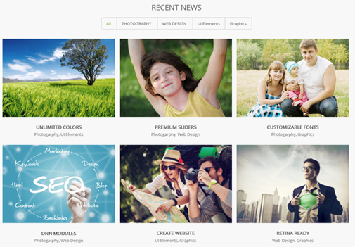
Codes are as follows:
<div class="backgroundImage26 news_border pt-60 pb-30">
  <div class="dnn_layout">
    <div class="content_mid">
      <div class="pane_layout">
        <h3 class="home3_news">RECENT NEWS</h3>
        <div class="isotope_grid animation isotope_grid2 scaleUp">
          <div class="isotope_group isotope_group3">
              <a class="active" href="#" data-filter="*">All</a>
              <a href="#" data-filter=".photography">PHOTOGRAPHY</a>
              <a href="#" data-filter=".webdesign">WEB DESIGN</a>
              <a href="#" data-filter=".ui">UI Elements</a>
              <a href="#" data-filter=".graphics">Graphics</a>
          </div>
          <div class="loading">
            <div class="loading-container container1">
              <div class="circle1"></div>
              <div class="circle2"></div>
              <div class="circle3"></div>
              <div class="circle4"></div>
            </div>
            <div class="loading-container container2">
              <div class="circle1"></div>
              <div class="circle2"></div>
              <div class="circle3"></div>
              <div class="circle4"></div>
            </div>
            <div class="loading-container container3">
              <div class="circle1"></div>
              <div class="circle2"></div>
              <div class="circle3"></div>
              <div class="circle4"></div>
            </div>
          </div>
          <div class="isotope_main" data-min-width="320">
            <div class="isotope_item photography blogs">
              <div class="photo_box">
                <div class="pic_box"> <img alt="" src="/portals/23/Photo8.jpg" />
                  <div class="content">
                    <div class="vertical_center_1">
                      <div class="vertical_center_2">
                        <div class="ico">
                            <a href="#" target="blank"><span class="fa fa-link"></span></a>
                            <a href="/Portals/23/Photo8.jpg" class="LightBox_image_gallery1"><span class="fa fa-search"></span></a>
                        </div>
                      </div>
                    </div>
                  </div>
                  <div class="shade"></div>
                </div>
                <h2>UNLIMITED COLORS</h2>
                <p>Photogarphy, UI Elements</p>
              </div>
            </div>
            <div class="isotope_item graphics webdesign">
              <div class="photo_box">
                <div class="pic_box"> <img alt="" src="/portals/23/Photo2.jpg" />
                  <div class="content">
                    <div class="vertical_center_1">
                      <div class="vertical_center_2">
                        <div class="ico">
                            <a href="#" target="blank"><span class="fa fa-link"></span></a>
                            <a href="/Portals/23/Photo2.jpg" class="LightBox_image_gallery1"><span class="fa fa-search"></span></a>
                        </div>
                      </div>
                    </div>
                  </div>
                  <div class="shade"></div>
                </div>
                <h2>PREMIUM SLIDERS</h2>
                <p>Photogarphy, Web Design</p>
              </div>
            </div>
            <div class="isotope_item photography webdesign">
              <div class="photo_box">
                <div class="pic_box"> <img alt="" src="/portals/23/Photo5.jpg" />
                  <div class="content">
                    <div class="vertical_center_1">
                      <div class="vertical_center_2">
                        <div class="ico">
                            <a href="#" target="blank"><span class="fa fa-link"></span></a>
                            <a href="/Portals/23/Photo5.jpg" class="LightBox_image_gallery1"><span class="fa fa-search"></span></a>
                        </div>
                      </div>
                    </div>
                  </div>
                  <div class="shade"></div>
                </div>
                <h2>CUSTOMIZABLE FONTS</h2>
                <p>Photogarphy, Graphics</p>
              </div>
            </div>
            <div class="isotope_item blogs webdesign">
              <div class="photo_box">
                <div class="pic_box"> <img alt="" src="/portals/23/Photo6.jpg" />
                  <div class="content">
                    <div class="vertical_center_1">
                      <div class="vertical_center_2">
                        <div class="ico">
                            <a href="#" target="blank"><span class="fa fa-link"></span></a>
                            <a href="/Portals/23/Photo6.jpg" class="LightBox_image_gallery1"><span class="fa fa-search"></span></a>
                        </div>
                      </div>
                    </div>
                  </div>
                  <div class="shade"></div>
                </div>
                <h2>DNN MODULES</h2>
                <p>Photogarphy, Web Design</p>
              </div>
            </div>
            <div class="isotope_item photography webdesign">
              <div class="photo_box">
                <div class="pic_box"> <img alt="" src="/portals/23/Photo11.jpg" />
                  <div class="content">
                    <div class="vertical_center_1">
                      <div class="vertical_center_2">
                        <div class="ico">
                            <a href="#" target="blank"><span class="fa fa-link"></span></a>
                            <a href="/Portals/23/Photo11.jpg" class="LightBox_image_gallery1"><span class="fa fa-search"></span></a>
                        </div>
                      </div>
                    </div>
                  </div>
                  <div class="shade"></div>
                </div>
                <h2>CREATE WEBSITE</h2>
                <p>UI Elements, Graphics</p>
              </div>
            </div>
            <div class="isotope_item graphics">
              <div class="photo_box">
                <div class="pic_box"> <img alt="" src="/portals/23/Photo12.jpg" />
                  <div class="content">
                    <div class="vertical_center_1">
                      <div class="vertical_center_2">
                        <div class="ico">
                            <a href="#" target="blank"><span class="fa fa-link"></span></a>
                            <a href="/Portals/23/Photo12.jpg" class="LightBox_image_gallery1"><span class="fa fa-search"></span></a>
                        </div>
                      </div>
                    </div>
                  </div>
                  <div class="shade"></div>
                </div>
                <h2>RETINA READY</h2>
                <p>Web Design, Graphics</p>
              </div>
            </div>
          </div>
        </div>
      </div>
    </div>
  </div>
</div>
Option:
- You can add
<a data-filter=".FilterName" href="#">Filter Name</a>to increase categories.data-filter=".FilterName"can not be blank space. - You can modify
data-min-widthto change minimum width of image. - You can modify
isotope_itemFilterNameto categorize images. - You can modify
animationto change or delete animation.Animation list.
Testimonials About Us area
Below is the screen shot:
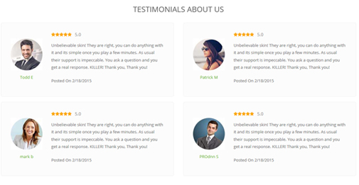
Codes are as follows:
<div class="home3_testimonials pt-60">
  <h3> TESTIMONIALS  ABOUT US</h3>
  <div class="row">
    <div class="col-sm-6  animation fadeInLeft">
      <div class="outer_box">
        <div class="member_img"><img alt="" src="/portals/23/h3_member1.jpg" /><span>Todd E</span></div>
        <div class="inner_box">
          <div class="star clearfix">
              <em class="fa fa-star"></em>
              <em class="fa fa-star"></em>
              <em class="fa fa-star"></em>
              <em class="fa fa-star"></em>
              <em class="fa fa-star"></em>
              <em class="last">5.0</em>
          </div>
          <p>Content Text1...<span>Posted On  2/18/2015</span></p>
        </div>
      </div>
    </div>
    <div class="col-sm-6 animation fadeInRight">
      <div class="outer_box">
        <div class="member_img"><img alt="" src="/portals/23/h3_member2.jpg" /><span>Patrick M</span></div>
        <div class="inner_box">
          <div class="star clearfix">
              <em class="fa fa-star"></em>
              <em class="fa fa-star"></em>
              <em class="fa fa-star"></em>
              <em class="fa fa-star"></em>
              <em class="fa fa-star"></em>
              <em class="last">5.0</em>
          </div>
          <p>Content Text4...<span>Posted On  2/18/2015</span></p>
        </div>
      </div>
    </div>
  </div>
  <div class="row">
    <div class="col-sm-6 animation fadeInLeft">
      <div class="outer_box">
        <div class="member_img"><img alt="" src="/portals/23/h3_member3.jpg" /><span>mark b</span></div>
        <div class="inner_box">
          <div class="star clearfix">
              <em class="fa fa-star"></em>
              <em class="fa fa-star"></em>
              <em class="fa fa-star"></em>
              <em class="fa fa-star"></em>
              <em class="fa fa-star"></em>
              <em class="last">5.0</em>
          </div>
          <p>Content Text3...<span>Posted On  2/18/2015</span></p>
        </div>
      </div>
    </div>
    <div class="col-sm-6 animation fadeInRight">
      <div class="outer_box">
        <div class="member_img"><img alt="" src="/portals/23/h3_member4.jpg" /><span>PROdnn S</span></div>
        <div class="inner_box">
          <div class="star clearfix">
              <em class="fa fa-star"></em>
              <em class="fa fa-star"></em>
              <em class="fa fa-star"></em>
              <em class="fa fa-star"></em>
              <em class="fa fa-star"></em>
              <em class="last">5.0</em>
          </div>
          <p>Content Text2...<span>Posted On  2/18/2015</span></p>
        </div>
      </div>
    </div>
  </div>
</div>
Option:
col-sm-6is the width of each column, you can change the width you need through value1~12.- You can modify
fato change icons. font icon list. - You can modify
animationto change the animation on the slide. Animation list.
Services list area
Below is the screen shot:
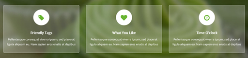
Codes are as follows:
<div class="ContentBottom3 pt-60 pb-60">
  <div class="dnn_layout">
    <div class="content_mid">
      <div class="functionList_6 row">
        <div class="col-sm-4 animation flipInY">
          <div class="functionBox">
            <div class="functionIcon"><span class="fa fa-tag"></span></div>
            <div class="functiontitle"> Friendly Tags</div>
            <div class="functionMain">
              <p>Content text ...</p>
            </div>
          </div>
        </div>
        <div class="col-sm-4 animation flipInY">
          <div class="functionBox">
            <div class="functionIcon"> <span class="fa fa-heart"></span></div>
            <div class="functiontitle"> What You Like </div>
            <div class="functionMain">
              <p>Content text ...</p>
            </div>
          </div>
        </div>
        <div class="col-sm-4 animation flipInY">
          <div class="functionBox">
            <div class="functionIcon"><span class="fa fa-clock-o"></span></div>
            <div class="functiontitle"> Time O'clock</div>
            <div class="functionMain">
              <p>Content text ...</p>
            </div>
          </div>
        </div>
      </div>
    </div>
  </div>
</div>
Option:
- You can modify
fato change icons. font icon list. - You can modify
animationto change the animation on the slide. Animation list. col-sm-4is the width for each column. You can change the width you need through value1~12
Buy This Theme Now area
Below is the screen shot:
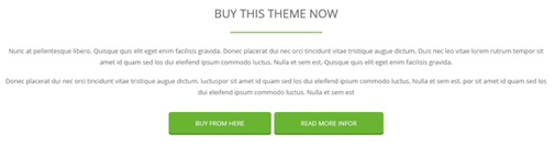
Codes are as follows:
<div class="buy_theme pt-50 pb-20 animation fadeInUp">
  <h3>BUY THIS THEME NOW</h3>
  <p>Content Text1...</p>
  <p>Content Text2...</p>
  <a href="#" target="blank">BUY FROM HERE</a><a href="#" target="blank">READ MORE INFOR</a>
</div>
Option:
- You can modify
animation scaleUpto change the animation on the slide. Animation list.
Latest Blogs area
Below is the screen shot:
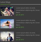
Codes are as follows:
<div class="blog_box animation fadeInUp">
  <div class="wrap clearfix"> <img alt="" class="img-responsive" src="/portals/23/h3_blog1.jpg" />
    <p>Lorem ipsum dolor sit amet,<span> consectetuer adipiscing elit. Donec libero.</span> <span class="date">Jan 20 2015</span></p>
  </div>
  <div class="wrap clearfix"> <img alt="" class="img-responsive" src="/portals/23/h3_blog2.jpg" />
    <p>Lorem ipsum dolor sit amet,<span> consectetuer adipiscing elit. Donec libero.</span> <span class="date">Jan 20 2015</span></p>
  </div>
  <div class="wrap clearfix"> <img alt="" class="img-responsive" src="/portals/23/h3_blog3.jpg" />
    <p>Lorem ipsum dolor sit amet,<span> consectetuer adipiscing elit. Donec libero.</span> <span class="date">Jan 20 2015</span></p>
  </div>
</div>
Option:
- You can modify
animationto change the animation on the slide. Animation list. Containeris usingContainer-3
Our Services area
Below is the screen shot:
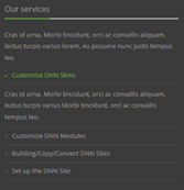
Codes are as follows:
<div class="service animation fadeInUp">
  <p>Cras id urna. Morbi tincidunt, orci ac convallis aliquam, lectus turpis varius lorem, eu posuere nunc justo tempus leo.</p>
  <div id="accordion7" class="panel-group accordion_7">
    <div class="panel panel-default">
      <div class="panel-heading">
        <h4 class="panel-title">
            <a data-parent="#accordion7" data-toggle="collapse" href="#item7_1">
                <span class="accordion_icon"></span>Customize DNN Skins
            </a>
        </h4>
      </div>
      <div id="item7_1" class="panel-collapse collapse in">
        <div class="panel-body">Content Text1...</div>
      </div>
    </div>
    <div class="panel panel-default">
      <div class="panel-heading">
        <h4 class="panel-title">
            <a data-parent="#accordion7" data-toggle="collapse" class="collapsed" href="#item7_2">
                <span class="accordion_icon"></span>Customize DNN Modules
            </a>
        </h4>
      </div>
      <div id="item7_2" class="panel-collapse collapse">
        <div class="panel-body">Content Text2...</div>
      </div>
    </div>
    <div class="panel panel-default">
      <div class="panel-heading">
        <h4 class="panel-title">
            <a data-parent="#accordion7" data-toggle="collapse" class="collapsed" href="#item7_3">
                <span class="accordion_icon"></span>Building/Copy/Convert DNN Sites
            </a>
        </h4>
      </div>
      <div id="item7_3" class="panel-collapse collapse">
        <div class="panel-body">Content Text3...</div>
      </div>
    </div>
    <div class="panel panel-default">
      <div class="panel-heading">
        <h4 class="panel-title">
            <a data-parent="#accordion7" data-toggle="collapse" class="collapsed" href="#item7_4">
                <span class="accordion_icon"></span>Set up the DNN Site
            </a>
        </h4>
      </div>
      <div id="item7_4" class="panel-collapse collapse">
        <div class="panel-body">Content Text4...</div>
      </div>
    </div>
  </div>
</div>
Option:
- This is an
Accordionseffect.You can modifyAccordionsto change image effects. Accordions - You can modify
animationto change the animation on the slide. Animation list. - You can modify
fato change icons. font icon list. Containeris usingContainer-3
Contact Info area
Below is the screen shot:
Codes are as follows:
<p class="animation fadeInUp">Content Text1...</p>
<ul class="Contact_List animation fadeInUp ">
  <li><span class="fa fa-map-marker"></span> XingAn Street No.287</li>
  <li><span class="fa  fa-phone"></span> (+086)-123-456-78910</li>
  <li><span class="fa fa-envelope"></span> dnnskindev@gmail.com</li>
  <li><span class="fa fa-headphones"></span> dnngo-linda</li>
</ul>
<div class="icon_only">
    <a href="#"><span class="fa fa-twitter"></span></a>
    <a href="#"><span class="fa fa-facebook"></span></a>
    <a href="#"><span class="fa fa-tumblr"></span></a>
    <a href="#"><span class="fa fa-youtube"></span></a>
    <a href="#"><span class="fa fa-google-plus"></span></a>
    <a href="#"><span class="fa fa-apple"></span></a>
</div>
Option:
- You can modify
animationto change the animation on the slide. Animation list. - You can modify
fato change icons. font icon list. Containeris usingContainer-3
Home Version 4
You can click the link to check Home Version 4 demo. Home Version 4
Contact Us area
Below is the screen shot:
Codes are as follows:
<ul class="Header_Info">
  <li> <span class="fa  fa-phone"></span> Call Us : (+088) - 0123 - 456 789 </li>
  <li> <span class="fa fa-envelope"></span> Email Us : dnnskindev@gmail.com </li>
</ul>
Banner area
Below is the screen shot:

It is using DNNGo LayerGalleryPro module here, you can import ContentListEntity-Home4.xml of the DNNGo_LayerGalleryPro folder to duplicate banner of the demo.
Services list area
Below is the screen shot:
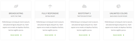
Codes are as follows:
<div class="functionList_7 pt-30 pb-30">
  <div class="row">
    <div class="col-sm-6 col-md-3  animation rotateIn">
      <div class="functionBox"> <span class="functionIcon fa fa-leaf"></span>
        <p class="functiontitle">BROADCASTING <span>NOTE THE TIME</span></p>
        <div class="functionMain">Content Text1...</div>
        <a class="functionMore" href="#">READ MORE</a> </div>
    </div>
    <div class="col-sm-6 col-md-3  animation rotateIn">
      <div class="functionBox"> <span class="functionIcon fa fa-umbrella"></span>
        <p class="functiontitle">FULLY RESPONSIVE<span>RETINA READY</span></p>
        <div class="functionMain">Content Text2...</div>
        <a class="functionMore" href="#">READ MORE</a></div>
    </div>
    <div class="col-sm-6 col-md-3  animation rotateIn">
      <div class="functionBox"> <span class="functionIcon fa fa-cloud"></span>
        <p class="functiontitle">BOOTSTRAP 3<span>TWITTER BOOTSTRAP </span></p>
        <div class="functionMain">Content Text3...</div>
        <a class="functionMore" href="#">READ MORE</a></div>
    </div>
    <div class="col-sm-6 col-md-3  animation rotateIn">
      <div class="functionBox"> <span class="functionIcon fa fa-pie-chart"></span>
        <p class="functiontitle">UNLIMITED COLORS<span>BACK-END COLOR PICKER</span></p>
        <div class="functionMain">Content Text4...</div>
        <a class="functionMore" href="#">READ MORE</a></div>
    </div>
  </div>
</div>
Option:
col-sm-6 col-md-3is the width for each column. You can change the width you need through value1~12- You can modify
animationto change the animation on the slide. Animation list. - You can modify
fato change icons. font icon list.
Social Link area
Below is the screen shot:

Codes are as follows:
<div class="backgroundImage28 pt-60 pb-60">
  <div class="dnn_layout">
    <div class="content_mid">
      <div class="row">
        <div class="col-sm-6 col-md-3 animation zoomIn">


          <div class="home4_social_box">
              <a href="#"> <span class="fa fa-facebook-square facebook"></span></a>
              <span class="social_title">Facebook<span class="social_title_b">Link us & share</span></span>
          </div>
        </div>
        <div class="col-sm-6 col-md-3 animation zoomIn">
          <div class="home4_social_box">
              <a href="#"> <span class="fa fa-twitter-square twitter"></span></a>
              <span class="social_title">Twitter<span class="social_title_b">Fllow us & stay tuned</span></span>
          </div>
        </div>
        <div class="col-sm-6 col-md-3 animation zoomIn">
          <div class="home4_social_box">
              <a href="#"> <span class="fa fa-rss-square rss"></span></a>
              <span class="social_title">RSS<span class="social_title_b">Know waht we’re up to</span></span>
          </div>
        </div>
        <div class="col-sm-6 col-md-3 animation zoomIn">
          <div class="home4_social_box">
              <a href="#"> <span class="fa fa-google-plus-square plus"></span> </a>
              <span class="social_title">Google +<span class="social_title_b">Check our latest products</span></span>
          </div>
        </div>
      </div>
    </div>
  </div>
</div>
Option:
col-sm-6 col-md-3is the width for each column. You can change the width you need through value1~12- You can modify
animationto change the animation on the slide. Animation list. - You can modify
fato change icons. font icon list.
Our Services area
Below is the screen shot:
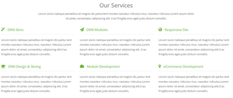
Codes are as follows:
<div class="home4_service pt-60 animation fadeInDown">
  <h3>Our Services</h3>
  <p>Content Text...<span> sit amet, consectetur adipisicing elit.  Cras fringilla eros eget justo dictum convallis.</span> </p>
  <div class="row">
    <div class="col-sm-4">
      <h3 class="service_title"><span class="fa fa-magic"></span>DNN Skins</h3>
      <p class="service_main">Content Text1...</p>
    </div>
    <div class="col-sm-4">
      <h3 class="service_title"><span class="fa fa-send"></span>DNN Modules</h3>
      <p class="service_main">Content Text2...</p>
    </div>
    <div class="col-sm-4">
      <h3 class="service_title"><span class="fa fa-globe"></span>Responsive Site</h3>
      <p class="service_main">Content Text3...</p>
    </div>
  </div>
  <div class="row">
    <div class="col-sm-4">
      <h3 class="service_title"><span class="fa fa fa-coffee"></span>DNN Design & Skning</h3>
      <p class="service_main">Content Text4...</p>
    </div>
    <div class="col-sm-4">
      <h3 class="service_title"><span class="fa fa-cloud"></span>Module Development</h3>
      <p class="service_main">Content Text5...</p>
    </div>
    <div class="col-sm-4">
      <h3 class="service_title"><span class="fa fa-map-marker"></span>eCommerce Development</h3>
      <p class="service_main">Content Text6...</p>
    </div>
  </div>
</div>
Option:
col-sm-4is the width for each column. You can change the width you need through value1~12- You can modify
animationto change the animation on the slide. Animation list. - You can modify
fato change icons. font icon list.
How It Created area
Below is the screen shot:
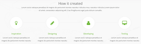
Codes are as follows:
<div class="backgroundImage26 decorative pt-60 pb-60">
  <div class="dnn_layout  animation fadeInUp">
    <div class="content_mid">
      <h3>How it created</h3>
      <p>Content Text1...<span>sit amet, consectetur adipisicing elit.  Cras fringilla eros eget justo dictum convallis. </span></p>
      <div class="row through_line">
        <div class="col-sm-3"> <a href="#" target="blank"><span><em class="fa fa-lightbulb-o"></em></span></a>
          <div class="created_box">
            <h3 class="created_title">Inspiration</h3>
            <p class="created_details">Content Text2...</p>
          </div>
        </div>
        <div class="col-sm-3"> <a href="#" target="blank"><span><em class="fa fa-pencil"></em></span></a>
          <div class="created_box">
            <h3 class="created_title">Designing</h3>
            <p class="created_details">Content Text3...</p>
          </div>
        </div>
        <div class="col-sm-3"> <a href="#" target="blank"><span><em class="fa fa-user"></em></span></a>
          <div class="created_box">
            <h3 class="created_title">Developing</h3>
            <p class="created_details">Content Text4...</p>
          </div>
        </div>
        <div class="col-sm-3"> <a href="#" target="blank"><span><em class="fa fa-desktop"></em></span></a>
          <div class="created_box">
            <h3 class="created_title">Testing</h3>
            <p class="created_details">Content Text5... </p>
          </div>
        </div>
        <div class="line_box"> </div>
      </div>
    </div>
  </div>
</div>
Option:
col-sm-3is the width for each column. You can change the width you need through value1~12- You can modify
animationto change the animation on the slide. Animation list. - You can modify
fato change icons. font icon list.
Theme Features area
Below is the screen shot:
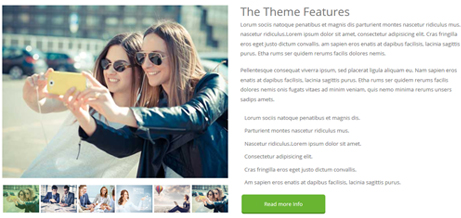
Codes are as follows:
<div class="row pt-60">
  <div class="col-sm-12 col-md-6  animation fadeInLeft">
    <div class="sync_carousel  sync_carousel_1" data-autoheight="false">
      <div class="carousel_main">
        <div class="item"> <img alt="" src="/portals/23/carouse1_big.jpg" /> </div>
        <div class="item"> <img alt="" src="/portals/23/carouse2_big.jpg" /> </div>
        <div class="item"> <img alt="" src="/portals/23/carouse3_big.jpg" /> </div>
        <div class="item"> <img alt="" src="/portals/23/carouse4_big.jpg" /> </div>
        <div class="item"> <img alt="" src="/portals/23/carouse5_big.jpg" /> </div>
      </div>
      <div class="carousel_nav">
        <div class="item"> <img alt="" src="/portals/23/carouse1_big.jpg" /> </div>
        <div class="item"> <img alt="" src="/portals/23/carouse2_big.jpg" /> </div>
        <div class="item"> <img alt="" src="/portals/23/carouse3_big.jpg" /> </div>
        <div class="item"> <img alt="" src="/portals/23/carouse4_big.jpg" /> </div>
        <div class="item"> <img alt="" src="/portals/23/carouse5_big.jpg" /> </div>
      </div>
    </div>
  </div>
  <div class="col-sm-12 col-md-6  animation fadeInRight">
    <div class="theme_features">
      <h3>The Theme Features</h3>
      <p>Content Text1...</p>
      <p>Content Text2...</p>
      <ul>
        <li><span class="fa fa-star"></span>Lorum sociis natoque penatibus et magnis dis.</li>
        <li><span class="fa fa-star"></span>Parturient montes nascetur ridiculus mus.</li>
        <li><span class="fa fa-star"></span>Nascetur ridiculus.Lorem ipsum dolor sit amet.</li>
        <li><span class="fa fa-star"></span>Consectetur adipisicing elit.</li>
        <li><span class="fa fa-star"></span>Cras fringilla eros eget justo dictum convallis.</li>
        <li><span class="fa fa-star"></span>Am sapien eros enatis at dapibus facilisis, lacinia sagittis purus.</li>
      </ul>
      <a href="#" target="blank">Read more Info</a> </div>
  </div>
</div>
Option:
- This is a
Carouseleffect.Carousel col-md-6is the width of each column, you can change the width you need through value1~12.- You can modify
animationto change the animation on the slide. Animation list. - You can modify
fato change icons. font icon list.
Parallax Presentation area
Below is the screen shot:
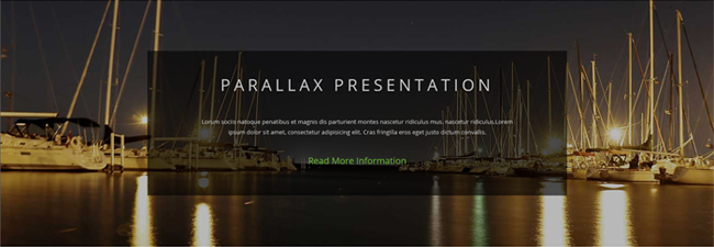
Codes are as follows:
<div class="backgroundImage29 pt-60 pb-60">
  <div class="dnn_layout animation scaleUp">
    <div class="content_mid">
      <div class="parallax">
        <h3>PARALLAX PRESENTATION</h3>
        <p>Content Text1...</p>
        <a href="#" target="blank">Read More Information</a> </div>
    </div>
  </div>
</div>
Option:
- You can modify
animationto change the animation on the slide. Animation list.
Our Team area
Below is the screen shot:
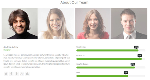
Codes are as follows:
<div class="pt-60 animation scaleUp">
  <h3 class="our_team">About Our Team</h3>
  <div class="horizontalTab_Top horizontalTab_Top_4">
    <ul class="resp-tabs-list ">
      <li><img alt="" class="img-responsive" src="/portals/23/o_team1.jpg" /></li>
      <li><img alt="" class="img-responsive" src="/portals/23/o_team2.jpg" /></li>
      <li><img alt="" class="img-responsive" src="/portals/23/o_team3.jpg" /></li>
      <li><img alt="" class="img-responsive" src="/portals/23/o_team4.jpg" /></li>
    </ul>
    <div class="resp-tabs-container">
      <div class="resp_container">
        <div class="resp_margin">
          <div class="row">
            <div class="col-sm-6">
              <div class="member_introduce">
                <p class="member_title">Andrea Arkov<span>Designer</span></p>
                <p class="member_content">Content Text1...</p>
                <ul>
                  <li><a href="#"><span class="fa fa-twitter"></span></a></li>
                  <li><a href="#"><span class="fa fa-facebook"></span></a></li>
                  <li><a href="#"><span class="fa fa-tumblr"></span></a></li>
                  <li><a href="#"><span class="fa fa-google-plus"></span></a></li>
                  <li><a href="#"><span class="fa fa-apple"></span></a></li>
                </ul>
              </div>
            </div>
            <div class="col-sm-6">
              <div class="loaded_list">
                <p> Web Design </p>
                <div class="progress progress-striped active">
                  <div class="progress-bar animation animationwidth" data-width="90%"><span></span></div>
                </div>
                <p> HTML/CSS</p>
                <div class="progress progress-striped active">
                  <div class="progress-bar animation animationwidth" data-width="95%"><span></span></div>
                </div>
                <p>Graphic Design </p>
                <div class="progress progress-striped active">
                  <div class="progress-bar animation animationwidth" data-width="85%"><span></span> </div>
                </div>
                <p>DNN</p>
                <div class="progress progress-striped active">
                  <div class="progress-bar animation animationwidth" data-width="75%"><span></span></div>
                </div>
              </div>
            </div>
          </div>
        </div>
      </div>
      <div class="resp_container">
        <div class="resp_margin">
          <div class="row">
            <div class="col-sm-6">
              <div class="member_introduce">
                <p class="member_title">Andrea Arkov<span>Designer</span></p>
                <p class="member_content">Content Text2...</p>
                <ul>
                  <li><a href="#"><span class="fa fa-twitter"></span></a></li>
                  <li><a href="#"><span class="fa fa-facebook"></span></a></li>
                  <li><a href="#"><span class="fa fa-tumblr"></span></a></li>
                  <li><a href="#"><span class="fa fa-google-plus"></span></a></li>
                  <li><a href="#"><span class="fa fa-apple"></span></a></li>
                </ul>
              </div>
            </div>
            <div class="col-sm-6">
              <div class="loaded_list">
                <p> Web Design </p>
                <div class="progress progress-striped active">
                  <div class="progress-bar animation animationwidth" data-width="30%"><span></span></div>
                </div>
                <p> HTML/CSS</p>
                <div class="progress progress-striped active">
                  <div class="progress-bar animation animationwidth" data-width="55%"><span></span></div>
                </div>
                <p>Graphic Design </p>
                <div class="progress progress-striped active">
                  <div class="progress-bar animation animationwidth" data-width="90%"><span></span> </div>
                </div>
                <p>DNN</p>
                <div class="progress progress-striped active">
                  <div class="progress-bar animation animationwidth" data-width="66%"><span></span></div>
                </div>
              </div>
            </div>
          </div>
        </div>
      </div>
      <div class="resp_container">
        <div class="resp_margin">
          <div class="row">
            <div class="col-sm-6">
              <div class="member_introduce">
                <p class="member_title">Andrea Arkov<span>Designer</span></p>
                <p class="member_content">Content Text3...</p>
                <ul>
                  <li><a href="#"><span class="fa fa-twitter"></span></a></li>
                  <li><a href="#"><span class="fa fa-facebook"></span></a></li>
                  <li><a href="#"><span class="fa fa-tumblr"></span></a></li>
                  <li><a href="#"><span class="fa fa-google-plus"></span></a></li>
                  <li><a href="#"><span class="fa fa-apple"></span></a></li>
                </ul>
              </div>
            </div>
            <div class="col-sm-6">
              <div class="loaded_list">
                <p> Web Design </p>
                <div class="progress progress-striped active">
                  <div class="progress-bar animation animationwidth" data-width="86%"><span></span></div>
                </div>
                <p> HTML/CSS</p>
                <div class="progress progress-striped active">
                  <div class="progress-bar animation animationwidth" data-width="83%"><span></span></div>
                </div>
                <p>Graphic Design </p>
                <div class="progress progress-striped active">
                  <div class="progress-bar animation animationwidth" data-width="23%"><span></span> </div>
                </div>
                <p>DNN</p>
                <div class="progress progress-striped active">
                  <div class="progress-bar animation animationwidth" data-width="93%"><span></span></div>
                </div>
              </div>
            </div>
          </div>
        </div>
      </div>
      <div class="resp_container">
        <div class="resp_margin">
          <div class="row">
            <div class="col-sm-6">
              <div class="member_introduce">
                <p class="member_title">Andrea Arkov<span>Designer</span></p>
                <p class="member_content">Content Text4...</p>
                <ul>
                  <li><a href="#"><span class="fa fa-twitter"></span></a></li>
                  <li><a href="#"><span class="fa fa-facebook"></span></a></li>
                  <li><a href="#"><span class="fa fa-tumblr"></span></a></li>
                  <li><a href="#"><span class="fa fa-google-plus"></span></a></li>
                  <li><a href="#"><span class="fa fa-apple"></span></a></li>
                </ul>
              </div>
            </div>
            <div class="col-sm-6">
              <div class="loaded_list">
                <p> Web Design </p>
                <div class="progress progress-striped active">
                  <div class="progress-bar animation animationwidth" data-width="56%"><span></span></div>
                </div>
                <p> HTML/CSS</p>
                <div class="progress progress-striped active">
                  <div class="progress-bar animation animationwidth" data-width="44%"><span></span></div>
                </div>
                <p>Graphic Design </p>
                <div class="progress progress-striped active">
                  <div class="progress-bar animation animationwidth" data-width="66%"><span></span> </div>
                </div>
                <p>DNN</p>
                <div class="progress progress-striped active">
                  <div class="progress-bar animation animationwidth" data-width="76%"><span></span></div>
                </div>
              </div>
            </div>
          </div>
        </div>
      </div>
    </div>
  </div>
</div>
Option:
- You can modify
animationto change the animation on the slide. Animation list. - You can modify
fato change icons. font icon list.
Contact area
Below is the screen shot:
Codes are as follows:
<div class="backgroundImage26 pt-60 pb-60">
  <div class="dnn_layout">
    <div class="content_mid">
      <div class="row">
        <div class="col-sm-4 animation rotateIn">
          <div class="contact_information"> <span class="fa fa-map-marker"></span>
            <p class="info_title">Address</p>
            <p class="info_article">XingAn Street No.287 ChangQing Road, Jianghan District Wuhan City, Hubei Province of China.</p>
          </div>

        </div>
        <div class="col-sm-4 animation rotateIn">
          <div class="contact_information"> <span class="fa fa-phone"></span>
            <p class="info_title">Phone</p>
            <p class="info_article"><span>Phone: 123-234-123-4567</span><span>Tax: 123-456-798-0234</span></p>
          </div>
        </div>
        <div class="col-sm-4 animation rotateIn">
          <div class="contact_information"> <span class="fa fa-envelope"></span>
            <p class="info_title">Email Address</p>
            <p class="info_article"><span>dnnskindev@gmail.com</span><span>admin@dnngo.net</span></p>
          </div>
        </div>
      </div>
    </div>
  </div>
</div>
Option:
- You can modify
fato change icons. font icon list. - You can modify
animationto change the animation on the slide. Animation list. col-sm-4is the width for each column. You can change the width you need through value1~12
Contact Us Form area
Below is the screen shot:
Option:
- This is
Theme_Responsive_20047_home4theme ofDNNGo PowerFormsmodule - You can modify
animation scaleUpto change the animation on the slide. Animation list. Containeris usingContainer-18
Location area
Below is the screen shot:
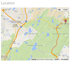
Codes are as follows:
<div id="gmap01" class="animation fadeInRight"></div>
Footer Info area
Below is the screen shot:
Codes are as follows:
<div class="f_business animation fadeInUp">
    <span class="b_title">Business</span>
    <span class="subscribe">Subscribe to our products</span>
  <p>
    <input type="text" placeholder="Email Address" />
    <input type="button" value="DONE" />
  </p>
</div>
Option:
- You can modify
animationto change the animation on the slide. Animation list.
HomeVersion5
You can click the link to check HomeVersion5 demo. HomeVersion5
Contact Us area
Below is the screen shot:
Codes are as follows:
<ul class="Header_Info">
  <li> <span class="fa  fa-phone"></span> Call Us : (+088) - 0123 - 456 789 </li>
  <li> <span class="fa fa-envelope"></span> Email Us : dnnskindev@gmail.com </li>
</ul>
Banner area
Below is the screen shot:

It is using DNNGo LayerGalleryPro module here, you can import ContentListEntity-Home1.xml of the DNNGo_LayerGalleryPro folder to duplicate banner of the demo.
Services list area
Below is the screen shot:
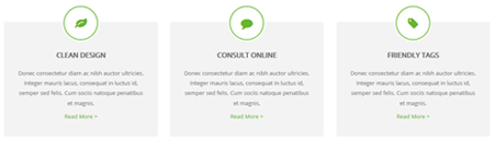
Codes are as follows:
<div class="functionList_5 row pt-30 pb-20">
  <div class="col-sm-4">
    <div class="functionBox animation zoomInUp">
      <div class="functionIcon">
        <div class="Ico_border"><span class="fa fa-leaf"></span></div>
      </div>
      <div class="functiontitle"> CLEAN DESIGN</div>
      <div class="functionMain">
        <p>Donec consectetur diam ac nibh auctor ultricies. Integer mauris lacus, consequat in luctus id, semper sed felis. Cum sociis natoque penatibus et magnis.</p>
        <a href="http://store.dnnsoftware.com/home/product-details/packageid/33822/r/7ab93d48c5e846d6b199" target="blank">Read More  ></a> </div>
    </div>
  </div>
  <div class="col-sm-4">
    <div class="functionBox animation zoomInUp">
      <div class="functionIcon">
        <div class="Ico_border"><span class="fa fa-comment"></span></div>
      </div>
      <div class="functiontitle">CONSULT ONLINE</div>
      <div class="functionMain">
        <p>Donec consectetur diam ac nibh auctor ultricies. Integer mauris lacus, consequat in luctus id, semper sed felis. Cum sociis natoque penatibus et magnis.</p>
        <a href="http://store.dnnsoftware.com/home/product-details/packageid/33822/r/7ab93d48c5e846d6b199" target="blank">Read More  ></a> </div>
    </div>
  </div>
  <div class="col-sm-4">
    <div class="functionBox animation zoomInUp">
      <div class="functionIcon">
        <div class="Ico_border"><span class="fa fa-tag"></span> </div>
      </div>
      <div class="functiontitle">FRIENDLY TAGS </div>
      <div class="functionMain">
        <p>Donec consectetur diam ac nibh auctor ultricies. Integer mauris lacus, consequat in luctus id, semper sed felis. Cum sociis natoque penatibus et magnis.</p>
        <a href="http://store.dnnsoftware.com/home/product-details/packageid/33822/r/7ab93d48c5e846d6b199" target="blank">Read More  ></a> </div>
    </div>
  </div>
</div>
Option:
col-sm-4is the width of each column, you can change the width you need through value1~12.- You can modify
fato change icons. font icon list. - You can modify
animationto change the animation on the slide. Animation list.
Latest Projects area
Below is the screen shot:
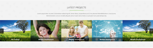
Codes are as follows:
<div class="latest_projects backgroundImage30 pt-60 pb-60">
  <div class="dnn_layout animation scaleUp">
    <div class="content_mid">
      <h3 class="hom5_common_title"><span>LATEST PROJECTS</span></h3>
      <p>Content Text...<span> Morbi tincidunt, orci ac convallis aliquam, lectus turpis varius lorem, eu posuere nunc justo tempus leo.</span></p>
    </div>
  </div>
  <div data-autoheight="false" data-navigation="true" data-pagination="false" class="carousel carousel_8 animation scaleUp">
    <div class="item">
      <div class="photo_box content_bottom_push_in_2">
        <div class="pic_box"> <img alt="" src="/portals/23/Photo8.jpg" />
          <div class="content">
            <div class="vertical_center_1">
              <div class="vertical_center_2">
                <h3>Responsive Web</h3>
                <p>Donec libero. Suspendisse purus nec placerat bibendbibendum.</p>
                <div class="ico">
                    <a href="#" target="blank"><span class="fa fa-link"></span> </a>
                    <a class="LightBox_image_gallery4" href="/Portals/23/Photo8.jpg"><span class="fa-search fa"></span></a>
                </div>
              </div>
            </div>
          </div>
          <div class="shade"></div>
        </div>
      </div>
    </div>
    <div class="item">
      <div class="photo_box content_bottom_push_in_2">
        <div class="pic_box"> <img alt="" src="/portals/23/Photo2.jpg" />
          <div class="content">
            <div class="vertical_center_1">
              <div class="vertical_center_2">
                <h3>Create Website</h3>
                <p>Donec libero. Suspendisse purus nec placerat bibendbibendum.</p>
                <div class="ico">
                    <a href="#" target="blank"><span class="fa fa-link"></span> </a>
                    <a class="LightBox_image_gallery4" href="/Portals/23/Photo2.jpg"><span class="fa-search fa"></span></a>
                </div>
              </div>
            </div>
          </div>
          <div class="shade"></div>
        </div>
      </div>
    </div>
    <div class="item">
      <div class="photo_box content_bottom_push_in_2">
        <div class="pic_box"> <img alt="" src="/portals/23/Photo5.jpg" />
          <div class="content">
            <div class="vertical_center_1">
              <div class="vertical_center_2">
                <h3>DNN Module</h3>
                <p>Donec libero. Suspendisse purus nec placerat bibendbibendum.</p>
                <div class="ico">
                    <a href="#" target="blank"><span class="fa fa-link"></span> </a>
                    <a class="LightBox_image_gallery4" href="/Portals/23/Photo5.jpg"><span class="fa-search fa"></span></a>
                </div>
              </div>
            </div>
          </div>
          <div class="shade"></div>
        </div>
      </div>
    </div>
    <div class="item">
      <div class="photo_box content_bottom_push_in_2">
        <div class="pic_box"> <img alt="" src="/portals/23/Photo6.jpg" />
          <div class="content">
            <div class="vertical_center_1">
              <div class="vertical_center_2">
                <h3>Professional Work</h3>
                <p>Donec libero. Suspendisse purus nec placerat bibendbibendum.</p>
                <div class="ico">
                    <a href="#" target="blank"><span class="fa fa-link"></span> </a>
                    <a class="LightBox_image_gallery4" href="/Portals/23/Photo6.jpg"><span class="fa-search fa"></span></a>
                </div>
              </div>
            </div>
          </div>
          <div class="shade"></div>
        </div>
      </div>
    </div>
    <div class="item">
      <div class="photo_box content_bottom_push_in_2">
        <div class="pic_box"> <img alt="" src="/portals/23/Photo8.jpg" />
          <div class="content">
            <div class="vertical_center_1">
              <div class="vertical_center_2">
                <h3>Site Settings</h3>
                <p>Donec libero. Suspendisse purus nec placerat bibendbibendum.</p>
                <div class="ico">
                    <a href="#" target="blank"><span class="fa fa-link"></span> </a>
                    <a class="LightBox_image_gallery4" href="/Portals/23/Photo8.jpg"><span class="fa-search fa"></span></a>
                </div>
              </div>
            </div>
          </div>
          <div class="shade"></div>
        </div>
      </div>
    </div>
    <div class="item">
      <div class="photo_box content_bottom_push_in_2">
        <div class="pic_box"> <img alt="" src="/portals/23/Photo2.jpg" />
          <div class="content">
            <div class="vertical_center_1">
              <div class="vertical_center_2">
                <h3>Module Development</h3>
                <p>Donec libero. Suspendisse purus nec placerat bibendbibendum.</p>
                <div class="ico">
                    <a href="#" target="blank"><span class="fa fa-link"></span> </a>
                    <a class="LightBox_image_gallery4" href="/Portals/23/Photo2.jpg"><span class="fa-search fa"></span></a>
                </div>
              </div>
            </div>
          </div>
          <div class="shade"></div>
        </div>
      </div>
    </div>
    <div class="item">
      <div class="photo_box content_bottom_push_in_2">
        <div class="pic_box"> <img alt="" src="/portals/23/Photo5.jpg" />
          <div class="content">
            <div class="vertical_center_1">
              <div class="vertical_center_2">
                <h3>Module Development</h3>
                <p>Donec libero. Suspendisse purus nec placerat bibendbibendum.</p>
                <div class="ico">
                    <a href="#" target="blank"><span class="fa fa-link"></span> </a>
                    <a class="LightBox_image_gallery4" href="/Portals/23/Photo5.jpg"><span class="fa-search fa"></span></a>
                </div>
              </div>
            </div>
          </div>
          <div class="shade"></div>
        </div>
      </div>
    </div>
    <div class="item">
      <div class="photo_box content_bottom_push_in_2">
        <div class="pic_box"> <img alt="" src="/portals/23/Photo6.jpg" />
          <div class="content">
            <div class="vertical_center_1">
              <div class="vertical_center_2">
                <h3>Module Development</h3>
                <p>Donec libero. Suspendisse purus nec placerat bibendbibendum.</p>


                <div class="ico">
                    <a href="#" target="blank"><span class="fa fa-link"></span> </a>
                    <a class="LightBox_image_gallery4" href="/Portals/23/Photo6.jpg"><span class="fa-search fa"></span></a>
                </div>
              </div>
            </div>
          </div>
          <div class="shade"></div>
        </div>
      </div>
    </div>
    <div class="item">
      <div class="photo_box content_bottom_push_in_2">
        <div class="pic_box"> <img alt="" src="/portals/23/Photo8.jpg" />
          <div class="content">
            <div class="vertical_center_1">
              <div class="vertical_center_2">
                <h3>Module Development</h3>
                <p>Donec libero. Suspendisse purus nec placerat bibendbibendum.</p>
                <div class="ico">
                    <a href="#" target="blank"><span class="fa fa-link"></span> </a>
                    <a class="LightBox_image_gallery4" href="/Portals/23/Photo8.jpg"><span class="fa-search fa"></span></a>
                </div>
              </div>
            </div>
          </div>
          <div class="shade"></div>
        </div>
      </div>
    </div>
  </div>
</div>
Option:
- This is a
Carouseleffect.You can modifyCarouselto change image effects. Carousel. - You can modify
fato change icons. font icon list. - You can modify
animation scaleUpto change the animation on the slide. Animation list.
Our Features area
Below is the screen shot:
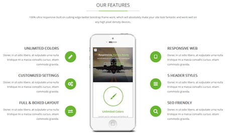
Codes are as follows:
<div class="home5_our_feature pt-60">
  <h3 class="hom5_common_title"><span>OUR FEATURES</span></h3>
  <p>Content Text...<span> any high pixel density devices.</span> </p>
  <div class="row hom5_ServeList mt-40 animation animated">
    <div class="col-sm-4">
      <ul class="left">
        <li class="animation fadeInLeft delay1">
          <h5>UNLIMITED COLORS</h5>
          <p> Donec in ut odio libero, at vulputate urna nulla tristique mi a massa convallis cursus. etiam commodo gravida. </p>
          <a href="#"><span class="fa fa-pencil"></span></a> </li>
        <li class="animation fadeInLeft delay2">
          <h5>CUSTOMIZED SETTINGS</h5>
          <p> Donec in ut odio libero, at vulputate urna nulla tristique mi a massa convallis cursus. etiam commodo gravida. </p>
          <a href="#"><span class="fa fa-cogs"></span></a> </li>
        <li class="animation fadeInLeft delay3">
          <h5>FULL & BOXED LAYOUT</h5>
          <p> Donec in ut odio libero, at vulputate urna nulla tristique mi a massa convallis cursus. etiam commodo gravida. </p>
          <a href="#"><span class="fa fa-exchange"></span></a> </li>
      </ul>
    </div>
    <div class="col-sm-4 center animation_item fadeInUp"><img alt="" class="img-responsive" src="/portals/23/center_mobile.jpg" /></div>
    <div class="col-sm-4">
      <ul class="right">
        <li class="animation fadeInRight delay1">
          <h5>RESPONSIVE WEB</h5>
          <p> Donec in ut odio libero, at vulputate urna nulla tristique mi a massa convallis cursus. etiam commodo gravida. </p>
          <a href="#"><span class="fa fa-tablet"></span></a> </li>
        <li class="animation fadeInRight delay2">
          <h5>5 HEADER STYLES</h5>
          <p> Donec in ut odio libero, at vulputate urna nulla tristique mi a massa convallis cursus. etiam commodo gravida. </p>
          <a href="#"><span class="fa fa-bars"></span></a> </li>
        <li class="animation fadeInRight delay3">
          <h5>SEO FRIENDLY</h5>
          <p> Donec in ut odio libero, at vulputate urna nulla tristique mi a massa convallis cursus. etiam commodo gravida. </p>
          <a href="#"><span class="fa-search fa"></span> </a></li>
      </ul>
    </div>
  </div>
</div>
Option:
col-sm-4is the width of each column, you can change the width you need through value1~12.- You can modify
animationto change the animation on the slide. Animation list. - You can modify
fato change icons. font icon list.
Number area
Below is the screen shot:
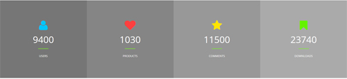
Codes are as follows:
<div class="number_Animation_4 animation scaleUp">
  <div class="row">
    <div class="col-sm-3 number_bg1">
        <span class="fa blue fa-user"> </span>
        <span class="animation  number" data-number="9400">0</span>
        <span>USERS</span>
    </div>
    <div class="col-sm-3 number_bg2">
        <span class="fa red fa-heart"> </span>
        <span class="animation  number" data-number="1030">0</span>
        <span>PRODUCTS</span>
    </div>
    <div class="col-sm-3 number_bg3">
        <span class="fa yellow fa-star"> </span>
        <span class="animation  number" data-number="11500">0</span>
        <span>COMMENTS</span>
    </div>
    <div class="col-sm-3 number_bg4">
        <span class="fa green fa-bookmark"> </span>
        <span class="animation  number" data-number="23740">0</span>
        <span class="fonts">DOWNLOADS</span>
    </div>
  </div>
</div>
Option:
- You can change the value you need to display through
data-number. - You can modify
fato change icons. font icon list. - You can modify
animation scaleUpto change the animation on the slide. Animation list. col-sm-3is the width of each column, you can change the width you need through value1~12.
Welcome area
Below is the screen shot:
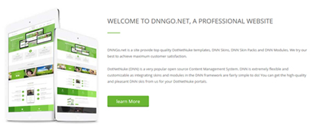
Codes are as follows:
<div class="welcom_box fadeInRight animation">
  <h3><span>WELCOME TO DNNGO.NET, A PROFESSIONAL WEBSITE</span></h3>
  <p>Content Text1...</p>
  <p>Content Text1...</p>
  <a href="#" target="blank" class="Button_green3">learn More</a>

</div>
Option:
- You can modify
animationto change the animation on the slide. Animation list.
Testimonials About Us area
Below is the screen shot:
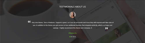
Codes are as follows:
<div class="backgroundImage31 pt-60 pb-60">
  <div class="dnn_layout animation fadeInUp">
    <div class="content_mid">
      <div class="home5_testimonials">
        <h3> TESTIMONIALS  ABOUT US</h3>
        <ul class="Testimonials_tab Testimonials_9" data-position="roll-left" data-display-navigation="true" data-display-arrows="false" data-autoplay="false">
          <li>
            <blockquote>
              <p><span class="Pic"><img alt="" src="/portals/23/team_pic_1.jpg" /></span>Content Text1...</p>
              <small><span>PROdnn S's </span></small> </blockquote>
          </li>
          <li>
            <blockquote>
              <p><span class="Pic"><img alt="" src="/portals/23/team_pic_2.jpg" /></span>Content Text2...</p>
              <small><span>Name</span></small> </blockquote>
          </li>
          <li>
            <blockquote>
              <p><span class="Pic"><img alt="" src="/portals/23/team_pic_3.jpg" /></span>Content Text3...</p>
              <small><span>Name</span></small> </blockquote>
          </li>
          <li>
            <blockquote>
              <p><span class="Pic"><img alt="" src="/portals/23/team_pic_4.jpg" /></span>Content Text4...</p>
              <small><span>Name </span></small> </blockquote>
          </li>
        </ul>
      </div>
    </div>
  </div>
</div>
Option:
- This is a
Testimonialseffect. You can modifyTestimonialsto change image effects. Testimonials. - You can modify
animationto change the animation on the slide. Animation list.
Price area
Below is the screen shot:
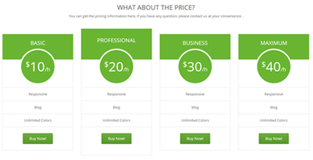
<div class="price_box pt-60 animation scaleUp">
  <h3 class="common_title">WHAT ABOUT THE PRICE?</h3>
  <p>You can get the pricing information here, if you have any question, please contact us at your convenience .</p>
  <div class="price-table price-table2 row">
    <div class="col-sm-3">
      <div class="price_title">
        <h2>BASIC</h2>
      </div>
      <div class="price_holder">
        <div class="price_box"><span class="sup">$</span><span class="price">10</span><span class="unit">/h</span></div>
        <ul>
          <li>Responsive</li>
          <li>Blog</li>
          <li>Unlimited Colors</li>
        </ul>
        <a href="#" target="blank" class="btn ">Buy Now!</a> </div>
    </div>
    <div class="col-sm-3 best_value">
      <div class="price_title ">
        <h2>PROFESSIONAL</h2>
      </div>
      <div class="price_holder">
        <div class="price_box"><span class="sup">$</span><span class="price">20</span><span class="unit">/h</span></div>
        <ul>
          <li>Responsive</li>
          <li>Blog</li>
          <li>Unlimited Colors</li>
        </ul>
        <a href="#" target="blank" class="btn">Buy Now!</a> </div>
    </div>
    <div class="col-sm-3">
      <div class="price_title">
        <h2>BUSINESS</h2>
      </div>
      <div class="price_holder">
        <div class="price_box"><span class="sup">$</span><span class="price">30</span><span class="unit">/h</span></div>
        <ul>
          <li>Responsive</li>
          <li>Blog</li>
          <li>Unlimited Colors</li>
        </ul>
        <a href="#" target="blank" class="btn">Buy Now!</a> </div>
    </div>
    <div class="col-sm-3">
      <div class="price_title">
        <h2>MAXIMUM</h2>
      </div>
      <div class="price_holder">
        <div class="price_box"><span class="sup">$</span><span class="price">40</span><span class="unit">/h</span></div>
        <ul>
          <li>Responsive</li>
          <li>Blog</li>
          <li>Unlimited Colors</li>
        </ul>
        <a href="#" target="blank" class="btn ">Buy Now!</a> </div>
    </div>
  </div>
</div>
Option:
- You can modify
animationto change the animation on the slide. Animation list. col-sm-3is the width for each column. You can change the width you need through value1~12.- You can modify
fato change icons. font icon list.
Welcome area
Below is the screen shot:

<div class="MessageBox MessageBox2   animation scaleUp pt-30 pb-20">
  <div class="Message_Icon"><span class="fa fa-wechat"></span> </div>
  <div class="MessageRightBox">
    <div class="Message_Content">
      <h3> WELCOME TO OUR WEBSITE </h3>
      <p> Content Text...</p>
    </div>
    <div class="Message_Button"> <a class="Button_white" href="#" target="blank"><span>Purchase This Theme</span></a> </div>
  </div>
</div>
Option:
- You can modify
animationto change the animation on the slide. Animation list.
Location area
Below is the screen shot:
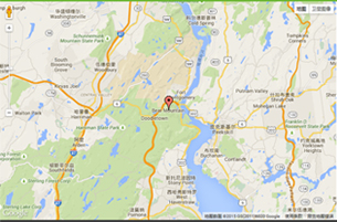
<div id="gmap2" class="fadeInLeft animation"></div>
Option:
- You can change
gmapaddress incustom.js
Contact Us area
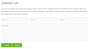
Option:
- This is
Theme_Responsive_20047_home5theme ofDNNGo PowerFormsmodule. - You can modify
animation scaleUpto change the animation on the slide. Animation list. Containeris usingContainer-18
Latest Blogs area
Below is the screen shot:
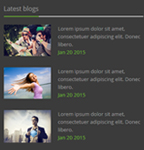
<div class="blog_box animation fadeInUp">
  <div class="wrap clearfix"> <img alt="" class="img-responsive" src="/portals/23/h3_blog1.jpg" />
    <p>Lorem ipsum dolor sit amet,<span> consectetuer adipiscing elit. Donec libero.</span> <span class="date">Jan 20 2015</span></p>
  </div>
  <div class="wrap clearfix"> <img alt="" class="img-responsive" src="/portals/23/h3_blog2.jpg" />
    <p>Lorem ipsum dolor sit amet,<span> consectetuer adipiscing elit. Donec libero.</span> <span class="date">Jan 20 2015</span></p>
  </div>
  <div class="wrap clearfix"> <img alt="" class="img-responsive" src="/portals/23/h3_blog3.jpg" />
    <p>Lorem ipsum dolor sit amet,<span> consectetuer adipiscing elit. Donec libero.</span> <span class="date">Jan 20 2015</span></p>
  </div>
</div>
Option:
- You can modify
animationto change the animation on the slide. Animation list. Containeris usingContainer-3
Our Services area
Below is the screen shot:
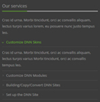
<div class="service animation fadeInUp">
  <p>Cras id urna. Morbi tincidunt, orci ac convallis aliquam, lectus turpis varius lorem, eu posuere nunc justo tempus leo.</p>
  <div id="accordion7" class="panel-group accordion_7">
    <div class="panel panel-default">
      <div class="panel-heading">
        <h4 class="panel-title"> <a data-parent="#accordion7" data-toggle="collapse" href="#item7_1"><span class="accordion_icon"></span>Customize DNN Skins</a> </h4>
      </div>
      <div id="item7_1" class="panel-collapse collapse in">
        <div class="panel-body">Cras id urna. Morbi tincidunt, orci ac convallis aliquam, lectus turpis varius Morbi tincidunt, orci ac convallis tempus leo. </div>
      </div>
    </div>
    <div class="panel panel-default">
      <div class="panel-heading">
        <h4 class="panel-title"> <a data-parent="#accordion7" data-toggle="collapse" class="collapsed" href="#item7_2"><span class="accordion_icon"></span>Customize DNN Modules</a> </h4>
      </div>
      <div id="item7_2" class="panel-collapse collapse">
        <div class="panel-body">Cras id urna. Morbi tincidunt, orci ac convallis aliquam, lectus turpis varius Morbi tincidunt, orci ac convallis tempus leo.</div>
      </div>
    </div>
    <div class="panel panel-default">
      <div class="panel-heading">
        <h4 class="panel-title"> <a data-parent="#accordion7" data-toggle="collapse" class="collapsed" href="#item7_3"><span class="accordion_icon"></span>Building/Copy/Convert DNN Sites</a> </h4>
      </div>
      <div id="item7_3" class="panel-collapse collapse">
        <div class="panel-body">Cras id urna. Morbi tincidunt, orci ac convallis aliquam, lectus turpis varius Morbi tincidunt, orci ac convallis tempus leo.</div>
      </div>
    </div>
    <div class="panel panel-default">
      <div class="panel-heading">
        <h4 class="panel-title"> <a data-parent="#accordion7" data-toggle="collapse" class="collapsed" href="#item7_4"><span class="accordion_icon"></span>Set up the DNN Site</a> </h4>
      </div>
      <div id="item7_4" class="panel-collapse collapse">
        <div class="panel-body">Cras id urna. Morbi tincidunt, orci ac convallis aliquam, lectus turpis varius Morbi tincidunt, orci ac convallis tempus leo.</div>
      </div>
    </div>
  </div>
</div>
Option:
- This is an
Accordionseffect.You can modifyAccordionsto change image effects. Accordions. - You can modify
animationto change the animation on the slide. Animation list. - You can modify
fato change icons. font icon list. Containeris usingContainer-3
Contact Info area
Below is the screen shot:
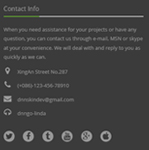
<p class="animation fadeInUp">Content Text1...</p>
<ul class="Contact_List animation fadeInUp ">
  <li><span class="fa fa-map-marker"></span> XingAn Street No.287</li>
  <li><span class="fa fa-phone"></span> (+086)-123-456-78910</li>
  <li><span class="fa fa-envelope"></span> dnnskindev@gmail.com</li>
  <li><span class="fa fa-headphones"></span> dnngo-linda</li>
</ul>
<div class="icon_only animation fadeInUp">
    <a href="#"><span class="fa fa-twitter"></span></a>
    <a href="#"><span class="fa fa-facebook"></span></a>
    <a href="#"><span class="fa fa-tumblr"></span></a>
    <a href="#"><span class="fa  fa-youtube"></span></a>
    <a href="#"><span class="fa fa-google-plus"></span></a>
    <a href="#"><span class="fa fa-apple"></span></a>
</div>
Option:
- You can modify
animationto change the animation on the slide. Animation list. - You can modify
fato change icons. font icon list. Containeris usingContainer-3
HomeVersion6
You can click the link to check HomeVersion6 demo. HomeVersion6
Anchor area
It will scroll to the corresponding area on the page when clicking the menu texts at the top. It will also do so when clicking the dots on the right of the skin.
These anchors are generated through page's anchorTag. Codes are as follows. You can place this piece of codes in page's HTML module, click the right anchor, then page will slide to this HTML module area.
<div class="iconimg anchorTag pb-60 " data-title="About Us" data-icourl="/Portals/0/home3con_a.png" data-scrollshownav="true" data-menuanchor="true">
	<span><img alt="" src="/portals/0/home3con_a.png" /></span>
</div>
Option:
data-title |
Title displayed correspondingly to the right navigation. If page title of the menu is the same as data-title, page will scroll to this area when clicking menu texts. |
data-menuanchor |
Whether to enable menu anchor feature or not. |
data-scrollshownav |
Whether to enable navigation or not. |
data-offset |
Offset value of up and down coordinate for anchor. |
data-icourl |
Image url that displays correspondingly of the right navigation. |
data-iconame |
Icon class names that displays correspondingly of the right navigation. |
How to set menu anchor
- Click Add New Page button.
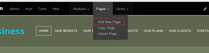
- Fill in Page Name and Page Title. Texts for Page Title needs to be the same as that of data-title.
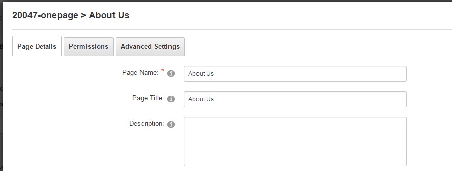
- Put the anchor code to HTML module of the page. It will scroll to the corresponding area on the page when clicking the top menu texts.
- <div data-title="About Us" class="anchorTag" data-offset="-60" data-scrollshownav="true" data-menuanchor="true"> </div>
Banner area
Below is the screen shot:
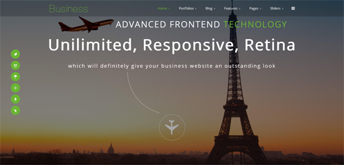
Codes are as follows:
<ul class="full_screen_pic">
  <li style="background-image: url('http://demo7.dnngo.net/Portals/23/home5-banner_1.jpg');">
    <div class="content">
      <div class="animation_1"></div>
      <div class="title animation_2">
        <p class="titl01 animation periodic1 animated"><img alt="" src="/portals/23/banner_img.png" />Advanced frontend<a href="#"> technology</a></p>
        <p class="titl02 animation periodic2 animated">Unilimited, Responsive, Retina </p>
        <p class="titl03 animation periodic3 animated">which will definitely give your business website an outstanding look</p>
      </div>
      <div class="Home5_line animation periodic4 animated"> <img alt="" src="/portals/23/home5_line.png" /></div>
      <div class="animation periodic5 animated" id="nextPage"><span>Next</span></div>
    </div>
  </li>
</ul>
Option:
- You can modify
background-imageto change background image.
Our Team Offer area
Below is the screen shot:

Codes are as follows:
<div class="Home5_one_bg pt-50 pb-50">
  <div class="dnn_layout clearfix ">
    <div class="content_mid animation fadeInUp ">
      <div class="row">
        <div class=" col-md-8  col-sm-12">
          <p class="Top_one_con">Our team offer a variety of customization service according to your needs</p>
        </div>
        <div class="clearfix visible-sm"></div>
        <div class=" col-md-4 col-sm-12">
            <a class="Button_default3" href="#" target="blank"> <span>Learn More</span> </a>
            <a class="Button_default3" href="#" target="blank"> <span>Buy It</span> </a>
        </div>
      </div>
    </div>
  </div>
</div>
Option:
- You can modify
animationto change the animation on the slide. Animation list. col-sm-8 col-sm-4is the width for each column. You can change the width you need through value1~12.
About Us area
Below is the screen shot:

Codes are as follows:
<div class="Home5_AboutUs clearfix">
  <div class="OurProcess_tit  AboutUs_tit_color tit_marg_bot">
    <h2>About Us</h2>
  </div>
  <div class="row">
    <div class="H5_AboutUs_Left col-sm-6 animation fadeInLeft ">
      <h2>Welcome to DNNGo.net, a professional website</h2>
      <p>Content Text...</p>
      <ul class="H5_list_one">
        <li><a href="#" target="blank"><span class="fa fa-magic"></span>Customize purchased/new DNN Skins</a></li>
        <li><a href="#" target="blank"><span class="fa fa-wechat"></span>Customize purchased/new DNN Modules</a></li>
        <li><a href="#" target="blank"><span class="fa fa-globe"></span>Build/Modify/Backup/Transfer the DNN site for you</a></li>
      </ul>
      <a class="Button_default3 Button_default3_f17" href="#" target="blank"> <span>Learn More</span> </a> </div>
    <div class="H5_AboutUs_Rifght col-sm-6 animation fadeInRight"> <img alt="" src="/portals/23/home50_image01.jpg" /> </div>
  </div>
</div>
<br />
Option:
- You can modify
animationto change the animation on the slide. Animation list. - You can modify
fato change icons. font icon list.
Airplane area
Below is the screen shot:

Codes are as follows:
<div class="backgroundImage19">
  <div class="dnn_layout animation fadeInUp">
    <div class="content_mid ">
      <div class="First_bg_image">
        <h2>Appealing skins and versatile modules</h2>
        <br />
        <div class="backgroundImage19_con">Enjoy innovative, personalized and powerful services for your online business</div>
      </div>
    </div>
  </div>
</div>
Option:
- You can modify
animationto change the animation on the slide. Animation list.
Our Works area
Below is the screen shot:
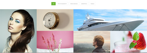
Codes are as follows:
<div class="isotope_grid isotope_grid_home5 animation fadeInUp">
  <div class="isotope_group pb40">
      <a data-filter="*" href="#" class="active">All</a>
      <a data-filter=".photography" href="#">PHOTOGRAPHY</a>
      <a data-filter=".webdesign" href="#">WEB DESIGN</a>
      <a data-filter=".graphics" href="#">GRAPHICS</a>
      <a data-filter=".video" href="#">VIDEO</a>
  </div>
  <div class="isotope_main" data-min-width="381">
    <div class="isotope_item photography graphics">
      <div class="photo_box img_zoom ico_zoom"> <a target="blank" href="#">
        <div class="pic_box"> <img alt="" src="/portals/23/isotope_img_11.jpg" />
          <div class="content">
            <div class="vertical_center_1">
              <div class="vertical_center_2">
                <div class="ico"><span class="fa fa-link"></span></div>
                <h3>IMAGE TITLE</h3>
                <p>Photos,Design</p>
              </div>
            </div>
          </div>
          <div class="shade"></div>
        </div>
        </a> </div>
    </div>
    <div class="isotope_item  webdesign">
      <div class="photo_box img_zoom ico_zoom"> <a target="blank" href="#">
        <div class="pic_box"> <img alt="" src="/portals/23/isotope_img_02.jpg" />
          <div class="content">
            <div class="vertical_center_1">
              <div class="vertical_center_2">
                <div class="ico"><span class="fa fa-link"></span></div>
                <h3>IMAGE TITLE</h3>
                <p>Photos,Design</p>
              </div>
            </div>
          </div>
          <div class="shade"></div>
        </div>
        </a> </div>
    </div>
    <div class="isotope_item graphics video" data-zoom="2">
      <div class="photo_box img_zoom ico_zoom"> <a target="blank" href="#">
        <div class="pic_box"> <img alt="" src="/portals/23/isotope_img_03.jpg" />
          <div class="content">
            <div class="vertical_center_1">
              <div class="vertical_center_2">
                <div class="ico"><span class="fa fa-link"></span></div>
                <h3>IMAGE TITLE</h3>
                <p>Photos,Design</p>
              </div>
            </div>
          </div>
          <div class="shade"></div>
        </div>
        </a> </div>
    </div>
    <div class="isotope_item video">
      <div class="photo_box img_zoom ico_zoom"> <a target="blank" href="#">
        <div class="pic_box"> <img alt="" src="/portals/23/isotope_img_04.jpg" />
          <div class="content">
            <div class="vertical_center_1">
              <div class="vertical_center_2">
                <div class="ico"><span class="fa fa-link"></span></div>
                <h3>IMAGE TITLE</h3>
                <p>Photos,Design</p>
              </div>
            </div>
          </div>
          <div class="shade"></div>
        </div>
        </a> </div>
    </div>
    <div class="isotope_item blogs video">
      <div class="photo_box img_zoom ico_zoom"> <a target="blank" href="#">
        <div class="pic_box"> <img alt="" src="/portals/23/isotope_img_05.jpg" />
          <div class="content">
            <div class="vertical_center_1">
              <div class="vertical_center_2">
                <div class="ico"><span class="fa fa-link"></span></div>
                <h3>IMAGE TITLE</h3>
                <p>Photos,Design</p>
              </div>
            </div>
          </div>
          <div class="shade"></div>
        </div>
        </a> </div>
    </div>
    <div class="isotope_item video webdesign photography">
      <div class="photo_box img_zoom ico_zoom"> <a target="blank" href="#">
        <div class="pic_box"> <img alt="" src="/portals/23/isotope_img_06.jpg" />
          <div class="content">
            <div class="vertical_center_1">
              <div class="vertical_center_2">
                <div class="ico"><span class="fa fa-link"></span></div>
                <h3>IMAGE TITLE</h3>
                <p>Photos,Design</p>
              </div>
            </div>
          </div>
          <div class="shade"></div>
        </div>
        </a> </div>
    </div>
  </div>
</div>
Option:
- You can add
<a data-filter=".FilterName" href="#">Filter Name</a>to increase categories.data-filter=".FilterName"can not be blank space. - You can modify
data-min-widthto change minimum width of image. - You can modify
isotope_itemFilterNameto categorize images. - You can modify
animationto change or delete animation.Animation list.
Our Process area
Below is the screen shot:
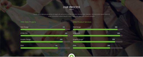
Codes are as follows:
<div class="backgroundImage20"> <br />
  <br />
  <br />
  <div class="dnn_layout">
    <div class="content_mid ">
      <div class="OurProcess_tit Process_tit_color ">
        <h2>Our Process</h2>
      </div>
      <div class="OurProcess_con pb40 pt40 animation fadeInDown">
        <div style="text-align: center;"> Content Text1...</div>
        <div style="text-align: center;">Content Text2...</div>
      </div>
      <div class="row Home5_loaded_list">
        <div class="col-sm-6 animation fadeInLeft">
          <div class=" loaded_list">
            <h2>DNN Web Projects</h2>
            <p> Web Design </p>
            <div class="progress progress-striped active">
              <div class="progress-bar animation animationwidth" data-width="90%"><span></span></div>
            </div>
            <p> HTML/CSS</p>
            <div class="progress progress-striped active">
              <div class="progress-bar animation animationwidth" data-width="95%"><span></span></div>
            </div>
            <p>Graphic Design </p>
            <div class="progress progress-striped active">
              <div class="progress-bar animation animationwidth" data-width="85%"><span></span> </div>
            </div>
            <p>DNN</p>
            <div class="progress progress-striped active">
              <div class="progress-bar animation animationwidth" data-width="75%"><span></span></div>
            </div>
          </div>
        </div>
        <div class="col-sm-6 animation fadeInRight">
          <div class=" loaded_list">
            <h2>DNN Product Services</h2>
            <p> Web Design </p>
            <div class="progress progress-striped active">
              <div class="progress-bar animation animationwidth" data-width="90%"><span></span></div>
            </div>
            <p> HTML/CSS</p>
            <div class="progress progress-striped active">
              <div class="progress-bar animation animationwidth" data-width="95%"><span></span></div>
            </div>
            <p>Graphic Design </p>
            <div class="progress progress-striped active">
              <div class="progress-bar animation animationwidth" data-width="85%"><span></span> </div>
            </div>
            <p>DNN</p>
            <div class="progress progress-striped active">
              <div class="progress-bar animation animationwidth" data-width="75%"><span></span></div>
            </div>
          </div>
        </div>
      </div>
    </div>
  </div>
  <br />
  <br />
  <br />
</div>
Option:
- This is a
ProgressBarsCounterseffect. ProgressBarsCounters. - You can modify
animationto change the animation on the slide. Animation list.
Our Services area
Below is the screen shot:
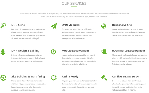
Codes are as follows:
<div class="iconimg anchorTag pb-60 " data-title="Our Process" data-icourl="/Portals/23/home3con_c.png">
    <span> <img alt="" src="/portals/23/home3con_c.png" /> </span>
</div>
<div class="dnn_layout">
  <div class="content_mid ">
    <div class="OurProcess_tit  Service_tit_color  ">
      <h2>Our Services</h2>
    </div>
    <div class="OurProcess_con pb40  pt40 animation fadeInUp ">
      <div style="text-align: center;"> Content Text1...</div>
      <div style="text-align: center;">Content Text2...</div>
    </div>
    <div class="row animation fadeInUp ">
      <div class="col-sm-4  H6_Services_box">
        <div class="H6_Services_con"> <span class="fa fa-magic"></span>
          <h2>DNN Skins</h2>
          Content Text3...</div>
      </div>
      <div class="col-sm-4  H6_Services_box">
        <div class="H6_Services_con"> <span class="fa fa-send"></span>
          <h2>DNN Modules</h2>
          Content Text4...</div>
      </div>
      <div class="col-sm-4  H6_Services_box">
        <div class="H6_Services_con"> <span class="fa fa-globe"></span>
          <h2>Responsive Site</h2>
          Content Text5... </div>
      </div>
    </div>
    <div class="row animation fadeInUp ">
      <div class="col-sm-4  H6_Services_box">
        <div class="H6_Services_con"> <span class="fa fa-tree"></span>
          <h2>DNN Design & Skining</h2>
          Content Text6... </div>
      </div>
      <div class="col-sm-4  H6_Services_box">
        <div class="H6_Services_con"> <span class="fa fa-clock-o"></span>
          <h2>Module Development</h2>
          Content Text7... </div>
      </div>
      <div class="col-sm-4  H6_Services_box">
        <div class="H6_Services_con"> <span class="fa fa-beer"></span>
          <h2>eCommerce Development</h2>
          Content Text8...</div>
      </div>
    </div>
    <div class="row animation fadeInUp ">
      <div class="col-sm-4  H6_Services_box">
        <div class="H6_Services_con"> <span class="fa  fa-futbol-o"></span>
          <h2>Site Building & Transfering</h2>
          Content Text9... </div>
      </div>
      <div class="col-sm-4  H6_Services_box">
        <div class="H6_Services_con"> <span class="fa fa-sun-o"></span>
          <h2>Retina Ready</h2>
          Content Text10... </div>
      </div>
      <div class="col-sm-4  H6_Services_box">
        <div class="H6_Services_con"> <span class="fa fa-legal"></span>
          <h2> Configure DNN server</h2>
          Content Text11... </div>
      </div>
    </div>
  </div>
</div>
Option:
col-sm-4is the width of each column, you can change the width you need through value1~12.- You can modify
animationto change the animation on the slide. Animation list. - You can modify
fato change icons. font icon list.
Our Fun Facts area
Below is the screen shot:
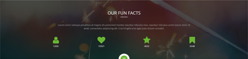
Codes are as follows:
<div class="backgroundImage21">
  <div class="dnn_layout animation scaleUp">
    <div class="content_mid">
      <div class="OurProcess_tit Process_tit_color">
        <h2>Our Fun Facts</h2>
      </div>
      <div class="OurProcess_con pb40  pt40 ">
        <div style="text-align: center;"> Content Text1...</div>
        <div style="text-align: center;">Content Text2...</div>
      </div>
      <div class="center">
        <div class="number_Animation row H6_number_Animation ">
          <div class="col-md-3 col-sm-3 col-xs-6 ">
              <span class="fa fa-user"> </span> <span class="animation  number" data-number="5300">0</span>
          </div>
          <div class="col-md-3 col-sm-3 col-xs-6">
              <span class="fa fa-heart"> </span> <span class="animation  number" data-number="10321">0</span>
          </div>
          <div class="col-md-3 col-sm-3 col-xs-6">
              <span class="fa fa-star"> </span> <span class="animation  number" data-number="4632">0</span>
          </div>
          <div class="col-md-3 col-sm-3 col-xs-6">
              <span class="fa fa-bookmark"> </span> <span class="animation  number" data-number="6548">0</span>
          </div>
        </div>
      </div>
    </div>
  </div>
</div>
Option:
- This is a
ProgressBarsCounterseffect. ProgressBarsCounters. - You can modify
animation scaleUpto change the animation on the slide. Animation list. - You can modify
fato change icons. font icon list. col-md-3is the width of each column, you can change the width you need through value1~12.
Meet Our Team area
Below is the screen shot:

Codes are as follows:
<div class="iconimg anchorTag pb-60 animation scaleUp" data-title="Our Team" data-icourl="/Portals/23/home3con_d.png">
    <span> <img alt="" src="/portals/23/home3con_d.png" /> </span>
</div>
<div class="dnn_layout animation scaleUp">
  <div class="content_mid ">
    <div class="OurProcess_tit  Service_tit_color">
      <h2>Meet Our Team</h2>
    </div>
    <div class="OurProcess_con pb40 pt40 ">
      <div style="text-align: center;"> Content Text1...</div>
      <div style="text-align: center;">Content Text2...</div>
    </div>
  </div>
  <div class="row h6_photo_box">
    <div class="col-sm-4">
      <div class="photo_box  ico_LeftAndRight_enter content_bottom_push_in">
        <div class="pic_box"> <img alt="" src="/portals/23/h6_us01.jpg" />
          <div class="ico">
              <a href="#" target="blank"> <span class="fa fa-search ico_left"></span></a>
              <a href="#" target="blank"><span class="fa fa-link ico_right"></span></a>
          </div>
          <div class="content">
            <h3>IMAGE TITLE</h3>
            <p>Photos,Design</p>
          </div>
        </div>
      </div>
    </div>
    <div class="col-sm-4">
      <div class="photo_box  ico_LeftAndRight_enter content_bottom_push_in">
        <div class="pic_box"> <img alt="" src="/portals/23/h6_us02.jpg" />
          <div class="ico">
              <a href="#" target="blank"><span class="fa fa-search ico_left"></span></a>
              <a href="#" target="blank"><span class="fa fa-link ico_right"></span></a>
          </div>
          <div class="content">
            <h3>IMAGE TITLE</h3>
            <p>Photos,Design</p>
          </div>
        </div>
      </div>
    </div>
    <div class="col-sm-4">
      <div class="photo_box  ico_LeftAndRight_enter content_bottom_push_in">
        <div class="pic_box"> <img alt="" src="/portals/23/h6_us03.jpg" />
          <div class="ico">
              <a href="#" target="blank"><span class="fa fa-search ico_left"></span></a>
              <a href="#" target="blank"><span class="fa fa-link ico_right"></span></a>
          </div>
          <div class="content">
            <h3>IMAGE TITLE</h3>
            <p>Photos,Design</p>
          </div>
        </div>
      </div>
    </div>
  </div>
  <div class="row h6_photo_box">
    <div class="col-sm-4">
      <div class="photo_box  ico_LeftAndRight_enter content_bottom_push_in">
        <div class="pic_box"> <img alt="" src="/portals/23/h6_us04.jpg" />
          <div class="ico">
              <a href="#" target="blank"><span class="fa fa-search ico_left"></span></a>
              <a href="#" target="blank"><span class="fa fa-link ico_right"></span></a>
          </div>
          <div class="content">
            <h3>IMAGE TITLE</h3>
            <p>Photos,Design</p>
          </div>
        </div>
      </div>
    </div>
    <div class="col-sm-4">
      <div class="photo_box  ico_LeftAndRight_enter content_bottom_push_in">
        <div class="pic_box"> <img alt="" src="/portals/23/h6_us05.jpg" />
          <div class="ico">
              <a href="#" target="blank"> <span class="fa fa-search ico_left"></span></a>
              <a href="#" target="blank"><span class="fa fa-link ico_right"></span></a>
          </div>
          <div class="content">
            <h3>IMAGE TITLE</h3>
            <p>Photos,Design</p>
          </div>
        </div>
      </div>
    </div>
    <div class="col-sm-4">
      <div class="photo_box  ico_LeftAndRight_enter content_bottom_push_in">
        <div class="pic_box"> <img alt="" src="/portals/23/h6_us06.jpg" />
          <div class="ico">
              <a href="#" target="blank"><span class="fa fa-search ico_left"></span></a>
              <a href="#" target="blank"><span class="fa fa-link ico_right"></span> </a>
          </div>
          <div class="content">
            <h3>IMAGE TITLE</h3>
            <p>Photos,Design</p>
          </div>
        </div>
      </div>
    </div>
  </div>
</div>
Option:
col-md-4is the width of each column, you can change the width you need through value1~12.- You can modify
fato change icons. font icon list. - You can modify
animationto change the animation on the slide. Animation list.
Testimonials About Us area
Below is the screen shot:
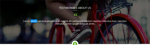
Codes are as follows:
<div class="backgroundImage22">
  <div class="dnn_layout animation fadeInUp">
    <div class="content_mid ">
      <div class="OurProcess_tit Process_tit_color">
        <h2> Testimonials  About Us</h2>
      </div>
      <ul data-autoheight="false" data-display-navigation="false" data-position="fade" class=" Testimonials_tab blockquote_box H6_Testimonials_tab">
        <li> <span class="mark"> “</span>
          <div class="H6_Testimonials_con pb-30 ">
            <p>Highly recommended, both this skin and the company as a whole! </p>
            <div class="H6_Testimonials_name  pt-30 pb-30 ">—<span> Patrick M</span></div>
          </div>
        </li>
        <li> <span class="mark"> “</span>
          <div class="H6_Testimonials_con  pb-30 ">
            <p> Lorum sociis natoque penatibus et magnis dis parturient montes nascetur ridiculus mus. nascetur ridiculus.Lorem ipsum dolor sit
              amet, </p>
            <div class="H6_Testimonials_name  pt-30 pb-30 ">—<span> Patrick M</span></div>
          </div>
        </li>
      </ul>
    </div>
  </div>
</div>
Option:
- This is a
Testimonialseffect. Testimonials. - You can modify
animationto change the animation on the slide. Animation list. - You can modify
fato change icons. font icon list.
Responsive & Retina area
Below is the screen shot:
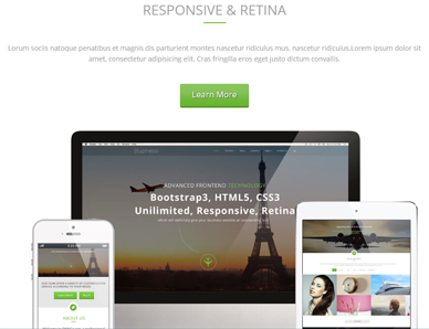
Codes are as follows:
<div class="iconimg anchorTag pb-60 " data-title="Responsive " data-icourl="/Portals/23/home3con_e.png"> <span> <img alt="" src="/portals/23/home3con_e.png" /> </span> </div>
<div class="dnn_layout">
  <div class="content_mid ">
    <div class="OurProcess_tit  Service_tit_color">
      <h2>Responsive & Retina</h2>
    </div>
    <div class="OurProcess_con pb40  pt40 ">
      <div style="text-align: center;">Content Text1...</div>
      <div style="text-align: center;">Content Text2...</div>
    </div>
    <div style="text-align: center;"> <a class="Button_default3 Button_default3_f17" href="#" target="blank"> <span>Learn More</span> </a> </div>
    <br />
    <br />
    <div class="H6_animation_con">
      <div class="mac animation fadeInUp"> <img alt="" class="img-responsive" src="/portals/23/mob02.jpg" /> </div>
      <div class="ipad animation fadeInRight"> <img alt="" class="img-responsive" src="/portals/23/h6_ipad.png" /> </div>
      <div class="phone animation fadeInLeft"> <img alt="" class="img-responsive" src="/portals/23/h6_phone.png" /> </div>
    </div>
  </div>
</div>
Option:
- You can modify
animationto change the animation on the slide. Animation list.
H6_footer_bg area
Below is the screen shot:

Codes are as follows:
<div class="H6_Footer_bg clearfix pt-50 pb-50">
  <div class="dnn_layout  animation scaleUp ">
    <div class="content_mid Footer_img">
      <div class="row" style="text-align: center;">
        <div class="col-md-2 col-sm-4  col-xs-6"><img alt="" class="img-responsive" src="/portals/23/home6_01.png" /> </div>
        <div class="col-md-2 col-sm-4 col-xs-6"><img alt="" class="img-responsive" src="/portals/23/home6_02.png" /> </div>
        <div class="clearfix visible-xs "></div>
        <div class="col-md-2 col-sm-4 col-xs-6 "><img alt="" class="img-responsive" src="/portals/23/home6_03.png" /> </div>
        <div class="clearfix visible-sm "></div>
        <div class="col-md-2 col-sm-4 col-xs-6"><img alt="" class="img-responsive" src="/portals/23/home6_04.png" /> </div>
        <div class="clearfix visible-xs "></div>
        <div class="col-md-2 col-sm-4  col-xs-6"><img alt="" class="img-responsive" src="/portals/23/home6_05.png" /> </div>
        <div class="col-md-2 col-sm-4  col-xs-6"><img alt="" class="img-responsive" src="/portals/23/home6_06.png" /> </div>
        <div class="clearfix visible-xs "></div>
      </div>
    </div>
  </div>
</div>
Option:
col-sm-4 col-sm-2is the width for each column. You can change the width you need through value1~12.
Contact Us Left area
Below is the screen shot:
Codes Are As Follows:
<div class="H5_Contactus_box animation fadeInLeft">
  <div class="con_e animation fadeInRight animated clearfix">
      <a href="#"> <span class="fa fa-twitter"></span> </a>
      <a href="#"> <span class="fa fa-facebook"></span> </a>
      <a href="#"> <span class="fa fa-tumblr"></span> </a>
      <a href="#"> <span class="fa fa-youtube"></span> </a>
      <a href="#"> <span class="fa fa-google-plus"></span> </a>
      <a href="#"> <span class="fa fa-apple"></span> </a>
  </div>
  <p> Content Text1...</p>
  <ul>
    <li>Address: XingAn Street No. 287</li>
    <li>Phone: (+086)-123-456-78910</li>
    <li>Fax: 012-8338238753</li>
    <li>Email: dnnskindev@gmail.com</li>
    <li>Skype: dnngo-linda</li>
    <li>MSN: dnnskindev@gmail.com</li>
    <li>Website: www.dnngo.net</li>
  </ul>
</div>
<br />
<br />
Option:
- You can modify
fato change icons. font icon list. - You can modify
animationto change the animation on the slide. Animation list.
Contact Us Right area
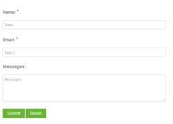
Option:
- This is
Theme_Responsive_20047_home6theme ofDNNGo PowerFormsmodule - You can modify
animationto change the animation on the slide. Animation list.
HomeVersion7
You can click the link to check HomeVersion7 demo. HomeVersion7
Banner area
Codes are as follows:
<ul class="full_screen_pic">
  <li style="background-image: url('http://demo7.dnngo.net/Portals/23/home5-banner.jpg');">
    <div class="full_screen_pic_bg">
      <div class="full_screen_pic_main  home7_fullscreenpic">
        <div class="H7_plane"><img alt="" src="/portals/23/banner_img.png" /></div>
        <h1 class="animation periodic1">Responsive,<span class="ColorCenter"> Retina Ready </span> </h1>
        <p class="animation periodic2 home7_fullscreenpic_con ">which will definitely give your business website an outstanding look</p>
            <a class="H7_bnt  animation periodic3" href="#" target="blank">Read More</a>
            <a class="H7_bnt   animation periodic3" href="#" target="blank">Buy It Now</a>
        </div>
      <div id="H7_nextPage"></div>
    </div>
  </li>
</ul>
Option:
- You can modify
background-imageto change background image. - You can modify
animationto change the animation on the slide. Animation list.
Services list area
Below is the screen shot:
Codes are as follows:
<div class="content_mid clearfix">
  <div class="H7_two_con pt-60 ">
    <div class="row animation fadeInUp">
      <div class=" col-sm-3 col-xs-6">
        <div class="H7_One_con">
          <div class="H7_icon"><span class="fa fa-pencil"></span></div>
          <h2>Unlimited Colors</h2>
          Lorum sociis natoque penatibus et magnis dis parturient montes nascetur ridiculus mus. nascetur ridiculus. </div>
      </div>
      <div class=" col-sm-3 col-xs-6">
        <div class="H7_One_con">
          <div class="H7_icon"><span class="fa fa-laptop"></span></div>
          <h2>Responsive Design</h2>
          Donec consectetur diam ac nibh auctor ultricies. Integer mauris lacus, consequat in luctus id, semper sed felis. </div>
      </div>
      <div class="clearfix visible-xs "></div>
      <div class=" col-sm-3 col-xs-6">
        <div class="H7_One_con">
          <div class="H7_icon"><span class="fa fa-tablet"></span></div>
          <h2>Multi-Purpose</h2>
          Integer vulputate porta augue, sit amet interdum tellus commodo et. Sed volutpat neque vel turpis ultrices sini. </div>
      </div>
      <div class=" col-sm-3 col-xs-6">
        <div class="H7_One_con">
          <div class="H7_icon"><span class="fa fa-asterisk"></span></div>
          <h2>Retina Ready</h2>
          Lorum sociis natoque penatibus et magnis dis parturient montes nascetur ridiculus mus. nascetur ridiculus. </div>
      </div>
    </div>
    <div class="clearfix visible-xs "></div>
    <div class="row animation fadeInUp">
      <div class=" col-sm-3 col-xs-6">
        <div class="H7_One_con">
          <div class="H7_icon"><span class="fa fa-share-alt"></span></div>
          <h2>Bootstrap</h2>
          Lorum sociis natoque penatibus et magnis dis parturient montes nascetur ridiculus mus. nascetur ridiculus. </div>
      </div>
      <div class=" col-sm-3 col-xs-6">
        <div class="H7_One_con">
          <div class="H7_icon"><span class="fa fa-coffee"></span></div>
          <h2>SEO friendly</h2>
          Donec consectetur diam ac nibh auctor ultricies. Integer mauris lacus, consequat in luctus id, semper sed felis. </div>
      </div>
      <div class="clearfix visible-xs "></div>
      <div class=" col-sm-3 col-xs-6">
        <div class="H7_One_con">
          <div class="H7_icon"><span class="fa fa-headphones"></span></div>
          <h2>CSS3 & HTML 5</h2>
          Integer vulputate porta augue, sit amet interdum tellus commodo et. Sed volutpat neque vel turpis ultrices sini. </div>
      </div>
      <div class=" col-sm-3 col-xs-6">
        <div class="H7_One_con">
          <div class="H7_icon"><span class="fa fa-cubes"></span></div>
          <h2>Sticky Header</h2>
          Lorum sociis natoque penatibus et magnis dis parturient montes nascetur ridiculus mus. nascetur ridiculus. </div>
      </div>
      <div class="clearfix visible-xs "></div>
    </div>
  </div>
</div>
Option:
col-sm-3 col-xs-6is the width of each column, you can change the width you need through value1~12.- You can modify
animationto change the animation on the slide. Animation list. - You can modify
fato change icons. font icon list.
Advanced Frontend Technology area
Below is the screen shot:
Codes are as follows:
<div class="backgroundImage_H7bg pt-60 pb-60">
  <div class="dnn_layout">
    <div class="content_mid H7_two_con ">
      <div class="row">
        <div class=" col-md-6 col-sm-12 animation fadeInLeft"><img alt="" src="/portals/23/h701.png" /></div>
        <div class="clearfix visible-sm"></div>
        <div class="col-md-6 col-sm-12 animation fadeInRight">
          <h2>Advanced Frontend Technology</h2>
          <ul class="clearfix ">
            <li class="H7_pr">
              <h3>HTML 5</h3>
              <p>Content text ...</p>
              <a href="#" target="blank">Read More</a> </li>
            <li>
              <h3>Cutting-edge CSS3</h3>
              <p>Content text ...</p>
              <a href="#" target="blank">Read More</a> </li>
            <li class="H7_pr">
              <h3>Bootstrap 3</h3>
              <p>Content text ...</p>
              <a href="#" target="blank">Read More</a> </li>
            <li>
              <h3>Javascript</h3>
              <p>Content text ...</p>
              <a href="#" target="blank">Read More</a> </li>
          </ul>
        </div>
      </div>
      <div class="row pt-60">
        <div class="col-md-5 col-sm-12 animation fadeInLeft">
          <h2>Advanced Frontend Technology</h2>
          <ul class="clearfix">
            <li>
              <h3>Unlimited Styles</h3>
              <p>Content text ...</p>
              <a href="#" target="blank">Read More</a> </li>
            <li>
              <h3>Ultra Responsive</h3>
              <p>Content text ...</p>
              <a href="#" target="blank">Read More</a> </li>
            <li>
              <h3>Retina Ready</h3>
              <p>Content text ...</p>
              <a href="#" target="blank">Read More</a> </li>
            <li>
              <h3>Retina</h3>
              <p>Content text ...</p>
              <a href="#" target="blank">Read More</a> </li>
          </ul>
        </div>
        <div class="clearfix visible-sm"></div>
        <div class="col-md-7 col-sm-12 animation fadeInRight"><img alt="" src="/portals/23/h702.png" /></div>
      </div>
    </div>
  </div>
</div>
Option:
col-md-7 col-sm-12is the width of each column, you can change the width you need through value1~12.- You can modify
animationto change the animation on the slide. Animation list.
Featured Works area
Below is the screen shot:
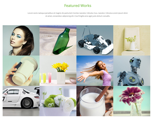
Codes are as follows:
<div class="pt-40 pb-60">
  <div class="H7_tit animation fadeInDown">Featured Works</div>
  <div class="pt-20 pb-60 animation fadeInDown">
    <div class="H7_center">Lorum sociis natoque penatibus et magnis dis parturient montes nascetur ridiculus mus. nascetur ridiculus.Lorem ipsum dolor</div>
    <div class="H7_center"> sit amet, consectetur adipisicing elit.  Cras fringilla eros eget justo dictum convallis.</div>
  </div>
  <div class="isotope_grid isotope_grid1 animation fadeInUp">
    <div class="loading">
      <div class="loading-container container1">
        <div class="circle1"></div>
        <div class="circle2"></div>
        <div class="circle3"></div>
        <div class="circle4"></div>
      </div>
      <div class="loading-container container2">
        <div class="circle1"></div>
        <div class="circle2"></div>
        <div class="circle3"></div>
        <div class="circle4"></div>
      </div>
      <div class="loading-container container3">
        <div class="circle1"></div>
        <div class="circle2"></div>
        <div class="circle3"></div>
        <div class="circle4"></div>
      </div>
    </div>
    <div class="isotope_main" data-min-width="275.5">
      <div class="isotope_item graphics video">
        <div class="photo photo_box content_top_increment"> <a href="#" target="blank"> <img alt="" src="/portals/23/h7_01.jpg" /> </a>
          <div class="ico">
            <div class="increment_3"><a href="#" target="blank"> <span class=" ico_left"></span></a></div>
            <h3 class="increment_2">Consectetur Adipisicing</h3>
            <div class="H7_isotope_con increment_1">Lorum sociis natoque penatibus et magnis dis parturient montes nascetur ridiculus mus. nascetur ridiculus.</div>
          </div>
          <div class="shade"></div>
        </div>
      </div>
      <div class="isotope_item graphics video">
        <div class="photo photo_box content_top_increment"> <a href="#" target="blank"> <img alt="" src="/portals/23/h7_02.jpg" /> </a>
          <div class="ico">
            <div class="increment_3"><a href="#" target="blank"> <span class=" ico_left"></span></a></div>
            <h3 class="increment_2">Consectetur Adipisicing</h3>
            <div class="H7_isotope_con increment_1">Lorum sociis natoque penatibus et magnis dis parturient montes nascetur ridiculus mus. nascetur ridiculus.</div>
          </div>
          <div class="shade"></div>
        </div>
      </div>
      <div class="isotope_item graphics video">
        <div class="photo photo_box  content_top_increment"> <a href="#" target="blank"> <img alt="" src="/portals/23/h7_03.jpg" /> </a>
          <div class="ico">
            <div class="increment_3"><a href="#" target="blank"> <span class=" ico_left"></span></a></div>
            <h3 class="increment_2">Consectetur Adipisicing</h3>
            <div class="H7_isotope_con increment_1">Lorum sociis natoque penatibus et magnis dis parturient montes nascetur ridiculus mus. nascetur ridiculus.</div>
          </div>
          <div class="shade"></div>
        </div>
      </div>
      <div class="isotope_item webdesign graphics">
        <div class="photo">
            <a href="#" target="blank"> <img alt="" src="/portals/23/h7_04.jpg" /> </a>
            <span class="angle"></span>
        </div>
      </div>
      <div class="isotope_item webdesign photography">
        <div class="photo">
            <a href="#" target="blank"> <img alt="" src="/portals/23/h7_05.jpg" /> </a>
            <span class="angle"></span>
        </div>
      </div>
      <div class="isotope_item graphics photography">
        <div class="photo">
            <a href="#" target="blank"> <img alt="" src="/portals/23/h7_06.jpg" /> </a>
            <span class="angle"></span>
        </div>
      </div>
      <div class="isotope_item webdesign photography">
        <div class="photo">
            <a href="#" target="blank"> <img alt="" src="/portals/23/h7_07.jpg" /> </a>
            <span class="angle"></span>
        </div>
      </div>
      <div class="isotope_item graphics photography">
        <div class="photo">
            <a href="#" target="blank"> <img alt="" src="/portals/23/h7_08.jpg" /> </a>
            <span class="angle"></span>
        </div>
      </div>
      <div class="isotope_item graphics photography">
        <div class="photo">
            <a href="#" target="blank"> <img alt="" src="/portals/23/h7_09.jpg" /> </a>
            <span class="angle"></span>
        </div>
      </div>
      <div class="isotope_item graphics photography">
        <div class="photo">
            <a href="#" target="blank"> <img alt="" src="/portals/23/h7_10.jpg" /> </a>
            <span class="angle"></span>
        </div>
      </div>
      <div class="isotope_item graphics photography">
        <div class="photo">
            <a href="#" target="blank"> <img alt="" src="/portals/23/h7_11.jpg" /> </a>
            <span class="angle"></span>
        </div>
      </div>
      <div class="isotope_item graphics photography">
        <div class="photo">
            <a href="#" target="blank"> <img alt="" src="/portals/23/h7_12.jpg" /> </a>
            <span class="angle"></span>
        </div>
      </div>
    </div>
  </div>
</div>
Option:
- You can modify
animationto change the animation on the slide. Animation list.
Testimonials area
Below is the screen shot:
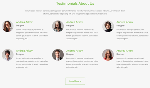
Codes are as follows:
<div class="H7_Aboutus_bg pt-40 pb-60">
  <div class="dnn_layout">
    <div class="content_mid">
      <div class="H7_tit">Testimonials  About Us</div>
      <div class=" pt-20 pb-40">
        <div class="H7_center">Content Text1...</div>
        <div class="H7_center"> Content Text2...</div>
      </div>
      <div class="row animation fadeInUp">
        <div class="col-sm-4">
          <div class="H7_Aboutus_box"> <span><img alt="" src="/portals/23/h7_tema01.jpg" /></span>
            <h2>Andrea Arkov</h2>
            <h3> Designer</h3>
            Content Text3...</div>
        </div>
        <div class=" col-sm-4">
          <div class="H7_Aboutus_box"> <span><img alt="" src="/portals/23/h7_tema02.jpg" /></span>
            <h2>Andrea Arkov</h2>
            <h3> Designer</h3>
            Content Text4...</div>
        </div>
        <div class=" col-sm-4">
          <div class="H7_Aboutus_box"> <span><img alt="" src="/portals/23/h7_tema03.jpg" /></span>
            <h2>Andrea Arkov</h2>
            <h3> Designer</h3>
            Content Text5...</div>
        </div>
      </div>
      <div class="row animation fadeInUp">
        <div class="col-sm-4">
          <div class="H7_Aboutus_box"> <span><img alt="" src="/portals/23/h7_tema04.jpg" /></span>
            <h2>Andrea Arkov</h2>
            <h3> Designer</h3>
            Content Text6...</div>
        </div>
        <div class=" col-sm-4">
          <div class="H7_Aboutus_box"> <span><img alt="" src="/portals/23/h7_tema05.jpg" /></span>
            <h2>Andrea Arkov</h2>
            <h3> Designer</h3>
            Content Text7...</div>
        </div>
        <div class=" col-sm-4">
          <div class="H7_Aboutus_box"> <span><img alt="" src="/portals/23/h7_tema06.jpg" /></span>
            <h2>Andrea Arkov</h2>
            <h3> Designer</h3>
            Content Text8...</div>
        </div>
      </div>
      <div class="Bnt_center"> <a href="#" target="blank" class="H7_bnt2">Load More</a> </div>
    </div>
  </div>
</div>
Option:
col-sm-4is the width of each column, you can change the width you need through value1~12.- You can modify
animationto change the animation on the slide. Animation list.
Logos area
Below is the screen shot:

Codes are as follows:
<div class="H7_carouse_bor animation scaleUp">
  <div class=" pt-60 pb-60 ">
    <div class=" clearfix">
      <div class="carousel carousel_8 H7_carouse" data-pagination="false">
        <div class="item"> <a href="#" target="blank"><img alt="" src="/portals/23/h7_line01.png" /></a> </div>
        <div class="item"> <a href="#" target="blank"><img alt="" src="/portals/23/h7_line02.png" /></a> </div>
        <div class="item"> <a href="#" target="blank"><img alt="" src="/portals/23/h7_line03.png" /></a> </div>
        <div class="item"> <a href="#" target="blank"><img alt="" src="/portals/23/h7_line04.png" /></a> </div>
        <div class="item"> <a href="#" target="blank"><img alt="" src="/portals/23/h7_line05.png" /></a> </div>
        <div class="item"> <a href="#" target="blank"><img alt="" src="/portals/23/h7_line06.png" /></a> </div>
        <div class="item"> <a href="#" target="blank"><img alt="" src="/portals/23/h7_line07.png" /></a> </div>
        <div class="item"> <a href="#" target="blank"><img alt="" src="/portals/23/h7_line01.png" /></a> </div>
        <div class="item"> <a href="#" target="blank"><img alt="" src="/portals/23/h7_line02.png" /></a> </div>
        <div class="item"> <a href="#" target="blank"><img alt="" src="/portals/23/h7_line03.png" /></a> </div>
      </div>
    </div>
  </div>
</div>
Option:
- This is a
Carouseleffect. Carousel. - You can modify
animationto change the animation on the slide. Animation list.
About Us area
Below is the screen shot:

Codes are as follows:
<div class="H7_tit pt-40 animation fadeInDown">Testimonials  About Us</div>
<div class="pt-20 pb-40 animation fadeInDown">
  <div class="H7_center">Lorum sociis natoque penatibus et magnis dis parturient montes nascetur ridiculus mus. nascetur ridiculus.Lorem ipsum dolor</div>
  <div class="H7_center"> sit amet, consectetur adipisicing elit.  Cras fringilla eros eget justo dictum convallis.</div>
</div>
<div class="H7_About_us_box">
  <div class="row">
    <div class="col-sm-3 animation flipInY">
      <div class="photo_box  ico_right_enter box_border_padding H7_team_box  "> <a href="#" target="blank">
        <div class="pic_box"> <img alt="" src="/portals/23/person01.jpg" />
          <div class="ico"> <span class="fa fa-plus"></span> </div>
          <div class="shade"> </div>
        </div>
        </a>
        <div class="H7_pic_box_con">
          <h2>Andrea Arkov</h2>
          <h3>Designer</h3>
        </div>
        <div class="H7_Social">
          <div class="H7_Social_center">
              <a href="#"><span class="fa fa-facebook-square"></span></a>
              <a href="#"><span class="fa fa-twitter-square"></span></a>
              <a href="#"><span class="fa fa-vimeo-square"></span></a>
              <a href="#"><span class="fa fa-linkedin-square"></span></a>
          </div>
        </div>
      </div>
    </div>
    <div class="col-sm-3 animation flipInY">
      <div class="photo_box  ico_right_enter box_border_padding H7_team_box  "> <a href="#" target="blank">
        <div class="pic_box"> <img alt="" src="/portals/23/person02.jpg" />
          <div class="ico"> <span class="fa fa-plus"></span> </div>
          <div class="shade"></div>
        </div>
        </a>
        <div class="H7_pic_box_con">
          <h2>Andrea Arkov</h2>
          <h3>Designer</h3>
        </div>
        <div class="H7_Social">
          <div class="H7_Social_center">
              <a href="#"><span class="fa fa-facebook-square"></span></a>
              <a href="#"><span class="fa fa-twitter-square"></span></a>
              <a href="#"><span class="fa fa-vimeo-square"></span></a>
              <a href="#"><span class="fa fa-linkedin-square"></span></a>
          </div>
        </div>
      </div>
    </div>
    <div class="col-sm-3 animation flipInY">
      <div class="photo_box  ico_right_enter box_border_padding H7_team_box  "> <a href="#" target="blank">
        <div class="pic_box"> <img alt="" src="/portals/23/person03.jpg" />
          <div class="ico"> <span class="fa fa-plus"></span> </div>
          <div class="shade"></div>
        </div>
        </a>
        <div class="H7_pic_box_con">
          <h2>Andrea Arkov</h2>
          <h3>Designer</h3>
        </div>
        <div class="H7_Social">
          <div class="H7_Social_center">
              <a href="#"><span class="fa fa-facebook-square"></span></a>
              <a href="#"><span class="fa fa-twitter-square"></span></a>
              <a href="#"><span class="fa fa-vimeo-square"></span></a>
              <a href="#"><span class="fa fa-linkedin-square"></span></a>
          </div>
        </div>
      </div>
    </div>
    <div class="col-sm-3 animation flipInY">
      <div class="photo_box  ico_right_enter box_border_padding H7_team_box  "> <a href="#" target="blank">
        <div class="pic_box"> <img alt="" src="/portals/23/person04.jpg" />
          <div class="ico"> <span class="fa fa-plus"></span> </div>
          <div class="shade"></div>
        </div>
        </a>
        <div class="H7_pic_box_con">
          <h2>Andrea Arkov</h2>
          <h3>Designer</h3>
        </div>
        <div class="H7_Social">
          <div class="H7_Social_center">
              <a href="#"><span class="fa fa-facebook-square"></span></a>
              <a href="#"><span class="fa fa-twitter-square"></span></a>
              <a href="#"><span class="fa fa-vimeo-square"></span></a>
              <a href="#"><span class="fa fa-linkedin-square"></span></a>
          </div>
        </div>
      </div>
    </div>
  </div>
  <div class="row">
    <div class="col-sm-3 animation flipInY">
      <div class="photo_box  ico_right_enter box_border_padding H7_team_box  "> <a href="#" target="blank">
        <div class="pic_box"> <img alt="" src="/portals/23/person05.jpg" />
          <div class="ico"> <span class="fa fa-plus"></span> </div>
          <div class="shade"></div>
        </div>
        </a>
        <div class="H7_pic_box_con">
          <h2>Andrea Arkov</h2>
          <h3>Designer</h3>
        </div>
        <div class="H7_Social">
          <div class="H7_Social_center">
              <a href="#"><span class="fa fa-facebook-square"></span></a>
              <a href="#"><span class="fa fa-twitter-square"></span></a>
              <a href="#"><span class="fa fa-vimeo-square"></span></a>
              <a href="#"><span class="fa fa-linkedin-square"></span></a>
          </div>
        </div>
      </div>
    </div>
    <div class="col-sm-3 animation flipInY">
      <div class="photo_box  ico_right_enter box_border_padding H7_team_box  "> <a href="#" target="blank">
        <div class="pic_box"> <img alt="" src="/portals/23/person06.jpg" />
          <div class="ico"> <span class="fa fa-plus"></span> </div>
          <div class="shade"></div>
        </div>
        <div class="H7_pic_box_con">
          <h2>Andrea Arkov</h2>
          <h3>Designer</h3>
        </div>
        </a>
        <div class="H7_Social">
          <div class="H7_Social_center">
              <a href="#"><span class="fa fa-facebook-square"></span></a>
              <a href="#"><span class="fa fa-twitter-square"></span></a>
              <a href="#"><span class="fa fa-vimeo-square"></span></a>
              <a href="#"><span class="fa fa-linkedin-square"></span></a>
          </div>
        </div>
      </div>
    </div>
    <div class="col-sm-3 animation flipInY">
      <div class="photo_box  ico_right_enter box_border_padding H7_team_box  "> <a href="#" target="blank">
        <div class="pic_box"> <img alt="" src="/portals/23/person07.jpg" />
          <div class="ico"> <span class="fa fa-plus"></span> </div>
          <div class="shade"></div>
        </div>
        </a>
        <div class="H7_pic_box_con">
          <h2>Andrea Arkov</h2>
          <h3>Designer</h3>
        </div>
        <div class="H7_Social">
          <div class="H7_Social_center">
              <a href="#"><span class="fa fa-facebook-square"></span></a>
              <a href="#"><span class="fa fa-twitter-square"></span></a>
              <a href="#"><span class="fa fa-vimeo-square"></span></a>
              <a href="#"><span class="fa fa-linkedin-square"></span></a>
          </div>
        </div>
      </div>
    </div>
    <div class="col-sm-3 animation flipInY">
      <div class="photo_box  ico_right_enter box_border_padding H7_team_box  "> <a href="#" target="blank">
        <div class="pic_box"> <img alt="" src="/portals/23/person08.jpg" />
          <div class="ico"> <span class="fa fa-plus"></span> </div>
          <div class="shade"></div>
        </div>
        </a>
        <div class="H7_pic_box_con">
          <h2>Andrea Arkov</h2>
          <h3>Designer</h3>
        </div>
        <div class="H7_Social">
          <div class="H7_Social_center">
              <a href="#"><span class="fa fa-facebook-square"></span></a>
              <a href="#"><span class="fa fa-twitter-square"></span></a>
              <a href="#"><span class="fa fa-vimeo-square"></span></a>
              <a href="#"><span class="fa fa-linkedin-square"></span></a>
          </div>
        </div>
      </div>
    </div>
  </div>
</div>
Option:
col-sm-3is the width of each column, you can change the width you need through value1~12.- You can modify
animationto change the animation on the slide. Animation list.
Our Features area
Below is the screen shot:
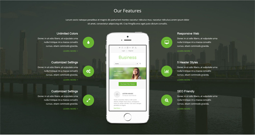
Codes are as follows:
<div class="backgroundImage_H7bg02 pt-40 pb-60">
  <div class="dnn_layout">
    <div class="content_mid ">
      <div class="H7_tit02"> Our Features</div>
      <div class=" pt-20 pb-40">
        <div class="H7_center02">Lorum sociis natoque penatibus et magnis dis parturient montes nascetur ridiculus mus. nascetur ridiculus.Lorem ipsum dolor</div>
        <div class="H7_center02"> sit amet, consectetur adipisicing elit.  Cras fringilla eros eget justo dictum convallis.</div>
      </div>
      <div class="row con_a">
        <div class="col-sm-4">
          <div class="left">
            <div class="box animation fadeInLeft">
              <div class="icon"> <span class="fa fa-tint"></span> </div>
              <h6 class="title">Unlimited Colors</h6>
              <p class="text">Content Text1...</p>
              <a class="link" href="#" target="blank">Learn More  ></a> </div>
            <div class="box animation fadeInLeft">
              <div class="icon"> <span class="fa fa-cogs"></span> </div>
              <h6 class="title">Customized Settings</h6>
              <p class="text">Content Text2...</p>
              <a class="link" href="#" target="blank">Learn More  ></a> </div>
            <div class="box animation fadeInLeft">
              <div class="icon"> <span class="fa fa-expand"></span> </div>
              <h6 class="title">Customized Settings</h6>
              <p class="text">Content Text3...</p>
              <a class="link" href="#" target="blank">Learn More  ></a> </div>
          </div>
        </div>
        <div class="col-sm-4">
          <div class="center animation fadeInUp"><img alt="" src="/portals/23/H7_phone.png" class="img-responsive" /></div>
        </div>
        <div class="col-sm-4">
          <div class="right">
            <div class="box animation fadeInRight">
              <div class="icon"> <span class="fa fa-desktop"></span> </div>
              <h6 class="title">Responsive Web</h6>
              <p class="text">Content Text4...</p>
              <a class="link" href="#" target="blank">Learn More  ></a> </div>
            <div class="box animation fadeInRight">
              <div class="icon"> <span class="fa fa-bar-chart"></span> </div>
              <h6 class="title">5 Header Styles</h6>
              <p class="text">Content Text5...</p>
              <a class="link" href="#" target="blank">Learn More  ></a> </div>
            <div class="box animation fadeInRight">
              <div class="icon"> <span class="fa fa-search-plus"></span> </div>
              <h6 class="title">SEO Friendly</h6>
              <p class="text">Content Text6...</p>
              <a class="link" href="#" target="blank">Learn More  ></a> </div>
          </div>
        </div>
      </div>
    </div>
  </div>
</div>
Option:
col-sm-4is the width of each column, you can change the width you need through value1~12.- You can modify
animationto change the animation on the slide. Animation list.
Contact Us area
Below is the screen shot:
Codes are as follows:
<div class="H7_tit pt-40">Testimonials  About Us</div>
<div class=" pt-20 pb-40">
  <div class="H7_center">Lorum sociis natoque penatibus et magnis dis parturient montes nascetur ridiculus mus. nascetur ridiculus.Lorem ipsum dolor</div>
  <div class="H7_center"> sit amet, consectetur adipisicing elit.  Cras fringilla eros eget justo dictum convallis.</div>
</div>
<div class="row animation fadeInUp">
  <div class="col-sm-4">
    <div class="H7_add_box"> <span class="fa fa-magic"></span>
      <div class="H7_add_con">
        <h4>Write An Email To Us</h4>
        <p>Email: dnskindev@gmail.com</p>
      </div>
    </div>
  </div>
  <div class=" col-sm-4">
    <div class="H7_add_box"> <span class="fa fa-wechat"></span>
      <div class="H7_add_con">
        <h4>Chat With Us Through Skype</h4>
        <p>Skype :  dnngo-linda</p>
      </div>
    </div>
  </div>
  <div class=" col-sm-4">
    <div class="H7_add_box"> <span class="fa fa-globe"></span>
      <div class="H7_add_con">
        <h4>Contact Us With MSN</h4>
        <p>MSN : dnnskindev@gmail.com</p>
      </div>
    </div>
  </div>
</div>
Option:
col-md-4is the width of each column, you can change the width you need through value1~12.- You can modify
fato change icons. font icon list. - You can modify
animationto change the animation on the slide. Animation list.
Form area
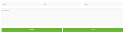
Option:
- This is
Theme_Responsive_20047_home7theme ofDNNGo PowerFormsmodule - You can modify
animationto change the animation on the slide. Animation list.
Map area
Below is the screen shot:
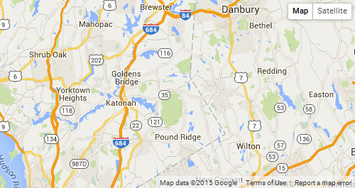
Codes are as follows:
<div id="gmap01" class="animation scaleUp"></div>
Coming Soon
You can click the link to check Coming Soon demo. Coming Soon
Below is the screen shot:
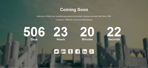
You can create the coming soon page easily following these steps:
- Create a page named coming soon page.
- Import the ComingSoon.Page.template for this page.
- You can set color, end time, and background image for Coming Soon page through xPlugin, as below:
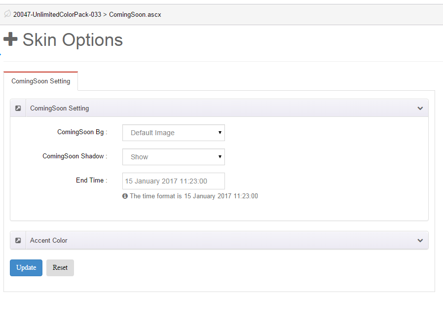
Boxed Layout
You can set Boxed mode in DNNGo.xPlugin > Skins > Options > Content Layout > Content Layout
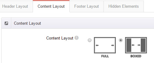
DNNGo_LayerGalleryPro Module
You can see this module in the banner section on the home page, we will guide you step by step to set up the module as the same as our demo site:
- Go to Host –> Extensions –> Install Extension wizard to install the module pack DNNGo_LayerGalleryPro_0x.0x.00_PA.zip.
- Add DNNGo_LayerGalleryPro module to the BannerPane.
- Click Manager button.
- Click the navigation of the left Import&Export
- Import ContentListEntity.xml file under DNNGo_LayerGalleryPro Module.
- You will see the imported data on Manage List page and you can change the text/image in the banner by clicking Edit button.
- Click this link so you can check the module instruction details.
DNNGo_GalleryPro Module
This module contains 15 responsive sldiers in total.
- Go to Host –> Extensions –> Install Extension wizard to install the module pack DNNGo_DNNGalleryPro_xx.xx.xx_PA.zip.
- Add DNNGo_DNNGalleryPro module to the page.
- Click Effect List tab.
- Choose an effect you like.
- You can click this link to check the module demo.
- Click this link so you can check the module instruction details.
DNNGo_xBlog Module
We use this module on the blog page, click this link so you can check the module instruction details.
DNNGo_PhotoAlbums Module
We use this module on the Portfolios page, click this link so you can check the module instruction details.
DNNGo_PowerForms Module
You can create the form through this module, click this link so you can check the module instruction details.
License interface
- Please login or register your account at http://www.dnngo.net
- Send an email to dnnskindev@gmail.com with your invoice ID, machine Key for every module( different module has different machine key), and your DNNGO username. We will generate an activation code for you. Please note: If your site is a demo site, your license will still be valid when you transfer your site to a live site.
- Manage my licenses
Contact Us
If you have any questions or suggestions about modules/skins or modules/skins installation process, please feel free to contact us.
- Website: www.dnngo.net
- Email: dnnskindev@gmail.com
- Skype: dnngo-linda