20060-UnlimitedColorsPack-042 v7.2.0
Documentation
- Created: 12/09/2015
- Latest update: 29/03/2019
- By: DNNGo
- Email: dnnskindev@gmail.com
Thank you for purchasing my theme. If you have any questions that are beyond the scope of this help file, please feel free to email via my user page contact form here. Thanks so much!
General Information
DotNetNuke Information
To install this skin you must have a working version of Dotnetnuke already installed. If you need help to install Dotnetnuke, follow the instructions in Documentation Center.
What Is Included With Your Package
When you purchase our theme, you will receive one large .zip file that contains everything inside. Unzip that file to get all the content inside. Below is a full list of everything that is included along with a brief description of each item. See the corresponding sections for info on installing the theme.
- Inside the Content folder are: DNN Skins folder, DNNGo_DNNGalleryPro Module folder, DNNGo_LayerGallery folder, DNNGo_PhotoAlbums Module folder, DNNGo_PowerForms Module folder, DNNGo_xPlugin Module folder, DNNGo_xBlog Module folder, PSD folder, Page template.
- DNN Skins folder - The skin in this folder can be used DNN 8.x, DNN 9.x only.
- DNNGo_DNNGalleryPro Module folder - This module contains 15 responsive sldiers in total.
- DNNGo_DNNGo_LayerGalleryPro folder - You can see this module in the banner section on home page.
- DNNGo_PhotoAlbums folder - You can see this module in Portfolios page.
- DNNGo_PowerForms folder - You can create forms through this module.
- DNNGo_xBlog Module folder - You can see this module on Blog page.
- Page Templates folder - Exported page templates will allow you to reproduce our live demo pages.
Notice: If you bought the theme from DNN Store (http://store.dnnsoftware.com), then none of module files are included in the download package. It only include DNN Skins, DNNGo_xPlugin, Page Templates and PSD files. If you need to purchase modules, please contact us via email (dnnskindev@gmail.com).
What Are The Requirements To Use skins and modules
To use skins and modules, you must be running DNN 8.x or higher. We have tested it with DNN8.x and DNN9.x.
Skin and Required Modules Installation
For DNN 8
-
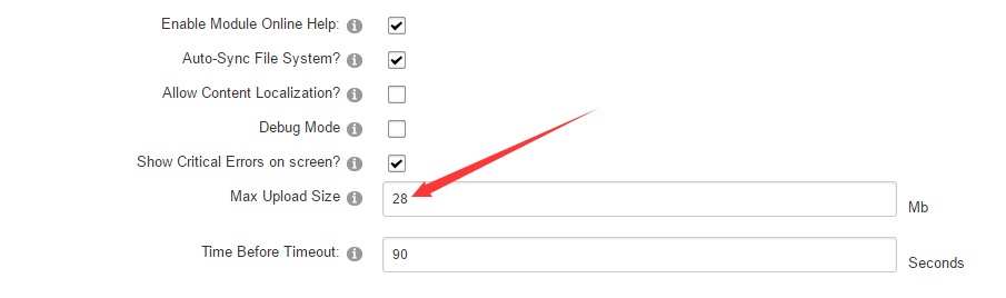
Go to Host-Settings –> Host-Settings, and select the tab Other Settings, changing Max Upload Size to 28 or higher.
-
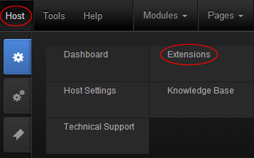
Go to Host –> Extensions –> Install Extension wizard to install the module pack DNNGo_xPlugin_0x.0x.0x_PA.zip
-
Go to Host –> Extensions –> Install Extension wizard to install the skin pack 20060-UnlimitedColorsPack-042-DNNSkins.zip
-
You can install other modules as per your own needs.
-
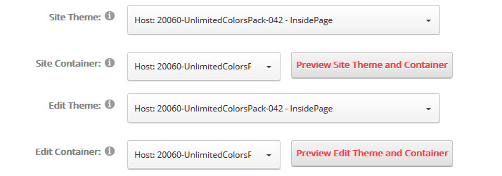
After the installation has been completed, navigate to Admin –> Site Settings –> Basic Settings (tab) –> Appearance (section) and specify portal and edit skins and containers like shown in the screenshot below. It should be done, in order to make your DNN admin UI look correct and readable.
-
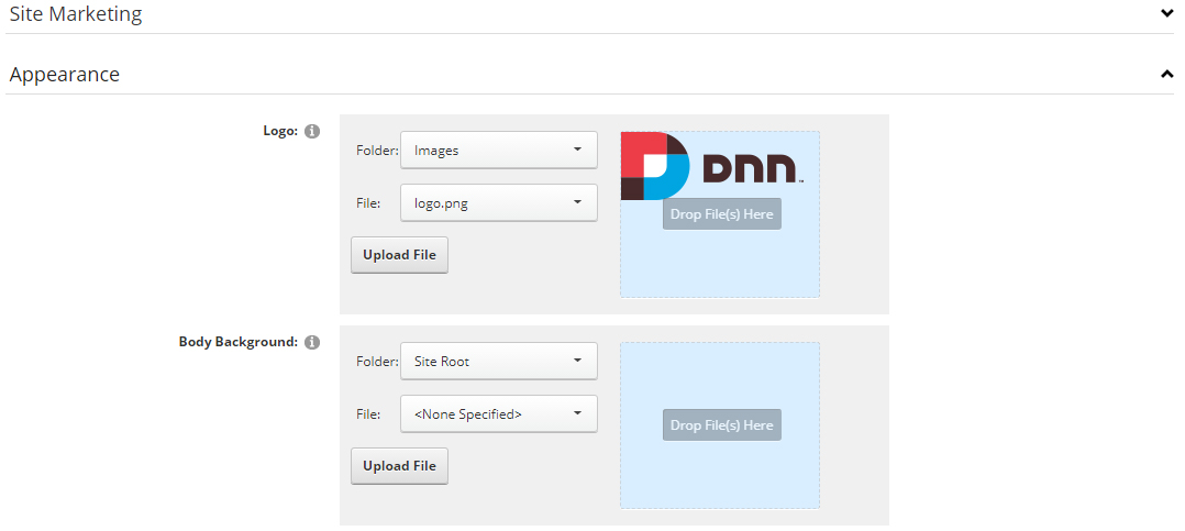
Now you can upload the LOGO image in Admin –> Site Settings –> Basic Settings (tab) –> Appearance (section) page.
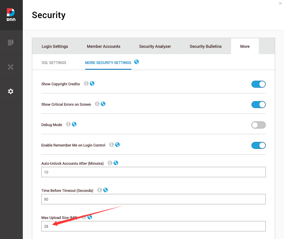
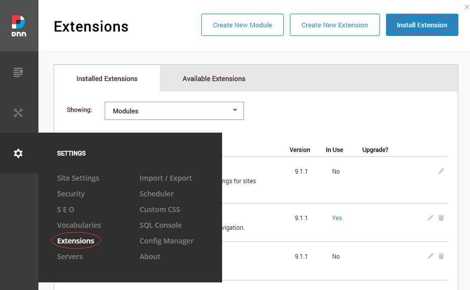
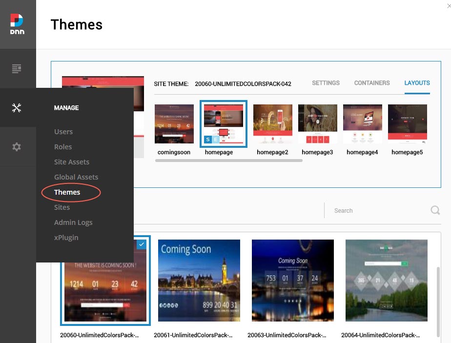
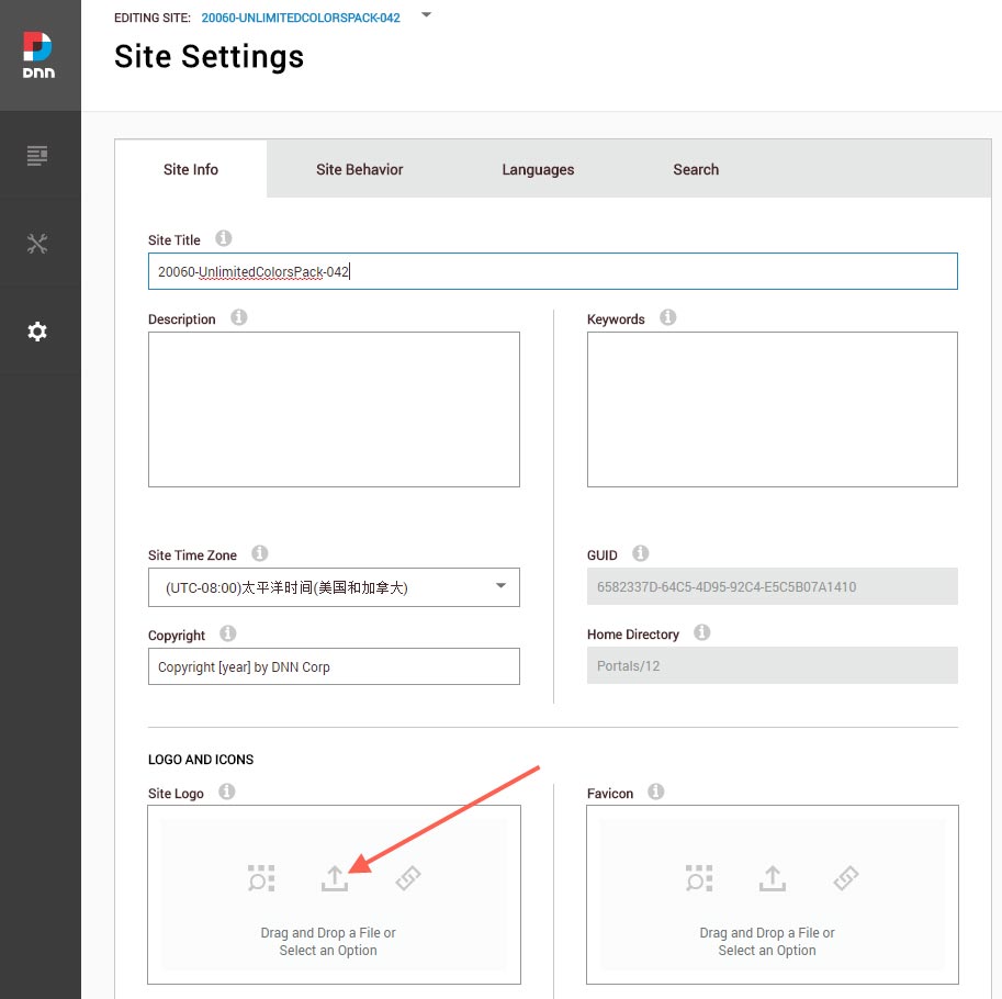
For DNN 9
-
Go to Settings –> Security –> More, and select the tab MORE SECURITY SETTINGS, changing Max Upload Size to 28 or higher.
-
Go to Host –> Extensions –> Install Extension wizard to install the module pack DNNGo_xPlugin_03.00.00_PA.zip
-
Go to Host –> Extensions –> Install Extension wizard to install the skin pack 20060-UnlimitedColorsPack-042-DNNSkins.zip
-
You can install other modules as per your own needs.
-
After the installation has been completed, navigate to Manage –> Themes. Select and apply 20060-UnlimitedColorsPack-042
-
You can upload the LOGO image in Settings –> Site Settings page.
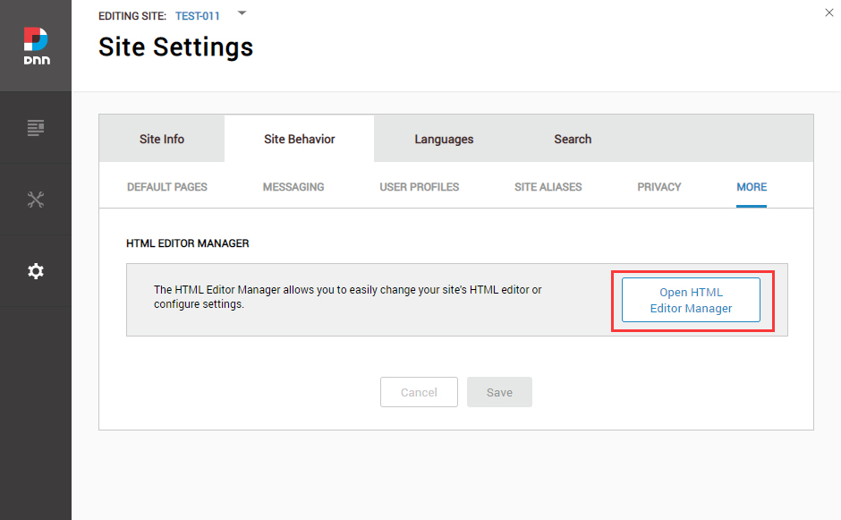
Change the Settings of HTML Editor
By default, HTML editor will remove the div tags whose content is blank. For example: if we add the code <div class=”pt-20″></div> in HTML editor and click save, you will find the code is missing when you edit it afterwards. So we need to change the settings to prevent this from happening.
Log in to your site as super administrator.
Go to SETTINGS > Site Settings > Site Behavior > MORE, click the Open HTML Editor Manager.
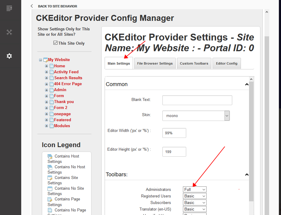
Click the Main Settings tab. Set the value of Administrators to be Full.
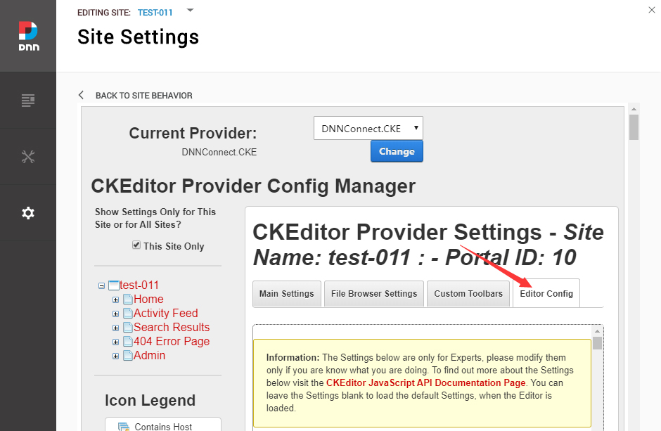
Click the Editor Config tab.
Set the value of AllowedContent to be true.
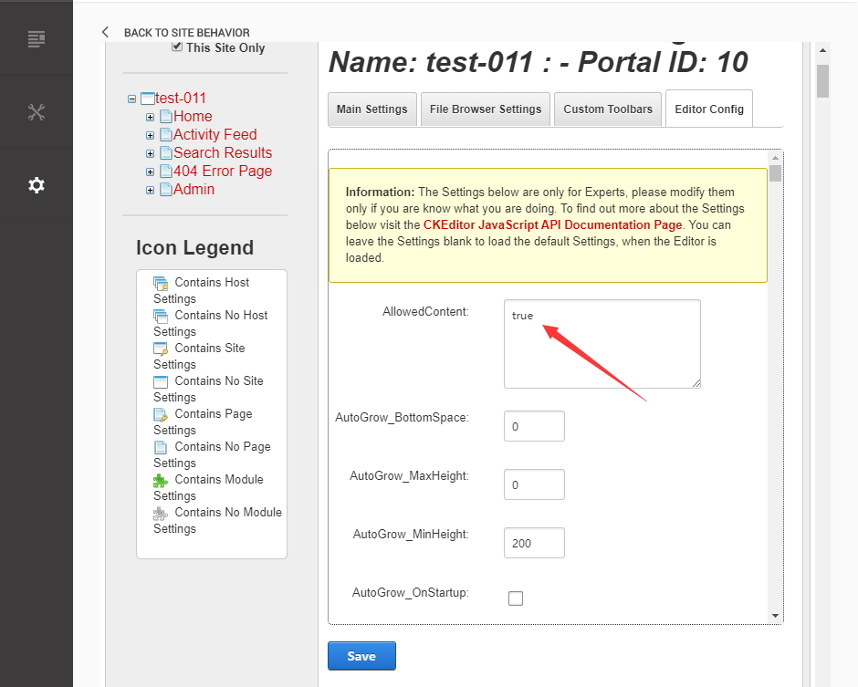
Set the value of FillEmptyBlocks to be false.
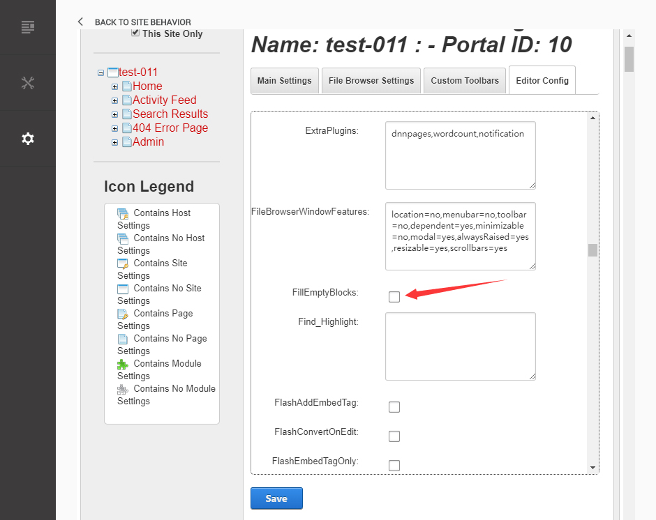
Set the value of ignoreEmptyParagraph to be false.
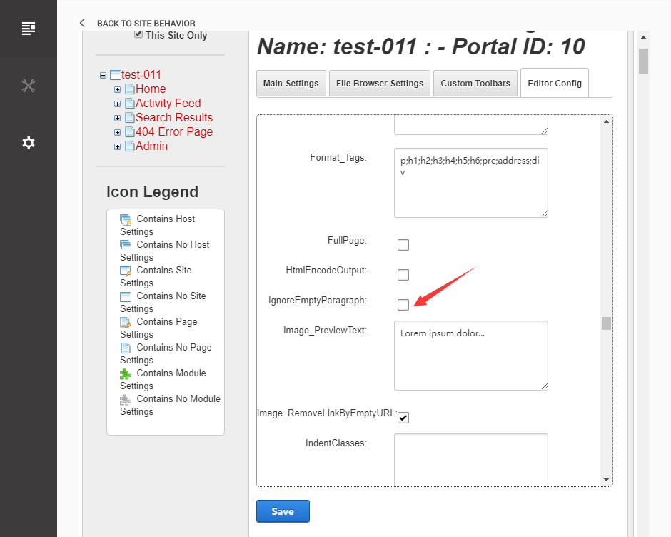
Click the Save button.
How to import page template?
Exported page templates will allow you to reproduce our live demo pages. We'll reproduce the home page as an example.
For DNN 8
-
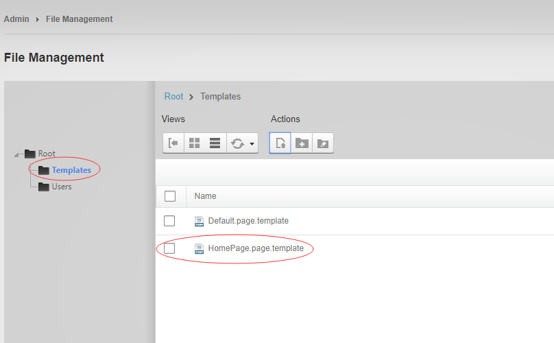
You can find these files in Page Templates Directory.
-
Upload Home.page.template file into your portal root (e.g. Portals/0/Templates/) in the previous chapter and synchronize your folders, you are able to start using page templates to clone live demo pages.
-
Because page templates can not import image files, you need to upload all the photo files of the "images" folder into your portal root (e.g. Portals/0/).
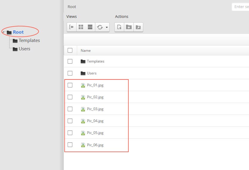
-
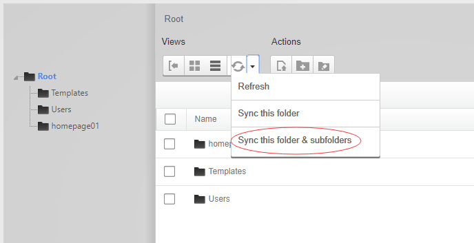
Synchronize the file in Admin > File-Management
-
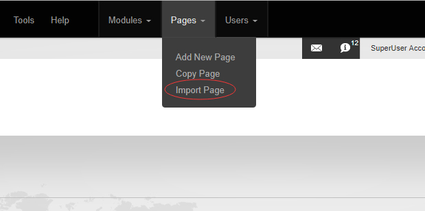
Navigate to the Home page and click Pages -> Import.
-
Find a proper page exported content file navigating to Templates folder and choosing for example Home page.
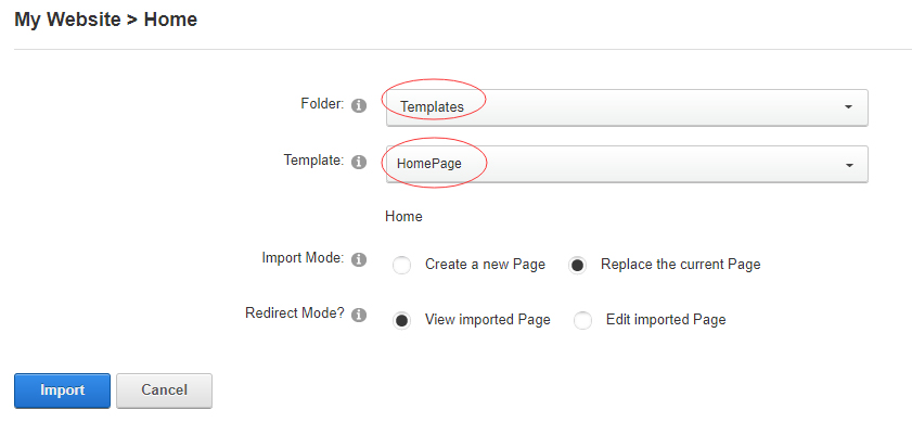
-
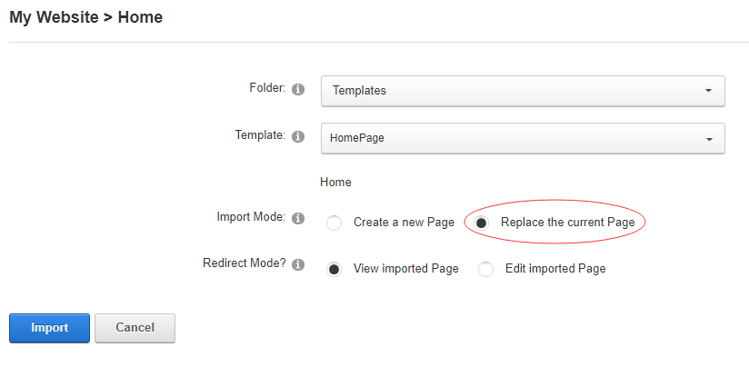
Choose "Replace the current Page" and the redirect mode you need. Please note, if you select "Replace the current Page", content of current page will be reset.
-
Click Import button if everything is correct.
-
Specify page settings according to your needs (necessarily apply HomePage skin to the home page) and click "Update Page". The home page is ready.
For DNN 9
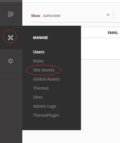
-
Go to Manage > Site Assets
-
Uploading Home.page.template file to Templates folder
-
Because page templates can not import image files, you need to upload all the photo files of the "images" folder into your portal root (e.g. Portals/0/).
-
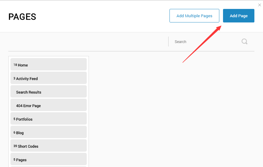
Go to Content > Pages > Add Page
-
Choose your template from Template drop-down.
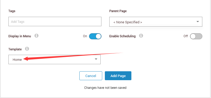
- Click Add Page
Note : Page templates can only be imported when you are creating a new page.
Skin features and how to use them.
Page Template
The product contains page templates for all pages in the live demo, you can copy our demo site by importing the page templates.
Seven kinds of header layout
You can click the xPlugin button to go to settings page, and then choose different header styles in Header Layout section.
You can click these links to check different header styles. header 1, header 2, header 3, header 4, header 5, header 6, header 7
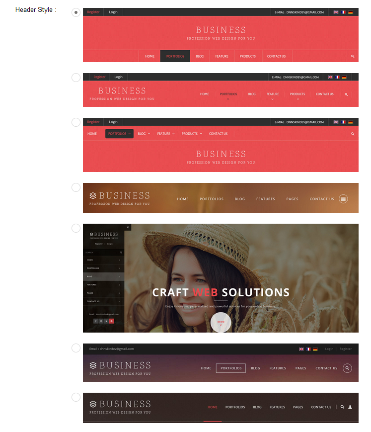
Each header includes very rich setting options, you can modify the color of whatever you would like to . For example: text color, font size and background color etc.
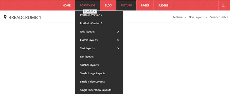
Insidepage-leftmenu layout
Insidepage-leftmenu layout page is using InsidePage-leftmenu skin. Menus on the left side are displaying the second level menus.
Full Layout and Boxed Layout
This skin contains Full Layout and Boxed Layout, you can set through Content Layout section.
With Boxed Layout applied, you can still set page background, it will display around the content. You can click link to check demo url of boxed layout.
The background can be set as static or rotating image or any solid color for you choose to apply, also you can set different background images for different pages.
How to set background image for DNN page.
- You need to choose Boxed Layout.
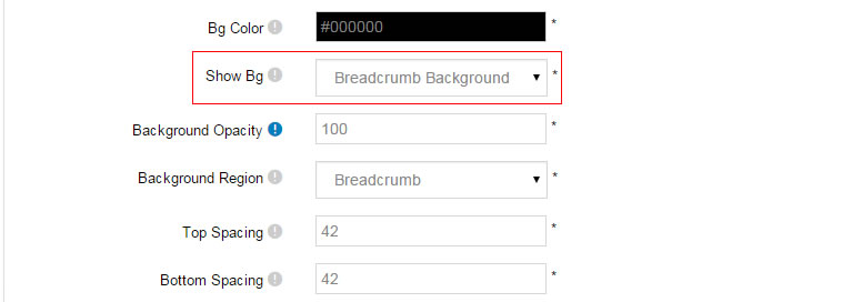
- Choose Page Background in the Option for Show bg, save settings.
- Click "pages" nav in the xPlugin.
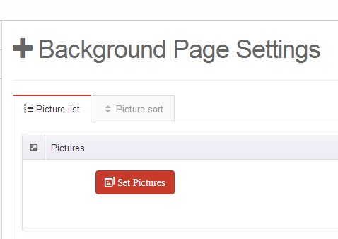
- Click Edit Background icon.
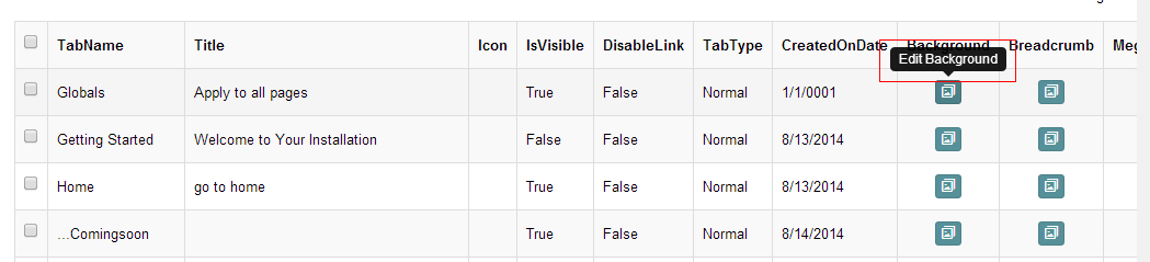
- Upload image, the background image will show as slider if you choose two or more images.
- "Globals" allows you to set background image for all pages.
- Also you can set background image for each page.
How to set breadcrumb image for DNN page.
- Choose Breadcrumb Background in the Option for Show bg, save settings.
- Click "pages" nav in the xPlugin.
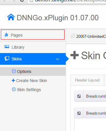
- Click Edit Breadcrumb icon.
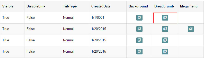
- Upload image, the background image will show as slider if you choose two or more images.
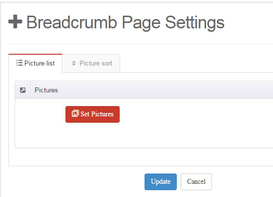
- "Globals" allows you to set background image for all pages.
- Also you can set background image for each page.
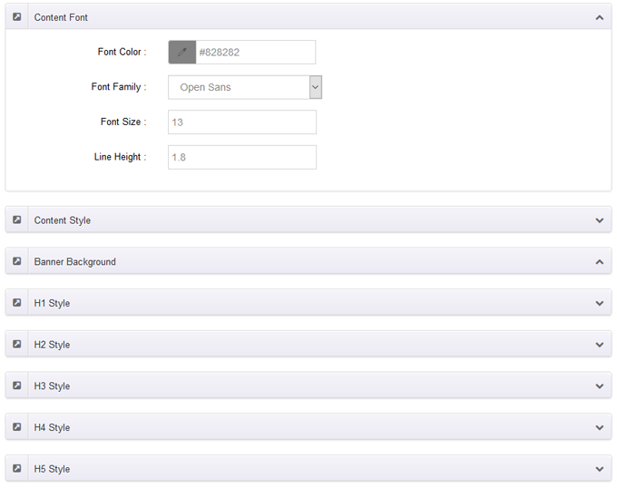
Content Style
You can set the font color and size, link color, the color of H1-H6 etc of the content area.
Three kinds of Breadcrumb layouts
You can choose different Breadcrumb styles through Breadcrumb Layout.
You can click these links to check different breadcrumb styles. breadcrumb 1, breadcrumb 2, breadcrumb 3, breadcrumb 4.
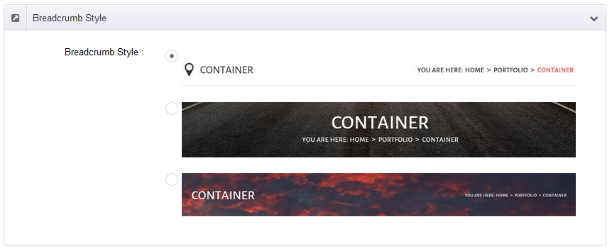
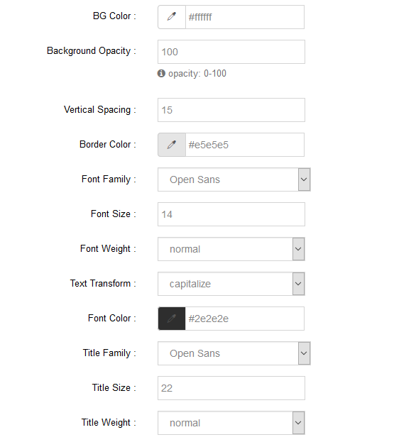
You can change the text color, background color and background image etc for each Breadcrumb layout.
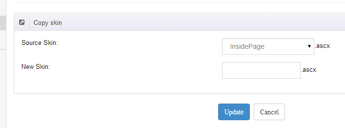
Create a Skin
You can create a new skin through xPlugin. Please note the new skin name shouldn't be the same as the current skin.
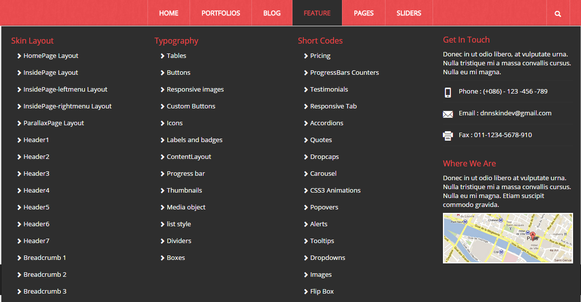
Standard Menu and MegaMenu
The skin sub menus contain two types-Standard Menu and MegaMenu.
Standard Menu is the default menu type, the sub menus will be set to display in one column only, as shown in screen shot below:
MegaMenu will set sub menus to display in multiple columns, also you can display HTML module or third party module in sub menus, as shown below:
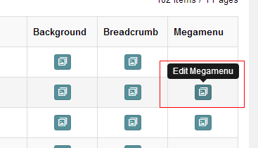
You can set the MegaMenu as per steps below:
- Click "pages" nav in the xPlugin.
- Click Edit MegaMenu button. Please note MegaMenu can be set for first level menus only.
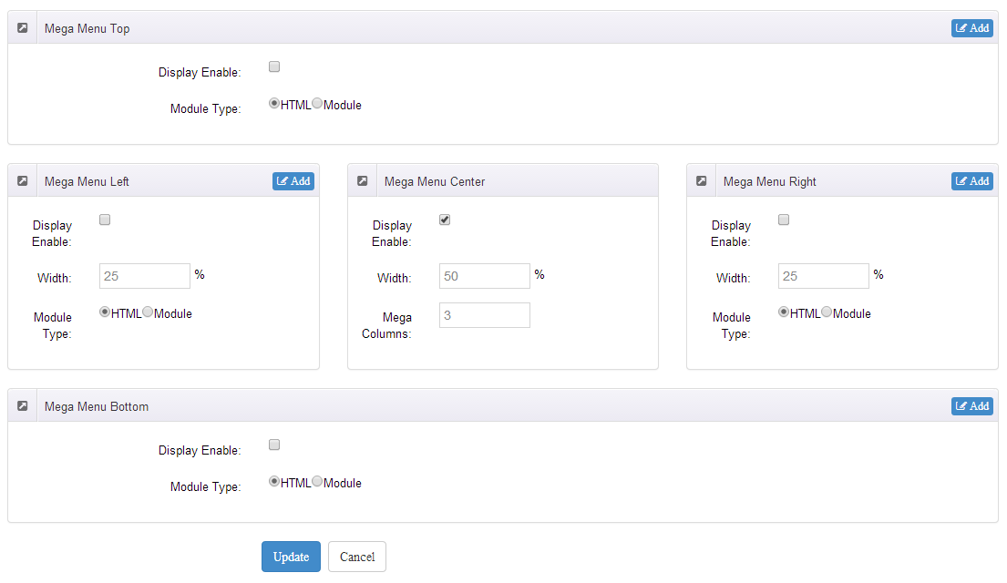
- Set the menu type to MegaMenu.
- Mega Menu has 5 sections: Menu Top, Menu Right, Menu Bottom, Menu Left, Menu Center.
- Click Add button so you will be able to add HTML module or any third module to Menu Top, Menu Right, Menu Bottom, Menu Left.
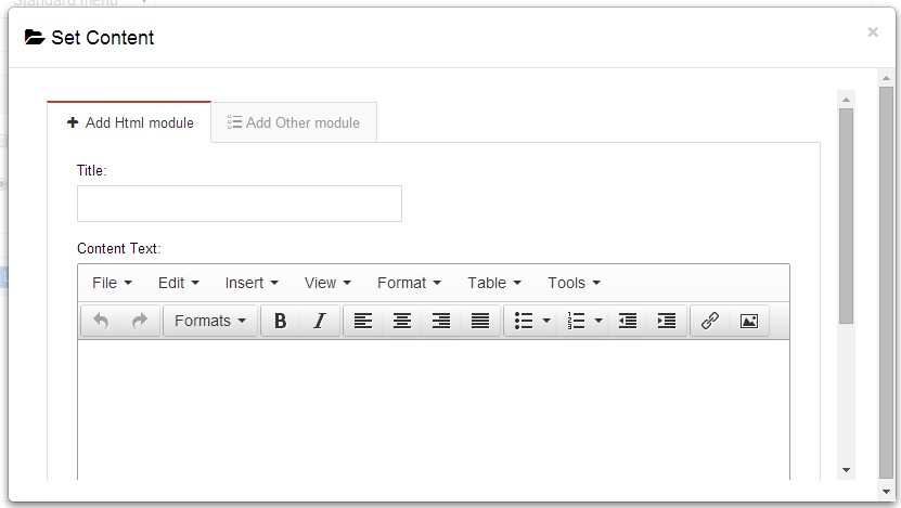
- Module Type-choose to display HTML module or third module.
- Menu Center-it will display secondary menus here.
- Mega Columns-set number of columns the secondary menu will display.
- You can set width for Menu Right, Menu Left, Menu Center, please note their previous total width shouldn't be more than 100.
Set Up Google Map
You can create Google Map easily following these steps:
- Go to xplugin, and click Map Settings tab to fill in API.
- You can register through https://developers.google.com/maps/documentation/javascript/get-api-key.
- Place the code <div id="gmap01"></div> into HTML module.
- Enter location of the map in Address, for example: Bear city, ny
- Enter description in Markers Html, for example: hello word
CSS Codes
Skin is using bootstrap framework. You will get to know more through this url. Link
Width of content area
dnn_layout is the page content framework:
| Device width | Width of content area |
| Large devices Desktops (≥1200px) | 1170px |
| Medium devices Desktops (≥992px) | 970px |
| Small devices Tablets (≥768px) | 750px |
| Extra small devices Phones (<768px) | auto |
content_mid is the spacing between both sides of the page :
| Device width | Spacing |
| Large devices Desktops (≥1200px) | 30px |
| Medium devices Desktops (≥992px) | 20px |
| Small devices Tablets (≥768px) | 15px |
| Extra small devices Phones (<768px) | 15px |
<div class="dnn_layout">
  <div class="content_mid clearfix"> content ... </div>
</div>
Bootstrap 12 grid layout
<!-- Tablet and desktop devices are 50% wide, mobile device is 100% wide -->
<div class="row">
  <div class="col-sm-6">.col-sm-6</div>
  <div class="col-sm-6">.col-sm-6</div>
</div>

<!-- Stack the columns on mobile by making one full-width and the other half-width -->
<div class="row">
  <div class="col-xs-12 col-md-8">.col-xs-12 .col-md-8</div>
  <div class="col-xs-6 col-md-4">.col-xs-6 .col-md-4</div>
</div>

<!-- Columns start at 50% wide on mobile and bump up to 33.3% wide on desktop -->
<div class="row">
  <div class="col-xs-6 col-md-4">.col-xs-6 .col-md-4</div>
  <div class="col-xs-6 col-md-4">.col-xs-6 .col-md-4</div>
  <div class="col-xs-6 col-md-4">.col-xs-6 .col-md-4</div>
</div>

<!-- Columns are always 50% wide, on mobile and desktop -->
<div class="row">
  <div class="col-xs-6">.col-xs-6</div>
  <div class="col-xs-6">.col-xs-6</div>
</div>

<!-- Add the extra clearfix for only the required viewport -->
<div class="clearfix visible-xs-block"></div>
Display and hide elements
| Extra small devices Phones (<768px) | Small devices Tablets (≥768px) | Medium devices Desktops (≥992px) | Large devices Desktops (≥1200px) | |
|---|---|---|---|---|
.visible-xs |
Visible | Hidden | Hidden | Hidden |
.visible-sm |
Hidden | Visible | Hidden | Hidden |
.visible-md |
Hidden | Hidden | Visible | Hidden |
.visible-lg |
Hidden | Hidden | Hidden | Visible |
.hidden-xs |
Hidden | Visible | Visible | Visible |
.hidden-sm |
Visible | Hidden | Visible | Visible |
.hidden-md |
Visible | Visible | Hidden | Visible |
.hidden-lg |
Visible | Visible | Visible | Hidden |
Visible in mobile devices and hidden in other devices
<div class="visible-xs">content...</div>

Visible in other devices and hidden in mobile devices
<div class="hidden-xs">content...</div>
Vertical spacing
 /*page Spacing*/
.mt-10 {margin-top: 10px;}
.mb-10 {margin-bottom: 10px;}
.pt-10 {padding-top: 10px;}
.pb-10 {padding-bottom: 10px;}
.mt-20 {margin-top: 20px;}
.mb-20 {margin-bottom: 20px;}
.pt-20 {padding-top: 20px;}
.pb-20 {padding-bottom: 20px;}
.mt-30 {margin-top: 30px;}
.mb-30 {margin-bottom: 30px;}
.pt-30 {padding-top: 30px;}
.pb-30 {padding-bottom: 30px;}
.mt-40 {margin-top: 40px;}
.mb-40 {margin-bottom: 40px;}
.pt-40 {padding-top: 40px;}
.pb-40 {padding-bottom: 40px;}
.mt-50 {margin-top: 50px;}
.mb-50 {margin-bottom: 50px;}
.pt-50 {padding-top: 50px;}
.pb-50 {padding-bottom: 50px;}
.mt-60 {margin-top: 60px;}
.mb-60 {margin-bottom: 60px;}
.pt-60 {padding-top: 60px;}
.pb-60 {padding-bottom: 60px;}
Short Codes
This skin contains a lot of short codes, it is very easy for you to use even you know nothing about js and css, all you need to do is just copying the short codes to HTML module.
Pricing
You can click the link to check Pricing demo. Demo Link
Style 1:
Below is the screen shot:
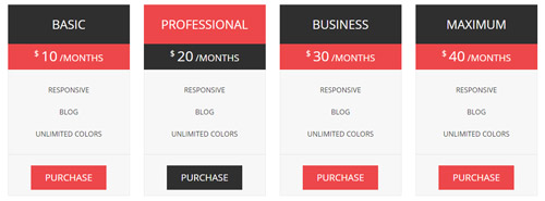
Codes are as follows:
<div class="price-table price-table1  row">
  <div class="col-md-3 col-sm-6">
    <div class="price_title">
      <h2>BASIC</h2>
    </div>
    <div class="price_holder">
      <div class="price_box"><span class="sup">$</span><span class="price">10</span><span class="unit">/MONTHS</span></div>
      <ul>
        <li>RESPONSIVE</li>
        <li>BLOG</li>
        <li>UNLIMITED COLORS</li>
      </ul>
      <a href="#" class="btn ">PURCHASE</a> </div>
  </div>
  <div class="col-md-3 col-sm-6 best_value">
    <div class="price_title ">
      <h2>PROFESSIONAL</h2>
    </div>
    <div class="price_holder">
      <div class="price_box"><span class="sup">$</span><span class="price">20</span><span class="unit">/MONTHS</span></div>
      <ul>
        <li>RESPONSIVE</li>
        <li>BLOG</li>
        <li>UNLIMITED COLORS</li>
      </ul>
      <a href="#" class="btn">PURCHASE</a> </div>
  </div>
  <div class="col-md-3 col-sm-6">
    <div class="price_title">
      <h2>BUSINESS</h2>
    </div>
    <div class="price_holder">
      <div class="price_box"><span class="sup">$</span><span class="price">30</span><span class="unit">/MONTHS</span></div>
      <ul>
        <li>RESPONSIVE</li>
        <li>BLOG</li>
        <li>UNLIMITED COLORS</li>
      </ul>
      <a href="#" class="btn">PURCHASE</a> </div>
  </div>
  <div class="col-md-3 col-sm-6">
    <div class="price_title">
      <h2>MAXIMUM</h2>
    </div>
    <div class="price_holder">
      <div class="price_box"><span class="sup">$</span><span class="price">40</span><span class="unit">/MONTHS</span></div>
      <ul>
        <li>RESPONSIVE</li>
        <li>BLOG</li>
        <li>UNLIMITED COLORS</li>
      </ul>
      <a href="#" class="btn ">PURCHASE</a> </div>
  </div>
</div>
Option:
col-md-* col-sm-*is the width for each column. You can change the width you need through value1~12
Style 2:
Below is the screen shot:
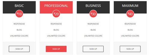
Codes are as follows:
<div class="price-table price-table2  row">
  <div class="col-md-3 col-sm-6">
    <div class="price_title">
      <h2>BASIC</h2>
    </div>
    <div class="price_holder">
      <div class="price_box"><span class="sup">$</span><span class="price">10</span></div>
      <ul>
        <li>RESPONSIVE</li>
        <li>BLOG</li>
        <li>UNLIMITED COLORS</li>
      </ul>
      <div class="price_bottom"> <a class="btn " href="#">SIGN UP</a> </div>
    </div>
  </div>
  <div class="col-md-3 col-sm-6 best_value">
    <div class="price_title ">
      <h2>PROFESSIONAL</h2>
    </div>
    <div class="price_holder">
      <div class="price_box"><span class="sup">$</span><span class="price">20</span></div>
      <ul>
        <li>RESPONSIVE</li>
        <li>BLOG</li>
        <li>UNLIMITED COLORS</li>
      </ul>
      <div class="price_bottom"> <a class="btn " href="#">SIGN UP</a> </div>
    </div>
  </div>
  <div class="col-md-3 col-sm-6">
    <div class="price_title">
      <h2>BUSINESS</h2>
    </div>
    <div class="price_holder">
      <div class="price_box"><span class="sup">$</span><span class="price">30</span></div>
      <ul>
        <li>RESPONSIVE</li>
        <li>BLOG</li>
        <li>UNLIMITED COLORS</li>
      </ul>
      <div class="price_bottom"> <a class="btn " href="#">SIGN UP</a> </div>
    </div>
  </div>
  <div class="col-md-3 col-sm-6">
    <div class="price_title">
      <h2>MAXIMUM</h2>
    </div>
    <div class="price_holder">
      <div class="price_box"><span class="sup">$</span><span class="price">40</span></div>
      <ul>
        <li>RESPONSIVE</li>
        <li>BLOG</li>
        <li>UNLIMITED COLORS</li>
      </ul>
      <div class="price_bottom"> <a class="btn " href="#">SIGN UP</a> </div>
    </div>
  </div>
</div>
Option:
col-md-* col-sm-*is the width for each column. You can change the width you need through value1~12
Style 3:
Below is the screen shot:
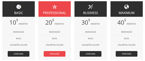
Codes are as follows:
<div class="price-table price-table3  row">
  <div class="col-md-3 col-sm-6">
    <div class="price_title"> <span class="glyphicons glyph-pie-chart"></span>
      <h2> BASIC</h2>
    </div>
    <div class="price_holder">
      <div class="price_box"><span class="price">10</span><span class="unit"><span class="sup">$</span> /MONTHS</span></div>
      <ul>
        <li>RESPONSIVE</li>
        <li>BLOG</li>
        <li>UNLIMITED COLORS</li>
      </ul>
      <a href="#" class="btn ">PURCHASE</a> </div>
  </div>
  <div class="col-md-3 col-sm-6 best_value">
    <div class="price_title "> <span class="glyphicons glyph-dislikes"></span>
      <h2> PROFESSIONAL</h2>
    </div>
    <div class="price_holder">
      <div class="price_box"><span class="price">20</span><span class="unit"><span class="sup">$</span> /MONTHS</span></div>
      <ul>
        <li>RESPONSIVE</li>
        <li>BLOG</li>
        <li>UNLIMITED COLORS</li>
      </ul>
      <a href="#" class="btn">PURCHASE</a> </div>
  </div>
  <div class="col-md-3 col-sm-6">
    <div class="price_title"> <span class="glyphicons glyph-magic"></span>
      <h2> BUSINESS</h2>
    </div>
    <div class="price_holder">
      <div class="price_box"><span class="price">30</span><span class="unit"><span class="sup">$</span> /MONTHS</span></div>
      <ul>
        <li>RESPONSIVE</li>
        <li>BLOG</li>
        <li>UNLIMITED COLORS</li>
      </ul>
      <a href="#" class="btn">PURCHASE</a> </div>
  </div>
  <div class="col-md-3 col-sm-6">
    <div class="price_title"> <span class="glyphicons glyph-globe"></span>
      <h2>MAXIMUM</h2>
    </div>
    <div class="price_holder">
      <div class="price_box"><span class="price">40</span><span class="unit"><span class="sup">$</span> /MONTHS</span></div>
      <ul>
        <li>RESPONSIVE</li>
        <li>BLOG</li>
        <li>UNLIMITED COLORS</li>
      </ul>
      <a href="#" class="btn ">PURCHASE</a> </div>
  </div>
</div>
Option:
col-md-* col-sm-*is the width for each column. You can change the width you need through value1~12- You can modify
glyphiconsto change icons. font icon list.
Style 4:
Below is the screen shot:
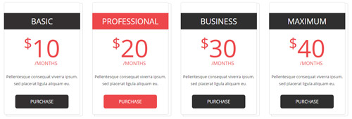
Codes are as follows:
<div class="price-table price-table4 row">
  <div class="col-md-3 col-sm-6">
    <div class="price_main">
      <div class="price_title">
        <h2> BASIC</h2>
      </div>
      <div class="price_holder">
        <div class="price_box"><span class="sup">$</span><span class="unit"><span class="price">10</span><br />
          /MONTHS</span></div>
        <div class="price_content"> Content text 1 ... </div>
        <a href="#" class="btn ">PURCHASE</a> </div>
    </div>
  </div>
  <div class="col-md-3 col-sm-6 best_value">
    <div class="price_main">
      <div class="price_title ">
        <h2> PROFESSIONAL</h2>
      </div>
      <div class="price_holder">
        <div class="price_box"><span class="sup">$</span><span class="unit"><span class="price">20</span><br />
          /MONTHS</span></div>
        <div class="price_content"> Content text 1 ... </div>
        <a href="#" class="btn">PURCHASE</a> </div>
    </div>
  </div>
  <div class="col-md-3 col-sm-6">
    <div class="price_main">
      <div class="price_title">
        <h2> BUSINESS</h2>
      </div>
      <div class="price_holder">
        <div class="price_box"><span class="sup">$</span><span class="unit"><span class="price">30</span><br />
          /MONTHS</span></div>
        <div class="price_content"> Content text 1 ... </div>
        <a href="#" class="btn">PURCHASE</a> </div>
    </div>
  </div>
  <div class="col-md-3 col-sm-6">
    <div class="price_main">
      <div class="price_title">
        <h2>MAXIMUM</h2>
      </div>
      <div class="price_holder">
        <div class="price_box"><span class="sup">$</span><span class="unit"><span class="price">40</span><br />
          /MONTHS</span></div>
        <div class="price_content"> Content text 1 ... </div>
        <a href="#" class="btn ">PURCHASE</a> </div>
    </div>
  </div>
</div>
Option:
col-md-* col-sm-*is the width for each column. You can change the width you need through value1~12
Style 5:
Below is the screen shot:
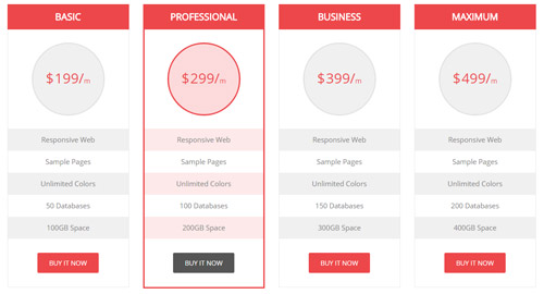
Codes are as follows:
<div class="price-table price-table5 row">
  <div class="col-md-3 col-sm-6">
    <div class="price_border">
      <div class="price_title">
        <h2>BASIC</h2>
      </div>
      <div class="price_holder">
        <div class="price_box"><span class="sup">$</span><span class="price">199/</span><span class="unit">m</span></div>
        <ul>
          <li>Responsive Web</li>
          <li>Sample Pages</li>
          <li>Unlimited Colors</li>
          <li>50 Databases</li>
          <li>100GB Space</li>
        </ul>
        <a class="Button_default" href="#">BUY IT NOW</a> </div>
    </div>
  </div>
  <div class="col-md-3 col-sm-6 best_value">
    <div class="price_border">
      <div class="price_title">
        <h2>BASIC</h2>
      </div>
      <div class="price_holder">
        <div class="price_box"><span class="sup">$</span><span class="price">299/</span><span class="unit">m</span></div>
        <ul>
          <li>Responsive Web</li>
          <li>Sample Pages</li>
          <li>Unlimited Colors</li>
          <li>100 Databases</li>
          <li>200GB Space</li>
        </ul>
        <a class="Button_default" href="#">BUY IT NOW</a> </div>
    </div>
  </div>
  <div class="col-md-3 col-sm-6">
    <div class="price_border">
      <div class="price_title">
        <h2>BASIC</h2>
      </div>
      <div class="price_holder">
        <div class="price_box"><span class="sup">$</span><span class="price">399/</span><span class="unit">m</span></div>
        <ul>
          <li>Responsive Web</li>
          <li>Sample Pages</li>
          <li>Unlimited Colors</li>
          <li>150 Databases</li>
          <li>300GB Space</li>
        </ul>
        <a class="Button_default" href="#">BUY IT NOW</a> </div>
    </div>
  </div>
  <div class="col-md-3 col-sm-6">
    <div class="price_border">
      <div class="price_title">
        <h2>BASIC</h2>
      </div>
      <div class="price_holder">
        <div class="price_box"><span class="sup">$</span><span class="price">499/</span><span class="unit">m</span></div>
        <ul>
          <li>Responsive Web</li>
          <li>Sample Pages</li>
          <li>Unlimited Colors</li>
          <li>200 Databases</li>
          <li>400GB Space</li>
        </ul>
        <a class="Button_default" href="#">BUY IT NOW</a> </div>
    </div>
  </div>
</div>
Option:
col-md-* col-sm-*is the width for each column. You can change the width you need through value1~12
ProgressBars Counters
You can click the link to check ProgressBars Counters demo. Demo Link
Style 1
Below is the screen shot:
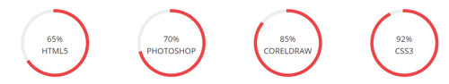
Codes are as follows:
<div class="chart_list row">
  <div class="col-sm-3">
    <div data-percent="65" class="percentage1">
      <div class="percentage_inner"><span>0</span>%
        <p>HTML5</p>
      </div>
    </div>
  </div>
  <div class="col-sm-3">
    <div data-percent="70" class="percentage1">
      <div class="percentage_inner"><span>0</span>%
        <p>PHOTOSHOP</p>
      </div>
    </div>
  </div>
  <div class="col-sm-3">
    <div data-percent="85" class="percentage1">
      <div class="percentage_inner"><span>0</span>%
        <p>CORELDRAW</p>
      </div>
    </div>
  </div>
  <div class="col-sm-3">
    <div data-percent="92" class="percentage1">
      <div class="percentage_inner"><span>0</span>%
        <p>CSS3</p>
      </div>
    </div>
  </div>
</div>
Option:
col-sm-*is the width of each column, you can change the width you need through value1~12data-percentis for controlling the percentage that displays, you can display percentage through value0~100
Style 2
Below is the screen shot:
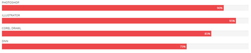
Codes are as follows:
<div class="loaded_list">
  <p>PHOTOSHOP </p>
  <div class="progress">
    <div class="bar animation animationwidth" data-width="90%"><span></span></div>
  </div>
  <p>ILLUSTRATOR</p>
  <div class="progress">
    <div class="bar animation animationwidth" data-width="95%"><span></span></div>
  </div>
  <p>COREL DRAWL</p>
  <p> </p>
  <div class="progress">
    <div class="bar animation animationwidth" data-width="85%"><span></span> </div>
  </div>
  <p>DNN</p>
  <div class="progress">
    <div class="bar animation animationwidth" data-width="75%"><span></span></div>
  </div>
</div>
Option:
- You can modify
animationto change the animation on the slide. Animation list. - You can change the value you need to display through
data-width
Style 3
Below is the screen shot:
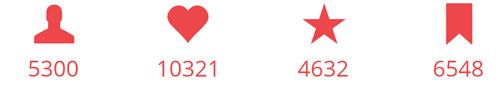
Codes are as follows:
<div class="number_Animation row">
  <div class="col-sm-3"> <span class="glyphicons glyph-user"> </span> <span class="animation  number" data-number="5300">0</span> </div>
  <div class="col-sm-3"> <span class="glyphicons glyph-heart"> </span> <span class="animation  number" data-number="10321">0</span> </div>
  <div class="col-sm-3"> <span class="glyphicons glyph-star"> </span> <span class="animation  number" data-number="4632">0</span> </div>
  <div class="col-sm-3"> <span class="glyphicons glyph-bookmark"> </span> <span class="animation  number" data-number="6548">0</span> </div>
</div>
Option:
- You can modify
glyphiconsto change icons. font icon list. col-sm-*is the width of each column, you can change the width you need through value1~12- You can modify
animationto change the animation on the slide. Animation list. - You can change the value you need to display through
data-number
Style 4
Below is the screen shot:
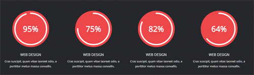
Codes are as follows:
<div class="chart_list1 row">
  <div class="col-md-3 col-sm-6">
    <div data-percent="95" class="percentage2">
      <div class="percentage_inner"><span>0</span></div>
    </div>
    <h3>Web Design</h3>
    <p>Cras suscipit, quam vitae  laoreet odio, a porttitor metus  massa convallis.</p>
  </div>
  <div class="col-md-3 col-sm-6">
    <div data-percent="75" class="percentage2">
      <div class="percentage_inner"><span>0</span></div>
    </div>
    <h3>Web Design</h3>
    <p>Cras suscipit, quam vitae  laoreet odio, a porttitor metus  massa convallis.</p>
  </div>
  <div class="col-md-3 col-sm-6">
    <div data-percent="82" class="percentage2">
      <div class="percentage_inner"><span>0</span></div>
    </div>
    <h3>Web Design</h3>
    <p>Cras suscipit, quam vitae  laoreet odio, a porttitor metus  massa convallis.</p>
  </div>
  <div class="col-md-3 col-sm-6">
    <div data-percent="64" class="percentage2">
      <div class="percentage_inner"><span>0</span></div>
    </div>
    <h3>Web Design</h3>
    <p>Cras suscipit, quam vitae  laoreet odio, a porttitor metus  massa convallis.</p>
  </div>
</div>
Option:
col-sm-*is the width of each column, you can change the width you need through value1~12data-percentis for controlling the percentage that displays, you can display percentage through value0~100
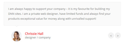
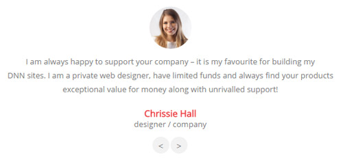
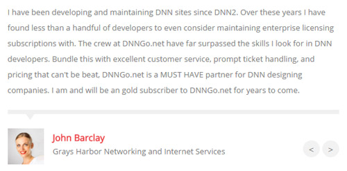
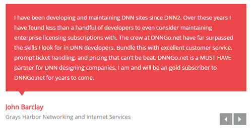
Testimonials
You can click the link to check Testimonials demo. Demo Link
Option:
Testimonials includes the parameters that listed below.
data-position |
Switch mode. fade:fade in fade out, roll-left:roll from side to side, roll-vertical:roll up and down |
data-display-navigation |
Navigation display and hidden. Default to true. true:Display, false:hidden |
data-display-arrows |
Left/right arrow display and hidden. Default to true. true:Display, false:hidden |
data-autoplay |
Whether to scroll automatically or not. 0 is for not scrolling automatically, numbers greater than 0 are for scrolling automatically, and these numbers are the time interval for scrolling. Default to 3000 |
data-autoheight |
Whether to be automatic height or not, default to true. true: automatic height, false: fixed height.< |
Example:
<ul class=" Testimonials_tab" data-position="roll-vertical" data-display-navigation="true" data-display-arrows="true" data-display-navigation="false" data-autoplay="3000" data-autoheight="true">
  <li>
    <h3 class="title a_t_c">What Others Say About Us ?</h3>
		......
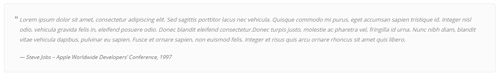
Style 1:
Below is the screen shot:
Codes are as follows:
<ul class=" Testimonials_tab Testimonials_1" data-position="fade" data-display-navigation="false" data-autoplay="0">
  <li>
    <blockquote>
      <p>Content text 1 ...</p>
      <small><img alt="" src="/portals/30/Pic_22.jpg" /><span>Name </span>introduce</small> </blockquote>
  </li>
  <li>
    <blockquote>
      <p>Content text 2 ...</p>
      <small><img alt="" src="/portals/30/Pic_15.jpg" /><span>Name</span>introduce</small> </blockquote>
  </li>
  <li>
    <blockquote>
      <p>Content text 3 ...</p>
      <small><img alt="" src="/portals/30/Pic_16.jpg" /><span>Name</span>introduce</small> </blockquote>
  </li>
  <li>
    <blockquote>
      <p>Content text 4 ...</p>
      <small><img alt="" src="/portals/30/Pic_17.jpg" /><span>Name </span>introduce</small> </blockquote>
  </li>
</ul>
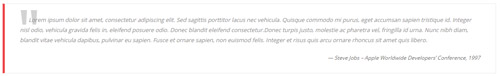
Style 2:
Below is the screen shot:
Codes are as follows:
<ul class="Testimonials_tab Testimonials_2" data-position="roll-left" data-display-navigation="false" data-height-auto="false">
  <li>
    <blockquote>
      <p><span class="Pic"><img alt="" src="/portals/30/Pic_22.jpg" /></span>Content text 1 ...</p>
      <small><span>Name </span>introduce</small> </blockquote>
  </li>
  <li>
    <blockquote>
      <p><span class="Pic"><img alt="" src="/portals/30/Pic_15.jpg" /></span>Content text 2 ...</p>
      <small><span>Name</span>introduce</small> </blockquote>
  </li>
  <li>
    <blockquote>
      <p><span class="Pic"><img alt="" src="/portals/30/Pic_16.jpg" /></span>Content text 3 ...</p>
      <small><span>Name</span>introduce</small> </blockquote>
  </li>
  <li>
    <blockquote>
      <p><span class="Pic"><img alt="" src="/portals/30/Pic_17.jpg" /></span>Content text 4 ...</p>
      <small><span>Name </span>introduce</small> </blockquote>
  </li>
</ul>
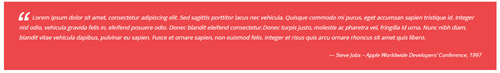
Style 3:
Below is the screen shot:

Codes are as follows:
<ul class=" Testimonials_tab Testimonials_3" data-autoplay="3000" data-display-arrows="false" data-position="roll-vertical">
  <li>
    <div class="Pic"><img alt="" src="/portals/30/Pic_22.jpg" /></div>
    <blockquote> <span class="mark">“</span>
      <p>Content text 1 ...</p>
      <small><span>Name</span>introduce</small> </blockquote>
  </li>
  <li>
    <div class="Pic"><img alt="" src="/portals/30/Pic_15.jpg" /></div>
    <blockquote> <span class="mark">“</span>
      <p>Content text 2 ...</p>
      <small><span>Name</span>introduce</small> </blockquote>
  </li>
  <li>
    <div class="Pic"><img alt="" src="/portals/30/Pic_16.jpg" /> </div>
    <blockquote> <span class="mark">“</span>
      <p>Content text 3 ...</p>
      <small><span>Name</span>introduce</small> </blockquote>
  </li>
  <li>
    <div class="Pic"><img alt="" src="/portals/30/Pic_17.jpg" /></div>
    <blockquote> <span class="mark">“</span>
      <p>>Content text 4 ...</p>
      <small><span>Name </span>introduce</small> </blockquote>
  </li>
</ul>
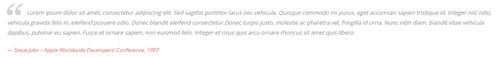
Style 4:
Below is the screen shot:
Codes are as follows:
<ul data-display-navigation="false" class="Testimonials_tab Testimonials_4">
  <li>
    <blockquote>
      <p>Content text 1 ...</p>
      <small><img alt="" src="/portals/30/Pic_22.jpg" /><span>Name</span> introduce</small> </blockquote>
  </li>
  <li>
    <blockquote>
      <p>Content text 2 ...</p>
      <small><img alt="" src="/portals/30/Pic_15.jpg" /><span>Name </span> introduce </small> </blockquote>
  </li>
  <li>
    <blockquote>
      <p>Content text 3 ...</p>
      <small><img alt="" src="/portals/30/Pic_16.jpg" /><span>Name </span> introduce </small> </blockquote>
  </li>
  <li>
    <blockquote>
      <p>Content text 4 ...</p>
      <small><img alt="" src="/portals/30/Pic_17.jpg" /><span>Name</span> introduce </small> </blockquote>
  </li>
</ul>
Style 5:
Below is the screen shot:
Codes are as follows:
<ul class=" Testimonials_tab Testimonials_5" data-position="fade" data-display-navigation="false" data-autoplay="0">
  <li>
    <blockquote>
      <p>Content text 1 ...</p>
      <small><span>Name </span>introduce</small> </blockquote>
  </li>
  <li>
    <blockquote>
      <p>Content text 2 ...</p>
      <small><span>Name</span>introduce</small> </blockquote>
  </li>
  <li>
    <blockquote>
      <p>Content text 3 ...</p>
      <small><span>Name</span>introduce</small> </blockquote>
  </li>
  <li>
    <blockquote>
      <p>Content text 4 ...</p>
      <small><span>Name</span>introduce</small> </blockquote>
  </li>
</ul>
Style 6:
Below is the screen shot:
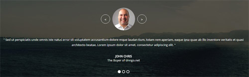
Codes are as follows:
<ul class="Testimonials_tab Testimonials_11" data-position="fade" data-autoplay="3000" data-height-auto="false">
  <li>
    <blockquote>
      <p><span class="Pic"><img alt="" src="/portals/30/home7_img13.png" /></span>Content text 1 ...</p>
      <small><span>Name</span>introduce</small> </blockquote>
  </li>
  <li>
    <blockquote>
      <p><span class="Pic"><img alt="" src="/portals/30/home7_img13.png" /></span>Content text 1 ...</p>
      <small><span>Name</span>introduce</small> </blockquote>
  </li>
  <li>
    <blockquote>
      <p><span class="Pic"><img alt="" src="/portals/30/home7_img13.png" /></span>Content text 1 ...</p>
      <small><span>Name</span>introduce</small> </blockquote>
  </li>
</ul>
Responsive Tab
You can click the link to check Responsive Tab demo. Demo Link
You can add the "resp-tabs-list" of "li" to add tab item, and add the "resp-tabs-container" of "resp_container" to add content
Example:
<div class="horizontalTab_Top">
  <ul class="resp-tabs-list">

    <li> Tab1 </li>
    <li> Tab2 </li>
    ....

  </ul>
  <div class="resp-tabs-container">

    <div class="resp_container"> Tab1 Content </div>
    <div class="resp_container"> Tab2 Content </div>
    ....

  </div>
</div>
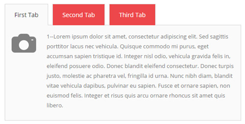
Style 1:
Below is the screen shot:
Codes are as follows:
<div class="horizontalTab_Top horizontalTab_Top_1">
  <ul class="resp-tabs-list">
    <li><span>Tab title 1</span></li>
    <li><span>Tab title 2</span></li>
    <li><span>Tab title 3</span></li>
  </ul>
  <div class="resp-tabs-container">
    <div class="resp_container">
      <div class="resp_margin">
        <table border="0" cellspacing="0" cellpadding="0">
          <tr>
            <td><img src="/portals/30/photo_icon.png" /></td>
            <td>Content text 1 ...</td>
          </tr>
        </table>
      </div>
    </div>
    <div class="resp_container">
      <div class="resp_margin">
        <table border="0" cellspacing="0" cellpadding="0">
          <tr>
            <td><img src="/portals/30/photo_icon.png" /></td>
            <td>Content text 2 ...</td>
          </tr>
        </table>
      </div>
    </div>
    <div class="resp_container">
      <div class="resp_margin">
        <table border="0" cellspacing="0" cellpadding="0">
          <tr>
            <td><img src="/portals/30/photo_icon.png" /></td>
            <td>Content text 3 ...</td>
          </tr>
        </table>
      </div>
    </div>
  </div>
</div>
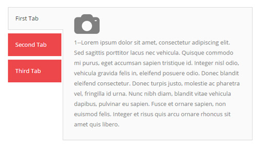
Style 2:
Below is the screen shot:
Codes are as follows:
<div class="verticalTab_Left  verticalTab_Left_1">
  <ul class="resp-tabs-list">
    <li><span>Tab title 1</span></li>
    <li><span>Tab title 2</span></li>
    <li><span>Tab title 3</span></li>
  </ul>
  <div class="resp-tabs-container">
    <div class="resp_container">
      <div class="resp_margin">
        <p><img alt="" src="/portals/30/photo_icon.png" /></p>
        Content text 1 ... </div>
    </div>
    <div class="resp_container">
      <div class="resp_margin">
        <p><img alt="" src="/portals/30/photo_icon.png" /></p>
        Content text 1 ... </div>
    </div>
    <div class="resp_container">
      <div class="resp_margin">
        <p><img alt="" src="/portals/30/photo_icon.png" /></p>
        Content text 1 ... </div>
    </div>
  </div>
</div>
Style 3:
Below is the screen shot:
Codes are as follows:
<div class="verticalTab_Right verticalTab_Right_1">
  <ul class="resp-tabs-list">
    <li><span>Tab title 1</span></li>
    <li><span>Tab title 2</span></li>
    <li><span>Tab title 3</span></li>
  </ul>
  <div class="resp-tabs-container">
    <div class="resp_container">
      <div class="resp_margin">
        <p><img alt="" src="/portals/30/photo_icon.png" /></p>
        Content text 1 ... </div>
    </div>
    <div class="resp_container">
      <div class="resp_margin">
        <p><img alt="" src="/portals/30/photo_icon.png" /></p>
        Content text 1 ... </div>
    </div>
    <div class="resp_container">
      <div class="resp_margin">
        <p><img alt="" src="/portals/30/photo_icon.png" /></p>
        Content text 1 ... </div>
    </div>
  </div>
</div>
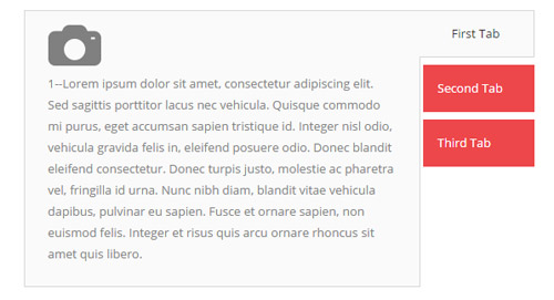
Style 4:
Below is the screen shot:
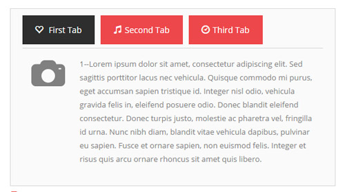
Codes are as follows:
<div class="horizontalTab_Top horizontalTab_Top_3">
  <ul class="resp-tabs-list">
    <li><span> <em class="glyphicons glyph-heart-empty"></em>Tab title 1</span></li>
    <li><span> <em class="glyphicons glyph-music"></em>Tab title 1</span></li>
    <li><span> <em class="glyphicons glyph-clock"></em>Tab title 1</span></li>
  </ul>
  <div class="resp-tabs-container">
    <div class="resp_container">
      <div class="resp_margin">
        <table border="0" cellspacing="0" cellpadding="0">
          <tr>
            <td><img alt="" src="/portals/30/photo_icon.png" /></td>
            <td>Content text 1 ...</td>
          </tr>
        </table>
      </div>
    </div>
    <div class="resp_container">
      <div class="resp_margin">
        <table border="0" cellspacing="0" cellpadding="0">
          <tr>
            <td><img alt="" src="/portals/30/photo_icon.png" /></td>
            <td>Content text 1 ...</td>
          </tr>
        </table>
      </div>
    </div>
  </div>
</div>
Style 5:
Below is the screen shot:
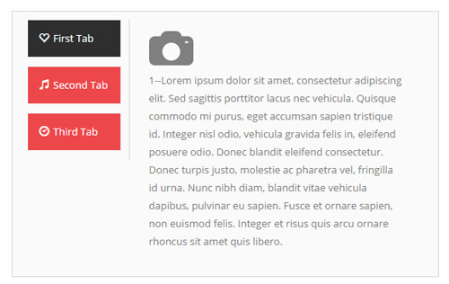
Codes are as follows:
<div class="verticalTab_Left  verticalTab_Left_3">
  <ul class="resp-tabs-list">
    <li><span><em class="glyphicons glyph-heart-empty"></em>Tab title 1</span></li>
    <li><span><em class="glyphicons glyph-music"></em>Tab title 1</span></li>
    <li><span><em class="glyphicons glyph-clock"></em>Tab title 1</span></li>
  </ul>
  <div class="resp-tabs-container">
    <div class="resp_container">
      <div class="resp_margin">
        <p><img alt="" src="/portals/30/photo_icon.png" /></p>
        Content text 1 ... </div>
    </div>
    <div class="resp_container">
      <div class="resp_margin">
        <p><img alt="" src="/portals/30/photo_icon.png" /></p>
        Content text 1 ... </div>
    </div>
    <div class="resp_container">
      <div class="resp_margin">
        <p><img alt="" src="/portals/30/photo_icon.png" /></p>
        Content text 1 ... </div>
    </div>
  </div>
</div>
Style 6:
Below is the screen shot:
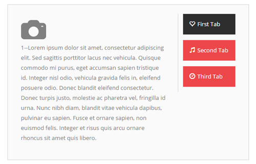
Codes are as follows:
<div class="verticalTab_Right verticalTab_Right_3">
  <ul class="resp-tabs-list">
    <li><span><em class="glyphicons glyph-heart-empty"></em>Tab title 1</span></li>
    <li><span><em class="glyphicons glyph-music"></em>Tab title 1</span></li>
    <li><span><em class="glyphicons glyph-clock"></em>Tab title 1</span></li>
  </ul>
  <div class="resp-tabs-container">
    <div class="resp_container">
      <div class="resp_margin">
        <p><img alt="" src="/portals/30/photo_icon.png" /></p>
        Content text 1 ... </div>
    </div>
    <div class="resp_container">
      <div class="resp_margin">
        <p><img alt="" src="/portals/30/photo_icon.png" /></p>
        Content text 1 ... </div>
    </div>
    <div class="resp_container">
      <div class="resp_margin">
        <p><img alt="" src="/portals/30/photo_icon.png" /></p>
        Content text 1 ... </div>
    </div>
  </div>
</div>
Accordions
You can click the link to check Accordions demo. Demo Link
Option:
- id="accordion" of each accordions effect needs using different names.
"data-parent"needs to have the same name asid- href="#collapse1" is the id that needs to expand content.
- id="collapse1" is the content that needs to expand.
<div class="panel-group" id="accordion">

  <div class="panel panel-default">
    <div class="panel-heading">
      <h4 class="panel-title"> <a data-toggle="collapse" data-parent="#accordion" href="#collapse1"> Title Text ... </a> </h4>
    </div>
    <div id="collapse1" class="panel-collapse collapse in">
      <div class="panel-body">Content Text ... </div>
    </div>
  </div>
  ....

</div>
Style 1:
Below is the screen shot:
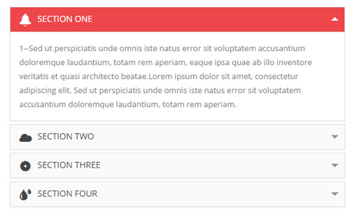
Codes are as follows:
<div class="panel-group accordion_1" id="accordion">
  <div class="panel panel-default">
    <div class="panel-heading">
      <h4 class="panel-title"> <a data-toggle="collapse" data-parent="#accordion" href="#collapse1_1"><span class="glyphicons glyph-bell"></span>title 1</a> </h4>
    </div>
    <div id="collapse1_1" class="panel-collapse collapse in">
      <div class="panel-body">Content text 1 ... </div>
    </div>
  </div>
  <div class="panel panel-default">
    <div class="panel-heading">
      <h4 class="panel-title"> <a data-toggle="collapse" data-parent="#accordion" href="#collapse1_2" class="collapsed"><span class="glyphicons glyph-cloud"></span>title 2</a> </h4>
    </div>
    <div id="collapse1_2" class="panel-collapse collapse">
      <div class="panel-body">Content text 2 ... </div>
    </div>
  </div>
  <div class="panel panel-default">
    <div class="panel-heading">
      <h4 class="panel-title"> <a data-toggle="collapse" data-parent="#accordion" href="#collapse1_3" class="collapsed"><span class="glyphicons glyph-saw-blade"></span>title 3</a> </h4>
    </div>
    <div id="collapse1_3" class="panel-collapse collapse">
      <div class="panel-body">Content text 3 ... </div>
    </div>
  </div>
  <div class="panel panel-default">
    <div class="panel-heading">
      <h4 class="panel-title"> <a data-toggle="collapse" data-parent="#accordion" href="#collapse1_4" class="collapsed"><span class="glyphicons glyph-tint"></span>title 4</a> </h4
        >
    </div>
    <div id="collapse1_4" class="panel-collapse collapse">
      <div class="panel-body">Content text 4 ... </div>
    </div>
  </div>
</div>
Style 2:
Below is the screen shot:
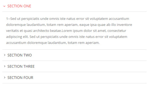
Codes are as follows:
<div class="panel-group accordion_2" id="accordion2">
  <div class="panel panel-default">
    <div class="panel-heading">
      <h4 class="panel-title"> <a data-toggle="collapse" data-parent="#accordion2" href="#collapse2_1"><span class="accordion_icon"></span>title 1</a> </h4>
    </div>
    <div id="collapse2_1" class="panel-collapse collapse in">
      <div class="panel-body">Content text 1 ... </div>
    </div>
  </div>
  <div class="panel panel-default">
    <div class="panel-heading">
      <h4 class="panel-title"> <a data-toggle="collapse" data-parent="#accordion2" href="#collapse2_2" class="collapsed"><span class="accordion_icon"></span>title 2</a> </h4>
    </div>
    <div id="collapse2_2" class="panel-collapse collapse">
      <div class="panel-body">Content text 2 ... </div>
    </div>
  </div>
  <div class="panel panel-default">
    <div class="panel-heading">
      <h4 class="panel-title"> <a data-toggle="collapse" data-parent="#accordion2" href="#collapse2_3" class="collapsed"><span class="accordion_icon"></span>title 3</a> </h4>
    </div>
    <div id="collapse2_3" class="panel-collapse collapse">
      <div class="panel-body">Content text 3 ... </div>
    </div>
  </div>
  <div class="panel panel-default">
    <div class="panel-heading">
      <h4 class="panel-title"> <a data-toggle="collapse" data-parent="#accordion2" href="#collapse2_4" class="collapsed"><span class="accordion_icon"></span>title 4</a> </h4>
    </div>
    <div id="collapse2_4" class="panel-collapse collapse">
      <div class="panel-body">Content text 4 ... </div>
    </div>
  </div>
</div>
Style 3:
Below is the screen shot:
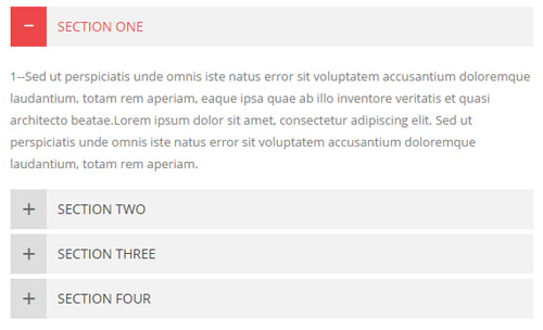
Codes are as follows:
<div class="panel-group accordion_3" id="accordion3">
  <div class="panel panel-default">
    <div class="panel-heading">
      <h4 class="panel-title"> <a data-toggle="collapse" data-parent="#accordion3" href="#collapse3_1"><span class="accordion_icon"></span>title 1</a> </h4>
    </div>
    <div id="collapse3_1" class="panel-collapse collapse in">
      <div class="panel-body">Content text 1 ... </div>
    </div>
  </div>
  <div class="panel panel-default">
    <div class="panel-heading">
      <h4 class="panel-title"> <a data-toggle="collapse" data-parent="#accordion3" href="#collapse3_2" class="collapsed"><span class="accordion_icon"></span>title 2</a> </h4>
    </div>
    <div id="collapse3_2" class="panel-collapse collapse">
      <div class="panel-body">Content text 2 ... </div>
    </div>
  </div>
  <div class="panel panel-default">
    <div class="panel-heading">
      <h4 class="panel-title"> <a data-toggle="collapse" data-parent="#accordion3" href="#collapse3_3" class="collapsed"><span class="accordion_icon"></span>title 3</a> </h4>
    </div>
    <div id="collapse3_3" class="panel-collapse collapse">
      <div class="panel-body">Content text 3 ... </div>
    </div>
  </div>
  <div class="panel panel-default">
    <div class="panel-heading">
      <h4 class="panel-title"> <a data-toggle="collapse" data-parent="#accordion3" href="#collapse3_4" class="collapsed"><span class="accordion_icon"></span>title 4</a> </h4>
    </div>
    <div id="collapse3_4" class="panel-collapse collapse">
      <div class="panel-body">Content text 4 ... </div>
    </div>
  </div>
</div>
Style 4:
Below is the screen shot:
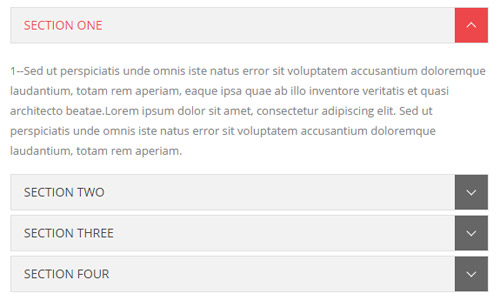
Codes are as follows:
<div class="panel-group accordion_4" id="accordion4">
  <div class="panel panel-default">
    <div class="panel-heading">
      <h4 class="panel-title"> <a data-toggle="collapse" data-parent="#accordion4" href="#collapse4_1"><span class="accordion_icon"></span>title 1</a> </h4>
    </div>
    <div id="collapse4_1" class="panel-collapse collapse in">
      <div class="panel-body">Content text 1 ... </div>
    </div>
  </div>
  <div class="panel panel-default">
    <div class="panel-heading">
      <h4 class="panel-title"> <a data-toggle="collapse" data-parent="#accordion4" href="#collapse4_2" class="collapsed"><span class="accordion_icon"></span>title 2</a> </h4>
    </div>
    <div id="collapse4_2" class="panel-collapse collapse">
      <div class="panel-body">Content text 2 ... </div>
    </div>
  </div>
  <div class="panel panel-default">
    <div class="panel-heading">
      <h4 class="panel-title"> <a data-toggle="collapse" data-parent="#accordion4" href="#collapse4_3" class="collapsed"><span class="accordion_icon"></span>title 3</a> </h4>
    </div>
    <div id="collapse4_3" class="panel-collapse collapse">
      <div class="panel-body">Content text 3 ... </div>
    </div>
  </div>
  <div class="panel panel-default">
    <div class="panel-heading">
      <h4 class="panel-title"> <a data-toggle="collapse" data-parent="#accordion4" href="#collapse4_4" class="collapsed"><span class="accordion_icon"></span>title 4</a> </h4>
    </div>
    <div id="collapse4_4" class="panel-collapse collapse">
      <div class="panel-body">Content text 4 ... </div>
    </div>
  </div>
</div>
Quotes
You can click the link to check Quotes demo. Demo Link
<div class="quotes_1">
  <blockquote> <span class="mark"> “</span>
    <p>Content text  ...</p>
    <small>Name</small> </blockquote>
</div>
<div class="quotes_2">
  <blockquote> <span class="mark"> “</span>
    <p>Content text  ...</p>
    <small>Name</small> </blockquote>
</div>
<div class="quotes_3">
  <blockquote> <span class="mark"> “</span>
    <p>Content text  ...</p>
    <small>Name</small> </blockquote>
</div>
<div class="quotes_4">
  <blockquote> <span class="mark"> “</span>
    <p>Content text  ...</p>
    <small>Name</small> </blockquote>
</div>
Dropcaps
You can click the link to check Dropcaps demo. Demo Link
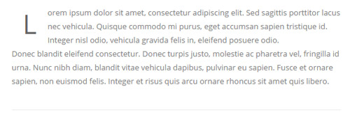
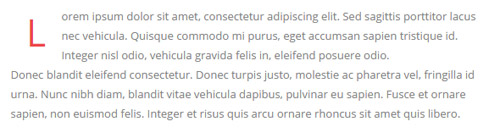
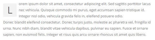
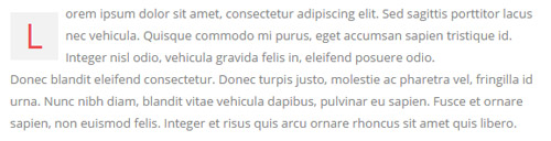
<p> <span class="dropcaps_1">L</span>Content text ... </p>
<p> <span class="dropcaps_2">L</span>Content text ... </p>
<p> <span class="dropcaps_3">L</span>Content text ... </p>
<p> <span class="dropcaps_4">L</span>Content text ... </p>
<p> <span class="dropcaps_5">L</span>Content text ... </p>
<p> <span class="dropcaps_6">L</span>Content text ... </p>
Carousel
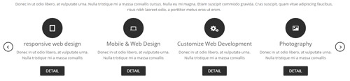
You can click the link to check Carousel demo. Demo Link
Style 1:
Below is the screen shot:
Codes are as follows:
<div class="carousel carousel_1" data-autoheight="false" data-pagination="false" data-items="4" data-navigation="true" data-autoplay="3000">
  <div class="item">
    <div class="ico"><span class="glyphicons glyph-ipad"></span></div>
    <h3>Title 1</h3>
    <p>Content 1</p>
    <a href="#" class="Button_normal">DETAIL</a> </div>
  <div class="item">
    <div class="ico"><span class="glyphicons glyph-macbook"></span></div>
    <h3>Title 2</h3>
    <p>Content 1</p>
    <a href="#" class="Button_normal">DETAIL</a> </div>
  <div class="item">
    <div class="ico"><span class="glyphicons glyph-cogwheels"></span></div>
    <h3>Title 3</h3>
    <p>Content 3 </p>
    <a href="#" class="Button_normal">DETAIL</a> </div>
  <div class="item">
    <div class="ico"><span class="glyphicons glyph-picture"></span></div>
    <h3>Title 4</h3>
    <p>Content 4 </p>
    <a href="#" class="Button_normal">DETAIL</a> </div>
  <div class="item">
    <div class="ico"><span class="glyphicons glyph-heart"></span></div>
    <h3>Title 5</h3>
    <p>Content 5 </p>
    <a href="#" class="Button_normal">DETAIL</a> </div>
  <div class="item">
    <div class="ico"><span class="glyphicons glyph-fire"></span></div>
    <h3>Title 6</h3>
    <p>Content 6 </p>
    <a href="#" class="Button_normal">DETAIL</a> </div>
</div>
Option:
- You can increase your content items through adding
<div class="item"></div> - You can modify
glyphiconsto change icons. font icon list.
| Variable | Default | Type | Description |
|---|---|---|---|
data-items |
4 | int | This variable allows you to set the maximum amount of items displayed at a time with the widest browser width. |
data-navigation |
true | boolean | Display "next" and "prev" buttons. |
data-pagination |
true | boolean | Show pagination. |
data-autoplay |
true | int/boolean | Change to any integrer for example data-autoplay ="5000" to play every 5 seconds. If you set data-autoplay="false" Stop auto scroll animation. |
Example:
<div class="carousel" data-items="4" data-navigation="true" data-pagination="true" data-autoplay="true">
  <div class="item">
		...
Style 2:
Below is the screen shot:

Codes are as follows:
<div class="carousel carousel_2" data-navigation="false"  data-autoheight="false" data-items="1" data-pagination="true" data-autoplay="3000">
  <div class="item"> <img alt="" src="/portals/32/controls_1.jpg" /> </div>
  <div class="item"> <img alt="" src="/portals/32/controls_2.jpg" /> </div>
  <div class="item"> <img alt="" src="/portals/32/controls_3.jpg" /> </div>
</div>
Option:
- You can increase your content items through adding
<div class="item"></div>
| Variable | Default | Type | Description |
|---|---|---|---|
data-items |
1 | int | This variable allows you to set the maximum amount of items displayed at a time with the widest browser width. |
data-navigation |
true | boolean | Display "next" and "prev" buttons. |
data-pagination |
true | boolean | Show pagination. |
data-autoplay |
true | int/boolean | Change to any integrer for example data-autoplay ="5000" to play every 5 seconds. If you set data-autoplay="false" Stop auto scroll animation. |
Example:
<div class="carousel" data-navigation="true" data-pagination="true" data-autoplay="true" data-autoheight="true">
  <div class="item">
		...
Style 3:
Below is the screen shot:
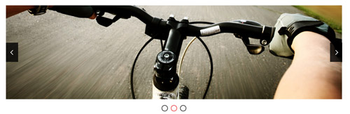
Codes are as follows:
<div class="carousel carousel_2" data-navigation="false" data-pagination="true" data-autoplay="3000" data-autoheight="true" data-items="1">
  <div class="item"> <img alt="" src="/portals/32/controls_1.jpg" /> </div>
  <div class="item"> <img alt="" src="/portals/32/controls_4.jpg" /> </div>
  <div class="item"> <img alt="" src="/portals/32/controls_5.jpg" /> </div>
</div>
Option:
- You can increase your content items through adding
<div class="item"></div> - You can control the way that the content comes out through these four styles
"text_left""text_right""text_top""text_bottom"
| Variable | Default | Type | Description |
|---|---|---|---|
data-items |
1 | int | This variable allows you to set the maximum amount of items displayed at a time with the widest browser width. |
data-navigation |
true | boolean | Display "next" and "prev" buttons. |
data-pagination |
true | boolean | Show pagination. |
data-autoplay |
true | int/boolean | Change to any integrer for example data-autoplay ="5000" to play every 5 seconds. If you set data-autoplay="false" Stop auto scroll animation. |
data-autoheight |
true | int/boolean | Whether to be automatic height or not, default to true. true: automatic height, false: fixed height. |
Style 4:
Below is the screen shot:
Codes are as follows:
<div class="carousel carousel_3" data-pagination="false" data-autoheight="false" data-items="3" data-navigation="true" data-autoplay="3000">
  <div class="item"> <img alt="" src="/portals/32/controls_7.jpg" />
    <h3>Title 1</h3>
    <p>Content 1</p>
  </div>
  <div class="item"> <img alt="" src="/portals/32/controls_8.jpg" />
    <h3>Title 2</h3>
    <p>Content 2</p>
  </div>
  <div class="item"> <img alt="" src="/portals/32/controls_9.jpg" />
    <h3>Title 3</h3>
    <p>Content 3</p>
  </div>
  <div class="item"> <img alt="" src="/portals/32/controls_10.jpg" />
    <h3>Title 4</h3>
    <p>Content 4</p>
  </div>
  <div class="item"> <img alt="" src="/portals/32/controls_11.jpg" />
    <h3>Title 5</h3>
    <p>Content 5</p>
  </div>
</div>
Option:
- You can increase your content items through adding
<div class="item"></div> - You can control the way that the content comes out through these four styles
"text_left""text_right""text_top""text_bottom"
| Variable | Default | Type | Description |
|---|---|---|---|
data-items |
3 | int | This variable allows you to set the maximum amount of items displayed at a time with the widest browser width. |
data-navigation |
true | boolean | Display "next" and "prev" buttons. |
data-pagination |
false | boolean | Show pagination. |
data-autoplay |
true | int/boolean | Change to any integrer for example data-autoplay ="5000" to play every 5 seconds. If you set data-autoplay="false" Stop auto scroll animation. |
Style 5:
Below is the screen shot:
Codes are as follows:
<div class="carousel carousel_4" data-autoheight="false" data-items="5" data-navigation="true" data-pagination="true" data-autoplay="3000">
  <div class="item"> <img alt="" src="/portals/32/controls_7.jpg" />
    <div class="sliding">
      <h3>Title 1</h3>
      <p>Content 1 </p>
      <a href="#">>>  MORE INFO</a> </div>
  </div>
  <div class="item"> <img alt="" src="/portals/32/controls_8.jpg" />
    <div class="sliding">
      <h3>Title 2</h3>
      <p>Content 2 </p>
      <a href="#"> >>  MORE INFO</a> </div>
  </div>
  <div class="item"> <img alt="" src="/portals/32/controls_9.jpg" />
    <div class="sliding">
      <h3>Title 3</h3>
      <p>Content 3 </p>
      <a href="#">>>  MORE INFO</a> </div>
  </div>
  <div class="item"> <img alt="" src="/portals/32/controls_10.jpg" />
    <div class="sliding">
      <h3>Title 4</h3>
      <p>Content 4 </p>
      <a href="#">>>  MORE INFO</a> </div>
  </div>
  <div class="item"> <img alt="" src="/portals/32/controls_11.jpg" />
    <div class="sliding">
      <h3>Title 5</h3>
      <p>Content 5 </p>
      <a href="#">>>  MORE INFO</a> </div>
  </div>
  <div class="item"> <img alt="" src="/portals/32/controls_7.jpg" />
    <div class="sliding">
      <h3>Title 6</h3>
      <p>Content 6 </p>
      <a href="#">>>  MORE INFO</a> </div>
  </div>
</div>
Option:
- You can increase your content items through adding
<div class="item"></div> - You can control the way that the content comes out through these four styles
"text_left""text_right""text_top""text_bottom"
| Variable | Default | Type | Description |
|---|---|---|---|
data-items |
5 | int | This variable allows you to set the maximum amount of items displayed at a time with the widest browser width. |
data-navigation |
true | boolean | Display "next" and "prev" buttons. |
data-pagination |
true | boolean | Show pagination. |
data-autoplay |
true | int/boolean | Change to any integrer for example data-autoplay ="5000" to play every 5 seconds. If you set data-autoplay="false" Stop auto scroll animation. |
Style 6:
Below is the screen shot:

Codes are as follows:
<div class="carousel carousel_6" data-navigation="true" data-pagination="false" data-autoplay="3000" data-items="6">
  <div class="item"> <img alt="" src="/portals/30/carousel_6_img1.png" /> </div>
  <div class="item"> <img alt="" src="/portals/30/carousel_6_img2.png" /> </div>
  <div class="item"> <img alt="" src="/portals/30/carousel_6_img3.png" /> </div>
  <div class="item"> <img alt="" src="/portals/30/carousel_6_img4.png" /> </div>
  <div class="item"> <img alt="" src="/portals/30/carousel_6_img5.png" /> </div>
  <div class="item"> <img alt="" src="/portals/30/carousel_6_img6.png" /> </div>
  <div class="item"> <img alt="" src="/portals/30/carousel_6_img1.png" /> </div>
  <div class="item"> <img alt="" src="/portals/30/carousel_6_img2.png" /> </div>
</div>
Option:
- You can increase your content items through adding
<div class="item"></div> - You can control the way that the content comes out through these four styles
"text_left""text_right""text_top""text_bottom"
| Variable | Default | Type | Description |
|---|---|---|---|
data-items |
6 | int | This variable allows you to set the maximum amount of items displayed at a time with the widest browser width. |
data-navigation |
true | boolean | Display "next" and "prev" buttons. |
data-pagination |
false | boolean | Show pagination. |
data-autoplay |
true | int/boolean | Change to any integrer for example data-autoplay ="5000" to play every 5 seconds. If you set data-autoplay="false" Stop auto scroll animation. |
CSS3 Animations
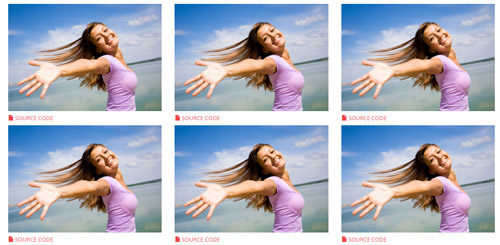
You can click the link to check CSS3 Animations demo. Demo Link
Style 1:
This type is a group of effects which are displayed in time sequence. Below is the screen shot:
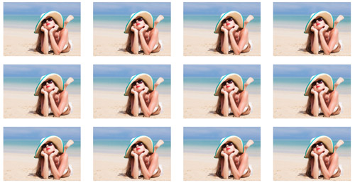
Codes are as follows:
<div class="animation">
   <div class="row mb-20">
       <div class="col-sm-3 animation_item scaleUp delay1"><img src="/portals/32/Photo2.jpg" /></div>
       <div class="col-sm-3 animation_item scaleUp delay2"><img src="/portals/32/Photo2.jpg" /></div>
       <div class="col-sm-3 animation_item scaleUp delay3"><img src="/portals/32/Photo2.jpg" /></div>
       <div class="col-sm-3 animation_item scaleUp delay4"><img src="/portals/32/Photo2.jpg" /></div>
	   ...
</div>
delay1, delay2, delay3, delay4 are used to control animation time, there are 12 time slots, which correspond to delay1~delay12 respectively.
scaleUp is used to control animation effect, there are scaleUp , bounceIn , bounceInDown , bounceInLeft , bounceInRight , bounceInUp , fadeIn , fadeInDown , fadeInLeft , fadeInRight , fadeInUp , fadeInDownBig , fadeInLeftBig , fadeInRightBig , fadeInUpBig , flip , flipInX , flipInY , lightSpeedIn , rotateIn , rotateInDownLeft , rotateInDownRight , rotateInUpLeft , rotateInUpRight , rollIn , zoomIn , zoomInDown , zoomInLeft , zoomInRight , zoomInUp 30 effects in total.
Style 2:
If you just need one animation effect, you can match with the following codes.
<div class="animation scaleUp"> <img src="/portals/32/Photo5.jpg" /> </div>
Style 3:
You can add animation for a certain element when mousing over. Codes are as follows:
<div class="animationhover bounce"> <img src="/portals/32/Photo5.jpg" /> </div>
When mousing over, it will show animation effect type (animationhover). There are bounce , flash , pulse , rubberBand , shake , swing , tada , wobble 8 effects.
Popovers
You can click the link to check Popovers demo. Demo Link
Below is the screen shot:
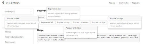
Codes are as follows:
<button data-content="Vivamus sagittis lacus vel augue laoreet rutrum faucibus." data-placement="left" data-toggle="popover" data-container="body" data-original-title="Popover on left" class="btn btn-default popovers" type="button">
    Popover on left
</button>
Option:
| Name | type | default | description |
|---|---|---|---|
| animation | boolean | true | apply a CSS fade transition to the tooltip |
| html | boolean | false | Insert HTML into the tooltip. If false, jQuery's text method will be used to insert content into the DOM. Use text if you're worried about XSS attacks. |
| placement | string | function | 'top' | how to position the tooltip - top | bottom | left | right | auto. When "auto" is specified, it will dynamically reorient the tooltip. For example, if placement is "auto left", the tooltip will display to the left when possible, otherwise it will display right. |
| selector | string | false | If a selector is provided, tooltip objects will be delegated to the specified targets. |
| title | string | function | '' | default title value if title attribute isn't present |
| trigger | string | 'hover focus' | how tooltip is triggered - click | hover | focus | manual. You may pass multiple triggers; separate them with a space. |
| delay | number | object | 0 | delay showing and hiding the tooltip (ms) - does not apply to manual trigger type If a number is supplied, delay is applied to both hide/show Object structure is: |
| container | string | false | false | Appends the tooltip to a specific element. Example: |
Alerts
You can click the link to check Alerts demo. Demo Link
Below is the screen shot:
Codes are as follows:
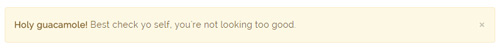
<div class="alert alert-warning fade in">
    <button aria-hidden="true" data-dismiss="alert" class="close" type="button">×</button>
    <strong>Holy guacamole!</strong> Best check yo self, you're not looking too good.
</div>
Option:
- You can change
alert-to change the color, there arealert-warning,alert-danger,alert-success,alert-info4 colors included in the effects. fadeis for hiddeninis for display
Tooltips
You can click the link to check Tooltips demo. Tooltips
Below is the screen shot:
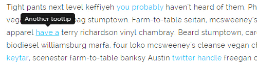
Codes are as follows:
<a href="#" class="tooltips" data-toggle="tooltip" title="first tooltip">Hover over me</a>
Option:
| Name | type | default | description |
|---|---|---|---|
| animation | boolean | true | apply a CSS fade transition to the tooltip |
| html | boolean | false | Insert HTML into the tooltip. If false, jQuery's text method will be used to insert content into the DOM. Use text if you're worried about XSS attacks. |
| placement | string | function | 'top' | how to position the tooltip - top | bottom | left | right | auto. When "auto" is specified, it will dynamically reorient the tooltip. For example, if placement is "auto left", the tooltip will display to the left when possible, otherwise it will display right. |
| selector | string | false | If a selector is provided, tooltip objects will be delegated to the specified targets. |
| title | string | function | '' | default title value if title attribute isn't present |
| trigger | string | 'hover focus' | how tooltip is triggered - click | hover | focus | manual. You may pass multiple triggers; separate them with a space. |
| delay | number | object | 0 | delay showing and hiding the tooltip (ms) - does not apply to manual trigger type If a number is supplied, delay is applied to both hide/show Object structure is: |
| container | string | false | false | Appends the tooltip to a specific element. Example: |
Dropdowns
You can click the link to check Dropdowns demo. Demo Link
Style 1:
Below is the screen shot:
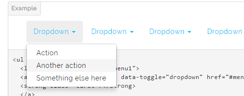
Codes are as follows:
<ul class="nav nav-pills">
  <li class="dropdown" id="menu1">
  <a class="dropdown-toggle" data-toggle="dropdown" href="#menu1">Dropdown
  <strong class="caret"></strong>
  </a>
    <ul class="dropdown-menu">
      <li><a href="#">Action</a></li>
      <li><a href="#">Another action</a></li>
      <li><a href="#">Something else here</a></li>
    </ul>
  </li>
</ul>
Style 2:
Below is the screen shot:
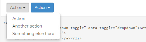
Codes are as follows:
<div class="btn-group">
  <button class="btn dropdown-toggle" data-toggle="dropdown">Action <span class="caret"></span></button>
  <ul class="dropdown-menu">
    <li><a href="#">Action</a></li>
    <li><a href="#">Another action</a></li>
    <li><a href="#">Something else here</a></li>
  </ul>
</div>
Style 3:
Below is the screen shot:
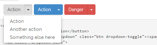
Codes are as follows:
<div class="btn-group">
  <button class="btn">Action</button>
  <button data-toggle="dropdown" class="btn dropdown-toggle"><span class="caret"></span></button>
  <ul class="dropdown-menu">
    <li><a href="#">Action</a></li>
    <li><a href="#">Another action</a></li>
    <li><a href="#">Something else here</a></li>
  </ul>
</div>
LightBox
You can click the link to check LightBox demo. Demo Link
Below is the screen shot:
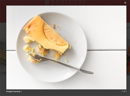
Option:
1. LightBox_image |
Show one image alone. |
2. LightBox_image_gallery+group number |
Classify those that share the same class name to one group, you can show other images within the group by clicking left and right arrow of the image. |
3. LightBox_image_group |
Classify these sub levels whose label class name is LightBox_image_group into one group. |
4. LightBox_youtube |
Show youtube video. |
5. LightBox_vimeo |
Show video. |
6. LightBox_gmaps |
Shown map. |
7. LightBox_youtube_gallery+group number |
Classify these that share the same class name into a group of youtube video show |
8. LightBox_vimeo_gallery+group number |
Classify these that share the same class name into a group of video show. |
9. LightBox_gmaps_gallery+group number |
Classify these that share the same class name into a group of map show. |
10. LightBox_youtube_group |
Classify these sub levels whose label class name is LightBox_youtube_group into one group. |
11. LightBox_vimeo_group |
Classify these sub levels whose label class name is LightBox_vimeo_group into one group. |
12. LightBox_gmaps_group |
Classify these sub levels whose label class names is LightBox_gmaps_group into one group. |
13. LightBox_Box |
Take div as layer pop up, div needs to hide by default. Style of pop up is custom style. |
14. LightBox_ajax |
Pop up a page |
15. LightBox_ajax_group |
Pop up a group of pages |
You need to fill url of the pop up image(video, map) in href=""
1.LightBox_image
<a href="bigPhoto.jpg" class="LightBox_image" title="Single Image 1"><img alt="" src="cover.jpg" /></a>
2.LightBox_image_gallery
<a href="bigPhoto1.jpg" class="LightBox_image_gallery1" title="Single Image 1"><img alt="" src="cover.jpg" /></a>
<a href="bigPhoto2.jpg" class="LightBox_image_gallery1" title="Single Image 1"><img alt="" src="cover.jpg" /></a>
<a href="bigPhoto3.jpg" class="LightBox_image_gallery2" title="Single Image 2"><img alt="" src="cover.jpg" /></a>
<a href="bigPhoto4.jpg" class="LightBox_image_gallery2" title="Single Image 2"><img alt="" src="cover.jpg" /></a>
3.LightBox_image_group
<div class="LightBox_image_group">
    <a href="bigPhoto1.jpg" title=" People Scenery 1"><img alt="" src="cover.jpg" /> </a>
    <a href="bigPhoto2.jpg" title=" People Scenery 2"></a>
    <a href="bigPhoto3.jpg" title=" People Scenery 3"></a>
</div>
4.LightBox_youtube
<a href="http://www.youtube.com/watch?v=0O2aH4XLbto" class="LightBox_youtube" title="youtube"><img alt="" src="cover.jpg" /></a>
5.LightBox_vimeo
<a href="https://vimeo.com/45830194" class="LightBox_vimeo" title="vimeo"><img alt="" src="cover.jpg" /></a>
6.LightBox_gmaps
<a href="https://maps.google.com/maps?q=221B+Baker+Street,+London,+United+Kingdom&hl=en&t=v&hnear=221B+Baker+St,+London+NW1+6XE,+United+Kingdom" class="LightBox_gmaps" title="gmaps"><img alt="" src="cover.jpg" /></a>
7.LightBox_youtube_gallery
<a href="http://www.youtube.com/watch?v=0O2aH4XLbto" class="LightBox_youtube_gallery1" title="youtube gallery"><img alt="" src="cover.jpg" /></a>
<a href="http://www.youtube.com/watch?v=0O2aH4XLbto" class="LightBox_youtube_gallery1" title="youtube gallery"><img alt="" src="cover.jpg" /></a>
<a href="http://www.youtube.com/watch?v=0O2aH4XLbto" class="LightBox_youtube_gallery2" title="youtube gallery"><img alt="" src="cover.jpg" /></a>
<a href="http://www.youtube.com/watch?v=0O2aH4XLbto" class="LightBox_youtube_gallery2" title="youtube gallery"><img alt="" src="cover.jpg" /></a>
8.LightBox_vimeo_gallery
<a href="https://vimeo.com/45830194" class="LightBox_vimeo_gallery1" title="vimeo gallery"><img alt="" src="cover.jpg" /></a>
<a href="https://vimeo.com/45830194" class="LightBox_vimeo_gallery1" title="vimeo gallery"><img alt="" src="cover.jpg" /></a>
<a href="https://vimeo.com/45830194" class="LightBox_vimeo_gallery2" title="vimeo gallery"><img alt="" src="cover.jpg" /></a>
<a href="https://vimeo.com/45830194" class="LightBox_vimeo_gallery2" title="vimeo gallery"><img alt="" src="cover.jpg" /></a>
9.LightBox_gmaps_gallery
<a href="https://maps.google.com/maps?q=221B+Baker+Street,+London,+United+Kingdom&hl=en&t=v&hnear=221B+Baker+St,+London+NW1+6XE,+United+Kingdom" class="LightBox_gmaps_gallery1" title="gmaps gallery"><img alt="" src="cover.jpg" /></a>
<a href="https://maps.google.com/maps?q=221B+Baker+Street,+London,+United+Kingdom&hl=en&t=v&hnear=221B+Baker+St,+London+NW1+6XE,+United+Kingdom" class="LightBox_gmaps_gallery1" title="gmaps gallery"><img alt="" src="cover.jpg" /></a>
<a href="https://maps.google.com/maps?q=221B+Baker+Street,+London,+United+Kingdom&hl=en&t=v&hnear=221B+Baker+St,+London+NW1+6XE,+United+Kingdom" class="LightBox_gmaps_gallery2" title="gmaps gallery"><img alt="" src="cover.jpg" /></a>
<a href="https://maps.google.com/maps?q=221B+Baker+Street,+London,+United+Kingdom&hl=en&t=v&hnear=221B+Baker+St,+London+NW1+6XE,+United+Kingdom" class="LightBox_gmaps_gallery2" title="gmaps gallery"><img alt="" src="cover.jpg" /></a>
10.LightBox_youtube_group
<div class="LightBox_youtube_group">
    <a href="http://www.youtube.com/watch?v=0O2aH4XLbto" title=" youtube 1"><img alt="" src="cover.jpg" /> </a>
    <a href="http://www.youtube.com/watch?v=0O2aH4XLbto" title=" youtube 2"></a>
    <a href="http://www.youtube.com/watch?v=0O2aH4XLbto" title=" youtube 3"></a>
</div>
11.LightBox_vimeo_group
<div class="LightBox_vimeo_group">
    <a href="https://vimeo.com/45830194" title=" vimeo 1"><img alt="" src="cover.jpg" /> </a>
    <a href="https://vimeo.com/45830194" title=" vimeo 2"></a>
    <a href="https://vimeo.com/45830194" title=" vimeo 3"></a>
</div>
12.LightBox_gmaps_group
<div class="LightBox_gmaps_group">
    <a href="https://maps.google.com/maps?q=221B+Baker+Street,+London,+United+Kingdom&hl=en&t=v&hnear=221B+Baker+St,+London+NW1+6XE,+United+Kingdom" title=" gmaps 1"><img alt="" src="cover.jpg" /> </a>
    <a href="https://maps.google.com/maps?q=221B+Baker+Street,+London,+United+Kingdom&hl=en&t=v&hnear=221B+Baker+St,+London+NW1+6XE,+United+Kingdom" title=" gmaps 2"></a>
    <a href="https://maps.google.com/maps?q=221B+Baker+Street,+London,+United+Kingdom&hl=en&t=v&hnear=221B+Baker+St,+London+NW1+6XE,+United+Kingdom" title=" gmaps 3"></a>
</div>
13.LightBox_Box
<a href=".LightBox_Content" class="LightBox_Box"> Click Here To Pop </a>
<a href=".LightBox_Content" class="LightBox_Box Button_default"> Click Here To Pop </a>
<div class="LightBox_Content">
    <h3>Click Here To Pop</h3>
 	  content text ...
</div>
14.LightBox_ajax
<a href="index.aspx" class="LightBox_ajax" title="ajax"><img alt="" src="cover.jpg" /></a>
15.LightBox_ajax_group
<div class="LightBox_ajax_group">
    <a href="index.aspx" title=" ajax 1"><img alt="" src="cover.jpg" /> </a>
    <a href="index.aspx" title=" ajax 2"></a>
    <a href="index.aspx" title=" ajax 3"></a>
</div>
Image Effects
You can click the link to check Image Effects demo. Demo Link
- You can copy over codes of the image effects directly to any HTML modules.
- You can change the font icon through modifying. font icon list
Flip Box
You can click the link to check Flip Box demo. Demo Link
Style 1:
Below is the screen shot:
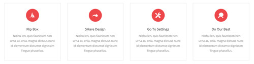
Codes are as follows:
<div class="row">
    <div class="col-sm-3">
        <div class="flip_box flip_box_1">
            <div class="rotate">
                <div class="front">
                    <span class="glyphicons glyph-cardio"></span>
                    <h3>Flip Box</h3>
                    <p>content text ...</p>
                </div>
                <div class="back">
                    <h3>Flip Box</h3>
                    <p>content text ...</p>
                    <a href="#" class="but">Read More</a>
                </div>
            </div>
        </div>
    </div>
    <div class="col-sm-3">
        <div class="flip_box flip_right flip_box_1">
            <div class="rotate">
                <div class="front">
                    <span class="glyphicons glyph-redo"></span>
                    <h3>SHare Design</h3>
                    <p>content text ...</p>
                </div>
                <div class="back">
                    <h3>SHare Design</h3>
                    <p>content text ...</p>
                    <a href="#" class="but">Read More</a>
                 </div>
            </div>
        </div>
    </div>
    <div class="col-sm-3">
        <div class="flip_box flip_top flip_box_1">
            <div class="rotate">
                <div class="front">
                    <span class="glyphicons glyph-settings"></span>
                    <h3>Go To Settings</h3>
                    <p>content text ...</p>
                </div>
                <div class="back">
                    <h3>Go To Settings</h3>
                    <p>content text ...</p>
                    <a href="#" class="but">Read More</a>
                </div>
            </div>
        </div>
    </div>
    <div class="col-sm-3">
        <div class="flip_box flip_bottom flip_box_1">
            <div class="rotate">
                <div class="front">
                    <span class="glyphicons glyph-table-tennis"></span>
                    <h3>Do Our Best</h3>
                    <p>content text ...</p>
                </div>
                <div class="back">
                    <h3>Do Our Best</h3>
                    <p>content text ...</p>
                    <a href="#" class="but">Read More</a>
                </div>
            </div>
        </div>
    </div>
</div>
Option:
col-md-3 col-sm-6is the width of each column, you can change the width you need through value1~12.frontis for front content.backis for back content.
Style 2:
Below is the screen shot:
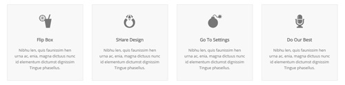
Codes are as follows:
<div class="row">
    <div class="col-sm-3">
        <div class="flip_box flip_box_2">
            <div class="rotate">
                <div class="front"> <span class="glyphicons glyph-drink"></span>
                    <h3>Flip Box</h3>
                    <p>content text ...</p>
                </div>
                <div class="back">
                    <h3>Flip Box</h3>
                    <p>content text ...</p>
                </div>
            </div>
        </div>
    </div>
    <div class="col-sm-3">
        <div class="flip_box flip_right flip_box_2">
            <div class="rotate">
                <div class="front"> <span class="glyphicons glyph-ring"></span>
                    <h3>SHare Design</h3>
                    <p>content text ...</p>
                </div>
                <div class="back">
                    <h3>SHare Design</h3>
                    <p>content text ...</p>
                </div>
            </div>
        </div>
    </div>
    <div class="col-sm-3">
        <div class="flip_box flip_top flip_box_2">
            <div class="rotate">
                <div class="front"> <span class="glyphicons glyph-bomb"></span>
                    <h3>Go To Settings</h3>
                    <p>content text ...</p>
                </div>
                <div class="back">
                    <h3>Go To Settings</h3>
                    <p>content text ...</p>
                </div>
            </div>
        </div>
    </div>
    <div class="col-sm-3">
        <div class="flip_box flip_bottom flip_box_2">
            <div class="rotate">
                <div class="front"> <span class="glyphicons glyph-microphone"></span>
                    <h3>Do Our Best</h3>
                    <p>content text ...</p>
                </div>
                <div class="back">
                    <h3>Do Our Best</h3>
                    <p>content text ...</p>
                </div>
                </div>
            </div>
        </div>
    </div>
<br />
Style 3:
Below is the screen shot:
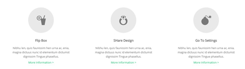
Codes are as follows:
<div class="row">
    <div class="col-sm-4">
        <div class="flip_box flip_box_3">
            <div class="rotate">
                <div class="front"> <span class="glyphicons glyph-drink"></span>
                    <h3>Flip Box</h3>
                    <p>content text ...</p>
                    <a href="#">More Information ></a>
                </div>
                <div class="back">
                    <h3>Flip Box</h3>
                    <p>content text ...</p>
                    <a href="#" class="but">Read More</a>
                </div>
            </div>
        </div>
    </div>
    <div class="col-sm-4">
        <div class="flip_box flip_right flip_box_3">
            <div class="rotate">
                <div class="front"> <span class="glyphicons glyph-ring"></span>
                    <h3>SHare Design</h3>
                    <p>content text ...</p>
                    <a href="#">More Information ></a>
                </div>
                <div class="back">
                    <h3>SHare Design</h3>
                    <p>content text ...</p>
                    <a href="#" class="but">Read More</a>
                </div>
            </div>
        </div>
    </div>
    <div class="col-sm-4">
        <div class="flip_box flip_top flip_box_3">
            <div class="rotate">
                <div class="front"> <span class="glyphicons glyph-bomb"></span>
                    <h3>Go To Settings</h3>
                    <p>content text ...</p>
                    <a href="#">More Information ></a>
                </div>
                <div class="back">
                    <h3>Go To Settings</h3>
                    <p>content text ...</p>
                    <a href="#" class="but">Read More</a>
                </div>
            </div>
        </div>
    </div>
<br />
Responsive Video
Ratio between width and height of the video needs to be 16:9.
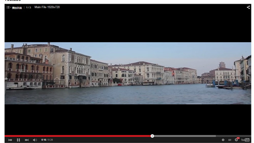
<div class="responsive-video">
    <iframe width="853" height="480" src="//www.youtube.com/embed/XcpOsJQXcx4?list=UUIkFV7_2tEhhEhh1NkkwTUw" frameborder="0" allowfullscreen></iframe>
</div>
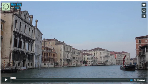
<div class="responsive-video">
    <iframe src="//player.vimeo.com/video/106249100" width="1920" height="1080" frameborder="0" webkitallowfullscreen mozallowfullscreen allowfullscreen></iframe>
</div>
<div class="responsive-video">
     <embed  src="/portals/32/movie.swf" type="application/x-shockwave-flash" allownetworking="all" allowfullscreen="true" allowscriptaccess="always" wmode="Opaque"></embed>
</div>
<div class="responsive-video">
    <video width="1920" height="1080"  controls="true">
    <source src="/portals/32/movie.m4v" type="video/mp4"></source>
    <source src="/portals/32/movie.ogv" type="video/ogg"></source>
    <source src="/portals/32/movie.webm" type="video/WebM"></source>
    Your browser does not support the video tag. </video>
</div>
Video Bg
You can click the link to check Video Bg demo. Demo Link
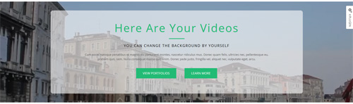
- "{videoURL:'npfu0fN9GUA' is the url of
youtube autoPlayis for whether to autoplay or nottrue/falseloopis for whether to play on a loop,true/false
<div data-property="{videoURL:'npfu0fN9GUA',containment:'self', showControls:false, autoPlay:true, loop:true, vol:50, mute:true, startAt:10, opacity:1, addRaster:false, quality:'hd1080'}" class="player">
<div class="Play"></div>
<div class="dnn_layout pt-60 pb-60">
<div class="content_mid clearfix">
<div class="player_boxes">
<h1 class="player_title"> Here Are Your Videos</h1>
<hr class="player_line" />
<h4 class="player_smalltitle">YOU CAN CHANGE THE BACKGROUND BY YOURSELF</h4>
<div class="player_content">
<p>Content Text 1 ... </p>
</div>
<p> <a class="Button_default" href="#"> VIEW PORTFOLIOS</a> <a class="Button_default" href="#"> LEARN MORE</a> </p>
</div>
</div>
</div>
</div>
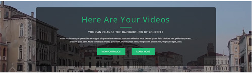
- "{videoURL:'npfu0fN9GUA' is the url of
youtube autoPlayis for whether to autoplay or nottrue/falseloopis for whether to play on a loop,true/false
<div data-property="{videoURL:'npfu0fN9GUA',containment:'self', showControls:false, autoPlay:true, loop:true, vol:50, mute:true, startAt:10, opacity:1, addRaster:false, quality:'hd1080'}" class="player">
<div class="Play"></div>
<div class="dnn_layout pt40 pb40">
<div class="content_mid clearfix">
<div class="player_boxes dark">
<h1 class="player_title"> Here Are Your Videos</h1>
<hr class="player_line" />
<h4 class="player_smalltitle">YOU CAN CHANGE THE BACKGROUND BY YOURSELF</h4>
<div class="player_content">
<p>Content Text 1 ... </p>
</div>
<p> <a class="Button_blue" href="#"> VIEW PORTFOLIOS</a> <a class="Button_blue" href="#"> LEARN MORE</a> </p>
</div>
</div>
</div>
</div>
Home Page Codes
This includes the html introductions that required for Home1~Home7 page, ComingSoon page, Boxed Layout page.
Home Version 1 (Home)
You can click the link to check Home Version 1 (home) demo. Home Version 1 (Home)
Banner area
Below is the screen shot:

It is using DNNGo LayerGalleryPro module here, you can import ContentListEntity-Home1.xml of the DNNGo_LayerGalleryPro folder to duplicate banner of the demo.
Our Services area
Below is the screen shot:
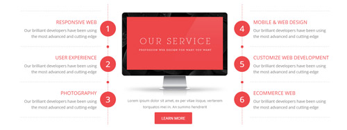
Codes are as follows:
<div class="serviceAnimation_box">
  <div class="service_left_box">
    <ul class="serviceAnimation  service_left">
      <li><span class="number">1</span>
        <div class="animation fadeInLeft">
          <h3>RESPONSIVE WEB</h3>
          Our brilliant developers have been using the most advanced and cutting-edge</div>
      </li>
      <li><span class="number">2</span>
        <div class="animation fadeInLeft">
          <h3>USER EXPERIENCE</h3>
          Our brilliant developers have been using the most advanced and cutting-edge </div>
      </li>
      <li><span class="number">3</span>
        <div class="animation fadeInLeft">
          <h3>PHOTOGRAPHY</h3>
          Our brilliant developers have been using the most advanced and cutting-edge</div>
      </li>
    </ul>
  </div>
  <div class="service_center_box">
    <div class="service_center">
      <div class="animation fadeInUp"> <img alt="" src="/portals/30/service_Pic.jpg" class="img-responsive" />
        <p> Lorem ipsum dolor sit amet, ex per vitae iisque, verterem torquatos mei in. An summo hendrerit</p>
        <a target="blank" href="#" class="Button_default">LEARN MORE</a> </div>
    </div>
    <br />
  </div>
  <div class="service_right_box">
    <ul class="serviceAnimation service_right">
      <li><span class="number">4</span>
        <div class="animation fadeInRight">
          <h3>MOBILE & WEB DESIGN</h3>
          Our brilliant developers have been using the most advanced and cutting-edge</div>
      </li>
      <li> <span class="number">5</span>
        <div class="animation fadeInRight">
          <h3>CUSTOMIZE WEB DEVELOPMENT</h3>
          Our brilliant developers have been using the most advanced and cutting-edge </div>
      </li>
      <li> <span class="number">6</span>
        <div class="animation fadeInRight">
          <h3>ECOMMERCE WEB </h3>
          Our brilliant developers have been using the most advanced and cutting-edge</div>
      </li>
    </ul>
  </div>
</div>
Option:
- You can modify
animationto change and delete animation. Animation list.
WHAT YOU CAN GET FROM OUR COMPANY area
Below is the screen shot:
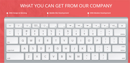
Codes are as follows:
<div class="keyAnimation">
  <ul>
    <li class="animation periodic1"><span class="ico"></span>DNN Design & Skinning</li>
    <li class="animation periodic2"><span class="ico"></span>Mobile Site Development</li>
    <li class="animation periodic3"><span class="ico"></span>DNN Module Development</li>
  </ul>
  <img alt="" src="/portals/30/keyboard.png" class="img-responsive" />
</div>
Option:
Containeris usingContainer-1- You can modify
animationto change the animation on the slide..Animation list.
SOME USEFUL INFORMATION area
Below is the screen shot:
Codes are as follows:
<div style="text-align: center;">Donec in ut odio libero, at vulputate urna. Nulla tristique mi a massa convallis cursus. Nulla eu mi magna. Etiam suscipit commodo gravida. Cras suscipit, quam vitae adipiscing faucibus, risus nibh laoreet odio, a porttitor metus eros ut enim.<br />
  <br />
  <br />
</div>
Option:
Containeris usingContainer-2
AMAZING SPIDER MAN / DESIGE area
Below is the screen shot:
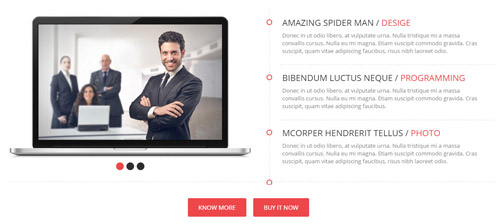
Codes are as follows:
<div class="info_main animation scaleUp">
  <div class="info_left">
    <ul data-display-arrows="false" data-position="roll-left" class=" Testimonials_tab Testimonials_6">
      <li><img alt="" src="/portals/30/Pic_01.jpg" /> </li>
      <li><img alt="" src="/portals/30/Pic_02.jpg" /> </li>
      <li><img alt="" src="/portals/30/Pic_03.jpg" /> </li>
    </ul>
  </div>
  <div class="info_right">
    <ul class="info_list">
      <li>
        <div class="info_box">
          <h3>AMAZING SPIDER MAN  / <span>DESIGE</span></h3>
          <p>Donec in ut odio libero, at vulputate urna. Nulla tristique mi a massa convallis cursus. Nulla eu mi magna. Etiam suscipit commodo gravida. Cras suscipit, quam vitae adipiscing faucibus, risus nibh laoreet odio.</p>
        </div>
      </li>
      <li>
        <div class="info_box">
          <h3>BIBENDUM LUCTUS NEQUE  / <span>PROGRAMMING</span></h3>
          <p>Donec in ut odio libero, at vulputate urna. Nulla tristique mi a massa convallis cursus. Nulla eu mi magna. Etiam suscipit commodo gravida. Cras suscipit, quam vitae adipiscing faucibus.</p>
        </div>
      </li>
      <li>
        <div class="info_box">
          <h3>MCORPER HENDRERIT TELLUS   / <span>PHOTO</span></h3>
          <p>Donec in ut odio libero, at vulputate urna. Nulla tristique mi a massa convallis cursus. Nulla eu mi magna. Etiam suscipit commodo gravida. Cras suscipit, quam vitae adipiscing faucibus, risus nibh laoreet odio.</p>
        </div>
      </li>
    </ul>
  </div>
</div>
<br />
<div style="text-align: center;"> <a target="blank" class="Button_default" href="#">KNOW MORE</a> <a target="blank" class="Button_default" href="#">BUY IT NOW</a> <br />
</div>
<br />
Option:
- You can modify
animationto change or delete animation.Animation list.
OUR SKILLS area
Below is the screen shot:
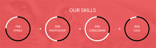
Codes are as follows:
<div class="row animation scaleUp">
  <div class="col-md-3 col-sm-6">
    <div data-percent="75" class="percentage">
      <div class="percentage_inner"><span>0</span>%
        <p>HTML5</p>
      </div>
      <em class="arrow"></em> </div>
  </div>
  <div class="col-md-3 col-sm-6">
    <div data-percent="50" class="percentage">
      <div class="percentage_inner"><span>0</span>%
        <p>PHOTOSHOP</p>
      </div>
      <em class="arrow hidden-sm"></em> </div>
  </div>
  <div class="col-md-3 col-sm-6">
    <div data-percent="30" class="percentage">
      <div class="percentage_inner"><span>0</span>%
        <p>CORELDRAW</p>
      </div>
      <em class="arrow"></em> </div>
  </div>
  <div class="col-md-3 col-sm-6">
    <div data-percent="90" class="percentage">
      <div class="percentage_inner"><span>0</span>%
        <p>CSS3</p>
      </div>
    </div>
  </div>
</div>
Option:
Containeris usingContainer-1- You can modify
animationto change or delete animation.Animation list. col-sm-* col-md-*is the width of each column, you can change the width you need through value1~12data-percentis for controlling the percentage that displays, you can display percentage through value0~100
ABOUT US area
Below is the screen shot:
Codes are as follows:
<div class="animation fadeInUp ">
  <p>Donec in ut odio libero, at vulputate urna. Nulla tristique mi a massa convallis cursus. Nulla eu mi magna.</p>
  <ul class="about_list">
    <li><span class="glyphicons glyph-iphone"></span>Phone :  (+086) - 123 -456 -789 </li>
    <li><span class="glyphicons glyph-envelope"></span>Email : dnnskindev@gmail.com </li>
    <li><span class="glyphicons glyph-fax"></span>Fax : 011-1234-5678-910 </li>
  </ul>
</div>
Option:
Containeris usingContainer-3- You can modify
animationto change the animation on the slide. Animation list. - You can modify
glyphiconsto change icons. font icon list.
RECENT POSTS area
Below is the screen shot:
Codes are as follows:
<ul class="posts_list animation fadeInUp ">
  <li><img alt="" src="/portals/30/Pic_04.jpg" /> web design: dnngo.net urma
    <p>February 28, 2014</p>
  </li>
  <li><img alt="" src="/portals/30/Pic_05.jpg" />Nulla tristique mi  massa donec
    <p>February 28, 2014</p>
  </li>
  <li><img alt="" src="/portals/30/Pic_06.jpg" />web design: dnngo.net
    <p>February 28, 2013</p>
  </li>
</ul>
Option:
Containeris usingContainer-3- You can modify
animationto change the animation on the slide. Animation list.
COMMENT LINK area
Below is the screen shot:
Codes are as follows:
<ul class="link_list animation fadeInUp ">
  <li><span class="glyphicons glyph-right-arrow"></span><a href="#" target="blank">Donec in ut odio libero at vulputate</a></li>
  <li><span class="glyphicons glyph-right-arrow"></span><a href="#" target="blank">Urna nulla tristique mi a massa</a></li>
  <li><span class="glyphicons glyph-right-arrow"></span><a href="#" target="blank">Convallis cursus nulla eu mi magna.</a></li>
  <li><span class="glyphicons glyph-right-arrow"></span><a href="#" target="blank">Donec in ut odio libero at vulputate </a></li>
  <li><span class="glyphicons glyph-right-arrow"></span><a href="#" target="blank">Nulla tristique mi a massa </a></li>
</ul>
Option:
Containeris usingContainer-3- You can modify
glyphiconsto change icons. font icon list. - You can modify
animationto change or delete animation.Animation list.
NEWSLETTER SIGNUP area
Below is the screen shot:
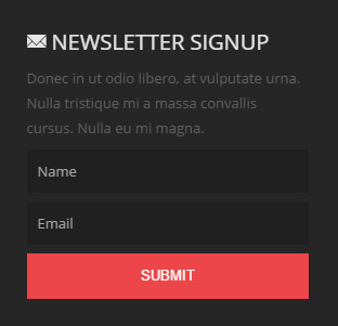
<div class="animation fadeInUp ">Donec in ut odio libero, at vulputate urna. Nulla tristique mi a massa convallis cursus. Nulla eu mi magna.</div>
Option:
Containeris usingContainer-3- You can modify
animationto change or delete animation.Animation list. - This is
Theme_Responsive_20060_home1theme ofDNNGo PowerFormsmodule
Home Version 2
You can click the link to check Home Version 2 demo. Home Version 2
Banner area
Below is the screen shot:

It is using DNNGo LayerGalleryPro module here, you can import ContentListEntity-Home2.xml of the DNNGo_LayerGalleryPro folder to duplicate banner of the demo.
Our Services area
Below is the screen shot:
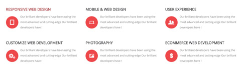
Codes are as follows:
<br />
<br />
<div class="row">
  <div class="col-sm-4 animation fadeInUp delay1">
    <dl class="Service_Box">
      <dt>RESPONSIVE WEB DESIGN</dt>
      <dd><span class="glyphicons glyph-ipad"></span> Our brilliant developers have been using the most advanced and cutting-edge Our brilliant developers have !</dd>
    </dl>
  </div>
  <div class="col-sm-4 animation fadeInUp delay2">
    <dl class="Service_Box">
      <dt>MOBILE & WEB DESIGN</dt>
      <dd><span class="glyphicons glyph-macbook"></span> Our brilliant developers have been using the most advanced and cutting-edge Our brilliant developers have !</dd>
    </dl>
  </div>
  <div class="col-sm-4 animation fadeInUp delay3">
    <dl class="Service_Box">
      <dt>USER EXPERIENCE</dt>
      <dd><span class="glyphicons glyph-parents"></span> Our brilliant developers have been using the most advanced and cutting-edge Our brilliant developers have !</dd>
    </dl>
  </div>
</div>
<div class="row">
  <div class="col-sm-4 animation fadeInUp delay4">
    <dl class="Service_Box">
      <dt>CUSTOMIZE WEB DEVELOPMENT</dt>
      <dd><span class="glyphicons glyph-cogwheels"></span> Our brilliant developers have been using the most advanced and cutting-edge Our brilliant developers have !</dd>
    </dl>
  </div>
  <div class="col-sm-4 animation fadeInUp delay5">
    <dl class="Service_Box">
      <dt>PHOTOGRAPHY</dt>
      <dd><span class="glyphicons glyph-picture"></span> Our brilliant developers have been using the most advanced and cutting-edge Our brilliant developers have !</dd>
    </dl>
  </div>
  <div class="col-sm-4 animation fadeInUp delay6">
    <dl class="Service_Box">
      <dt>ECOMMERCE WEB DEVELOPMENT</dt>
      <dd><span class="glyphicons glyph-usd"></span> Our brilliant developers have been using the most advanced and cutting-edge Our brilliant developers have !</dd>
    </dl>
  </div>
</div>
Option:
- You can modify
glyphiconsto change icons. font icon list. - You can modify
animationto change the animation on the slide. Animation list. col-sm-*is the width of each column, you can change the width you need through value1~12
OUR RECENT WORKS area
Below is the screen shot:
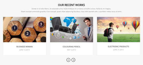
Codes are as follows:
<div class="fullScreen_box_1">
  <div class="dnn_layout">
    <div class="content_mid clearfix"> <br />
      <br />
      <h3 style="font-size: 22px; text-align: center;">OUR RECENT WORKS</h3>
      <p style="text-align: center;">Donec in ut odio libero, at vulputate urna. Nulla tristique mi a massa convallis cursus. Nulla eu mi magna. <br />
        Etiam suscipit commodo gravida. Cras suscipit, quam vitae adipiscing faucibus, risus nibh laoreet odio, a porttitor metus eros ut enim.</p>
      <br />
      <div class="carousel carousel_3 animation scaleUp">
        <div class="item">
          <div class="photo_box img_zoom ico_top_enter"> <a title=" Title One" href="/Portals/30/controls_7.jpg" class="LightBox_image_gallery1">
            <div class="pic_box"> <img alt="" src="/portals/30/controls_7.jpg" />
              <div class="ico"> <span class="glyphicons glyph-picture"></span> </div>
              <div class="shade"></div>
            </div>
            </a>
            <h3>BUSINESS W0MAN</h3>
            <p>JUNE 12,2013</p>
          </div>
        </div>
        <div class="item">
          <div class="photo_box img_zoom ico_top_enter"> <a title=" Title One" href="/Portals/30/controls_8.jpg" class="LightBox_image_gallery1">
            <div class="pic_box"> <img alt="" src="/portals/30/controls_8.jpg" />
              <div class="ico"> <span class="glyphicons glyph-picture"></span> </div>
              <div class="shade"></div>
            </div>
            </a>
            <h3>COLOURING PENCIL</h3>
            <p>MAY 3,2013</p>
          </div>
        </div>
        <div class="item">
          <div class="photo_box img_zoom ico_top_enter"> <a title=" Title One" href="/Portals/30/controls_9.jpg" class="LightBox_image_gallery1">
            <div class="pic_box"> <img alt="" src="/portals/30/controls_9.jpg" />
              <div class="ico"> <span class="glyphicons glyph-picture"></span> </div>
              <div class="shade"></div>
            </div>
            </a>
            <h3>ELECTRONIC PRODUCTS</h3>
            <p>JUNE 21,2013</p>
          </div>
        </div>
        <div class="item">
          <div class="photo_box img_zoom ico_top_enter"> <a title=" Title One" href="/Portals/30/controls_10.jpg" class="LightBox_image_gallery1">
            <div class="pic_box"> <img alt="" src="/portals/30/controls_10.jpg" />
              <div class="ico"> <span class="glyphicons glyph-picture"></span> </div>
              <div class="shade"></div>
            </div>
            </a>
            <h3>PHOTOGRAPHY</h3>
            <p>MAY 1,2012</p>
          </div>
        </div>
        <div class="item">
          <div class="photo_box img_zoom ico_top_enter"> <a title=" Title One" href="/Portals/30/controls_11.jpg" class="LightBox_image_gallery1">
            <div class="pic_box"> <img alt="" src="/portals/30/controls_11.jpg" />
              <div class="ico"> <span class="glyphicons glyph-picture"></span> </div>
              <div class="shade"></div>
            </div>
            </a>
            <h3>CAROUSEL</h3>
            <p>JUNE 12,2011</p>
          </div>
        </div>
      </div>
      <br />
      <br />
    </div>
  </div>
</div>
<br />
<br />
Image area
Below is the screen shot:
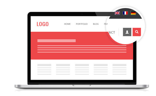
Codes are as follows:
<img alt="" src="/portals/30/Photo9.jpg" class="animation fadeInLeft img-responsive" /> <br />
Option:
- You can modify
animationto change or delete animation.Animation list.
WHAT WE CAN DO FOR YOU area
Below is the screen shot:
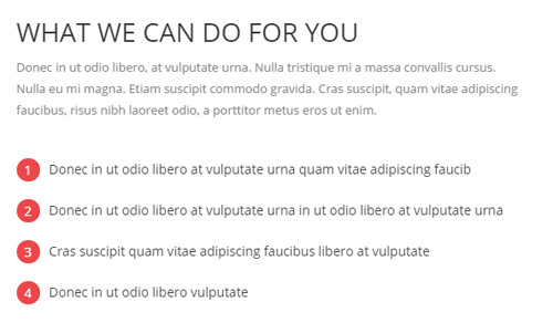
Codes are as follows:
<div class="animation fadeInRight">
  <p>Donec in ut odio libero, at vulputate urna. Nulla tristique mi a massa convallis cursus. Nulla eu mi magna. Etiam suscipit commodo gravida. Cras suscipit, quam vitae adipiscing faucibus, risus nibh laoreet odio, a porttitor metus eros ut enim.</p>
  <br />
  <div class="list_style8">
    <li><span class="ico">1</span>Donec in ut odio libero at vulputate urna quam vitae adipiscing faucib</li>
    <li><span class="ico">2</span>Donec in ut odio libero at vulputate urna in ut odio libero at vulputate urna</li>
    <li><span class="ico">3</span>Cras suscipit quam vitae adipiscing faucibus libero at vulputate</li>
    <li><span class="ico">4</span>Donec in ut odio libero  vulputate </li>
  </div>
</div>
Option:
Containeris usingContainer-16- You can modify
animationto change or delete animation.Animation list.
CLIENT TESTIMONIALS area
Below is the screen shot:
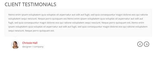
Codes are as follows:
<ul data-display-navigation="false" data-position="fade" data-autoplay="0" class=" Testimonials_tab Testimonials_9 animation scaleUp">
  <li>
    <blockquote>
      <p>Content Text ...</p>
      <small><img alt="" src="/portals/30/Pic_22.jpg" /><span>Chrissie Hall </span> designer / company</small> </blockquote>
  </li>
  <li>
    <blockquote>
      <p>Content Text ...</p>
      <small><img alt="" src="/portals/30/Pic_15.jpg" /><span>Aaron</span>Calibrated Design</small> </blockquote>
  </li>
  <li>
    <blockquote>
      <p>Content Text ...</p>
      <small><img alt="" src="/portals/30/Pic_16.jpg" /><span>James Divine</span>Divine Solutions</small> </blockquote>
  </li>
  <li>
    <blockquote>
      <p>Content Text ...</p>
      <small><img alt="" src="/portals/30/Pic_17.jpg" /><span>John Barclay </span> Grays Harbor Networking and Internet Services</small> </blockquote>
  </li>
</ul>
Option:
Containeris usingContainer-16- You can modify
animationto change or delete animation.Animation list
Image area
Below is the screen shot:

Codes are as follows:
<img alt="" src="/portals/30/pic_10.jpg" class="animation fadeInRight img-responsive" />
Option:
- You can modify
animationto change or delete animation.Animation list.
FREQUENTLY ASKED QUESTIONS area
Below is the screen shot:
Codes are as follows:
<br />
<div class="fullScreen_box_1 ">
  <div class="dnn_layout animation scaleUp">
    <div style="text-align: center;" class="content_mid clearfix"> <br />
      <br />
      <h1 style="text-align: center;">FREQUENTLY ASKED QUESTIONS</h1>
      <p style="text-align: center;">Donec in ut odio libero, at vulputate urna. Nulla tristique mi a massa convallis cursus. Nulla eu mi magna. Etiam suscipit commodo gravida. Cras suscipit, quam vitae adipiscing faucibus, risus nibh laoreet odio, a porttitor metus eros ut enim.</p>
      <br />
      <a class="Button_default" target="blank" href="#">EMAIL US YOUR QUESTION</a><a class="Button_default" href="#" target="blank">SEND US A TESTIMONIAL</a> <br />
      <br />
    </div>
  </div>
</div>
Option:
- You can modify
animationto change or delete animation.Animation list.
About Us area
Below is the screen shot:
Codes are as follows:
<div class="animation fadeInUp"> Donec in ut odio libero, at vulputate urna. Nulla tristique mi a massa convallis cursus. Nulla eu mi magna.<br />
  Donec in ut odio libero, at vulputate urna. Nulla tristique mi a massa .
  <div class="social_list2 clearfix"> <a href="#"><span class="social social-twitter"></span></a> <a href="#"><span class="social social-tumblr"></span></a> <a href="#"><span class="social social-facebook"></span></a> <a href="#"><span class="social social-picasa"></span></a> <a href="#"><span class="social social-google-plus"></span></a> </div>
</div>
Option:
Containeris usingContainer-3- You can modify
animationto change or delete animation.Animation list. - You can modify
socialto change icons. font icon list.
RECENT POSTS area
Below is the screen shot:
Codes are as follows:
<ul class="list_style9 animation fadeInUp">
  <li>Donec consectetur diam ac nibh ...<br />
    February 28, 2014 </li>
  <li>Donec consectetur diam ac nibh ...<br />
    February 28, 2014 </li>
  <li>Donec consectetur diam ac nibh ...<br />
    February 28, 2014 </li>
</ul>
Option:
Containeris usingContainer-3- You can modify
animationto change or delete animation.Animation list.
NEW PHOTOS area
Below is the screen shot:
Codes are as follows:
<div class="foot_photo photo_box img_zoom animation fadeInUp"> <a class="LightBox_image_gallery2" href="/Portals/30/Photo10-big.jpg">
  <div class="pic_box"> <img alt="" src="/portals/30/Photo10.jpg" />
    <div class="ico"> <span class="glyphicons glyph-search"></span> </div>
    <div class="shade"></div>
  </div>
  </a> </div>
<div class="foot_photo photo_box img_zoom animation fadeInUp"> <a class="LightBox_image_gallery2" href="/Portals/30/Photo11-big.jpg">
  <div class="pic_box"> <img alt="" src="/portals/30/Photo11.jpg" />
    <div class="ico"> <span class="glyphicons glyph-search"></span> </div>
    <div class="shade"></div>
  </div>
  </a> </div>
<div class="foot_photo photo_box img_zoom animation fadeInUp"> <a class="LightBox_image_gallery2" href="/Portals/30/Photo12-big.jpg">
  <div class="pic_box"> <img alt="" src="/portals/30/Photo12.jpg" />
    <div class="ico"> <span class="glyphicons glyph-search"></span> </div>
    <div class="shade"></div>
  </div>
  </a> </div>
<div class="foot_photo photo_box img_zoom animation fadeInUp"> <a class="LightBox_image_gallery2" href="/Portals/30/Photo13-big.jpg">
  <div class="pic_box"> <img alt="" src="/portals/30/Photo13.jpg" />
    <div class="ico"> <span class="glyphicons glyph-search"></span> </div>
    <div class="shade"></div>
  </div>
  </a> </div>
<div class="foot_photo photo_box img_zoom animation fadeInUp"> <a class="LightBox_image_gallery2" href="/Portals/30/Photo14-big.jpg">
  <div class="pic_box"> <img alt="" src="/portals/30/Photo14.jpg" />
    <div class="ico"> <span class="glyphicons glyph-search"></span> </div>
    <div class="shade"></div>
  </div>
  </a> </div>
<div class="foot_photo photo_box img_zoom animation fadeInUp"> <a class="LightBox_image_gallery2" href="/Portals/30/Photo15-big.jpg">
  <div class="pic_box"> <img alt="" src="/portals/30/Photo15.jpg" />
    <div class="ico"> <span class="glyphicons glyph-search"></span> </div>
    <div class="shade"></div>
  </div>
  </a> </div>
Option:
Containeris usingContainer-3- You can modify
animationto change or delete animation.Animation list. - You can modify
glyphiconsto change icons. font icon list.
POPULAR LINK area
Below is the screen shot:
Codes are as follows:
<ul class="list_style9 animation fadeInUp">
  <li>Donec consectetur diam ac nibh </li>
  <li>Donec consectetur diam ac nibh </li>
  <li>Donec consectetur diam ac nibh </li>
  <li>Donec consectetur diam ac nibh </li>
</ul>
Option:
Containeris usingContainer-3- You can modify
animationto change or delete animation.Animation list.
Home Version 3
You can click the link to check Home Version 3 demo. Home Version 3
Banner area
Below is the screen shot:
It is using DNNGo GalleryPro module here.
OUR SERVICE area
Below is the screen shot:
Codes are as follows:
<div style="text-align: center;">Donec in ut odio libero, at vulputate urna. Nulla tristique mi a massa convallis cursus. Nulla eu mi magna. Etiam suscipit commodo gravida. Cras suscipit, quam vitae adipiscing faucibus, risus nibh laoreet odio, a porttitor metus eros ut enim.<br />
</div>
<br />
Option:
Containeris usingContainer-15
Service Icons area
Below is the screen shot:
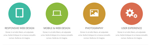
Codes are as follows:
<div class="row">
  <div class="col-md-3 col-sm-6 animation fadeInUp delay1">
    <div class="advantage_box2">
      <div class="advantage_ico color_1"><span class="glyphicons glyph-ipad"></span></div>
      <h3>RESPONSIVE WEB DESIGN</h3>
      <p>Donec in ut odio libero, at vulputate urna. Nulla tristique mi a massa convallis cursus. Nulla eu mi magna. </p>
    </div>
  </div>
  <div class="col-md-3 col-sm-6 animation fadeInUp delay2">
    <div class="advantage_box2">
      <div class="advantage_ico color_2"><span class="glyphicons glyph-macbook"></span></div>
      <h3>MOBILE & WEB DESIGN</h3>
      <p>Donec in ut odio libero, at vulputate urna. Nulla tristique mi a massa convallis cursus. Nulla eu mi magna. </p>
    </div>
  </div>
  <div class="col-md-3 col-sm-6 animation fadeInUp delay3">
    <div class="advantage_box2">
      <div class="advantage_ico color_3"><span class="glyphicons glyph-picture"></span></div>
      <h3>PHOTOGRAPHY</h3>
      <p>Donec in ut odio libero, at vulputate urna. Nulla tristique mi a massa convallis cursus. Nulla eu mi magna. </p>
    </div>
  </div>
  <div class="col-md-3 col-sm-6 animation fadeInUp delay4">
    <div class="advantage_box2">
      <div class="advantage_ico color_4"><span class="glyphicons glyph-cogwheels"></span></div>
      <h3>USER EXPERIENCE</h3>
      <p>Donec in ut odio libero, at vulputate urna. Nulla tristique mi a massa convallis cursus. Nulla eu mi magna. </p>
    </div>
  </div>
</div>
<br />
<hr class="dividers_1" />
<br />
Option:
col-sm-* col-md-*is the width of each column, you can change the width you need through value1~12.- You can modify
animationto change or delete animation.Animation list. - You can modify
glyphiconsto change icons. font icon list.
RECENT WORK area
Below is the screen shot:
Codes are as follows:
<div style="text-align: center;">Donec in ut odio libero, at vulputate urna. Nulla tristique mi a massa convallis cursus. Nulla eu mi magna. Etiam suscipit commodo gravida. Cras suscipit, quam vitae adipiscing faucibus, risus nibh laoreet odio, a porttitor metus eros ut enim.<br />
</div>
Option:
Containeris usingContainer-15
Carousel area
Below is the screen shot:
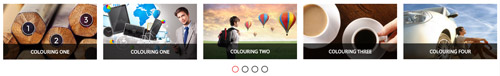
Codes are as follows:
<div class="carousel carousel_4 animation scaleUp">
  <div class="item"> <img alt="" src="/portals/30/controls_7.jpg" />
    <div class="sliding">
      <h3>COLOURING ONE</h3>
      <p>Donec in ut odio libero, at vulputate urna. Nulla tristique mi a massa convallis cursus. Donec in ut odio libero, at vulputate urna. </p>
      <a target="blank" href="#">>>  MORE INFO</a> </div>
  </div>
  <div class="item"> <img alt="" src="/portals/30/controls_8.jpg" />
    <div class="sliding">
      <h3>COLOURING ONE</h3>
      <p>Donec in ut odio libero, at vulputate urna. Nulla tristique mi a massa convallis cursus. Donec in ut odio libero, at vulputate urna. </p>
      <a target="blank" href="#"> >>  MORE INFO</a> </div>
  </div>
  <div class="item"> <img alt="" src="/portals/30/controls_9.jpg" />
    <div class="sliding">
      <h3>COLOURING TWO</h3>
      <p>Donec in ut odio libero, at vulputate urna. Nulla tristique mi a massa convallis cursus. Donec in ut odio libero, at vulputate urna. </p>
      <a target="blank" href="#">>>  MORE INFO</a> </div>
  </div>
  <div class="item"> <img alt="" src="/portals/30/controls_10.jpg" />
    <div class="sliding">
      <h3>COLOURING THREE</h3>
      <p>Donec in ut odio libero, at vulputate urna. Nulla tristique mi a massa convallis cursus. Donec in ut odio libero, at vulputate urna. </p>
      <a target="blank" href="#">>>  MORE INFO</a> </div>
  </div>
  <div class="item"> <img alt="" src="/portals/30/controls_11.jpg" />
    <div class="sliding">
      <h3>COLOURING FOUR</h3>
      <p>Donec in ut odio libero, at vulputate urna. Nulla tristique mi a massa convallis cursus. Donec in ut odio libero, at vulputate urna. </p>
      <a target="blank" href="#">>>  MORE INFO</a> </div>
  </div>
  <div class="item"> <img alt="" src="/portals/30/controls_7.jpg" />
    <div class="sliding">
      <h3>COLOURING FIVE</h3>
      <p>Donec in ut odio libero, at vulputate urna. Nulla tristique mi a massa convallis cursus. Donec in ut odio libero, at vulputate urna. </p>
      <a target="blank" href="#">>>  MORE INFO</a> </div>
  </div>
  <div class="item"> <img alt="" src="/portals/30/controls_8.jpg" />
    <div class="sliding">
      <h3>COLOURING SIX</h3>
      <p>Donec in ut odio libero, at vulputate urna. Nulla tristique mi a massa convallis cursus. Donec in ut odio libero, at vulputate urna. </p>
      <a target="blank" href="#">>>  MORE INFO</a> </div>
  </div>
  <div class="item"> <img alt="" src="/portals/30/controls_9.jpg" />
    <div class="sliding">
      <h3>COLOURING SEVEN</h3>
      <p>Donec in ut odio libero, at vulputate urna. Nulla tristique mi a massa convallis cursus. Donec in ut odio libero, at vulputate urna. </p>
      <a target="blank" href="#">>>  MORE INFO</a> </div>
  </div>
  <div class="item"> <img alt="" src="/portals/30/controls_10.jpg" />
    <div class="sliding">
      <h3>COLOURING EIFHT</h3>
      <p>Donec in ut odio libero, at vulputate urna. Nulla tristique mi a massa convallis cursus. Donec in ut odio libero, at vulputate urna. </p>
      <a target="blank" href="#">>>  MORE INFO</a> </div>
  </div>
  <div class="item"> <img alt="" src="/portals/30/controls_11.jpg" />
    <div class="sliding">
      <h3>COLOURING NINE</h3>
      <p>Donec in ut odio libero, at vulputate urna. Nulla tristique mi a massa convallis cursus. Donec in ut odio libero, at vulputate urna. </p>
      <a target="blank" href="#">>>  MORE INFO</a> </div>
  </div>
  <div class="item"> <img alt="" src="/portals/30/controls_7.jpg" />
    <div class="sliding">
      <h3>COLOURING TEN</h3>
      <p>Donec in ut odio libero, at vulputate urna. Nulla tristique mi a massa convallis cursus. Donec in ut odio libero, at vulputate urna. </p>
      <a target="blank" href="#">>>  MORE INFO</a> </div>
  </div>
  <div class="item"> <img alt="" src="/portals/30/controls_8.jpg" />
    <div class="sliding">
      <h3>COLOURING ELEVEN</h3>
      <p>Donec in ut odio libero, at vulputate urna. Nulla tristique mi a massa convallis cursus. Donec in ut odio libero, at vulputate urna. </p>
      <a target="blank" href="#">>>  MORE INFO</a> </div>
  </div>
  <div class="item"> <img alt="" src="/portals/30/controls_9.jpg" />
    <div class="sliding">
      <h3>COLOURING TWELVE</h3>
      <p>Donec in ut odio libero, at vulputate urna. Nulla tristique mi a massa convallis cursus. Donec in ut odio libero, at vulputate urna. </p>
      <a target="blank" href="#">>>  MORE INFO</a> </div>
  </div>
  <div class="item"> <img alt="" src="/portals/30/controls_10.jpg" />
    <div class="sliding">
      <h3>COLOURING THIRTEEN</h3>
      <p>Donec in ut odio libero, at vulputate urna. Nulla tristique mi a massa convallis cursus. Donec in ut odio libero, at vulputate urna. </p>
      <a target="blank" href="#">>>  MORE INFO</a> </div>
  </div>
  <div class="item"> <img alt="" src="/portals/30/controls_11.jpg" />
    <div class="sliding">
      <h3>COLOURING FOURTEEN</h3>
      <p>Donec in ut odio libero, at vulputate urna. Nulla tristique mi a massa convallis cursus. Donec in ut odio libero, at vulputate urna. </p>
      <a target="blank" href="#">>>  MORE INFO</a> </div>
  </div>
  <div class="item"> <img alt="" src="/portals/30/controls_7.jpg" />
    <div class="sliding">
      <h3>COLOURING FIFTEEN</h3>
      <p>Donec in ut odio libero, at vulputate urna. Nulla tristique mi a massa convallis cursus. Donec in ut odio libero, at vulputate urna. </p>
      <a target="blank" href="#">>>  MORE INFO</a> </div>
  </div>
</div>
Option:
- This is a
ProgressBars Counterseffect. Carousel - You can modify
animationto change or delete animation.Animation list.
SOME INFORMATION area
Below is the screen shot:
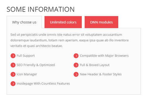
Codes are as follows:
<div class="horizontalTab_Top horizontalTab_Top_1 animation  fadeInLeft">
  <ul class="resp-tabs-list">
    <li><span>Why choose us</span></li>
    <li><span>Unlimited colors</span></li>
    <li><span>DNN modules</span></li>
  </ul>
  <div class="resp-tabs-container">
    <div class="resp_container">
      <div class="resp_margin"> Sed ut perspiciatis unde omnis iste natus error sit voluptatem accusantium doloremque laudantium, totam rem aperiam, eaque ipsa quae ab illo inventore veritatis et quasi architecto beatae.
        <ul class="list_style7">
          <li><span class="ico"></span>Full Support </li>
          <li><span class="ico"></span>Compatible with Major Browsers </li>
          <li><span class="ico"></span>SEO Friendly & Optimized</li>
          <li><span class="ico"></span>Full & Boxed Layout</li>
          <li><span class="ico"></span>Icon Manager</li>
          <li><span class="ico"></span>New Header & Footer Styles</li>
          <li><span class="ico"></span>Insidepage With Countless Features</li>
        </ul>
      </div>
    </div>
    <div class="resp_container">
      <div class="resp_margin"> Sed ut perspiciatis unde omnis iste natus error sit voluptatem accusantium doloremque laudantium, totam rem aperiam, eaque ipsa quae ab illo inventore veritatis et quasi architecto beatae.
        <ul class="list_style7">
          <li><span class="ico"></span>Full Support </li>
          <li><span class="ico"></span>Compatible with Major Browsers</li>
          <li><span class="ico"></span>SEO Friendly & Optimized</li>
          <li><span class="ico"></span>Full & Boxed Layout</li>
          <li><span class="ico"></span>Icon Manager</li>
          <li><span class="ico"></span>New Header & Footer Styles</li>
          <li><span class="ico"></span>Insidepage With Countless Features</li>
        </ul>
      </div>
    </div>
  </div>
</div>
Option:
Containeris usingContainer-16- You can modify
animationto change or delete animation.Animation list.
WHAT WE CAN DO area
Below is the screen shot:
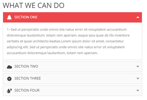
Codes are as follows:
<div class="panel-group accordion_1 animation  fadeInRight" id="accordion">
  <div class="panel panel-default">
    <div class="panel-heading">
      <h4 class="panel-title"> <a data-toggle="collapse" data-parent="#accordion" href="#collapse1_1"><span class="glyphicons glyph-bell"></span>SECTION ONE</a> </h4>
    </div>
    <div id="collapse1_1" class="panel-collapse collapse in">
      <div class="panel-body">1--Sed ut perspiciatis unde omnis iste natus error sit voluptatem accusantium doloremque laudantium, totam rem aperiam, eaque ipsa quae ab illo inventore veritatis et quasi architecto beatae.Lorem ipsum dolor sit amet, consectetur adipiscing elit. Sed ut perspiciatis unde omnis iste natus error sit voluptatem accusantium doloremque laudantium, totam rem aperiam. </div>
    </div>
  </div>
  <div class="panel panel-default">
    <div class="panel-heading">
      <h4 class="panel-title"> <a data-toggle="collapse" data-parent="#accordion" href="#collapse1_2" class="collapsed"><span class="glyphicons glyph-cloud"></span>SECTION TWO</a> </h4>
    </div>
    <div id="collapse1_2" class="panel-collapse collapse">
      <div class="panel-body">2--Sed ut perspiciatis unde omnis iste natus error sit voluptatem accusantium doloremque laudantium, totam rem aperiam, eaque ipsa quae ab illo inventore veritatis et quasi architecto beatae.Lorem ipsum dolor sit amet, consectetur adipiscing elit. Sed ut perspiciatis unde omnis iste natus error sit voluptatem accusantium doloremque laudantium, totam rem aperiam. </div>
    </div>
  </div>
  <div class="panel panel-default">
    <div class="panel-heading">
      <h4 class="panel-title"> <a data-toggle="collapse" data-parent="#accordion" href="#collapse1_3" class="collapsed"><span class="glyphicons glyph-saw-blade"></span>SECTION THREE</a> </h4>
    </div>
    <div id="collapse1_3" class="panel-collapse collapse">
      <div class="panel-body">3--Sed ut perspiciatis unde omnis iste natus error sit voluptatem accusantium doloremque laudantium, totam rem aperiam, eaque ipsa quae ab illo inventore veritatis et quasi architecto beatae.Lorem ipsum dolor sit amet, consectetur adipiscing elit. Sed ut perspiciatis unde omnis iste natus error sit voluptatem accusantium doloremque laudantium, totam rem aperiam. </div>
    </div>
  </div>
  <div class="panel panel-default">
    <div class="panel-heading">
      <h4 class="panel-title"> <a data-toggle="collapse" data-parent="#accordion" href="#collapse1_4" class="collapsed"><span class="glyphicons glyph-tint"></span>SECTION FOUR</a> </h4>
    </div>
    <div id="collapse1_4" class="panel-collapse collapse">
      <div class="panel-body">4--Sed ut perspiciatis unde omnis iste natus error sit voluptatem accusantium doloremque laudantium, totam rem aperiam, eaque ipsa quae ab illo inventore veritatis et quasi architecto beatae.Lorem ipsum dolor sit amet, consectetur adipiscing elit. Sed ut perspiciatis unde omnis iste natus error sit voluptatem accusantium doloremque laudantium, totam rem aperiam. </div>
    </div>
  </div>
</div>
Option:
Containeris usingContainer-16- You can modify
animationto change or delete animation.Animation list.
OUR TEAM MEMBER area
Below is the screen shot:
Codes are as follows:
<div class="animation scaleUp">
  <div style="text-align: center;">Donec in ut odio libero, at vulputate urna. Nulla tristique mi a massa convallis cursus. Nulla eu mi magna. Etiam suscipit commodo gravida. Cras suscipit, quam vitae adipiscing faucibus, risus nibh laoreet odio, a porttitor metus eros ut enim.<br />
  </div>
  <br />
  <div class="our_team1">
    <div class="row">
      <div class="col-sm-4 animation periodic1">
        <div class="team_list">
          <div class="team_person">
            <div class="team_img"><img alt="" src="/portals/30/OurTeam_Pic_1.jpg" /></div>
          </div>
          <div class="team_content">
            <div class="team_title">Andrea Arkov  / <span> Designer</span></div>
            <p>Pellentesque consequat viverra ipsum, sed placerat ligula aliquam eu. Nam sapien eros enatis at dapibus </p>
            <div class="team_social">
              <div class="social-icons  clearfix"> <a href="#"><span class="social social-twitter"></span></a> <a href="#"><span class="social social-tumblr"></span></a> <a href="#"><span class="social social-facebook"></span></a> <a href="#"><span class="social social-picasa"></span></a> <a href="#"><span class="social social-google-plus"></span></a> </div>
            </div>
          </div>
        </div>
      </div>
      <div class="col-sm-4 animation periodic2">
        <div class="team_list">
          <div class="team_person">
            <div class="team_img"><img alt="" src="/portals/30/OurTeam_Pic_2.jpg" /></div>
          </div>
          <div class="team_content">
            <div class="team_title">Harra Halloy  / <span>Developer</span></div>
            <p>Pellentesque consequat viverra ipsum, sed placerat ligula aliquam eu. Nam sapien eros enatis at dapibus </p>
            <div class="team_social">
              <div class="social-icons  clearfix"> <a href="#"><span class="social social-twitter"></span></a> <a href="#"><span class="social social-tumblr"></span></a> <a href="#"><span class="social social-facebook"></span></a> <a href="#"><span class="social social-picasa"></span></a> <a href="#"><span class="social social-google-plus"></span></a> </div>
            </div>
          </div>
        </div>
      </div>
      <div class="col-sm-4 animation periodic3">
        <div class="team_list">
          <div class="team_person">
            <div class="team_img"><img alt="" src="/portals/30/OurTeam_Pic_3.jpg" /></div>
          </div>
          <div class="team_content">
            <div class="team_title">John Smith / <span>Programmer</span></div>
            <p>Pellentesque consequat viverra ipsum, sed placerat ligula aliquam eu. Nam sapien eros enatis at dapibus </p>
            <div class="team_social">
              <div class="social-icons  clearfix"> <a href="#"><span class="social social-twitter"></span></a> <a href="#"><span class="social social-tumblr"></span></a> <a href="#"><span class="social social-facebook"></span></a> <a href="#"><span class="social social-picasa"></span></a> <a href="#"><span class="social social-google-plus"></span></a> </div>
            </div>
          </div>
        </div>
      </div>
    </div>
  </div>
</div>
Option:
Containeris usingContainer-15- You can modify
animationto change or delete animation.Animation list. - You can modify
socialto change icons. font icon list.
TESTIMONIAL area
Below is the screen shot:
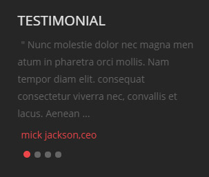
Codes are as follows:
<ul class=" Testimonials_tab Testimonials_10 animation fadeInUp" data-position="fade" data-display-arrows="false" data-autoplay="0">
  <li>
    <blockquote>
      <p>" Nunc molestie dolor nec magna men atum in pharetra orci mollis. Nam tempor diam elit. consequat consectetur viverra nec, convallis et lacus. Aenean ...</p>
      <small>mick jackson,ceo</small> </blockquote>
  </li>
  <li>
    <blockquote>
      <p>" Nunc molestie dolor nec magna men atum in pharetra orci mollis. Nam tempor diam elit. consequat consectetur viverra nec, convallis et lacus. Aenean ...</p>
      <small>mick jackson,ceo</small> </blockquote>
  </li>
  <li>
    <blockquote>
      <p>" Nunc molestie dolor nec magna men atum in pharetra orci mollis. Nam tempor diam elit. consequat consectetur viverra nec, convallis et lacus. Aenean ...</p>
      <small>mick jackson,ceo</small> </blockquote>
  </li>
  <li>
    <blockquote>
      <p>" Nunc molestie dolor nec magna men atum in pharetra orci mollis. Nam tempor diam elit. consequat consectetur viverra nec, convallis et lacus. Aenean ...</p>
      <small>mick jackson,ceo</small> </blockquote>
  </li>
</ul>
Option:
Containeris usingContainer-3- You can modify
animationto change or delete animation.Animation list.
LATEST FROM BLOG area
Below is the screen shot:
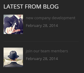
Codes are as follows:
<ul class="posts_list2 animation fadeInUp">
  <li><a href="/Portals/30/Photo16-big.jpg" class="singleimage"><img alt="" src="/portals/30/Photo16.jpg" /></a>new company development
    <p>February 28, 2014</p>
  </li>
  <li><a href="/Portals/30/Photo17-big.jpg" class="singleimage"><img alt="" src="/portals/30/Photo17.jpg" /></a>join our team members
    <p>February 28, 2014</p>
  </li>
</ul>
Option:
Containeris usingContainer-3- You can modify
animationto change or delete animation.Animation list.
TAG CLOUD area
Below is the screen shot:
Codes are as follows:
<div class="tags_list animation fadeInUp">
    <a href="#" target="blank">DNNGO     </a>
    <a href="#" target="blank">DNN SKINS</a>
    <a href="#" target="blank"> DNN MODULES</a
    ><a href="#" target="blank"> SKIN PACKS</a>
    <a href="#" target="blank"> CATALOOK SKINS </a>
    <a href="#" target="blank">DNN SERVICES </a>
    <a href="#" target="blank">DNN STORE</a>
    <a href="#" target="blank"> MOBILE SKIN </a>
    <a href="#" target="blank">UNLIMITED COLORS </a>
</div>
Option:
Containeris usingContainer-3- You can modify
animationto change or delete animation.Animation list.
CONTACT INFO area
Below is the screen shot:
Codes are as follows:
<div class="animation fadeInUp"> Sed ut perspiciatis unde omnis iste natus error sit voluptatem accusantium doloremque laudantium.<br />
  <br />
  <p> <strong>phone:</strong> (+086) - 123 -456 <br />
    <strong>email:</strong> dnnskindev@gmail.com <br />
    <strong>address: </strong>1236 castle, Hawaii,hk 12034</p>
</div>
Option:
Containeris usingContainer-3- You can modify
animationto change or delete animation.Animation list.
Home Version 4
You can click the link to check Home Version 4 demo. Home Version 4
Banner area
Below is the screen shot:

It is using DNNGo LayerGalleryPro module here,you can import ContentListEntity-Home4.xml of the DNNGo_LayerGalleryPro folder to duplicate banner of the demo.
POWERFUL,RESPONSIVE & RETINA READY THEME area
Below is the screen shot:

Codes are as follows:
<div class="backgroundImage1 pt-50 pb-50">
  <div class="dnn_layout  animation scaleUp">
    <div class="content_mid clearfix">
      <h1 class="title_style_1 pb-10">POWERFUL,RESPONSIVE & RETINA READY THEME</h1>
      <p class="big_size">We are a team comprised of experienced developers and reliable designers whose aim is to provide you with compelling, engaging and satisfying skins and modules.</p>
    </div>
  </div>
</div>
Option:
- You can modify
animationto change the animation on the slide. Animation list. - You can modify
glyphiconsto change icons. font icon list.
Service Lists area
Below is the screen shot:
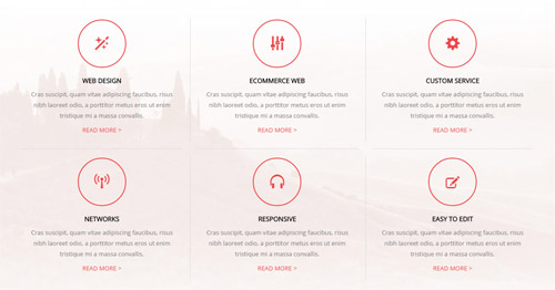
Codes are as follows:
<div class="backgroundImage2 pt-40 pb-40">
  <div class="dnn_layout  animation scaleUp">
    <div class="content_mid clearfix ServeList_1">
      <ul class="ServeList_1">
        <li>
          <div class="ico"><span class="glyphicons glyph-magic"></span></div>
          <h5>WEB DESIGN</h5>
          <p> Cras suscipit, quam vitae adipiscing faucibus, risus nibh laoreet odio, a porttitor metus eros ut enim tristique mi a massa convallis.</p>
          <p><a target="blank" href="#">READ MORE ></a></p>
        </li>
        <li>
          <div class="ico"><span class="glyphicons glyph-adjust-alt"></span></div>
          <h5>ECOMMERCE WEB</h5>
          <p> Cras suscipit, quam vitae adipiscing faucibus, risus nibh laoreet odio, a porttitor metus eros ut enim tristique mi a massa convallis.</p>
          <p><a target="blank" href="#">READ MORE ></a></p>
        </li>
        <li>
          <div class="ico"><span class="glyphicons glyph-cogwheel"></span></div>
          <h5>CUSTOM SERVICE</h5>
          <p> Cras suscipit, quam vitae adipiscing faucibus, risus nibh laoreet odio, a porttitor metus eros ut enim tristique mi a massa convallis.</p>
          <p><a target="blank" href="#">READ MORE ></a></p>
        </li>
        <li>
          <div class="ico"><span class="glyphicons glyph-wifi-alt"></span></div>
          <h5>NETWORKS</h5>
          <p> Cras suscipit, quam vitae adipiscing faucibus, risus nibh laoreet odio, a porttitor metus eros ut enim tristique mi a massa convallis.</p>
          <p><a target="blank" href="#">READ MORE ></a></p>
        </li>
        <li>
          <div class="ico"><span class="glyphicons glyph-headphones"></span></div>
          <h5>RESPONSIVE</h5>
          <p> Cras suscipit, quam vitae adipiscing faucibus, risus nibh laoreet odio, a porttitor metus eros ut enim tristique mi a massa convallis.</p>
          <p><a target="blank" href="#">READ MORE ></a></p>
        </li>
        <li>
          <div class="ico"><span class="glyphicons glyph-edit"></span></div>
          <h5>EASY TO EDIT</h5>
          <p> Cras suscipit, quam vitae adipiscing faucibus, risus nibh laoreet odio, a porttitor metus eros ut enim tristique mi a massa convallis.</p>
          <p><a target="blank" href="#">READ MORE ></a></p>
        </li>
      </ul>
    </div>
  </div>
</div>
Option:
- You can modify
animationto change the animation on the slide. Animation list. - You can modify
glyphiconsto change icons. font icon list.
WHY CHOOSE US area
Below is the screen shot:
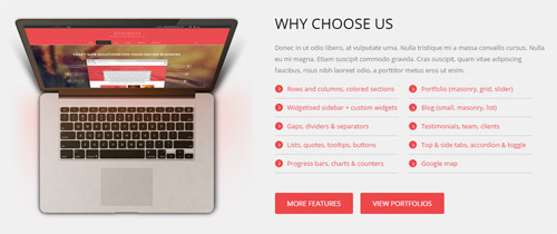
Codes are as follows:
<div class="backgroundImage3 pt-60 pb-50 mb-50">
  <div class="dnn_layout">
    <div class="content_mid clearfix">
      <div class="row">
        <div class="col-sm-6 animation fadeInLeft"><img alt="" src="/portals/30/Pic_11.png" class="img-responsive" /></div>
        <div style="text-align: left;" class="col-sm-6 animation fadeInRight">
          <h3 class="title_style_2 pb-10">WHY CHOOSE US</h3>
          <p>Donec in ut odio libero, at vulputate urna. Nulla tristique mi a massa convallis cursus. Nulla eu mi magna. Etiam suscipit commodo gravida. Cras suscipit, quam vitae adipiscing faucibus, risus nibh laoreet odio, a porttitor metus eros ut enim.</p>
          <ul class="list_style10">
            <li><span class="ico"></span><a href="#" target="blank">Rows and columns, colored sections</a></li>
            <li><span class="ico"></span><a href="#" target="blank">Portfolio (masonry, grid, slider)</a></li>
            <li><span class="ico"></span><a href="#" target="blank">Widgetised sidebar + custom widgets</a></li>
            <li><span class="ico"></span><a href="#" target="blank">Blog (small, masonry, list)</a></li>
            <li><span class="ico"></span><a href="#" target="blank">Gaps, dividers & separators</a></li>
            <li><span class="ico"></span><a href="#" target="blank">Testimonials, team, clients</a></li>
            <li><span class="ico"></span><a href="#" target="blank">Lists, quotes, tooltips, buttons</a></li>
            <li><span class="ico"></span><a href="#" target="blank">Top & side tabs, accordion & toggle</a></li>
            <li><span class="ico"></span><a href="#" target="blank">Progress bars,  charts & counters</a></li>
            <li><span class="ico"></span><a href="#" target="blank">Google map</a></li>
          </ul>
          <p class="pt-40"> <a target="blank" href="#" class="Button_default">MORE FEATURES</a> <a target="blank" href="#" class="Button_default">VIEW PORTFOLIOS</a> </p>
        </div>
      </div>
    </div>
  </div>
</div>
Option:
- You can modify
animationto change the animation on the slide. Animation list.
RECENT WORKS area
Below is the screen shot:
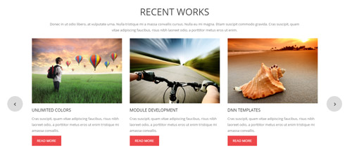
Codes are as follows:
<div style="text-align: center;">Donec in ut odio libero, at vulputate urna. Nulla tristique mi a massa convallis cursus. Nulla eu mi magna. Etiam suscipit commodo gravida. Cras suscipit, quam<br />
  vitae adipiscing faucibus, risus nibh laoreet odio, a porttitor metus eros ut enim.<br />
</div>
<div class="carousel carousel_5 mt-20 pb-60 animation scaleUp">
  <div class="item">
    <div class="photo_box img_zoom ico_top_enter"> <a title=" Title One" href="/Portals/30/controls_7.jpg" class="LightBox_image_gallery1">
      <div class="pic_box"> <img alt="" src="/portals/30/carousel_5_01.jpg" />
        <div class="ico"> <span class="glyphicons glyph-picture"></span> </div>
        <div class="shade"></div>
      </div>
      </a>
      <h3>UNLIMITED COLORS</h3>
      <p>Cras suscipit, quam vitae adipiscing faucibus, risus nibh laoreet odio, a porttitor metus eros ut enim tristique mi amassa convallis.</p>
      <a target="blank" href="#" class="but">READ MORE</a> </div>
  </div>
  <div class="item">
    <div class="photo_box img_zoom ico_top_enter"> <a title=" Title One" href="/Portals/30/controls_8.jpg" class="LightBox_image_gallery1">
      <div class="pic_box"> <img alt="" src="/portals/30/carousel_5_02.jpg" />
        <div class="ico"> <span class="glyphicons glyph-picture"></span> </div>
        <div class="shade"></div>
      </div>
      </a>
      <h3>MODULE DEVELOPMENT</h3>
      <p>Cras suscipit, quam vitae adipiscing faucibus, risus nibh laoreet odio, a porttitor metus eros ut enim tristique mi amassa convallis.</p>
      <a target="blank" href="#" class="but">READ MORE</a> </div>
  </div>
  <div class="item">
    <div class="photo_box img_zoom ico_top_enter"> <a title=" Title One" href="/Portals/30/controls_9.jpg" class="LightBox_image_gallery1">
      <div class="pic_box"> <img alt="" src="/portals/30/carousel_5_03.jpg" />
        <div class="ico"> <span class="glyphicons glyph-picture"></span> </div>
        <div class="shade"></div>
      </div>
      </a>
      <h3>DNN TEMPLATES</h3>
      <p>Cras suscipit, quam vitae adipiscing faucibus, risus nibh laoreet odio, a porttitor metus eros ut enim tristique mi amassa convallis.</p>
      <a target="blank" href="#" class="but">READ MORE</a> </div>
  </div>
  <div class="item">
    <div class="photo_box img_zoom ico_top_enter"> <a title=" Title One" href="/Portals/30/controls_10.jpg" class="LightBox_image_gallery1">
      <div class="pic_box"> <img alt="" src="/portals/30/carousel_5_01.jpg" />
        <div class="ico"> <span class="glyphicons glyph-picture"></span> </div>
        <div class="shade"></div>
      </div>
      </a>
      <h3>PHOTOGRAPHY</h3>
      <p>Cras suscipit, quam vitae adipiscing faucibus, risus nibh laoreet odio, a porttitor metus eros ut enim tristique mi amassa convallis.</p>
      <a target="blank" href="#" class="but">READ MORE</a> </div>
  </div>
  <div class="item">
    <div class="photo_box img_zoom ico_top_enter"> <a title=" Title One" href="/Portals/30/controls_11.jpg" class="LightBox_image_gallery1">
      <div class="pic_box"> <img alt="" src="/portals/30/carousel_5_02.jpg" />
        <div class="ico"> <span class="glyphicons glyph-picture"></span> </div>
        <div class="shade"></div>
      </div>
      </a>
      <h3>CAROUSEL</h3>
      <p>Cras suscipit, quam vitae adipiscing faucibus, risus nibh laoreet odio, a porttitor metus eros ut enim tristique mi amassa convallis.</p>
      <a target="blank" href="#" class="but">READ MORE</a> </div>
  </div>
</div>
Option:
Containeris usingContainer-15- This is a
ProgressBars Counterseffect. Carousel - You can modify
animationto change the animation on the slide. Animation list. - You can modify
glyphiconsto change icons. font icon list.
Number area
Below is the screen shot:
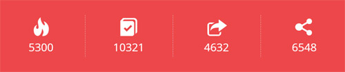
Codes are as follows:
<div class="backgroundImage1 pt-50 pb-50 mb-50">
  <div class="dnn_layout  animation scaleUp">
    <div class="content_mid clearfix">
      <div class="number_Animation2 row">
        <div class="col-sm-3"> <span class="glyphicons glyph-fire"> </span> <span class="animation  number" data-number="5300">0</span> </div>
        <div class="col-sm-3"> <span class="glyphicons glyph-log-book"> </span> <span class="animation  number" data-number="10321">0</span> </div>
        <div class="col-sm-3"> <span class="glyphicons glyph-new-window"> </span> <span class="animation  number" data-number="4632">0</span> </div>
        <div class="col-sm-3"> <span class="glyphicons glyph-share-alt"> </span> <span class="animation  number" data-number="6548">0</span> </div>
      </div>
    </div>
  </div>
</div>
Option:
- You can modify
animationto change the animation on the slide. Animation list. - You can modify
glyphiconsto change icons. font icon list. - You can change the value you need to display through
data-number
LATEST NEWS area
Below is the screen shot:
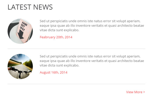
Codes are as follows:
<ul class="news_list animation fadeInLeft">
  <li>
    <div class="pic"><img alt="" src="/portals/30/Photo1.jpg" /></div>
    <p>Sed ut perspiciatis unde omnis iste natus error sit volupt aperiam, eaque ipsa quae ab illo inventore veritatis et quasi architecto beatae vitae dicta sunt explicabo.</p>
    <a target="blank" href="#">Feabruary 20th, 2014</a> </li>
  <li>
    <div class="pic"><img alt="" src="/portals/30/carousel_5_02.jpg" /></div>
    <p>Sed ut perspiciatis unde omnis iste natus error sit volupt aperiam, eaque ipsa quae ab illo inventore veritatis et quasi architecto beatae vitae dicta sunt explicabo.</p>
    <a target="blank" href="#">August 16th, 2014</a> </li>
</ul>
<p style="text-align: right;" class="pt-20"> <a target="blank" href="#">View More ></a></p>
Option:
Containeris usingContainer-16- You can modify
animationto change the animation on the slide. Animation list.
OUR FEATURES area
Below is the screen shot:
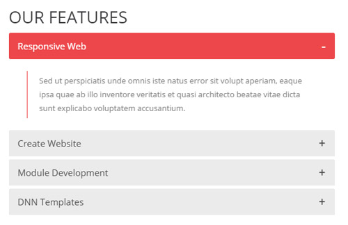
Codes are as follows:
<div class="panel-group accordion_5 animation fadeInRight" id="accordion">
  <div class="panel panel-default">
    <div class="panel-heading">
      <h4 class="panel-title"> <a data-toggle="collapse" data-parent="#accordion" href="#collapse1_1">Responsive Web</a> </h4>
    </div>
    <div id="collapse1_1" class="panel-collapse collapse in">
      <div class="panel-body">Sed ut perspiciatis unde omnis iste natus error sit volupt aperiam, eaque ipsa quae ab illo inventore veritatis et quasi architecto beatae vitae dicta sunt explicabo voluptatem accusantium.</div>
    </div>
  </div>
  <div class="panel panel-default">
    <div class="panel-heading">
      <h4 class="panel-title"> <a data-toggle="collapse" data-parent="#accordion" href="#collapse1_2" class="collapsed">Create Website</a> </h4>
    </div>
    <div id="collapse1_2" class="panel-collapse collapse">
      <div class="panel-body">Sed ut perspiciatis unde omnis iste natus error sit volupt aperiam, eaque ipsa quae ab illo inventore veritatis et quasi architecto beatae vitae dicta sunt explicabo voluptatem accusantium.</div>
    </div>
  </div>
  <div class="panel panel-default">
    <div class="panel-heading">
      <h4 class="panel-title"> <a data-toggle="collapse" data-parent="#accordion" href="#collapse1_3" class="collapsed">Module Development</a> </h4>
    </div>
    <div id="collapse1_3" class="panel-collapse collapse">
      <div class="panel-body">Sed ut perspiciatis unde omnis iste natus error sit volupt aperiam, eaque ipsa quae ab illo inventore veritatis et quasi architecto beatae vitae dicta sunt explicabo voluptatem accusantium.</div>
    </div>
  </div>
  <div class="panel panel-default">
    <div class="panel-heading">
      <h4 class="panel-title"> <a data-toggle="collapse" data-parent="#accordion" href="#collapse1_4" class="collapsed">DNN Templates</a> </h4>
    </div>
    <div id="collapse1_4" class="panel-collapse collapse">
      <div class="panel-body">Sed ut perspiciatis unde omnis iste natus error sit volupt aperiam, eaque ipsa quae ab illo inventore veritatis et quasi architecto beatae vitae dicta sunt explicabo voluptatem accusantium.</div>
    </div>
  </div>
</div>
Option:
Containeris usingContainer-16- You can modify
animationto change the animation on the slide. Animation list.
OUR PROCESS area
Below is the screen shot:
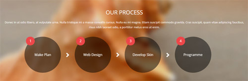
Codes are as follows:
<div class="backgroundImage4 pt-50 pb-50 mt-40">
  <div class="dnn_layout">
    <div class="content_mid clearfix">
      <h3 class="title_style_1 pb-10">OUR PROCESS</h3>
      <p class="pb-20">Donec in ut odio libero, at vulputate urna. Nulla tristique mi a massa convallis cursus. Nulla eu mi magna. Etiam suscipit commodo gravida. Cras suscipit, quam vitae adipiscing faucibus, risus nibh laoreet odio, a porttitor metus eros ut enim.</p>
      <ul class="list_1 animation scaleUp">
        <li>
          <div class="ico"><span>1</span></div>
          Make Plan</li>
        <li>
          <div class="ico"><span>2</span></div>
          Web Design</li>
        <li>
          <div class="ico"><span>3</span></div>
          Develop Skin</li>
        <li>
          <div class="ico"><span>4</span></div>
          Programme</li>
      </ul>
    </div>
  </div>
</div>
Option:
- You can modify
animationto change the animation on the slide. Animation list.
CONTACT US area
Below is the screen shot:
Codes are as follows:
<div class="animation fadeInUp">
	Sed ut perspiciatis unde omnis iste natus error sit voluptatem accusantium doloremque laudantium, totam rem aperiam, eaque ipsa quae ab illo inventore veritatis et quasi architecto beatae vitae dicta sunt explicabo. Nemo enim ipsam voluptatem quia voluptas sit aspernatur aut odit aut fugit. Pellentesque eget ipsum. Aliquam suscipit fringilla libero id luctus. Nulla nisi mi, rutrum ac orci sit amet, accumsan adipiscing mi.
</div>
Option:
Containeris usingContainer-17- This is a
ProgressBars Counterseffect. Carousel - You can modify
animationto change the animation on the slide. Animation list.
EMAIL US area
Below is the screen shot:
Option:
Containeris usingContainer-18- This is
Theme_Responsive_20060_home4theme ofDNNGo PowerFormsmodule
GET IN TOUCH area
Below is the screen shot:
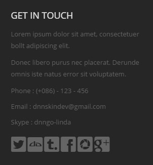
Codes are as follows:
<div class="animation fadeInUp">
  <p class="mb-10">Lorem ipsum dolor sit amet, consectetuer bollt adipiscing elit.</p>
  <p class="mb-10">Donec libero purus nec placerat. Derunde omnis iste natus error sit voluptatem.</p>
  <p>Phone :    (+086) - 123 - 456</p>
  <p>Email  :    dnnskindev@gmail.com</p>
  <p>Skype :    dnngo-linda</p>
  <div class="font-icons  clearfix"> <a href="#"><span class="social social-twitter"></span></a> <a href="#"><span class="social social-deviantart"></span></a> <a href="#"><span class="social social-tumblr"></span></a> <a href="#"><span class="social social-facebook"></span></a> <a href="#"><span class="social social-picasa"></span></a> <a href="#"><span class="social social-google-plus"></span></a> </div>
</div>
Option:
Containeris usingContainer-18- You can modify
animationto change the animation on the slide. Animation list. - You can modify
socialto change icons. font icon list.
HomeVersion5
You can click the link to check HomeVersion5 demo. HomeVersion5
Banner area
Below is the screen shot:

Codes are as follows:
<ul class="full_screen_pic">
    <li style="background-image: url('http://demo7.dnngo.net/Portals/30/full_screen_img.jpg');">
    <div class="content">
    <div class="title animation_1">CRAFT <span class="animation_2">WEB</span> SOLUTIONS </div>
    <div class="line"></div>
    <div class="animation_3"> Enjoy innovative, personalized and powerful services for your online business.</div>
    <div id="nextPage">DEMO </div>
    </div>
    </li>
</ul>
About area
Below is the screen shot:
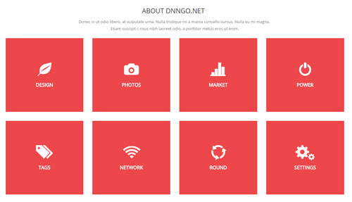
Codes are as follows:
<div class="pt-10  pb-20" style="text-align: center;">Donec in ut odio libero,
  at vulputate urna. Nulla tristique mi a massa convallis cursus. Nulla eu mi magna. <br />
  Etiam suscipit c risus nibh laoreet odio, a porttitor metus eros ut enim.<br />
</div>
<div class="animation scaleUp">
  <div class="row">
    <div class="col-md-3 col-sm-6">
      <div class="magic_box">
        <div class="up"> <span class="glyphicons glyph-leaf"></span>
          <h3>DESIGN</h3>
        </div>
        <div class="down">
          <h3>DESIGN</h3>
          <p>Sed ut perspiciatis unde omnis iste natus error sit voluptatem accusantium doloremque.</p>
          <a class="but" href="#" target="blank">READ MORE ></a> </div>
      </div>
    </div>
    <div class="col-md-3 col-sm-6">
      <div class="magic_box ">
        <div class="up"> <span class="glyphicons glyph-camera"></span>
          <h3>PHOTOS</h3>
        </div>
        <div class="down">
          <h3>PHOTOS</h3>
          <p>Sed ut perspiciatis unde omnis iste natus error sit voluptatem accusantium doloremque.</p>
          <a class="but" href="#" target="blank">READ MORE ></a> </div>
      </div>
    </div>
    <div class="clearfix visible-sm"></div>
    <div class="col-md-3 col-sm-6">
      <div class="magic_box ">
        <div class="up"> <span class="glyphicons glyph-charts"></span>
          <h3>MARKET</h3>
        </div>
        <div class="down">
          <h3>MARKET</h3>
          <p>Sed ut perspiciatis unde omnis iste natus error sit voluptatem accusantium doloremque.</p>
          <a class="but" href="#" target="blank">READ MORE ></a> </div>
      </div>
    </div>
    <div class="col-md-3 col-sm-6">
      <div class="magic_box ">
        <div class="up"> <span class="glyphicons glyph-power"></span>
          <h3>POWER</h3>
        </div>
        <div class="down">
          <h3>POWER</h3>
          <p>Sed ut perspiciatis unde omnis iste natus error sit voluptatem accusantium doloremque.</p>
          <a class="but" href="#" target="blank">READ MORE ></a> </div>
      </div>
    </div>
  </div>
  <div class="row pb-30">
    <div class="col-md-3 col-sm-6">
      <div class="magic_box ">
        <div class="up"> <span class="glyphicons glyph-tags"></span>
          <h3>TAGS</h3>
        </div>
        <div class="down">
          <h3>TAGS</h3>
          <p>Sed ut perspiciatis unde omnis iste natus error sit voluptatem accusantium doloremque.</p>
          <a class="but" href="#" target="blank">READ MORE ></a> </div>
      </div>
    </div>
    <div class="col-md-3 col-sm-6">
      <div class="magic_box ">
        <div class="up"> <span class="glyphicons glyph-wifi"></span>
          <h3>NETWORK</h3>
        </div>
        <div class="down">
          <h3>NETWORK</h3>
          <p>Sed ut perspiciatis unde omnis iste natus error sit voluptatem accusantium doloremque.</p>
          <a class="but" href="#" target="blank">READ MORE ></a> </div>
      </div>
    </div>
    <div class="clearfix visible-sm"></div>
    <div class="col-md-3 col-sm-6">
      <div class="magic_box ">
        <div class="up"> <span class="glyphicons glyph-roundabout"></span>
          <h3>ROUND</h3>
        </div>
        <div class="down">
          <h3>ROUND</h3>
          <p>Sed ut perspiciatis unde omnis iste natus error sit voluptatem accusantium doloremque.</p>
          <a class="but" href="#" target="blank">READ MORE ></a> </div>
      </div>
    </div>
    <div class="col-md-3 col-sm-6">
      <div class="magic_box ">
        <div class="up"> <span class="glyphicons glyph-cogwheels"></span>
          <h3>SETTINGS</h3>
        </div>
        <div class="down">
          <h3>SETTINGS</h3>
          <p>Sed ut perspiciatis unde omnis iste natus error sit voluptatem accusantium doloremque.</p>
          <a class="but" href="#" target="blank">READ MORE ></a> </div>
      </div>
    </div>
  </div>
</div>
Option:
Containeris usingContainer-6- You can modify
animationto change the animation on the slide. Animation list. col-sm-* col-md-*is the width of each column, you can change the width you need through value1~12.- You can modify
glyphiconsto change icons. font icon list.
Testimonials area
Below is the screen shot:

Codes are as follows:
<div class="backgroundImage5 pt-60 pb-60 mb-40">
  <div class="dnn_layout animation scaleUp">
    <div class="content_mid clearfix">
      <blockquote class="blockquote1"> <span class="mark">“</span>
        <p>” Currently, we have launched a membership system. As a gold member, you will have the privilege to
        download all our skins and modules free of charge. In addition to this, you will enjoy more discount when ordering our other services. ”</p>
        <small><span>Steve Jobs </span>The CEO Manager</small> </blockquote>
    </div>
  </div>
</div>
Option:
- You can modify
animationto change the animation on the slide. Animation list.
OUR EMPLOYEES area
Below is the screen shot:
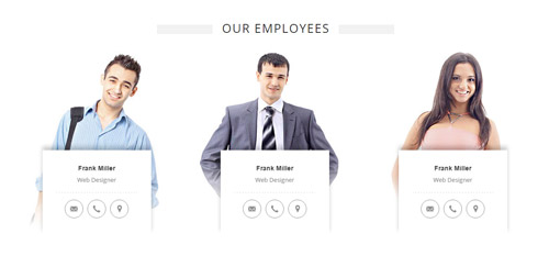
Codes are as follows:
<div class="row employees pt-20 pb-50">
  <div class="col-sm-4 animation fadeInUp delay1">
    <div class="employeesBox"><img alt="" src="/portals/30/Pic_12.jpg" />
      <div class="employeesContent">
        <h6>Frank Miller</h6>
        <p> Web Designer</p>
        <div class="glyph"> <a href="#"><span class="glyphicons glyph-envelope"></span></a> <a href="#"><span class="glyphicons glyph-earphone"></span></a> <a href="#"><span class="glyphicons glyph-google-maps"></span></a> </div>
      </div>
    </div>
  </div>
  <div class="col-sm-4 animation fadeInUp delay2">
    <div class="employeesBox"><img alt="" src="/portals/30/Pic_13.jpg" />
      <div class="employeesContent">
        <h6>Frank Miller</h6>
        <p> Web Designer</p>
        <div class="glyph"> <a href="#"><span class="glyphicons glyph-envelope"></span></a> <a href="#"><span class="glyphicons glyph-earphone"></span></a> <a href="#"><span class="glyphicons glyph-google-maps"></span></a> </div>
      </div>
    </div>
  </div>
  <div class="col-sm-4 animation fadeInUp delay3">
    <div class="employeesBox"><img alt="" src="/portals/30/Pic_14.jpg" />
      <div class="employeesContent">
        <h6>Frank Miller</h6>
        <p> Web Designer</p>
        <div class="glyph"> <a href="#"><span class="glyphicons glyph-envelope"></span></a> <a href="#"><span class="glyphicons glyph-earphone"></span></a> <a href="#"><span class="glyphicons glyph-google-maps"></span></a> </div>
      </div>
    </div>
  </div>
</div>
Option:
Containeris usingContainer-19col-sm-*is the width of each column, you can change the width you need through value1~12.- You can modify
animationto change and delete animation. Animation list. - You can modify
glyphiconsto change icons. font icon list.
RECENT WORKS area
Below is the screen shot:
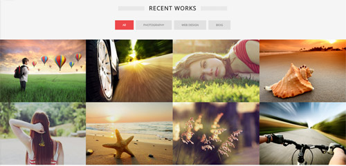
Codes are as follows:
<div class="backgroundImage6 pt-60 mb-40">
  <div class="dnn_layout">
    <div class="content_mid clearfix">
      <div class="title_style_3 mb-20">
        <h3> RECENT WORKS</h3>
      </div>
    </div>
  </div>
  <div class="isotope_grid animation scaleUp">
    <div class="isotope_group"> <a data-filter="*" href="#" class="active">All</a> <a data-filter=".photography" href="#">PHOTOGRAPHY</a> <a data-filter=".webdesign" href="#">WEB DESIGN</a> <a data-filter=".blog" href="#">BlOG</a> </div>
    <div class="loading">
      <div class="loading-container container1">
        <div class="circle1"></div>
        <div class="circle2"></div>
        <div class="circle3"></div>
        <div class="circle4"></div>
      </div>
      <div class="loading-container container2">
        <div class="circle1"></div>
        <div class="circle2"></div>
        <div class="circle3"></div>
        <div class="circle4"></div>
      </div>
      <div class="loading-container container3">
        <div class="circle1"></div>
        <div class="circle2"></div>
        <div class="circle3"></div>
        <div class="circle4"></div>
      </div>
    </div>
    <div data-min-width="381" class="isotope_main">
      <div class="isotope_item photography blog">
        <div class="photo_box img_zoom ico_LeftAndRight_enter">
          <div class="pic_box"> <img alt="" src="/portals/30/isotope_img_01.jpg" />
            <div class="content">
              <div class="vertical_center_1">
                <div class="vertical_center_2">
                  <h3>Development</h3>
                  <p>Cras suscipit, quam vitae adipiscing</p>
                  <div class="ico"><a href="#"><span class="glyphicons glyph-heart ico_left"></span></a> <a href="#" target="blank"><span class="glyphicons glyph-tag ico_right"></span></a></div>
                </div>
              </div>
            </div>
            <div class="shade"></div>
          </div>
        </div>
      </div>
      <div class="isotope_item  webdesign">
        <div class="photo_box img_zoom ico_LeftAndRight_enter">
          <div class="pic_box"> <img alt="" src="/portals/30/isotope_img_02.jpg" />
            <div class="content">
              <div class="vertical_center_1">
                <div class="vertical_center_2">
                  <h3>Development</h3>
                  <p>Cras suscipit, quam vitae adipiscing</p>
                  <div class="ico"><a href="#"><span class="glyphicons glyph-heart ico_left"></span></a> <a href="#" target="blank"><span class="glyphicons glyph-tag ico_right"></span></a></div>
                </div>
              </div>
            </div>
            <div class="shade"></div>
          </div>
        </div>
      </div>
      <div class="isotope_item blog">
        <div class="photo_box img_zoom ico_LeftAndRight_enter">
          <div class="pic_box"> <img alt="" src="/portals/30/isotope_img_03.jpg" />
            <div class="content">
              <div class="vertical_center_1">
                <div class="vertical_center_2">
                  <h3>Development</h3>
                  <p>Cras suscipit, quam vitae adipiscing</p>
                  <div class="ico"><a href="#"><span class="glyphicons glyph-heart ico_left"></span></a> <a href="#" target="blank"><span class="glyphicons glyph-tag ico_right"></span></a></div>
                </div>
              </div>
            </div>
            <div class="shade"></div>
          </div>
        </div>
      </div>
      <div class="isotope_item blog">
        <div class="photo_box img_zoom ico_LeftAndRight_enter">
          <div class="pic_box"> <img alt="" src="/portals/30/isotope_img_04.jpg" />
            <div class="content">
              <div class="vertical_center_1">
                <div class="vertical_center_2">
                  <h3>Development</h3>
                  <p>Cras suscipit, quam vitae adipiscing</p>
                  <div class="ico"><a href="#"><span class="glyphicons glyph-heart ico_left"></span></a> <a href="#" target="blank"><span class="glyphicons glyph-tag ico_right"></span></a></div>
                </div>
              </div>
            </div>
            <div class="shade"></div>
          </div>
        </div>
      </div>
      <div class="isotope_item blog ">
        <div class="photo_box img_zoom ico_LeftAndRight_enter">
          <div class="pic_box"> <img alt="" src="/portals/30/isotope_img_05.jpg" />
            <div class="content">
              <div class="vertical_center_1">
                <div class="vertical_center_2">
                  <h3>Development</h3>
                  <p>Cras suscipit, quam vitae adipiscing</p>
                  <div class="ico"><a href="#"><span class="glyphicons glyph-heart ico_left"></span></a> <a href="#" target="blank"><span class="glyphicons glyph-tag ico_right"></span></a></div>
                </div>
              </div>
            </div>
            <div class="shade"></div>
          </div>
        </div>
      </div>
      <div class="isotope_item blog webdesign photography">
        <div class="photo_box img_zoom ico_LeftAndRight_enter">
          <div class="pic_box"> <img alt="" src="/portals/30/isotope_img_06.jpg" />
            <div class="content">
              <div class="vertical_center_1">
                <div class="vertical_center_2">
                  <h3>Development</h3>
                  <p>Cras suscipit, quam vitae adipiscing</p>
                  <div class="ico"><a href="#"><span class="glyphicons glyph-heart ico_left"></span></a> <a href="#" target="blank"><span class="glyphicons glyph-tag ico_right"></span></a></div>
                </div>
              </div>
            </div>
            <div class="shade"></div>
          </div>
        </div>
      </div>
      <div class="isotope_item photography blog">
        <div class="photo_box img_zoom ico_LeftAndRight_enter">
          <div class="pic_box"> <img alt="" src="/portals/30/isotope_img_07.jpg" />
            <div class="content">
              <div class="vertical_center_1">
                <div class="vertical_center_2">
                  <h3>Development</h3>
                  <p>Cras suscipit, quam vitae adipiscing</p>
                  <div class="ico"><a href="#"><span class="glyphicons glyph-heart ico_left"></span></a> <a href="#" target="blank"><span class="glyphicons glyph-tag ico_right"></span></a></div>
                </div>
              </div>
            </div>
            <div class="shade"></div>
          </div>
        </div>
      </div>
      <div class="isotope_item  webdesign">
        <div class="photo_box img_zoom ico_LeftAndRight_enter">
          <div class="pic_box"> <img alt="" src="/portals/30/isotope_img_08.jpg" />
            <div class="content">
              <div class="vertical_center_1">
                <div class="vertical_center_2">
                  <h3>Development</h3>
                  <p>Cras suscipit, quam vitae adipiscing</p>
                  <div class="ico"><a href="#"><span class="glyphicons glyph-heart ico_left"></span></a> <a href="#" target="blank"><span class="glyphicons glyph-tag ico_right"></span></a></div>
                </div>
              </div>
            </div>
            <div class="shade"></div>
          </div>
        </div>
      </div>
    </div>
  </div>
</div>
Option:
- You can modify
animationto change the animation on the slide. Animation list. - You can modify
glyphiconsto change icons. font icon list.
WHY CHOOSE US area
Below is the screen shot:
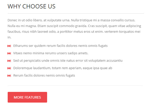
Codes are as follows:
<div class="animation fadeInLeft">
  <p>Donec in ut odio libero, at vulputate urna. Nulla tristique mi a massa convallis cursus.
  Nulla eu mi magna. Etiam suscipit commodo gravida. Cras suscipit, quam vitae adipiscing faucibus, risus nibh laoreet odio, a porttitor metus eros ut enim. verterem torquatos mei in.</p>
  <ul class="list_style11 ">
    <li>Etharums ser quidem rerum facilis dolores nemis omnis fugats </li>
    <li>Vitaes nemo minima rerums unsers sadips amets. </li>
    <li>Sed ut perspiciatis unde omnis iste natus error sit voluptatem accusantiu</li>
    <li>Doloremque laudantium, totam rem aperiam, eaque ipsa quae ab</li>
    <li>Rerum facilis dolores nemis omnis fugats </li>
  </ul>
  <div class="pt-20 pb-20">
    <hr class="dividers_1" />
  </div>
  <a href="#" target="blank" class="Button_default"> MORE FEATURES</a> </div>
Option:
Containeris usingContainer-20- You can modify
animationto change the animation on the slide. Animation list.
LATEST NEWS area
Below is the screen shot:
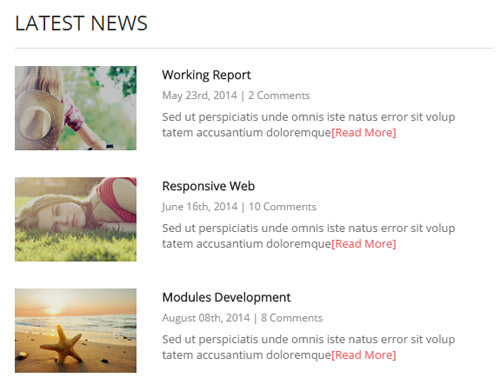
Codes are as follows:
<ul class="news_list2 animation fadeInRight">
  <li>
    <div class="pic"><img alt="" src="/portals/30/news_list_01.jpg" /></div>
    <h3>Working Report</h3>
    <div class="info">May 23rd, 2014  |  2 Comments </div>
    <p> Sed ut perspiciatis unde omnis iste natus error sit volup tatem accusantium doloremque<a href="#" target="blank">[Read More]</a> </p>
  </li>
  <li>
    <div class="pic"><img alt="" src="/portals/30/news_list_02.jpg" /></div>
    <h3>Responsive Web</h3>
    <div class="info">June 16th, 2014  |  10 Comments</div>
    <p> Sed ut perspiciatis unde omnis iste natus error sit volup tatem accusantium doloremque<a href="#" target="blank">[Read More]</a> </p>
  </li>
  <li>
    <div class="pic"><img alt="" src="/portals/30/news_list_03.jpg" /></div>
    <h3>Modules Development</h3>
    <div class="info">August 08th, 2014  |  8 Comments</div>
    <p> Sed ut perspiciatis unde omnis iste natus error sit volup tatem accusantium doloremque<a href="#" target="blank">[Read More]</a> </p>
  </li>
</ul>
Option:
- You can modify
animationto change the animation on the slide. Animation list.
OUR SERVICES area
Below is the screen shot:
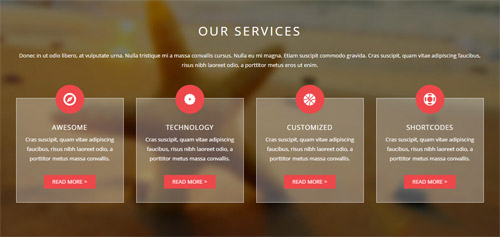
Codes are as follows:
<div class="backgroundImage7 pt-60 pb-60 mb-40">
  <div class="dnn_layout">
    <div class="content_mid clearfix">
      <h3 class="title_style_4">OUR SERVICES</h3>
      <p>Donec in ut odio libero, at vulputate urna. Nulla tristique mi a massa convallis cursus. Nulla eu mi magna. Etiam suscipit commodo gravida. Cras suscipit,
      quam vitae adipiscing faucibus, risus nibh laoreet odio, a porttitor metus eros ut enim.</p>
      <div class="row pt-30  animation scaleUp">
        <div class="col-md-3 col-sm-6">
          <div class="ServeList_2">
            <div class="ico"><span class="glyphicons glyph-compass"></span></div>
            <h5>AWESOME</h5>
            <p> Cras suscipit, quam vitae adipiscing faucibus, risus nibh laoreet odio, a porttitor metus  massa convallis.</p>
            <p><a class="but" href="#" target="blank">READ MORE ></a></p>
          </div>
        </div>
        <div class="col-md-3 col-sm-6">
          <div class="ServeList_2">
            <div class="ico"><span class="glyphicons glyph-saw-blade"></span></div>
            <h5>TECHNOLOGY</h5>
            <p> Cras suscipit, quam vitae adipiscing faucibus, risus nibh laoreet odio, a porttitor metus  massa convallis.</p>
            <p><a class="but" href="#" target="blank">READ MORE ></a></p>
          </div>
        </div>
        <div class="clearfix visible-sm"></div>
        <div class="col-md-3 col-sm-6">
          <div class="ServeList_2">
            <div class="ico"><span class="glyphicons glyph-basketball"></span></div>
            <h5>CUSTOMIZED</h5>
            <p> Cras suscipit, quam vitae adipiscing faucibus, risus nibh laoreet odio, a porttitor metus  massa convallis.</p>
            <p><a class="but" href="#" target="blank">READ MORE ></a></p>
          </div>
        </div>
        <div class="col-md-3 col-sm-6">
          <div class="ServeList_2">
            <div class="ico"><span class="glyphicons glyph-life-preserver"></span></div>
            <h5>SHORTCODES</h5>
            <p> Cras suscipit, quam vitae adipiscing faucibus, risus nibh laoreet odio, a porttitor metus  massa convallis.</p>
            <p><a class="but" href="#" target="blank">READ MORE ></a></p>
          </div>
        </div>
      </div>
    </div>
  </div>
</div>
Option:
col-sm-* col-md-*is the width of each column, you can change the width you need through value1~12.- You can modify
animationto change the animation on the slide. Animation list. - You can modify
glyphiconsto change icons. font icon list.
OUR FEATURES area
Below is the screen shot:
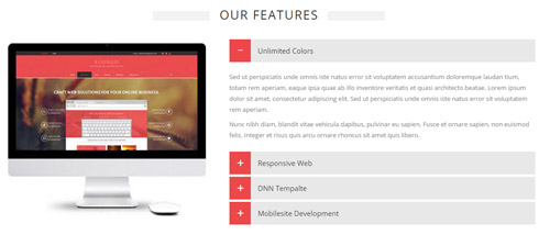
Codes are as follows:
<div class="row pt-30 pb-30">
  <div class="col-sm-5 animation fadeInLeft"><img alt="" class="img-responsive" src="/portals/30/newpic_15.jpg" /></div>
  <div class="col-sm-7 animation fadeInRight">
    <div id="accordion3" class="panel-group accordion_6">
      <div class="panel panel-default">
        <div class="panel-heading">
          <h4 class="panel-title"> <a href="#collapse3_1" data-parent="#accordion3" data-toggle="collapse"><span class="accordion_icon"></span>Unlimited Colors</a> </h4>
        </div>
        <div class="panel-collapse collapse in" id="collapse3_1">
          <div class="panel-body">
            <p>Sed ut perspiciatis unde omnis iste natus error sit voluptatem accusantium doloremque laudan tium, totam rem aperiam,
            eaque ipsa quae ab illo inventore veritatis et quasi architecto beatae. Lorem ipsum dolor sit amet, consectetur adipiscing elit. Sed ut perspiciatis unde omnis iste natus error sit voluptatem  rem aperiam. </p>
            <p> Nunc nibh diam, blandit vitae vehicula dapibus, pulvinar eu sapien. Fusce et ornare sapien, non euismod felis. Integer et risus quis arcu ornare rhoncus sit amet quis libero.</p>
          </div>
        </div>
      </div>
      <div class="panel panel-default">
        <div class="panel-heading">
          <h4 class="panel-title"> <a class="collapsed" href="#collapse3_2" data-parent="#accordion3" data-toggle="collapse"><span class="accordion_icon"></span>Responsive Web</a> </h4>
        </div>
        <div class="panel-collapse collapse" id="collapse3_2">
          <div class="panel-body">
            <p>Sed ut perspiciatis unde omnis iste natus error sit voluptatem accusantium doloremque laudan tium, totam rem aperiam, eaque ipsa quae ab illo inventore veritatis et quasi architecto beatae.
            Lorem ipsum dolor sit amet, consectetur adipiscing elit. Sed ut perspiciatis unde omnis iste natus error sit voluptatem  rem aperiam. </p>
            <p> Nunc nibh diam, blandit vitae vehicula dapibus, pulvinar eu sapien. Fusce et ornare sapien, non euismod felis. Integer et risus quis arcu ornare rhoncus sit amet quis libero.</p>
          </div>
        </div>
      </div>
      <div class="panel panel-default">
        <div class="panel-heading">
          <h4 class="panel-title"> <a class="collapsed" href="#collapse3_3" data-parent="#accordion3" data-toggle="collapse"><span class="accordion_icon"></span>DNN Tempalte</a> </h4>
        </div>
        <div class="panel-collapse collapse" id="collapse3_3">
          <div class="panel-body">
            <p>Sed ut perspiciatis unde omnis iste natus error sit voluptatem accusantium doloremque laudan tium, totam rem aperiam, eaque ipsa quae ab illo inventore veritatis et quasi architecto beatae.
            Lorem ipsum dolor sit amet, consectetur adipiscing elit. Sed ut perspiciatis unde omnis iste natus error sit voluptatem  rem aperiam. </p>
            <p> Nunc nibh diam, blandit vitae vehicula dapibus, pulvinar eu sapien. Fusce et ornare sapien, non euismod felis. Integer et risus quis arcu ornare rhoncus sit amet quis libero.</p>
          </div>
        </div>
      </div>
      <div class="panel panel-default">
        <div class="panel-heading">
          <h4 class="panel-title"> <a class="collapsed" href="#collapse3_4" data-parent="#accordion3" data-toggle="collapse"><span class="accordion_icon"></span>Mobilesite Development</a> </h4>
        </div>
        <div class="panel-collapse collapse" id="collapse3_4">
          <div class="panel-body">
            <p>Sed ut perspiciatis unde omnis iste natus error sit voluptatem accusantium doloremque laudan tium, totam rem aperiam, eaque ipsa quae ab illo inventore veritatis et quasi architecto beatae. Lorem ipsum dolor sit amet,
            consectetur adipiscing elit. Sed ut perspiciatis unde omnis iste natus error sit voluptatem  rem aperiam. </p>
            <p> Nunc nibh diam, blandit vitae vehicula dapibus, pulvinar eu sapien. Fusce et ornare sapien, non euismod felis. Integer et risus quis arcu ornare rhoncus sit amet quis libero.</p>
          </div>
        </div>
      </div>
    </div>
  </div>
</div>
Option:
Containeris usingContainer-19- You can modify
animationto change the animation on the slide. Animation list. col-sm-*is the width of each column, you can change the width you need through value1~12.
If you want to make a website, submit a ticket here area
Below is the screen shot:
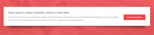
Codes are as follows:
<div class="pt-60 pb-60">
  <div class="boxes_style_9 animation scaleUp">
    <div class="boxes">
      <h3 class="Boxes_title">If you want to make a website, submit a ticket here</h3>
      <p>Lorem ipsum dolor sit amet, consectetuer adipiscing elit. Donec libero. Suspendisse purus nec placerat bibendbibendum. Cras id urna. Morbi tincidunt,
      orci ac convallis aliquam, lectus turpis varius lorem, eu posuere nunc justo tempus leo.</p>
      <div class="but"> <a class="Button_default" target="blank" href="#">More Information</a></div>
    </div>
  </div>
</div>
Option:
- You can modify
animationto change the animation on the slide. Animation list.
PHOTOS area
Below is the screen shot:
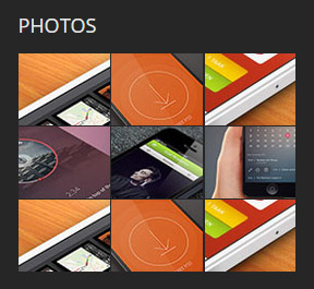
Codes are as follows:
<div class="animation fadeInUp">
  <div class="foot_photo photo_box img_zoom "> <a href="/Portals/30/Photo10-big.jpg" class="LightBox_image_gallery2">
    <div class="pic_box"> <img alt="" src="/portals/30/Photo10.jpg" />
      <div class="ico"> <span class="glyphicons glyph-search"></span> </div>
      <div class="shade"></div>
    </div>
    </a> </div>
  <div class="foot_photo photo_box img_zoom "> <a href="/Portals/30/Photo11-big.jpg" class="LightBox_image_gallery2">
    <div class="pic_box"> <img alt="" src="/portals/30/Photo11.jpg" />
      <div class="ico"> <span class="glyphicons glyph-search"></span> </div>
      <div class="shade"></div>
    </div>
    </a> </div>
  <div class="foot_photo photo_box img_zoom "> <a href="/Portals/30/Photo12-big.jpg" class="LightBox_image_gallery2">
    <div class="pic_box"> <img alt="" src="/portals/30/Photo12.jpg" />
      <div class="ico"> <span class="glyphicons glyph-search"></span> </div>
      <div class="shade"></div>
    </div>
    </a> </div>
  <div class="foot_photo photo_box img_zoom "> <a href="/Portals/30/Photo13-big.jpg" class="LightBox_image_gallery2">
    <div class="pic_box"> <img alt="" src="/portals/30/Photo13.jpg" />
      <div class="ico"> <span class="glyphicons glyph-search"></span> </div>
      <div class="shade"></div>
    </div>
    </a> </div>
  <div class="foot_photo photo_box img_zoom "> <a href="/Portals/30/Photo14-big.jpg" class="LightBox_image_gallery2">
    <div class="pic_box"> <img alt="" src="/portals/30/Photo14.jpg" />
      <div class="ico"> <span class="glyphicons glyph-search"></span> </div>
      <div class="shade"></div>
    </div>
    </a> </div>
  <div class="foot_photo photo_box img_zoom "> <a href="/Portals/30/Photo15-big.jpg" class="LightBox_image_gallery2">
    <div class="pic_box"> <img alt="" src="/portals/30/Photo15.jpg" />
      <div class="ico"> <span class="glyphicons glyph-search"></span> </div>
      <div class="shade"></div>
    </div>
    </a> </div>
  <div class="foot_photo photo_box img_zoom "> <a href="/Portals/30/Photo10-big.jpg" class="LightBox_image_gallery2">
    <div class="pic_box"> <img alt="" src="/portals/30/Photo10.jpg" />
      <div class="ico"> <span class="glyphicons glyph-search"></span> </div>
      <div class="shade"></div>
    </div>
    </a> </div>
  <div class="foot_photo photo_box img_zoom "> <a href="/Portals/30/Photo11-big.jpg" class="LightBox_image_gallery2">
    <div class="pic_box"> <img alt="" src="/portals/30/Photo11.jpg" />
      <div class="ico"> <span class="glyphicons glyph-search"></span> </div>
      <div class="shade"></div>
    </div>
    </a> </div>
  <div class="foot_photo photo_box img_zoom "> <a href="/Portals/30/Photo12-big.jpg" class="LightBox_image_gallery2">
    <div class="pic_box"> <img alt="" src="/portals/30/Photo12.jpg" />
      <div class="ico"> <span class="glyphicons glyph-search"></span> </div>
      <div class="shade"></div>
    </div>
    </a> </div>
</div>
Option:
Containeris usingContainer-18- You can modify
animationto change the animation on the slide. Animation list. - You can modify
glyphiconsto change icons. font icon list.
RECENT POSTS area
Below is the screen shot:
Codes are as follows:
<ul class="list_style9 animation fadeInUp">
  <li><a href="#" target="blank">Banner Slideshow Post</a> </li>
  <li><a href="#" target="blank">Donec libero purus </a></li>
  <li><a href="#" target="blank">Suscipit Dim Euismods</a></li>
  <li><a href="#" target="blank">Give A Comment</a></li>
  <li><a href="#" target="blank">Latest News Posts</a></li>
</ul>
Option:
Containeris usingContainer-18- You can modify
animationto change the animation on the slide. Animation list.
FRIENDLY TAGS area
Below is the screen shot:
Codes are as follows:
<div class="tags_list2 animation fadeInUp">
    <a target="blank" href="#">DNNGO </a>
    <a target="blank" href="#">DNN SKINS</a>
    <a target="blank" href="#"> DNN MODULES</a>
    <a target="blank" href="#"> SKIN PACKS</a>
    <a target="blank" href="#"> CATALOOK SKINS </a>
    <a target="blank" href="#">DNN SERVICES </a>
    <a target="blank" href="#">DNN STORE</a>
    <a target="blank" href="#"> MOBILE SKIN </a>
    <a target="blank" href="#">UNLIMITED COLORS </a>
</div>
Option:
Containeris usingContainer-18- You can modify
animationto change the animation on the slide. Animation list.
GET IN TOUCH area
Below is the screen shot:
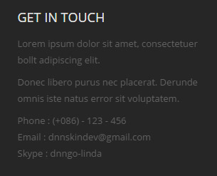
Codes are as follows:
<div class="animation fadeInUp">
  <p>Lorem ipsum dolor sit amet, consectetuer bollt adipiscing elit. </p>
  <p>Donec libero purus nec placerat. Derunde omnis iste natus error sit voluptatem. </p>
  Phone :    (+086) - 123 - 456<br />
  Email  :    dnnskindev@gmail.com<br />
  Skype :    dnngo-linda<br />
</div>
Option:
Containeris usingContainer-18- You can modify
animationto change the animation on the slide. Animation list.
HomeVersion6
You can click the link to check HomeVersion6 demo. HomeVersion6
Banner area
Below is the screen shot:
It is using DNNGo LayerGalleryPro module here,you can import ContentListEntity-Home6.xml of the DNNGo_LayerGalleryPro folder to duplicate banner of the demo.
Services List area
Below is the screen shot:
Codes are as follows:
<div class="home6_text1 text-center pb-60 pt-60">
  <div class="row">
    <div class="col-sm-4 animation fadeInUp delay1">
      <div class="home6_text1_img"><img alt="" src="/portals/30/home6_img1.png" /></div>
      <div class="home6_head">
        <h4>Videos</h4>
        <h3>Youtube Play</h3>
        <div class="line_center"></div>
      </div>
      <p>Sed ut perspiciatis unde omnis iste natus error sit voluptatem accusantium dolore mque laudan tium, totam rem aperiam, eaque ipsa quae ab illo inventore veritatis  adipiscing elit.</p>
      <a href="#">Read More ></a> </div>
    <div class="col-sm-4 animation fadeInUp delay2">
      <div class="home6_text1_img"><img alt="" src="/portals/30/home6_img2.png" /></div>
      <div class="home6_head">
        <h4>Email</h4>
        <h3>Get In Touch</h3>
        <div class="line_center"></div>
      </div>
      <p>Sed ut perspiciatis unde omnis iste natus error sit voluptatem accusantium dolore mque laudan tium, totam rem aperiam, eaque ipsa quae ab illo inventore veritatis  adipiscing elit.</p>
      <a href="#">Read More ></a> </div>
    <div class="col-sm-4 animation fadeInUp delay3">
      <div class="home6_text1_img"><img alt="" src="/portals/30/home6_img3.png" /></div>
      <div class="home6_head">
        <h4>Images</h4>
        <h3>Photo Gallery</h3>
        <div class="line_center"></div>
      </div>
      <p>Sed ut perspiciatis unde omnis iste natus error sit voluptatem accusantium dolore mque laudan tium, totam rem aperiam, eaque ipsa quae ab illo inventore veritatis  adipiscing elit.</p>
      <a href="#">Read More ></a> </div>
  </div>
</div>
Option:
- You can modify
animationto change the animation on the slide. Animation list. col-sm-*is the width of each column, you can change the width you need through value1~12.
WHO WE ARE area
Below is the screen shot:

Codes are as follows:
<div class="home6_full_bg1 clearfix">
  <div class="home6_full_bg1_l">
    <div class="home6_head">
      <h4>Hello World !</h4>
      <h3>Who We Are</h3>
      <div class="line"></div>
    </div>
    <div class="animation fadeInLeft">
      <p>DNNGO.NET is recognised as one of the most professional websites who have been specialized in designing, developing DNN Skins, DNN Modules and Sites since 2008. So far we have owned hundreds of skins and modules, what's more, we will keep developing and releasing on a regular basis. Our brilliant developers have been using the most advanced and cutting-edge development technology, such as HTML5 and CSS3...which will definitely give your business website an outstanding look.</p>
      <p>We are a team comprised of experienced developers and reliable designers whose aim is to provide you with compelling, engaging and satisfying skins and modules.</p>
      <div class="home6_full_bg1_btn"><a href="#" class="Button_default">Learn More</a></div>
    </div>
  </div>
  <div class="home6_full_bg1_r"> </div>
</div>
Option:
- You can modify
animationto change the animation on the slide. Animation list.
LATEST PORTFOLIOS area
Below is the screen shot:
Codes are as follows:
<div class="home6_isotope text-center pt-60">
  <div class="home6_head">
    <h4>Our Recent Works</h4>
    <h3>latest Portfolios</h3>
    <div class="line_center"></div>
  </div>
  <div class="dnn_layout">
    <div class="content_mid">
      <p>Donec in ut odio libero, at vulputate urna. Nulla tristique mi a massa convallis cursus. Nulla eu mi magna. Etiam suscipit commodo gravida. Cras suscipit, quam vitae adipiscing faucibus, risus nibh laoreet odio, a porttitor metus eros ut enim.</p>
    </div>
  </div>
  <div class="isotope_grid animation scaleUp">
    <div class="isotope_group"> <a class="active" href="#" data-filter="*">ALL</a> <a href="#" data-filter=".photography">PHOTOGRAPHY</a> <a href="#" data-filter=".webdesign">WEB DESIGN</a> <a href="#" data-filter=".blogs">BLOG</a> </div>
    <div class="loading">
      <div class="loading-container container1">
        <div class="circle1"></div>
        <div class="circle2"></div>
        <div class="circle3"></div>
        <div class="circle4"></div>
      </div>
      <div class="loading-container container2">
        <div class="circle1"></div>
        <div class="circle2"></div>
        <div class="circle3"></div>
        <div class="circle4"></div>
      </div>
      <div class="loading-container container3">
        <div class="circle1"></div>
        <div class="circle2"></div>
        <div class="circle3"></div>
        <div class="circle4"></div>
      </div>
    </div>
    <div class="isotope_main" data-min-width="392">
      <div class="isotope_item photography">
        <div class="photo_box ico_right_rotate"> <a class="LightBox_image_gallery1" href="/Portals/30/home6_isotope1.jpg">
          <div class="pic_box"> <img alt="" src="/portals/30/home6_isotope1.jpg" />
            <div class="ico"><span class="glyphicons glyph-resize-full ico_right"></span></div>
            <div class="content">
              <div class="vertical_center_1">
                <div class="vertical_center_2">
                  <h3>DNN Modules</h3>
                  <p>April 12th,2014</p>
                </div>
              </div>
            </div>
            <div class="shade"></div>
          </div>
          </a> </div>
      </div>
      <div class="isotope_item webdesign">
        <div class="photo_box ico_right_rotate"> <a class="LightBox_image_gallery1" href="/Portals/30/home6_isotope2.jpg">
          <div class="pic_box"> <img alt="" src="/portals/30/home6_isotope2.jpg" />
            <div class="ico"><span class="glyphicons glyph-resize-full ico_right"></span></div>
            <div class="content">
              <div class="vertical_center_1">
                <div class="vertical_center_2">
                  <h3>DNN Modules</h3>
                  <p>April 12th,2014</p>
                </div>
              </div>
            </div>
            <div class="shade"></div>
          </div>
          </a> </div>
      </div>
      <div class="isotope_item photography blogs">
        <div class="photo_box ico_right_rotate"> <a class="LightBox_image_gallery1" href="/Portals/30/home6_isotope3.jpg">
          <div class="pic_box"> <img alt="" src="/portals/30/home6_isotope3.jpg" />
            <div class="ico"><span class="glyphicons glyph-resize-full ico_right"></span></div>
            <div class="content">
              <div class="vertical_center_1">
                <div class="vertical_center_2">
                  <h3>DNN Modules</h3>
                  <p>April 12th,2014</p>
                </div>
              </div>
            </div>
            <div class="shade"></div>
          </div>
          </a> </div>
      </div>
      <div class="isotope_item photography">
        <div class="photo_box ico_right_rotate"> <a class="LightBox_image_gallery1" href="/Portals/30/home6_isotope4.jpg">
          <div class="pic_box"> <img alt="" src="/portals/30/home6_isotope4.jpg" />
            <div class="ico"><span class="glyphicons glyph-resize-full ico_right"></span></div>
            <div class="content">
              <div class="vertical_center_1">
                <div class="vertical_center_2">
                  <h3>DNN Modules</h3>
                  <p>April 12th,2014</p>
                </div>
              </div>
            </div>
            <div class="shade"></div>
          </div>
          </a> </div>
      </div>
      <div class="isotope_item photography webdesign blogs">
        <div class="photo_box ico_right_rotate"> <a class="LightBox_image_gallery1" href="/Portals/30/home6_isotope5.jpg">
          <div class="pic_box"> <img alt="" src="/portals/30/home6_isotope5.jpg" />
            <div class="ico"><span class="glyphicons glyph-resize-full ico_right"></span></div>
            <div class="content">
              <div class="vertical_center_1">
                <div class="vertical_center_2">
                  <h3>DNN Modules</h3>
                  <p>April 12th,2014</p>
                </div>
              </div>
            </div>
            <div class="shade"></div>
          </div>
          </a> </div>
      </div>
      <div class="isotope_item webdesign blogs">
        <div class="photo_box ico_right_rotate"> <a class="LightBox_image_gallery1" href="/Portals/30/home6_isotope6.jpg">
          <div class="pic_box"> <img alt="" src="/portals/30/home6_isotope6.jpg" />
            <div class="ico"><span class="glyphicons glyph-resize-full ico_right"></span></div>
            <div class="content">
              <div class="vertical_center_1">
                <div class="vertical_center_2">
                  <h3>DNN Modules</h3>
                  <p>April 12th,2014</p>
                </div>
              </div>
            </div>
            <div class="shade"></div>
          </div>
          </a> </div>
      </div>
      <div class="isotope_item webdesign">
        <div class="photo_box ico_right_rotate"> <a class="LightBox_image_gallery1" href="/Portals/30/home6_isotope7.jpg">
          <div class="pic_box"> <img alt="" src="/portals/30/home6_isotope7.jpg" />
            <div class="ico"><span class="glyphicons glyph-resize-full ico_right"></span></div>
            <div class="content">
              <div class="vertical_center_1">
                <div class="vertical_center_2">
                  <h3>DNN Modules</h3>
                  <p>April 12th,2014</p>
                </div>
              </div>
            </div>
            <div class="shade"></div>
          </div>
          </a> </div>
      </div>
      <div class="isotope_item photography blogs">
        <div class="photo_box ico_right_rotate"> <a class="LightBox_image_gallery1" href="/Portals/30/home6_isotope8.jpg">
          <div class="pic_box"> <img alt="" src="/portals/30/home6_isotope8.jpg" />
            <div class="ico"><span class="glyphicons glyph-resize-full ico_right"></span></div>
            <div class="content">
              <div class="vertical_center_1">
                <div class="vertical_center_2">
                  <h3>DNN Modules</h3>
                  <p>April 12th,2014</p>
                </div>
              </div>
            </div>
            <div class="shade"></div>
          </div>
          </a> </div>
      </div>
    </div>
  </div>
</div>
Option:
- You can modify
animationto change and delete animation. Animation list. - You can modify
glyphiconsto change icons. font icon list.
Number area
Below is the screen shot:
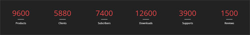
Codes are as follows:
<div class="home6_number_bg">
  <div class="number_Animation row pt-60 pb-60 animation scaleUp">
    <div class="col-xs-6 col-sm-4 col-md-2"> <span class="animation  number" data-number="9600">0</span>
      <div class="home6_number_line"></div>
      <p>Products</p>
    </div>
    <div class="col-xs-6 col-sm-4 col-md-2"> <span class="animation  number" data-number="5880">0</span>
      <div class="home6_number_line"></div>
      <p>Clients</p>
    </div>
    <div class="col-xs-6 col-sm-4 col-md-2"> <span class="animation  number" data-number="7400">0</span>
      <div class="home6_number_line"></div>
      <p>Subcribers</p>
    </div>
    <div class="col-xs-6 col-sm-4 col-md-2 "> <span class="animation  number" data-number="12600">0</span>
      <div class="home6_number_line"></div>
      <p>Downloads</p>
    </div>
    <div class="col-xs-6 col-sm-4 col-md-2"> <span class="animation  number" data-number="3900">0</span>
      <div class="home6_number_line"></div>
      <p>Supports</p>
    </div>
    <div class="col-xs-6 col-sm-4 col-md-2"> <span class="animation  number" data-number="1500">0</span>
      <div class="home6_number_line"></div>
      <p>Reviews</p>
    </div>
  </div>
</div>
Option:
- You can change the value you need to display through
data-number col-xs-* col-sm-* col-md-*is the width of each column, you can change the width you need through value1~12.- You can modify
animationto change the animation on the slide. Animation list.
POWERFUL TECHNOLOGY area
Below is the screen shot:
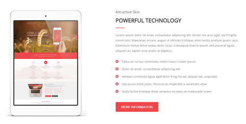
Codes are as follows:
<div class="home6_text2 row pt-60 pb-60">
  <div class="col-sm-6">
    <div class="home6_text2_left text-center animation fadeInLeft"> <img alt="" src="/portals/30/home6_img5.png" class="img-responsive img_display" /> </div>
  </div>
  <div class="col-sm-6">
    <div class="home6_head">
      <h4>Attractive Skin</h4>
      <h3>Powerful Technology</h3>
      <div class="line"></div>
    </div>
    <div class="animation fadeInRight">
      <p>Lorem ipsum dolor sit amet, consectetur adipiscing elit. Donec nec eros eget nisl fringilla comm odo. Maecenas ornare, augue ut ultricies tristique, enim lectus pretium quam, quis bibendum metus tellus sedeu dolor lacus. Consequat viverra ipsum, sed placerat ligula aliquam eu sapien eros enatis at dapibus.</p>
      <div class="home6_text2_ul">
        <ul>
          <li><span class="glyphicons glyph-circle-plus"></span>Tellus ac cursus commodo, tortor mauri Lorem ipsum</li>
          <li><span class="glyphicons glyph-circle-plus"></span>Dolor sit amet, consectetuer adipiscing elit</li>
          <li><span class="glyphicons glyph-circle-plus"></span>Aenean commodo ligula eget dolor fring illa vel, aliquet nec, vulputate</li>
          <li><span class="glyphicons glyph-circle-plus"></span>Get arcuin enim justo, rhoncus ut, imperdiet a, venenatis vitae</li>
          <li><span class="glyphicons glyph-circle-plus"></span>Nulla facilisi tristique dolor senectus et netus et malesuada lorem</li>
        </ul>
      </div>
      <a href="#" class="Button_default">More Information</a> </div>
  </div>
</div>
Option:
col-sm-*is the width of each column, you can change the width you need through value1~12.- You can modify
glyphiconsto change icons. font icon list. - You can modify
animationto change the animation on the slide. Animation list.
FEATURED THEME area
Below is the screen shot:
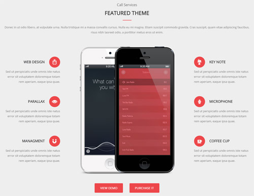
Codes are as follows:
<div class="home6_full_bg1 text-center pt-60 pb-60">
  <div class="dnn_layout">
    <div class="content_mid">
      <div class="home6_head">
        <h4>Call Services</h4>
        <h3>Featured Theme</h3>
        <div class="line_center"></div>
      </div>
      <p>Donec in ut odio libero, at vulputate urna. Nulla tristique mi a massa convallis cursus. Nulla eu mi magna. Etiam suscipit commodo gravida. Cras suscipit, quam vitae adipiscing faucibus, risus nibh laoreet odio, a porttitor metus eros ut enim.</p>
      <div class="home6_text3">
        <div class="row">
          <div class="col-sm-3">
            <div class="home6_text3_left">
              <div class="animation fadeInLeft">
                <p class="home6_text3_left_title clearfix">web design<span class="glyphicons glyph-luggage"></span></p>
                <p>Sed ut perspiciatis unde omnis iste natus error sit voluptatem doloremque totam rem aperiam, eaque ipsa quae.</p>
              </div>
              <div class="animation fadeInLeft">
                <p class="home6_text3_left_title clearfix">Parallax<span class="glyphicons glyph-eye-open"></span></p>
                <p>Sed ut perspiciatis unde omnis iste natus error sit voluptatem doloremque totam rem aperiam, eaque ipsa quae.</p>
              </div>
              <div class="animation fadeInLeft">
                <p class="home6_text3_left_title clearfix">Managment<span class="glyphicons glyph-magnet"></span></p>
                <p>Sed ut perspiciatis unde omnis iste natus error sit voluptatem doloremque totam rem aperiam, eaque ipsa quae.</p>
              </div>
            </div>
          </div>
          <div class="col-sm-6 text-center animation scaleUp"> <img alt="" src="/portals/30/home6_img6.png" class="img-responsive img_display" />
            <div class="home6_text3_btn"><a href="#" class="Button_default">View Demo</a><a href="#" class="Button_default">Purchase It</a></div>
          </div>
          <div class="col-sm-3">
            <div class="home6_text3_right">
              <div class="animation fadeInRight">
                <p class="home6_text3_right_title clearfix">Key Note<span class="glyphicons glyph-keynote"></span></p>
                <p>Sed ut perspiciatis unde omnis iste natus error sit voluptatem doloremque totam rem aperiam, eaque ipsa quae.</p>
              </div>
              <div class="animation fadeInRight">
                <p class="home6_text3_right_title clearfix">Microphone<span class="glyphicons glyph-microphone"></span></p>
                <p>Sed ut perspiciatis unde omnis iste natus error sit voluptatem doloremque totam rem aperiam, eaque ipsa quae.</p>
              </div>
              <div class="animation fadeInRight">
                <p class="home6_text3_right_title clearfix">Coffee Cup<span class="glyphicons glyph-coffe-cup"></span></p>
                <p>Sed ut perspiciatis unde omnis iste natus error sit voluptatem doloremque totam rem aperiam, eaque ipsa quae.</p>
              </div>
            </div>
          </div>
        </div>
      </div>
    </div>
  </div>
</div>
Option:
col-sm-*is the width of each column, you can change the width you need through value1~12.- You can modify
animationto change the animation on the slide. Animation list. - You can modify
glyphiconsto change icons. font icon list.
CREATIVE WEB DESIGN area
Below is the screen shot:

Codes are as follows:
<div class="three_equal_height">
  <div class="table_cell1">
    <div class="home6_head">
      <h4>The First Step</h4>
      <h3>Creative Web Design</h3>
      <div class="line"></div>
    </div>
    <div class="animation scaleUp">
      <p>Donec in ut odio libero, at vulputate urna. Nulla tristique mi a massa convallis cursus. Nulla eu mi magna. Etiam suscipit commodo gravida. Cras suscipit, quam vitae adipiscing faucibus, risus nibh laoreet odio.</p>
      <a class="table_cell_btn" href="#">Read More</a> </div>
  </div>
  <div class="table_cell2">
    <div class="home6_head">
      <h4>The Second Step</h4>
      <h3>DNN Skin Development</h3>
      <div class="line"></div>
    </div>
    <div class="animation scaleUp">
      <p>Donec in ut odio libero, at vulputate urna. Nulla tristique mi a massa convallis cursus. Nulla eu mi magna. Etiam suscipit commodo gravida. Cras suscipit, quam vitae adipiscing faucibus, risus nibh laoreet odio.</p>
      <a class="table_cell_btn" href="#">Read More</a> </div>
  </div>
  <div class="table_cell3">
    <div class="home6_head">
      <h4>The Third Step</h4>
      <h3>Programme Testing</h3>
      <div class="line"></div>
    </div>
    <div class="animation scaleUp">
      <p>Donec in ut odio libero, at vulputate urna. Nulla tristique mi a massa convallis cursus. Nulla eu mi magna. Etiam suscipit commodo gravida. Cras suscipit, quam vitae adipiscing faucibus, risus nibh laoreet odio.</p>
      <a class="table_cell_btn" href="#">Read More</a> </div>
  </div>
</div>
Option:
- You can modify
animationto change the animation on the slide. Animation list.
MEET OUR TEAMS area
Below is the screen shot:
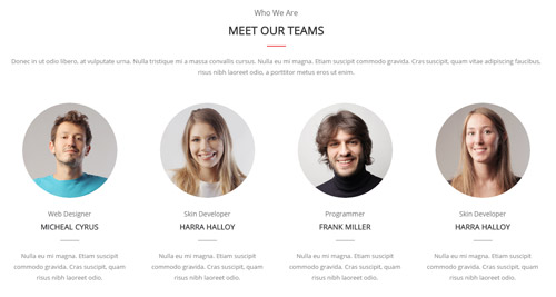
Codes are as follows:
<div class="home6_team text-center pt-60 pb-60">
  <div class="home6_head">
    <h4>Who We Are</h4>
    <h3>Meet Our Teams</h3>
    <div class="line_center"></div>
  </div>
  <p>Donec in ut odio libero, at vulputate urna. Nulla tristique mi a massa convallis cursus. Nulla eu mi magna. Etiam suscipit commodo gravida. Cras suscipit, quam vitae adipiscing faucibus, risus nibh laoreet odio, a porttitor metus eros ut enim.</p>
  <div class="home6_team_content animation scaleUp">
    <div class="row">
      <div class="col-sm-3">
        <div class="photo_box">
          <div class="pic_box"> <img alt="" src="/portals/30/home6_team_img1.png" class="img-responsive" />
            <div class="shade"></div>
          </div>
        </div>
        <div class="home6_head">
          <h4>Web Designer</h4>
          <h3>Micheal Cyrus</h3>
          <div class="line_center"></div>
        </div>
        <p>Nulla eu mi magna. Etiam suscipit commodo gravida. Cras suscipit, quam risus nibh laoreet odio.</p>
      </div>
      <div class="col-sm-3">
        <div class="photo_box">
          <div class="pic_box"> <img alt="" src="/portals/30/home6_team_img2.png" class="img-responsive" />
            <div class="shade"></div>
          </div>
        </div>
        <div class="home6_head">
          <h4>Skin Developer</h4>
          <h3>Harra Halloy</h3>
          <div class="line_center"></div>
        </div>
        <p>Nulla eu mi magna. Etiam suscipit commodo gravida. Cras suscipit, quam risus nibh laoreet odio.</p>
      </div>
      <div class="col-sm-3">
        <div class="photo_box">
          <div class="pic_box"> <img alt="" src="/portals/30/home6_team_img3.png" class="img-responsive" />
            <div class="shade"></div>
          </div>
        </div>
        <div class="home6_head">
          <h4>Programmer</h4>
          <h3>Frank Miller</h3>
          <div class="line_center"></div>
        </div>
        <p>Nulla eu mi magna. Etiam suscipit commodo gravida. Cras suscipit, quam risus nibh laoreet odio.</p>
      </div>
      <div class="col-sm-3">
        <div class="photo_box">
          <div class="pic_box"> <img alt="" src="/portals/30/home6_team_img4.png" class="img-responsive" />
            <div class="shade"></div>
          </div>
        </div>
        <div class="home6_head">
          <h4>Skin Developer</h4>
          <h3>Harra Halloy</h3>
          <div class="line_center"></div>
        </div>
        <p>Nulla eu mi magna. Etiam suscipit commodo gravida. Cras suscipit, quam risus nibh laoreet odio.</p>
      </div>
    </div>
  </div>
</div>
Option:
col-sm-*is the width of each column, you can change the width you need through value1~12.- You can modify
animationto change the animation on the slide. Animation list.
Our Clients area
Below is the screen shot:
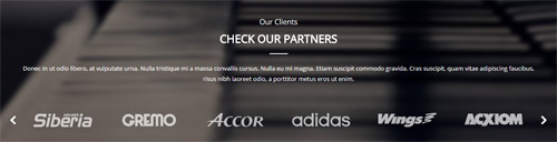
Codes are as follows:
<div class="home6_full_bg2  text-center pt-60 pb-60">
  <div class="dnn_layout">
    <div class="content_mid">
      <div class="home6_head">
        <h4>Our Clients</h4>
        <h3>Check Our Partners</h3>
        <div class="line_center"></div>
      </div>
      <p>Donec in ut odio libero, at vulputate urna. Nulla tristique mi a massa convallis cursus. Nulla eu mi magna. Etiam suscipit commodo gravida. Cras suscipit, quam vitae adipiscing faucibus, risus nibh laoreet odio, a porttitor metus eros ut enim.</p>
      <div class="carousel carousel_6 animation scaleUp">
        <div class="item"> <img alt="" src="/portals/30/carousel_6_img1.png" /> </div>
        <div class="item"> <img alt="" src="/portals/30/carousel_6_img2.png" /> </div>
        <div class="item"> <img alt="" src="/portals/30/carousel_6_img3.png" /> </div>
        <div class="item"> <img alt="" src="/portals/30/carousel_6_img4.png" /> </div>
        <div class="item"> <img alt="" src="/portals/30/carousel_6_img5.png" /> </div>
        <div class="item"> <img alt="" src="/portals/30/carousel_6_img6.png" /> </div>
        <div class="item"> <img alt="" src="/portals/30/carousel_6_img1.png" /> </div>
        <div class="item"> <img alt="" src="/portals/30/carousel_6_img2.png" /> </div>
      </div>
    </div>
  </div>
</div>
Option:
- This is a
ProgressBars Counterseffect. Carousel
GET IN TOUCH WITH US area
Below is the screen shot:
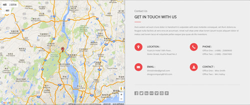
Codes are as follows:
<div class="home6_full_bg1 clearfix">
  <div id="gmap01" class="gmap"></div>
  <div class="home6_contact">
    <div class="home6_head">
      <h4>Contact Us</h4>
      <h3>Get IN Touch With US</h3>
      <div class="line"></div>
    </div>
    <div class="animation fadeInRight">
      <p>Duis autem vel eum iriure dolor in hendrerit in vulputate velit esse molestie consequat, vel illum dolore eu feugiat nulla facilisis at vero eros et accumsan. Amet null vitae ante vitae lorem ipsum turpis aliquam dolor id metus sed lorem lacus et vulputate pellen eaque ipsa quae ab illo inventore.</p>
      <div class="home6_contact_info">
        <div class="row">
          <div class="col-sm-6 clearfix"> <span class="glyphicons glyph-google-maps"></span>
            <div class="home6_contact_info_right"> <span>Location :</span>
              <div>YuanLin Hotel 16th Floor,</div>
              <div>XinAn Street, HuaYu Road No.2</div>
            </div>
          </div>
          <div class="col-sm-6 clearfix"> <span class="glyphicons glyph-earphone"></span>
            <div class="home6_contact_info_right"> <span>Phone :</span>
              <div>Office One :  (+088) - 25889600</div>
              <div>Office Two :  (+088) - 25667400</div>
            </div>
          </div>
        </div>
        <div class="row">
          <div class="col-sm-6 clearfix"> <span class="glyphicons glyph-envelope"></span>
            <div class="home6_contact_info_right"> <span>Email :</span>
              <div>dnnskindev@gmail.com</div>
              <div>dnngocompany@163.com</div>
            </div>
          </div>
          <div class="col-sm-6 clearfix"> <span class="glyphicons glyph-user"></span>
            <div class="home6_contact_info_right"> <span>Contact :</span>
              <div>Office One :  Miss Smith</div>
              <div>Office Two :  Mrs Halloy</div>
            </div>
          </div>
        </div>
      </div>
      <div class="home6_contact_social clearfix"> <a href="#"><span class="social social-facebook"></span></a> <a href="#"><span class="social social-twitter"></span></a> <a href="#"><span class="social social-linked-in"></span></a> <a href="#"><span class="social social-flickr"></span></a> <a href="#"><span class="social social-vimeo"></span></a> <a href="#"><span class="social social-dribbble"></span></a> <a href="#"><span class="social social-pinterest"></span></a> </div>
    </div>
  </div>
</div>
Option:
- You can modify
animationto change the animation on the slide. Animation list. col-sm-*is the width of each column, you can change the width you need through value1~12- You can modify
glyphiconsto change icons. font icon list.
ABOUT US area
Below is the screen shot:
Codes are as follows:
<div class="home6_foot_about animation scaleUp">
	<img alt="" src="/portals/30/home6_foot_logo.png" class="img-responsive" />
	<p>Sed ut perspiciatis unde omnis iste natus error sit volup tatem accusantium dolore mque laudan tium, totam rem aperiam, eaque ipsa quae ab illo inventore veritatis et quasi archi tecto beatae. Lorem ipsum dolor sit amet, consectetur adipiscing elit. Nunc nibh diam, blan dit vitae vehicula dapibus.</p>
	<a>Read More<span class="arrow_icon"></span></a>
</div>
Option:
- You can modify
animationto change the animation on the slide. Animation list. Containeris usingContainer-21
RECENT NEWS area
Below is the screen shot:
Codes are as follows:
<div class="animation scaleUp">
  <div class="home6_foot_news clearfix"> <img alt="" src="/portals/30/home6_img7.jpg" />
    <div class="news_p1">Umlimited Colors Skinpack</div>
    <div class="news_p2">Integer et risus quis commodo diam gravida</div>
  </div>
  <div class="home6_foot_news clearfix"> <img alt="" src="/portals/30/home6_img8.jpg" />
    <div class="news_p1">Responsive Design</div>
    <div class="news_p2">Massa convallis cursus. etiamnon</div>
  </div>
  <div class="home6_foot_news clearfix"> <img alt="" src="/portals/30/home6_img9.jpg" />
    <div class="news_p1">Amazing Video Posts</div>
    <div class="news_p2">Omnis iste natus error sit voluptatem accu</div>
  </div>
</div>
Option:
- You can modify
animationto change the animation on the slide. Animation list. Containeris usingContainer-21
EMAIL US area
Below is the screen shot:
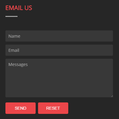
Option:
- This is
Theme_Responsive_20060_home6theme ofDNNGo PowerFormsmodule Containeris usingContainer-21
HomeVersion7 One Page
You can click the link to check HomeVersion7 demo. HomeVersion7
Anchor area
It will scroll to the corresponding area on the page when clicking the menu texts at the top. It will also do so when clicking the dots on the right of the skin.
These anchors are generated through page's anchorTag. Codes are as follows. You can place this piece of codes in page's HTML module, click the right anchor, then page will slide to this HTML module area.
- <div data-title="About Us" class="anchorTag" data-offset="-60" data-scrollshownav="true" data-menuanchor="true"> </div>
Option:
data-title |
Title displayed correspondingly to the right navigation. If page title of the menu is the same as data-title, page will scroll to this area when clicking menu texts. |
data-menuanchor |
Whether to enable menu anchor feature or not. |
data-scrollshownav |
Whether to enable navigation or not. |
data-offset |
Offset value of up and down coordinate for anchor. |
data-icourl |
Image url that displays correspondingly of the right navigation. |
data-iconame |
Icon class names that displays correspondingly of the right navigation. |
How to set menu anchor
- Click Add New Page button.
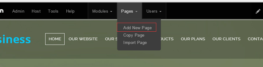
- Fill in Page Name and Page Title. Texts for Page Title needs to be the same as that of data-title.
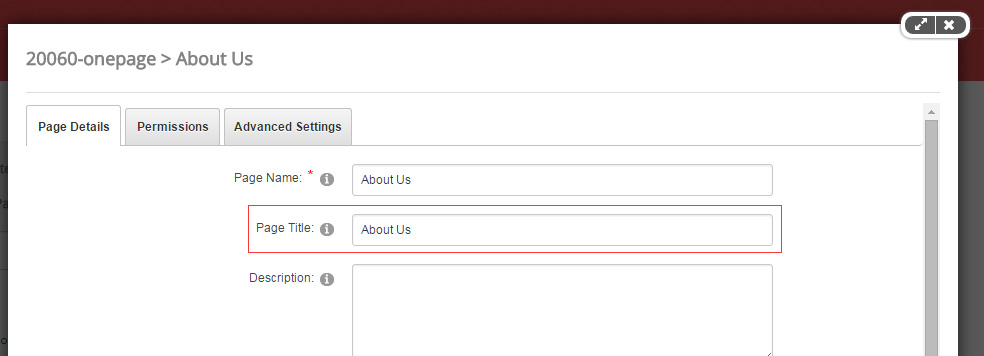
- Put the anchor code to HTML module of the page. It will scroll to the corresponding area on the page when clicking the top menu texts.
- <div data-title="About Us" class="anchorTag" data-offset="-60" data-scrollshownav="true" data-menuanchor="true"> </div>
Banner area
Below is the screen shot:
It is using DNNGo LayerGalleryPro module here,you can import ContentListEntity-Home7.xml of the DNNGo_LayerGalleryPro folder to duplicate banner of the demo.
ABOUT US area
Below is the screen shot:
Codes are as follows:
<div class="home7_anchor_bg text-center pt-60 pb-60">
  <div data-menuanchor="true" data-scrollshownav="true" data-offset="-60" class="anchorTag" data-title="About Us"> </div>
  <div class="anchor_title"> About Us
    <div class="title_left_line"> <img alt="" src="/portals/1043/home7_left_line.png" /> </div>
    <div class="title_right_line"> <img alt="" src="/portals/1043/home7_right_line.png" /> </div>
  </div>
  <p class="pr-15 pl-15">Welcome to our website, you can get some information about us from here</p>
</div>
WHO WE ARE area
Below is the screen shot:
Codes are as follows:
<div class="home7_text1 text-center pb-60">
  <p class="pr-10 pl-10">Donec in ut odio libero, at vulputate urna. Nulla tristique mi a massa convallis cursus. Nulla eu mi magna. Etiam suscipit c risus nibh laoreet odio, a porttitor metus eros ut enim  senectus et netus et malesuada fames turpis egestas..</p>
  <div class="home7_text1_content row">
    <div class="col-sm-4 animation fadeInUp delay1"> <img alt="" src="/portals/30/home7_img1.png" />
      <h3>Umlimited Colors</h3>
      <p>Maecenas faucibus mollis interdum. Vivamus sagittis lacus vel augue laoreet rutrum faucibus dolor auctor. Praesent commodo cursus magna, vel scelerisque nisl consectetur sit amet non magna.</p>
      <a href="#">Read More<span class="arrow_icon"></span></a> </div>
    <div class="col-sm-4 animation fadeInUp delay2"> <img alt="" src="/portals/30/home7_img2.png" />
      <h3>Best solutions</h3>
      <p>Maecenas faucibus mollis interdum. Vivamus sagittis lacus vel augue laoreet rutrum faucibus dolor auctor. Praesent commodo cursus magna, vel scelerisque nisl consectetur sit amet non magna.</p>
      <a href="#">Read More<span class="arrow_icon"></span></a> </div>
    <div class="col-sm-4 animation fadeInUp delay3"> <img alt="" src="/portals/30/home7_img3.png" />
      <h3>Major Browsers</h3>
      <p>Maecenas faucibus mollis interdum. Vivamus sagittis lacus vel augue laoreet rutrum faucibus dolor auctor. Praesent commodo cursus magna, vel scelerisque nisl consectetur sit amet non magna.</p>
      <a href="#">Read More<span class="arrow_icon"></span></a> </div>
  </div>
</div>
Option:
col-sm-*is the width of each column, you can change the width you need through value1~12.- You can modify
animationto change the animation on the slide. Animation list.
WHAT WE DO area
Below is the screen shot:
Codes are as follows:
<div class="home7_full_bg1 pt-60 pb-60">
  <div class="dnn_layout">
    <div class="content_mid">
      <div class="row">
        <div class="col-sm-6 animation fadeInLeft"> <img alt="" src="/portals/30/home7_img4.png" class="img-responsive" /> </div>
        <div class="col-sm-6">
          <div class="home7_head">
            <h3>What We Do</h3>
            <div class="dash_line"></div>
          </div>
          <div class="animation fadeInRight">
            <p>Sed ut perspiciatis unde omnis iste natus error sit voluptatem accusantium dolore mque laudan tium, totam rem aperiam, eaque ipsa quae ab illo inventore veritatis et quasi architecto beatae, habitant morbi tristique senectus et netus et malesuada fames turpis egestas.</p>
            <div class="home7_text2_ul">
              <div class="row">
                <div class="col-sm-6">
                  <ul>
                    <li><span class="arrow_icon"></span>New Header & Footer</li>
                    <li><span class="arrow_icon"></span>5 Main Layout Styles</li>
                    <li><span class="arrow_icon"></span>Full & Boxed Layout</li>
                    <li><span class="arrow_icon"></span>Compatible with Browsers</li>
                    <li><span class="arrow_icon"></span>SEO Friendly & Optimized</li>
                    <li><span class="arrow_icon"></span>Customized Settings</li>
                  </ul>
                </div>
                <div class="col-sm-6">
                  <ul>
                    <li><span class="arrow_icon"></span>Ultra Responsive design</li>
                    <li><span class="arrow_icon"></span>Retina Ready</li>
                    <li><span class="arrow_icon"></span>Responsive Slider Banner</li>
                    <li><span class="arrow_icon"></span>CSS3 & HTML 5</li>
                    <li><span class="arrow_icon"></span>DNN6 & DNN7</li>
                    <li><span class="arrow_icon"></span>Hundreds of Google Fonts</li>
                  </ul>
                </div>
              </div>
            </div>
            <a class="Button_default" href="#">More Information</a> </div>
        </div>
      </div>
    </div>
  </div>
</div>
Option:
col-sm-*is the width of each column, you can change the width you need through value1~12.- You can modify
animationto change and delete animation. Animation list.
OUR TEAMS area
Below is the screen shot:

Codes are as follows:
<div class="home7_anchor_bg text-center pt-60 pb-60">
  <div data-menuanchor="true" data-scrollshownav="true" data-offset="-60" class="anchorTag" data-title="Our Teams"> </div>
  <div class="anchor_title"> Our Teams
    <div class="title_left_line"> <img alt="" src="/portals/1043/home7_left_line.png" /> </div>
    <div class="title_right_line"> <img alt="" src="/portals/1043/home7_right_line.png" /> </div>
  </div>
  <p class="pr-15 pl-15">We are a team comprised of experienced developers and reliable designers</p>
</div>
HOW WE CHARGE area
Below is the screen shot:
Codes are as follows:
<div class="home7_employees text-center pb-60">
  <p class="pr-10 pl-10">Donec in ut odio libero, at vulputate urna. Nulla tristique mi a massa convallis cursus. Nulla eu mi magna. Etiam suscipit c risus nibh laoreet odio, a porttitor metus eros ut enim  senectus et netus et malesuada fames turpis egestas..</p>
  <div class="home7_employees_content row animation scaleUp">
    <div class="col-sm-4"> <img alt="" src="/portals/30/home7_img5.jpg" class="img-responsive" />
      <h3>Frank Miller</h3>
      <h4>Web Designer</h4>
      <p>Sed ut perspiciatis unde omnis iste natus error sit voluptatem accusantium doloremque laudantium, totam rem aperiam, eaque ipsa quae ab illo dicta sunt explicabo.</p>
      <a href="#"><span class="glyphicons glyph-envelope"></span></a> <a href="#"><span class="glyphicons glyph-earphone"></span></a> <a href="#"><span class="glyphicons glyph-google-maps"></span></a> </div>
    <div class="col-sm-4"> <img alt="" src="/portals/30/home7_img6.jpg" class="img-responsive" />
      <h3>Mary Chris</h3>
      <h4>Programmer</h4>
      <p>Sed ut perspiciatis unde omnis iste natus error sit voluptatem accusantium doloremque laudantium, totam rem aperiam, eaque ipsa quae ab illo dicta sunt explicabo.</p>
      <a href="#"><span class="glyphicons glyph-envelope"></span></a> <a href="#"><span class="glyphicons glyph-earphone"></span></a> <a href="#"><span class="glyphicons glyph-google-maps"></span></a> </div>
    <div class="col-sm-4"> <img alt="" src="/portals/30/home7_img7.jpg" class="img-responsive" />
      <h3>Harra Halloy</h3>
      <h4>Developer</h4>
      <p>Sed ut perspiciatis unde omnis iste natus error sit voluptatem accusantium doloremque laudantium, totam rem aperiam, eaque ipsa quae ab illo dicta sunt explicabo.</p>
      <a href="#"><span class="glyphicons glyph-envelope"></span></a> <a href="#"><span class="glyphicons glyph-earphone"></span></a> <a href="#"><span class="glyphicons glyph-google-maps"></span></a> </div>
  </div>
</div>
Option:
col-sm-*is the width of each column, you can change the width you need through value1~12.- You can modify
glyphiconsto change icons. font icon list. - You can modify
animationto change the animation on the slide. Animation list.
OUR SKILLS area
Below is the screen shot:
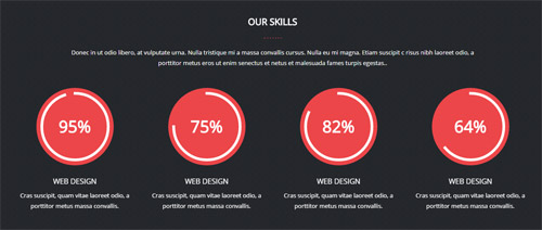
Codes are as follows:
<div class="home7_full_bg2 text-center pt-60 pb-60">
  <div class="dnn_layout">
    <div class="content_mid">
      <div class="home7_head">
        <h3>Our Skills</h3>
        <div class="dash_line_center"></div>
      </div>
      <p class="pr-10 pl-10">Donec in ut odio libero, at vulputate urna. Nulla tristique mi a massa convallis cursus. Nulla eu mi magna. Etiam suscipit c risus nibh laoreet odio, a porttitor metus eros ut enim  senectus et netus et malesuada fames turpis egestas..</p>
      <div class="chart_list1 row animation scaleUp">
        <div class="col-md-3 col-sm-6">
          <div data-percent="95" class="percentage2">
            <div class="percentage_inner"><span>0</span>%</div>
          </div>
          <h3>Web Design</h3>
          <p>Cras suscipit, quam vitae  laoreet odio, a porttitor metus  massa convallis.</p>
        </div>
        <div class="col-md-3 col-sm-6">
          <div data-percent="75" class="percentage2">
            <div class="percentage_inner"><span>0</span>%</div>
          </div>
          <h3>Web Design</h3>
          <p>Cras suscipit, quam vitae  laoreet odio, a porttitor metus  massa convallis.</p>
        </div>
        <div class="col-md-3 col-sm-6">
          <div data-percent="82" class="percentage2">
            <div class="percentage_inner"><span>0</span>%</div>
          </div>
          <h3>Web Design</h3>
          <p>Cras suscipit, quam vitae  laoreet odio, a porttitor metus  massa convallis.</p>
        </div>
        <div class="col-md-3 col-sm-6">
          <div data-percent="64" class="percentage2">
            <div class="percentage_inner"><span>0</span>%</div>
          </div>
          <h3>Web Design</h3>
          <p>Cras suscipit, quam vitae  laoreet odio, a porttitor metus  massa convallis.</p>
        </div>
      </div>
    </div>
  </div>
</div>
Option:
col-sm-* col-md-*is the width of each column, you can change the width you need through value1~12.- You can modify
animationto change the animation on the slide. Animation list. data-percentis for controlling the percentage that displays, you can display percentage through value0~100
SERVICES area
Below is the screen shot:
Codes are as follows:
<div class="home7_anchor_bg text-center pt-60 pb-60">
  <div data-menuanchor="true" data-scrollshownav="true" data-offset="-60" class="anchorTag" data-title="Services"> </div>
  <div class="anchor_title"> Services
    <div class="title_left_line"> <img alt="" src="/portals/1043/home7_left_line.png" /> </div>
    <div class="title_right_line"> <img alt="" src="/portals/1043/home7_right_line.png" /> </div>
  </div>
  <p class="pr-15 pl-15">Customization services ensure what exactly you want, skins or modules</p>
</div>
WHY CHOOSE US area
Below is the screen shot:
Codes are as follows:
<div class="dnn_layout">
  <div class="content_mid">
    <div class="home7_text3 pb-60">
      <p class="text-center pr-10 pl-10">Donec in ut odio libero, at vulputate urna. Nulla tristique mi a massa convallis cursus. Nulla eu mi magna. Etiam suscipit c risus nibh laoreet odio, a porttitor metus eros ut enim  senectus et netus et malesuada fames turpis egestas..</p>
      <div class="home7_text3_content">
        <div class="row">
          <div class="col-sm-4 animation fadeInUp delay1"> <span class="glyphicons glyph-headphones"></span>
            <div class="home7_text3_right">
              <h3>Listen to Music</h3>
              <p>Lorem ipsum dolor sit amet, consectetur adipi sicing elit. Vitae, eius perferendis temporibus sequi magni odit repellat.</p>
            </div>
          </div>
          <div class="col-sm-4 animation fadeInUp delay2"> <span class="glyphicons glyph-repeat"></span>
            <div class="home7_text3_right">
              <h3>Revocation</h3>
              <p>Lorem ipsum dolor sit amet, consectetur adipi sicing elit. Vitae, eius perferendis temporibus sequi magni odit repellat.</p>
            </div>
          </div>
          <div class="col-sm-4 animation fadeInUp delay3"> <span class="glyphicons glyph-cogwheel"></span>
            <div class="home7_text3_right">
              <h3>Site Settings</h3>
              <p>Lorem ipsum dolor sit amet, consectetur adipi sicing elit. Vitae, eius perferendis temporibus sequi magni odit repellat.</p>
            </div>
          </div>
        </div>
        <div class="row">
          <div class="col-sm-4 animation fadeInUp delay4"> <span class="glyphicons glyph-fire"></span>
            <div class="home7_text3_right">
              <h3>COnsult Online</h3>
              <p>Lorem ipsum dolor sit amet, consectetur adipi sicing elit. Vitae, eius perferendis temporibus sequi magni odit repellat.</p>
            </div>
          </div>
          <div class="col-sm-4 animation fadeInUp delay5"> <span class="glyphicons glyph-clock"></span>
            <div class="home7_text3_right">
              <h3>Time O'clock</h3>
              <p>Lorem ipsum dolor sit amet, consectetur adipi sicing elit. Vitae, eius perferendis temporibus sequi magni odit repellat.</p>
            </div>
          </div>
          <div class="col-sm-4 animation fadeInUp delay6"> <span class="glyphicons glyph-flag"></span>
            <div class="home7_text3_right">
              <h3>Customize Skin</h3>
              <p>Lorem ipsum dolor sit amet, consectetur adipi sicing elit. Vitae, eius perferendis temporibus sequi magni odit repellat.</p>
            </div>
          </div>
        </div>
      </div>
    </div>
  </div>
</div>
Option:
col-sm-*is the width of each column, you can change the width you need through value1~12.- You can modify
glyphiconsto change icons. font icon list. - You can modify
animationto change the animation on the slide. Animation list.
AMAZING FEATURES area
Below is the screen shot:
Codes are as follows:
<div class="home7_full_bg3 pt-60">
  <div class="dnn_layout">
    <div class="content_mid">
      <div class="row">
        <div class="col-sm-6 home7_features_left text-center animation fadeInLeft"> <img alt="" src="/portals/30/home7_img8.png" class="img-responsive" /> </div>
        <div class="col-sm-6">
          <div class="home7_head">
            <h3>Amazing Features</h3>
            <div class="dash_line"></div>
          </div>
          <div class="animation fadeInRight">
            <div class="home7_features clearfix"> <span class="glyphicons glyph-cloud"></span>
              <div>Sed ut perspiciatis unde omnis iste natus error sit voluptatem accus antium dolore mque laudan tium, totam rem aperiam, eaque ipsa quae ab illo inventore egestas.</div>
            </div>
            <div class="home7_features clearfix"> <span class="glyphicons glyph-suitcase"></span>
              <div>Sed ut perspiciatis unde omnis iste natus error sit voluptatem accus antium dolore mque laudan tium, totam rem aperiam, eaque ipsa quae ab illo inventore egestas.</div>
            </div>
            <div class="home7_features clearfix"> <span class="glyphicons glyph-comments"></span>
              <div>Sed ut perspiciatis unde omnis iste natus error sit voluptatem accus antium dolore mque laudan tium, totam rem aperiam, eaque ipsa quae ab illo inventore egestas.</div>
            </div>
            <div class="home7_features_btn"> <a href="#" class="Button_default">View All Features</a> </div>
          </div>
        </div>
      </div>
    </div>
  </div>
</div>
Option:
col-sm-*is the width of each column, you can change the width you need through value1~12.- You can modify
animationto change the animation on the slide. Animation list. - You can modify
glyphiconsto change icons. font icon list.
PORTFOLIOS area
Below is the screen shot:
Codes are as follows:
<div class="home7_anchor_bg text-center pt-60 pb-60">
  <div data-menuanchor="true" data-scrollshownav="true" data-offset="-60" class="anchorTag" data-title="Portfolio"> </div>
  <div class="anchor_title"> Portfolios
    <div class="title_left_line"> <img alt="" src="/portals/1043/home7_left_line.png" /> </div>
    <div class="title_right_line"> <img alt="" src="/portals/1043/home7_right_line.png" /> </div>
  </div>
  <p class="pr-15 pl-15">Recent portfolios can help you to realize our latest works about the products</p>
</div>
Meeting Report area
Below is the screen shot:
Codes are as follows:
<div class="home7_portfolio clearfix">
  <div class="home7_portfolio_img1"></div>
  <div class="home7_portfolio_text1 animation scaleUp">
    <h3>Meeting Report</h3>
    <p>Maecenas faucibus mollis interdum. Vivamus sagittis lacus vel augue laoreet rutrum faucibus dolor auctor. Praesent commodo cursus magna, vel scelerisque nisl consectetur sit amet non magna.</p>
    <p>Consequat viverra ipsum, sed placerat ligula aliquam eu sapien eros enatis at dapibus.</p>
    <a href="#">Read More<span class="arrow_icon"></span></a> </div>
  <div class="home7_portfolio_img2"></div>
  <div class="home7_portfolio_text2 animation scaleUp">
    <h3>Awesome theme</h3>
    <p>Maecenas faucibus mollis interdum. Vivamus sagittis lacus vel augue laoreet rutrum faucibus dolor auctor. Praesent commodo cursus magna, vel scelerisque nisl consectetur sit amet non magna.</p>
    <p>Consequat viverra ipsum, sed placerat ligula aliquam eu sapien eros enatis at dapibus.</p>
    <a href="#">Read More<span class="arrow_icon"></span></a> </div>
</div>
<div class="home7_portfolio clearfix">
  <div class="home7_portfolio_img3"></div>
  <div class="home7_portfolio_text3 animation scaleUp">
    <h3>Full & Boxed Layout</h3>
    <p>Maecenas faucibus mollis interdum. Vivamus sagittis lacus vel augue laoreet rutrum faucibus dolor auctor. Praesent commodo cursus magna, vel scelerisque nisl consectetur sit amet non magna.</p>
    <p>Consequat viverra ipsum, sed placerat ligula aliquam eu sapien eros enatis at dapibus.</p>
    <a href="#">Read More<span class="arrow_icon"></span></a> </div>
  <div class="home7_portfolio_img4"></div>
  <div class="home7_portfolio_text4 animation scaleUp">
    <h3>Customer Service</h3>
    <p>Maecenas faucibus mollis interdum. Vivamus sagittis lacus vel augue laoreet rutrum faucibus dolor auctor. Praesent commodo cursus magna, vel scelerisque nisl consectetur sit amet non magna.</p>
    <p>Consequat viverra ipsum, sed placerat ligula aliquam eu sapien eros enatis at dapibus.</p>
    <a href="#">Read More<span class="arrow_icon"></span></a> </div>
</div>
Option:
- You can modify
animationto change the animation on the slide. Animation list.
TESTIMONIALS area
Below is the screen shot:
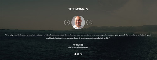
Codes are as follows:
<div class="home7_full_bg4 text-center pt-60 pb-60">
  <div class="dnn_layout">
    <div class="content_mid">
      <h3>Testimonials</h3>
      <ul class="Testimonials_tab Testimonials_11 animation scaleUp" data-position="fade" data-autoplay="3000" data-height-auto="false">
        <li>
          <blockquote>
            <p><span class="Pic"><img alt="" src="/portals/30/home7_img13.png" /></span> "   Sed ut perspiciatis unde omnis iste natus error sit voluptatem accusantium dolore mque laudan tium, totam rem aperiam, eaque ipsa quae ab illo inventore veritatis et quasi architecto beatae. Lorem ipsum dolor sit amet, consectetur adipiscing elit.   "</p>
            <small><span>John Chris</span>The Buyer of dnngo.net</small> </blockquote>
        </li>
        <li>
          <blockquote>
            <p><span class="Pic"><img alt="" src="/portals/30/home6_team_img2.png" /></span> "   Donec in ut odio libero, at vulputate urna. Nulla tristique mi a massa convallis cursus. Nulla eu mi magna. Etiam suscipit commodo gravida. Cras suscipit, quam vitae adipiscing faucibus, risus nibh laoreet odio, a porttitor metus eros ut enim.   "</p>
            <small><span>Chrissie Hall </span>Designer / Company</small> </blockquote>
        </li>
        <li>
          <blockquote>
            <p><span class="Pic"><img alt="" src="/portals/30/home6_team_img3.png" /></span> "   Nulla eu mi magna. Etiam suscipit commodo gravida. Cras suscipit, quam risus nibh laoreet odio.   "</p>
            <small><span>James Divine</span>Divine Solutions</small> </blockquote>
        </li>
      </ul>
    </div>
  </div>
</div>
Option:
- You can modify
animationto change the animation on the slide. Animation list.
PRICING area
Below is the screen shot:
Codes are as follows:
<div class="home7_anchor_bg text-center pt-60 pb-60">
  <div data-menuanchor="true" data-scrollshownav="true" data-offset="-60" class="anchorTag" data-title="Pricing"> </div>
  <div class="anchor_title"> Pricing
    <div class="title_left_line"> <img alt="" src="/portals/1043/home7_left_line.png" /> </div>
    <div class="title_right_line"> <img alt="" src="/portals/1043/home7_right_line.png" /> </div>
  </div>
  <p class="pr-15 pl-15">Here are the prcing informtion, you can choose your price plan from here</p>
</div>
HOW WE CHARGE area
Below is the screen shot:
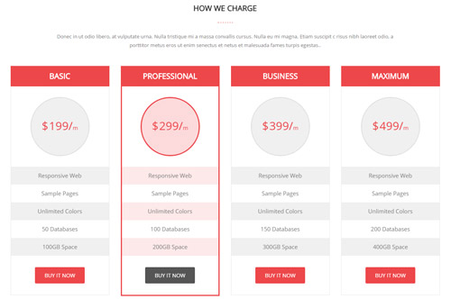
Codes are as follows:
<div class="dnn_layout">
  <div class="content_mid">
    <div class="home7_pricing text-center pb-60">
      <p class="pr-10 pl-10">Donec in ut odio libero, at vulputate urna. Nulla tristique mi a massa convallis cursus. Nulla eu mi magna. Etiam suscipit c risus nibh laoreet odio, a porttitor metus eros ut enim  senectus et netus et malesuada fames turpis egestas..</p>
      <div class="price-table price-table5 row">
        <div class="col-md-3 col-sm-6 animation fadeInUp delay1">
          <div class="price_border">
            <div class="price_title">
              <h2>BASIC</h2>
            </div>
            <div class="price_holder">
              <div class="price_box"><span class="sup">$</span><span class="price">199/</span><span class="unit">m</span></div>
              <ul>
                <li>Responsive Web</li>
                <li>Sample Pages</li>
                <li>Unlimited Colors</li>
                <li>50 Databases</li>
                <li>100GB Space</li>
              </ul>
              <a class="Button_default" href="#">BUY IT NOW</a> </div>
          </div>
        </div>
        <div class="col-md-3 col-sm-6 best_value animation fadeInUp delay2">
          <div class="price_border">
            <div class="price_title ">
              <h2>PROFESSIONAL</h2>
            </div>
            <div class="price_holder">
              <div class="price_box"><span class="sup">$</span><span class="price">299/</span><span class="unit">m</span></div>
              <ul>
                <li>Responsive Web</li>
                <li>Sample Pages</li>
                <li>Unlimited Colors</li>
                <li>100 Databases</li>
                <li>200GB Space</li>
              </ul>
              <a class="Button_default" href="#">BUY IT NOW</a> </div>
          </div>
        </div>
        <div class="col-md-3 col-sm-6 animation fadeInUp delay3">
          <div class="price_border">
            <div class="price_title">
              <h2>BUSINESS</h2>
            </div>
            <div class="price_holder">
              <div class="price_box"><span class="sup">$</span><span class="price">399/</span><span class="unit">m</span></div>
              <ul>
                <li>Responsive Web</li>
                <li>Sample Pages</li>
                <li>Unlimited Colors</li>
                <li>150 Databases</li>
                <li>300GB Space</li>
              </ul>
              <a class="Button_default" href="#">BUY IT NOW</a> </div>
          </div>
        </div>
        <div class="col-md-3 col-sm-6 animation fadeInUp delay4">
          <div class="price_border">
            <div class="price_title">
              <h2>MAXIMUM</h2>
            </div>
            <div class="price_holder">
              <div class="price_box"><span class="sup">$</span><span class="price">499/</span><span class="unit">m</span></div>
              <ul>
                <li>Responsive Web</li>
                <li>Sample Pages</li>
                <li>Unlimited Colors</li>
                <li>200 Databases</li>
                <li>400GB Space</li>
              </ul>
              <a class="Button_default" href="#">BUY IT NOW</a> </div>
          </div>
        </div>

      </div>
    </div>
  </div>
</div>
Option:
col-sm-* col-md-*is the width of each column, you can change the width you need through value1~12.- You can modify
animationto change the animation on the slide. Animation list.
DO YOU LIKE THIS DNN THEME ? area
Below is the screen shot:
Codes are as follows:
<div class="home7_full_bg5 pt-60 pb-60">
  <div class="dnn_layout animation scaleUp">
    <div class="content_mid">
      <div class="home7_text4 text-center">
        <h3>Do You like this dnn theme ?</h3>
        <p>If you want to customize a new dnn skin, we will develop business solutions that fitted to your needs</p>
        <a href="#">Purchase it</a><a href="#">Submit A ticket</a> </div>
    </div>
  </div>
</div>
Option:
- You can modify
animationto change the animation on the slide. Animation list.
CONTACT area
Below is the screen shot:
Codes are as follows:
<div class="home7_anchor_bg text-center pt-60 pb-60">
  <div data-menuanchor="true" data-scrollshownav="true" data-offset="-60" class="anchorTag" data-title="Contact"> </div>
  <div class="anchor_title"> Contact
    <div class="title_left_line"> <img alt="" src="/portals/1043/home7_left_line.png" /> </div>
    <div class="title_right_line"> <img alt="" src="/portals/1043/home7_right_line.png" /> </div>
  </div>
  <p class="pr-15 pl-15">If you have any questions, please contact us by the ways as follows</p>
</div>
GET IN TOUCH area
Below is the screen shot:
Codes are as follows:
<div class="home7_touch pb-60 animation fadeInLeft">
  <p>Donec in ut odio libero, at vulputate urna. Nulla tristique mi a massa convallis cursus. Nulla eu mi magna. Etiam suscipit commodo gravida. Cras suscipit, quam vitae adipiscing faucibus, risus nibh laoreet odio, a porttitor metus eros ut enim, vel illum dolore eu feugiat nulla facilisis at vero eros.</p>
  <div class="home7_touch_info">
    <h4>Address :</h4>
    <div>LanHua Building, XingAn Street No.287, New York City, USA</div>
  </div>
  <div class="row">
    <div class="col-sm-6">
      <div class="home7_touch_info">
        <h4>Phone :</h4>
        <div><span>Office One  :</span>(+012) - 345 - 6789</div>
        <div><span>Office Two  :</span>(+089) - 123 - 4567</div>
        <div><span>Contacts  :</span>Mrs Wang</div>
      </div>
    </div>
    <div class="col-sm-6">
      <div class="home7_touch_info">
        <h4>Email :</h4>
        <div><span>Suppot  :</span>dnnskindev@gmail.com</div>
        <div><span>Technology  :</span>dnnskindev@gmail.com</div>
        <div><span>Contacts  :</span>John Smith</div>
      </div>
    </div>
  </div>
  <div class="home7_touch_social"> <a href="#"><span class="social social-facebook"></span></a><a href="#"><span class="social social-twitter"></span></a><a href="#"><span class="social social-google-plus"></span></a><a href="#"><span class="social social-vimeo"></span></a><a href="#"><span class="social social-skype"></span></a> </div>
</div>
Option:
Containeris usingContainer-23- You can modify
animationto change the animation on the slide. Animation list. col-sm-*is the width of each column, you can change the width you need through value1~12.- You can modify
socialto change icons. font icon list.
EMAIL US area
Below is the screen shot:
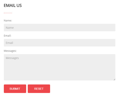
Option:
Containeris usingContainer-23- This is
Theme_Responsive_20060_home7theme ofDNNGo PowerFormsmodule
MAP area
Below is the screen shot:
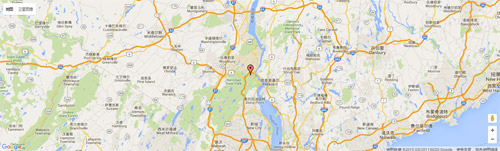
Codes are as follows:
<div id="gmap01"></div>
PHOTOS area
Below is the screen shot:
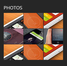
Codes are as follows:
<div class="animation fadeInUp">
  <div class="foot_photo photo_box img_zoom "> <a class="LightBox_image_gallery2" href="/Portals/30/Photo10-big.jpg">
    <div class="pic_box"> <img alt="" src="/portals/30/Photo10.jpg" />
      <div class="ico"> <span class="glyphicons glyph-search"></span> </div>
      <div class="shade"></div>
    </div>
    </a> </div>
  <div class="foot_photo photo_box img_zoom "> <a class="LightBox_image_gallery2" href="/Portals/30/Photo11-big.jpg">
    <div class="pic_box"> <img alt="" src="/portals/30/Photo11.jpg" />
      <div class="ico"> <span class="glyphicons glyph-search"></span> </div>
      <div class="shade"></div>
    </div>
    </a> </div>
  <div class="foot_photo photo_box img_zoom "> <a class="LightBox_image_gallery2" href="/Portals/30/Photo12-big.jpg">
    <div class="pic_box"> <img alt="" src="/portals/30/Photo12.jpg" />
      <div class="ico"> <span class="glyphicons glyph-search"></span> </div>
      <div class="shade"></div>
    </div>
    </a> </div>
  <div class="foot_photo photo_box img_zoom "> <a class="LightBox_image_gallery2" href="/Portals/30/Photo13-big.jpg">
    <div class="pic_box"> <img alt="" src="/portals/30/Photo13.jpg" />
      <div class="ico"> <span class="glyphicons glyph-search"></span> </div>
      <div class="shade"></div>
    </div>
    </a> </div>
  <div class="foot_photo photo_box img_zoom "> <a class="LightBox_image_gallery2" href="/Portals/30/Photo14-big.jpg">
    <div class="pic_box"> <img alt="" src="/portals/30/Photo14.jpg" />
      <div class="ico"> <span class="glyphicons glyph-search"></span> </div>
      <div class="shade"></div>
    </div>
    </a> </div>
  <div class="foot_photo photo_box img_zoom "> <a class="LightBox_image_gallery2" href="/Portals/30/Photo15-big.jpg">
    <div class="pic_box"> <img alt="" src="/portals/30/Photo15.jpg" />
      <div class="ico"> <span class="glyphicons glyph-search"></span> </div>
      <div class="shade"></div>
    </div>
    </a> </div>
  <div class="foot_photo photo_box img_zoom "> <a class="LightBox_image_gallery2" href="/Portals/30/Photo10-big.jpg">
    <div class="pic_box"> <img alt="" src="/portals/30/Photo10.jpg" />
      <div class="ico"> <span class="glyphicons glyph-search"></span> </div>
      <div class="shade"></div>
    </div>
    </a> </div>
  <div class="foot_photo photo_box img_zoom "> <a class="LightBox_image_gallery2" href="/Portals/30/Photo11-big.jpg">
    <div class="pic_box"> <img alt="" src="/portals/30/Photo11.jpg" />
      <div class="ico"> <span class="glyphicons glyph-search"></span> </div>
      <div class="shade"></div>
    </div>
    </a> </div>
  <div class="foot_photo photo_box img_zoom "> <a class="LightBox_image_gallery2" href="/Portals/30/Photo12-big.jpg">
    <div class="pic_box"> <img alt="" src="/portals/30/Photo12.jpg" />
      <div class="ico"> <span class="glyphicons glyph-search"></span> </div>
      <div class="shade"></div>
    </div>
    </a> </div>
</div>
Option:
Containeris usingContainer-3- You can modify
animationto change the animation on the slide. Animation list. - You can modify
glyphiconsto change icons. font icon list.
ABOUT US area
Below is the screen shot:
Codes are as follows:
<div class="animation fadeInUp">
  <p>Donec consectetur diam ac nibh auctor ultricies. Integer mauris lacus, consequat in luctus id, semper sed felis. Cum sociis natoque magnis.</p>
  <p>Fugiat dapibus, tellus ac cursus commodo, mauris sit condim eser ntumsi nibh, uum a justo vitaes amet risus amets un.</p>
  <a href="#">> More Information</a>
</div>
Option:
Containeris usingContainer-3- You can modify
animationto change the animation on the slide. Animation list.
RECENT NEWS area
Below is the screen shot:
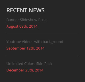
Codes are as follows:
<div class="animation fadeInUp">
  <div class="home7_foot_news">
    <div>Banner Slideshow Post</div>
    <div class="home7_foot_accent">August 08th, 2014</div>
  </div>
  <div class="home7_foot_news">
    <div>Youtube Videos with background</div>
    <div class="home7_foot_accent">September 12th, 2014</div>
  </div>
  <div class="home7_foot_news">
    <div>Unlimited Colors Skin Pack</div>
    <div class="home7_foot_accent">December 25th, 2014</div>
  </div>
</div>
Option:
Containeris usingContainer-3- You can modify
animationto change the animation on the slide. Animation list.
FOLLOW US area
Below is the screen shot:
Codes are as follows:
<div class="animation fadeInUp">
  <div class="home7_foot_social"> <a href="#"><span class="social social-facebook"></span>Facebook<span class="home7_social_arrow"></span></a> </div>
  <div class="home7_foot_social"> <a href="#"><span class="social social-twitter"></span>Twitter<span class="home7_social_arrow"></span></a> </div>
  <div class="home7_foot_social"> <a href="#"><span class="social social-vimeo"></span>Vimeo<span class="home7_social_arrow"></span></a> </div>
  <div class="home7_foot_social"> <a href="#"><span class="social social-skype"></span>Skype<span class="home7_social_arrow"></span></a> </div>
</div>
Option:
Containeris usingContainer-3- You can modify
animationto change the animation on the slide. Animation list. - You can modify
socialto change icons. font icon list.
Coming Soon
You can click the link to check Coming Soon demo. Coming Soon
Below is the screen shot:
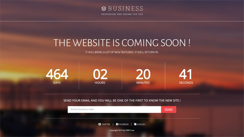
You can create the coming soon page easily following these steps:
- Create a page named coming soon page.
- Import the ComingSoon.Page.template for this page.
- You can set color, end time, and background image for Coming Soon page through xPlugin, as below:
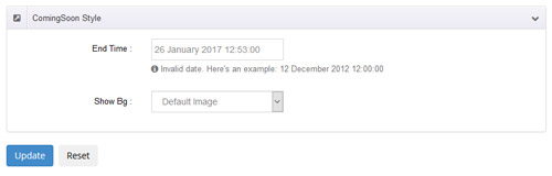
Boxed Layout
You can set Boxed mode in DNNGo.xPlugin > Skins > Options > Content Layout > Content Layout
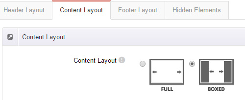
DNNGo_LayerGallery Module
You can see this module in the banner section on the home page, we will guide you step by step to set up the module as the same as our demo site:
- Go to Host –> Extensions –> Install Extension wizard to install the module pack DNNGo_LayerGalleryPro.0x.0x_PA.zip.
- Add DNNGo_LayerGalleryPro module to the BannerPane.
- Click Manager button.
- Click the navigation of the left Import&Export
- Import ContentListEntity.xml file under DNNGo_LayerGalleryPro Module.
- You will see the imported data on Manage List page and you can change the text/image in the banner by clicking Edit button.
- Click this link so you can check the module instruction details.
DNNGo_GalleryPro Module
This module contains 15 responsive sldiers in total.
- Go to Host –> Extensions –> Install Extension wizard to install the module pack DNNGo_DNNGalleryPro_xx.xx.xx_PA.zip.
- Add DNNGo_DNNGalleryPro module to the page.
- Click Effect List tab.
- Choose an effect you like.
- You can click this link to check the module demo.
- Click this link so you can check the module instruction details.
DNNGo_xBlog Module
We use this module on the blog page, click this link so you can check the module instruction details.
DNNGo_PhotoAlbums Module
We use this module on the Portfolios page, click this link so you can check the module instruction details.
DNNGo_PowerForms Module
You can create the form through this module, click this link so you can check the module instruction details.
License interface
- Please login or register your account at http://www.dnngo.net
- Send an email to dnnskindev@gmail.com with your invoice ID, machine Key for every module( different module has different machine key), and your DNNGO username. We will generate an activation code for you. Please note: If your site is a demo site, your license will still be valid when you transfer your site to a live site.
- Manage my licenses
Contact Us
If you have any questions or suggestions about modules/skins or modules/skins installation process, please feel free to contact us.
- Website: www.dnngo.net
- Email: dnnskindev@gmail.com
- Skype: dnngo-linda