20061-UnlimitedColorsPack-043 v6.2.0
Documentation
- Created: 06/10/2015
- Latest update: 04/03/2019
- By: DNNGo
- Email: dnnskindev@gmail.com
Thank you for purchasing my theme. If you have any questions that are beyond the scope of this help file, please feel free to email via my user page contact form here. Thanks so much!
General Information
DotNetNuke Information
To install this skin you must have a working version of Dotnetnuke already installed. If you need help to install Dotnetnuke, follow the instructions in Documentation Center.
What Is Included With Your Package
When you purchase our theme, you will receive one large .zip file that contains everything inside. Unzip that file to get all the content inside. Below is a full list of everything that is included along with a brief description of each item. See the corresponding sections for info on installing the theme.
- Inside the Content folder are: DNN Skins folder, DNNGo_DNNGalleryPro Module folder, DNNGo_LayerGalleryPro folder, DNNGo_PhotoAlbums Module folder, DNNGo_PowerForms Module folder, DNNGo_xPlugin Module folder, DNNGo_xBlog Module folder, PSD folder, Page template.
- DNN Skins folder - The skin in this folder can be used in DNN 8.x, DNN 9.x only.
- DNNGo_DNNGalleryPro Module folder - This module contains 15 responsive sldiers in total.
- DNNGo_DNNGo_LayerGalleryPro folder - You can see this module in the banner section on home page.
- DNNGo_PhotoAlbums folder - You can see this module in Portfolios page.
- DNNGo_PowerForms folder - You can create forms through this module.
- DNNGo_xBlog Module folder - You can see this module on Blog page.
- Page Templates folder - Exported page templates will allow you to reproduce our live demo pages.
Notice: If you bought the theme from DNN Store (http://store.dnnsoftware.com), then none of module files are included in the download package. It only include DNN Skins, DNNGo_xPlugin, Page Templates and PSD files. If you need to purchase modules, please contact us via email (dnnskindev@gmail.com).
What Are The Requirements To Use skins and modules
To use skins and modules, you must be running DNN 8.x or higher. We have tested it with DNN8.x and DNN9.x.
Skin and Required Modules Installation
For DNN 8
-
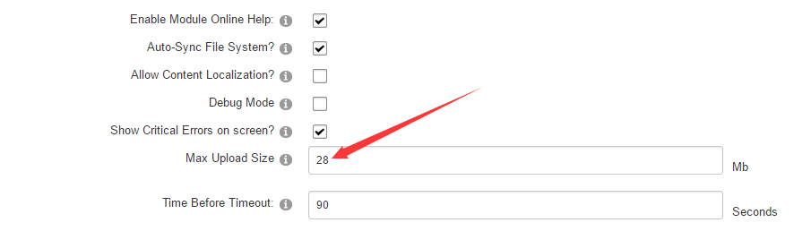
Go to Host-Settings –> Host-Settings, and select the tab Other Settings, changing Max Upload Size to 28 or higher.
-
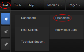
Go to Host –> Extensions –> Install Extension wizard to install the module pack DNNGo_xPlugin_0x.0x.0x_PA.zip
-
Go to Host –> Extensions –> Install Extension wizard to install the skin pack 20060-UnlimitedColorsPack-042-DNNSkins.zip
-
You can install other modules as per your own needs.
-
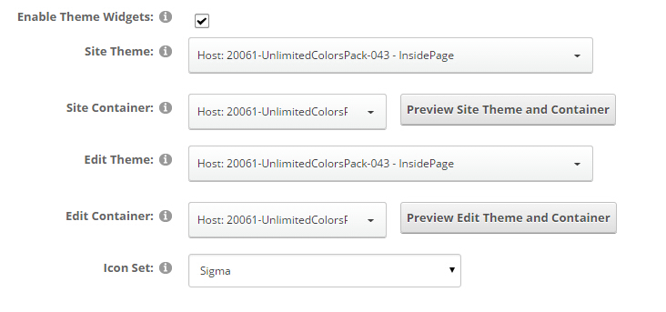
After the installation has been completed, navigate to Admin –> Site Settings –> Basic Settings (tab) –> Appearance (section) and specify portal and edit skins and containers like shown in the screenshot below. It should be done, in order to make your DNN admin UI look correct and readable.
-
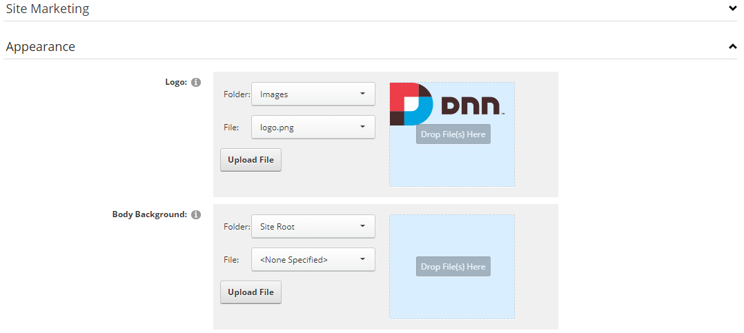
Now you can upload the LOGO image in Admin –> Site Settings –> Basic Settings (tab) –> Appearance (section) page.
For DNN 9
-
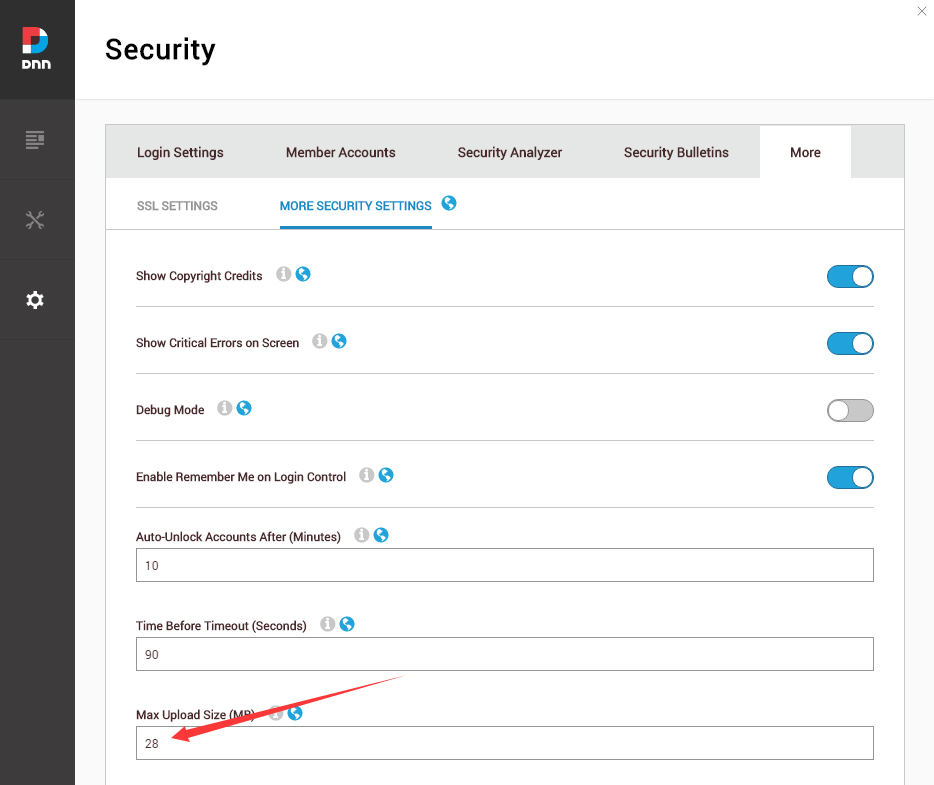
Go to Settings –> Security –> More, and select the tab MORE SECURITY SETTINGS, changing Max Upload Size to 28 or higher.
-
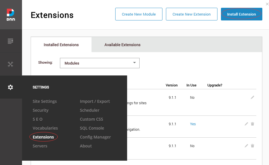
Go to Host –> Extensions –> Install Extension wizard to install the module pack DNNGo_xPlugin_0x.0x.0x_PA.zip
-
Go to Host –> Extensions –> Install Extension wizard to install the skin pack 20061-UnlimitedColorsPack-043-DNNSkins.zip
-
You can install other modules as per your own needs.
-
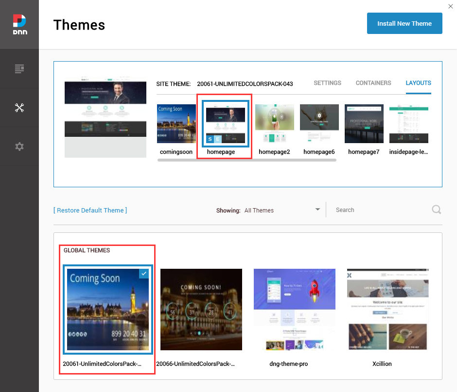
After the installation has been completed, navigate to Manage –> Themes. Select and apply 20061-UnlimitedColorsPack-043
-
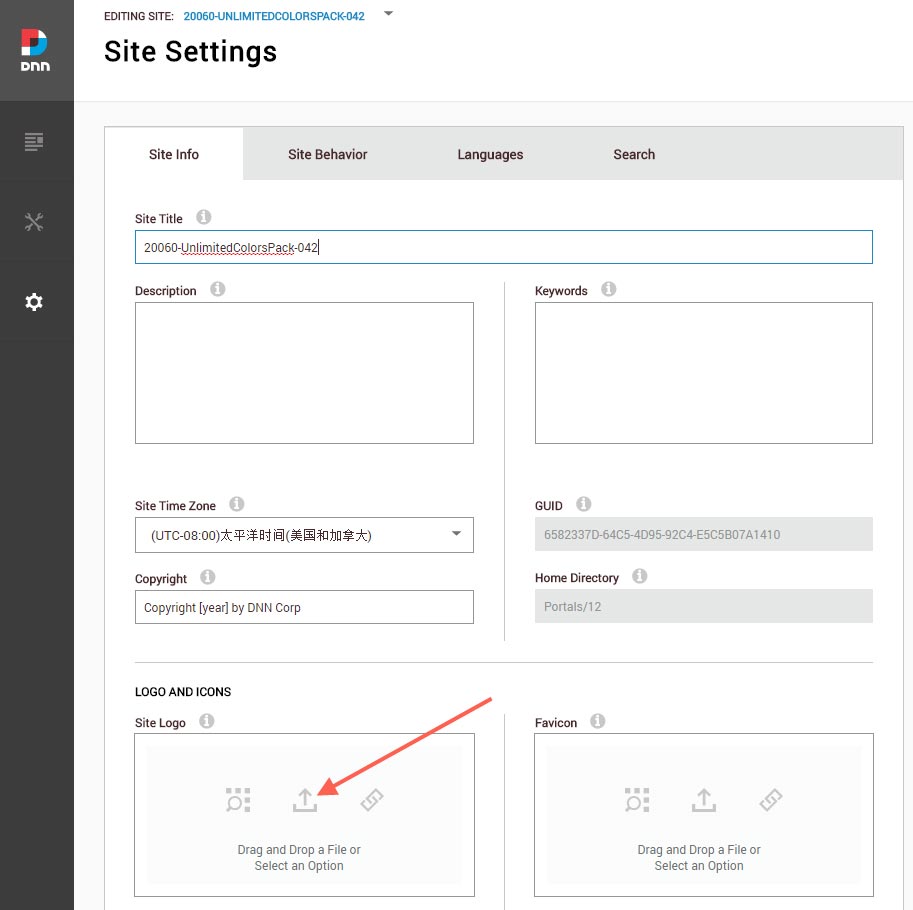
You can upload the LOGO image in Settings –> Site Settings page.
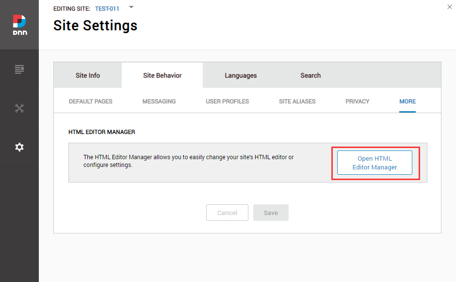
Change the Settings of HTML Editor
By default, HTML editor will remove the div tags whose content is blank. For example: if we add the code <div class=”pt-20″></div> in HTML editor and click save, you will find the code is missing when you edit it afterwards. So we need to change the settings to prevent this from happening.
Log in to your site as super administrator.
Go to SETTINGS > Site Settings > Site Behavior > MORE, click the Open HTML Editor Manager.
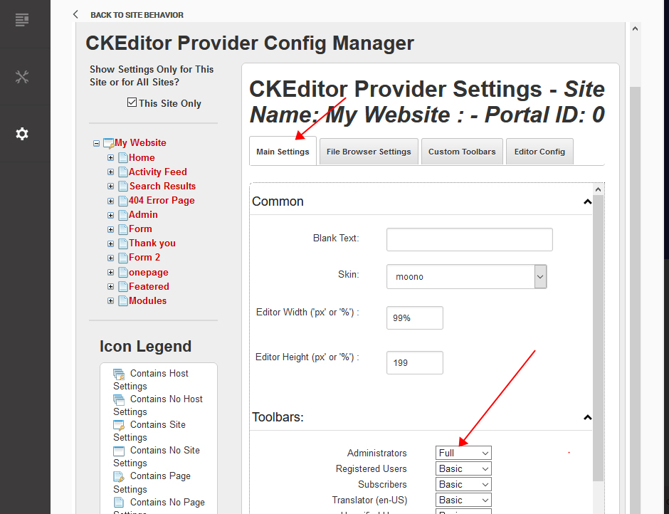
Click the Main Settings tab. Set the value of Administrators to be Full.
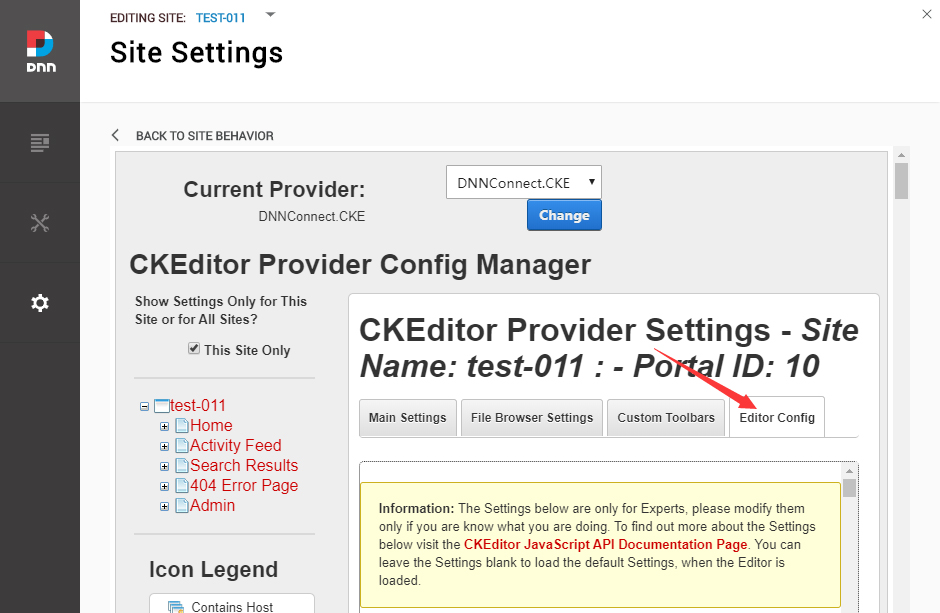
Click the Editor Config tab.
Set the value of AllowedContent to be true.
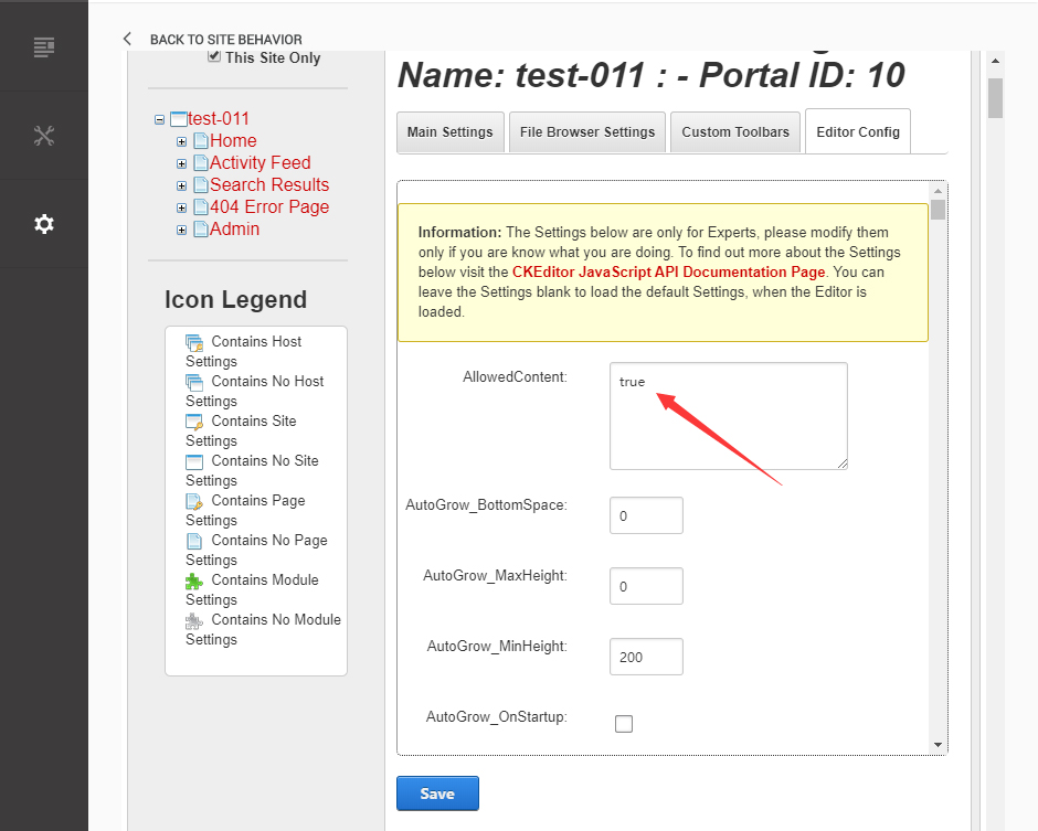
Set the value of FillEmptyBlocks to be false.
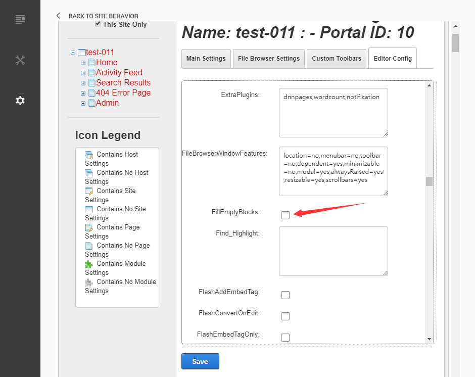
Set the value of ignoreEmptyParagraph to be false.
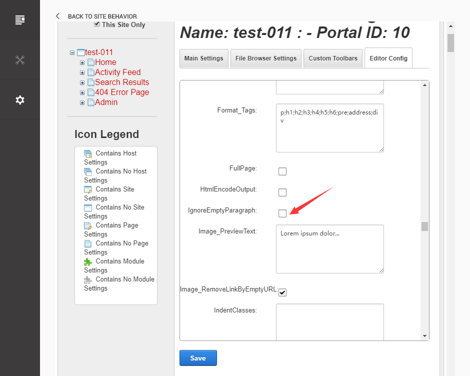
Click the Save button.
How to import page template?
Exported page templates will allow you to reproduce our live demo pages. We'll reproduce the home page as an example.
For DNN 8
-
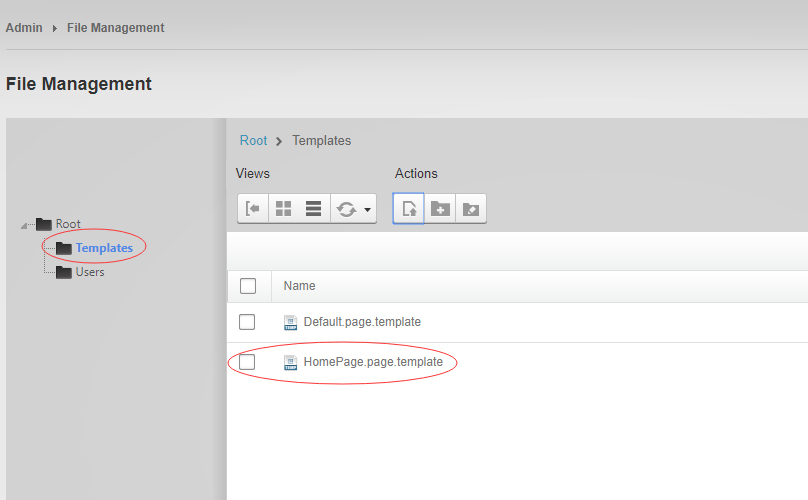
You can find these files in Page Templates Directory.
-
Upload Home.page.template file into your portal root (e.g. Portals/0/Templates/) in the previous chapter and synchronize your folders, you are able to start using page templates to clone live demo pages.
-
Because page templates can not import image files, you need to upload all the photo files of the "images" folder into your portal root (e.g. Portals/0/).
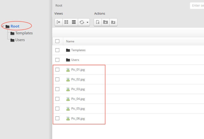
-
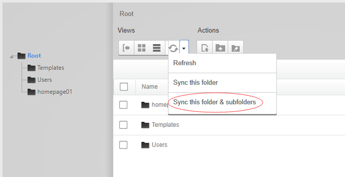
Synchronize the file in Admin > File-Management
-
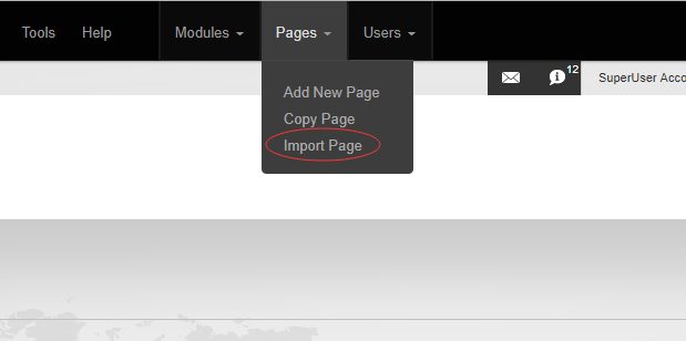
Navigate to the Home page and click Pages -> Import.
-
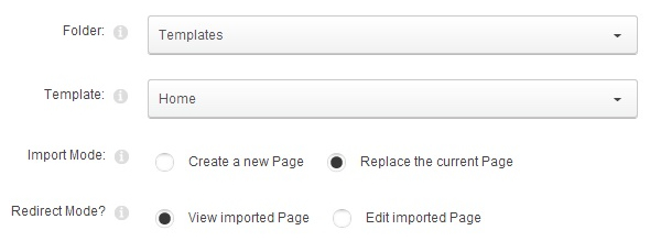
Find a proper page exported content file navigating to Templates folder and choosing for example Home page.
-
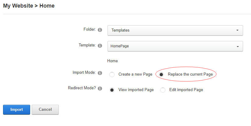
Choose "Replace the current Page" and the redirect mode you need. Please note, if you select "Replace the current Page", content of current page will be reset.
-
Click Import button if everything is correct.
-
Specify page settings according to your needs (necessarily apply HomePage skin to the home page) and click "Update Page". The home page is ready.
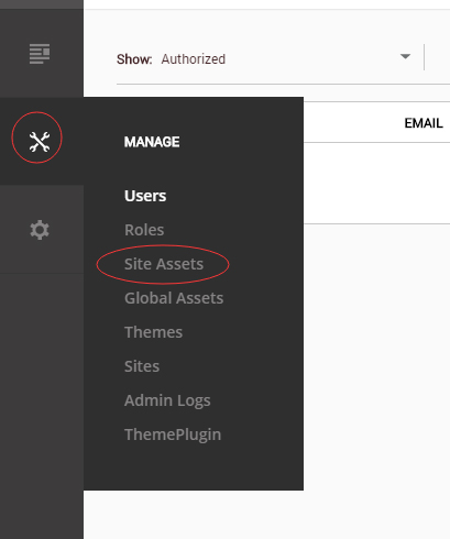
For DNN 9
-
Go to Manage > Site Assets
-
Uploading Home.page.template file to Templates folder
-
Because page templates can not import image files, you need to upload all the photo files of the "images" folder into your portal root (e.g. Portals/0/).
-
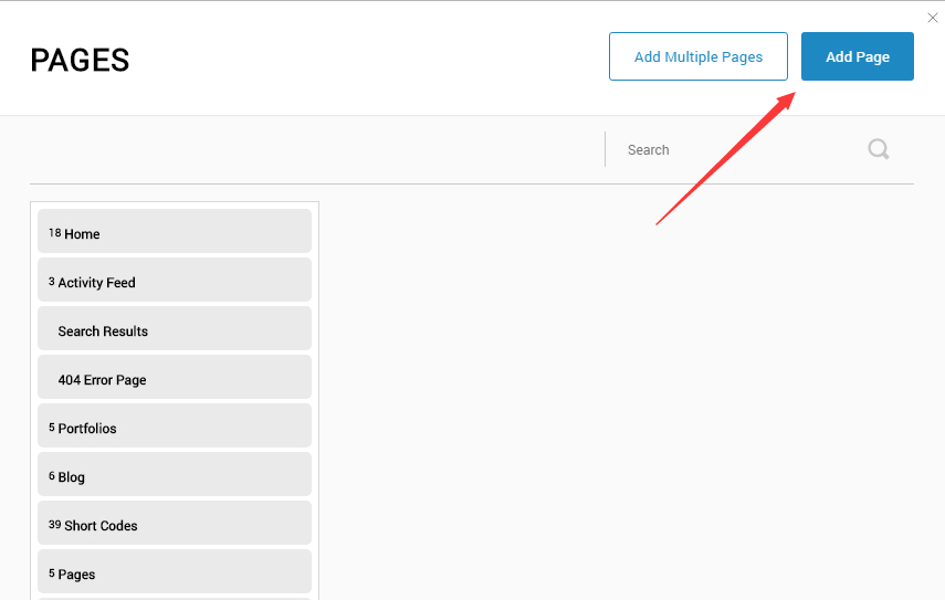
Go to Content > Pages > Add Page
-
Choose your template from Template drop-down.
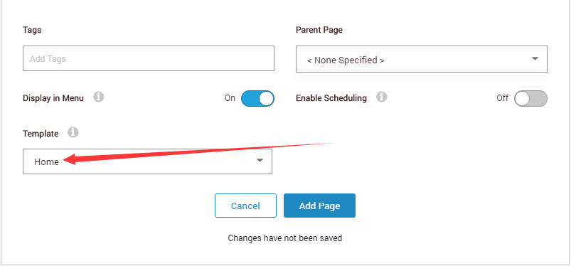
- Click Add Page
Note : Page templates can only be imported when you are creating a new page.
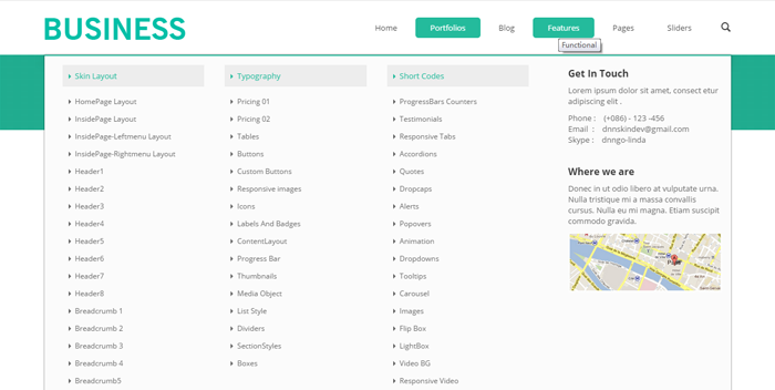
Skin features and how to use them.
Page Template
The product contains page templates for all pages in the live demo, you can copy our demo site by importing the page templates.
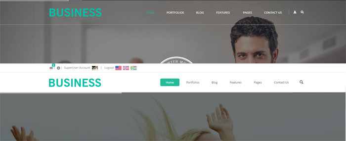
Seven kinds of header layout
You can click the xPlugin button to go to settings page, and then choose different header styles in Header Layout section.
You can click these links to check different header styles. header 1, header 2, header 3, header 4, header 5, header 6, header 7
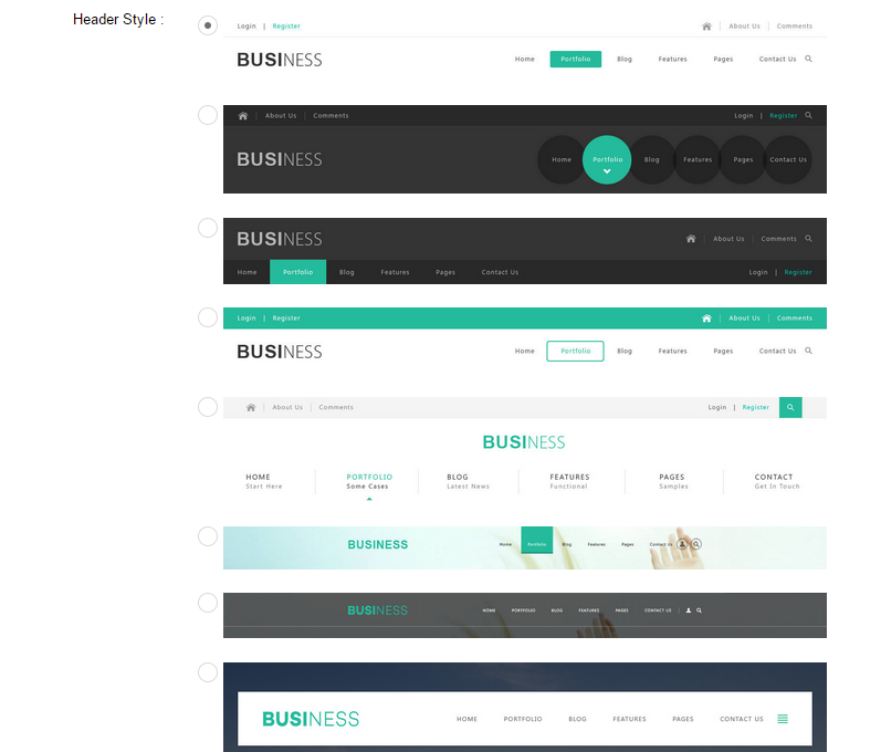
Each header includes very rich setting options, you can modify the color of whatever you would like to . For example: text color, font size and background color etc.
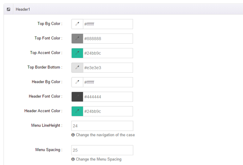
Header Position
Header Position is for setting the position of Header. If you have it set to Float to top, Header will float over the Banner. If you have it set to Not float, Header will show with Banner side by side. You can compare the difference between these two settings through the following two screen shots.
Header5 Option
Menus in Header 5 include main title and subtitle, these title texts can be set in Page Settings. Main title is from Page Name, sub-title is from Page Title.

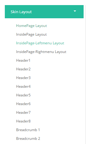
Insidepage-leftmenu layout
Insidepage-leftmenu layout page is using InsidePage-leftmenu skin. Menus on the left side are displaying the second level menus.
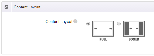
Full Layout and Boxed Layout
This skin contains Full Layout and Boxed Layout, you can set through Content Layout section.
With Boxed Layout applied, you can still set page background, it will display around the content. You can click link to check demo url of boxed layout.
The background can be set as static or rotating image or any solid color for you choose to apply, also you can set different background images for different pages.
How to set background image for DNN page.
- You need to choose Boxed Layout.
- Choose Page Background in the Option for Show bg, save settings.
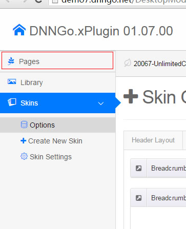
- Click "pages" nav in the xPlugin.
- Click Edit Background icon.
- Upload image, the background image will show as slider if you choose two or more images.
- "Globals" allows you to set background image for all pages.
- Also you can set background image for each page.
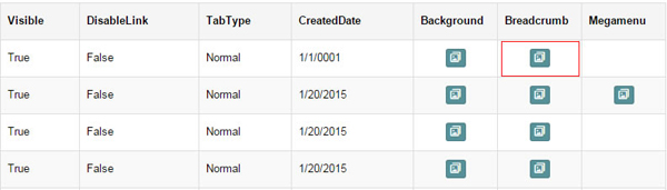
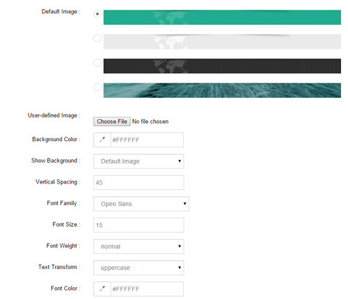
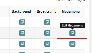
How to set breadcrumb image for DNN page.
- Choose Breadcrumb Background in the Option for Show bg, save settings.
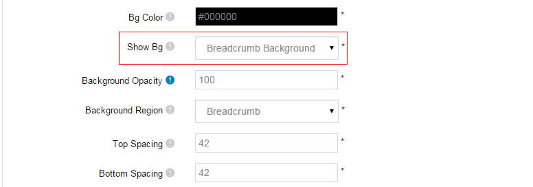
- Click "pages" nav in the xPlugin.
- Click Edit Breadcrumb icon.
- Upload image, the background image will show as slider if you choose two or more images.
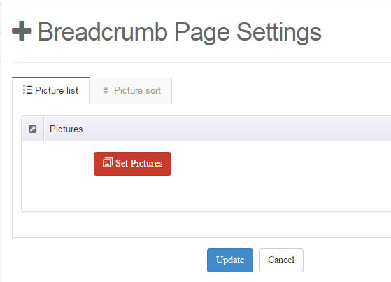
- "Globals" allows you to set background image for all pages.
- Also you can set background image for each page.
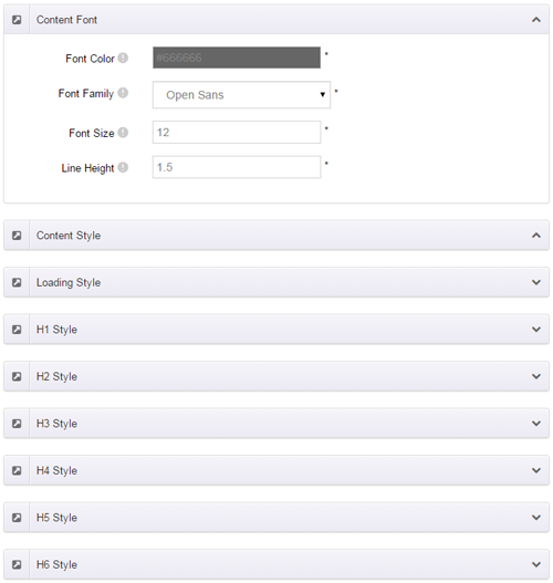
Content Style
You can set the font color and size, link color, the color of H1-H6 etc of the content area.
Four kinds of Breadcrumb layouts
You can choose different Breadcrumb styles through Breadcrumb Layout.
You can click these links to check different breadcrumb styles. breadcrumb 1, breadcrumb 2, breadcrumb 3, breadcrumb 4 , breadcrumb 5.
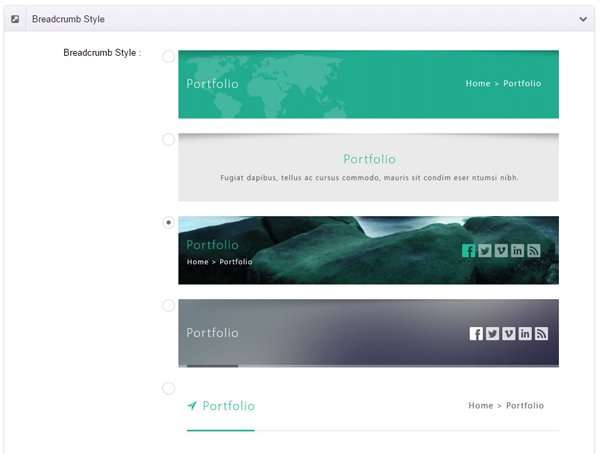
You can change the text color, background color and background image etc for each Breadcrumb layout.
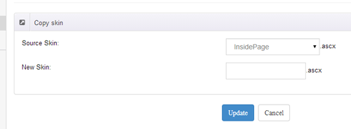
Create a Skin
You can create a new skin through xPlugin. Please note the new skin name shouldn't be the same as the current skin.
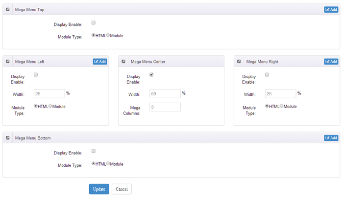
Standard Menu and MegaMenu
The skin sub menus contain two types-Standard Menu and MegaMenu.
Standard Menu is the default menu type, the sub menus will be set to display in one column only, as shown in screen shot below:
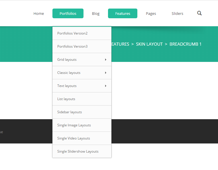
MegaMenu will set sub menus to display in multiple columns, also you can display HTML module or third party module in sub menus, as shown below:
You can set the MegaMenu as per steps below:
- Click "pages" nav in the xPlugin.
- Click Edit MegaMenu button. Please note MegaMenu can be set for first level menus only.
- Set the menu type to MegaMenu.
- Mega Menu has 5 sections: Menu Top, Menu Right, Menu Bottom, Menu Left, Menu Center.
- Click Add button so you will be able to add HTML module or any third module to Menu Top, Menu Right, Menu Bottom, Menu Left.
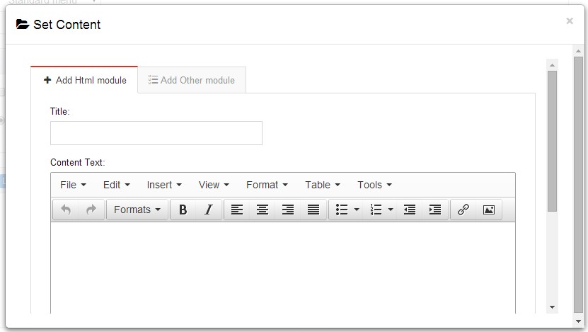
- Module Type-choose to display HTML module or third module.
- Menu Center-it will display secondary menus here.
- Mega Columns-set number of columns the secondary menu will display.
- You can set width for Menu Right, Menu Left, Menu Center, please note their previous total width shouldn't be more than 100.
Set Up Google Map
You can create Google Map easily following these steps:
- Go to xplugin, and click Map Settings tab to fill in API.
- You can register through https://developers.google.com/maps/documentation/javascript/get-api-key.
- Place the code <div id="gmap01"></div> into HTML module.
- Enter location of the map in Address, for example: Bear city, ny
- Enter description in Markers Html, for example: hello word
CSS Codes
Skin is using bootstrap framework. You will get to know more through this url. Link
Width of content area
dnn_layout is the page content framework:
| Device width | Width of content area |
| Large devices Desktops (≥1200px) | 1170px |
| Medium devices Desktops (≥992px) | 970px |
| Small devices Tablets (≥768px) | 750px |
| Extra small devices Phones (<768px) | auto |
content_mid is the spacing between both sides of the page :
| Device width | Spacing |
| Large devices Desktops (≥1200px) | 30px |
| Medium devices Desktops (≥992px) | 20px |
| Small devices Tablets (≥768px) | 15px |
| Extra small devices Phones (<768px) | 15px |
<div class="dnn_layout">
  <div class="content_mid clearfix"> content ... </div>
</div>
Bootstrap 12 grid layout
<!-- Tablet and desktop devices are 50% wide, mobile device is 100% wide -->
<div class="row">
  <div class="col-sm-6">.col-sm-6</div>
  <div class="col-sm-6">.col-sm-6</div>
</div>

<!-- Stack the columns on mobile by making one full-width and the other half-width -->
<div class="row">
  <div class="col-xs-12 col-md-8">.col-xs-12 .col-md-8</div>
  <div class="col-xs-6 col-md-4">.col-xs-6 .col-md-4</div>
</div>

<!-- Columns start at 50% wide on mobile and bump up to 33.3% wide on desktop -->
<div class="row">
  <div class="col-xs-6 col-md-4">.col-xs-6 .col-md-4</div>
  <div class="col-xs-6 col-md-4">.col-xs-6 .col-md-4</div>
  <div class="col-xs-6 col-md-4">.col-xs-6 .col-md-4</div>
</div>

<!-- Columns are always 50% wide, on mobile and desktop -->
<div class="row">
  <div class="col-xs-6">.col-xs-6</div>
  <div class="col-xs-6">.col-xs-6</div>
</div>

<!-- Add the extra clearfix for only the required viewport -->
<div class="clearfix visible-xs-block"></div>
Display and hide elements
| Extra small devices Phones (<768px) | Small devices Tablets (≥768px) | Medium devices Desktops (≥992px) | Large devices Desktops (≥1200px) | |
|---|---|---|---|---|
.visible-xs |
Visible | Hidden | Hidden | Hidden |
.visible-sm |
Hidden | Visible | Hidden | Hidden |
.visible-md |
Hidden | Hidden | Visible | Hidden |
.visible-lg |
Hidden | Hidden | Hidden | Visible |
.hidden-xs |
Hidden | Visible | Visible | Visible |
.hidden-sm |
Visible | Hidden | Visible | Visible |
.hidden-md |
Visible | Visible | Hidden | Visible |
.hidden-lg |
Visible | Visible | Visible | Hidden |
Visible in mobile devices and hidden in other devices
<div class="visible-xs">content...</div>

Visible in other devices and hidden in mobile devices
<div class="hidden-xs">content...</div>
Vertical spacing
 /*page Spacing*/
.mt-10 {margin-top: 10px;}
.mb-10 {margin-bottom: 10px;}
.pt-10 {padding-top: 10px;}
.pb-10 {padding-bottom: 10px;}
.mt-20 {margin-top: 20px;}
.mb-20 {margin-bottom: 20px;}
.pt-20 {padding-top: 20px;}
.pb-20 {padding-bottom: 20px;}
.mt-30 {margin-top: 30px;}
.mb-30 {margin-bottom: 30px;}
.pt-30 {padding-top: 30px;}
.pb-30 {padding-bottom: 30px;}
.mt-40 {margin-top: 40px;}
.mb-40 {margin-bottom: 40px;}
.pt-40 {padding-top: 40px;}
.pb-40 {padding-bottom: 40px;}
.mt-50 {margin-top: 50px;}
.mb-50 {margin-bottom: 50px;}
.pt-50 {padding-top: 50px;}
.pb-50 {padding-bottom: 50px;}
.mt-60 {margin-top: 60px;}
.mb-60 {margin-bottom: 60px;}
.pt-60 {padding-top: 60px;}
.pb-60 {padding-bottom: 60px;}
CSS background
<div class="SectionStyle1">SectionStyle1</div>
<div class="SectionStyle2">SectionStyle2</div>

<div class="SectionStyle3">SectionStyle3</div>

<div class="SectionStyle4">SectionStyle4</div>
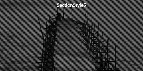
<div class="SectionStyle5">SectionStyle5</div>

<div class="SectionStyle6">SectionStyle6</div>
<div class="SectionStyle7">SectionStyle7</div>

<div class="SectionStyle8">SectionStyle8</div>
<div class="SectionStyle9">SectionStyle9</div>
<div class="SectionStyle10">SectionStyle10</div>
Short Codes
This skin contains a lot of short codes, it is very easy for you to use even you know nothing about js and css, all you need to do is just copying the short codes to HTML module.
Pricing
You can click the link to check Pricing demo. Demo Link
Style 1:
Below is the screen shot:
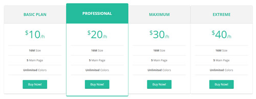
Codes are as follows:
<div class="price-table price-table1 row">
  <div class="col-md-3 col-sm-6" >
    <div class="price_title">
      <h2>Basic Plan</h2>
    </div>
    <div class="price_holder">
      <div class="price_box"> <span class="sup">$</span><span class="price">10</span><span class="unit">/h</span> </div>
      <ul>
        <li><span>16M</span> Size</li>
        <li><span>5</span> Main Page</li>
        <li><span>Unlimited</span> Colors</li>
      </ul>
      <a href="#" class="btn ">Buy Now!</a> </div>
  </div>
  <div class="col-md-3 col-sm-6 best_value">
    <div class="price_title ">
      <h2>professional</h2>
    </div>
    <div class="price_holder">
      <div class="price_box"> <span class="sup">$</span><span class="price">20</span><span class="unit">/h</span> </div>
      <ul>
        <li><span>16M</span> Size</li>
        <li><span>5</span> Main Page</li>
        <li><span>Unlimited</span> Colors</li>
      </ul>
      <a href="#" class="btn">Buy Now!</a> </div>
  </div>
  <div class="col-md-3 col-sm-6" >
    <div class="price_title">
      <h2>MAXIMUM</h2>
    </div>
    <div class="price_holder">
      <div class="price_box"> <span class="sup">$</span><span class="price">30</span><span class="unit">/h</span> </div>
      <ul>
        <li><span>16M</span> Size</li>
        <li><span>5</span> Main Page</li>
        <li><span>Unlimited</span> Colors</li>
      </ul>
      <a href="#" class="btn">Buy Now!</a> </div>
  </div>
  <div class="col-md-3 col-sm-6" >
    <div class="price_title">
      <h2>EXTREME</h2>
    </div>
    <div class="price_holder">
      <div class="price_box"> <span class="sup">$</span><span class="price">40</span><span class="unit">/h</span> </div>
      <ul>
        <li><span>16M</span> Size</li>
        <li><span>5</span> Main Page</li>
        <li><span>Unlimited</span> Colors</li>
      </ul>
      <a href="#" class="btn ">Buy Now!</a> </div>
  </div>
</div>
Option:
col-md-* col-sm-*is the width for each column. You can change the width you need through value1~12
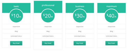
Style 2:
Below is the screen shot:
Codes are as follows:
<div class="price-table price-table2 row">
  <div class="col-md-3 col-sm-6">
    <div class="price_title">
      <h2>basic</h2>
    </div>
    <div class="price_holder">
      <div class="price_box"> <span class="sup">$</span><span class="price">10</span><span class="unit">/h</span> </div>
      <ul>
        <li>responsive</li>
        <li>Blog</li>
        <li>Unlimited Colors</li>
      </ul>
      <a href="#" class="btn ">Buy Now!</a> </div>
  </div>
  <div class="col-md-3 col-sm-6 best_value">
    <div class="price_title ">
      <h2>professional</h2>
    </div>
    <div class="price_holder">
      <div class="price_box"> <span class="sup">$</span><span class="price">20</span><span class="unit">/h</span> </div>
      <ul>
        <li>responsive</li>
        <li>Blog</li>
        <li>Unlimited Colors</li>
      </ul>
      <a href="#" class="btn">Buy Now!</a> </div>
  </div>
  <div class="col-md-3 col-sm-6">
    <div class="price_title">
      <h2>business</h2>
    </div>
    <div class="price_holder">
      <div class="price_box"> <span class="sup">$</span><span class="price">30</span><span class="unit">/h</span> </div>
      <ul>
        <li>responsive</li>
        <li>Blog</li>
        <li>Unlimited Colors</li>
      </ul>
      <a href="#" class="btn">Buy Now!</a> </div>
  </div>
  <div class="col-md-3 col-sm-6">
    <div class="price_title">
      <h2>maximum</h2>
    </div>
    <div class="price_holder">
      <div class="price_box"> <span class="sup">$</span><span class="price">40</span><span class="unit">/h</span> </div>
      <ul>
        <li>responsive</li>
        <li>Blog</li>
        <li>Unlimited Colors</li>
      </ul>
      <a href="#" class="btn ">Buy Now!</a> </div>
  </div>
</div>
Option:
col-md-* col-sm-*is the width for each column. You can change the width you need through value1~12
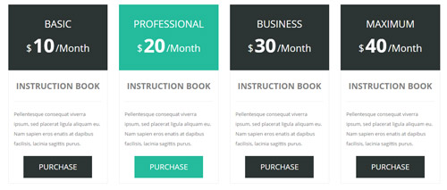
Style 3:
Below is the screen shot:
Codes are as follows:
<div class="price-table price-table3 row">
  <div class="col-md-3 col-sm-6">
    <div class="price_title">
      <h2>BASIC</h2>
      <div class="price_box"><span class="sup">$</span><span class="price">10</span><span class="unit">/Month</span></div>
    </div>
    <dl class="price_holder">
      <dt>INSTRUCTION BOOK</dt>
      <dd> Content text 1 ... </dd>
      <a href="#" class="btn ">PURCHASE</a>
    </dl>
  </div>
  <div class="col-md-3 col-sm-6 best_value">
    <div class="price_title ">
      <h2>PROFESSIONAL</h2>
      <div class="price_box"><span class="sup">$</span><span class="price">20</span><span class="unit">/Month</span></div>
    </div>
    <dl class="price_holder">
      <dt>INSTRUCTION BOOK </dt>
      <dd> Content text 2 ...</dd>
      <a href="#" class="btn">PURCHASE</a>
    </dl>
  </div>
  <div class="col-md-3 col-sm-6">
    <div class="price_title">
      <h2>BUSINESS</h2>
      <div class="price_box"><span class="sup">$</span><span class="price">30</span><span class="unit">/Month</span></div>
    </div>
    <dl class="price_holder">
      <dt>INSTRUCTION BOOK </dt>
      <dd> Content text 3 ...</dd>
      <a href="#" class="btn">PURCHASE</a>
    </dl>
  </div>
  <div class="col-md-3 col-sm-6">
    <div class="price_title">
      <h2>MAXIMUM</h2>
      <div class="price_box"><span class="sup">$</span><span class="price">40</span><span class="unit">/Month</span></div>
    </div>
    <dl class="price_holder">
      <dt>INSTRUCTION BOOK </dt>
      <dd> Content text 4 ...</dd>
      <a href="#" class="btn ">PURCHASE</a>
    </dl>
  </div>
</div>
Option:
col-md-* col-sm-*is the width for each column. You can change the width you need through value1~12
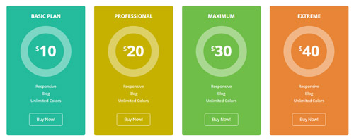
Style 4:
Below is the screen shot:
Codes are as follows:
<div class="price-table price-table4 row">
  <div class="col-md-3 col-sm-6">
    <div class="color_1">
      <div class="price_title">
        <h2>Basic Plan</h2>
      </div>
      <div class="price_holder">
        <div class="price_box"> <span class="sup">$</span><span class="price">10</span> </div>
        <ul>
          <li>Responsive</li>
          <li>Blog</li>
          <li>Unlimited Colors</li>
        </ul>
        <a href="#" class="btn ">Buy Now!</a> </div>
    </div>
  </div>
  <div class="col-md-3 col-sm-6">
    <div class="color_2">
      <div class="price_title ">
        <h2>professional</h2>
      </div>
      <div class="price_holder">
        <div class="price_box"> <span class="sup">$</span><span class="price">20</span> </div>
        <ul>
          <li>Responsive</li>
          <li>Blog</li>
          <li>Unlimited Colors</li>
        </ul>
        <a href="#" class="btn">Buy Now!</a> </div>
    </div>
  </div>
  <div class="col-md-3 col-sm-6" >
    <div class="color_3">
      <div class="price_title">
        <h2>MAXIMUM</h2>
      </div>
      <div class="price_holder">
        <div class="price_box"> <span class="sup">$</span><span class="price">30</span> </div>
        <ul>
          <li>Responsive</li>
          <li>Blog</li>
          <li>Unlimited Colors</li>
        </ul>
        <a href="#" class="btn">Buy Now!</a> </div>
    </div>
  </div>
  <div class="col-md-3 col-sm-6" >
    <div class="color_4">
      <div class="price_title">
        <h2>EXTREME</h2>
      </div>
      <div class="price_holder">
        <div class="price_box"> <span class="sup">$</span><span class="price">40</span> </div>
        <ul>
          <li>Responsive</li>
          <li>Blog</li>
          <li>Unlimited Colors</li>
        </ul>
        <a href="#" class="btn ">Buy Now!</a> </div>
    </div>
  </div>
</div>
Option:
col-md-* col-sm-*is the width for each column. You can change the width you need through value1~12
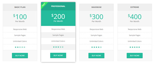
Style 5:
Below is the screen shot:
Codes are as follows:
<div class="price-table price-table5 row">
  <div class="col-md-3 col-sm-6">
    <div class="price_border">
      <div class="price_title">
        <h2>Basic Plan</h2>
      </div>
      <div class="price_holder">
        <div class="price_box"><span class="sup">$</span><span class="price">100</span><span class="unit">Per Month</span></div>
        <ul>
          <li>Responsive Web</li>
          <li>Sample Pages</li>
          <li>Unlimited Colors</li>
          <li><span class="glyphicons glyph-star"></span><span class="glyphicons glyph-star"></span><span class="glyphicons glyph-star"></span><span class="glyphicons glyph-dislikes"></span><span class="glyphicons glyph-dislikes"></span></li>
        </ul>
        <a href="#" class="btn ">BUY NOW!</a> </div>
    </div>
  </div>
  <div class="col-md-3 col-sm-6 best_value">
    <div class="price_border">
      <div class="price_title ">
        <h2>PROFESSIONAL</h2>
      </div>
      <div class="price_holder">
        <div class="price_box"><span class="sup">$</span><span class="price">200</span><span class="unit">Per Month</span></div>
        <ul>
          <li>Responsive Web</li>
          <li>Sample Pages</li>
          <li>Unlimited Colors</li>
          <li><span class="glyphicons glyph-star"></span><span class="glyphicons glyph-star"></span><span class="glyphicons glyph-star"></span><span class="glyphicons glyph-dislikes"></span><span class="glyphicons glyph-dislikes"></span></li>
        </ul>
        <a href="#" class="btn">BUY NOW!</a> </div>
    </div>
  </div>
  <div class="col-md-3 col-sm-6">
    <div class="price_border">
      <div class="price_title">
        <h2>MAXIMUM</h2>
      </div>
      <div class="price_holder">
        <div class="price_box"><span class="sup">$</span><span class="price">300</span><span class="unit">Per Month</span></div>
        <ul>
          <li>Responsive Web</li>
          <li>Sample Pages</li>
          <li>Unlimited Colors</li>
          <li><span class="glyphicons glyph-star"></span><span class="glyphicons glyph-star"></span><span class="glyphicons glyph-star"></span><span class="glyphicons glyph-dislikes"></span><span class="glyphicons glyph-dislikes"></span></li>
        </ul>
        <a href="#" class="btn">BUY NOW!</a> </div>
    </div>
  </div>
  <div class="col-md-3 col-sm-6">
    <div class="price_border">
      <div class="price_title">
        <h2>EXTREME</h2>
      </div>
      <div class="price_holder">
        <div class="price_box"><span class="sup">$</span><span class="price">400</span><span class="unit">Per Month</span></div>
        <ul>
          <li>Responsive Web</li>
          <li>Sample Pages</li>
          <li>Unlimited Colors</li>
          <li><span class="glyphicons glyph-star"></span><span class="glyphicons glyph-star"></span><span class="glyphicons glyph-star"></span><span class="glyphicons glyph-dislikes"></span><span class="glyphicons glyph-dislikes"></span></li>
        </ul>
        <a href="#" class="btn ">BUY NOW!</a> </div>
    </div>
  </div>
</div>
Option:
col-md-* col-sm-*is the width for each column. You can change the width you need through value1~12- You can modify
glyphiconsto change icons. font icon list.
Style 6:
Below is the screen shot:
Codes are as follows:
<div class="price-table price-table6 row">
  <div class="col-md-3 col-sm-6 color_1">
    <div class="price_border">
      <div class="price_title">
        <h2>BASIC</h2>
      </div>
      <div class="price_holder">
        <div class="price_box"><span class="sup">$</span><span class="price">10</span><span class="unit">Per Month</span></div>
        <ul>
          <li>10gb disk space</li>
          <li>100gb bandwidth</li>
          <li>umlimited colors</li>
          <li>dnn free skin</li>
          <li>full time support</li>
        </ul>
        <a class="btn " href="#">BUY NOW!</a> </div>
    </div>
  </div>
  <div class="col-md-3 col-sm-6  color_2">
    <div class="price_border">
      <div class="price_title ">
        <h2>PROFESSIONAL</h2>
      </div>
      <div class="price_holder">
        <div class="price_box"><span class="sup">$</span><span class="price">20</span><span class="unit">Per Month</span></div>
        <ul>
          <li>10gb disk space</li>
          <li>100gb bandwidth</li>
          <li>umlimited colors</li>
          <li>dnn free skin</li>
          <li>full time support</li>
        </ul>
        <a class="btn" href="#">BUY NOW!</a> </div>
    </div>
  </div>
  <div class="col-md-3 col-sm-6  color_3">
    <div class="price_border">
      <div class="price_title">
        <h2>BUSINESS</h2>
      </div>
      <div class="price_holder">
        <div class="price_box"><span class="sup">$</span><span class="price">30</span><span class="unit">Per Month</span></div>
        <ul>
          <li>10gb disk space</li>
          <li>100gb bandwidth</li>
          <li>umlimited colors</li>
          <li>dnn free skin</li>
          <li>full time support</li>
        </ul>
        <a class="btn" href="#">BUY NOW!</a> </div>
    </div>
  </div>
  <div class="col-md-3 col-sm-6  color_4">
    <div class="price_border">
      <div class="price_title">
        <h2>MAXIMUM</h2>
      </div>
      <div class="price_holder">
        <div class="price_box"><span class="sup">$</span><span class="price">40</span><span class="unit">Per Month</span></div>
        <ul>
          <li>10gb disk space</li>
          <li>100gb bandwidth</li>
          <li>umlimited colors</li>
          <li>dnn free skin</li>
          <li>full time support</li>
        </ul>
        <a class="btn " href="#">BUY NOW!</a> </div>
    </div>
  </div>
</div>
Option:
col-md-* col-sm-*is the width for each column. You can change the width you need through value1~12
ProgressBars Counters
You can click the link to check ProgressBars Counters demo. Demo Link
Style 1
Below is the screen shot:
Codes are as follows:
<div class="conboxq pt-60 pb-60">
  <div class="dnn_layout">
    <div class="row">
      <div class="col-md-3 col-sm-6">
        <div class="chart_list5">
          <div data-percent="81" class="percentage3">
            <div class="percentage_inner">
              <div class="glyphicons glyph-magic"></div>
            </div>
            <div class="nob"><span>0</span>%</div>
          </div>
          Web Design </div>
      </div>
      <div class="col-md-3 col-sm-6">
        <div class="chart_list5">
          <div data-percent="91" class="percentage3">
            <div class="percentage_inner">
              <div class="glyphicons glyph-embed-close"></div>
            </div>
            <div class="nob"><span>0</span>%</div>
          </div>
          Html5 & Css3 </div>
      </div>
      <div class="col-md-3 col-sm-6">
        <div class="chart_list5">
          <div data-percent="96" class="percentage3">
            <div class="percentage_inner">
              <div class="glyphicons glyph-more-windows"></div>
            </div>
            <div class="nob"><span>0</span>%</div>
          </div>
          DNN Themes </div>
      </div>
      <div class="col-md-3 col-sm-6">
        <div class="chart_list5">
          <div data-percent="76" class="percentage3">
            <div class="percentage_inner">
              <div class="glyphicons glyph-adjust-alt"></div>
            </div>
            <div class="nob"><span>0</span>%</div>
          </div>
          Jquery </div>
      </div>
    </div>
  </div>
</div>
Option:
col-md-* col-sm-*is the width of each column, you can change the width you need through value1~12data-percentis for controlling the percentage that displays, you can display percentage through value0~100- You can modify
glyphiconsto change icons. font icon list.
Style 2
Below is the screen shot:
Codes are as follows:
<div class="pt-50 pb-50">
  <div class="dnn_layout">
    <div class="content_mid clearfix">
      <div class="pane_layout">
        <div class="chart_list row">
          <div class="col-sm-2">
            <div data-percent="66" class="percentage5">
              <div class="percentage_inner"><span>0</span>%</div>
            </div>
            <p>Dnn Skin</p>
          </div>
          <div class="col-sm-2">
            <div data-percent="98" class="percentage5">
              <div class="percentage_inner"><span>0</span>%</div>
            </div>
            <p>Dnn Module</p>
          </div>
          <div class="col-sm-2">
            <div data-percent="49" class="percentage5">
              <div class="percentage_inner"><span>0</span>%</div>
            </div>
            <p>Template</p>
          </div>
          <div class="col-sm-2">
            <div data-percent="81" class="percentage5">
              <div class="percentage_inner"><span>0</span>%</div>
            </div>
            <p>Skin Pack</p>
          </div>
          <div class="col-sm-2">
            <div data-percent="76" class="percentage5">
              <div class="percentage_inner"><span>0</span>%</div>
            </div>
            <p>Dnn Store</p>
          </div>
          <div class="col-sm-2">
            <div data-percent="63" class="percentage5">
              <div class="percentage_inner"><span>0</span>%</div>
            </div>
            <p>Photoshop</p>
          </div>
        </div>
      </div>
    </div>
  </div>
</div>
Option:
col-sm-*is the width of each column, you can change the width you need through value1~12data-percentis for controlling the percentage that displays, you can display percentage through value0~100
Style 3
Below is the screen shot:
Codes are as follows:
<div class="SectionStyles14 pt-60 pb-60">
<div class="dnn_layout">
<div class="content_mid clearfix">
<div class="pane_layout">
<div class="row">
<div class="col-sm-6 col-md-3">
<div class="chart_list">
<div data-percent="91" class="percentage6">
<div class="percentage_inner"><span>0</span>%</div>
</div>
<p>Web Design</p>
</div>
</div>
<div class="col-sm-6 col-md-3">
<div class="chart_list">
<div data-percent="96" class="percentage6">
<div class="percentage_inner"><span>0</span>%</div>
</div>
<p>HTML5 & CSS3</p>
</div>
</div>
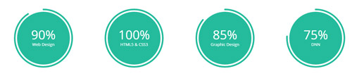
<div class="col-sm-6 col-md-3">
<div class="chart_list">
<div data-percent="86" class="percentage6">
<div class="percentage_inner"><span>0</span>%</div>
</div>
<p>Graphic Design</p>
</div>
</div>
<div class="col-sm-6 col-md-3">
<div class="chart_list">
<div data-percent="76" class="percentage6">
<div class="percentage_inner"><span>0</span>%</div>
</div>
<p>DNN</p>
</div>
</div>
</div>
</div>
</div>
</div>
</div>
Option:
- This is a SectionStyles effect.
col-sm-* col-md-*is the width of each column, you can change the width you need through value1~12data-percentis for controlling the percentage that displays, you can display percentage through value0~100
Style 4
Below is the screen shot:
Codes are as follows:
<div class="chart_list row">
  <div class="col-md-3 col-sm-6">
    <div data-percent="91" class="percentage">
      <div class="percentage_inner"><span>0</span>%
        <p>Web Design</p>
      </div>
    </div>
  </div>
  <div class="col-md-3 col-sm-6">
    <div data-percent="101" class="percentage">
      <div class="percentage_inner"><span>0</span>%
        <p>HTML5 & CSS3</p>
      </div>
    </div>
  </div>
  <div class="col-md-3 col-sm-6">
    <div data-percent="86" class="percentage">
      <div class="percentage_inner"><span>0</span>%
        <p>Graphic Design</p>
      </div>
    </div>
  </div>
  <div class="col-md-3 col-sm-6">
    <div data-percent="76" class="percentage">
      <div class="percentage_inner"><span>0</span>%
        <p>DNN</p>
      </div>
    </div>
  </div>
</div>
Option:
col-md-* col-sm-*is the width of each column, you can change the width you need through value1~12data-percentis for controlling the percentage that displays, you can display percentage through value0~100
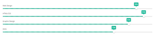
Style 5
Below is the screen shot:
Codes are as follows:
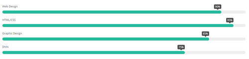
<div class="loaded_list">
  <p> Web Design </p>
  <div class="progress progress-striped active">
    <div class="bar animation animationwidth" data-width="90%"><span></span></div>
  </div>
  <p> HTML/CSS</p>
  <div class="progress progress-striped active">
    <div class="bar animation animationwidth" data-width="95%"><span></span></div>
  </div>
  <p>Graphic Design </p>
  <div class="progress progress-striped active">
    <div class="bar animation animationwidth" data-width="85%"><span></span> </div>
  </div>
  <p>DNN</p>
  <div class="progress progress-striped active">
    <div class="bar animation animationwidth" data-width="75%"><span></span></div>
  </div>
</div>
Option:
- You can modify
animationto change the animation on the slide. Animation list. - You can change the value you need to display through
data-width
Style 6
Below is the screen shot:
Codes are as follows:
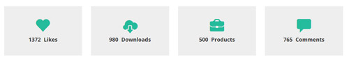
<div class="number_Animation row">
  <div class="col-sm-3">
    <div class="number_Animation_bg"> <span class="glyphicons glyph-heart"> </span> <span class="animation  number" data-number="5300">0</span> <span class="number_name">Likes</span> </div>
  </div>
  <div class="col-sm-3">
    <div class="number_Animation_bg"> <span class="glyphicons glyph-cloud-upload"> </span> <span class="animation  number" data-number="10321">0</span> <span class="number_name">Downloads</span> </div>
  </div>
  <div class="col-sm-3">
    <div class="number_Animation_bg"> <span class="glyphicons glyph-briefcase"> </span> <span class="animation  number" data-number="4632">0</span> <span class="number_name">Products</span> </div>
  </div>
  <div class="col-sm-3">
    <div class="number_Animation_bg"> <span class="glyphicons glyph-comments"> </span> <span class="animation  number" data-number="6548">0</span> <span class="number_name">Comments</span> </div>
  </div>
</div>
Option:
col-sm-*is the width of each column, you can change the width you need through value1~12- You can change the value you need to display through
data-number - You can modify
animationto change the animation on the slide. Animation list. - You can modify
glyphiconsto change icons. font icon list.
Style 7
Below is the screen shot:
Codes are as follows:
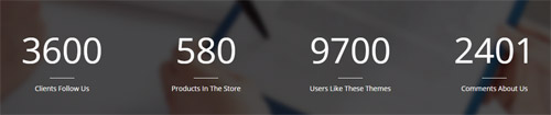
<div class="conboxi">
  <div class="conboxi_bg">
    <div class="shadow pt-30">
      <div class="dnn_layout">
        <div class="conboxi_bgbottom">
          <div class="number_Animation row">
            <div class="col-sm-3 col-xs-6"> <span class="animation  number" data-number="3600">0</span> <span class="line"></span><span class="number_name">Clients Follow Us</span> </div>
            <div class="col-sm-3 col-xs-6"> <span class="animation  number" data-number="580">0</span> <span class="line"></span><span class="number_name">Products In The Store</span> </div>
            <div class="col-sm-3 col-xs-6"> <span class="animation  number" data-number="9700">0</span> <span class="line"></span><span class="number_name">Users Like These Themes</span> </div>
            <div class="col-sm-3 col-xs-6"> <span class="animation  number" data-number="2401">0</span> <span class="line"></span><span class="number_name">Comments About Us</span> </div>
          </div>
        </div>
      </div>
    </div>
  </div>
</div>
Option:
col-sm-* col-xs-*is the width of each column, you can change the width you need through value1~12- You can change the value you need to display through
data-number - You can modify
animationto change the animation on the slide. Animation list.
Style 8
Below is the screen shot:
Codes are as follows:
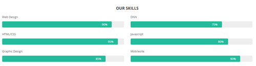
<div class="row loaded_list2_h3">
  <h3>OUR SKILLS</h3>
</div>
<div class="row">
  <div class="col-sm-6 loaded_list2">
    <p> Web Design </p>
    <div class="progress progress-striped active">
      <div data-width="90%" class="bar animation animationwidth"><span></span></div>
    </div>
    <p> HTML/CSS</p>
    <div class="progress progress-striped active">
      <div data-width="95%" class="bar animation animationwidth"><span></span></div>
    </div>
    <p>Graphic Design </p>
    <div class="progress progress-striped active">
      <div data-width="85%" class="bar animation animationwidth"><span></span> </div>
    </div>
  </div>
  <div class="col-sm-6 loaded_list2">
    <p> DNN </p>
    <div class="progress progress-striped active">
      <div data-width="75%" class="bar animation animationwidth"><span></span></div>
    </div>
    <p> Javascript</p>
    <div class="progress progress-striped active">
      <div data-width="80%" class="bar animation animationwidth"><span></span></div>
    </div>
    <p>Mobilesite </p>
    <div class="progress progress-striped active">
      <div data-width="90%" class="bar animation animationwidth"><span></span> </div>
    </div>
  </div>
</div>
Option:
col-sm-*is the width of each column, you can change the width you need through value1~12- You can change the value you need to display through
data-width - You can modify
animationto change the animation on the slide. Animation list.
Style 9
Below is the screen shot:
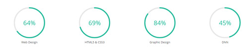
Codes are as follows:
<div class="chart_list2 row">
  <div class="col-sm-3">
    <div data-percent="65" class="percentage2">
      <div class="percentage_inner"><span>0</span>%</div>
    </div>
    Web Design </div>
  <div class="col-sm-3">
    <div data-percent="70" class="percentage2">
      <div class="percentage_inner"><span>0</span>%</div>
    </div>
    HTML5 & CSS3 </div>
  <div class="col-sm-3">
    <div data-percent="85" class="percentage2">
      <div class="percentage_inner"><span>0</span>%</div>
    </div>
    Graphic Design </div>
  <div class="col-sm-3">
    <div data-percent="45" class="percentage2">
      <div class="percentage_inner"><span>0</span>%</div>
    </div>
    DNN </div>
</div>
Option:
col-sm-*is the width of each column, you can change the width you need through value1~12- You can change the value you need to display through
data-percent
Style 10
Below is the screen shot:
Codes are as follows:
<div class="loaded_list3">
  <p> Web Design </p>
  <div class="progress progress-striped active">
    <div class="bar animation animationwidth" data-width="90%"><span></span></div>
  </div>
  <p> HTML/CSS</p>
  <div class="progress progress-striped active">
    <div class="bar animation animationwidth" data-width="95%"><span></span></div>
  </div>
  <p>Graphic Design </p>
  <div class="progress progress-striped active">
    <div class="bar animation animationwidth" data-width="85%"><span></span> </div>
  </div>
  <p>DNN</p>
  <div class="progress progress-striped active">
    <div class="bar animation animationwidth" data-width="75%"><span></span></div>
  </div>
</div>
Option:
- You can modify
animationto change the animation on the slide. Animation list. - You can change the value you need to display through
data-width
Style 11
Below is the screen shot:
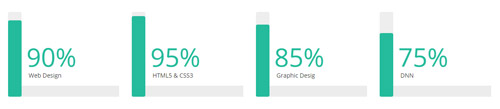
Codes are as follows:
<div class="row">
  <div class="col-md-3 col-sm-6">
    <div class="loaded_list4">
      <div class="progress progress-striped active">
        <div class="bar animation animationwidth" data-height="90%"><span></span> </div>
        <p>Web Design</p>
      </div>
    </div>
  </div>
  <div class="col-md-3 col-sm-6">
    <div class="loaded_list4">
      <div class="progress progress-striped active">
        <div class="bar animation animationwidth" data-height="95%"><span></span> </div>
        <p>HTML5 & CSS3</p>
      </div>
    </div>
  </div>
  <div class="col-md-3 col-sm-6">
    <div class="loaded_list4">
      <div class="progress progress-striped active">
        <div class="bar animation animationwidth" data-height="85%"><span></span> </div>
        <p>Graphic Desig</p>
      </div>
    </div>
  </div>
  <div class="col-md-3 col-sm-6">
    <div class="loaded_list4">
      <div class="progress progress-striped active">
        <div class="bar animation animationwidth" data-height="75%"><span></span> </div>
        <p>DNN</p>
      </div>
    </div>
  </div>
</div>
Option:
col-sm-* colmd-*is the width of each column, you can change the width you need through value1~12.- You can modify
animationto change the animation on the slide. Animation list. - You can change the value you need to display through
data-height
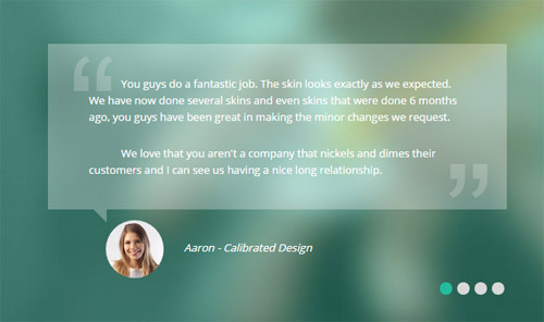
Testimonials
You can click the link to check Testimonials demo. Demo Link
Option:
Testimonials includes the parameters that listed below.
data-position |
Switch mode. fade:fade in fade out, roll-left:roll from side to side, roll-vertical:roll up and down |
data-display-navigation |
Navigation display and hidden. Default to true. true:Display, false:hidden |
data-display-arrows |
Left/right arrow display and hidden. Default to true. true:Display, false:hidden |
data-autoplay |
Whether to scroll automatically or not. 0 is for not scrolling automatically, numbers greater than 0 are for scrolling automatically, and these numbers are the time interval for scrolling. Default to 3000 |
data-autoheight |
Whether to be automatic height or not, default to true. true: automatic height, false: fixed height.< |
Example:
<ul class=" Testimonials_tab" data-position="roll-vertical" data-display-navigation="true" data-display-arrows="true" data-display-navigation="false" data-autoplay="3000" data-autoheight="true">
  <li>
    <h3 class="title a_t_c">What Others Say About Us ?</h3>
		......
Style 1:
Below is the screen shot:
Codes are as follows:
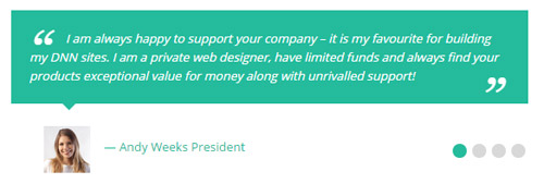
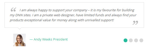
<ul class=" Testimonials_tab Testimonials_1" data-position="fade" data-display-arrows="false" data-autoplay="0">
  <li>
    <blockquote>
      <p>Content text 1 ...</p>
      <small><img alt="" src="/portals/32/Pic_14.jpg" /><span>Name </span></small> </blockquote>
  </li>
  <li>
    <blockquote>
      <p>Content text 2 ...</p>
      <small><img alt="" src="/portals/32/Pic_15.jpg" /><span>Name</span></small> </blockquote>
  </li>
  <li>
    <blockquote>
      <p>Content text 3 ...</p>
      <small><img alt="" src="/portals/32/Pic_16.jpg" /><span>Name</span></small> </blockquote>
  </li>
  <li>
    <blockquote>
      <p>Content text 4 ...</p>
      <small><img alt="" src="/portals/32/Pic_17.jpg" /><span>Name </span></small> </blockquote>
  </li>
</ul>
Style 2:
Below is the screen shot:
Codes are as follows:
<ul class=" Testimonials_tab Testimonials_2" data-position="fade" data-display-arrows="false" data-autoplay="0">
  <li>
    <blockquote>
      <p>Content text 1 ...</p>
      <small><img alt="" src="/portals/32/Pic_14.jpg" /><span>Name </span></small> </blockquote>
  </li>
  <li>
    <blockquote>
      <p>Content text 2 ...</p>
      <small><img alt="" src="/portals/32/Pic_15.jpg" /><span>Name</span></small> </blockquote>
  </li>
  <li>
    <blockquote>
      <p>Content text 3 ...</p>
      <small><img alt="" src="/portals/32/Pic_16.jpg" /><span>Name</span></small> </blockquote>
  </li>
  <li>
    <blockquote>
      <p>Content text 4 ...</p>
      <small><img alt="" src="/portals/32/Pic_17.jpg" /><span>Name </span></small> </blockquote>
  </li>
</ul>
Style 3:
Below is the screen shot:
Codes are as follows:
<ul class=" Testimonials_tab Testimonials_3" data-position="fade" data-display-arrows="false" data-autoplay="0">
  <li>
    <blockquote>
      <p>Content text 1 ...</p>
      <small><span>Name </span></small> </blockquote>
  </li>
  <li>
    <blockquote>
      <p>Content text 2 ...</p>
      <small><span>Name</span></small> </blockquote>
  </li>
  <li>
    <blockquote>
      <p>Content text 3 ...</p>
      <small><span>Name</span></small> </blockquote>
  </li>
  <li>
    <blockquote>
      <p>Content text 4 ...</p>
      <small><span>Name </span></small> </blockquote>
  </li>
</ul>
Style 4:
Below is the screen shot:
Codes are as follows:
<ul class=" Testimonials_tab Testimonials_4" data-position="fade" data-display-arrows="false" data-autoplay="0">
  <li>
    <blockquote>
      <p>Content text 1 ...</p>
      <small><img alt="" src="/portals/32/Pic_14.jpg" /><span>Name </span></small> </blockquote>
  </li>
  <li>
    <blockquote>
      <p>Content text 2 ...</p>
      <small><img alt="" src="/portals/32/Pic_15.jpg" /><span>Name</span></small> </blockquote>
  </li>
  <li>
    <blockquote>
      <p>Content text 3 ...</p>
      <small><img alt="" src="/portals/32/Pic_16.jpg" /><span>Name</span></small> </blockquote>
  </li>
  <li>
    <blockquote>
      <p>Content text 4 ...</p>
      <small><img alt="" src="/portals/32/Pic_17.jpg" /><span>Name </span></small> </blockquote>
  </li>
</ul>
Style 5:
Below is the screen shot:
Codes are as follows:
<ul class=" Testimonials_tab Testimonials_5" data-position="fade" data-display-arrows="false" data-autoplay="0">
  <li>
    <blockquote>
      <p>Content text 1 ...</p>
      <small><img alt="" src="/portals/32/Pic_14.jpg" /><span>Name </span></small> </blockquote>
  </li>
  <li>
    <blockquote>
      <p>Content text 2 ...</p>
      <small><img alt="" src="/portals/32/Pic_15.jpg" /><span>Name</span></small> </blockquote>
  </li>
  <li>
    <blockquote>
      <p>Content text 3 ...</p>
      <small><img alt="" src="/portals/32/Pic_16.jpg" /><span>Name</span></small> </blockquote>
  </li>
  <li>
    <blockquote>
      <p>Content text 4 ...</p>
      <small><img alt="" src="/portals/32/Pic_17.jpg" /><span>Name </span></small> </blockquote>
  </li>
</ul>
Style 6:
Below is the screen shot:
Codes are as follows:
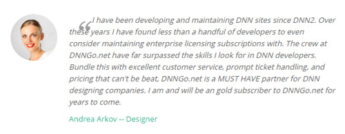
<ul class=" Testimonials_tab Testimonials_6" data-autoplay="3000" data-display-arrows="false" data-position="roll-vertical">
  <li>
    <div class="Pic"><img alt="" src="/portals/32/Pic_14.jpg" /></div>
    <blockquote> <span class="mark">“</span>
      <p>Content text 1 ...</p>
      <small><span>Name</span></small> </blockquote>
  </li>
  <li>
    <div class="Pic"><img alt="" src="/portals/32/Pic_15.jpg" /></div>
    <blockquote> <span class="mark">“</span>
      <p>Content text 2 ...</p>
      <small><span>Name</span></small> </blockquote>
  </li>
  <li>
    <div class="Pic"><img alt="" src="/portals/32/Pic_16.jpg" /> </div>
    <blockquote> <span class="mark">“</span>
      <p>Content text 3 ...</p>
      <small><span>Name</span></small> </blockquote>
  </li>
  <li>
    <div class="Pic"><img alt="" src="/portals/32/Pic_17.jpg" /></div>
    <blockquote> <span class="mark">“</span>
      <p>>Content text 4 ...</p>
      <small><span>Name </span></small> </blockquote>
  </li>
</ul>
Style 7:
Below is the screen shot:
Codes are as follows:
<ul class=" Testimonials_tab Testimonials_7" data-position="fade" data-display-arrows="false" data-autoplay="0">
  <li>
    <blockquote>
      <p>Content text 1 ...</p>
      <small><img alt="" src="/portals/32/Pic_14.jpg" /><span>Name </span></small> </blockquote>
  </li>
  <li>
    <blockquote>
      <p>Content text 2 ...</p>
      <small><img alt="" src="/portals/32/Pic_15.jpg" /><span>Name</span></small> </blockquote>
  </li>
  <li>
    <blockquote>
      <p>Content text 3 ...</p>
      <small><img alt="" src="/portals/32/Pic_16.jpg" /><span>Name</span></small> </blockquote>
  </li>
  <li>
    <blockquote>
      <p>Content text 4 ...</p>
      <small><img alt="" src="/portals/32/Pic_17.jpg" /><span>Name </span></small> </blockquote>
  </li>
</ul>
Style 8:
Below is the screen shot:
Codes are as follows:
<ul class=" Testimonials_tab Testimonials_8" data-position="fade" data-display-arrows="false" data-autoplay="0">
  <li>
    <blockquote>
      <div class="testimonial_text">
        <p>Content text 1 ...</p>
      </div>
      <small><img alt="" src="/portals/32/Pic_14.jpg" /><span>Name </span></small> </blockquote>
  </li>
  <li>
    <blockquote>
      <div class="testimonial_text">
        <p>Content text 2 ...</p>
      </div>
      <small><img alt="" src="/portals/32/Pic_15.jpg" /><span>Name</span></small> </blockquote>
  </li>
  <li>
    <blockquote>
      <div class="testimonial_text">
        <p>Content text 3 ...</p>
      </div>
      <small><img alt="" src="/portals/32/Pic_16.jpg" /><span>Name</span></small> </blockquote>
  </li>
  <li>
    <blockquote>
      <div class="testimonial_text">
        <p>Content text 4 ...</p>
      </div>
      <small><img alt="" src="/portals/32/Pic_17.jpg" /><span>Name </span></small> </blockquote>
  </li>
</ul>
Style 9:
Below is the screen shot:

Codes are as follows:
<div class="SectionStyles13 pt-60 pb-60">
  <div class="dnn_layout">
    <div class="content_mid clearfix">
      <div class="pane_layout">
        <div class="row">
          <div class="col-sm-12">
            <div class="home6con_g animation fadeInUp">
              <h1 class="title">What Others Say</h1>
              <div class="icon"><span class="glyphicons glyph-comments"></span></div>
              <ul class="Testimonials_tab Testimonials_9" data-display-arrows="false" data-position="roll-left" data-height-auto="false" data-autoplay="5000">
                <li>
                  <blockquote>
                    <p>Content text ...</p>
                    <small>David Smith <span>dnngo buyer</span></small> </blockquote>
                </li>
                <li>
                  <blockquote>
                    <p>Content text...</p>
                    <small>Andy Weeks President <span>dnngo buyer</span></small> </blockquote>
                </li>
                <li>
                  <blockquote>
                    <p>Content text...</p>
                    <small>Michal Cyrus<span>dnngo buyer</span></small> </blockquote>
                </li>
              </ul>
            </div>
          </div>
        </div>
      </div>
    </div>
  </div>
</div>
Style 10:
Below is the screen shot:
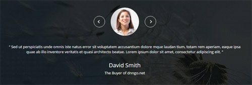
Codes are as follows:
<div class="SectionStyles15 pt-60 pb-60">
  <div class="dnn_layout">
    <div class="content_mid clearfix">
      <div class="pane_layout">
        <div class="row">
          <div class="col-sm-12">
            <ul class="Testimonials_tab Testimonials_10" data-position="roll-left" data-height-auto="false" data-autoplay="5000" data-display-navigation="false">
              <li>
                <blockquote>
                  <p><span class="Pic"><img alt="" class="img-responsive" src="/portals/32/circle1.jpg" /></span> “   Content text ...   ”</p>
                  <small>David Smith <span>The Buyer of dnngo.net</span></small> </blockquote>
              </li>
              <li>
                <blockquote>
                  <p><span class="Pic"><img alt="" class="img-responsive" src="/portals/32/circle2.jpg" /></span> “   Content text...   ”</p>
                  <small>David Smith <span>The Buyer of dnngo.net</span></small> </blockquote>
              </li>
              <li>
                <blockquote>
                  <p><span class="Pic"><img alt="" class="img-responsive" src="/portals/32/circle3.jpg" /></span> “   Content text...   ”</p>
                  <small>David Smith <span>The Buyer of dnngo.net</span></small> </blockquote>
              </li>
            </ul>
          </div>
        </div>
      </div>
    </div>
  </div>
</div>
Responsive Tab
You can click the link to check Responsive Tab demo. Demo Link
You can add the "resp-tabs-list" of "li" to add tab item, and add the "resp-tabs-container" of "resp_container" to add content
Example:
<div class="horizontalTab_Top">
  <ul class="resp-tabs-list">

    <li> Tab1 </li>
    <li> Tab2 </li>
    ....

  </ul>
  <div class="resp-tabs-container">

    <div class="resp_container"> Tab1 Content </div>
    <div class="resp_container"> Tab2 Content </div>
    ....

  </div>
</div>
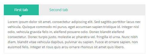
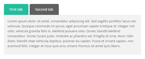
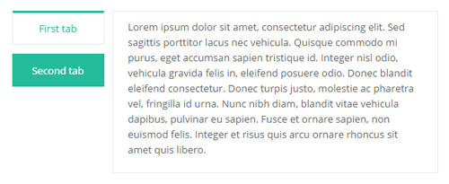
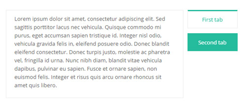
Style 1:
Below is the screen shot:
Codes are as follows:
<div class="horizontalTab_Top horizontalTab_Top_1">
  <ul class="resp-tabs-list">
    <li><span>Title 1</span></li>
    <li><span>Title 2</span></li>
  </ul>
  <div class="resp-tabs-container">
    <div class="resp_container">
      <div class="resp_margin">Content text 1 ...</div>
    </div>
    <div class="resp_container">
      <div class="resp_margin">Content text 2 ...</div>
    </div>
  </div>
</div>
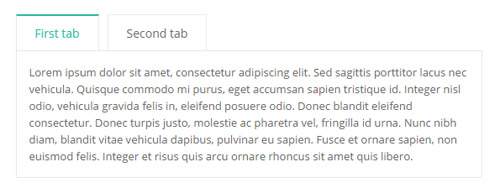
Style 2:
Below is the screen shot:
Codes are as follows:
<div class="horizontalTab_Top horizontalTab_Top_2">
  <ul class="resp-tabs-list clearfix">
    <li><span>Title 1</span></li>
    <li><span>Title 2</span></li>
  </ul>
  <div class="resp-tabs-container">
    <div class="resp_container">
      <div class="resp_margin">Content text 1 ...</div>
    </div>
    <div class="resp_container">
      <div class="resp_margin">Content text 2 ...</div>
    </div>
  </div>
</div>
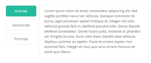
Style 3:
Below is the screen shot:
Codes are as follows:
<div class="verticalTab_Left verticalTab_Left_1">
  <ul class="resp-tabs-list">
    <li><span><em class="glyphicons glyph-leaf"></em>Title 1</span></li>
    <li><span><em class="glyphicons glyph-cogwheel"></em>Title 2</span></li>
    <li><span><em class="glyphicons glyph-power"></em>Title 3</span></li>
    <li><span><em class="glyphicons glyph-playlist"></em>Title 4</span></li>
  </ul>
  <div class="resp-tabs-container">
    <div class="resp_container">
      <div class="resp_margin">Content text 1 ...</div>
    </div>
    <div class="resp_container">
      <div class="resp_margin">Content text 2 ...</div>
    </div>
    <div class="resp_container">
      <div class="resp_margin">Content text 3 ...</div>
    </div>
    <div class="resp_container">
      <div class="resp_margin">Content text 4 ...</div>
    </div>
  </div>
</div>
Style 4:
Below is the screen shot:
Codes are as follows:
<div class="verticalTab_Right verticalTab_Right_1">
  <ul class="resp-tabs-list">
    <li><span><em class="glyphicons glyph-leaf"></em>Title 1</span></li>
    <li><span><em class="glyphicons glyph-cogwheel"></em>Title 2</span></li>
    <li><span><em class="glyphicons glyph-power"></em>Title 3</span></li>
    <li><span><em class="glyphicons glyph-playlist"></em>Title 4</span></li>
  </ul>
  <div class="resp-tabs-container">
    <div class="resp_container">
      <div class="resp_margin">Content text 1 ...</div>
    </div>
    <div class="resp_container">
      <div class="resp_margin">Content text 2 ...</div>
    </div>
    <div class="resp_container">
      <div class="resp_margin">Content text 3 ...</div>
    </div>
    <div class="resp_container">
      <div class="resp_margin">Content text 4 ...</div>
    </div>
  </div>
</div>
Style 5:
Below is the screen shot:
Codes are as follows:
<div class="horizontalTab_Top horizontalTab_Top_3">
    <ul class="resp-tabs-list">
        <li><span>Tab title 1</span></li>
        <li><span>Tab title 2</span></li>
        <li><span>Tab title 3</span></li>
    </ul>
    <div class="resp-tabs-container">
        <div class="resp_container">
            <div class="resp_margin">
            <p>Content text 1 ...</p>
            </div>
        </div>
        <div class="resp_container">
            <div class="resp_margin">
            <p>Content text 2 ...</p>
            </div>
        </div>
        <div class="resp_container">
            <div class="resp_margin">
            <p>Content text 3 ...</p>
            </div>
        </div>
    </div>
</div>
Style 6:
Below is the screen shot:
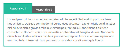
Codes are as follows:
<div class="horizontalTab_Top horizontalTab_Top_4">
  <ul class="resp-tabs-list">
    <li><span>Responsive 1</span></li>
    <li><span>Responsive 2</span></li>
  </ul>
  <div class="resp-tabs-container">
    <div class="resp_container">
      <div class="resp_margin">
        <p>Content text 1 ...</p>
      </div>
    </div>
    <div class="resp_container">
      <div class="resp_margin">
        <p>Content text 2 ...</p>
      </div>
    </div>
  </div>
</div>
Style 7:
Below is the screen shot:
Codes are as follows:
<div class="verticalTab_Left verticalTab_Left_2">
  <ul class="resp-tabs-list">
    <li><span>Title 1</span></li>
    <li><span>Title 2</span></li>
    <li><span>Title 3</span></li>
  </ul>
  <div class="resp-tabs-container">
    <div class="resp_container">
      <div class="resp_margin">Content text 1 ...</div>
    </div>
    <div class="resp_container">
      <div class="resp_margin">Content text 2 ...</div>
    </div>
    <div class="resp_container">
      <div class="resp_margin">Content text 3 ...</div>
    </div>
  </div>
</div>
Style 8:
Below is the screen shot:
Codes are as follows:
<div class="verticalTab_Right verticalTab_Right_2">
  <ul class="resp-tabs-list">
    <li><span>Title 1</span></li>
    <li><span>Title 2</span></li>
    <li><span>Title 3</span></li>
  </ul>
  <div class="resp-tabs-container">
    <div class="resp_container">
      <div class="resp_margin">Content text 1 ...</div>
    </div>
    <div class="resp_container">
      <div class="resp_margin">Content text 2 ...</div>
    </div>
    <div class="resp_container">
      <div class="resp_margin">Content text 3 ...</div>
    </div>
  </div>
</div>
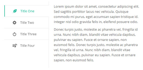
Style 9:
Below is the screen shot:
Codes are as follows:
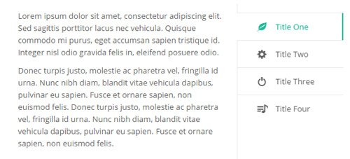
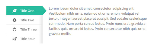
<div class="verticalTab_Left verticalTab_Left_4">
  <ul class="resp-tabs-list">
    <li><span>Title One</span></li>
    <li><span>Title Two</span></li>
    <li><span>Title Three</span></li>
    <li><span>Title Four</span></li>
  </ul>
  <div class="resp-tabs-container">
    <div class="resp_container">
      <div class="resp_margin">
        <p>Content text 1 ...</p>
      </div>
    </div>
    <div class="resp_container">
      <div class="resp_margin">
        <p>Content text 2 ...</p>
      </div>
    </div>
    <div class="resp_container">
      <div class="resp_margin">
        <p>Content text 3 ...</p>
      </div>
    </div>
    <div class="resp_container">
      <div class="resp_margin">
        <p>Content text 4 ...</p>
      </div>
    </div>
  </div>
</div>
Style 10:
Below is the screen shot:
Codes are as follows:
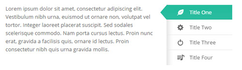
<div class="verticalTab_Right verticalTab_Right_4">
  <ul class="resp-tabs-list">
    <li><span>Title One</span></li>
    <li><span>Title Two</span></li>
    <li><span>Title Three</span></li>
    <li><span>Title Four</span></li>
  </ul>
  <div class="resp-tabs-container">
    <div class="resp_container">
      <div class="resp_margin">
        <p>Content text 1 ...</p>
      </div>
    </div>
    <div class="resp_container">
      <div class="resp_margin">
        <p>Content text 2 ...</p>
      </div>
    </div>
    <div class="resp_container">
      <div class="resp_margin">
        <p>Content text 3 ...</p>
      </div>
    </div>
    <div class="resp_container">
      <div class="resp_margin">
        <p>Content text 4 ...</p>
      </div>
    </div>
  </div>
</div>
Style 11:
Below is the screen shot:
Codes are as follows:
<div class="verticalTab_Left verticalTab_Left_3">
  <ul class="resp-tabs-list">
    <li><span>Title 1</span></li>
    <li><span>Title 2</span></li>
  </ul>
  <div class="resp-tabs-container">
    <div class="resp_container">
      <div class="resp_margin">Content text 1 ...</div>
    </div>
    <div class="resp_container">
      <div class="resp_margin">Content text 2 ...</div>
    </div>
  </div>
</div>
Style 12:
Below is the screen shot:
Codes are as follows:
<div class="verticalTab_Right verticalTab_Right_3">
  <ul class="resp-tabs-list">
    <li><span>Title 1</span></li>
    <li><span>Title 2</span></li>
  </ul>
  <div class="resp-tabs-container">
    <div class="resp_container">
      <div class="resp_margin">Content text 1 ...</div>
    </div>
    <div class="resp_container">
      <div class="resp_margin">Content text 2 ...</div>
    </div>
  </div>
</div>
Style 13:
Below is the screen shot:
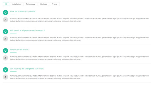
Codes are as follows:
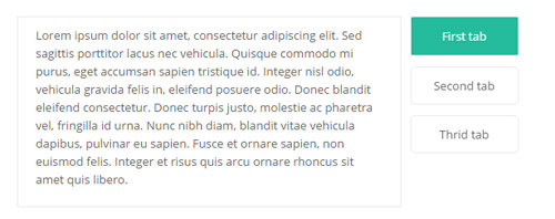
<div class="horizontalTab_Top horizontalTab_Top_5">
  <ul class="resp-tabs-list">
    <li><span>All</span></li>
    <li><span>Installation</span></li>
    <li><span>Technology</span></li>
    <li><span>Modules</span></li>
    <li><span>Pricing</span></li>
  </ul>
  <div class="resp-tabs-container">
    <div class="resp_container">
      <div class="resp_margin">
        <div class="resp_main">
          <div class="resp_top clearfix"> <span class="dropcaps_2">Q</span>
            <p>What services do you provide ?</p>
            <span class="resp_line"></span> </div>
          <div class="resp_con clearfix"> <span class="dropcaps_7">A</span>
            <p>Content text...</p>
          </div>
        </div>
        <div class="resp_main">
          <div class="resp_top clearfix"> <span class="dropcaps_2">Q</span>
            <p>Will it work in all popular web browsers ?</p>
            <span class="resp_line"></span> </div>
          <div class="resp_con clearfix"> <span class="dropcaps_7">A</span>
            <p>Content text...</p>
          </div>
        </div>
        <div class="resp_main">
          <div class="resp_top clearfix"> <span class="dropcaps_2">Q</span>
            <p>How much will it cost ?</p>
            <span class="resp_line"></span> </div>
          <div class="resp_con clearfix"> <span class="dropcaps_7">A</span>
            <p>Content text...</p>
          </div>
        </div>
        <div class="resp_main">
          <div class="resp_top clearfix"> <span class="dropcaps_2">Q</span>
            <p>Can you help me change the skin color ?</p>
            <span class="resp_line"></span> </div>
          <div class="resp_con clearfix"> <span class="dropcaps_7">A</span>
            <p>Content text...</p>
          </div>
        </div>
      </div>
    </div>
    <div class="resp_container">
      <div class="resp_margin">
        <div class="resp_main">
          <div class="resp_top clearfix"> <span class="dropcaps_2">Q</span>
            <p>What services do you provide ?</p>
            <span class="resp_line"></span> </div>
          <div class="resp_con clearfix"> <span class="dropcaps_7">A</span>
            <p>Content text...</p>
          </div>
        </div>
        <div class="resp_main">
          <div class="resp_top clearfix"> <span class="dropcaps_2">Q</span>
            <p>Will it work in all popular web browsers ?</p>
            <span class="resp_line"></span> </div>
          <div class="resp_con clearfix"> <span class="dropcaps_7">A</span>
            <p>Content text...</p>
          </div>
        </div>
        <div class="resp_main">
          <div class="resp_top clearfix"> <span class="dropcaps_2">Q</span>
            <p>How much will it cost ?</p>
            <span class="resp_line"></span> </div>
          <div class="resp_con clearfix"> <span class="dropcaps_7">A</span>
            <p>Content text...</p>
          </div>
        </div>
        <div class="resp_main">
          <div class="resp_top clearfix"> <span class="dropcaps_2">Q</span>
            <p>Can you help me change the skin color ?</p>
            <span class="resp_line"></span> </div>
          <div class="resp_con clearfix"> <span class="dropcaps_7">A</span>
            <p>Content text...</p>
          </div>
        </div>
      </div>
    </div>
    <div class="resp_container">
      <div class="resp_margin">
        <div class="resp_main">
          <div class="resp_top clearfix"> <span class="dropcaps_2">Q</span>
            <p>What services do you provide ?</p>
            <span class="resp_line"></span> </div>
          <div class="resp_con clearfix"> <span class="dropcaps_7">A</span>
            <p>Content text...</p>
          </div>
        </div>
        <div class="resp_main">
          <div class="resp_top clearfix"> <span class="dropcaps_2">Q</span>
            <p>Will it work in all popular web browsers ?</p>
            <span class="resp_line"></span> </div>
          <div class="resp_con clearfix"> <span class="dropcaps_7">A</span>
            <p>Content text...</p>
          </div>
        </div>
        <div class="resp_main">
          <div class="resp_top clearfix"> <span class="dropcaps_2">Q</span>
            <p>How much will it cost ?</p>
            <span class="resp_line"></span> </div>
          <div class="resp_con clearfix"> <span class="dropcaps_7">A</span>
            <p>Content text...</p>
          </div>
        </div>
      </div>
    </div>
  </div>
</div>
Style 14:
Below is the screen shot:
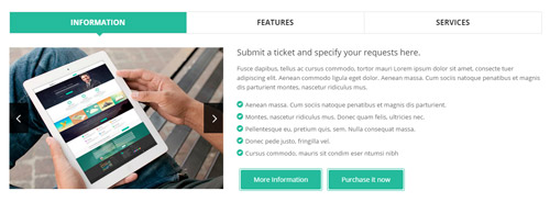
Codes are as follows:
<div class="horizontalTab_Top horizontalTab_Top_6 animation fadeInUp">
  <ul class="resp-tabs-list clearfix">
    <li><span>Information</span></li>
    <li><span>Features</span></li>
    <li><span>Services</span></li>
  </ul>
  <div class="resp-tabs-container">
    <div class="resp_container">
      <div class="resp_margin">
        <div class="row horizontalTab_Top_6A">
          <div class="col-sm-5">
            <div class="carousel carousel_2" data-autoheight="false" data-pagination="false">
              <div class="item"> <img alt="" class="img-responsive" src="/portals/32/show24.png" /> </div>
              <div class="item"> <img alt="" class="img-responsive" src="/portals/32/show25.png" /> </div>
            </div>
          </div>
          <div class="col-sm-7">
            <h3>Submit a ticket and specify your requests here.</h3>
            <p>Fusce dapibus, tellus ac cursus commodo, tortor mauri Lorem ipsum dolor sit amet, consecte tuer adipiscing elit. Aenean commodo ligula eget dolor. Aenean massa. Cum sociis natoque penatibus et magnis dis parturient montes, nascetur ridiculus mus. </p>
            <ul class="list_style">
              <li><span class="glyphicons glyph-circle-ok"></span>Aenean massa. Cum sociis natoque penatibus et magnis dis parturient. </li>
              <li><span class="glyphicons glyph-circle-ok"></span>Montes, nascetur ridiculus mus. Donec quam felis, ultricies nec. </li>
              <li><span class="glyphicons glyph-circle-ok"></span>Pellentesque eu, pretium quis, sem. Nulla consequat massa. </li>
              <li><span class="glyphicons glyph-circle-ok"></span>Donec pede justo, fringilla vel.</li>
              <li><span class="glyphicons glyph-circle-ok"></span>Cursus commodo, mauris sit condim eser ntumsi nibh</li>
            </ul>
            <div class="conboxf_a"><a class="Button_default" href="#">More Information</a><a class="Button_default" href="#">Purchase it now</a></div>
          </div>
        </div>
      </div>
    </div>
    <div class="resp_container">
      <div class="resp_margin">
        <div class="row horizontalTab_Top_6B">
          <div class="col-sm-4">
            <div class="horizontalTab_Top_6B_lefticon"><span class="glyphicons glyph-fire"></span></div>
            <h3>The Features</h3>
            <div class="line"></div>
            <ul class="list_style">
              <li><span class="glyphicons glyph-flash"></span>Full Support</li>
              <li><span class="glyphicons glyph-flash"></span>Unlimited Colors or Themes</li>
              <li><span class="glyphicons glyph-flash"></span>New Header & Footer</li>
              <li><span class="glyphicons glyph-flash"></span>5 Main Layout Sample Styles</li>
              <li><span class="glyphicons glyph-flash"></span>Full & Boxed Layout</li>
              <li><span class="glyphicons glyph-flash"></span>Compatible with Major Browsers</li>
              <li><span class="glyphicons glyph-flash"></span>SEO Friendly & Optimized</li>
              <li><span class="glyphicons glyph-flash"></span>Customized Settings</li>
            </ul>
          </div>
          <div class="col-sm-4">
            <div class="horizontalTab_Top_6B_lefticon"><span class="glyphicons glyph-cloud"></span></div>
            <h3>Download</h3>
            <div class="line"></div>
            <ul class="list_style">
              <li><span class="glyphicons glyph-flash"></span>Unlimited Skins/Styles/Colors</li>
              <li><span class="glyphicons glyph-flash"></span>Ultra Responsive design</li>
              <li><span class="glyphicons glyph-flash"></span>Multi-Purpose</li>
              <li><span class="glyphicons glyph-flash"></span>Bootstrap 3 & Retina Ready</li>
              <li><span class="glyphicons glyph-flash"></span>Responsive Full Width Slider Banner</li>
              <li><span class="glyphicons glyph-flash"></span>CSS3 & HTML 5</li>
              <li><span class="glyphicons glyph-flash"></span>DNN6 & DNN7</li>
              <li><span class="glyphicons glyph-flash"></span>Hundreds of Google Fonts</li>
            </ul>
          </div>
          <div class="col-sm-4">
            <div class="horizontalTab_Top_6B_lefticon"><span class="glyphicons glyph-fire"></span></div>
            <h3>Advanced</h3>
            <div class="line"></div>
            <ul class="list_style">
              <li><span class="glyphicons glyph-flash"></span>5 Header Styles</li>
              <li><span class="glyphicons glyph-flash"></span>5 Header Styles</li>
              <li><span class="glyphicons glyph-flash"></span>4 Menu options</li>
              <li><span class="glyphicons glyph-flash"></span>Cutting-edge CSS3 animations</li>
              <li><span class="glyphicons glyph-flash"></span>DNN 7 Page Template</li>
              <li><span class="glyphicons glyph-flash"></span>Short Codes</li>
              <li><span class="glyphicons glyph-flash"></span>Typography</li>
              <li><span class="glyphicons glyph-flash"></span>3 Portfolios styles</li>
            </ul>
          </div>
        </div>
      </div>
    </div>
    <div class="resp_container">
      <div class="resp_margin">
        <div class="row horizontalTab_Top_6C">
          <div class="col-sm-4">
            <h3><span class="glyphicons glyph-tint"></span>Clean Design</h3>
            <p>Nullam quis risus eget urna mollis ornare vel eu leo. Duis mollis, est non commod us, nisi erat porttitor ligula, eget lacinia odio sem nec elit. </p>
          </div>
          <div class="col-sm-4">
            <h3><span class="glyphicons glyph-parents"></span>Membership</h3>
            <p>Nullam quis risus eget urna mollis ornare vel eu leo. Duis mollis, est non commod us, nisi erat porttitor ligula, eget lacinia odio sem nec elit. </p>
          </div>
          <div class="col-sm-4">
            <h3><span class="glyphicons glyph-leaf"></span>Smart Skin</h3>
            <p>Nullam quis risus eget urna mollis ornare vel eu leo. Duis mollis, est non commod us, nisi erat porttitor ligula, eget lacinia odio sem nec elit. </p>
          </div>
        </div>
        <div class="row horizontalTab_Top_6C">
          <div class="col-sm-4">
            <h3><span class="glyphicons glyph-heart"></span>Many Likes</h3>
            <p>Nullam quis risus eget urna mollis ornare vel eu leo. Duis mollis, est non commod us, nisi erat porttitor ligula, eget lacinia odio sem nec elit. </p>
          </div>
          <div class="col-sm-4">
            <h3><span class="glyphicons glyph-cogwheel"></span>Easy Managed</h3>
            <p>Nullam quis risus eget urna mollis ornare vel eu leo. Duis mollis, est non commod us, nisi erat porttitor ligula, eget lacinia odio sem nec elit. </p>
          </div>
          <div class="col-sm-4">
            <h3><span class="glyphicons glyph-resize-full"></span>Fully Support</h3>
            <p>Nullam quis risus eget urna mollis ornare vel eu leo. Duis mollis, est non commod us, nisi erat porttitor ligula, eget lacinia odio sem nec elit. </p>
          </div>
        </div>
      </div>
    </div>
  </div>
</div>
Style 15:
Below is the screen shot:
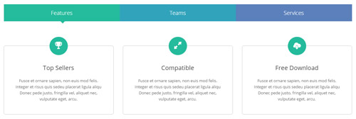
Codes are as follows:
<div class="horizontalTab_Top horizontalTab_Top_7">
  <ul class="resp-tabs-list clearfix">
    <li class="ht7_a"><span>Features</span></li>
    <li class="ht7_b"><span>Teams</span></li>
    <li class="ht7_c"><span>Services</span></li>
  </ul>
  <div class="resp-tabs-container">
    <div class="resp_container">
      <div class="resp_margin">
        <div class="row horizontalTab_Top_7A">
          <div class="col-sm-4">
            <div class="flip_box_6">
              <div class="icon"><span class="glyphicons glyph-cup"></span></div>
              <h1>Top Sellers</h1>
              <p>Fusce et ornare sapien, non euis mod felis. Integer et risus quis sedeu placerat ligula aliqu Donec pede justo, fringilla vel, aliquet nec, vulputate eget, arcu.</p>
            </div>
          </div>
          <div class="col-sm-4">
            <div class="flip_box_6">
              <div class="icon"><span class="glyphicons glyph-resize-full"></span></div>
              <h1>Compatible</h1>
              <p>Fusce et ornare sapien, non euis mod felis. Integer et risus quis sedeu placerat ligula aliqu Donec pede justo, fringilla vel, aliquet nec, vulputate eget, arcu.</p>
            </div>
          </div>
          <div class="col-sm-4">
            <div class="flip_box_6">
              <div class="icon"><span class="glyphicons glyph-cloud-upload"></span></div>
              <h1>Free Download</h1>
              <p>Fusce et ornare sapien, non euis mod felis. Integer et risus quis sedeu placerat ligula aliqu Donec pede justo, fringilla vel, aliquet nec, vulputate eget, arcu.</p>
            </div>
          </div>
        </div>
      </div>
    </div>
    <div class="resp_container">
      <div class="resp_margin">
        <div class="row horizontalTab_Top_7B">
          <div class="col-sm-6 col-md-3">
            <div class="our_team_home6">
              <div class="img">
                <div class="photo_box"> <a href="#">
                  <div class="pic_box"> <img alt="" src="/portals/32/oth1_5.jpg" class="img-responsive" />
                    <div class="shade"></div>
                  </div>
                  </a> </div>
              </div>
              <h5>Merry Smith</h5>
              <h4>Designer</h4>
            </div>
          </div>
          <div class="col-sm-6 col-md-3">
            <div class="our_team_home6">
              <div class="img">
                <div class="photo_box"> <a href="#">
                  <div class="pic_box"> <img alt="" src="/portals/32/oth1_4.jpg" class="img-responsive" />
                    <div class="shade"></div>
                  </div>
                  </a> </div>
              </div>
              <h5>Harro Holloy</h5>
              <h4>Developer</h4>
            </div>
          </div>
          <div class="col-sm-6 col-md-3">
            <div class="our_team_home6">
              <div class="img">
                <div class="photo_box"> <a href="#">
                  <div class="pic_box"> <img alt="" src="/portals/32/oth1_7.jpg" class="img-responsive" />
                    <div class="shade"></div>
                  </div>
                  </a> </div>
              </div>
              <h5>Steven Doe</h5>
              <h4>Programmer</h4>
            </div>
          </div>
          <div class="col-sm-6 col-md-3">
            <div class="our_team_home6">
              <div class="img">
                <div class="photo_box"> <a href="#">
                  <div class="pic_box"> <img alt="" src="/portals/32/oth1_8.jpg" class="img-responsive" />
                    <div class="shade"></div>
                  </div>
                  </a> </div>
              </div>
              <h5>David Bomme </h5>
              <h4>CEO</h4>
            </div>
          </div>
        </div>
      </div>
    </div>
    <div class="resp_container">
      <div class="resp_margin">
        <div class="horizontalTab_Top_7C">
          <div class="row">
            <div class="col-sm-12">
              <h6>Customization services ensure what exactly you want</h6>
              <p>Fusce dapibus, tellus ac cursus commodo, tortor mauri Lorem ipsum dolor sit amet, consecte tuer adipiscing elit. Aenean commodo ligula eget dolor. Aenean massa. Cum sociis natoque penatibus et magnis dis parturient montes, nascetur ridiculus mus. </p>
            </div>
          </div>
          <div class="chart_list row">
            <div class="col-sm-2">
              <div data-percent="66" class="percentage5">
                <div class="percentage_inner"><span>0</span>%</div>
              </div>
              <p>Dnn Skin</p>
            </div>
            <div class="col-sm-2">
              <div data-percent="98" class="percentage5">
                <div class="percentage_inner"><span>0</span>%</div>
              </div>
              <p>Dnn Module</p>
            </div>
            <div class="col-sm-2">
              <div data-percent="49" class="percentage5">
                <div class="percentage_inner"><span>0</span>%</div>
              </div>
              <p>Template</p>
            </div>
            <div class="col-sm-2">
              <div data-percent="81" class="percentage5">
                <div class="percentage_inner"><span>0</span>%</div>
              </div>
              <p>Skin Pack</p>
            </div>
            <div class="col-sm-2">
              <div data-percent="76" class="percentage5">
                <div class="percentage_inner"><span>0</span>%</div>
              </div>
              <p>Dnn Store</p>
            </div>
            <div class="col-sm-2">
              <div data-percent="63" class="percentage5">
                <div class="percentage_inner"><span>0</span>%</div>
              </div>
              <p>Photoshop</p>
            </div>
          </div>
        </div>
      </div>
    </div>
  </div>
</div>
Accordions
You can click the link to check Accordions demo. Demo Link
Option:
- id="accordion" of each accordions effect needs using different names.
"data-parent"needs to have the same name asid- href="#collapse1" is the id that needs to expand content.
- id="collapse1" is the content that needs to expand.
<div class="panel-group" id="accordion">

  <div class="panel panel-default">
    <div class="panel-heading">
      <h4 class="panel-title"> <a data-toggle="collapse" data-parent="#accordion" href="#collapse1"> Title Text ... </a> </h4>
    </div>
    <div id="collapse1" class="panel-collapse collapse in">
      <div class="panel-body">Content Text ... </div>
    </div>
  </div>
  ....

</div>
Style 1:
Below is the screen shot:
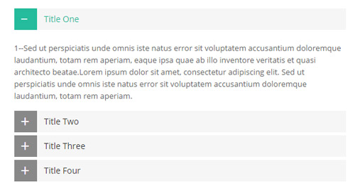
Codes are as follows:
<div class="panel-group accordion_1" id="accordion">
  <div class="panel panel-default">
    <div class="panel-heading">
      <h4 class="panel-title"> <a data-toggle="collapse" data-parent="#accordion" href="#collapse1_1"><span class="accordion_icon"></span>title 1</a> </h4>
    </div>
    <div id="collapse1_1" class="panel-collapse collapse in">
      <div class="panel-body">Content text 1 ... </div>
    </div>
  </div>
  <div class="panel panel-default">
    <div class="panel-heading">
      <h4 class="panel-title"> <a data-toggle="collapse" data-parent="#accordion" href="#collapse1_2" class="collapsed"><span class="accordion_icon"></span>title 2</a> </h4>
    </div>
    <div id="collapse1_2" class="panel-collapse collapse">
      <div class="panel-body">Content text 2 ... </div>
    </div>
  </div>
  <div class="panel panel-default">
    <div class="panel-heading">
      <h4 class="panel-title"> <a data-toggle="collapse" data-parent="#accordion" href="#collapse1_3" class="collapsed"><span class="accordion_icon"></span>title 3</a> </h4>
    </div>
    <div id="collapse1_3" class="panel-collapse collapse">
      <div class="panel-body">Content text 3 ... </div>
    </div>
  </div>
  <div class="panel panel-default">
    <div class="panel-heading">
      <h4 class="panel-title"> <a data-toggle="collapse" data-parent="#accordion" href="#collapse1_4" class="collapsed"><span class="accordion_icon"></span>title 4</a> </h4
        >
    </div>
    <div id="collapse1_4" class="panel-collapse collapse">
      <div class="panel-body">Content text 4 ... </div>
    </div>
  </div>
</div>
Style 2:
Below is the screen shot:
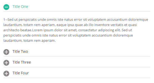
Codes are as follows:
<div class="panel-group accordion_2" id="accordion2">
  <div class="panel panel-default">
    <div class="panel-heading">
      <h4 class="panel-title"> <a data-toggle="collapse" data-parent="#accordion2" href="#collapse2_1"><span class="accordion_icon"></span>title 1</a> </h4>
    </div>
    <div id="collapse2_1" class="panel-collapse collapse in">
      <div class="panel-body">Content text 1 ... </div>
    </div>
  </div>
  <div class="panel panel-default">
    <div class="panel-heading">
      <h4 class="panel-title"> <a data-toggle="collapse" data-parent="#accordion2" href="#collapse2_2" class="collapsed"><span class="accordion_icon"></span>title 2</a> </h4>
    </div>
    <div id="collapse2_2" class="panel-collapse collapse">
      <div class="panel-body">Content text 2 ... </div>
    </div>
  </div>
  <div class="panel panel-default">
    <div class="panel-heading">
      <h4 class="panel-title"> <a data-toggle="collapse" data-parent="#accordion2" href="#collapse2_3" class="collapsed"><span class="accordion_icon"></span>title 3</a> </h4>
    </div>
    <div id="collapse2_3" class="panel-collapse collapse">
      <div class="panel-body">Content text 3 ... </div>
    </div>
  </div>
  <div class="panel panel-default">
    <div class="panel-heading">
      <h4 class="panel-title"> <a data-toggle="collapse" data-parent="#accordion2" href="#collapse2_4" class="collapsed"><span class="accordion_icon"></span>title 4</a> </h4
        >
    </div>
    <div id="collapse2_4" class="panel-collapse collapse">
      <div class="panel-body">Content text 4 ... </div>
    </div>
  </div>
</div>
Style 3:
Below is the screen shot:
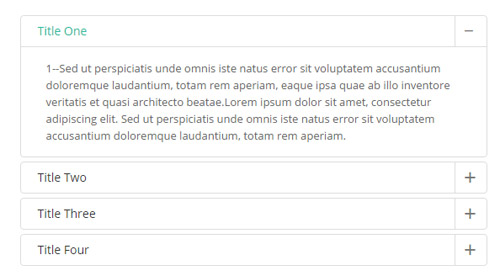
Codes are as follows:
<div class="panel-group accordion_3" id="accordion3">
  <div class="panel panel-default">
    <div class="panel-heading">
      <h4 class="panel-title"> <a data-toggle="collapse" data-parent="#accordion3" href="#collapse3_1"><span class="accordion_icon"></span>title 1</a> </h4>
    </div>
    <div id="collapse3_1" class="panel-collapse collapse in">
      <div class="panel-body">Content text 1 ... </div>
    </div>
  </div>
  <div class="panel panel-default">
    <div class="panel-heading">
      <h4 class="panel-title"> <a data-toggle="collapse" data-parent="#accordion3" href="#collapse3_2" class="collapsed"><span class="accordion_icon"></span>title 2</a> </h4>
    </div>
    <div id="collapse3_2" class="panel-collapse collapse">
      <div class="panel-body">Content text 2 ... </div>
    </div>
  </div>
  <div class="panel panel-default">
    <div class="panel-heading">
      <h4 class="panel-title"> <a data-toggle="collapse" data-parent="#accordion3" href="#collapse3_3" class="collapsed"><span class="accordion_icon"></span>title 3</a> </h4>
    </div>
    <div id="collapse3_3" class="panel-collapse collapse">
      <div class="panel-body">Content text 3 ... </div>
    </div>
  </div>
  <div class="panel panel-default">
    <div class="panel-heading">
      <h4 class="panel-title"> <a data-toggle="collapse" data-parent="#accordion3" href="#collapse3_4" class="collapsed"><span class="accordion_icon"></span>title 4</a> </h4
        >
    </div>
    <div id="collapse3_4" class="panel-collapse collapse">
      <div class="panel-body">Content text 4 ... </div>
    </div>
  </div>
</div>
Style 4:
Below is the screen shot:
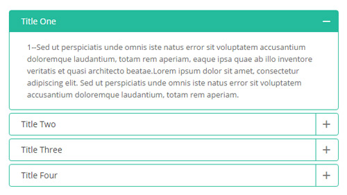
Codes are as follows:
<div class="panel-group accordion_4" id="accordion4">
  <div class="panel panel-default">
    <div class="panel-heading">
      <h4 class="panel-title"> <a data-toggle="collapse" data-parent="#accordion4" href="#collapse4_1"><span class="accordion_icon"></span>title 1</a> </h4>
    </div>
    <div id="collapse4_1" class="panel-collapse collapse in">
      <div class="panel-body">Content text 1 ... </div>
    </div>
  </div>
  <div class="panel panel-default">
    <div class="panel-heading">
      <h4 class="panel-title"> <a data-toggle="collapse" data-parent="#accordion4" href="#collapse4_2" class="collapsed"><span class="accordion_icon"></span>title 2</a> </h4>
    </div>
    <div id="collapse4_2" class="panel-collapse collapse">
      <div class="panel-body">Content text 2 ... </div>
    </div>
  </div>
  <div class="panel panel-default">
    <div class="panel-heading">
      <h4 class="panel-title"> <a data-toggle="collapse" data-parent="#accordion4" href="#collapse4_3" class="collapsed"><span class="accordion_icon"></span>title 3</a> </h4>
    </div>
    <div id="collapse4_3" class="panel-collapse collapse">
      <div class="panel-body">Content text 3 ... </div>
    </div>
  </div>
  <div class="panel panel-default">
    <div class="panel-heading">
      <h4 class="panel-title"> <a data-toggle="collapse" data-parent="#accordion4" href="#collapse4_4" class="collapsed"><span class="accordion_icon"></span>title 4</a> </h4
        >
    </div>
    <div id="collapse4_4" class="panel-collapse collapse">
      <div class="panel-body">Content text 4 ... </div>
    </div>
  </div>
</div>
Style 5:
Below is the screen shot:
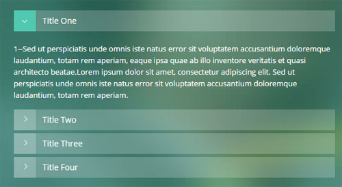
Codes are as follows:
<div class="panel-group accordion_5" id="accordion5">
  <div class="panel panel-default">
    <div class="panel-heading">
      <h4 class="panel-title"> <a data-toggle="collapse" data-parent="#accordion5" href="#collapse5_1"><span class="accordion_icon"></span>title 1</a> </h4>
    </div>
    <div id="collapse5_1" class="panel-collapse collapse in">
      <div class="panel-body">Content text 1 ... </div>
    </div>
  </div>
  <div class="panel panel-default">
    <div class="panel-heading">
      <h4 class="panel-title"> <a data-toggle="collapse" data-parent="#accordion5" href="#collapse5_2" class="collapsed"><span class="accordion_icon"></span>title 2</a> </h4>
    </div>
    <div id="collapse5_2" class="panel-collapse collapse">
      <div class="panel-body">Content text 2 ... </div>
    </div>
  </div>
  <div class="panel panel-default">
    <div class="panel-heading">
      <h4 class="panel-title"> <a data-toggle="collapse" data-parent="#accordion5" href="#collapse5_3" class="collapsed"><span class="accordion_icon"></span>title 3</a> </h4>
    </div>
    <div id="collapse5_3" class="panel-collapse collapse">
      <div class="panel-body">Content text 3 ... </div>
    </div>
  </div>
  <div class="panel panel-default">
    <div class="panel-heading">
      <h4 class="panel-title"> <a data-toggle="collapse" data-parent="#accordion5" href="#collapse5_4" class="collapsed"><span class="accordion_icon"></span>title 4</a> </h4
        >
    </div>
    <div id="collapse5_4" class="panel-collapse collapse">
      <div class="panel-body">Content text 4 ... </div>
    </div>
  </div>
</div>
Style 6:
Below is the screen shot:
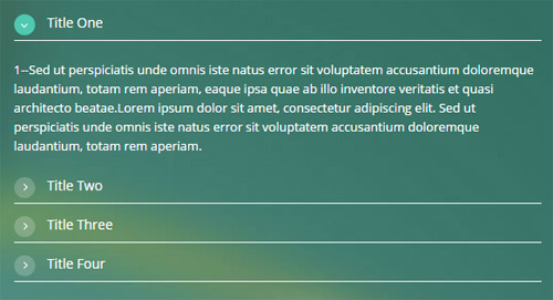
Codes are as follows:
<div class="panel-group accordion_6" id="accordion6">
  <div class="panel panel-default">
    <div class="panel-heading">
      <h4 class="panel-title"> <a data-toggle="collapse" data-parent="#accordion6" href="#collapse6_1"><span class="accordion_icon"></span>title 1</a> </h4>
    </div>
    <div id="collapse6_1" class="panel-collapse collapse in">
      <div class="panel-body">Content text 1 ... </div>
    </div>
  </div>
  <div class="panel panel-default">
    <div class="panel-heading">
      <h4 class="panel-title"> <a data-toggle="collapse" data-parent="#accordion6" href="#collapse6_2" class="collapsed"><span class="accordion_icon"></span>title 2</a> </h4>
    </div>
    <div id="collapse6_2" class="panel-collapse collapse">
      <div class="panel-body">Content text 2 ... </div>
    </div>
  </div>
  <div class="panel panel-default">
    <div class="panel-heading">
      <h4 class="panel-title"> <a data-toggle="collapse" data-parent="#accordion6" href="#collapse6_3" class="collapsed"><span class="accordion_icon"></span>title 3</a> </h4>
    </div>
    <div id="collapse6_3" class="panel-collapse collapse">
      <div class="panel-body">Content text 3 ... </div>
    </div>
  </div>
  <div class="panel panel-default">
    <div class="panel-heading">
      <h4 class="panel-title"> <a data-toggle="collapse" data-parent="#accordion6" href="#collapse6_4" class="collapsed"><span class="accordion_icon"></span>title 4</a> </h4
        >
    </div>
    <div id="collapse6_4" class="panel-collapse collapse">
      <div class="panel-body">Content text 4 ... </div>
    </div>
  </div>
</div>
Style 7:
Below is the screen shot:
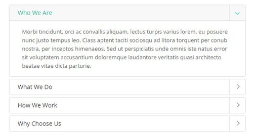
Codes are as follows:
<div class="panel-group accordion_7" id="accordion7">
  <div class="panel panel-default">
    <div class="panel-heading">
      <h4 class="panel-title"> <a data-toggle="collapse" data-parent="#accordion7" href="#collapse7_1"><span class="accordion_icon"></span>Who We Are</a> </h4>
    </div>
    <div id="collapse7_1" class="panel-collapse collapse in">
      <div class="panel-body"> Morbi tincidunt, orci ac convallis aliquam, lectus turpis varius lorem, eu posuere nunc justo tempus leo. Class aptent taciti sociosqu ad litora torquent per conub nostra, per inceptos himenaeos. Sed ut perspiciatis unde omnis iste natus error sit voluptatem accusantium doloremque laudantore veritatis quasi architecto beatae vitae dicta parturie.</div>
    </div>
  </div>
  <div class="panel panel-default">
    <div class="panel-heading">
      <h4 class="panel-title"> <a data-toggle="collapse" data-parent="#accordion7" href="#collapse7_2" class="collapsed"><span class="accordion_icon"></span>What We Do</a> </h4>
    </div>
    <div id="collapse7_2" class="panel-collapse collapse">
      <div class="panel-body">Sed ut perspiciatis unde omnis iste natus error sit voluptatem accusantium doloremque laudantium, totam rem aperiam, eaque ipsa quae ab illo inventore veritatis et quasi architecto beatae.Lorem ipsum dolor sit amet, consectetur adipiscing elit. Sed ut perspiciatis unde omnis iste natus error sit voluptatem accusantium doloremque laudantium, totam rem aperiam.</div>
    </div>
  </div>
  <div class="panel panel-default">
    <div class="panel-heading">
      <h4 class="panel-title"> <a data-toggle="collapse" data-parent="#accordion7" href="#collapse7_3" class="collapsed"><span class="accordion_icon"></span>How We Work</a> </h4>
    </div>
    <div id="collapse7_3" class="panel-collapse collapse">
      <div class="panel-body">Donec pede justo, fringilla vel, aliquet nec, vulputate eget, arcu. In enim justo, rhoncus ut, imperdiet a, venenatis vitae, justo. Nullam dictum felis eu pede mollis pretium. Integer tincidunt. Cras dapibus. </div>
    </div>
  </div>
  <div class="panel panel-default">
    <div class="panel-heading">
      <h4 class="panel-title"> <a data-toggle="collapse" data-parent="#accordion7" href="#collapse7_4" class="collapsed"><span class="accordion_icon"></span>Why Choose Us</a> </h4>
    </div>
    <div id="collapse7_4" class="panel-collapse collapse">
      <div class="panel-body">Our skins and modules are user friendly, powerful and easy to install and definitely will help make your site stand out. also our developers are improving the modules and releasing new versions of existing DNN modules constantly.</div>
    </div>
  </div>
</div>
Quotes
You can click the link to check Quotes demo. Demo Link
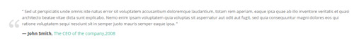
<div class="quotes_1">
  <blockquote> <span class="mark"> “</span>
    <p>Content text  ...</p>
    <small>Name</small> </blockquote>
</div>
<div class="quotes_2">
  <blockquote> <span class="mark"> “</span>
    <p>Content text  ...</p>
    <small>Name</small> </blockquote>
</div>
<div class="quotes_3">
  <blockquote> <span class="mark"> “</span>
    <p>Content text  ...</p>
    <small>Name</small> </blockquote>
</div>
<div class="quotes_4">
  <blockquote> <span class="mark"> “</span>
    <p>Content text  ...</p>
    <small>Name</small> </blockquote>
</div>
<div class="quotes_5">
  <blockquote> <span class="mark"> “</span>
    <p>Content text  ...</p>
    <small>Name</small> </blockquote>
</div>
Dropcaps
You can click the link to check Dropcaps demo. Demo Link
<p> <span class="dropcaps_1">A</span>Content text ... </p>
<p> <span class="dropcaps_2">A</span>Content text ... </p>
<p> <span class="dropcaps_3">A</span>Content text ... </p>

<p> <span class="dropcaps_4">A</span>Content text ... </p>
<p> <span class="dropcaps_5">A</span>Content text ... </p>
<p> <span class="dropcaps_6">A</span>Content text ... </p>
Carousel
You can click the link to check Carousel demo. Demo Link
Style 1:
Below is the screen shot:
Codes are as follows:
<div class="carousel carousel_1" data-autoheight="false" data-pagination="false" data-items="4" data-navigation="true" data-autoplay="3000">
  <div class="item">
    <div class="ico"><span class="glyphicons glyph-ipad"></span></div>
    <h3>Title 1</h3>
    <p>Content 1</p>
    <a href="#" class="Button_normal">DETAIL</a> </div>
  <div class="item">
    <div class="ico"><span class="glyphicons glyph-macbook"></span></div>
    <h3>Title 2</h3>
    <p>Content 1</p>
    <a href="#" class="Button_normal">DETAIL</a> </div>
  <div class="item">
    <div class="ico"><span class="glyphicons glyph-cogwheels"></span></div>
    <h3>Title 3</h3>
    <p>Content 3 </p>
    <a href="#" class="Button_normal">DETAIL</a> </div>
  <div class="item">
    <div class="ico"><span class="glyphicons glyph-picture"></span></div>
    <h3>Title 4</h3>
    <p>Content 4 </p>
    <a href="#" class="Button_normal">DETAIL</a> </div>
  <div class="item">
    <div class="ico"><span class="glyphicons glyph-heart"></span></div>
    <h3>Title 5</h3>
    <p>Content 5 </p>
    <a href="#" class="Button_normal">DETAIL</a> </div>
  <div class="item">
    <div class="ico"><span class="glyphicons glyph-fire"></span></div>
    <h3>Title 6</h3>
    <p>Content 6 </p>
    <a href="#" class="Button_normal">DETAIL</a> </div>
</div>
Option:
- You can increase your content items through adding
<div class="item"></div> - You can modify
glyphiconsto change icons. font icon list.
| Variable | Default | Type | Description |
|---|---|---|---|
data-items |
4 | int | This variable allows you to set the maximum amount of items displayed at a time with the widest browser width. |
data-navigation |
true | boolean | Display "next" and "prev" buttons. |
data-pagination |
true | boolean | Show pagination. |
data-autoplay |
true | int/boolean | Change to any integrer for example data-autoplay ="5000" to play every 5 seconds. If you set data-autoplay="false" Stop auto scroll animation. |
Example:
<div class="carousel" data-items="4" data-navigation="true" data-pagination="true" data-autoplay="true">
  <div class="item">
		...
Style 2:
Below is the screen shot:

Codes are as follows:
<div class="carousel carousel_2" data-navigation="false"  data-autoheight="false" data-items="1" data-pagination="true" data-autoplay="3000">
  <div class="item"> <img alt="" src="/portals/32/controls_1.jpg" /> </div>
  <div class="item"> <img alt="" src="/portals/32/controls_2.jpg" /> </div>
  <div class="item"> <img alt="" src="/portals/32/controls_3.jpg" /> </div>
</div>
Option:
- You can increase your content items through adding
<div class="item"></div>
| Variable | Default | Type | Description |
|---|---|---|---|
data-items |
1 | int | This variable allows you to set the maximum amount of items displayed at a time with the widest browser width. |
data-navigation |
true | boolean | Display "next" and "prev" buttons. |
data-pagination |
true | boolean | Show pagination. |
data-autoplay |
true | int/boolean | Change to any integrer for example data-autoplay ="5000" to play every 5 seconds. If you set data-autoplay="false" Stop auto scroll animation. |
Example:
<div class="carousel" data-navigation="true" data-pagination="true" data-autoplay="true" data-autoheight="true">
  <div class="item">
		...
Style 3:
Below is the screen shot:
Codes are as follows:
<div class="carousel carousel_2" data-navigation="false" data-pagination="true" data-autoplay="3000" data-autoheight="true" data-items="1">
  <div class="item"> <img alt="" src="/portals/32/controls_1.jpg" /> </div>
  <div class="item"> <img alt="" src="/portals/32/controls_4.jpg" /> </div>
  <div class="item"> <img alt="" src="/portals/32/controls_5.jpg" /> </div>
</div>
Option:
- You can increase your content items through adding
<div class="item"></div> - You can control the way that the content comes out through these four styles
"text_left""text_right""text_top""text_bottom"
| Variable | Default | Type | Description |
|---|---|---|---|
data-items |
1 | int | This variable allows you to set the maximum amount of items displayed at a time with the widest browser width. |
data-navigation |
true | boolean | Display "next" and "prev" buttons. |
data-pagination |
true | boolean | Show pagination. |
data-autoplay |
true | int/boolean | Change to any integrer for example data-autoplay ="5000" to play every 5 seconds. If you set data-autoplay="false" Stop auto scroll animation. |
data-autoheight |
true | int/boolean | Whether to be automatic height or not, default to true. true: automatic height, false: fixed height. |
Style 4:
Below is the screen shot:
Codes are as follows:
<div class="carousel carousel_3" data-pagination="false" data-autoheight="false" data-items="3" data-navigation="true" data-autoplay="3000">
  <div class="item"> <img alt="" src="/portals/32/controls_7.jpg" />
    <h3>Title 1</h3>
    <p>Content 1</p>
  </div>
  <div class="item"> <img alt="" src="/portals/32/controls_8.jpg" />
    <h3>Title 2</h3>
    <p>Content 2</p>
  </div>
  <div class="item"> <img alt="" src="/portals/32/controls_9.jpg" />
    <h3>Title 3</h3>
    <p>Content 3</p>
  </div>
  <div class="item"> <img alt="" src="/portals/32/controls_10.jpg" />
    <h3>Title 4</h3>
    <p>Content 4</p>
  </div>
  <div class="item"> <img alt="" src="/portals/32/controls_11.jpg" />
    <h3>Title 5</h3>
    <p>Content 5</p>
  </div>
</div>
Option:
- You can increase your content items through adding
<div class="item"></div> - You can control the way that the content comes out through these four styles
"text_left""text_right""text_top""text_bottom"
| Variable | Default | Type | Description |
|---|---|---|---|
data-items |
3 | int | This variable allows you to set the maximum amount of items displayed at a time with the widest browser width. |
data-navigation |
true | boolean | Display "next" and "prev" buttons. |
data-pagination |
false | boolean | Show pagination. |
data-autoplay |
true | int/boolean | Change to any integrer for example data-autoplay ="5000" to play every 5 seconds. If you set data-autoplay="false" Stop auto scroll animation. |
Style 5:
Below is the screen shot:
Codes are as follows:
<div class="carousel carousel_4" data-autoheight="false" data-items="5" data-navigation="true" data-pagination="true" data-autoplay="3000">
  <div class="item"> <img alt="" src="/portals/32/controls_7.jpg" />
    <div class="sliding">
      <h3>Title 1</h3>
      <p>Content 1 </p>
      <a href="#">>>  MORE INFO</a> </div>
  </div>
  <div class="item"> <img alt="" src="/portals/32/controls_8.jpg" />
    <div class="sliding">
      <h3>Title 2</h3>
      <p>Content 2 </p>
      <a href="#"> >>  MORE INFO</a> </div>
  </div>
  <div class="item"> <img alt="" src="/portals/32/controls_9.jpg" />
    <div class="sliding">
      <h3>Title 3</h3>
      <p>Content 3 </p>
      <a href="#">>>  MORE INFO</a> </div>
  </div>
  <div class="item"> <img alt="" src="/portals/32/controls_10.jpg" />
    <div class="sliding">
      <h3>Title 4</h3>
      <p>Content 4 </p>
      <a href="#">>>  MORE INFO</a> </div>
  </div>
  <div class="item"> <img alt="" src="/portals/32/controls_11.jpg" />
    <div class="sliding">
      <h3>Title 5</h3>
      <p>Content 5 </p>
      <a href="#">>>  MORE INFO</a> </div>
  </div>
  <div class="item"> <img alt="" src="/portals/32/controls_7.jpg" />
    <div class="sliding">
      <h3>Title 6</h3>
      <p>Content 6 </p>
      <a href="#">>>  MORE INFO</a> </div>
  </div>
</div>
Option:
- You can increase your content items through adding
<div class="item"></div> - You can control the way that the content comes out through these four styles
"text_left""text_right""text_top""text_bottom"
| Variable | Default | Type | Description |
|---|---|---|---|
data-items |
5 | int | This variable allows you to set the maximum amount of items displayed at a time with the widest browser width. |
data-navigation |
true | boolean | Display "next" and "prev" buttons. |
data-pagination |
true | boolean | Show pagination. |
data-autoplay |
true | int/boolean | Change to any integrer for example data-autoplay ="5000" to play every 5 seconds. If you set data-autoplay="false" Stop auto scroll animation. |
Style 6:
Below is the screen shot:

Codes are as follows:
<div class="carousel carousel_5" data-pagination="false" data-autoheight="false" data-items="5" data-navigation="true" data-autoplay="3000">
  <div class="item"> <img alt="" src="/portals/32/psds32202.jpg" />
    <div class="sliding"> <a href="#">>> </a> </div>
  </div>
  <div class="item"> <img alt="" src="/portals/32/dnngo-11.jpg" />
    <div class="sliding"> <a href="#"> >> </a> </div>
  </div>
  <div class="item"> <img alt="" src="/portals/32/apic1494.jpg" />
    <div class="sliding"> <a href="#">>> </a> </div>
  </div>
  <div class="item"> <img alt="" src="/portals/32/hbh.jpg" />
    <div class="sliding"> <a href="#">>> </a> </div>
  </div>
  <div class="item"> <img alt="" src="/portals/32/fe10667.jpg" />
    <div class="sliding"> <a href="#">>> </a> </div>
  </div>
  <div class="item"> <img alt="" src="/portals/32/apic2333.jpg" />
    <div class="sliding"> <a href="#">>> </a> </div>
  </div>
</div>
Option:
- You can increase your content items through adding
<div class="item"></div> - You can control the way that the content comes out through these four styles
"text_left""text_right""text_top""text_bottom"
| Variable | Default | Type | Description |
|---|---|---|---|
data-items |
5 | int | This variable allows you to set the maximum amount of items displayed at a time with the widest browser width. |
data-navigation |
true | boolean | Display "next" and "prev" buttons. |
data-pagination |
false | boolean | Show pagination. |
data-autoplay |
true | int/boolean | Change to any integrer for example data-autoplay ="5000" to play every 5 seconds. If you set data-autoplay="false" Stop auto scroll animation. |
Style 7:
Below is the screen shot:
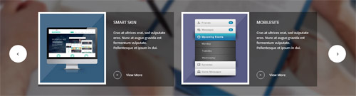
Codes are as follows:
<div class="conboxr">
  <div class="conboxr_shadow pt-60 pb-60 animation fadeInUp">
    <div class="dnn_layout">
      <div class="carousel carousel_6" data-pagination="false" data-autoheight="false" data-autoplay="3000" data-items="2" data-navigation="true">
        <div class="item clearfix">
          <div class="carousel_6left"> <img alt="" class="img-responsive" src="/portals/32/conboxrpic1.jpg" /> </div>
          <div class="carousel_6right">
            <h4>Smart SKin</h4>
            <p>Cras at ultrices erat, sed vulputate eros. Nunc at augue gravida est fermentum vulputate. Pellentesque et ipsum in dui.</p>
            <div><span>></span><a href="#">View More</a></div>
          </div>
        </div>
        <div class="item clearfix">
          <div class="carousel_6left"> <img alt="" class="img-responsive" src="/portals/32/conboxrpic2.jpg" /> </div>
          <div class="carousel_6right">
            <h4>Mobilesite</h4>
            <p>Cras at ultrices erat, sed vulputate eros. Nunc at augue gravida est fermentum vulputate. Pellentesque et ipsum in dui.</p>
            <div><span>></span><a href="#">View More</a></div>
          </div>
        </div>
        <div class="item clearfix">
          <div class="carousel_6left"> <img alt="" class="img-responsive" src="/portals/32/conboxrpic1.jpg" /> </div>
          <div class="carousel_6right">
            <h4>Smart SKin</h4>
            <p>Cras at ultrices erat, sed vulputate eros. Nunc at augue gravida est fermentum vulputate. Pellentesque et ipsum in dui.</p>
            <div><span>></span><a href="#">View More</a></div>
          </div>
        </div>
        <div class="item clearfix">
          <div class="carousel_6left"> <img alt="" class="img-responsive" src="/portals/32/conboxrpic2.jpg" /> </div>
          <div class="carousel_6right">
            <h4>Mobilesite</h4>
            <p>Cras at ultrices erat, sed vulputate eros. Nunc at augue gravida est fermentum vulputate. Pellentesque et ipsum in dui.</p>
            <div><span>></span><a href="#">View More</a></div>
          </div>
        </div>
      </div>
    </div>
  </div>
</div>
Option:
- You can increase your content items through adding
<div class="item"></div> - You can control the way that the content comes out through these four styles
"text_left""text_right""text_top""text_bottom"
| Variable | Default | Type | Description |
|---|---|---|---|
data-items |
2 | int | This variable allows you to set the maximum amount of items displayed at a time with the widest browser width. |
data-navigation |
true | boolean | Display "next" and "prev" buttons. |
data-pagination |
false | boolean | Show pagination. |
data-autoplay |
true | int/boolean | Change to any integrer for example data-autoplay ="5000" to play every 5 seconds. If you set data-autoplay="false" Stop auto scroll animation. |
Style 8:
Below is the screen shot:
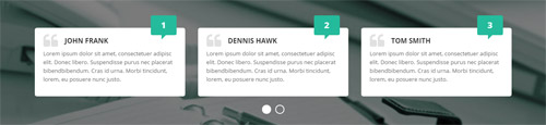
Codes are as follows:
<div class="conboxu">
  <div class="conboxu_shadow pt-20 pb-60">
    <div class="dnn_layout">
      <div class="conboxu_bottom">
        <div class="carousel carousel_7" data-navigation="false" data-autoheight="false" data-items="3" data-pagination="true" data-autoplay="3000">
          <div class="item">
            <h3>John FranK</h3>
            <p>Lorem ipsum dolor sit amet, consectetuer adipisc elit. Donec libero. Suspendisse purus nec placerat bibendbibendum. Cras id urna. Morbi tincidunt, lorem, eu posuere nunc justo. </p>
            <span>1</span> </div>
          <div class="item">
            <h3>Dennis Hawk</h3>
            <p>Lorem ipsum dolor sit amet, consectetuer adipisc elit. Donec libero. Suspendisse purus nec placerat bibendbibendum. Cras id urna. Morbi tincidunt, lorem, eu posuere nunc justo. </p>
            <span>2</span> </div>
          <div class="item">
            <h3>Tom Smith</h3>
            <p>Lorem ipsum dolor sit amet, consectetuer adipisc elit. Donec libero. Suspendisse purus nec placerat bibendbibendum. Cras id urna. Morbi tincidunt, lorem, eu posuere nunc justo. </p>
            <span>3</span> </div>
          <div class="item">
            <h3>John FranK</h3>
            <p>Lorem ipsum dolor sit amet, consectetuer adipisc elit. Donec libero. Suspendisse purus nec placerat bibendbibendum. Cras id urna. Morbi tincidunt, lorem, eu posuere nunc justo. </p>
            <span>4</span> </div>
        </div>
      </div>
    </div>
  </div>
</div>
Option:
- You can increase your content items through adding
<div class="item"></div> - You can control the way that the content comes out through these four styles
"text_left""text_right""text_top""text_bottom"
| Variable | Default | Type | Description |
|---|---|---|---|
data-items |
3 | int | This variable allows you to set the maximum amount of items displayed at a time with the widest browser width. |
data-navigation |
true | boolean | Display "next" and "prev" buttons. |
data-pagination |
false | boolean | Show pagination. |
data-autoplay |
true | int/boolean | Change to any integrer for example data-autoplay ="5000" to play every 5 seconds. If you set data-autoplay="false" Stop auto scroll animation. |
Style 9:
Below is the screen shot:
Codes are as follows:
<div class="SectionStyles11">
  <div class="dnn_layout">
    <div data-autoheight="false" data-pagination="false" data-items="4" data-navigation="true" data-autoplay="3000" class="carousel carousel_8">
      <div class="item"> <a href="#"><img alt="" src="/portals/32/show15.jpg" /></a> </div>
      <div class="item"> <a href="#"><img alt="" src="/portals/32/show16.jpg" /></a> </div>
      <div class="item"> <a href="#"> <img alt="" src="/portals/32/show17.jpg" /></a> </div>
      <div class="item"> <a href="#"><img alt="" src="/portals/32/show18.jpg" /></a> </div>
      <div class="item"> <a href="#"><img alt="" src="/portals/32/show15.jpg" /></a> </div>
      <div class="item"> <a href="#"><img alt="" src="/portals/32/show16.jpg" /></a> </div>
      <div class="item"> <a href="#"><img alt="" src="/portals/32/show17.jpg" /></a> </div>
      <div class="item"> <a href="#"><img alt="" src="/portals/32/show18.jpg" /></a> </div>
    </div>
  </div>
</div>
Option:
- You can increase your content items through adding
<div class="item"></div> - You can control the way that the content comes out through these four styles
"text_left""text_right""text_top""text_bottom"
| Variable | Default | Type | Description |
|---|---|---|---|
data-items |
4 | int | This variable allows you to set the maximum amount of items displayed at a time with the widest browser width. |
data-navigation |
true | boolean | Display "next" and "prev" buttons. |
data-pagination |
false | boolean | Show pagination. |
data-autoplay |
true | int/boolean | Change to any integrer for example data-autoplay ="5000" to play every 5 seconds. If you set data-autoplay="false" Stop auto scroll animation. |
Style 10:
Below is the screen shot:
Codes are as follows:
<div class="pt-60 pb-60">
  <div class="dnn_layout">
    <div class="content_mid clearfix">
      <div class="pane_layout">
        <div class="row">
          <div class="col-sm-12">
            <div data-autoheight="false" data-pagination="false" data-autoplay="3000" data-items="6" data-navigation="true" class="carousel carousel_9">
              <div class="item"> <a href="#"><img alt="" src="/portals/32/show27.jpg" /></a> </div>
              <div class="item"> <a href="#"><img alt="" src="/portals/32/show28.jpg" /></a> </div>
              <div class="item"><a href="#"> <img alt="" src="/portals/32/show29.jpg" /></a> </div>
              <div class="item"><a href="#"> <img alt="" src="/portals/32/show30.jpg" /></a> </div>
              <div class="item"><a href="#"> <img alt="" src="/portals/32/show31.jpg" /></a> </div>
              <div class="item"><a href="#"> <img alt="" src="/portals/32/show32.jpg" /></a> </div>
              <div class="item"><a href="#"> <img alt="" src="/portals/32/show27.jpg" /> </a></div>
              <div class="item"><a href="#"> <img alt="" src="/portals/32/show28.jpg" /> </a></div>
              <div class="item"><a href="#"> <img alt="" src="/portals/32/show29.jpg" /></a> </div>
              <div class="item"><a href="#"> <img alt="" src="/portals/32/show30.jpg" /></a> </div>
              <div class="item"><a href="#"> <img alt="" src="/portals/32/show31.jpg" /></a> </div>
              <div class="item"><a href="#"> <img alt="" src="/portals/32/show32.jpg" /></a> </div>
            </div>
          </div>
        </div>
      </div>
    </div>
  </div>
</div>
Option:
- You can increase your content items through adding
<div class="item"></div> - You can control the way that the content comes out through these four styles
"text_left""text_right""text_top""text_bottom"
| Variable | Default | Type | Description |
|---|---|---|---|
data-items |
6 | int | This variable allows you to set the maximum amount of items displayed at a time with the widest browser width. |
data-navigation |
true | boolean | Display "next" and "prev" buttons. |
data-pagination |
false | boolean | Show pagination. |
data-autoplay |
true | int/boolean | Change to any integrer for example data-autoplay ="5000" to play every 5 seconds. If you set data-autoplay="false" Stop auto scroll animation. |
CSS3 Animations
You can click the link to check CSS3 Animations demo. Demo Link
Style 1:
This type is a group of effects which are displayed in time sequence. Below is the screen shot:
Codes are as follows:
<div class="animation">
   <div class="row mb-20">
       <div class="col-sm-3 animation_item scaleUp delay1"><img src="/portals/32/Photo2.jpg" /></div>
       <div class="col-sm-3 animation_item scaleUp delay2"><img src="/portals/32/Photo2.jpg" /></div>
       <div class="col-sm-3 animation_item scaleUp delay3"><img src="/portals/32/Photo2.jpg" /></div>
       <div class="col-sm-3 animation_item scaleUp delay4"><img src="/portals/32/Photo2.jpg" /></div>
	   ...
</div>
delay1, delay2, delay3, delay4 are used to control animation time, there are 12 time slots, which correspond to delay1~delay12 respectively.
scaleUp is used to control animation effect, there are scaleUp , bounceIn , bounceInDown , bounceInLeft , bounceInRight , bounceInUp , fadeIn , fadeInDown , fadeInLeft , fadeInRight , fadeInUp , fadeInDownBig , fadeInLeftBig , fadeInRightBig , fadeInUpBig , flip , flipInX , flipInY , lightSpeedIn , rotateIn , rotateInDownLeft , rotateInDownRight , rotateInUpLeft , rotateInUpRight , rollIn , zoomIn , zoomInDown , zoomInLeft , zoomInRight , zoomInUp 30 effects in total.
Style 2:
If you just need one animation effect, you can match with the following codes.
<div class="animation scaleUp"> <img src="/portals/32/Photo5.jpg" /> </div>
Style 3:
You can add animation for a certain element when mousing over. Codes are as follows:
<div class="animationhover bounce"> <img src="/portals/32/Photo5.jpg" /> </div>
When mousing over, it will show animation effect type (animationhover). There are bounce , flash , pulse , rubberBand , shake , swing , tada , wobble 8 effects.
Popovers
You can click the link to check Popovers demo. Demo Link
Below is the screen shot:
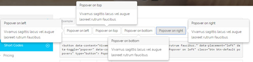
Codes are as follows:
<button data-content="Vivamus sagittis lacus vel augue laoreet rutrum faucibus." data-placement="left" data-toggle="popover" data-container="body" data-original-title="Popover on left" class="btn btn-default popovers" type="button">
    Popover on left
</button>
Option:
| Name | type | default | description |
|---|---|---|---|
| animation | boolean | true | apply a CSS fade transition to the tooltip |
| html | boolean | false | Insert HTML into the tooltip. If false, jQuery's text method will be used to insert content into the DOM. Use text if you're worried about XSS attacks. |
| placement | string | function | 'top' | how to position the tooltip - top | bottom | left | right | auto. When "auto" is specified, it will dynamically reorient the tooltip. For example, if placement is "auto left", the tooltip will display to the left when possible, otherwise it will display right. |
| selector | string | false | If a selector is provided, tooltip objects will be delegated to the specified targets. |
| title | string | function | '' | default title value if title attribute isn't present |
| trigger | string | 'hover focus' | how tooltip is triggered - click | hover | focus | manual. You may pass multiple triggers; separate them with a space. |
| delay | number | object | 0 | delay showing and hiding the tooltip (ms) - does not apply to manual trigger type If a number is supplied, delay is applied to both hide/show Object structure is: |
| container | string | false | false | Appends the tooltip to a specific element. Example: |
Alerts
You can click the link to check Alerts demo. Demo Link
Below is the screen shot:
Codes are as follows:
<div class="alert alert-warning fade in">
    <button aria-hidden="true" data-dismiss="alert" class="close" type="button">×</button>
    <strong>Holy guacamole!</strong> Best check yo self, you're not looking too good.
</div>
Option:
- You can change
alert-to change the color, there arealert-warning,alert-danger,alert-success,alert-info4 colors included in the effects. fadeis for hiddeninis for display
Tooltips
You can click the link to check Tooltips demo. Tooltips
Below is the screen shot:
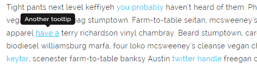
Codes are as follows:
<a href="#" class="tooltips" data-toggle="tooltip" title="first tooltip">Hover over me</a>
Option:
| Name | type | default | description |
|---|---|---|---|
| animation | boolean | true | apply a CSS fade transition to the tooltip |
| html | boolean | false | Insert HTML into the tooltip. If false, jQuery's text method will be used to insert content into the DOM. Use text if you're worried about XSS attacks. |
| placement | string | function | 'top' | how to position the tooltip - top | bottom | left | right | auto. When "auto" is specified, it will dynamically reorient the tooltip. For example, if placement is "auto left", the tooltip will display to the left when possible, otherwise it will display right. |
| selector | string | false | If a selector is provided, tooltip objects will be delegated to the specified targets. |
| title | string | function | '' | default title value if title attribute isn't present |
| trigger | string | 'hover focus' | how tooltip is triggered - click | hover | focus | manual. You may pass multiple triggers; separate them with a space. |
| delay | number | object | 0 | delay showing and hiding the tooltip (ms) - does not apply to manual trigger type If a number is supplied, delay is applied to both hide/show Object structure is: |
| container | string | false | false | Appends the tooltip to a specific element. Example: |
Dropdowns
You can click the link to check Dropdowns demo. Demo Link
Style 1:
Below is the screen shot:
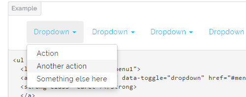
Codes are as follows:
<ul class="nav nav-pills">
  <li class="dropdown" id="menu1">
  <a class="dropdown-toggle" data-toggle="dropdown" href="#menu1">Dropdown
  <strong class="caret"></strong>
  </a>
    <ul class="dropdown-menu">
      <li><a href="#">Action</a></li>
      <li><a href="#">Another action</a></li>
      <li><a href="#">Something else here</a></li>
    </ul>
  </li>
</ul>
Style 2:
Below is the screen shot:
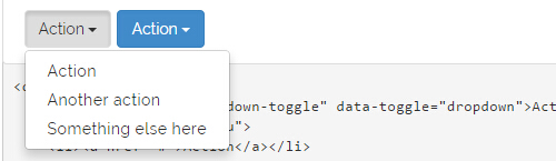
Codes are as follows:
<div class="btn-group">
  <button class="btn dropdown-toggle" data-toggle="dropdown">Action <span class="caret"></span></button>
  <ul class="dropdown-menu">
    <li><a href="#">Action</a></li>
    <li><a href="#">Another action</a></li>
    <li><a href="#">Something else here</a></li>
  </ul>
</div>
Style 3:
Below is the screen shot:
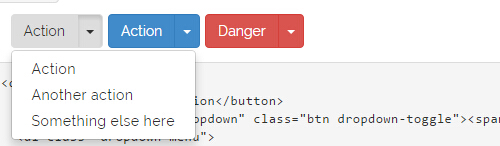
Codes are as follows:
<div class="btn-group">
  <button class="btn">Action</button>
  <button data-toggle="dropdown" class="btn dropdown-toggle"><span class="caret"></span></button>
  <ul class="dropdown-menu">
    <li><a href="#">Action</a></li>
    <li><a href="#">Another action</a></li>
    <li><a href="#">Something else here</a></li>
  </ul>
</div>
LightBox
You can click the link to check LightBox demo. Demo Link
Below is the screen shot:

Option:
1. LightBox_image |
Show one image alone. |
2. LightBox_image_gallery+group number |
Classify those that share the same class name to one group, you can show other images within the group by clicking left and right arrow of the image. |
3. LightBox_image_group |
Classify these sub levels whose label class name is LightBox_image_group into one group. |
4. LightBox_youtube |
Show youtube video. |
5. LightBox_vimeo |
Show video. |
6. LightBox_gmaps |
Shown map. |
7. LightBox_youtube_gallery+group number |
Classify these that share the same class name into a group of youtube video show |
8. LightBox_vimeo_gallery+group number |
Classify these that share the same class name into a group of video show. |
9. LightBox_gmaps_gallery+group number |
Classify these that share the same class name into a group of map show. |
10. LightBox_youtube_group |
Classify these sub levels whose label class name is LightBox_youtube_group into one group. |
11. LightBox_vimeo_group |
Classify these sub levels whose label class name is LightBox_vimeo_group into one group. |
12. LightBox_gmaps_group |
Classify these sub levels whose label class names is LightBox_gmaps_group into one group. |
13. LightBox_Box |
Take div as layer pop up, div needs to hide by default. Style of pop up is custom style. |
14. LightBox_ajax |
Pop up a page |
15. LightBox_ajax_group |
Pop up a group of pages |
You need to fill url of the pop up image(video, map) in href=""
1.LightBox_image
<a href="bigPhoto.jpg" class="LightBox_image" title="Single Image 1"><img alt="" src="cover.jpg" /></a>
2.LightBox_image_gallery
<a href="bigPhoto1.jpg" class="LightBox_image_gallery1" title="Single Image 1"><img alt="" src="cover.jpg" /></a>
<a href="bigPhoto2.jpg" class="LightBox_image_gallery1" title="Single Image 1"><img alt="" src="cover.jpg" /></a>
<a href="bigPhoto3.jpg" class="LightBox_image_gallery2" title="Single Image 2"><img alt="" src="cover.jpg" /></a>
<a href="bigPhoto4.jpg" class="LightBox_image_gallery2" title="Single Image 2"><img alt="" src="cover.jpg" /></a>
3.LightBox_image_group
<div class="LightBox_image_group">
    <a href="bigPhoto1.jpg" title=" People Scenery 1"><img alt="" src="cover.jpg" /> </a>
    <a href="bigPhoto2.jpg" title=" People Scenery 2"></a>
    <a href="bigPhoto3.jpg" title=" People Scenery 3"></a>
</div>
4.LightBox_youtube
<a href="http://www.youtube.com/watch?v=0O2aH4XLbto" class="LightBox_youtube" title="youtube"><img alt="" src="cover.jpg" /></a>
5.LightBox_vimeo
<a href="https://vimeo.com/45830194" class="LightBox_vimeo" title="vimeo"><img alt="" src="cover.jpg" /></a>
6.LightBox_gmaps
<a href="https://maps.google.com/maps?q=221B+Baker+Street,+London,+United+Kingdom&hl=en&t=v&hnear=221B+Baker+St,+London+NW1+6XE,+United+Kingdom" class="LightBox_gmaps" title="gmaps"><img alt="" src="cover.jpg" /></a>
7.LightBox_youtube_gallery
<a href="http://www.youtube.com/watch?v=0O2aH4XLbto" class="LightBox_youtube_gallery1" title="youtube gallery"><img alt="" src="cover.jpg" /></a>
<a href="http://www.youtube.com/watch?v=0O2aH4XLbto" class="LightBox_youtube_gallery1" title="youtube gallery"><img alt="" src="cover.jpg" /></a>
<a href="http://www.youtube.com/watch?v=0O2aH4XLbto" class="LightBox_youtube_gallery2" title="youtube gallery"><img alt="" src="cover.jpg" /></a>
<a href="http://www.youtube.com/watch?v=0O2aH4XLbto" class="LightBox_youtube_gallery2" title="youtube gallery"><img alt="" src="cover.jpg" /></a>
8.LightBox_vimeo_gallery
<a href="https://vimeo.com/45830194" class="LightBox_vimeo_gallery1" title="vimeo gallery"><img alt="" src="cover.jpg" /></a>
<a href="https://vimeo.com/45830194" class="LightBox_vimeo_gallery1" title="vimeo gallery"><img alt="" src="cover.jpg" /></a>
<a href="https://vimeo.com/45830194" class="LightBox_vimeo_gallery2" title="vimeo gallery"><img alt="" src="cover.jpg" /></a>
<a href="https://vimeo.com/45830194" class="LightBox_vimeo_gallery2" title="vimeo gallery"><img alt="" src="cover.jpg" /></a>
9.LightBox_gmaps_gallery
<a href="https://maps.google.com/maps?q=221B+Baker+Street,+London,+United+Kingdom&hl=en&t=v&hnear=221B+Baker+St,+London+NW1+6XE,+United+Kingdom" class="LightBox_gmaps_gallery1" title="gmaps gallery"><img alt="" src="cover.jpg" /></a>
<a href="https://maps.google.com/maps?q=221B+Baker+Street,+London,+United+Kingdom&hl=en&t=v&hnear=221B+Baker+St,+London+NW1+6XE,+United+Kingdom" class="LightBox_gmaps_gallery1" title="gmaps gallery"><img alt="" src="cover.jpg" /></a>
<a href="https://maps.google.com/maps?q=221B+Baker+Street,+London,+United+Kingdom&hl=en&t=v&hnear=221B+Baker+St,+London+NW1+6XE,+United+Kingdom" class="LightBox_gmaps_gallery2" title="gmaps gallery"><img alt="" src="cover.jpg" /></a>
<a href="https://maps.google.com/maps?q=221B+Baker+Street,+London,+United+Kingdom&hl=en&t=v&hnear=221B+Baker+St,+London+NW1+6XE,+United+Kingdom" class="LightBox_gmaps_gallery2" title="gmaps gallery"><img alt="" src="cover.jpg" /></a>
10.LightBox_youtube_group
<div class="LightBox_youtube_group">
    <a href="http://www.youtube.com/watch?v=0O2aH4XLbto" title=" youtube 1"><img alt="" src="cover.jpg" /> </a>
    <a href="http://www.youtube.com/watch?v=0O2aH4XLbto" title=" youtube 2"></a>
    <a href="http://www.youtube.com/watch?v=0O2aH4XLbto" title=" youtube 3"></a>
</div>
11.LightBox_vimeo_group
<div class="LightBox_vimeo_group">
    <a href="https://vimeo.com/45830194" title=" vimeo 1"><img alt="" src="cover.jpg" /> </a>
    <a href="https://vimeo.com/45830194" title=" vimeo 2"></a>
    <a href="https://vimeo.com/45830194" title=" vimeo 3"></a>
</div>
12.LightBox_gmaps_group
<div class="LightBox_gmaps_group">
    <a href="https://maps.google.com/maps?q=221B+Baker+Street,+London,+United+Kingdom&hl=en&t=v&hnear=221B+Baker+St,+London+NW1+6XE,+United+Kingdom" title=" gmaps 1"><img alt="" src="cover.jpg" /> </a>
    <a href="https://maps.google.com/maps?q=221B+Baker+Street,+London,+United+Kingdom&hl=en&t=v&hnear=221B+Baker+St,+London+NW1+6XE,+United+Kingdom" title=" gmaps 2"></a>
    <a href="https://maps.google.com/maps?q=221B+Baker+Street,+London,+United+Kingdom&hl=en&t=v&hnear=221B+Baker+St,+London+NW1+6XE,+United+Kingdom" title=" gmaps 3"></a>
</div>
13.LightBox_Box
<a href=".LightBox_Content" class="LightBox_Box"> Click Here To Pop </a>
<a href=".LightBox_Content" class="LightBox_Box Button_default"> Click Here To Pop </a>
<div class="LightBox_Content">
    <h3>Click Here To Pop</h3>
 	  content text ...
</div>
14.LightBox_ajax
<a href="index.aspx" class="LightBox_ajax" title="ajax"><img alt="" src="cover.jpg" /></a>
15.LightBox_ajax_group
<div class="LightBox_ajax_group">
    <a href="index.aspx" title=" ajax 1"><img alt="" src="cover.jpg" /> </a>
    <a href="index.aspx" title=" ajax 2"></a>
    <a href="index.aspx" title=" ajax 3"></a>
</div>
Image Effects
You can click the link to check Image Effects demo. Demo Link
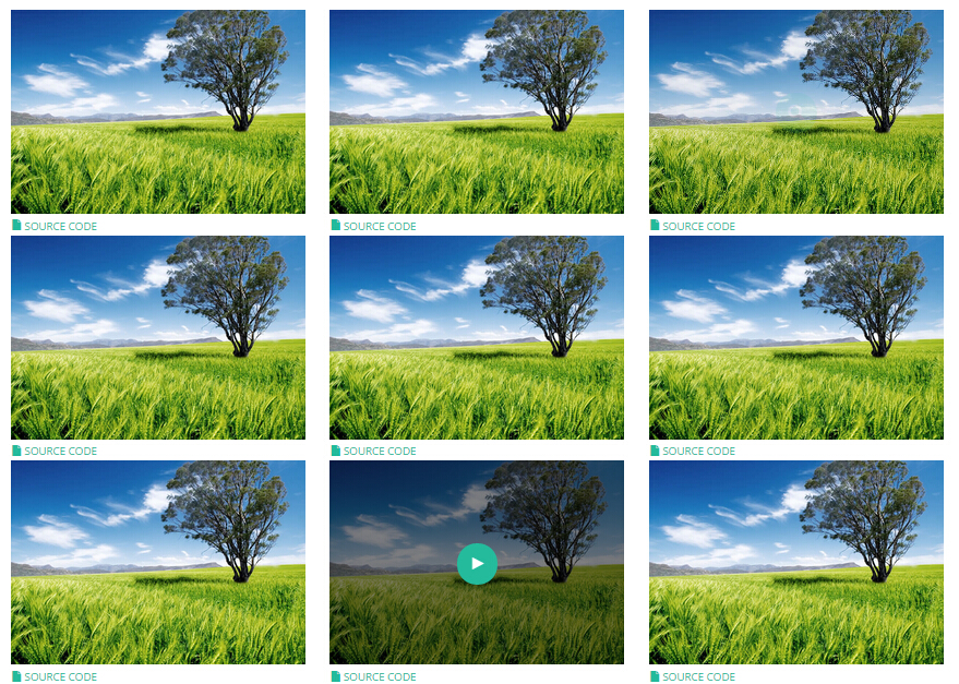
- You can copy over codes of the image effects directly to any HTML modules.
- You can change the font icon through modifying. font icon list
Flip Box
You can click the link to check Flip Box demo. Demo Link
Style 1:
Below is the screen shot:
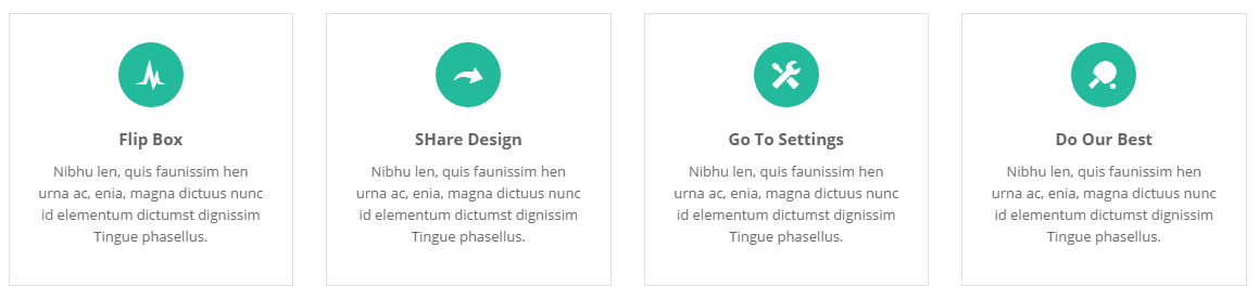
Codes are as follows:
<div class="row">
    <div class="col-sm-3">
        <div class="flip_box flip_box_1">
            <div class="rotate">
                <div class="front">
                    <span class="glyphicons glyph-cardio"></span>
                    <h3>Flip Box</h3>
                    <p>content text ...</p>
                </div>
                <div class="back">
                    <h3>Flip Box</h3>
                    <p>content text ...</p>
                    <a href="#" class="but">Read More</a>
                </div>
            </div>
        </div>
    </div>
    <div class="col-sm-3">
        <div class="flip_box flip_right flip_box_1">
            <div class="rotate">
                <div class="front">
                    <span class="glyphicons glyph-redo"></span>
                    <h3>SHare Design</h3>
                    <p>content text ...</p>
                </div>
                <div class="back">
                    <h3>SHare Design</h3>
                    <p>content text ...</p>
                    <a href="#" class="but">Read More</a>
                 </div>
            </div>
        </div>
    </div>
    <div class="col-sm-3">
        <div class="flip_box flip_top flip_box_1">
            <div class="rotate">
                <div class="front">
                    <span class="glyphicons glyph-settings"></span>
                    <h3>Go To Settings</h3>
                    <p>content text ...</p>
                </div>
                <div class="back">
                    <h3>Go To Settings</h3>
                    <p>content text ...</p>
                    <a href="#" class="but">Read More</a>
                </div>
            </div>
        </div>
    </div>
    <div class="col-sm-3">
        <div class="flip_box flip_bottom flip_box_1">
            <div class="rotate">
                <div class="front">
                    <span class="glyphicons glyph-table-tennis"></span>
                    <h3>Do Our Best</h3>
                    <p>content text ...</p>
                </div>
                <div class="back">
                    <h3>Do Our Best</h3>
                    <p>content text ...</p>
                    <a href="#" class="but">Read More</a>
                </div>
            </div>
        </div>
    </div>
</div>
Option:
col-md-3 col-sm-6is the width of each column, you can change the width you need through value1~12.frontis for front content.backis for back content.
Style 2:
Below is the screen shot:
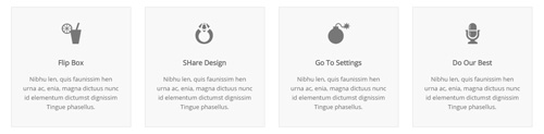
Codes are as follows:
<div class="row">
    <div class="col-sm-3">
        <div class="flip_box flip_box_2">
            <div class="rotate">
                <div class="front"> <span class="glyphicons glyph-drink"></span>
                    <h3>Flip Box</h3>
                    <p>content text ...</p>
                </div>
                <div class="back">
                    <h3>Flip Box</h3>
                    <p>content text ...</p>
                </div>
            </div>
        </div>
    </div>
    <div class="col-sm-3">
        <div class="flip_box flip_right flip_box_2">
            <div class="rotate">
                <div class="front"> <span class="glyphicons glyph-ring"></span>
                    <h3>SHare Design</h3>
                    <p>content text ...</p>
                </div>
                <div class="back">
                    <h3>SHare Design</h3>
                    <p>content text ...</p>
                </div>
            </div>
        </div>
    </div>
    <div class="col-sm-3">
        <div class="flip_box flip_top flip_box_2">
            <div class="rotate">
                <div class="front"> <span class="glyphicons glyph-bomb"></span>
                    <h3>Go To Settings</h3>
                    <p>content text ...</p>
                </div>
                <div class="back">
                    <h3>Go To Settings</h3>
                    <p>content text ...</p>
                </div>
            </div>
        </div>
    </div>
    <div class="col-sm-3">
        <div class="flip_box flip_bottom flip_box_2">
            <div class="rotate">
                <div class="front"> <span class="glyphicons glyph-microphone"></span>
                    <h3>Do Our Best</h3>
                    <p>content text ...</p>
                </div>
                <div class="back">
                    <h3>Do Our Best</h3>
                    <p>content text ...</p>
                </div>
                </div>
            </div>
        </div>
    </div>
<br />
Style 3:
Below is the screen shot:
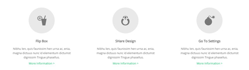
Codes are as follows:
<div class="row">
    <div class="col-sm-4">
        <div class="flip_box flip_box_3">
            <div class="rotate">
                <div class="front"> <span class="glyphicons glyph-drink"></span>
                    <h3>Flip Box</h3>
                    <p>content text ...</p>
                    <a href="#">More Information ></a>
                </div>
                <div class="back">
                    <h3>Flip Box</h3>
                    <p>content text ...</p>
                    <a href="#" class="but">Read More</a>
                </div>
            </div>
        </div>
    </div>
    <div class="col-sm-4">
        <div class="flip_box flip_right flip_box_3">
            <div class="rotate">
                <div class="front"> <span class="glyphicons glyph-ring"></span>
                    <h3>SHare Design</h3>
                    <p>content text ...</p>
                    <a href="#">More Information ></a>
                </div>
                <div class="back">
                    <h3>SHare Design</h3>
                    <p>content text ...</p>
                    <a href="#" class="but">Read More</a>
                </div>
            </div>
        </div>
    </div>
    <div class="col-sm-4">
        <div class="flip_box flip_top flip_box_3">
            <div class="rotate">
                <div class="front"> <span class="glyphicons glyph-bomb"></span>
                    <h3>Go To Settings</h3>
                    <p>content text ...</p>
                    <a href="#">More Information ></a>
                </div>
                <div class="back">
                    <h3>Go To Settings</h3>
                    <p>content text ...</p>
                    <a href="#" class="but">Read More</a>
                </div>
            </div>
        </div>
    </div>
<br />
Responsive Video
Ratio between width and height of the video needs to be 16:9.
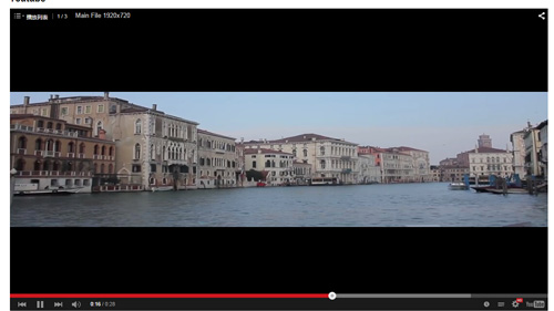
<div class="responsive-video">
    <iframe width="853" height="480" src="//www.youtube.com/embed/XcpOsJQXcx4?list=UUIkFV7_2tEhhEhh1NkkwTUw" frameborder="0" allowfullscreen></iframe>
</div>
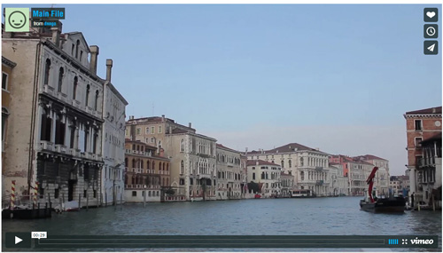
<div class="responsive-video">
    <iframe src="//player.vimeo.com/video/106249100" width="1920" height="1080" frameborder="0" webkitallowfullscreen mozallowfullscreen allowfullscreen></iframe>
</div>
<div class="responsive-video">
     <embed  src="/portals/32/movie.swf" type="application/x-shockwave-flash" allownetworking="all" allowfullscreen="true" allowscriptaccess="always" wmode="Opaque"></embed>
</div>
<div class="responsive-video">
    <video width="1920" height="1080"  controls="true">
    <source src="/portals/32/movie.m4v" type="video/mp4"></source>
    <source src="/portals/32/movie.ogv" type="video/ogg"></source>
    <source src="/portals/32/movie.webm" type="video/WebM"></source>
    Your browser does not support the video tag. </video>
</div>
Video Bg
You can click the link to check Video Bg demo. Demo Link
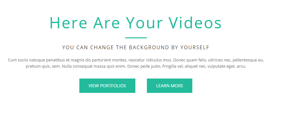
- "{videoURL:'npfu0fN9GUA' is the url of
youtube autoPlayis for whether to autoplay or nottrue/falseloopis for whether to play on a loop,true/false
<div data-property="{videoURL:'npfu0fN9GUA',containment:'self', showControls:false, autoPlay:true, loop:true, vol:50, mute:true, startAt:10, opacity:1, addRaster:false, quality:'hd1080'}" class="player">
<div class="Play"></div>
<div class="dnn_layout pt-60 pb-60">
<div class="content_mid clearfix">
<div class="player_boxes">
<h1 class="player_title"> Here Are Your Videos</h1>
<hr class="player_line" />
<h4 class="player_smalltitle">YOU CAN CHANGE THE BACKGROUND BY YOURSELF</h4>
<div class="player_content">
<p>Content Text 1 ... </p>
</div>
<p> <a class="Button_default" href="#"> VIEW PORTFOLIOS</a> <a class="Button_default" href="#"> LEARN MORE</a> </p>
</div>
</div>
</div>
</div>
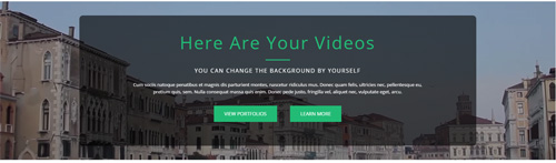
- "{videoURL:'npfu0fN9GUA' is the url of
youtube autoPlayis for whether to autoplay or nottrue/falseloopis for whether to play on a loop,true/false
<div data-property="{videoURL:'npfu0fN9GUA',containment:'self', showControls:false, autoPlay:true, loop:true, vol:50, mute:true, startAt:10, opacity:1, addRaster:false, quality:'hd1080'}" class="player">
<div class="Play"></div>
<div class="dnn_layout pt40 pb40">
<div class="content_mid clearfix">
<div class="player_boxes dark">
<h1 class="player_title"> Here Are Your Videos</h1>
<hr class="player_line" />
<h4 class="player_smalltitle">YOU CAN CHANGE THE BACKGROUND BY YOURSELF</h4>
<div class="player_content">
<p>Content Text 1 ... </p>
</div>
<p> <a class="Button_blue" href="#"> VIEW PORTFOLIOS</a> <a class="Button_blue" href="#"> LEARN MORE</a> </p>
</div>
</div>
</div>
</div>
Home Page Codes
This includes the html introductions that required for Home1~Home7 page, ComingSoon page, Boxed Layout page.
Home Version 1 (Home)
You can click the link to check Home Version 1 (home) demo. Home Version 1 (Home)
Banner area
Below is the screen shot:

It is using DNNGo LayerGalleryPro module here, you can import ContentListEntity-Home1.xml of the DNNGo_LayerGalleryPro folder to duplicate banner of the demo.
Services List area
Below is the screen shot:
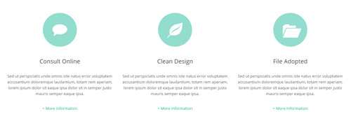
Codes are as follows:
<div class="ServeList_2 row pt-60">
  <div class="col-sm-4 animation_item scaleUp delay1">
    <div class="ServeBox">
      <div class="Serve_Icon"><span class="glyphicons glyph-chat"></span></div>
      <h3>Consult Online</h3>
      <p>Sed ut perspiciatis unde omnis iste natus error voluptatem accusantium doloremque laudantium, totam rem aperiam, lorem ipsum dolor sit eaque ipsa dolor sit in semper justo mauris semper eaque ipsa. </p>
      <p><a target="blank" href="#">>  More Information</a></p>
    </div>
  </div>
  <div class="col-sm-4 animation_item scaleUp delay1">
    <div class="ServeBox">
      <div class="Serve_Icon"><span class="glyphicons glyph-leaf"></span></div>
      <h3>Clean Design</h3>
      <p>Sed ut perspiciatis unde omnis iste natus error voluptatem accusantium doloremque laudantium, totam rem aperiam, lorem ipsum dolor sit eaque ipsa dolor sit in semper justo mauris semper eaque ipsa.</p>
      <p><a target="blank" href="#">>  More Information</a></p>
    </div>
  </div>
  <div class="col-sm-4 animation_item scaleUp delay1">
    <div class="ServeBox">
      <div class="Serve_Icon"><span class="glyphicons glyph-folder-open"></span></div>
      <h3>File Adopted</h3>
      <p>Sed ut perspiciatis unde omnis iste natus error voluptatem accusantium doloremque laudantium, totam rem aperiam, lorem ipsum dolor sit eaque ipsa dolor sit in semper justo mauris semper eaque ipsa.</p>
      <p><a target="blank" href="#">>  More Information</a></p>
    </div>
  </div>
</div>
Option:
col-sm-4is the width of each column, you can change the width you need through value1~12.- You can modify
animationto change and delete animation. Animation list. - You can modify
glyphiconsto change icons. font icon list.
Latest Projects area
Below is the screen shot:
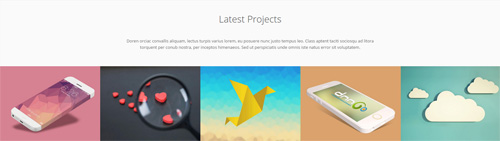
Codes are as follows:
<div class="dnn_layout">
  <div class="content_mid clearfix">
    <div class="pane_layout">
      <div class="row">
        <div class="col-sm-12">
          <p class="conboxx animation fadeInUp">Content text... </p>
        </div>
      </div>
    </div>
  </div>
</div>
<div data-pagination="false" data-autoheight="false" class="carousel carousel_5">
  <div class="item">
    <div class="photo_box"> <a href="/Portals/32/psds32202.jpg" class="LightBox_image_gallery1" title="Image Gallery">
      <div class="pic_box"> <img alt="" src="/portals/32/psds32202.jpg" />
        <div class="ico"> <span class="glyphicons glyph-plus"></span> </div>
        <div class="shade"></div>
      </div>
      </a> </div>
  </div>
  <div class="item">
    <div class="photo_box"> <a href="/Portals/32/dnngo-11.jpg" class="LightBox_image_gallery1" title="Image Gallery">
      <div class="pic_box"> <img alt="" src="/portals/32/dnngo-11.jpg" />
        <div class="ico"> <span class="glyphicons glyph-plus"></span> </div>
        <div class="shade"></div>
      </div>
      </a> </div>
  </div>
  <div class="item">
    <div class="photo_box"> <a href="/Portals/32/apic1494.jpg" class="LightBox_image_gallery1" title="Image Gallery">
      <div class="pic_box"> <img alt="" src="/portals/32/apic1494.jpg" />
        <div class="ico"> <span class="glyphicons glyph-plus"></span> </div>
        <div class="shade"></div>
      </div>
      </a> </div>
  </div>
  <div class="item">
    <div class="photo_box"> <a href="/Portals/32/hbh.jpg" class="LightBox_image_gallery1" title="Image Gallery">
      <div class="pic_box"> <img alt="" src="/portals/32/hbh.jpg" />
        <div class="ico"> <span class="glyphicons glyph-plus"></span> </div>
        <div class="shade"></div>
      </div>
      </a> </div>
  </div>
  <div class="item">
    <div class="photo_box"> <a href="/Portals/32/fe10667.jpg" class="LightBox_image_gallery1" title="Image Gallery">
      <div class="pic_box"> <img alt="" src="/portals/32/fe10667.jpg" />
        <div class="ico"> <span class="glyphicons glyph-plus"></span> </div>
        <div class="shade"></div>
      </div>
      </a> </div>
  </div>
  <div class="item">
    <div class="photo_box"> <a href="/Portals/32/apic2333.jpg" class="LightBox_image_gallery1" title="Image Gallery">
      <div class="pic_box"> <img alt="" src="/portals/32/apic2333.jpg" />
        <div class="ico"> <span class="glyphicons glyph-plus"></span> </div>
        <div class="shade"></div>
      </div>
      </a> </div>
  </div>
  <div class="item">
    <div class="photo_box"> <a href="/Portals/32/xpic589.jpg" class="LightBox_image_gallery1" title="Image Gallery">
      <div class="pic_box"> <img alt="" src="/portals/32/xpic589.jpg" />
        <div class="ico"> <span class="glyphicons glyph-plus"></span> </div>
        <div class="shade"></div>
      </div>
      </a> </div>
  </div>
  <div class="item">
    <div class="photo_box"> <a href="/Portals/32/psds32202.jpg" class="LightBox_image_gallery1" title="Image Gallery">
      <div class="pic_box"> <img alt="" src="/portals/32/psds32202.jpg" />
        <div class="ico"> <span class="glyphicons glyph-plus"></span> </div>
        <div class="shade"></div>
      </div>
      </a> </div>
  </div>
  <div class="item">
    <div class="photo_box"> <a href="/Portals/32/dnngo-11.jpg" class="LightBox_image_gallery1" title="Image Gallery">
      <div class="pic_box"> <img alt="" src="/portals/32/dnngo-11.jpg" />
        <div class="ico"> <span class="glyphicons glyph-plus"></span> </div>
        <div class="shade"></div>
      </div>
      </a> </div>
  </div>
  <div class="item">
    <div class="photo_box"> <a href="/Portals/32/apic1494.jpg" class="LightBox_image_gallery1" title="Image Gallery">
      <div class="pic_box"> <img alt="" src="/portals/32/apic1494.jpg" />
        <div class="ico"> <span class="glyphicons glyph-plus"></span> </div>
        <div class="shade"></div>
      </div>
      </a> </div>
  </div>
  <div class="item">
    <div class="photo_box"> <a href="/Portals/32/hbh.jpg" class="LightBox_image_gallery1" title="Image Gallery">
      <div class="pic_box"> <img alt="" src="/portals/32/hbh.jpg" />
        <div class="ico"> <span class="glyphicons glyph-plus"></span> </div>
        <div class="shade"></div>
      </div>
      </a> </div>
  </div>
  <div class="item">
    <div class="photo_box"> <a href="/Portals/32/fe10667.jpg" class="LightBox_image_gallery1" title="Image Gallery">
      <div class="pic_box"> <img alt="" src="/portals/32/fe10667.jpg" />
        <div class="ico"> <span class="glyphicons glyph-plus"></span> </div>
        <div class="shade"></div>
      </div>
      </a> </div>
  </div>
  <div class="item">
    <div class="photo_box"> <a href="/Portals/32/apic2333.jpg" class="LightBox_image_gallery1" title="Image Gallery">
      <div class="pic_box"> <img alt="" src="/portals/32/apic2333.jpg" />
        <div class="ico"> <span class="glyphicons glyph-plus"></span> </div>
        <div class="shade"></div>
      </div>
      </a> </div>
  </div>
  <div class="item">
    <div class="photo_box"> <a href="/Portals/32/xpic589.jpg" class="LightBox_image_gallery1" title="Image Gallery">
      <div class="pic_box"> <img alt="" src="/portals/32/xpic589.jpg" />
        <div class="ico"> <span class="glyphicons glyph-plus"></span> </div>
        <div class="shade"></div>
      </div>
      </a> </div>
  </div>
</div>
Option:
col-sm-12is the width of each column, you can change the width you need through value1~12.- This is a
Carouseleffect. Carousel - You can modify
animationto change the animation on the slide..Animation list. - You can modify
glyphiconsto change icons. font icon list.
PROVIDE PROFESSIONAL AND BEFUTIFUL DESIGN area
Below is the screen shot:

Codes are as follows:
<div class="pt-50 pb-60 conboxy animation fadeInUp">
  <p class="conboxy_1">PROVIDE PROFESSIONAL AND BEFUTIFUL DESIGN</p>
  <h4>THESE THEMES WILL HELP YOU TO MANAGE YOUR WEBSITE EASILY</h4>
  <p class="conboxy_2">Cras at ultrices erat, sed vulputate eros. Nunc at augue gravida est fermentum vulputate. Pellentesque et ipsum in dui malesuada tempus. Donec pellentesque.Donec consectetur diam ac nibh auctor ultricies. Integer mauris lacus, consequat in luctus id.</p>
  <p> <a class="Buttom_animation" target="blank" href="#">TAKE A LOOK</a>    <a class="Buttom_animation" target="blank" href="#">SUBMIT A TICKET</a> </p>
</div>
Option:
- You can modify
animationto change and delete animation. Animation list.
Services List area
Below is the screen shot:
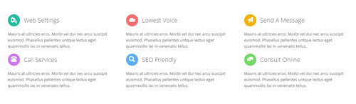
Codes are as follows:
<div class="ServeList_1">
  <div class="row">
    <div class="col-sm-4 animation_item scaleUp delay1">
      <div class="ServeBox">
        <h3><span class="Serve_Icon icon_color1"><em class="glyphicons glyph-cogwheels"></em></span>Web Settings</h3>
        <p>Mauris at ultricies eros. Morbi vel dui nec arcu suscipit euismod. Phasellus pellentes untque lectus eget quammollis lac in venenatis tellus.</p>
      </div>
    </div>
    <div class="col-sm-4 animation_item scaleUp delay2">
      <div class="ServeBox">
        <h3><span class="Serve_Icon icon_color2"><em class="glyphicons glyph-cloud"></em></span>Lowest Voice</h3>
        <p>Mauris at ultricies eros. Morbi vel dui nec arcu suscipit euismod. Phasellus pellentes untque lectus eget quammollis lac in venenatis tellus.</p>
      </div>
    </div>
    <div class="col-sm-4 animation_item scaleUp delay3">
      <div class="ServeBox">
        <h3><span class="Serve_Icon icon_color3"><em class="glyphicons glyph-send"></em></span>Send A Message</h3>
        <p>Mauris at ultricies eros. Morbi vel dui nec arcu suscipit euismod. Phasellus pellentes untque lectus eget quammollis lac in venenatis tellus.</p>
      </div>
    </div>
  </div>
  <div class="row">
    <div class="col-sm-4 animation_item scaleUp delay4">
      <div class="ServeBox">
        <h3><span class="Serve_Icon icon_color4"><em class="glyphicons glyph-phone-alt"></em></span>Call Services</h3>
        <p>Mauris at ultricies eros. Morbi vel dui nec arcu suscipit euismod. Phasellus pellentes untque lectus eget quammollis lac in venenatis tellus. </p>
      </div>
    </div>
    <div class="col-sm-4 animation_item scaleUp delay5">
      <div class="ServeBox">
        <h3><span class="Serve_Icon icon_color5"><em class="glyphicons glyph-search"></em> </span>SEO Friendly</h3>
        <p>Mauris at ultricies eros. Morbi vel dui nec arcu suscipit euismod. Phasellus pellentes untque lectus eget quammollis lac in venenatis tellus. </p>
      </div>
    </div>
    <div class="col-sm-4 animation_item scaleUp delay6">
      <div class="ServeBox">
        <h3><span class="Serve_Icon icon_color6"><em class="glyphicons glyph-conversation"></em></span>Consult Online</h3>
        <p>Mauris at ultricies eros. Morbi vel dui nec arcu suscipit euismod. Phasellus pellentes untque lectus eget quammollis lac in venenatis tellus. </p>
      </div>
    </div>
  </div>
</div>
Option:
col-sm-*is the width of each column, you can change the width you need through value1~12.- You can modify
animationto change or delete animation.Animation list. - You can modify
glyphiconsto change icons. font icon list.
Background area
Below is the screen shot:
Codes are as follows:
<div class="boxes_style_9 pt-60 pb-60 animation fadeInUp">
  <div class="boxes">
    <h3 class="Boxes_title">If you have any question, please e-mail us without hesitation.</h3>
    <p>Lorem ipsum dolor sit amet, consectetuer adipiscing elit. Donec libero. Suspendisse purus nec placerat bibendbibendum. Cras id urna. Morbi tincidunt, orci ac convallis aliquam, lectus turpis varius lorem, eu posuere nunc justo tempus leo.</p>
    <div class="but"> <a class="Button_default" target="blank" href="#">More Information</a></div>
  </div>
</div>
Option:
- You can modify
animationto change or delete animation.Animation list.
Testimonials area
Below is the screen shot:
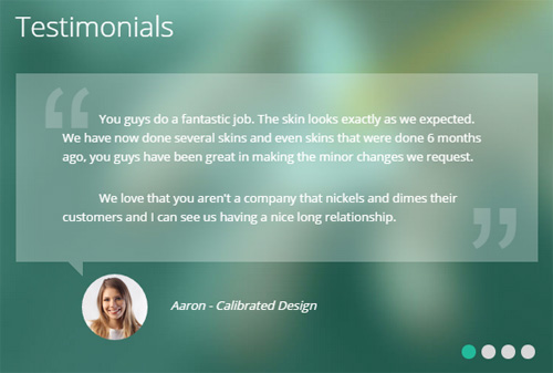
Codes are as follows:
<ul class=" Testimonials_tab Testimonials_8" data-autoplay="5000" data-autoheight="false" data-position="fade" data-display-arrows="false">
  <li>
    <blockquote>
      <div class="testimonial_text">
        <p>You guys do a fantastic job.  The skin looks exactly as we expected.  We have now done several skins and even skins that were done 6 months ago, you guys have been great in making the minor changes we request.</p>
        <br />
        <p>We love that you aren't a company that nickels and dimes their customers and I can see us having a nice long relationship.</p>
      </div>
      <small><img alt="" src="/portals/32/Pic_14.jpg" /><span>Aaron - Calibrated Design</span></small> </blockquote>
  </li>
  <li>
    <blockquote>
      <div class="testimonial_text">
        <p>You guys do a fantastic job.  The skin looks exactly as we expected.  We have now done several skins and even skins that were done 6 months ago, you guys have been great in making the minor changes we request.</p>
      </div>
      <small><img alt="" src="/portals/32/Pic_15.jpg" /><span>Harra - Skin Developer</span></small> </blockquote>
  </li>
  <li>
    <blockquote>
      <div class="testimonial_text">
        <p> The folks at dnngo.net have been a pleasure to work with.  As the owner of a web design business, I've come to rely on them to do good, quality work on skin conversions.  They are always friendly, thorough and provide a great quality product at a reasonable price.  I've worked with others in the past, but once I started working with DNNGO I knew I had found a team I could rely on and have sent all of my business to them ever since.</p>
      </div>
      <small><img alt="" src="/portals/32/Pic_16.jpg" /><span>James Divine</span></small> </blockquote>
  </li>
  <li>
    <blockquote>
      <div class="testimonial_text">
        <p> I have been developing and maintaining DNN sites since DNN2. Over these years I have found less than a handful of developers to even consider maintaining enterprise licensing subscriptions with. The crew at DNNGo.net have far surpassed the skills I look for in  DNN developers. Bundle this with excellent customer service, prompt ticket handling, and pricing that can't be beat, DNNGo.net is a MUST HAVE partner for DNN designing companies. I am and will be an gold subscriber to DNNGo.net for years to come.</p>
      </div>
      <small><img alt="" src="/portals/32/Pic_17.jpg" /><span>John Barclay </span></small> </blockquote>
  </li>
</ul>
Option:
- This is a
Testimonialseffect.Testimonials
Email Us area
Below is the screen shot:
Option:
- This is
Theme_Responsive_20061_home1theme ofDNNGo PowerFormsmodule
Meet Our Teams area
Below is the screen shot:
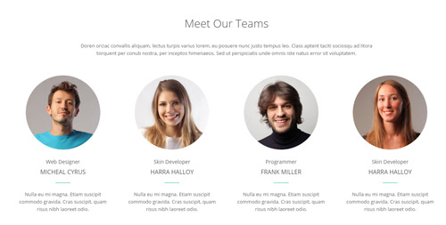
Codes are as follows:
<div class="botbox_a pt-50 pb-60">
  <div class="dnn_layout">
    <div class="content_mid clearfix">
      <div class="pane_layout">
        <div class="row">
          <div class="col-sm-12">
            <h1 class="title">Meet Our Teams</h1>
            <p class="text animation fadeInUp">Content text... </p>
          </div>
        </div>
        <div class="row">
          <div class="col-sm-6 col-md-3 animation flipInY">
            <div class="our_team_home1">
              <div class="img">
                <div class="photo_box"> <a href="#">
                  <div class="pic_box"> <img alt="" src="/portals/32/oth1_1.jpg" class="img-responsive" />
                    <div class="shade"></div>
                  </div>
                  </a> </div>
              </div>
              <h5>Web Designer</h5>
              <h4>Micheal Cyrus</h4>
              <div class="line"></div>
              <p>Nulla eu mi magna. Etiam suscipit commodo gravida. Cras suscipit, quam risus nibh laoreet odio.</p>
            </div>
          </div>
          <div class="col-sm-6 col-md-3 animation flipInY">
            <div class="our_team_home1">
              <div class="img">
                <div class="photo_box"> <a href="#">
                  <div class="pic_box"> <img alt="" src="/portals/32/oth1_2.jpg" class="img-responsive" />
                    <div class="shade"></div>
                  </div>
                  </a> </div>
              </div>
              <h5>Skin Developer</h5>
              <h4>Harra Halloy</h4>
              <div class="line"></div>
              <p>Nulla eu mi magna. Etiam suscipit commodo gravida. Cras suscipit, quam risus nibh laoreet odio.</p>
            </div>
          </div>
          <div class="col-sm-6 col-md-3 animation flipInY">
            <div class="our_team_home1">
              <div class="img">
                <div class="photo_box"> <a href="#">
                  <div class="pic_box"> <img alt="" src="/portals/32/oth1_3.jpg" class="img-responsive" />
                    <div class="shade"></div>
                  </div>
                  </a> </div>
              </div>
              <h5>Programmer</h5>
              <h4>Frank Miller</h4>
              <div class="line"></div>
              <p>Nulla eu mi magna. Etiam suscipit commodo gravida. Cras suscipit, quam risus nibh laoreet odio.</p>
            </div>
          </div>
          <div class="col-sm-6 col-md-3 animation flipInY">
            <div class="our_team_home1">
              <div class="img">
                <div class="photo_box"> <a href="#">
                  <div class="pic_box"> <img alt="" src="/portals/32/oth1_4.jpg" class="img-responsive" />
                    <div class="shade"></div>
                  </div>
                  </a> </div>
              </div>
              <h5>Skin Developer</h5>
              <h4>Harra Halloy</h4>
              <div class="line"></div>
              <p>Nulla eu mi magna. Etiam suscipit commodo gravida. Cras suscipit, quam risus nibh laoreet odio.</p>
            </div>
          </div>
        </div>
      </div>
    </div>
  </div>
</div>
Option:
col-sm-* col-md-*is the width of each column, you can change the width you need through value1~12.- You can modify
animationto change or delete animation.Animation list.
Why Choose Us area
Below is the screen shot:
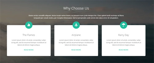
Codes are as follows:
<div class="botbox_b pt-50 pb-60">
  <div class="dnn_layout">
    <div class="content_mid clearfix">
      <div class="pane_layout">
        <div class="row">
          <div class="col-sm-12">
            <h1 class="title">Why Choose Us</h1>
            <p class="text animation fadeInUp">Content text... </p>
          </div>
        </div>
        <div class="row">
          <div class="col-sm-4 animation flipInX">
            <div class="flip_box_5">
              <div class="icon"><span class="glyphicons glyph-fire"></span></div>
              <h1>The Flames</h1>
              <p>Lorem ipsum dolor sit amet, consectetur adipi sicing elit, sed do eiusmod tempor incididunt ut labore et dolore magna aliqua.</p>
              <a target="blank" href="#">Read More</a> </div>
          </div>
          <div class="col-sm-4 animation flipInX">
            <div class="flip_box_5">
              <div class="icon"><span class="glyphicons glyph-airplane"></span></div>
              <h1>Airplane</h1>
              <p>Lorem ipsum dolor sit amet, consectetur adipi sicing elit, sed do eiusmod tempor incididunt ut labore et dolore magna aliqua.</p>
              <a target="blank" href="#">Read More</a> </div>
          </div>
          <div class="col-sm-4 animation flipInX">
            <div class="flip_box_5">
              <div class="icon"><span class="glyphicons glyph-umbrella"></span></div>
              <h1>Rainy Day</h1>
              <p>Lorem ipsum dolor sit amet, consectetur adipi sicing elit, sed do eiusmod tempor incididunt ut labore et dolore magna aliqua.</p>
              <a target="blank" href="#">Read More</a> </div>
          </div>
        </div>
      </div>
    </div>
  </div>
</div>
Option:
col-sm-*is the width of each column, you can change the width you need through value1~12.- You can modify
animationto change or delete animation.Animation list. - You can modify
glyphiconsto change icons. font icon list.
Logos area
Below is the screen shot:
Codes are as follows:
<div class="pt-60 pb-60">
  <div class="dnn_layout">
    <div class="content_mid clearfix">
      <div class="pane_layout">
        <div class="row">
          <div class="col-sm-12">
            <div data-autoheight="false" data-pagination="false" data-autoplay="3000" class="carousel carousel_9 animation fadeInUp">
              <div class="item"> <a target="blank" href="#"><img alt="" src="/portals/32/show27.jpg" /></a> </div>
              <div class="item"> <a target="blank" href="#"><img alt="" src="/portals/32/show28.jpg" /></a> </div>
              <div class="item"><a target="blank" href="#"> <img alt="" src="/portals/32/show29.jpg" /></a> </div>
              <div class="item"><a target="blank" href="#"> <img alt="" src="/portals/32/show30.jpg" /></a> </div>
              <div class="item"><a target="blank" href="#"> <img alt="" src="/portals/32/show31.jpg" /></a> </div>
              <div class="item"><a target="blank" href="#"> <img alt="" src="/portals/32/show32.jpg" /></a> </div>
              <div class="item"><a target="blank" href="#"> <img alt="" src="/portals/32/show27.jpg" /> </a></div>
              <div class="item"><a target="blank" href="#"> <img alt="" src="/portals/32/show28.jpg" /> </a></div>
              <div class="item"><a target="blank" href="#"> <img alt="" src="/portals/32/show29.jpg" /></a> </div>
              <div class="item"><a target="blank" href="#"> <img alt="" src="/portals/32/show30.jpg" /></a> </div>
              <div class="item"><a target="blank" href="#"> <img alt="" src="/portals/32/show31.jpg" /></a> </div>
              <div class="item"><a target="blank" href="#"> <img alt="" src="/portals/32/show32.jpg" /></a> </div>
            </div>
          </div>
        </div>
      </div>
    </div>
  </div>
</div>
Option:
col-sm-12is the width of each column, you can change the width you need through value1~12.- This is a
Carouseleffect. Carousel
Photos area
Below is the screen shot:
Codes are as follows:
<div class="footboxc row">
  <div class="col-sm-4 col-xs-6 animation fadeInUp">
    <div class="photo_box"> <a href="/Portals/32/potots_hbh.jpg" class="LightBox_image_gallery1" title="Image Gallery">
      <div class="pic_box"> <img alt="" src="/portals/32/potots_hbh.jpg" class="img-responsive" />
        <div class="shade"></div>
      </div>
      </a> </div>
  </div>
  <div class="col-sm-4  col-xs-6 animation fadeInUp">
    <div class="photo_box"> <a href="/Portals/32/potots_apic1494.jpg" class="LightBox_image_gallery1" title="Image Gallery">
      <div class="pic_box"> <img alt="" src="/portals/32/potots_apic1494.jpg" class="img-responsive" />
        <div class="shade"></div>
      </div>
      </a> </div>
  </div>
  <div class="col-sm-4  col-xs-6 animation fadeInUp">
    <div class="photo_box"> <a href="/Portals/32/potots_dnngo-11.jpg" class="LightBox_image_gallery1" title="Image Gallery">
      <div class="pic_box"> <img alt="" src="/portals/32/potots_dnngo-11.jpg" class="img-responsive" />
        <div class="shade"></div>
      </div>
      </a> </div>
  </div>
  <div class="col-sm-4  col-xs-6 animation fadeInUp">
    <div class="photo_box"> <a href="/Portals/32/potots_psds32202.jpg" class="LightBox_image_gallery1" title="Image Gallery">
      <div class="pic_box"> <img alt="" src="/portals/32/potots_psds32202.jpg" class="img-responsive" />
        <div class="shade"></div>
      </div>
      </a> </div>
  </div>
  <div class="col-sm-4  col-xs-6 animation fadeInUp">
    <div class="photo_box"> <a href="/Portals/32/potots_chuangyisj68.jpg" class="LightBox_image_gallery1" title="Image Gallery">
      <div class="pic_box"> <img alt="" src="/portals/32/potots_chuangyisj68.jpg" class="img-responsive" />
        <div class="shade"></div>
      </div>
      </a> </div>
  </div>
  <div class="col-sm-4  col-xs-6 animation fadeInUp">
    <div class="photo_box"> <a href="/Portals/32/potots_fe10667.jpg" class="LightBox_image_gallery1" title="Image Gallery">
      <div class="pic_box"> <img alt="" src="/portals/32/potots_fe10667.jpg" class="img-responsive" />
        <div class="shade"></div>
      </div>
      </a> </div>
  </div>
</div>
Option:
col-sm-* col-md-*is the width of each column, you can change the width you need through value1~12.- You can modify
animationto change or delete animation.Animation list. Containeris usingContainer-20061-4
Archives area
Below is the screen shot:
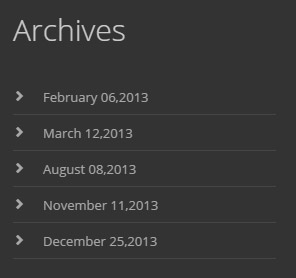
Codes are as follows:
<ul class="footer_archives_list animation fadeInUp">
  <li><a target="blank" href="#">February 06,2013</a></li>
  <li><a target="blank" href="#">March 12,2013</a></li>
  <li><a target="blank" href="#">August 08,2013</a></li>
  <li><a target="blank" href="#">November 11,2013</a></li>
  <li><a target="blank" href="#">December 25,2013</a></li>
</ul>
Option:
- You can modify
animationto change or delete animation.Animation list. Containeris usingContainer-20061-4
Tags area
Below is the screen shot:
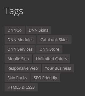
Codes are as follows:
<div class="tags animation fadeInUp">
    <a target="blank" href="#">DNNGo</a>
    <a target="blank" href="#">DNN Skins</a>
    <a target="blank" href="#">DNN Modules</a>
    <a target="blank" href="#">CataLook Skins</a>
    <a target="blank" href="#">DNN Services</a>
    <a target="blank" href="#">DNN Store</a>
    <a target="blank" href="#">Mobile Skin</a>
    <a target="blank" href="#">Unlimited Colors</a>
    <a target="blank" href="#">Responsive Web</a>
    <a target="blank" href="#">Your Business</a>
    <a target="blank" href="#">Skin Packs</a>
    <a target="blank" href="#">SEO Friendly</a>
    <a target="blank" href="#">HTML5 & CSS3</a>
</div>
Option:
- You can modify
animationto change or delete animation.Animation list. Containeris usingContainer-20061-4
Contact area
Below is the screen shot:
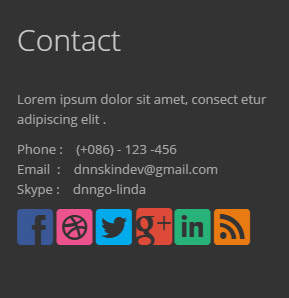
Codes are as follows:
<div class="animation fadeInUp">
  <p>Lorem ipsum dolor sit amet, consect etur adipiscing elit .</p>
  <p>Phone :    (+086) - 123 -456<br />
    Email  :    dnnskindev@gmail.com<br />
    Skype :    dnngo-linda</p>
  <p class="socialicon_footer">
      <a class="social social-facebook" href="#"></a>
      <a class="social social-dribbble" href="#"></a>
      <a class="social social-twitter" href="#"></a>
      <a class="social social-google-plus" href="#"></a>
      <a class="social social-linked-in" href="#"></a>
      <a class="social social-rss" href="#"></a>
  </p>
</div>
Option:
- You can modify
animationto change or delete animation.Animation list. - You can modify
glyphiconsto change icons. font icon list. Containeris usingContainer-20061-4
Home Version 2
You can click the link to check Home Version 2 demo. Home Version 2
Banner area
Below is the screen shot:
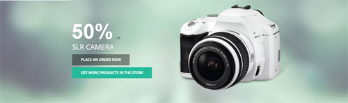
It is using DNNGo LayerGalleryPro module here, you can import ContentListEntity-Home2.xml of the DNNGo_LayerGalleryPro folder to duplicate banner of the demo.
Analyze area
Below is the screen shot:

Codes are as follows:
<div class="conboxa pt-60 pb-60">
  <div class="dnn_layout">
    <div class="row">
      <div class="col-sm-12">
        <ul class="animation fadeInUp">
          <li>
            <div>1</div>
            <p>Analyze</p>
          </li>
          <li><span></span> </li>
          <li>
            <div>2</div>
            <p>Make Plan</p>
          </li>
          <li><span></span> </li>
          <li>
            <div>3</div>
            <p>Product Design</p>
          </li>
          <li><span></span> </li>
          <li>
            <div>4</div>
            <p>Develop</p>
          </li>
          <li><span></span> </li>
          <li>
            <div>5</div>
            <p>Support</p>
          </li>
        </ul>
      </div>
    </div>
  </div>
</div>
Option:
- You can modify
animationto change or delete animation.Animation list.
Latest Projects area
Below is the screen shot:
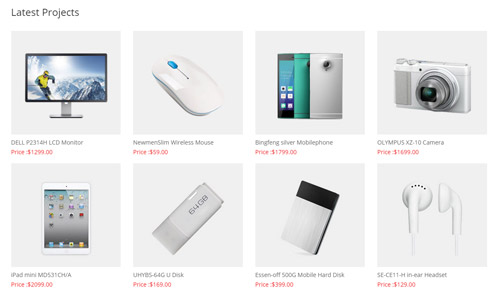
Codes are as follows:
<div class="row conboxb animation fadeInUp">
  <div class="col-sm-3">
    <div class="photo_box ico_push_in">
      <div class="pic_box"> <img alt="" class="img-responsive" src="/portals/32/show1.jpg" />
        <div class="ico"><a target="blank" href="#"> <span class="glyphicons glyph-link ico_left"></span></a> <a href="#"><span class="glyphicons glyph-cart-in ico_right"></span></a> </div>
        <div class="shade"></div>
      </div>
      <div class="text_sytle_6">
        <h3>DELL P2314H LCD Monitor</h3>
        <p>Price :$1299.00</p>
      </div>
    </div>
  </div>
  <div class="col-sm-3">
    <div class="photo_box ico_push_in">
      <div class="pic_box"> <img alt="" class="img-responsive" src="/portals/32/show2.jpg" />
        <div class="ico"><a target="blank" href="#"> <span class="glyphicons glyph-link ico_left"></span></a> <a href="#"><span class="glyphicons glyph-cart-in ico_right"></span></a> </div>
        <div class="shade"></div>
      </div>
      <div class="text_sytle_6">
        <h3>NewmenSlim Wireless Mouse</h3>
        <p>Price :$59.00</p>
      </div>
    </div>
  </div>
  <div class="col-sm-3">
    <div class="photo_box ico_push_in">
      <div class="pic_box"> <img alt="" class="img-responsive" src="/portals/32/show3.jpg" />
        <div class="ico"><a target="blank" href="#"> <span class="glyphicons glyph-link ico_left"></span></a> <a href="#"><span class="glyphicons glyph-cart-in ico_right"></span></a> </div>
        <div class="shade"></div>
      </div>
      <div class="text_sytle_6">
        <h3>Bingfeng silver Mobilephone</h3>
        <p>Price :$1799.00</p>
      </div>
    </div>
  </div>
  <div class="col-sm-3">
    <div class="photo_box ico_push_in">
      <div class="pic_box"> <img alt="" class="img-responsive" src="/portals/32/show4.jpg" />
        <div class="ico"><a target="blank" href="#"> <span class="glyphicons glyph-link ico_left"></span></a> <a href="#"><span class="glyphicons glyph-cart-in ico_right"></span></a> </div>
        <div class="shade"></div>
      </div>
      <div class="text_sytle_6">
        <h3>OLYMPUS XZ-10 Camera</h3>
        <p>Price :$1699.00</p>
      </div>
    </div>
  </div>
</div>
<div class="row conboxb">
  <div class="col-sm-3">
    <div class="photo_box ico_push_in">
      <div class="pic_box"> <img alt="" class="img-responsive" src="/portals/32/show5.jpg" />
        <div class="ico"><a target="blank" href="#"> <span class="glyphicons glyph-link ico_left"></span></a> <a href="#"><span class="glyphicons glyph-cart-in ico_right"></span></a> </div>
        <div class="shade"></div>
      </div>
      <div class="text_sytle_6">
        <h3>iPad mini MD531CH/A</h3>
        <p>Price :$2099.00</p>
      </div>
    </div>
  </div>
  <div class="col-sm-3">
    <div class="photo_box ico_push_in">
      <div class="pic_box"> <img alt="" class="img-responsive" src="/portals/32/show6.jpg" />
        <div class="ico"><a target="blank" href="#"> <span class="glyphicons glyph-link ico_left"></span></a> <a href="#"><span class="glyphicons glyph-cart-in ico_right"></span></a> </div>
        <div class="shade"></div>
      </div>
      <div class="text_sytle_6">
        <h3>UHYBS-64G U Disk</h3>
        <p>Price :$169.00</p>
      </div>
    </div>
  </div>
  <div class="col-sm-3">
    <div class="photo_box ico_push_in">
      <div class="pic_box"> <img alt="" class="img-responsive" src="/portals/32/show7.jpg" />
        <div class="ico"><a target="blank" href="#"> <span class="glyphicons glyph-link ico_left"></span></a> <a href="#"><span class="glyphicons glyph-cart-in ico_right"></span></a> </div>
        <div class="shade"></div>
      </div>
      <div class="text_sytle_6">
        <h3>Essen-off 500G Mobile Hard Disk</h3>
        <p>Price :$399.00</p>
      </div>
    </div>
  </div>
  <div class="col-sm-3">
    <div class="photo_box ico_push_in">
      <div class="pic_box"> <img alt="" class="img-responsive" src="/portals/32/show8.jpg" />
        <div class="ico"><a target="blank" href="#"> <span class="glyphicons glyph-link ico_left"></span></a> <a href="#"><span class="glyphicons glyph-cart-in ico_right"></span></a> </div>
        <div class="shade"></div>
      </div>
      <div class="text_sytle_6">
        <h3>SE-CE11-H in-ear Headset</h3>
        <p>Price :$129.00</p>
      </div>
    </div>
  </div>
</div>
Option:
Containeris usingContainer-20061-H3- You can modify
animationto change or delete animation.Animation list. col-sm-3is the width of each column, you can change the width you need through value1~12.
Appealing skins and versatile Products area
Below is the screen shot:
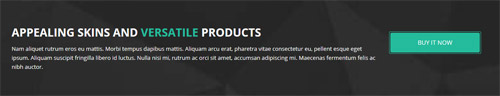
Codes are as follows:
<div class="SectionStyles10 pt-60 pb-60">
  <div class="dnn_layout">
    <div class="content_mid clearfix">
      <div class="pane_layout">
        <section class="row animation fadeInUp">
          <div class="col-md-9 col-sm-12">
            <h4>Appealing skins and <span>versatile</span> Products</h4>
            <p>text.......</p>
          </div>
          <div class="col-md-3 col-sm-12">
            <div class="Button_SectionStyles10main">
                <a target="blank" href="#" class="Button_SectionStyles10">Buy It Now</a>
            </div>
          </div>
        </section>
      </div>
    </div>
  </div>
</div>
Option:
- This is a SectionStyles effect.
- You can modify
animationto change or delete animation.Animation list. col-sm-* col-md-*is the width of each column, you can change the width you need through value1~12.
Best Selling area
Below is the screen shot:
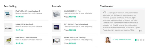
Codes are as follows:
<div class="conboxcmain">
  <div class="dnn_layout">
    <div class="row">
      <div class="col-sm-4 animation rotateIn ">
        <h3>Best Selling</h3>
        <ul class="conboxc">
          <li> <img alt="" src="/portals/32/show9.jpg" class="img-responsive" />
            <div>
              <p><strong>iPad Tablet Wireless Keyboard</strong><br />
                Nenean massa. Cum sociis natoque </p>
              <span class="glyphicons glyph-star"></span><span class="glyphicons glyph-star"></span><span class="glyphicons glyph-star"></span><span class="glyphicons glyph-star"></span><span class="glyphicons glyph-star"></span> </div>
          </li>
          <li> <img alt="" src="/portals/32/show10.jpg" class="img-responsive" />
            <div>
              <p><strong>SONY SVF14 Notebook</strong><br />
                Nenean massa. Cum sociis natoque </p>
              <span class="glyphicons glyph-star"></span><span class="glyphicons glyph-star"></span><span class="glyphicons glyph-star"></span><span class="glyphicons glyph-dislikes"></span><span class="glyphicons glyph-dislikes"></span> </div>
          </li>
          <li> <img alt="" src="/portals/32/show11.jpg" class="img-responsive" />
            <div>
              <p><strong>IdeaCentre C340 Computer</strong><br />
                Nenean massa. Cum sociis natoque </p>
              <span class="glyphicons glyph-star"></span><span class="glyphicons glyph-star"></span><span class="glyphicons glyph-star"></span><span class="glyphicons glyph-star"></span><span class="glyphicons glyph-dislikes"></span> </div>
          </li>
        </ul>
      </div>
      <div class="col-sm-4 animation rotateIn ">
        <h3>Pre-sale</h3>
        <ul class="conboxc">
          <li> <img alt="" src="/portals/32/show12.jpg" class="img-responsive" />
            <div>
              <p><strong>SAMSUNG SF-761 Fax</strong><br />
                Lorem ipsum dolor sit amet edipiscing </p>
              <strong>Price : <span>$1599.00</span></strong> </div>
          </li>
          <li> <img alt="" src="/portals/32/show13.jpg" class="img-responsive" />
            <div>
              <p><strong>SVF15N18SCS Touch Notebook</strong><br />
                Lorem ipsum dolor sit amet edipiscing </p>
              <strong>Price : <span>$3298.00</span></strong> </div>
          </li>
          <li> <img alt="" src="/portals/32/show14.jpg" class="img-responsive" />
            <div>
              <p><strong> Vostro 3800-R1846 Desktop</strong><br />
                Lorem ipsum dolor sit amet edipiscing </p>
              <strong>Price : <span>$1769.00</span></strong> </div>
          </li>
        </ul>
      </div>
      <div class="col-sm-4 animation rotateIn">
        <h3>Testimonial</h3>
        <ul class=" Testimonials_tab Testimonials_1" data-position="fade" data-display-arrows="false" data-autoplay="5000">
          <li>
            <blockquote>
              <p>Lorem ipsum dolor sit amet, consectetur adipiscing elit. Sed sagittis porttitor lacus nec vehicula. Quisque commodo mi purus, eget accumsan sapien tristique id. Integer nisl odio. Donec blandit eleifend consectetur molestie ac pharetra vel, fringilla id urna. Nunc nibh diam, blandit vitae vehicula dapibus, pulvinar eu sapien. Fusce et ornare sapien, non euismod felis.</p>
              <small><img alt="" src="/portals/32/Pic_14.jpg" /><span>Andy Weeks President </span></small> </blockquote>
          </li>
          <li>
            <blockquote>
              <p>Lorem ipsum dolor sit amet, consectetur adipiscing elit. Sed sagittis porttitor lacus nec vehicula. Quisque commodo mi purus, eget accumsan sapien tristique id. Integer nisl odio. Donec blandit eleifend consectetur molestie ac pharetra vel, fringilla id urna. Nunc nibh diam, blandit vitae vehicula dapibus, pulvinar eu sapien. Fusce et ornare sapien, non euismod felis.</p>
              <small><img alt="" src="/portals/32/Pic_15.jpg" /><span>Andy Weeks President</span></small> </blockquote>
          </li>
          <li>
            <blockquote>
              <p>Lorem ipsum dolor sit amet, consectetur adipiscing elit. Sed sagittis porttitor lacus nec vehicula. Quisque commodo mi purus, eget accumsan sapien tristique id. Integer nisl odio. Donec blandit eleifend consectetur molestie ac pharetra vel, fringilla id urna. Nunc nibh diam, blandit vitae vehicula dapibus, pulvinar eu sapien. Fusce et ornare sapien, non euismod felis.</p>
              <small><img alt="" src="/portals/32/Pic_16.jpg" /><span>Andy Weeks President</span></small> </blockquote>
          </li>
          <li>
            <blockquote>
              <p>Lorem ipsum dolor sit amet, consectetur adipiscing elit. Sed sagittis porttitor lacus nec vehicula. Quisque commodo mi purus, eget accumsan sapien tristique id. Integer nisl odio. Donec blandit eleifend consectetur molestie ac pharetra vel, fringilla id urna. Nunc nibh diam, blandit vitae vehicula dapibus, pulvinar eu sapien. Fusce et ornare sapien, non euismod felis.</p>
              <small><img alt="" src="/portals/32/Pic_17.jpg" /><span>Andy Weeks President </span></small> </blockquote>
          </li>
        </ul>
      </div>
    </div>
  </div>
</div>
Option:
- You can modify
animationto change or delete animation.Animation list. col-sm-* col-md-*is the width of each column, you can change the width you need through value1~12.- You can modify
glyphiconsto change icons. font icon list.
Best Selling Products area
Below is the screen shot:

Codes are as follows:
<div class="home2con_a clearfix">
  <div class="hc_aleft animation fadeInLeft"></div>
  <div class="hc_aright clearfix animation fadeInRight">
    <h1>Best Selling Products</h1>
    <p>Lorem ipsum dolor sit amet, consectetuer adipiscing elit. Donec libero. Suspendisse purus nec placerat bibendbibendum. Cras id urna. Morbi tincidunt, orci ac convallis aliquam, lectus turpis varius lorem, eu posuere nunc justo tempus leo. Class aptent taciti sociosqu ad litora torquent per conubia nostra, per inceptos himenaeos. Sed ut perspiciatis unde omnis iste natus error sit voluptatem accusantium. <br />
      <br />
      Fusce dapibus, tellus ac cursus commodo, tortor mauri Lorem ipsum dolor sit amet, cons ecte tuer adipiscing elit. Aenean commodo ligula eget dolor. Aenean massa. Cum sociis natoque penatibus et magnis dis parturient montes, nascetur ridiculus mus eu posuere nunc justo tempus leo.</p>
    <div class="line"></div>
    <div class="clear"></div>
    <a target="blank" href="#" class="Button_default">More Detail</a> <a href="#" class="social social-rss"></a> <a href="#" class="social social-vimeo"></a> <a href="#" class="social social-blogger"></a> <a href="#" class="social social-pinterest"></a> <a href="#" class="social social-twitter"></a> <a href="#" class="social social-facebook"></a> </div>
</div>
Option:
- You can modify
animationto change or delete animation.Animation list.
Choose Pricing Plan area
Below is the screen shot:
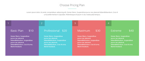
Codes are as follows:
<div class="home2con_b pt-50">
  <div class="dnn_layout">
    <div class="content_mid clearfix">
      <div class="pane_layout">
        <div class="row animation fadeInUp">
          <div class="col-sm-12">
            <h1 class="title">Choose Pricing Plan</h1>
            <div class="line"></div>
            <p class="text">Lorem ipsum dolor sit amet, consectetuer adipiscing elit. Donec libero. Suspendisse purus nec placerat bibendbibendum. Cras id urna.estfermentum vulputate. Pellentesque et ipsum in dui malesuada tempus. </p>
            <ul class="clearfix">
              <li class="cb_one"> <span class="lefttop">1</span> <span class="title">Basic Plan</span><span class="nomber">$10</span>
                <div class="clear"></div>
                <p>Donec libero. Suspendisse purus nec placerat bibendbibendum. Suspendisse purus nec placerat bibendbibendum. Cras id urna. Morbi tincidunt.</p>
              </li>
              <li class="cb_two"><span class="lefttop">2</span> <span class="title">Professional</span><span class="nomber">$20</span>
                <div class="clear"></div>
                <p>Donec libero. Suspendisse purus nec placerat bibendbibendum. Suspendisse purus nec placerat bibendbibendum. Cras id urna. Morbi tincidunt.</p>
              </li>
              <li class="cb_three"><span class="lefttop">3</span> <span class="title">Maximum</span><span class="nomber">$30</span>
                <div class="clear"></div>
                <p>Donec libero. Suspendisse purus nec placerat bibendbibendum. Suspendisse purus nec placerat bibendbibendum. Cras id urna. Morbi tincidunt.</p>
              </li>
              <li class="cb_four"><span class="lefttop">4</span> <span class="title">Extreme</span><span class="nomber">$40</span>
                <div class="clear"></div>
                <p>Donec libero. Suspendisse purus nec placerat bibendbibendum. Suspendisse purus nec placerat bibendbibendum. Cras id urna. Morbi tincidunt.</p>
              </li>
            </ul>
          </div>
        </div>
      </div>
    </div>
  </div>
</div>
Option:
- You can modify
animationto change or delete animation.Animation list. col-sm-*is the width of each column, you can change the width you need through value1~12.
Logos area
Below is the screen shot:

Codes are as follows:
<div class="SectionStyles11">
  <div class="dnn_layout">
    <div data-autoheight="false" data-pagination="false" class="carousel carousel_8 animation fadeInUp">
      <div class="item"> <a target="blank" href="#"><img alt="" src="/portals/32/show15.jpg" /></a> </div>
      <div class="item"> <a target="blank" href="#"><img alt="" src="/portals/32/show16.jpg" /></a> </div>
      <div class="item"><a target="blank" href="#"> <img alt="" src="/portals/32/show17.jpg" /></a> </div>
      <div class="item"> <a target="blank" href="#"><img alt="" src="/portals/32/show18.jpg" /></a> </div>
      <div class="item"> <a target="blank" href="#"><img alt="" src="/portals/32/show15.jpg" /></a> </div>
      <div class="item"> <a target="blank" href="#"><img alt="" src="/portals/32/show16.jpg" /></a> </div>
      <div class="item"> <a target="blank" href="#"><img alt="" src="/portals/32/show17.jpg" /></a> </div>
      <div class="item"> <a target="blank" href="#"><img alt="" src="/portals/32/show18.jpg" /></a> </div>
    </div>
  </div>
</div>
Option:
- This is a
Carouseleffect.Carousel - This is a SectionStyles effect.
- You can modify
animationto change or delete animation.Animation list.
About Us area
Below is the screen shot:
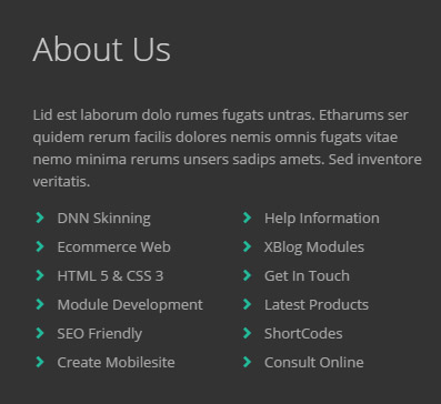
Codes are as follows:
<div class="animation fadeInUp">
  <p>Lid est laborum dolo rumes fugats untras. Etharums ser quidem rerum facilis dolores nemis omnis fugats vitae nemo minima rerums unsers sadips amets. Sed  inventore veritatis. </p>
  <ul class="conboxd">
    <li><a target="blank" href="#" class="conboxda"><span class="glyphicons glyph-chevron-right"></span>DNN Skinning</a></li>
    <li><a target="blank" href="#" class="conboxda"><span class="glyphicons glyph-chevron-right"></span>Ecommerce Web</a></li>
    <li><a target="blank" href="#" class="conboxda"><span class="glyphicons glyph-chevron-right"></span>HTML 5 & CSS 3</a></li>
    <li><a target="blank" href="#" class="conboxda"><span class="glyphicons glyph-chevron-right"></span>Module Development</a></li>
    <li><a target="blank" href="#" class="conboxda"><span class="glyphicons glyph-chevron-right"></span>SEO Friendly</a></li>
    <li><a target="blank" href="#" class="conboxda"><span class="glyphicons glyph-chevron-right"></span>Create Mobilesite</a></li>
  </ul>
  <ul class="conboxd">
    <li><a target="blank" href="#" class="conboxda"></a><a target="blank" href="#" class="conboxda"><span class="glyphicons glyph-chevron-right"></span>Help Information</a></li>
    <li><a target="blank" href="#" class="conboxda"><span class="glyphicons glyph-chevron-right"></span>XBlog Modules</a></li>
    <li><a target="blank" href="#" class="conboxda"><span class="glyphicons glyph-chevron-right"></span>Get In Touch</a></li>
    <li><a target="blank" href="#" class="conboxda"><span class="glyphicons glyph-chevron-right"></span>Latest Products</a></li>
    <li><a target="blank" href="#" class="conboxda"><span class="glyphicons glyph-chevron-right"></span>ShortCodes</a></li>
    <li><a target="blank" href="#" class="conboxda"><span class="glyphicons glyph-chevron-right"></span>Consult Online</a></li>
  </ul>
</div>
Option:
- You can modify
animationto change or delete animation.Animation list. - You can modify
glyphiconsto change icons. font icon list. Containeris usingContainer-20061-4
Recent News area
Below is the screen shot:
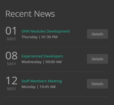
Codes are as follows:
<ul class="conboxe animation fadeInUp">
  <li class="clearfix">
    <div class="conboxe_a"><span>01</span><br />
      MAY</div>
    <div class="conboxe_b"><span>DNN Modules Development</span><br />
      Thursday  |  01:30 PM</div>
    <div class="conboxe_c"><a target="blank" href="#" class="conboxe_ca">Details</a></div>
  </li>
  <li class="clearfix">
    <div class="conboxe_a"><span>08</span><br />
      MAY</div>
    <div class="conboxe_b"><span>Experienced Developers</span><br />
      Wednesday  |  09:00 AM</div>
    <div class="conboxe_c"><a target="blank" href="#" class="conboxe_ca">Details</a></div>
  </li>
  <li class="clearfix">
    <div class="conboxe_a"><span>12</span><br />
      MAY</div>
    <div class="conboxe_b"><span>Staff Members Meeting</span><br />
      Monday  |  10:45 AM</div>
    <div class="conboxe_c"><a target="blank" href="#" class="conboxe_ca">Details</a></div>
  </li>
</ul>
Option:
- You can modify
animationto change or delete animation.Animation list. - You can modify
glyphiconsto change icons. font icon list. Containeris usingContainer-20061-4
Contact area
Below is the screen shot:
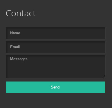
Option:
- This is
Theme_Responsive_20061_home2theme ofDNNGo PowerFormsmodule Containeris usingContainer-20061-4
Home Version 3
You can click the link to check Home Version 3 demo. Home Version 3
Banner area
Below is the screen shot:

It is using DNNGo LayerGalleryPro module here,you can import ContentListEntity-Home3.xml of the DNNGo_LayerGalleryPro folder to duplicate banner of the demo.
Icons area
Below is the screen shot:
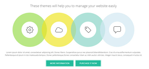
Codes are as follows:
<div class="conboxf animation scaleUp">
  <h4>These themes will help you to manage your website easily</h4>
  <div class="conboxf_main animation">
    <div class="conboxf_mainA">
      <div class="conboxf_maincon"><img alt="" class="img-responsive" src="/portals/32/conboxfpic1.png" /></div>
    </div>
    <div class="conboxf_mainB">
      <div class="conboxf_maincon"><img alt="" class="img-responsive" src="/portals/32/conboxfpic2.png" /></div>
    </div>
    <div class="conboxf_mainC">
      <div class="conboxf_maincon"><img alt="" class="img-responsive" src="/portals/32/conboxfpic3.png" /></div>
    </div>
    <div class="conboxf_mainD">
      <div class="conboxf_maincon"><img alt="" class="img-responsive" src="/portals/32/conboxfpic4.png" /></div>
    </div>
  </div>
  <p>Lorem ipsum dolor sit amet, consectetuer adipiscing elit. Donec libero. Suspendisse purus nec placerat bibendbibendum. Cras id urna.estfermentum vulputate. Pellentesque et ipsum in dui malesuada tempus. Donec pellentesque.Donec consectetur diam ac nibh auctor ultricies. Integer mauris lacus, consequat in luctus id.</p>
  <div class="conboxf_a"><a target="blank" href="#" class="Button_default">More Information</a><a target="blank" href="#" class="Button_default">Purchase it now</a></div>
</div>
Option:
- You can modify
animationto change or delete animation.Animation list.
Recent Blogs area
Below is the screen shot:
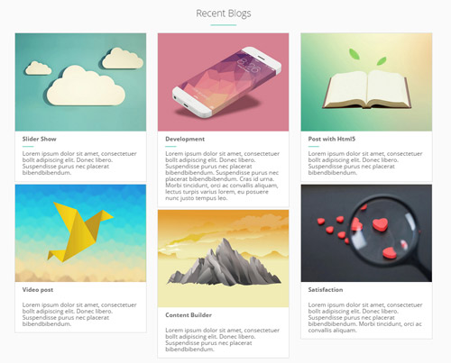
Codes are as follows:
<div class="dnn_layout animation scaleUp">
  <div class="row">
    <div class="conboxg">
      <h3>Recent Blogs</h3>
      <div class="conboxg_line"></div>
      <ul class="conboxg_main animation clearfix">
        <li class="col-sm-4">
          <div class="photo_box shade_zoom">
            <div class="pic_box"> <img alt="" class="img-responsive" src="/portals/32/apic1494.jpg" />
              <div class="ico"> <a target="blank" href="#"><span class="glyphicons glyph-link"></span></a> <a href="/Portals/32/apic1494.jpg" class="LightBox_image" title="Image Gallery"><span class="glyphicons glyph-resize-small"></span></a> </div>
              <div class="shade"></div>
            </div>
            <div class="text_sytle_3">
              <h3>Slider Show</h3>
              <span class="line"></span>
              <p> Lorem ipsum dolor sit amet, consectetuer  bollt adipiscing elit. Donec libero. Suspendisse purus nec placerat bibendbibendum. </p>
            </div>
          </div>
          <div class="photo_box shade_zoom">
            <div class="pic_box"> <img alt="" class="img-responsive" src="/portals/32/psds32202.jpg" />
              <div class="ico"> <a target="blank" href="#"><span class="glyphicons glyph-link"></span></a><a href="/Portals/32/psds32202.jpg" class="LightBox_image" title="Image Gallery"><span class="glyphicons glyph-resize-small"></span></a></div>
              <div class="shade"></div>
            </div>
            <div class="text_sytle_3">
              <h3>Video post</h3>
              <span class="line"></span>
              <p> Lorem ipsum dolor sit amet, consectetuer  bollt adipiscing elit. Donec libero. Suspendisse purus nec placerat bibendbibendum. </p>
            </div>
          </div>
        </li>
        <li class="col-sm-4">
          <div class="photo_box shade_zoom">
            <div class="pic_box"> <img alt="" class="img-responsive" src="/portals/32/apic2333.jpg" />
              <div class="ico"> <a target="blank" href="#"><span class="glyphicons glyph-link"></span></a><a href="/Portals/32/apic2333.jpg" class="LightBox_image" title="Image Gallery"><span class="glyphicons glyph-resize-small"></span></a> </div>
              <div class="shade"></div>
            </div>
            <div class="text_sytle_3">
              <h3>Development</h3>
              <span class="line"></span>
              <p>Lorem ipsum dolor sit amet, consectetuer  bollt adipiscing elit. Donec libero. Suspendisse purus nec placerat bibendbibendum. Suspendisse purus nec placerat bibendbibendum. Cras id urna. Morbi tincidunt, orci ac convallis aliquam, lectus turpis varius lorem, eu posuere nunc justo tempus leo.</p>
            </div>
          </div>
          <div class="photo_box shade_zoom">
            <div class="pic_box"> <img alt="" class="img-responsive" src="/portals/32/hbh.jpg" />
              <div class="ico"> <a target="blank" href="#"><span class="glyphicons glyph-link"></span></a><a href="/Portals/32/hbh.jpg" class="LightBox_image" title="Image Gallery"><span class="glyphicons glyph-resize-small"></span></a> </div>
              <div class="shade"></div>
            </div>
            <div class="text_sytle_3">
              <h3>Content Builder</h3>
              <span class="line"></span>
              <p>Lorem ipsum dolor sit amet, consectetuer  bollt adipiscing elit. Donec libero. Suspendisse purus nec placerat bibendbibendum. </p>
            </div>
          </div>
        </li>
        <li class="col-sm-4">
          <div class="photo_box shade_zoom">
            <div class="pic_box"> <img alt="" class="img-responsive" src="/portals/32/fe10667.jpg" />
              <div class="ico"> <a target="blank" href="#"><span class="glyphicons glyph-link"></span></a><a href="/Portals/32/fe10667.jpg" class="LightBox_image" title="Image Gallery"><span class="glyphicons glyph-resize-small"></span></a> </div>
              <div class="shade"></div>
            </div>
            <div class="text_sytle_3">
              <h3>Post with Html5</h3>
              <span class="line"></span>
              <p>Lorem ipsum dolor sit amet, consectetuer  bollt adipiscing elit. Donec libero. Suspendisse purus nec placerat bibendbibendum. </p>
            </div>
          </div>
          <div class="photo_box shade_zoom">
            <div class="pic_box"> <img alt="" class="img-responsive" src="/portals/32/xpic589.jpg" />
              <div class="ico"> <a target="blank" href="#"><span class="glyphicons glyph-link"></span></a><a href="/Portals/32/xpic589.jpg" class="LightBox_image" title="Image Gallery"><span class="glyphicons glyph-resize-small"></span> </a></div>
              <div class="shade"></div>
            </div>
            <div class="text_sytle_3">
              <h3>Satisfaction</h3>
              <span class="line"></span>
              <p>Lorem ipsum dolor sit amet, consectetuer  bollt adipiscing elit. Donec libero. Suspendisse purus nec placerat bibendbibendum. Morbi tincidunt, orci ac convallis aliquam. </p>
            </div>
          </div>
        </li>
      </ul>
    </div>
  </div>
</div>
Option:
- You can modify
animationto change or delete animation.Animation list. col-md-4is the width of each column, you can change the width you need through value1~12.- You can modify
glyphiconsto change icons. font icon list.
View More Blogs area
Below is the screen shot:

Codes are as follows:
<div class="conboxh">
  <div class="dnn_layout animation scaleUp">
    <div class="line">
      <div class="conboxha">
      	<a target="blank" href="#" class="Button_default">View More Blogs</a> </div>
    </div>
  </div>
</div>
Option:
- You can modify
animationto change or delete animation.Animation list.
Our Top Numbers area
Below is the screen shot:

Codes are as follows:
<div class="conboxi">
  <div class="conboxi_bg">
    <div class="shadow">
      <div class="dnn_layout">
        <div class="conboxi_bgtop">
          <h3>Our Top Numbers</h3>
          <div class="line"></div>
          <p>Lorem ipsum dolor sit amet, consectetuer adipiscing elit. Donec libero. Suspendisse purus nec placerat bibendbibendum. Cras id urna.estfermentum vulputate. Pellentesque et ipsum in dui malesuada tempus. </p>
        </div>
        <div class="conboxi_bgbottom">
          <div class="number_Animation row animation scaleUp">
            <div class="col-sm-3 col-xs-6"> <span class="animation  number" data-number="3600">0</span> <span class="line"></span><span class="number_name">Clients Follow Us</span> </div>
            <div class="col-sm-3 col-xs-6"> <span class="animation  number" data-number="580">0</span> <span class="line"></span><span class="number_name">Products In The Store</span> </div>
            <div class="col-sm-3 col-xs-6"> <span class="animation  number" data-number="9700">0</span> <span class="line"></span><span class="number_name">Users Like These Themes</span> </div>
            <div class="col-sm-3 col-xs-6"> <span class="animation  number" data-number="2401">0</span> <span class="line"></span><span class="number_name">Comments About Us</span> </div>
          </div>
        </div>
      </div>
    </div>
  </div>
</div>
Option:
col-sm-* col-xs-*is the width of each column, you can change the width you need through value1~12- This is a
ProgressBars Counterseffect.ProgressBars Counters - You can change the value you need to display through
data-number - You can modify
animationto change or delete animation.Animation list.
Our Employees area
Below is the screen shot:
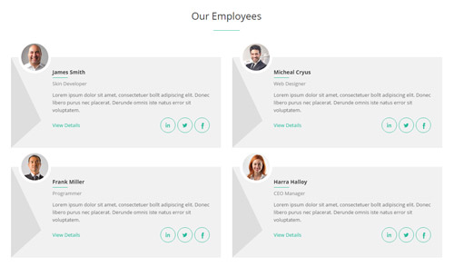
Codes are as follows:
<div class="conboxj">
  <h3>Our Employees</h3>
  <div class="line"></div>
  <div class="row">
    <div class="col-sm-6 animation fadeInLeft">
      <div class="conboxj_main clearfix">
        <div class="emblem"><img alt="" class="img-responsive" src="/portals/32/show19.jpg" /></div>
        <div class="conboxj_left"></div>
        <div class="conboxj_right">
          <h3>James Smith</h3>
          <div class="line"></div>
          <div class="title">Skin Developer</div>
          <p>Lorem ipsum dolor sit amet, consectetuer  bollt adipiscing elit. Donec libero purus nec placerat. Derunde omnis iste natus error sit voluptatem.</p>
          <div class="clearfix"><a target="blank" href="#" class="linkleft">View Details</a><a href="#" class="linkright"><span class="social social-facebook"></span></a><a href="#" class="linkright"><span class="social social-twitter"></span></a><a href="#" class="linkright"><span class="social social-linked-in"></span></a></div>
        </div>
      </div>
    </div>
    <div class="col-sm-6 animation fadeInRight">
      <div class="conboxj_main clearfix">
        <div class="emblem"><img alt="" class="img-responsive" src="/portals/32/show20.jpg" /></div>
        <div class="conboxj_left"></div>
        <div class="conboxj_right">
          <h3> Micheal Cryus</h3>
          <div class="line"></div>
          <div class="title">Web Designer</div>
          <p>Lorem ipsum dolor sit amet, consectetuer  bollt adipiscing elit. Donec libero purus nec placerat. Derunde omnis iste natus error sit voluptatem.</p>
          <div class="clearfix"><a target="blank" href="#" class="linkleft">View Details</a><a href="#" class="linkright"><span class="social social-facebook"></span></a><a href="#" class="linkright"><span class="social social-twitter"></span></a><a href="#" class="linkright"><span class="social social-linked-in"></span></a></div>
        </div>
      </div>
    </div>
  </div>
  <div class="row">
    <div class="col-sm-6 animation fadeInLeft">
      <div class="conboxj_main clearfix">
        <div class="emblem"><img alt="" class="img-responsive" src="/portals/32/show21.jpg" /></div>
        <div class="conboxj_left"></div>
        <div class="conboxj_right">
          <h3>Frank Miller </h3>
          <div class="line"></div>
          <div class="title">Programmer</div>
          <p>Lorem ipsum dolor sit amet, consectetuer  bollt adipiscing elit. Donec libero purus nec placerat. Derunde omnis iste natus error sit voluptatem.</p>
          <div class="clearfix"><a target="blank" href="#" class="linkleft">View Details</a><a href="#" class="linkright"><span class="social social-facebook"></span></a><a href="#" class="linkright"><span class="social social-twitter"></span></a><a href="#" class="linkright"><span class="social social-linked-in"></span></a></div>
        </div>
      </div>
    </div>
    <div class="col-sm-6 animation fadeInRight">
      <div class="conboxj_main clearfix">
        <div class="emblem"><img alt="" class="img-responsive" src="/portals/32/show22.jpg" /></div>
        <div class="conboxj_left"></div>
        <div class="conboxj_right">
          <h3>Harra Halloy</h3>
          <div class="line"></div>
          <div class="title">CEO Manager</div>
          <p>Lorem ipsum dolor sit amet, consectetuer  bollt adipiscing elit. Donec libero purus nec placerat. Derunde omnis iste natus error sit voluptatem.</p>
          <div class="clearfix"><a target="blank" href="#" class="linkleft">View Details</a><a href="#" class="linkright"><span class="social social-facebook"></span></a><a href="#" class="linkright"><span class="social social-twitter"></span></a><a href="#" class="linkright"><span class="social social-linked-in"></span></a></div>
        </div>
      </div>
    </div>
  </div>
</div>
Option:
- You can modify
animationto change or delete animation.Animation list. col-md-*is the width of each column, you can change the width you need through value1~12.- You can modify
glyphiconsto change icons. font icon list.
Our Skills area
Below is the screen shot:
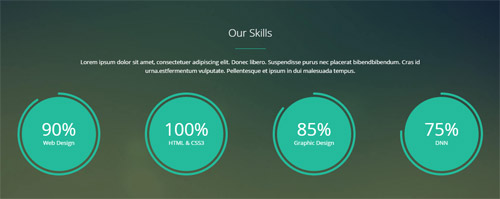
Codes are as follows:
<div class="home3con_a pt-60 pb-60">
  <div class="dnn_layout">
    <div class="content_mid clearfix">
      <div class="pane_layout">
        <div class="row animation fadeInUp">
          <div class="col-sm-12">
            <h1 class="title">Our Skills</h1>
            <div class="line"></div>
            <p class="text">Lorem ipsum dolor sit amet, consectetuer adipiscing elit. Donec libero. Suspendisse purus nec placerat bibendbibendum. Cras id urna.estfermentum vulputate. Pellentesque et ipsum in dui malesuada tempus. </p>
            <div class="chart_list row">
              <div class="col-md-3 col-sm-6 animation rotateIn">
                <div data-percent="91" class="percentage4">
                  <div class="percentage_inner"><span>0</span>%
                    <p>Web Design</p>
                  </div>
                </div>
              </div>
              <div class="col-md-3 col-sm-6 animation rotateIn">
                <div data-percent="101" class="percentage4">
                  <div class="percentage_inner"><span>0</span>%
                    <p>HTML & CSS3</p>
                  </div>
                </div>
              </div>
              <div class="col-md-3 col-sm-6 animation rotateIn">
                <div data-percent="86" class="percentage4">
                  <div class="percentage_inner"><span>0</span>%
                    <p>Graphic Design</p>
                  </div>
                </div>
              </div>
              <div class="col-md-3 col-sm-6 animation rotateIn">
                <div data-percent="76" class="percentage4">
                  <div class="percentage_inner"><span>0</span>%
                    <p>DNN</p>
                  </div>
                </div>
              </div>
            </div>
          </div>
        </div>
      </div>
    </div>
  </div>
</div>
Option:
- You can modify
animationto change or delete animation.Animation list. col-sm-* col-md-*is the width of each column, you can change the width you need through value1~12- This is a
ProgressBars Counterseffect.ProgressBars Counters data-percentis for controlling the percentage that displays, you can display percentage through value0~100
Our Features area
Below is the screen shot:
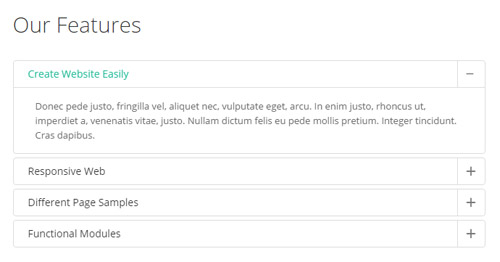
Codes are as follows:
<div class="panel-group accordion_3 animation fadeInLeft" id="accordion3">
  <div class="panel panel-default">
    <div class="panel-heading">
      <h4 class="panel-title"> <a data-toggle="collapse" data-parent="#accordion3" href="#collapse3_1"><span class="accordion_icon"></span>Create Website Easily </a> </h4>
    </div>
    <div id="collapse3_1" class="panel-collapse collapse in">
      <div class="panel-body">Donec pede justo, fringilla vel, aliquet nec, vulputate eget, arcu. In enim justo, rhoncus ut, imperdiet a, venenatis vitae, justo. Nullam dictum felis eu pede mollis pretium. Integer tincidunt. Cras dapibus. </div>
    </div>
  </div>
  <div class="panel panel-default">
    <div class="panel-heading">
      <h4 class="panel-title"> <a data-toggle="collapse" data-parent="#accordion3" href="#collapse3_2" class="collapsed"><span class="accordion_icon"></span>Responsive Web</a> </h4>
    </div>
    <div id="collapse3_2" class="panel-collapse collapse">
      <div class="panel-body">Sed ut perspiciatis unde omnis iste natus error sit voluptatem accusantium doloremque laudantium, totam rem aperiam, eaque ipsa quae ab illo inventore veritatis et quasi architecto beatae.Lorem ipsum dolor sit amet, consectetur adipiscing elit. Sed ut perspiciatis unde omnis iste natus error sit voluptatem accusantium doloremque laudantium, totam rem aperiam.</div>
    </div>
  </div>
  <div class="panel panel-default">
    <div class="panel-heading">
      <h4 class="panel-title"> <a data-toggle="collapse" data-parent="#accordion3" href="#collapse3_3" class="collapsed"><span class="accordion_icon"></span>Different Page Samples</a> </h4>
    </div>
    <div id="collapse3_3" class="panel-collapse collapse">
      <div class="panel-body">Fugiat dapibus, tellus ac cursus commodo, mauris sit condim eser ntumsi nibh, uum a justo vitaes amet risus amets un. Posi sectetut amet fermntum orem ipsum. sed diam non umy at volutpat.</div>
    </div>
  </div>
  <div class="panel panel-default">
    <div class="panel-heading">
      <h4 class="panel-title"> <a data-toggle="collapse" data-parent="#accordion3" href="#collapse3_4" class="collapsed"><span class="accordion_icon"></span>Functional Modules</a> </h4>
    </div>
    <div id="collapse3_4" class="panel-collapse collapse">
      <div class="panel-body">Our skins and modules are user friendly, powerful and easy to install and definitely will help make your site stand out. also our developers are improving the modules and releasing new versions of existing DNN modules constantly.</div>
    </div>
  </div>
</div>
Option:
- You can modify
animationto change or delete animation.Animation list. - This is a
Accordionseffect.Accordions Containeris usingContainer-20061-4
Why Choose Us area
Below is the screen shot:
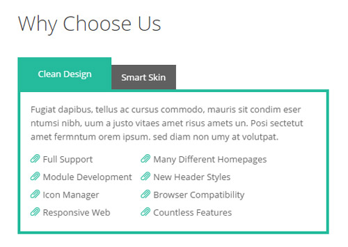
Codes are as follows:
<div class="home3con_b horizontalTab_Top horizontalTab_Top_4 animation fadeInRight">
  <ul class="resp-tabs-list">
    <li><span>Clean Design</span></li>
    <li><span>Smart Skin</span></li>
  </ul>
  <div class="resp-tabs-container">
    <div class="resp_container">
      <div class="resp_margin">
        <p>Fugiat dapibus, tellus ac cursus commodo, mauris sit condim eser ntumsi nibh, uum a justo vitaes amet risus amets un. Posi sectetut amet fermntum orem ipsum. sed diam non umy at volutpat.</p>
        <ul class="list_style">
          <li><span class="glyphicons glyph-paperclip"></span>Full Support</li>
          <li><span class="glyphicons glyph-paperclip"></span>Module Development</li>
          <li><span class="glyphicons glyph-paperclip"></span>Icon Manager</li>
          <li><span class="glyphicons glyph-paperclip"></span>Responsive Web</li>
        </ul>
        <ul class="list_style">
          <li><span class="glyphicons glyph-paperclip"></span>Many Different Homepages</li>
          <li><span class="glyphicons glyph-paperclip"></span>New Header Styles</li>
          <li><span class="glyphicons glyph-paperclip"></span>Browser Compatibility</li>
          <li><span class="glyphicons glyph-paperclip"></span>Countless Features</li>
        </ul>
      </div>
    </div>
    <div class="resp_container">
      <div class="resp_margin">
        <p> </p>
        <p>Fugiat dapibus, tellus ac cursus commodo, mauris sit condim eser ntumsi nibh, uum a justo vitaes amet risus amets un. Posi sectetut amet fermntum orem ipsum. sed diam non umy at volutpat.</p>
        <p> </p>
      </div>
    </div>
  </div>
</div>
Option:
- You can modify
animationto change or delete animation.Animation list. Containeris usingContainer-20061-4- This is a
Responsive Tabeffect.ResponsiveTab - You can modify
glyphiconsto change icons. font icon list.
Friendly Links area
Below is the screen shot:
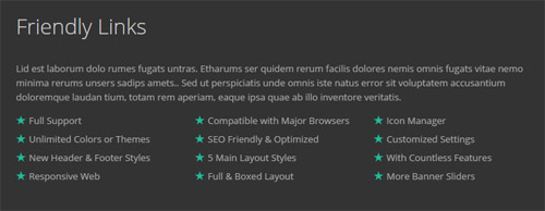
Codes are as follows:
<div class="animation fadeInUp">
  <p>Lid est laborum dolo rumes fugats untras. Etharums ser quidem rerum facilis dolores nemis omnis fugats vitae nemo minima rerums unsers sadips amets.. Sed ut perspiciatis unde omnis iste natus error sit voluptatem accusantium doloremque laudan tium, totam rem aperiam, eaque ipsa quae ab illo inventore veritatis. </p>
  <ul class="list_style">
    <li><span class="glyphicons glyph-star"></span>Full Support</li>
    <li><span class="glyphicons glyph-star"></span>Unlimited Colors or Themes</li>
    <li><span class="glyphicons glyph-star"></span>New Header & Footer Styles</li>
    <li><span class="glyphicons glyph-star"></span>Responsive Web</li>
  </ul>
  <ul class="list_style">
    <li><span class="glyphicons glyph-star"></span>Compatible with Major Browsers</li>
    <li><span class="glyphicons glyph-star"></span>SEO Friendly & Optimized</li>
    <li><span class="glyphicons glyph-star"></span>5 Main Layout Styles</li>
    <li><span class="glyphicons glyph-star"></span>Full & Boxed Layout</li>
  </ul>
  <ul class="list_style">
    <li><span class="glyphicons glyph-star"></span>Icon Manager</li>
    <li><span class="glyphicons glyph-star"></span>Customized Settings</li>
    <li><span class="glyphicons glyph-star"></span>With Countless Features</li>
    <li><span class="glyphicons glyph-star"></span>More Banner Sliders</li>
  </ul>
  <div class="clear"></div>
</div>
Option:
- You can modify
animationto change or delete animation.Animation list. Containeris usingContainer-20061-4- You can modify
glyphiconsto change icons. font icon list.
Contact area
Below is the screen shot:
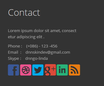
Codes are as follows:
<div class="animation fadeInUp">
  <p>Lorem ipsum dolor sit amet, consect <br />
    etur adipiscing elit .</p>
  <p>Phone :    (+086) - 123 -456<br />
    Email  :    dnnskindev@gmail.com<br />
    Skype :    dnngo-linda</p>
  <p class="socialicon_footer"> <a href="#" class="social social-facebook"></a> <a href="#" class="social social-dribbble"></a> <a href="#" class="social social-twitter"></a> <a href="#" class="social social-google-plus"></a> <a href="#" class="social social-linked-in"></a> <a href="#" class="social social-rss"></a> </p>
</div>
Option:
- You can modify
animationto change or delete animation.Animation list. Containeris usingContainer-20061-4- You can modify
glyphiconsto change icons. font icon list.
Home Version 4
You can click the link to check Home Version 4 demo. Home Version 4
Banner area
Below is the screen shot:
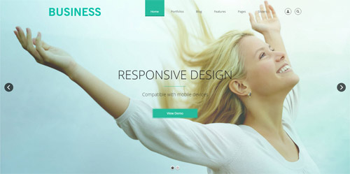
It is using DNNGo LayerGalleryPro module here,you can import ContentListEntity-Home4.xml of the DNNGo_LayerGalleryPro folder to duplicate banner of the demo.
Create your own business area
Below is the screen shot:
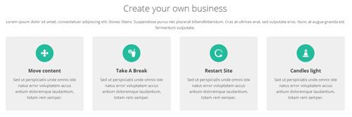
Codes are as follows:
<div class="row animation fadeInUp">
  <div class="col-sm-12">
    <h3 class="flip_box_4h3">Create your own business</h3>
    <p class="flip_box_4p">Lorem ipsum dolor sit amet, consectetuer adipiscing elit. Donec libero. Suspendisse purus nec placerat bibendbibendum. Cras at ultrices erat, sed vulputate eros. Nunc at augue gravida est fermentum vulputate.</p>
  </div>
  <div class="col-sm-3">
    <div class="flip_box flip_box_4">
      <div class="rotate">
        <div class="front"> <span class="glyphicons glyph-move"></span>
          <h3>Move content</h3>
          <p>Sed ut perspiciatis unde omnis iste natus error voluptatem accus antium doloremque laudantium, totam rem  semper.</p>
        </div>
        <div class="back">
          <h3>Take A Break</h3>
          <p>Mauris at ultricies eros. Morbi vel dui nec arcu suscipit euismod. Phasellus pellentes untque lectus eget quammollis lac in venenatis suscipit tellus.</p>
          <a target="blank" href="#" class="but">Read More  ></a> </div>
      </div>
    </div>
  </div>
  <div class="col-sm-3">
    <div class="flip_box flip_right flip_box_4">
      <div class="rotate">
        <div class="front"> <span class="glyphicons glyph-drink"></span>
          <h3>Take A Break</h3>
          <p>Sed ut perspiciatis unde omnis iste natus error voluptatem accus antium doloremque laudantium, totam rem  semper.</p>
        </div>
        <div class="back">
          <h3>Take A Break</h3>
          <p>Mauris at ultricies eros. Morbi vel dui nec arcu suscipit euismod. Phasellus pellentes untque lectus eget quammollis lac in venenatis suscipit tellus.</p>
          <a target="blank" href="#" class="but">Read More  ></a> </div>
      </div>
    </div>
  </div>
  <div class="col-sm-3">
    <div class="flip_box flip_top flip_box_4">
      <div class="rotate">
        <div class="front"> <span class="glyphicons glyph-restart"></span>
          <h3>Restart Site</h3>
          <p>Sed ut perspiciatis unde omnis iste natus error voluptatem accus antium doloremque laudantium, totam rem  semper.</p>
        </div>
        <div class="back">
          <h3>Take A Break</h3>
          <p>Mauris at ultricies eros. Morbi vel dui nec arcu suscipit euismod. Phasellus pellentes untque lectus eget quammollis lac in venenatis suscipit tellus.</p>
          <a target="blank" href="#" class="but">Read More  ></a> </div>
      </div>
    </div>
  </div>
  <div class="col-sm-3">
    <div class="flip_box flip_bottom flip_box_4">
      <div class="rotate">
        <div class="front"> <span class="glyphicons glyph-candle"></span>
          <h3>Candles light</h3>
          <p>Sed ut perspiciatis unde omnis iste natus error voluptatem accus antium doloremque laudantium, totam rem  semper.</p>
        </div>
        <div class="back">
          <h3>Take A Break</h3>
          <p>Mauris at ultricies eros. Morbi vel dui nec arcu suscipit euismod. Phasellus pellentes untque lectus eget quammollis lac in venenatis suscipit tellus.</p>
          <a target="blank" href="#" class="but">Read More  ></a> </div>
      </div>
    </div>
  </div>
</div>
Option:
- You can modify
animationto change the animation on the slide. Animation list. - You can modify
glyphiconsto change icons. font icon list.
HTML5 + CSS3 area
Below is the screen shot:
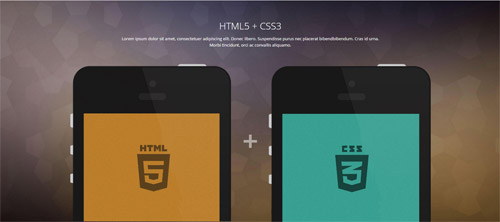
Codes are as follows:
<div class="conboxk">
  <div class="dnn_layout">
    <h3>HTML5 + CSS3</h3>
    <p>Lorem ipsum dolor sit amet, consectetuer adipiscing elit. Donec libero. Suspendisse purus nec placerat bibendbibendum. Cras id urna. Morbi tincidunt, orci ac convallis aliquamo.</p>
    <div class="imgmain clearfix">
      <div class="imgleft animation fadeInLeft"><img alt="" class="img-responsive" src="/portals/32/conboxk_1.png" /></div>
      <div class="imgright animation fadeInRight"><img alt="" class="img-responsive" src="/portals/32/conboxk_2.png" /></div>
      <div class="imgmainicon"><span class="glyphicons glyph-plus"></span></div>
    </div>
  </div>
</div>
Option:
- You can modify
animationto change the animation on the slide. Animation list. - You can modify
glyphiconsto change icons. font icon list.
Recent Products area
Below is the screen shot:
Codes are as follows:
<div class="conboxl pt-50 pb-60 animation fadeInUp">
  <div class="dnn_layout">
    <h3>Recent Products</h3>
    <p>Lorem ipsum dolor sit amet, consectetuer adipiscing elit. Donec libero. Suspendisse purus nec placerat bibendbibendum. Cras id urna. Morbi tincidunt, orci ac convallis aliquamo.</p>
  </div>
</div>
Option:
- You can modify
animationto change the animation on the slide. Animation list.
Photos area
Below is the screen shot:

Codes are as follows:
<div class="row conboxm animation scaleUp">
  <div class="col-md-3 col-xs-6">
    <div class="photo_box ico_push_in">
      <div class="pic_box"> <img alt="" class="img-responsive" src="/portals/32/psds32202.jpg" />
        <div class="ico"> <a target="blank" href="#"> <span class="glyphicons glyph-link ico_left"></span></a> <a href="#"><span class="glyphicons glyph-share ico_right"></span></a> <a href="/Portals/32/psds32202.jpg" class="three LightBox_image"><span class="glyphicons glyph-search ico_right"></span></a> </div>
        <div class="shade"></div>
      </div>
    </div>
  </div>
  <div class="col-md-3 col-xs-6">
    <div class="photo_box ico_push_in">
      <div class="pic_box"> <img alt="" class="img-responsive" src="/portals/32/dnngo-11.jpg" />
        <div class="ico"> <a target="blank" href="#"> <span class="glyphicons glyph-link ico_left"></span></a> <a href="#"><span class="glyphicons glyph-share ico_right"></span></a> <a href="/Portals/32/dnngo-11.jpg" class="three LightBox_image"><span class="glyphicons glyph-search ico_right"></span></a> </div>
        <div class="shade"></div>
      </div>
    </div>
  </div>
  <div class="col-md-3 col-xs-6">
    <div class="photo_box ico_push_in">
      <div class="pic_box"> <img alt="" class="img-responsive" src="/portals/32/apic1494.jpg" />
        <div class="ico"> <a target="blank" href="#"> <span class="glyphicons glyph-link ico_left"></span></a> <a href="#"><span class="glyphicons glyph-share ico_right"></span></a> <a href="/Portals/32/apic1494.jpg" class="three LightBox_image"><span class="glyphicons glyph-search ico_right"></span></a> </div>
        <div class="shade"></div>
      </div>
    </div>
  </div>
  <div class="col-md-3 col-xs-6">
    <div class="photo_box ico_push_in">
      <div class="pic_box"> <img alt="" class="img-responsive" src="/portals/32/hbh.jpg" />
        <div class="ico"> <a target="blank" href="#"> <span class="glyphicons glyph-link ico_left"></span></a> <a href="#"><span class="glyphicons glyph-share ico_right"></span></a> <a href="/Portals/32/hbh.jpg" class="three LightBox_image"><span class="glyphicons glyph-search ico_right"></span></a> </div>
        <div class="shade"></div>
      </div>
    </div>
  </div>
</div>
<div class="row conboxm animation scaleUp">
  <div class="col-md-3 col-xs-6">
    <div class="photo_box ico_push_in">
      <div class="pic_box"> <img alt="" class="img-responsive" src="/portals/32/fe10667.jpg" />
        <div class="ico"> <a target="blank" href="#"> <span class="glyphicons glyph-link ico_left"></span></a> <a href="#"><span class="glyphicons glyph-share ico_right"></span></a> <a href="/Portals/32/fe10667.jpg" class="three LightBox_image"><span class="glyphicons glyph-search ico_right"></span></a> </div>
        <div class="shade"></div>
      </div>
    </div>
  </div>
  <div class="col-md-3 col-xs-6">
    <div class="photo_box ico_push_in">
      <div class="pic_box"> <img alt="" class="img-responsive" src="/portals/32/apic2333.jpg" />
        <div class="ico"> <a target="blank" href="#"> <span class="glyphicons glyph-link ico_left"></span></a> <a href="#"><span class="glyphicons glyph-share ico_right"></span></a> <a href="/Portals/32/apic2333.jpg" class="three LightBox_image"><span class="glyphicons glyph-search ico_right"></span></a> </div>
        <div class="shade"></div>
      </div>
    </div>
  </div>
  <div class="col-md-3 col-xs-6">
    <div class="photo_box ico_push_in">
      <div class="pic_box"> <img alt="" class="img-responsive" src="/portals/32/xpic589.jpg" />
        <div class="ico"> <a target="blank" href="#"> <span class="glyphicons glyph-link ico_left"></span></a> <a href="#"><span class="glyphicons glyph-share ico_right"></span></a> <a href="/Portals/32/xpic589.jpg" class="three LightBox_image"><span class="glyphicons glyph-search ico_right"></span></a> </div>
        <div class="shade"></div>
      </div>
    </div>
  </div>
  <div class="col-md-3 col-xs-6">
    <div class="photo_box ico_push_in">
      <div class="pic_box"> <img alt="" class="img-responsive" src="/portals/32/psds32202.jpg" />
        <div class="ico"> <a target="blank" href="#"> <span class="glyphicons glyph-link ico_left"></span></a> <a href="#"><span class="glyphicons glyph-share ico_right"></span></a> <a href="/Portals/32/psds32202.jpg" class="three LightBox_image"><span class="glyphicons glyph-search ico_right"></span></a> </div>
        <div class="shade"></div>
      </div>
    </div>
  </div>
</div>
Option:
- You can modify
animationto change the animation on the slide. Animation list. - You can modify
glyphiconsto change icons. font icon list.
Parallax area
Below is the screen shot:

Codes are as follows:
<div class="conboxn">
  <div class="conboxnicon animation scaleUp"><span class="glyphicons glyph-eye-open"></span></div>
  <p>Parallax</p>
</div>
Option:
- You can modify
animationto change the animation on the slide. Animation list. - You can modify
glyphiconsto change icons. font icon list.
Call For Services area
Below is the screen shot:

Codes are as follows:
<div class="home4_line_bg mt40 mb40"></div>
Mobilesite Development area
Below is the screen shot:
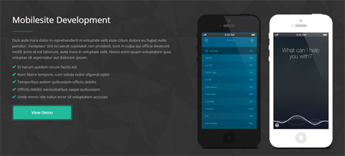
Codes are as follows:
<div class="conboxp pt-60 pb-60">
  <div class="dnn_layout">
    <div class="row">
      <div class="col-sm-6 animation fadeInLeft">
        <h3>Mobilesite Development</h3>
        <div class="line"></div>
        <p>Duis aute irure dolor in reprehenderit in voluptate velit esse cillum dolore eu fugiat nulla pariatur. Excepteur sint occaecat cupidatat non proident, sunt in culpa qui officia deserunt mollit anim id est laborum. aute irure in voluptate velit. Nemo enim ipsam voluptatem quia voluptas sit aspernatur aut dolorem ipsum.</p>
        <ul class="list_style">
          <li><span class="glyphicons glyph-ok-2"></span>Et harum quidem rerum facilis est</li>
          <li><span class="glyphicons glyph-ok-2"></span>Nam libero tempore, cum soluta nobis  eligendi optio</li>
          <li><span class="glyphicons glyph-ok-2"></span>Temporibus autem quibusdam officiis debitis</li>
          <li><span class="glyphicons glyph-ok-2"></span>Officiis debitis necessitatibus saepe quibusdam</li>
          <li><span class="glyphicons glyph-ok-2"></span>Unde omnis iste natus error sit voluptatem accusan</li>
        </ul>
        <div class="Button_SectionStyles10main"><a class="Button_SectionStyles10" target="blank" href="#">View Demo</a></div>
      </div>
      <div class="col-sm-6 clearfix"><img alt="" class="img-responsive animation fadeInRight" src="/portals/32/conboxp_2.png" /><img alt="" class="img-responsive animation fadeInRight" src="/portals/32/conboxp_1.png" /></div>
    </div>
  </div>
</div>
Option:
- You can modify
animationto change the animation on the slide. Animation list. - You can modify
glyphiconsto change icons. font icon list.
Our Skills area
Below is the screen shot:
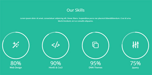
Codes are as follows:
<div class="conboxq pt-60 pb-60">
  <div class="dnn_layout">
    <div class="row animation fadeInUp">
      <div class="col-sm-12">
        <h3 class="chart_list5h3">Our Skills</h3>
        <p class="chart_list5p">Lorem ipsum dolor sit amet, consectetuer adipiscing elit. Donec libero. Suspendisse purus nec placerat bibendbibendum. Cras id urna. Morbi tincidunt, orci ac convallis aliquamo.</p>
      </div>
      <div class="col-md-3 col-sm-6 animation rotateIn">
        <div class="chart_list5">
          <div data-percent="81" class="percentage3">
            <div class="percentage_inner">
              <div class="glyphicons glyph-magic"></div>
            </div>
            <div class="nob"><span>0</span>%</div>
          </div>
          Web Design </div>
      </div>
      <div class="col-md-3 col-sm-6 animation rotateIn">
        <div class="chart_list5">
          <div data-percent="91" class="percentage3">
            <div class="percentage_inner">
              <div class="glyphicons glyph-embed-close"></div>
            </div>
            <div class="nob"><span>0</span>%</div>
          </div>
          Html5 & Css3 </div>
      </div>
      <div class="col-md-3 col-sm-6 animation rotateIn">
        <div class="chart_list5">
          <div data-percent="96" class="percentage3">
            <div class="percentage_inner">
              <div class="glyphicons glyph-more-windows"></div>
            </div>
            <div class="nob"><span>0</span>%</div>
          </div>
          DNN Themes </div>
      </div>
      <div class="col-md-3 col-sm-6 animation rotateIn">
        <div class="chart_list5">
          <div data-percent="76" class="percentage3">
            <div class="percentage_inner">
              <div class="glyphicons glyph-adjust-alt"></div>
            </div>
            <div class="nob"><span>0</span>%</div>
          </div>
          Jquery </div>
      </div>
    </div>
  </div>
</div>
Option:
- You can modify
glyphiconsto change icons. font icon list. - You can modify
animationto change the animation on the slide. Animation list. col-sm-* col-xs-*is the width of each column, you can change the width you need through value1~12data-percentis for controlling the percentage that displays, you can display percentage through value0~100
Recent Posts area
Below is the screen shot:
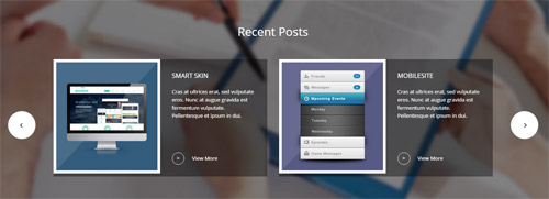
Codes are as follows:
<div class="conboxr">
  <div class="conboxr_shadow pt-60 pb-60 animation fadeInUp">
    <div class="dnn_layout">
      <h3>Recent Posts</h3>
      <div class="carousel carousel_6" data-pagination="false" data-autoheight="false" data-autoplay="false">
        <div class="item clearfix">
          <div class="carousel_6left"> <img alt="" class="img-responsive" src="/portals/32/conboxrpic1.jpg" /> </div>
          <div class="carousel_6right">
            <h4>Smart SKin</h4>
            <p>Cras at ultrices erat, sed vulputate eros. Nunc at augue gravida est fermentum vulputate. Pellentesque et ipsum in dui.</p>
            <div><span>></span><a target="blank" href="#">View More</a></div>
          </div>
        </div>
        <div class="item clearfix">
          <div class="carousel_6left"> <img alt="" class="img-responsive" src="/portals/32/conboxrpic2.jpg" /> </div>
          <div class="carousel_6right">
            <h4>Mobilesite</h4>
            <p>Cras at ultrices erat, sed vulputate eros. Nunc at augue gravida est fermentum vulputate. Pellentesque et ipsum in dui.</p>
            <div><span>></span><a target="blank" href="#">View More</a></div>
          </div>
        </div>
        <div class="item clearfix">
          <div class="carousel_6left"> <img alt="" class="img-responsive" src="/portals/32/conboxrpic1.jpg" /> </div>
          <div class="carousel_6right">
            <h4>Smart SKin</h4>
            <p>Cras at ultrices erat, sed vulputate eros. Nunc at augue gravida est fermentum vulputate. Pellentesque et ipsum in dui.</p>
            <div><span>></span><a target="blank" href="http://store.dnnsoftware.com/home/product-details/unlimited-responsive-dnn-theme-043-v320-retina-shortcodes-bootstrap3-css3animations/r/7ab93d48c5e846d6b199">View More</a></div>
          </div>
        </div>
        <div class="item clearfix">
          <div class="carousel_6left"> <img alt="" class="img-responsive" src="/portals/32/conboxrpic2.jpg" /> </div>
          <div class="carousel_6right">
            <h4>Mobilesite</h4>
            <p>Cras at ultrices erat, sed vulputate eros. Nunc at augue gravida est fermentum vulputate. Pellentesque et ipsum in dui.</p>
            <div><span>></span><a target="blank" href="http://store.dnnsoftware.com/home/product-details/unlimited-responsive-dnn-theme-043-v320-retina-shortcodes-bootstrap3-css3animations/r/7ab93d48c5e846d6b199">View More</a></div>
          </div>
        </div>
      </div>
    </div>
  </div>
</div>
Option:
- This is a
ProgressBars Counterseffect. Carousel - You can modify
animationto change the animation on the slide. Animation list.
Contact Us area
Below is the screen shot:
Codes are as follows:
<div class="conboxs animation fadeInUp">
  <h3>Contact Us</h3>
  <p>Lorem ipsum dolor sit amet, consectetuer adipiscing elit. Donec libero. Suspendisse purus nec placerat bibendbibendum. Cras id urna. Morbi tincidunt, orci ac convallis aliquamo.</p>
</div>
Option:
- You can modify
animationto change the animation on the slide. Animation list.
About Us area
Below is the screen shot:
Codes are as follows:
<div class="animation fadeInUp">
  <p>Aliquam fringilla, sapien egetferas scelerisque placerat, lorem libero cursus lorem, sed sodales lorem libero eu sapien. Nunc mattis feugiat justo vel faucibus. Nulla consequat feugiat malesuada autem quibusdam officiis debitis aut rerum.</p>
  <div class="footboxa row">
    <div class="col-sm-3  col-xs-6">
      <div class="photo_box"> <a href="/Portals/32/apic1494.jpg" class="LightBox_image_gallery1" title="Image Gallery">
        <div class="pic_box"> <img alt="" src="/portals/32/apic1494.jpg" class="img-responsive" />
          <div class="shade"></div>
        </div>
        </a> </div>
    </div>
    <div class="col-sm-3  col-xs-6">
      <div class="photo_box"> <a href="/Portals/32/apic2333.jpg" class="LightBox_image_gallery1" title="Image Gallery">
        <div class="pic_box"> <img alt="" src="/portals/32/apic2333.jpg" class="img-responsive" />
          <div class="shade"></div>
        </div>
        </a> </div>
    </div>
    <div class="col-sm-3  col-xs-6">
      <div class="photo_box"> <a href="/Portals/32/fe10667.jpg" class="LightBox_image_gallery1" title="Image Gallery">
        <div class="pic_box"> <img alt="" src="/portals/32/fe10667.jpg" class="img-responsive" />
          <div class="shade"></div>
        </div>
        </a> </div>
    </div>
    <div class="col-sm-3  col-xs-6">
      <div class="photo_box"> <a href="/Portals/32/psds32202.jpg" class="LightBox_image_gallery1" title="Image Gallery">
        <div class="pic_box"> <img alt="" src="/portals/32/psds32202.jpg" class="img-responsive" />
          <div class="shade"></div>
        </div>
        </a> </div>
    </div>
  </div>
  <a target="blank" href="http://dnngo.net/">www.dnngo.net</a> </div>
Option:
Containeris usingContainer-20064-4- You can modify
animationto change the animation on the slide. Animation list. col-md-3 col-sm-6is the width of each column, you can change the width you need through value1~12.
Archives area
Below is the screen shot:
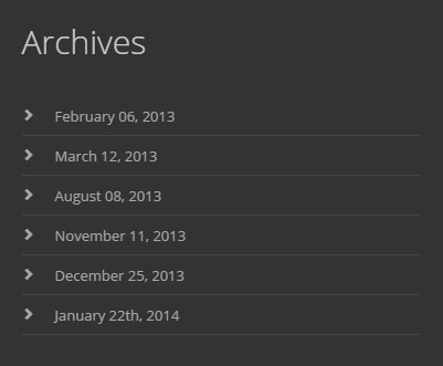
Codes are as follows:
<ul class="footer_archives_list animation fadeInUp">
  <li><a target="blank" href="#">February 06, 2013</a></li>
  <li><a target="blank" href="#">March 12, 2013</a></li>
  <li><a target="blank" href="#">August 08, 2013</a></li>
  <li><a target="blank" href="#">November 11, 2013</a></li>
  <li><a target="blank" href="#">December 25, 2013</a></li>
  <li><a target="blank" href="#">January 22th, 2014</a></li>
</ul>
Option:
Containeris usingContainer-20064-4- You can modify
animationto change the animation on the slide. Animation list.
Get In Touch area
Below is the screen shot:
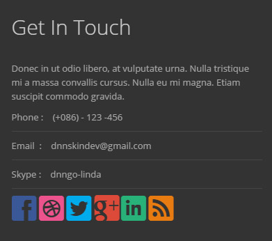
Codes are as follows:
<div class="animation fadeInUp">
  <p>Donec in ut odio libero, at vulputate urna. Nulla tristique mi a massa convallis cursus. Nulla eu mi magna. Etiam suscipit commodo gravida. </p>
  <p class="footboxb">Phone :    (+086) - 123 -456</p>
  <p class="footboxb">Email  :    dnnskindev@gmail.com</p>
  <p class="footboxb">Skype :    dnngo-linda</p>
  <p class="socialicon_footer"> <a href="#" class="social social-facebook"></a> <a href="#" class="social social-dribbble"></a> <a href="#" class="social social-twitter"></a> <a href="#" class="social social-google-plus"></a> <a href="#" class="social social-linked-in"></a> <a href="#" class="social social-rss"></a> </p>
</div>
Option:
Containeris usingContainer-20064-4- You can modify
animationto change the animation on the slide. Animation list. - You can modify
glyphiconsto change icons. font icon list.
HomeVersion5
You can click the link to check HomeVersion5 demo. HomeVersion5
Banner area
Below is the screen shot:

It is using DNNGo LayerGalleryPro module here,you can import ContentListEntity-Home5.xml of the DNNGo_LayerGalleryPro folder to duplicate banner of the demo.
HTML5 Easy Guide For Beginners area
Below is the screen shot:

Codes are as follows:
<div class="conboxt pt-60 pb-60 animation fadeInUp">
  <div class="dnn_layout clearfix">
    <div class="conboxt_left"> <span>HTML5 Easy Guide For Beginners</span><br />
      Lorem ipsum dolor sit amet, consectetuer adipiscing elit. </div>
    <div class="conboxt_right"> <span>CSS3 Effectively Use Layout</span><br />
      Lorem ipsum dolor sit amet, consectetuer adipiscing elit. </div>
    <div class="conboxt_center"><img alt="" src="/portals/32/show23.png" /></div>
  </div>
</div>
Option:
- You can modify
animationto change the animation on the slide. Animation list.
Services Box area
Below is the screen shot:
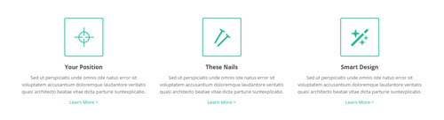
Codes are as follows:
<div class="pt-60">
  <div class="dnn_layout">
    <div class="content_mid clearfix">
      <div class="pane_layout">
        <div class="ServeList_3">
          <div class="row">
            <div class="col-sm-4 animation flipInY">
              <div class="ServeBox animation periodic1">
                <div class="Serve_Icon"><span class="glyphicons glyph-screenshot"></span></div>
                <h3>Your Position</h3>
                <p>Sed ut perspiciatis unde omnis iste natus error sit voluptatem accusantium doloremque laudantore veritatis quasi architecto beatae vitae dicta parturie suntexplicabo.</p>
                <p><a target="blank" href="#">Learn More   ></a></p>
              </div>
            </div>
            <div class="col-sm-4 animation flipInY">
              <div class="ServeBox animation periodic2">
                <div class="Serve_Icon"><span class="glyphicons glyph-nails"></span></div>
                <h3>These Nails</h3>
                <p>Sed ut perspiciatis unde omnis iste natus error sit voluptatem accusantium doloremque laudantore veritatis quasi architecto beatae vitae dicta parturie suntexplicabo.</p>
                <p><a target="blank" href="#">Learn More   ></a></p>
              </div>
            </div>
            <div class="col-sm-4 animation flipInY">
              <div class="ServeBox animation periodic3">
                <div class="Serve_Icon"><span class="glyphicons glyph-magic"></span></div>
                <h3>Smart Design</h3>
                <p>Sed ut perspiciatis unde omnis iste natus error sit voluptatem accusantium doloremque laudantore veritatis quasi architecto beatae vitae dicta parturie suntexplicabo.</p>
                <p><a target="blank" href="#">Learn More   ></a></p>
              </div>
            </div>
          </div>
        </div>
      </div>
    </div>
  </div>
</div>
Option:
- You can modify
glyphiconsto change icons. font icon list. col-sm-*is the width of each column, you can change the width you need through value1~12.- You can modify
animationto change the animation on the slide. Animation list.
Recent Works area
Below is the screen shot:
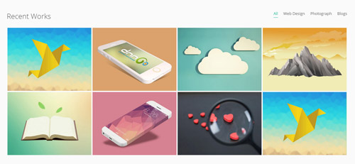
Codes are as follows:
<div class="pt-50 pb-60 home5con_c animation fadeInUp">
  <div class="dnn_layout">
    <div class="content_mid clearfix">
      <div class="pane_layout">
        <div class="row">
          <div class="col-sm-12">
            <div class="isotope_grid">
              <div class="isotope_top clearfix">
                <div class="isotope_title">Recent Works</div>
                <div class="isotope_group"> <a class="active" href="#" data-filter="*">All</a> <a href="#" data-filter=".webdesign">Web Design</a> <a href="#" data-filter=".photography">Photograph</a> <a href="#" data-filter=".blogs">Blogs</a> </div>
              </div>
              <div class="isotope_main" data-min-width="250">
                <div class="isotope_item  blogs">
                  <div class="photo_box img_zoom ico_zoom"> <a href="/Portals/32/psds32202.jpg" class="LightBox_image_gallery1" title="Image Gallery">
                    <div class="pic_box"> <img alt="" src="/portals/32/psds32202.jpg" class="img-responsive" />
                      <div class="ico"><span class="glyphicons glyph-resize-small"></span></div>
                      <div class="shade"></div>
                    </div>
                    </a> </div>
                </div>
                <div class="isotope_item   photography">
                  <div class="photo_box img_zoom ico_zoom"> <a href="/Portals/32/dnngo-11.jpg" class="LightBox_image_gallery1" title="Image Gallery">
                    <div class="pic_box"> <img alt="" src="/portals/32/dnngo-11.jpg" class="img-responsive" />
                      <div class="ico"><span class="glyphicons glyph-resize-small"></span></div>
                      <div class="shade"></div>
                    </div>
                    </a> </div>
                </div>
                <div class="isotope_item  webdesign">
                  <div class="photo_box img_zoom ico_zoom"> <a href="/Portals/32/apic1494.jpg" class="LightBox_image_gallery1" title="Image Gallery">
                    <div class="pic_box"> <img alt="" src="/portals/32/apic1494.jpg" class="img-responsive" />
                      <div class="ico"><span class="glyphicons glyph-resize-small"></span></div>
                      <div class="shade"></div>
                    </div>
                    </a> </div>
                </div>
                <div class="isotope_item  photography">
                  <div class="photo_box img_zoom ico_zoom"> <a href="/Portals/32/hbh.jpg" class="LightBox_image_gallery1" title="Image Gallery">
                    <div class="pic_box"> <img alt="" src="/portals/32/hbh.jpg" class="img-responsive" />
                      <div class="ico"><span class="glyphicons glyph-resize-small"></span></div>
                      <div class="shade"></div>
                    </div>
                    </a> </div>
                </div>
                <div class="isotope_item  blogs photography">
                  <div class="photo_box img_zoom ico_zoom"> <a href="/Portals/32/fe10667.jpg" class="LightBox_image_gallery1" title="Image Gallery">
                    <div class="pic_box"> <img alt="" src="/portals/32/fe10667.jpg" class="img-responsive" />
                      <div class="ico"><span class="glyphicons glyph-resize-small"></span></div>
                      <div class="shade"></div>
                    </div>
                    </a> </div>
                </div>
                <div class="isotope_item  photography webdesign">
                  <div class="photo_box img_zoom ico_zoom"> <a href="/Portals/32/apic2333.jpg" class="LightBox_image_gallery1" title="Image Gallery">
                    <div class="pic_box"> <img alt="" src="/portals/32/apic2333.jpg" class="img-responsive" />
                      <div class="ico"><span class="glyphicons glyph-resize-small"></span></div>
                      <div class="shade"></div>
                    </div>
                    </a> </div>
                </div>
                <div class="isotope_item  blogs">
                  <div class="photo_box img_zoom ico_zoom"> <a href="/Portals/32/xpic589.jpg" class="LightBox_image_gallery1" title="Image Gallery">
                    <div class="pic_box"> <img alt="" src="/portals/32/xpic589.jpg" class="img-responsive" />
                      <div class="ico"><span class="glyphicons glyph-resize-small"></span></div>
                      <div class="shade"></div>
                    </div>
                    </a> </div>
                </div>
                <div class="isotope_item  blogs webdesign">
                  <div class="photo_box img_zoom ico_zoom"> <a href="/Portals/32/psds32202.jpg" class="LightBox_image_gallery1" title="Image Gallery">
                    <div class="pic_box"> <img alt="" src="/portals/32/psds32202.jpg" class="img-responsive" />
                      <div class="ico"><span class="glyphicons glyph-resize-small"></span></div>
                      <div class="shade"></div>
                    </div>
                    </a> </div>
                </div>
              </div>
            </div>
          </div>
        </div>
      </div>
    </div>
  </div>
</div>
Option:
- You can add
<a data-filter=".FilterName" href="#">Filter Name</a>to increase categories.data-filter=".FilterName"can not be blank space. - You can modify
data-min-widthto change minimum width of image. - You can modify
isotope_itemFilterNameto categorize images. col-sm-*is the width of each column, you can change the width you need through value1~12.- You can modify
animationto change and delete animation. Animation list. - You can modify
glyphiconsto change icons. font icon list.
HorizontalTab Top area
Below is the screen shot:
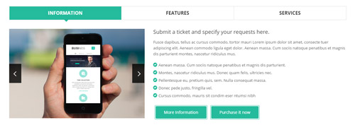
Codes are as follows:
<div class="horizontalTab_Top horizontalTab_Top_6 animation fadeInUp">
  <ul class="resp-tabs-list clearfix">
    <li><span>Information</span></li>
    <li><span>Features</span></li>
    <li><span>Services</span></li>
  </ul>
  <div class="resp-tabs-container">
    <div class="resp_container">
      <div class="resp_margin">
        <div class="row horizontalTab_Top_6A">
          <div class="col-sm-5">
            <div class="carousel carousel_2" data-autoheight="false" data-pagination="false">
              <div class="item"> <img alt="" class="img-responsive" src="/portals/32/show24.png" /> </div>
              <div class="item"> <img alt="" class="img-responsive" src="/portals/32/show25.png" /> </div>
            </div>
          </div>
          <div class="col-sm-7">
            <h3>Submit a ticket and specify your requests here.</h3>
            <p>Fusce dapibus, tellus ac cursus commodo, tortor mauri Lorem ipsum dolor sit amet, consecte tuer adipiscing elit. Aenean commodo ligula eget dolor. Aenean massa. Cum sociis natoque penatibus et magnis dis parturient montes, nascetur ridiculus mus. </p>
            <ul class="list_style">
              <li><span class="glyphicons glyph-circle-ok"></span>Aenean massa. Cum sociis natoque penatibus et magnis dis parturient. </li>
              <li><span class="glyphicons glyph-circle-ok"></span>Montes, nascetur ridiculus mus. Donec quam felis, ultricies nec. </li>
              <li><span class="glyphicons glyph-circle-ok"></span>Pellentesque eu, pretium quis, sem. Nulla consequat massa. </li>
              <li><span class="glyphicons glyph-circle-ok"></span>Donec pede justo, fringilla vel.</li>
              <li><span class="glyphicons glyph-circle-ok"></span>Cursus commodo, mauris sit condim eser ntumsi nibh</li>
            </ul>
            <div class="conboxf_a"><a class="Button_default" target="blank" href="#">More Information</a><a class="Button_default" target="blank" href="#">Purchase it now</a></div>
          </div>
        </div>
      </div>
    </div>
    <div class="resp_container">
      <div class="resp_margin">
        <div class="row horizontalTab_Top_6B">
          <div class="col-sm-4">
            <div class="horizontalTab_Top_6B_lefticon"><span class="glyphicons glyph-fire"></span></div>
            <h3>The Features</h3>
            <div class="line"></div>
            <ul class="list_style">
              <li><span class="glyphicons glyph-flash"></span>Full Support</li>
              <li><span class="glyphicons glyph-flash"></span>Unlimited Colors or Themes</li>
              <li><span class="glyphicons glyph-flash"></span>New Header & Footer</li>
              <li><span class="glyphicons glyph-flash"></span>5 Main Layout Sample Styles</li>
              <li><span class="glyphicons glyph-flash"></span>Full & Boxed Layout</li>
              <li><span class="glyphicons glyph-flash"></span>Compatible with Major Browsers</li>
              <li><span class="glyphicons glyph-flash"></span>SEO Friendly & Optimized</li>
              <li><span class="glyphicons glyph-flash"></span>Customized Settings</li>
            </ul>
          </div>
          <div class="col-sm-4">
            <div class="horizontalTab_Top_6B_lefticon"><span class="glyphicons glyph-cloud"></span></div>
            <h3>Download</h3>
            <div class="line"></div>
            <ul class="list_style">
              <li><span class="glyphicons glyph-flash"></span>Unlimited Skins/Styles/Colors</li>
              <li><span class="glyphicons glyph-flash"></span>Ultra Responsive design</li>
              <li><span class="glyphicons glyph-flash"></span>Multi-Purpose</li>
              <li><span class="glyphicons glyph-flash"></span>Bootstrap 3 & Retina Ready</li>
              <li><span class="glyphicons glyph-flash"></span>Responsive Full Width Slider Banner</li>
              <li><span class="glyphicons glyph-flash"></span>CSS3 & HTML 5</li>
              <li><span class="glyphicons glyph-flash"></span>DNN6 & DNN7</li>
              <li><span class="glyphicons glyph-flash"></span>Hundreds of Google Fonts</li>
            </ul>
          </div>
          <div class="col-sm-4">
            <div class="horizontalTab_Top_6B_lefticon"><span class="glyphicons glyph-fire"></span></div>
            <h3>Advanced</h3>
            <div class="line"></div>
            <ul class="list_style">
              <li><span class="glyphicons glyph-flash"></span>5 Header Styles</li>
              <li><span class="glyphicons glyph-flash"></span>5 Header Styles</li>
              <li><span class="glyphicons glyph-flash"></span>4 Menu options</li>
              <li><span class="glyphicons glyph-flash"></span>Cutting-edge CSS3 animations</li>
              <li><span class="glyphicons glyph-flash"></span>DNN 7 Page Template</li>
              <li><span class="glyphicons glyph-flash"></span>Short Codes</li>
              <li><span class="glyphicons glyph-flash"></span>Typography</li>
              <li><span class="glyphicons glyph-flash"></span>3 Portfolios styles</li>
            </ul>
          </div>
        </div>
      </div>
    </div>
    <div class="resp_container">
      <div class="resp_margin">
        <div class="row horizontalTab_Top_6C">
          <div class="col-sm-4">
            <h3><span class="glyphicons glyph-tint"></span>Clean Design</h3>
            <p>Nullam quis risus eget urna mollis ornare vel eu leo. Duis mollis, est non commod us, nisi erat porttitor ligula, eget lacinia odio sem nec elit. </p>
          </div>
          <div class="col-sm-4">
            <h3><span class="glyphicons glyph-parents"></span>Membership</h3>
            <p>Nullam quis risus eget urna mollis ornare vel eu leo. Duis mollis, est non commod us, nisi erat porttitor ligula, eget lacinia odio sem nec elit. </p>
          </div>
          <div class="col-sm-4">
            <h3><span class="glyphicons glyph-leaf"></span>Smart Skin</h3>
            <p>Nullam quis risus eget urna mollis ornare vel eu leo. Duis mollis, est non commod us, nisi erat porttitor ligula, eget lacinia odio sem nec elit. </p>
          </div>
        </div>
        <div class="row horizontalTab_Top_6C">
          <div class="col-sm-4">
            <h3><span class="glyphicons glyph-heart"></span>Many Likes</h3>
            <p>Nullam quis risus eget urna mollis ornare vel eu leo. Duis mollis, est non commod us, nisi erat porttitor ligula, eget lacinia odio sem nec elit. </p>
          </div>
          <div class="col-sm-4">
            <h3><span class="glyphicons glyph-cogwheel"></span>Easy Managed</h3>
            <p>Nullam quis risus eget urna mollis ornare vel eu leo. Duis mollis, est non commod us, nisi erat porttitor ligula, eget lacinia odio sem nec elit. </p>
          </div>
          <div class="col-sm-4">
            <h3><span class="glyphicons glyph-resize-full"></span>Full Support</h3>
            <p>Nullam quis risus eget urna mollis ornare vel eu leo. Duis mollis, est non commod us, nisi erat porttitor ligula, eget lacinia odio sem nec elit. </p>
          </div>
        </div>
      </div>
    </div>
  </div>
</div>
Option:
- This is a
Responsive Tabeffect.ResponsiveTab col-sm-*is the width of each column, you can change the width you need through value1~12.- You can modify
animationto change the animation on the slide. Animation list. - You can modify
glyphiconsto change icons. font icon list.
How we start the web development area
Below is the screen shot:
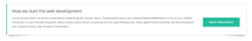
Codes are as follows:
<div class="boxes_style_7 boxes_style_7home5 animation fadeInUp">
  <div class="boxes">
    <h3 class="Boxes_title">How we start the web development</h3>
    <p>Lorem ipsum dolor sit amet, consectetuer adipiscing elit. Donec libero. Suspendisse purus nec placerat bibendbibendum. Cras id urna. Morbi tincidunt, orci ac convallis aliquam, lectus turpis varius lorem, eu posuere nunc justo tempus leo. Class aptent taciti sociosqu ad litora torquent per conubia nostra, per inceptos himenaeos.</p>
    <div class="but"> <a class="Button_default" target="blank" href="#">More Information</a></div>
  </div>
</div>
Option:
- You can modify
animationto change the animation on the slide. Animation list.
Our Skills area
Below is the screen shot:
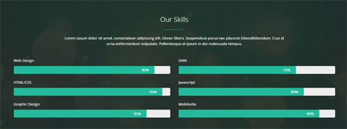
Codes are as follows:
<div class="home5con_a pt-60 pb-60">
  <div class="dnn_layout">
    <div class="content_mid clearfix">
      <div class="pane_layout">
        <div class="row">
          <div class="col-sm-12 animation fadeInDown">
            <h1 class="title">Our Skills</h1>
            <div class="line"></div>
            <p class="text">Lorem ipsum dolor sit amet, consectetuer adipiscing elit. Donec libero. Suspendisse purus nec placerat bibendbibendum. Cras id urna.estfermentum vulputate. Pellentesque et ipsum in dui malesuada tempus. </p>
          </div>
        </div>
        <div class="row">
          <div class="col-sm-6 loaded_list2 animation fadeInLeft">
            <p> Web Design </p>
            <div class="progress progress-striped active">
              <div data-width="90%" class="bar animation animationwidth"><span></span></div>
            </div>
            <p> HTML/CSS</p>
            <div class="progress progress-striped active">
              <div data-width="95%" class="bar animation animationwidth"><span></span></div>
            </div>
            <p>Graphic Design </p>
            <div class="progress progress-striped active">
              <div data-width="85%" class="bar animation animationwidth"><span></span> </div>
            </div>
          </div>
          <div class="col-sm-6 loaded_list2 animation fadeInLeft">
            <p> DNN </p>
            <div class="progress progress-striped active">
              <div data-width="75%" class="bar animation animationwidth"><span></span></div>
            </div>
            <p> Javascript</p>
            <div class="progress progress-striped active">
              <div data-width="80%" class="bar animation animationwidth"><span></span></div>
            </div>
            <p>Mobilesite </p>
            <div class="progress progress-striped active">
              <div data-width="90%" class="bar animation animationwidth"><span></span> </div>
            </div>
          </div>
        </div>
      </div>
    </div>
  </div>
</div>
Option:
col-sm-*is the width of each column, you can change the width you need through value1~12.- You can modify
animationto change the animation on the slide. Animation list. - This is a
ProgressBars Counterseffect.ProgressBars Counters - You can change the value you need to display through
data-width
Why Choose Us area
Below is the screen shot:
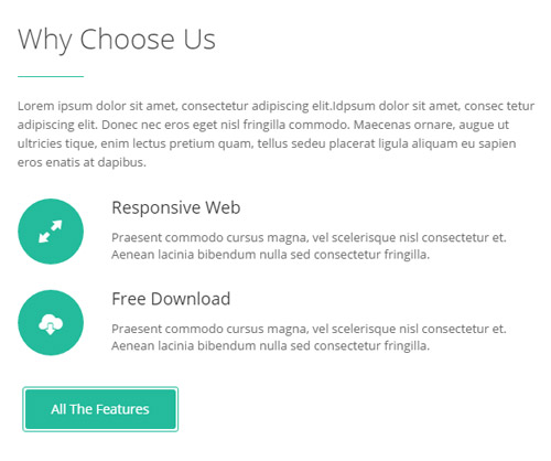
Codes are as follows:
<div class="home5con_b animation fadeInLeft">
  <h1 class="title">Why Choose Us</h1>
  <div class="line"></div>
  <p class="text">Lorem ipsum dolor sit amet, consectetur adipiscing elit.Idpsum dolor sit amet, consec tetur adipiscing elit. Donec nec eros eget nisl fringilla commodo. Maecenas ornare, augue ut ultricies tique, enim lectus pretium quam, tellus sedeu placerat ligula aliquam eu sapien eros enatis at dapibus.</p>
  <ul>
    <li> <span class="glyphicons glyph-resize-full"></span>
      <h5>Responsive Web</h5>
      <p>Praesent commodo cursus magna, vel scelerisque nisl consectetur et. Aenean lacinia bibendum nulla sed consectetur fringilla.</p>
    </li>
    <li> <span class="glyphicons glyph-cloud-upload"></span>
      <h5>Free Download</h5>
      <p>Praesent commodo cursus magna, vel scelerisque nisl consectetur et. Aenean lacinia bibendum nulla sed consectetur fringilla.</p>
    </li>
  </ul>
  <a target="blank" href="#" class="Button_default">All The Features</a> </div>
Option:
- You can modify
animationto change the animation on the slide. Animation list. - You can modify
glyphiconsto change icons. font icon list.
Image area
Below is the screen shot:

Codes are as follows:
<img alt="" src="/portals/32/home5con_b_right.jpg" class="img-responsive animation fadeInRight">
Option:
- You can modify
animationto change the animation on the slide. Animation list.
What others say about us area
Below is the screen shot:
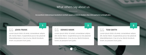
Codes are as follows:
<div class="conboxu">
  <div class="conboxu_shadow pt-60 pb-60">
    <div class="dnn_layout animation fadeInUp">
      <div class="conboxu_top">
        <h3>What others say about us</h3>
        <div class="line"></div>
        <p>Accusantium doloremque laudantore veritatis quasi architecto beatae vitae dicta parturie suntexplicabo.</p>
      </div>
      <div class="conboxu_bottom">
        <div class="carousel carousel_7" data-navigation="false" data-autoheight="false">
          <div class="item">
            <h3>John FranK</h3>
            <p>Lorem ipsum dolor sit amet, consectetuer adipisc elit. Donec libero. Suspendisse purus nec placerat bibendbibendum. Cras id urna. Morbi tincidunt, lorem, eu posuere nunc justo. </p>
            <span>1</span> </div>
          <div class="item">
            <h3>Dennis Hawk</h3>
            <p>Lorem ipsum dolor sit amet, consectetuer adipisc elit. Donec libero. Suspendisse purus nec placerat bibendbibendum. Cras id urna. Morbi tincidunt, lorem, eu posuere nunc justo. </p>
            <span>2</span> </div>
          <div class="item">
            <h3>Tom Smith</h3>
            <p>Lorem ipsum dolor sit amet, consectetuer adipisc elit. Donec libero. Suspendisse purus nec placerat bibendbibendum. Cras id urna. Morbi tincidunt, lorem, eu posuere nunc justo. </p>
            <span>3</span> </div>
          <div class="item">
            <h3>John FranK</h3>
            <p>Lorem ipsum dolor sit amet, consectetuer adipisc elit. Donec libero. Suspendisse purus nec placerat bibendbibendum. Cras id urna. Morbi tincidunt, lorem, eu posuere nunc justo. </p>
            <span>4</span> </div>
        </div>
      </div>
    </div>
  </div>
</div>
Option:
- You can modify
animationto change the animation on the slide. Animation list. - This is a
Carouseleffect. Carousel
Are You Ready to Start Your Business area
Below is the screen shot:

Codes are as follows:
<div class="conboxv animation fadeInUp">
  <div class="dnn_layout"> <a href="#" target="blank">Are You Ready to Start Your Business  ?<span>></span></a> </div>
</div>
Option:
- You can modify
animationto change the animation on the slide. Animation list.
CONTACT area
Below is the screen shot:
Codes are as follows:
<div class="animation fadeInUp">
  <h6 class="conboxwtop">Contact</h6>
  Lid est laborum dolo rumes fugats untras. Etharums ser quidem rerum facilis dolores nemis omnis fugats vitae nemo minima rerums unsers sadips amets. Sed adloyut  inventore veritatis. Mirum est notare quam littera gothica, quam nunc putamus parum claram, anteposuerit litterarum formas. Claritas est etiam processus dynamicus, qui sequitur mutationem consuetudium lectorum. </div>
Option:
- You can modify
animationto change the animation on the slide. Animation list.
LINKS area
Below is the screen shot:
Codes are as follows:
<div class="row conboxw animation fadeInUp">
  <div class="col-sm-2">
    <h3>LINKS :</h3>
    <ul class="conboxwul">
      <li><a target="blank" href="#"><span class="glyphicons glyph-chevron-right"></span>About Dnngo</a></li>
      <li><a target="blank" href="#"><span class="glyphicons glyph-chevron-right"></span>Our Site Map</a></li>
      <li><a target="blank" href="#"><span class="glyphicons glyph-chevron-right"></span>Dnn Modules Store</a></li>
      <li><a target="blank" href="#"><span class="glyphicons glyph-chevron-right"></span>Blog & News</a></li>
    </ul>
  </div>
  <div class="col-sm-2">
    <h3>SUBSCRIBE :</h3>
    <ul class="conboxwul">
      <li><a target="blank" href="#"><span class="glyphicons glyph-chevron-right"></span>The Business</a></li>
      <li><a target="blank" href="#"><span class="glyphicons glyph-chevron-right"></span>Daily News Emails</a></li>
      <li><a target="blank" href="#"><span class="glyphicons glyph-chevron-right"></span>My Account</a></li>
      <li><a target="blank" href="#"><span class="glyphicons glyph-chevron-right"></span>Shopping Experience</a></li>
    </ul>
  </div>
  <div class="col-sm-2">
    <h3>BUY :</h3>
    <ul class="conboxwul">
      <li><a target="blank" href="#"><span class="glyphicons glyph-chevron-right"></span>The Skin Pack</a></li>
      <li><a target="blank" href="#"><span class="glyphicons glyph-chevron-right"></span>Unlimited Colors</a></li>
      <li><a target="blank" href="#"><span class="glyphicons glyph-chevron-right"></span>Two Layouts</a></li>
      <li><a target="blank" href="#"><span class="glyphicons glyph-chevron-right"></span>New Products</a></li>
    </ul>
  </div>
  <div class="col-sm-3"> <img alt="" src="/portals/32/show26.png" class="img-responsive" /> </div>
  <div class="col-sm-3 conboxwa">
    <h3>BUY :</h3>
    <a href="#"><span class="social social-facebook"></span></a> <a href="#"><span class="social social-pinterest"></span></a> <a href="#"><span class="social social-twitter"></span></a> <a href="#"><span class="social social-google-plus"></span></a> <a href="#"><span class="social social-vimeo"></span></a> <a href="#"><span class="social social-dribbble"></span></a> <a href="#"><span class="social social-flickr"></span></a> <a href="#"><span class="social social-rss"></span></a> <a href="#"><span class="social social-blogger"></span></a> <a href="#"><span class="social social-linked-in"></span></a> <a href="#"><span class="social social-skype"></span></a> <a href="#"><span class="social social-e-mail"></span></a> <a href="#"><span class="social social-yahoo"></span></a> </div>
</div>
Option:
- You can modify
animationto change the animation on the slide. Animation list. col-sm-*is the width of each column, you can change the width you need through value1~12.- You can modify
glyphiconsto change icons. font icon list.
HomeVersion6
You can click the link to check HomeVersion6 demo. HomeVersion6
Banner area
Below is the screen shot:
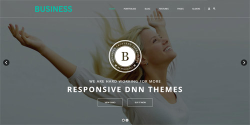
It is using DNNGo LayerGalleryPro module here,you can import ContentListEntity-Home6.xml of the DNNGo_LayerGalleryPro folder to duplicate banner of the demo.
Welcome area
Below is the screen shot:
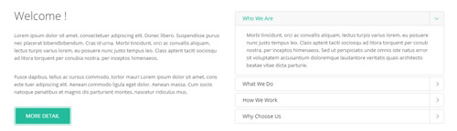
Codes are as follows:
<div class="pb-60">
  <div class="dnn_layout">
    <div class="content_mid clearfix">
      <div class="pane_layout">
        <div class="row">
          <div class="col-sm-6">
            <div class="home6con_a animation fadeInLeft">
              <h1 class="title">Welcome !</h1>
              <p class="text">Lorem ipsum dolor sit amet, consectetuer adipiscing elit. Donec libero. Suspendisse purus nec placerat bibendbibendum. Cras id urna. Morbi tincidunt, orci ac convallis aliquam, lectus turpis varius lorem, eu posuere nunc justo tempus leo. Class aptent taciti sociosqu ad litora torquent per conubia nostra, per inceptos himenaeos. </p>
              <br />
              <p class="text">Fusce dapibus, tellus ac cursus commodo, tortor mauri Lorem ipsum dolor sit amet, cons ecte tuer adipiscing elit. Aenean commodo ligula eget dolor. Aenean massa. Cum sociis natoque penatibus et magnis dis parturient montes, nascetur ridiculus mus.</p>
              <br />
              <a class="Button_default" target="blank" href="#">More Detail</a> </div>
          </div>
          <div class="col-sm-6">
            <div class="panel-group accordion_7 animation fadeInRight" id="accordion7">
              <div class="panel panel-default">
                <div class="panel-heading">
                  <h4 class="panel-title"> <a data-toggle="collapse" data-parent="#accordion7" href="#collapse7_1"><span class="accordion_icon"></span>Who We Are</a> </h4>
                </div>
                <div id="collapse7_1" class="panel-collapse collapse in">
                  <div class="panel-body"> Morbi tincidunt, orci ac convallis aliquam, lectus turpis varius lorem, eu posuere nunc justo tempus leo. Class aptent taciti sociosqu ad litora torquent per conub nostra, per inceptos himenaeos. Sed ut perspiciatis unde omnis iste natus error sit voluptatem accusantium doloremque laudantore veritatis quasi architecto beatae vitae dicta parturie.</div>
                </div>
              </div>
              <div class="panel panel-default">
                <div class="panel-heading">
                  <h4 class="panel-title"> <a data-toggle="collapse" data-parent="#accordion7" href="#collapse7_2" class="collapsed"><span class="accordion_icon"></span>What We Do</a> </h4>
                </div>
                <div id="collapse7_2" class="panel-collapse collapse">
                  <div class="panel-body">Sed ut perspiciatis unde omnis iste natus error sit voluptatem accusantium doloremque laudantium, totam rem aperiam, eaque ipsa quae ab illo inventore veritatis et quasi architecto beatae.Lorem ipsum dolor sit amet, consectetur adipiscing elit. Sed ut perspiciatis unde omnis iste natus error sit voluptatem accusantium doloremque laudantium, totam rem aperiam.</div>
                </div>
              </div>
              <div class="panel panel-default">
                <div class="panel-heading">
                  <h4 class="panel-title"> <a data-toggle="collapse" data-parent="#accordion7" href="#collapse7_3" class="collapsed"><span class="accordion_icon"></span>How We Work</a> </h4>
                </div>
                <div id="collapse7_3" class="panel-collapse collapse">
                  <div class="panel-body">Donec pede justo, fringilla vel, aliquet nec, vulputate eget, arcu. In enim justo, rhoncus ut, imperdiet a, venenatis vitae, justo. Nullam dictum felis eu pede mollis pretium. Integer tincidunt. Cras dapibus. </div>
                </div>
              </div>
              <div class="panel panel-default">
                <div class="panel-heading">
                  <h4 class="panel-title"> <a data-toggle="collapse" data-parent="#accordion7" href="#collapse7_4" class="collapsed"><span class="accordion_icon"></span>Why Choose Us</a> </h4>
                </div>
                <div id="collapse7_4" class="panel-collapse collapse">
                  <div class="panel-body">Our skins and modules are user friendly, powerful and easy to install and definitely will help make your site stand out. also our developers are improving the modules and releasing new versions of existing DNN modules constantly.</div>
                </div>
              </div>
            </div>
          </div>
        </div>
      </div>
    </div>
  </div>
</div>
Option:
- You can modify
animationto change the animation on the slide. Animation list. col-sm-*is the width of each column, you can change the width you need through value1~12.
The Amazing Theme area
Below is the screen shot:
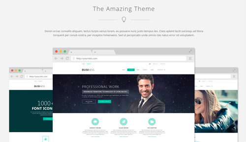
Codes are as follows:
<div class="SectionStyles12 pt-50">
  <div class="dnn_layout">
    <div class="content_mid clearfix">
      <div class="pane_layout">
        <div class="row">
          <div class="col-sm-12">
            <div class="home6con_b">
              <h1 class="title">The Amazing Theme</h1>
              <div class="icon"><span class="glyphicons glyph-lightbulb"></span></div>
              <p class="text">Content text...</p>
              <div class="h6c_bimg">
                <div class="h6c_bimg1 animation fadeInLeft"><img alt="" class="img-responsive" src="/portals/32/home6con_b_1.png" /></div>
                <div class="h6c_bimg2 animation fadeInRight"><img alt="" class="img-responsive" src="/portals/32/home6con_b_2.png" /></div>
                <div class="h6c_bimg3 animation fadeInUp"><img alt="" class="img-responsive" src="/portals/32/home6con_b_3.png" /></div>
              </div>
            </div>
          </div>
        </div>
      </div>
    </div>
  </div>
</div>
Option:
- This is a SectionStyles effect.
- You can modify
glyphiconsto change icons. font icon list. col-sm-*is the width of each column, you can change the width you need through value1~12.- You can modify
animationto change the animation on the slide. Animation list.
Information area
Below is the screen shot:
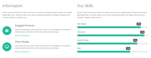
Codes are as follows:
<div class="pt-50 pb-60">
  <div class="dnn_layout">
    <div class="content_mid clearfix">
      <div class="pane_layout">
        <div class="row">
          <div class="col-sm-6">
            <div class="home6con_c animation fadeInLeft">
              <h1 class="title">Information</h1>
              <p class="text">Tortor mauri Lorem ipsum dolor sit amet, cons ecte tuer adipiscing elit. Aenean commodo ligula eget dolor. Aenean massa. Cum sociis natoque penatibus et magnis dis parturient montes, nascetur ridiculus mus.</p>
              <ul>
                <li> <span class="glyphicons glyph-briefcase"></span>
                  <h5>Engaged Products</h5>
                  <p>Sed ut perspiciatis unde omnis iste natus error voluptatem accusantium doloremque laudantium, totam rem aperiam eaque ipsa.</p>
                  <a target="blank" href="#">More Information  ></a> </li>
                <li> <span class="glyphicons glyph-display"></span>
                  <h5>Clean Design</h5>
                  <p>Sed ut perspiciatis unde omnis iste natus error voluptatem accusantium doloremque laudantium, totam rem aperiam eaque ipsa.</p>
                  <a target="blank" href="#">More Information  ></a> </li>
              </ul>
            </div>
          </div>
          <div class="col-sm-6">
            <div class="home6con_c animation fadeInRight">
              <h1 class="title">Our Skills</h1>
              <p class="text">Tortor mauri Lorem ipsum dolor sit amet, cons ecte tuer adipiscing elit. Aenean commodo ligula eget dolor. Aenean massa. Cum sociis natoque penatibus et magnis dis parturient montes, nascetur ridiculus mus.</p>
              <div class="loaded_list">
                <p> Web Design </p>
                <div class="progress progress-striped active">
                  <div class="bar animation animationwidth" data-width="90%"><span></span></div>
                </div>
                <p> HTML/CSS</p>
                <div class="progress progress-striped active">
                  <div class="bar animation animationwidth" data-width="95%"><span></span></div>
                </div>
                <p>Graphic Design </p>
                <div class="progress progress-striped active">
                  <div class="bar animation animationwidth" data-width="85%"><span></span> </div>
                </div>
                <p>DNN</p>
                <div class="progress progress-striped active">
                  <div class="bar animation animationwidth" data-width="75%"><span></span></div>
                </div>
              </div>
            </div>
          </div>
        </div>
      </div>
    </div>
  </div>
</div>
Option:
- This is a
ProgressBars Counterseffect.ProgressBars Counters col-sm-*is the width of each column, you can change the width you need through value1~12.- You can modify
animationto change and delete animation. Animation list. - You can modify
glyphiconsto change icons. font icon list.
Our Recent Works area
Below is the screen shot:
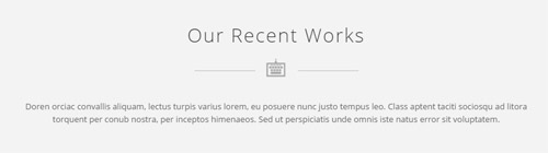
Codes are as follows:
<div class="SectionStyles12_1 pt-50 pb-60">
  <div class="dnn_layout">
    <div class="content_mid clearfix">
      <div class="pane_layout">
        <div class="row">
          <div class="col-sm-12">
            <div class="home6con_b animation fadeInUp">
              <h1 class="title">Our Recent Works</h1>
              <div class="icon"><span class="icon_a glyphicons glyph-keyboard-wired"></span></div>
              <p class="text">Content text...</p>
            </div>
          </div>
        </div>
      </div>
    </div>
  </div>
</div>
Option:
- This is a SectionStyles effect.
col-sm-*is the width of each column, you can change the width you need through value1~12.- You can modify
animationto change the animation on the slide. Animation list. - You can modify
glyphiconsto change icons. font icon list.
photo_box area
Below is the screen shot:

Codes are as follows:
<div class="home6con_d animation fadeInUp">
  <ul class="clearfix">
    <li>
      <div class="photo_box img_zoom ico_zoom"> <a target="blank" href="#">
        <div class="pic_box"> <img alt="" class="img-responsive" src="/portals/32/potots_apic1494.jpg" />
          <div class="content">
            <div class="vertical_center_1">
              <div class="vertical_center_2">
                <div class="ico"><span class="glyphicons glyph-resize-small"></span></div>
                <h3>Unlimited Colors</h3>
                <p>April 12th,2014</p>
              </div>
            </div>
          </div>
          <div class="shade"></div>
        </div>
        </a> </div>
    </li>
    <li>
      <div class="photo_box img_zoom ico_zoom"> <a target="blank" href="#">
        <div class="pic_box"> <img alt="" class="img-responsive" src="/portals/32/potots_fe10667.jpg" />
          <div class="content">
            <div class="vertical_center_1">
              <div class="vertical_center_2">
                <div class="ico"><span class="glyphicons glyph-resize-small"></span></div>
                <h3>Unlimited Colors</h3>
                <p>April 12th,2014</p>
              </div>
            </div>
          </div>
          <div class="shade"></div>
        </div>
        </a> </div>
    </li>
    <li>
      <div class="photo_box img_zoom ico_zoom"> <a target="blank" href="#">
        <div class="pic_box"> <img alt="" class="img-responsive" src="/portals/32/potots_hbh.jpg" />
          <div class="content">
            <div class="vertical_center_1">
              <div class="vertical_center_2">
                <div class="ico"><span class="glyphicons glyph-resize-small"></span></div>
                <h3>Unlimited Colors</h3>
                <p>April 12th,2014</p>
              </div>
            </div>
          </div>
          <div class="shade"></div>
        </div>
        </a> </div>
    </li>
    <li>
      <div class="photo_box img_zoom ico_zoom"> <a target="blank" href="#">
        <div class="pic_box"> <img alt="" class="img-responsive" src="/portals/32/potots_psds32202.jpg" />
          <div class="content">
            <div class="vertical_center_1">
              <div class="vertical_center_2">
                <div class="ico"><span class="glyphicons glyph-resize-small"></span></div>
                <h3>Unlimited Colors</h3>
                <p>April 12th,2014</p>
              </div>
            </div>
          </div>
          <div class="shade"></div>
        </div>
        </a> </div>
    </li>
    <li>
      <div class="photo_box img_zoom ico_zoom"> <a target="blank" href="#">
        <div class="pic_box"> <img alt="" class="img-responsive" src="/portals/32/potots_apic1494.jpg" />
          <div class="content">
            <div class="vertical_center_1">
              <div class="vertical_center_2">
                <div class="ico"><span class="glyphicons glyph-resize-small"></span></div>
                <h3>Unlimited Colors</h3>
                <p>April 12th,2014</p>
              </div>
            </div>
          </div>
          <div class="shade"></div>
        </div>
        </a> </div>
    </li>
  </ul>
</div>
Option:
- You can modify
glyphiconsto change icons. font icon list. - You can modify
animationto change the animation on the slide. Animation list.
Develop interactive, engaging and satisfying website area
Below is the screen shot:

Codes are as follows:
<div class="home6con_e pt-50 pb-50 animation fadeInUp">
  <div class="dnn_layout">
    <div class="content_mid clearfix">
      <div class="pane_layout">
        <div class="row">
          <div class="col-sm-12">
            <div class="boxes_style_10">
              <h1>Develop interactive, engaging and satisfying website</h1>
              <div class="but"> <a target="blank" href="#" class="Button_default2">Purchase This Theme</a> </div>
            </div>
          </div>
        </div>
      </div>
    </div>
  </div>
</div>
Option:
col-sm-*is the width of each column, you can change the width you need through value1~12.- You can modify
animationto change the animation on the slide. Animation list.
Featured Products area
Below is the screen shot:
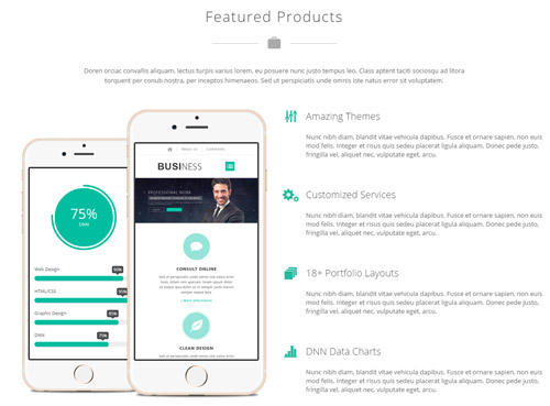
Codes are as follows:
<div class="pt-50 pb-60">
  <div class="dnn_layout">
    <div class="content_mid clearfix">
      <div class="pane_layout">
        <div class="row">
          <div class="col-sm-12">
            <div class="home6con_f animation fadeInUp">
              <h1 class="title">Featured Products</h1>
              <div class="icon"><span class="glyphicons glyph-suitcase"></span></div>
              <p class="text">Content text...</p>
              <br />
              <br />
            </div>
          </div>
          <div class="col-sm-6">
            <div class="home6con_f_out clearfix">
              <div class="home6con_f_1 animation fadeInLeft"> <img alt="" src="/portals/32/home6con_f_1.png" class="img-responsive" /> </div>
              <div class="home6con_f_2 animation fadeInLeft"> <img alt="" src="/portals/32/home6con_f_2.png" class="img-responsive" /> </div>
            </div>
          </div>
          <div class="col-sm-6">
            <ul class="home6con_f_3 animation fadeInRight">
              <li>
                <h4><span class="glyphicons glyph-adjust-alt"></span>Amazing Themes</h4>
                <p>Content text...</p>
              </li>
              <li>
                <h4><span class="glyphicons glyph-cogwheels"></span>Customized Services</h4>
                <p>Content text...</p>
              </li>
              <li>
                <h4><span class="glyphicons glyph-sort"></span>18+ Portfolio Layouts</h4>
                <p>Content text...</p>
              </li>
              <li>
                <h4><span class="glyphicons glyph-charts"></span>DNN Data Charts</h4>
                <p>Content text...</p>
              </li>
            </ul>
          </div>
        </div>
      </div>
    </div>
  </div>
</div>
Option:
col-sm-*is the width of each column, you can change the width you need through value1~12.- You can modify
animationto change the animation on the slide. Animation list. - You can modify
glyphiconsto change icons. font icon list.
What Others Say area
Below is the screen shot:

Codes are as follows:
<div class="SectionStyles13 pt-60 pb-60">
  <div class="dnn_layout">
    <div class="content_mid clearfix">
      <div class="pane_layout">
        <div class="row">
          <div class="col-sm-12">
            <div class="home6con_g animation fadeInUp">
              <h1 class="title">What Others Say</h1>
              <div class="icon"><span class="glyphicons glyph-comments"></span></div>
              <ul class="Testimonials_tab Testimonials_9" data-display-arrows="false" data-position="roll-left" data-height-auto="false" data-autoplay="5000">
                <li>
                  <blockquote>
                    <p>Content text ...</p>
                    <small>David Smith <span>dnngo buyer</span></small> </blockquote>
                </li>
                <li>
                  <blockquote>
                    <p>Content text...</p>
                    <small>Andy Weeks President <span>dnngo buyer</span></small> </blockquote>
                </li>
                <li>
                  <blockquote>
                    <p>Content text...</p>
                    <small>Michal Cyrus<span>dnngo buyer</span></small> </blockquote>
                </li>
              </ul>
            </div>
          </div>
        </div>
      </div>
    </div>
  </div>
</div>
Option:
- This is a
Carouseleffect.Carousel col-sm-*is the width of each column, you can change the width you need through value1~12.- This is a SectionStyles effect.
- You can modify
animationto change the animation on the slide. Animation list. - You can modify
glyphiconsto change icons. font icon list.
Our Services area
Below is the screen shot:
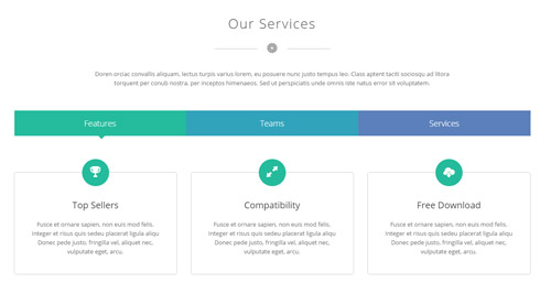
Codes are as follows:
<div class="pt-50">
  <div class="dnn_layout">
    <div class="content_mid clearfix">
      <div class="pane_layout">
        <div class="row">
          <div class="col-sm-12">
            <div class="home6con_f animation fadeInUp">
              <h1 class="title">Our Services</h1>
              <div class="icon"><span class="glyphicons glyph-saw-blade"></span></div>
              <p class="text">Content text...</p>
              <br />
              <br />
            </div>
          </div>
          <div class="col-sm-12">
            <div class="horizontalTab_Top horizontalTab_Top_7 animation fadeInUp">
              <ul class="resp-tabs-list clearfix">
                <li class="ht7_a"><span>Features</span></li>
                <li class="ht7_b"><span>Teams</span></li>
                <li class="ht7_c"><span>Services</span></li>
              </ul>
              <div class="resp-tabs-container">
                <div class="resp_container">
                  <div class="resp_margin">
                    <div class="row horizontalTab_Top_7A">
                      <div class="col-sm-4">
                        <div class="flip_box_6">
                          <div class="icon"><span class="glyphicons glyph-cup"></span></div>
                          <h1>Top Sellers</h1>
                          <p>Fusce et ornare sapien, non euis mod felis. Integer et risus quis sedeu placerat ligula aliqu Donec pede justo, fringilla vel, aliquet nec, vulputate eget, arcu.</p>
                        </div>
                      </div>
                      <div class="col-sm-4">
                        <div class="flip_box_6">
                          <div class="icon"><span class="glyphicons glyph-resize-full"></span></div>
                          <h1>Compatibility</h1>
                          <p>Fusce et ornare sapien, non euis mod felis. Integer et risus quis sedeu placerat ligula aliqu Donec pede justo, fringilla vel, aliquet nec, vulputate eget, arcu.</p>
                        </div>
                      </div>
                      <div class="col-sm-4">
                        <div class="flip_box_6">
                          <div class="icon"><span class="glyphicons glyph-cloud-upload"></span></div>
                          <h1>Free Download</h1>
                          <p>Fusce et ornare sapien, non euis mod felis. Integer et risus quis sedeu placerat ligula aliqu Donec pede justo, fringilla vel, aliquet nec, vulputate eget, arcu.</p>
                        </div>
                      </div>
                    </div>
                  </div>
                </div>
                <div class="resp_container">
                  <div class="resp_margin">
                    <div class="row horizontalTab_Top_7B">
                      <div class="col-sm-6 col-md-3">
                        <div class="our_team_home6">
                          <div class="img">
                            <div class="photo_box"> <a href="#">
                              <div class="pic_box"><img alt="" src="/portals/32/oth1_5.jpg" class="img-responsive" />
                                <div class="shade"></div>
                              </div>
                              </a> </div>
                          </div>
                          <h5>Merry Smith</h5>
                          <h4>Designer</h4>
                        </div>
                      </div>
                      <div class="col-sm-6 col-md-3">
                        <div class="our_team_home6">
                          <div class="img">
                            <div class="photo_box"> <a href="#">
                              <div class="pic_box"><img alt="" src="/portals/32/oth1_4.jpg" class="img-responsive" />
                                <div class="shade"></div>
                              </div>
                              </a> </div>
                          </div>
                          <h5>Harro Holloy</h5>
                          <h4>Developer</h4>
                        </div>
                      </div>
                      <div class="col-sm-6 col-md-3">
                        <div class="our_team_home6">
                          <div class="img">
                            <div class="photo_box"> <a href="#">
                              <div class="pic_box"><img alt="" src="/portals/32/oth1_7.jpg" class="img-responsive" />
                                <div class="shade"></div>
                              </div>
                              </a> </div>
                          </div>
                          <h5>Steven Doe</h5>
                          <h4>Programmer</h4>
                        </div>
                      </div>
                      <div class="col-sm-6 col-md-3">
                        <div class="our_team_home6">
                          <div class="img">
                            <div class="photo_box"> <a href="#">
                              <div class="pic_box"><img alt="" src="/portals/32/oth1_8.jpg" class="img-responsive" />
                                <div class="shade"></div>
                              </div>
                              </a> </div>
                          </div>
                          <h5>David Bomme </h5>
                          <h4>CEO</h4>
                        </div>
                      </div>
                    </div>
                  </div>
                </div>
                <div class="resp_container">
                  <div class="resp_margin">
                    <div class="horizontalTab_Top_7C">
                      <div class="row">
                        <div class="col-sm-12">
                          <h6>Customization services ensure what exactly you want</h6>
                          <p>Fusce dapibus, tellus ac cursus commodo, tortor mauri Lorem ipsum dolor sit amet, consecte tuer adipiscing elit. Aenean commodo ligula eget dolor. Aenean massa. Cum sociis natoque penatibus et magnis dis parturient montes, nascetur ridiculus mus. </p>
                        </div>
                      </div>
                      <div class="chart_list row">
                        <div class="col-sm-2">
                          <div data-percent="66" class="percentage5">
                            <div class="percentage_inner"><span>0</span>%</div>
                          </div>
                          <p>Dnn Skin</p>
                        </div>
                        <div class="col-sm-2">
                          <div data-percent="98" class="percentage5">
                            <div class="percentage_inner"><span>0</span>%</div>
                          </div>
                          <p>Dnn Module</p>
                        </div>
                        <div class="col-sm-2">
                          <div data-percent="49" class="percentage5">
                            <div class="percentage_inner"><span>0</span>%</div>
                          </div>
                          <p>Template</p>
                        </div>
                        <div class="col-sm-2">
                          <div data-percent="81" class="percentage5">
                            <div class="percentage_inner"><span>0</span>%</div>
                          </div>
                          <p>Skin Pack</p>
                        </div>
                        <div class="col-sm-2">
                          <div data-percent="76" class="percentage5">
                            <div class="percentage_inner"><span>0</span>%</div>
                          </div>
                          <p>Dnn Store</p>
                        </div>
                        <div class="col-sm-2">
                          <div data-percent="63" class="percentage5">
                            <div class="percentage_inner"><span>0</span>%</div>
                          </div>
                          <p>Photoshop</p>
                        </div>
                      </div>
                    </div>
                  </div>
                </div>
              </div>
            </div>
          </div>
        </div>
      </div>
    </div>
  </div>
</div>
Option:
col-sm-*is the width of each column, you can change the width you need through value1~12.- You can modify
animationto change the animation on the slide. Animation list. - You can modify
glyphiconsto change icons. font icon list. - This is a
Responsive Tabeffect.ResponsiveTab
About area
Below is the screen shot:
Codes are as follows:
<div class="botbox_c animation fadeInUp">
  <p>Sed ut perspiciatis unde omnis iste natus error sit voluptatem accusantium dolore mque laudan tium, totam rem aperiam, eaque ipsa quae ab illo inventore veritatis et quasi architecto beatae. <br />
    <br />
    Lorem ipsum dolor sit amet, consectetur adipiscing elit. Nunc nibh diam, blandit vitae vehicula dapibus. </p>
  <br />
  <br />
  <a href="#" class="social social-facebook"></a> <a href="#" class="social social-dribbble"></a> <a href="#" class="social social-twitter"></a> <a href="#" class="social social-google-plus"></a> <a href="#" class="social social-linked-in"></a> <a href="#" class="social social-rss"></a> </div>
Option:
- You can modify
animationto change the animation on the slide. Animation list. - You can modify
glyphiconsto change icons. font icon list. Containeris usingContainer-20061-4
Photos area
Below is the screen shot:
Codes are as follows:
<div class="botbox_d row animation fadeInUp">
  <div class="col-sm-4 col-xs-6">
    <div class="photo_box"> <a title="Image Gallery" class="LightBox_image_gallery1" href="/Portals/32/LightBox1.jpg">
      <div class="pic_box"> <img alt="" class="img-responsive" src="/portals/32/LightBox1.jpg" />
        <div class="shade"></div>
      </div>
      </a> </div>
  </div>
  <div class="col-sm-4  col-xs-6">
    <div class="photo_box"> <a title="Image Gallery" class="LightBox_image_gallery1" href="/Portals/32/LightBox2.jpg">
      <div class="pic_box"> <img alt="" class="img-responsive" src="/portals/32/LightBox2.jpg" />
        <div class="shade"></div>
      </div>
      </a> </div>
  </div>
  <div class="col-sm-4  col-xs-6">
    <div class="photo_box"> <a title="Image Gallery" class="LightBox_image_gallery1" href="/Portals/32/LightBox3.jpg">
      <div class="pic_box"> <img alt="" class="img-responsive" src="/portals/32/LightBox3.jpg" />
        <div class="shade"></div>
      </div>
      </a> </div>
  </div>
  <div class="col-sm-4  col-xs-6">
    <div class="photo_box"> <a title="Image Gallery" class="LightBox_image_gallery1" href="/Portals/32/LightBox4.jpg">
      <div class="pic_box"> <img alt="" class="img-responsive" src="/portals/32/LightBox4.jpg" />
        <div class="shade"></div>
      </div>
      </a> </div>
  </div>
  <div class="col-sm-4  col-xs-6">
    <div class="photo_box"> <a title="Image Gallery" class="LightBox_image_gallery1" href="/Portals/32/LightBox5.jpg">
      <div class="pic_box"> <img alt="" class="img-responsive" src="/portals/32/LightBox5.jpg" />
        <div class="shade"></div>
      </div>
      </a> </div>
  </div>
  <div class="col-sm-4  col-xs-6">
    <div class="photo_box"> <a title="Image Gallery" class="LightBox_image_gallery1" href="/Portals/32/LightBox6.jpg">
      <div class="pic_box"> <img alt="" class="img-responsive" src="/portals/32/LightBox6.jpg" />
        <div class="shade"></div>
      </div>
      </a> </div>
  </div>
  <div class="col-sm-4  col-xs-6">
    <div class="photo_box"> <a title="Image Gallery" class="LightBox_image_gallery1" href="/Portals/32/LightBox7.jpg">
      <div class="pic_box"> <img alt="" class="img-responsive" src="/portals/32/LightBox7.jpg" />
        <div class="shade"></div>
      </div>
      </a> </div>
  </div>
  <div class="col-sm-4  col-xs-6">
    <div class="photo_box"> <a title="Image Gallery" class="LightBox_image_gallery1" href="/Portals/32/LightBox8.jpg">
      <div class="pic_box"> <img alt="" class="img-responsive" src="/portals/32/LightBox8.jpg" />
        <div class="shade"></div>
      </div>
      </a> </div>
  </div>
  <div class="col-sm-4  col-xs-6">
    <div class="photo_box"> <a title="Image Gallery" class="LightBox_image_gallery1" href="/Portals/32/LightBox9.jpg">
      <div class="pic_box"> <img alt="" class="img-responsive" src="/portals/32/LightBox9.jpg" />
        <div class="shade"></div>
      </div>
      </a> </div>
  </div>
</div>
Option:
- This is a
LightBoxeffect.LightBox - You can modify
animationto change the animation on the slide. Animation list. col-sm-* col-xs-*is the width of each column, you can change the width you need through value1~12.Containeris usingContainer-20061-4
Categories area
Below is the screen shot:
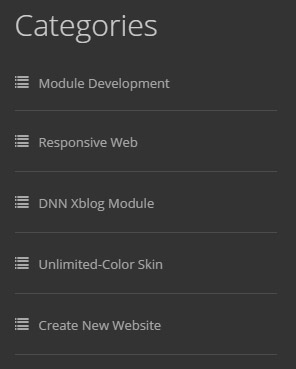
Codes are as follows:
<ul class="botbox_e animation fadeInUp">
  <li><a target="blank" href="#"><span class="glyphicons glyph-list"></span>Module Development</a></li>
  <li><a target="blank" href="#"><span class="glyphicons glyph-list"></span>Responsive Web</a></li>
  <li><a target="blank" href="#"><span class="glyphicons glyph-list"></span>DNN Xblog Module</a></li>
  <li><a target="blank" href="#"><span class="glyphicons glyph-list"></span>Unlimited-Color Skin</a></li>
  <li><a target="blank" href="#"><span class="glyphicons glyph-list"></span>Create New Website</a></li>
</ul>
Option:
- You can modify
animationto change the animation on the slide. Animation list. - You can modify
glyphiconsto change icons. font icon list. Containeris usingContainer-20061-4
Contact area
Below is the screen shot:
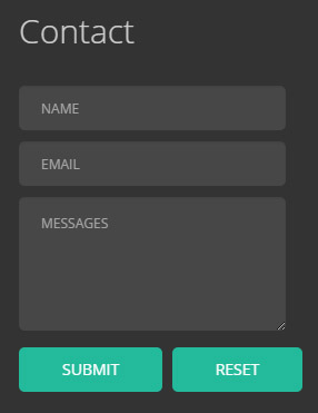
Option:
- This is
Theme_Responsive_20061_home6theme ofDNNGo PowerFormsmodule Containeris usingContainer-20061-4
HomeVersion7
You can click the link to check HomeVersion7 demo. HomeVersion7
Anchor area
It will scroll to the corresponding area on the page when clicking the menu texts at the top. It will also do so when clicking the dots on the right of the skin.
These anchors are generated through page's anchorTag. Codes are as follows. You can place this piece of codes in page's HTML module, click the right anchor, then page will slide to this HTML module area.
- <div data-title="Who_We Are" class="anchorTag" data-offset="-60" data-scrollshownav="true" data-menuanchor="true"> </div>
Option:
data-title |
Title displayed correspondingly to the right navigation. If page title of the menu is the same as data-title, page will scroll to this area when clicking menu texts. |
data-menuanchor |
Whether to enable menu anchor feature or not. |
data-scrollshownav |
Whether to enable navigation or not. |
data-offset |
Offset value of up and down coordinate for anchor. |
data-icourl |
Image url that displays correspondingly of the right navigation. |
data-iconame |
Icon class names that displays correspondingly of the right navigation. |
How to set menu anchor
- Click Add New Page button.
- Fill in Page Name and Page Title. Texts for Page Title needs to be the same as that of data-title.
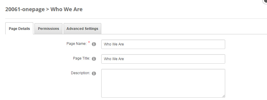
- Put the anchor code to HTML module of the page. It will scroll to the corresponding area on the page when clicking the top menu texts.
- <div data-title="Who_We Are" class="anchorTag" data-offset="-60" data-scrollshownav="true" data-menuanchor="true"> </div>
Banner area
Below is the screen shot:
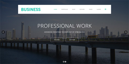
It is using DNNGo LayerGalleryPro module here,you can import ContentListEntity-Home7.xml of the DNNGo_LayerGalleryPro folder to duplicate banner of the demo.
Who We Are area
Below is the screen shot:
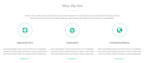
Codes are as follows:
<div class="pb-60 pt50">
  <div class="dnn_layout">
    <div class="content_mid clearfix">
      <div class="pane_layout">
        <div class="row">
          <div class="col-sm-12 animation fadeInDown">
            <div class="home7con_a">
              <h1 class="title">Who We Are</h1>
              <div class="line"></div>
              <p class="text">Content text...</p>
            </div>
          </div>
          <div class="col-sm-4">
            <div class="ServeList_4 animation flipInY">
              <div class="icon_out">
                <div class="icon"><span class="glyphicons glyph-life-preserver"></span></div>
              </div>
              <h6>Appealing Skins</h6>
              <p>Sed ut perspiciatis unde omnis iste natus error voluptatem accusantium doloremque laudantium, deum a justo vitaes amet risus amets utotam rem aperiam vidoers eaque ipsa.</p>
              <a target="blank" href="#">Read More  ></a> </div>
          </div>
          <div class="col-sm-4">
            <div class="ServeList_4 animation flipInY">
              <div class="icon_out">
                <div class="icon"><span class="glyphicons glyph-basketball"></span></div>
              </div>
              <h6>Glyph-globe</h6>
              <p>Sed ut perspiciatis unde omnis iste natus error voluptatem accusantium doloremque laudantium, deum a justo vitaes amet risus amets utotam rem aperiam vidoers eaque ipsa.</p>
              <a target="blank" href="#">Read More  ></a> </div>
          </div>
          <div class="col-sm-4">
            <div class="ServeList_4 animation flipInY">
              <div class="icon_out">
                <div class="icon"><span class="glyphicons glyph-globe"></span></div>
              </div>
              <h6>Compelling Website</h6>
              <p>Sed ut perspiciatis unde omnis iste natus error voluptatem accusantium doloremque laudantium, deum a justo vitaes amet risus amets utotam rem aperiam vidoers eaque ipsa.</p>
              <a target="blank" href="#" class="lastlinks">Read More  ></a> </div>
          </div>
        </div>
      </div>
    </div>
  </div>
</div>
Option:
- You can modify
animationto change the animation on the slide. Animation list. col-sm-*is the width of each column, you can change the width you need through value1~12.- You can modify
glyphiconsto change icons. font icon list.
What We Do area
Below is the screen shot:
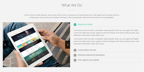
Codes are as follows:
<div class="SectionStyles12 pt-50 pb-60">
  <div class="dnn_layout">
    <div class="content_mid clearfix">
      <div class="pane_layout">
        <div class="row">
          <div class="col-sm-12">
            <div class="home7con_a">
              <h1 class="title">What We Do</h1>
              <div class="line"></div>
              <p class="text">Content text...</p>
            </div>
          </div>
          <div class="col-sm-6">
            <div class="carousel carousel_2 home7con_b animation fadeInLeft" data-pagination="false" data-autoheight="false">
              <div class="item"> <img alt="" src="/portals/32/controls_12.jpg" /> </div>
              <div class="item"> <img alt="" src="/portals/32/controls_13.jpg" /> </div>
            </div>
          </div>
          <div class="col-sm-6">
            <div class="panel-group accordion_2 home7con_b animation fadeInRight" id="accordion2">
              <div class="panel panel-default">
                <div class="panel-heading">
                  <h4 class="panel-title"> <a data-toggle="collapse" data-parent="#accordion2" href="#collapse2_1"><span class="accordion_icon"></span>Responsive design</a> </h4>
                </div>
                <div id="collapse2_1" class="panel-collapse collapse in">
                  <div class="panel-body">
                    <p>Lorem ipsum dolor sit amet, consectetur adipiscing elit. Donec nec eros eget nisl fringilla comm odo. Maecenas ornare, augue ut ultricies tristique, enim lectus pretium quam, quis bibendum metus tellus sedeu dolor lacus. </p>
                    <p>Lorem ipsum dolor sit amet, consectetur adipiscing elit. Donec nec eros eget nisl fringilla comm odo. Maecenas ornare, augue ut ultricies tristique, enim lectus pretium quam, quis bibendum metus tellus sedeu dolor lacus. </p>
                  </div>
                </div>
              </div>
              <div class="panel panel-default">
                <div class="panel-heading">
                  <h4 class="panel-title"> <a data-toggle="collapse" data-parent="#accordion2" href="#collapse2_2" class="collapsed"><span class="accordion_icon"></span>Customization services</a> </h4>
                </div>
                <div id="collapse2_2" class="panel-collapse collapse">
                  <div class="panel-body">Sed ut perspiciatis unde omnis iste natus error sit voluptatem accusantium doloremque laudantium, totam rem aperiam, eaque ipsa quae ab illo inventore veritatis et quasi architecto beatae.Lorem ipsum dolor sit amet, consectetur adipiscing elit. Sed ut perspiciatis unde omnis iste natus error sit voluptatem accusantium doloremque laudantium, totam rem aperiam.</div>
                </div>
              </div>
              <div class="panel panel-default">
                <div class="panel-heading">
                  <h4 class="panel-title"> <a data-toggle="collapse" data-parent="#accordion2" href="#collapse2_3" class="collapsed"><span class="accordion_icon"></span>Extensive experienced developers</a> </h4>
                </div>
                <div id="collapse2_3" class="panel-collapse collapse">
                  <div class="panel-body">Morbi tincidunt, orci ac convallis aliquam, lectus turpis varius lorem, eu posuere nunc justo tempus leo. Class aptent taciti sociosqu ad litora torquent per conub nostra, per inceptos himenaeos. Sed ut perspiciatis unde omnis iste natus error sit voluptatem accusantium doloremque laudantore veritatis quasi architecto beatae vitae dicta parturie.</div>
                </div>
              </div>
              <div class="panel panel-default">
                <div class="panel-heading">
                  <h4 class="panel-title"> <a data-toggle="collapse" data-parent="#accordion2" href="#collapse2_4" class="collapsed"><span class="accordion_icon"></span>Free supports and updates</a> </h4>
                </div>
                <div id="collapse2_4" class="panel-collapse collapse">
                  <div class="panel-body">Donec pede justo, fringilla vel, aliquet nec, vulputate eget, arcu. In enim justo, rhoncus ut, imperdiet a, venenatis vitae, justo. Nullam dictum felis eu pede mollis pretium. Integer tincidunt. Cras dapibus.</div>
                </div>
              </div>
            </div>
          </div>
        </div>
      </div>
    </div>
  </div>
</div>
Option:
- This is a SectionStyles effect.
- This is a
Accordionseffect.Accordions - This is a
Carouseleffect. Carousel col-sm-*is the width of each column, you can change the width you need through value1~12.- You can modify
animationto change the animation on the slide. Animation list.
Meet Our Teams area
Below is the screen shot:
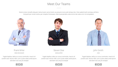
Codes are as follows:
<div class="pb-60 pt-50">
  <div class="dnn_layout">
    <div class="content_mid clearfix">
      <div class="pane_layout">
        <div class="row">
          <div class="col-sm-12 animation fadeInDown">
            <div class="home7con_a">
              <h1 class="title">Meet Our Teams</h1>
              <div class="line"></div>
              <p class="text">Content text...</p>
            </div>
          </div>
          <div class="col-sm-4">
            <div class="our_team2 animation fadeInUp">
              <div class="team_list">
                <div class="team_content">
                  <div class="team_img"><img alt="" src="/portals/32/ourteam1.png" class="img-responsive" /></div>
                  <div class="team_title">Frank Miller</div>
                  <div class="team_title2">Web Designer</div>
                  <p>Fugiat dapibus, tellus ac cursus commodo, mauris sit condim eser ntumsi nibh, uum a justo vitaes amet  ipsum. sed diam non umy at volutpat</p>
                  <div class="team_social"> <a href="#"><span class="social social-facebook"></span></a> <a href="#"><span class="social social-twitter"></span></a> <a href="#"><span class="social social-linked-in"></span></a> </div>
                </div>
              </div>
            </div>
          </div>
          <div class="col-sm-4">
            <div class="our_team2 animation fadeInUp">
              <div class="team_list">
                <div class="team_content">
                  <div class="team_img"><img alt="" src="/portals/32/ourteam2.png" class="img-responsive" /></div>
                  <div class="team_title">Steven Doe</div>
                  <div class="team_title2">Developer</div>
                  <p>Fugiat dapibus, tellus ac cursus commodo, mauris sit condim eser ntumsi nibh, uum a justo vitaes amet  ipsum. sed diam non umy at volutpat</p>
                  <div class="team_social"> <a href="#"><span class="social social-facebook"></span></a> <a href="#"><span class="social social-twitter"></span></a> <a href="#"><span class="social social-linked-in"></span></a> </div>
                </div>
              </div>
            </div>
          </div>
          <div class="col-sm-4">
            <div class="our_team2 animation fadeInUp">
              <div class="team_list">
                <div class="team_content">
                  <div class="team_img"><img alt="" src="/portals/32/ourteam3.png" class="img-responsive" /></div>
                  <div class="team_title">John Smith</div>
                  <div class="team_title2">CEO</div>
                  <p>Fugiat dapibus, tellus ac cursus commodo, mauris sit condim eser ntumsi nibh, uum a justo vitaes amet  ipsum. sed diam non umy at volutpat</p>
                  <div class="team_social"> <a href="#"><span class="social social-facebook"></span></a> <a href="#"><span class="social social-twitter"></span></a> <a href="#"><span class="social social-linked-in"></span></a> </div>
                </div>
              </div>
            </div>
          </div>
        </div>
      </div>
    </div>
  </div>
</div>
Option:
col-sm-*is the width of each column, you can change the width you need through value1~12.- You can modify
animationto change and delete animation. Animation list. - You can modify
glyphiconsto change icons. font icon list.
Meet Our Teams area
Below is the screen shot:
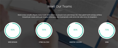
Codes are as follows:
<div class="SectionStyles14 pt-50 pb-60">
  <div class="dnn_layout">
    <div class="content_mid clearfix">
      <div class="pane_layout">
        <div class="row animation fadeInUp">
          <div class="col-sm-12">
            <div class="home7con_a white">
              <h1 class="title">Meet Our Teams</h1>
              <div class="line"></div>
              <p class="text">Content text...</p>
            </div>
          </div>
          <div class="col-sm-6 col-md-3">
            <div class="chart_list">
              <div data-percent="91" class="percentage6">
                <div class="percentage_inner"><span>0</span>%</div>
              </div>
              <p>Web Design</p>
            </div>
          </div>
          <div class="col-sm-6 col-md-3">
            <div class="chart_list">
              <div data-percent="96" class="percentage6">
                <div class="percentage_inner"><span>0</span>%</div>
              </div>
              <p>HTML5 & CSS3</p>
            </div>
          </div>
          <div class="col-sm-6 col-md-3">
            <div class="chart_list">
              <div data-percent="86" class="percentage6">
                <div class="percentage_inner"><span>0</span>%</div>
              </div>
              <p>Graphic Design</p>
            </div>
          </div>
          <div class="col-sm-6 col-md-3">
            <div class="chart_list">
              <div data-percent="76" class="percentage6">
                <div class="percentage_inner"><span>0</span>%</div>
              </div>
              <p>DNN</p>
            </div>
          </div>
        </div>
      </div>
    </div>
  </div>
</div>
Option:
- This is a SectionStyles effect.
col-sm-* col-md-*is the width of each column, you can change the width you need through value1~12.- You can modify
animationto change the animation on the slide. Animation list. - This is a
ProgressBars Counterseffect.ProgressBars Counters data-percentis for controlling the percentage that displays, you can display percentage through value0~100
Our Services area
Below is the screen shot:
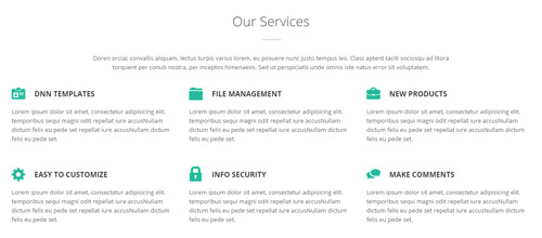
Codes are as follows:
<div class="pt-50">
  <div class="dnn_layout">
    <div class="content_mid clearfix">
      <div class="pane_layout">
        <div class="row">
          <div class="col-sm-12">
            <div class="home7con_a">
              <h1 class="title">Our Services</h1>
              <div class="line"></div>
              <p class="text">Content text...</p>
            </div>
          </div>
        </div>
        <div class="home7con_c animation fadeInUp">
          <div class="row">
            <div class="col-sm-4">
              <h4><span class="glyphicons glyph-nameplate"></span>DNN Templates</h4>
              <p>Lorem ipsum dolor sit amet, consectetur adipisicing elit. temporibus sequi magni odit repellat iure accusNullam dictum felis eu pede set repellat iure accusNullam dictum felis eu pede set.</p>
            </div>
            <div class="col-sm-4">
              <h4><span class="glyphicons glyph-folder-closed"></span>File Management</h4>
              <p>Lorem ipsum dolor sit amet, consectetur adipisicing elit. temporibus sequi magni odit repellat iure accusNullam dictum felis eu pede set repellat iure accusNullam dictum felis eu pede set.</p>
            </div>
            <div class="col-sm-4">
              <h4><span class="glyphicons glyph-briefcase"></span>New Products</h4>
              <p>Lorem ipsum dolor sit amet, consectetur adipisicing elit. temporibus sequi magni odit repellat iure accusNullam dictum felis eu pede set repellat iure accusNullam dictum felis eu pede set.</p>
            </div>
          </div>
        </div>
        <div class="home7con_c animation fadeInUp">
          <div class="row">
            <div class="col-sm-4">
              <h4><span class="glyphicons glyph-cogwheel"></span>Easy To Customize</h4>
              <p>Lorem ipsum dolor sit amet, consectetur adipisicing elit. temporibus sequi magni odit repellat iure accusNullam dictum felis eu pede set repellat iure accusNullam dictum felis eu pede set.</p>
            </div>
            <div class="col-sm-4">
              <h4><span class="glyphicons glyph-lock"></span>Info security</h4>
              <p>Lorem ipsum dolor sit amet, consectetur adipisicing elit. temporibus sequi magni odit repellat iure accusNullam dictum felis eu pede set repellat iure accusNullam dictum felis eu pede set.</p>
            </div>
            <div class="col-sm-4">
              <h4><span class="glyphicons glyph-conversation"></span>Make Comments</h4>
              <p>Lorem ipsum dolor sit amet, consectetur adipisicing elit. temporibus sequi magni odit repellat iure accusNullam dictum felis eu pede set repellat iure accusNullam dictum felis eu pede set.</p>
            </div>
          </div>
        </div>
      </div>
    </div>
  </div>
</div>
Option:
col-sm-*is the width of each column, you can change the width you need through value1~12.- You can modify
glyphiconsto change icons. font icon list. - You can modify
animationto change the animation on the slide. Animation list.
Featured Theme area
Below is the screen shot:
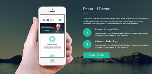
Codes are as follows:
<div class="SectionStyles13">
  <div class="SectionStyles13_bg pt-50">
    <div class="dnn_layout">
      <div class="content_mid clearfix">
        <div class="pane_layout">
          <div class="row">
            <div class="col-sm-6">
              <div class="home7con_d animation fadeInLeft"> <img alt="" src="/portals/32/home7con_d.png" class="img-responsive" /> </div>
            </div>
            <div class="col-sm-6">
              <div class="home7con_a white textleft animation fadeInRight">
                <h1 class="title">Featured Theme</h1>
                <div class="line"></div>
                <p class="text">Content text...</p>
                <ul>
                  <li> <span>1</span>
                    <h5>Browser Compatibility</h5>
                    <p>Nunc nibh diam, blandit vitae vehicula dapibus. Fusce et ornare sapien, non euismod felis. Integer et risus quis arcu.</p>

                  </li>
                  <li> <span>2</span>
                    <h5>Advanced Technology</h5>
                    <p>Nunc nibh diam, blandit vitae vehicula dapibus. Fusce et ornare sapien, non euismod felis. Integer et risus quis arcu.</p>
                  </li>
                </ul>
                <div class="Button_SectionStyles10main"><a target="blank" href="#" class="Button_SectionStyles10">All The Features</a></div>
              </div>
            </div>
          </div>
        </div>
      </div>
    </div>
  </div>
</div>
Option:
- This is a SectionStyles effect.
col-sm-*is the width of each column, you can change the width you need through value1~12.- You can modify
animationto change the animation on the slide. Animation list.
Recent Works area
Below is the screen shot:
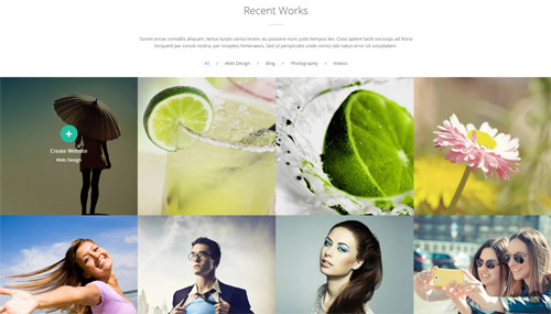
Codes are as follows:
<div class="pt-50">
  <div class="dnn_layout">
    <div class="content_mid clearfix">
      <div class="pane_layout">
        <div class="row">
          <div class="col-sm-12">
            <div class="home7con_a animation fadeInUp">
              <h1 class="title">Recent Works</h1>
              <div class="line"></div>
              <p class="text">Content text...</p>
            </div>
          </div>
        </div>
      </div>
    </div>
  </div>
</div>
<div class="isotope_grid isotope_grid1 animation fadeInUp">
  <div class="isotope_group"> <a data-filter="*" href="#" class="active">All</a>/<a data-filter=".webdesign" href="#">Web Design</a>/<a data-filter=".blogs" href="#">Blog</a>/<a data-filter=".photography" href="#">Photography</a>/<a data-filter=".videos" href="#">Videos</a></div>
  <div class="loading">
    <div class="loading-container container1">
      <div class="circle1"></div>
      <div class="circle2"></div>
      <div class="circle3"></div>
      <div class="circle4"></div>
    </div>
    <div class="loading-container container2">
      <div class="circle1"></div>
      <div class="circle2"></div>
      <div class="circle3"></div>
      <div class="circle4"></div>
    </div>
    <div class="loading-container container3">
      <div class="circle1"></div>
      <div class="circle2"></div>
      <div class="circle3"></div>
      <div class="circle4"></div>
    </div>
  </div>
  <div data-min-width="390" class="isotope_main">
    <div class="isotope_item webdesign">
      <div class="photo_box img_zoom ico_zoom"> <a target="blank" href="http://store.dnnsoftware.com/home/product-details/packageid/34790/r/7ab93d48c5e846d6b199">
        <div class="pic_box"> <img alt="" src="/portals/32/LightBox1.jpg" class="img-responsive" />
          <div class="content">
            <div class="vertical_center_1">
              <div class="vertical_center_2">
                <div class="ico"><span class="glyphicons glyph-plus"></span></div>
                <h3>Create Website</h3>
                <p>Web Design</p>
              </div>
            </div>
          </div>
          <div class="shade"></div>
        </div>
        </a> </div>
    </div>
    <div class="isotope_item blogs">
      <div class="photo_box img_zoom ico_zoom"> <a target="blank" href="http://store.dnnsoftware.com/home/product-details/packageid/34790/r/7ab93d48c5e846d6b199">
        <div class="pic_box"> <img alt="" src="/portals/32/LightBox2.jpg" class="img-responsive" />
          <div class="content">
            <div class="vertical_center_1">
              <div class="vertical_center_2">
                <div class="ico"><span class="glyphicons glyph-plus"></span></div>
                <h3>Create Website</h3>
                <p>Blog</p>
              </div>
            </div>
          </div>
          <div class="shade"></div>
        </div>
        </a> </div>
    </div>
    <div class="isotope_item photography">
      <div class="photo_box img_zoom ico_zoom"> <a target="blank" href="http://store.dnnsoftware.com/home/product-details/packageid/34790/r/7ab93d48c5e846d6b199">
        <div class="pic_box"> <img alt="" src="/portals/32/LightBox3.jpg" class="img-responsive" />
          <div class="content">
            <div class="vertical_center_1">
              <div class="vertical_center_2">
                <div class="ico"><span class="glyphicons glyph-plus"></span></div>
                <h3>Create Website</h3>
                <p>Photography</p>
              </div>
            </div>
          </div>
          <div class="shade"></div>
        </div>
        </a> </div>
    </div>
    <div class="isotope_item videos">
      <div class="photo_box img_zoom ico_zoom"> <a target="blank" href="http://store.dnnsoftware.com/home/product-details/packageid/34790/r/7ab93d48c5e846d6b199">
        <div class="pic_box"> <img alt="" src="/portals/32/LightBox4.jpg" class="img-responsive" />
          <div class="content">
            <div class="vertical_center_1">
              <div class="vertical_center_2">
                <div class="ico"><span class="glyphicons glyph-plus"></span></div>
                <h3>Create Website</h3>
                <p>Videos</p>
              </div>
            </div>
          </div>
          <div class="shade"></div>
        </div>
        </a> </div>
    </div>
    <div class="isotope_item blogs webdesign">
      <div class="photo_box img_zoom ico_zoom"> <a target="blank" href="http://store.dnnsoftware.com/home/product-details/packageid/34790/r/7ab93d48c5e846d6b199">
        <div class="pic_box"> <img alt="" src="/portals/32/LightBox5.jpg" class="img-responsive" />
          <div class="content">
            <div class="vertical_center_1">
              <div class="vertical_center_2">
                <div class="ico"><span class="glyphicons glyph-plus"></span></div>
                <h3>Create Website</h3>
                <p>Blogs Webdesign</p>
              </div>
            </div>
          </div>
          <div class="shade"></div>
        </div>
        </a> </div>
    </div>
    <div class="isotope_item photography videos">
      <div class="photo_box img_zoom ico_zoom"> <a target="blank" href="http://store.dnnsoftware.com/home/product-details/packageid/34790/r/7ab93d48c5e846d6b199">
        <div class="pic_box"> <img alt="" src="/portals/32/LightBox6.jpg" class="img-responsive" />
          <div class="content">
            <div class="vertical_center_1">
              <div class="vertical_center_2">
                <div class="ico"><span class="glyphicons glyph-plus"></span></div>
                <h3>Create Website</h3>
                <p>Photography Videos</p>
              </div>
            </div>
          </div>
          <div class="shade"></div>
        </div>
        </a> </div>
    </div>
    <div class="isotope_item blogs videos">
      <div class="photo_box img_zoom ico_zoom"> <a target="blank" href="http://store.dnnsoftware.com/home/product-details/packageid/34790/r/7ab93d48c5e846d6b199">
        <div class="pic_box"> <img alt="" src="/portals/32/LightBox7.jpg" class="img-responsive" />
          <div class="content">
            <div class="vertical_center_1">
              <div class="vertical_center_2">
                <div class="ico"><span class="glyphicons glyph-plus"></span></div>
                <h3>Create Website</h3>
                <p>Blogs Videos</p>
              </div>
            </div>
          </div>
          <div class="shade"></div>
        </div>
        </a> </div>
    </div>
    <div class="isotope_item photography webdesign">
      <div class="photo_box img_zoom ico_zoom"> <a target="blank" href="http://store.dnnsoftware.com/home/product-details/packageid/34790/r/7ab93d48c5e846d6b199">
        <div class="pic_box"> <img alt="" src="/portals/32/LightBox8.jpg" class="img-responsive" />
          <div class="content">
            <div class="vertical_center_1">
              <div class="vertical_center_2">
                <div class="ico"><span class="glyphicons glyph-plus"></span></div>
                <h3>Create Website</h3>
                <p>Photography Webdesign</p>
              </div>
            </div>
          </div>
          <div class="shade"></div>
        </div>
        </a> </div>
    </div>
  </div>
</div>
Option:
col-sm-*is the width of each column, you can change the width you need through value1~12.- You can modify
animationto change the animation on the slide. Animation list. - You can modify
glyphiconsto change icons. font icon list. - You can add
<a data-filter=".FilterName" href="#">Filter Name</a>to increase categories.data-filter=".FilterName"can not be blank space. - You can modify
data-min-widthto change minimum width of image. - You can modify
isotope_itemFilterNameto categorize images.
Testimonials_tab area
Below is the screen shot:
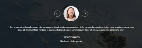
Codes are as follows:
<div class="SectionStyles15 pt-60 pb-60">
  <div class="dnn_layout animation fadeInUp">
    <div class="content_mid clearfix">
      <div class="pane_layout">
        <div class="row">
          <div class="col-sm-12">
            <ul class="Testimonials_tab Testimonials_10" data-position="roll-left" data-height-auto="false" data-autoplay="5000" data-display-navigation="false">
              <li>
                <blockquote>
                  <p><span class="Pic"><img alt="" class="img-responsive" src="/portals/32/circle1.jpg" /></span> “   Content text ...   ”</p>
                  <small>David Smith <span>The Buyer of dnngo.net</span></small> </blockquote>
              </li>
              <li>
                <blockquote>
                  <p><span class="Pic"><img alt="" class="img-responsive" src="/portals/32/circle2.jpg" /></span> “   Content text...   ”</p>
                  <small>David Smith <span>The Buyer of dnngo.net</span></small> </blockquote>
              </li>
              <li>
                <blockquote>
                  <p><span class="Pic"><img alt="" class="img-responsive" src="/portals/32/circle3.jpg" /></span> “   Content text...   ”</p>
                  <small>David Smith <span>The Buyer of dnngo.net</span></small> </blockquote>
              </li>
            </ul>
          </div>
        </div>
      </div>
    </div>
  </div>
</div>
Option:
col-sm-*is the width of each column, you can change the width you need through value1~12.- This is a SectionStyles effect.
- You can modify
animationto change the animation on the slide. Animation list. - This is a
Carouseleffect.Carousel
Pricing Tables area
Below is the screen shot:
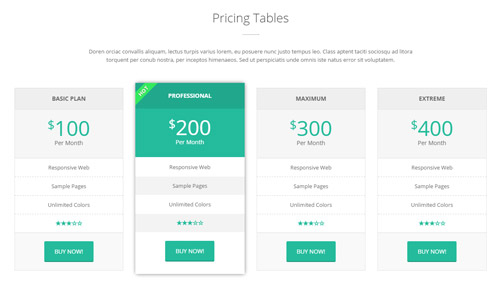
Codes are as follows:
<div class="pt-50 pb-60">
  <div class="dnn_layout">
    <div class="content_mid clearfix">
      <div class="pane_layout">
        <div class="row">
          <div class="col-sm-12">
            <div class="home7con_a animation fadeInUp">
              <h1 class="title">Pricing Tables</h1>
              <div class="line"></div>
              <p class="text">Content text...</p>
            </div>
          </div>
        </div>
        <div class="home7con_e price-table price-table5 row">
          <div class="col-md-3 col-sm-6">
            <div class="price_border animation_item scaleUp delay1">
              <div class="price_title">
                <h2>Basic Plan</h2>
              </div>
              <div class="price_holder">
                <div class="price_box"><span class="sup">$</span><span class="price">100</span><span class="unit">Per Month</span></div>
                <ul>
                  <li>Responsive Web</li>
                  <li>Sample Pages</li>
                  <li>Unlimited Colors</li>
                  <li><span class="glyphicons glyph-star"></span><span class="glyphicons glyph-star"></span><span class="glyphicons glyph-star"></span><span class="glyphicons glyph-dislikes"></span><span class="glyphicons glyph-dislikes"></span> </li>
                </ul>
                <a target="blank" href="http://store.dnnsoftware.com/home/product-details/packageid/34790/r/7ab93d48c5e846d6b199" class="btn ">BUY NOW!</a> </div>
            </div>
          </div>
          <div class="col-md-3 col-sm-6 best_value">
            <div class="price_border animation_item scaleUp delay2">
              <div class="price_title ">
                <h2>PROFESSIONAL</h2>
              </div>
              <div class="price_holder">
                <div class="price_box"><span class="sup">$</span><span class="price">200</span><span class="unit">Per Month</span></div>
                <ul>
                  <li>Responsive Web</li>
                  <li>Sample Pages</li>
                  <li>Unlimited Colors</li>
                  <li><span class="glyphicons glyph-star"></span><span class="glyphicons glyph-star"></span><span class="glyphicons glyph-star"></span><span class="glyphicons glyph-dislikes"></span><span class="glyphicons glyph-dislikes"></span> </li>
                </ul>
                <a target="blank" href="http://store.dnnsoftware.com/home/product-details/packageid/34790/r/7ab93d48c5e846d6b199" class="btn">BUY NOW!</a> </div>
            </div>
          </div>
          <div class="col-md-3 col-sm-6">
            <div class="price_border animation_item scaleUp delay3">
              <div class="price_title">
                <h2>MAXIMUM</h2>
              </div>
              <div class="price_holder">
                <div class="price_box"><span class="sup">$</span><span class="price">300</span><span class="unit">Per Month</span></div>
                <ul>
                  <li>Responsive Web</li>
                  <li>Sample Pages</li>
                  <li>Unlimited Colors</li>
                  <li><span class="glyphicons glyph-star"></span><span class="glyphicons glyph-star"></span><span class="glyphicons glyph-star"></span><span class="glyphicons glyph-dislikes"></span><span class="glyphicons glyph-dislikes"></span> </li>
                </ul>
                <a target="blank" href="http://store.dnnsoftware.com/home/product-details/packageid/34790/r/7ab93d48c5e846d6b199" class="btn">BUY NOW!</a> </div>
            </div>
          </div>
          <div class="col-md-3 col-sm-6">
            <div class="price_border animation_item scaleUp delay4">
              <div class="price_title">
                <h2>EXTREME</h2>
              </div>
              <div class="price_holder">
                <div class="price_box"><span class="sup">$</span><span class="price">400</span><span class="unit">Per Month</span></div>
                <ul>
                  <li>Responsive Web</li>
                  <li>Sample Pages</li>
                  <li>Unlimited Colors</li>
                  <li><span class="glyphicons glyph-star"></span><span class="glyphicons glyph-star"></span><span class="glyphicons glyph-star"></span><span class="glyphicons glyph-dislikes"></span><span class="glyphicons glyph-dislikes"></span> </li>
                </ul>
                <a target="blank" href="http://store.dnnsoftware.com/home/product-details/packageid/34790/r/7ab93d48c5e846d6b199" class="btn ">BUY NOW!</a> </div>
            </div>
          </div>
        </div>
      </div>
    </div>
  </div>
</div>
Option:
col-sm-* col-md-*is the width of each column, you can change the width you need through value1~12.- You can modify
animationto change the animation on the slide. Animation list. - You can modify
glyphiconsto change icons. font icon list.
Develop interactive, engaging and satisfying website area
Below is the screen shot:
Codes are as follows:
<div class="SectionStyles16 pt-60 pb-60">
  <div class="dnn_layout">
    <div class="content_mid clearfix">
      <div class="pane_layout">
        <div class="row">
          <div class="col-sm-12">
            <h1 class="home7con_f animation fadeInUp"> Develop interactive, engaging and satisfying website
              <div class="clearfix visible-sm"></div>
              <a target="blank" href="http://store.dnnsoftware.com/home/product-details/packageid/34790/r/7ab93d48c5e846d6b199" class="Button_default2">Purchase This Theme</a> </h1>
          </div>
        </div>
      </div>
    </div>
  </div>
</div>
Option:
- This is a SectionStyles effect.
- You can modify
animationto change or delete animation.Animation list.
Contact Us area
Below is the screen shot:
Codes are as follows:
<div class="pt-50">
  <div class="dnn_layout">
    <div class="content_mid clearfix">
      <div class="pane_layout">
        <div class="row">
          <div class="col-sm-12">
            <div class="home7con_a animation fadeInUp">
              <h1 class="title">Contact Us</h1>
              <div class="line"></div>
              <p class="text nomargin">Content text...</p>
            </div>
          </div>
        </div>
      </div>
    </div>
  </div>
</div>
Option:
- You can modify
animationto change the animation on the slide. Animation list. col-sm-*is the width of each column, you can change the width you need through value1~12.
Work Time area
Below is the screen shot:
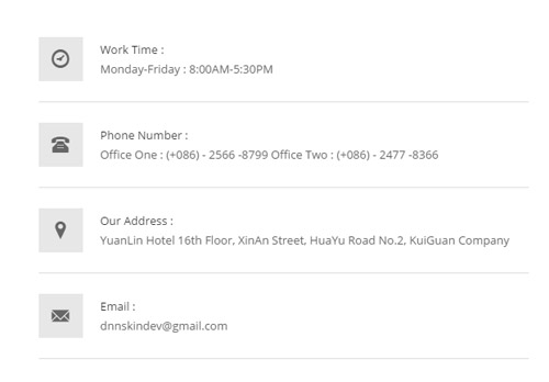
Codes are as follows:
<ul class="home7con_g animation fadeInLeft">
  <li><span class="glyphicons glyph-clock"></span>
    <h6><span>Work Time :</span> Monday-Friday : 8:00AM-5:30PM</h6>
  </li>
  <li><span class="glyphicons glyph-phone-alt"></span>
    <h6><span>Phone Number :</span> Office One :  (+086) - 2566 -8799      Office Two :  (+086) - 2477 -8366</h6>
  </li>
  <li><span class="glyphicons glyph-google-maps"></span>
    <h6><span>Our Address :</span> YuanLin Hotel 16th Floor, XinAn Street, HuaYu Road No.2, KuiGuan Company</h6>
  </li>
  <li><span class="glyphicons glyph-envelope"></span>
    <h6><span>Email :</span> dnnskindev@gmail.com</h6>
  </li>
</ul>
Option:
- You can modify
animationto change the animation on the slide. Animation list. - You can modify
glyphiconsto change icons. font icon list.
Theme_Responsive_20061_home7 area
Below is the screen shot:
Option:
- This is
Theme_Responsive_20061_home7theme ofDNNGo PowerFormsmodule
MAP area
Below is the screen shot:
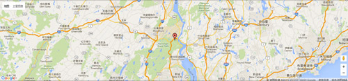
Codes are as follows:
<div id="gmap01" class="animation fadeInUp"></div>
Option:
- You can modify
animationto change the animation on the slide. Animation list.
About area
Below is the screen shot:
Codes are as follows:
<div class="botbox_c animation fadeInUp">
  <p>Sed ut perspiciatis unde omnis iste natus error sit voluptatem accusantium dolore mque laudan tium, totam rem aperiam, eaque ipsa quae ab illo inventore veritatis et quasi architecto beatae. <br />
    <br />
    Lorem ipsum dolor sit amet, consectetur adipiscing elit. Nunc nibh diam, blandit vitae vehicula dapibus. </p>
  <br />
  <br />
  <a href="#" class="social social-facebook"></a> <a href="#" class="social social-dribbble"></a> <a href="#" class="social social-twitter"></a> <a href="#" class="social social-google-plus"></a> <a href="#" class="social social-linked-in"></a> <a href="#" class="social social-rss"></a> </div>
Option:
- You can modify
animationto change the animation on the slide. Animation list. - You can modify
glyphiconsto change icons. font icon list. Containeris usingContainer-20061-4
Photos area
Below is the screen shot:
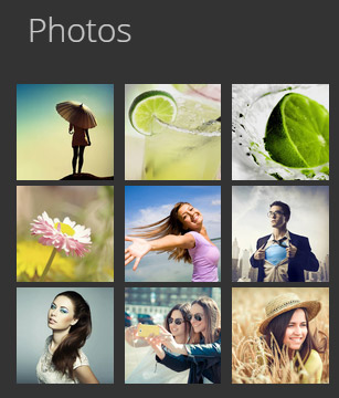
Codes are as follows:
<div class="botbox_d row animation fadeInUp">
  <div class="col-sm-4 col-xs-6">
    <div class="photo_box"> <a title="Image Gallery" class="LightBox_image_gallery1" href="/Portals/32/LightBox1.jpg">
      <div class="pic_box"> <img alt="" class="img-responsive" src="/portals/32/LightBox1.jpg" />
        <div class="shade"></div>
      </div>
      </a> </div>
  </div>
  <div class="col-sm-4  col-xs-6">
    <div class="photo_box"> <a title="Image Gallery" class="LightBox_image_gallery1" href="/Portals/32/LightBox2.jpg">
      <div class="pic_box"> <img alt="" class="img-responsive" src="/portals/32/LightBox2.jpg" />
        <div class="shade"></div>
      </div>
      </a> </div>
  </div>
  <div class="col-sm-4  col-xs-6">
    <div class="photo_box"> <a title="Image Gallery" class="LightBox_image_gallery1" href="/Portals/32/LightBox3.jpg">
      <div class="pic_box"> <img alt="" class="img-responsive" src="/portals/32/LightBox3.jpg" />
        <div class="shade"></div>
      </div>
      </a> </div>
  </div>
  <div class="col-sm-4  col-xs-6">
    <div class="photo_box"> <a title="Image Gallery" class="LightBox_image_gallery1" href="/Portals/32/LightBox4.jpg">
      <div class="pic_box"> <img alt="" class="img-responsive" src="/portals/32/LightBox4.jpg" />
        <div class="shade"></div>
      </div>
      </a> </div>
  </div>
  <div class="col-sm-4  col-xs-6">
    <div class="photo_box"> <a title="Image Gallery" class="LightBox_image_gallery1" href="/Portals/32/LightBox5.jpg">
      <div class="pic_box"> <img alt="" class="img-responsive" src="/portals/32/LightBox5.jpg" />
        <div class="shade"></div>
      </div>
      </a> </div>
  </div>
  <div class="col-sm-4  col-xs-6">
    <div class="photo_box"> <a title="Image Gallery" class="LightBox_image_gallery1" href="/Portals/32/LightBox6.jpg">
      <div class="pic_box"> <img alt="" class="img-responsive" src="/portals/32/LightBox6.jpg" />
        <div class="shade"></div>
      </div>
      </a> </div>
  </div>
  <div class="col-sm-4  col-xs-6">
    <div class="photo_box"> <a title="Image Gallery" class="LightBox_image_gallery1" href="/Portals/32/LightBox7.jpg">
      <div class="pic_box"> <img alt="" class="img-responsive" src="/portals/32/LightBox7.jpg" />
        <div class="shade"></div>
      </div>
      </a> </div>
  </div>
  <div class="col-sm-4  col-xs-6">
    <div class="photo_box"> <a title="Image Gallery" class="LightBox_image_gallery1" href="/Portals/32/LightBox8.jpg">
      <div class="pic_box"> <img alt="" class="img-responsive" src="/portals/32/LightBox8.jpg" />
        <div class="shade"></div>
      </div>
      </a> </div>
  </div>
  <div class="col-sm-4  col-xs-6">
    <div class="photo_box"> <a title="Image Gallery" class="LightBox_image_gallery1" href="/Portals/32/LightBox9.jpg">
      <div class="pic_box"> <img alt="" class="img-responsive" src="/portals/32/LightBox9.jpg" />
        <div class="shade"></div>
      </div>
      </a> </div>
  </div>
</div>
Option:
- This is a
LightBoxeffect.LightBox Containeris usingContainer-20061-4- You can modify
animationto change the animation on the slide. Animation list. col-sm-* col-xs-*is the width of each column, you can change the width you need through value1~12.
Categories area
Below is the screen shot:
Codes are as follows:
<ul class="botbox_e animation fadeInUp">
  <li><a target="blank" href="http://store.dnnsoftware.com/home/product-details/packageid/34790/r/7ab93d48c5e846d6b199"><span class="glyphicons glyph-list"></span>Module Development</a></li>
  <li><a target="blank" href="http://store.dnnsoftware.com/home/product-details/packageid/34790/r/7ab93d48c5e846d6b199"><span class="glyphicons glyph-list"></span>Responsive Web</a></li>
  <li><a target="blank" href="http://store.dnnsoftware.com/home/product-details/packageid/34790/r/7ab93d48c5e846d6b199"><span class="glyphicons glyph-list"></span>Dnn Xblog Module</a></li>
  <li><a target="blank" href="http://store.dnnsoftware.com/home/product-details/packageid/34790/r/7ab93d48c5e846d6b199"><span class="glyphicons glyph-list"></span>Unlimited-Color Skin</a></li>
  <li><a target="blank" href="http://store.dnnsoftware.com/home/product-details/packageid/34790/r/7ab93d48c5e846d6b199"><span class="glyphicons glyph-list"></span>Create New Website</a></li>
</ul>
Option:
Containeris usingContainer-20061-4- You can modify
animationto change the animation on the slide. Animation list. - You can modify
glyphiconsto change icons. font icon list.
Recent News area
Below is the screen shot:
Codes are as follows:
<ul class="botbox_f animation fadeInUp">
  <li>
    <div class="img"><img alt="" src="/portals/32/botbox_e1.jpg"></div>
    <p>Totam rem aperiam, eaque ipsa quae ab illo inventore veritatis quasi tecto. </p>
    <a href="http://store.dnnsoftware.com/home/product-details/packageid/34790/r/7ab93d48c5e846d6b199" target="blank">Read More</a> </li>
  <li class="bbf2">
    <div class="img"><img alt="" src="/portals/32/botbox_e2.jpg"></div>
    <p>Totam rem aperiam, eaque ipsa quae ab illo inventore veritatis quasi tecto. </p>
    <a href="http://store.dnnsoftware.com/home/product-details/packageid/34790/r/7ab93d48c5e846d6b199" target="blank">Read More</a> </li>
</ul>
Option:
Containeris usingContainer-20061-4- You can modify
animationto change the animation on the slide. Animation list.
Coming Soon
You can click the link to check Coming Soon demo. Coming Soon
Below is the screen shot:
You can create the coming soon page easily following these steps:
- Create a page named coming soon page.
- Import the ComingSoon.Page.template for this page.
- You can set color, end time, and background image for Coming Soon page through xPlugin, as below:
Boxed Layout
You can set Boxed mode in DNNGo.xPlugin > Skins > Options > Content Layout > Content Layout
Dark Mode
You can set Dark mode directly in DNNGo.xPlugin > Skins > Options > Content Layout > Content Color Mode.
DNNGo_LayerGalleryPro Module
You can see this module in the banner section on the home page, we will guide you step by step to set up the module as the same as our demo site:
- Go to Host –> Extensions –> Install Extension wizard to install the module pack DNNGo_LayerGalleryPro.0x.0x.0x_PA.zip.
- Add DNNGo_LayerGalleryPro module to the BannerPane.
- Click Manager button.
- Click the navigation of the left Import&Export
- Import ContentListEntity.xml file under DNNGo_LayerGalleryPro Module.
- You will see the imported data on Manage List page and you can change the text/image in the banner by clicking Edit button.
- Click this link so you can check the module instruction details.
DNNGo_GalleryPro Module
This module contains 15 responsive sldiers in total.
- Go to Host –> Extensions –> Install Extension wizard to install the module pack DNNGo_DNNGalleryPro_xx.xx.xx_PA.zip.
- Add DNNGo_DNNGalleryPro module to the page.
- Click Effect List tab.
- Choose an effect you like.
- You can click this link to check the module demo.
- Click this link so you can check the module instruction details.
DNNGo_xBlog Module
We use this module on the blog page, click this link so you can check the module instruction details.
DNNGo_PhotoAlbums Module
We use this module on the Portfolios page, click this link so you can check the module instruction details.
DNNGo_PowerForms Module
You can create the form through this module, click this link so you can check the module instruction details.
License interface
- Please login or register your account at http://www.dnngo.net
- Send an email to dnnskindev@gmail.com with your invoice ID, machine Key for every module( different module has different machine key), and your DNNGO username. We will generate an activation code for you. Please note: If your site is a demo site, your license will still be valid when you transfer your site to a live site.
- Manage my licenses
Contact Us
If you have any questions or suggestions about modules/skins or modules/skins installation process, please feel free to contact us.
- Website: www.dnngo.net
- Email: dnnskindev@gmail.com
- Skype: dnngo-linda