20066-UnlimitedColorsPack-048 v5.6.0
Documentation
- Created: 09/01/2015
- Latest update: 02/17/2020
- By: DNNGo
- Email: dnnskindev@gmail.com
Thank you for purchasing my theme. If you have any questions that are beyond the scope of this help file, please feel free to email via my user page contact form here. Thanks so much!
General Information
DotNetNuke Information
To install this skin you must have a working version of Dotnetnuke already installed. If you need help to install Dotnetnuke, follow the instructions in Documentation Center.
What Is Included With Your Package
When you purchase our theme, you will receive one large .zip file that contains everything inside. Unzip that file to get all the content inside. Below is a full list of everything that is included along with a brief description of each item. See the corresponding sections for info on installing the theme.
- Inside the Content folder are: DNN Skins folder, DNNGo_DNNGallery Module folder, DNNGo_LayerGalleryPro folder, DNNGo_PhotoAlbums Module folder, DNNGo_PowerForms Module folder, DNNGo_xPlugin Module folder, DNNGo_xBlog Module folder, PSD folder, Page template.
- DNN Skins folder - The skin in this folder can be used in DNN 8.x, DNN 9.x only.
- DNNGo_DNNGalleryPro Module folder - This module contains 15 responsive sldiers in total.
- DNNGo_LayerGalleryPro folder - You can see this module in the banner section on home page.
- DNNGo_PhotoAlbums folder - You can see this module in Portfolios page.
- DNNGo_PowerForms folder - You can create forms through this module.
- DNNGo_xBlog Module folder - You can see this module on Blog page.
- Page Templates folder - Exported page templates will allow you to reproduce our live demo pages.
Notice: If you bought the theme from DNN Store (http://store.dnnsoftware.com), then none of module files are included in the download package. It only include DNN Skins, DNNGo_xPlugin, Page Templates and PSD files. If you need to purchase modules, please contact us via email (dnnskindev@gmail.com).
What Are The Requirements To Use skins and modules
To use skins and modules, you must be running DNN 8.x or higher. We have tested it with DNN 8.x, DNN 9.x.
Skin and Required Modules Installation
For DNN 8
-
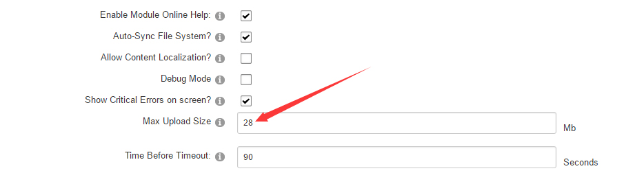
Go to Host-Settings –> Host-Settings, and select the tab Other Settings, changing Max Upload Size to 28 or higher.
-
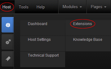
Go to Host –> Extensions –> Install Extension wizard to install the module pack DNNGo_xPlugin_0x.0x.0x_PA.zip
-
Go to Host –> Extensions –> Install Extension wizard to install the skin pack 20066-UnlimitedColorsPack-048-DNNSkins.zip
-
You can install other modules as per your own needs.
-
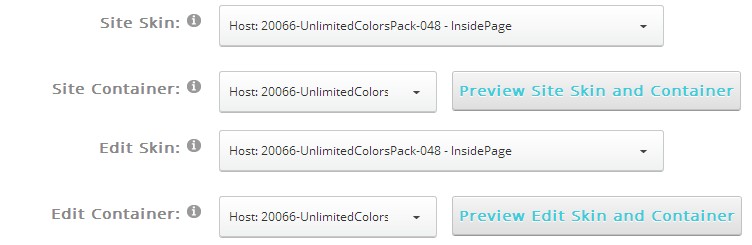
After the installation has been completed, navigate to Admin –> Site Settings –> Basic Settings (tab) –> Appearance (section) and specify portal and edit skins and containers like shown in the screenshot below. It should be done, in order to make your DNN admin UI look correct and readable.
-
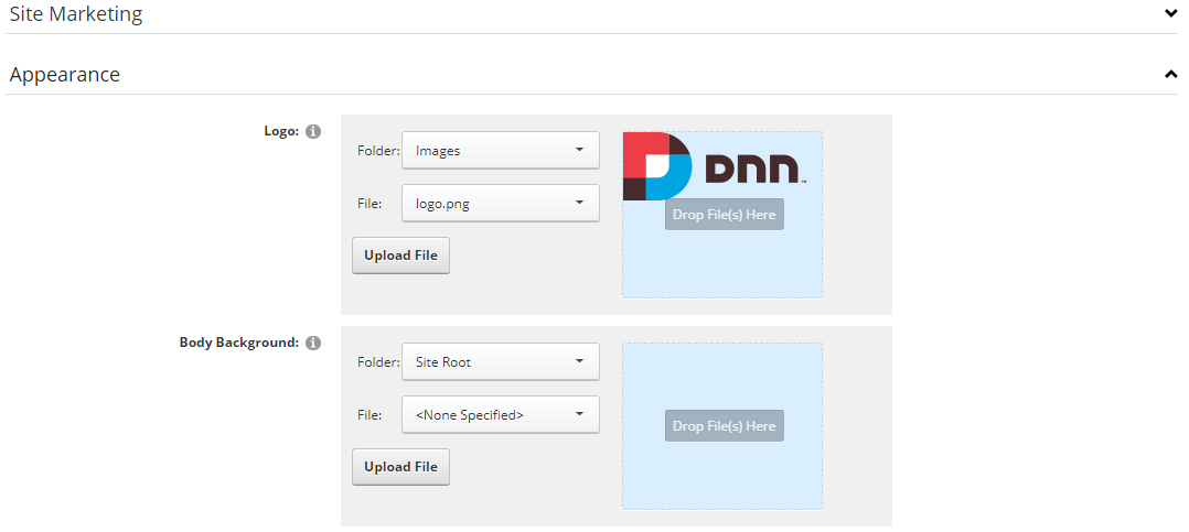
Now you can upload the LOGO image in Admin –> Site Settings –> Basic Settings (tab) –> Appearance (section) page.
For DNN 9
-
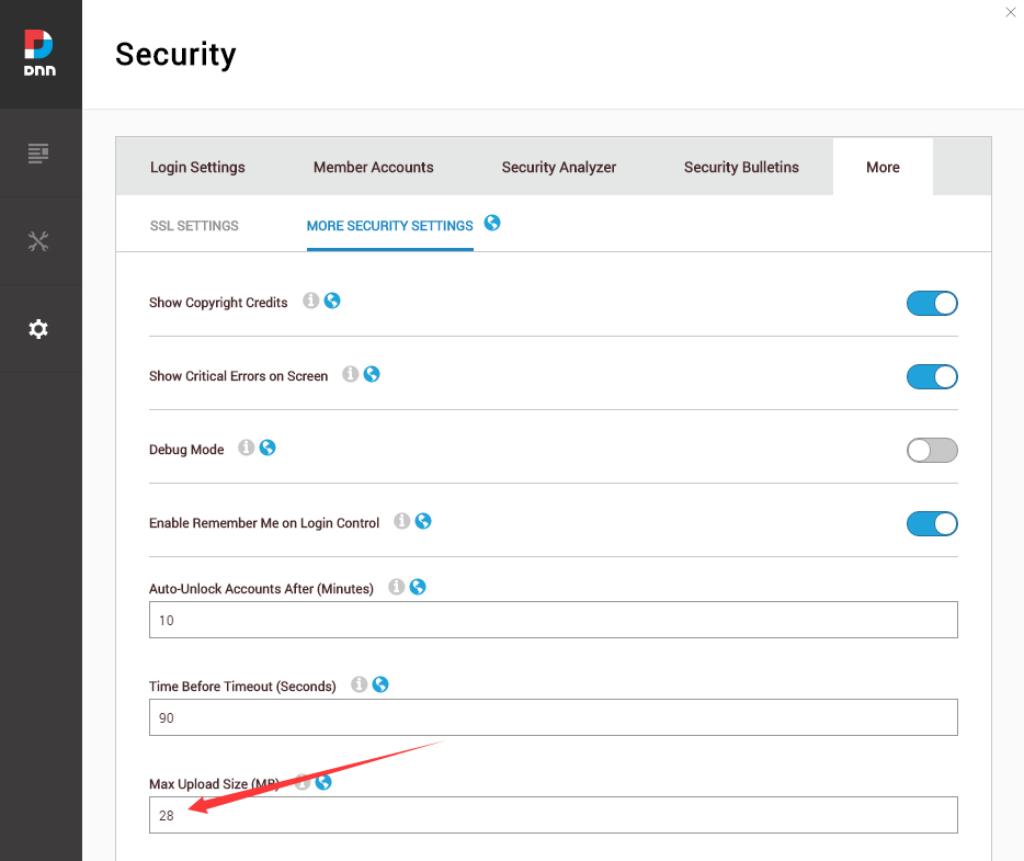
Go to Settings –> Security –> More, and select the tab MORE SECURITY SETTINGS, changing Max Upload Size to 28 or higher.
-
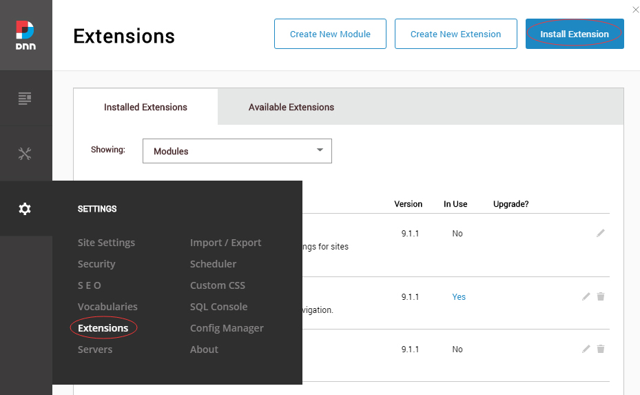
Go to Host –> Extensions –> Install Extension wizard to install the module pack DNNGo_xPlugin_0x.0x.0x_PA.zip
-
Go to Host –> Extensions –> Install Extension wizard to install the skin pack 20066-UnlimitedColorsPack-048-DNNSkins.zip
-
You can install other modules as per your own needs.
-
Manage
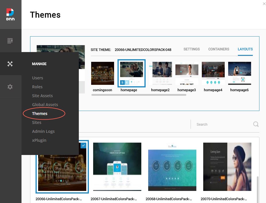
After the installation has been completed, navigate to Manage –> Themes. Select and apply 20066-UnlimitedColorsPack-048
-
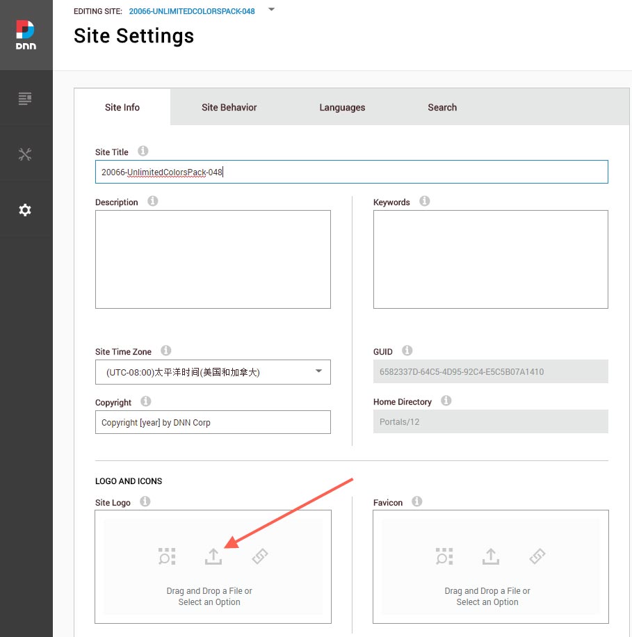
You can upload the LOGO image in Settings –> Site Settings page.
Change the Settings of HTML Editor
By default, HTML editor will remove the div tags whose content is blank. For example: if we add the code <div class=”pt-20″></div> in HTML editor and click save, you will find the code is missing when you edit it afterwards. So we need to change the settings to prevent this from happening.
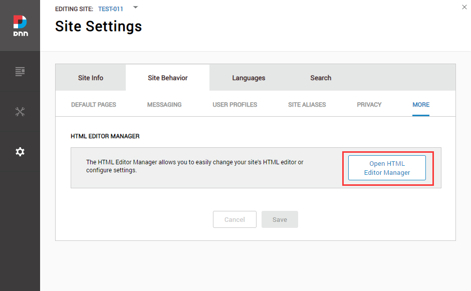
Log in to your site as super administrator.
Go to SETTINGS > Site Settings > Site Behavior > MORE, click the Open HTML Editor Manager.
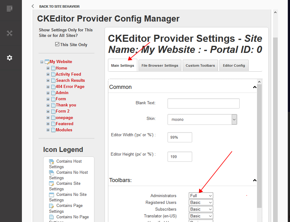
Click the Main Settings tab. Set the value of Administrators to be Full.
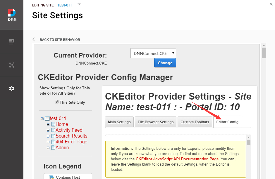
Click the Editor Config tab.
Set the value of AllowedContent to be true.
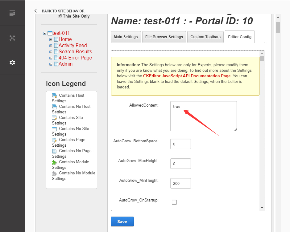
Set the value of FillEmptyBlocks to be false.
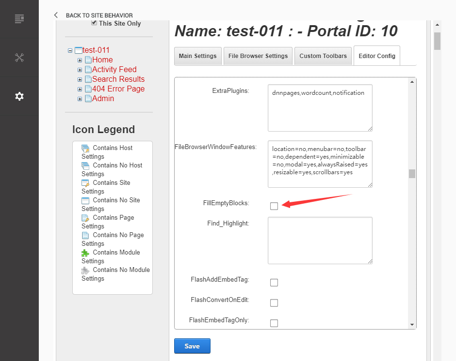
Set the value of ignoreEmptyParagraph to be false.
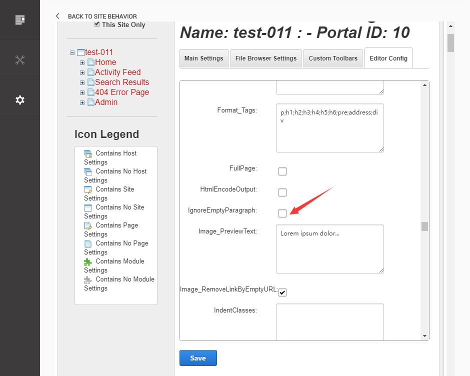
Click the Save button.
How to import page template?
Exported page templates will allow you to reproduce our live demo pages. We'll reproduce the home page as an example.
For DNN 8
-
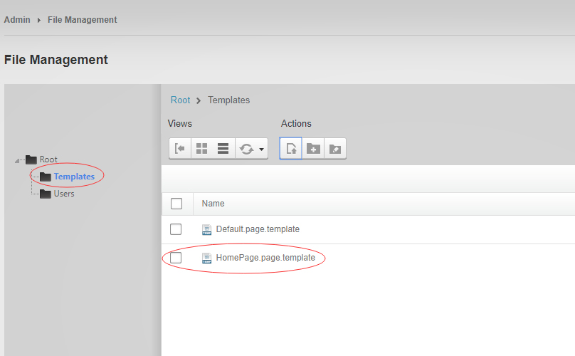
You can find these files in Page Templates Directory.
-
Upload Home.page.template file into your portal root (e.g. Portals/0/Templates/) in the previous chapter and synchronize your folders, you are able to start using page templates to clone live demo pages.
-
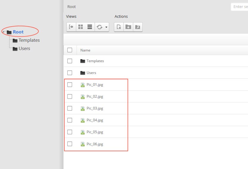
Because page templates can not import image files, you need to upload all the photo files of the "images" folder into your portal root (e.g. Portals/0/).
-
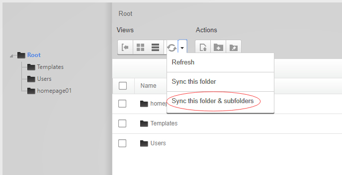
Synchronize the file in Admin > File-Management
-
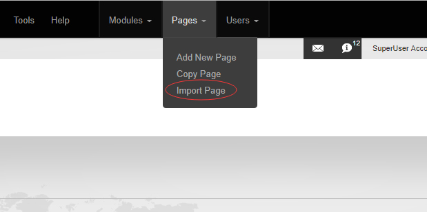
Navigate to the Home page and click Pages -> Import.
-
Find a proper page exported content file navigating to Templates folder and choosing for example Home page.
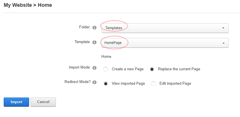
-
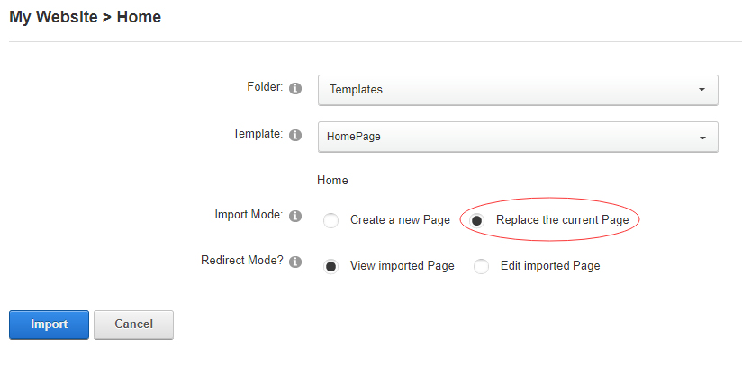
Choose "Replace the current Page" and the redirect mode you need. Please note, if you select "Replace the current Page", content of current page will be reset.
-
Click Import button if everything is correct.
-
Specify page settings according to your needs (necessarily apply HomePage skin to the home page) and click "Update Page". The home page is ready.
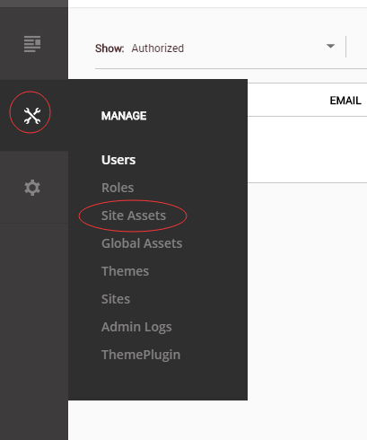
For DNN 9
-
Go to Manage > Site Assets
-
Uploading Home.page.template file to Templates folder
-
Because page templates can not import image files, you need to upload all the photo files of the "images" folder into your portal root (e.g. Portals/0/).
-
Go to Content > Pages > Add Page
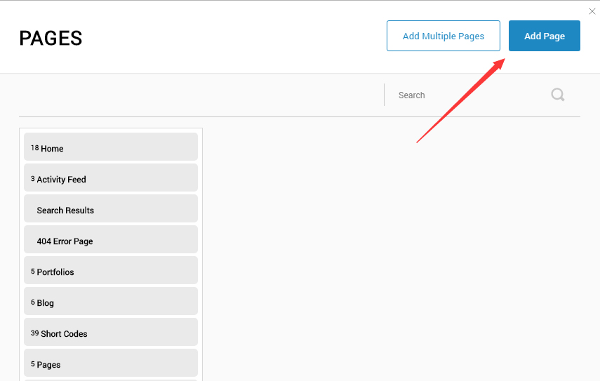
-
Choose your template from Template drop-down.
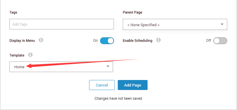
- Click Add Page
Note : Page templates can only be imported when you are creating a new page.
Skin features and how to use them.
Page Template
The product contains page templates for all pages in the live demo, you can copy our demo site by importing the page templates.
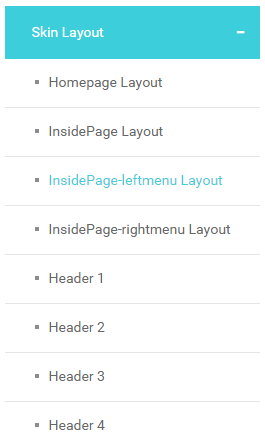
Seven kinds of header layout
You can click the xPlugin button to go to settings page, and then choose different header styles in Header Layout section.
You can click these links to check different header styles. header 1, header 2, header 3, header 4, header 5, header 6, header 7
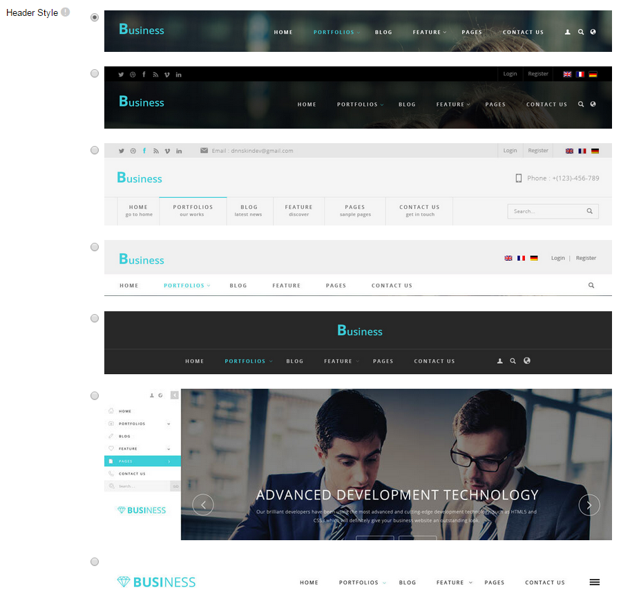
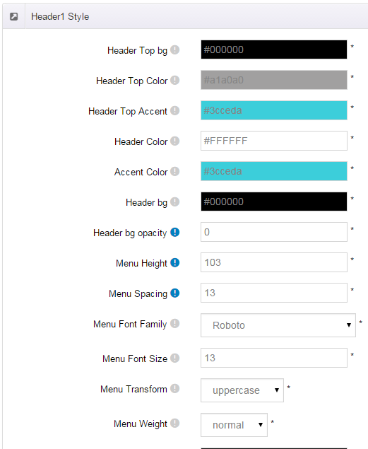
Each header includes very rich setting options, you can modify the color of whatever you would like to . For example: text color, font size and background color etc.
Header Position
Header Position is for setting the position of Header. If you have it set to Float to top, Header will float over the Banner. If you have it set to Not float, Header will show with Banner side by side. You can compare the difference between these two settings through the following two screen shots.

Header3 Option
Menus in Header 3 include main title and subtitle, these title texts can be set in Page Settings. Main title is from Page Name, sub-title is from Page Title.

Insidepage-leftmenu layout
Insidepage-leftmenu layout page is using InsidePage-leftmenu skin. Menus on the left side are displaying the second level menus.
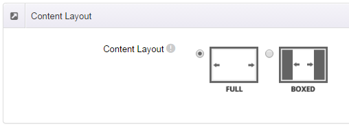
Full Layout and Boxed Layout
This skin contains Full Layout and Boxed Layout, you can set through Content Layout section.
With Boxed Layout applied, you can still set page background, it will display around the content. You can click link to check demo url of boxed layout.
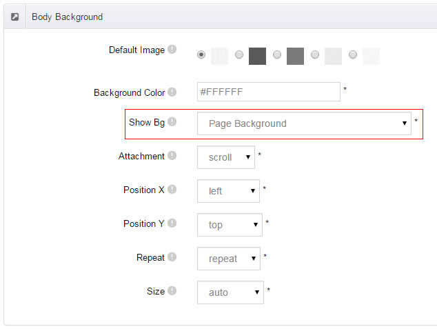
The background can be set as static or rotating image or any solid color for you choose to apply, also you can set different background images for different pages.
How to set background image for DNN page.
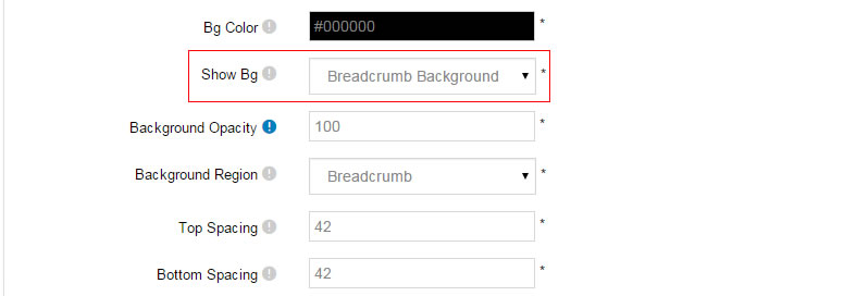
- You need to choose Boxed Layout.
- Choose Page Background in the Option for Show bg, save settings.
- Click "pages" nav in the xPlugin.
- Click Edit Background icon.
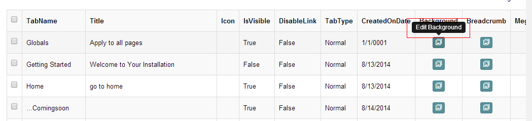
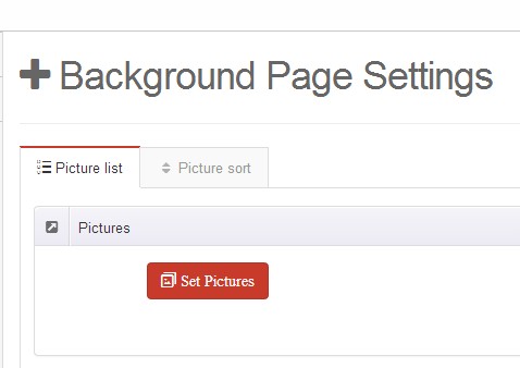
- Upload image, the background image will show as slider if you choose two or more images.
- "Globals" allows you to set background image for all pages.
- Also you can set background image for each page.
How to set breadcrumb image for DNN page.
- Choose Breadcrumb Background in the Option for Show bg, save settings.
- Click "pages" nav in the xPlugin.
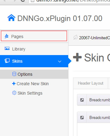
- Click Edit Breadcrumb icon.
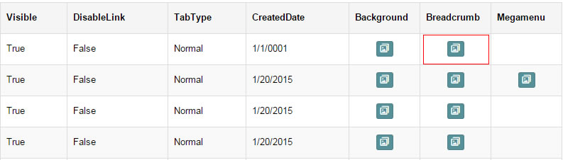
- Upload image, the background image will show as slider if you choose two or more images.
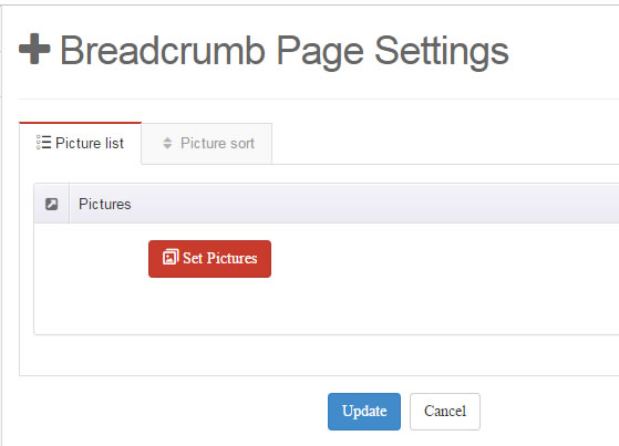
- "Globals" allows you to set background image for all pages.
- Also you can set background image for each page.
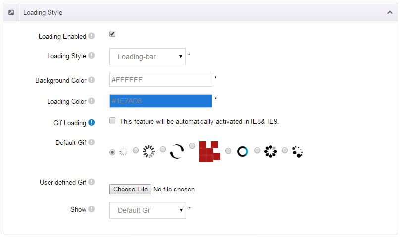
Loading Style
You can set the page loading animation.
You can select to have this feature turned on or off.
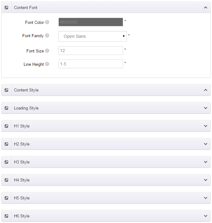
Content Style
You can set the font color and size, link color, the color of H1-H6 etc of the content area.
Four kinds of Breadcrumb layouts
You can choose different Breadcrumb styles through Breadcrumb Layout.
You can click these links to check different breadcrumb styles. breadcrumb 1, breadcrumb 2, breadcrumb 3, breadcrumb 4.
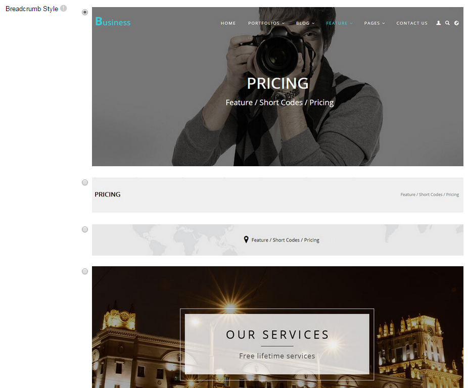
You can change the text color, background color and background image etc for each Breadcrumb layout.
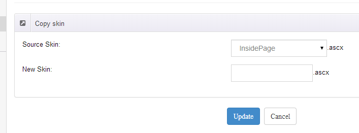
Create a Skin
You can create a new skin through xPlugin. Please note the new skin name shouldn't be the same as the current skin.
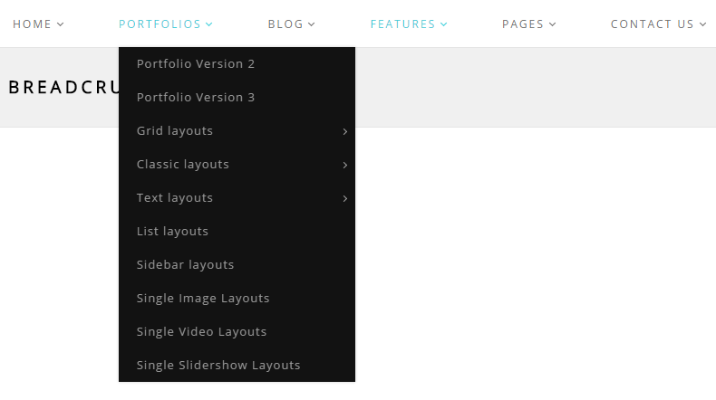
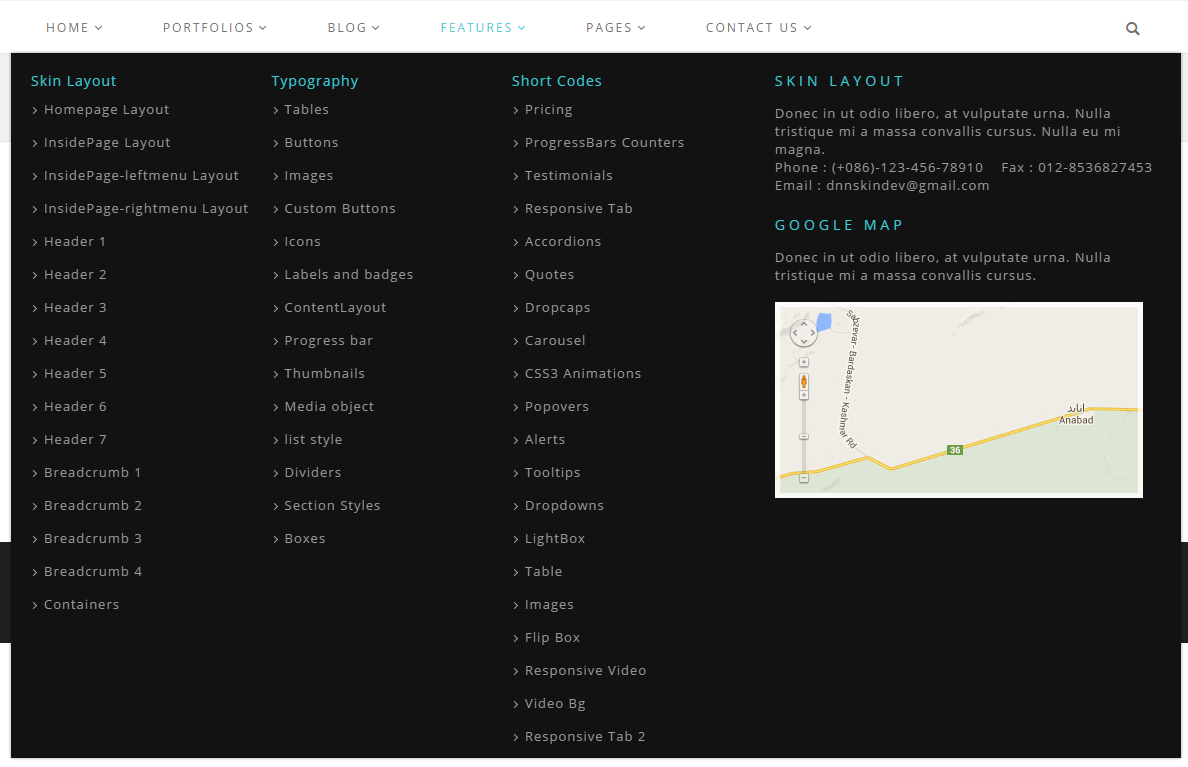
Standard Menu and MegaMenu
The skin sub menus contain two types-Standard Menu and MegaMenu.
Standard Menu is the default menu type, the sub menus will be set to display in one column only, as shown in screen shot below:
MegaMenu will set sub menus to display in multiple columns, also you can display HTML module or third party module in sub menus, as shown below:
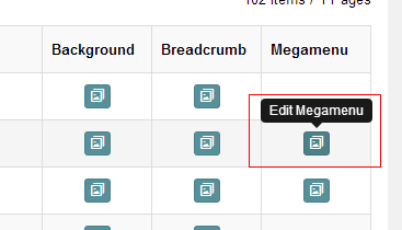
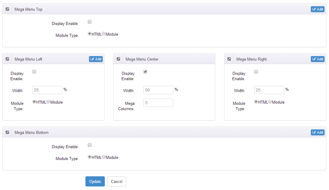
You can set the MegaMenu as per steps below:
- Click "pages" nav in the xPlugin.
- Click Edit MegaMenu button. Please note MegaMenu can be set for first level menus only.
- Set the menu type to MegaMenu.
- Mega Menu has 5 sections: Menu Top, Menu Right, Menu Bottom, Menu Left, Menu Center.
- Click Add button so you will be able to add HTML module or any third party module to Menu Top, Menu Right, Menu Bottom, Menu Left.
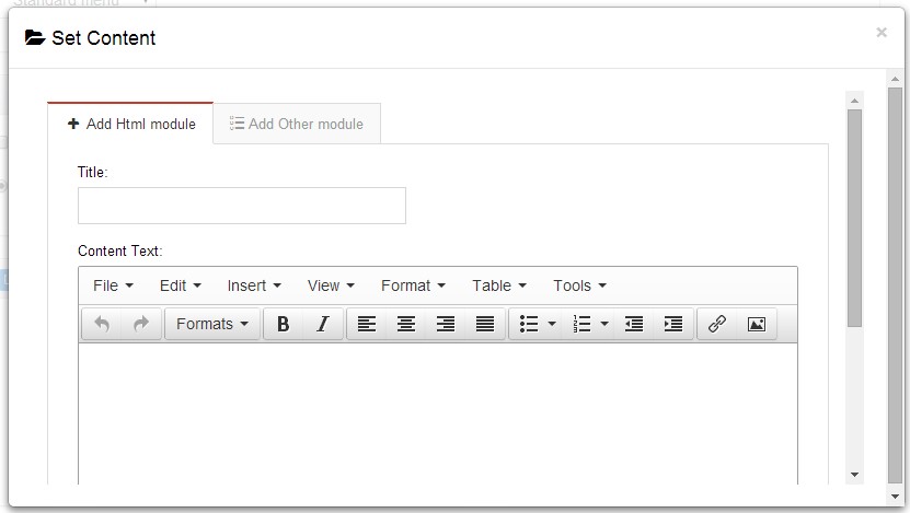
- Module Type-choose to display HTML module or third party module.
- Menu Center-it will display secondary menus here.
- Mega Columns-set number of columns the secondary menu will display.
- You can set width for Menu Right, Menu Left, Menu Center, please note their previous total width shouldn't be more than 100.
Set Up Google Map
You can create Google Map easily following these steps:
- Go to xplugin, and click Map Settings tab to fill in API.
- You can register through https://developers.google.com/maps/documentation/javascript/get-api-key.
- Place the code <div id="gmap01"></div> into HTML module.
- Enter location of the map in Address, for example: Bear city, ny
- Enter description in Markers Html, for example: hello word
CSS Codes
Skin is using bootstrap framework. You will get to know more through this url. Link
Width of content area
dnn_layout is the page content framework:
| Device width | Width of content area |
| Large devices Desktops (≥1200px) | 1170px |
| Medium devices Desktops (≥992px) | 970px |
| Small devices Tablets (≥768px) | 750px |
| Extra small devices Phones (<768px) | auto |
content_mid is the spacing between both sides of the page :
| Device width | Spacing |
| Large devices Desktops (≥1200px) | 30px |
| Medium devices Desktops (≥992px) | 20px |
| Small devices Tablets (≥768px) | 15px |
| Extra small devices Phones (<768px) | 15px |
<div class="dnn_layout">
  <div class="content_mid clearfix"> content ... </div>
</div>
Bootstrap 12 grid layout
<!-- Tablet and desktop devices are 50% wide, mobile device is 100% wide -->
<div class="row">
  <div class="col-sm-6">.col-sm-6</div>
  <div class="col-sm-6">.col-sm-6</div>
</div>

<!-- Stack the columns on mobile by making one full-width and the other half-width -->
<div class="row">
  <div class="col-xs-12 col-md-8">.col-xs-12 .col-md-8</div>
  <div class="col-xs-6 col-md-4">.col-xs-6 .col-md-4</div>
</div>

<!-- Columns start at 50% wide on mobile and bump up to 33.3% wide on desktop -->
<div class="row">
  <div class="col-xs-6 col-md-4">.col-xs-6 .col-md-4</div>
  <div class="col-xs-6 col-md-4">.col-xs-6 .col-md-4</div>
  <div class="col-xs-6 col-md-4">.col-xs-6 .col-md-4</div>
</div>

<!-- Columns are always 50% wide, on mobile and desktop -->
<div class="row">
  <div class="col-xs-6">.col-xs-6</div>
  <div class="col-xs-6">.col-xs-6</div>
</div>

<!-- Add the extra clearfix for only the required viewport -->
<div class="clearfix visible-xs-block"></div>
Display and hide elements
| Extra small devices Phones (<768px) | Small devices Tablets (≥768px) | Medium devices Desktops (≥992px) | Large devices Desktops (≥1200px) | |
|---|---|---|---|---|
.visible-xs |
Visible | Hidden | Hidden | Hidden |
.visible-sm |
Hidden | Visible | Hidden | Hidden |
.visible-md |
Hidden | Hidden | Visible | Hidden |
.visible-lg |
Hidden | Hidden | Hidden | Visible |
.hidden-xs |
Hidden | Visible | Visible | Visible |
.hidden-sm |
Visible | Hidden | Visible | Visible |
.hidden-md |
Visible | Visible | Hidden | Visible |
.hidden-lg |
Visible | Visible | Visible | Hidden |
Visible in mobile devices and hidden in other devices
<div class="visible-xs">content...</div>

Visible in other devices and hidden in mobile devices
<div class="hidden-xs">content...</div>
Vertical spacing
 /*page Spacing*/
.mt-10 {margin-top: 10px;}
.mb-10 {margin-bottom: 10px;}
.pt-10 {padding-top: 10px;}
.pb-10 {padding-bottom: 10px;}
.mt-20 {margin-top: 20px;}
.mb-20 {margin-bottom: 20px;}
.pt-20 {padding-top: 20px;}
.pb-20 {padding-bottom: 20px;}
.mt-30 {margin-top: 30px;}
.mb-30 {margin-bottom: 30px;}
.pt-30 {padding-top: 30px;}
.pb-30 {padding-bottom: 30px;}
.mt-40 {margin-top: 40px;}
.mb-40 {margin-bottom: 40px;}
.pt-40 {padding-top: 40px;}
.pb-40 {padding-bottom: 40px;}
.mt-50 {margin-top: 50px;}
.mb-50 {margin-bottom: 50px;}
.pt-50 {padding-top: 50px;}
.pb-50 {padding-bottom: 50px;}
.mt-60 {margin-top: 60px;}
.mb-60 {margin-bottom: 60px;}
.pt-60 {padding-top: 60px;}
.pb-60 {padding-bottom: 60px;}
CSS background
<div class="backgroundImage1">backgroundImage1</div>

<div class="backgroundImage2">backgroundImage2</div>

<div class="backgroundImage3">backgroundImage3</div>

<div class="backgroundImage4">backgroundImage4</div>

<div class="backgroundImage5">backgroundImage5</div>
<div class="backgroundImage6">backgroundImage6</div>
<div class="backgroundImage7">backgroundImage7</div>
<div class="backgroundImage8">backgroundImage8</div>
<div class="backgroundImage9">backgroundImage9</div>
<div class="backgroundImage10">backgroundImage10</div>
<div class="backgroundImage11">backgroundImage11</div>
<div class="backgroundImage12">backgroundImage12</div>

<div class="backgroundImage13">backgroundImage13</div>

<div class="backgroundImage14">backgroundImage14</div>
<div class="backgroundImage15">backgroundImage15</div>

<div class="backgroundImage16">backgroundImage16</div>

<div class="backgroundImage17">backgroundImage17</div>
<div class="backgroundImage18">backgroundImage18</div>
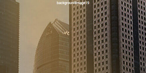
<div class="backgroundImage19">backgroundImage19</div>

<div class="backgroundImage20">backgroundImage20</div>

<div class="backgroundImage21">backgroundImage21</div>
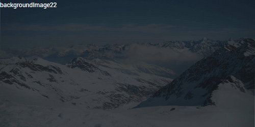
<div class="backgroundImage22">backgroundImage22</div>

<div class="backgroundImage23">backgroundImage23</div>

<div class="backgroundImage24">backgroundImage24</div>

<div class="backgroundImage25">backgroundImage25</div>

<div class="backgroundImage26">backgroundImage26</div>
Short Codes
This skin contains a lot of short codes, it is very easy for you to use even you know nothing about js and css, all you need to do is just copying the short codes to HTML module.
Pricing
You can click the link to check Pricing demo. Demo Link
Style 1:
Below is the screen shot:
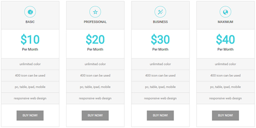
Codes are as follows:
<div class="price-table price-table1  row">
  <div class="col-md-3 col-sm-6">
    <div class="price_title"> <span class="glyphicons glyph-pie-chart"></span>
      <h2> BASIC</h2>
    </div>
    <div class="price_holder">
      <div class="price_box"> <span class="price">$10</span> <span class="unit">Per Month</span> </div>
      <ul>
        <li>unlimited color</li>
        <li>400 icon can be used</li>
        <li>pc, table, ipad, mobile</li>
        <li>responsive web design</li>
      </ul>
      <a href="#" class="btn ">BUY NOW!</a> </div>
  </div>
  <div class="col-md-3 col-sm-6 best_value">
    <div class="price_title "> <span class="glyphicons glyph-dislikes"></span>
      <h2> PROFESSIONAL</h2>
    </div>
    <div class="price_holder">
      <div class="price_box"> <span class="price">$20</span> <span class="unit">Per Month</span> </div>
      <ul>
        <li>unlimited color</li>
        <li>400 icon can be used</li>
        <li>pc, table, ipad, mobile</li>
        <li>responsive web design</li>
      </ul>
      <a href="#" class="btn">BUY NOW!</a> </div>
  </div>
  <div class="col-md-3 col-sm-6">
    <div class="price_title"> <span class="glyphicons glyph-magic"></span>
      <h2> BUSINESS</h2>
    </div>
    <div class="price_holder">
      <div class="price_box"> <span class="price">$30</span> <span class="unit">Per Month</span> </div>
      <ul>
        <li>unlimited color</li>
        <li>400 icon can be used</li>
        <li>pc, table, ipad, mobile</li>
        <li>responsive web design</li>
      </ul>
      <a href="#" class="btn">BUY NOW!</a> </div>
  </div>
  <div class="col-md-3 col-sm-6">
    <div class="price_title"> <span class="glyphicons glyph-globe"></span>
      <h2>MAXIMUM</h2>
    </div>
    <div class="price_holder">
      <div class="price_box"> <span class="price">$40</span> <span class="unit">Per Month</span> </div>
      <ul>
        <li>unlimited color</li>
        <li>400 icon can be used</li>
        <li>pc, table, ipad, mobile</li>
        <li>responsive web design</li>
      </ul>
      <a href="#" class="btn ">BUY NOW!</a> </div>
  </div>
</div>
Option:
col-md-3 col-sm-6is the width for each column. You can change the width you need through value1~12
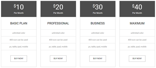
Style 2:
Below is the screen shot:
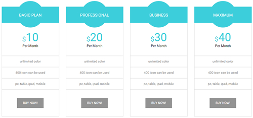
Codes are as follows:
<div class="price-table price-table2 row">
  <div class="col-md-3 col-sm-6">
    <div class="price_title">
      <h2> BASIC PLAN</h2>
    </div>
    <div class="price_holder">
      <div class="price_box">
        <span class="sup">$</span>
        <span class="price">10</span>
        <span class="unit">Per Month</span>
      </div>
      <ul>
        <li>unlimited color</li>
        <li>400 icon can be used</li>
        <li>pc, table, ipad, mobile</li>
      </ul>
      <a class="btn " href="#">BUY NOW!</a>
     </div>
  </div>
  <div class="col-md-3 col-sm-6 best_value">
    <div class="price_title ">
      <h2> PROFESSIONAL</h2>
    </div>
    <div class="price_holder">
      <div class="price_box">
        <span class="sup">$</span>
        <span class="price">20</span>
        <span class="unit">Per Month</span>
      </div>
      <ul>
        <li>unlimited color</li>
        <li>400 icon can be used</li>
        <li>pc, table, ipad, mobile</li>
      </ul>
      <a class="btn" href="#">BUY NOW!</a>
    </div>
  </div>
  <div class="col-md-3 col-sm-6">
    <div class="price_title">
      <h2> BUSINESS</h2>
    </div>
    <div class="price_holder">
      <div class="price_box">
        <span class="sup">$</span>
        <span class="price">30</span>
        <span class="unit">Per Month</span>
      </div>
      <ul>
        <li>unlimited color</li>
        <li>400 icon can be used</li>
        <li>pc, table, ipad, mobile</li>
      </ul>
      <a class="btn" href="#">BUY NOW!</a>
    </div>
  </div>
  <div class="col-md-3 col-sm-6">
    <div class="price_title">
      <h2>MAXIMUM</h2>
    </div>
    <div class="price_holder">
      <div class="price_box">
        <span class="sup">$</span>
        <span class="price">40</span>
        <span class="unit">Per Month</span>
      </div>
      <ul>
        <li>unlimited color</li>
        <li>400 icon can be used</li>
        <li>pc, table, ipad, mobile</li>
      </ul>
      <a class="btn " href="#">BUY NOW!</a>
    </div>
  </div>
</div>
Option:
col-md-3 col-sm-6is the width for each column. You can change the width you need through value1~12
Style 3:
Below is the screen shot:
Codes are as follows:
<div class="price-table price-table3 row">
  <div class="col-md-3 col-sm-6">
    <div class="price_holder">
      <div class="price_box">
        <span class="sup">$</span>
        <span class="price">10</span>
        <span class="unit">Per Month</span>
      </div>
      <div class="price_title">
        <h2> BASIC PLAN</h2>
      </div>
      <ul>
        <li>unlimited color</li>
        <li>400 icon can be used</li>
        <li>pc, table, ipad, mobile</li>
      </ul>
      <a href="#" class="btn ">BUY NOW!</a> </div>
  </div>
  <div class="col-md-3 col-sm-6 best_value">
    <div class="price_holder">
      <div class="price_box">
        <span class="sup">$</span>
        <span class="price">20</span>
        <span class="unit">Per Month</span>
      </div>
      <div class="price_title ">
        <h2> PROFESSIONAL</h2>
      </div>
      <ul>
        <li>unlimited color</li>
        <li>400 icon can be used</li>
        <li>pc, table, ipad, mobile</li>
      </ul>
      <a href="#" class="btn">BUY NOW!</a> </div>
  </div>
  <div class="col-md-3 col-sm-6">
    <div class="price_holder">
      <div class="price_box">
        <span class="sup">$</span>
        <span class="price">30</span>
        <span class="unit">Per Month</span>
      </div>
      <div class="price_title">
        <h2> BUSINESS</h2>
      </div>
      <ul>
        <li>unlimited color</li>
        <li>400 icon can be used</li>
        <li>pc, table, ipad, mobile</li>
      </ul>
      <a href="#" class="btn">BUY NOW!</a> </div>
  </div>
  <div class="col-md-3 col-sm-6">
    <div class="price_holder">
      <div class="price_box">
        <span class="sup">$</span>
        <span class="price">40</span>
        <span class="unit">Per Month</span>
      </div>
      <div class="price_title">
        <h2>MAXIMUM</h2>
      </div>
      <ul>
        <li>unlimited color</li>
        <li>400 icon can be used</li>
        <li>pc, table, ipad, mobile</li>
      </ul>
      <a href="#" class="btn ">BUY NOW!</a> </div>
  </div>
</div>
Option:
col-md-3 col-sm-6is the width for each column. You can change the width you need through value1~12
ProgressBars Counters
You can click the link to check ProgressBars Counters demo. Demo Link
Style 1
Below is the screen shot:
Codes are as follows:
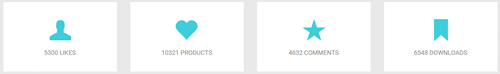
<div class="number_Animation_1 row">
  <div class="col-sm-3">
    <span class="glyphicons glyph-user"> </span>
    <span class="animation  number" data-number="5300">0</span>
  </div>
  <div class="col-sm-3">
    <span class="glyphicons glyph-heart"> </span>
    <span class="animation  number" data-number="10321">0</span>
  </div>
  <div class="col-sm-3">
    <span class="glyphicons glyph-star"> </span>
    <span class="animation  number" data-number="4632">0</span>
  </div>
  <div class="col-sm-3">
    <span class="glyphicons glyph-bookmark"> </span>
    <span class="animation  number" data-number="6548">0</span>
  </div>
</div>
Option:
col-sm-3is the width of each column, you can change the width you need through value1~12- You can change the font icon through
glyphicons glyph-user. font icon list - You can change the value you need to display through
data-number
Style 2
Below is the screen shot:
Codes are as follows:
<div class="chart_list_1 row">
  <div class="col-sm-3">
    <div data-percent="65" class="percentage1">
      <div class="percentage_inner">
        <span>0</span>
        %</div>
    </div>
    <p>HTML5</p>
  </div>
  <div class="col-sm-3">
    <div data-percent="70" class="percentage1">
      <div class="percentage_inner">
        <span>0</span>
        %</div>
    </div>
    <p>PHOTOSHOP</p>
  </div>
  <div class="col-sm-3">
    <div data-percent="85" class="percentage1">
      <div class="percentage_inner">
        <span>0</span>
        %</div>
    </div>
    <p>CORELDRAW</p>
  </div>
  <div class="col-sm-3">
    <div data-percent="92" class="percentage1">
      <div class="percentage_inner">
        <span>0</span>
        %</div>
    </div>
    <p>CSS3</p>
  </div>
</div>
Option:
col-sm-3is the width of each column, you can change the width you need through value1~12data-percentis for controlling the percentage that displays, you can display percentage through value0~100
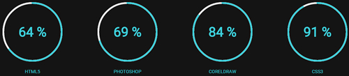
Style 3
Below is the screen shot:
Codes are as follows:
<div class="loaded_list_1">
  <p>PHOTOSHOP </p>
  <div class="progress">
    <div class="bar animation animationwidth" data-width="90%">
      <span></span>
    </div>
  </div>
  <p>ILLUSTRATOR</p>
  <div class="progress">
    <div class="bar animation animationwidth" data-width="95%">
      <span></span>
    </div>
  </div>
  <p>COREL DRAWL</p>
  <p> </p>
  <div class="progress">
    <div class="bar animation animationwidth" data-width="85%">
      <span></span>
    </div>
  </div>
  <p>DNN</p>
  <div class="progress">
    <div class="bar animation animationwidth" data-width="75%">
      <span></span>
    </div>
  </div>
</div>
<div class="loaded_list_2">
  <p>PHOTOSHOP </p>
  <div class="progress">
    <div class="bar animation animationwidth" data-width="90%">
      <span></span>
    </div>
  </div>
  <p>ILLUSTRATOR</p>
  <div class="progress">
    <div class="bar animation animationwidth" data-width="95%">
      <span></span>
    </div>
  </div>
  <p>COREL DRAWL</p>
  <p> </p>
  <div class="progress">
    <div class="bar animation animationwidth" data-width="85%">
      <span></span>
    </div>
  </div>
  <p>DNN</p>
  <div class="progress">
    <div class="bar animation animationwidth" data-width="75%">
      <span></span>
    </div>
  </div>
</div>
Option:
data-widthis for controlling the percentage that displays, you can display percentage through value0~100
Style 4
Below is the screen shot:
Codes are as follows:
<div class="number_Animation_2 row">
  <div class="col-sm-3">
    <div class="box">
      <span class="glyphicons glyph-user"> </span>
      <span data-number="5300" class="animation  number">0</span>
      LIKES </div>
  </div>
  <div class="col-sm-3">
    <div class="box">
      <span class="glyphicons glyph-heart"> </span>
      <span data-number="10321" class="animation  number">0</span>
      PRODUCTS </div>
  </div>
  <div class="col-sm-3">
    <div class="box">
      <span class="glyphicons glyph-star"> </span>
      <span data-number="4632" class="animation  number">0</span>
      COMMENTS </div>
  </div>
  <div class="col-sm-3">
    <div class="box">
      <span class="glyphicons glyph-bookmark"> </span>
      <span data-number="6548" class="animation  number">0</span>
      DOWNLOADS </div>
  </div>
</div>
Option:
col-md-3is the width of each column, you can change the width you need through value1~12- You can change the font icon through
glyphicons glyph-user. font icon list - You can change the value you need to display through
data-number
Testimonials
You can click the link to check Testimonials demo. Demo Link
Option:
Testimonials includes the parameters that listed below.
data-position |
Switch mode. fade:fade in fade out, roll-left:roll from side to side, roll-vertical:roll up and down |
data-display-navigation |
Navigation display and hidden. Default to true. true:Display, false:hidden |
data-display-arrows |
Left/right arrow display and hidden. Default to true. true:Display, false:hidden |
data-autoplay |
Whether to scroll automatically or not. 0 is for not scrolling automatically, numbers greater than 0 are for scrolling automatically, and these numbers are the time interval for scrolling. Default to 3000 |
data-autoheight |
Whether to be automatic height or not, default to true. true: automatic height, false: fixed height.< |
Example:
<ul class=" Testimonials_tab" data-position="roll-vertical" data-display-navigation="true" data-display-arrows="true" data-display-navigation="false" data-autoplay="3000" data-autoheight="true">
  <li>
    <h3 class="title a_t_c">What Others Say About Us ?</h3>
		......
Style 1:
Below is the screen shot:
Codes are as follows:
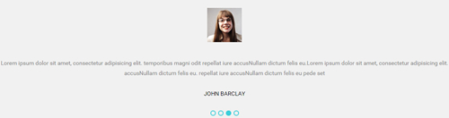
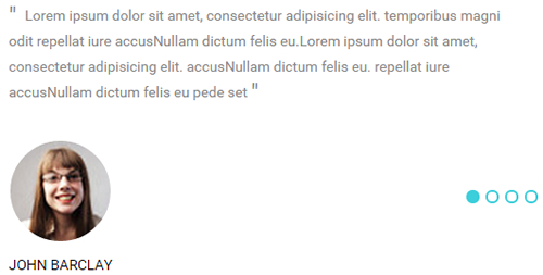
<ul class=" Testimonials_tab Testimonials_1" data-position="roll-left" data-display-arrows="false" data-autoplay="3000">
  <li>
    <blockquote>
      <span class="pic"><img alt="" src="/portals/33/portrait_1.jpg" /></span>
      <p>Content Text 1 ... </p>
      <small>JOHN BARCLAY</small> </blockquote>
  </li>
  <li>
    <blockquote>
      <span class="pic"><img alt="" src="/portals/33/portrait_1.jpg" /></span>
      <p>Content Text 2 ... </p>
      <small>JOHN BARCLAY</small> </blockquote>
  </li>
  <li>
    <blockquote>
      <span class="pic"><img alt="" src="/portals/33/portrait_1.jpg" /></span>
      <p>Content Text 3 ... </p>
      <small>JOHN BARCLAY</small> </blockquote>
  </li>
  <li>
    <blockquote>
      <span class="pic"><img alt="" src="/portals/33/portrait_1.jpg" /></span>
      <p>Content Text 4 ... </p>
      <small>JOHN BARCLAY</small> </blockquote>
  </li>
</ul>
Style 2:
Below is the screen shot:
Codes are as follows:
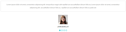
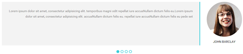
<ul class=" Testimonials_tab Testimonials_2" data-position="fade" data-display-arrows="false" data-autoplay="0">
  <li>
    <blockquote>
      <p>Content Text 1 ...</p>
      <small>
      <span class="pic"><img alt="" src="/portals/33/portrait_1.jpg" /></span>
      JOHN BARCLAY</small> </blockquote>
  </li>
  <li>
    <blockquote>
      <p>Content Text 2 ... </p>
      <small>
      <span class="pic"><img alt="" src="/portals/33/portrait_1.jpg" /></span>
      JOHN BARCLAY</small> </blockquote>
  </li>
  <li>
    <blockquote>
      <p>Content Text 3 ...</p>
      <small>
      <span class="pic"><img alt="" src="/portals/33/portrait_1.jpg" /></span>
      JOHN BARCLAY</small> </blockquote>
  </li>
  <li>
    <blockquote>
      <p>Content Text 4 ... </p>
      <small>
      <span class="pic"><img alt="" src="/portals/33/portrait_1.jpg" /></span>
      JOHN BARCLAY</small> </blockquote>
  </li>
</ul>
Style 3:
Below is the screen shot:
Codes are as follows:
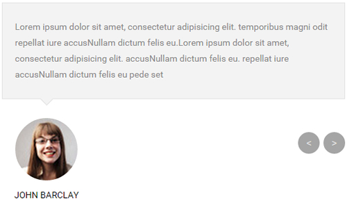
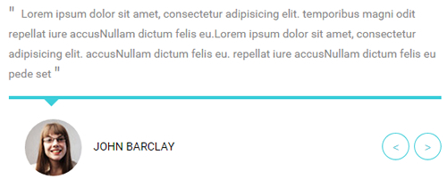
<ul class=" Testimonials_tab Testimonials_3" data-position="fade" data-display-navigation="false" data-autoplay="0">
    <li>
    <blockquote>
    <p>Content Text 1 ... </p>
    <small><span class="pic"><img alt="" src="/portals/33/portrait_1.jpg" /></span>JOHN BARCLAY</small> </blockquote>
    </li>
    <li>
    <blockquote>
    <p>Content Text 2 ... </p>
    <small><span class="pic"><img alt="" src="/portals/33/portrait_1.jpg" /></span>JOHN BARCLAY</small> </blockquote>
    </li>
    <li>
    <blockquote>
    <p>Content Text 3 ... </p>
    <small><span class="pic"><img alt="" src="/portals/33/portrait_1.jpg" /></span>JOHN BARCLAY</small> </blockquote>
    </li>
    <li>
    <blockquote>
    <p>Content Text 4 ... </p>
    <small><span class="pic"><img alt="" src="/portals/33/portrait_1.jpg" /></span>JOHN BARCLAY</small> </blockquote>
    </li>
</ul>
Style 4:
Below is the screen shot:
Codes are as follows:
<ul class=" Testimonials_tab Testimonials_4" data-position="fade" data-display-arrows="false" data-autoplay="0">
  <li>
    <blockquote>
      <p>Content Text 1 ... </p>
      <small>
      <span class="pic"><img alt="" src="/portals/33/portrait_1.jpg" /></span>
      JOHN BARCLAY</small> </blockquote>
  </li>
  <li>
    <blockquote>
      <p>Content Text 2 ... </p>
      <small>
      <span class="pic"><img alt="" src="/portals/33/portrait_1.jpg" /></span>
      JOHN BARCLAY</small> </blockquote>
  </li>
  <li>
    <blockquote>
      <p>Content Text 3 ... </p>
      <small>
      <span class="pic"><img alt="" src="/portals/33/portrait_1.jpg" /></span>
      JOHN BARCLAY</small> </blockquote>
  </li>
  <li>
    <blockquote>
      <p>Content Text 4 ... </p>
      <small>
      <span class="pic"><img alt="" src="/portals/33/portrait_1.jpg" /></span>
      JOHN BARCLAY</small> </blockquote>
  </li>
</ul>
Style 5:
Below is the screen shot:
Codes are as follows:
<ul class=" Testimonials_tab Testimonials_5" data-position="roll-vertical" data-display-arrows="false" data-autoplay="0">
  <li>
    <blockquote>
      <p>Content Text 1 ...</p>
      <small>
      <span class="pic"><img alt="" src="/portals/33/portrait_1.jpg" /></span>
      JOHN BARCLAY</small> </blockquote>
  </li>
  <li>
    <blockquote>
      <p>Content Text 2 ...</p>
      <small>
      <span class="pic"><img alt="" src="/portals/33/portrait_1.jpg" /></span>
      JOHN BARCLAY</small> </blockquote>
  </li>
  <li>
    <blockquote>
      <p>Content Text 3 ...</p>
      <small>
      <span class="pic"><img alt="" src="/portals/33/portrait_1.jpg" /></span>
      JOHN BARCLAY</small> </blockquote>
  </li>
  <li>
    <blockquote>
      <p>Content Text 4 ...</p>
      <small>
      <span class="pic"><img alt="" src="/portals/33/portrait_1.jpg" /></span>
      JOHN BARCLAY</small> </blockquote>
  </li>
</ul>
Style 6:
Below is the screen shot:
Codes are as follows:
<ul class=" Testimonials_tab Testimonials_6" data-position="fade" data-display-navigation="false" data-autoplay="0">
  <li>
    <blockquote>
      <p>Content Text 1 ... </p>
      <small>
      <span class="pic"><img alt="" src="/portals/33/portrait_1.jpg" /></span>
      JOHN BARCLAY</small> </blockquote>
  </li>
  <li>
    <blockquote>
      <p>Content Text 2 ... </p>
      <small>
      <span class="pic"><img alt="" src="/portals/33/portrait_1.jpg" /></span>
      JOHN BARCLAY</small> </blockquote>
  </li>
  <li>
    <blockquote>
      <p>Content Text 3 ... </p>
      <small>
      <span class="pic"><img alt="" src="/portals/33/portrait_1.jpg" /></span>
      JOHN BARCLAY</small> </blockquote>
  </li>
  <li>
    <blockquote>
      <p>Content Text 4 ... </p>
      <small>
      <span class="pic"><img alt="" src="/portals/33/portrait_1.jpg" /></span>
      JOHN BARCLAY</small> </blockquote>
  </li>
</ul>
Style 7:
Below is the screen shot:
Codes are as follows:
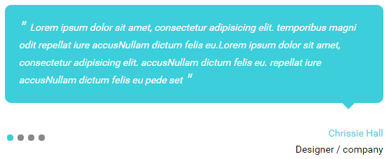
<ul class=" Testimonials_tab Testimonials_7" data-position="roll-left" data-display-arrows="false" data-autoplay="0">
  <li>
    <blockquote>
      <p>Content Text 1 ... </p>
      <small>
      <span>Chrissie Hall </span>
      Designer / company</small> </blockquote>
  </li>
  <li>
    <blockquote>
      <p>Content Text 2 ... </p>
      <small>
      <span>Chrissie Hall </span>
      Designer / company</small> </blockquote>
  </li>
  <li>
    <blockquote>
      <p>Content Text 3 ... </p>
      <small>
      <span>Chrissie Hall </span>
      Designer / company</small> </blockquote>
  </li>
  <li>
    <blockquote>
      <p>Content Text 4 ... </p>
      <small>
      <span>Chrissie Hall </span>
      Designer / company</small> </blockquote>
  </li>
</ul>
Responsive Tab
You can click the link to check Responsive Tab demo. Demo Link
You can add the "resp-tabs-list" of "li" to add tab item, and add the "resp-tabs-container" of "resp_container" to add content
Example:
<div class="horizontalTab_Top">
  <ul class="resp-tabs-list">

    <li> Tab1 </li>
    <li> Tab2 </li>
    ....

  </ul>
  <div class="resp-tabs-container">

    <div class="resp_container"> Tab1 Content </div>
    <div class="resp_container"> Tab2 Content </div>
    ....

  </div>
</div>
Style 1:
Below is the screen shot:
Codes are as follows:
<div class="horizontalTab_Top horizontalTab_Top_1">
  <ul class="resp-tabs-list">
    <li>
      <span>FIRST TAB</span>
    </li>
    <li>
      <span>SECOND TAB</span>
    </li>
  </ul>
  <div class="resp-tabs-container">
    <div class="resp_container">
      <div class="resp_margin"> Content Text 1 ... </div>
    </div>
    <div class="resp_container">
      <div class="resp_margin"> Content Text 2 ... </div>
    </div>
  </div>
</div>
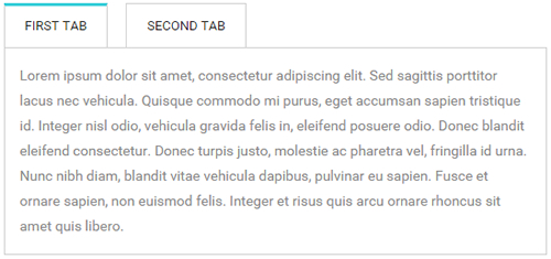
Style 2:
Below is the screen shot:
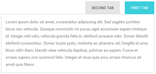
Codes are as follows:
<div class="horizontalTab_Top horizontalTab_Top_2">
  <ul class="resp-tabs-list">
    <li>
      <span>FIRST TAB</span>
    </li>
    <li>
      <span>SECOND TAB</span>
    </li>
  </ul>
  <div class="resp-tabs-container">
    <div class="resp_container">
      <div class="resp_margin"> Content Text 1 ... </div>
    </div>
    <div class="resp_container">
      <div class="resp_margin"> Content Text 2 ... </div>
    </div>
  </div>
</div>
Style 3:
Below is the screen shot:
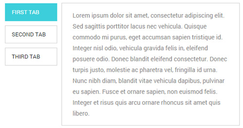
Codes are as follows:
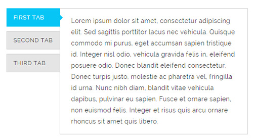
<div class="verticalTab_Left verticalTab_Left_1">
  <ul class="resp-tabs-list">
    <li>
      <span>FIRST TAB</span>
    </li>
    <li>
      <span>SECOND TAB</span>
    </li>
    <li>
      <span>THIRD TAB</span>
    </li>
  </ul>
  <div class="resp-tabs-container">
    <div class="resp_container">
      <div class="resp_margin"> Content Text 1 ... </div>
    </div>
    <div class="resp_container">
      <div class="resp_margin"> Content Text 2 ... </div>
    </div>
    <div class="resp_container">
      <div class="resp_margin"> Content Text 3 ... </div>
    </div>
  </div>
</div>
Style 4:
Below is the screen shot:
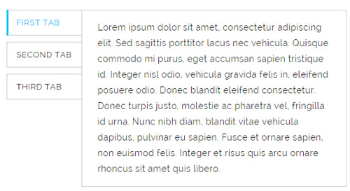
Codes are as follows:
<div class="pb-20">
  <div class="verticalTab_Left verticalTab_Left_2">
    <ul class="resp-tabs-list">
      <li> <span>FIRST TAB</span> </li>
      <li> <span>SECOND TAB</span> </li>
      <li> <span>THIRD TAB</span> </li>
    </ul>
    <div class="resp-tabs-container">
      <div class="resp_container">
        <div class="resp_margin">Content Text 1...</div>
      </div>
      <div class="resp_container">
        <div class="resp_margin">Content Text 2...</div>
      </div>
      <div class="resp_container">
        <div class="resp_margin">Content Text 3...</div>
      </div>
    </div>
  </div>
</div>
Style 5:
Below is the screen shot:
Codes are as follows:
<div class="pb-20">
  <div class="verticalTab_Left verticalTab_Left_3">
    <ul class="resp-tabs-list">
      <li> <span>FIRST TAB</span> </li>
      <li> <span>SECOND TAB</span> </li>
      <li> <span>THIRD TAB</span> </li>
    </ul>
    <div class="resp-tabs-container">
      <div class="resp_container">
        <div class="resp_margin">Content Text 1...</div>
      </div>
      <div class="resp_container">
        <div class="resp_margin">Content Text 2...</div>
      </div>
      <div class="resp_container">
        <div class="resp_margin">Content Text 3...</div>
      </div>
    </div>
  </div>
</div>
Style 6:
Below is the screen shot:
Codes are as follows:
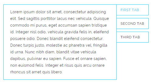
<div class="verticalTab_Right  verticalTab_Right_1">
  <ul class="resp-tabs-list">
    <li> <span>FIRST TAB</span> </li>
    <li> <span>SECOND TAB</span> </li>
    <li> <span>THIRD TAB</span> </li>
  </ul>
  <div class="resp-tabs-container">
    <div class="resp_container">
      <div class="resp_margin">Content Text 1...</div>
    </div>
    <div class="resp_container">
      <div class="resp_margin">Content Text 2...</div>
    </div>
    <div class="resp_container">
      <div class="resp_margin">Content Text 3...</div>
    </div>
  </div>
</div>
Style 7:
Below is the screen shot:
Codes are as follows:
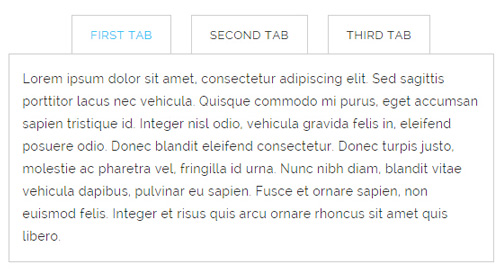
<div class="horizontalTab_Top horizontalTab_Top_5">
  <ul class="resp-tabs-list">
    <li> <span>FIRST TAB</span> </li>
    <li> <span>SECOND TAB</span> </li>
    <li> <span>THIRD TAB</span> </li>
  </ul>
  <div class="resp-tabs-container">
    <div class="resp_container">
      <div class="resp_margin"> Content Text 1... </div>
    </div>
    <div class="resp_container">
      <div class="resp_margin"> Content Text 2... </div>
    </div>
    <div class="resp_container">
      <div class="resp_margin"> Content Text 3... </div>
    </div>
  </div>
</div>
Style 8:
Below is the screen shot:
Codes are as follows:
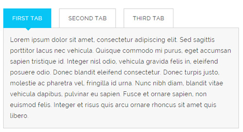
<div class="horizontalTab_Top horizontalTab_Top_6">
  <ul class="resp-tabs-list">
    <li> <span>FIRST TAB</span> </li>
    <li> <span>SECOND TAB</span> </li>
    <li> <span>THIRD TAB</span> </li>
  </ul>
  <div class="resp-tabs-container">
    <div class="resp_container">
      <div class="resp_margin">Content Text 1...</div>
    </div>
    <div class="resp_container">
      <div class="resp_margin">Content Text 2...</div>
    </div>
    <div class="resp_container">
      <div class="resp_margin">Content Text 3...</div>
    </div>
  </div>
</div>
Accordions
You can click the link to check Accordions demo. Demo Link
Option:
- id="accordion" of each accordions effect needs using different names.
"data-parent"needs to have the same name asid- href="#collapse1" is the id that needs to expand content.
- id="collapse1" is the content that needs to expand.
<div class="panel-group" id="accordion">

  <div class="panel panel-default">
    <div class="panel-heading">
      <h4 class="panel-title"> <a data-toggle="collapse" data-parent="#accordion" href="#collapse1"> Title Text ... </a> </h4>
    </div>
    <div id="collapse1" class="panel-collapse collapse in">
      <div class="panel-body">Content Text ... </div>
    </div>
  </div>
  ....

</div>
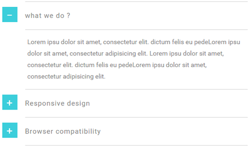
Style 1:
Below is the screen shot:
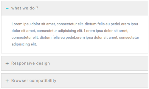
Codes are as follows:
<div class="panel-group accordion_1" id="accordion1">
  <div class="panel panel-default">
    <div class="panel-heading">
      <h4 class="panel-title"> <a data-toggle="collapse" data-parent="#accordion1" href="#collapse1_1">
        <span class="accordion_icon"></span>
        what we do ?</a> </h4>
    </div>
    <div id="collapse1_1" class="panel-collapse collapse in">
      <div class="panel-body">Content Text 1 ... </div>
    </div>
  </div>
  <div class="panel panel-default">
    <div class="panel-heading">
      <h4 class="panel-title"> <a data-toggle="collapse" data-parent="#accordion1" href="#collapse1_2" class="collapsed">
        <span class="accordion_icon"></span>
        Responsive design </a> </h4>
    </div>
    <div id="collapse1_2" class="panel-collapse collapse">
      <div class="panel-body">Content Text 2 ... </div>
    </div>
  </div>
  <div class="panel panel-default">
    <div class="panel-heading">
      <h4 class="panel-title"> <a data-toggle="collapse" data-parent="#accordion1" href="#collapse1_3" class="collapsed">
        <span class="accordion_icon"></span>
        Browser compatibility </a> </h4>
    </div>
    <div id="collapse1_3" class="panel-collapse collapse">
      <div class="panel-body">Content Text 3 ... </div>
    </div>
  </div>
</div>
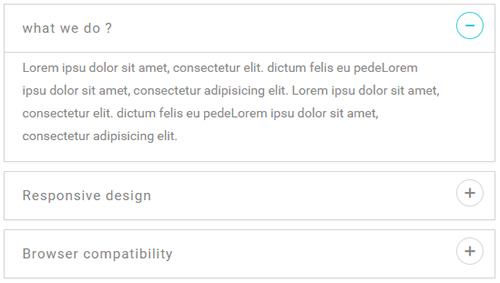
Style 2:
Below is the screen shot:
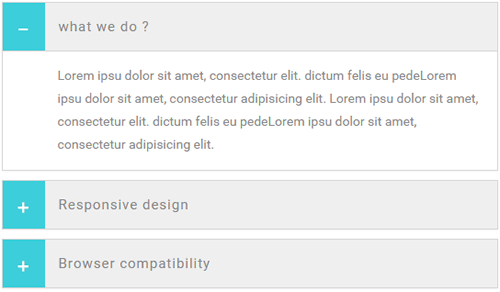
Codes are as follows:
<div class="panel-group accordion_2" id="accordion2">
  <div class="panel panel-default">
    <div class="panel-heading">
      <h4 class="panel-title"> <a data-toggle="collapse" data-parent="#accordion2" href="#collapse2_1">
        <span class="accordion_icon"></span>
        what we do ?</a> </h4>
    </div>
    <div id="collapse2_1" class="panel-collapse collapse in">
      <div class="panel-body">Content Text 1 ... </div>
    </div>
  </div>
  <div class="panel panel-default">
    <div class="panel-heading">
      <h4 class="panel-title"> <a data-toggle="collapse" data-parent="#accordion2" href="#collapse2_2" class="collapsed">
        <span class="accordion_icon"></span>
        Responsive design </a> </h4>
    </div>
    <div id="collapse2_2" class="panel-collapse collapse">
      <div class="panel-body">Content Text 2 ... </div>
    </div>
  </div>
  <div class="panel panel-default">
    <div class="panel-heading">
      <h4 class="panel-title"> <a data-toggle="collapse" data-parent="#accordion2" href="#collapse2_3" class="collapsed">
        <span class="accordion_icon"></span>
        Browser compatibility </a> </h4>
    </div>
    <div id="collapse2_3" class="panel-collapse collapse">
      <div class="panel-body">Content Text 3 ... </div>
    </div>
  </div>
</div>
Style 3:
Below is the screen shot:
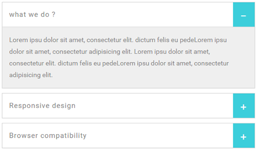
Codes are as follows:
<div class="panel-group accordion_3" id="accordion3">
  <div class="panel panel-default">
    <div class="panel-heading">
      <h4 class="panel-title"> <a data-toggle="collapse" data-parent="#accordion3" href="#collapse3_1"><span class="accordion_icon"></span>what we do ?</a> </h4>
    </div>
    <div id="collapse3_1" class="panel-collapse collapse in">
      <div class="panel-body">Content Text 1 ...  </div>
    </div>
  </div>
  <div class="panel panel-default">
    <div class="panel-heading">
      <h4 class="panel-title"> <a data-toggle="collapse" data-parent="#accordion3" href="#collapse3_2" class="collapsed"><span class="accordion_icon"></span>Responsive design </a> </h4>
    </div>
    <div id="collapse3_2" class="panel-collapse collapse">
      <div class="panel-body">Content Text 2 ...  </div>
    </div>
  </div>
  <div class="panel panel-default">
    <div class="panel-heading">
      <h4 class="panel-title"> <a data-toggle="collapse" data-parent="#accordion3" href="#collapse3_3" class="collapsed"><span class="accordion_icon"></span>Browser compatibility </a> </h4>
    </div>
    <div id="collapse3_3" class="panel-collapse collapse">
      <div class="panel-body">Content Text 3 ...  </div>
    </div>
  </div>
</div>
Style 4:
Below is the screen shot:
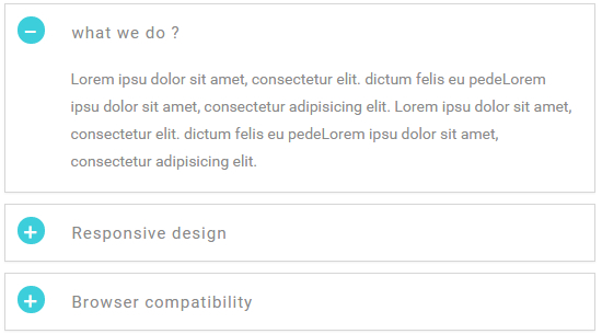
Codes are as follows:
<div class="panel-group accordion_4" id="accordion4">
  <div class="panel panel-default">
    <div class="panel-heading">
      <h4 class="panel-title"> <a data-toggle="collapse" data-parent="#accordion4" href="#collapse4_1"><span class="accordion_icon"></span>what we do ?</a> </h4>
    </div>
    <div id="collapse4_1" class="panel-collapse collapse in">
      <div class="panel-body">Content Text 1 ... </div>
    </div>
  </div>
  <div class="panel panel-default">
    <div class="panel-heading">
      <h4 class="panel-title"> <a data-toggle="collapse" data-parent="#accordion4" href="#collapse4_2" class="collapsed"><span class="accordion_icon"></span>Responsive design </a> </h4>
    </div>
    <div id="collapse4_2" class="panel-collapse collapse">
      <div class="panel-body">Content Text 2 ... </div>
    </div>
  </div>
  <div class="panel panel-default">
    <div class="panel-heading">
      <h4 class="panel-title"> <a data-toggle="collapse" data-parent="#accordion4" href="#collapse4_3" class="collapsed"><span class="accordion_icon"></span>Browser compatibility </a> </h4>
    </div>
    <div id="collapse4_3" class="panel-collapse collapse">
      <div class="panel-body">Content Text 3 ... </div>
    </div>
  </div>
</div>
Style 5:
Below is the screen shot:
Codes are as follows:
<div class="panel-group accordion_5" id="accordion5">
  <div class="panel panel-default">
    <div class="panel-heading">
      <h4 class="panel-title"> <a data-toggle="collapse" data-parent="#accordion5" href="#collapse5_1"><span class="accordion_icon"></span>what we do ?</a> </h4>
    </div>
    <div id="collapse5_1" class="panel-collapse collapse in">
      <div class="panel-body">Content Text 1 ...</div>
    </div>
  </div>
  <div class="panel panel-default">
    <div class="panel-heading">
      <h4 class="panel-title"> <a data-toggle="collapse" data-parent="#accordion5" href="#collapse5_2" class="collapsed"><span class="accordion_icon"></span>Responsive design </a> </h4>
    </div>
    <div id="collapse5_2" class="panel-collapse collapse">
      <div class="panel-body">Content Text 1 ...</div>
    </div>
  </div>
  <div class="panel panel-default">
    <div class="panel-heading">
      <h4 class="panel-title"> <a data-toggle="collapse" data-parent="#accordion5" href="#collapse5_3" class="collapsed"><span class="accordion_icon"></span>Browser compatibility </a> </h4>
    </div>
    <div id="collapse5_3" class="panel-collapse collapse">
      <div class="panel-body">Content Text 1 ...</div>
    </div>
  </div>
</div>
Style 6:
Below is the screen shot:
Codes are as follows:
<div class="panel-group accordion_6" id="accordion6">
  <div class="panel panel-default">
    <div class="panel-heading">
      <h4 class="panel-title"> <a data-toggle="collapse" data-parent="#accordion6" href="#collapse6_1"><span class="accordion_icon"></span>what we do ?</a> </h4>
    </div>
    <div id="collapse6_1" class="panel-collapse collapse in">
      <div class="panel-body">Content Text 1 ... </div>
    </div>
  </div>
  <div class="panel panel-default">
    <div class="panel-heading">
      <h4 class="panel-title"> <a data-toggle="collapse" data-parent="#accordion6" href="#collapse6_2" class="collapsed"><span class="accordion_icon"></span>Responsive design </a> </h4>
    </div>
    <div id="collapse6_2" class="panel-collapse collapse">
      <div class="panel-body">Content Text 1 ... </div>
    </div>
  </div>
  <div class="panel panel-default">
    <div class="panel-heading">
      <h4 class="panel-title"> <a data-toggle="collapse" data-parent="#accordion6" href="#collapse6_3" class="collapsed"><span class="accordion_icon"></span>Browser compatibility </a> </h4>
    </div>
    <div id="collapse6_3" class="panel-collapse collapse">
      <div class="panel-body">Content Text 1 ... </div>
    </div>
  </div>
</div>
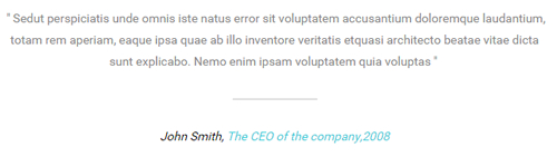
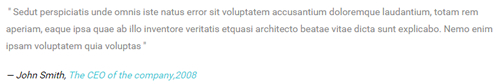
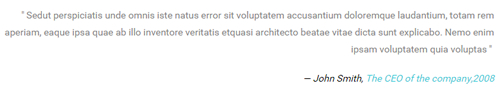
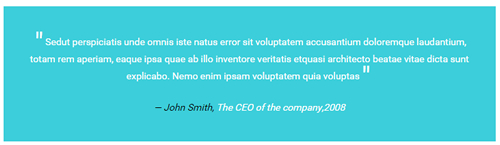
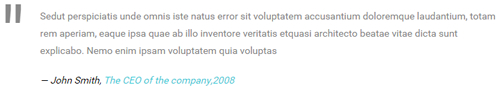
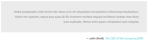
Quotes
You can click the link to check Quotes demo. Demo Link
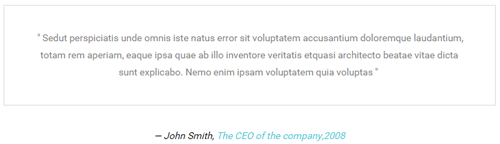
<div class="quotes_1">
  <blockquote>
    <p>Content Text 1 ...</p>
    <small>John Smith, <span>The CEO of the company,2008</span></small> </blockquote>
</div>
<div class="quotes_2">
  <blockquote>
    <p>Content Text 2 ...</p>
    <small>John Smith, <span>The CEO of the company,2008</span></small> </blockquote>
</div>
<div class="quotes_3">
  <blockquote>
    <p>Content Text 3 ...</p>
    <small>John Smith, <span>The CEO of the company,2008</span></small> </blockquote>
</div>
<div class="quotes_4">
  <blockquote>
    <p>Content Text 4 ...</p>
    <small>John Smith, <span>The CEO of the company,2008</span></small> </blockquote>
</div>
<div class="quotes_5">
  <blockquote>
    <p>Content Text 5 ...</p>
    <small>John Smith, <span>The CEO of the company,2008</span></small> </blockquote>
</div>
<div class="quotes_6">
  <blockquote>
    <p>Content Text 6 ...</p>
    <small>John Smith, <span>The CEO of the company,2008</span></small> </blockquote>
</div>
<div class="quotes_7">
  <blockquote>
    <p>Content Text 7 ...</p>
    <small>John Smith, <span>The CEO of the company,2008</span></small> </blockquote>
</div>
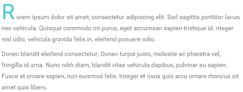
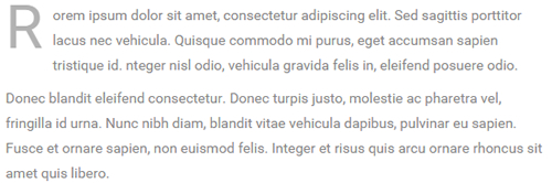
Dropcaps
You can click the link to check Dropcaps demo. Demo Link
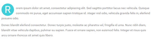
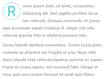
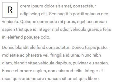
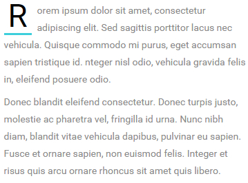
<span class="dropcaps_1">R</span> Content Text ...
<span class="dropcaps_2">R</span> Content Text ...
<span class="dropcaps_3">R</span> Content Text ...
<span class="dropcaps_4">R</span> Content Text ...
<span class="dropcaps_5">R</span> Content Text ...
<span class="dropcaps_6">R</span> Content Text ...
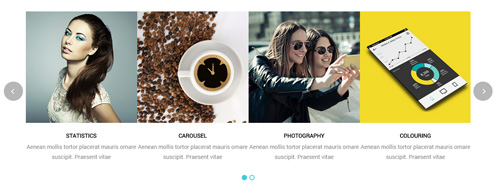
Carousel
You can click the link to check Carousel demo. Demo Link
Style 1:
Below is the screen shot:
Codes are as follows:
<div class="carousel carousel_1" data-items="4" data-navigation="true" data-pagination="true" data-autoplay="true">
  <div class="item">
    <div class="photo_box"> <a href="/Portals/33/carousel_01.jpg" class="LightBox_image_gallery1" title="Image Gallery">
      <div class="pic_box"> <img alt="" src="/portals/33/carousel_01.jpg" />
        <div class="ico"> <span class="glyphicons glyph-picture"></span> </div>
        <div class="shade"></div>
      </div>
      </a> </div>
    <h3>CAROUSEL</h3>
    <p>Content text ... </p>
  </div>
  <div class="item">
    <div class="photo_box"> <a href="/Portals/33/carousel_02.jpg" class="LightBox_image_gallery1" title="Image Gallery">
      <div class="pic_box"> <img alt="" src="/portals/33/carousel_02.jpg" />
        <div class="ico"> <span class="glyphicons glyph-picture"></span> </div>
        <div class="shade"></div>
      </div>
      </a> </div>
    <h3>PHOTOGRAPHY</h3>
    <p>Content text ... </p>
  </div>
  <div class="item">
    <div class="photo_box"> <a href="/Portals/33/carousel_03.jpg" class="LightBox_image_gallery1" title="Image Gallery">
      <div class="pic_box"> <img alt="" src="/portals/33/carousel_03.jpg" />
        <div class="ico"> <span class="glyphicons glyph-picture"></span> </div>
        <div class="shade"></div>
      </div>
      </a> </div>
    <h3>COLOURING</h3>
    <p>Content text ... </p>
  </div>
  <div class="item">
    <div class="photo_box"> <a href="/Portals/33/carousel_04.jpg" class="LightBox_image_gallery1" title="Image Gallery">
      <div class="pic_box"> <img alt="" src="/portals/33/carousel_04.jpg" />
        <div class="ico"> <span class="glyphicons glyph-picture"></span> </div>
        <div class="shade"></div>
      </div>
      </a> </div>
    <h3>STATISTICS</h3>
    <p>Content text ... </p>
  </div>
  <div class="item">
    <div class="photo_box"> <a href="/Portals/33/carousel_01.jpg" class="LightBox_image_gallery1" title="Image Gallery">
      <div class="pic_box"> <img alt="" src="/portals/33/carousel_01.jpg" />
        <div class="ico"> <span class="glyphicons glyph-picture"></span> </div>
        <div class="shade"></div>
      </div>
      </a> </div>
    <h3>CAROUSEL</h3>
    <p>Content text ... </p>
  </div>
  <div class="item">
    <div class="photo_box"> <a href="/Portals/33/carousel_02.jpg" class="LightBox_image_gallery1" title="Image Gallery">
      <div class="pic_box"> <img alt="" src="/portals/33/carousel_02.jpg" />
        <div class="ico"> <span class="glyphicons glyph-picture"></span> </div>
        <div class="shade"></div>
      </div>
      </a> </div>
    <h3>PHOTOGRAPHY</h3>
    <p>Content text ... </p>
  </div>
  <div class="item">
    <div class="photo_box"> <a href="/Portals/33/carousel_03.jpg" class="LightBox_image_gallery1" title="Image Gallery">
      <div class="pic_box"> <img alt="" src="/portals/33/carousel_03.jpg" />
        <div class="ico"> <span class="glyphicons glyph-picture"></span> </div>
        <div class="shade"></div>
      </div>
      </a> </div>
    <h3>COLOURING</h3>
    <p>Content text ... </p>
  </div>
  <div class="item">
    <div class="photo_box"> <a href="/Portals/33/carousel_04.jpg" class="LightBox_image_gallery1" title="Image Gallery">
      <div class="pic_box"> <img alt="" src="/portals/33/carousel_04.jpg" />
        <div class="ico"> <span class="glyphicons glyph-picture"></span> </div>
        <div class="shade"></div>
      </div>
      </a> </div>
    <h3>STATISTICS</h3>
    <p>Content text ... </p>
  </div>
</div>
Option:
- You can increase your content items through adding
<div class="item"></div> - You can add image style effects through effects of imageeffects page.
- You can add image enlargement effect through the effect of lightbox page.
| Variable | Default | Type | Description |
|---|---|---|---|
data-items |
4 | int | This variable allows you to set the maximum amount of items displayed at a time with the widest browser width. |
data-navigation |
true | boolean | Display "next" and "prev" buttons. |
data-pagination |
true | boolean | Show pagination. |
data-autoplay |
true | int/boolean | Change to any integrer for example data-autoplay ="5000" to play every 5 seconds. If you set data-autoplay="false" Stop auto scroll animation. |
Example:
<div class="carousel" data-items="4" data-navigation="true" data-pagination="true" data-autoplay="true">
  <div class="item">
		...
Style 2:
Below is the screen shot:

Codes are as follows:
<div class="carousel carousel_2" data-pagination="false" data-navigation="true" data-autoplay="true" data-autoheight="true">
  <div class="item"> <img alt="" src="/portals/33/carousel_05.jpg" /> </div>
  <div class="item"> <img alt="" src="/portals/33/carousel_06.jpg" /> </div>
  <div class="item"> <img alt="" src="/portals/33/carousel_07.jpg" /> </div>
</div>
Option:
- You can increase your content items through adding
<div class="item"></div>
| Variable | Default | Type | Description |
|---|---|---|---|
data-navigation |
true | boolean | Display "next" and "prev" buttons. |
data-pagination |
true | boolean | Show pagination. |
data-autoplay |
true | int/boolean | Change to any integrer for example data-autoplay ="5000" to play every 5 seconds. If you set data-autoplay="false" Stop auto scroll animation. |
data-autoheight |
true | boolean | Add height to owl-wrapper-outer so you can use diffrent heights on slides. Use it only for one item per page setting. |
Example:
<div class="carousel" data-navigation="true" data-pagination="true" data-autoplay="true" data-autoheight="true">
  <div class="item">
		...
Style 3:
Below is the screen shot:

Codes are as follows:
<div class="carousel carousel_3" data-autoplay="true" data-pagination="true" data-navigation="true" data-items="4">
  <div class="item">
    <div class="photo_box img_zoom ico_zoom"> <a href="#">
      <div class="pic_box"> <img alt="" src="/portals/33/carousel_08.jpg" />
        <div class="content">
          <div class="vertical_center_1">
            <div class="vertical_center_2">
              <div class="ico"><span class="glyphicons glyph-link"></span></div>
              <h3>IMAGE TITLE</h3>
              <p>Photos,Design</p>
            </div>
          </div>
        </div>
        <div class="shade"></div>
      </div>
      </a> </div>
  </div>
  <div class="item">
    <div class="photo_box img_zoom ico_zoom"> <a href="#">
      <div class="pic_box"> <img alt="" src="/portals/33/carousel_09.jpg" />
        <div class="content">
          <div class="vertical_center_1">
            <div class="vertical_center_2">
              <div class="ico"><span class="glyphicons glyph-link"></span></div>
              <h3>IMAGE TITLE</h3>
              <p>Photos,Design</p>
            </div>
          </div>
        </div>
        <div class="shade"></div>
      </div>
      </a> </div>
  </div>
  <div class="item">
    <div class="photo_box img_zoom ico_zoom"> <a href="#">
      <div class="pic_box"> <img alt="" src="/portals/33/carousel_10.jpg" />
        <div class="content">
          <div class="vertical_center_1">
            <div class="vertical_center_2">
              <div class="ico"><span class="glyphicons glyph-link"></span></div>
              <h3>IMAGE TITLE</h3>
              <p>Photos,Design</p>
            </div>
          </div>
        </div>
        <div class="shade"></div>
      </div>
      </a> </div>
  </div>
  <div class="item">
    <div class="photo_box img_zoom ico_zoom"> <a href="#">
      <div class="pic_box"> <img alt="" src="/portals/33/carousel_11.jpg" />
        <div class="content">
          <div class="vertical_center_1">
            <div class="vertical_center_2">
              <div class="ico"><span class="glyphicons glyph-link"></span></div>
              <h3>IMAGE TITLE</h3>
              <p>Photos,Design</p>
            </div>
          </div>
        </div>
        <div class="shade"></div>
      </div>
      </a> </div>
  </div>
  <div class="item">
    <div class="photo_box img_zoom ico_zoom"> <a href="#">
      <div class="pic_box"> <img alt="" src="/portals/33/carousel_08.jpg" />
        <div class="content">
          <div class="vertical_center_1">
            <div class="vertical_center_2">
              <div class="ico"><span class="glyphicons glyph-link"></span></div>
              <h3>IMAGE TITLE</h3>
              <p>Photos,Design</p>
            </div>
          </div>
        </div>
        <div class="shade"></div>
      </div>
      </a> </div>
  </div>
  <div class="item">
    <div class="photo_box img_zoom ico_zoom"> <a href="#">
      <div class="pic_box"> <img alt="" src="/portals/33/carousel_09.jpg" />
        <div class="content">
          <div class="vertical_center_1">
            <div class="vertical_center_2">
              <div class="ico"><span class="glyphicons glyph-link"></span></div>
              <h3>IMAGE TITLE</h3>
              <p>Photos,Design</p>
            </div>
          </div>
        </div>
        <div class="shade"></div>
      </div>
      </a> </div>
  </div>
  <div class="item">
    <div class="photo_box img_zoom ico_zoom"> <a href="#">
      <div class="pic_box"> <img alt="" src="/portals/33/carousel_10.jpg" />
        <div class="content">
          <div class="vertical_center_1">
            <div class="vertical_center_2">
              <div class="ico"><span class="glyphicons glyph-link"></span></div>
              <h3>IMAGE TITLE</h3>
              <p>Photos,Design</p>
            </div>
          </div>
        </div>
        <div class="shade"></div>
      </div>
      </a> </div>
  </div>
  <div class="item">
    <div class="photo_box img_zoom ico_zoom"> <a href="#">
      <div class="pic_box"> <img alt="" src="/portals/33/carousel_11.jpg" />
        <div class="content">
          <div class="vertical_center_1">
            <div class="vertical_center_2">
              <div class="ico"><span class="glyphicons glyph-link"></span></div>
              <h3>IMAGE TITLE</h3>
              <p>Photos,Design</p>
            </div>
          </div>
        </div>
        <div class="shade"></div>
      </div>
      </a> </div>
  </div>
</div>
Option:
| Variable | Default | Type | Description |
|---|---|---|---|
data-items |
4 | int | This variable allows you to set the maximum amount of items displayed at a time with the widest browser width. |
data-navigation |
true | boolean | Display "next" and "prev" buttons. |
data-pagination |
true | boolean | Show pagination. |
data-autoplay |
true | int/boolean | Change to any integrer for example data-autoplay ="5000" to play every 5 seconds. If you set data-autoplay="false" Stop auto scroll animation. |
Style 4:
Below is the screen shot:

Codes are as follows:
<div class="sync_carousel  sync_carousel_2">
  <div class="carousel_main">
    <div class="item"> <img alt="" src="/portals/33/carousel_12.jpg" /> </div>
    <div class="item"> <img alt="" src="/portals/33/carousel_13.jpg" /> </div>
    <div class="item"> <img alt="" src="/portals/33/carousel_14.jpg" /> </div>
    <div class="item"> <img alt="" src="/portals/33/carousel_15.jpg" /> </div>
  </div>
  <div class="carousel_nav">
    <div class="item"> <img alt="" src="/portals/33/carousel_12_small.jpg" /> </div>
    <div class="item"> <img alt="" src="/portals/33/carousel_13_small.jpg" /> </div>
    <div class="item"> <img alt="" src="/portals/33/carousel_14_small.jpg" /> </div>
    <div class="item"> <img alt="" src="/portals/33/carousel_15_small.jpg" /> </div>
  </div>
</div>
Option:
carousel_mainis the framework which large image shows,carousel_navis the framework which thumbnail shows.- You can increase your item numbers through adding
<div class="item"></div>. You also need to add corresponding thumbnails when adding larger images.
CSS3 Animations
You can click the link to check CSS3 Animations demo. Demo Link
Style 1:
This type is a group of effects which are displayed in time sequence. Below is the screen shot:
Codes are as follows:
<div class="animation">
   <div class="row mb-20">
       <div class="col-sm-3 animation_item scaleUp delay1"><img src="/portals/37/Photo2.jpg" /></div>
       <div class="col-sm-3 animation_item scaleUp delay2"><img src="/portals/37/Photo2.jpg" /></div>
       <div class="col-sm-3 animation_item scaleUp delay3"><img src="/portals/37/Photo2.jpg" /></div>
       <div class="col-sm-3 animation_item scaleUp delay4"><img src="/portals/37/Photo2.jpg" /></div>
	   ...
</div>
delay1, delay2, delay3, delay4 are used to control animation time, there are 12 time slots, which correspond to delay1~delay12 respectively.
scaleUp is used to control animation effect, there are scaleUp , bounceIn , bounceInDown , bounceInLeft , bounceInRight , bounceInUp , fadeIn , fadeInDown , fadeInLeft , fadeInRight , fadeInUp , fadeInDownBig , fadeInLeftBig , fadeInRightBig , fadeInUpBig , flip , flipInX , flipInY , lightSpeedIn , rotateIn , rotateInDownLeft , rotateInDownRight , rotateInUpLeft , rotateInUpRight , rollIn , zoomIn , zoomInDown , zoomInLeft , zoomInRight , zoomInUp 30 effects in total.
Style 2:
If you just need one animation effect, you can match with the following codes.
<div class="animation scaleUp"> <img src="/portals/37/Photo5.jpg" /> </div>
Style 3:
You can add animation for a certain element when mousing over. Codes are as follows:
<div class="animationhover bounce"> <img src="/portals/37/Photo5.jpg" /> </div>
When mousing over, it will show animation effect type (animationhover). There are bounce , flash , pulse , rubberBand , shake , swing , tada , wobble 8 effects.
Popovers
You can click the link to check Popovers demo. Demo Link
Below is the screen shot:
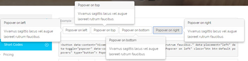
Codes are as follows:
<button data-content="Vivamus sagittis lacus vel augue laoreet rutrum faucibus."
    data-placement="left" data-toggle="popover" data-container="body" data-original-title="Popover on left" class="btn btn-default popovers" type="button">
    Popover on left
</button>
Option:
| Name | type | default | description |
|---|---|---|---|
| animation | boolean | true | apply a CSS fade transition to the tooltip |
| html | boolean | false | Insert HTML into the tooltip. If false, jQuery's text method will be used to insert content into the DOM. Use text if you're worried about XSS attacks. |
| placement | string | function | 'top' | how to position the tooltip - top | bottom | left | right | auto. When "auto" is specified, it will dynamically reorient the tooltip. For example, if placement is "auto left", the tooltip will display to the left when possible, otherwise it will display right. |
| selector | string | false | If a selector is provided, tooltip objects will be delegated to the specified targets. |
| title | string | function | '' | default title value if title attribute isn't present |
| trigger | string | 'hover focus' | how tooltip is triggered - click | hover | focus | manual. You may pass multiple triggers; separate them with a space. |
| delay | number | object | 0 | delay showing and hiding the tooltip (ms) - does not apply to manual trigger type If a number is supplied, delay is applied to both hide/show Object structure is: |
| container | string | false | false | Appends the tooltip to a specific element. Example: |
Alerts
You can click the link to check Alerts demo. Demo Link
Below is the screen shot:
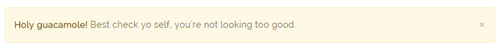
Codes are as follows:
<div class="alert alert-warning fade in">
    <button aria-hidden="true" data-dismiss="alert" class="close" type="button">×</button>
    <strong>Holy guacamole!</strong> Best check yo self, you're not looking too good.
</div>
Option:
- You can change
alert-to change the color, there arealert-warning,alert-danger,alert-success,alert-info4 colors included in the effects. fadeis for hiddeninis for display
Tooltips
You can click the link to check Tooltips demo. Tooltips
Below is the screen shot:
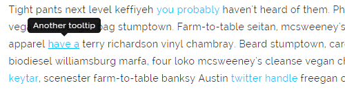
Codes are as follows:
<a href="#" class="tooltips" data-toggle="tooltip" title="first tooltip">Hover over me</a>
Option:
| Name | type | default | description |
|---|---|---|---|
| animation | boolean | true | apply a CSS fade transition to the tooltip |
| html | boolean | false | Insert HTML into the tooltip. If false, jQuery's text method will be used to insert content into the DOM. Use text if you're worried about XSS attacks. |
| placement | string | function | 'top' | how to position the tooltip - top | bottom | left | right | auto. When "auto" is specified, it will dynamically reorient the tooltip. For example, if placement is "auto left", the tooltip will display to the left when possible, otherwise it will display right. |
| selector | string | false | If a selector is provided, tooltip objects will be delegated to the specified targets. |
| title | string | function | '' | default title value if title attribute isn't present |
| trigger | string | 'hover focus' | how tooltip is triggered - click | hover | focus | manual. You may pass multiple triggers; separate them with a space. |
| delay | number | object | 0 | delay showing and hiding the tooltip (ms) - does not apply to manual trigger type If a number is supplied, delay is applied to both hide/show Object structure is: |
| container | string | false | false | Appends the tooltip to a specific element. Example: |
Dropdowns
You can click the link to check Dropdowns demo. Demo Link
Style 1:
Below is the screen shot:
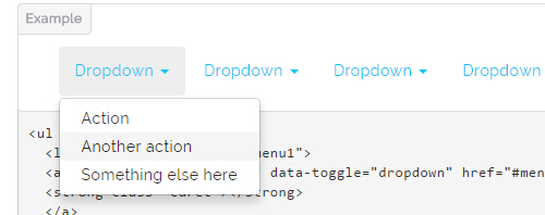
Codes are as follows:
<ul class="nav nav-pills">
  <li class="dropdown" id="menu1">
  <a class="dropdown-toggle" data-toggle="dropdown" href="#menu1">Dropdown
  <strong class="caret"></strong>
  </a>
    <ul class="dropdown-menu">
      <li><a href="#">Action</a></li>
      <li><a href="#">Another action</a></li>
      <li><a href="#">Something else here</a></li>
    </ul>
  </li>
</ul>
Style 2:
Below is the screen shot:
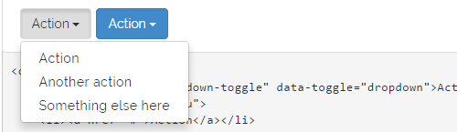
Codes are as follows:
<div class="btn-group">
  <button class="btn dropdown-toggle" data-toggle="dropdown">Action <span class="caret"></span></button>
  <ul class="dropdown-menu">
    <li><a href="#">Action</a></li>
    <li><a href="#">Another action</a></li>
    <li><a href="#">Something else here</a></li>
  </ul>
</div>
Style 3:
Below is the screen shot:
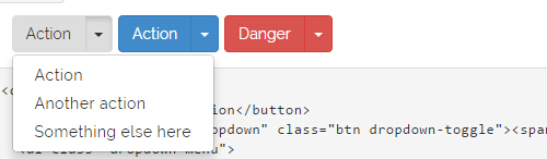
Codes are as follows:
<div class="btn-group">
  <button class="btn">Action</button>
  <button data-toggle="dropdown" class="btn dropdown-toggle"><span class="caret"></span></button>
  <ul class="dropdown-menu">
    <li><a href="#">Action</a></li>
    <li><a href="#">Another action</a></li>
    <li><a href="#">Something else here</a></li>
  </ul>
</div>
LightBox
You can click the link to check LightBox demo. Demo Link
Below is the screen shot:
Option:
1. LightBox_image |
Show one image alone. |
2. LightBox_image_gallery+group number |
Classify those that share the same class name to one group, you can show other images within the group by clicking left and right arrow of the image. |
3. LightBox_image_group |
Classify these sub levels whose label class name is LightBox_image_group into one group. |
4. LightBox_youtube |
Show youtube video. |
5. LightBox_vimeo |
Show video. |
6. LightBox_gmaps |
Shown map. |
7. LightBox_youtube_gallery+group number |
Classify these that share the same class name into a group of youtube video show |
8. LightBox_vimeo_gallery+group number |
Classify these that share the same class name into a group of video show. |
9. LightBox_gmaps_gallery+group number |
Classify these that share the same class name into a group of map show. |
10. LightBox_youtube_group |
Classify these sub levels whose label class name is LightBox_youtube_group into one group. |
11. LightBox_vimeo_group |
Classify these sub levels whose label class name is LightBox_vimeo_group into one group. |
12. LightBox_gmaps_group |
Classify these sub levels whose label class names is LightBox_gmaps_group into one group. |
13. LightBox_Box |
Take div as layer pop up, div needs to hide by default. Style of pop up is custom style. |
14. LightBox_ajax |
Pop up a page |
15. LightBox_ajax_group |
Pop up a group of pages |
You need to fill url of the pop up image(video, map) in href=""
1.LightBox_image
<a href="bigPhoto.jpg" class="LightBox_image" title="Single Image 1"><img alt="" src="cover.jpg" /></a>
2.LightBox_image_gallery
<a href="bigPhoto1.jpg" class="LightBox_image_gallery1" title="Single Image 1"><img alt="" src="cover.jpg" /></a>
<a href="bigPhoto2.jpg" class="LightBox_image_gallery1" title="Single Image 1"><img alt="" src="cover.jpg" /></a>
<a href="bigPhoto3.jpg" class="LightBox_image_gallery2" title="Single Image 2"><img alt="" src="cover.jpg" /></a>
<a href="bigPhoto4.jpg" class="LightBox_image_gallery2" title="Single Image 2"><img alt="" src="cover.jpg" /></a>
3.LightBox_image_group
<div class="LightBox_image_group">
    <a href="bigPhoto1.jpg" title=" People Scenery 1"><img alt="" src="cover.jpg" /> </a>
    <a href="bigPhoto2.jpg" title=" People Scenery 2"></a>
    <a href="bigPhoto3.jpg" title=" People Scenery 3"></a>
</div>
4.LightBox_youtube
<a href="http://www.youtube.com/watch?v=0O2aH4XLbto" class="LightBox_youtube" title="youtube"><img alt="" src="cover.jpg" /></a>
5.LightBox_vimeo
<a href="https://vimeo.com/45830194" class="LightBox_vimeo" title="vimeo"><img alt="" src="cover.jpg" /></a>
6.LightBox_gmaps
<a href="https://maps.google.com/maps?q=221B+Baker+Street,+London,+United+Kingdom&hl=en&t=v&hnear=221B+Baker+St,+London+NW1+6XE,+United+Kingdom"
class="LightBox_gmaps"title="gmaps"><img alt="" src="cover.jpg" /></a>
7.LightBox_youtube_gallery
<a href="http://www.youtube.com/watch?v=0O2aH4XLbto" class="LightBox_youtube_gallery1" title="youtube gallery"><img alt="" src="cover.jpg" /></a>
<a href="http://www.youtube.com/watch?v=0O2aH4XLbto" class="LightBox_youtube_gallery1" title="youtube gallery"><img alt="" src="cover.jpg" /></a>
<a href="http://www.youtube.com/watch?v=0O2aH4XLbto" class="LightBox_youtube_gallery2" title="youtube gallery"><img alt="" src="cover.jpg" /></a>
<a href="http://www.youtube.com/watch?v=0O2aH4XLbto" class="LightBox_youtube_gallery2" title="youtube gallery"><img alt="" src="cover.jpg" /></a>
8.LightBox_vimeo_gallery
<a href="https://vimeo.com/45830194" class="LightBox_vimeo_gallery1" title="vimeo gallery"><img alt="" src="cover.jpg" /></a>
<a href="https://vimeo.com/45830194" class="LightBox_vimeo_gallery1" title="vimeo gallery"><img alt="" src="cover.jpg" /></a>
<a href="https://vimeo.com/45830194" class="LightBox_vimeo_gallery2" title="vimeo gallery"><img alt="" src="cover.jpg" /></a>
<a href="https://vimeo.com/45830194" class="LightBox_vimeo_gallery2" title="vimeo gallery"><img alt="" src="cover.jpg" /></a>
9.LightBox_gmaps_gallery
<a href="https://maps.google.com/maps?q=221B+Baker+Street,+London,+United+Kingdom&hl=en&t=v&hnear=221B+Baker+St,+London+NW1+6XE,+United+Kingdom"
class="LightBox_gmaps_gallery1" title="gmaps gallery"><img alt="" src="cover.jpg" /></a>
<a href="https://maps.google.com/maps?q=221B+Baker+Street,+London,+United+Kingdom&hl=en&t=v&hnear=221B+Baker+St,+London+NW1+6XE,+United+Kingdom"
class="LightBox_gmaps_gallery1" title="gmaps gallery"><img alt="" src="cover.jpg" /></a>
<a href="https://maps.google.com/maps?q=221B+Baker+Street,+London,+United+Kingdom&hl=en&t=v&hnear=221B+Baker+St,+London+NW1+6XE,+United+Kingdom"
class="LightBox_gmaps_gallery2" title="gmaps gallery"><img alt="" src="cover.jpg" /></a>
<a href="https://maps.google.com/maps?q=221B+Baker+Street,+London,+United+Kingdom&hl=en&t=v&hnear=221B+Baker+St,+London+NW1+6XE,+United+Kingdom"
class="LightBox_gmaps_gallery2" title="gmaps gallery"><img alt="" src="cover.jpg" /></a>
10.LightBox_youtube_group
<div class="LightBox_youtube_group">
    <a href="http://www.youtube.com/watch?v=0O2aH4XLbto" title=" youtube 1"><img alt="" src="cover.jpg" /> </a>
    <a href="http://www.youtube.com/watch?v=0O2aH4XLbto" title=" youtube 2"></a>
    <a href="http://www.youtube.com/watch?v=0O2aH4XLbto" title=" youtube 3"></a>
</div>
11.LightBox_vimeo_group
<div class="LightBox_vimeo_group">
    <a href="https://vimeo.com/45830194" title=" vimeo 1"><img alt="" src="cover.jpg" /> </a>
    <a href="https://vimeo.com/45830194" title=" vimeo 2"></a>
    <a href="https://vimeo.com/45830194" title=" vimeo 3"></a>
</div>
12.LightBox_gmaps_group
<div class="LightBox_gmaps_group">
    <a href="https://maps.google.com/maps?q=221B+Baker+Street,+London,+United+Kingdom&hl=en&t=v&hnear=221B+Baker+St,+London+NW1+6XE,+United+Kingdom" title=" gmaps 1"><img alt="" src="cover.jpg" /> </a>
    <a href="https://maps.google.com/maps?q=221B+Baker+Street,+London,+United+Kingdom&hl=en&t=v&hnear=221B+Baker+St,+London+NW1+6XE,+United+Kingdom" title=" gmaps 2"></a>
    <a href="https://maps.google.com/maps?q=221B+Baker+Street,+London,+United+Kingdom&hl=en&t=v&hnear=221B+Baker+St,+London+NW1+6XE,+United+Kingdom" title=" gmaps 3"></a>
</div>
13.LightBox_Box
<a href=".LightBox_Content" class="LightBox_Box"> Click Here To Pop </a>
<a href=".LightBox_Content" class="LightBox_Box Button_default"> Click Here To Pop </a>
<div class="LightBox_Content">
    <h3>Click Here To Pop</h3>
 	  content text ...
</div>
14.LightBox_ajax
<a href="index.aspx" class="LightBox_ajax" title="ajax"><img alt="" src="cover.jpg" /></a>
15.LightBox_ajax_group
<div class="LightBox_ajax_group">
    <a href="index.aspx" title=" ajax 1"><img alt="" src="cover.jpg" /> </a>
    <a href="index.aspx" title=" ajax 2"></a>
    <a href="index.aspx" title=" ajax 3"></a>
</div>
Image Effects
You can click the link to check Image Effects demo. Demo Link
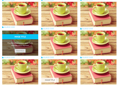
- You can copy over codes of the image effects directly to any HTML modules.
- You can change the font icon through modifying. font icon list
Flip Box
You can click the link to check Flip Box demo. Demo Link
Style 1:
Below is the screen shot:
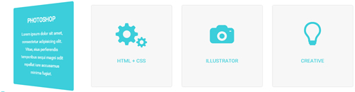
Codes are as follows:
<div class="row">
  <div class="col-sm-3">
    <div class="flip_box flip_box_1">
      <div class="rotate">
        <div class="front"> <span class="glyphicons glyph-edit"></span>
          <h3>PHOTOSHOP</h3>
        </div>
        <div class="back">
          <h3>PHOTOSHOP</h3>
          <p>Content Text 1 ...</p>
        </div>
      </div>
    </div>
  </div>
  <div class="col-sm-3">
    <div class="flip_box flip_right flip_box_1">
      <div class="rotate">
        <div class="front"> <span class="glyphicons glyph-cogwheels"></span>
          <h3>HTML + CSS</h3>
        </div>
        <div class="back">
          <h3>HTML + CSS</h3>
          <p>Content Text 2 ...</p>
        </div>
      </div>
    </div>
  </div>
  <div class="col-sm-3">
    <div class="flip_box flip_top flip_box_1">
      <div class="rotate">
        <div class="front"> <span class="glyphicons glyph-camera"></span>
          <h3>ILLUSTRATOR</h3>
        </div>
        <div class="back">
          <h3>ILLUSTRATOR</h3>
          <p>Content Text 3 ...</p>
        </div>
      </div>
    </div>
  </div>
  <div class="col-sm-3">
    <div class="flip_box flip_bottom flip_box_1">
      <div class="rotate">
        <div class="front"> <span class="glyphicons glyph-lightbulb"></span>
          <h3>CREATIVE</h3>
        </div>
        <div class="back">
          <h3>CREATIVE</h3>
          <p>Content Text 4 ...</p>
        </div>
      </div>
    </div>
  </div>
</div>
Option:
col-md-3 col-sm-6is the width of each column, you can change the width you need through value1~12.frontis for front content.backis for back content.
Style 2:
Below is the screen shot:
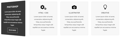
Codes are as follows:
<div class="row">
  <div class="col-sm-3">
    <div class="flip_box flip_box_2">
      <div class="rotate">
        <div class="front"> <span class="glyphicons glyph-edit"></span>
          <h3>PHOTOSHOP</h3>
          <p>Content Text 1 ...</p>
        </div>
        <div class="back">
          <h3>PHOTOSHOP</h3>
          <p>Content Text 1 ...</p>
          <a href="#" class="but">READ MORE</a> </div>
      </div>
    </div>
  </div>
  <div class="col-sm-3">
    <div class="flip_box flip_right flip_box_2">
      <div class="rotate">
        <div class="front"> <span class="glyphicons glyph-cogwheels"></span>
          <h3>HTML + CSS</h3>
          <p>Content Text 2 ...</p>
        </div>
        <div class="back">
          <h3>HTML + CSS</h3>
          <p>Content Text 2 ...</p>
          <a href="#" class="but">READ MORE</a> </div>
      </div>
    </div>
  </div>
  <div class="col-sm-3">
    <div class="flip_box flip_top flip_box_2">
      <div class="rotate">
        <div class="front"> <span class="glyphicons glyph-camera"></span>
          <h3>ILLUSTRATOR</h3>
          <p>Content Text 3 ...</p>
        </div>
        <div class="back">
          <h3>ILLUSTRATOR</h3>
          <p>Content Text 3 ...</p>
          <a href="#" class="but">READ MORE</a> </div>
      </div>
    </div>
  </div>
  <div class="col-sm-3">
    <div class="flip_box flip_bottom flip_box_2">
      <div class="rotate">
        <div class="front"> <span class="glyphicons glyph-lightbulb"></span>
          <h3>CREATIVE</h3>
          <p>Content Text 4 ...</p>
        </div>
        <div class="back">
          <h3>CREATIVE</h3>
          <p>Content Text 4 ...</p>
          <a href="#" class="but">READ MORE</a> </div>
      </div>
    </div>
  </div>
</div>
Style 3:
Below is the screen shot:
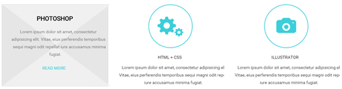
Codes are as follows:
<div class="row">
  <div class="col-sm-4">
    <div class="flip_box flip_box_3">
      <div class="rotate">
        <div class="front"> <span class="glyphicons glyph-edit"></span>
          <h3>PHOTOSHOP</h3>
          <p>Content Text 1 ...</p>
        </div>
        <div class="back">
          <h3>PHOTOSHOP</h3>
          <p>Content Text 1 ...</p>
          <a href="#" class="but">READ MORE</a> </div>
      </div>
    </div>
  </div>
  <div class="col-sm-4">
    <div class="flip_box flip_right flip_box_3">
      <div class="rotate">
        <div class="front"> <span class="glyphicons glyph-cogwheels"></span>
          <h3>HTML + CSS</h3>
          <p>Content Text 2 ...</p>
        </div>
        <div class="back">
          <h3>HTML + CSS</h3>
          <p>Content Text 2 ...</p>
          <a href="#" class="but">READ MORE</a> </div>
      </div>
    </div>
  </div>
  <div class="col-sm-4">
    <div class="flip_box flip_top flip_box_3">
      <div class="rotate">
        <div class="front"> <span class="glyphicons glyph-camera"></span>
          <h3>ILLUSTRATOR</h3>
          <p>Content Text 3 ...</p>
        </div>
        <div class="back">
          <h3>ILLUSTRATOR</h3>
          <p>Content Text 3 ...</p>
          <a href="#" class="but">READ MORE</a> </div>
      </div>
    </div>
  </div>
</div>
Responsive Video
Ratio between width and height of the video needs to be 16:9.
<div class="responsive-video">
    <iframe width="853" height="480" src="//www.youtube.com/embed/XcpOsJQXcx4?list=UUIkFV7_2tEhhEhh1NkkwTUw" frameborder="0" allowfullscreen></iframe>
</div>
<div class="responsive-video">
    <iframe src="//player.vimeo.com/video/106249100" width="1920" height="1080" frameborder="0" webkitallowfullscreen mozallowfullscreen allowfullscreen></iframe>
</div>
<div class="responsive-video">
     <embed  src="/portals/37/movie.swf" type="application/x-shockwave-flash" allownetworking="all" allowfullscreen="true" allowscriptaccess="always" wmode="Opaque"></embed>
</div>
<div class="responsive-video">
    <video width="1920" height="1080"  controls="true">
    <source src="/portals/37/movie.m4v" type="video/mp4"></source>
    <source src="/portals/37/movie.ogv" type="video/ogg"></source>
    <source src="/portals/37/movie.webm" type="video/WebM"></source>
    Your browser does not support the video tag. </video>
</div>
Video Bg
You can click the link to check Video Bg demo. Demo Link

- "{videoURL:'npfu0fN9GUA' is the url of
youtube autoPlayis for whether to autoplay or nottrue/falseloopis for whether to play on a loop,true/false
<div data-property="{videoURL:'npfu0fN9GUA',containment:'self', showControls:false, autoPlay:true, loop:true, vol:50, mute:true, startAt:10, opacity:1, addRaster:false, quality:'hd1080'}" class="player">
<div class="Play"></div>
<div class="dnn_layout pt-60 pb-60">
<div class="content_mid clearfix">
<div class="player_boxes">
<h1 class="player_title"> Here Are Your Videos</h1>
<hr class="player_line" />
<h4 class="player_smalltitle">YOU CAN CHANGE THE BACKGROUND BY YOURSELF</h4>
<div class="player_content">
<p>Content Text 1 ... </p>
</div>
<p> <a class="Button_default" href="#"> VIEW PORTFOLIOS</a> <a class="Button_default" href="#"> LEARN MORE</a> </p>
</div>
</div>
</div>
</div>
Home Page Codes
This includes the html introductions that required for Home1~Home7 page, ComingSoon page, Boxed Layout page.
Home Version 1 (Home)
You can click the link to check Home Version 1 (home) demo. Home Version 1 (Home)
Banner area
Below is the screen shot:
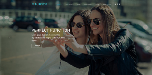
It is using DNNGo LayerGalleryPro module here, you can import ContentListEntity-Home1.xml of the DNNGo_LayerGalleryPro folder to duplicate banner of the demo.
OUR SERVICE area
Below is the screen shot:
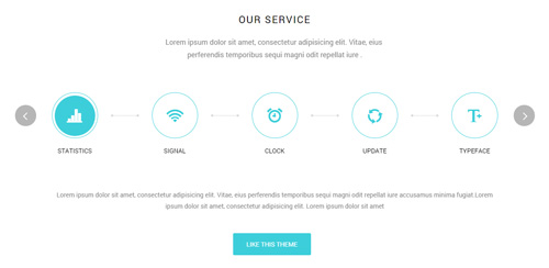
Codes are as follows:
<div class="big_size pb-60 animation scaleUp" style="text-align: center;">Content text ...<br />
   Content text ....
</div>
<div class="sync_carousel  sync_carousel_1 animation scaleUp">
  <div class="carousel_nav">
    <div class="item">
      <div class="ico"><span class="glyphicons glyph-charts"></span><em class="line"></em></div>
      <p> STATISTICS</p>
    </div>
    <div class="item">
      <div class="ico"><span class="glyphicons glyph-wifi"></span><em class="line"></em></div>
      <p> SIGNAL</p>
    </div>
    <div class="item">
      <div class="ico"><span class="glyphicons glyph-alarm"></span><em class="line"></em></div>
      <p> CLOCK</p>
    </div>
    <div class="item">
      <div class="ico"><span class="glyphicons glyph-roundabout"></span><em class="line"></em></div>
      <p> UPDATE </p>
    </div>
    <div class="item">
      <div class="ico"><span class="glyphicons glyph-text-bigger"></span> <em class="line"></em></div>
      <p> TYPEFACE</p>
    </div>
  </div>
  <div class="carousel_main">
    <div class="item">
      <p class="pb-40"> Lorem ipsum dolor sit amet, consectetur adipisicing elit...</p>
      <p> <a class="Button_default" href="#" target="blank">LIKE THIS THEME</a> </p>
    </div>
    <div class="item">
      <p class="pb-40"> Lorem ipsum dolor sit amet, consectetur adipisicing elit...</p>
      <p><a class="Button_default" href="#" target="blank">LIKE THIS THEME</a></p>
    </div>
    <div class="item">
      <p class="pb-40"> Lorem ipsum dolor sit amet, consectetur adipisicing elit...</p>
      <p><a class="Button_default" href="#" target="blank">LIKE THIS THEME</a> </p>
    </div>
    <div class="item">
      <p class="pb-40"> Lorem ipsum dolor sit amet, consectetur adipisicing elit...</p>
      <p> <a class="Button_default" href="#" target="blank">LIKE THIS THEME</a></p>
    </div>
    <div class="item">
      <p class="pb-40"> Lorem ipsum dolor sit amet, consectetur adipisicing elit...</p>
      <p><a class="Button_default" href="#" target="blank">LIKE THIS THEME</a> </p>
    </div>
  </div>
</div>
Option:
- You can modify
animation scaleUpto change the animation on the slide..Animation list. - You can modify
glyphicons glyph-chartsto change icons. font icon list. - Module Container is using
Container-H3-1
SOME FEATURE ABOUT US area
Below is the screen shot:
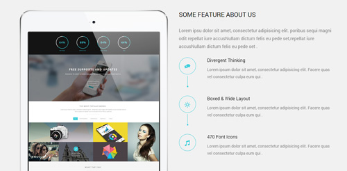
Codes are as follows:
<div class="backgroundImage1  pt-60">
  <div class="dnn_layout">
    <div class="content_mid clearfix">
      <div class="row">
        <div class="col-sm-6 col-sm-push-6">
          <h3 class="h3_style_1 pb-20">SOME FEATURE ABOUT US</h3>
          <div class="big_size pb-20  animation fadeInRight"> Lorem ipsu dolor sit amet, consectetur adipisicing elit... </div>
          <ul class="ServeList_1">
            <li class=" animation fadeInRight">
              <div class="ico"><span class="glyphicons glyph-conversation"></span></div>
              <h5>Divergent Thinking</h5>
              Lorem ipsum dolor sit amet, consectetur adipisicing elit. Facere quas vel consectetur culpa eum qui  . </li>
            <li class=" animation fadeInRight">
              <div class="ico"><span class="glyphicons glyph-brightness-increase"></span></div>
              <h5>Boxed & Wide Layout</h5>
              Lorem ipsum dolor sit amet, consectetur adipisicing elit. Facere quas vel consectetur culpa eum qui  . </li>
            <li class=" animation fadeInRight">
              <div class="ico"><span class="glyphicons glyph-music"></span></div>
              <h5>470 Font Icons</h5>
              Lorem ipsum dolor sit amet, consectetur adipisicing elit. Facere quas vel consectetur culpa eum qui  . </li>
          </ul>
        </div>
        <div class="col-sm-6 col-sm-pull-6 animation fadeInLeft"><img alt="" class="img-responsive" src="/portals/33/Pic_01.png" /></div>
      </div>
    </div>
  </div>
</div>
Option:
- You can modify
animation fadeInRightto change the animation on the slide..Animation list. - You can modify
glyphicons glyph-conversationto change icons. font icon list.
COMPATIBLE WITH DESKTOPS, LAPTOPS AND MOBILE DEVICES.
Below is the screen shot:

Codes are as follows:
<div class="backgroundImage2 pt-20 pb-20">
  <div class="dnn_layout animation scaleUp">
    <div class="content_mid clearfix">
      <h1 class="special_color_1"> Compatible with desktops, laptops and mobile devices.
        <div class="clearfix visible-sm"></div>
        <a class="Button_border_white" href="#" target="blank">READ MORE</a> </h1>
    </div>
  </div>
</div>
Option:
- You can modify
animationto change and delete animation. Animation list.
INNOVATIVE DESIGNS
Below is the screen shot:
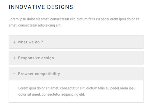
Codes are as follows:
<div class="animation fadeInLeft">
  <p class="pb-20 "> Lorem ipsu dolor sit amet, consectetur elit. dictum felis eu pedeLorem ipsu dolor sit amet, consectetur adipisicing elit. </p>
  <div id="accordion" class="panel-group accordion_1">
    <div class="panel panel-default">
      <div class="panel-heading">
        <h4 class="panel-title"> <a href="#collapse1_1" data-parent="#accordion" data-toggle="collapse"><span class="accordion_icon"></span>what we do ? </a> </h4>
      </div>
      <div class="panel-collapse collapse in" id="collapse1_1">
        <div class="panel-body">Lorem ipsu dolor sit amet, consectetur elit. dictum felis eu pedeLorem ipsu dolor sit amet, consectetur adipisicing elit. </div>
      </div>
    </div>
    <div class="panel panel-default">
      <div class="panel-heading">
        <h4 class="panel-title"> <a class="collapsed" href="#collapse1_2" data-parent="#accordion" data-toggle="collapse"><span class="accordion_icon"></span>Responsive design </a> </h4>
      </div>
      <div class="panel-collapse collapse" id="collapse1_2">
        <div class="panel-body">Lorem ipsu dolor sit amet, consectetur elit. dictum felis eu pedeLorem ipsu dolor sit amet, consectetur adipisicing elit. </div>
      </div>
    </div>
    <div class="panel panel-default">
      <div class="panel-heading">
        <h4 class="panel-title"> <a class="collapsed" href="#collapse1_3" data-parent="#accordion" data-toggle="collapse"><span class="accordion_icon"></span>Browser compatibility</a> </h4>
      </div>
      <div class="panel-collapse collapse" id="collapse1_3">
        <div class="panel-body">Lorem ipsu dolor sit amet, consectetur elit. dictum felis eu pedeLorem ipsu dolor sit amet, consectetur adipisicing elit. </div>
      </div>
    </div>
  </div>
</div>
Option:
- This is an
Accordioneffect. accordion - You can modify
animationto change or delete animation.Animation list. Containeris usingContainer-H3-2
ProgressBars Counters area
Below is the screen shot:
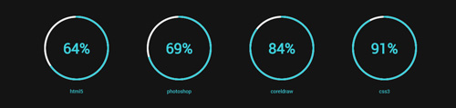
Codes are as follows:
This is a ProgressBars Counters effect.ProgressBars Counters
<div class="backgroundImage3 pt-40 pb-40">
  <div class="dnn_layout">
    <div class="content_mid clearfix">
      <div class="chart_list_1  row">
        <div class="col-md-3 col-sm-6 animation periodic1">
          <div class="percentage1" data-percent="65">
            <div class="percentage_inner"><span>0</span>% </div>
          </div>
          <p> html5 </p>
        </div>
        <div class="col-md-3 col-sm-6 animation periodic2">
          <div class="percentage1" data-percent="70">
            <div class="percentage_inner"><span>0</span>% </div>
          </div>
          <p> photoshop </p>
        </div>
        <div class="clearfix visible-sm"></div>
        <div class="col-md-3 col-sm-6 animation periodic3">
          <div class="percentage1" data-percent="85">
            <div class="percentage_inner"><span>0</span>% </div>
          </div>
          <p> coreldraw </p>
        </div>
        <div class="col-md-3 col-sm-6 animation periodic4">
          <div class="percentage1" data-percent="92">
            <div class="percentage_inner"><span>0</span>% </div>
          </div>
          <p> css3 </p>
        </div>
      </div>
    </div>
  </div>
</div>
ABOUT OUR CLIENTS area
Below is the screen shot:
Codes are as follows:
<div class="backgroundImage4  pt-40 pb-40 mb-10">
  <div class="dnn_layout  pt-40 pb-40 animation scaleUp">
    <div class="content_mid clearfix">
      <h1 class="h1_style_1 pt-40 pb-20">FREE SUPPORTS AND UPDATES</h1>
      <p style="font-size: 20px;"> Lorem ipsum dolor sit amet, consectetur adipisicing elit... </p>
      <p class="pt-40 pb-40"> <a href="#" target="blank" class="Button_white"> Click to buy</a> </p>
    </div>
  </div>
</div>
THE MOST POPULAR WORKS area
Below is the screen shot:
isotope follows:
 <div class="animation scaleUp" style="text-align: center;"> Lorem ipsum dolor sit amet, consectetur adipisicing elit... </div>
<div class="dividers_8 mt-40"></div>
- You can modify
animation fadeInRightto change the animation on the slide..Animation list. Containeris usingContainer-H3-1
Isotope area
Below is the screen shot:

Codes are as follows:
<div class="isotope_grid  animation scaleUp">
  <div class="isotope_group">
      <a data-filter="*" href="#" class="active">All</a>
      <a data-filter=".photography" href="#">PHOTOGRAPHY</a>
      <a data-filter=".webdesign" href="#">WEB DESIGN</a>
      <a data-filter=".graphics" href="#">GRAPHICS</a>
      <a data-filter=".video" href="#">VIDEO</a>
  </div>
  <div class="loading">
    <div class="loading-container container1">
      <div class="circle1"></div>
      <div class="circle2"></div>
      <div class="circle3"></div>
      <div class="circle4"></div>
    </div>
    <div class="loading-container container2">
      <div class="circle1"></div>
      <div class="circle2"></div>
      <div class="circle3"></div>
      <div class="circle4"></div>
    </div>
    <div class="loading-container container3">
      <div class="circle1"></div>
      <div class="circle2"></div>
      <div class="circle3"></div>
      <div class="circle4"></div>
    </div>
  </div>
  <div data-min-width="381" class="isotope_main">
    <div data-zoom="2" class="isotope_item photography graphics">
      <div class="photo_box img_zoom ico_zoom"> <a href="#" target="blank">
        <div class="pic_box"> <img alt="" src="/portals/33/isotope_img_01.jpg" />
          <div class="content">
            <div class="vertical_center_1">
              <div class="vertical_center_2">
                <div class="ico"><span class="glyphicons glyph-link"></span></div>
                <h3>IMAGE TITLE</h3>
                <p>Photos,Design</p>
              </div>
            </div>
          </div>
          <div class="shade"></div>
        </div>
        </a> </div>
    </div>
    <div class="isotope_item  webdesign">
      <div class="photo_box img_zoom ico_zoom"> <a href="#" target="blank">
        <div class="pic_box"> <img alt="" src="/portals/33/isotope_img_02.jpg" />
          <div class="content">
            <div class="vertical_center_1">
              <div class="vertical_center_2">
                <div class="ico"><span class="glyphicons glyph-link"></span></div>
                <h3>IMAGE TITLE</h3>
                <p>Photos,Design</p>
              </div>
            </div>
          </div>
          <div class="shade"></div>
        </div>
        </a> </div>
    </div>
    <div class="isotope_item graphics video">
      <div class="photo_box img_zoom ico_zoom"> <a href="#" target="blank">
        <div class="pic_box"> <img alt="" src="/portals/33/isotope_img_03.jpg" />
          <div class="content">
            <div class="vertical_center_1">
              <div class="vertical_center_2">
                <div class="ico"><span class="glyphicons glyph-link"></span></div>
                <h3>IMAGE TITLE</h3>
                <p>Photos,Design</p>
              </div>
            </div>
          </div>
          <div class="shade"></div>
        </div>
        </a> </div>
    </div>
    <div class="isotope_item video">
      <div class="photo_box img_zoom ico_zoom"> <a href="#" target="blank">
        <div class="pic_box"> <img alt="" src="/portals/33/isotope_img_04.jpg" />
          <div class="content">
            <div class="vertical_center_1">
              <div class="vertical_center_2">
                <div class="ico"><span class="glyphicons glyph-link"></span></div>
                <h3>IMAGE TITLE</h3>
                <p>Photos,Design</p>
              </div>
            </div>
          </div>
          <div class="shade"></div>
        </div>
        </a> </div>
    </div>
    <div class="isotope_item blogs video">
      <div class="photo_box img_zoom ico_zoom"> <a href="#" target="blank">
        <div class="pic_box"> <img alt="" src="/portals/33/isotope_img_05.jpg" />
          <div class="content">
            <div class="vertical_center_1">
              <div class="vertical_center_2">
                <div class="ico"><span class="glyphicons glyph-link"></span></div>
                <h3>IMAGE TITLE</h3>
                <p>Photos,Design</p>
              </div>
            </div>
          </div>
          <div class="shade"></div>
        </div>
        </a> </div>
    </div>
    <div class="isotope_item video webdesign photography">
      <div class="photo_box img_zoom ico_zoom"> <a href="#" target="blank">
        <div class="pic_box"> <img alt="" src="/portals/33/isotope_img_06.jpg" />
          <div class="content">
            <div class="vertical_center_1">
              <div class="vertical_center_2">
                <div class="ico"><span class="glyphicons glyph-link"></span></div>
                <h3>IMAGE TITLE</h3>
                <p>Photos,Design</p>
              </div>
            </div>
          </div>
          <div class="shade"></div>
        </div>
        </a> </div>
    </div>
  </div>
</div>
Option:
- You can add
<a data-filter=".FilterName" href="#">Filter Name</a>to increase categories.data-filter=".FilterName"can not be blank space. - You can modify
data-min-widthto change minimum width of image. - You can modify
isotope_itemFilterNameto categorize images. - You can modify
animation scaleUpto change the animation on the slide..Animation list. - You can modify
glyphicons glyph-linkto change icons. font icon list.
Testimonials area
Below is the screen shot:
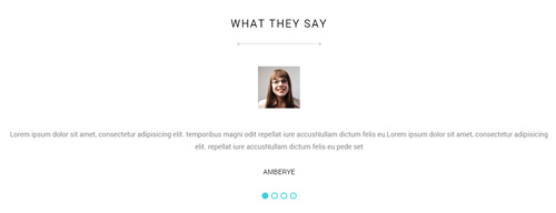
Codes are as follows:
<div class="dividers_8"></div>
<ul data-autoplay="0" data-display-arrows="false" data-position="fade" class=" Testimonials_tab Testimonials_1 animation scaleUp">
  <li>
    <blockquote> <span class="pic"> <img alt="" src="/portals/33/portrait_1.jpg" /></span>
      <p> Content text .....
        repellat iure accusNullam dictum felis eu pede set </p>
      <small>AMBERYE</small> </blockquote>
  </li>
  <li>
    <blockquote> <span class="pic"> <img alt="" src="/portals/33/portrait_1.jpg" /></span>
      <p> Content text .....
        repellat iure accusNullam dictum felis eu pede set </p>
      <small>AMBERYE</small> </blockquote>
  </li>
  <li>
    <blockquote> <span class="pic"> <img alt="" src="/portals/33/portrait_1.jpg" /></span>
      <p> Content text .....
        repellat iure accusNullam dictum felis eu pede set </p>
      <small>AMBERYE</small> </blockquote>
  </li>
  <li>
    <blockquote> <span class="pic"> <img alt="" src="/portals/33/portrait_1.jpg" /></span>
      <p> Content text .....
        repellat iure accusNullam dictum felis eu pede set </p>
      <small>AMBERYE</small> </blockquote>
  </li>
</ul>
Option:
- This is a
Testimonialseffect.Testimonials - You can modify
animation fadeInRightto change the animation on the slide..Animation list. Containeris usingContainer-H3-1
OUR SKILLS area
Below is the screen shot:
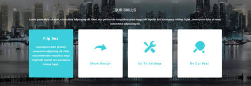
Codes are as follows:
<div class="backgroundImage5 pt-40 pb-40 ">
  <div class="dnn_layout">
    <div class="content_mid clearfix">
      <h3 class="h3_style_1 pb-20 animation scaleUp">OUR SKILLS</h3>
      <p class="animation scaleUp">Lorem ipsum dolor sit amet, consectetur adipisicing elit... </p>
      <div class="ServeList_2 mt-20">
        <div class="row animation">
          <div class="col-md-3 col-sm-6 animation_item scaleUp delay1">
            <div class="flip_box">
              <div class="rotate">
                <div class="front"> <span class="glyphicons glyph-cardio"></span>
                  <h3>Flip Box</h3>
                </div>
                <div class="back">
                  <h3>Flip Box</h3>
                  <p>Content Text 1 ...</p>
                </div>
              </div>
            </div>
          </div>
          <div class="col-md-3 col-sm-6 animation_item scaleUp delay2">
            <div class="flip_box">
              <div class="rotate">
                <div class="front"> <span class="glyphicons glyph-redo"></span>
                  <h3>Share Design</h3>
                </div>
                <div class="back">
                  <h3>Share Design</h3>
                  <p>Content Text 1 ...</p>
                </div>
              </div>
            </div>
          </div>
          <div class="clearfix visible-sm"></div>
          <div class="col-md-3 col-sm-6 animation_item scaleUp delay3">
            <div class="flip_box">
              <div class="rotate">
                <div class="front"> <span class="glyphicons glyph-settings"></span>
                  <h3>Go To Settings</h3>
                </div>
                <div class="back">
                  <h3>Go To Settings</h3>
                  <p>Content Text 1 ...</p>
                </div>
              </div>
            </div>
          </div>
          <div class="col-md-3 col-sm-6 animation_item scaleUp delay4">
            <div class="flip_box">
              <div class="rotate">
                <div class="front"> <span class="glyphicons glyph-table-tennis"></span>
                  <h3>Do Our Best</h3>
                </div>
                <div class="back">
                  <h3>Do Our Best</h3>
                  <p>Content Text 1 ...</p>
                </div>
              </div>
            </div>
          </div>
        </div>
      </div>
    </div>
  </div>
</div>
Option:
- This is a
FlipBoxeffect.FlipBox - You can modify
animationto change the animation on the slide. Animation list. - You can modify
glyphiconsto change icons. font icon list.
ABOUT US area
Below is the screen shot:
Codes are as follows:
<div class="animation fadeInUp">
  <p>Lorem ipsum dolor sit amet, consetetur vidunt ut labore et dolore Donec id elit llus ac cursus commodo.. </p>
  <br />
  <div class="social-icons foot_social  clearfix">
      <a href="#"><span class="social social-twitter"></span></a>
      <a href="#"><span class="social social-tumblr"></span></a>
      <a href="#"><span class="social social-facebook"></span></a>
      <a href="#"><span class="social social-picasa"></span></a>
      <a href="#"><span class="social social-google-plus"></span></a> <a href="#"><span class="social social-apple"></span></a>
  </div>
</div>
Option:
- You can modify
animationto change the animation on the slide. Animation list. - You can modify
glyphiconsto change icons. font icon list. Containeris usingContainer-3
RECENT POST area
Below is the screen shot:
Codes are as follows:
<ul class="list_style1 animation fadeInUp">
  <li>
    <p>Lorem ipsum dolor sit amet</p>
    <span>may 5 , 2014</span></li>
  <li>
    <p>mauris s et accusam et justo</p>
    <span>March 18 , 2014</span> </li>
  <li>
    <p>Donec facilisis viverra anteluctus vel</p>
    <span>February 12 ,2014</span></li>
</ul>
Option:
- You can modify
animationto change the animation on the slide. Animation list. Containeris usingContainer-3
Map area
Below is the screen shot:
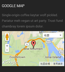
Codes are as follows:
<div class="animation fadeInUp">
  <p>Single-origin coffee keytar wolf pickled. Pariatur meh vegan ut art party. Trust fund chambray lorem ipsum dolor.</p>
  <div id="gmap01"></div>
</div>
Option:
Containeris usingContainer-3
CONTACT INFO area
Below is the screen shot:
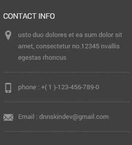
Codes are as follows:
<ul class="list_style2 animation fadeInUp">
  <li><span class="glyphicons glyph-google-maps"></span> Content text .... </li>
  <li><span class="glyphicons glyph-iphone"></span>phone :  +( 1 )-123-456-789-0</li>
  <li><span class="glyphicons glyph-envelope"></span>Email : dnnskindev@gmail.com</li>
</ul>
Option:
- You can modify
animationto change the animation on the slide. Animation list. - You can modify
glyphiconsto change icons. font icon list. Containeris usingContainer-3
Home Version 2
You can click the link to check Home Version 2 demo. Home Version 2
Banner area
Below is the screen shot:

It is using DNNGo LayerGalleryPro module here, you can import ContentListEntity-Home2.xml of the DNNGo_LayerGalleryPro folder to duplicate banner of the demo.
Service Lists area
Below is the screen shot:
Codes are as follows:
<div class="row pt-10 animation ">
  <div class="col-md-3 col-sm-6 animation_item scaleUp delay1">
    <div class="ServeList_5">
      <div class="ico"><span class="glyphicons glyph-fire"></span></div>
      <h5>CONSULT ONLINE</h5>
      <p>Lorem ipsum dolor sit amet, conse ctetuer adipiscing elit.</p>
      <p><a href="#" target="blank">READ MORE ></a></p>
    </div>
  </div>
  <div class="col-md-3 col-sm-6 animation_item scaleUp delay2">
    <div class="ServeList_5">
      <div class="ico"><span class="glyphicons glyph-clock"></span></div>
      <h5>CLEAN DESIGN</h5>
      <p>Lorem ipsum dolor sit amet, conse ctetuer adipiscing elit.</p>
      <p><a href="#" target="blank">READ MORE ></a></p>
    </div>
  </div>
  <div class="clearfix visible-sm"></div>
  <div class="col-md-3 col-sm-6 animation_item scaleUp delay3">
    <div class="ServeList_5">
      <div class="ico"><span class="glyphicons glyph-flag"></span></div>
      <h5>CUSTOMIZE WEB </h5>
      <p>Lorem ipsum dolor sit amet, conse ctetuer adipiscing elit.</p>
      <p><a href="#" target="blank">READ MORE ></a></p>
    </div>
  </div>
  <div class="col-md-3 col-sm-6 animation_item scaleUp delay4">
    <div class="ServeList_5">
      <div class="ico"><span class="glyphicons glyph-leaf"></span></div>
      <h5>FILE ADOPTED</h5>
      <p>Lorem ipsum dolor sit amet, conse ctetuer adipiscing elit.</p>
      <p><a href="#" target="blank">READ MORE ></a></p>
    </div>
  </div>
</div>
Option:
col-md-3 col-sm-6is the width of each column, you can change the width you need through value1~12.- You can modify
animationto change the animation on the slide. Animation list. - You can modify
glyphiconsto change icons. font icon list.
THE MOST POPULAR WORKS area
Below is the screen shot:
Codes are as follows:
<div class="backgroundImage12 pt-60 pb-60">
  <h3 class="h3_style_1">THE MOST POPULAR WORKS</h3>
  <div class="dividers_9"></div>
  <p>Lorem ipsum dolor sit amet, consectetur adipisicing elit. Vitae, eius perferendis temporibus sequi magni <br />
    odit repellat iure accusamus minima fugiat. </p>
  <div class="carousel carousel_3 carousel_3_arrow mt-20 animation scaleUp" data-pagination="false">
    <div class="item">
      <div class="photo_box img_zoom ico_zoom"> <a href="#" target="blank">
        <div class="pic_box"> <img alt="" src="/portals/33/carousel_18.jpg" />
          <div class="content">
            <div class="vertical_center_1">
              <div class="vertical_center_2">
                <div class="ico"><span class="glyphicons glyph-link"></span></div>
                <h3>IMAGE TITLE</h3>
                <p>Photos,Design</p>
              </div>
            </div>
          </div>
          <div class="shade"></div>
        </div>
        </a> </div>
    </div>
    <div class="item">
      <div class="photo_box img_zoom ico_zoom"> <a href="#" target="blank">
        <div class="pic_box"> <img alt="" src="/portals/33/carousel_19.jpg" />
          <div class="content">
            <div class="vertical_center_1">
              <div class="vertical_center_2">
                <div class="ico"><span class="glyphicons glyph-link"></span></div>
                <h3>IMAGE TITLE</h3>
                <p>Photos,Design</p>
              </div>
            </div>
          </div>
          <div class="shade"></div>
        </div>
        </a> </div>
    </div>
    <div class="item">
      <div class="photo_box img_zoom ico_zoom"> <a href="#" target="blank">
        <div class="pic_box"> <img alt="" src="/portals/33/carousel_20.jpg" />
          <div class="content">
            <div class="vertical_center_1">
              <div class="vertical_center_2">
                <div class="ico"><span class="glyphicons glyph-link"></span></div>
                <h3>IMAGE TITLE</h3>
                <p>Photos,Design</p>
              </div>
            </div>
          </div>
          <div class="shade"></div>
        </div>
        </a> </div>
    </div>
    <div class="item">
      <div class="photo_box img_zoom ico_zoom"> <a href="#" target="blank">
        <div class="pic_box"> <img alt="" src="/portals/33/carousel_21.jpg" />
          <div class="content">
            <div class="vertical_center_1">
              <div class="vertical_center_2">
                <div class="ico"><span class="glyphicons glyph-link"></span></div>
                <h3>IMAGE TITLE</h3>
                <p>Photos,Design</p>
              </div>
            </div>
          </div>
          <div class="shade"></div>
        </div>
        </a> </div>
    </div>
    <div class="item">
      <div class="photo_box img_zoom ico_zoom"> <a href="#" target="blank">
        <div class="pic_box"> <img alt="" src="/portals/33/carousel_18.jpg" />
          <div class="content">
            <div class="vertical_center_1">
              <div class="vertical_center_2">
                <div class="ico"><span class="glyphicons glyph-link"></span></div>
                <h3>IMAGE TITLE</h3>
                <p>Photos,Design</p>
              </div>
            </div>
          </div>
          <div class="shade"></div>
        </div>
        </a> </div>
    </div>
    <div class="item">
      <div class="photo_box img_zoom ico_zoom"> <a href="#" target="blank">
        <div class="pic_box"> <img alt="" src="/portals/33/carousel_19.jpg" />
          <div class="content">
            <div class="vertical_center_1">
              <div class="vertical_center_2">
                <div class="ico"><span class="glyphicons glyph-link"></span></div>
                <h3>IMAGE TITLE</h3>
                <p>Photos,Design</p>
              </div>
            </div>
          </div>
          <div class="shade"></div>
        </div>
        </a> </div>
    </div>
    <div class="item">
      <div class="photo_box img_zoom ico_zoom"> <a href="#" target="blank">
        <div class="pic_box"> <img alt="" src="/portals/33/carousel_20.jpg" />
          <div class="content">
            <div class="vertical_center_1">
              <div class="vertical_center_2">
                <div class="ico"><span class="glyphicons glyph-link"></span></div>
                <h3>IMAGE TITLE</h3>
                <p>Photos,Design</p>
              </div>
            </div>
          </div>
          <div class="shade"></div>
        </div>
        </a> </div>
    </div>
    <div class="item">
      <div class="photo_box img_zoom ico_zoom"> <a href="#" target="blank">
        <div class="pic_box"> <img alt="" src="/portals/33/carousel_21.jpg" />
          <div class="content">
            <div class="vertical_center_1">
              <div class="vertical_center_2">
                <div class="ico"><span class="glyphicons glyph-link"></span></div>
                <h3>IMAGE TITLE</h3>
                <p>Photos,Design</p>
              </div>
            </div>
          </div>
          <div class="shade"></div>
        </div>
        </a> </div>
    </div>
  </div>
</div>
Option:
- This is a
ProgressBars Counterseffect. Carousel - You can modify
animationto change the animation on the slide. Animation list. - You can modify
glyphiconsto change icons. font icon list. - You can modify
photo_boxto change image effects. Image Effects
DNN SKIN AND MODULE CUSTOMIZATION area
Below is the screen shot:
Codes are as follows:
A:<img alt="" class="img-responsive animation fadeInLeft" src="/portals/33/Pic_03.png" />B:
<div class="animation fadeInRight">
  <p class="pt-60 pb-40">Lorem ipsum dolor sit amet, consectetur adipisicing elit...</p>
  <a href="#" target="blank">READ MORE</a>
</div>
Option:
img-responsiveimage responsive- You can modify
animationto change the animation on the slide. Animation list. Containeris usingContainer-H3-3
WHAT OUR CLIENTS SAY area
Below is the screen shot:
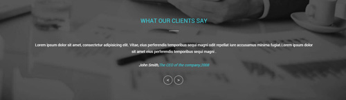
Codes are as follows:
<img alt="" class="img-responsive animation fadeInLeft" src="/portals/33/Pic_03.png" />
<div class="backgroundImage13 pt-60 pb-60">
  <div class="dnn_layout">
    <div class="content_mid clearfix">
      <h2 class="h3_style_1">WHAT OUR CLIENTS SAY</h2>
      <div class="dividers_10 mb-40"></div>
      <ul data-display-navigation="false" data-autoplay="0" data-position="fade" class=" Testimonials_tab Testimonials_8 animation scaleUp">
        <li>
          <blockquote>
            <p>Lorem ipsum dolor sit amet, consectetur adipisicing elit...</p>
            <small>John Smith,<span>The CEO of the company,2008</span> </small> </blockquote>
        </li>
        <li>
          <blockquote>
            <p>Develop strong and flexible solutions that are fitted to the needs of our customers. </p>
            <small>John Smith,<span>The CEO of the company,2008</span></small> </blockquote>
        </li>
        <li>
          <blockquote>
            <p>Lorem ipsum dolor sit amet, consectetur adipisicing elit...</p>
            <small>John Smith,<span>The CEO of the company,2008</span></small> </blockquote>
        </li>
        <li>
          <blockquote>
            <p>Donec in ut odio libero, at vulputate urna. Nulla tristique mi a massa convallis cursus. Nulla eu mi magna.</p>
            <small>John Smith,<span>The CEO of the company,2008</span></small> </blockquote>
        </li>
      </ul>
    </div>
  </div>
</div>
Option:
- This is a
ProgressBars Counterseffect.Testimonials - You can modify
animationto change the animation on the slide. Animation list.
SEE ALL CUSTOMER REVIEWS area
Below is the screen shot:

Codes are as follows:
<div class="backgroundImage2 pt-40 pb-40">
      <div class="dnn_layout animation scaleUp">
        <div class="content_mid clearfix">
          <p> <span class="big_size"><a href="#" target="blank">SEE ALL CUSTOMER REVIEWS      ></a></span></p>
        </div>
      </div>
    </div>
Option:
- You can modify
animationto change the animation on the slide. Animation list.
Image area
Below is the screen shot:
Codes are as follows:
<img alt="" class="img-responsive" src="/portals/33/Pic_04.png">
Option:
img-responsiveimage responsive
WHAT OUR CLIENTS SAY area
Below is the screen shot:
Codes are as follows:
<div class="dnn_layout  pt-20 animation scaleUp">
  <div class="content_mid clearfix"> <img alt="" class="img-responsive" src="/portals/33/Pic_04.png" /> </div>
</div>
<div class="backgroundImage14">
  <div class="shade  pt-40 pb-40">
    <div class="dnn_layout">
      <div class="content_mid clearfix">
        <h3 class="h3_style_1">WHAT OUR CLIENTS SAY</h3>
        <div class="dividers_10"></div>
        <div class="row">
          <div class="col-sm-4 animation fadeInUp">
            <div class="ServeList_6">
              <div class="ico"><span class="glyphicons glyph-headphones"></span></div>
              Am aliquet rutrum eros eu mattis. Morbi tempus dapibus mattis. Aliquam arcu erat, pharetra vitae consectetur eu. </div>
          </div>
          <div class="col-sm-4 animation fadeInUp">
            <div class="ServeList_6">
              <div class="ico"><span class="glyphicons glyph-edit"></span></div>
              Am aliquet rutrum eros eu mattis. Morbi tempus dapibus mattis. Aliquam arcu erat, pharetra vitae consectetur eu.</div>
          </div>
          <div class="col-sm-4 animation fadeInUp">
            <div class="ServeList_6">
              <div class="ico"><span class="glyphicons glyph-globe"></span></div>
              Am aliquet rutrum eros eu mattis. Morbi tempus dapibus mattis. Aliquam arcu erat, pharetra vitae consectetur eu.</div>
          </div>
        </div>
        <div class="row">
          <div class="col-sm-4 animation fadeInUp">
            <div class="ServeList_6">
              <div class="ico"><span class="glyphicons glyph-check"></span></div>
              Am aliquet rutrum eros eu mattis. Morbi tempus dapibus mattis. Aliquam arcu erat, pharetra vitae consectetur eu. </div>
          </div>
          <div class="col-sm-4 animation fadeInUp">
            <div class="ServeList_6">
              <div class="ico"><span class="glyphicons glyph-shopping-cart"></span></div>
              Am aliquet rutrum eros eu mattis. Morbi tempus dapibus mattis. Aliquam arcu erat, pharetra vitae consectetur eu.</div>
          </div>
          <div class="col-sm-4 animation fadeInUp">
            <div class="ServeList_6">
              <div class="ico"><span class="glyphicons glyph-fire"></span></div>
              Am aliquet rutrum eros eu mattis. Morbi tempus dapibus mattis. Aliquam arcu erat, pharetra vitae consectetur eu.</div>
          </div>
        </div>
      </div>
    </div>
  </div>
</div>
Option:
col-md-3 col-sm-6is the width of each column, you can change the width you need through value1~12.img-responsiveimage responsive- You can modify
animationto change the animation on the slide. Animation list. - You can modify
glyphiconsto change icons. font icon list.
OUR CLIENTS area
Below is the screen shot:
Codes are as follows:
<div style="text-align: center;" class="pb-40"> Lorem ipsum dolor sit amet, consectetur adipisicing elit... </div>
<div class="carousel carousel_5 animation scaleUp" data-pagination="false">
  <div class="item"><a target="blank" href="#"><img alt="" src="/portals/33/list_link_05.png" /></a></div>
  <div class="item"><a target="blank" href="#"><img alt="" src="/portals/33/list_link_06.png" /></a></div>
  <div class="item"><a target="blank" href="#"><img alt="" src="/portals/33/list_link_07.png" /></a></div>
  <div class="item"><a target="blank" href="#"><img alt="" src="/portals/33/list_link_08.png" /></a></div>
  <div class="item"><a target="blank" href="#"><img alt="" src="/portals/33/list_link_09.png" /></a></div>
  <div class="item"><a target="blank" href="#"><img alt="" src="/portals/33/list_link_10.png" /></a></div>
</div>
Option:
- This is a
Carouseleffect.Carousel - You can modify
animationto change the animation on the slide. Animation list.
CONTACT US area
Below is the screen shot:

Codes are as follows:
<div class="backgroundImage15 pt-40 pb-40">
      <div class="dnn_layout">
        <div class="content_mid clearfix">
          <h3 class="h3_style_1">CONTACT US</h3>
          <div class="dividers_10"></div>
          <br />
          <div class="row animation">
            <div class="col-md-3 col-sm-6 animation_item scaleUp delay1">
              <div class="contact_list"> <span class="glyphicons glyph-google-maps"></span>
                <p>usto duo dolores et ea sum no.12345 nvallis egestas rhoncus</p>
              </div>
            </div>
            <div class="col-md-3 col-sm-6 animation_item scaleUp delay2">
              <div class="contact_list"> <span class="glyphicons glyph-iphone"></span>
                <p>Phone : +(123)-456-789 </p>
              </div>
            </div>
            <div class="clearfix visible-sm"></div>
            <div class="col-md-3 col-sm-6 animation_item scaleUp delay3">
              <div class="contact_list"> <span class="glyphicons glyph-fax"></span>
                <p>Fax: +(123)-86-456-789 </p>
              </div>
            </div>
            <div class="col-md-3 col-sm-6 animation_item scaleUp delay4">
              <div class="contact_list"> <span class="glyphicons glyph-envelope"></span>
                <p>Email : dnnskindev@gmail.com </p>
              </div>
            </div>
          </div>
        </div>
      </div>
    </div>
Option:
col-md-3 col-sm-6is the width of each column, you can change the width you need through value1~12.- You can modify
animationto change the animation on the slide. Animation list. - You can modify
glyphiconsto change icons. font icon list.
CLICK HERE TO VIEW ON OUR MAP area
Below is the screen shot:

Codes are as follows:
<div class="backgroundImage1 pt-30 pb-30" style="text-align: center;">
<span class="big_size animation scaleUp"><a style="color: #393939;" href="/20066/en-us/pages/contactus.aspx">CLICK HERE TO VIEW ON OUR MAP></a></span>
</div>
Option:
- You can modify
animationto change the animation on the slide. Animation list.
ABOUT US area
Below is the screen shot:
Codes are as follows:
<div class="animation fadeInLeft"> Am aliquet rutrum eros eu mattis. Morbi tempus dapibus mattis... </div>
Option:
- You can modify
animationto change the animation on the slide. Animation list. Containeris usingContainer-H3-2
EMAIL US area
Below is the screen shot:
Option:
- This is
Theme_Responsive_20066-home2theme ofDNNGo PowerFormsmodule Containeris usingContainer-H3-2
BOTTOM area
Below is the screen shot:

Codes are as follows:
<div class="animation scaleUp">
  <p style="text-align: center;"><img alt="" src="/portals/33/logo_2.png" /> </p>
  <br />
  <p style="text-align: center;">Craft Web solutions for your online business.Our skins and
    modules<br />
    can apply to your corporation economy.</p>
</div>
Home Version 3
You can click the link to check Home Version 3 demo. Home Version 3
Banner area
Below is the screen shot:

It is using DNNGo LayerGalleryPro module here,you can import ContentListEntity-Home3.xml of the DNNGo_LayerGalleryPro folder to duplicate banner of the demo.
BANNER BOTTOM area
Below is the screen shot:
Codes are as follows:
<div class="backgroundImage9 pt-20 pb-40">
  <div class="dnn_layout animation scaleUp">
    <div class="content_mid clearfix">
      <div class="row">
        <div class="col-sm-9 big_size" style="text-align: left;">
          <p class=" pt-30">Develop strong and flexible solutions that are fitted to the needs of our customers.</p>
        </div>
        <div class="col-sm-3" style="text-align: center;"> <br />
          <p> <a class="Button_gray" href="#" target="blank">BUY NOW</a> </p>
        </div>
      </div>
    </div>
  </div>
</div>
Option:
col-md-3 col-md-9is the width of each column, you can change the width you need through value1~12.- You can modify
animationto change the animation on the slide. Animation list.
ABOUT OUR RECENT WORK area
Below is the screen shot:
Codes are as follows:
<p class="pt-20 pb-20" style="text-align: center;">Lorem ipsum dolor sit amet, consectetur adipisicing elit... </p>
<div class="row ourteam_1">
  <div class="col-sm-4 animation periodic1">
    <div class="photo_box  img_zoom"> <a href="#">
      <div class="pic_box"> <img alt="" src="/portals/33/pic_11.jpg" />
        <div class="ico"> <span class="glyphicons glyph-search"></span> </div>
        <div class="shade"></div>
      </div>
      </a> </div>
    <h3>PHONE PORT DEVELOPMENT</h3>
    <p> Content Text 1 ... </p>
  </div>
  <div class="col-sm-4 animation periodic2">
    <div class="photo_box  img_zoom"> <a href="#">
      <div class="pic_box"> <img alt="" src="/portals/33/pic_12.jpg" />
        <div class="ico"> <span class="glyphicons glyph-search"></span> </div>
        <div class="shade"></div>
      </div>
      </a> </div>
    <h3>THE CORE OF THE MAIN</h3>
    <p> Content Text 1 ... </p>
  </div>
  <div class="col-sm-4 animation periodic3">
    <div class="photo_box  img_zoom"> <a href="#">
      <div class="pic_box"> <img alt="" src="/portals/33/pic_13.jpg" />
        <div class="ico"> <span class="glyphicons glyph-search"></span> </div>
        <div class="shade"></div>
      </div>
      </a> </div>
    <h3>TECHNOLOGICAL INNOVATION</h3>
    <p> Content Text 1 ... </p>
  </div>
</div>
Option:
col-md-*is the width of each column, you can change the width you need through value1~12.- You can modify
animationto change the animation on the slide. Animation list. - You can modify
glyphiconsto change icons. font icon list. - You can modify
photo_boxto change image effects. Image Effects Containeris usingContainer-H3-5
OUR SERVICE FEATURES area
Below is the screen shot:
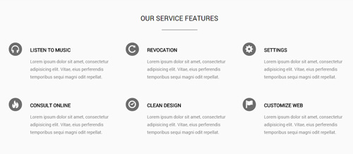
Codes are as follows:
<div class="backgroundImage16 pt-40 pb-20">
  <div class="dnn_layout">
    <div class="content_mid clearfix">
      <h3 class="h3_style_1" style="text-align: center;">OUR SERVICE FEATURES</h3>
      <div class="dividers_11"></div>
      <div class="row">
        <div class="col-sm-4 animation fadeInUp">
          <div class="ServeList_7">
            <div class="ico"><span class="glyphicons glyph-headphones"></span></div>
            <h5>LISTEN TO MUSIC</h5>
            Content Text 1 ... </div>
        </div>
        <div class="col-sm-4 animation fadeInUp">
          <div class="ServeList_7">
            <div class="ico"><span class="glyphicons glyph-repeat"></span></div>
            <h5>REVOCATION</h5>
            Content Text 1 ... </div>
        </div>
        <div class="col-sm-4 animation fadeInUp">
          <div class="ServeList_7">
            <div class="ico"><span class="glyphicons glyph-cogwheel"></span></div>
            <h5>SETTINGS</h5>
            Content Text 1 ... </div>
        </div>
      </div>
      <div class="row">
        <div class="col-sm-4 animation fadeInUp">
          <div class="ServeList_7">
            <div class="ico"><span class="glyphicons glyph-fire"></span></div>
            <h5>CONSULT ONLINE</h5>
            Content Text 1 ... </div>
        </div>
        <div class="col-sm-4 animation fadeInUp">
          <div class="ServeList_7">
            <div class="ico"><span class="glyphicons glyph-clock"></span></div>
            <h5>CLEAN DESIGN</h5>
            Content Text 1 ... </div>
        </div>
        <div class="col-sm-4 animation fadeInUp">
          <div class="ServeList_7">
            <div class="ico"><span class="glyphicons glyph-flag"></span></div>
            <h5>CUSTOMIZE WEB</h5>
            Content Text 1 ... </div>
        </div>
      </div>
    </div>
  </div>
</div>
Option:
col-md-*is the width of each column, you can change the width you need through value1~12.- You can modify
animationto change the animation on the slide. Animation list. - You can modify
glyphiconsto change icons. font icon list. - You can modify
photo_boxto change image effects. Image Effects
OUR CUSTOMER BASE ANALYSIS DATA area
Below is the screen shot:
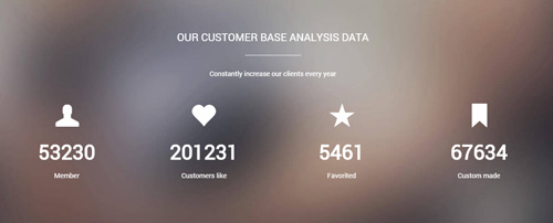
Codes are as follows:
<div class="backgroundImage17 pt-60 pb-60">
  <div class="dnn_layout">
    <div class="content_mid clearfix">
      <h3 class="h3_style_1" style="text-align: center;">OUR CUSTOMER BASE ANALYSIS DATA</h3>
      <div class="dividers_12"></div>
      <p style="text-align: center;">Constantly increase our clients every year</p>
      <div class="number_Animation_4  row  mt-20">
        <div class="col-sm-3 animation periodic1">
          <div class="box"> <span class="glyphicons glyph-user"> </span> <span data-number="53230" class="animation  number">0</span>
            <p>Member</p>
          </div>
        </div>
        <div class="col-sm-3 animation periodic2">
          <div class="box"> <span class="glyphicons glyph-heart"> </span> <span data-number="201231" class="animation  number">0</span>
            <p>Customers like</p>
          </div>
        </div>
        <div class="col-sm-3 animation periodic3">
          <div class="box"> <span class="glyphicons glyph-star"> </span> <span data-number="5461" class="animation  number">0</span>
            <p>Favorited</p>
          </div>
        </div>
        <div class="col-sm-3 animation periodic4">
          <div class="box"> <span class="glyphicons glyph-bookmark"> </span> <span data-number="67634" class="animation  number">0</span>
            <p>Custom made</p>
          </div>
        </div>
      </div>
    </div>
  </div>
</div>
Option:
- You can change the value you need to display through
data-number col-md-*is the width of each column, you can change the width you need through value1~12.- You can modify
animationto change the animation on the slide. Animation list. - You can modify
glyphiconsto change icons. font icon list.
LOGO area
Below is the screen shot:

Codes are as follows:
<div class="row animation scaleUp" style="text-align: center;">
  <div class="col-md-2 col-sm-4 col-xs-6"><img alt="" class="img-responsive" src="/portals/33/list_link_05.png" /> </div>
  <div class="col-md-2 col-sm-4 col-xs-6"><img alt="" class="img-responsive" src="/portals/33/list_link_06.png" /> </div>
  <div class="clearfix visible-xs"></div>
  <div class="col-md-2 col-sm-4 col-xs-6"><img alt="" class="img-responsive" src="/portals/33/list_link_07.png" /> </div>
  <div class="clearfix visible-sm"></div>
  <div class="col-md-2 col-sm-4 col-xs-6"><img alt="" class="img-responsive" src="/portals/33/list_link_08.png" /> </div>
  <div class="clearfix visible-xs"></div>
  <div class="col-md-2 col-sm-4 col-xs-6"><img alt="" class="img-responsive" src="/portals/33/list_link_09.png" /> </div>
  <div class="col-md-2 col-sm-4 col-xs-6"><img alt="" class="img-responsive" src="/portals/33/list_link_10.png" /> </div>
</div>
Option:
col-md-*is the width of each column, you can change the width you need through value1~12.img-responsiveimage responsive- You can modify
animationto change the animation on the slide. Animation list.
FREE LIFETIME SERVICES area
Below is the screen shot:
Codes are as follows:
<div class="backgroundImage9 pt-40 pb-40">
  <div class="dnn_layout">
    <div class="content_mid clearfix">
      <div class="row">
        <div class="col-sm-6 animation fadeInLeft" style="text-align: left;"> <img alt="" class="img-responsive" src="/portals/33/Pic_05.png" /></div>
        <div class="col-sm-6 pt-40 animation fadeInRight" style="text-align: left;">
          <h3 class="h3_style_1">FREE LIFETIME SERVICES</h3>
          <p class="pb-20">Lorem ipsum dolor sit amet, consectetur adipisicing elit...</p>
          <a class="Button_gray" href="#" target="blank">BUY NOW</a></div>
      </div>
    </div>
  </div>
</div>
Option:
col-md-*is the width of each column, you can change the width you need through value1~12.img-responsiveimage responsive- You can modify
animationto change the animation on the slide. Animation list.
EXPERIENCED DEVELOPERS AND SKILLFUL DESIGNERS area
Below is the screen shot:

Codes are as follows:
<div class="backgroundImage17 pt-60">
  <div class="dnn_layout">
    <div class="content_mid clearfix">
      <h3 class="h3_style_1" style="text-align: center;">EXPERIENCED DEVELOPERS AND SKILLFUL DESIGNERS</h3>
      <div class="dividers_12 mb-40"></div>
      <div class="row">
        <div class="col-sm-6 animation fadeInLeft"><img alt="" class="img-responsive" src="/portals/33/pic_06_09.png" /></div>
        <div class="col-sm-6 animation fadeInRight" style="text-align: left;">
          <h5>DEVELOPMENT OF TECHNOLOGY</h5>
          <p class="pb-40"> Content text ....</p>
          <h5>INNOVATIVE DESIGN</h5>
          <p class="pb-20"> Content text ....</p>
          <a class="Button_default2" href="#" target="blank">SEE MORE</a> </div>
      </div>
    </div>
  </div>
</div>
Option:
col-md-*is the width of each column, you can change the width you need through value1~12.img-responsiveimage responsive- You can modify
animationto change the animation on the slide. Animation list.
Testimonials area
Below is the screen shot:
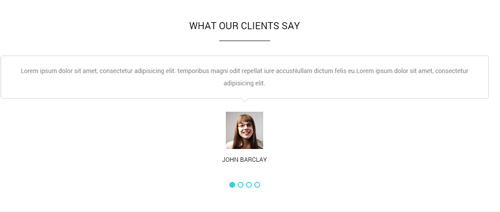
Codes are as follows:
<ul data-autoplay="0" data-display-arrows="false" data-position="fade" class=" Testimonials_tab Testimonials_2 mt-20 animation scaleUp">
  <li>
    <blockquote>
      <p>Lorem ipsum dolor sit amet, consectetur adipisicing elit... </p>
      <small> <span class="pic"><img alt="" src="/portals/33/portrait_1.jpg" /></span> JOHN BARCLAY</small><br />
    </blockquote>
  </li>
  <li>
    <blockquote>
      <p>Lorem ipsum dolor sit amet, consectetur adipisicing elit... </p>
      <small> <span class="pic"><img alt="" src="/portals/33/portrait_1.jpg" /></span> JOHN BARCLAY</small><br />
    </blockquote>
  </li>
  <li>
    <blockquote>
      <p>Develop strong and flexible solutions that are fitted to the needs of our customers.</p>
      <small> <span class="pic"><img alt="" src="/portals/33/portrait_1.jpg" /></span> JOHN BARCLAY</small> <br />
    </blockquote>
  </li>
  <li>
    <blockquote>
      <p> Content text ....</p>
      <small> <span class="pic"><img alt="" src="/portals/33/portrait_1.jpg" /></span> JOHN BARCLAY</small><br />
    </blockquote>
  </li>
</ul>
Option:
- This is a
Testimonialseffect.Testimonials - You can modify
animationto change the animation on the slide. Animation list.
BOTTOM area
Below is the screen shot:

Codes are as follows:
<div class="backgroundImage16 pt-20 pb-40">
  <div class="dnn_layout">
    <div class="content_mid clearfix">
      <div class="row" style="padding-top: 8px;">
        <div class="col-sm-9 big_size pt-30" style="text-align: left;">
          <p>We will design and develop the skins and modules based completely on your needs. </p>
        </div>
        <div class="col-sm-3" style="text-align: center;"><br />
          <p> <a href="#" target="blank" class="Button_gray">BUY NOW</a> </p>
        </div>
      </div>
    </div>
  </div>
</div>
Option:
col-md-*is the width of each column, you can change the width you need through value1~12.
RECENT PROJECTS area
Below is the screen shot:
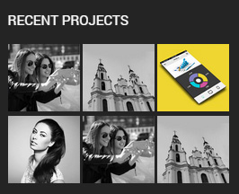
Codes are as follows:
<ul class="img_list animation fadeInUp">
  <li>
    <div class="photo_box content_zoom  ico_zoom  content_sytle_2"> <a class="LightBox_image_gallery1" href="/Portals/33/carousel_18.jpg">
      <div class="pic_box"> <img alt="" src="/portals/33/carousel_18.jpg" />
        <div class="ico"><span class="glyphicons glyph-zoom-in"></span></div>
        <div class="shade"></div>
      </div>
      </a> </div>
  </li>
  <li>
    <div class="photo_box content_zoom ico_zoom  content_sytle_2"> <a class="LightBox_image_gallery1" href="/Portals/33/carousel_19.jpg">
      <div class="pic_box"> <img alt="" src="/portals/33/carousel_19.jpg" />
        <div class="ico"><span class="glyphicons glyph-zoom-in"></span></div>
        <div class="shade"></div>
      </div>
      </a> </div>
  </li>
  <li>
    <div class="photo_box content_zoom ico_zoom  content_sytle_2"> <a class="LightBox_image_gallery1" href="/Portals/33/carousel_20.jpg">
      <div class="pic_box"> <img alt="" src="/portals/33/carousel_20.jpg" />
        <div class="ico"><span class="glyphicons glyph-zoom-in"></span></div>
        <div class="shade"></div>
      </div>
      </a> </div>
  </li>
  <li>
    <div class="photo_box content_zoom ico_zoom  content_sytle_2"> <a class="LightBox_image_gallery1" href="/Portals/33/carousel_21.jpg">
      <div class="pic_box"> <img alt="" src="/portals/33/carousel_21.jpg" />
        <div class="ico"><span class="glyphicons glyph-zoom-in"></span></div>
        <div class="shade"></div>
      </div>
      </a> </div>
  </li>
  <li>
    <div class="photo_box content_zoom ico_zoom  content_sytle_2"> <a class="LightBox_image_gallery1" href="/Portals/33/carousel_18.jpg">
      <div class="pic_box"> <img alt="" src="/portals/33/carousel_18.jpg" />
        <div class="ico"><span class="glyphicons glyph-zoom-in"></span></div>
        <div class="shade"></div>
      </div>
      </a> </div>
  </li>
  <li>
    <div class="photo_box content_zoom ico_zoom  content_sytle_2"> <a class="LightBox_image_gallery1" href="/Portals/33/carousel_19.jpg">
      <div class="pic_box"> <img alt="" src="/portals/33/carousel_19.jpg" />
        <div class="ico"><span class="glyphicons glyph-zoom-in"></span></div>
        <div class="shade"></div>
      </div>
      </a> </div>
  </li>
</ul>
Option:
- You can modify
animationto change the animation on the slide. Animation list. - You can modify
glyphiconsto change icons. font icon list. - You can modify
photo_boxto change image effects. Image Effects Containeris usingContainer-3
CONTACT INFO area
Below is the screen shot:
Codes are as follows:
<div class="animation fadeInUp">
    <ul class="list_style2">
        <li><span class="glyphicons glyph-google-maps"></span>Content text ....</li>
        <li><span class="glyphicons glyph-iphone"></span>phone :  +( 1 )-123-456-789-0</li>
        <li><span class="glyphicons glyph-envelope"></span>Email : dnnskindev@gmail.com</li>
    </ul>
    <div class="social-icons foot_social_2  clearfix">
        <a href="#"><span class="social social-twitter"></span></a>
        <a href="#"><span class="social social-tumblr"></span></a>
        <a href="#"><span class="social social-facebook"></span></a>
        <a href="#"><span class="social social-picasa"></span></a>
        <a href="#"><span class="social social-google-plus"></span></a>
        <a href="#"><span class="social social-apple"></span></a></div>
    </div>
</div>
Option:
- You can modify
animationto change the animation on the slide. Animation list. - You can modify
glyphiconsto change icons. font icon list. Containeris usingContainer-3
OUR SERVICES area
Below is the screen shot:
Codes are as follows:
<div id="accordion7" class="panel-group accordion_7 animation fadeInUp">
  <div class="panel panel-default">
    <div class="panel-heading">
      <h4 class="panel-title"> <a href="#collapse7_1" data-parent="#accordion7" data-toggle="collapse"><span class="accordion_icon"></span>Web design</a> </h4>
    </div>
    <div class="panel-collapse collapse in" id="collapse7_1">
      <div class="panel-body">Lorem ipsum dolor sit amet, consectetur adipisicing elit... </div>
    </div>
  </div>
  <div class="panel panel-default">
    <div class="panel-heading">
      <h4 class="panel-title"> <a class="collapsed" href="#collapse7_2" data-parent="#accordion7" data-toggle="collapse"><span class="accordion_icon"></span>Typeface </a> </h4>
    </div>
    <div class="panel-collapse collapse" id="collapse7_2">
      <div class="panel-body">Lorem ipsum dolor sit amet, consectetur adipisicing elit... </div>
    </div>
  </div>
  <div class="panel panel-default">
    <div class="panel-heading">
      <h4 class="panel-title"> <a class="collapsed" href="#collapse7_3" data-parent="#accordion7" data-toggle="collapse"><span class="accordion_icon"></span>Typeface </a> </h4>
    </div>
    <div class="panel-collapse collapse" id="collapse7_3">
      <div class="panel-body">Lorem ipsum dolor sit amet, consectetur adipisicing elit... </div>
    </div>
  </div>
  <div class="panel panel-default">
    <div class="panel-heading">
      <h4 class="panel-title"> <a class="collapsed" href="#collapse7_4" data-parent="#accordion7" data-toggle="collapse"><span class="accordion_icon"></span>HTLM&CSS </a> </h4>
    </div>
    <div class="panel-collapse collapse" id="collapse7_4">
      <div class="panel-body">Lorem ipsum dolor sit amet, consectetur adipisicing elit... </div>
    </div>
  </div>
</div>
Option:
- You can modify
animationto change the animation on the slide. Animation list. Containeris usingContainer-3
GET IN TOUCH area
Below is the screen shot:
Codes are as follows:
Option:
- This is
Theme_Responsive_20066-home2theme ofDNNGo PowerFormsmodule Containeris usingContainer-3
Home Version 4
You can click the link to check Home Version 4 demo. Home Version 4
Banner area
Below is the screen shot:
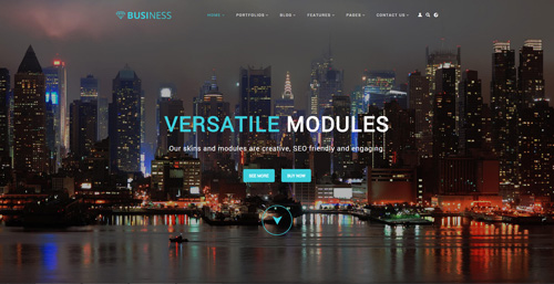
Codes are as follows:
<ul class="full_screen_pic">
      <li style="background-image: url('http://demo7.dnngo.net/Portals/33/full_screen_img.jpg');">
        <div class="content">
          <div class="title"> <span class="animation_1"> VERSATILE</span> <span class="animation_2"> MODULES </span> </div>
          <div class="animation_3"> Our skins and modules are creative, SEO friendly and engaging. </div>
          <div class="but">
              <span class="animation_4"> <a href="#" target="blank">SEE MORE</a></span>
              <span class="animation_4"> <a href="#" target="blank">BUY NOW</a></span>
          </div>
          <div id="nextPage"> </div>
        </div>
      </li>
    </ul>
Option:
- You can modify
background-imageto change background image.
TAB area
Below is the screen shot:
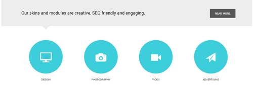
Codes are as follows:
<div class="horizontalTab_Top horizontalTab_bottom_1 ">
  <div class="tab_bg">
    <div class="dnn_layout animation scaleUp">
      <div class="content_mid clearfix">
        <div class="resp-tabs-container">
          <div class="resp_container">
            <div class="resp_margin">
              <p>Our skins and modules are creative, SEO friendly and engaging. </p>
              <a class="but" href="#" target="blank">READ MORE</a></div>
          </div>
          <div class="resp_container">
            <div class="resp_margin">
              <p> Lorem ipsum dolor sit amet, consectetuer adipiscing elit</p>
              <a class="but" href="#" target="blank">READ MORE</a></div>
          </div>
          <div class="resp_container">
            <div class="resp_margin">
              <p>Lorem ipsu dolor sit amet, consectetur elit. </p>
              <a class="but" href="#" target="blank">READ MORE</a></div>
          </div>
          <div class="resp_container">
            <div class="resp_margin">
              <p>Promise to keep upgrading our skins and modules constantly.</p>
              <a class="but" href="#" target="blank">READ MORE</a></div>
          </div>
        </div>
      </div>
    </div>
  </div>
  <div class="dnn_layout mb-60">
    <div class="content_mid clearfix">
      <ul class="resp-tabs-list">
        <li class="animation periodic1">
          <div class="tab_ico"><span class="glyphicons glyph-display"></span> DESIGN </div>
        </li>
        <li class="animation periodic2">
          <div class="tab_ico"><span class="glyphicons glyph-camera"></span> PHOTOGRAPHY </div>
        </li>
        <li class="animation periodic3">
          <div class="tab_ico"><span class="glyphicons glyph-facetime-video"></span> VIDEO </div>
        </li>
        <li class="animation periodic4">
          <div class="tab_ico"><span class="glyphicons glyph-send"></span> ADVERTISING </div>
        </li>
      </ul>
    </div>
  </div>
</div>
Option:
- This is a
Responsive Tabeffect.ResponsiveTab - You can modify
animationto change the animation on the slide. Animation list. - You can modify
glyphiconsto change icons. font icon list.
ADVANCED TECHNOLOGY area
Below is the screen shot:
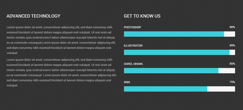
Codes are as follows:
<div class="backgroundImage18 pt-60 pb-60" style="text-align: left;">
  <div class="dnn_layout">
    <div class="content_mid clearfix">
      <div class="row">
        <div class="col-sm-6 animation fadeInLeft">
          <h3 class="h3_style_1 pb-20">ADVANCED TECHNOLOGY</h3>
          <div class="color_style_1">
            <p>Lorem ipsum dolor sit amet, consectetuer adipiscing elit...</p>
          </div>
        </div>
        <div class="col-sm-6 animation fadeInRight">
          <h3 class="h3_style_1 pb-20">GET TO KNOW US</h3>
          <div class="loaded_list_3">
            <p>PHOTOSHOP </p>
            <div class="progress">
              <div data-width="90%" class="bar animation animationwidth"> <span></span> </div>
            </div>
            <p>ILLUSTRATOR</p>
            <div class="progress">
              <div data-width="95%" class="bar animation animationwidth"> <span></span> </div>
            </div>
            <p>COREL DRAWL</p>
            <p> </p>
            <div class="progress">
              <div data-width="85%" class="bar animation animationwidth"> <span></span> </div>
            </div>
            <p>DNN</p>
            <div class="progress">
              <div data-width="75%" class="bar animation animationwidth"> <span></span> </div>
            </div>
          </div>
        </div>
      </div>
    </div>
  </div>
</div>
Option:
data-widthis controlling the percentage that displays, you can display percentage through value0~100- You can modify
animationto change the animation on the slide. Animation list.
MEET THE TEAM area
Below is the screen shot:
Codes are as follows:
<div class="row ourteam_3 mt-20">
  <div class="col-sm-4 animation periodic1">
    <a href="#" target="blank">
        <img alt="" src="/portals/33/ourteam_01.png" />
    </a>
    <h3>SMITH ELLE<span>ART DIRECTOR</span></h3>
    <p> Content Text 1 ... </p>
  </div>
  <div class="col-sm-4 animation periodic2">
    <a href="#" target="blank">
        <img alt="" src="/portals/33/ourteam_02.png" />
    </a>
    <h3>SMITH ELLE<span>CEO</span></h3>
    <p> Content Text 1 ... </p>
  </div>
  <div class="col-sm-4 animation periodic3">
    <a href="#" target="blank">
        <img alt="" src="/portals/33/ourteam_03.png" />
    </a>
    <h3>SMITH ELLE<span>GRAPHIC DESIGNER</span></h3>
    <p> Content Text 1 ... </p>
  </div>
</div>
Option:
col-md-*is the width of each column, you can change the width you need through value1~12.- You can modify
animationto change the animation on the slide. Animation list. Containeris usingContainer-H3-5
NUMBER area
Below is the screen shot:
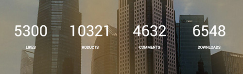
Codes are as follows:
<div class="backgroundImage19 ">
  <div class="shade pt-60 pb-60">
    <div class="dnn_layout">
      <div class="content_mid clearfix">
        <div class="number_Animation_5 row">
          <div class="col-sm-3 animation fadeInUp"> <span data-number="5300" class="animation  number">0</span>
            <p>LIKES</p>
          </div>
          <div class="col-sm-3 animation fadeInUp"> <span data-number="10321" class="animation  number">0</span>
            <p>RODUCTS</p>
          </div>
          <div class="col-sm-3 animation fadeInUp"> <span data-number="4632" class="animation  number">0</span>
            <p>COMMENTS</p>
          </div>
          <div class="col-sm-3 animation fadeInUp"> <span data-number="6548" class="animation  number">0</span>
            <p>DOWNLOADS</p>
          </div>
        </div>
        <br />
      </div>
    </div>
  </div>
</div>
Option:
- You can change the value you need to display through
data-number - You can modify
animationto change the animation on the slide. Animation list.
WHY CHOOSE US area
Below is the screen shot:
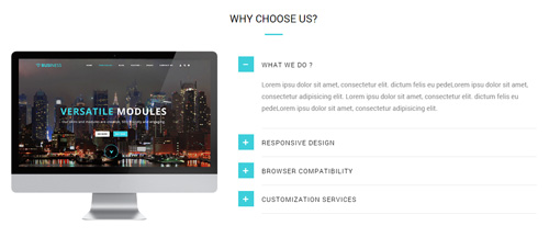
Codes are as follows:
<div class="row pt-20">
  <div class="col-sm-5 animation fadeInLeft"> <img alt="" class="img-responsive" src="/portals/33/pic_07.png" /> </div>
  <div class="col-sm-7 animation fadeInRight">
    <div id="accordion8" class="panel-group accordion_8">
      <div class="panel panel-default">
        <div class="panel-heading">
          <h4 class="panel-title"> <a href="#collapse8_1" data-parent="#accordion8" data-toggle="collapse"><span class="accordion_icon"></span>WHAT WE DO ? </a> </h4>
        </div>
        <div class="panel-collapse collapse in" id="collapse8_1">
          <div class="panel-body">Content Text 1 ... </div>
        </div>
      </div>
      <div class="panel panel-default">
        <div class="panel-heading">
          <h4 class="panel-title"> <a class="collapsed" href="#collapse8_2" data-parent="#accordion8" data-toggle="collapse"><span class="accordion_icon"></span>RESPONSIVE DESIGN </a> </h4>
        </div>
        <div class="panel-collapse collapse" id="collapse8_2">
          <div class="panel-body">Content Text 1 ... </div>
        </div>
      </div>
      <div class="panel panel-default">
        <div class="panel-heading">
          <h4 class="panel-title"> <a class="collapsed" href="#collapse8_3" data-parent="#accordion8" data-toggle="collapse"><span class="accordion_icon"></span>BROWSER COMPATIBILITY</a> </h4>
        </div>
        <div class="panel-collapse collapse" id="collapse8_3">
          <div class="panel-body">Content Text 1 ... </div>
        </div>
      </div>
      <div class="panel panel-default">
        <div class="panel-heading">
          <h4 class="panel-title"> <a class="collapsed" href="#collapse8_4" data-parent="#accordion8" data-toggle="collapse"><span class="accordion_icon"></span>CUSTOMIZATION SERVICES </a> </h4>
        </div>
        <div class="panel-collapse collapse" id="collapse8_4">
          <div class="panel-body">Content Text 1 ... </div>
        </div>
      </div>
    </div>
  </div>
</div>
Option:
- This is a
Accordionseffect.Accordions col-md-*is the width of each column, you can change the width you need through value1~12.img-responsiveimage responsive- You can modify
animationto change the animation on the slide. Animation list.
BACKGROUNDIMAGE18 area
Below is the screen shot:

Codes are as follows:
<div class="backgroundImage18 pt-20 pb-20">
  <div class="dnn_layout animation scaleUp">
    <div class="content_mid clearfix">
      <div class="row">
        <div class="col-sm-9 big_size" style="text-align: left;">
          <p class=" pt-30">Promise to keep upgrading our skins and modules constantly.</p>
        </div>
        <div class="col-sm-3" style="text-align: center;"> <br />
          <p> <a href="#" target="blank" class="Button_default3">CHECK IT OUT</a> </p>
        </div>
      </div>
    </div>
  </div>
</div>
Option:
col-md-*is the width of each column, you can change the width you need through value1~12.- You can modify
animationto change the animation on the slide. Animation list.
OUR SERVICES AND FEATURES area
Below is the screen shot:
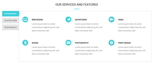
Codes are as follows:
<div class="dnn_layout pb-40 animation scaleUp">
  <div class="content_mid clearfix">
    <div class="verticalTab_Left verticalTab_Left_3">
      <ul class="resp-tabs-list">
        <li> <span>OUR SERVICES</span> </li>
        <li> <span>OUR FEATURES</span> </li>
        <li> <span>TESTIMONIALS</span> </li>
      </ul>
      <div class="resp-tabs-container">
        <div class="resp_container">
          <div class="resp_margin">
            <div class="row">
              <div class="col-sm-4">
                <div class="ServeList_8">
                  <div class="ico"><span class="glyphicons glyph-imac"></span></div>
                  <h6>WEB DESIGN</h6>
                  Content Text 1 ... </div>
              </div>
              <div class="col-sm-4">
                <div class="ServeList_8">
                  <div class="ico"><span class="glyphicons glyph-send"></span></div>
                  <h6>ADVERTISING</h6>
                  Content Text 1 ... </div>
              </div>
              <div class="col-sm-4">
                <div class="ServeList_8">
                  <div class="ico"><span class="glyphicons glyph-facetime-video"></span></div>
                  <h6>VIDEO</h6>
                  Content Text 1 ... </div>
              </div>
            </div>
            <div class="row">
              <div class="col-sm-4">
                <div class="ServeList_8">
                  <div class="ico"><span class="glyphicons glyph-microphone"></span></div>
                  <h6>SOUND</h6>
                  Content Text 1 ... </div>
              </div>
              <div class="col-sm-4">
                <div class="ServeList_8">
                  <div class="ico"><span class="glyphicons glyph-camera"></span></div>
                  <h6>PHOTOGRAPHY</h6>
                  Content Text 1 ... </div>
              </div>
              <div class="col-sm-4">
                <div class="ServeList_8">
                  <div class="ico"><span class="glyphicons glyph-cogwheel"></span></div>
                  <h6>PRINT DESIGN</h6>
                  Content Text 1 ... </div>
              </div>
            </div>
          </div>
        </div>
      </div>
    </div>
  </div>
</div>
Option:
- This is a
Responsive Tabeffect.ResponsiveTab col-md-*is the width of each column, you can change the width you need through value1~12.- You can modify
animationto change the animation on the slide. Animation list. - You can modify
glyphiconsto change icons. font icon list. Containeris usingContainer-H3-6
OUR LATEST WORK area
Below is the screen shot:
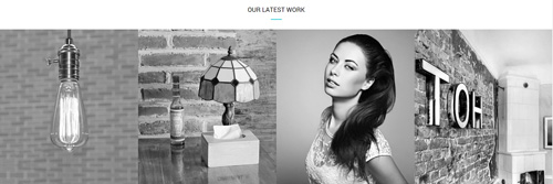
Codes are as follows:
<div data-pagination="false" class="carousel carousel_3 mt-20 animation scaleUp">
  <div class="item discoloration">
  <a href="#" target="blank"> <img alt="" src="/portals/33/carousel_22.jpg" /> </a>
  </div>
  <div class="item discoloration">
  <a href="#" target="blank"> <img alt="" src="/portals/33/carousel_23.jpg" /> </a>
  </div>
  <div class="item discoloration">
   <a href="#" target="blank"> <img alt="" src="/portals/33/carousel_24.jpg" /> </a>
   </div>
  <div class="item discoloration">
  <a href="#" target="blank"> <img alt="" src="/portals/33/carousel_25.jpg" /> </a>
  </div>
  <div class="item discoloration">
  <a href="#" target="blank"> <img alt="" src="/portals/33/carousel_22.jpg" /> </a>
  </div>
  <div class="item discoloration">
  <a href="#" target="blank"> <img alt="" src="/portals/33/carousel_23.jpg" /> </a>
  </div>
  <div class="item discoloration">
  <a href="#" target="blank"> <img alt="" src="/portals/33/carousel_24.jpg" /> </a>
  </div>
  <div class="item discoloration">
  <a href="#" target="blank"> <img alt="" src="/portals/33/carousel_25.jpg" /> </a>
  </div>
</div>
Option:
- This is a
Carouseleffect.Carousel - You can modify
animationto change the animation on the slide. Animation list. Containeris usingContainer-H3-6
CLIENTS area
Below is the screen shot:
Codes are as follows:
<div class="pt-20 pb-20" style="text-align: center;">Arem ipsum dolor sit amet, consectetur adipiscing elit.<br />
</div>
<div class="row animation scaleUp" style="text-align: center;">
  <div class="col-md-2 col-sm-4 col-xs-6"><img alt="" src="/portals/33/list_link_05.png" class="img-responsive" /> </div>
  <div class="col-md-2 col-sm-4 col-xs-6"><img alt="" src="/portals/33/list_link_06.png" class="img-responsive" /> </div>
  <div class="clearfix visible-xs"></div>
  <div class="col-md-2 col-sm-4 col-xs-6"><img alt="" src="/portals/33/list_link_07.png" class="img-responsive" /> </div>
  <div class="clearfix visible-sm"></div>
  <div class="col-md-2 col-sm-4 col-xs-6"><img alt="" src="/portals/33/list_link_08.png" class="img-responsive" /> </div>
  <div class="clearfix visible-xs"></div>
  <div class="col-md-2 col-sm-4 col-xs-6"><img alt="" src="/portals/33/list_link_09.png" class="img-responsive" /> </div>
  <div class="col-md-2 col-sm-4 col-xs-6"><img alt="" src="/portals/33/list_link_10.png" class="img-responsive" /> </div>
</div>
Option:
img-responsiveimage responsive- You can modify
animationto change the animation on the slide. Animation list. Containeris usingContainer-H3-6
ABOUT US area
Below is the screen shot:
Codes are as follows:
<div class="animation fadeInUp">
  <p class="pb-20">Content Text 1 ...</p>
  <a class="Button_default3 small" href="#" target="blank">CHECK IT OUT</a>
</div>
Option:
- You can modify
animationto change the animation on the slide. Animation list. Containeris usingContainer-3
OUR SERVICES area
Below is the screen shot:
Codes are as follows:
<ul class="list_style4 animation fadeInUp">
  <li><span class="glyphicons glyph-ok-2"></span>Vestibulum ante ipsum</li>
  <li><span class="glyphicons glyph-ok-2"></span>Curae Integer in enime</li>
  <li><span class="glyphicons glyph-ok-2"></span>Morbi aliquet nulla at a</li>
  <li><span class="glyphicons glyph-ok-2"></span>Aliquam augue elit sfga</li>
</ul>
Option:
- You can modify
animationto change the animation on the slide. Animation list. - You can modify
glyphiconsto change icons. font icon list. Containeris usingContainer-3
CONTACT INFO area
Below is the screen shot:
Codes are as follows:
<ul class="list_style2 white_line animation fadeInUp">
  <li><span class="glyphicons glyph-google-maps"></span>Content text ....</li>
  <li><span class="glyphicons glyph-iphone"></span>phone :  +( 1 )-123-456-789-0</li>
  <li><span class="glyphicons glyph-envelope"></span>Email : dnnskindev@gmail.com</li>
</ul>
Option:
col-md-*is the width of each column, you can change the width you need through value1~12.- You can modify
animationto change the animation on the slide. Animation list. - You can modify
glyphiconsto change icons. font icon list. Containeris usingContainer-3
RECENT PROJECTS area
Below is the screen shot:
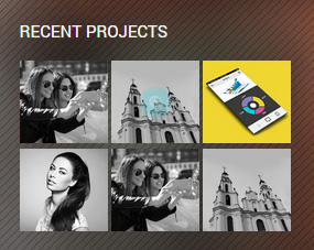
Codes are as follows:
<ul class="img_list animation fadeInUp">
  <li>
    <div class="photo_box content_zoom  ico_zoom  content_sytle_2"> <a href="/Portals/33/carousel_18.jpg" class="LightBox_image_gallery1">
      <div class="pic_box"> <img alt="" src="/portals/33/carousel_18.jpg" />
        <div class="ico"><span class="glyphicons glyph-zoom-in"></span></div>
        <div class="shade"></div>
      </div>
      </a> </div>
  </li>
  <li>
    <div class="photo_box content_zoom ico_zoom  content_sytle_2"> <a href="/Portals/33/carousel_19.jpg" class="LightBox_image_gallery1">
      <div class="pic_box"> <img alt="" src="/portals/33/carousel_19.jpg" />
        <div class="ico"><span class="glyphicons glyph-zoom-in"></span></div>
        <div class="shade"></div>
      </div>
      </a> </div>
  </li>
  <li>
    <div class="photo_box content_zoom ico_zoom  content_sytle_2"> <a href="/Portals/33/carousel_20.jpg" class="LightBox_image_gallery1">
      <div class="pic_box"> <img alt="" src="/portals/33/carousel_20.jpg" />
        <div class="ico"><span class="glyphicons glyph-zoom-in"></span></div>
        <div class="shade"></div>
      </div>
      </a> </div>
  </li>
  <li>
    <div class="photo_box content_zoom ico_zoom  content_sytle_2"> <a href="/Portals/33/carousel_21.jpg" class="LightBox_image_gallery1">
      <div class="pic_box"> <img alt="" src="/portals/33/carousel_21.jpg" />
        <div class="ico"><span class="glyphicons glyph-zoom-in"></span></div>
        <div class="shade"></div>
      </div>
      </a> </div>
  </li>
  <li>
    <div class="photo_box content_zoom ico_zoom  content_sytle_2"> <a href="/Portals/33/carousel_18.jpg" class="LightBox_image_gallery1">
      <div class="pic_box"> <img alt="" src="/portals/33/carousel_18.jpg" />
        <div class="ico"><span class="glyphicons glyph-zoom-in"></span></div>
        <div class="shade"></div>
      </div>
      </a> </div>
  </li>
  <li>
    <div class="photo_box content_zoom ico_zoom  content_sytle_2"> <a href="/Portals/33/carousel_19.jpg" class="LightBox_image_gallery1">
      <div class="pic_box"> <img alt="" src="/portals/33/carousel_19.jpg" />
        <div class="ico"><span class="glyphicons glyph-zoom-in"></span></div>
        <div class="shade"></div>
      </div>
      </a> </div>
  </li>
</ul>
Option:
- This is a
LightBoxeffect.LightBox - You can modify
animationto change the animation on the slide. Animation list. - You can modify
glyphiconsto change icons. font icon list. - You can modify
photo_boxto change image effects. Image Effects Containeris usingContainer-3
HomeVersion5
You can click the link to check HomeVersion5 demo. HomeVersion5
Anchor area
It will scroll to the corresponding area on the page when clicking the menu texts at the top. It will also do so when clicking the dots on the right of the skin.
These anchors are generated through page's anchorTag. Codes are as follows. You can place this piece of codes in page's HTML module, click the right anchor, then page will slide to this HTML module area.
<div data-scrollshownav="true" class="anchorTag" data-title="FEATURES" data-menuanchor="true">
<div class="number"><span>1</span></div>
</div>
Option:
data-title |
Title displayed correspondingly to the right navigation. If page title of the menu is the same as data-title, page will scroll to this area when clicking menu texts. |
data-menuanchor |
Whether to enable menu anchor feature or not. |
data-scrollshownav |
Whether to enable navigation or not. |
data-offset |
Offset value of up and down coordinate for anchor. |
data-icourl |
Image url that displays correspondingly of the right navigation. |
data-iconame |
Icon class names that displays correspondingly of the right navigation. |
How to set menu anchor
- Click Add New Page button.
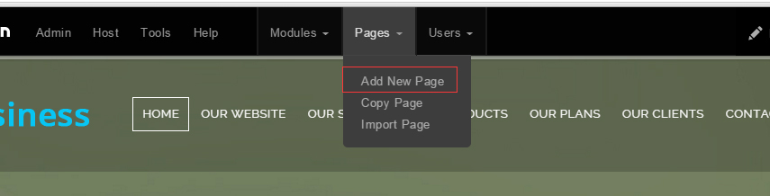
- Fill in Page Name and Page Title. Texts for Page Title needs to be the same as that of data-title.
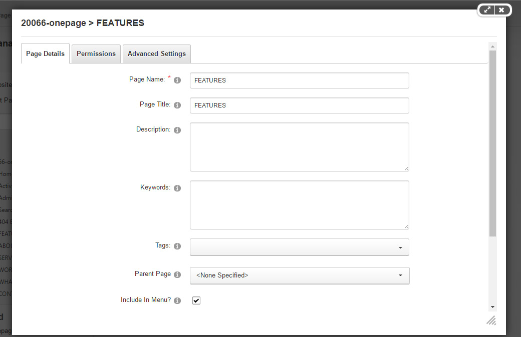
- Put the anchor code to HTML module of the page. It will scroll to the corresponding area on the page when clicking the top menu texts.
<div data-scrollshownav="true" class="anchorTag" data-title="FEATURES" data-menuanchor="true">
<div class="number"><span>1</span></div>
</div>
Banner area
Below is the screen shot:

It is using DNNGo LayerGalleryPro module here,you can import ContentListEntity-OnePage.xml of the DNNGo_LayerGalleryPro folder to duplicate banner of the demo.
WELCOME TO OUR WEBSITE area
Below is the screen shot:

Codes are as follows:
<div class="title_style_13 animation fadeInUp">
  <div data-title="WELCOME TO OUR WEBSITE" class="anchorTag" data-offset="-60"> </div>
  <h3>WELCOME TO OUR WEBSITE</h3>
  <h4>The Best Selling DNN themes in 2014 on DNN Store.</h4>
</div>
Banner area
Below is the screen shot:
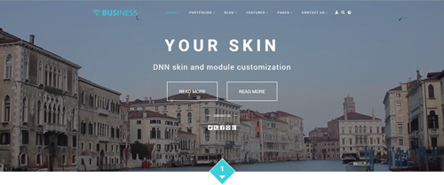
Codes are as follows:
<div class="player" data-property="{videoURL:'npfu0fN9GUA',containment:'self', showControls:false, autoPlay:true, loop:true, vol:50, mute:true, startAt:10, opacity:1, addRaster:false, quality:'hd1080'}">
  <div class="Play"></div>
  <div class="dnn_layout pt-60 pb-60">
    <div class="content_mid clearfix">
      <div class="player_boxes">
        <h1 class="player_title">YOUR SKIN</h1>
        <h4 class="player_smalltitle">DNN skin and module customization </h4>
        <p>
            <a href="#" target="blank" class="Button"> READ MORE</a>
            <a href="#" class="Button" target="blank">READ MORE</a>
        </p>
        <div class="player_content">
          <div class="content_title"><span> CONTACT US</span></div>
          <div class="social_list  social_list2 clearfix">
              <a href="#"><span class="social social-twitter"></span></a>
              <a href="#"><span class="social social-tumblr"></span></a>
              <a href="#"><span class="social social-facebook"></span></a>
              <a href="#"><span class="social social-picasa"></span></a>
              <a href="#"><span class="social social-google-plus"></span></a>
          </div>
        </div>
      </div>
    </div>
  </div>
</div>
Option:
- "{videoURL:'npfu0fN9GUA' is the url of
youtube - You can modify
socialto change icons. font icon list.
ABOUT OUR FEATURES area
Below is the screen shot:
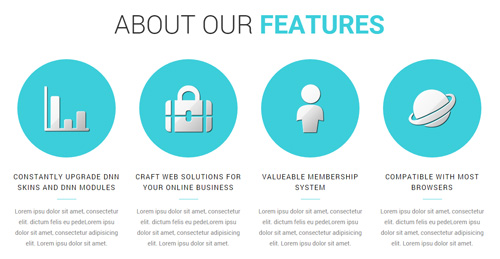
Codes are as follows:
<div class="ServeList_9 mt-20 pb-40">
  <div class="row">
    <div class="col-md-3 col-sm-6 animation periodic1">
      <div class="ico"><img alt="" src="/portals/33/Pic_14.png" /></div>
      <h5>CONSTANTLY UPGRADE DNN SKINS AND DNN MODULES</h5>
      <p>Content Text 1 ... </p>
    </div>
    <div class="col-md-3 col-sm-6 animation periodic2">
      <div class="ico"><img alt="" src="/portals/33/Pic_15.png" /></div>
      <h5>CRAFT WEB SOLUTIONS FOR YOUR ONLINE BUSINESS</h5>
      <p>Content Text 1 ... </p>
    </div>
    <div class="clearfix visible-sm"></div>
    <div class="col-md-3 col-sm-6 animation periodic3">
      <div class="ico"><img alt="" src="/portals/33/Pic_16.png" /></div>
      <h5>VALUEABLE MEMBERSHIP SYSTEM</h5>
      <p>Content Text 1 ... </p>
    </div>
    <div class="col-md-3 col-sm-6 animation periodic4">
      <div class="ico"><img alt="" src="/portals/33/Pic_17.png" /></div>
      <h5>COMPATIBLE WITH MOST BROWSERS</h5>
      <p>Content Text 1 ... </p>
    </div>
  </div>
</div>
Option:
col-md-*is the width of each column, you can change the width you need through value1~12.- You can modify
animationto change the animation on the slide. Animation list. Containeris usingContainer-4
ABOUT US area
Below is the screen shot:
Codes are as follows:
<div class="anchorTag">
  <div class="number"><span>2</span></div>
</div>

<div class="backgroundImage3">
  <div class="dnn_layout">
    <div class="content_mid clearfix">
      <div class="img_tab animation scaleUp">

        <ul class="tab_nav">
          <li><img alt="" src="/portals/33/Tab_img_01.jpg" /></li>
          <li><img alt="" src="/portals/33/Tab_img_02.jpg" /></li>
          <li><img alt="" src="/portals/33/Tab_img_03.jpg" /></li>
        </ul>

        <div class="tab_content">
          <div class="tab_item">
            <h3 class="tab_title">ABOUT <span>US</span></h3>
            <h4 class="tab_smalltitle">Just let us know what you have in mind and we will turn it to reality.</h4>
            <p class="pb-20"> <span class="dropcaps_7">L</span> orem ipsu dolor sit amet, consectetur elit... </p>
            <p> <span class="dropcaps_7">N</span> orem ipsu dolor sit amet, consectetur elit... </p>
          </div>
          <div class="tab_item">
            <h3 class="tab_title"><span>TECHNOLOGY</span></h3>
            <h4 class="tab_smalltitle"> Which will definitely give your business website an outstanding look. </h4>
            <p class="pb-20"> <span class="dropcaps_7">L</span> orem ipsu dolor sit amet, consectetur elit... </p>
            <p> <span class="dropcaps_7">N</span> orem ipsu dolor sit amet, consectetur elit. dictum felis. </p>
          </div>
          <div class="tab_item">
            <h3 class="tab_title"><span>RESPONSIVE</span></h3>
            <h4 class="tab_smalltitle">Responsive design
              Compatible with desktops, laptops and mobile devices.</h4>
            <p class="pb-20"> <span class="dropcaps_7">L</span> orem ipsu dolor sit amet, consectetur elit... </p>
            <p> <span class="dropcaps_7">N</span> orem ipsu dolor sit amet, consectetur elit... </p>
          </div>
        </div>

      </div>
    </div>
  </div>
</div>

<div class="anchorTag mb-20">
  <div class="number"><span>3</span></div>
</div>
<div class="clear"> </div>
Option:
- Through adding, changing, deleting
.tab_nav > liand.tab_content > .tab_itemyou can control the displaying number of the tab.
ABOUT OUR SERVICES area
Below is the screen shot:
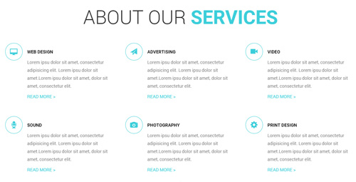
Codes are as follows:
<div class="row">
  <div class="col-sm-4 animation fadeInUp">
    <div class="ServeList_8">
      <div class="ico2"><span class="glyphicons glyph-imac"></span></div>
      <h6>WEB DESIGN</h6>
      <p> Lorem ipsu dolor sit amet, consectetur adipisicing elit... </p>
      <a href="#" target="blank">READ MORE ></a> </div>
  </div>
  <div class="col-sm-4 animation fadeInUp">
    <div class="ServeList_8">
      <div class="ico2"><span class="glyphicons glyph-send"></span></div>
      <h6>ADVERTISING</h6>
      <p> Lorem ipsu dolor sit amet, consectetur adipisicing elit... </p>
      <a href="#" target="blank">READ MORE ></a> </div>
  </div>
  <div class="col-sm-4 animation fadeInUp">
    <div class="ServeList_8">
      <div class="ico2"><span class="glyphicons glyph-facetime-video"></span></div>
      <h6>VIDEO</h6>
      <p> Lorem ipsu dolor sit amet, consectetur adipisicing elit... </p>
      <a href="#" target="blank">READ MORE ></a> </div>
  </div>
</div>
<div class="row">
  <div class="col-sm-4 animation fadeInUp">
    <div class="ServeList_8">
      <div class="ico2"><span class="glyphicons glyph-microphone"></span></div>
      <h6>SOUND</h6>
      <p> Lorem ipsu dolor sit amet, consectetur adipisicing elit... </p>
      <a href="#" target="blank">READ MORE ></a> </div>
  </div>
  <div class="col-sm-4 animation fadeInUp">
    <div class="ServeList_8">
      <div class="ico2"><span class="glyphicons glyph-camera"></span></div>
      <h6>PHOTOGRAPHY</h6>
      <p> Lorem ipsu dolor sit amet, consectetur adipisicing elit...</p>
      <a href="#" target="blank">READ MORE ></a> </div>
  </div>
  <div class="col-sm-4 animation fadeInUp">
    <div class="ServeList_8">
      <div class="ico2"><span class="glyphicons glyph-cogwheel"></span></div>
      <h6>PRINT DESIGN</h6>
      <p> Lorem ipsu dolor sit amet, consectetur adipisicing elit... </p>
      <a href="#" target="blank">READ MORE ></a> </div>
  </div>
</div>
Option:
col-md-*is the width of each column, you can change the width you need through value1~12.- You can modify
animationto change the animation on the slide. Animation list. - You can modify
glyphiconsto change icons. font icon list. Containeris usingContainer-4
NUMBER area
Below is the screen shot:
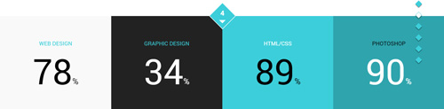

Codes are as follows:
<div class="anchorTag">
  <div class="number"><span>4</span></div>
</div>
<div class="number_Animation_6 row">
  <div class="col-md-3 col-sm-6 bgcolor_1">
    <div class="box animation scaleUp">
      <h3>WEB DESIGN </h3>
      <span data-number="78" class="animation  number">0</span><span class="sup">%</span></div>
  </div>
  <div class="col-md-3 col-sm-6 bgcolor_2">
    <div class="box animation scaleUp">
      <h3>GRAPHIC DESIGN </h3>
      <span data-number="34" class="animation  number">0</span><span class="sup">%</span></div>
  </div>
  <div class="clearfix visible-sm"></div>
  <div class="col-md-3 col-sm-6 bgcolor_3">
    <div class="box animation scaleUp">
      <h3>HTML/CSS </h3>
      <span data-number="89" class="animation  number">0</span><span class="sup">%</span></div>
  </div>
  <div class="col-md-3 col-sm-6 bgcolor_4">
    <div class="box animation scaleUp">
      <h3>PHOTOSHOP </h3>
      <span data-number="90" class="animation  number">0</span><span class="sup">%</span></div>
  </div>
</div>
<div class="pic_discolor"><img alt="" src="/portals/33/pic_18.jpg" /></div>
<div class="anchorTag mb-20">
  <div class="number"><span>5</span></div>
</div>
<div class="clear"> </div>
Option:
- You can change the value you need to display through
data-number col-md-*is the width of each column, you can change the width you need through value1~12.
THE POPULAR WORKS area
Below is the screen shot:
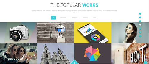
Codes are as follows:
<div class="dnn_layout pb-20">
  <div class="footer_mid clearfix">
    <div style="text-align: center;"> Lorem ipsum dolor sit amet, consectetur adipisicing elit... </div>
  </div>
</div>
<div class="isotope_grid animation scaleUp">
  <div class="isotope_group">
      <a data-filter="*" href="#" class="active">All</a>
      <a data-filter=".photography" href="#">PHOTOGRAPHY</a>
      <a data-filter=".webdesign" href="#">WEB DESIGN</a>
      <a data-filter=".graphics" href="#">GRAPHICS</a>
      <a data-filter=".video" href="#">VIDEO</a>
  </div>
  <div data-min-width="381" class="isotope_main">
    <div class="isotope_item photography graphics">
      <div class="photo_box img_zoom ico_zoom"> <a href="#" target="blank">
        <div class="pic_box"> <img alt="" src="/portals/33/isotope_img_08.jpg" />
          <div class="content">
            <div class="vertical_center_1">
              <div class="vertical_center_2">
                <div class="ico"><span class="glyphicons glyph-link"></span></div>
                <h3>IMAGE TITLE</h3>
                <p>Photos,Design</p>
              </div>
            </div>
          </div>
          <div class="shade"></div>
        </div>
        </a> </div>
    </div>
    <div class="isotope_item  webdesign">
      <div class="photo_box img_zoom ico_zoom"> <a href="#" target="blank">
        <div class="pic_box"> <img alt="" src="/portals/33/isotope_img_09.jpg" />
          <div class="content">
            <div class="vertical_center_1">
              <div class="vertical_center_2">
                <div class="ico"><span class="glyphicons glyph-link"></span></div>
                <h3>IMAGE TITLE</h3>
                <p>Photos,Design</p>
              </div>
            </div>
          </div>
          <div class="shade"></div>
        </div>
        </a> </div>
    </div>
    <div class="isotope_item graphics video">
      <div class="photo_box img_zoom ico_zoom"> <a href="#" target="blank">
        <div class="pic_box"> <img alt="" src="/portals/33/isotope_img_10.jpg" />
          <div class="content">
            <div class="vertical_center_1">
              <div class="vertical_center_2">
                <div class="ico"><span class="glyphicons glyph-link"></span></div>
                <h3>IMAGE TITLE</h3>
                <p>Photos,Design</p>
              </div>
            </div>
          </div>
          <div class="shade"></div>
        </div>
        </a> </div>
    </div>
    <div class="isotope_item video">
      <div class="photo_box img_zoom ico_zoom"> <a href="#" target="blank">
        <div class="pic_box"> <img alt="" src="/portals/33/isotope_img_11.jpg" />
          <div class="content">
            <div class="vertical_center_1">
              <div class="vertical_center_2">
                <div class="ico"><span class="glyphicons glyph-link"></span></div>
                <h3>IMAGE TITLE</h3>
                <p>Photos,Design</p>
              </div>
            </div>
          </div>
          <div class="shade"></div>
        </div>
        </a> </div>
    </div>
    <div class="isotope_item blogs video">
      <div class="photo_box img_zoom ico_zoom"> <a href="#" target="blank">
        <div class="pic_box"> <img alt="" src="/portals/33/isotope_img_12.jpg" />
          <div class="content">
            <div class="vertical_center_1">
              <div class="vertical_center_2">
                <div class="ico"><span class="glyphicons glyph-link"></span></div>
                <h3>IMAGE TITLE</h3>
                <p>Photos,Design</p>
              </div>
            </div>
          </div>
          <div class="shade"></div>
        </div>
        </a> </div>
    </div>
    <div class="isotope_item video webdesign photography">
      <div class="photo_box img_zoom ico_zoom"> <a href="#" target="blank">
        <div class="pic_box"> <img alt="" src="/portals/33/isotope_img_13.jpg" />
          <div class="content">
            <div class="vertical_center_1">
              <div class="vertical_center_2">
                <div class="ico"><span class="glyphicons glyph-link"></span></div>
                <h3>IMAGE TITLE</h3>
                <p>Photos,Design</p>
              </div>
            </div>
          </div>
          <div class="shade"></div>
        </div>
        </a> </div>
    </div>
    <div class="isotope_item video webdesign photography">
      <div class="photo_box img_zoom ico_zoom"> <a href="#" target="blank">
        <div class="pic_box"> <img alt="" src="/portals/33/isotope_img_14.jpg" />
          <div class="content">
            <div class="vertical_center_1">
              <div class="vertical_center_2">
                <div class="ico"><span class="glyphicons glyph-link"></span></div>
                <h3>IMAGE TITLE</h3>
                <p>Photos,Design</p>
              </div>
            </div>
          </div>
          <div class="shade"></div>
        </div>
        </a> </div>
    </div>
    <div class="isotope_item video webdesign photography">
      <div class="photo_box img_zoom ico_zoom"> <a href="#" target="blank">
        <div class="pic_box"> <img alt="" src="/portals/33/isotope_img_15.jpg" />
          <div class="content">
            <div class="vertical_center_1">
              <div class="vertical_center_2">
                <div class="ico"><span class="glyphicons glyph-link"></span></div>
                <h3>IMAGE TITLE</h3>
                <p>Photos,Design</p>
              </div>
            </div>
          </div>
          <div class="shade"></div>
        </div>
        </a> </div>
    </div>
  </div>
</div>
<div class="anchorTag mb-20">
  <div class="number"><span>6</span></div>
</div>
<div class="clear"> </div>
Option:
- You can modify
photo_boxto change image effects. Image Effects - You can add
<a data-filter=".FilterName" href="#">Filter Name</a>to increase categories.data-filter=".FilterName"can not be blank space. - You can modify
data-min-widthto change minimum width of image. - You can modify
isotope_itemFilterNameto categorize images. - You can modify
animationto change the animation on the slide. Animation list. - You can modify
glyphiconsto change icons. font icon list. Containeris usingContainer-4
Testimonials area
Below is the screen shot:
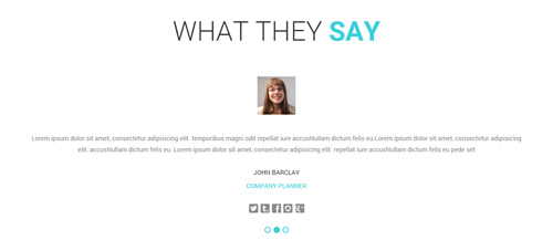
Codes are as follows:
<div class="pb-40">
  <ul data-autoplay="0" data-display-arrows="false" data-position="fade" class=" Testimonials_tab Testimonials_1 animation scaleUp">
    <li>
      <blockquote> <span class="pic"><img alt="" src="/portals/33/pic_19.jpg" /></span>
        <p>Lorem ipsum dolor sit amet, consectetur adipisicing elit... </p>
        <small>JOHN BARCLAY<span>COMPANY PLANNER</span></small>
        <div class="social_list Social_list2 clearfix">
            <a href="#"><span class="social social-twitter"></span></a>
            <a href="#"><span class="social social-tumblr"></span></a>
            <a href="#"><span class="social social-facebook"></span></a>
            <a href="#"><span class="social social-picasa"></span></a>
            <a href="#"><span class="social social-google-plus"></span></a>
        </div>
      </blockquote>
    </li>
    <li>
      <blockquote> <span class="pic"><img alt="" src="/portals/33/pic_19.jpg" /></span>
        <p>Lorem ipsum dolor sit amet, consectetur adipisicing elit...</p>
        <small>JOHN BARCLAY<span>COMPANY PLANNER</span></small>
        <div class="social_list Social_list2 clearfix">
            <a href="#"><span class="social social-twitter"></span></a>
            <a href="#"><span class="social social-tumblr"></span></a>
            <a href="#"><span class="social social-facebook"></span></a>
            <a href="#"><span class="social social-picasa"></span></a>
            <a href="#"><span class="social social-google-plus"></span></a>
        </div>
      </blockquote>
    </li>
  </ul>
</div>
Option:
- This is a
Testimonialseffect.Testimonials - You can modify
animationto change the animation on the slide. Animation list. - You can modify
socialto change icons. font icon list. Containeris usingContainer-4
CONTACT US area
Below is the screen shot:
This area is divided into 5 sections
A: Anchor area is placed in Full_Screen_FootPaneA . Anchor codes are as follows:
<div class="anchorTag" data-offset="0">
    <div class="number"><span>7</span></div>
</div>
B: Title area is placed in Full_Screen_FootPaneA, it is using Container of Container-5, and the content is empty.
C: ABOUT US area
This area is placed in FootPaneK, and it is using Container-6, content codes are as follows:
<div class="animation fadeInUp">
  <p>Lorem ipsum dolor sit amet, consetetur vidunt ut labore et dolore Donec id elit llus ac cursus commodo, tortor mauris . </p>
  <br />
  <div class="social-icons foot_social_2  clearfix">
      <a href="#"><span class="social social-twitter"></span></a>
      <a href="#"><span class="social social-tumblr"></span></a>
      <a href="#"><span class="social social-facebook"></span></a>
      <a href="#"><span class="social social-picasa"></span></a>
      <a href="#"><span class="social social-google-plus"></span></a>
      <a href="#"><span class="social social-apple"></span></a>
  </div>
</div>
Option:
- You can modify
animationto change the animation on the slide. Animation list. - You can modify
socialto change icons. font icon list. Containeris usingContainer-6
D: CONTACT INFO area
This area is placed in FootPaneL ,and it is using Container-6, content codes are as follows:
<ul class="list_style12 animation fadeInUp">
  <li><span class="glyphicons glyph-google-maps"></span>Content text ....</li>
  <li><span class="glyphicons glyph-iphone"></span>phone :  +( 1 )-123-456-789-0</li>
  <li><span class="glyphicons glyph-envelope"></span>Email : dnnskindev@gmail.com</li>
</ul>
Option:
- You can modify
animationto change the animation on the slide. Animation list. - You can modify
glyphiconsto change icons. font icon list. Containeris usingContainer-6
E: POWERFORMS area
This area is placed in FootPaneM
This is Theme_Responsive_20066_home5 theme of DNNGo PowerForms module
Map area
Below is the screen shot:
Codes are as follows:
<div class="pt-20">
 <div id="gmap01"></div>
</div>
Option:
- You can change
gmap4address incustom.js
HomeVersion6
You can click the link to check HomeVersion6 demo. HomeVersion6
Banner area
Below is the screen shot:

It is using DNNGo LayerGalleryPro module here,you can import ContentListEntity-HomeVersion6.xml of the DNNGo_LayerGalleryPro folder to duplicate banner of the demo.
Welcome To Our Website area
Below is the screen shot:
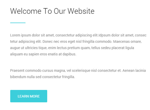
Codes are as follows:
<div class="animation fadeInLeft">
  <p class="mb-40">Lorem ipsum dolor sit amet, consectetur adipiscing elit.Idpsum dolor sit amet, consec tetur adipiscing elit...</p>
  <p class="mb-40">Praesent commodo cursus magna, vel scelerisque nisl consectetur et. Aenean lacinia bibendum nulla sed consectetur fringilla.</p>
  <a class="Button_default linker" href="#" target="blank">Learn More</a>
</div>
Option:
- You can modify
animationto change the animation on the slide. Animation list. Containeris usingContainer-7
Image area
Below is the screen shot:
Codes are as follows:
<div class="animation fadeInRight"><img alt="" src="/portals/33/home6_1.png" class="img-responsive" /></div>
Option:
- You can modify
animationto change the animation on the slide. Animation list.
backgroundImage20 area
Below is the screen shot:
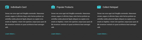
Codes are as follows:
<div class="backgroundImage20 pt-40 pb-40">
  <div class="dnn_layout">
    <div class="content_mid clearfix">
      <div class="row">
        <div class="col-sm-4 animation periodic1">
          <h3><span class="glyphicons glyph-nameplate"></span>Individual's Card</h3>
          <p class="mb-30 mt-30">Donec nec eros eget nisl fringilla commodo. Maecenas ornare... </p>
          <a href="#" target="blank">Learn More ></a> </div>
        <div class="col-sm-4 animation periodic2">
          <h3><span class="glyphicons glyph-briefcase"></span>Popular Products</h3>
          <p class="mb-30 mt-30">Donec nec eros eget nisl fringilla commodo. Maecenas ornare... </p>
          <a href="#" target="blank">Learn More ></a> </div>
        <div class="col-sm-4 animation periodic3">
          <h3><span class="glyphicons glyph-wallet"></span>Collect Notepad</h3>
          <p class="mb-30 mt-30">Donec nec eros eget nisl fringilla commodo. Maecenas ornare... </p>
          <a href="#" target="blank">Learn More ></a> </div>
      </div>
    </div>
  </div>
</div>
Option:
col-md-*is the width of each column, you can change the width you need through value1~12.- You can modify
animationto change the animation on the slide. Animation list. - You can modify
glyphiconsto change icons. font icon list.
Recent Works area And Latest News area
Below is the screen shot:
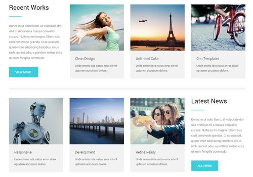
Codes are as follows:
<div class="row">
  <div class="col-sm-3">
    <div class="home6_a animation fadeInLeft">
      <h1>Recent Works</h1>
      <div class="line"></div>
      <p class="mt-30 mb-30">Donec in ut odio libero, at vulputate drn ulla tristique mi a massa convallis cursus...</p>
      <a class="Button_default" href="#" target="blank">View More</a> </div>
  </div>
  <div class="col-sm-9">
    <div class="row home6_b animation fadeInRight">
      <div class="col-sm-4">
        <div class="photo_box  img_zoom"> <a href="#" target="blank">
          <div class="pic_box"> <img alt="" src="/portals/33/home6_b1.jpg" />
            <div class="ico"> <span class="glyphicons glyph-plus"></span> </div>
            <div class="shade"></div>
          </div>
          <h3>Clean Design</h3>
          <p> Unde omnis iste natus error sitvol uptatem accutium dolore. </p>
          </a> </div>
      </div>
      <div class="col-sm-4">
        <div class="photo_box  img_zoom"> <a href="#" target="blank">
          <div class="pic_box"> <img alt="" src="/portals/33/home6_b2.jpg" />
            <div class="ico"> <span class="glyphicons glyph-plus"></span> </div>
            <div class="shade"></div>
          </div>
          <h3>Unlimited Color</h3>
          <p> Unde omnis iste natus error sitvol uptatem accutium dolore. </p>
          </a> </div>
      </div>
      <div class="col-sm-4">
        <div class="photo_box  img_zoom"> <a href="#" target="blank">
          <div class="pic_box"> <img alt="" src="/portals/33/home6_b3.jpg" />
            <div class="ico"> <span class="glyphicons glyph-plus"></span> </div>
            <div class="shade"></div>
          </div>
          <h3>Dnn Templates</h3>
          <p> Unde omnis iste natus error sitvol uptatem accutium dolore. </p>
          </a> </div>
      </div>
    </div>
  </div>
</div>
<div class="row">
  <div class="col-sm-12">
    <div class="dividers_7 animation fadeIn"></div>
  </div>
</div>
<div class="row">
  <div class="col-sm-9">
    <div class="row home6_b animation fadeInLeft">
      <div class="col-sm-4">
        <div class="photo_box  img_zoom"> <a href="#" target="blank">
          <div class="pic_box"> <img alt="" src="/portals/33/home6_b4.jpg" />
            <div class="ico"> <span class="glyphicons glyph-plus"></span> </div>
            <div class="shade"></div>
          </div>
          <h3>Responsive</h3>
          <p> Unde omnis iste natus error sitvol uptatem accutium dolore. </p>
          </a> </div>
      </div>
      <div class="col-sm-4">
        <div class="photo_box  img_zoom"> <a href="#" target="blank">
          <div class="pic_box"> <img alt="" src="/portals/33/home6_b5.jpg" />
            <div class="ico"> <span class="glyphicons glyph-plus"></span> </div>
            <div class="shade"></div>
          </div>
          <h3>Development</h3>
          <p> Unde omnis iste natus error sitvol uptatem accutium dolore. </p>
          </a> </div>
      </div>
      <div class="col-sm-4">
        <div class="photo_box  img_zoom"> <a href="#" target="blank">
          <div class="pic_box"> <img alt="" src="/portals/33/home6_b6.jpg" />
            <div class="ico"> <span class="glyphicons glyph-plus"></span> </div>
            <div class="shade"></div>
          </div>
          <h3>Retina Ready</h3>
          <p> Unde omnis iste natus error sitvol uptatem accutium dolore. </p>
          </a> </div>
      </div>
    </div>
  </div>
  <div class="col-sm-3">
    <div class="home6_a home6_a2 animation fadeInRight">
      <h1>Latest News</h1>
      <div class="line"></div>
      <p class="mt-30 mb-30">Donec in ut odio libero, at vulputate drn ulla tristique mi a massa convallis cursus...</p>
      <a class="Button_default" href="#" target="blank">All News</a> </div>
  </div>
</div>
Option:
- You can modify
photo_boxto change image effects. Image Effects col-md-*is the width of each column, you can change the width you need through value1~12.- You can modify
animationto change the animation on the slide. Animation list. - You can modify
glyphiconsto change icons. font icon list.
backgroundImage21 area
Below is the screen shot:

Codes are as follows:
<div class="backgroundImage21 pt-60 pb-60 animation fadeInUp">
  <div class="dnn_layout">
    <div class="content_mid clearfix">
      <h3>Create interactive, engaging and satisfying website</h3>
      <p>We provide interactive website development, which will definitely improve satisfaction of your online business</p>
      <a class="Button_border_white" href="#" target="blank">Purchase it</a><a class="Button_border_white" href="#" target="blank">Take A Look</a> </div>
  </div>
</div>
Option:
- You can modify
animationto change the animation on the slide. Animation list.
Our Service area
Below is the screen shot:
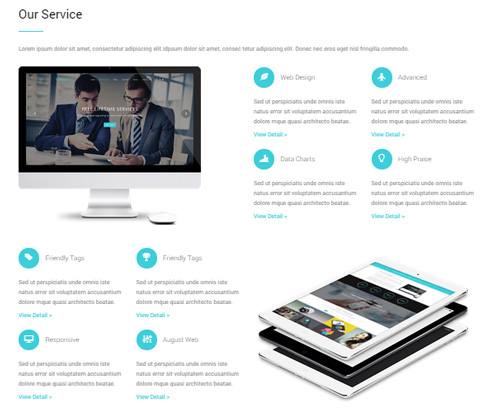
Codes are as follows:
<div class="dnn_layout">
  <div class="content_mid clearfix">
    <div class="pane_layout">

      <div class="row">
        <div class="col-sm-12">
          <div class="home6_a">
            <h1>Our Service</h1>
            <div class="line"></div>
            <p class="mt-30 mb-30">Lorem ipsum dolor sit amet, consectetur adipiscing elit.Idpsum dolor sit amet, consec tetur adipiscing elit... </p>
          </div>
        </div>
      </div>

      <div class="row">

        <div class="col-md-6"><img alt="" class="img-responsive animation fadeInLeft" src="/portals/33/home6_c_1.png" /><br />
        </div>

        <div class="col-md-6">
          <div class="row home6_c animation fadeInRight">
            <div class="col-sm-6">
              <h3>
                <div class="out"><span class="glyphicons glyph-leaf"></span></div>
                Web Design</h3>
              <p class="pt-20">Sed ut perspiciatis unde omnis iste natus error sit voluptatem accusantium dolore mque quasi architecto beatae.</p>
              <a class="mb-20" href="#" target="blank">View Detail ></a> </div>
            <div class="col-sm-6">
              <h3>
                <div class="out"><span class="glyphicons glyph-airplane"></span></div>
                Advanced</h3>
              <p class="pt-20">Sed ut perspiciatis unde omnis iste natus error sit voluptatem accusantium dolore mque quasi architecto beatae.</p>
              <a class="mb-20" href="#" target="blank">View Detail ></a> </div>
            <div class="col-sm-6">
              <h3>
                <div class="out"><span class="glyphicons glyph-charts"></span></div>
                Data Charts</h3>
              <p class="pt-20">Sed ut perspiciatis unde omnis iste natus error sit voluptatem accusantium dolore mque quasi architecto beatae.</p>
              <a href="#" target="blank">View Detail ></a> </div>
            <div class="col-sm-6">
              <h3>
                <div class="out"><span class="glyphicons glyph-lightbulb"></span></div>
                High Praise</h3>
              <p class="pt-20">Sed ut perspiciatis unde omnis iste natus error sit voluptatem accusantium dolore mque quasi architecto beatae.</p>
              <a href="#" target="blank">View Detail ></a> </div>
          </div>
        </div>

      </div>

      <div class="row pt-30">

        <div class="col-md-6">
          <div class="row home6_c animation fadeInLeft">
            <div class="col-sm-6">
              <h3>
                <div class="out"><span class="glyphicons glyph-tag"></span></div>
                Friendly Tags</h3>
              <p class="pt-20">Sed ut perspiciatis unde omnis iste natus error sit voluptatem accusantium dolore mque quasi architecto beatae.</p>
              <a class="mb-20" href="#" target="blank">View Detail ></a> </div>
            <div class="col-sm-6">
              <h3>
                <div class="out"><span class="glyphicons glyph-cup"></span></div>
                Friendly Tags</h3>
              <p class="pt-20">Sed ut perspiciatis unde omnis iste natus error sit voluptatem accusantium dolore mque quasi architecto beatae.</p>
              <a class="mb-20" href="#" target="blank">View Detail ></a> </div>
            <div class="col-sm-6">
              <h3>
                <div class="out"><span class="glyphicons glyph-display"></span></div>
                Responsive</h3>
              <p class="pt-20">Sed ut perspiciatis unde omnis iste natus error sit voluptatem accusantium dolore mque quasi architecto beatae.</p>
              <a href="#" target="blank">View Detail ></a> </div>
            <div class="col-sm-6">
              <h3>
                <div class="out"><span class="glyphicons glyph-adjust-alt"></span></div>
                August Web</h3>
              <p class="pt-20">Sed ut perspiciatis unde omnis iste natus error sit voluptatem accusantium dolore mque quasi architecto beatae.</p>
              <a href="#" target="blank">View Detail ></a> </div>
          </div>
        </div>

        <div class="col-md-6"><br />
          <img alt="" class="img-responsive animation fadeInRight" src="/portals/33/home6_c_2.png" />
         </div>

      </div>

    </div>
  </div>
</div>
Option:
col-md-*is the width of each column, you can change the width you need through value1~12.- You can modify
animationto change the animation on the slide. Animation list. - You can modify
glyphiconsto change icons. font icon list.
NUMBER area
Below is the screen shot:
Codes are as follows:
<div class="backgroundImage9 pt-40 pb-40 mt-40">
  <div class="dnn_layout">
    <div class="content_mid clearfix">
      <div class="number_Animation_7 row">
        <div class="col-sm-3"> <span class="img"> <img alt="" src="/portals/33/number_Animation_7_1.png" /></span> <span class="animation  number" data-number="1660">0</span>
          <p class="text">Happy Clients</p>
        </div>
        <div class="col-sm-3"> <span class="img"> <img alt="" src="/portals/33/number_Animation_7_2.png" /></span> <span class="animation  number" data-number="780">0</span>
          <p class="text">Awesome Products</p>
        </div>
        <div class="col-sm-3"> <span class="img"> <img alt="" src="/portals/33/number_Animation_7_3.png" /></span> <span class="animation  number" data-number="2530">0</span>
          <p class="text">Best Reviews</p>
        </div>
        <div class="col-sm-3"> <span class="img"> <img alt="" src="/portals/33/number_Animation_7_4.png" /></span> <span class="animation  number" data-number="940">0</span>
          <p class="text">Best Reviews</p>
        </div>
      </div>
    </div>
  </div>
</div>
Option:
- You can change the value you need to display through
data-number col-md-*is the width of each column, you can change the width you need through value1~12.
Testimonials & Clients area
Below is the screen shot:
Codes are as follows:
<div class="backgroundImage22 mb-40 pt-60 pb-60">
  <div class="dnn_layout">
    <div class="content_mid clearfix">
      <div class="row">
        <div class="col-sm-12">
          <div class="home6_d animation fadeInUp">
            <h1>Testimonials & Clients</h1>
            <div class="line"></div>
            <p>Content text ...</p>
          </div>
        </div>
      </div>
      <div class="row">
        <div class="col-md-6 animation fadeInLeft">
          <ul data-autoplay="3000" data-display-arrows="false" data-position="fade" class=" Testimonials_tab Testimonials_9">
            <li>
              <blockquote> <span class="pic"><img alt="" src="/portals/33/portrait_2.jpg" /></span> <small>Frank Miller <span>The CEO of YGU Company</span></small>
                <p>"Sed ut perspiciatis unde omnis iste natus error sit voluptatem accusantium..."</p>
              </blockquote>
            </li>
            <li>
              <blockquote> <span class="pic"><img alt="" src="/portals/33/portrait_3.jpg" /></span> <small>Frank Miller <span>The CEO of YGU Company</span></small>
                <p>"Lorem ipsum dolor sit amet, consectetur adipisicing elit..." </p>
              </blockquote>
            </li>
            <li>
              <blockquote> <span class="pic"><img alt="" src="/portals/33/portrait_4.jpg" /></span> <small>Frank Miller <span>The CEO of YGU Company</span></small>
                <p>"We have used dnngo.net for a number of DotNetNuke skin projects. Their work and attention .." </p>
              </blockquote>
            </li>
          </ul>
        </div>
        <div class="col-md-6 home6_e animation fadeInRight">
            <a href="#" target="blank"><img alt="" src="/portals/33/portrait_5.png" /></a>
            <a href="#" target="blank"><img alt="" src="/portals/33/portrait_6.png" /></a>
            <a href="#" target="blank"><img alt="" src="/portals/33/portrait_7.png" /></a>
            <a href="#" target="blank"><img alt="" src="/portals/33/portrait_8.png" /></a>
            <a href="#" target="blank"><img alt="" src="/portals/33/portrait_9.png" /></a>
            <a href="#" target="blank"><img alt="" src="/portals/33/portrait_10.png" /></a>
        </div>
      </div>
    </div>
  </div>
</div>
Option:
- This is a
Testimonialseffect.Testimonials col-md-*is the width of each column, you can change the width you need through value1~12.- You can modify
animationto change the animation on the slide. Animation list.
Meet Our Teams area
Below is the screen shot:
Codes are as follows:
<div class="mt-40 mb-40">
  <div class="dnn_layout">
    <div class="content_mid clearfix">
      <div class="row">
        <div class="col-sm-12">
          <div class="home6_f animation fadeInUp">
            <h1>Meet Our Teams</h1>
            <div class="line"></div>
            <p>Lorem ipsum dolor sit amet, consectetur adipiscing elit... </p>
          </div>
        </div>
      </div>
      <div class="row ourteam_4 animation fadeInUp">
        <div class="col-md-3 col-sm-6">
          <div class="photo_box  img_zoom"> <a href="#">
            <div class="pic_box"> <img alt="" src="/portals/33/ourteam_4_1.jpg" />
              <div class="ico"> <span class="glyphicons glyph-search"></span> </div>
              <div class="shade"></div>
            </div>
            </a> </div>
          <h3>Micheal Cyrus<span>Web Designer</span></h3>
          <div class="line"></div>
          <p> Sed ut perspiciatis unde omnis iste natus error sit voluptatem accusantium dolore mque quasi architecto beatae. </p>
        </div>
        <div class="col-md-3 col-sm-6">
          <div class="photo_box  img_zoom"> <a href="#">
            <div class="pic_box"> <img alt="" src="/portals/33/ourteam_4_2.jpg" />
              <div class="ico"> <span class="glyphicons glyph-search"></span> </div>
              <div class="shade"></div>
            </div>
            </a> </div>
          <h3>John Smith<span>Skin Developer</span></h3>
          <div class="line"></div>
          <p> Sed ut perspiciatis unde omnis iste natus error sit voluptatem accusantium dolore mque quasi architecto beatae. </p>
        </div>
        <div class="clearfix visible-sm"></div>
        <div class="col-md-3 col-sm-6">
          <div class="photo_box  img_zoom"> <a href="#">
            <div class="pic_box"> <img alt="" src="/portals/33/ourteam_4_3.jpg" />
              <div class="ico"> <span class="glyphicons glyph-search"></span> </div>
              <div class="shade"></div>
            </div>
            </a> </div>
          <h3>Harra Halloy<span>Programmer</span></h3>
          <div class="line"></div>
          <p> Sed ut perspiciatis unde omnis iste natus error sit voluptatem accusantium dolore mque quasi architecto beatae. </p>
        </div>
        <div class="col-md-3 col-sm-6">
          <div class="photo_box  img_zoom"> <a href="#">
            <div class="pic_box"> <img alt="" src="/portals/33/ourteam_4_4.jpg" />
              <div class="ico"> <span class="glyphicons glyph-search"></span> </div>
              <div class="shade"></div>
            </div>
            </a> </div>
          <h3>David Chris<span>CEO Manager</span></h3>
          <div class="line"></div>
          <p> Sed ut perspiciatis unde omnis iste natus error sit voluptatem accusantium dolore mque quasi architecto beatae. </p>
        </div>
      </div>
    </div>
  </div>
</div>
Option:
- You can modify
photo_boxto change image effects. Image Effects col-md-*is the width of each column, you can change the width you need through value1~12.- You can modify
animationto change the animation on the slide. Animation list. - You can modify
glyphiconsto change icons. font icon list.
Why Choose Us area And Our Skills area
Below is the screen shot:
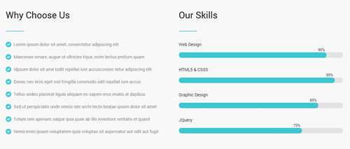
Codes are as follows:
<div class="backgroundImage23 pt-40 pb-40">
  <div class="dnn_layout">
    <div class="content_mid clearfix">
      <div class="row">
        <div class="col-sm-6">
          <div class="home6_g animation fadeInLeft">
            <h1>Why Choose Us</h1>
            <div class="line"></div>
            <ul class="list_style4">
              <li><span class="glyphicons glyph-circle-ok"></span>Lorem ipsum dolor sit amet, consectetur adipiscing elit</li>
              <li><span class="glyphicons glyph-circle-ok"></span>Maecenas ornare, augue ut ultricies tique, enim lectus pretium quam</li>
              <li><span class="glyphicons glyph-circle-ok"></span>Idpsum dolor sit ame todit repellat iure accusconsec tetur adipiscing elit </li>
              <li><span class="glyphicons glyph-circle-ok"></span>Donec nec eros eget nisl fringilla commodo odit repellat iure accus</li>
              <li><span class="glyphicons glyph-circle-ok"></span>Tellus sedeu placerat ligula aliquam eu sapien eros enatis at dapibus</li>
              <li><span class="glyphicons glyph-circle-ok"></span>Sed ut perspiciatis unde omnis iste archi tecto beatae ipsum dolor  sit amet</li>
              <li><span class="glyphicons glyph-circle-ok"></span>Totam rem aperiam, eaque ipsa quae ab illo inventore veritatis et quasit</li>
              <li><span class="glyphicons glyph-circle-ok"></span>Nemo enim ipsam voluptatem quia voluptas sit aspernatur aut odit aut fugit </li>
            </ul>
          </div>
        </div>
        <div class="col-sm-6">
          <div class="home6_h animation fadeInRight">
            <h1>Our Skills</h1>
            <div class="line"></div>
            <div class="loaded_list_2">
              <p>Web Design</p>
              <div class="progress">
                <div data-width="90%" class="bar animation animationwidth"> <span></span> </div>
              </div>
              <p>HTML5 & CSS3</p>
              <div class="progress">
                <div data-width="95%" class="bar animation animationwidth"> <span></span> </div>
              </div>
              <p>Graphic Design</p>
              <p> </p>
              <div class="progress">
                <div data-width="85%" class="bar animation animationwidth"> <span></span> </div>
              </div>
              <p>JQuery</p>
              <div class="progress">
                <div data-width="75%" class="bar animation animationwidth"> <span></span> </div>
              </div>
            </div>
          </div>
        </div>
      </div>
    </div>
  </div>
</div>
Option:
col-md-*is the width of each column, you can change the width you need through value1~12.- You can modify
animationto change the animation on the slide. Animation list. - You can modify
glyphiconsto change icons. font icon list. data-widthis controlling the percentage that displays, you can display percentage through value0~100
Map area
Below is the screen shot:
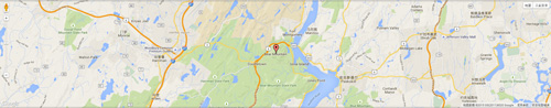
Codes are as follows:
<div id="gmap02"></div>
Contact Us area
Below is the screen shot:
Codes are as follows:
<div class="dnn_layout">
  <div class="content_mid clearfix">
    <div class="pane_layout">
      <div class="row">
        <div class="col-sm-12">
          <div class="home6_a mt-40 animation fadeInUp">
            <h1>Contact Us</h1>
            <div class="line"></div>
            <p class="mt-30 mb-30">Idpsum dolor sit amet, consectetur adipiscing elit...</p>
          </div>
        </div>
      </div>
    </div>
  </div>
</div>
Option:
col-md-*is the width of each column, you can change the width you need through value1~12.- You can modify
animationto change the animation on the slide. Animation list.
Forms area
Below is the screen shot:
This is Theme_Responsive_20066-home6 theme of DNNGo PowerForms module
Contact Us area
Below is the screen shot:
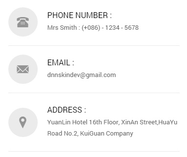
Codes are as follows:
<ul class="home6_i animation fadeInRight">
  <li class="home6_ione"><span class="glyphicons glyph-phone-alt"></span>
    <h6>Phone Number :</h6>
    Mrs Smith : (+086) - 1234 - 5678</li>
  <li class="home6_itwo"><span class="glyphicons glyph-envelope"></span>
    <h6>Email :</h6>
    dnnskindev@gmail.com</li>
  <li class="home6_ithree"><span class="glyphicons glyph-google-maps"></span>
    <h6>Address :</h6>
    YuanLin Hotel 16th Floor, XinAn Street,HuaYu Road No.2, KuiGuan Company</li>
</ul>
Option:
- You can modify
animationto change the animation on the slide. Animation list. - You can modify
glyphiconsto change icons. font icon list.
About Dnngo area
Below is the screen shot:
Codes are as follows:
<div class="animation periodic1">
  <p> Sed ut perspiciatis unde omnis iste natus error sit voluptatem ... </p>
  <br />
  <a href="#">+ More Information</a> </div>
Option:
- You can modify
animationto change the animation on the slide. Animation list. Containeris usingContainer-8
Archives area
Below is the screen shot:
Codes are as follows:
<ul class="foot_a animation periodic2">
  <li><a href="#" target="blank"><span class="glyphicons glyph-calendar"></span>February 08th, 2014</a></li>
  <li><a href="#" target="blank"><span class="glyphicons glyph-calendar"></span>March 16th, 2014</a></li>
  <li><a href="#" target="blank"><span class="glyphicons glyph-calendar"></span>August 29th, 2014</a></li>
  <li><a href="#" target="blank"><span class="glyphicons glyph-calendar"></span>September 09th, 2014</a></li>
  <li><a href="#" target="blank"><span class="glyphicons glyph-calendar"></span>October 10th, 2014</a></li>
</ul>
Option:
- You can modify
animationto change the animation on the slide. Animation list. - You can modify
glyphiconsto change icons. font icon list. Containeris usingContainer-8
Recent News area
Below is the screen shot:
Codes are as follows:
<ul class="foot_b animation periodic3">
  <li>
    <div class="img"><img alt="" src="/portals/33/foot_b_1.jpg" /></div>
    <p>Phasellus et nisl tellustia mfacilisis eu nisi sceleris que faucibus.</p>
    <a href="#" target="blank">Read More</a> </li>
  <li>
    <div class="img"><img alt="" src="/portals/33/foot_b_2.jpg" /></div>
    <p>Phasellus et nisl tellustia mfacilisis eu nisi sceleris que faucibus.</p>
    <a href="#" target="blank">Read More</a> </li>
</ul>
Option:
- You can modify
animationto change the animation on the slide. Animation list. Containeris usingContainer-8
Follow Us area
Below is the screen shot:
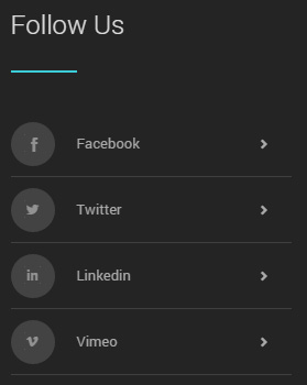
Codes are as follows:
<ul class="foot_c animation periodic4">
  <li><a href="#">
    <div class="icon"><span class="social social-facebook"></span></div>
    Facebook<span class="arrow glyphicons glyph-chevron-right"></span></a></li>
  <li><a href="#">
    <div class="icon"><span class="social social-twitter"></span></div>
    Twitter<span class="arrow glyphicons glyph-chevron-right"></span></a></li>
  <li><a href="#">
    <div class="icon"><span class="social social-linked-in"></span></div>
    Linkedin<span class="arrow glyphicons glyph-chevron-right"></span></a></li>
  <li><a href="#">
    <div class="icon"><span class="social social-vimeo"></span></div>
    Vimeo<span class="arrow glyphicons glyph-chevron-right"></span></a></li>
</ul>
Option:
- You can modify
animationto change the animation on the slide. Animation list. - You can modify
glyphiconsto change icons. font icon list. Containeris usingContainer-8
HomeVersion7
You can click the link to check HomeVersion7 demo. HomeVersion7
Banner area
Below is the screen shot:

Codes are as follows:
<ul class="home7app_banner full_screen_pic">
  <li style="background-image: url('http://demo7.dnngo.net/Portals/33/home7_banner1.jpg');">
    <div class="full_screen_pic_bg">
      <div class="full_screen_pic_main">
        <div class="dnn_layout">
          <div class="content_mid clearfix">
            <div class="pane_layout">
              <div class="row">
                <div class="col-sm-5 leftcon animation fadeInUp"> <img alt="" src="/portals/33/home7banner1_1.png" class="img-responsive" /> </div>
                <div class="col-sm-7 rightcon">
                  <h1 class="animation fadeInRight">App Landing Theme</h1>
                  <h2 class="animation fadeInRight">Create Your New Page</h2>
                  <p class="animation fadeInRight">We provide interactive, compelling and engaging website development...</p>
                  <div class="rcb"> <a href="#">
                    <div class="rcbleft animation fadeInUp"> <img alt="" src="/portals/33/home7banner1_2.png" /> <span>Available on the</span>
                      <p>App Store</p>
                    </div>
                    </a> <a href="#">
                    <div class="rcbright animation fadeInUp"> <img alt="" src="/portals/33/home7banner1_3.png" /> <span>Direct Download</span>
                      <p>icloud</p>
                    </div>
                    </a> </div>
                </div>
              </div>
            </div>
          </div>
        </div>
      </div>
    </div>
  </li>
</ul>
Option:
- You can modify
background-imageto change background image. col-md-*is the width of each column, you can change the width you need through value1~12.- You can modify
animationto change the animation on the slide. Animation list. - You can modify
glyphiconsto change icons. font icon list.
Icon area
Below is the screen shot:
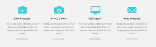
Codes are as follows:
<div class="backgroundImage1 pt-40 pb-40">
  <div class="dnn_layout">
    <div class="content_mid clearfix">
      <div class="row home7_a">
        <div class="col-md-3 col-sm-6">
          <div class="ServeList_5 animation periodic1">
            <div class="ico"><span class="glyphicons glyph-briefcase"></span></div>
            <h5>New Products</h5>
            <p>Sed ut perspiciatis unde omnis iste tium dolore mque laudan tium, totam rem aperiam, eaque ipsa quae ab illo tecto beatae.</p>
            <p><a href="#" target="blank">Learn More ></a></p>
          </div>
        </div>
        <div class="col-md-3 col-sm-6">
          <div class="ServeList_5 animation periodic2">
            <div class="ico"><span class="glyphicons glyph-camera"></span></div>
            <h5>Photo Gallery</h5>
            <p>Sed ut perspiciatis unde omnis iste tium dolore mque laudan tium, totam rem aperiam, eaque ipsa quae ab illo tecto beatae.</p>
            <p><a href="#" target="blank">Learn More ></a></p>
          </div>
        </div>
        <div class="clearfix visible-sm"></div>
        <div class="col-md-3 col-sm-6">
          <div class="ServeList_5 animation periodic3">
            <div class="ico"><span class="glyphicons glyph-imac"></span></div>
            <h5>Full Support</h5>
            <p>Sed ut perspiciatis unde omnis iste tium dolore mque laudan tium, totam rem aperiam, eaque ipsa quae ab illo tecto beatae.</p>
            <p><a href="#" target="blank">Learn More ></a></p>
          </div>
        </div>
        <div class="col-md-3 col-sm-6">
          <div class="ServeList_5 animation periodic4">
            <div class="ico"><span class="glyphicons glyph-envelope"></span></div>
            <h5>Read Message</h5>
            <p>Sed ut perspiciatis unde omnis iste tium dolore mque laudan tium, totam rem aperiam, eaque ipsa quae ab illo tecto beatae.</p>
            <p><a href="#" target="blank">Learn More ></a></p>
          </div>
        </div>
      </div>
    </div>
  </div>
</div>
Option:
col-md-*is the width of each column, you can change the width you need through value1~12.- You can modify
animationto change the animation on the slide. Animation list. - You can modify
glyphiconsto change icons. font icon list.
Creative & Skillful Theme area
Below is the screen shot:
Codes are as follows:
<div class="dnn_layout">
  <div class="content_mid clearfix">
    <div class="row">
      <div class="col-sm-5">
        <div class="home7_b animation fadeInLeft"> <img alt="" class="img-responsive" src="/portals/33/home7_b.png" /> </div>
      </div>
      <div class="col-sm-7">
        <div class="home6_a animation fadeInRight">
          <h1>Creative & Skillful Theme</h1>
          <div class="line"></div>
          <p class="mt-30 mb-30">Lorem ipsum dolor sit amet, consectetur adipiscing elit... <br />
            <br />
            Praesent commodo cursus magna, vel scelerisque nisl consectetur et. Aenean lacinia bibendum nulla sed consectetur fringilla.</p>
          <a class="Button_border" href="#" target="blank">View Demo</a> </div>
      </div>
    </div>
  </div>
</div>
Option:
img-responsiveimage responsivecol-md-*is the width of each column, you can change the width you need through value1~12.- You can modify
animationto change the animation on the slide. Animation list.
Why Choose The App area
Below is the screen shot:
Codes are as follows:
<div class="home7_c">
  <div class="backgroundImage2 pt-60">
    <div class="dnn_layout">
      <div class="content_mid clearfix">
        <div class="row">
          <div class="col-sm-6">
            <div class="home6_a animation fadeInLeft">
              <h1>Why Choose The App</h1>
              <div class="line"></div>
              <p class="mt-30 mb-30">Lorem ipsum dolor sit amet, consectetur adipiscing elit..<br />
                <br />
                Praesent commodo cursus magna, vel scelerisque nisl consectetur et. Aenean lacinia bibendum nulla sed consectetur fringilla.</p>
              <a class="Button_border_white" href="#" target="blank">Get In Touch</a> </div>
          </div>
          <div class="col-sm-6">
            <div class="home7_d animation fadeInRight"> <img alt="" class="img-responsive" src="/portals/33/home7_d.png" /> </div>
          </div>
        </div>
      </div>
    </div>
  </div>
</div>
Option:
col-md-*is the width of each column, you can change the width you need through value1~12.- You can modify
animationto change the animation on the slide. Animation list.
Powerful & Functional area
Below is the screen shot:
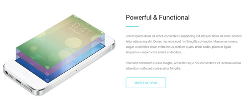
Codes are as follows:
<div class="mb-40">
  <div class="dnn_layout">
    <div class="content_mid clearfix">
      <div class="row">
        <div class="col-sm-6">
          <div class="home7_b animation fadeInLeft"> <img alt="" class="img-responsive" src="/portals/33/home7_e.png" /> </div>
        </div>
        <div class="col-sm-6">
          <div class="home6_a animation fadeInRight">
            <h1>Powerful & Functional</h1>
            <div class="line"></div>
            <p class="mt-30 mb-30">Lorem ipsum dolor sit amet, consectetur adipiscing elit... <br />
              <br />
              Praesent commodo cursus magna, vel scelerisque nisl consectetur et. Aenean lacinia bibendum nulla sed consectetur fringilla.</p>
            <a class="Button_border" href="#" target="blank">More Features</a> </div>
        </div>
      </div>
    </div>
  </div>
</div>
Option:
col-md-*is the width of each column, you can change the width you need through value1~12.- You can modify
animationto change the animation on the slide. Animation list.
Amazing Features area
Below is the screen shot:
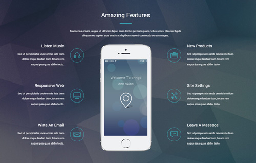
Codes are as follows:
<div class="backgroundImage24 pt-60 pb-60">
  <div class="dnn_layout">
    <div class="content_mid clearfix">
      <div class="row">
        <div class="col-sm-12">
          <div class="home6_d animation fadeInUp">
            <h1>Amazing Features</h1>
            <div class="line"></div>
            <p>Maecenas ornare, augue ut ultricies tique, enim lectus pretium quam... </p>
          </div>
        </div>
      </div>
      <div class="row">
        <div class="col-sm-12">
          <ul class="clearfix home7_d">
            <li class="leftc">
              <div class="box boxone animation fadeInLeft">
                <div class="icon"> <img alt="" src="/portals/33/home7_f_1.png" class="img-responsive" /> </div>
                <h6 class="title">Listen Music</h6>
                <p class="text">Sed ut perspiciatis unde omnis iste tium dolore mque laudan tium, totam rem eaque ipsa quae abillo tecto.</p>
              </div>
              <div class="box sec animation fadeInLeft">
                <div class="icon"> <img alt="" src="/portals/33/home7_f_2.png" class="img-responsive" /> </div>
                <h6 class="title">Responsive Web</h6>
                <p class="text">Sed ut perspiciatis unde omnis iste tium dolore mque laudan tium, totam rem eaque ipsa quae abillo tecto.</p>
              </div>
              <div class="box boxthree animation fadeInLeft">
                <div class="icon"> <img alt="" src="/portals/33/home7_f_3.png" class="img-responsive" /> </div>
                <h6 class="title">Wirte An Email</h6>
                <p class="text">Sed ut perspiciatis unde omnis iste tium dolore mque laudan tium, totam rem eaque ipsa quae abillo tecto.</p>
              </div>
            </li>
            <li>
              <div class="centerc animation fadeInUp"><img alt="" src="/portals/33/home7_f.png" class="img-responsive" /></div>
            </li>
            <li class="rightc">
              <div class="box boxone animation fadeInRight">
                <div class="icon"> <img alt="" src="/portals/33/home7_f_4.png" class="img-responsive" /> </div>
                <h6 class="title">New Products</h6>
                <p class="text">Sed ut perspiciatis unde omnis iste tium dolore mque laudan tium, totam rem eaque ipsa quae abillo tecto.</p>
              </div>
              <div class="box sec animation fadeInRight">
                <div class="icon"> <img alt="" src="/portals/33/home7_f_5.png" class="img-responsive" /> </div>
                <h6 class="title">Site Settings</h6>
                <p class="text">Sed ut perspiciatis unde omnis iste tium dolore mque laudan tium, totam rem eaque ipsa quae abillo tecto.</p>
              </div>
              <div class="box boxthree animation fadeInRight">
                <div class="icon"> <img alt="" src="/portals/33/home7_f_6.png" class="img-responsive" /> </div>
                <h6 class="title">Leave A Message</h6>
                <p class="text">Sed ut perspiciatis unde omnis iste tium dolore mque laudan tium, totam rem eaque ipsa quae abillo tecto.</p>
              </div>
            </li>
          </ul>
        </div>
      </div>
    </div>
  </div>
</div>
Option:
col-md-*is the width of each column, you can change the width you need through value1~12.- You can modify
animationto change the animation on the slide. Animation list. img-responsiveimage responsive
Check Our Services area
Below is the screen shot:
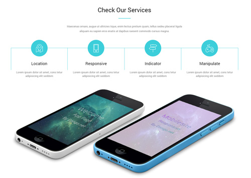
Codes are as follows:
<div class="mt-40">
  <div class="dnn_layout">
    <div class="content_mid clearfix">
      <div class="row">
        <div class="col-sm-12">
          <div class="home6_f animation fadeInUp">
            <h1>Check Our Services</h1>
            <div class="line"></div>
            <p>Content text ... </p>
          </div>
        </div>
      </div>
      <div class="row">
        <div class="col-sm-12">
          <ul class="home7_e clearfix animation fadeInUp">
            <li>
              <div class="icon"><img alt="" class="img-responsive" src="/portals/33/home7_e1.png" /></div>
              <h1>Location</h1>
              <p>Lorem ipsum dolor sit amet, cons tetur adipisicing elit seddom</p>
            </li>
            <li>
              <div class="icon"><img alt="" class="img-responsive" src="/portals/33/home7_e2.png" /></div>
              <h1>Responsive</h1>
              <p>Lorem ipsum dolor sit amet, cons tetur adipisicing elit seddom</p>
            </li>
            <li>
              <div class="icon"><img alt="" class="img-responsive" src="/portals/33/home7_e3.png" /></div>
              <h1>Indicator</h1>
              <p>Lorem ipsum dolor sit amet, cons tetur adipisicing elit seddom</p>
            </li>
            <li>
              <div class="icon"><img alt="" class="img-responsive" src="/portals/33/home7_e4.png" /></div>
              <h1>Manipulate</h1>
              <p>Lorem ipsum dolor sit amet, cons tetur adipisicing elit seddom</p>
            </li>
          </ul>
        </div>
      </div>
      <div class="row">
        <div class="col-sm-12">
          <div class="home7_f">
            <div class="home7_f_left animation periodic1"> <img alt="" class="img-responsive" src="/portals/33/home7_e5.png" /> </div>
            <div class="home7_f_right animation periodic2"> <img alt="" class="img-responsive" src="/portals/33/home7_e6.png" /> </div>
          </div>
        </div>
      </div>
    </div>
  </div>
</div>
Option:
img-responsiveimage responsivecol-md-*is the width of each column, you can change the width you need through value1~12.- You can modify
animationto change the animation on the slide. Animation list.
What Others Say About Us area
Below is the screen shot:
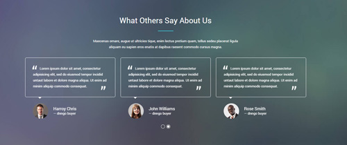
Codes are as follows:
<div class="backgroundImage25 pt-60 pb-60">
  <div class="dnn_layout">
    <div class="content_mid clearfix">
      <div class="row">
        <div class="col-sm-12">
          <div class="home6_d">
            <h1>What Others Say About Us</h1>
            <div class="line"></div>
            <p>Content text ...</p>
          </div>
        </div>
      </div>
      <div class="row">
        <div class="col-sm-12 animation fadeInUp">
          <div data-autoplay="3000" data-autoheight="false" data-navigation="false" class="carousel carousel_6">
            <div class="item">
              <blockquote class="clearfix">
                <p>Lorem ipsum dolor sit amet, consectetur adipisicing elit... </p>
                <span class="pic"><img alt="" src="/portals/33/portrait_1.jpg" /></span> <small>Harroy Chris <span class="name">dnngo buyer</span></small> </blockquote>
            </div>
            <div class="item">
              <blockquote class="clearfix">
                <p>Lorem ipsum dolor sit amet, consectetur adipisicing elit... </p>
                <span class="pic"><img alt="" src="/portals/33/portrait_2.jpg" /></span> <small>John Williams<span class="name">dnngo buyer</span></small> </blockquote>
            </div>
            <div class="item">
              <blockquote class="clearfix">
                <p>Lorem ipsum dolor sit amet, consectetur adipisicing elit... </p>
                <span class="pic"><img alt="" src="/portals/33/portrait_3.jpg" /></span> <small>Rose Smith <span class="name">dnngo buyer</span></small> </blockquote>
            </div>
            <div class="item">
              <blockquote class="clearfix">
                <p>Lorem ipsum dolor sit amet, consectetur adipisicing elit... </p>
                <span class="pic"><img alt="" src="/portals/33/portrait_4.jpg" /></span> <small>Harroy Chris <span class="name">dnngo buyer</span></small> </blockquote>
            </div>
            <div class="item">
              <blockquote class="clearfix">
                <p>Lorem ipsum dolor sit amet, consectetur adipisicing elit... </p>
                <span class="pic"><img alt="" src="/portals/33/portrait_1.jpg" /></span> <small>John Williams <span class="name">dnngo buyer</span></small> </blockquote>
            </div>
            <div class="item">
              <blockquote class="clearfix">
                <p>Lorem ipsum dolor sit amet, consectetur adipisicing elit... </p>
                <span class="pic"><img alt="" src="/portals/33/portrait_2.jpg" /></span> <small>Rose Smith <span class="name">dnngo buyer</span></small> </blockquote>
            </div>
          </div>
        </div>
      </div>
    </div>
  </div>
</div>
Option:
- This is a
Carouseleffect.Carousel col-md-*is the width of each column, you can change the width you need through value1~12.- You can modify
animationto change the animation on the slide. Animation list.
Craft Web solutions for your online business area
Below is the screen shot:

Codes are as follows:
<div class="home7_g pt-40 pb-40">
  <div class="dnn_layout">
    <div class="content_mid clearfix">
      <div class="pane_layout">
        <div class="row animation fadeInUp">
          <div class="col-sm-8">
            <h1> Craft Web solutions for your online business
              <p>We provide interactive website development, which will definitely improve satisfaction, raise awareness.</p>
            </h1>
          </div>
          <div class="col-sm-4">
              <a class="Button_border" href="#" target="blank">Buy The App</a>
              <a class="Button_border" href="#" target="blank">More advantages</a>
          </div>
        </div>
      </div>
    </div>
  </div>
</div>
Option:
col-md-*is the width of each column, you can change the width you need through value1~12.- You can modify
animationto change the animation on the slide. Animation list.
Our Apps area
Below is the screen shot:
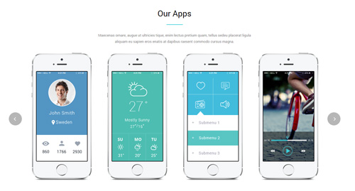
Codes are as follows:
<div class="mt-40 mb-40">
  <div class="dnn_layout">
    <div class="content_mid clearfix">
      <div class="row">
        <div class="col-sm-12">
          <div class="home6_f">
            <h1>Our Apps</h1>
            <div class="line"></div>
            <p>Maecenas ornare, augue ut ultricies tique, enim lectus pretium quam...</p>
          </div>
        </div>
      </div>
      <div class="row">
        <div class="col-sm-12">
          <div data-pagination="false" data-autoheight="false" data-autoplay="3000" class="carousel carousel_7">
            <div class="item"> <img alt="" src="/portals/33/carousel_7_1.png" class="img-responsive" /> </div>
            <div class="item"> <img alt="" src="/portals/33/carousel_7_2.png" class="img-responsive" /> </div>
            <div class="item"> <img alt="" src="/portals/33/carousel_7_3.png" class="img-responsive" /> </div>
            <div class="item"> <img alt="" src="/portals/33/carousel_7_4.png" class="img-responsive" /> </div>
            <div class="item"> <img alt="" src="/portals/33/carousel_7_1.png" class="img-responsive" /> </div>
          </div>
        </div>
      </div>
    </div>
  </div>
</div>
Option:
- This is a
Carouseleffect.Carousel col-md-*is the width of each column, you can change the width you need through value1~12.
NUMBRE area
Below is the screen shot:
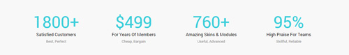
Codes are as follows:
<div class="backgroundImage9 pt-40 pb-40">
  <div class="dnn_layout">
    <div class="content_mid clearfix">
      <div class="number_Animation_8 row">
        <div class="col-sm-6 col-md-3">
          <div class="nob"><span class="animation  number" data-number="1800">0</span>+</div>
          <h6 class="text">Satisfied Customers</h6>
          <p>Best, Perfect</p>
        </div>
        <div class="col-sm-6 col-md-3">
          <div class="nob">$<span class="animation  number" data-number="499">0</span></div>
          <h6 class="text">For Years Of Members</h6>
          <p>Cheap, Bargain</p>
        </div>
        <div class="col-sm-6 col-md-3">
          <div class="nob"><span class="animation  number" data-number="760">0</span>+</div>
          <h6 class="text">Amazing Skins & Modules</h6>
          <p>Useful, Advanced</p>
        </div>
        <div class="col-sm-6 col-md-3">
          <div class="nob"><span class="animation  number" data-number="95">0</span>%</div>
          <h6 class="text">High Praise For Teams</h6>
          <p>Skillful, Reliable</p>
        </div>
      </div>
    </div>
  </div>
</div>
Option:
- You can change the value you need to display through
data-number col-md-*is the width of each column, you can change the width you need through value1~12.
Pricing Table area
Below is the screen shot:
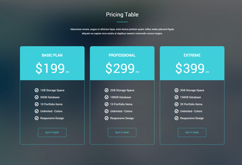
Codes are as follows:
<div class="backgroundImage26 pt-60 pb-60">
  <div class="dnn_layout">
    <div class="content_mid clearfix">
      <div class="row">
        <div class="col-sm-12">
          <div class="home6_d">
            <h1>Pricing Table</h1>
            <div class="line"></div>
            <p>Maecenas ornare, augue ut ultricies tique, enim lectus pretium quam... </p>
          </div>
        </div>
      </div>
      <div class="price-table price-table4 row">
        <div class="col-sm-4">
          <div class="price_holder animation periodic1">
            <div class="price_box">
              <div class="price_title ">
                <h2>Basic Plan</h2>
              </div>
              <span class="sup">$</span> <span class="price">199</span> <span class="unit">/m</span> </div>
            <ul>
              <li><span class="glyphicons glyph-ok"></span>1GB Storage Space</li>
              <li><span class="glyphicons glyph-ok"></span>50GB Database</li>
              <li><span class="glyphicons glyph-ok"></span>10 Portfolio Items</li>
              <li><span class="glyphicons glyph-ok"></span>Unlimited - Colors</li>
              <li><span class="glyphicons glyph-ok"></span>Responsive Design</li>
              <a class="Button_border" href="#" target="blank">Buy It Now</a>
            </ul>
          </div>
        </div>
        <div class="col-sm-4">
          <div class="price_holder animation periodic2">
            <div class="price_box">
              <div class="price_title ">
                <h2>Professional</h2>
              </div>
              <span class="sup">$</span> <span class="price">299</span> <span class="unit">/m</span> </div>
            <ul>
              <li><span class="glyphicons glyph-ok"></span>2GB Storage Space</li>
              <li><span class="glyphicons glyph-ok"></span>100GB Database</li>
              <li><span class="glyphicons glyph-ok"></span>15 Portfolio Items</li>
              <li><span class="glyphicons glyph-ok"></span>Unlimited - Colors</li>
              <li><span class="glyphicons glyph-ok"></span>Responsive Design</li>
              <a class="Button_border" href="#" target="blank">Buy It Now</a>
            </ul>
          </div>
        </div>
        <div class="col-sm-4">
          <div class="price_holder animation periodic3">
            <div class="price_box">
              <div class="price_title ">
                <h2>Extreme</h2>
              </div>
              <span class="sup">$</span> <span class="price">399</span> <span class="unit">/m</span> </div>
            <ul>
              <li><span class="glyphicons glyph-ok"></span>3GB Storage Space</li>
              <li><span class="glyphicons glyph-ok"></span>150GB Database</li>
              <li><span class="glyphicons glyph-ok"></span>20 Portfolio Items</li>
              <li><span class="glyphicons glyph-ok"></span>Unlimited - Colors</li>
              <li><span class="glyphicons glyph-ok"></span>Responsive Design</li>
              <a class="Button_border" href="#" target="blank">Buy It Now</a>
            </ul>
          </div>
        </div>
      </div>
    </div>
  </div>
</div>
Option:
col-md-*is the width of each column, you can change the width you need through value1~12.- You can modify
animationto change the animation on the slide. Animation list. - You can modify
glyphiconsto change icons. font icon list.
Contact Us area
Below is the screen shot:
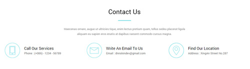
Codes are as follows:
<div class="mt-40 mb-40">
  <div class="dnn_layout">
    <div class="content_mid clearfix">
      <div class="row">
        <div class="col-sm-12">
          <div class="home6_f animation fadeInUp">
            <h1>Contact Us</h1>
            <div class="line"></div>
            <p>Maecenas ornare, augue ut ultricies tique, enim lectus pretium quam...</p>
          </div>
        </div>
      </div>
      <div class="row ">
        <div class="col-sm-4">
          <div class="home7_h animation periodic1"> <img alt="" class="img-responsive" src="/portals/33/home7_h_1.png" />
            <h6>Call Our Services
              <p>Phone :  (+086) - 1234 - 56789</p>
            </h6>
          </div>
        </div>
        <div class="col-sm-4">
          <div class="home7_h animation periodic2"> <img alt="" class="img-responsive" src="/portals/33/home7_h_2.png" />
            <h6>Write An Email To Us
              <p>Email :  dnnskindev@gmail.com</p>
            </h6>
          </div>
        </div>
        <div class="col-sm-4">
          <div class="home7_h animation periodic3"> <img alt="" class="img-responsive" src="/portals/33/home7_h_3.png" />
            <h6>Find Our Location
              <p>Address :  XingAn Street No.287</p>
            </h6>
          </div>
        </div>
      </div>
    </div>
  </div>
</div>
Option:
col-md-*is the width of each column, you can change the width you need through value1~12.- You can modify
animationto change the animation on the slide. Animation list.
Forms area
Below is the screen shot:
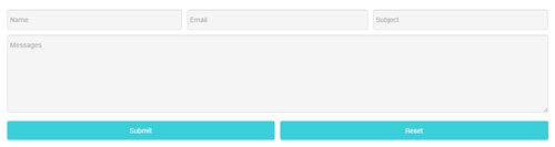
This is Theme_Responsive_20066-home7 theme of DNNGo PowerForms module
About Dnngo area
Below is the screen shot:
Codes are as follows:
<div class="foot_d animation periodic1"> <img alt="" src="/portals/33/foot_d1.png" class="img-responsive" />
  <p>Sed ut perspiciatis unde omnis iste natus error sit ... </p>
  <div class="foot_social_4  clearfix">
      <a href="#"><span class="social social-twitter"></span></a>
      <a href="#"><span class="social social-tumblr"></span></a>
      <a href="#"><span class="social social-facebook"></span></a>
      <a href="#"><span class="social social-picasa"></span></a>
      <a href="#"><span class="social social-google-plus"></span></a>
      <a href="#"><span class="social social-apple"></span></a>
  </div>
</div>
Option:
img-responsiveimage responsive- You can modify
animationto change the animation on the slide. Animation list. - You can modify
socialto change icons. font icon list. Containeris usingContainer-8
Friendly Tags area
Below is the screen shot:
Codes are as follows:
<div class="foot_e animation periodic2">
    <a class="Button_border_gray2" href="#" target="blank">Dnngo</a>
    <a class="Button_border_gray2" href="#" target="blank">HTML5</a>
    <a class="Button_border_gray2" href="#" target="blank">CSS3</a>
    <a class="Button_border_gray2" href="#" target="blank">Skin Pack</a>
    <a class="Button_border_gray2" href="#" target="blank">Catalook</a>
    <a class="Button_border_gray2" href="#" target="blank">Blogs</a>
    <a class="Button_border_gray2" href="#" target="blank">Features</a>
    <a class="Button_border_gray2" href="#" target="blank">Typography</a>
    <a class="Button_border_gray2" href="#" target="blank">News</a>
    <a class="Button_border_gray2" href="#" target="blank">Responsive</a>
    <a class="Button_border_gray2" href="#" target="blank">Mobilesite</a>
</div>
Option:
- You can modify
animationto change the animation on the slide. Animation list. Containeris usingContainer-8
Photo Gallery area
Below is the screen shot:
Codes are as follows:
<div class="animation periodic3">
  <ul class="foot_f">
    <li><img alt="" src="/portals/33/Photo1.jpg" /></li>
    <li><img alt="" src="/portals/33/Photo2.jpg" /></li>
    <li><img alt="" src="/portals/33/Photo3.jpg" /></li>
  </ul>
  <ul class="foot_f">
    <li><img alt="" src="/portals/33/Photo4.jpg" /></li>
    <li><img alt="" src="/portals/33/Photo5.jpg" /></li>
    <li><img alt="" src="/portals/33/Photo6.jpg" /></li>
  </ul>
</div>
Option:
- You can modify
animationto change the animation on the slide. Animation list. Containeris usingContainer-8
Coming Soon
You can click the link to check Coming Soon demo. Coming Soon
Below is the screen shot:
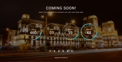
You can create the coming soon page easily following these steps:
- Create a page named coming soon page.
- Import the ComingSoon.Page.template for this page.
- You can set color, end time, and background image for Coming Soon page through xPlugin, as below:
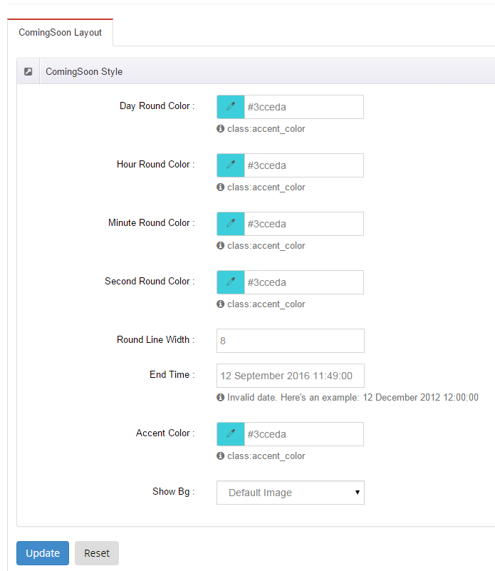
Boxed Layout
You can set Boxed mode in DNNGo.xPlugin > Skins > Options > Content Layout > Content Layout
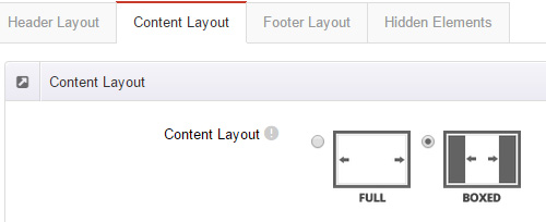
Dark Mode
You can set Dark mode directly in DNNGo.xPlugin > Skins > Options > Content Layout > Content Color Mode.
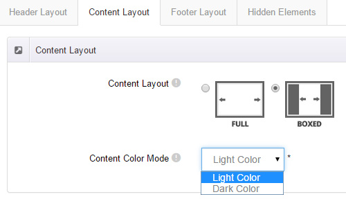
DNNGo_LayerGalleryPro Module
You can see this module in the banner section on the home page, we will guide you step by step to set up the module as the same as our demo site:
- Go to Host –> Extensions –> Install Extension wizard to install the module pack DNNGo_LayerGalleryPro.0x.0x.0x_PA.zip.
- Add DNNGo_LayerGalleryPro module to the BannerPane.
- Click Manager button.
- Click the navigation of the left Import&Export
- Import ContentListEntity.xml file under DNNGo_LayerGalleryPro Module.
- You will see the imported data on Manage List page and you can change the text/image in the banner by clicking Edit button.
- Click this link so you can check the module instruction details.
DNNGo_GalleryPro Module
This module contains 15 responsive sldiers in total.
- Go to Host –> Extensions –> Install Extension wizard to install the module pack DNNGo_DNNGalleryPro_xx.xx.xx_PA.zip.
- Add DNNGo_DNNGalleryPro module to the page.
- Click Effect List tab.
- Choose an effect you like.
- You can click this link to check the module demo.
- Click this link so you can check the module instruction details.
DNNGo_xBlog Module
We use this module on the blog page, click this link so you can check the module instruction details.
DNNGo_PhotoAlbums Module
We use this module on the Portfolios page, click this link so you can check the module instruction details.
DNNGo_PowerForms Module
You can create the form through this module, click this link so you can check the module instruction details.
License interface
- Please login or register your account at http://www.dnngo.net
- Send an email to dnnskindev@gmail.com with your invoice ID, machine Key for every module( different module has different machine key), and your DNNGO username. We will generate an activation code for you. Please note: If your site is a demo site, your license will still be valid when you transfer your site to a live site.
- Manage my licenses
Contact Us
If you have any questions or suggestions about modules/skins or modules/skins installation process, please feel free to contact us.
- Website: www.dnngo.net
- Email: dnnskindev@gmail.com
- Skype: dnngo-linda